EMAIL ADDRESS - markspostcardchat@gmail.com
22/05/2020
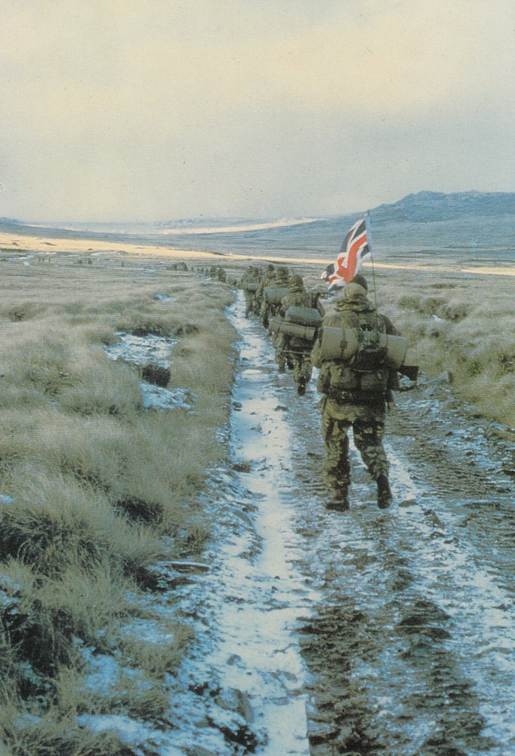
45 COMMANDO RM
YOMPING IN THE FALKLAND ISLANDS 1982
Published by
BERIC TEMPEST & CO., LTD (St Ives, Cornwall)
a
BERIC TEMPEST COLOURCARD
On the 21st May 1982 3 Commando Brigade executed landings in San Carlos Water. On the 22nd May 3 Commando Brigade were all ashore and the Brigades Maintenance Area was established at Ajax Bay. It should also be noted that on the 21st May HMS Ardent was sunk. On the 23rd May HMS Antelope was sunk. This period of the Falklands War was an important one as there was a fear in the UK government that the landings on the islands could result in loss of life. Thankfully, the landings went unopposed and were successful, although as you will have seen from the above details there was a loss of naval shipping.
It was later when the army had to commence their ‘Yomp’ across the Island towards Stanley and it was the commencement of this yomp which produced what is probably the best remembered image from the war, this soldier walking off with his union jack flag sticking up from his pack.

21/05/2020
ICH GLAUB, ICH
SPINNE
‘I think I am a Spider’
Published by
MODERN TIMES GMBH
Copyright
OTTIFANT PRODUCTIONS GMBH
Ref: Best.-Nr. 0103-8500223
Spider Elephant, Spider Elephant, does whatever a Spider Elephant can … does not quite sound as good when sung to the theme tune with the right words! Still, how often do you find an elephant dressed as a superhero? Not often I suspect.
REVERSE SIDE OF ABOVE POSTCARD

21/05/2020
THE WORLD IS YOUR LOBSTER
Published by
GONE CRABBING
I bought this lovely simple little card when we were in Cromer in Norfolk late last summer. I believe I got it from the ‘Tourist Information’ centre, which I should also say is a particularly good source of postcards although it is a little out of the way and some distance from the beach and seafront area.

The logo that appears in the bottom right corner on the reverse side of the above postcard

21/05/2020
BIODIVERSITY … THE VARIETY OF LIFE
SIMPLIFIED HABITATS OF PURBECK
THE PURBECK BIODIVERSITY PROJECT
Produced by
PURBECK DISTRICT COUNCIL, COMMUNITY Planning and Design Section
I do like a local issued postcard which has a connection unique to the location in question. This one has a connection to natural history with its mention of different wild habitats. Something different.

REVERSE SIDE OF ABOVE POSTCARD

20/05/2020
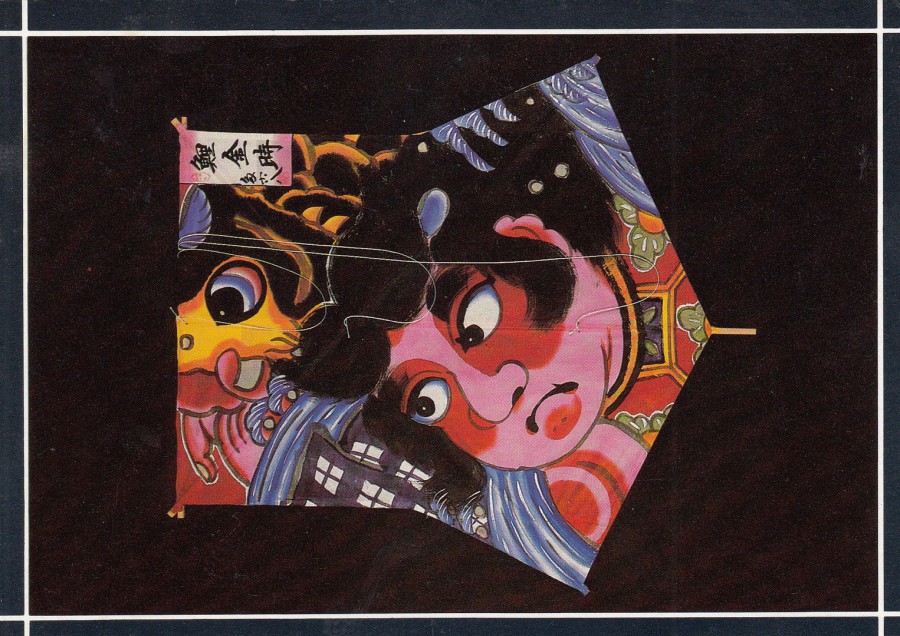
EDO KITE
Traditional kite of Tokyo Metropolis. Familiar image of Dragon and Mount Fuji. A rare example in black, white and gold by Kikutaro Kozuka
From the Collection of Eiji Ohashi
KITES EXHIBITION: SUNDERLAND CIVIC CENTRE
Copyright WASHINGTON ARTS CENTRE, 1986
JAPANESE FESTIVAL: WASHINGTON & SUNDERLAND
Published for the
KITES EXHIBITION: SUNDERLAND & WASHINGTON
For me it was the Dragon that appears on this kite which was the draw. I am fascinated with mythological creatures and any postcard depicting one is going to end up in my collection and this one also has an unusual source material as well.
SURUGA KITE
Image of Carp and Kintaro, symbol of boyhood strength. Made by Asako Kato, Shizuoka Prefecture (formerly Suruga)
From the Collection of Eiji Ohashi
KITES EXHIBITION: SUNDERLAND CIVIC CENTRE
Copyright WASHINGTON ARTS CENTRE, 1986
JAPANESE FESTIVAL: WASHINGTON & SUNDERLAND
Published for the
KITES EXHIBITION: SUNDERLAND & WASHINGTON

BUKA KITE
Traditional kite of Shizuoka Prefecture with carp, symbol of strength to celebrate boy’s first birthday. Maker Masao Fujiwara
From the Collection of Eiji Ohashi
KITES EXHIBITION: SUNDERLAND CIVIC CENTRE
Copyright WASHINGTON ARTS CENTRE, 1986
JAPANESE FESTIVAL: WASHINGTON & SUNDERLAND
Published for the
KITES EXHIBITION: SUNDERLAND & WASHINGTON
20/05/2020
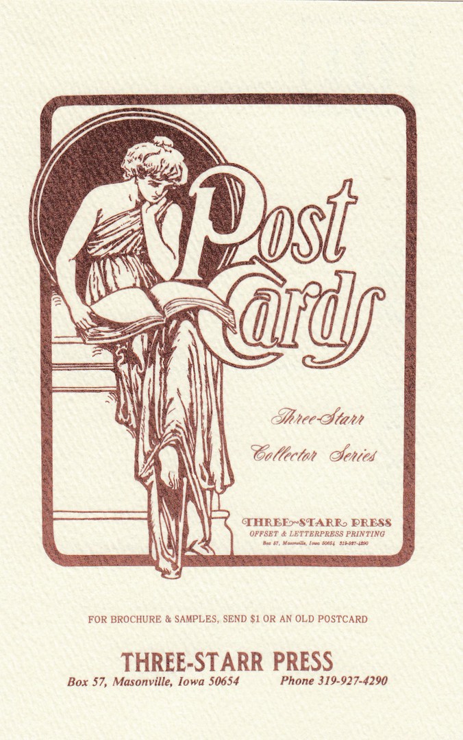
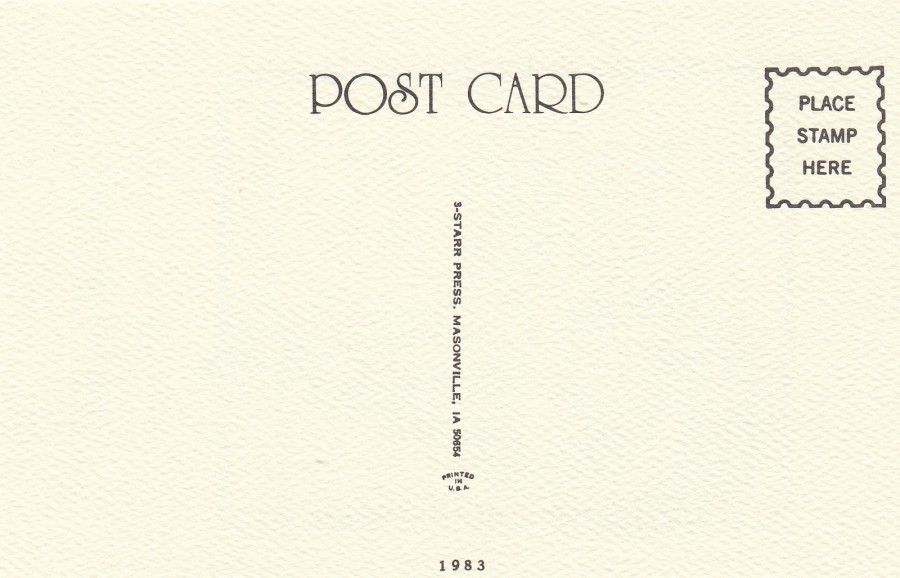
POST CARDS
THREE-STARR COLLECTOR SERIES
1983
Company Advertising Postcard
Published by
3-STARR PRESS
MASONVILLE, IOWA
The reason why I like this postcard so much is that this company was responsible for printing many of the private American issued National Postcard Week postcards that collectors produced during the early 1980’s. So, as I have a number of these postcards it is nice to have an advertising postcard printed by this company and advertising their services.
REVERSE SIDE OF ABOVE POSTCARD
20/05/2020
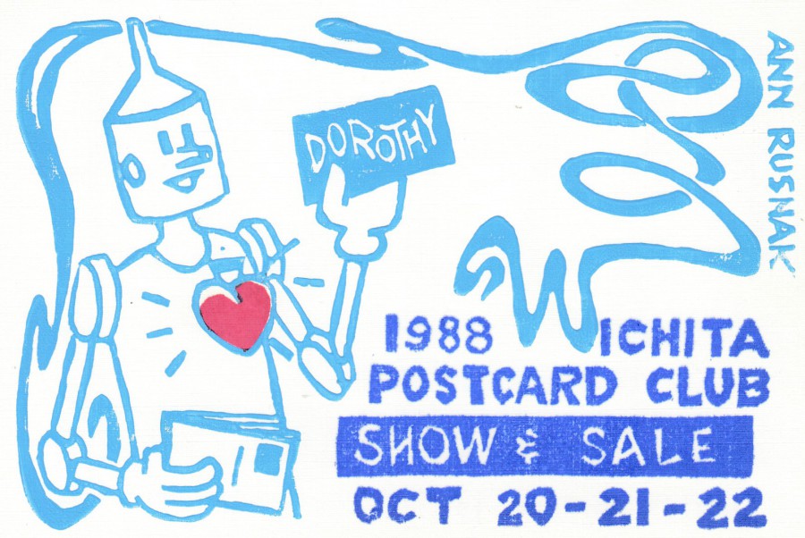
1988 WICHITA POSTCARD CLUB
SHOW & SALE
20 – 21- 22ND OCT
Design by
ANN RUSNAK
Published by
ANN RUSNAK
Limited Edition of just 122
All 122 of these postcards were hand made by Ann using the lino-cut method of printing also called ‘Block Printing’. So, each card is just a little different around its edges where the paint was applied a little more or a little less. For this reason alone, I have always liked this design, but you also have the fact that only 122 were made, so its not an easy one to find now.
REVERSE SIDE OF ABOVE POSTCARD
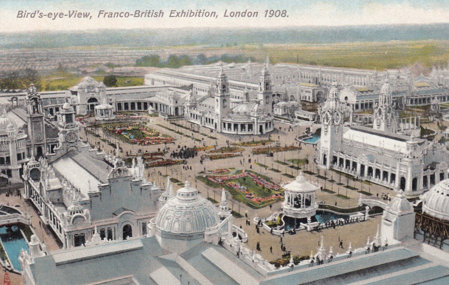
19/05/2020
BIRDS-EYE-VIEW,
FRANCO-BRITISH EXHIBITION,
LONDON 1908
Published by
RAPHAEL TUCK & SONS
Ref: FRANCO-BRITISH EXHIBITION Postcard 3524
If ever they do invent a time-machine I will be booking a trip back in time to visit this exhibition. The wonderful appearance of the buildings and the popularity of the exhibition have always caused me to be fascinated with the event. The postcards issued do make it look amazing.
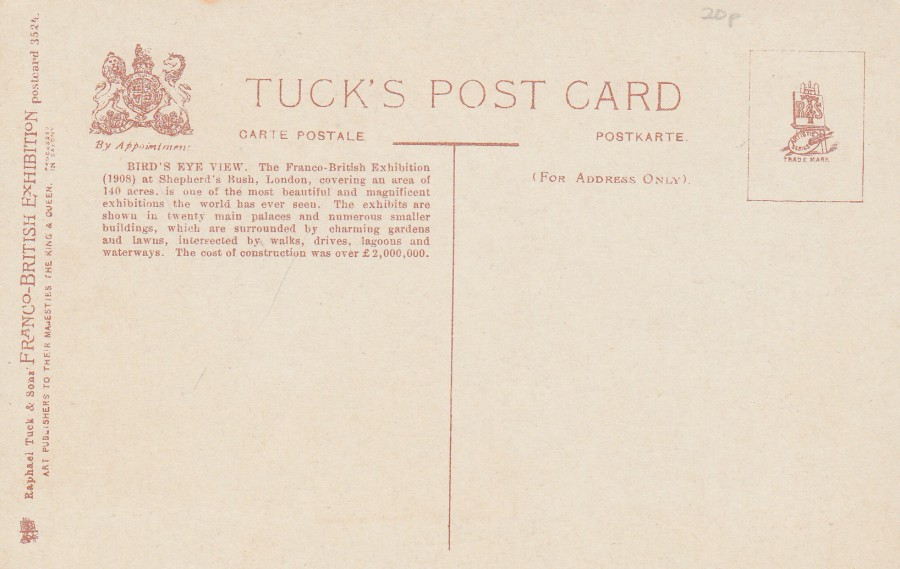
REVERSE SIDE OF ABOVE POSTCARD
19/05/2020
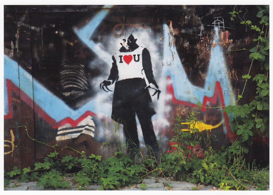
BERLIN STREET ART
Published by
BERLIN – BLEIBT – BUNT
Copyright:
GERD SCHNURER, BERLIN
Ref: Card Nr. GS-269
The street art in Berlin is renowned, possibly because of the graffiti that appeared on the Berlin wall, and still does along the largest remaining section of it. I have an interest in the early black and white horror movies, the older the better, and Nosferatu, from 1922 is one of the earliest. The main character is called Count Orlok (as played b y Max Schreck). I mention all this because, if you did not already know, it is Count Orlock that appears here in this piece of street art, although I am sure he did not wear this particular t-shirt in the film.
18/05/2020
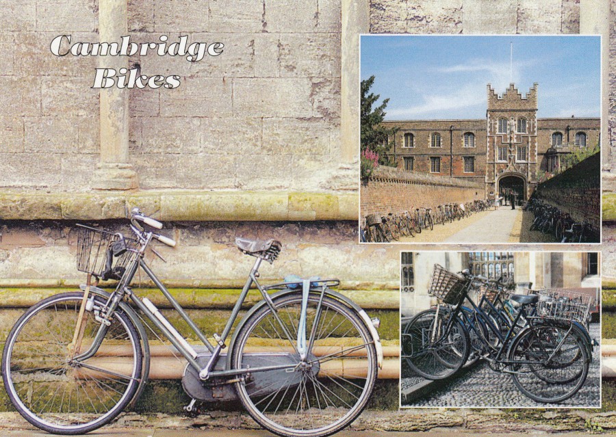
CAMBRIDGE BIKES
A more traditional way of travelling around Cambridge
Published by
JUDGES OF HASTINGS
Ref: C28306
There can be no doubt that more and more people have taken up cycling since, rather ironically, the lockdown came into force. When I am out doing my daily walk (one of the four reasons people are allowed to leave their house for is to take exercise for up to an hour a day – the other three are to buy food, collect medicine and to support a vulnerable person).
I love Cambridge and visited it again last year and had intended to return this year, but that is looking unlikely for awhile yet still. This postcard is one I bought on my visit last year
18/05/2020
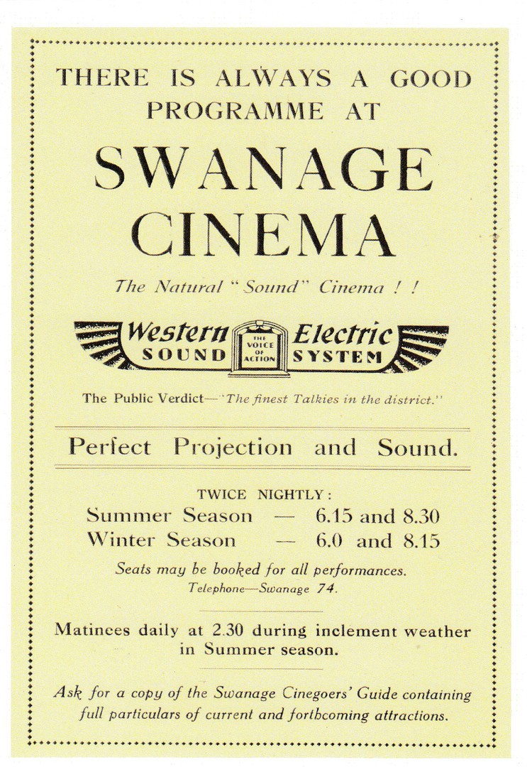
THERE IS ALWAYS A GOOD PROGRAMME AT
SWANAGE CINEMA
‘The Natural Sound Cinema!!’
Published by
MARTIN’S PURBECK MEMORIES
Design & Print by
GHPM
Copyright 2017
I do enjoy finding unusual postcards which depict something which probably could not be found illustrated on any other card. Unfortunately, there is no informative text on this card to give you any idea of when this programme poster was used, although, judging from the telephone number given – 74 – this was very early on in the cinema story. I thought this was a great piece of early cinema history.
17/05/2020
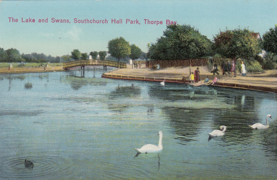
THE LAKE AND SWANS
SOUTHCHURCH HALL PARK
THORPE BAY
Unknown Publisher
(Probably a local published postcard)
Me and Jo walked around this lake the other day. Before the pandemic lockdown, this park was always packed with people, but when we attended there were far fewer people around than I have ever seen here before. The people I saw were all practising social distancing, couples and small family groups being together, but all these groups were keeping apart from everyone else. What I did find strange was the lack of small toy power boats moving across the lake, and the lack of small pedalo’s (or paddle boats as they are also called) which can be found on the lake on one side of the bridge you can see in this image, the small toy power boats have the lake area on the other side of the bridge. What you can see in this image is the pedalo side. The lack of both came as a shock as they have always been part of the scenery here, and I have seen them here since I was a small child, but clearly many years before neither were present, as this photograph attests.
REVERSE SIDE OF ABOVE POSTCARD
17/05/2020
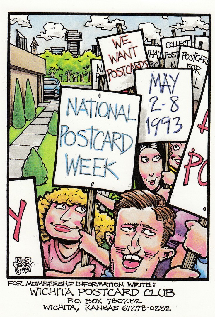
NATIONAL POSTCARD WEEK
2-8 MAY 1993
Published by the
WICHITA POSTCARD CLUB
It would not be allowed now! All that protesting in groups! Social distancing has changed things a great deal this year. Most people seem to have been complying with these new rules, but some have not. Some have become ‘very’ angry with those who have carried on as normal, and those who believe it is their right have also been very verbal about that considered right, and whatever the rights and wrongs of either viewpoint the virus has become yet another thing that has created rifts between people. This is a sad thing, but I am hoping that communication via the postal system, which has mostly kept going throughout this pandemic, will help bring people back together. Nurses, doctors, keyworkers, police, fire fighters and other emergency service workers along with other essential workers like all those who have continued keeping our supermarkets and food outlets open and those refuse workers still removing our endless waste and rubbish have all quite rightly been thanked, but I think our postmen also need some respect, because the ability to send and receive messages, packets and goods has done much to keep peoples morale up. I know that it is the one thing which has kept me going throughout.
17/05/2020
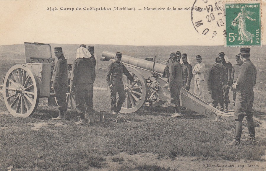
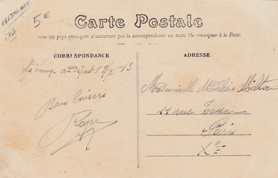
CAMP DE COETQUIDAN (MORBIHAN)
MANVEUVRE DE LA NOUVELLE PIECE DE 155
Coetquidan Camp (Morbihan)
Manoeuvring of the new 155 Piece
Published by
E. MIRY-ROUSSELIERE.
EDIT RENNES
Ref: 2342
This just pre-dates WW1 as it was posted in 1913, the year before I suspect this very piece of artillery was put to real use. The stamp, applied to the front which as previously mentioned was normal for this period of French postal history, has been cancelled with a ‘Morbihan’ cancel dated the 20th [?] 1913. Camp Coetquidan is a French military educational facility located in the Morbihan department of Brittany. So, it appears this camp has been a military establishment for many decades, well, over 100 years now. This is a nice image for anyone interested in the history of French artillery.
REVERSE SIDE OF ABOVE POSTCARD
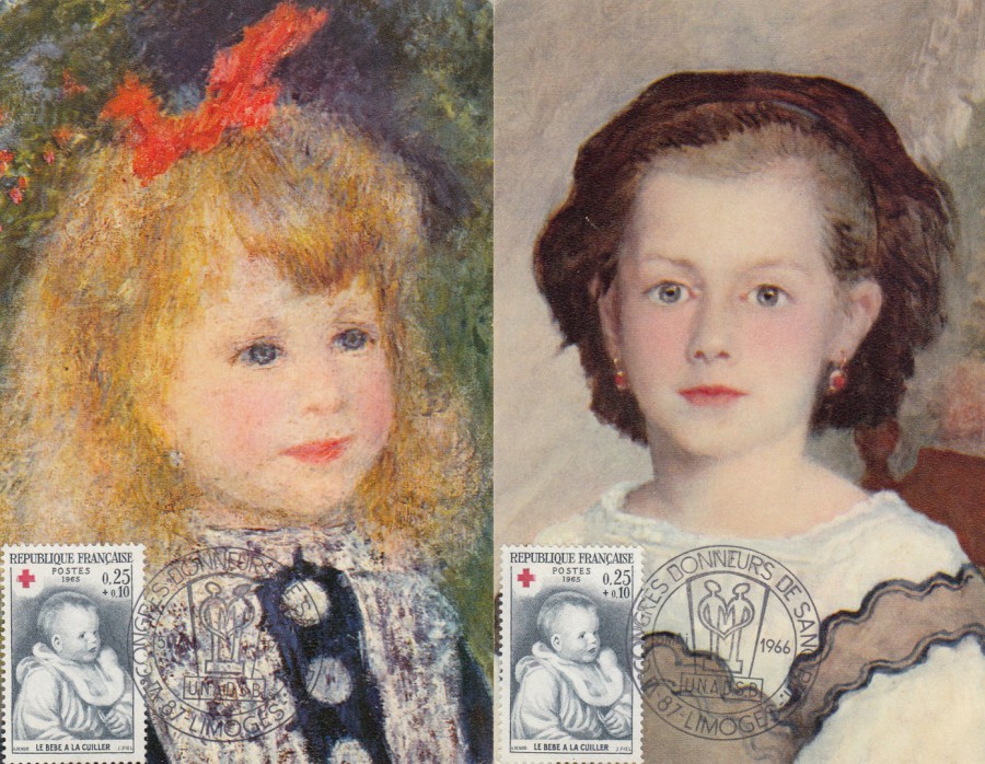
16/05/2020
(LEFT SIDE)
L’ENFANT A L’ARROSOIR
By
RENOIR
(National Gallery of Art, Washington DC – Chester Dale Collection)
EDITE PAR LE
‘COMITE NATIONAL DE L’ENFANCE’
(National Childhood Committee)
51, Avenue Franklin-D-Roosevelt, Paris (VIII*)
(RIGHT SIDE)
PORTRAIT DE MADEMOISELLE ROMAINE LACAUX
By
RENOIR
(The Cleveland Museum of Art, Gift Hanna Fund)
EDITE PAR LE
‘COMITE NATIONAL DE L’ENFANCE’
(National Childhood Committee)
51, Avenue Franklin-D-Roosevelt, Paris (VIII*)
Two nice painting postcards were published by the French ‘National Childhood Committee’ located in Paris. They have both been used to receive the same French postage stamp:
RED CROSS FUND – Painting by Renoir ‘LE BEBE A LA CUILLER’ – 25c + 10c (blue and red) (SG 1698)
The stamp was issued in 1965 so this cancellation, as used on both cards, is not first day of issue. The cancellation reads as:
‘VI CONGRES DONNEURS DE SANG ‘PTT’’ – 87 LIMOGES – 5 MAI 1966’
VI (6th) Blood Donors Congress PTT [French postal designation]- 87 [Location postal Code No] Limoges [a city in southwest-central France] – 5th May 1966.
I suspect the use of this special hand stamp was to connect the red cross themed postage stamp with a medical related cancel. The postcard images already connect to the stamps through the joint depiction of artwork by Renoir. A nice combination I thought.
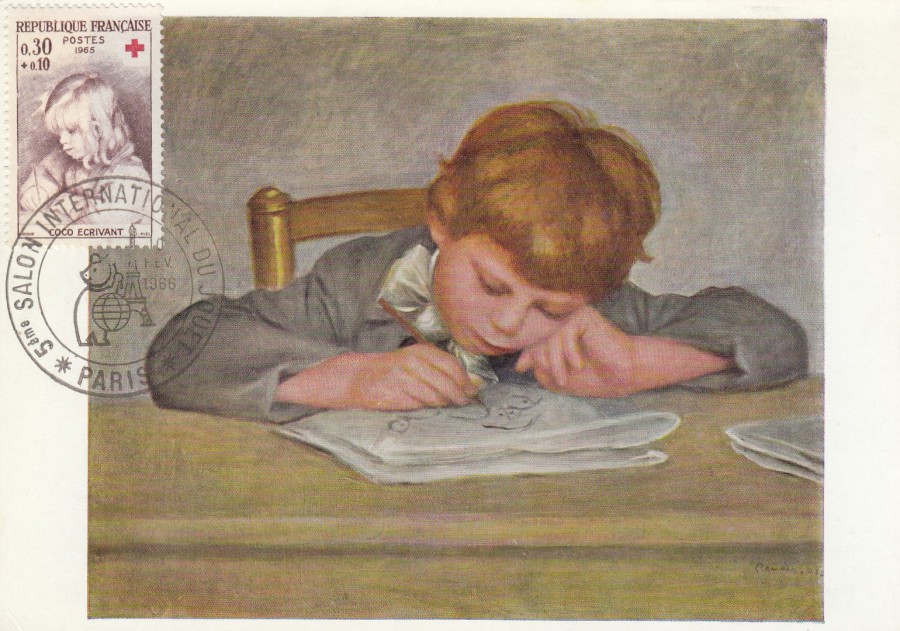
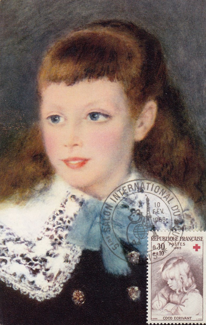
JEAN RENOIR DRAWING
By
AUGUSTE RENOIR
(Collection Basil Barlow, Buckinghamshire)
Published by
SOHO GALLERY LTD., LONDON. W. 1
Copyright S.P.A.D.E.M. Paris 1963
Ref: Soho Card 327
This card has the second stamp from the same set as the stamps that appear on the above two cards:
RED CROSS FUND – Painting by Renoir ‘COCO ECRIVANT’ [portrait of Renoir’s small son writing] – 30c + 10c (brown and red) (SG 1699).
The extra 10c, as with that on the stamps on the above cards, was to go to the Red Cross, so this was a charity fund raising stamp issue.
On this postcard the stamp has been cancelled with another special cancellation which is ‘NOT’ first day of issue (as the stamps came out in 1965). This cancellation reads:
‘5eme SALON INTERNATIONAL DU JOUET – PARIS – 10 FEV 1966’
(5TH International Toy Show – Paris – 10th February 1966)
The connection here is obviously the theme of children, a child on the artwork, a child on the stamp and the childhood connection with toys. For me there is the extra addition of the Eiffel Tower appearing in the cancellation as I collect Eiffel Tower material.
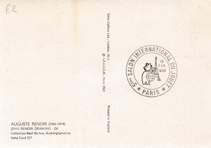
REVERSE SIDE OF ABOVE POSTCARD
It was common practice for this type of maxi-card in France to also have a strike of the special cancellation on the reverse side (although unusually this did not happen with the top two postcards). These reverse side cancels are often much clearer, and you can read them better.
PORTRAIT DE MADEMOISELLE MARTHE BERARD
By
RENOIR
(Musee [Museum] de Sao paulo)
EDITE PAR LE
‘COMITE NATIONAL DE L’ENFANCE’
(National Childhood Committee)
51, Avenue Franklin-D-Roosevelt, Paris (VIII*)
Same stamp and special cancellation as used on the above postcard but clearly here applied to a different Renoir painting postcard (from the same source as the top two cards).

REVERSE SIDE OF ABOVE POSTCARD
16/05/2020
‘POPULARIZATION OF ROAD ASSISTANCE BY THE POLISH MOTOR ASSOCIATION’
POLISH POSTAL STATIONERY POST CARD
Left Side Picture: EMBLEM AND ROAD SERVICE VEHICLE
Issued: 25th February 1980
Michel Ref: P779
Official Polish Postal Authority Issue
I do like postal stationery post cards, both old and modern ones. A few years ago, I picked up some Polish cards from the early 1980’s from The Strand Stamp shop opposite the Stanley Gibbons building. These were all used and addressed to the Ford Motor Company here in the UK, and all seemed to be requests to be considered for employment with the company (I wonder if they had a push for workers from this country in 1981, which is when this card was posted). Used postal stationery post cards when sent outside of the country can be made more interesting y the addition of extra stamps to upgrade the postage for foreign transit, as is the case here. The cards I have either have extra stamps to the value of an additional 3.50Zt or 4Zt, so I assume the extra cost of a card to the UK was around that value. So, you get a little more of a story with a used post card, and I think they can look more interesting as well, and I like how the sender of this card seems to have had some trouble translating the company's address - no 'Google Translate' back then of course!
15/05/2020
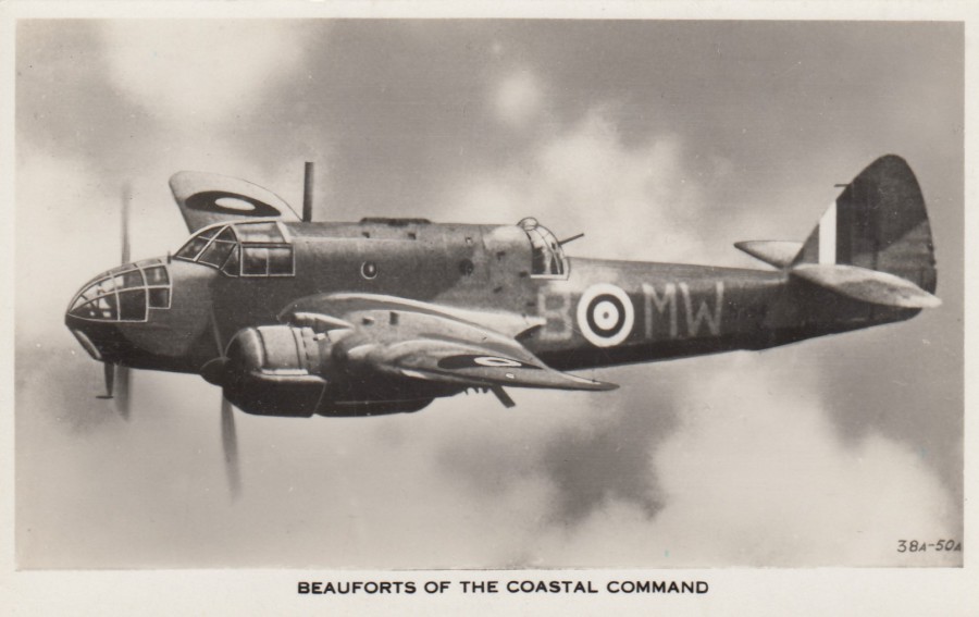
BEAUFORTS OF THE COASTAL COMMAND
Published by
VALENTINE & SONS LTD
Ref: 38A-50A
An aeroplane image was required I thought, so to also change the approach I decided on a military one. This is a World War II issue showing one of the early war planes, the Bristol Beaufort, a twin-engined torpedo bomber, a light bomber designed by Bristol Aeroplane Company. The plane was introduced in 1939 (15th October was the date of the first flight) but retired in 1944 (declared obsolete in 1945). They saw service with the Royal Air Force Coastal Command and then the Royal Navy Fleet Air Arm from 1940 and they saw considerable service in the Mediterranean with squadrons based in Egypt and Malta. They were used as mentioned above as torpedo bombers, then conventional bombers and as mine-layers. From 1942 they were used as trainer aircraft as they were removed from active service that year.
One interesting fact about these planes is that although a military plane more hours were flown as a training-hours than combat/operational hours. This resulted in more planes being lost through accidents and mechanical failures than lost to enemy fire.
REVERSE SIDE OF ABOVE POSTCARD
15/05/2020
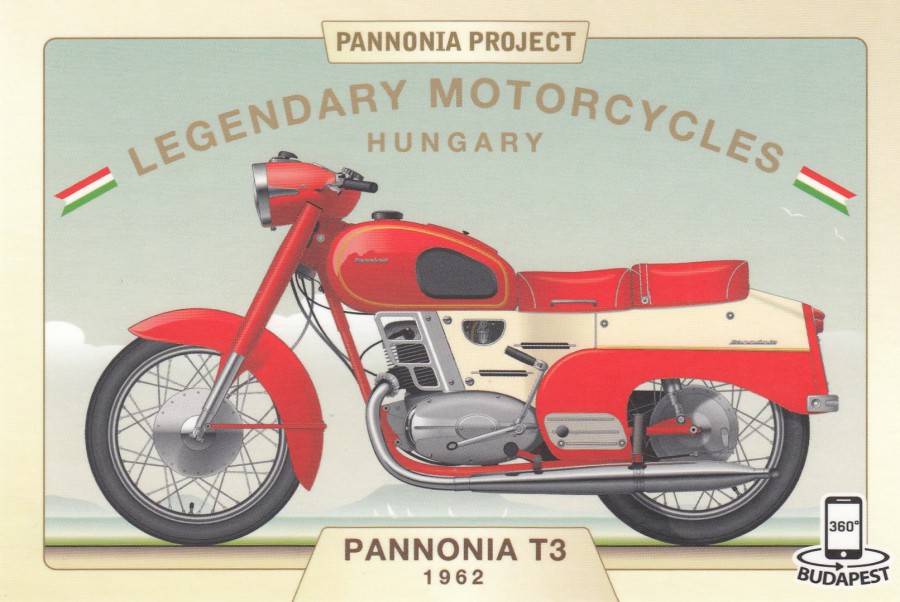
PANNONIA PROJECT
LEGENDARY MOTORCYCLES
PANNONIA T3
1962
Published by
Panorama PostcARd
Ref: 091HS
Whilst I seem to be on a ‘TARNSPORT’ fix tonight I thought I should also include a motorcycle postcard, so I thought this nice 360% one from Budapest would suffice nicely. I have shown before one of these 360% issues, also from Budapest, and mentioned how unusual they are. Full instructions on how to use this postcard and where to get the App to do so is printed on the reverse side (see below).
REVERSE SIDE OF ABOVE POSTCARD
15/05/2020
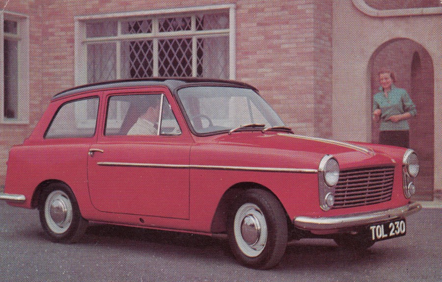
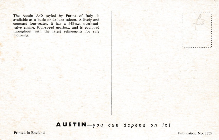
AUSTIN A40
STYLED BY FARINA OF ITALY
AUSTIN – YOU CAN DEPEND ON IT
Official Austin promotional postcard
Printed in England
Ref: Publication No. 1759
Another great postcard from the late 1950’s (I believe the car in question being advertised here was released around 1958). I mentioned before, several times I think, that these early mid-20th century car advert cards are growing in popularity and value. Grab these whilst you can, that’s my advice.
REVERSE SIDE OF ABOVE POSTCARD

15/05/2020
THE GREEN GREYHOUND
By
K. E. CARTER
Published by
THE MEDICI SOCIETY LTD, LONDON
Ref: P.C. 1554
All the information you need to know about this train is printed in some informative text printed on the reverse side (see below). Train painting postcards have continued to be collectible throughout the history of postcard production and right up to today. This is a nice one from the 1970’s era.

REVERSE SIDE OF ABOVE POSTCARD
15/05/2020
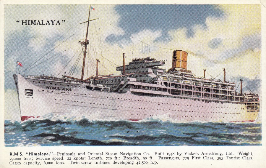
R.M.S. “HIMALAYA”
Published by
VALENTINE & SONS, LTD
Ref: VALENTINE’S “SHIP” SERIES
No. 1794
I do love this delightfully painted ship series. They were popular and therefore they crop up quite regularly and can be bought from dealers for anywhere between £1.50 and £5 depending on their condition, with used copies with some minor edge damage being at the bottom end and near perfect mint copies on eBay at the other end. Dealers at fairs seem to price around the £3 mark which I think is a reasonable.
REVERSE SIDE OF ABOVE POSTCARD
14/05/2020
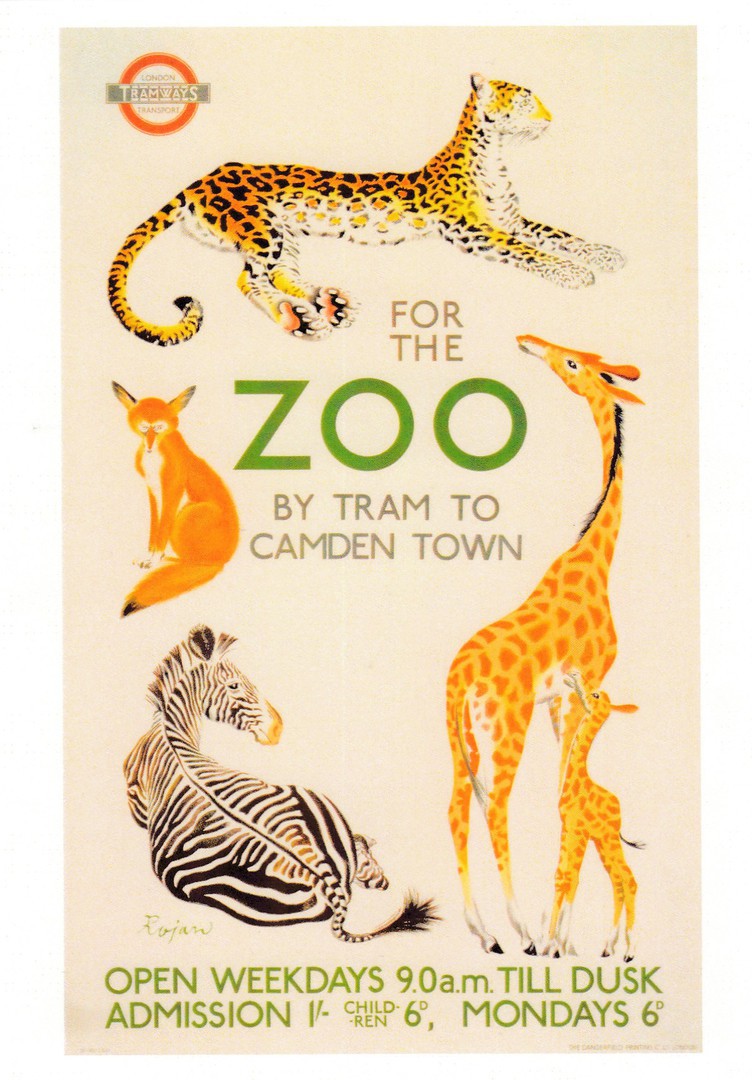
FOR THE ZOO
BY TRAM TO CAMDEN TOWN
Poster design by
ROJAN
1935
Published by the
LONDON TRANSPORT MUSEUM
No Reference Number
Copyright 2017
In this blighted time, I have been hearing how many zoos across the world have been struggling to feed their animals, raise money and even just survive. I heard of one zoo, not here in the UK, which had to end up feeding some of its hoofed display animals to its carnivore big cats and other large carnivore animals. A sad state-of-affairs indeed. I have always loved zoos, and even though I accept that some have had issues in the past I believe most big zoos now days are trying to help out with conservation projects and are trying to give their animals better enclosures and better lives, with a few exceptions, the bad small zoos that do mistreat their animals (hopefully now more the exception to the rule). Fingers crossed that the major zoos both survive and that their animals are well looked after.
REVERSE SIDE OF ABOVE POSTCARD
No LTM reference number, which surprised me
14/05/2020
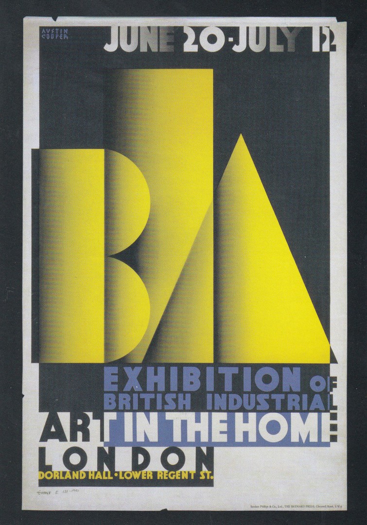
BIA EXHIBITION
(BRITISH INDUSTRIAL ART)
IN THE HOME
Poster Design
By
AUSTIN COOPER (1890 – 1964)
For use in the year
1933, LONDON
Published by the
VICTORIA & ALBERT MUSEUM
Ref: 129046
Poster designs are still one of the modern era’s most collected themes, and postcards depicting posters have been issued by numerous museums, galleries and publishers over the past 40 years (and long before of course as well). The postcards published by museums are often of posters in their own collection and these can sometimes be the only source for that, or those, specific design(s). If I visit any museum, I always look forward to checking out the gift shop. Often, I find these days, they only stock the Robert Opie issues (an all-conquering modern postcard publisher whose cards are taking over in all gift shops across the country) or just one or two images of the outside of the premises if it is a stately home or famous building etc., but, I have a word of advice – always ask the person behind the counter if there any old postcards still in stock anywhere. This approach has produced some interesting cards which were held back under the counter, or in the back storeroom, placed there because new stuff had been bought and was now out front. These places never throw anything away – so ask.
REVERSE SIDE OF ABOVE POSTCARD
The interesting vertical layout being used by this museum now
14/05/2020
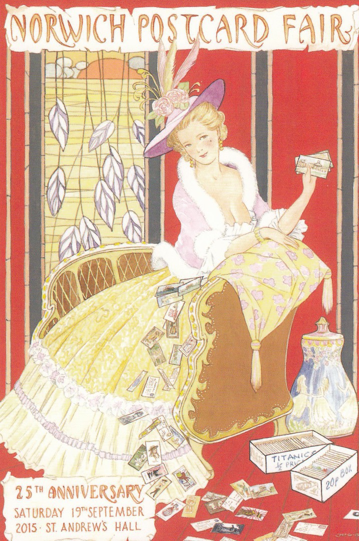
NORWICH POSTCARD FAIR
25TH ANNIVERSARY
SATURDAY 19TH SEPTEMBER
2015
Design by
JOHN PULHAM
(with acknowledgements to George Barbier)
Limited Edition of 550
Published by
OVERDALE CARDS,
SUDBURY, SUFFOLK
Ref: OC23
This is yet another of the fair postcards which I suspect were given away free to visitors to this Norwich Postcard Fair. This is another cracking image all-be-it that there is a substantial amount of cleavage on display! Also, I liked that there is a 20p box displayed here as I love going through 20p boxes. There is also a box of Titanic postcards, although I have never been fortunate enough to come across a box of these marked up as ½ price!!!!
p.s.
Sadly, I now believe that the Norwich Postcard Fair is no longer being held. A sad result of lowering visitor numbers and increased costs.
14/05/2020
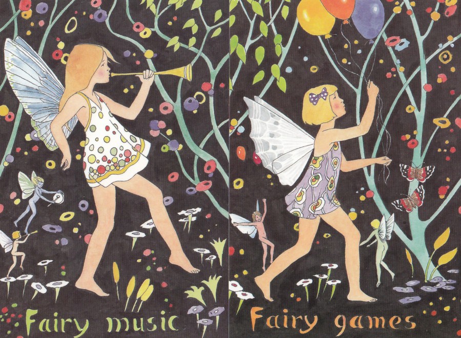
Far Left (left side)
FAIRY MUSIC
Design by
JOHN PULHAM
Published by
OVERDALE CARDS,
SUDBURY, SUFFOLK
Ref: OC17
Near Left (right side)
FAIRY GAMES
Design by
JOHN PULHAM
Published by
OVERDALE CARDS,
SUDBURY, SUFFOLK
Ref: OC16
This is a nice set of three cards (the third is depicted below). Overdale Cards produce the cards for the postcard fairs at Bury St Edmunds (Suffolk), Norwich (Norfolk) and Billericay (Essex). I therefore wonder if these three postcards had anything to do with these fairs, although no mention of any events, locations or dates are given on the front or the reverse sides. John Pulham does do the postcard artwork for the cards given out at these fairs, some of which have appeared previously on this webpage. Whatever the reason for issue they are lovely designs reminiscent of those produced by the children’s book artists of earlier years.

FAIRY LIGHTS
Design by
JOHN PULHAM
Published by
OVERDALE CARDS,
SUDBURY, SUFFOLK
Ref: OC18
This is the last design of the three. Looking at these now I realise I have not put them together in the correct order and that if I had I would have noticed they fit together to make continuous image. This makes them a little bit more special.

13/05/2020
GREAT BRITAIN
HALF PENNY LILAC ON BUFF CARD
POSTAL STATIONERY POST CARD
Higgins & Gage, World Postal Stationery Catalog
Section 7
Great Britain - Page 1
Reference No: 1
Issued: 1870
An example of the very first postal stationery post card issued here in the UK. This card was first issued on the 1st October 1870 so this one here with a postmark dated 15th October 1874 was used a few years into the postal card story. In the following year, 1875 the card would be slightly altered with the word ‘TO’ seen top left of the address box area being removed (see postal card below). It was only a subtle change, but it does give collectors two versions to look out for, something specialists like. This copy has the Edinburgh 131 Duplex with dotted circle type cancellation, a type of cancellation priced in the ‘Collect British Postmarks, 8th Edition’ at £12 which is a nice little usage.
REVERSE SIDE OF ABOVE POSTAL STATIONERY POST CARD
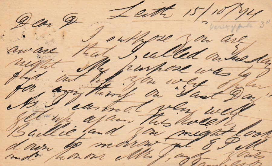
Sometimes the handwriting on a postcard can be ‘really’ hard to make out and although I can make out a good percentage of this one it does show how writing styles have changed since the Victorian times.
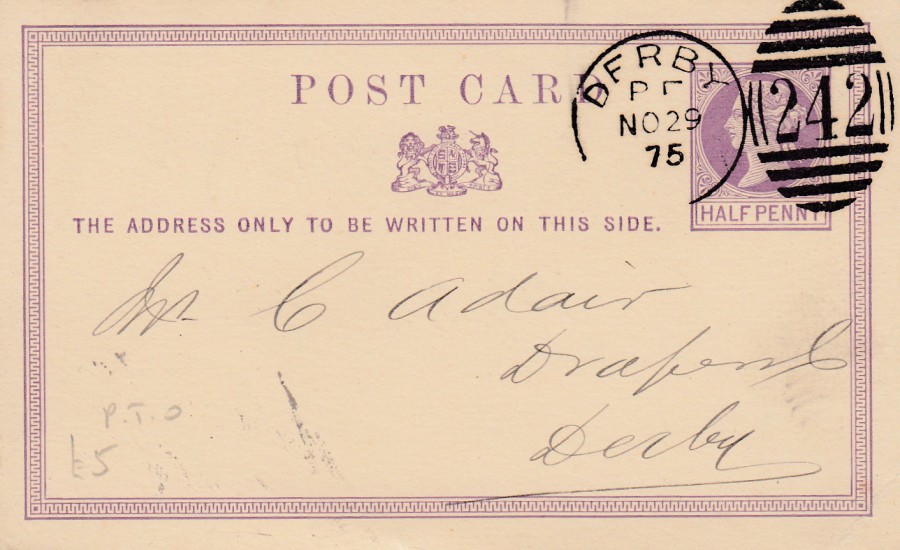
GREAT BRITAIN
HALF PENNY LILAC ON BUFF CARD
POSTAL STATIONERY POST CARD
Higgins & Gage, World Postal Stationery Catalog
Section 7
Great Britain - Page 1
Reference No: 2
Issued: 1875
This is a copy of the second type of postcard issued here in the UK. There is actually only one small difference to that of the original 1870 issued card and that is the removal of the “TO” word which appeared in the top left corner of the address area on the original (see above postal card).
This card was posted from Derby receiving a nice duplex 242 numbered cancellation dated 29th November 1875, the year of release for this specific design of postal card.
REVERSE SIDE OF ABOVE POSTAL STATIONERY POST CARD
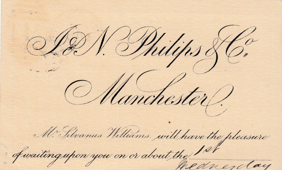
This one has a nice printed company logo and details of an appointment. A lot of companies took up usage of the postal card in the UK, mainly because it was half the price of sending a letter and if your message was short then this was an incredible saving over time.
J & N PHILIPS & CO
MANCHESTER
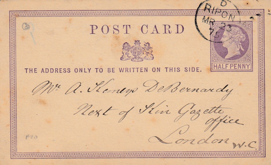
GREAT BRITAIN
HALF PENNY LILAC ON BUFF CARD
POSTAL STATIONERY POST CARD
Higgins & Gage, World Postal Stationery Catalog
Section 7
Great Britain - Page 1
Reference No: 2
Issued: 1875
Another copy of the 1875 issue, without the extra “TO” on the front. This one was also posted in 1875, on March 23rd from Rippon. This has a nice single circle straight line text early Ripon cancellation.
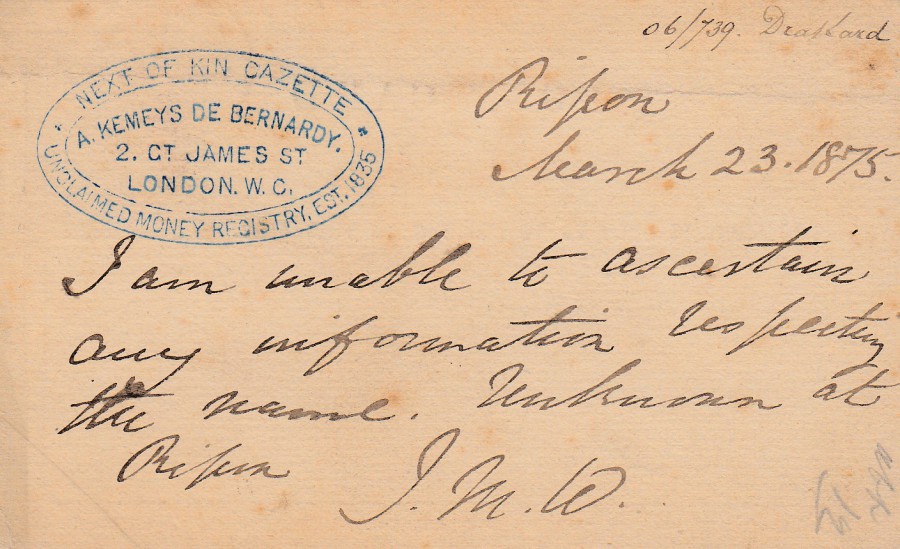
REVERSE SIDE OF ABOVE POSTAL STATIONERY POST CARD
I will openly admit that I bought this one because the blue office cachet applied top left intrigued and appealed to me.
NEXT OF KIN GAZETTE
A. KEMEYS DE BERNARDY
2. GT. JAMES ST
LONDON. W.C.
UNCLAIMED MONEY REGISTRY, EST. 1835
This postal card was sent by someone to the ‘Next of Kin Gazette’ to inform them that no one could be found in Ripon for the name that they had obviously been asked to check for. I love the use of this card.
13/05/2020
(TOP)
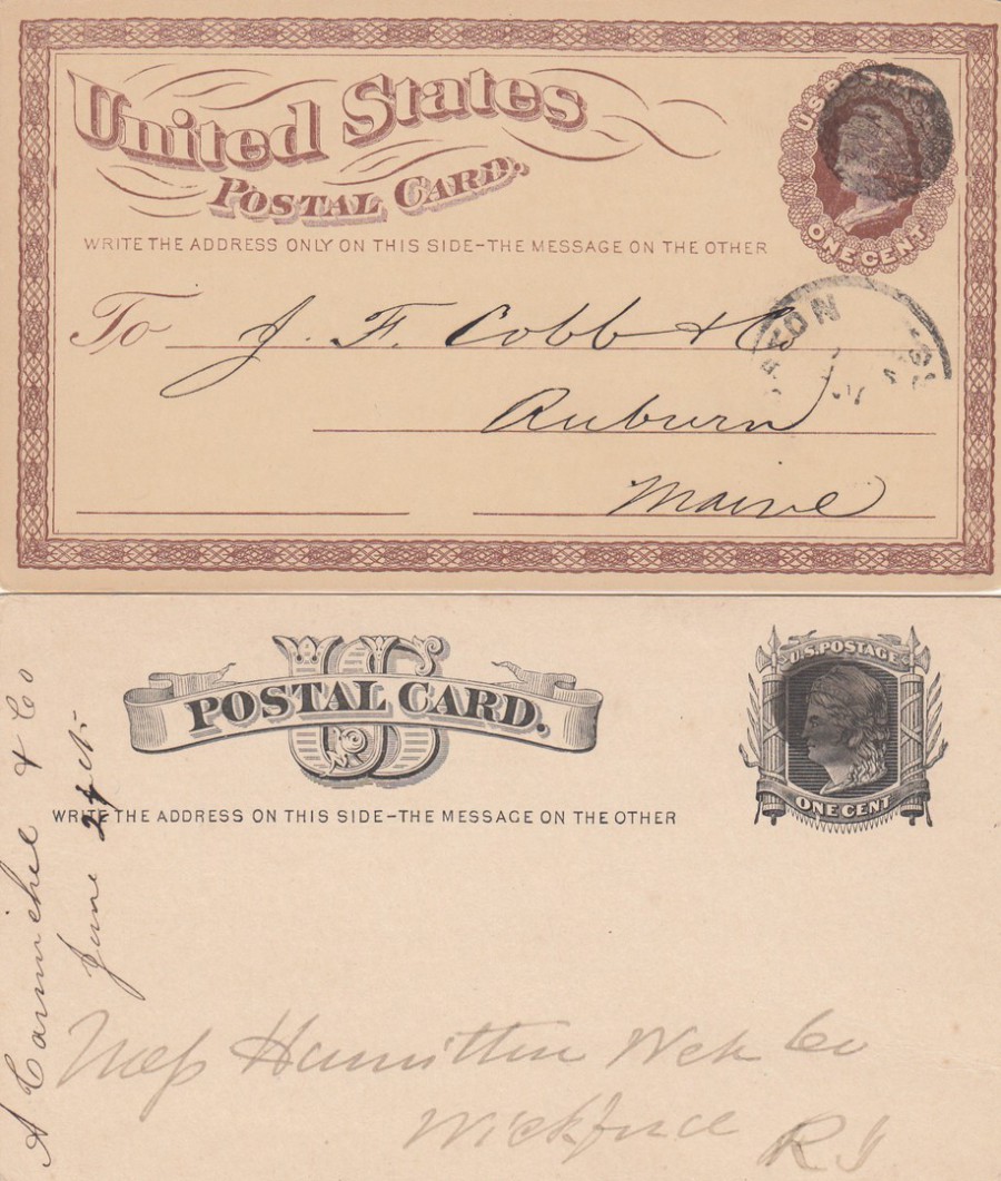
UNITED STATES OF AMERICA
1 cent BROWN ON BROWN CARD
Higgins & Gage, World Postal Stationery Catalog
Section 18
United States of America - Page 1
Reference No: 1
Issued: 1873
(BOTTOM)
UNITED STATES OF AMERICA
1 cent BLACK ON BUFF CARD
Higgins & Gage, World Postal Stationery Catalog
Section 18
United States of America - Page 1
Reference No: 4
Issued: 1875
The postal stationery post card at the top is the very first US issued official postal card. Note the simple round plain back circle-cancel applied over the pre-printed stamp, a stamp design unique to this postal card issue. The stamp features an image of the head of ‘Liberty’.
The bottom postal stationery post card is the second style of postal card issued by the US. This one also has a simple circular black mark over the pre-printed stamp.
So here you have the initial early years of US postal card history displayed in one combined image.
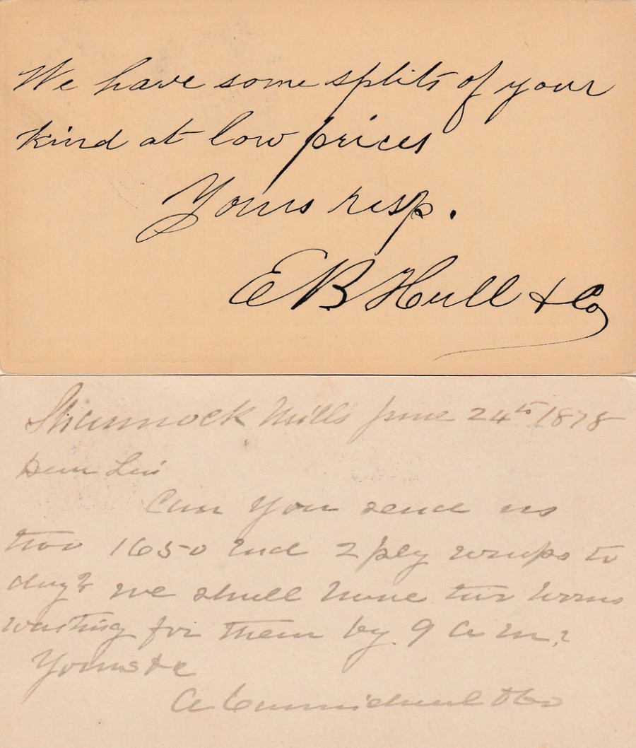
REVERSE SIDES OF THE ABOVE TWO POSTAL STATIONERY POST CARDS
13/05/2020
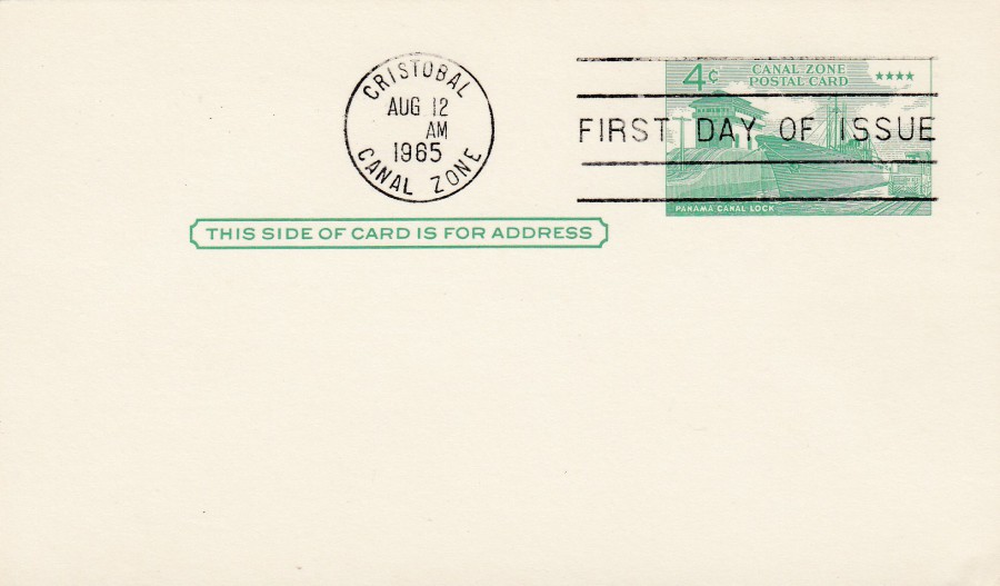
CANAL ZONE 4c POSTAL STATIONERY POST CARD
1965 NEW DEFINITIVE ISSUE
Higgins & Gage, World Postal Stationery Catalog
Section 3
Canal Zone - Page 3
Reference No: 14
Issued: 1965
This is the type of postal stationery post card that you can often pick up for 50p, or £1. They are mainly going to be of interest to those who either collect the Canal Zone as a postal area or those like me who are postal card collectors. This copy has been philatelically postmarked first day of issue. This card is in a clean, sharp near perfect condition, but its still a cheap card.