05/06/2018
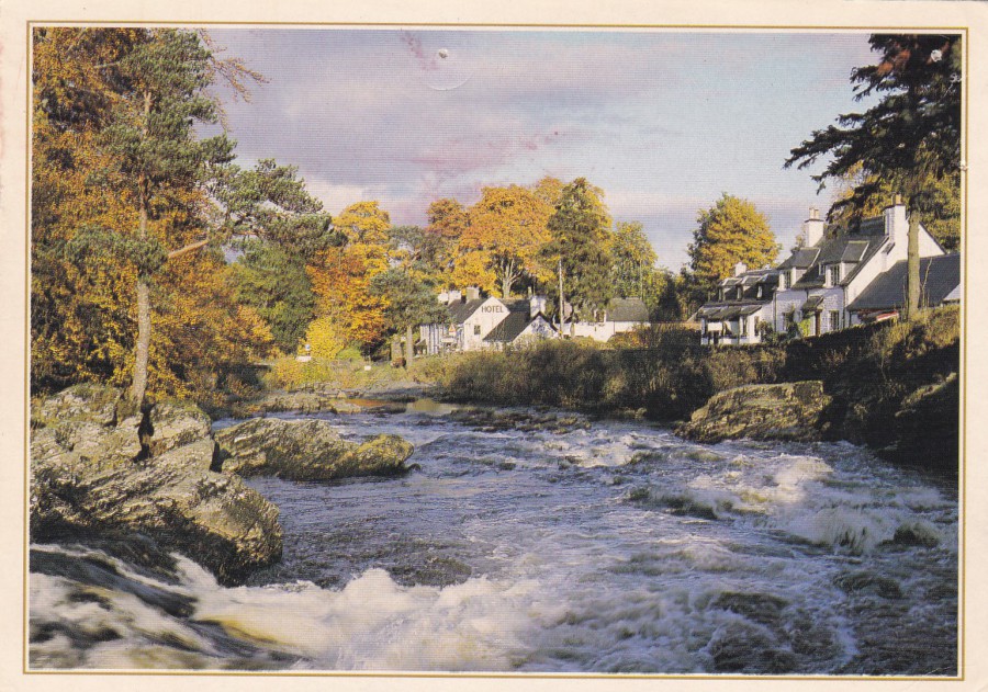
KILLIN, PERTHSHIRE
Photography by
VIC GUY
Published by
J. ARTHUR DIXON LTD
Ref: PPR 27052
As collectors I think we sometimes forget that the ‘vast-majority’ of postcards, both old and modern, but especially modern, in many ways, are simple local view postcards. These often have no text on the front, or if they do its just the locations place name. They also often have an image which although beautiful to look at has nothing within it that is of interest to specific subject collectors, i.e. no windmills, watermills, landmarks, statues, war memorials, famous buildings and structures, all of which have their dedicated collectors. Most of these postcards, ones without any other structures depicted, ones of rivers and streets and village squares etc., are considered worthless, and on a purely catalogue value status this is probably true, but also it must be remembered that every posted postcard has a stamp applied (most of which are extremely common and of very low value – but there are exceptions) which is cancelled by a hand stamp either hand applied or machine applied, and some of these can be of interest to postal history collectors and handstamp collectors (there is a dedicated band of postmark collectors here in the UK and especially in the US where they have some very topical town names), but again the vast number are of little monetary value and lastly there is usually, if genuinely posted by a normal member of the public / tourist / family member, rather than another collector, a hand written message. Most of these messages are bland “Nice Weather”, “We have just visited…” and the classic “Wish you were here” (which was once so commonly used that publishers started printing it on the front of some postcards to save senders the trouble of writing it!), but occasionally the message has some interesting historic content or some social history information which adds interest to the card (and some times even a little extra value – I have posted on the webpage one card with a message relating to WWI Zeppelin bombings and a WWII one posted in France with a message about refugees out of Paris early on in the war in France). This postcard here is as basic as you can get, but it does have a hand-written message, a nice stamp and a red printed slogan postmark, so I have placed it in my collection – does it have any value? No, not really – does that matter? Not to me.
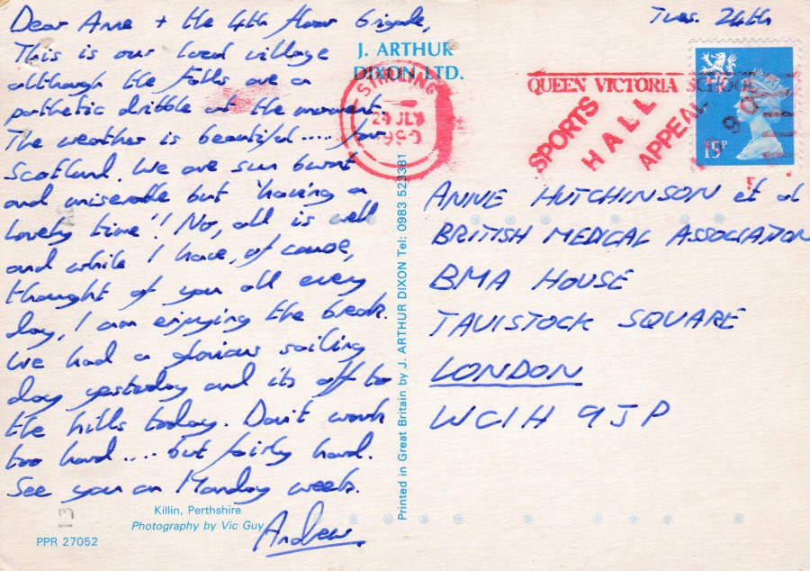
REVERSE SIDE OF ABOVE POSTCARD
This as a 15p Machin head definitive stamp design, with lion heraldic logo top left. This has been cancelled with a red slogan postmark from Stirling:
QUEEN VICTORIA SCHOOL
SPORTS HALL APPEAL 1990
DUNBLANE (this last part of the slogan has not applied clearly to this example)
STIRLING
24 JULY 1990
This slogan was used in red ink between the 3rd May and 15th September 1990 (and then in black between 17th Sept and 2nd Dec). It was only applied at Stirling, as shown here, and Perth. At Stirling the slogan was not used until the 14th May. The slogan was not in constant use throughout this period. The slogan mark has the reference number 4090R (Slogan Postmarks of the Nineties – Part 1 The First Five Years 1990 – 1994).

05/06/2018
THE RED ROES
(DEER IN RED)
By
FRANZ MARC (1880 – 1916)
Published by
BRUCKMANNS BILDKARTE
Ref: NR. 72
Printed in Germany
This is a lovely maxi-card where the image on the postcard also appears on the stamp which has been applied. The stamp is a 30pf stamp from the 1974 ‘GERMAN EXPRESSIONIST PAINTINGS’ stamp set (SG 1688). Here the stamp has been cancelled with a special first day of issue hand stamp dated 15th February 1974.
05/06/2018
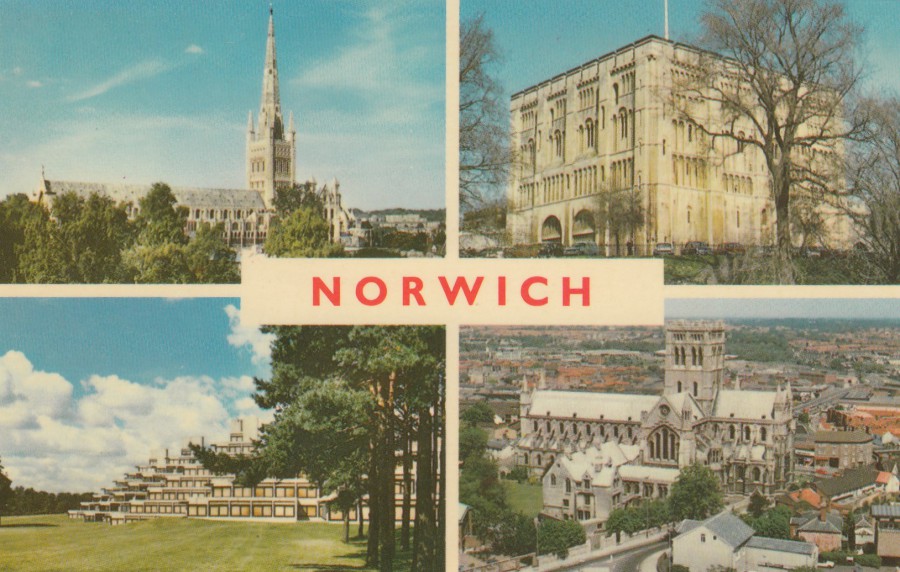
NORWICH
Top Left – Norwich Cathedral
Top Right – Norwich Castle
Bottom Left – University of East Anglia
Bottom Right – St. John’s Catholic Cathedral
Published and Printed by
JARROLD & SONS LTD, NORWICH
A
COTMAN-COLOR SERIES POSTCARD
Ref: KN 205
A standard design modern multi-view postcard issued in the traditional ‘golden-age’ postcard size. Normally I don’t go out of my way to collect this type of postcard, but I have a few in my collection because I like to have examples of different types of postcard design and layouts, but this one I had to have because of how it has been used – see below.
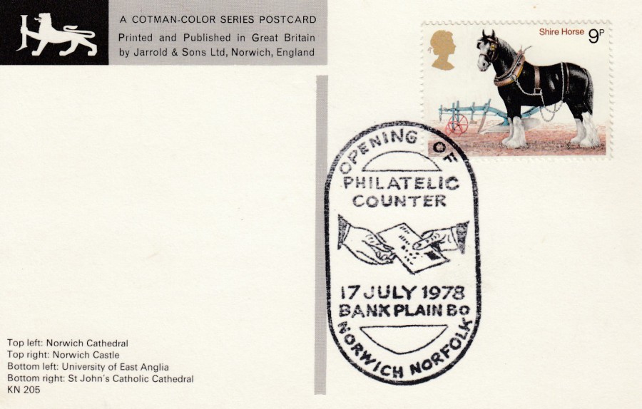
REVERSE SIDE OF ABOVE POSTCARD
This postcard has had a 9p Shire Horse stamp (SG 1063) from the 1978 ‘Horses’ stamp set applied to receive the special hand stamp:
OPENING OF
NORWICH NORFOLK
PHILATELIC COUNTER
17 JULY 1978
BANK PLAIN BO
This special handstamp is reference number 3607 in the ‘SPECIAL EVENT POSTMARKS OF THE UNITED KINGDOM’ catalogue by George Pearson, Third Edition (published by ‘British Postmark Society’ 1984).
As you will have realised by now I like special hand stamps and postcards used in different ways. Here the person making this item has used an appropriate local postcard to obtain a related area special hand stamp – this makes a nice combination in my mind.
05/06/2018
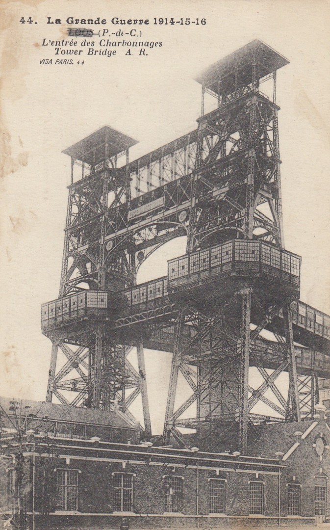
LA GRANDE GUERRE 1914 – 15 – 16
LOOS (P -de – C)
L’ENTRÉE DES CHARBONNAGES
The Great War 1914 – 15 – 16
Loos (Pas de Calais)
Tower Bridge A. R.
Published by
A. RICHARD
84 FAUB DU TEMPLE,
PARIS
Printed by
IMPR. EDIA, VERSAILLES
Ref: 44
Another World War I postcard, this time showing the massive tower bridge at Loos. Loos was the location for biggest British attack of 1915 and the first location that the British used poison gas, with mixed results. It was also the first mass engagement for many of the new army units sent out after the first year’s initial battles. The British soldiers advanced over open fields towards barb-wire which they believed had been cut by artillery fire, but it had not been destroyed as planned. The battle took place between the 25th September and the 8th October 1915. Although some land was taken the British suffered devastating losses which were twice that of the Germans (although figure vary). Of the 10,000 attacking soldiers on the first day, 8,000 became casualties in the first four hours. In the main attack they suffered 43,367 casualties with another 10,880 casualties from the subsidiary attack. Over the campaign at Loos there was an incredible 59, 247 British casualties.
This is another location and battlefield which I have visited. When you stand at the Dud Corner Cemetery (so named because of all the shells which did not explode when fired at the enemy thus being ‘Duds’ – there were so many that the area was called Dud Corner) you can look across the fields and get an idea of how flat the land is and how crossing it against enemy fire must have been horrendous.
It was here at Loos that Rudyard Kipling’s son John Kipling lost his life attacking the German front line. His name appears on the walls of the Dud Corner cemetery because his body was not recovered at the time. In 1992 a grave site was identified as containing John Kipling’s body. He now has a reported grave site and his name on the wall at Dud Corner Cemetery.
REVERSE SIDE OF ABOVE POSTCARD

05/06/2018
ONE POUND DEFINITIVE STAMP
Published by
ROYAL MAIL
A ROYAL MAIL STAMP CARD
Ref: A Royal Mail Stamp Card Series D7 8/95
Printed by
THE HOUSE OF QUESTA
These stamp cards are in a similar format to the PHQ Stamp Cards that I regularly post on the website, but these often have different coloured boarders. Unlike the PHQ cards which have a PHQ prefix to their reference numbers these definitive card examples have a ‘D’ suffix to their reference number. This card depicts the Machin Queens head £1 stamp that was issued on the 22nd August 1995.

REVERSE SIDE OF ABOVE POSTCARD
My copy of this postcard has been used with one of the depicted £1 stamps which has been cancelled with a special three lions first day of issue hand stamp. Copies used with the stamp like this can be expensive (£5 - £10).
05/06/2018
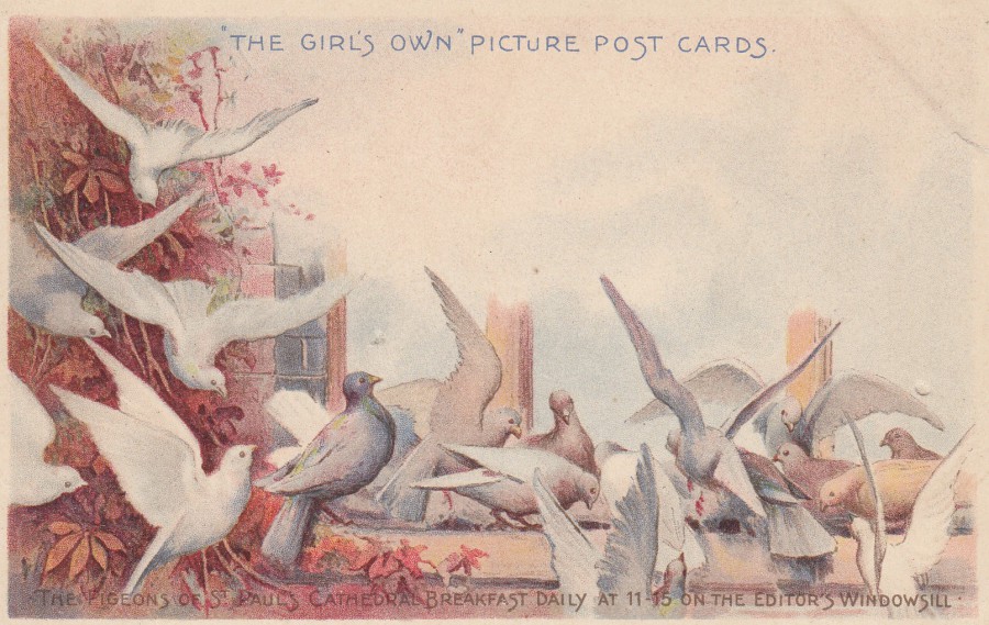
“THE GIRL’S OWN”
PICTURE POST CARDS
THE PIGEONS OF ST PAULS CATHEDRAL
BREAKFAST DAILY AT 11-15 ON THE EDITOR’S WINDOWSILL
Official postcard published for
‘The Girls Own’
‘The Girls Own’ was a story paper issued, naturally enough given the title, for girls and young women here in the UK. It ran from 1880 through to 1956, but this postcard is from the early years of the 1900’s, very early in fact as it has an undivided back, so I suspect this was issued prior to 1902 (or around that year). ‘The Girl’s Own’ was initially published by the Religious Tract Society, which later became the Lutterworth Press. This is a lovely postcard which again appealed to me because of the animal content.
REVERSE SIDE OF ABOVE POSTCARD
05/06/2018
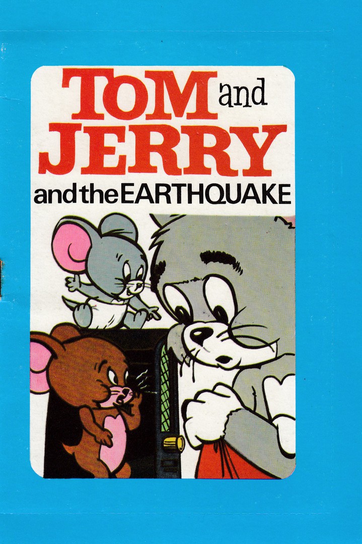
TOM AND JERRY
AND THE EARTHQUAKE
‘MAGIC POST-A-BOOK’
Published by
WORLD DISTRIBUTORS (MANCHESTER) LIMITED
Novelty ‘Book-a-Post’ item
(a 12-page book within a sealable boarder –
With a postcard styled back)
FRONT OF BOOK POST ITEM
This is the front page of this book-s-post item. There is a perforated edge-strip that runs across the through the middle of the blue boarder across the top, down the right side and across the bottom (you can just about see it in this scan). This would allow the receiver to remove the sealed boarder and gain access to the book inside. Obviously mint copies like mine will have this full boarder still attached unsealed.

PHOTOGRAPH
Expanded cover of the ‘Post-A-Book’ item. This shows the front and back of the book in full. With the exception of some rusting, around the single staple holding the book pages inside, this item is in superb condition (the rusting on the staple is a common feature on older items held together by these things. They often, in fact nearly always, rust up and this can cause some discolouration on the paper around the staple area).
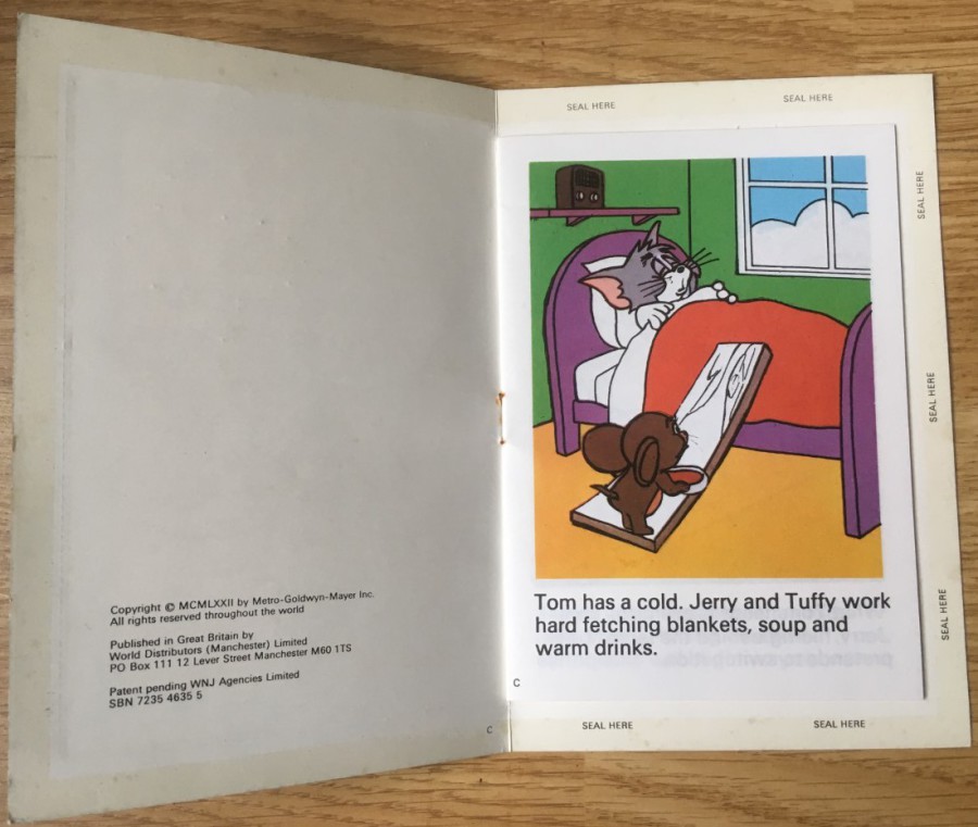
PHOTOGRAPH
Inside of the Book-a-Post’ showing the first page of the book. On the left side is the inside of the cover with the details of the publisher and the fact that this item had a patent pending (I wonder if they got it).

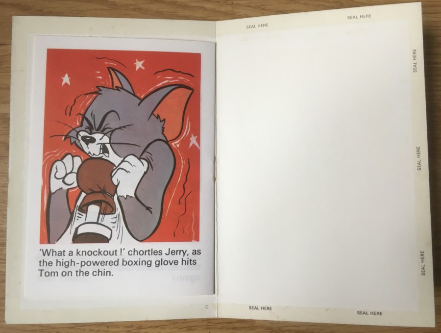
PHOTOGRAPH
This image shows the middle pages from the book (note the rusting around the staple). The pages each have a single colour picture with three lines of story text at the bottom (note that only four of the twelve pages are being shown here, but the others are of the same format).
PHOTOGRAPH
This is the back page of the book and the inside of the back cover. Here you can see the SEAL HERE gummed area around the edge of the end card. This is the strip that would be used to seal the two sides of the cover together, around the edge of the book contained inside.
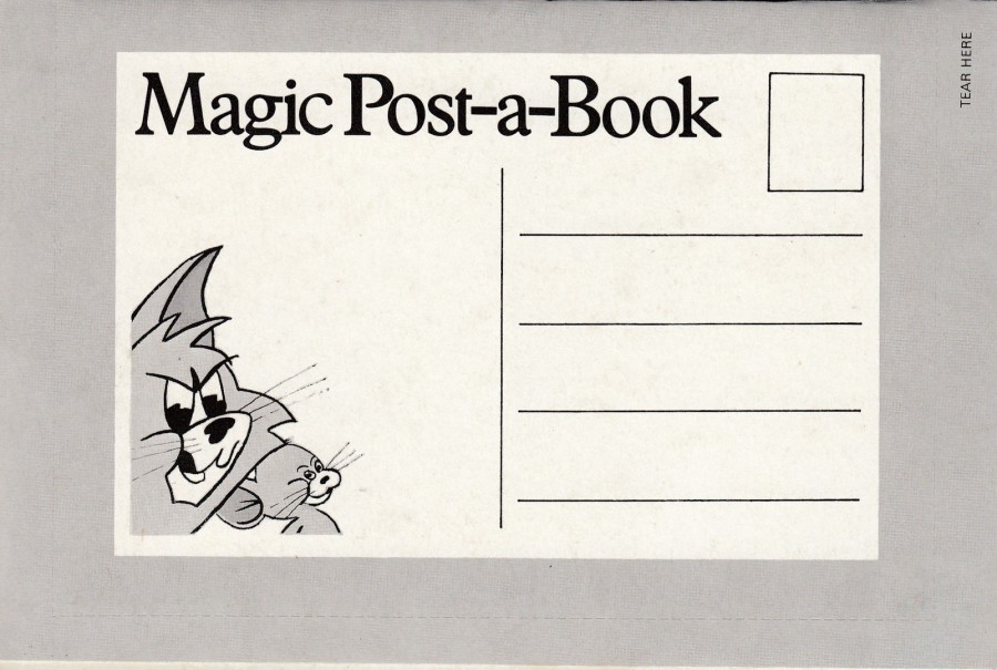
BACK COVER OF THE ‘POST-A-BOOK’
Here you can see why these items look so much like a postcard from this side. I have one other item in this format which is a’ Diddy Men’ one, from the world and mind of the late Ken Dodd, which is also mint (I have posted this previously – check out the ‘April Blogs 2016’ tab and check down the page). These two I own are in a nice mint condition, but I would like to find one used, posted and opened properly as this would make an interesting addition to my collection. I would also like to know if there are any more of these, which I suspect there is. If anyone has any others I would love to hear from you – use the contact us details from the above tab.

05/06/2018
“REINTRODUCED SPECIES”
ROYAL MAIL PHQ STAMP CARD SET
PHQ Set 441
(postcards that reproduce the Royal Mail’s stamp releases)
Stamps issued – 17TH April 2018
(As always, I have my copies used with the appropriate stamp applied to the front of the card and cancelled first day of issue with a special hand stamp)
Published by
ROYAL MAIL
TOP
OSPREY
1st Class stamp
Illustration by
TANYA LOCK
Published by
ROYAL MAIL
Ref: PHQ 441 (1) 4. 18
As an old ‘Wildlife’ postcard collector I loved this stamp set and think it is a good example of how stamp artwork can look really-attractive enlarged on these postcard copies of the stamp images.
BOTTOM
LARGE BLUE BUTTERFLY
1st Class stamp
Illustration by
TANYA LOCK
Published by
ROYAL MAIL
Ref: PHQ 441 (2) 4. 18
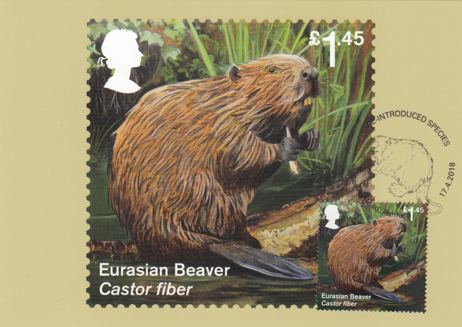
EURASIAN BEAVER
£1.45 stamp
Illustration by
TANYA LOCK
Published by
ROYAL MAIL
Ref: PHQ 441 (3) 4. 18
Possibly my favourite of this set
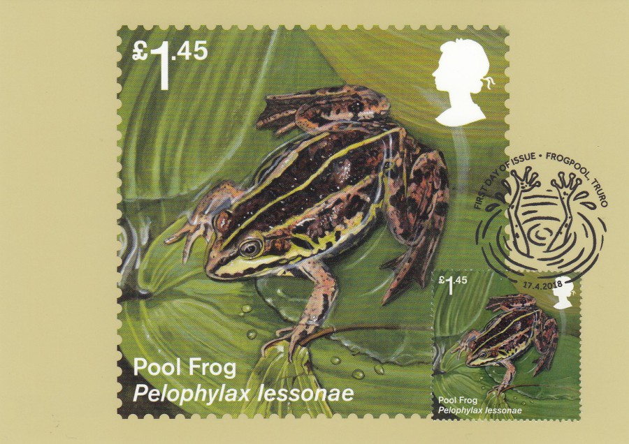
POOL FROG
£1.45 stamp
Illustration by
TANYA LOCK
Published by
ROYAL MAIL
Ref: PHQ 441 (4) 4. 18
I thought the hand stamp used here was amusing
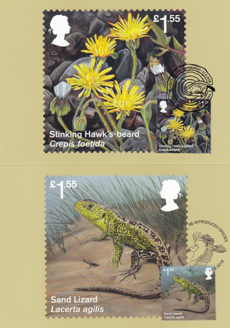
TOP
STINKING HAWK’S-BEARD
£1.55 stamp
Illustration by
TANYA LOCK
Published by
ROYAL MAIL
Ref: PHQ 441 (5) 4. 18
What a great name and almost certainly the first postcard I have depicting this plant
BOTTOM
SAND LIZARD
£1.55 stamp
Illustration by
TANYA LOCK
Published by
ROYAL MAIL
Ref: PHQ 441 (6) 4. 18
Pity there was not a Lizard themed hand stamp, otherwise this could have been my favourite card
05/06/2018
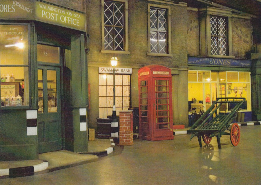
DAD’S ARMY EXHIBITION
At the
BRESSINGHAM STEAM & GARDENS MUSEUM
Photo by
David Hall
Official Museum Postcard – unknown printer
“The fictional town of Walmington-on-Sea is brought to life at Bressingham with Captain Mainwarings bank, the church hall and Jones’ butchers shop.”
(Text from reverse side of postcard)
We visited Bressingham a couple of weekends ago and had a fantastic time there. As a television history fan and TV postcard theme collector I really enjoyed the ‘Dad’s Army Exhibition’, which in my opinion is worth the entrance fee and a visit on its own. I was already aware of this postcard because I had a postally used copy in my collection, but it was nice to pick up a crisp mint undamaged copy. It is also an unusual postcard for a classic British television programme for which there are has not been a large number of postcards issued. This month there is a Dad’s Army stamp set being issued by the Royal Mail, so I have bought some of these cards with a view to having the stamps applied and getting some first day of issue special hand stamps.
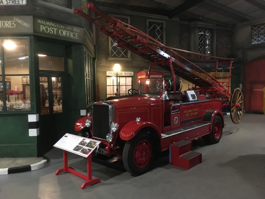
PHOTOGRAPH
25/05/2018
This is a photograph I took on my visit depicting the shop fronts as they appear on the card, but now they have an old fire engine on display in the area in front of the shops. This is an actual vehicle which was used in filming of an episode of Dad’s Army. I like this photograph and think it would make a great postcard.
05/06/2018
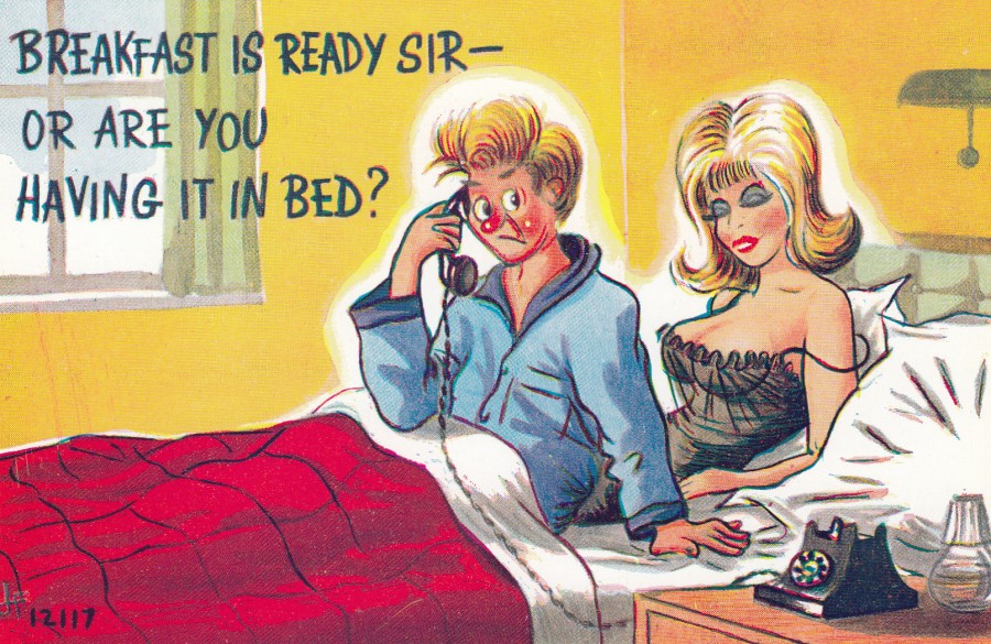
BREAKFAST IS READY SIR –
OR ARE YOU HAVING IT IN BED?
Published by
BROOK PUBLISHING COMPANY LTD,
LONDON
Ref: 12117
Classic use of the double entendre on what could be considered a typical ‘Saucy Seaside Comic’ postcard design. There is something ‘collective’ about the style of the drawings of women used on these naughty comic cards. When you see one you immediately know that it is a British postcard.
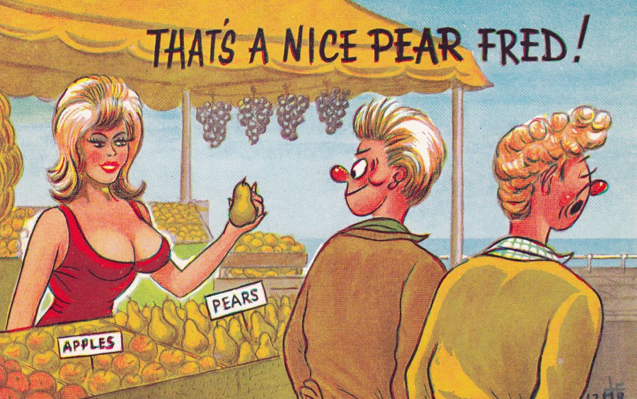
THAT’S A NICE PEAR FRED!
Published by
BROOK PUBLISHING COMPANY LTD,
LONDON
Ref: 12118
The use of the ‘Nice Pear/Pair’ double entendre is perhaps one of the most common depicted saucy postcard cartoons. This is a less typical example because of the use of the fruit and the correct spelling of Pear, which is not as common as the more basic version of someone carrying two footballs or two melons, or other round and often large fruit, which are then referred to as a ‘Pair’!

05/06/2018
FOUR POSTCARDS IN MINIATURE
VIEWS OF BEDFORD
Published by
THE PICTORIAL STATIONERY Co., Ltd, London
PEACOCK “AUTOCHROM” (Regd.) POST CARD
Ref: 1989. S
This is such an unusual postcard. I found it in the same 50p box (or 3 x £1) that the Peterborough card posted below was found in during my recent London trip. Multi-view postcards have been popular for a long time, I have posted many on this webpage over the years, and there has been circumstances where images from other postcards have been used together on a separate postcard, but this is the earliest postcard I have found which illustrates complete postcard images on a postcard (at least one that is not a postcard advertising postcard displaying the companies wares). Here you have four, I assume recently if not concurrently available, postcards displayed on a postcard for sale to the public. This postcard was posted in 1905, so it is a very early example.
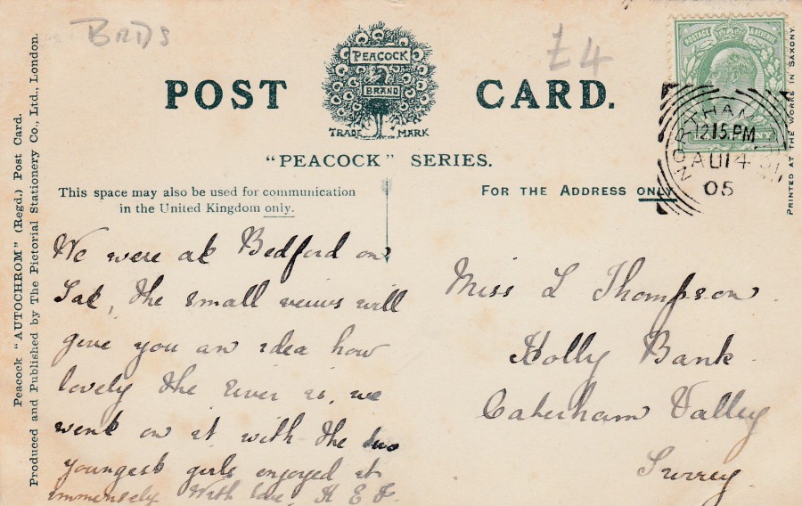
REVERSE SIDE OF ABOVE POSTCARD
This card was posted from Northampton using a ½ penny green King Edward VII definitive stamp which has been cancelled with a boxed circle Northampton hand stamp dated 14th August 1905.

04/06/2018
CHOCOLATE PENGUIN
“SHUT YOUR EYES –
OPEN YOUR MOUTH”
Only 3 ½ d
(By kind permission of United Biscuits (UK) Ltd)
Published by
HALF MOON BAY,
BATH
Ref: POSTMC01
Before I was diabetic I loved Penguin bars (we call them ‘bars’ even though they are biscuits! I wonder why we do this? Was it, I wonder, because back when I was young the chocolate was so thick around the biscuit bit that it felt like a chocolate bar). This advertising poster is from way back before my time, but the penguin bars are still around, and are still popular. It surprised me to find out that these have been around since 1932!

04/06/2018
MARKET PLACE
PETERBOROUGH
Published by
H. REAM STATIONER, &c.,
MIDGATE, PETERBOROUGH
Under their:
RA SERIES
(No reference number)
When I was in London last week I visited the book shops (there are now far fewer of them than there used to be when I first started visiting them many years ago) along Charring Cross Road. In one of them they have a shoe-box of postcards priced at 50p each or 3 for £1. This is one of the postcards I pulled out of that box. This is a lovely old view card given added interest via the inclusion of the tram, a form of transport which is much collected on postcards. Although not dated this looks like it is from either the very early years of WW1 or I suspect more likely from the pre-war years. At some point in its history someone has bought this postcard from a dealer and paid £8 for it (see reverse side below). I suspect that sort of price would only have been achieved if the card was sold locally in Peterborough or nearby. £8 seems a bit steep but it would certainly be worth several pounds, so I got a bargain here.
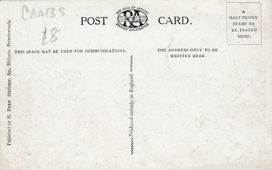
REVERSE SIDE OF ABOVE POSTCARD

04/06/2018
GOLDEN JUBILEE OF BBC EXTERNAL SERVICES
WARTIME UNDERGROUND STUDIO
MR GEORGE FORMBY BROADCASTING TO FORCES OVERSESA
WITH GERALDO AND ORCHESTRA
Published by
PAMLIN PRINTS
In their:
COLLECTORCARDS series
Ref: C7534
This postcard was issued in 1982, which was the year of the Golden Jubilee this card celebrated. I have owned this card for a few years now and have had it scanned in to show you for many months but had just not got around to showing it yet, but I saw another copy of it at the Bury St Edmunds postcard fair the other weekend. The copy I saw was priced at £6 which seemed a bit high to me but that was probably only because I bought my copy for 15p.
I collect any postcard which is related to the BBC because here in the UK the BBC is directly connected to the early history of television. It was also, as this postcard celebrates, the source of early official radio station transmissions as well. During World War II the BBC’s radio services were essential to the moral of those at home and the soldiers abroad, so this postcard could also fit into a military history/WWII collection as well.

04/06/2018
CHINESE AIRCRAFT
STAMP-CARD SET OF FOUR
I believe these are Official Stamp-Cards published by the Chinese Postal Authority
TOP
F-8
Official Stamp-Card
Ref: MC-24 (4-1)
BOTTOM
A-5
Official Stamp-Card
Ref: MC-24 (4-2)
I love the combination of stamps and images on these stamp cards. This was a cheap set when I bought it at a STAMPEX show a few years ago. I believe this set cost me just 50p for the four cards, a bargain. The stamp set was issued by China in 1996.

CHINESE AIRCRAFT
STAMP-CARD SET OF FOUR
TOP
Yun-7
Official Stamp-Card
Ref: MC-24 (4-3)
BOTTOM
Yun-12
Official Stamp-Card
Ref: MC-24 (4-4)
04/06/2018
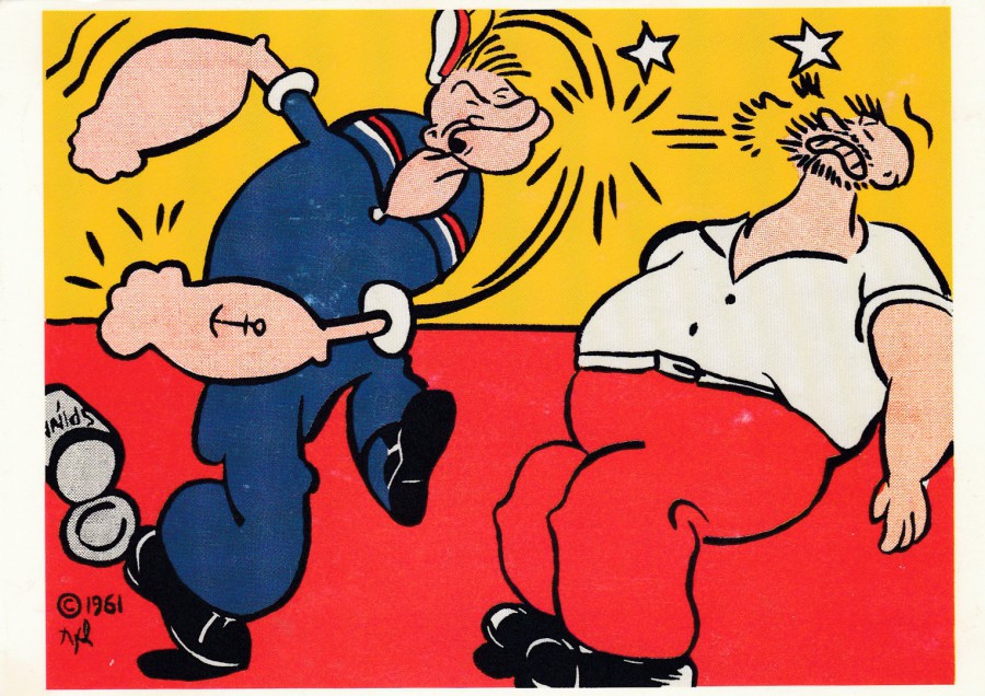
POPEYE
1961
By
ROY LICHTENSTEIN
Published by
GEBR. KONIG POSTKARTENVERLAG
BREITESTR. 93. D-5000 KOLN 1
© VG BILD-KUNST, BONN, 1992
Ref: Serie 180 POP ART 1
Karte 3 von 10
I collect Popeye related postcards under my main ‘Television’ theme, although the character has his origins in drawn cartoons and has film connections as well. This card could also be placed in an ‘Art’ collection, but despite being aware, and having seen some of the ‘POP ART’ artwork, of Roy Lichtenstein I had not seen this Popeye picture before obtaining this postcard some years ago.
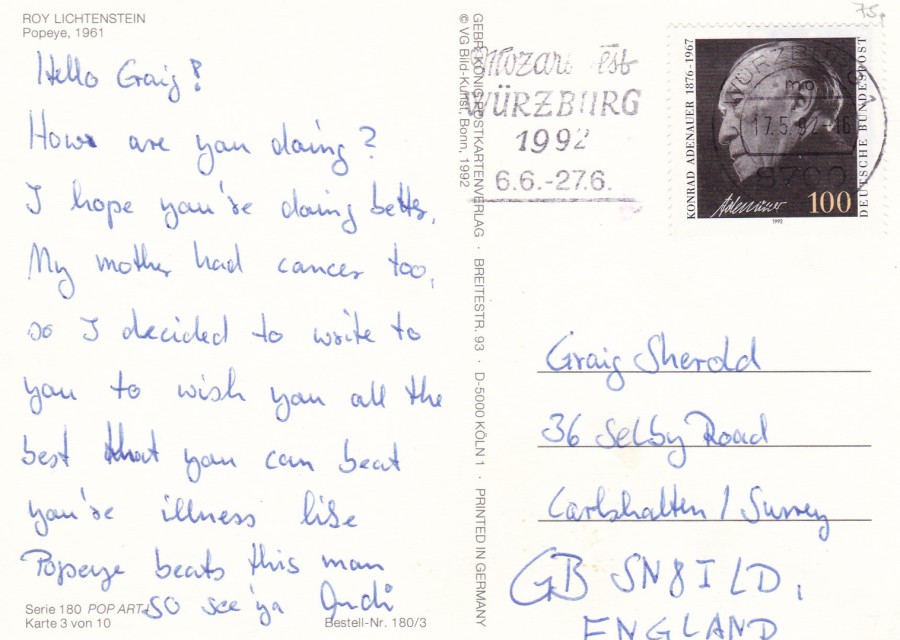
REVERSE SIDE OF ABOVE POSTCARD
This is a German produced postcard which was posted to England in 1992. The German 1992 issued Conrad Adenauer stamp has been cancelled with a slogan cancel for ‘WURZBURG – 17.5.92 – ‘MOZART EST WURZBURG 1992’. This is a nice combination of stamp and music-themed cancel. It is also the only copy of this stamp I have used in my collection.
03/06/2018
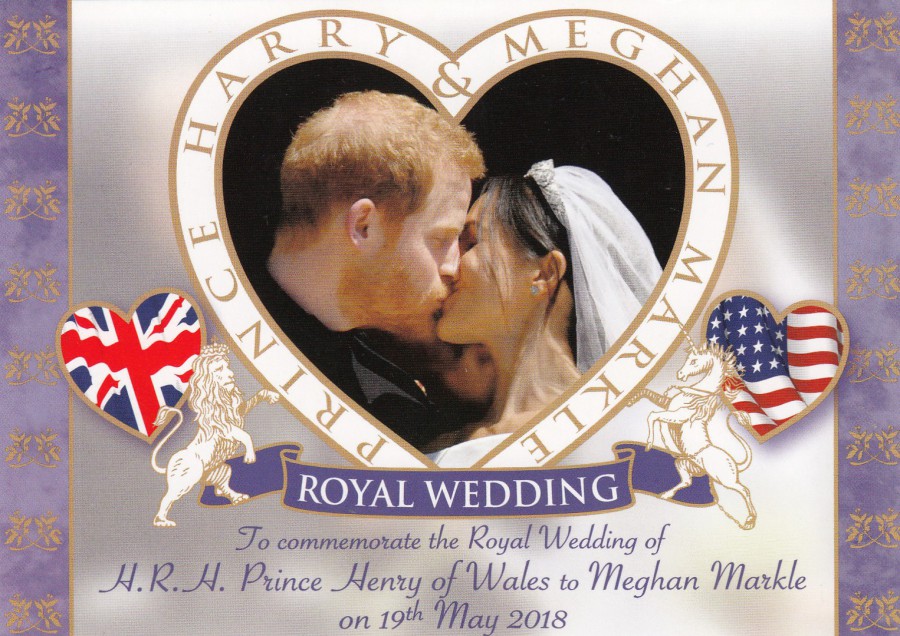
PRINCE HARRY & MEGHAN MARKLE
ROYAL WEDDING
TO COMMEMORATE THE ROYAL WEDDING OF
H.R.H. PRINCE HENRY OF WALES TO MEGHAN MARKLE
ON 19TH MAY 2018
Published by
JUDGE SAMPSON LIMITED
Ref: ROYPOS003
Without wishing to post too many Harry & Meghan related postcards on the webpage this month I still thought it worthwhile to place these three postcards on the webpage today.
This card, and the two depicted below were the very first Harry & Meghan royal wedding postcards I found. They were on sale in a small specialist shop in Saint Martin’s Lane, London and despite spending three days in London checking out other shops and locations this was the only place I saw them.
These are nice ornate designs which depict nice photographs from the royal wedding day. These were 60p each which I thought was a very reasonable price.

Top:
ROYAL WEDDING
TO COMMEMORATE THE ROYAL WEDDING OF
H.R.H. PRINCE HENRY OF WALES TO MEGHAN MARKLE
ON 19TH MAY 2018
Published by
JUDGE SAMPSON LIMITED
Ref: ROYPOS005
Bottom:
ROYAL WEDDING
TO COMMEMORATE THE ROYAL WEDDING OF
H.R.H. PRINCE HENRY OF WALES TO MEGHAN MARKLE
ON 19TH MAY 2018
Published by
JUDGE SAMPSON LIMITED
Ref: ROYPOS005
For some reason, I suspect an error in the printing and proofing of the reverse side of these cards, these two both have the same reference number (whilst clearly the top postcard above has a different reference number – I wonder if one of these should be ROYPOS004).
I was really pleased with these and although I have found at least one wedding related postcard since these were still the very first I came across.

03/06/2018
SIR KEN DODD OBE
NOV 1927 – MARCH 2018
AN ENGLISH COMEDIAN. SINGER & OCCASIONAL ACTOR
Published by
CoIR. CARDS
Ref: 2018.CR.245
Another topical CoIR published postcard. This one came out soon after Ken Dodd’s death and continues this companies traditional output of commemorative postcards issued soon after the loss of any celebrity.
03/06/2018
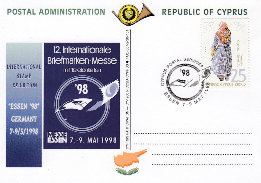
ESSEN 1998
‘ESSEN 98’ GERMANY
12th International stamp and telephone card exhibition
7th – 9th May 1998
REPUBLIC OF CYPRUS
POSTAL ADMINISTRATION INTERNATIONAL STAMP EXHIBITION
POSTAL POSTCARD
Official ‘Postal Administration – Republic of Cyprus’ postcard
Issued to celebrate Cyprus’ participation in the event
This card would have been on sale on the Cyprus postal administrations stand at the Essen 98 exhibition, and possibly only on sale there. The card is plain backed but has all the required postcard bits and pieces on the one side (this is a standard format for many stamp exhibition postal cards). This card has a nice stamp applied which has been cancelled with a special cancellation which I strongly suspect was only available on cards bought from the stand at the event.
03/06/2018
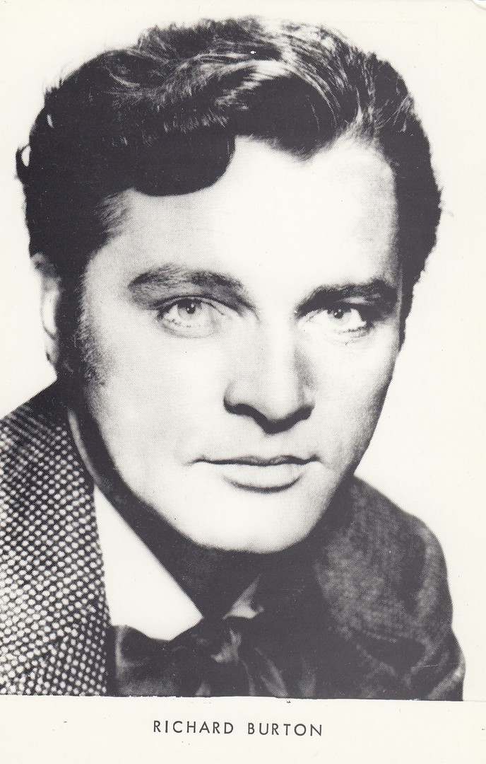
RICHARD BURTON
Unknown Publisher/Printer
This looks like a very early promotional style black and white photograph to me. It was not an image I had seen before. This postcard was produced long after the image was taken. This was a 30p find in a postcard box at the recent Bury St Edmunds fair.
03/06/2018
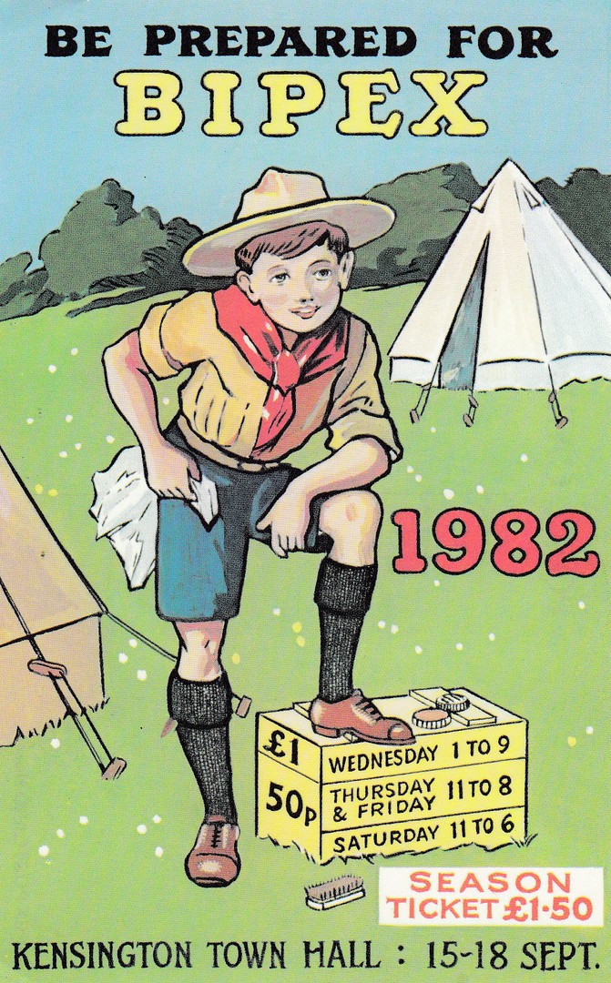
BE PREPARED FOR
BIPEX
1982
KENSINGTON TOWN HALL
15 – 18 SEPT
Official event postcard published for BIPEX
Ref: BIPEX POSTCARD No 4
BIPEX was the ‘British International Postcard Exhibition’, an event which was held every year in London. It ceased to be a good few years ago now, but with every show they used to issue a special postcard which everyone through the door received as a souvenir with the shows booklet. This one is popular with scout collectors, for obvious reasons, and is one of the best of the BIPEX issues.
03/06/2018
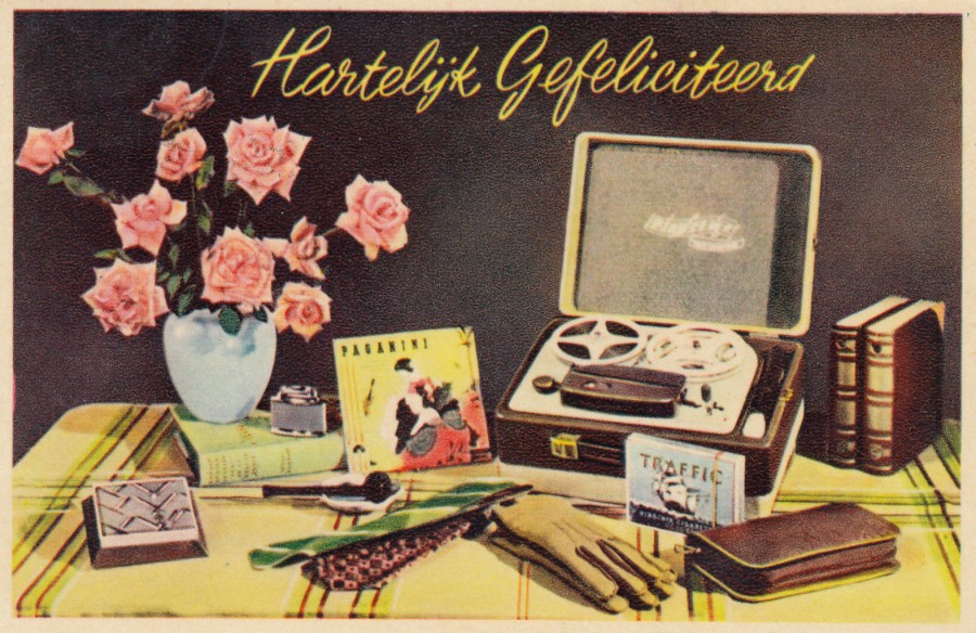
HARTELYK GEFELICITEERD
(Hearty Congratulations)
Unknown Printer / Publisher
A fairly-basic postcard design of flowers and artifacts with a printed greetings message of some sort. This type of postcard was very popular in Europe, but they have not retained their interest with modern collectors, unless that is, the image contains something of interest amongst the selected items. With this card it is the old tape machine, something which adds some interest and value to this individual postcard.
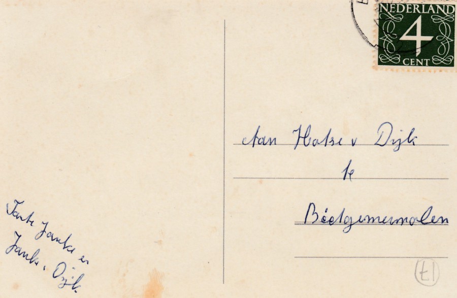
REVERSE SIDE OF ABOVE POSTCARD
This card was posted in the Netherlands (Nederland) using a standard 4 cent definitive stamp issue.
03/06/2018
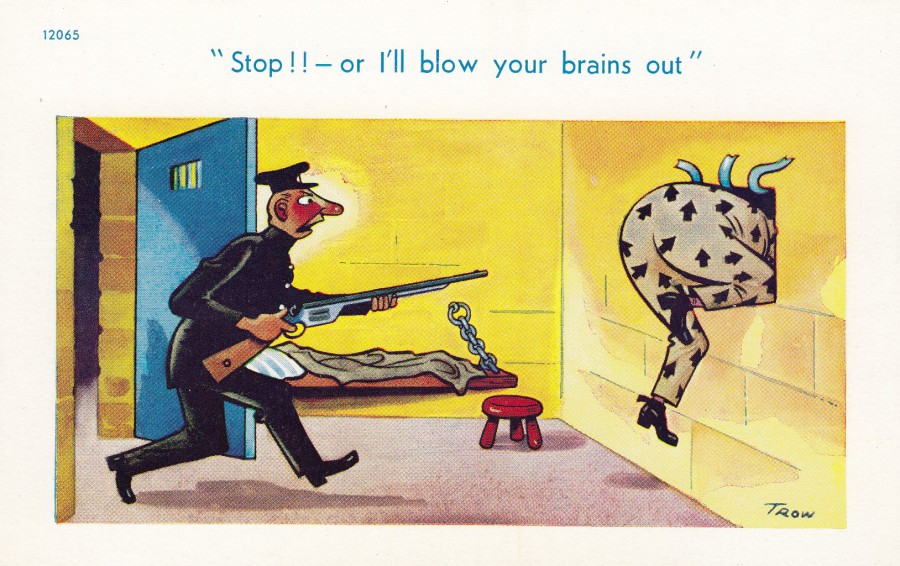
“STOP!! OR I’LL BLOW YOUR BRAINS OUT”
Design by
TROW
Published by
BROOK PUBLISHING COMPANY LTD, LONDON
Ref: 12065
It was nice to find a Trow design which wasn’t so blatantly rude that it could not be placed on this section of the webpage. Most of Trow’s images have topless women in them or have some very-obvious sexual content whether visual or within the text, again often with blatant inuendo. This one is just funny with the bonus it fits into my ‘Law & Order/Police’ collection.
03/06/2018
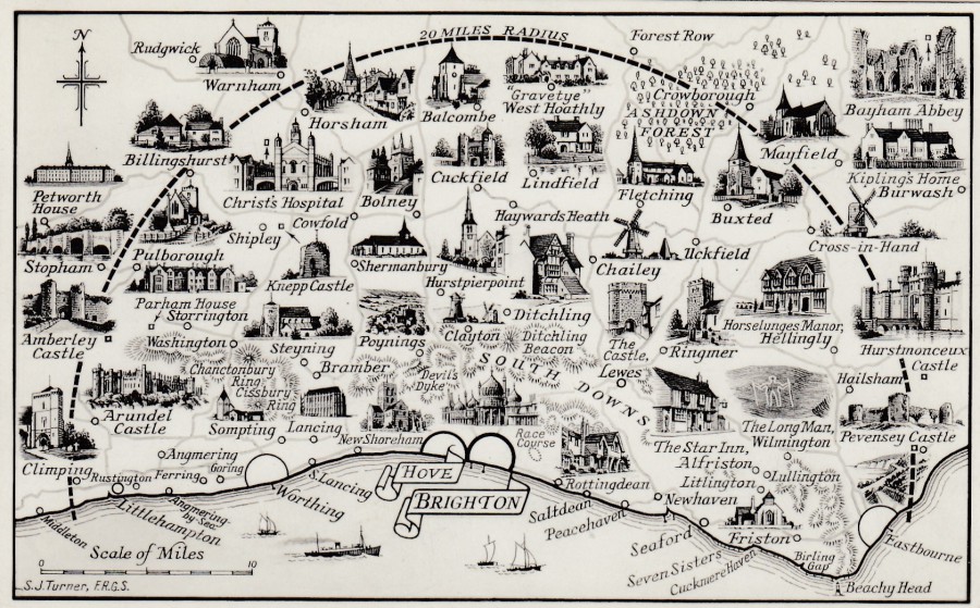
HOVE
BRIGHTON
MAP POSTCARD
Published by
SHOESMITH & ETHERIDGE LTD, HASTINGS
Some of the map designs that can be found on postcards are beautifully drawn and I think this one is a superb example of this. This one is in black and white, but I think I prefer it because of this as I think the addition of colour might take away some of the charm of the little images of buildings which adorn this map.
02/06/2018
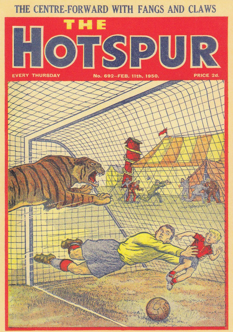
THE HOTSPUR
CLASSIC COMICS
Published by
DC THOMSON & CO LTD (2016)
Ref: POSTDC03
I loved comics as a kid, who didn’t? So, I also like postcards which depict the front covers of old comics, and, also the more modern ones. This one is issue No 692 – FEB 11th 1950, of the comic ‘The Hotspur’, which came out long before I was born! To be honest, despite my love of comics, I would have bought this one anyway as I love tiger themed postcards, especially unusual ones, and this is ‘definitely’ unusual.
02/06/2018
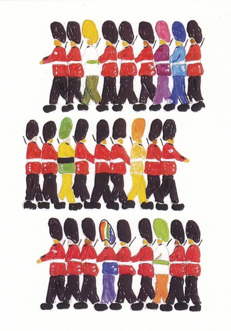
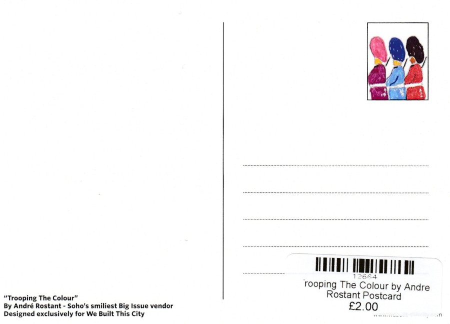
TROOPING THE COLOUR
By
ANDRE ROSTANT
SOHO’S SMILIEST BIG ISSUE VENDOR
Designed exclusively for ‘WE BUILT THIS CITY’
Published by
WE BUILT THIS CITY
As the photograph below will show you I found this postcard on the counter of a specialist shop called ‘WE BUILT THIS CITY’ located in Carnaby Street, London. It was the circumstances behind the cards artwork that I liked. The painting is by one of the ‘Big Issue’ sellers in the Soho area of London. For those who live outside of the UK and do not know what the ‘Big Issue’ is I will explain. ‘Big Issue’ is a magazine which was created to be sold by homeless people on the street. To simplify the reasoning behind its creation ill say it solved an issue which was preventing homeless people obtaining housing. The situation was that without a job anyone wanting to gain any type of housing or accommodation was denied access because they were unemployed. So, the ‘Big Issue’ magazine was created so that homeless people could sell it and thus be employed as sellers of the magazine and thus get on the accommodation ladder and move off- of the streets. The ‘Big Issue’ production is run by a charitable foundation and is a fantastic ongoing nationwide project which was launched in 1991. Andre Rostant has now moved from selling the magazine to also doing postcard design artwork and I wish him well and love the fact that his postcard is now on sale here in this shop.
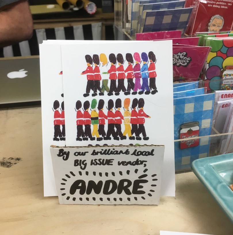
PHOTOGRAPH
30TH May 2018
Postcards on display on the shops counter
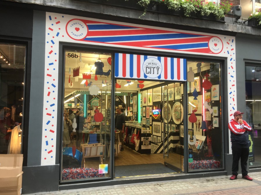
PHOTOGRAPH
30TH May 2018
Front of the shop – ‘We Built This City’
Carnaby Street
02/06/2018
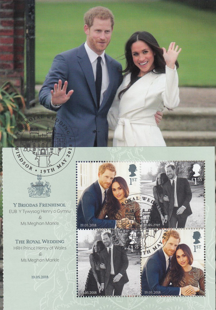
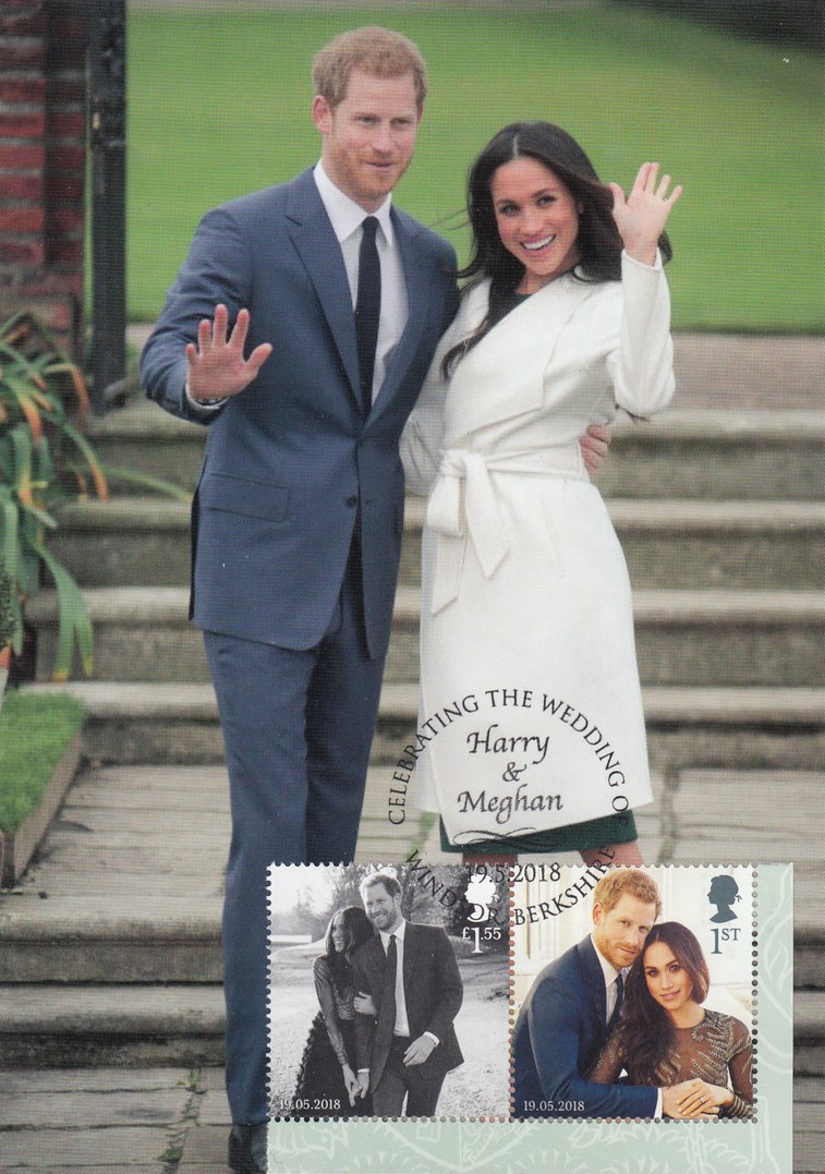
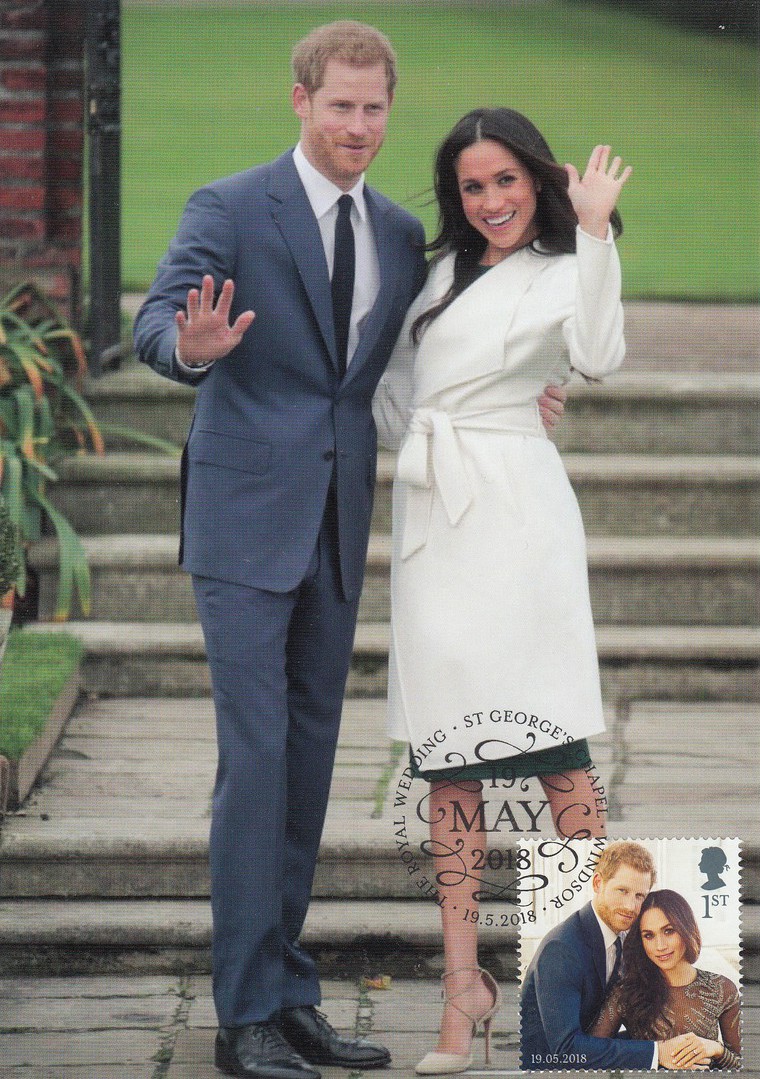
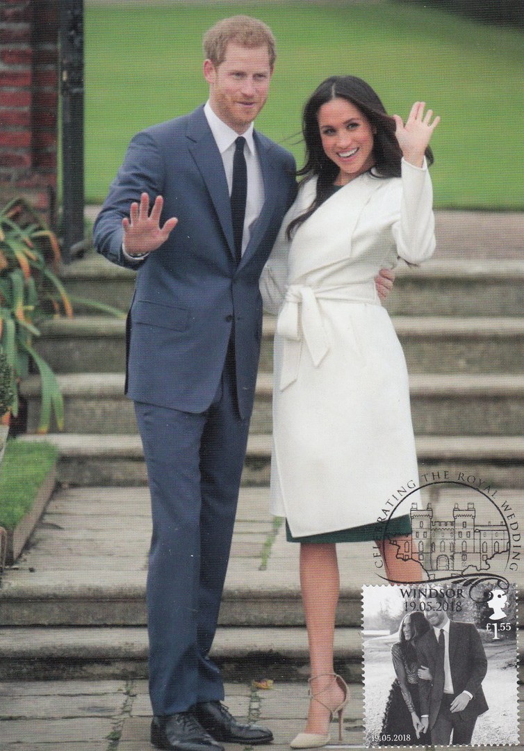
PRINCE HARRY & MEGHAN MARKLE
ROYAL WEDDING
Personal Maxi-Cards created using the
Royal Mail
ROYAL WEDDING STAMPS
POSTCARD
H.R.H. PRINCE HARRY AND MS. MEGHAN MARKLE
ON THE OCCASION OF THEIR ENGAGEMENT
Published by
KARDORAMA
Ref: SV-431
As stated in a previous posting (possibly on the facebook page) I obtained some of the Royal Mail Royal Wedding commemorative stamp sheets and intended to try and make up some maxi-cards by applying these stamps to some postcards I had obtained only a few days before the stamps were released. So, as promised then, here are the postcards which I received back from the special hand-stamp centre yesterday.
FULL STAMP SHEET
ROYAL WEDDING
(Royal Mail)
First day used with
THE ROYAL WEDDING
WINDSOR
19TH MAY 2018
Castle pictorial cancellation
Royal Wedding Stamps
(Royal Mail)
£1.55 Black and white photograph stamp
And
1st Class colour photograph stamp
(bottom two stamps from the stamp sheet with some sheet edging left in place)
First day used with
CELEBRATING THE WEDDING
HARRY & MEGHAN
19.5.2018
WINDSOR, BERKSHIRE
Special cancellation
Royal Wedding Stamps
(Royal Mail)
1st Class colour photograph stamp
First day used with
THE ROYAL WEDDING
ST GEORGE’S CHAPEL
19 MAY 2018
WINDSOR
19.5.2018
Special cancellation
Royal Wedding Stamps
(Royal Mail)
£1.55 Black and white photograph stamp
First day used with
CELEBRATING THE ROYAL WEDDING
WINDSOR
19.05.2018
Castle pictorial cancellation

02/06/2018
HIS ROYAL HIGHNESS PRINCE WILLIAM
Published by
J. SALMON LTD (SEVENOAKS)
‘SALMON CAMERACOLOUR POST CARD’
Ref: 2 – 99 – 00 – 68
We were in London over the past three days (lots of postings to the facebook page made over this period). On Thursday we took a bus tour, a special one in which they serve you tea, sandwich’s and cakes whilst the big double decker red London bus takes you around the sites. It was really-good, not our first London bus tour but the first with food (the cakes were superb).
At one point on the tour we were travelling past Kensington Palace when all transport was stopped by a police motorcycle officer. Some cars then pulled out of the entrance of Kensington Palace and drove past us. We saw Prince William sat in the back of one of these official cars. He was on his way to a garden party at Buckingham Palace (at the time we guessed this as we had not long since driven past Buckingham Palace and seen the queues of people who were clearly attending a garden party there – we confirmed his attendance through the newspapers later the next day). So, we had an interesting little extra on our tour which was a little ironic really, as the tour we were on was titled as the ‘Royal Tea Bus Tour’. As I was going through my already scanned postcard images (I still need to sit down and scan in the ones I bought over the three days!) I saw this one and thought ‘I saw him the other day’, so it seemed an appropriate posting. The tour guide (and cake server) had been doing this tour for three years and this was the first time she had seen anyone coming out of Kensington Palace, let along a member of the royal family, so we felt quite lucky (although both Jo and I have seen Prince William before, along with his with Catherine and his brother Harry at the 100th memorial to the Battle of the Somme held in France back in 2016 - and postcards from that visit to this event and the battlefields in the area were posted here on the webpage over several postings around that time)

02/06/2018
YOU’RE MAGIC
Printed by
THE HAPPY NEWS
By
EMILY COXHEAD
“Sprinkling a tiny bit of happiness all over the planet”
Ref: POS0002A
The idea of unicorns, which as I predicted earlier in the year are still a big postcard trend (for the moment anyway), being big and fluffy and connected to the colour pink I am sure comes from the unicorn connection in the ‘Despicable Me’ animated films (“its so fluffy”). This postcard here is still available out there and is a nice design aimed squarely at the young and the young at heart.
02/06/2018
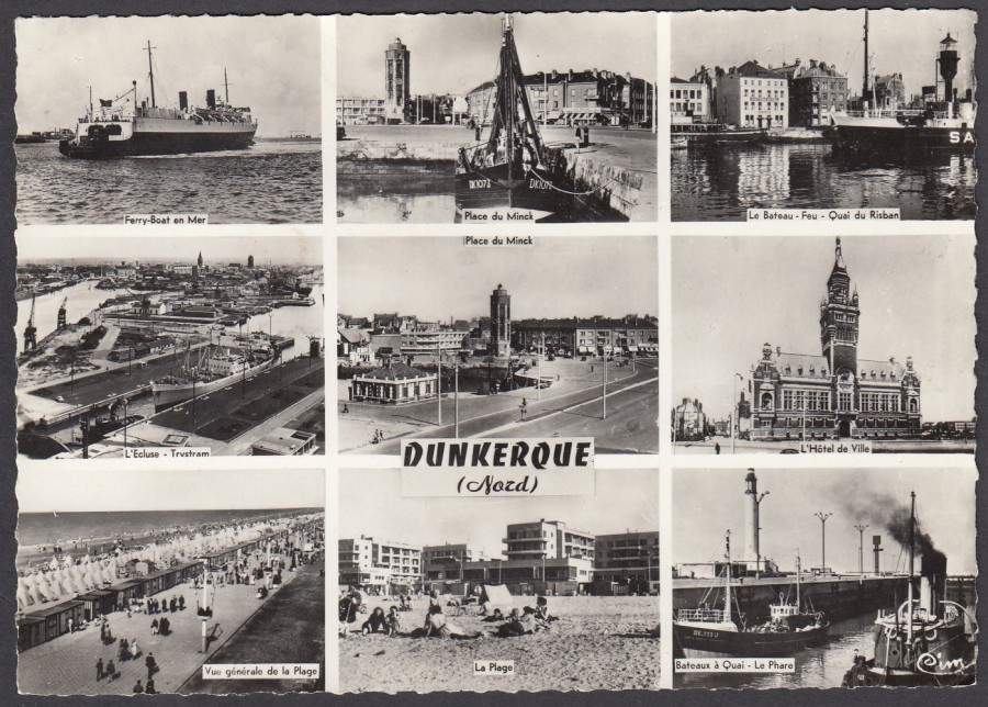
DUNKERQUE
(NORD)
DUNKIRK
(NORTH)
Published by
COMBIER IMP. MACON
Ref: 15 C
I did a military history themed tour of Dunkirk some years ago now and visited the beaches and the Commonwealth War Grave site located here, which is a really-well laid out and attractive location. I ended up buying this postcard because of my interest in military history locations, especially WWII ones. This was not posted so I have no exact date of issue, but looking at it I suspect its late 1950’s, maybe early 1960’s. It is a nice multi-view postcard with nine images, the number used here again makes me feel it is late 1950’s as the trend of more and more views on a card went up during this period to nine, with a slight deckle-edge (another 1950’s common addition).