
15/10/2016
‘Pinkbgandblackline’
DESIGNER PROFLE SERIES
Ref: No 6
Artwork by
LUCIE BENNETT
Published by
BOOMERANG MEDIA
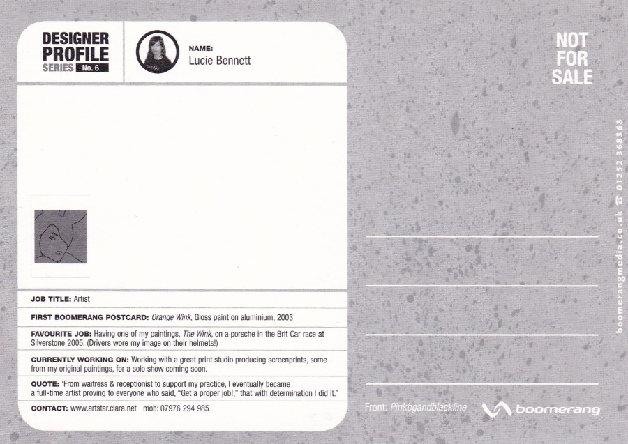
I think this is the only postcard I have in this series where each postcard profiles a specific artist whose work has appeared on Boomerang free rack cards. This is profile No 6 in the series and shows a design by Lucie Bennett.
On the reverse side (see below) there are some details about the artist and information about their first Boomerang postcard appearance.
REVERSE SIDE OF ABOVE POSTCARD
Full profile details for the artist
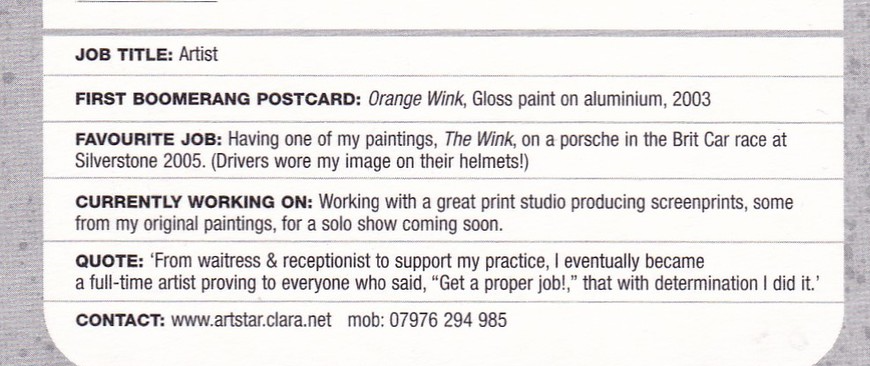
ENLARGEMENT OF TEXT AREA for easier reading
Comments
-
Boomerang racks seem to have disappeared in the recent past from the cinemas I used to find them in such as The Odeon in New Street, Brum and the Odeon in Mansfield, Notts.
15/20/2016
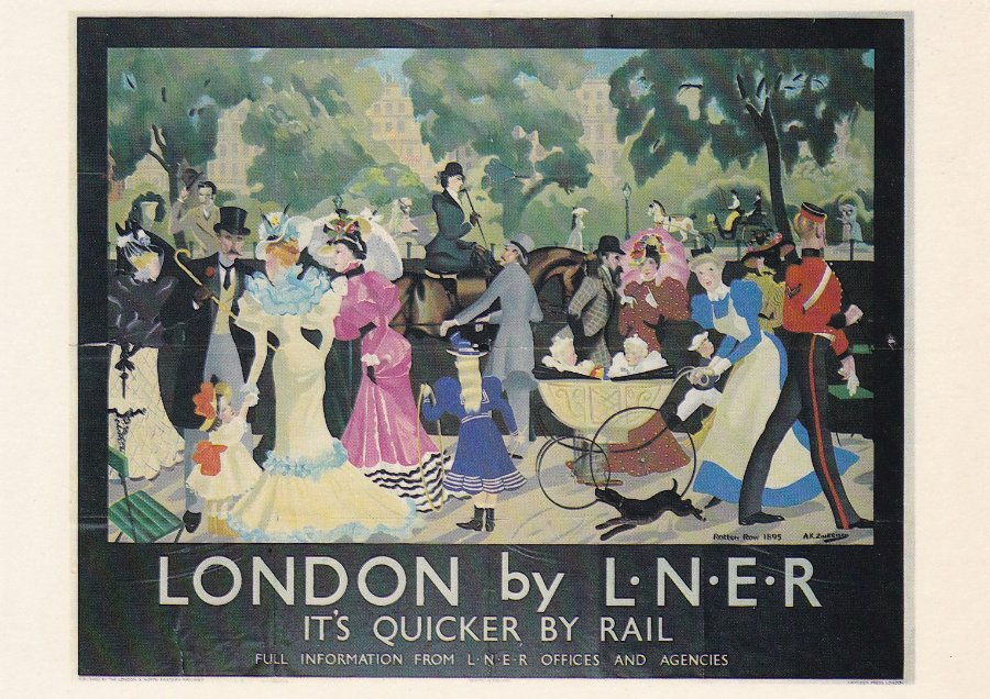
LONDON – ROTTEN ROW 1895
By
Anna Zinkeisen – 1923
LONDON & NORTH EASTERN RAILWAY
Published by
LONDON TRANSPORT MUSEUM
Ref: LTM 97
This poster is a horizontal design and on the front reads ‘LONDON by L.N.E.R. – IT’S QUICKER BY RAIL’ (the tag line ‘ITS QUICKER BY RAIL’ was of course used for many years).
I was intrigued by the title of this one and discovered that Rotten Row is the area leading from Hyde Park Corner, London to Serpentine Road. Apparently, and the poster image seems to confirm this, it was the fashionable place to be seen for the upper-class in the 18th and 19th century, whilst horse riding and walking. It apparently is maintained to this day as a place to ride horses in the centre of London, although I do not know that it is used as such that often these days.
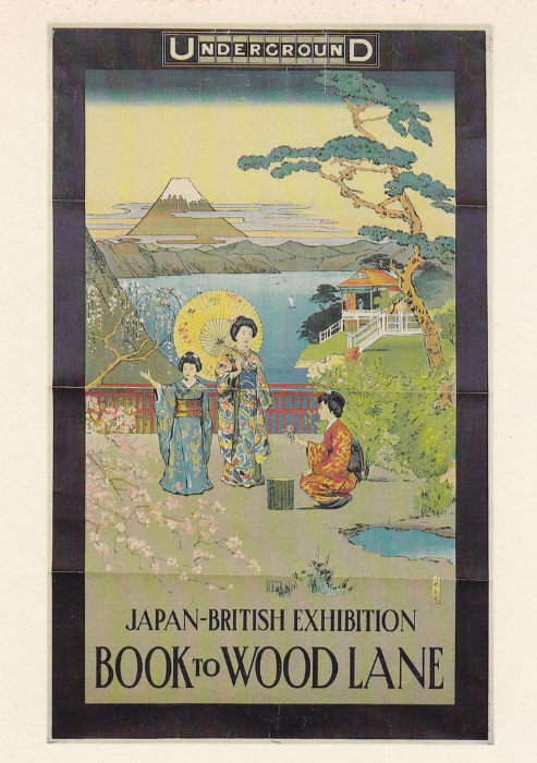
JAPAN – BRITISH EXHIBITION
By
Unknown Artist – 1910
Published by
LONDON TRANSPORT MUSEUM
Ref: LTM 73
Another smashing poster from this long running museum exclusive series (which has been mentioned before quite recently with a poster card for Southend, my home town).
This is an Underground poster (I like the fact that you can see the folds in the poster on this postcard – the poster is of course from the museum’s own collection, which is quite extensive).
There are many ‘Poster’ postcard collectors, and some ‘Underground Railway’ collectors as well (a friend of mine collects London Underground related material).
This particular postcard is mint and recently cost me £1, which I was happy to pay for such a delightful card.
15/10/2016
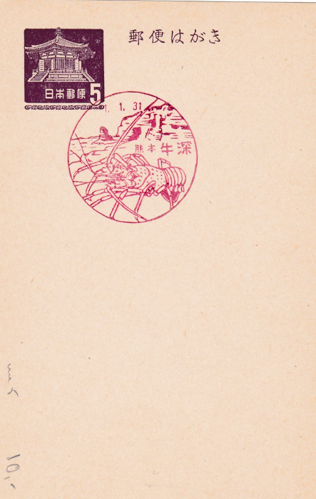
JAPANESE POSTAL STATIONERY CARD
Red Lobster Pictorial Cancel
My knowledge of Japanese postal stationery is all but non-existent, but I do know that they can be quite expensive, even the fairly modern ones. This one here is a very nice example of a plain pre-stamped card used with a lovely Lobster pictorial red cancellation. I have seen this very card, or similar, priced between £8 and £12. This seems a lot, but others I have seen, from this period, have been priced at £30+. This sort of collecting is out of my price range as it is a non-specialisation of mine, but this particular example turned up in a dealers £1 box, and that price was well worth picking up (this was bought at the most recent STAMPEX show in London).
Any help with the actual date involved would be appreciated as I do not understand the Japanese dating system and I do not think the 1.1.31 actually means the 1st of January 1931 (but I could be wrong).
15/10/2016
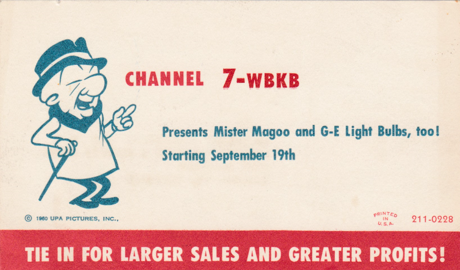
MR MAGOO
‘CHANNEL 7-WBKB Presents Mister Magoo and G-E Light Bulbs, too!’
“TIE IN FOR LARGER SALES AND GREATER PROFITS!”
This is a small sized 1960’s postcard posted out of Chicago using a blue, undated (so the equivalent of our second class post – a cheaper service). Postcard depicting Mr Magoo are not common, I only have two in my collection of which this is one, and considering I specialise in TV related postcards this is not many.
This particular postcard has been sent out to a store owner and is trying to get that person to tie in their advertising with the advertising that clearly was to go out during the animated programmes breaks. So here you have a postcard for advertising, television and cartoon collectors. A nice item probably valued around £5 - £7.

REVERSE SIDE OF ABOVE POSTCARD
This has a nice blue ink advertising meter mark cancellation
15/10/2016
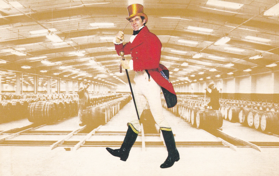
KILMARNOCK
HOME OF JOHNNIE WALKER SCOTCH WHISKY – BLENDING HALL
Personally I am not a drinker, but, there are some lovely alcohol related promotional postcards produced and the subject is actually collected by a few people, and the cards of some certain breweries have become popular (Guinness postcards have always been popular, and Absolut Vodka have issued some superb poster designs – all very collectible). This postcard here relates more to the process of producing the drink rather than the drink itself.
I suspect that this postcard can be bought as some sort of tour souvenir? I reminder of a visit to the Blending Hall mentioned in the only line of text on the reverse side (as the title above). The background image seems to be an historic image of the barrels in the hall, whilst overlaid in bright colour in the centre is a man dressed as the Johnnie Walker label logo man himself. This card is slightly smaller in size to the more modern sized card that is normally now used.
15/10/2016
TOMORROWLAND
WALT DISNEY WORLD
“IL MONDO DEL FUTURO CHE DIVENTAREALTA”
Published by
ACCORNERO (E UNA ESCLUSIVISTA)
A bit of a strange one this one. By now my interest in the postcards of Walt Disney World should have become clear (in fact, although I am sitting in the sun on the veranda of a villa in Turkey as I type this, I am in fact looking forward to two weeks in Walt Disney World next month – this is not as ‘high living’ as it sounds, I have just saved up my holiday time for the end of the year).
This particular postcard, although it purports to be an official ‘Walt Disney World’ postcard, was actually printed and issued in Italy. I have mentioned before Italy’s then view towards the copyright usage of Disney characters, but this the first time I have come across a photograph of an actual ride at one of the American theme parks. The ride depicted here is ‘Space Mountain’ (I have ridden this a few times over the years). I have previously depicted a real official Walt Disney World postcard that shows this ride, but this one here is a real curiosity. The photograph used is a really good one and any Disney collector would want this.
The character depicted in the circle is called Gyro Gearloose, and he is one of the lesser known characters, and not common on postcard. His first appearance was actually in print in ‘Walt Disney’s Comics and Stories’ issue #140 (May 1952 – the story was called “Gladstone’s Terrible Secret”). I have some extra interest here as he appeared in the animated TV series ‘Duck Tales’, so I can place this card in my Television collection as well.
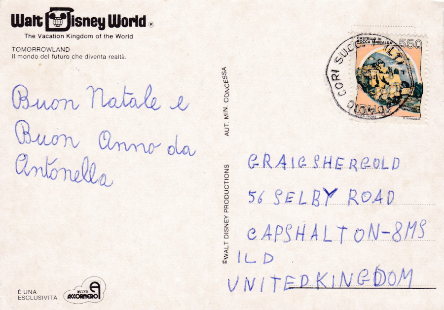
REVERSE SIDE OF ABOVE POSTCARD
This copy was posted from Italy in what I think was 1989. It is one of the many ‘Craig Shergold’ addressed postcards that came on the market in the early 1990’s. Craig was a young boy who wanted to be in the Guinness book of records for receiving the most postcards and having the most in a collection. He was ill at the time and his cause was taken up across the world and he literally received millions of postcards as a result. This is but one of those (I have a few hundred of his cards in my collection now – some Disney and some Italian view postcards and quite a few American States postcards).
15/10/2016
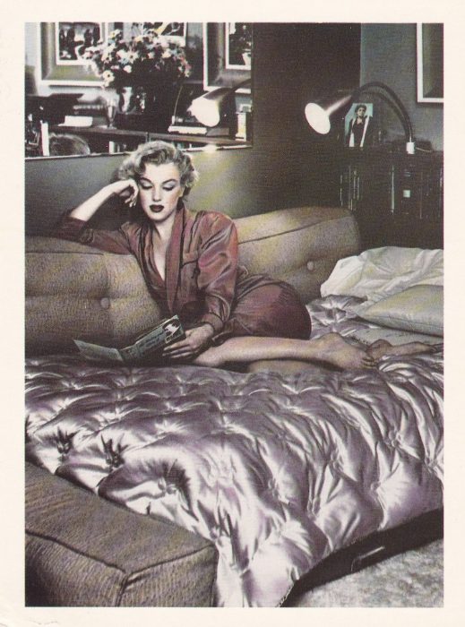
MARILYN MONROE
Published by
ATHENA INTERNATIONAL
Ref: E2204418
Not my first Marilyn Monroe posting (it certainly won’t be my last either) but it is a lovely simple image. The photograph has received some slight colour toning, a process which was popular for a while and Athena International used in a number of postcard series/images. It looks like this is a sofa bed, so maybe this was taken in a hotel somewhere or at one of her friend’s apartments.
15/10/2016
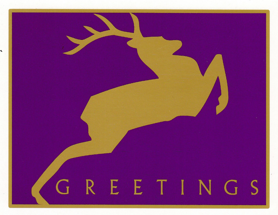
UNITED STATES POSTAL SERVICE
“GREETINGS”
This appears to be an official release from the American Postal Service. It seems to have come from either a book of cards or from a sheet as one edge is perforated. It may have been a free item sent out to subscribers to their stamps or their other issues (a gift perhaps for their continued custom).
The postcard depicts one of the 1999 USA Christmas stamp designs issued on 20th October that year. There were four designs which all featured the same gold reindeer, but with different coloured backgrounds (red, green, purple and blue – clearly the purple one has been used on this card). On the stamps the value of 33cents and underneath this the country as ‘USA’ appear top right, but this has been removed from this postcard version.
The stamps were designed by Tom Nikosey, from California, and these were his first stamp designs for the US postal Service.

REVERSE SIDE OF ABOVE POSTCARD
“THIRD ANNUAL EGGFEST – COLORADO GATORS”
I bought this postcard because I liked this special handstamp, although it has absolutely nothing at all to do with the design on the postcard. The red inked cancel depicts an alligator breaking out of its shell and has the full text of “JULY 6, 2002 – THIRD ANULA EGGFEST – Eggfest Station-Mosca, CO 81146-9717 – Celebrating the beginning of the nesting season at – COLORADO GATORS”. I HAVE SEEN ALLIGATORS IN Florida and have interest in them so the cancel appealed to me. To be fair though, I would probably have bought this card if it was mint as I collect postal stationery cards (as you may have guessed if you have seen previous postings). The reverse side of this card has some interesting features and information. It is copyrighted to the year 2000, a year after the stamp design depicted on the front was released. This gives more credence to my theory that this was a freebie, given away the following Christmas. The pre-printed stamp top right is a really nice item and follows the normal rule with pre-stamped American modern cards. This does have a value and the USA print added (obviously, as otherwise it would not have postal validity – see above block of text), but here the value is shown as 20cents, whereas the previously issued actual stamp was valued at 33cents. Postal Stationery Cards always have a different, lower value printed stamp to the actual issued stamp. This means that these card items become collectible in their own right because of this different denomination.
14/10/2016
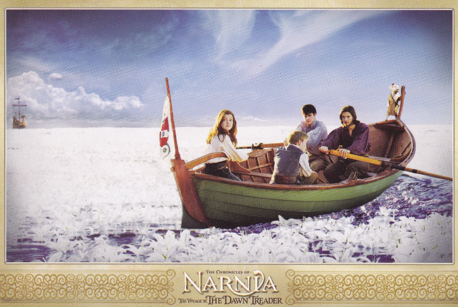
THE CHRONICLES OF NARNIA
THE VOYAGE OF THE DAWN TREADER
This was the third film in the ‘Narnia series, and, so far I believe, the last. This one came out in 2010 (Royal Film Performance – 30th November, General release in the UK from 9TH December and in the USA from the 10th December) and was made with a budget of $155 million, and took a box office of $415.7 million. It was also the only film in this series to be released in Digital 3D. The filming took place in Australia and New Zealand, New Zealand issued stamp sets for the first two films but I can-not remember there being a set issued for this one.
This is not of course the last book in the Narnia Chronicles, and plans were in place to produce the next film ‘The Magicians Nephew’, but in 2011 the filming companies contract with the late writer’s estate expired, it was not renewed.
The postcard shown here, a free advertising promotional postcard, came from Australia, but I do not know if the same, or similar designs were issued in other countries. The image shows the three main characters; Lucy Pevensie (Georgie Henley), Edmund Pevensie (Skandar Keynes) and Prince Caspian (Ben Barnes – who played the now King of Narnia after the previous, and second film in the series, where he also played this part). I think the young male character with his back to us is Eustace Scrubb (Will Poulter – he plays the Lucy’s and Edmunds annoying cousin who gets sucked into Narnia with them on this trip).
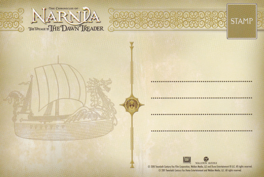
REVERSE SIDE OF ABOVE POSTCARD
I thought this was quite attractive with the outline of the boat and the continued colouring as from the boarder on the front

14/10/2016
NIJMEGEN, NETHERLANDS
JAN VAN HOOF MONUMENT
(Nijmegen, Waalbrug met Monument Jan van Hoof)
Ref: No 101
This attractive black and white photograph depicts the monument in the foreground, with the bridge in the background. The bridge of course was one of those which was part of the WWII ‘Operation Market Garden’ and needed to be crossed to join up the advancing tank column with the American paratroopers who had been dropped in this area.
The monument depicts Jan van Hoof who was a student and a member of the underground services in the Netherlands. He was collecting data on the bridges across the Waal, especially on how the Germans were laying explosives on them. He is said to have been responsible for disabling the charges on the bridge during the fighting on the 18th September 1944, although his act is stated as ‘virtually sure to have happened’ there was initially some dispute. But, regardless of the authority of that single event, which seems now to be accepted, he was still a very brave and dedicated resistance fighter and he was subsequently awarded posthumously bravery awards by the Netherlands (The Military Order of William) and the United States. I also liked the fact that he had strongly been involved in the Scout movement before the war and I wonder how much this lead to him naturally being drawn into the resistance.
He was captured by the Germans on the 19th September 1944 leading a British armoured vehicle through the city. He was executed by the Germans that same day. His body now lies in a war grave in Erekerhof cemetery, although the date on his gravestone is incorrect and shows the date as 22nd Sept instead of the 19th, as it should be.
The monument is in bronze and shows a male figure (not necessarily, I think, Jan van Hoof himself) with a flag. The text on the monument can be translated as “With this monument we honour all that died with Jan van Hoof in the resistance for the liberation of Nijmegen 1940 – 1945”.
The statue was erected on 5th May 1954, and was designed by Marius van Beek.
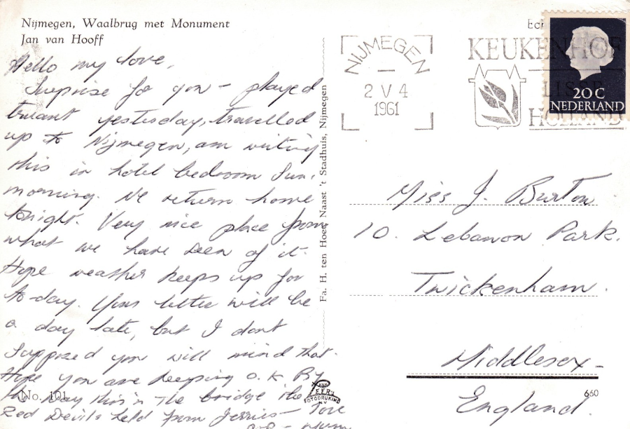
THE REVERSE SIDE OF ABOVE POSTCARD
I show this because I liked the slogan cancellation used on the stamp, this is dated 2nd May 1961 and has a nice Tulip pictorial element. The message also has some interest as the sender writes “By the way this is the bridge the Red Devils held from the Jerries”. (I am not sure he is right here - I think the Americans were here and the Red Devils were at Arnhem itself, further along - but some British were at Nijmegan so I could be wrong)
14/10/2016
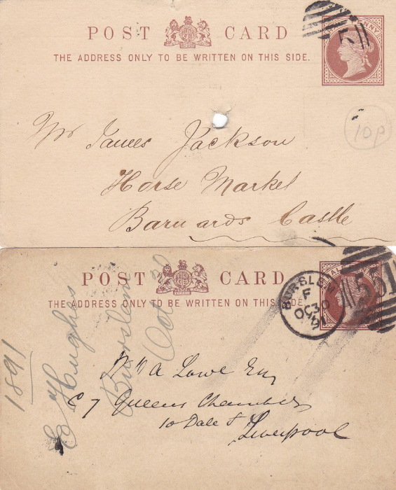
QUEEN VICTORIA HALF PENNY
Brown Postal Stationery Cards
These were standard issue GB postal stationery post cards, and as such these are quite common and obtaining copies is not difficult, or expensive (as you can see the top card only cost me 10p – but that was a few years ago). Both of the postcards have been cancelled using a Duplex styled cancellation, although the one on the top card did not come out clearly. The Duplex cancel on the bottom card is much clearer and is numbered 551, which is for BURSLEM (one of six towns which were later amalgamated to form the city of Stoke-on-Trent, Staffordshire), and is dated 30th October 1891.

THE REVERSE SIDES OF THE ABOVE TWO POSTAL STATIONERY CARDS
And here is the reason why I have decided to post these two items. I think these nicely show the range of usage for these cards.
The top one is a lovely example of an overprinted company card used as part of a business. There is also the bonus of a date being applied, which helps date this one as the cancellation was not clearly applied – this is the oldest of the two cards as is dated 18th November 1878 (the card was printed with the part date 187, so copies were expected to be used up over the 10 years of that decade). The company was based in Birmingham, so we can assume this card was posted out from there. These printed versions of the plain backed cards make an attractive addition to a collection.
The hole in the centre of the card is not unusual as many of the business and personal mail receivers of this time stuck down their mail onto a vertical spike to hold the mail responded to or not requiring a response in one location. The holes are part of the cards usage, as such, and copies should not be disposed of because of this trait. At least here the person got it quite central, I have some with these holes all over cards, in different positions on the card! (I still think this was a bargain at 10p)
The bottom card is of the more traditional plain backed card with a hand written message applied. This is the type of used version which is far more abundant and easier to obtain copies of. More and more of this type of cards are now turning up in dealer’s stock, with a number almost specialising, or having a specialised section of such cards. They are a very important part of the postcard story, in-fact they are the commencing part of the postcard story and deserve to be collected for this reason.
13/10/16
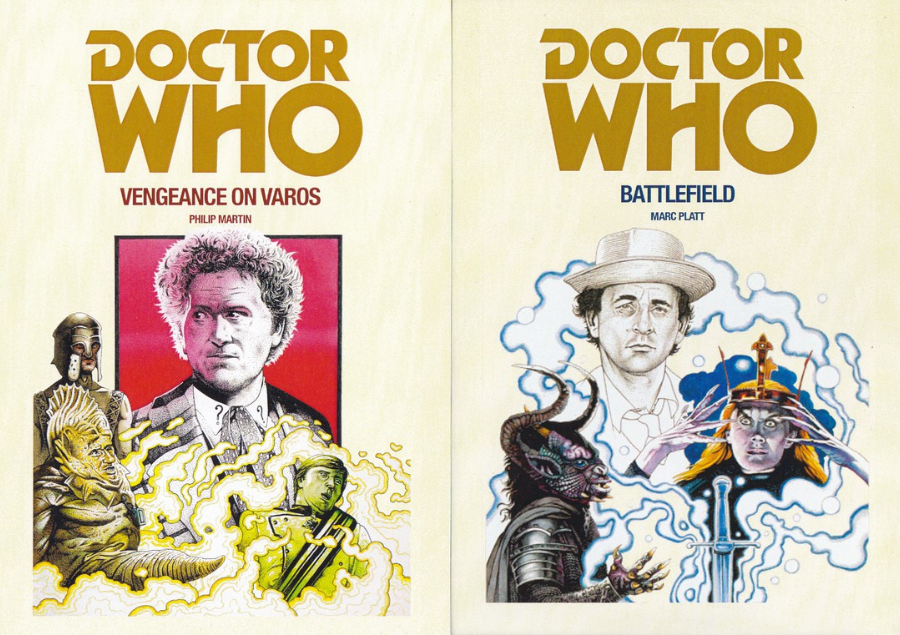
DOCTOR WHO
BBC BOOKS
This set of postcards was a recent eBay auction win. They are postcards that I had not seen before and although I can clearly surmise that they were issued to promote the release of these books they are copyrighted to 1996 and these books illustrated here were issued over a number of years and prior to this year date. I think they relate to a re-release, possibly around that time, or even more recently. I have checked back on eBay since and no more have appeared. I actually think I got these quite cheap at £10 for the set, but to be honest, I really don’t know, as without any information, or further sightings of these cards I have no real information to go on.
The artwork on these covers is by the well-known Dr Who artist (and fantasy artist) Chris Achilleos, who is actually someone I have met a couple of times and whose autograph I have on other postcards in my collection (and on a Dr Who stamp cover which features his artwork).
In the meantime, I post these here because I love Doctor Who related postcards, and I have a specialised Doctor Who collection with postcards going back many years (readers of my articles in PPM already know I am a Dr Who collector as I have regularly mentioned, and depicted such cards there)
VENGEANCE ON VAROS
By
Philip Martin
(Artwork by Chris Achilleos)
BATTLEFIELD
By
Marc Platt
(Artwork by Chris Achilleos)
This is actually a Dr Who story that I like – the TV Programme was not well received but I liked it
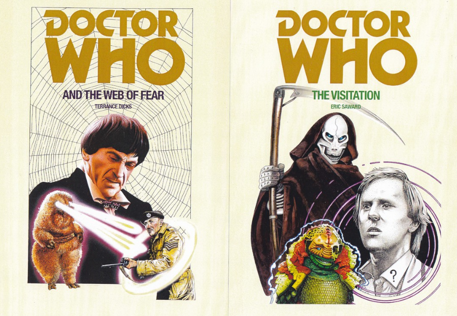
DOCTOR WHO AND THE WEB OF FEAR
By
Terrence Dicks
(Artwork by Chris Achilleos)
Terrence Dicks actually wrote for the TV series and subsequently wrote a number of the novelisation versions. The ‘Web of Fear’ was actually a lost story for many years but a recording of some of the missing episodes was recovered only a couple of years ago and fans can now watch it again (I have the DVD release from when the episodes were recovered and almost immediately placed on sale as a DVD.
THE VISITATION
By
Eric Saward
(Artwork by Chris Achilleos)
A Peter Davison Dr Who story – remembered by some as being the story where his Sonic Screwdriver was destroyed by the alien – it was missing for some time after this, but did eventually make a return – it is also the story where he gets caught up in the Great Fire of London (well, I say ‘caught up’, he kind of starts it)
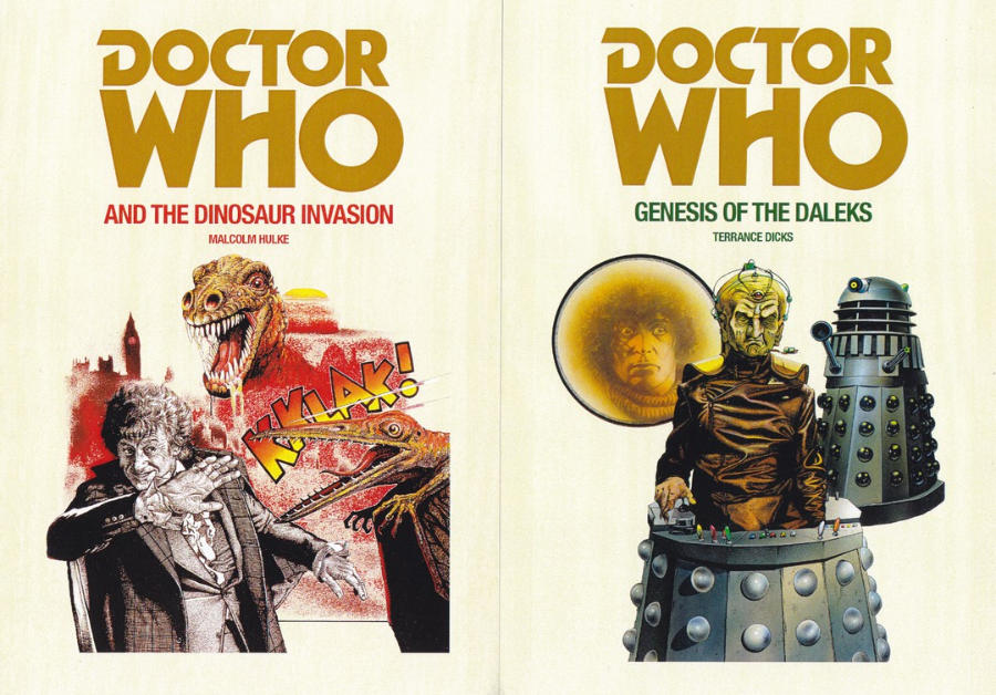
DOCTOR WHO AND THE DINOSAUR INVASION
By
Malcolm Hulke
(Artwork by Chris Achilleos)
This is the only book amongst this selection which I have actually read – Jon Pertwee is my favourite Doctor (probably because he was the first one I watched all the way through. I did see some of the Patrick Troughton ones towards the end of his reign but for me Pertwee was Dr Who)
GENESIS OF THE DALEKS
By
Terrence Dicks
(Artwork by Chris Achilleos)
The Fourth, and longest running Doctor, and a favourite of many people. The Genesis of the Daleks story was a classic, and had the moment where the Doctor was given the chance to bring an end to the Daleks before they had even begun their reign of terror – the dilemma he is shown to be in is one of the better Doctor Who moments
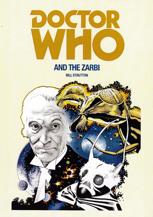
DOCTOR WHO AND THE ZARBI
By
Bill Strutton
(Artwork by Chris Achilleos)
And so we reach the very first Doctor Who as played by William Hartnell. His autograph is very collectible and one of the most sought after by Dr Who autograph collectors. I do not have it on a postcard but I do have a signed photograph and a hand written and signed letter.
This is an interesting novelisation as it is the only one where the Book story title is different to the title of the actual TV version. On the television the story was titled ‘The Web Planet’, but here they decided to call it ‘Doctor Who and the Zarbi’. The Zarbi are creatures (they are the giant Ant like creatures at the top right of the artwork) that the Doctor and his companions meet when visiting a planet in the story. I have this story on BBC Video, before the advent of DVD it was an extremely collectible Video and the story came in two video parts (they are still interesting items, but less valuable now)
13/10/2016
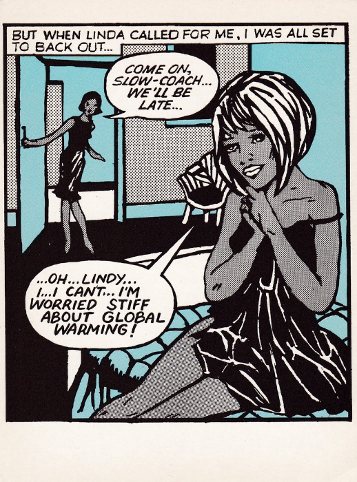
GLOBAL WARMING
Published by
ATHENA INTERNATIONAL
Design by – ARTISTIQUE & SENTIMENTAL
Ref: E1000575
Amusing take on the ‘Global Warming’ fear that was going around in the late 1980’s and early 190’s. This one is staged like a panel in a comic strip and is very simply drawn in a kind of lino cut style using just black, white and blue. I suspect ‘Global Warming’ still comes under the collectible heading of ‘Green Issues’, a collecting theme which was much collected throughout the 1980’s.
Comments
-
This card is ideal for sending as congratulations to president elect Trump haha
13/10/2016
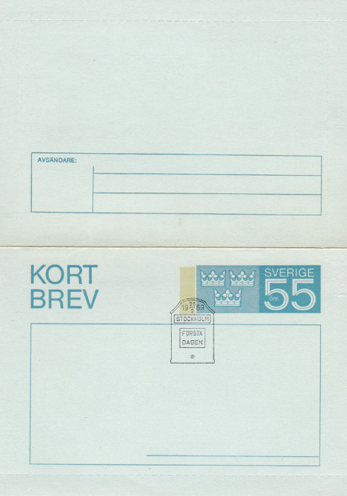
SWEDEN
LETTER CARD
I picked this up for £1 and as you will realise, if not already, I like postal stationery items. This one is cancelled with what I believe to be a first day of issue ‘STOCKHOLM’ cancel shaped like a small postbox. The date on this is the 28th February 1969, placed in the unusual format of the start and end of the year date either side of the month date and the month placed above and below a central line between the 19 and the 69. SVERIGE is printed on all Swedish stamps and is Sweden in their dialect, and it appears here on the pre-printed postage marker, a design exclusive to the postal stationery item(s).
13/10/2016
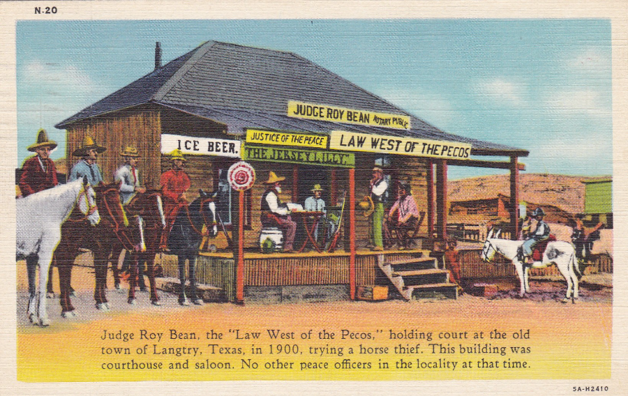
JUDGE ROY BEAN
Published by
J. R. WILLIS – Albuquerque
Printed by
GENUINE CURTEICH-CHICAGO “C. T. ART-COLORTONE” POST CARD
Ref: N.20 (5A-H2410)
“JUDGE ROY BEAN “LAW WEST OF THE PECOS” – Judge Roy Bean, the “Law West of the Pecos”, holding court at the old town of Langtry, Texas, in 1900, trying a horse thief. This building was courthouse and saloon. No other peace officers in the locality at that time”
(Text from both the front and the reverse side of postcard)
I only know about Judge Roy Bean because of the 1972 feature film ‘The Life and Times of Judge Roy Bean’, which featured Paul Newman as the Judge. The film is listed as a comedy and I have no doubt that it veers strongly from the true story of the Judge, but it did the basics of his existence to me.
Born Phantly Roy Bean (sometime circa 1825) he was a saloon keeper and Justice of the Peace. He had a very interesting early life, well worth looking up – he travelled a lot, born Kentucky, left home to ride a flatboat to New Orleans, got I trouble there and fled to San Antonio, Texas. He opened a trading post with his brother (Samuel Gore “Sam” Bean – 1819 – 1903) in the Mexican state of Chihuahua but Roy shot and killed a Mexican (who apparently had threatened to kill a ‘Gringo’) and had to flee to Sonora and then to San Diego, California (here he lived with another brother called Joshua who was elected mayor of the city in 1850, a year after Roy had joined him).
Whilst here Roy was challenged to a pistol shooting match on horseback (this was probably over a woman). Roy was left to decide the targets, and he chose that they would shoot at each other. The other man ended up with being shot in the arm and they both ended up being arrested and Roy was charged with assault. Roy spent two months in jail. He escaped by using knives which had been smuggled in within his food and which he used to dig through his cell wall. He escaped to San Gabriel, California. Here, after the death of Joshua, his brother, who was murdered, he inherited a saloon.
In 1854 Roy was courting a young woman who ended up being kidnapped and married to a Mexican Officer. Roy challenged this man to a duel and killed him. The man’s friends tied Roy up and tried to hang him from the back of a horse. The horse did not move so Roy was left sitting with a noose around his neck and the men left him there to eventually die. But, he was released by the woman, who had apparently been hiding in the tree. He did end up with a permanent rope burn on his neck.
Roy then left for New Mexico to again join ‘Sam’, his other brother, mentioned above. Sam was the sheriff of Dona Ana County.
During the American Civil War Roy was a blockade runner for the Confederates running cotton from San Antonio t British ships off the coast. After the war, and for many years, Roy lived in San Antonio.
In 1866 Roy married Virginia Chavez with whom he had four children, but despite this within a year was arrested for domestic assault. The marriage did not always go well.
Roy eventually sold up, split from his wife and left his kids and set up a small saloon near the Pecos River. Because of the lack of law and order Roy was appointed Justice of the Peace (as a request from a Texas Ranger). This was when he titled himself the ‘Law West of the Pecos’ and is the period from when the photograph (hand coloured on this postcard representation) was taken, circa 1900. His later life was no less interesting (and worth further reading) and he died peacefully in his bed on 16th March 1903, after a bout of heavy drinking. An interesting postcard with a smashing back story.
REVERSE SIDE OF ABOVE POSTCARD
This particular postcard was posted from LORDSBURG, New Mexico, wavy line machine cancel on the 28th January 1946 (not that long after the end of WWII).
Lordsburg is a city, in and around the county seat of Hidalgo County, New Mexico, which was founded in 1880. It covers an area of 8.4 square miles and has a population of just 3,379 (according to the latest Wikipedia entry). Interestingly for my WWII history it had an internment camp for Japanese Americans where 1,500 were held. The camp also held captured German and Italian soldiers.

13/10/2016
“POOR GUIDO”
Published by
TREEFROG ILLUSTRATION
This is an Acrylic piece by the artist
JASMINE MERCER
I have previously mentioned that I started out as a young collector just buying Animal related postcards. So, occasionally I still pick up ones that appeal to me.
This one I thought was quite nice, and also slightly annoying as well. It clearly shows a Cheetah as a doctor, giving a medical check to a very ill Giraffe (who, judging from the title, is called Guido). There is also a Zebra, a Lion and some sort of Owl (which most resembles an African Wood-Owl, I suspect a young one). All of these are of course found in Africa, so, can anyone tell me why there is a young Orangutan in the tree? They are definitely not found in Africa. These are, of course, from Asia, and exclusively from Asia as well.
The obvious answer to the Orangutan, I assume, because I don’t know, is that this could be an illustration for some sort of book, a child’s book perhaps. Maybe, if it is a story illustration, the presence of the Orangutan is explained…if not, then maybe it is there just to annoy wildlife orientated people like me!
13/10/2016
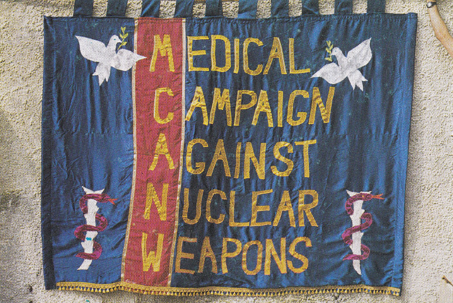
MEDICAL CAMPAIGN AGAINST NUCLEAR WEAPONS
(MCANW)
Published by
W.F.L.O.E.
(Which, if I remember correctly, stands for – WOMEN FOR LIFE ON EARTH)
“Designed by Thalia Campbell a member of the March to Greenham Common in 1981. Made in August 1983 with help from Lesley Owen and Jan Higgs”
(Text from Reverse side of postcard)
You can find a number of these ‘Banner’ type postcards, a number produced by W.F.L.O.E., which relate to the Anti-Nuclear campaign heights of the 1980’s, but there were also a number produced showing miner related banners during the mid-80’s miner strike (which was around the same time as the Anti-Nuclear campaign postcard issuing period, although this started some years earlier).
During the 1980’s this type of postcard was very much collected. Then, much later, the interest waned a bit, as it did with political related postcards. But, recently there has been quite an upsurge in interest in the political cards of the 1980’s, and in some of the 1990’s issues. Some of the old ‘LEEDS POSTCARDS’ political issues have been selling well on eBay, and for some reasonably high prices (£3 - £6), so maybe the Anti-Nuclear campaign postcards are also due a revival of interest.
12/10/2016
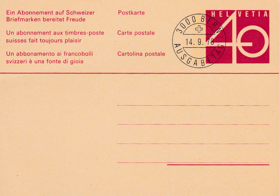
HELVETIA
(SWITZERLAND)
Postal Stationery Post Card
Now, I am going to be honest and say that I know next to nothing about this postal stationery card except that it is from Switzerland. The stamps of Switzerland are all shown as coming from HELVETIA, which is printed on them. The pre-printed stamp on this card has HELVETIA across the top. If I was jot already aware of which country Helvetia was then the cancel applied – dated 14-9-78 – would have helped. The cancel is for BERN, which is the capital city of Switzerland. The little cross in the top semi-circle portion of the cancel might also have helped as this is the symbol cross from the Swiss flag.
The date of 14th September 1978 could potentially be the first day of issue of this card, I suspect it is but can-not confirm this (you can-not know everything – information on more recent postal stationery cards is much harder to access – there are catalogues for those from the pre the 1970’s period which I have access to, but after that it is considerably harder – but, having said all this I can-not see why this would have been cancelled in this way unless there was a specific reason, and the only one I can think of immediately is that it is a release date cancel).
09/10/2016
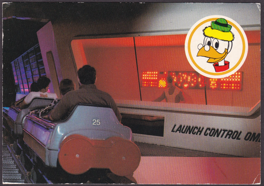
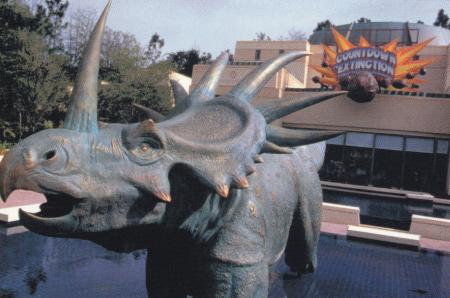
DISNEY’S ANIMAL KINGDOM
NO ESCAPE CLAWS
“Countdown to Extinction is a thrilling attraction that is ahead of its time. It is all part of the excitement found at Disney’s Animal Kingdom”
(Text from reverse side of postcard)
Despite the awful ‘NO ESCAPE CLAWS’ pun, this is actually a very collectible postcard. It depicts a Styracosaurus located outside a ride called ‘Countdown to Extinction’. The interest here is that all this changed shortly after the 19th May 2000 when Disney released an animated film called ‘Dinosaur’.
To coincide with the film’s release, and to tie the ride in with the movie, the rides name was changed from ‘Countdown to Extinction’ to ‘Dinosaur’. Also the Styracosaurus depicted on this postcard was removed and replaced with the dinosaur called ‘Aladar’ in the film, an Iguanodon. So, other than the actual building, nothing shown here on this postcard still remains. It is therefore a little piece of Disney ‘Animal Kingdom’ history.
I have ridden the ‘Dinosaur’ ride many times. The ride itself remained the same, after the name change, with just a couple of touches, one to the violent movement of the vehicles in the ride, and the other a softening to the music, all to make it more child friendly, as the film, it was now connected to, was aimed at children, and therefore they expected more children to ride it.
To be honest the ‘Riders’, the attractions vehicles, still move about, and jolt you quite a bit. We once shared a row with a couple who when we got to the other end found that their bag had been thrown out of the vehicle as we went around (they were nicely informed that they could not stop the ride and that they would look for the bag after the ride closed down, at the end of the day, when the park closed!).
09/10/2016
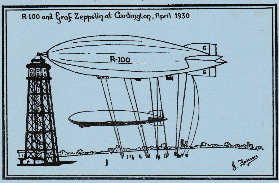
R-100 and GRAF ZEPPELIN at Cardington, April 1930
Published by
LEWFOL
(A Limited Edition Collector’s Card)
Ref: B. 1. XZ
Hand Numbered limited edition of 100 postcards
(My copy here is number 46)
Artwork by
J. Follows
Jack Follows is a well-known modern postcard artist and a large number of his images, all be it that they are simplistic in design, have been issued on postcard, and in fact most are designed exclusively for postcard depiction, as this one here was. This postcard was also clearly issued for the modern postcard collecting world, indicated by the very low print run
This postcard commemorates the meeting of both the British R100 airship and the German Graf Zeppelin airship at Cardington airbase in April 1930.

REVERSE SIDE OF ABOVE POSTCARD
A privately produced postcard, homemade, and although its simple, still one which airship collectors would like in their collection (have I mentioned I collect Airships?)

08/10/2016
HELP!
Published by
ATHENA INTERNATIONAL
Artwork by
JON MAC (at Meiklejohn Illustartion)
Ref: 9755
When this design came out in the 1980’s it was one of the most popular of the Athena postcards. At the time there was a lot of outcry re the slaughter of seal cubs for their fur. This design is a direct link to this killing. It was also, I believe, available as a poster. This postcard always reminds me of some of my earlier days of collecting. I actually bought this when it first arrived in the sales rack.
08/10/2016
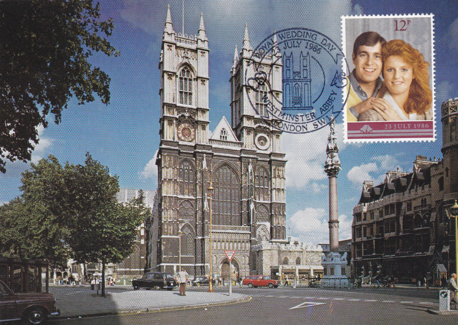
WESTMINSTER ABBEY
West Front view of Westminster Abbey
Published by
J. ARTHUR DIXON
Ref: PLO/23833
This postcard mint would make a nice London souvenir in its own right, but here someone has applied a 12p 1986 ‘Royal Wedding’ stamp to the front and had it cancelled with the ‘23rd July 1986 – ROYAL WEDDING DAY – WESTMINSTER ABBEY, LONDON SW1’ special hand stamp which features the Abbey front. Prince Andrew and Sarah Ferguson were of course married in Westminster Abbey, which is why this combination, of postcard, stamp and hand stamp is so good.
The cancel is of course for the actual date of the wedding itself – 23/07/86, this is not the date that the stamp (and its partner, it was a two stamp set) was issued, as this was the previous day, 22nd July 1986.

06/10/2016
‘REGENTS PARK’
BP PORTRAIT AWARD 1990
(Commended)
By
Chris Stevens
Oil on Canvas
Ref: NPGPC 45
I like this painting as I think it captures, what I take to be, a normal man, in Regents Park, who for some reason I have decided is a homeless man, there Is no indication that he is, It’s just my interpretation of the image. I assume the interpretation you make from the chimpanzee being in the bottom left corner is that London Zoo is also in Regents Park (does this mean that I can put this card into my London Zoo collection?)
04/10/2016
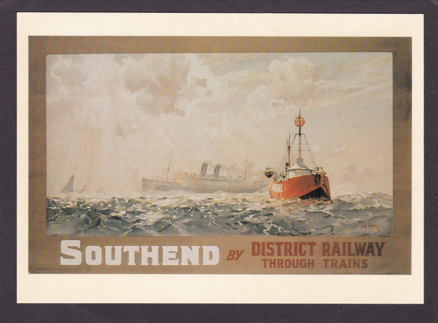
SOUTHEND BY DISTRICT RAILWAY THROUGH TRAINS
Published by
LONDON TRANSPORT MUSEUM
Ref: LTM 51
Poster by C. E. TURNER – 1919
Southend is of course my home town, so anything that relates to it postcard wise is always a bonus. This poster postcard is a real cracker, and I love the Ocean Liner that can be seen in the distance.
The London Transport Museum have a strong history of postcard production which continues to this day. In-fact, there are a number of collectors that concentrate on the museums output alone, something which is made much easier by the fact that the museum number their postcards. No 51 is quite an early card.
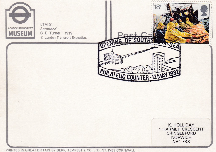
REVERSE SIDE OF ABOVE POSTCARD
Someone, I assume a Mr Holliday, took this particular postcard and applied a 18p fishing commemorative stamp and had tis cancelled with a special cancel that celebrated the ‘OPENING OF SOUTHEND – on – SEA PHILATELIC COUNTER – 12 MAY 1982’. I remember this counter well as I bought many of my early PHQ Stamp Cards from here and had them posted to receive the ‘FIRST DAY OF ISSUE – SOUTHEND ON SEA’ circular date stamp (applied when you posted items in the postbox at the counter. I am in fact still friends with one of the people who ran the counter, he is a member of my stamp club. Sadly, Philatelic counters are a thing of the past, and the Southend one has long gone. The building where the original Philatelic Counter was opened (the subject of the cancel) is now a Pub, rather appropriately called ‘The Last Post’. The Post Office here moved to a more modern building, and the counter originally went with it before later being shut down.
04/10/2016
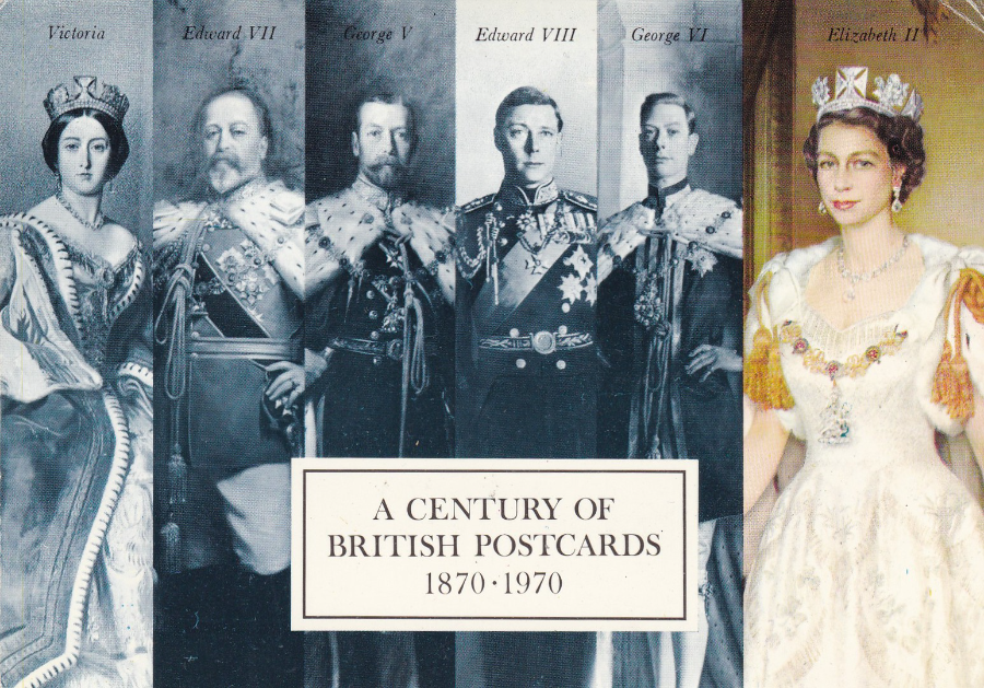
A CENTURY OF BRITISH POSTCARDS
1870 – 1970
Now, I have posted this postcard on the website before, and there I gave all the details behind its issue etc (see under ‘Feb Blog 4’).
I show it again here because I picked up another copy at the recent Woking fair for £1 but the reverse side was exceptional – see below.
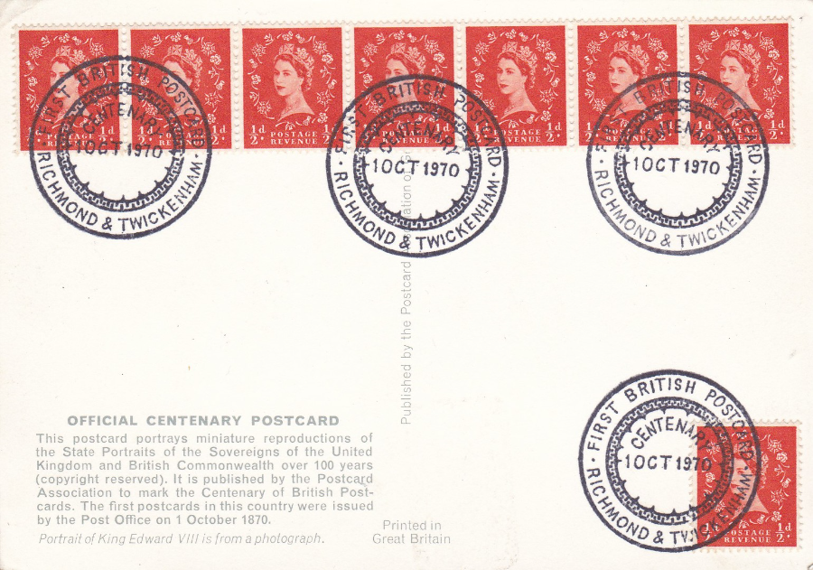
REVERSE SIDE OF ABOVE POSTCARD
This copy has received eight ½ d Queen Elizabeth wilding stamps which have been cancelled with four strikes of the special hand stamp “FIRST BRITISH POSTCARD CENTENARY – 1 OCT 1970 – RICHMOND & TWICKENHAM”. The combination I thought was very attractive, and of course very relevant to my collecting interests.
03/10/2016
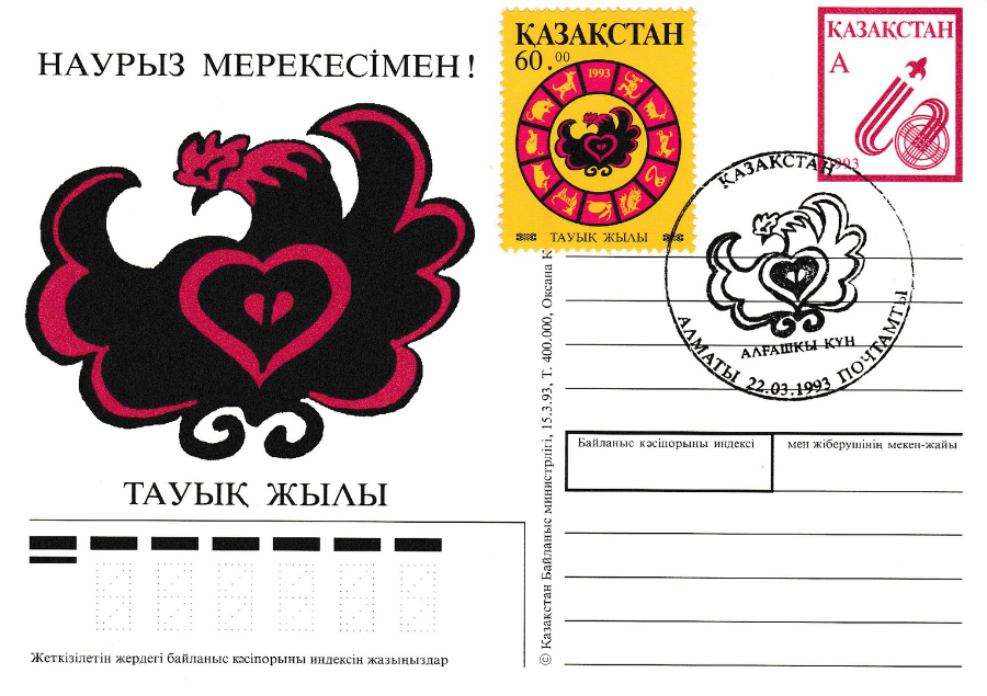
KAZAKHSTAN
CHINESE YEAR OF THE ROOSTER (COCKERILL)
Postal Stationery Card
Airmail (?)
This postal stationery post card has the Kazakhstan ‘Year of the Rooster’ postage stamp applied and this, along with the printed pre-paid stamp, which I believe is for airmail rate, has been cancelled with a ‘Year of the Rooster’ special cancellation 22/03/1993 (possibly first day of issue – but not confirmed) which uses the same image that appears on both the stamp and postal card.
Before obtaining this used copy I did have a mint one (not sure where it is otherwise I would have posted it here as well) but from that alone, without the obvious connection obtained from the design on the stamp, I did not know what the card related to.
I don’t think this card is worth very much, but, it is unusual and I like unusual – and I think I only paid £1 for it anyway.

03/10/2016
ISLE ON MAN
2016 Stamp Issue titled:
Aardman – AN EXTRAORDINARY JOURNEY, TAKEN ONE FRAME AT A TIME
Celebrating
40 YEARS OF AARDMAN
This is a cracking set of stamps which depict Morph, Wallace & Gromit, Shaun the Sheep and some of the characters from ‘Creature Comforts’. At the recent Stampex Show I was delighted to pick up the set of postcards which have been released to coincide with the stamps. Each card depicts a single stamp along with the large 40th logo and one of the characters on the right hand side looking like they have burst through the red boarder area. Unusually the cards do not come stamped on the front with an applied stamp and have no pre-printed stamp on the reverse side, so these are just postcards, sold mint, sealed as a set.
The Isle of Man stand also had the actual stamps of course and the man behind the counter asked if I wanted a set to go with the cards. I asked if there was a special STAMPEX show cachet, and there was. They also had with them an actual date canceller for ‘Douglas, Isle of Man’. So, I was able to stick the stamps on (I went for a set that had a bit of the margin area which included the 4oth logo – just for a little extra look and collectability) and have each cancelled with a ‘Douglas’ cancel for the 14th Sept (the first day of STAMPEX – these are not first day of issue for the stamps). They then applied the special exclusive Stampex cachet on the right side.
So, here you have the collection of cards as obtained that day:
MORPH – LAXEY TRAM STATION
1st CLASS STAMP
Morph gets to be depicted with an actual Isle of Man landmark – all the other characters are depicted in scenes from their animated stories.
WALLACE & GROMIT – A CLOSE SHAVE POSTCARD
The individual cards all have the reference number;
ISLE OF MAN POST OFFICE STAMP CARD No 33. (8)
(they all have the (8) after the 33 and do not have individual bracket numbers)
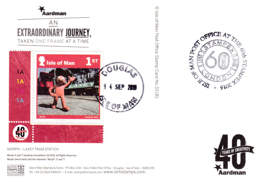
REVERSE SIDE OF THE MORPH – LAXEY TRAM STATION POSTCARD
Here you can see the cancel for DOUGLAS and the STAMPEX cachet which appear on all the below reverse layouts.
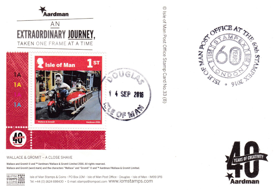
REVERSE SIDE OF THE WALLACE & GROMIT – A CLOSE SHAVE POSTCARD
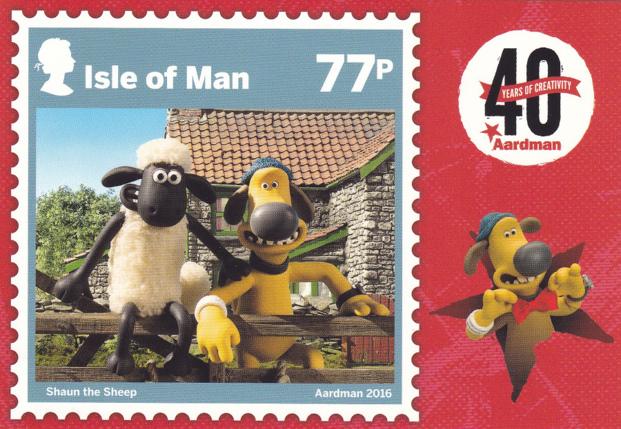
SHAUN THE SHEEP – MOSSY BOTTOM FARM
77p VALUE STAMP
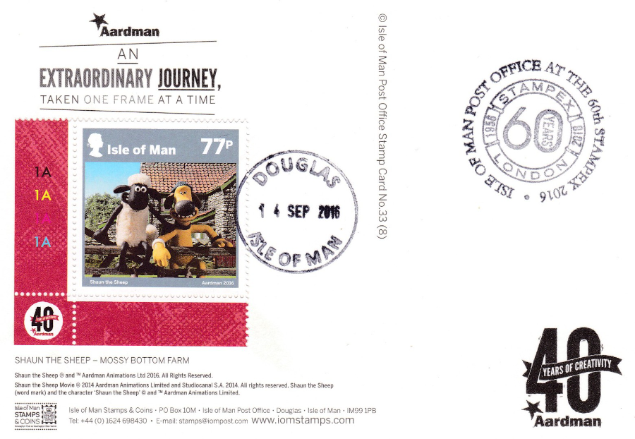
REVERSE SIDE OF ABOVE POSTCARD
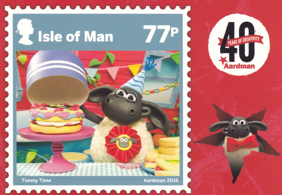
TIMMY TIME – TIMMY’S BIRTHDAY
77p VALUE STAMP
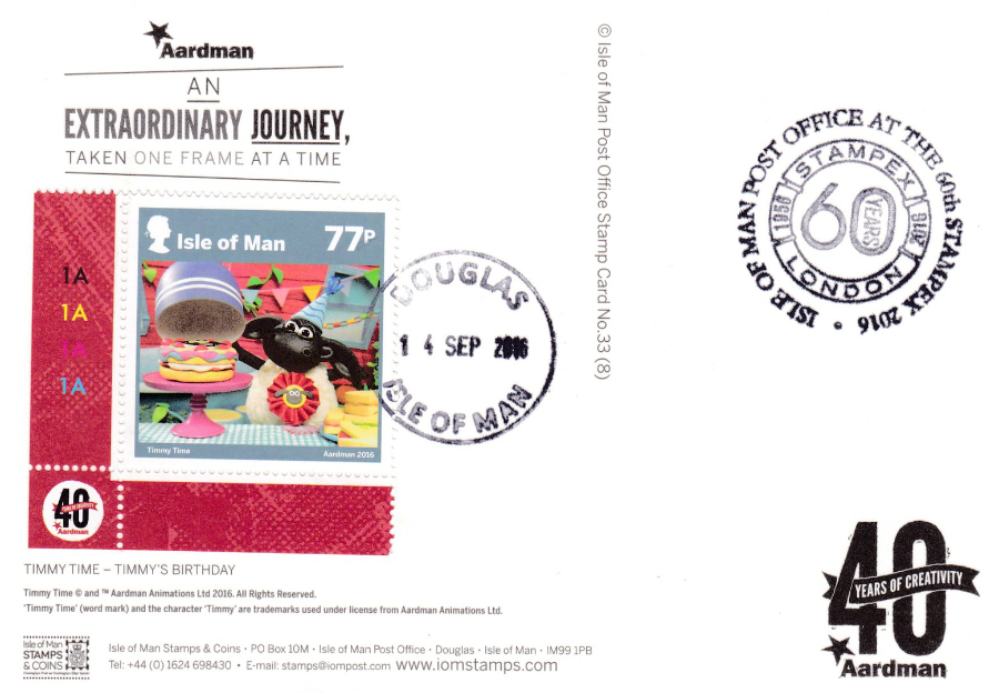
REVERSE SIDE OF ABOVE POSTCARD

WALLACE & GROMIT – A GRAND DAY OUT
95p VALUE STAMP
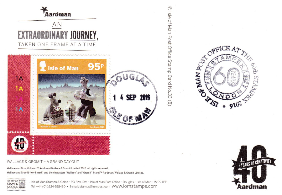
REVERSE SIDE OF ABOVE POSTCARD
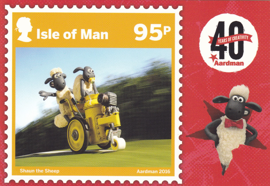
SHAUN THE SHEEP – DRAW THE LINE
95p VALUE STAMP
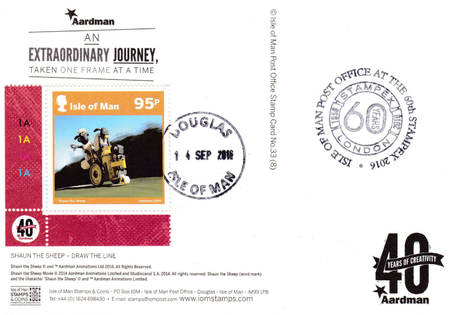
REVERSE SIDE OF ABOVE POSTCARD
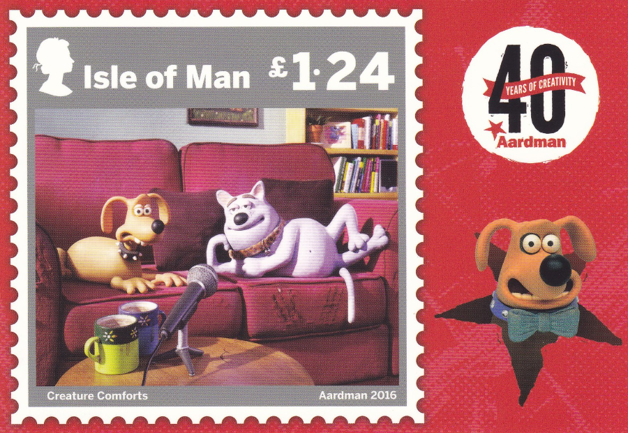
CREATURE COMFORTS – TRIXIE AND CAPTAIN CUDDLEPUSS
£1.24 VALUE STAMP
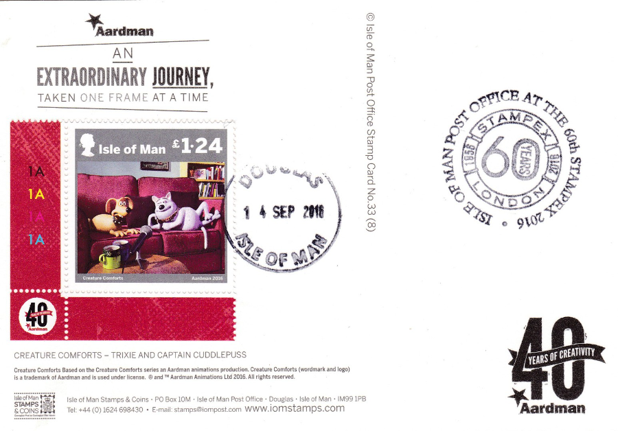
REVERSE SIDE OF ABOVE POSTCARD

MORPH – LAXEY WHEEL
£1.24 VALUE STAMP
Again Morph gets to visit a famous Isle of Man landmark

REVERSE SIDE OF ABOVE POSTCARD

03/10/2016
LYNMOUTH HARBOUR FROM MARS HILL
Published by
E. A. SWEETMAN & SON (Tunbridge Wells)
“Solograph” Series De Luxe Photogravure
Ref: 2182
This photograph of Lynmouth includes the little tower at the entrance to the harbour as it was then. All of this area seen here was washed away in the disastrous flood of 1952 (see previous posting of a flood damage card in ‘Jan Blog 4’). So this images captures a piece of history, now totally changed by the disastrous force of mother nature. My interest in not only the flood, but the area of Lynton & Lynmouth arises from my many visits here.
This Postcard was posted from BRENDONE which is a small village 1.5 miles from Lynton. Lynton is the village area at the top of the cliffs immediately above Lynmouth, which is why it is known as ‘Lynton & Lynmouth’, an area I spent a number of childhood holidays visiting. The postcard was posted in 1946, just under a year after the end of World War II (this was posted on 22nd Aug and the war with Japan finished on 2nd Sept the year before).
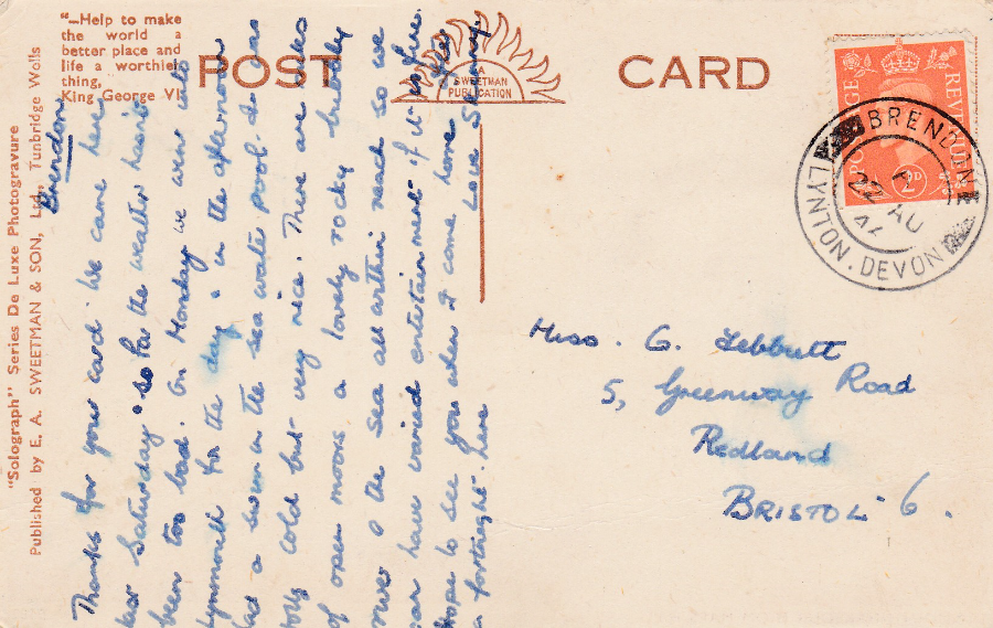
REVERSE SIDE OF ABOVE POSTCARD
03/10/2016
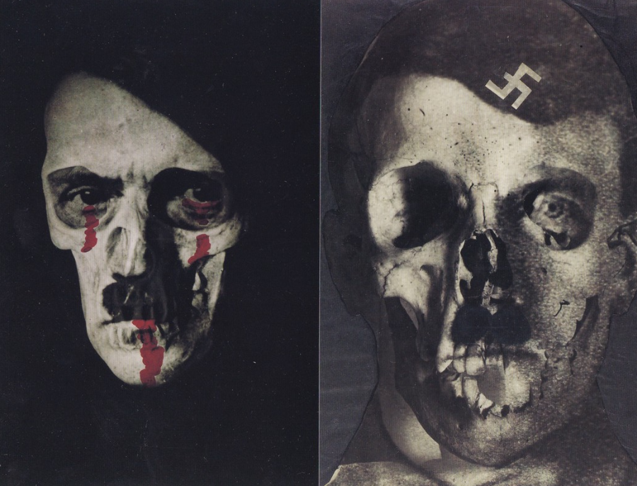
ERWIN BLUMENFELD
Printed by
ABACUS (COLOUR PRINTERS) LTD
1996 – ESTATE OF ERWIN BLUMENFELD
By Yorick Blumenfeld
FAR LEFT – HITLER, HOLLAND Circa 1933
NEAR LEFT – HITLER 1933
Erwin Blumenfeld (1897 – 1969) was a German born artist and photographer. He was a leading fashion photographer and worked for both ‘Vogue’ and ‘Harper’s Bazaar’ in the 1940’s and 1950’s. He produced photographic artwork pieces whilst residing in Germany, the Netherlands, United States and France. Blumenfeld was of Jewish decent, born in Berlin and was called up for WW1, as an ambulance driver. I found it interesting that he decided to desert the army but his own mother had him arrested. He moved to Amsterdam in 1918 and I wonder if the arrest had anything to do with his move. It was in Amsterdam that he found a Dark Room and started up photography again, having been working in the clothing industry. He moved to Paris in 1936 and it was here he started to photograph celebrities. After a brief stint in New York in 1939 he returned to France early in WW2.
Blumenfeld and his family ended up in concentration camps, separated. But there is an interesting postcard connection as they managed to maintain contact via postcards and it was via this contact through postcards and letters that the family of five managed to reunite and in 1941 obtain a visa and escape to North Africa and onto New York.
By 1950 he was reported to be the highest-paid photographer in the world and he is credited with more covers of Vogue than any other photographer (and this still stands).
One of his sons was Franck (Yorick), and it was he who has been named as responsible for the release of the two postcards depicted here.
The ‘HITLER 1933’ image was produced as a gelatin silver print in the 1960’s and a copy is recorded as selling for $20,000. Fortunately for me I have the postcard image, which only cost me 15p.

02/10/2016
CUTTHROAT ISLAND
Published by
LONDON CARDGUIDE LTD
“Swashbuckling, head-shaving, slave-trading adventure of bleached bones, duels and deaths on the high seas of the 1650’s to reach the treasure that’s buried at ‘Cutthroat Island. Geena Davis and Matthew Modine star in ‘Cutthroat Island’ at a cinema near you from Easter ‘96”
(Text from reverse side of Postcard)
Look closely and you can see a skull and crossbones on this postcard. On the actual card it is much clearer as it is printed on in shiny silver ink. It is in fact the only adornment to the front of this postcard, as the film, the card promotes, is only mentioned in the text on the reverse side.
Cutthroat Island was a massive pirate film full of horse and carriage chases and high seas battles and fights, but, unfortunately, it does lack something, I cannot put my finger on it, but the film did not gel with me. Apparently I was not alone. The film cost $98 million (it has been suggested it may be as high as $115 million) but in the US it made just $10,017,322.
In the Guinness book of records this film was credited with the biggest financial loss (apparently it still rates highly even after being adjusted for inflation!).
Still, a Cracking Postcard though.
London Cardguide Ltd were a company who produced free ‘Rack Cards’. They did not have a long life as a company but they produced some of the best quality free rack cards that were available. This one is a good example of their work.

02/10/2016
NORMANDIE
LE COTENTIN
(NORMANDY)
Published by
ARTAUD Freres – Editions
1Bis -LA NORMANDIE – LE COTENTIN
Ref: OR 55
Map postcards were once extremely popular and there was (I don’t know if it is still going – I suspect not) a GB Map Postcard Collectors Club (who actually issued a handful of very collectible postcards themselves). The interest has waned a bit, and few modern dealers stock the theme anymore, which is a shame as some of the map postcards are extremely attractive and the ones with lots of little images placed on the map can make the card very interesting to a wide range of thematic collectors.
This one of Normandy appealed to me, firstly because it is an attractive design, but then secondly because it fits into my World War II collection. There is actually depicted an American WWII Landing Craft, one of the type that landed on Utah beach on D-Day in 1944. The Utah Beach memorial is also shown. The church at St Mere-Eglise is also depicted and that is also connected as many American paratroopers dropped in on this town and were either killed or taken prisoner (it is a marvellous place to visit and they keep a dummy paratrooper with parachute attached to the top of the church where an actual trooper was caught up – but that’s another story – and one I will tell in the future via other postcards I bought here when I visited). There are also some ships, lighthouses and other buildings depicted, all of which would appeal to one or more collectors. All-in-all a nice card, and it only cost me 15p.
02/10/2016
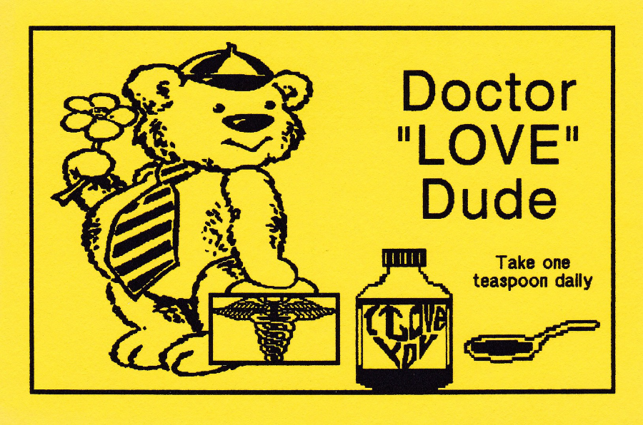
DOCTOR “LOVE” DUDE
Take one teaspoon daily
BOB’S COMPUTER GENERATED POSTCARD –
PRINTINGOF 50 CARDS
TEDDY SERIES
Card Design
No. TB – 01
BALTIMORE, USA
We are now of course, in the 21st Century, used to excellent computer generated images, almost lifelike in their detail. But, this was not always the case. Early computer generated postcards were far, far more simple in what they depicted, and in the very early days were constructed of simple black images with clearly computer generated text.
This example here is an excellent sample of an early computer generated postcard. Privately produced on a matt, single colour card, rarely white, often yellow, but because of the simplicity of the design they used colour card to make them look a little better. Looking at these now they look almost childlike and cheap, but, remember that at the time this was issued it was a ground breaking new trend, and this card would have been considered at the forefront of new computer postcard production.
The early home computers placed postcard design into the hands of anyone (well, anyone who could actually use them then) and there are a number of postcards which follow the format of the card depicted here.
These deserve a place in the story of modern postcard production and should be kept for that reason alone, if not any other.
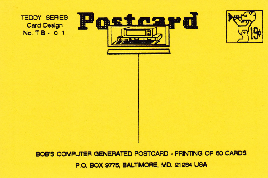
REVERSE SIDE OF ABOVE POSTCARD

02/10/2016
POSTAL STATIONERY CARD
QUEEN ELIZABETH 2 ½ d (Red)
We arrived in Turkey at 21:00hrs last night (19:00hrs UK time) and I am pleased to say that the wifi was all sorted out lunch time today – so here I am sitting out under a wooden veranda on a gloriously sunny and hot day overlooking some amazing scenery.
Anyway, less of that, and more about today’s posting. By now some of you will have realised that I like the simple looking postal stationery cards which have pre-printed stamps on them and which were sold as items upon which you wrote the address on the stamped side, and your message on the, normally, blank reverse side. These postcards could be bought in packs where they came with a paper seal around them holding together the cards. As you can see here I have one of these seals around a single 2 ½ d Queen Elizabeth card. The seal states that there were 11 postcards sold (seems an odd kind of number but I assume there was a reason for there being eleven, possibly it evened out the cost -I am not good with what is called ‘Old Money’, or maths for that matter, but I make that 27 ½ d… but the price shown is 2s 8d – 2 shillings and 8 pence, a shilling was 12 pence so that was 24 plus the 8d = 32d. Which indicates to me that you were paying 4 ½ d for the card used).
The actual QEII 2 ½ d postal card is quite common, but the wrapper seals are less so. All I need to do now is buy 10 odd cards and I will have a complete package.
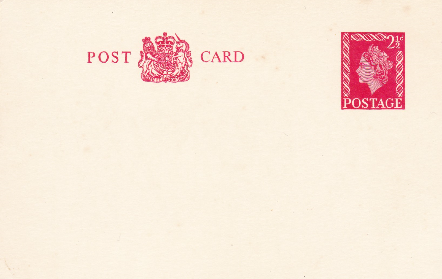
POSTAL STATIONERY CARD
QUEEN ELIZABETH 2 ½ d (Red)
Here you have the card with the wrapper seal removed. The card was first issued in 1957 and much common usage and as stated is not hard to obtain. In fact, the card with the wrapper seal, as shown complete above, only cost me £3 altogether. It was a recent buy at last month’s ‘Stampex’ show in London.
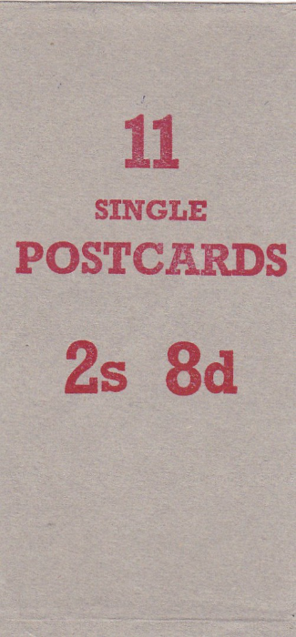
CLOSE UP OF THE WRAPPER SEAL
FRONT – WITH QUANTITY AND COST PRICE-
2s 8d
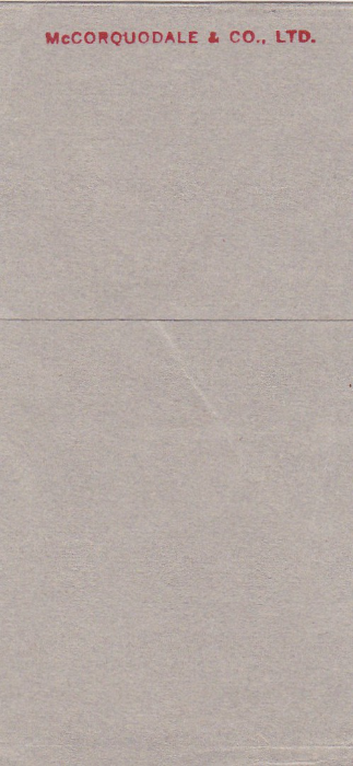
CLOSE UP OF REVERSE SIDE OF WRAPPER SEAL
TEXT READS
“McCORQUODALE & CO., LTD”