29/08/2016
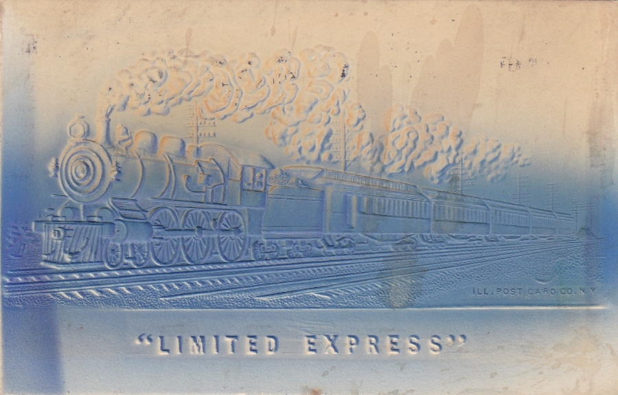
LIMITED EXPRESS
Embossed postcard published by
“ILL. POST CARD CO. N.Y”
This embossed (raised relief) postcard has a smashing embossed American steam train on it which is really well presented in this format. Even the letters of ‘LIMITED EXPRESS’ have been embossed.
This particular copy was posted to England from America in 1903 – see reverse side below.

REVERSE SIDE OF ABOVE POSTCARD
This was posted from New York (from where the postcard was published) on February 10th, 1903. Two 1 cent stamps were required to cover international postage. Because the train image is embossed you can see the design from this side as well, although now the image is concave instead of convex (i.e. pushed out).
29/08/2016
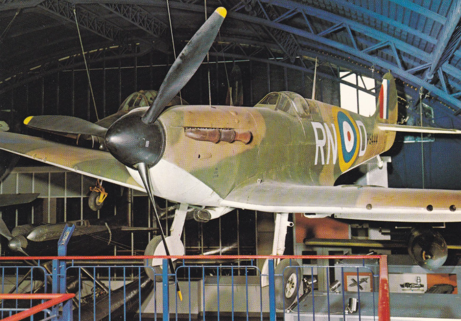
SUPERMARINE SPITFIRE
SCIENCE MUSEUM
Ref: Card 624
“This Supermarine Spitfire 1A (P9444) flew with No. 72 Squadron, R.A.F., in July 1940”
(Text from reverse side of postcard)
Three weekends ago Jo and I went up to London to have a walk around Hyde Park and also for me to re-visit the ‘Science Museum’. I first visited here back in the 1970’s, and this postcard here I bought on a visit in the early 1980’s (or possibly late 1970’s). The aviation hall has always been my favourite display area and the war planes are my favourite. This spitfire has always been on display although it no longer hangs in the same place as shown on this postcard.
Many years after my first visit I bought a collection of signed postcards which included a Spitfire card signed by Air Vice Marshall R. Deacon-Elliott C.B, D.F.C. Through my research into the signatories I discovered that ELLIOTT actually flew the spitfire depicted here. He blacked out in it and only came round just in time to crash land it. The rebuilt Spitfire is now here, hanging from the ceiling of the Science Museum. I love how my hobby combines images with my interest in military history and how research connects items in my collection.
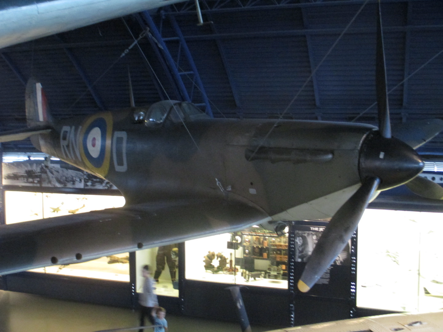
PHOTOGRAPH
SCIENCE MUSEUM
The Spitfire is actually quite hard to photograph because the hall itself is quite dark

AIR VICE MARSHALL R. DEACON-ELLIOTT C.B, D.F.C.
Autograph
On
FAGA ‘Spitfire’ postcard
Called up at the outbreak of war Elliott was commissioned in December 1939 and was posted to No. 72 Squadron, flying spitfires. Taking part in the Battle of Britain and had to ‘bale out’ over Kent on one occasion and on another he blacked out when his oxygen supply failed, fortunately, he came round as the aircraft reached 1000 feet and he was just able to recover and land the aircraft, although it needed rebuilding (and this is the spitfire on display in the Science Museum today).
Citation for the award of the Distinguished Flying Cross
“Acting Flight Lieutenant Robert Deacon ELLIOTT (76311), Royal Air Force Volunteer Reserve, No 72 Squadron”
This officer has been engaged on operational flying since December 1939. He fought in the Battle of Britain during which he destroyed 4 enemy aircraft. In addition to participating in many night patrols, Flight Lieutenant Elliott has been largely responsible for the training of new members of his squadron. Throughout, he has shown exceptional skill and courage”
29/08/2016
NATIONAL MARITIME MUSEUM
LORD NELSON related POSTCARDS
So, yesterday Jo and I returned again to London to try a walk we have not been on before, The Thames Path, between Tower Bridge and Greenwich. It’s around 6 miles and with a stop to have a drink in a nice pub and frequent short stops to take photographs and see the statues, anchors and cannon’s placed along this walk and a stop at the ‘Surrey Docks Farm’, we made in just over two and half hours.
When you reach Greenwich one of the many places to visit is the ‘National Maritime Museum’, which is one of the many free museums in London.
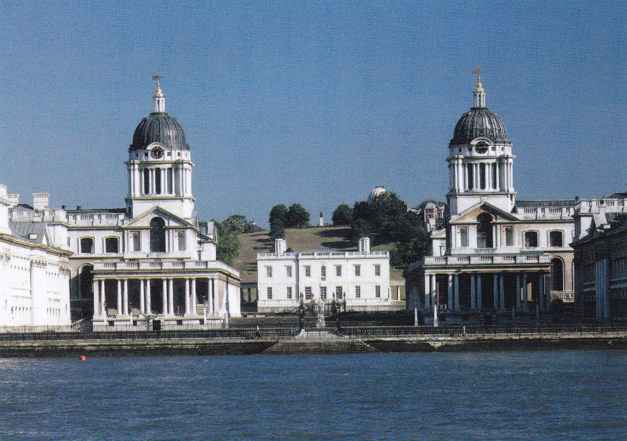
POSTCARD
Royal Naval College, Greenwich showing The Queen’s House
The actual National Maritime Museum is to the right of the area depicted on this image. But I could not resist this postcard because, sad as this may be, this area features predominately in the closing battle scenes of the Marvel superhero film: ‘Thor: the Dark World’ (and by some amazing coincidence this is the Bank Holiday film showing on BBC 1 tonight!).

NATIONAL MARITIME MUSEUM
‘THE BATTLE OF TRAFALGAR, 21ST OCTOBER 1805
Painted by
Joseph Mallord William Turner (1822 – 1824)
So, Nelson. There is an entire hall dedicated to Lord Nelson and the Royal Navy during his time. But downstairs, in a room all of its own, is hung this massive painting. If you are not prepared for its size, then it can be a bit of shock as this is huge (2615mm x 3685mm - that’s 8 ½ ft by 12ft!!).
Now I will admit that I am not a massive Turner fan, I don’t dislike his work it’s just that he is not one of my favourites, but this painting is an exception, and it is by far my favourite Turner piece.
I have since discovered that this was a controversial painting as it was considered that it did not portray an historic image of the battle. It seems that Turner combined within the painting several different elements and incidents that occurred over different times in the battle.

NATIONAL MARITIME MUSEUM
‘The Nelson Touch’: Restoring HMS Victory, 1805-1925
By
William Lionel Wyllie, 1925
I like this painting as it shows the work that was done to restore the glory of the HMS Victory and also because it shows the navy’s connection with the past and the future as in the background on the left you can see what was then a modern metal grey battleship. A cracking painting and one with a strong Nelson attachment.
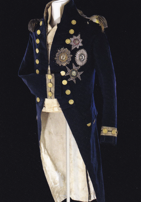
NATIONAL MARITIME MUSEUM
“Vice-admiral’s undress coat worn by Nelson (758 – 1805) at the Battle of Trafalgar. There is a bullet hole on the left shoulder, close to the epaulette”
(Text from reverse side of postcard)
This iconic piece of clothing, the actual undress coat worn by Nelson when he was shot during the Battle of Trafalgar, is on display towards the rear of the Nelson display hall. Sadly, I watched many people walk past without reading the small description card by this display. And, to be fair there is nothing immediately obvious to the eye to indicate that this coat is different to a number of other ones on display just prior to this one. But, those who walked past missed out as if you do read the description card you immediately look for the bullet hole, and it can be seen top right just under the epaulette, and, you do realise just who important this is. For any historian this single exhibit item is alone worth the trip to this museum.

Enlargement of area around left shoulder to show more clearly the bullet hole in the coat
29/08/2016
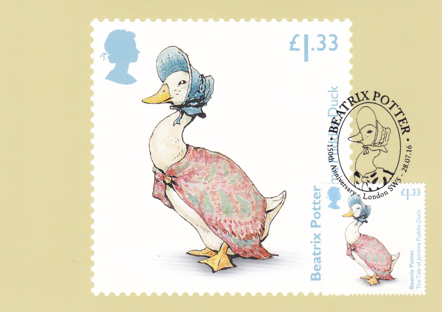
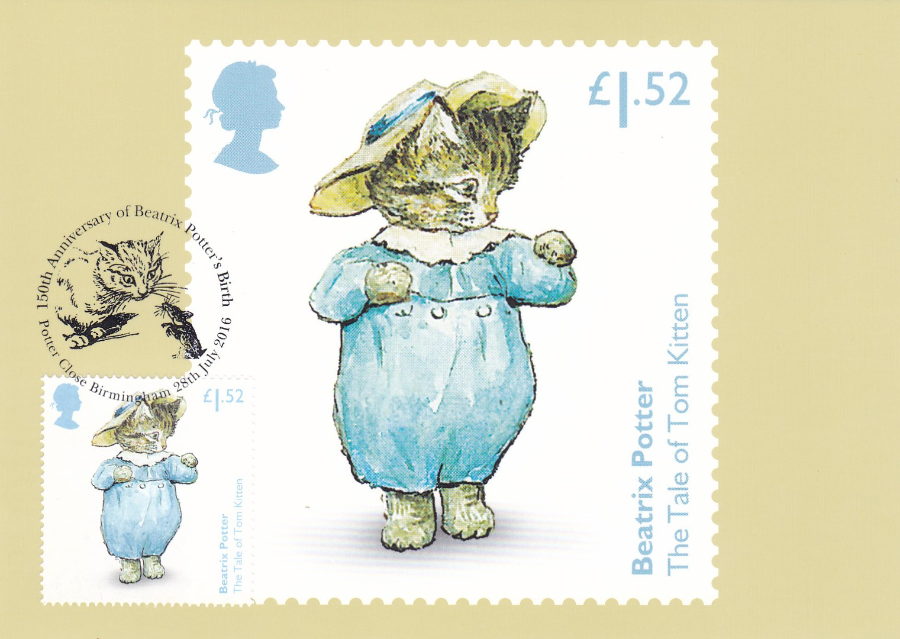
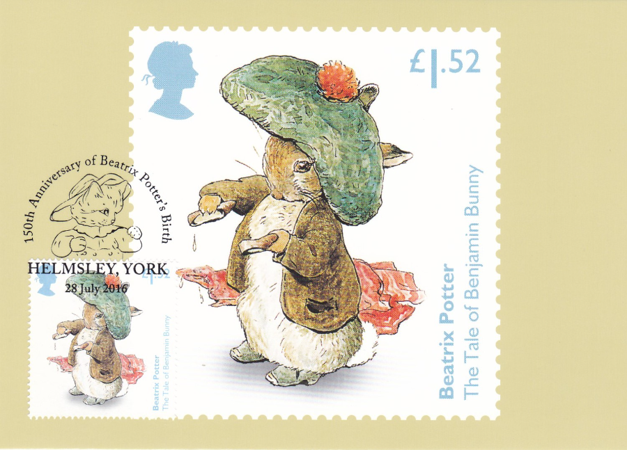
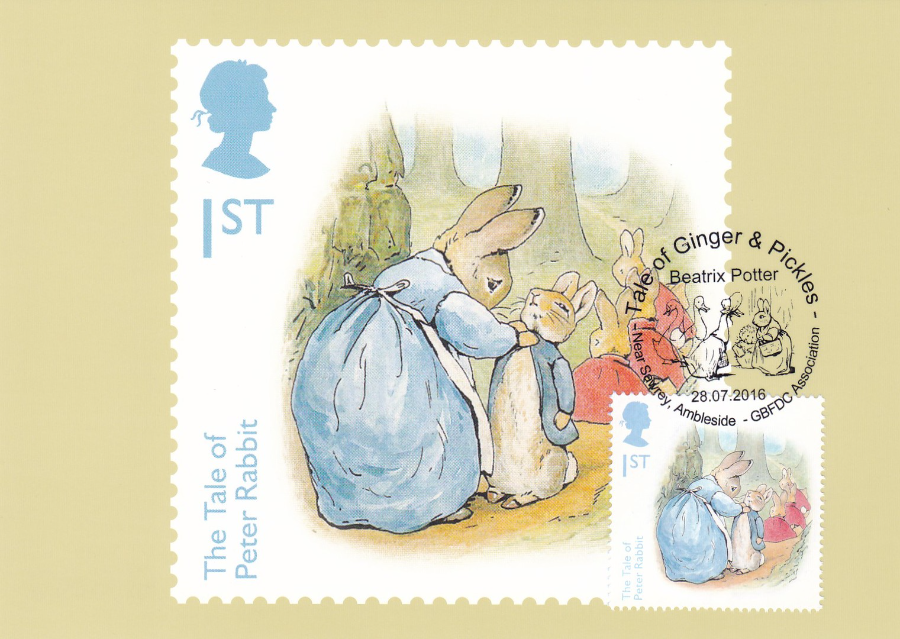
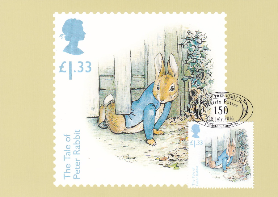
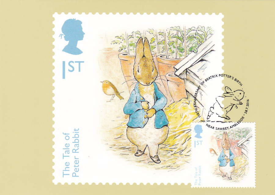
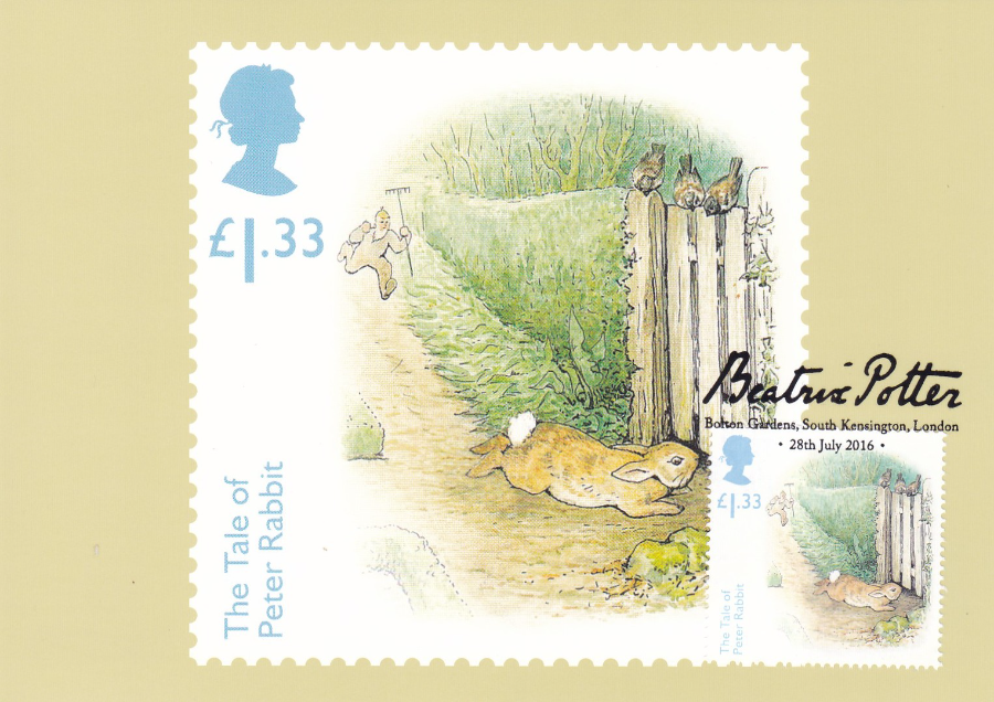
ROYAL MAIL
BEATRIX POTTER
PHQ / STAMP CARD SET
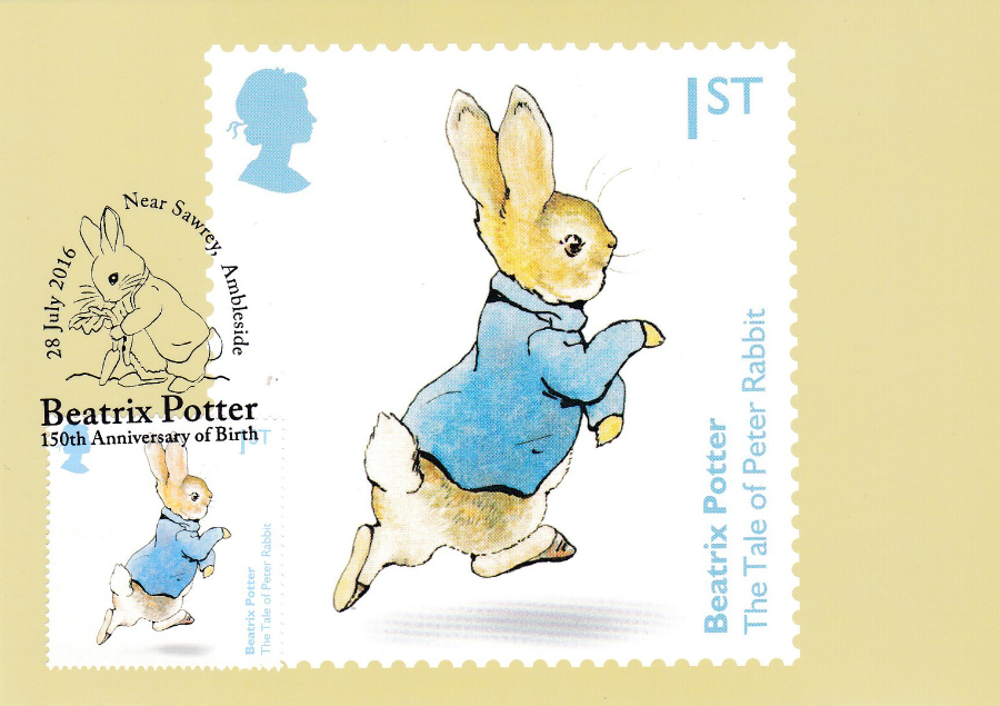
Stamps Issued 28th July 2016
This is a smashing set of stamps/cards issued to celebrate the 150th anniversary of the birth of Beatrix Potter. Six individual stamps each depict a single character from one of her many iconic books, whilst a special four stamp miniature stamp sheet depicts images from the most famous of her characters; Peter Rabbit. With the postcard PHQ set there is an individual card for each of the four stamps within the miniature stamp sheet and a further postcard depicting the entire sheet (I have my cards used with the appropriate depicted stamp or sheet attached – as mentioned before, sometimes the sheet is small enough to fit on a single card and this is the case here)
BEATRIX POTTER
THE TALE OF PETER RABBIT
PHQ 418 (1) 7.16
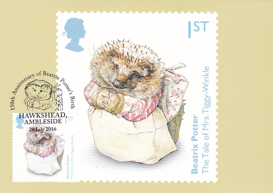
BEATRIX POTTER
THE TALE OF MRS. TIGGY-WINKLE
PHQ 418 (2) 7.16
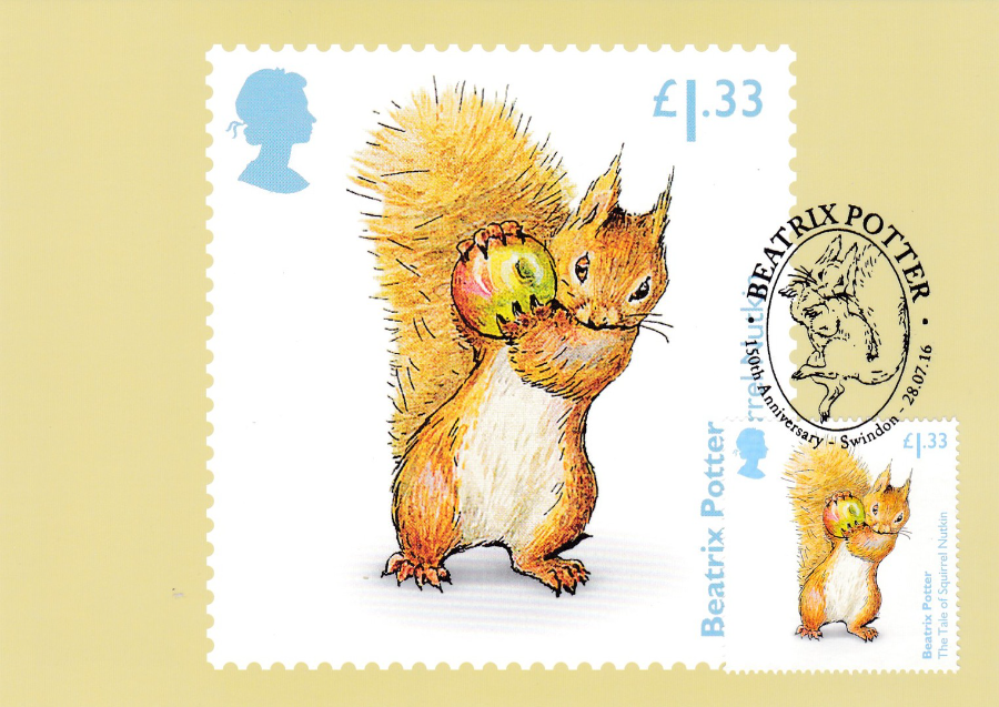
BEATRIX POTTER
THE TALE OF SQUIRREL NUTKIN
PHQ 418 (3) 7.16
BEATRIX POTTER
THE TALE OF JEMIMA PUDDLE-DUCK
PHQ 418 (4) 7.16
BEATRIX POTTER
THE TALE OF TOM KITTEN
PHQ 418 (5) 7.16
BEATRIX POTTER
THE TALE OF BENJAMIN BUNNY
PHQ 418 (6) 7.16
BEATRIX POTTER
THE TALE OF PETER RABBIT
MRS. RABBIT, PETER, FLOPSY, MOPSY AND COTTON-TAIL
Miniature Stamp Sheet stamp
PHQ 418 (7) 7.16
BEATRIX POTTER
THE TALE OF PETER RABBIT
PETER SQUEEZES UNDER MR. MCGEGOR’S GARDEN GATE
Miniature Stamp Sheet stamp
PHQ 418 (8) 7.16
BEATRIX POTTER
THE TALE OF PETER RABBIT
PETER LOOKS FOR SOME PARSLEY
Miniature Stamp Sheet stamp
PHQ 418 (9) 7.16
BEATRIX POTTER
THE TALE OF PETER RABBIT
PETER RUNS AWAY FROM MR. MCGREGOR
Miniature Stamp Sheet stamp
PHQ 418 (10) 7.16

BEATRIX POTTER
THE TALE OF PETER RABBIT
MINIATURE SHEET
PHQ 418 (7) 7.16
As mentioned above this has a complete miniature sheet attached to the front of the postcard.

27/08/2016
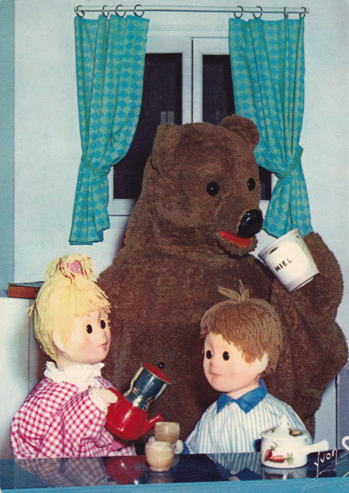
BONNE NUIT LES PETITS
(Translates as “Good Night Small” or “Good Night Little”)
I have mentioned before that ‘Television’ themed postcards are my favourite, and that TV is my main collected topic. After years of collecting I have built up a more than reasonable collection (around 16,000 TV related postcards), but, as with any theme, after a while any collector naturally looks outwards. With TV this means looking at foreign programmes and their related postcards.
In my collection I already had a couple of ‘Bonne Nuit Les Petits’ related postcards and through research knew about this French children’s puppet show. Related postcards appear to be valued anywhere between £2 and £5 each, more obviously, in France where there are people who actually remember the show (it was never shown in the UK). But, recently I came across an eBay auction for 10 different postcards depicting the characters from ‘Bonne Nuit Les Petits’. Six of the postcards were in good condition, whilst the remaining four were in less good condition, with one of those being quite badly bent. The bid had a starting price of 99p but clearly I thought I needed to put a higher bid price down, which I did. Imagine my surprise when I actually got all 10 for just 99p, I was the only bidder (but I do not know why, maybe my timing was very good and the sellers very bad or maybe the description just was not good enough to reach the other collectors). What ever happened, I ended up here with a real bargain.
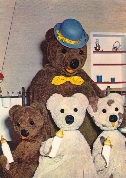
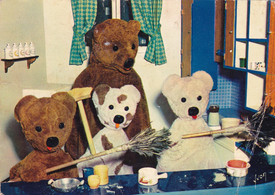
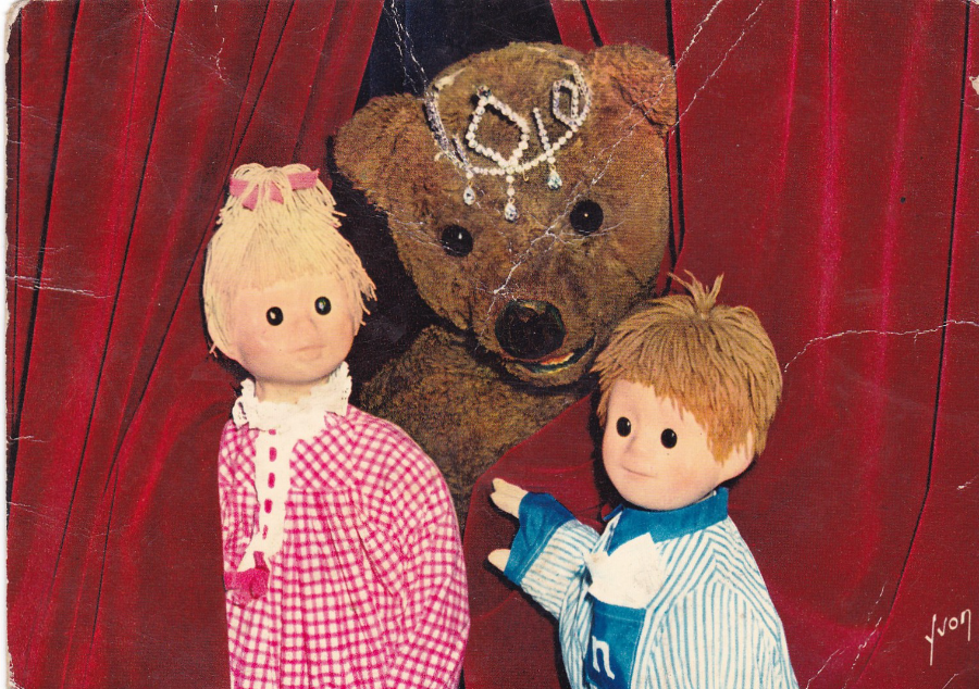
“BONNE NUIT LES PETITS”
Nounours Nicolas et Pimprenelle
‘Nounours raconte une histoire’
“Teddy Bear tells a story”
Published by
Editions d’art YVON
Ref: No 1
“BONNE NUIT LES PETITS”
Nounours Nicolas et Pimprenelle
‘Nounours est gourmand !...’
“Teddy Bear is greedy !...”
Published by
Editions d’art YVON
Ref: No 8
This television series was about a Big Bear (a Teddy Bear) that visits two children (played by puppets in the series). The Bear visits the children every night before bedtime and asks them about their day and at the end tells them a story before returning to his cloud (yes, his cloud… but then this was the 1960’s). As the Bear leaves a handful of golden sand falls like rain onto the now sleeping children.
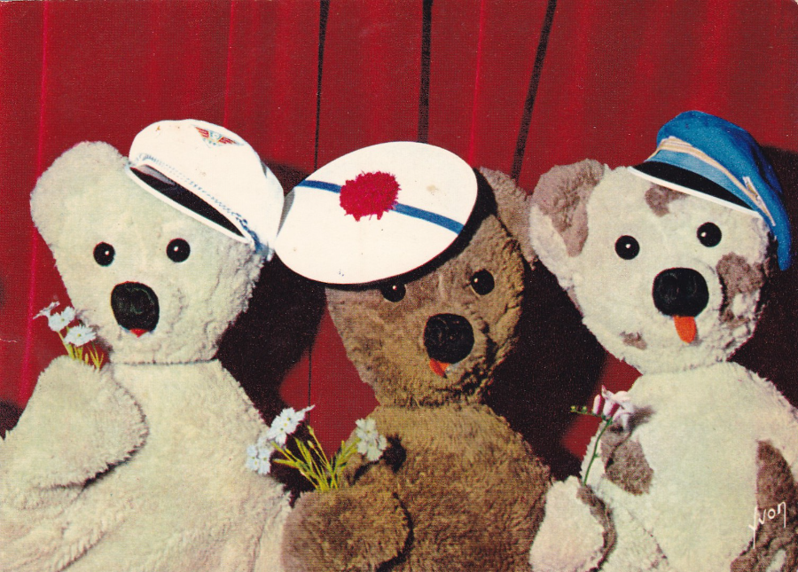
“BONNE NUIT LES PETITS”
Nounours et ses neveux
“Nounours et ses neveux”
“Bedtime Bear”
Published by
Editions d’art YVON
Ref: No 11
This French series was originally in black and white and was the creation of Claude Laydu and first appeared in December 1962 (first episode was shown on the 10th). It was shown on the RTF TV channel, and the channel’s logo appears on the reverse side of the postcards.
Between 1962 and 1973 a total of 568 episodes were made, all 5 minutes long. There were also five specials shown during this period as well.
The three smaller bears that appear on this postcard were the nephews of Big Bear and they were introduced individually during 1964 and were called Remi, Toto and Fanfan.
“BONNE NUIT LES PETITS”
Nounours et ses neveux
“Bonne Fete les Enfants”
“Happy Children’s Day”
Published by
Editions d’art YVON
Ref: No 14
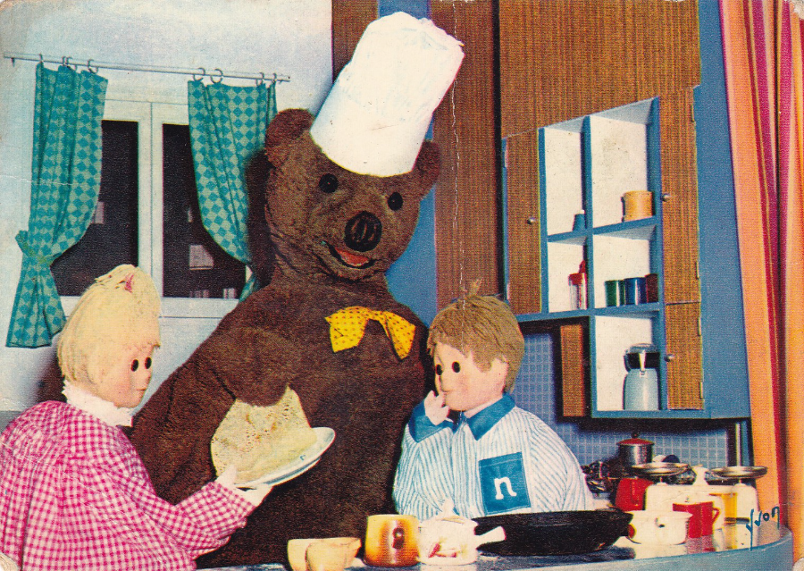
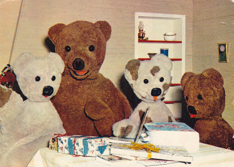
“BONNE NUIT LES PETITS”
Nounours et ses neveux
“Nounours fait des crepes”
“Teddy makes pancakes”
Published by
Editions d’art YVON
Ref: No 16
The two children in the series were called Louis and Mirabelle (in season one - although this changed with season two - and these images are from season two) and apparently the sand that sprinkled down like rain was thrown down by another character called the Sandman and this golden sand/dust made the children go to sleep.
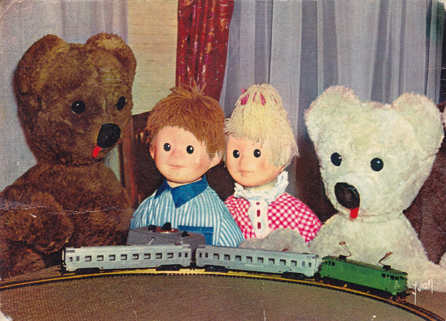
“BONNE NUIT LES PETITS”
Nounours et ses neveux
“On joue au train electrique”
“We’re playing the electric train”
Published by
Editions d’art YVON
Ref: No 17
“BONNE NUIT LES PETITS”
Nounours et ses neveux
“Nous aussi on fait le menage!”
“We also have the household”
{I wonder if this does not relate to ‘Housework’ rather than Household}
Published by
Editions d’art YVON
Ref: No 18
“BONNE NUIT LES PETITS”
Nounours et ses neveux
“Remi, Toto et Fanfan”
{as we know these are the names of the three smaller bears – nephews of the Big Bear}
Published by
Editions d’art YVON
Ref: No 19
“BONNE NUIT LES PETITS”
Nounours et ses neveux
“Le spectacle va commencer !”
“The show is going to start !”
Published by
Editions d’art YVON
Ref: No 20
This was the most damaged of the postcards I received, but it is not so bad that I do not want to keep it until I can obtain a better quality one. In the meantime, this works for me as an addition awaiting upgrading.
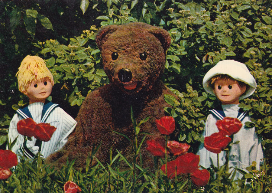
“BONNE NUIT LES PETITS”
“Nounours, Nicolas et Pimprenelle au jardin…”
“Teddy, Nicolas and Burnet in the Garden…”
Published by
Editions d’art YVON
Ref: E. K. B. 23
On this postcard the numbering system is different. I have come across this before as the same system of change appears on this companies ‘Magic Roundabout’ postcards (although of course it was not called ‘Magic Roundabout’ in France, where it originated). The children’s names changed in the second season (1963) and were now Nicolas and Burnet – all of the postcards shown here are from this period and on many you can see the letter ‘N’ on the boy’s pyjamas.
26/08/2016
ANASTASIA CATRIS
Illustrator & Writer
Anastasia is another of the artists that I met at the 2015 Memorabilia show at the NEC Birmingham. Fortunately, that year she had had printed a set of postcards under the series heading ‘Cirque Du Mort’, and, unlike quite a few of the artists she had these printed with full postcards backs. They are also extremely well designed and produced, both front and back.
AUTOGRAPH
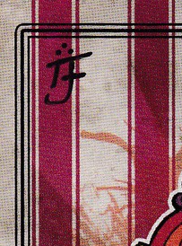
Anastasia also kindly signed each of the postcards on the front for me. She has a very small signature which blends into each of the designs and would be missed if you did not know it had been added.
The signature looks like this, which has been enlarged from the first postcard – see if you can find the signature on the other designs
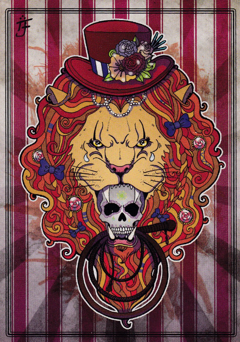
CIRQUE DU MORT
“REVENGE IS SWEET”
This Lion head design seems to be in the style that is indicative of Anastasia’s work in this series. The designs are all sort of ‘freaky’ and they fit nicely under the general series heading of ‘Cirque Du Mort’.
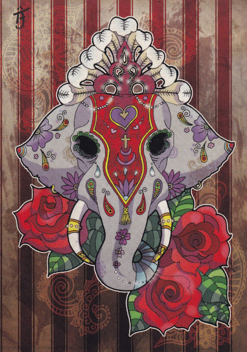
CIRQUE DU MORT
“NEVER FORGET”
I think this elephant as a very ‘India’ feel to its design but somehow it still seems to compliment the above Lion picture.
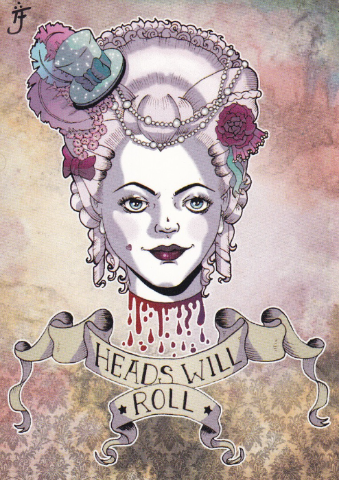
CIRQUE DU MORT
“HEADS WILL ROLL”
Gruesome, but still a great image. Without any information to the contrary this looks to me like a French aristocrat, one beheaded perhaps during the French Revolution.
CIRQUE DU MORT
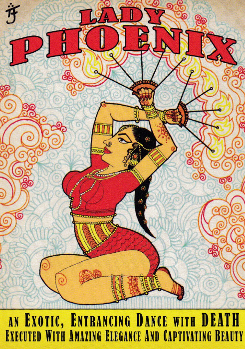
“LADY PHOENIX”
AN EXOTIC, ENTRANCING DANCE WITH DEATH EXECUTED WITH AMAZING ELEGANCE AND CAPTIVATING BEAUTY
This one looks like a poster design and again has an ‘India’ vibe to it, especially with the look of Lady Phoenix, but also with the swirl like background pattern.
CIRQUE DU MORT
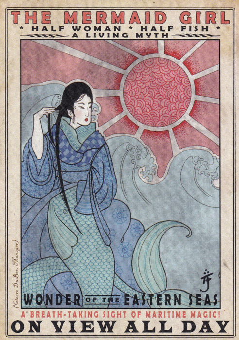
“THE MERMAID GIRL”
HALF WOMAN – HALF FISH
A LIVING MYTH
WONDER OF THE EASTERN SEAS
A BREATH-TAKING SIGHT OF MARITIME MAGIC
ON VIEW ALL DAY
Another poster styled design and mermaids are actually quite collected and they often feature on postcards. I actually know a couple of people who specialise in Mermaid postcards.
<< New image with text >>
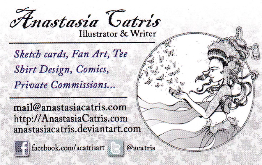
CALLING CARD
Here are Anastasia’s contact details via her advert business card.
Contact her if you are interested in any of these postcards as I am sure she would happily sell you a set, or any individual design you like.

26/08/2016
IELLA
London Based Illustrator & graphic designer
Iella’s designs have a fantasy, fable like atmosphere to them and I was pleased that again the postcards have full postcard backs. Unfortunately, the designs are not titled on the actual cards so I don’t know what these are individually called.
In all I bought three postcards from her stall at the Memorabilia show (NEC Birmingham – and again in 2015) and again I asked for them to be signed, which she kindly did on the front of each (the ‘iella’ black signatures are hand written on the cards and are not printed on)
.
.

CALLING CARD
BUISNESS CARD
Front – with Aardvark like animal drawing
REVERSE SIDE OF CARD
With full contact details
24/08/2016
DISNEYLAND
THE MAGIC KINGDOM
FRONTIERLAND
“PEACEFUL INDIAN VILLAGE”
Ref: DT-35941-C
“An Indian child and his dog eye frontier river vessels while the rest of the villagers go about their daily chores”
(Text from reverse side)
Only the one posting (but two postcards) tonight because, to be honest, it so hot I am just sitting here melting! It has been really hot all day down where I live and I don’t know about you but I struggle to do anything when it’s as hot as this, but I try and post at least one card a day whilst I am actually at home. As I love Disney related postcards these two won out.
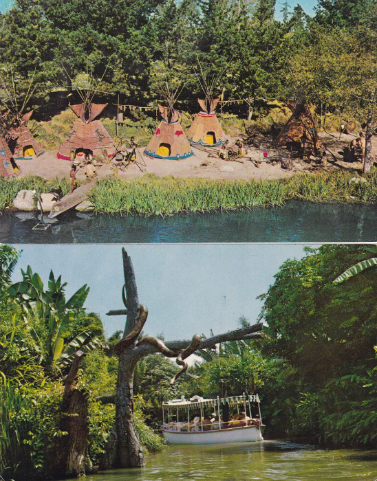
DISNEYLAND
THE MAGIC KINGDOM
ADVENTURELAND
“JUNGLE RIVER CRUISE – ADVENTURELAND”
Ref: B-3
“Adventure lurks at every bend on an explorer’s boat cruise which carries you away from civilization on an exciting trip down mysterious jungle rivers”
(Text from reverse side)
Although this image is from the Jungle Cruise in Disneyland, the same ride in Walt Disney World, Florida is one of my favourites. Here in this image you can see one of the cruise boats disappearing around a bend in the distance having passed under a large snake on a dead tree branch (in Florida the snake is lower down, nearer the water and beside the boat as it passes – this can also be found on postcard)
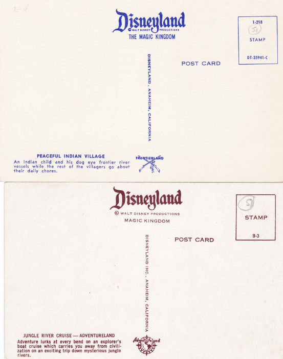
REVERSE SIDES OF ABOVE TWO POSTCARDS
TOP
BLUE PRINTING
BOTTOM
BROWN PRINTING

23/08/2016
BIRTHDAY REMEMBRANCE
By
Catherine Klein
Published by
THE REGENT PUBLISHING Co LTD, LONDON N.W.1
Printed in Germany
Ref: No 600
Catherine Klein is extremely well known as an artist in postcard circles, and her flower postcards are distinctive and well collected. This image here is an unusual non-flower design which uses fruit instead of her normal flowers.
Klein was born in Berlin on 4th November 1861 and attended art school here later, where she learnt and perfected her flower paintings, which were in ‘Gouche’ (opaque watercolour).
Records seen to indicate that her best work was produced between 1890 and 1900. Because her flower paintings were often appearing in print her flower designs became the best known, and one of the major items on which her flower paintings appeared were postcards. She also became known as the Rose Lady because so many of her paintings used this flower.
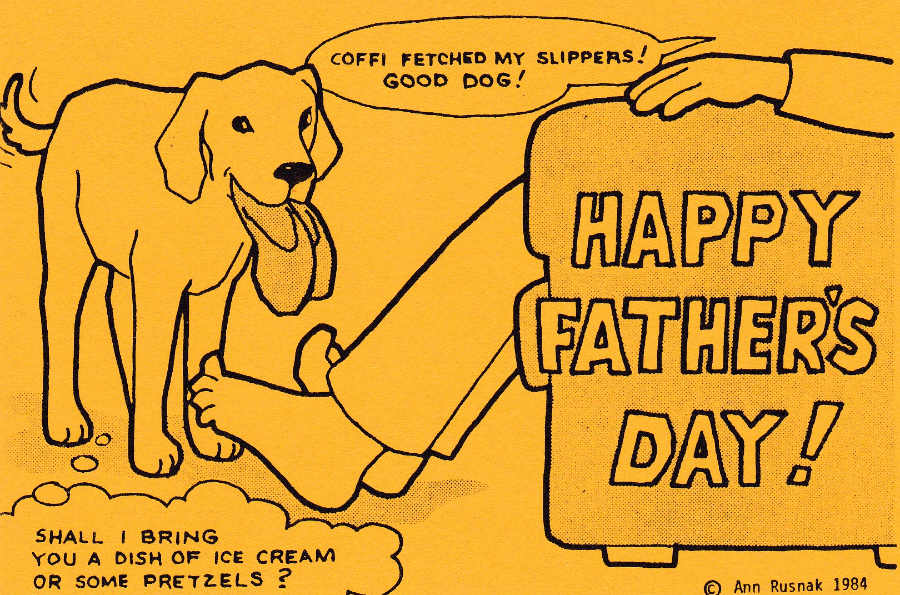
23/08/2016
HAPPY FATHER’S DAY
“COFFI FETCHED MY SLIPPERS! GOOD DOG”
“SHALL I BRING YOU A DISH OF ICE CREAM OR SOME PRETZELS?”
By
Ann Rusnak
Issued 1984
A simple and very typical Ann Rusnak design (see pervious postings) which was issued in 1984. This is a postcard actually issued by Ann, whose postcard work is now very collectible as many of her postcards were issued in very low numbers.

22/08/2016
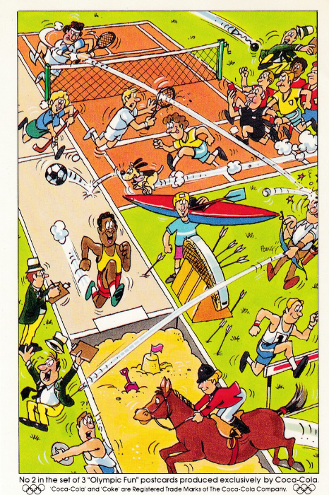
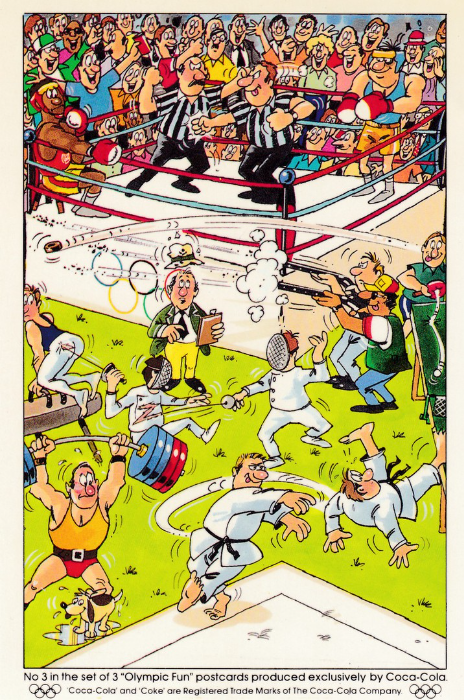
COCA-COLA
OLYMPICS POSTCARD SET
Congratulations to Team GB on their medal haul at the Rio Olympic Games:
A Total of 67 Medals.
The First ‘Nation’ Team to Increase their medal tally after hosting the previous Games.
POSTCARD
For the 1996 Atlanta Olympic Games the ‘Coca-Cola’ company ran a promotion where free postcard sets were given away with certain Coca-Cola products. Each set had three postcards with each individual set of three designed and drawn by a specific artist (although the details of the artists were not given on the postcards). The individual postcards in each set were numbered 1 to 3, but the sets themselves were not numbered or always titled. If I am right I believe there were six sets of three, although personally I only have four of them.
To celebrate the end of the Rio Games, and the success of Team GB this comic set of three seemed the most appropriate to post – the cards are number 1 at the top, 2 in the middle and 3 at the bottom.
TEAM GB
GOLD
Adam peaty – 100m breaststroke
Jack Laugher & Chris Mears – 3m synchronised springboard
Paul Bennett, Scott Durant, Matt Gotrel, Matt Langridge, Tom Ransley, Pete Reed, William Satch, Andrew Triggs Hodge & Phelan Hill – Men’s eight rowing
Helen Glover & Heather Stanning – Women’s coxless pair rowing
Alex Gregory, Constantine Louloudis, George Nash & Mohamed Sbihi – Men’s coxless four rowing
Steven Burke, Ed Clancy, Owain Doull & Bradley Wiggins – Men’s team pursuit cycling
Katie Archibald, Elinor Barker, Joanna Rowsell & Laura Trott – Women’s team pursuit cycling
Laura Trott – Women’s omnium
Philip Hindes, Jason Kenny & Callum Skinner – Men’s team sprint cycling
Jason Kenny – Men’s sprint cycling
Jason Kenny – Men’s keirin cycling
Mo Farah – Men’s 5,000m
Mo Farah – Men’s 10,000m
Max Whitlock – Gymnastics men’s floor
Max Whitlock – Gymnastics pommel horse
Justin Rose – Golf
Andy Murray – Men’s singles tennis
Charlotte Dujardin – Equestrian individual dressage
Nick Skelton – Equestrian individual jumping
Alistair Brownlee – Triathlon
Giles Scott – Sailing Finn (dinghy)
Joe Clarke – Canoe slalom K-1
Saskia Clark & Hannah Mills – Sailing 470 (dinghy)
Liam Heath – Kayak single 200m
Jade Jones – Taekwondo 57kg
The Women’s Hockey Team – Women’s Hockey
Nicola Adams – Women’s flyweight boxing
TEAM GB
SILVER
Jazz Carlin – Women’s 400m freestyle
Jazz Carlin – Women’s 800m freestyle
Siobhan-Marie O’Connor – Women’s 200m individual medley
Men’s 4 x 200m freestyle relay team
Katherine Grainger & Victoria Thornley – Women’s double sculls rowing
David Florence & Richard Hounslow – Canoe slalom double (C2)
Rugby sevens team
Bryony Page – Trampoline gymnastics
Equestrian dressage team
Women’s eight rowing team
Rebecca James – Women’s keirin
Rebecca James – Women’s sprint
Men’s 4 x 100m medley relay
Jessica Ennis-Hill – Women’s heptathlon
Nick Dempsey – Windsurfing
Louis Smith – Men’s pommel horse
Callum Skinner – Men’s sprint cycling
Mark Cavendish – Men’s omnium
Jack Laugher – Men’s 3m springboard
Liam Heath & Jon Schofield – Men’s kayak double 200m
Jonathan Brownlee – Triathlon
Lutalo Muhammad – Taekwondo
Joe Joyce – Men’s super-heavyweight
TEAM GB
BRONZE
Edward Ling – Trap shooting
Tom Daley & Dan Goodfellow - Men’s synchronised 10m platform
Chris Froome – Men’s individual time trial cycling
Steven Scott – Double trap shooting
Sally Conway – Women’s judo
Max Whitlock – Men’s individual all-round gymnastics
Greg Rutherford – Men’s long jump
Sophie Hitchon – Women’s hammer throw
Amy Tinkler – Gymnastics women’s floor
Nile Wilson – Men’s horizontal bar
Katy Marchant – Women’s sprint cycling
Joshua Buatsi – Men’s light heavy (81kg) boxing
Marcus Ellis & Chris Langridge – Badminton men’s doubles
Women’s 4 x 100m relay team
Vicky Holland – Women’s triathlon
Bianca Walkden – Taekwondo women’s (plus)67kg
Women’s 4 x 400m relay team
And there you have the roll of honour – congratulations to each and every one of them and, as importantly, the team and individual coaches and trainers who helped these athletes to achieve these medals, they should not be forgotten.

21/08/2016
PETER PAN’S PLAYGROUND
SOUTHEND-ON-SEA
Published by
Ernest Joyce & Co., Ltd., Norwich
Printed by
Plastichrome
Ref: EJE 1715 (Plastichrome Ref: P42897)
I have posted quite a few Peter Pan’s Playground postcards, but then it was a place I used to enjoy as a child and I have fond memories of. The section depicted here has been completely re-vamped so what you see here is all now gone. It is these historic views showing scenes long gone from my past which makes postcard collecting so interesting to me.
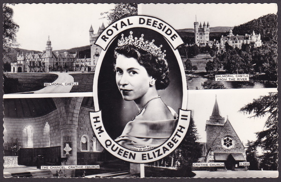
ROYAL DEESIDE
H.M. QUEEN ELIZABETH II
Printed by
VALENTINE’S
This nice black and white, deckle edged, multi-view postcard is a really nice royalty themed item and has been nicely crafted by a well-known postcard publisher. The four outer images depict ‘Balmoral Castle’ (top left), ‘Balmoral Castle from the river’ (top right), ‘The Chancel, Crathie Church’ (bottom left) and lastly ‘Crathie Church’ (bottom right). I have also always liked the image of the Queen which has been used here, it appears on a number of postcards and is quite well known.

REVERSE SIDE OF ABOVE POSTCARD
Someone has taken this older postcard and applied a 1992 Royal Mail “40th Anniversary: The Accession: Queen Elizabeth II” 24p stamp which depicts the Queen. The stamp has been cancelled with a very appropriate (considering the images on the front) ‘Balmoral Castle, Aberdeenshire” special handstamp dated 6th February 1992 (first day of issue date for the stamp). All in all, a nice combination and one which increases the value of the postcard.
21/08/2016
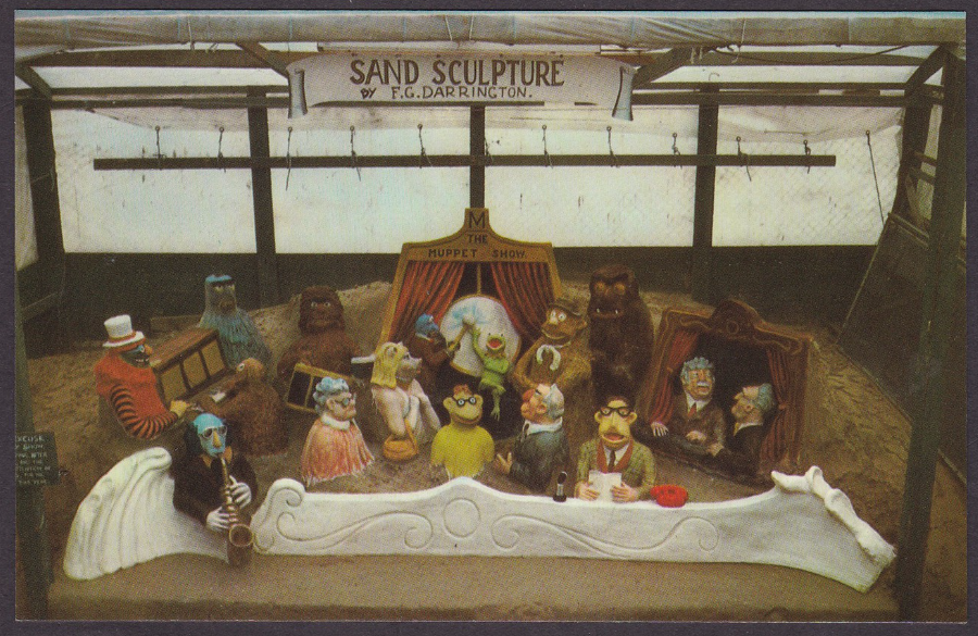
MUPPETS
September 1977
Published by
Jarrold & Sons Ltd, Norwich
Ref: KDWS 1
“These models are made entirely of Weymouth sand by F. G. Darrington”
As a collector of television related postcards this one was a must have when I saw it. Considering I have been collecting TV related postcards for 40 odd years this is still the only copy of this postcard I have seen. It is also a very unusual image and would be interesting to any collector of Muppets memorabilia.
I suppose they may even be people out there who collect sand statues/models, who knows?
This postcard here does bring up the dilemma of value, what is this card worth? In the UK a mint copy would, perhaps be priced anywhere between 50p to £2, in America I expect it would cost nearer £5 to £6. But, this copy here has been signed on the revere side by the sand artist himself, F.G. Darrington. So, how much now? Is it worth £10? I think it comes down to this for me, if I had not bought it this one time I saw it then chances are I may never see another copy, signed or unsigned. So I paid the £10 and now own it.
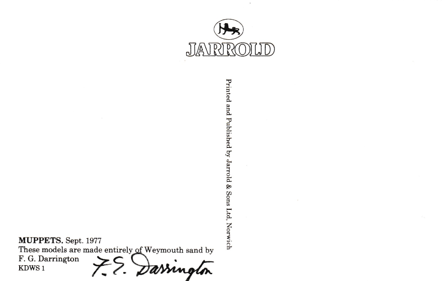
REVERSE SIDE OF ABOVE POSTCARD
Here you can see the sand artists signature along the bottom on the left side. The artist was, as mentioned on both the front and reverse side of the postcard, F.G. Darrington.
Fred Darrington (28/08/1910 – 16/08/2002) had a passion for sand sculptures which started after WW1, sometime in the early 1920’s. Fred Darrington made his sculptures at Weymouth on the beach, he started before the quay extensions to Weymouth Harbour had been built and then the level of the beach was lower. Fred would jump down onto the sand when the tide had moved out, and in those early days he would draw images in the sand rather than building statues. Admirers would throw money down to him. Apparently once the tide had moved back in people would still throw down coins and then watch as Fred dived in to collect them! Fred was not alone with these sand drawings so he branched out on his own into sand sculpting. His skills improved over time until he became one of the world’s acknowledged masters of sand sculpting. He was entirely self-taught and worked on sand sculptures from the 1920’s right up to his retirement in 1996 (he was 86yrs old and only retired because of a stroke).
.
21/08/2016
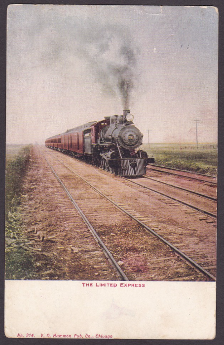
THE LIMITED EXPRESS
Published by
V.O. HAMMON PUBLISHING Co., CHICAGO
Another postcard obtained whilst I was at an American antiques fair. This one cost me $2 but it is a nice photograph of an American steam train of the type I have seen so often in the American western films and TV shows.
In America a ‘Limited Express’ is a name which was used for, typically overnight, trains that made very few stops. As this postcard was produced by a company based in Chicago it is feasible this train depicted was from that area. And, this particular copy was actually posted from Chicago as well, in 1908.
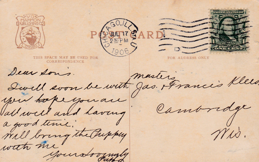
REVERSE SIDE OF ABOVE POSTCARD
The ‘Series 1902 UNITED STATES OF AMERICA – 1c FRANKLIN’ stamp has been cancelled with a ‘CHICAGO, ILL. STA. U’ wavy line machine cancellation dated 17th July 1908. The Chicago bit is obvious and the ‘ILL’ bit stands for ‘Illinois’, but I am not sure if the ‘STA’ bit stands for STATE or STATION (there is a Union Station in Chicago and it is possible that this is what the ‘STA. U’ stands for – does anyone know?)
21/08/2016
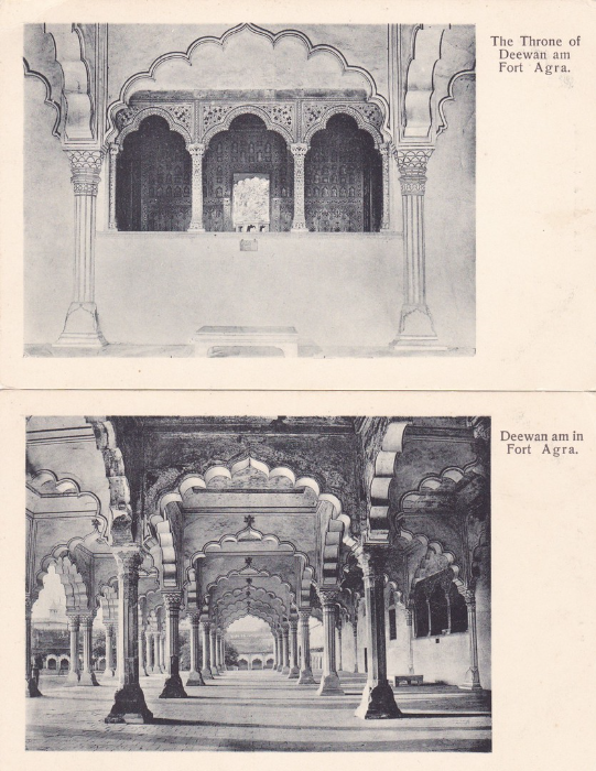
FORT AGRA
THE THRONE OF DEEWAN AM
FORT AGRA
Published by
H. A. Mirza & Sons, Delhi
The Throne within the hall described below (see next postcard). This postcard and the one depicted below are clearly from the same series although they have no reference numbers and the series has no obvious name. The two postcards do like nice together.
For those who like a literary connection the Fort Agra plays a key role in the Sherlock Holmes story titled ‘The Sign of the Four’, by Sir Arthur Conan Doyle. I am a very big Sherlock Holmes fan and have read all the books (and a large number of the new ones produced since the copyright on the character came to an end).
DEEWAN AM IN FORT AGRA
Published by
H. A. Mirza & Sons, Delhi
The red fort called Agra Fort is now a UNESCO world heritage site and a major tourist attraction. It is the former imperial residence of the Mughal Dynasty and is only 2.5 km northwest from that other famous Indian structure, the Taj Mahal. Although called a fort it is apparently more like a walled city.
The title of this postcard is DEEWAN AM IN FORT AGRA but it should probably be, more correctly, the Diwan-i-Am at Fort Agra. Diwan-i-Am means ‘Hall of Audience’ and this was where the Mughal emperor Shah Jahan (1628 – 1658) and his successors received the people and heard their grievances.
The Diwan-i-Am consists of a front hall which is open on three sides and backed by a set of rooms faced in red sandstone. The massive hall, 100ft x 60ft, is divided into a number of square bays, 27 in all, which are placed within a system of ornate columns which support the attractive arches which can be seen clearly in this postcard. The hall was ornamented with gilded and white shell lime plaster work, called ‘Chunam’, whilst its ceiling and the columns were painted with gold.
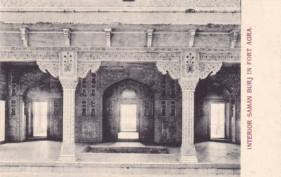
INTERIOR SAMAN BURJ IN FORT AGRA
Published by
H. A. Mirza & Sons, Delhi
This postcard, although by the same publisher, is clearly in a different format layout. This postcard depicts the interior, of what is called on the postcard, the SAMAN BURJ but, which is also better now known as the MUSAMMAN BURJ (It is also called the ‘SHAH-BURJ’). This is actually an octagonal tower which stands close to the Shah Jahan’s private hall in the fort.
It was built by Shah Jahan for his beloved wife, Mumtaz Mahal. It is a multi-storied marble tower inlaid with precious stones. It was built between 1631 and 1640, and it gives some very good views of the Taj Mahal. The Musamman Burj is constructed of delicate marble lattices with ornamental niches, from where the ladies of the court could gaze out from without being seen. The decoration of the walls is in something called ‘pietra dura’, which is pictorial mosaic work which uses precious stones (more typically used on table tops and other furniture and panels).