12/01/2017
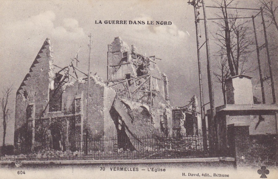
LA GUERRE DANS LE NORD
(The War in the North)
VERMELLES – L’EGLISE
(Vermelles – Church)
Ref: 70
Vermelles is another Pas-de-Calais region location, and again, as can be seen from this postcard image, was damaged by bombing during the first world war. Interestingly Vermelles is in the Bethune Arrondisement, and the postcard posted below is from Bethune.
Personally, I like these postcards as I believe the impart at least an idea of how damaging the war was on the individual villages and towns involved. They are also historic documents for the people who live in these villages and towns today. They give visual details of the damage caused to specific buildings and monuments and thus also indicate the levels of restoration that was required. For any historian this information could be essential to any understanding of the effect of the great war on their home location.
REVERSE SIDE OF ABOVE POSTCARD
I like the logo bottom left
12/01/2017
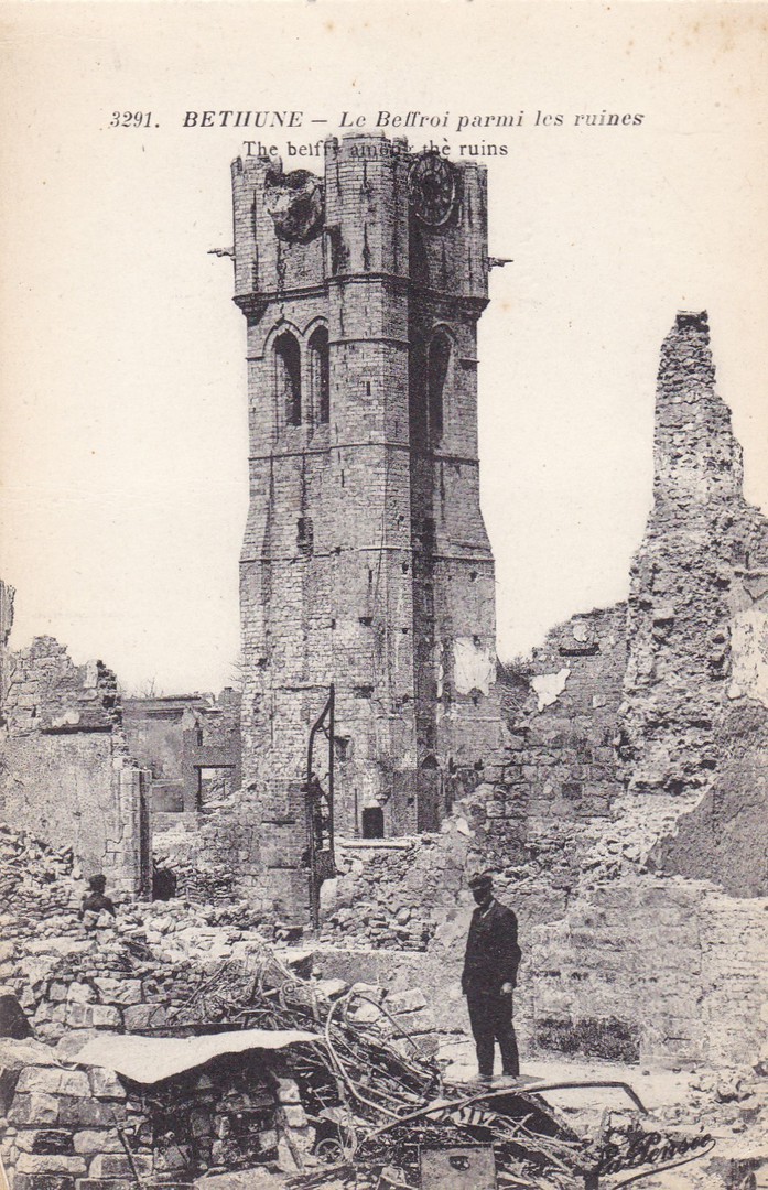
BETHUNE
LE BEFFROI PARMI LES RUINS
THE BELFRY AMONG THE RUINS
Ref: 3291
Bethune is in the Pas-de-Calais region of France and it was involved in the First World War. Here you can see a WWI postcard depicting the belfry after some quite severe bombing. Postcards of war damage like this were very popular and were produced in massive numbers, so many in fact that they are still quite easy to pick up and thus have very low catalogue value, this is despite the images having some historic interest.
NOTE
There was no webpage posting last night. This was because we had a family emergency and my wife and I needed to arrange sudden transport to France. And, France is where I now, unexpectedly, after some very fast airline bookings, find myself. This is probably why I have posted a French postcard. I am much further south than where the First World War played out but it is a part of France that I love.
10/01/2017
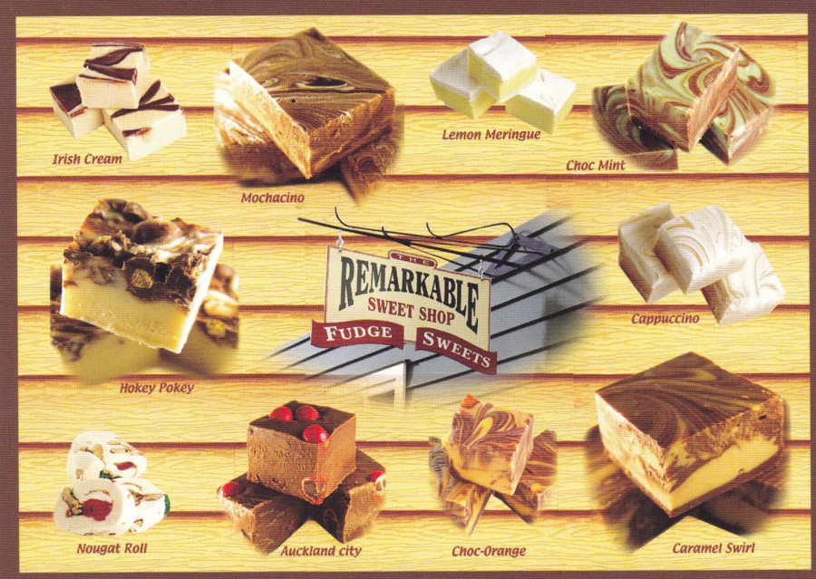
THE REMARKABLE SWEET SHOP
FUDGE – SWEETS
ARROWTOWN – QUEENSTOWN
NEW ZEALAND
I am diabetic, and I strongly suspect that one of the reasons for this is a lifetime love of fudge, which has not gone away despite my diabetic issues. This postcard from New Zealand shows you all the reasons why I love fudge so much.

10/01/2017
EURO DISNEY
ADVENTURELAND
ADVENTURE ISLE
One of the postcards issued as a promotional pre-opening illustration of how the Euro Disney (now of course called ‘Disneyland Paris Resort’) Adventureland area would look. As we have discussed before (see some previous postings of Euro Disney art cards) these were available before the park opened and for a few years after the opening. They were the very first Euro Disney themed postcards (as far as I have seen).
Having been here, I have to say that this area, with the pirate ship and Skull rock, is my favourite part of the theme park.
10/01/2017
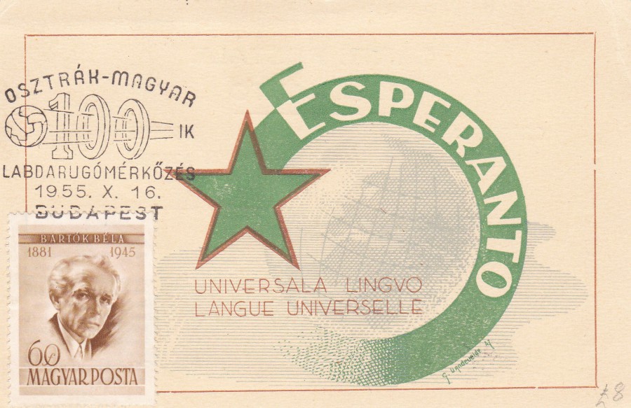
ESPERANTO
UNIVERSAL LANGUAGE
HUNGARY
1955
Esperanto was a language invented to be used as a universal language to replace all other languages so that people of all countries, nationalities and backgrounds could converse. Although a popular idea the actual language never took real hold. It has none the less become a collectible theme.
The handstamp used on this postcard celebrates 100 years of football between Austria and Hungary and is dated 16th October 1955. For a collector of stamps, postcards and handstamps this is a mixed bag of themes, with no obvious connection, but still a nice item though.

REVERSE SIDE OF ABOVE POSTCARD
10/01/2017
TOWARDS DOLLY
A CENTURY OF ANIMAL GENETICS IN EDINBURGH
“Towards Dolly: a century of animal genetics, free exhibition at the University of Edinburgh Main Library Exhibition Gallery, 31 July – 31 October 2015”
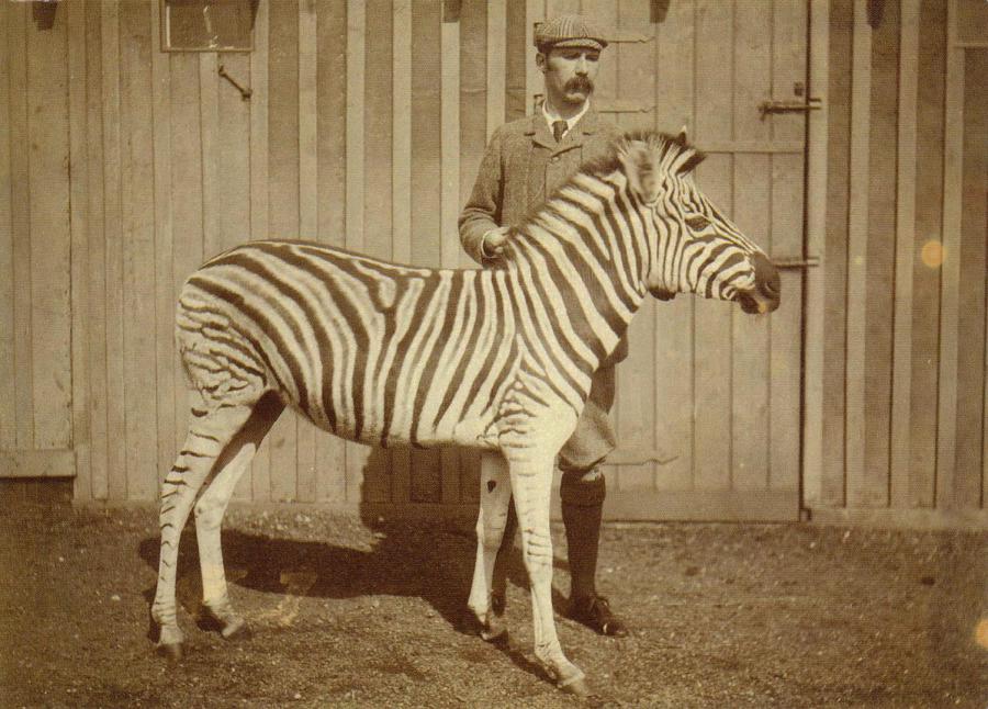
Photograph of James Cossar Ewart with a Burchell’s zebra, 1899
Published by
THE UNIVERSITY of EDNINBURGH
James Cossar Ewart FRS. FRSE (born 26 November 1851 – died 31 December 1933) studied medicine at the University of Edinburgh between 1871 and 1874, where he graduated MB ChB. After his graduation, he became an anatomy demonstrator and then held the position of Curator of the Zoological Museum at the University College, London. Later, in 1878 he returned to Scotland and progressed from the Aberdeen University back to the Edinburgh University in 1882, where he stayed in post until 1927.
Ewart is mainly remembered for his cross-breeding experiments with zebras (thus the photograph on this postcard). He created the cross-breed animals known as zebroid’s, zedonk’s, Zorse’s, zonkey’s and zebrule’s.
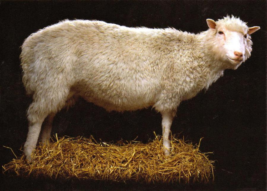
TOWARDS DOLLY
A CENTURY OF ANIMAL GENETICS IN EDINBURGH
“Towards Dolly: a century of animal genetics, free exhibition at the University of Edinburgh Main Library Exhibition Gallery, 31 July – 31 October 2015”
Dolly the sheep (1996 – 2003), loan courtesy of National Museum’s Scotland
Published by
THE UNIVERSITY of EDNINBURGH
I am sure many people remember Dolly the sheep, the first successful cloned mammal. The technical description is that Dolly was the first mammal cloned from an adult somatic cell, using a process of nuclear transfer (phew!). Dolly was cloned by Ian Wilmut and Keith Campbell (with colleagues) at the Roslin Institute (part of the University of Edinburgh – which I did not remember). The funding was provided by PPL Therapeutics (who also supplied staff who assisted with the experiment) and the Ministry of Agriculture.
When asked about the source of the name ‘Dolly’ Ian Wilmut replied “Dolly is derived from a mammary gland cell and we couldn’t think of a more impressive pair of glands than Dolly Parton’s”.
10/01/2017
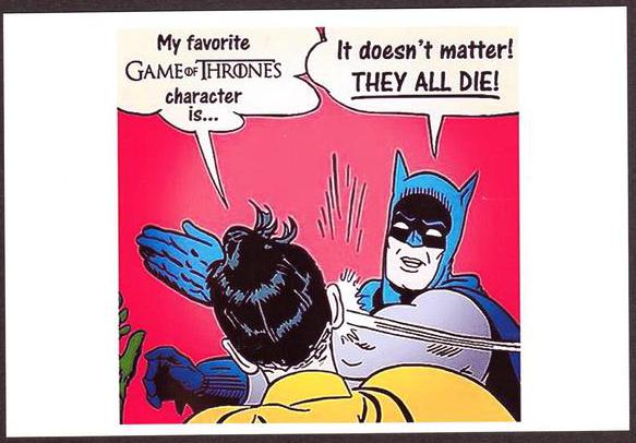
“MY FAVOURITE ‘GAME OF THRONE’S’ CHARACTER IS…..”
“IT DOESN’T MATTER! THEY ALL DIE!”
Batman & Robin cartoon
There is no printer or publisher details on this postcard, it just has the normal required stamp box, address lines and centre dividing line on the reverse. I picked this up from a stand at a Memorabilia Fair at the NEC, Birmingham. It cost me 50p and was worth every penny, because it made me laugh.
10/01/2017
JAPANESE POSTAL STATIONERY POST CARDS
The one thing which most people immediately notice with these Japanese postal cards is that they are vertical in format. The stamp (normally) appears top left and then there are a set of boxes to the right of the stamp. These boxes are, I believe, for the postal area number to be placed in (like our Postcode here in the UK). Then, often along the bottom, you have an image which is an advert (again, normally).
Unfortunately, I have no ability to read or translate Japanese, which leaves me only the images themselves to try and use to discover what the postcard is advertising. In some case’s this is quite easy, others, not so. Also, be aware that the reverse side of all these cards (normally, again) are entirely blank.
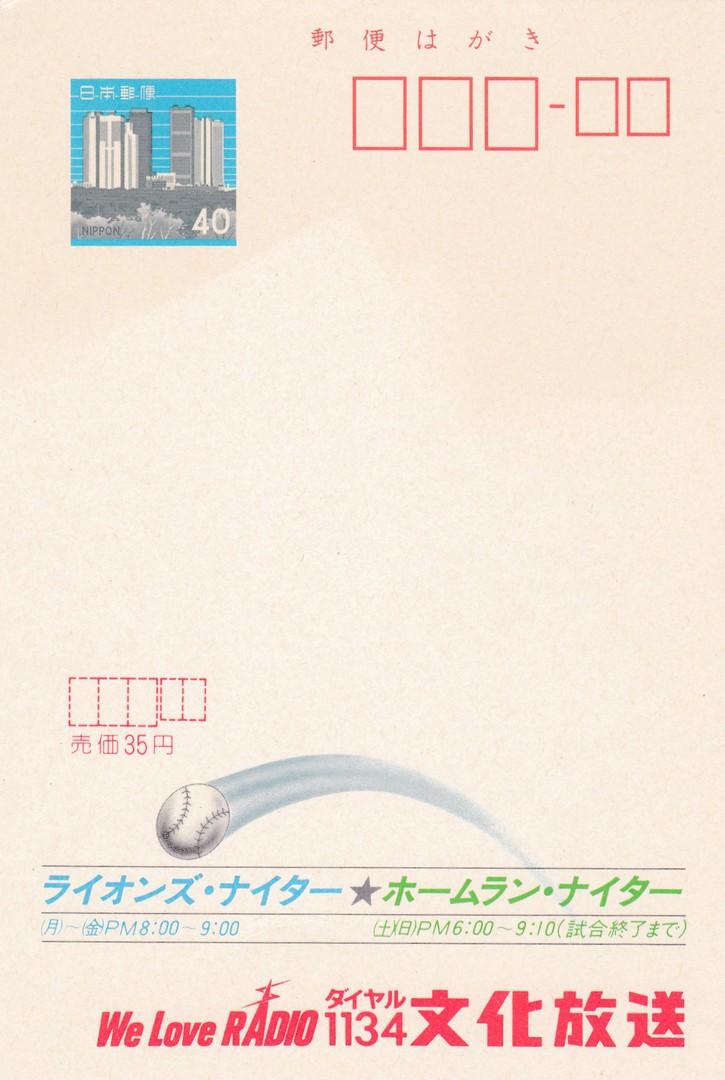
BASEBALL – RADIO
This postal stationery post card depicts a baseball, a sport very popular in Japan. Along the bottom there is, thankfully, some English text which indicates that the card is advertising a Radio channel. I assume this card relates to the regular (or perhaps one off) broadcast of one, or more, Baseball games on the radio, perhaps on channel 1134? It does make for an unusual sports related postcard.
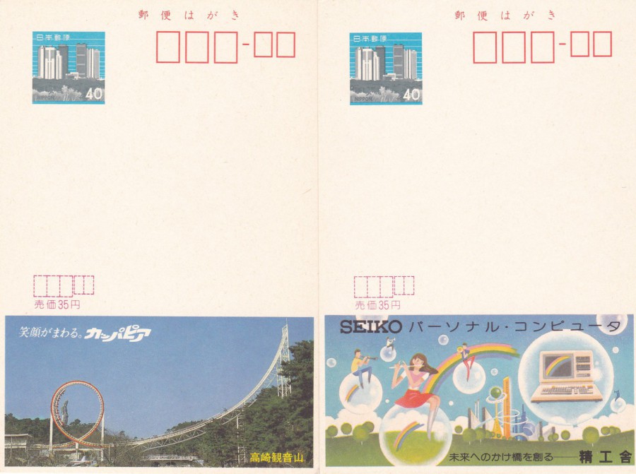
FAR LEFT
THEME PARK ROLLER-COASTER
There is no English text on this postcard so, I am only ‘assuming’ that this is a Theme Park related advertisement (although someone has also very kindly written ‘Theme Park’ in pencil on the reverse side, so I am going with whoever that was. I hope they were right). It is a smashing looking ride though.
NEAR LEFT
SEIKO ADVERT
My, hopefully knowledgeable, pencil welding, unknown contributor, has written ‘COMPUTER’ on the reverse side of this postal stationery card, although I think (or hope) that even I could have worked this one out. The drawing is a very nice one though.
These three designs are quite typical of those produced at the time and there are many, many different cards to hunt down. I am not interested in specialising in these but wanted to have a handful as examples in my ‘Postal History Postcards’ collection. These three all have the price £2 in pencil on each but I am sure I only paid 50p each for them, so they probably came from a cheap box.

10/01/2017
LIVE LIFE 3D
LIVE LIFE POSTCARD Series
Published by
DELUXEBASE LTD (UK)
Artwork by
HOWARD ROBINSON
I have previously depicted a couple of T-Rex designs and a Great White Shark image in this series on a previous posting. Here I depict the remaining postcards in my collection. Because they are 3D images they do not always scan very well, which is shame as they are terrific images which come out towards you in effective ways. So, the scanned images are not as good as the actual postcards but, they are still worth a posting I believe. These all have rounded corner (again not obvious in all the scans, and, because of the layers of plastic needed to make the 3D effect, these are quite thick cards)
POSTCARD
REEF SHARKS
Ref: 8014
Copyright year 2012

“SMILE”
LIVE LIFE 3D
LIVE LIFE POSTCARD Series
Published by
DELUXEBASE LTD (UK)
Artwork by
HOWARD ROBINSON
Ref: Item# 10221
Copyright year - 2013
“ON THE PROWL”
LIVE LIFE 3D
LIVE LIFE POSTCARD Series
Published by
DELUXEBASE LTD (UK)
Artwork by
HOWARD ROBINSON
Ref: Item# 08038
Copyright year 2013
PHOTOGRAPH
These are almost as hard to photograph, but hopefully this image will be less blurred

“TREE OF LIFE”
LIVE LIFE 3D
LIVE LIFE POSTCARD Series
Published by
DELUXEBASE LTD (UK)
Artwork by
HOWARD ROBINSON
Ref: 7888
Copyright year 2012

“A CAT NAP”
LIVE LIFE 3D
LIVE LIFE POSTCARD Series
Published by
DELUXEBASE LTD (UK)
Artwork by
HOWARD ROBINSON
Ref: Item# 08861
Copyright year 2013

PHOTOGRAPH
These are almost as hard to photograph, but hopefully this image will be less blurred
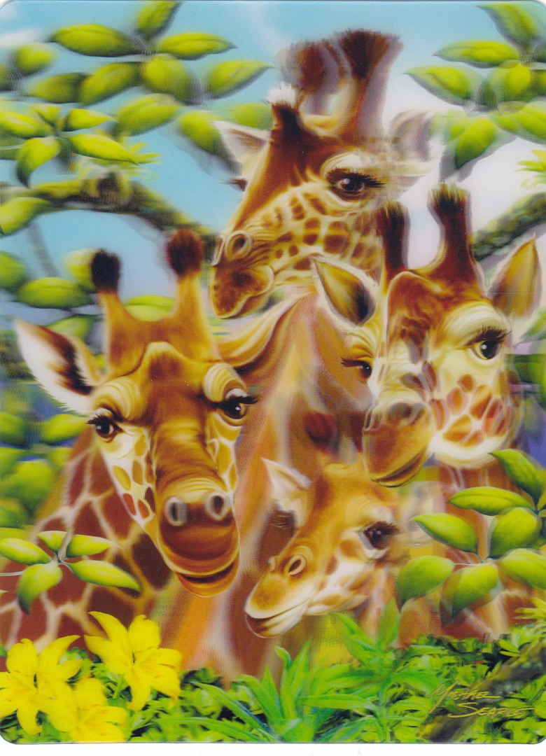
“GIRAFFE TRAFFIC”
LIVE LIFE 3D
LIVE LIFE POSTCARD Series
Published by
DELUXEBASE LTD (UK)
Artwork by
MICHAEL SEARLE (this one is not by Howard Robinson)
Ref: Item# 15387
Copyright year 2014
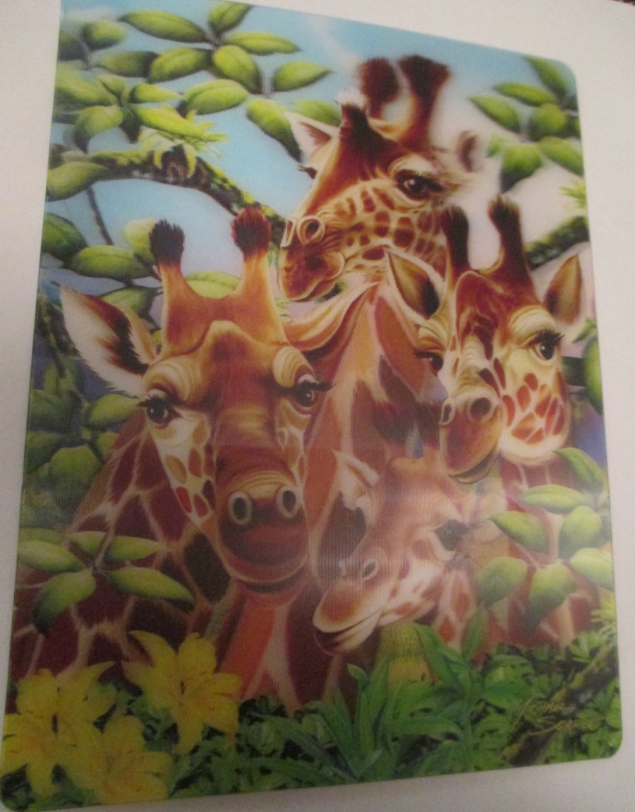
PHOTOGRAPH
These are almost as hard to photograph, but hopefully this image will be less blurred
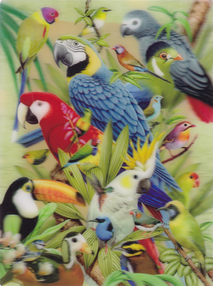
“AVIAN WORLD”
LIVE LIFE 3D
LIVE LIFE POSTCARD Series
Published by
DELUXEBASE LTD (UK)
Artwork by
HOWARD ROBINSON
Ref: 8915
Copyright year 2012

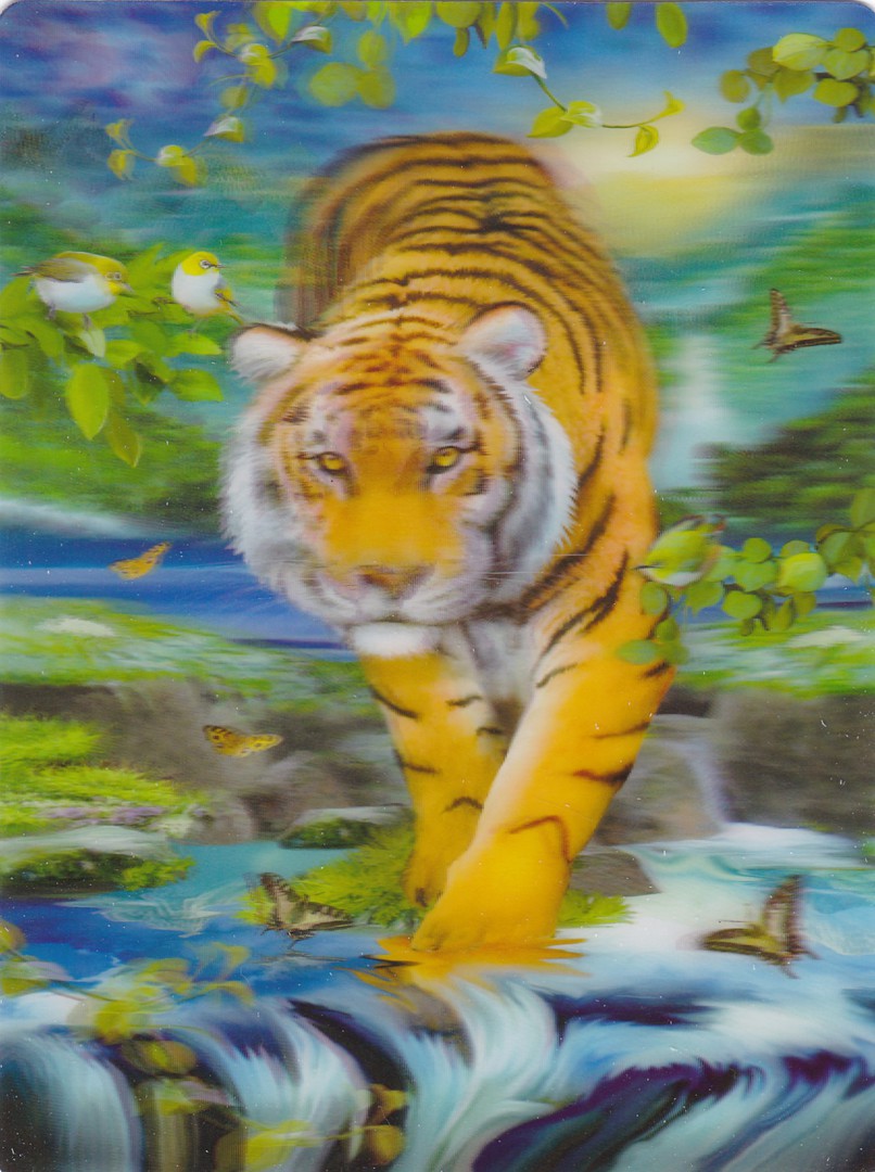
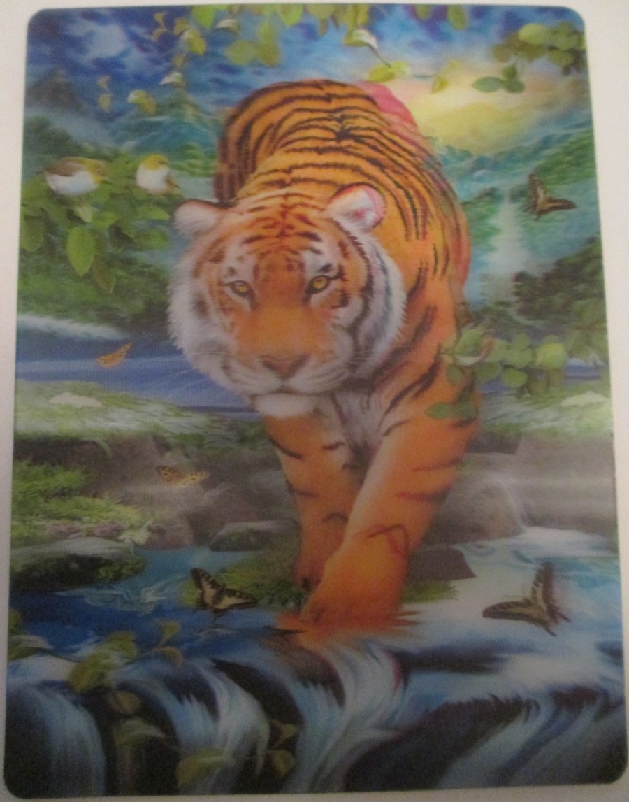
“BY THE SHADY POOL”
LIVE LIFE 3D
LIVE LIFE POSTCARD Series
Published by
DELUXEBASE LTD (UK)
Artwork by
HOWARD ROBINSON
Ref: Item# 08571
Copyright year 2013
This is by far the most difficult design to scan, as you can probably see. But, held in the hand and tilted slightly the image comes to life with the tigers in the background being framed in the front by the leaves which are across the top and down the side.

PHOTOGRAPH
These are almost as hard to photograph, but hopefully this image will be less blurred
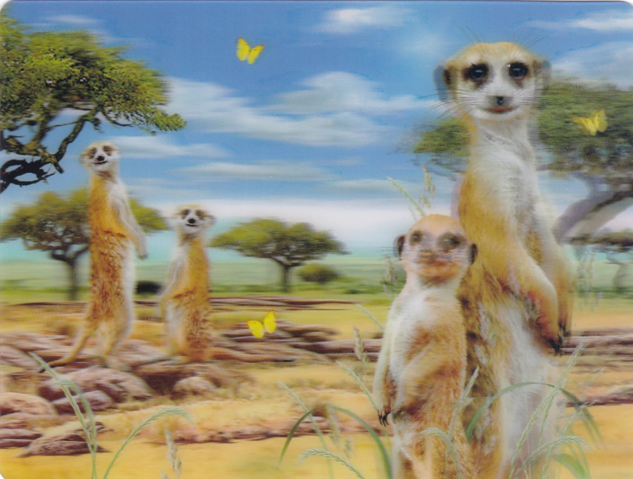
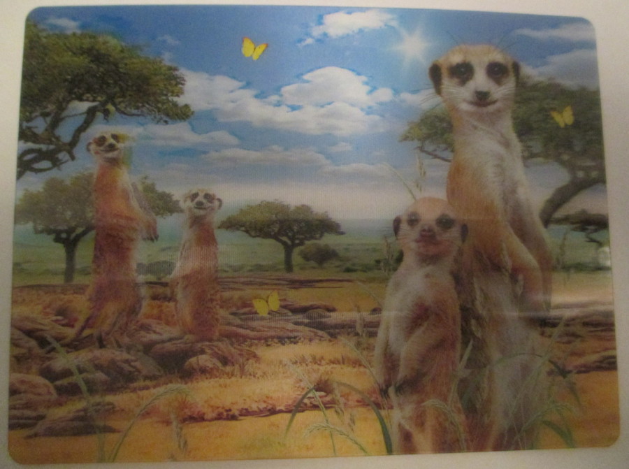
“MEERKAT MOB”
LIVE LIFE 3D
LIVE LIFE POSTCARD Series
Published by
DELUXEBASE LTD (UK)
Artwork by
HOWARD ROBINSON
Ref: Item# 19095
Copyright year 2013
So, if you come across these they are a real delight and have, despite the scans here, a fantastic 3D effect. They are also not that expensive, I think I only paid £1 each for these, which is good value. I suspect they could be common around Zoo’s, and aquariums and the like, keep an eye out for them.
PHOTOGRAPH
These are almost as hard to photograph, but hopefully this image will be less blurred
09/01/2017
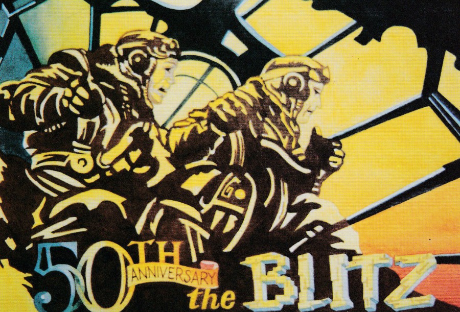
50th ANNIVERSAY OF THE BLITZ
Published by
TIMES REMEMBERED
Ref: No 2 (PC103)
Limited Edition of 2000
From a Painting by Tom Sweeney
“The most concentrated period of the Blitz on London ran from September 7th, 1940 to May 1941. The spirit of the British people remained unbroken. A German bomber crew gaze out onto a sea of flame which is London”
(Text from reverse side of postcard)
I always liked the artwork of Tom Sweeney, and much of his work was issued on postcard, including many designs specifically produced for postcard release. Somewhere amongst my collection I have a postcard design of his which I obtained his autograph on, I shall have to seek it out and put it on here in the future. This design here fits very nicely into my military collection.
09/01/2017
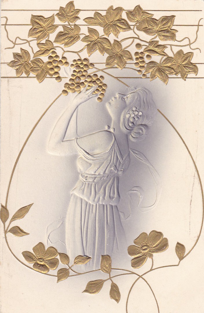
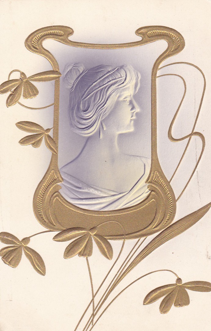
EMBOSSED IMAGE
Woman and grapes
Published by
Stewart & Woolf, London
Printed in Prussia
Ref: Series No. 429
As you know, I like novelty postcards and when I saw this one I thought it was lovely. The image of the young lady is not painted onto the card but embossed from underneath. This means that the image has been pushed upwards and is raised up on the card. The splash of grey just highlights the edges a little and gives some perspective to the lines.
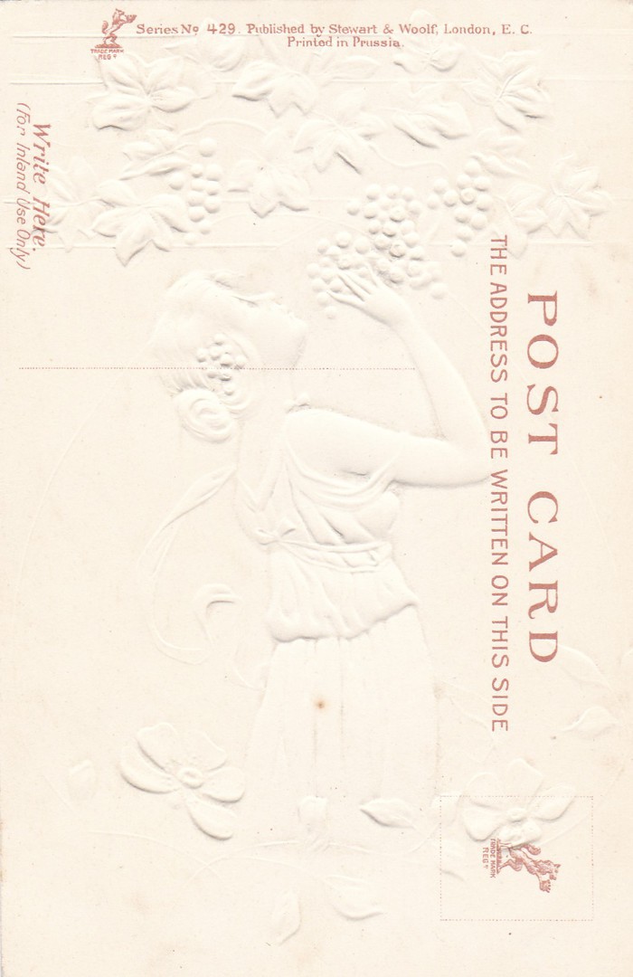
REVERSE SIDE OF ABOVE POSTCARD
Although not extremely clear, you can just about see the shape of the lady and the grapes from the reverse side of the card. Because it is all white the image is difficult to see, but tilt your computer or phone and it becomes clearer
EMBOSSED IMAGE
Cameo Portrait in fancy frame
Published by
Stewart & Woolf, London
Printed in Prussia
Ref: Series No. 429
This one was on sale at the same time as the postcard above, so, of course I had to have this one as well. The two postcards are by the same publisher and were issued in the same series – Series No 429.
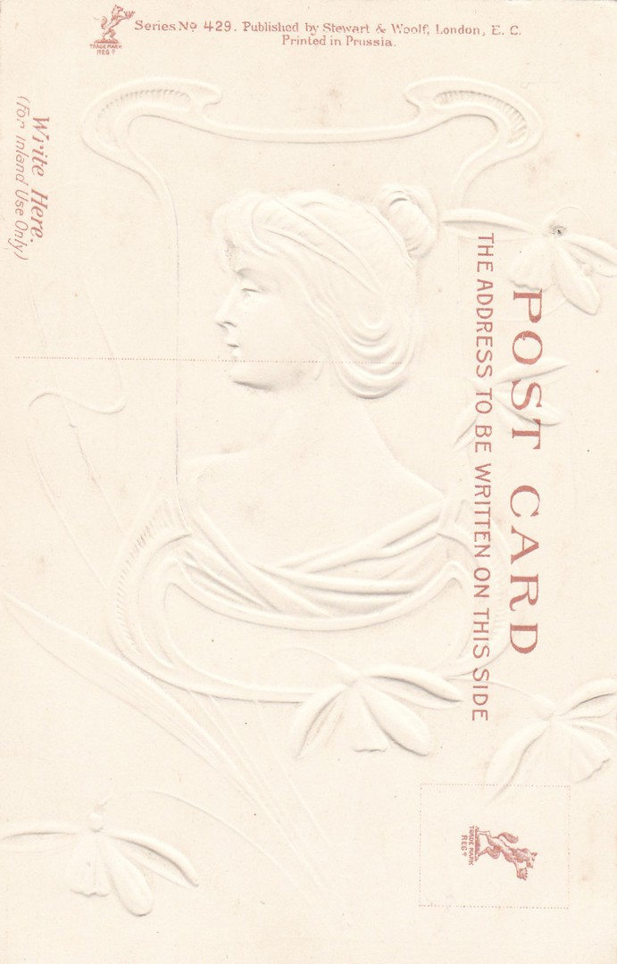
REVERSE SIDE OF ABOVE POSTCARD
I have again depicted the reverse side so that you can again see the embossing from the opposite side. The embossed image makes the reverse side extra interesting, in my opinion.
08/01/2017
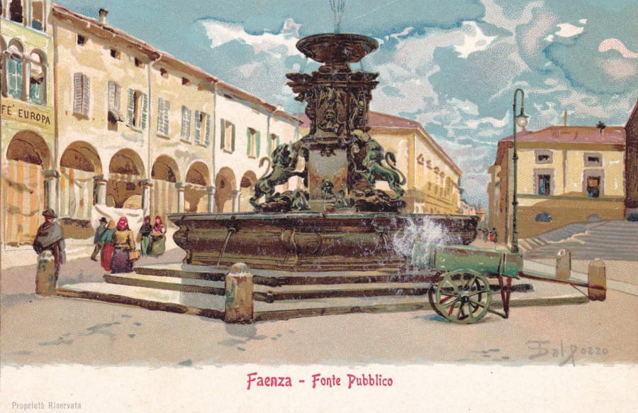
FAENZA – FONTE PUBBLICO
(Faenza – Public Source – so, Public Water Drinks Fountain? Or just Water Fountain)
(CARTOLINA POSTALE)
Published by
Angelo Albonetti – Editore – Faenza
Very early painting postcard from the Italian city of Faenza, in the province of Ravenna, Emilia-Romagna. These three postcards here came my way in a bundle of postcards I bought as a package. There were around a hundred cards, many of which were from between 1900 to 1925. These ones are obviously nearer to 1900. All, are also painted by the same artist, looking at the signature this looks like Sal (or possibly ‘DAL’ as this seems to be a known name) Pozzo. Unfortunately, I have been unable to find out anything about the artist, but this should not prevent people from enjoying their work.
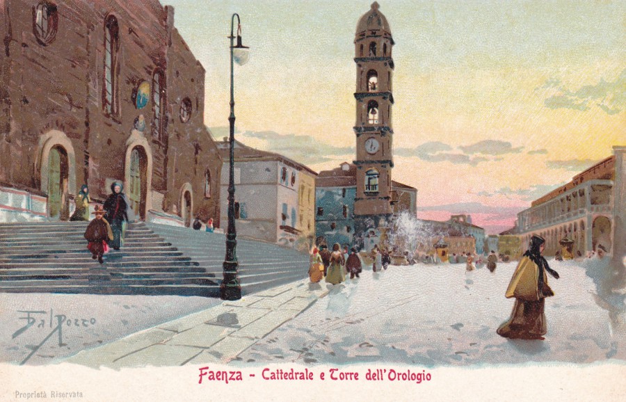
FAENZA – CATTEDRALE E TORRE DELL’OROLOGIO
(Faenza – Cathedral and Clock Tower)
(CARTOLINA POSTALE)
Published by
Angelo Albonetti – Editore – Faenza
These are really good examples of early scenic town paintings, and these postcards would have been issued for tourists visiting the area. Some would be kept as souvenirs (like these ones here I suspect as they are unposted – mint) and other would be sent home to tell people where they had been. This type of postcard was extremely popular.
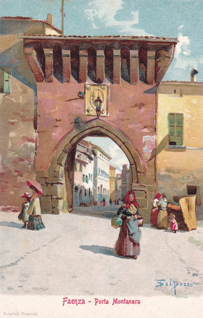
FAENZA – PORTA MONTANARA
(Faenza – Montanara Gate/Entrance)
(CARTOLINA POSTALE)
Published by
Angelo Albonetti – Editore – Faenza
With a series of postcards like this the images would show the structures and landmarks which the tourist would probably see on any normal visit. Before the days of general photography these would make a good souvenir of places seen and visited.
08/01/2017
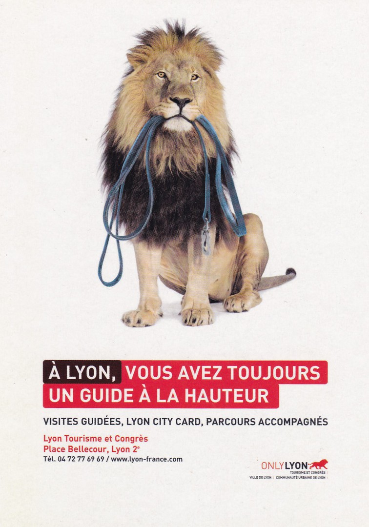
A LYON, VOUS AVEZ TOUJOURS UN GUIDE A LA HAUTEUR
(In Lyon, you always have a guide at the height)
Published by
CART COM ECO
(Free French promotional rack postcard).
This is a postcard I found on one of my visits to France to see the in-laws. Near to where the live there is a massive sports shop which had a free postcard rack in it. This was one of the postcards I picked up from there. It was the lion that appealed to me, a throwback to my childhood collecting animal postcards.
08/01/2017
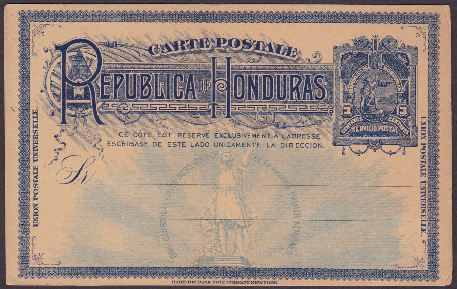
CARTE POSTALE
REPUBLICA DE HONDURAS
(Columbus sighting for the coast of Honduras – Ornamental Border)
3c Deep Blue (Ref: 14 in ‘Higgins & Gage’ catalogue)
Issued 1892
Some of these early Postal Stationery cards can be very ornate in their design. This one from the Republic of Honduras is one of my favourites. This one cost me £3 when I bought it, worth every penny.
08/01/2017
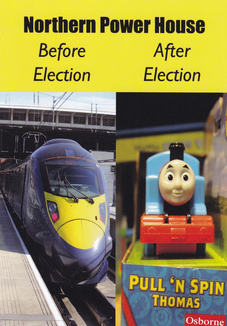
NORTHERN POWER HOUSE
Before Election – After Election
NORTHERN POWER MOUSE (No. 37)
Published by
GEORGE BLAIR’S MIND’S EYE
This is classed as a ‘Political Cartoon’ postcard, although for me it fits nicely into my television collection because of the image of Thomas the Tank Engine. In fact, it is the unusual postcards like this one which I like to put into my television collection, this is even though I also do have a ‘Political’ collection as well. In fact, thinking about it now, this postcard would also fit well into ‘Railway’ themed collection.
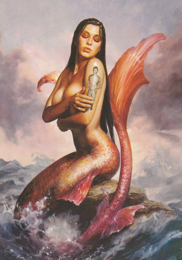
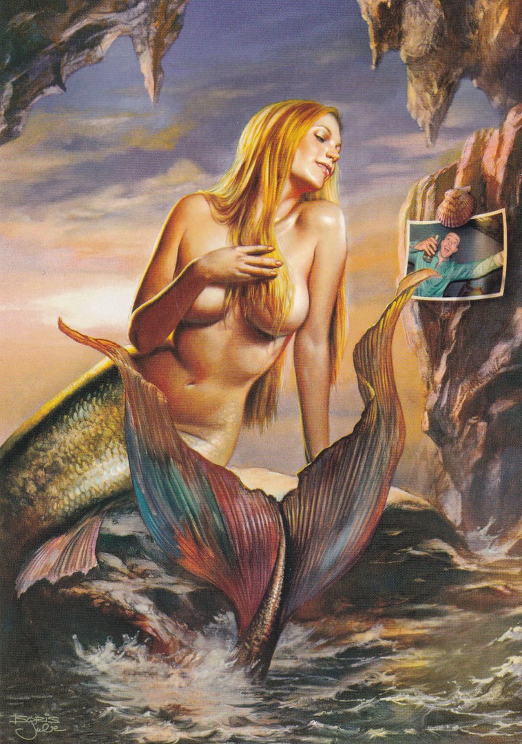
08/01/2017
MERMAIDS
LYNX DRY – Anti-Perspirant Adverts
Published by
BOOMERANG
(Free Rack Postcards)
I have mentioned before how I came around to collecting Mermaid postcards (check the ‘December Blogs 2016’ Tab and scroll down to the depicted Mermaid postcard). Thus, when I saw these two postcards I knew I had to have them for my ‘Mermaid’ collection. They are, admittedly, and deliberately, ‘Glamourous’ in their depiction of the, rather attractive, if not buxom, mermaids. But then the television ‘Lynx’ adverts are also full of attractive young women, so, these postcards are following this style. These two designs are paintings and extremely well done, and as mermaids are not that common on postcards it is always nice to find new ones.
08/01/2017
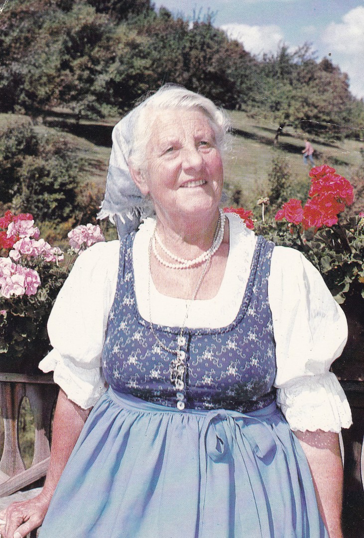
MARIA VON TRAPP
Surrounded by a few of her favourite flowers
Published by
Forward’s Color Productions, Inc, Manchester, Vermont
Ref: PS.28
Printed in Canada
(My copy of this postcard was posted from Canada in 1986)
This is the real Maria von Trapp who was portrayed in the musical film ‘The Sound of Music’. The real Maria von Trapp became a celebrity as a direct result of the film’s release and postcards like this became available. I picked up my copy from a cheap dealer’s box.
Maria Franziska von Trapp
28th Septmeber 1914
18th February 2014
Maria was the second oldest daughter of Georg von Trapp and his first wife, Agatha Whitehead von Trapp. She was a member of the Trapp Family Singers whose lives inspired the film 'The Sound of Music'. In the film she was portryaed as 'Louisa'. She diesd aged 99yrs and was the last surviving sibling of those portryaed in the film.
08/01/2017
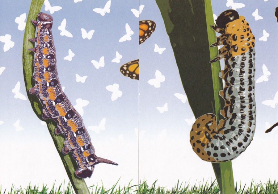
NATURAL HISTORY MUSEUM
AMAZING BUTTERFLIES
(Giant maze and butterfly house)
An Exhibition held until 17th August 2008
Published by
BOOMERANG
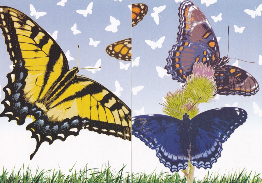
FAR LEFT – Number 1 of 6
NEAR LEFT – Number 3 of 6
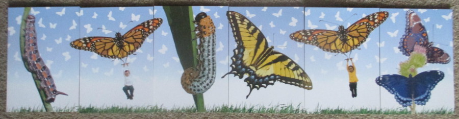
This was a free set of six postcards placed out in the racks belonging to the promotional postcard issuing company called ‘Boomerang’. The postcards are individually numbered but the butterflies are not named. The six postcards can be placed together to make one long picture (they are displayed here out of order, but see below).
NATURAL HISTORY MUSEUM
AMAZING BUTTERFLIES
(Giant maze and butterfly house)
An Exhibition held until 17th August 2008
Published by
BOOMERANG
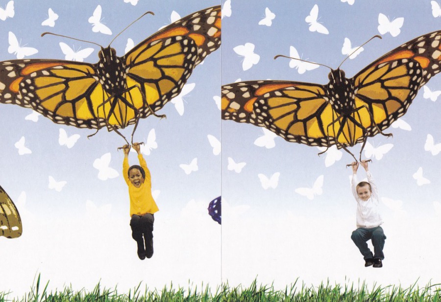
FAR LEFT – Number 4 of 6
NEAR LEFT – Number 6 of 6
NATURAL HISTORY MUSEUM
AMAZING BUTTERFLIES
(Giant maze and butterfly house)
An Exhibition held until 17th August 2008
Published by
BOOMERANG
FAR LEFT – Number 5 of 6
NEAR LEFT – Number 2 of 6
PHOTOGRAPH
Here the six postcards have been laid together end on end to make one complete image across the six designs.
07/01/2017
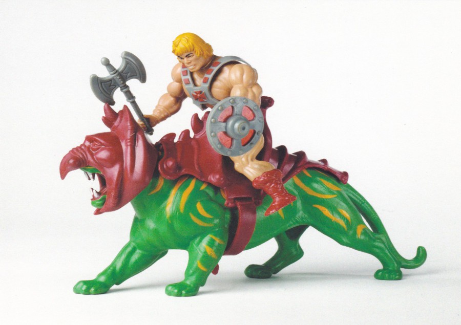
MUSEUM OF CHILDHOOD
(V & A Museum of Childhood)
He-Man and Battle Cat
(Masters of the Universe)
Toy by Mattel Inc (Taiwan – 1983-87)
This is the type of museum postcard which I really love. ‘He-Man and the Masters of the Universe’ was of course an animated television children’s series, which I did watch. It was the first time a toy range was designed at the same time as a programme thus making them a linked product. If I remember properly there was quite a risk taking this approach, but it certainly paid off as I remember the toys being massive sellers, clearly, as this postcard proves.

MUSEUM OF CHILDHOOD
(V & A Museum of Childhood)
Jemima
Rag-Doll
Characters from TV show Play School
Made by Simple Toys
(Malta and England 1977)
Another cracking television themed postcard from this excellent little museum, which is an off-shot of the Victoria & Albert Museum. As a television theme collector it is postcards like this that really enhance a collection.
07/01/2017
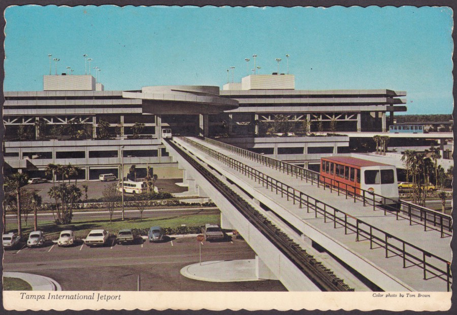
TAMPA INTERNATIONAL JETPORT
Published by
WARD BECKETT & CO, Clearwater, Florida
Ref: TC-38A
(84060-C)
“The new TAMPA INTERNATIONAL JETPORT TERMINAL opened April, 1971. Passenger carrying shuttle cars travel automatically back and forth between the magnificent ‘Landside’ Terminal and four satellite ‘Airside’ buildings where travelers [sic] disembark from or board their planes”
(Colorphoto from Eastern Airline’s Building – Airside B – by Tom Brown)
(Text from reverse side of Postcard)
I have been to Florida eight times now and, as a result I now have a small collection of Florida postcards. This one depicts the Tampa International Jetport.
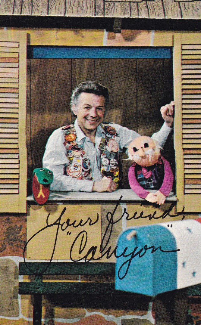
07/01/2017
CANYON KID
Published by
DYNACOLOR GRAPHICS INC (MIAMI, FLORIDA)
Ref: P720
“Since 1953, Jim Henry has been better known to Siouxland audiences as “Canyon Kid.” As host of KCAU-TV’s children’s programming he has become a familiar figure on and off the screen. His CANYON KID’S CORNER is seen Sundays from 11;00 a.m. to noon on Channel 9 and provides a variety of entertainment for both the young and the young at heart”
(Text from reverse side of Postcard)
I love early American television related postcards. They are almost impossible to buy in the UK and I rarely find any at postcard fairs, but, since eBay has been around I have been able to source these direct from America. In nearly every case I have no knowledge of the people depicted or the programmes mentioned, mainly because many of these were local area American programmes which did not travel well so were never shown in the UK, and for that matter, did not appear in other areas of America either. So, for me, everything about these cards is new. This is a superb example of such a card and has the bonus of having a very useful mini-bio on the reverse side (saves me looking up details).
The signature on the front of this postcard is pre-printed.
07/01/2017
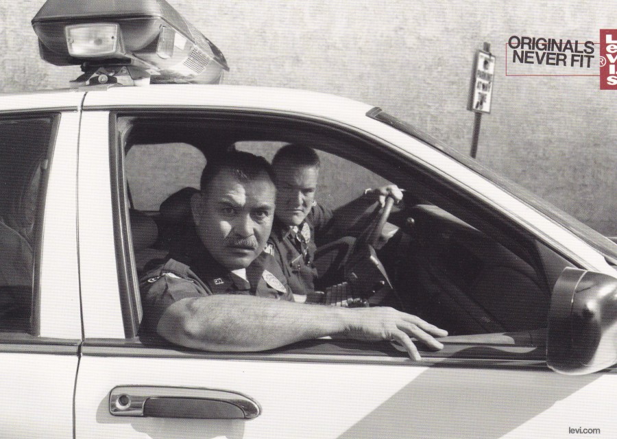
LEVI’S - ORIGINALS NEVER FIT
SEE THE ORIGINAL FOR YOURSELF
THE LEVI’S SPRING/SUMMER 2008 COLLECTION
174 – 176 REGENT STREET, LONDON W1
Clearly an advert for Levi’s jeans, but because of the image depicted, also a cracking postcard for my Police themed collection.

07/01/2017
CO-OP
“I’M IN”
My friend David Rye sent me this very simple postcard after visiting a village hall temporary exhibition put on by the local Co-op society. The display included some superb photographs of the early days of the Co-op movement which made for an interesting display but David bemoaned the fact that only this postcard was available to visitors.

07/01/2017
MELBOURNE, AUSTRALIA
MELBOURNE, VICTORIA, AUSTRALIA
Published by
VISIT GALLERY
This lovely postcard was posted to me by Willy Allen. It depicts an old photograph of a street in Melbourne which is mainly in black and white although tram like buses have been coloured in as green. These are the type of unusual postcards which you can get when people know you are interested in such items. This one here also has a special cancellation as well. Willy had visited Fitzroy Gardens which are next to Captain Cook’s Cottage (re-built) in the centre of Melbourne. As this postcard was posted from here it received a special COOK’S COTTAGE – EAST MELBOURNE, VIC 3002 special hand stamp, dated 29th August 2016. As we all know, I do like unusual cachets, hand stamps and postal marks.
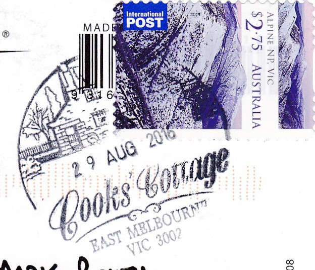
ENLARGEMENT OF SPECIAL HAND STAMP
COOK’S COTTAGE, MELBOURNE
07/01/2017
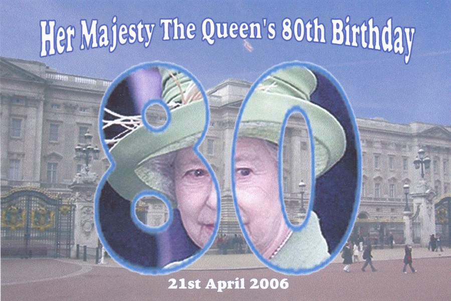
HER MAJESTY THE QUEEN’S 80TH BIRTHDAY
21ST APRIL 2006
Published by
C. R. CARDS
Ref: 2006.C. 142
C. R. Cards have produced postcards for many years now and they concentrate on special events, anniversaries and other commemorative events. They are a good source of unusual events that otherwise might not appear on postcard, although the Queen’s 80th did have a range of postcards issued for it. These C. R. Cards issues are not produced in high numbers and are almost exclusively bought by collectors at Postcard Fairs and sales, and are not available to the ‘General Public’ via shops and the normal type of outlets.

07/01/2017
AMERICAN SEA SHELLS POSTCARDS
There is trend for issuing postcards depicting a range of seashells on postcards in the Florida area. Here I have depicted a small range of ones from my collection
FLORIDA SEA SHELLS
Published by
SUNCOAST POST CARDS
Ref: SCP-006
“With hundreds of miles of coast line and endless tides, millions of shells of all varieties wash up along Florida’s beaches. Collecting shells has always been a popular pastime among visitors and residents alike”
(Text from reverse side of Postcard)
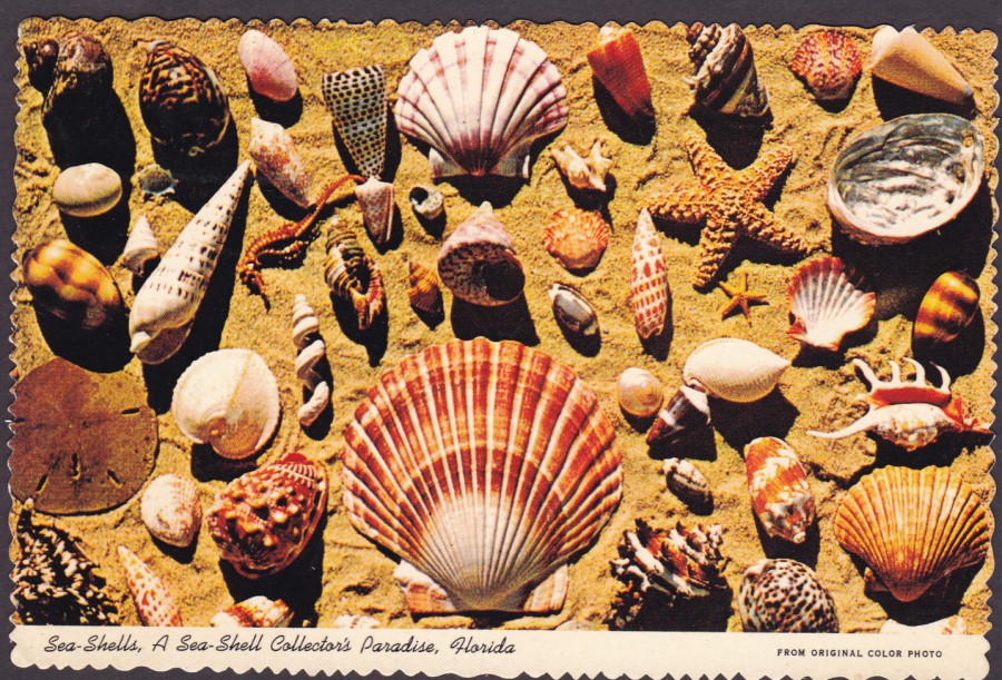
SEA-SHELLS, A SEA-SHELL COLLECTOR’S PARADISE, FLORIDA
Publisher
CURTEICHCOLOR 3-D NATURAL COLOR REPRO
FLORIDA CLASSICS (series)
INTERNATIONAL “SUPER-DUPER”
Ref: CTF.21
“SEA-SHELL COLLECTION IN FLORIDA – The ceaseless tide washes ashore hundreds of species of sea shells along the Coasts of Florida. Shells of brilliant colors are found here, the rarer species going to collectors and museums, while the commoner types are shipped by the barrel to manufacturers of shell art novelties. Shell collecting is becoming a popular hobby”
(Text from reverse side of Postcard)
This one is an older postcard (the one above is much newer) from the 1970’s and has the deckle edge effect which was so popular during that period. The stamp was used sometime after the 9th October 1973 as the stamp used was issued that day (I cannot read the year but it was posted on the 11th February, so I am going with 1974 being most likely). This type of photographic layout of shells on sand (I assume we are supposed to accept that the photograph was taken on a beach) is very common, but none the less very attractive.
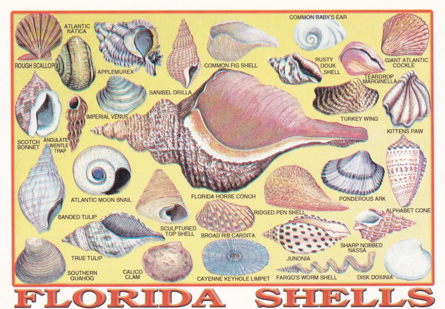
FLORIDA SHELLS
COLORFUL SHELL COLLECTION FROM FLORIDA
Published by
CITY SIGHTS POSTCARDS
Ref: 101-2057
No text on the reverse side of this postcard but then the shells are all named on the front. This is the only one of the three postcards which I got to buy myself from a gift shop in Florida, so this one is still available if you visit.
Because I started off collecting wildlife postcards I have always collected sea-shell cards as well, they are after all natural creations which once held a living creature. So these postcards here, all bought over the last four years, would always have appealed to me.
07/01/2017
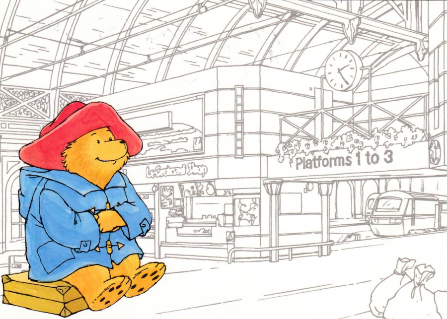
PADDINGTON BEAR
I obtained these three Paddington Bear postcards from a postcard dealer at last years ‘Woking Postcard Fair’. They have the location that Paddington is visiting recorded on the reverse side but no printer or publisher details. I had not seen these before and openly admit that I know nothing about these beyond the fact that they were printed in or after 2010.
The use of a colour picture of Paddington placed into a black and white line drawing of a location works for me, I find these quite appealing, but then I am a big Paddington fan after reading the books as a young boy.
PADDINGTON AT PADDINGTON STATION
This one is copyrighted to the year 2010, with my copy being posted and postmarked in 2011 (January). This was clearly the logical one to show you first as the location is the source of the bears name (which I will assume you did all know anyway).
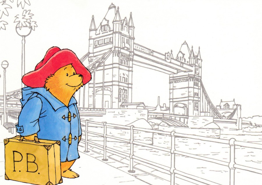
PADDINGTON BEAR AT TOWER BRIDGE
Copyrighted to the year 2010

PADDINGTON BEAR AT PORTOBELLO MARKET
Copyrighted to the year 2013
Possibly my favourite of the three. This one is copyrighted to a different year to the other two and was posted and cancelled 3rd December 2013. I would not be surprised to find out that there are more designs available so I would like to hear from anyone who knows the source of these postcards or who has any different.
07/01/2017
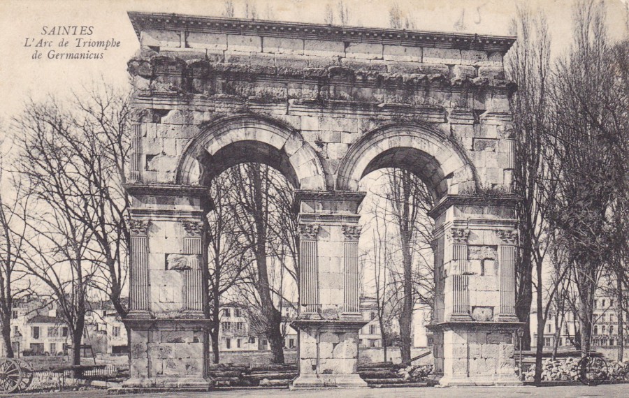
SAINTES
L’ARC DE TRIOMPHE DE GERMANICUS
(THE ARCH OF GERMANICUS)
Saintes is a French town in the Charente-Maritime department (area). I know it well as it is the nearest town to where my In-Laws live and as such we have visited here many, many times.
In Roman times the town was known initially as Mediolanum Santonum, but went on to become Saintes, with this being spelt Xaintes or Xainctes.
Because of its strong Roman connections there are Roman remains and ruins here which, with my love of history, I have much enjoyed visiting. I have two favourites, the Amphitheatre (more about this on another occasion) and the Arch of Germanicus.
The ‘Arch’ is from the ancient Roman era (18 or 19AD) and was built by a rich citizen of the town called C. Julius Rufus. The Arch was dedicated to the emperor Tiberius, his son Drusus Julius Caesar and his adoptive son Germanicus (from whom the Arch has obtained its current name). The Arch has been moved, back in time it used to be located over the terminus of the Roman road from Lyon to Saintes but it was moved fifteen metres in 1843 because of work being done then on the quays along the river next to it. After the move the Arch was restored in 1851 and still looks superb.
My interest in the Arch has led to me obtaining a few postcards depicting it.
POSTCARD
This is an early French postcard depicting the Arch. The publisher is indicated by a circular logo that appears bottom right on the front, although I cannot make out the exact details, but I expect it was a local production.
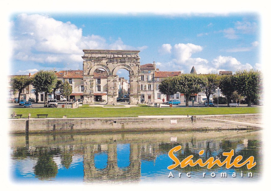
SAINTES
ARC ROMAIN
Published by
AS DE COEUR
Printed by
ARTAUD Freres
Ref: 11117415_002
(Ref located in stamp box)
This is a modern postcard that I bought myself on one of my visits. This is how the Arch looks today and how I best remember it
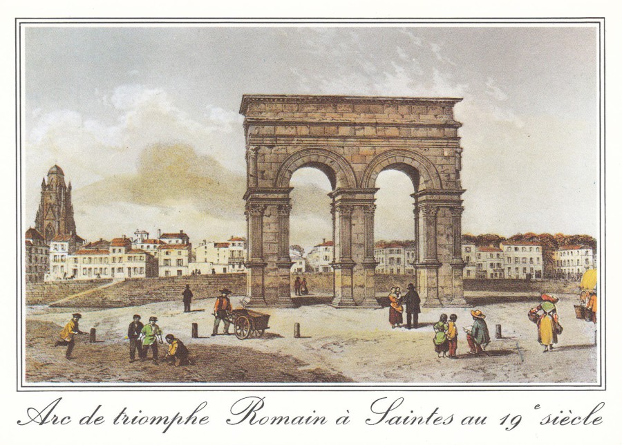
ARC DE TRIOMPHE ROMAIN A SAINTES 19TH SIECLE
Published by
COMPA CARTERIE
Number under bar code top right – 3 419610 000060
Number under bar code bottom left – 1714523357
This modern postcard, also bought on one of my visits, is a painting of the Arch from the 19th Century. It makes a nice companion piece to the photographic postcards.
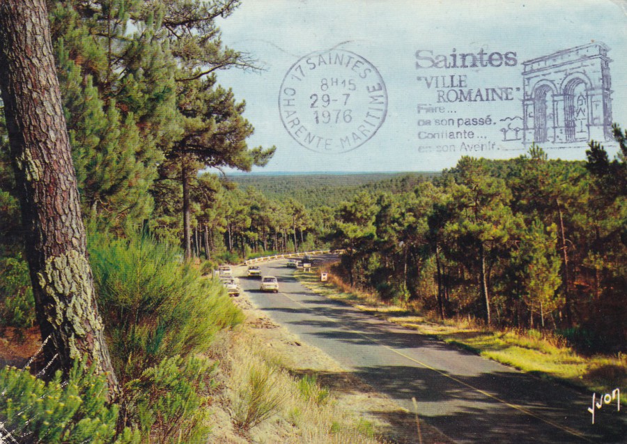
SLOGAN POSTMARK
When I saw this postcard in a cheap box I immediately recognised the Arch depicted in the cancellation. It is of course the Arch of Germanicus in Saintes. It did slightly help that SANITES is mentioned as well. The cancellation is dated 29th July 1976 and it is technically a ‘back stamp’ or receiving mark. Before cut backs and money saving it was traditional for each item of mail, envelopes and postcards, to have the postage stamp cancelled at point of departure (the postal area where the sender posted the item) and then for the mail item to receive a ‘Back Stamp’ cancel upon its arrival at the destination point, the main post office for its distribution to the receiver (normally the receivers home town if this is a big enough town, it definitely would be the case with any city location). In this case, as with postcards generally, this back stamp would, clearly, needing to be on the opposite side of the one with the cancelled postage stamp, appear on the front.
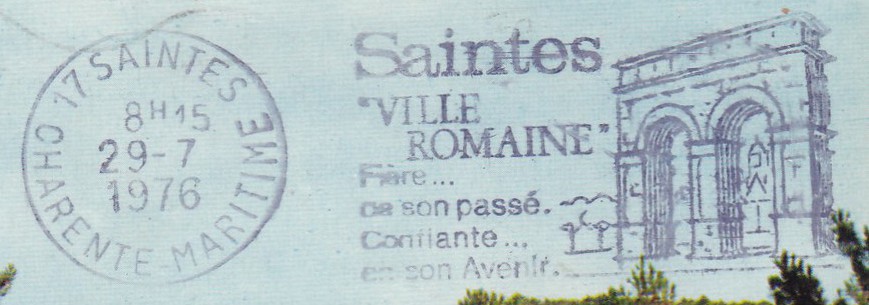
ENLARGEMENT OF SLOGAN CANCEL
REVERSE SIDE OF ABOVE POSTCARD
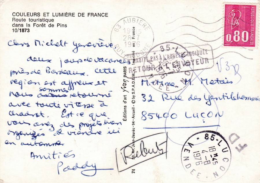
COULEURS ET LUMIERE DE FRANCE (Colours and Light of France)
ROUTE TOURISTIQUE (Tourist Route)
DANS LA FORET DE PINS (in the Pine Forest)
Published by
EDITIONS D’ART YVON PARIS
Ref: 10/1873
This has an added interest as the postcard was ‘Returned to Sender’, so has some interesting postal marks. It was posted from ‘AUBIERE, PUY-DE-DOME’ and the stamp used has been cancelled with a machine applied wavy line cancel dated 28th July 1976. The arrival back stamp, as mentioned above, is on the front of the postcard (main postal area). In this case the front SAINTES slogan cancel records the postcards arrival at the main sorting office before being passed out to its ‘final destination’, at Lucon. It has then received a final receiving cancel for LUCON dated 30th July 1976. Unfortunately, something went wrong and the people concerned where not known at this address so a cachet mark was applied
NO HABITE PAS A L'ADRESSE INDIQUEE
RETOUR A L'EN VOYEUR
Which means ‘DOES NOT LIVE AT ADDRESS – RETURN TO SENDER’. Thus, the postcard was returned to the Lucon post office by whoever did reside at the address. At Lucon they then applied another cancel dated 4th August 1976. Unfortunately, it is rare for postcard senders to apply their own address to cards so returning the item becomes extremely hard and this card must have remained stored somewhere until somehow it became available and was bought by me.