03/08/2018
UNTITLED
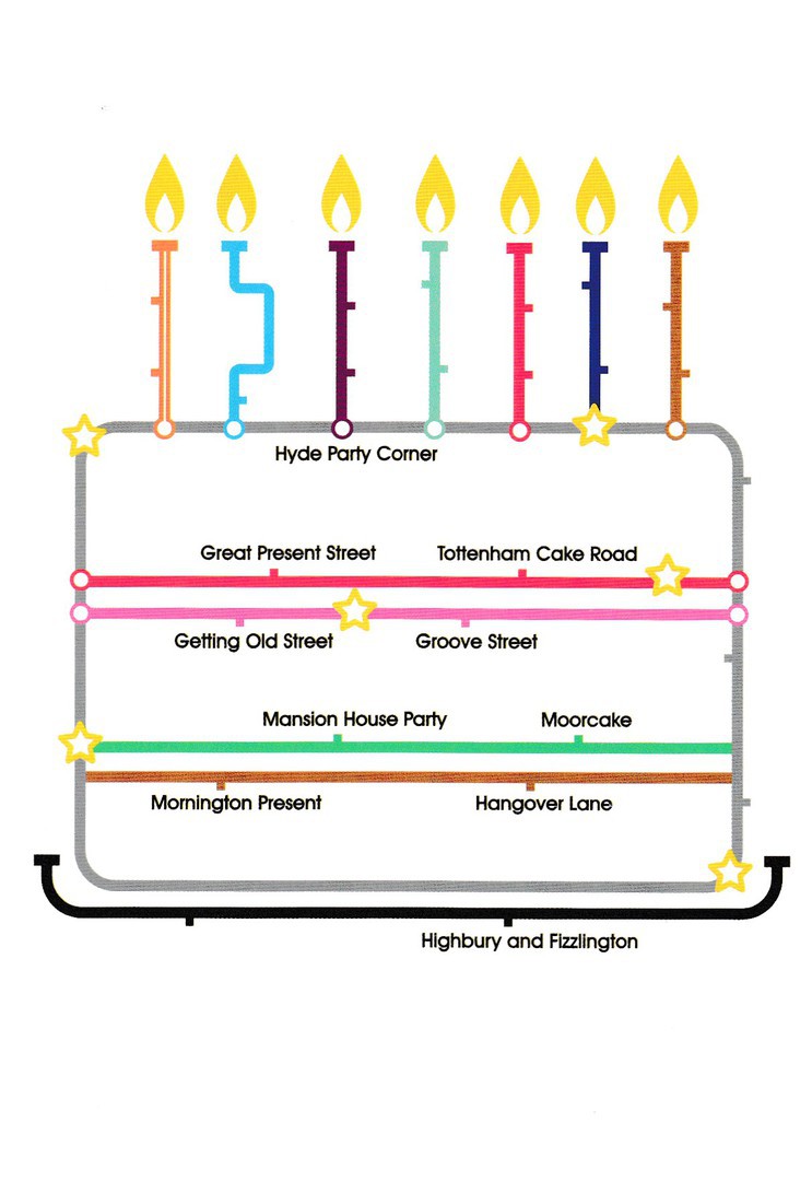
HAPPY BIRTHDAY UNDERGROUND MAP DESIGN
Published by
‘paperchase’
Ref: FSC C014059
I had intended to place this card on the webpage on the 1st January, the webpages birthday but I did not get around it. It is a design which sits nicely beside the similar ‘Christmas Tree’ design which I posted on the 24th Dec 2017 (December 2017 Blog 4). This design again uses a range of word puns on London underground station names – I quite like the idea of ‘Tottenham CAKE Road’.
03/08/2018
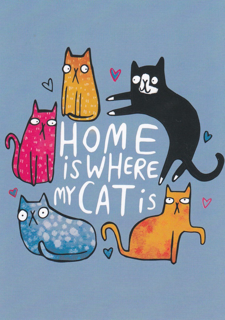
HOME IS WHERE MY CAT IS
By
Katie Abey
Published by
WHALE & BIRD
Ref: KAPC010
The first ‘CAT’ themed postcard of the new year. This is another recent buy, and another from the ‘paperchase’ company, and continues to prove my belief that cat themed postcards are making, or perhaps have made, a big comeback over the past six months. It will be interesting to see if more come to light in 2018, and I shall certainly be out there looking. In the meantime, I think this design here is aimed very much towards a specific type of person, and I know many who would fit this mould, both family and friends. If you are a cat lover, then this postcard is made for you.
03/08/2018
WEBPAGE ISSUES
Yesterday – 02/01/2018 – my webpage provider had an issue with a ‘Bug’ on their server which disconnected me from my webpage access to the CURRENT BLOG PAGE (and most of the December 2017 blog pages). This prevented me from posting anything yesterday. And, for awhile it looked like I was going to lose all of Decembers posts! I was not alone and other users had the same issue. Thankfully they fixed the problem and regained all my data. So, tonight we are back in business, better late than never. So, our apologies if you visited expecting something to be posted and could not gain access to the proper current page…. I blame modern technology (I have to as I have no idea what was going on as I am not very ‘Tech Savvy’, despite doing this webpage)
01/01/2018
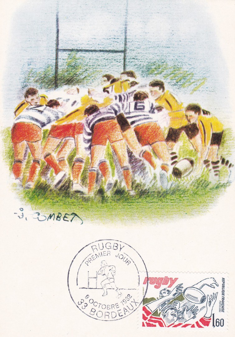
RUGBY
Maximum Card
Published by
EDITIONS CEF
FRANCE
In France they have a history of producing special first day of issue maximum cards. They produce new postcards especially designed to receive the new stamp and first day of issue cancellation. Some of these are really- nice and if you are interested in the theme behind the stamp issue then the maximum cards can also be of interest. This one is clearly sport related and has the 1982 issued ‘Rugby’ 1.60f French stamp (SG 2544) attached and cancelled with a special Bordeaux hand stamp dated 9th October 1982 (release date for this single stamp issue).

01/01/2018
FRIEDRICHSHAFEN AM BODENSEE
Published by
KRUGER
Ref: 799 (926/147)
Friedrichshafen is in Germany and is located on the shore of Lake Constance (Bodensee in German). It is a location I am aware of through my collection of Zeppelin postcards as this is where they were housed and from where they left on their flights around the world. There is a Zeppelin Museum here which I would also love to visit. There is no mention of zeppelins on this postcard as it is a modern release (I am going to say 1980’s, maybe early 1990’s). This is what everyone recognises as a standard multi-view style of postcard, otherwise known as a basic tourist card. If you look in the bottom left corner, you will see a boat. Although not named on the card I suspect this is called the Stuttgart, and below I will show you why I believe this.

REVERSE SIDE OF ABOVE POSTCARD
On the reverse side you can see an applied large purple coloured cachet for the:
BODENSEE – MOTORSCHIFF
STUTTGART
HEIMATHAFEN FRIEDRICHSGAFEN
Bodensee Motor Ship
STUTTGART
Port of Registry Friedrichshafen
Logic would seem to indicate that that this cachet was applied to this postcard on board the ship and that it can be postulated that this postcard was either sold on board the boat, or at an attached dockside shop (less likely I think) or it was given to visitors to the boat as a souvenir (quite possible as it would be a good form of promotion and this is done elsewhere). In my mind it is this cachet that makes this card so interesting (and I have frequently mentioned my interest in unusual cachets and marks on postcards). This one was bought last year, and it was the cachet that caused me to buy it.
01/01/2018
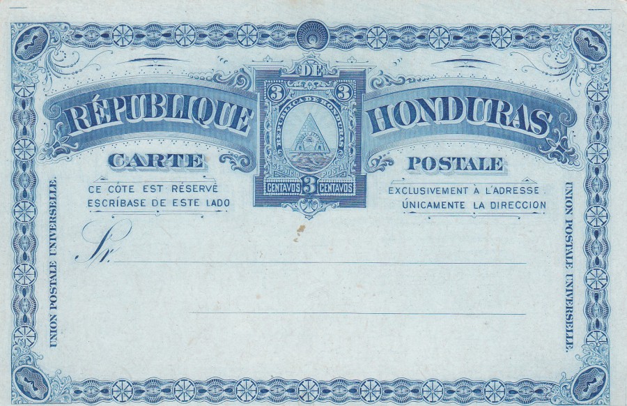
HONDURAS
3c POSTAL STATIONERY POST CARD
Higgins & Gage, World Postal Stationery Catalog
Section 15
Honduras - Page 1
Reference No: 6
Issued 1890
This is lovely card, almost a piece of art in-itself. The South American countries often issued elaborate designed postal stationery, often with a very detailed boarder design. Sadly, they were produced in quite reasonable numbers and mint unused copies are quite common and low priced with many being able to be picked up for a £1, which is what I paid for this one here.
01/01/2018
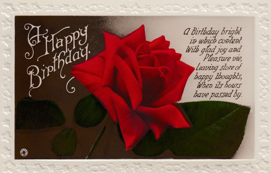
A HAPPY BIRTHDAY
Published in
THE ,, ACADEMY “ SERIES
Ref: No 3095 – 5 – W. B. L.
Printed in Italy
“A Birthday bright
in which content
With glad joy and
Pleasure vie,
Leaving store of
happy thoughts,
When its hours
have passed by”
Today is the website’s birthday. The first post went out on the 1st January 2016 and looking back on it now I can see that I was commencing something new and there was much to learn. Those early postings are very different, and I hope I have improved the general layout and in the size and form of the pages.
This lovely rose postcard is in a format which should be well known to collectors as it is a very, very common format, and thus these are now also very cheap to pick up. But, anyone interested in the history of postcard production should try and pick up at least a selection of these cards as they do form an important part of the postcard story (despite their cheapness, then and now).
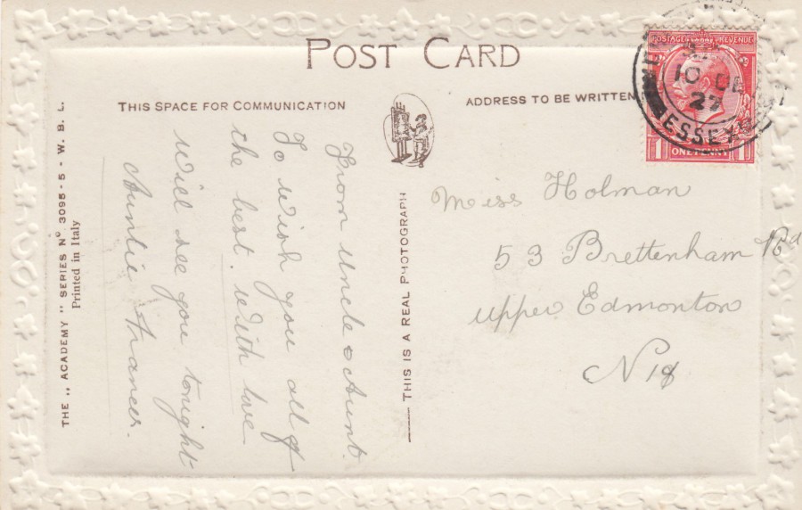
REVERSE SIDE OF ABOVE POSTCARD
The embossed edging can easily be seen on the reverse side of this postcard, which was posted in 1927 using a one penny King George V definitive stamp first issued in 1912 (SG 419)
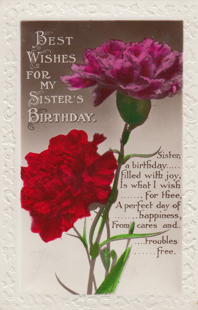
BEST WISHES FOR MY SISTER’S BIRTHDAY
Anonymous Publisher
Ref: N. 1903
Another example of this postcard format, this time a vertical one. Unlike the more common red rose, as used above, this one depicts carnations (Dianthus caryophyllus). The above rose design is a general birthday wishes design whilst this one here is for a specific family relation – a Sister. This is not uncommon, and all sorts of family member types can be found on these.
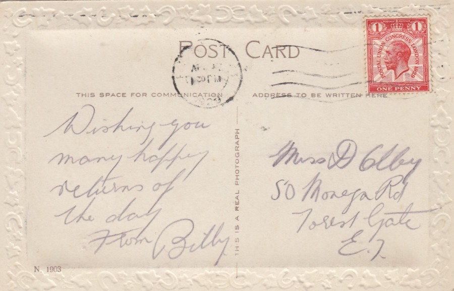
REVERSE SIDE OF ABOVE POSTCARD
The embossed edging can again be easily seen on the reverse side of this postcard, which was posted in 1929 using a one penny King George V ‘Postal Union congress, London 1929’ definitive stamp first issued in 1929 (SG 435)
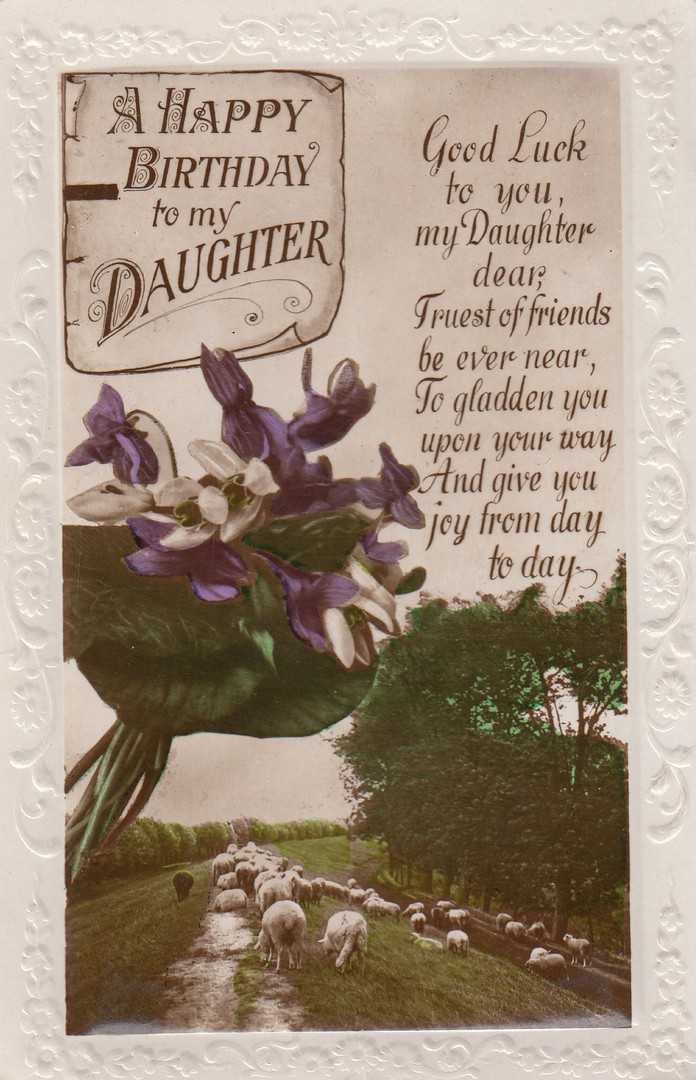
A HAPPY BIRTHDAY TO MY DAUGHTER
Anonymous Publisher
Another example – this time for a daughter
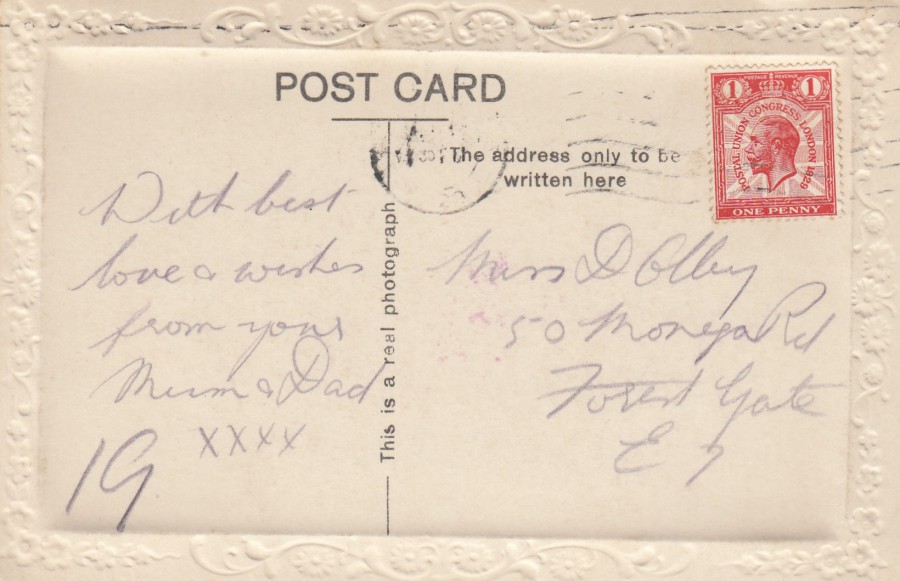
REVERSE SIDE OF ABOVE POSTCARD
This postcard was posted in 1929 using a one penny King George V ‘Postal Union congress, London 1929’ definitive stamp first issued in 1929 (SG 435). As the postcard was designed to be used by a parent, or parents, it is nice to see that this one was sent by ‘Mum & Dad’.
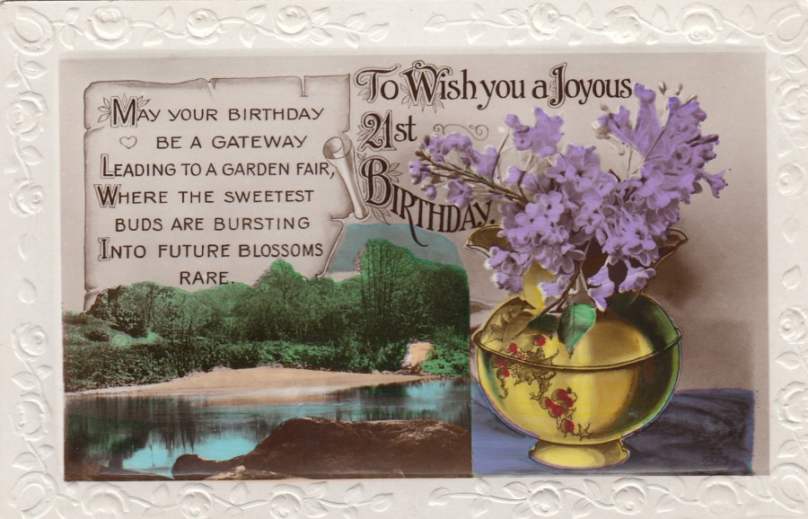
TO WISH YOU A JOYUS 21ST BIRTHDAY
Anonymous Publisher
This postcard is from the same period as the ones posted above but this was sent under a separate envelope (which was not unusual as remember that this was the normal process for Greetings Cards sent out for birthdays, so doing the same with birthday postcards seemed the thing to do). This means I have no precise dating factors, but these were common to the late 1920’s period so this card is almost certainly from this time frame.
This design is for a specific type of birthday, the much celebrated 21st. Alongside cards for specific family members cards were also produced for specific event birthdays, like this one. Because these were easy to produce by this time they could afford to produce a range of specific postcard types.
REVERSE SIDE OF ABOVE POSTCARD
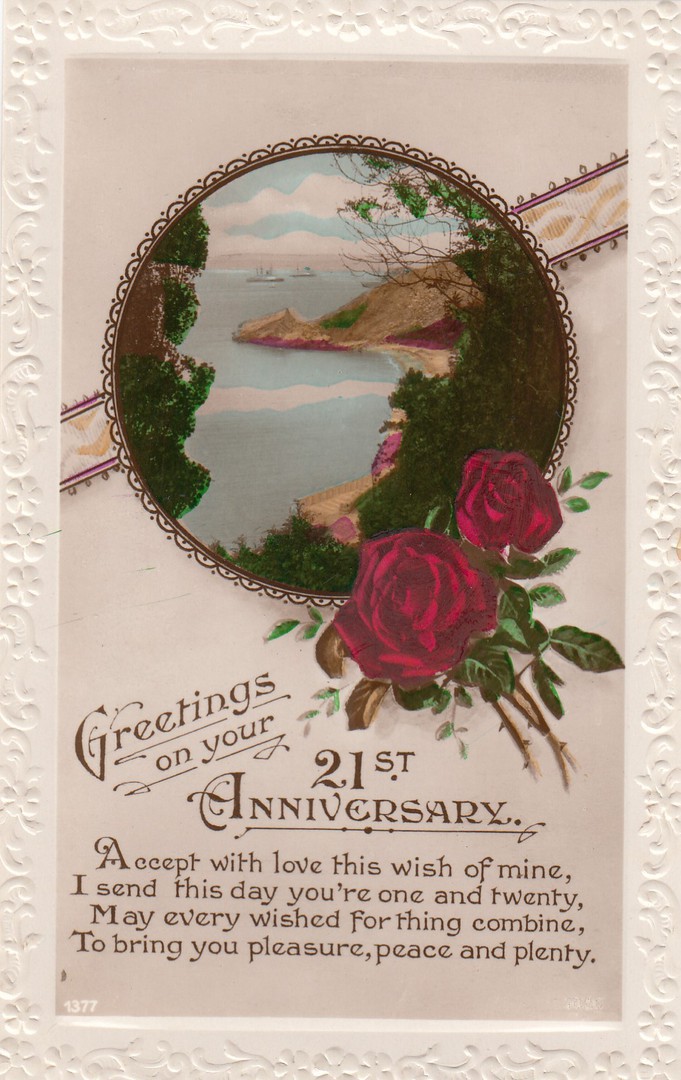
GREETINGS ON YOUR 21ST ANNIVERSARY
Anonymous Publisher
This design was to be used as a 21st Birthday card. This is certainly what this depicted card was used for as the sender has written a message on the reverse side saying that it was sent out as a 21st Birthday card. This design is unusual, I think, because of the use of the word ‘Anniversary’ rather than ‘Birthday’. It seems a more formal approach to me and perhaps that was its intention.
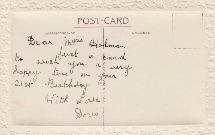
REVERSE SIDE OF ABOVE POSTCARD
With hand written 21st Birthday message
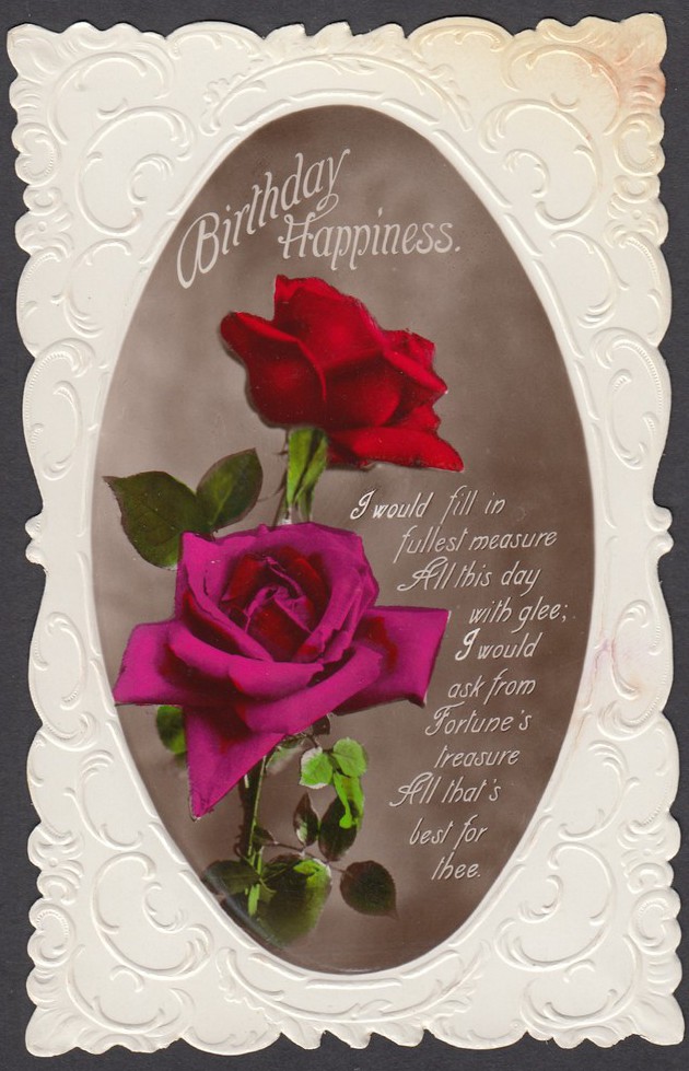
BIRTHDAY HAPPINESS
Anonymous Publisher
Ref: 8002
As these postcards became more and more common, with many different publishers, some anonymous, issuing similar type designs, there was a need to do something different. Here they have cut the edge of the postcard into an elaborate patterned boarder. I think this makes this sort of card far more attractive and I would suspect that someone looking for this sort of thing would be far more likely to pick this one out. This is one of my favourites.
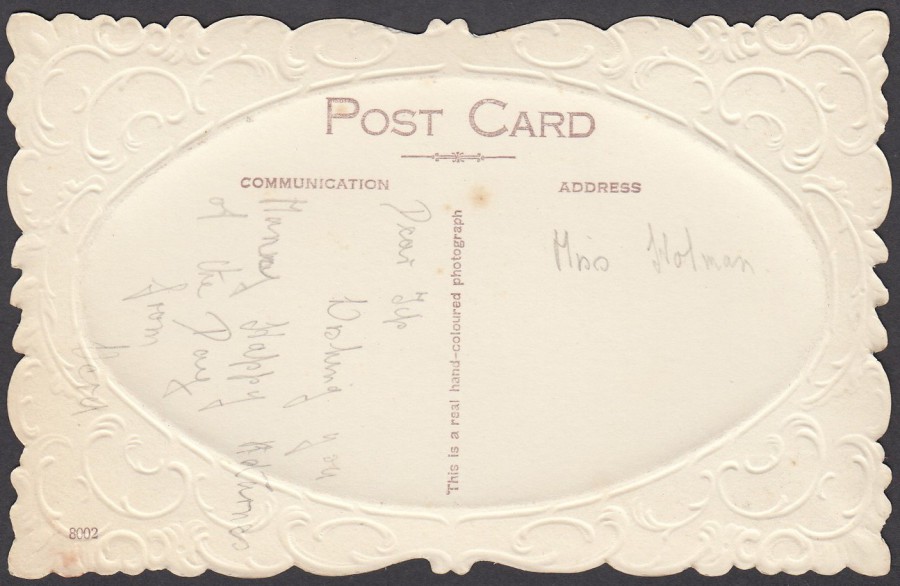
REVERSE SIDE OF ABOVE POSTCARD
This one also looks impressive from the back
31/12/2017
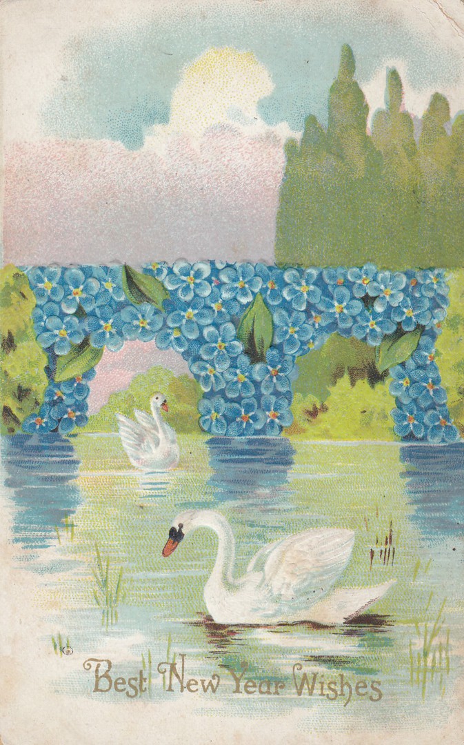
BEST NEW YEAR WISHES
By
Anonymous Publisher
Embossed ‘Relief’ Postcard
Early embossed swan design produced for New Year wishes
May I wish a Happy New Year to all our readers
REVERSE SIDE OF ABOVE POSTCARD
you can see the raised embossed areas in reverse from this side, in fact they are easier to see here than on the front of the card
31/12/2017
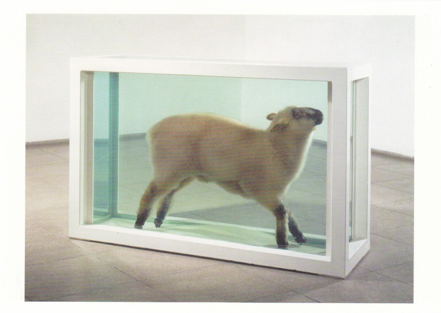
AWAY FROM THE FLOCK (1994)
DAMIEN HIRST
Published by
ARTIST ROOMS (NATIONAL GALLERIES SCOTLAND) – TATE GALLERY
The art works of Damien Hirst have always been divisive, especially the animals in formaldehyde, the basking shark perhaps being the best known (and there is a postcard depicting this as well). This sheep one is not known as well but is one that I have seen (I have also seen the basking shark one). Is this art? Yes, I think it probably is. I do know that a lot of work was involved in the production of each piece, its not as simple as just putting the animal in a tank of formaldehyde as each of the animal’s internal organs needs to be individually injected with the formaldehyde, a difficult and quite lengthy process. This postcard here was bought at the Tate Modern, London shop although I believe the piece was obtained through the joint work of Artist Rooms and the Galleries of Scotland.
31/12/2017
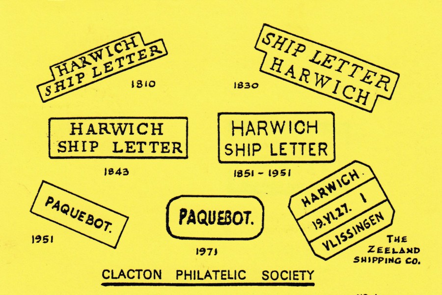
HARWICH SHIP LETTER & PAQUEBOT CANCELS
Published by
CLACTON PHILATELIC SOCIETY
These postcards depicting various historic hand stamps and cancellations have been very popular for a long time and they are collected by stamp and philatelic collectors rather than true postcard collectors. This one is from my home county of Essex and is maritime themed. I like the use of yellow coloured card as this catches the eye, it is also a colour of card which has previously been used for this type of card, although white card is still the main type of card used.
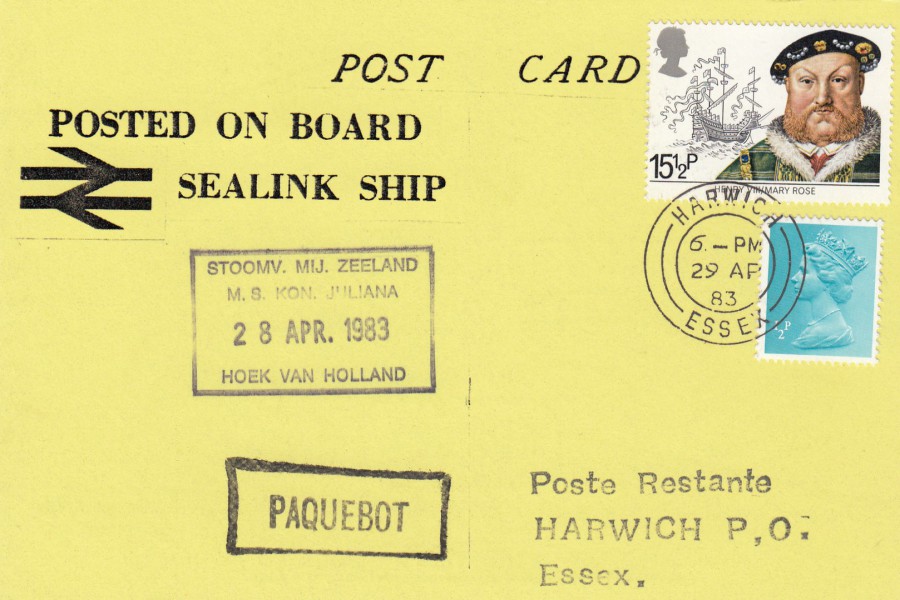
REVERSE SIDE OF ABOVE POSTCARD
To go with the theme of the cancels depicted on the front of the card some of these were posted on board the ship the M. S. KON JULIANA on the 28th April 1983 receiving the ships boxed identification cachet and the boxed ‘PAQUEBOT’ (posted at sea) cachet. A 15 ½ P King Henry VIII Maritime History stamp has been used with the correct postage made up with an additional ½ p machin postage stamp. These stamps have been cancelled with a Harwich double circled cancel dated 29th April 1983. Printed at the top on the left-hand side is ‘POSTED ON BOARD SEALINK SHIP’ which clearly indicates that the M. S. KON JULIANA is a Sealink company Ferry.
This is a lovely card and fortunately it is quite common, certainly down here in Essex, and copies are usually reasonably priced and easy enough to get. Still a very nice card though, with interesting usage.
31/12/2017
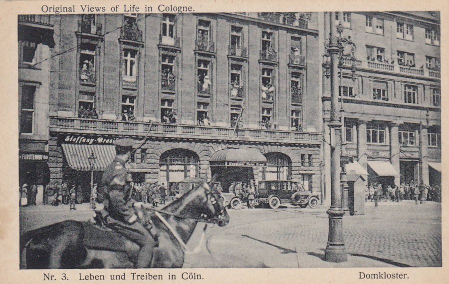
ORIGINAL VIEWS OF LIFE IN COLOGNE
Nr. 3 LEBEN UND TREIBEN IN COLN
(No 3. LIFE AND BUSTLE IN COLOGNE)
Published
FOTO – WERKSTATTE – COLN, MARSPLATZ
This card caught my eye because of the soldier, a sergeant possibly judging from the stripes on his arm, who appears on the horse in the foreground. But, upon closer look it seems that most of the people out front of the central building, and on its balconies, are military men. But, these do not look like German soldiers, they appear to be wearing a more British style of uniform. There is no dating information here either, but, looking at the vehicles out front I believe this is more post WW1 era rather than a lot later. Certainly after 1918, (possibly late that year, but I don’t think so) to me this has the feel of a card published somewhere between the end of the war and the early 1920’s, perhaps depicting the soldiers enjoying this German city after their success in WWI. Cologne was under occupation by the British Army of the Rhine from the end of WWI until 1926, and I think this is who you are seeing in this photograph. If I had to place money on it I think I would come down on this being an early 1920’s postcard. As it almost certainly depicts the British in occupation I wonder just how popular this postcard would have been to the locals, not much I would have guessed.

REVERSE SIDE OF ABOVE POSTCARD
German published
(but was it for sale to the occupying soldiers?)
31/12/2017
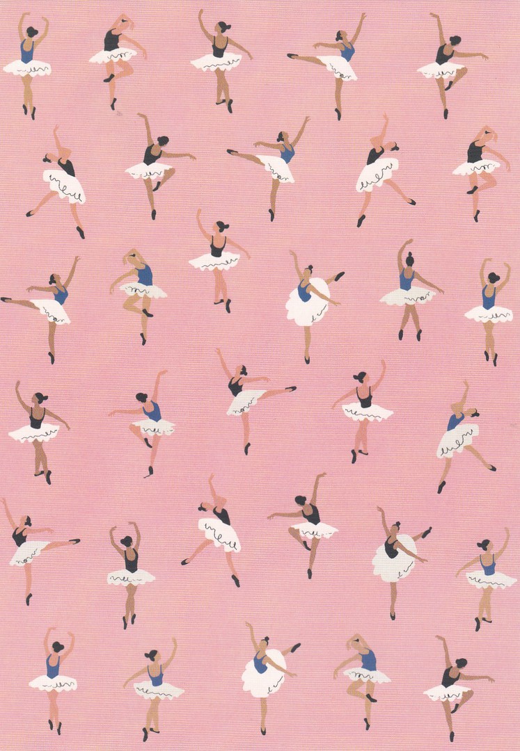
UNTITLED
BALLET DANCERS DESIGN
Published by
paperchase
Ref: FSC C014059
Simple designs can sometimes catch the eye just as easily as complex and detailed ones. I saw this card yesterday and there is also often some outside element that draws you to a card, something that has happened recently or something you read or saw on television. With this card I wonder if it was the announcement that in the New Years honours list Darcey Bussell is to be made a Dame. Although all the papers made mention of her as one of the dancing judges on ‘Strictly Come Dancing’ she was of course a former top ballerina. Having only read about this that morning I wonder if this news was the reason this postcard called to me on this occasion?
30/12/2017
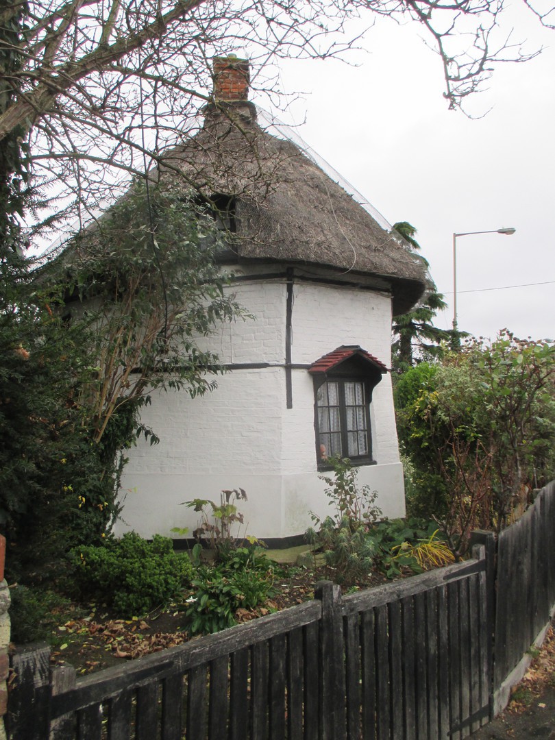
This is another examination of a local historic building, another one from my old work place of Canvey Island. As previously stated on another posting I am doing these postings to show you how a study of an area can be enhanced through the collecting of topographical postcards – clearly for me, this is going to be areas around where I live and have worked as these are the area’s that I am interested in.
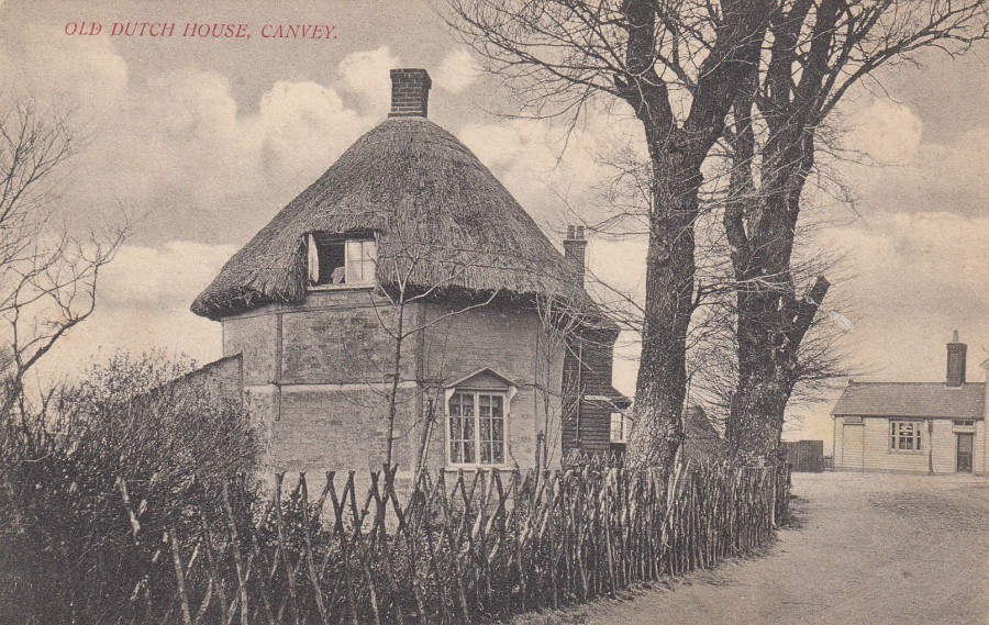
OLD DUTCH HOUSE
CANVEY
Anonymous Publisher
This is a printed postcard depicting one of the two remaining Dutch Cottages left on Canvey Island. I have previously depicted some postcards showing this ‘particular’ cottage, but I recently came across some more. This image here is a finely detailed photograph.
REVERSE SIDE OF ABOVE POSTCARD
Nice red printing used here
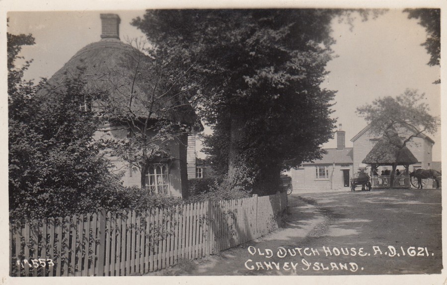
OLD DUTCH HOUSE A.D.1621
CANVEY ISLAND
Anonymous Publisher
Ref: 11553
Although this is another old photograph it was taken more recently than the one depicted above. This is also a real photographic post card rather than a printed card like the one above. There is a lot more foliage around the cottage in this photograph. I once had the opportunity to go inside this cottage, it is privately owned so people can-not usually gain access, but I was fortunate and spent some time inside the cottage speaking with the then occupier. If you are curious and want to see the inside of one of these there is a second Dutch Cottage on the island and this one is a museum which you can go and visit, by previous arrangement I believe. I have also been inside this one, under the rather tragic circumstances that it had been broken into. Fortunately, not much damage was caused on that occasion.
REVERSE SIDE OF ABOVE POSTCARD
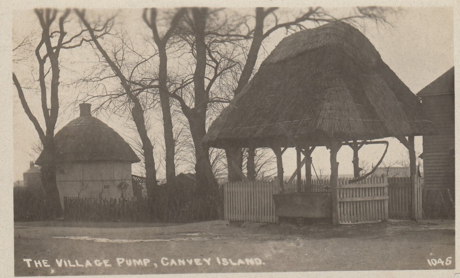
THE VILLAGE PUMP
CANVEY ISLAND
Anonymous Publisher
Ref: 1045
The Dutch Cottage can be seen here in the background. This image is taken from the other side of the cottage to the two previous postcards above. The concentration here is on the village pump (which can be seen in the above postcard on the right side with horses drinking from it). Canvey Island had a mainstay of horse drawn carriages for longer than many other locations because of the issue around access to the island when the tide was in. I don’t believe motor vehicles arrived on the island until the road bridge was built between Canvey Island and the mainland at Benfleet. I think because of this the village pump was more prominent, and lasted longer and certainly was the subject of many postcards.
REVERSE SIDE OF ABOVE POSTCARD

PHOTOGRAPH
Taken 07/12/2017
When I attended here to take this photograph the cottage was up for sale. I was quite pleased with this photograph as it is taken quite close to where the second of the above postcards was taken. The village pump would have been-located in the middle of the road, where the traffic lights can be seen. The building in the background was the ‘King Canute Pub’ but as you can see here it is currently boarded up. I remember this pub well as I attended a ‘number’ of incidents here and it remained at the time part of the history of the Island, so it was sad to see it closed-up (in some ways).
PHOTOGRAPH
Taken 07/12/2017
Close-up shot of the cottage
30/12/2017
CHARTWELL HOUSE
PART TWO
It has taken a couple of months for me to get around to posting the second selection of postcards obtained on my visit to Chartwell a some weeks back. But, here is that selection.
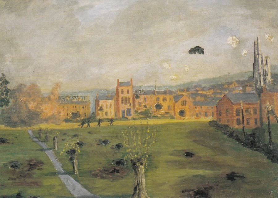
‘PLUG STREET’ 1916
Painting by
SIR WINSTON CHURCHILL
Oil on Canvas
Produced by
THE NATIONAL TRUST
Ref: C-42926X
I have been to ‘Plug Street’ as the soldiers called it, it is correctly called ‘Ploegsteert’, a village located in Belgium. I have also seen Churchill’s HQ in the village which is a very slim, small house. I don’t know if this was painted whilst he was there, or later when things were safer, but it is an unusual addition to a military history collection. I also got to see this painting at Chartwell House where it hangs on the wall (as an aside the staff member gave a little talk to visitors whilst I was there during which she incorrectly placed ‘Plug Street’ at the Battle of the Somme, and in France instead of Belgium – I did not have the heart to correct her as she seemed so keen!)
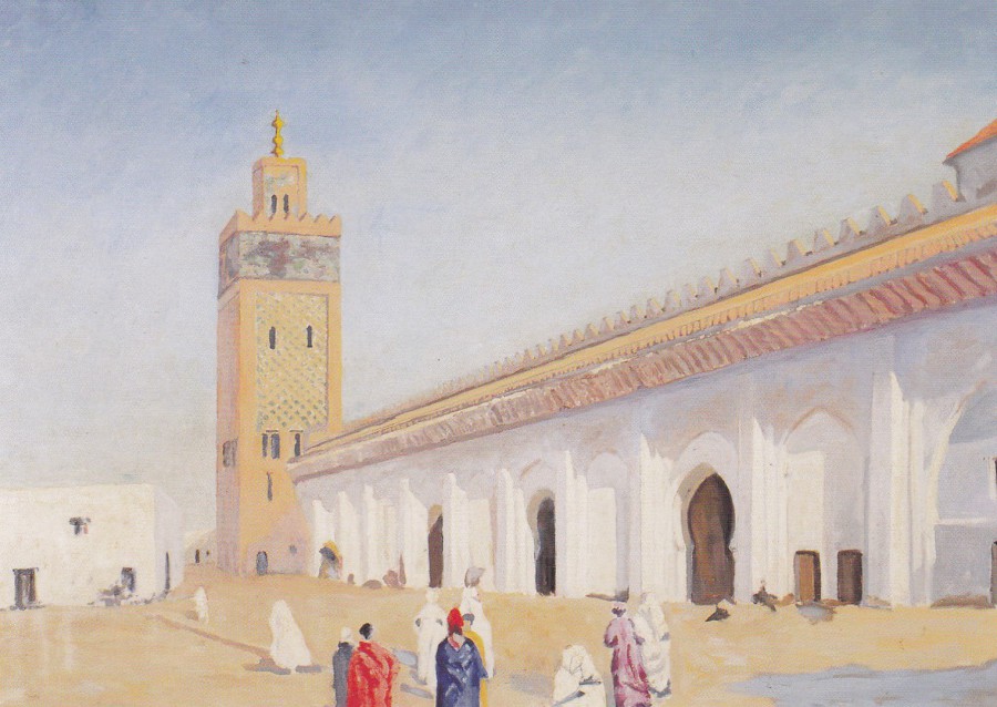
THE MOSQUE AT MARRAKECH, 1948
Painting by
SIR WINSTON CHURCHILL
Oil on Canvas
THE NATIONAL TRUST
Ref: C-50677X
Although I am not a great fan of the paintings by Churchill I will admit that this one is rather good. It is without doubt my favourite amongst those that I have so far seen, so I was glad to see that a postcard of it was on sale.
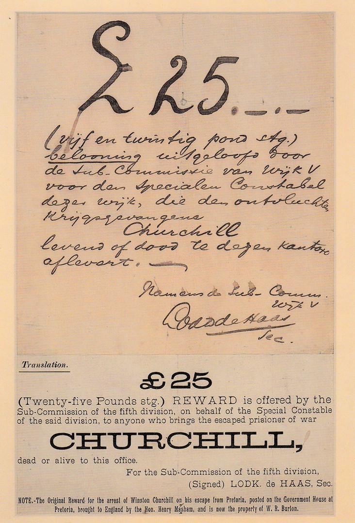
OFFER OF A REWARD FOR CHURCHILL
‘DEAD OR ALIVE’
18 DECEMBER 1899
Produced by
THE NATIONAL TRUST
This small reward poster is on display in the house and it relates to the time that Churchill, having been captured by the Boer during the Second Boer War, escaped from a prisoner of war camp. He had been caught when a train had been ambushed. Churchill had been loading injured soldiers onto the train when it left without him. Churchill had been in a gulley when the train pulled away and was, although technically a civilian at this time, treated as a prisoner of war. After just four weeks, on 12th December 1899, Churchill escaped into the dark streets of Pretoria. After a while a price was placed on his head and this sheet announced that there was a £25 reward. Churchill made it back to his side by the 21st December having spent some time in the house of an Englishman who resided in the territory.
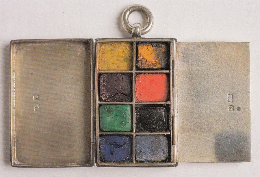
SILVER MINIATURE PAINTBOX
BELONGING TO SIR WINSTON CHURCHILL
Produced by
THE NATIONAL TRUST
When they say ‘Miniature’ they really mean it. I had seen this postcard in the shop prior to touring the house and had thought it of little interest. But, when I saw the actual item itself I was amazed just how small it is. This would fit into the palm of your hand with ease, and plenty of skin still to be seen around it’s edges. Having seen it I became aware of why they had produced a postcard showing it. It is so unusual that I changed my mind completely and bought the card.
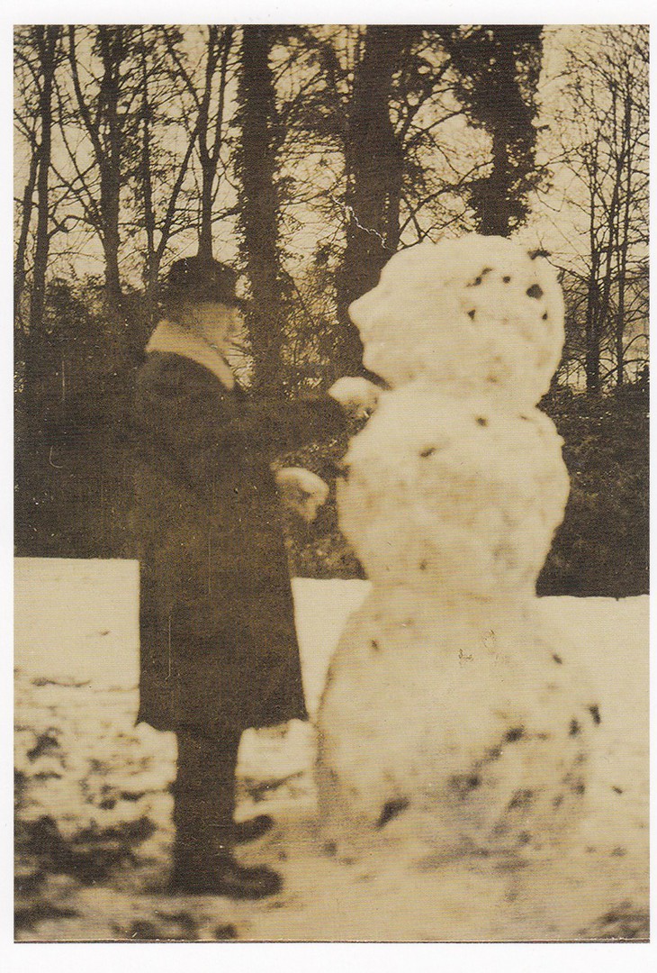
SIR WINSTON CHURCHILL BUILDING A SNOWMAN
IN 1972
“THE YEAR OF THE GREAT SNOW”
Produced by
THE NATIONAL TRUST
I noticed that the copyright date for this postcard is 2017, as is the paint box card above (the reward poster card is copyrighted to 2016 – the painting cards have no date on them re-copyright). So, this may be a new issue, or just a new print run with the date updated. Although the image is a bit blurred it is still an interesting and unusual image of Churchill. It would look good in any themed collection based around Churchill or his military, and or political connections
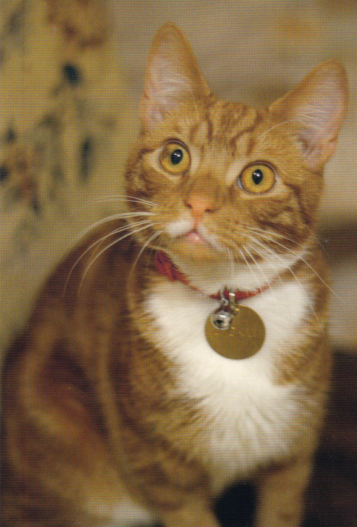
CHARTWELL HOUSE
THE SIXTH JOCK
“Churchill was given a ginger cat on his 88th birthday”
Produced by
THE NATIONAL TRUST
The attached shop has a whole range of items connected to the houses cat, named Jock. They even asked me if I had seen him. The interesting thing for me is that this postcard is not with all the other postcards but is on the shelf in the opposite corner where they have a stand of ‘Jock’ the cat related stuff. I did not see this postcard until almost the last minute and nearly missed it. So, if you visit here I recommend having a good look around the shop as they do like to hide one or two of these postcards in different corners.

30/12/2017
LADYBIRD BOOK COVER POSTCARDS
From the boxed set of 100 Ladybird Book Covers
Used on the front with a Royal Mail ‘Ladybird Books’ Stamp 2017
Cancelled with a special AUTUMN STAMPEX 2017 special hand stamp.
This is another of the postcards which I had a ladybird stamp applied to and cancelled first day of issue at the last STAMPEX show. I had a number of these done and I think these are quite attractive and made for some great souvenirs.
This is the most unusual of the postcards from the Ladybird boxed set. It is the only card that does not depict an actual book cover. This one just depicts the Ladybird logo used by the company. I think this is one of the most relevant of the cards to have been used in this way.
30/12/2017
PELICANS
Published by
SUGARBOO DESIGNS
“How much do I love you?
I’ll tell you no lie.
How deep is the ocean?
How high is the sky?
(Irving Berlin)
This is the last of my ‘SugarBoo’ postcard buys to be posted on the webpage. The others have already been depicted, and this one is again a wildlife themed design. These, as previously stated, are not cheap postcards, but when you are in the world of the ‘Mouse’, good old Mickey himself (in Florida of course, where I acquired these cards), you tend to forget a little, or maybe a lot, about the cost of things, especially as many official Disney things can appear to be a bit expensive – postcards especially so.
Still, this is a delightful card.
30/12/2017
SPORTS CENTENARIES
ROYAL MAIL
PHQ / STAMP CARD
12P Athletics
Ref: PHQ 47 (a) 10/80 (NPM)
In 1980 the Post Offices ‘National Postal Museum’ (the old one, not the one that opened-up earlier this year) overprinted a small number of this 12p PHQ Stamp Card for their Exhibition of Elizabethan Sports stamps – the overprint read:
A Souvenir of the Elizabethan Sports Stamps Exhibition.
National Postal Museum – October – November, 1980
This overprint appeared on the reverse side of the PHQ Stamp card and only copies of the 12p stamp card were used. These two lines of text are printed in the top left corner on the reverse side. There is also another small piece of overprint, which is often missed in listings of this special card, and this is an additional ‘(NPM)’ at the end of the text line down the centre of the reverse side.
Some of these stamp cards were also posted on the first day of issue of the stamp with the depicted 12p Athletics stamp attached and cancelled with the exclusive red ‘NATIONAL POSTAL MUSEUM – LONDON E.C.1.’ Maltese Cross special hand stamp dated 10th October 1980.
The 1986 5th Edition of ‘Collect Post Office Cards’ (published by B.B.P. Publications – page 15) lists this special one-off edition and prices it as follows:
Mint Copy of overprinted stamp card - £5
Copy of overprinted card with National Postal Museum F.D.I. Cancel - £8
A latter edition of ‘Collect Post Office Cards’ (published by Rosendale Stamps Ltd – issued 1994 – and this was the last catalogue for these postcards released – page 9) also lists this card and values them as:
Mint Copy of overprinted stamp card - £5
Copy of overprinted card with National Postal Museum F.D.I. Cancel - £10
When copies of this special card do turn up they do sell for £10 and they are considered one of the few really-collectible PHQ Stamp cards from this period.
REVERSE SIDE OF ABOVE POSTCARD
Here you can see the overprints and first day of issue cancellation. They are not immediately obvious at a first quick glance, but this is a card worth keeping an eye out for when used in this way.
30/12/2017
THE GREAT CHILDREN’S PARTY
HYDE PARK
30 – 31ST MAY 1979
THE POST OFFICE
Official Postcard
The ‘Hyde Park Great Children’s Party’ was a massive event held to mark the International Year of the Child in 1979. Over two days (30 31st May) children attended what was possibly the largest party ever held and 80,000 children attended (I have read one report that states 160,000).
This postcard was printed and given away free to the children at the event and they could take this to a stand where the card could receive a special exclusive black cachet which had the head of a lion wearing a party hat, the official logo for the event.
Now, mint cards were later made available to buy at the BIPEX event (British International Postcard Exhibition) later that year and this was the only place that collectors could pick up copies. Therefore, mint copies, without the central cachet, are valued between 50p - £1. But, the black lion head cachet was only available at the party itself and was only available to children. Kids will be kids and naturally enough these cards were roughly handled, bent, knocked about and mainly damaged in some way. And, lets face it, something like this in the hands of a child at what was then the biggest party ever held stood little chance of survival. And, because of this nice copies used with the cachet are quite scarce, and are very collectible, especially because these were official POST OFFICE cards.
The 1986 5th Edition of ‘Collect Post Office Cards’ (published by B.B.P. Publications – page 90) gives this card the reference HQP12 and values them as follows:
A mint copy (no cachet) – 50p
A copy with the cachet applied - £20
A latter edition of ‘Collect Post Office Cards’ (published by Rosendale Stamps Ltd – issued 1994 – and this was the last catalogue for these postcards released – page 45) gives this card the reference NL 12 and values them as:
A mint copy (no cachet) –60p
A copy with the cachet applied - £22
So this is considered a valuable postcard.
REVERSE SIDE OF ABOVE POSTCARD
The front of the post card has drawn images of areas around Hyde Park, with a plain white central circle, where the cachet was supposed to be applied (as above). The reverse side has a proper postcard layout with images of three blue birds carrying letters in their beaks top left. There is a known error in printing in regards of these birds where the blue printing is offset from its pink boarder print, thus making the birds look a bit fuzzy. This listed error is also sought after and is quite scarce, especially so if this is found on a card which has received the cachet, which is, as you can see here, the case with my copy.
I was extremely lucky to obtain this card. I was at a local philatelic club members auction night when I saw this card in amongst a lot of common cards and envelopes, the rest being of little value. When I saw this card, I knew immediately what it was and what it was worth. Luckily, I was the only person who did as I won the lot for just a couple of pounds. I was delighted to be able to add one to my collection as I have not seen one since (and it was over 25 years ago that I got this card!)
CLOSE-UP OF ERROR PRINT AREA
Misalignment on edge of birds

29/12/2017
THE CENTRAL TELEGRAPH OFFICE LONDON
CHRISTMAS GREETINGS 1888
Published by
TELECOM TECHNOLOGY SHOWCASE, LONDON
Printed by
Beric Tempest & Co., Ltd
Ref: EPHEMERA SERIES No. 6
“The 1888 Christmas card of the British Post Office’s main London telegraph office, widely known as CTO”
(Text from reverse side of postcard)
The ‘Telecom Technology Showcase’ issued a range of postcards in what was a numbered series. The cards all had a connection to the world of telephones, telegraphs and similar technology. The series was quite popular and was collected by many philatelists as the cards were often also linked to stamp release subjects or at least had a special related first day of issue hand stamp and, also often a cachet which was only applied at the showcase premises. Therefore, cards with both the FDI hand stamp and the cachet are valued higher and are more desirable.
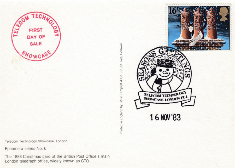
REVERSE SIDE OF ABOVE POSTCARD
My copy of this postcard has the special ‘Telecom Technology Showcase’ red ‘FIRST DAY OF ISSUE’ cachet, which has been applied top left side. This cachet, as mentioned, was only applied at the showcase premises on the release date (although, to be fair, dealers were given advance-notice of the release and as such many were collected on the day and circulated amongst collectors).
The dealer responsible for this ‘particular’ card has applied a 16p Christmas 1983 stamp (SG 1232) which has been cancelled with a first day of issue – 16th November 1983 – special hand stamp which is a ‘SEASON’S GREETINGS – TELECOM TECHNOLOGY SHOWCASE’ snowman design which was issued for the release of this specific postcard. This makes for a great combination, and one which has some value beyond that of the basic postcard issue.
29/12/2017
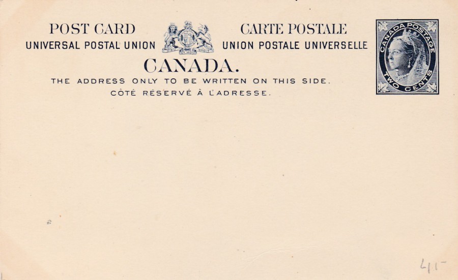
CANADA
2 Cents deep blue pre-printed Queen Victoria postage stamp
Higgins & Gage, World Postal Stationery Catalog
Section 3
Canada - Page 2
Reference No: 21
Issued 1898
This was a new Maple Leaf stamp design (maple leaf’s in the corners of the stamp design) with extended text areas either side of a central heraldic lion and unicorn motif. It is the stamp image here which I really like. This is a much older Queen Victoria than appears on most postal stationery items from her reign. Just look at the Queen Victoria image on the Gibraltar card posted below, which is the more common Queen Victoria portrait in use through her reign.

29/12/2017
15 Centimos Brown pre-printed stamp on Buff card
(Spanish Currency values)
Higgins & Gage, World Postal Stationery Catalog
Section 6
Gibraltar - Page 2
Reference No: 17
Issued 1889
The first Gibraltar postal stationery post cards had been issued in 1886, and these had had English currency values. In 1889 these were overprinted with Spanish currency values which lead to the printing of Spanish currency valued postal stationery post cards later in 1889. The values changed back to English currency values in 1898.
It has been awhile since I have posted one of these early postal stationery cards on the webpage so excuse me if I place a few on over the next few days.
28/12/2017
THE WAR DOCTOR
JOHN HURT
Published by
THE DOCTOR WHO EXPERIENCE
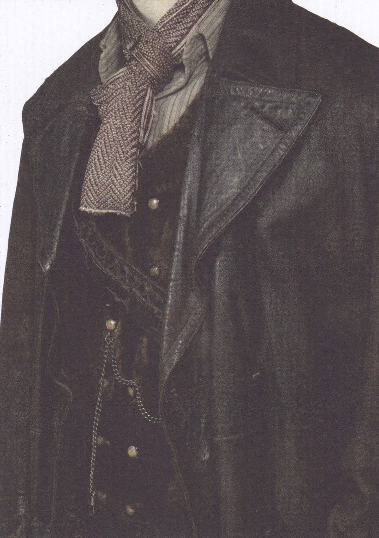
The Doctor Who Experience, in Cardiff, Wales, produces a lot of excellent exclusive postcards which are unfortunately only available at this tourist location. They do not sell their cards via the internet, so an actual attendance is required. This means that I am subjected to looking through dealer’s stocks and mostly buying these cards on eBay. One of the sets they have issued is a wonderful set of costumes as worn by various Doctor’s themselves and, many of the companions and other people who have appeared on the programme. I really like this set and have been slowly building up my collection. This one here was a more recent addition and is from the War Doctor, who has only a few postcard appearances to his name.
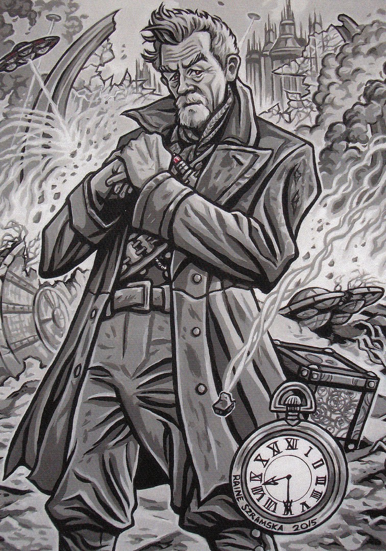
UNTITLED
THE WAR DOCTOR
Published by
DWS
This is a great black and white piece of artwork which depicts the War Doctor, as played by John Hurt. When the character first appeared in the 50th anniversary special I thought he was a great creation and I was glad when, a few months back, I found the postcards depicted here.
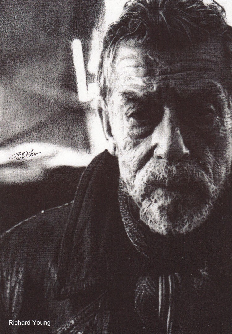
UNTITLED
THE WAR DOCTOR
Published by
DWB
Black and White Photograph
By
Richard Young
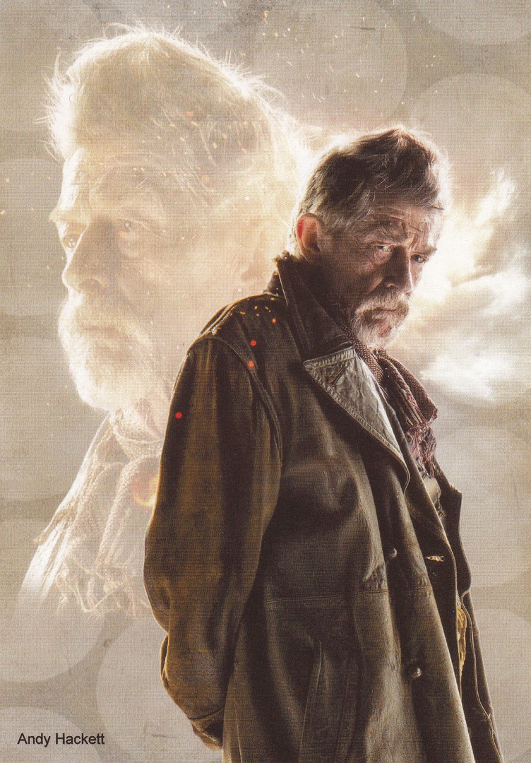
UNTITLED
THE WAR DOCTOR
Published by
DWB
Colour photographic montage
By
Andy Hackett

28/12/2017
WONDERGROUND GALLERY
WALT DISNEY WORLD
FLORIDA
Original Artwork of
“CAFÉ HIPSTER”
By Artist
Jerrod Maruyama
There are a number of Maruyama Mickey Mouse designs published by ‘Wonderground’, and they are very distinctive in style. This one has a very modern look to it and I liked the fact that Mickey is shown with some large headphones, which are of course back in fashion.
I am currently feeling qiute 'Disney' as for Christmas we announced to our grandchildren that we are taking them to Florida during the summer holidays as out gift to them. Needless to say there was much exitement at the thought of a Disney holiday. Which means, as we were keeping a surprise until Christmas, I can now let you know that we will be returning to the world of the mouse - Walt Disney World - in 2018 . I am sure new postcards will be found there, especially new 'Wonderground' issues. So, hang on in there for seven months and I am sure the webpage will contain these new cards.

WONDERGROUND GALLERY
WALT DISNEY WORLD
FLORIDA
Original Artwork of
“COURTING MINNIE”
By Artist
Jerrod Maruyama
Although distinctive in artistic style this image takes Mickey back to his more traditional roots. I actually prefer this one to the previously posted Maruyama design.