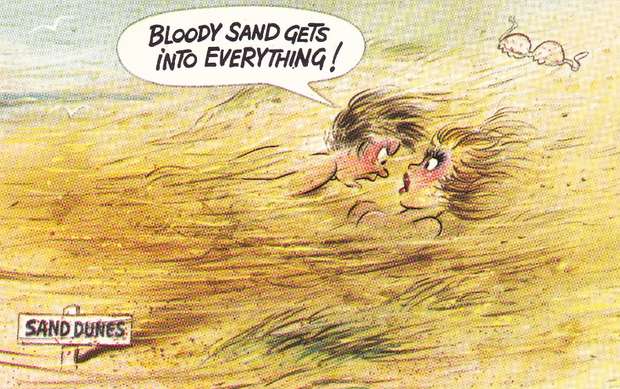
MARK’S ‘PIRATE’ POSTCARD
(WITH COMPULSARY ‘DR WHO’ REFERENCE)
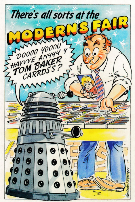
THE ‘MODERNS’ FAIR – LONDON 31ST AUGUST 2002
“There’s all sorts at the MODERNS FAIR”
“Doooo Yooou Havve Anyyy y TOM BAKER Carrdss?”
Copyright 2002 Mark Routh
Artist – Michael O’Brien
I commissioned this postcard and asked the well-known postcard artist Michael O’Brien to produce an image for me which had a television connection (I might have asked specifically for a Dr Who connection but it might have been that Michael came up with that excellent idea knowing my fascination for the programme). My reason for wanting to produce a postcard for the London 2002 ‘Modern’s Fair’ was that I was instrumental in organizing this event for, and with the help of, the PTA (Postcard Traders Association). I was really pleased with how the event (which was an additional fair attached to the then regular yearly ‘Picture Postcard Show’) went and have always felt proud about the day itself (although it was tiring and from my point of view a very long day).
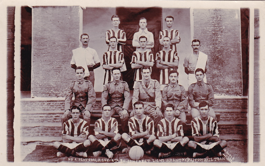
No 1 PLATOON, A COY 2ND BAT, SOMERSET LIGHT INFANTRY (PA) FOOTBALL TEAM
“Number 1 Platoon, A Company, 2nd Battalion”
The Somerset Light Infantry regiment has had several names and existed between 1685 and 1959 (in 1959 the regiment amalgamated with the Duke of Cornwall’s Light Infantry to form the Somerset and Cornwall Light Infantry – but subsequent amalgamations have all but obscured the Somerset name).
The Second Battalion was raised at Winchester in January 1858 after the Crimean War and the mutiny in India had shown that the military were overstretched. After various campaigns the regiment found itself in active service in the first world war with battalion’s serving on the western front, Mesopotamia and Palestine. The 2nd Battalion was in India on the outbreak of war and remained in India and fought in the brief Third Anglo-Afghan War in 1919. After this service in Afghan the battalion returned to India in 1920 and moved to Sudan in 1926 and returned to England in 1927.
The postcard here of the Battalions football team was described as circa WW1 and this may be correct but it could also be from the time immediately prior to the wars start as the Battalion was in India throughout this period. If anyone knows anything about this team photo I would be interested to hear from them.
P.S. This is clearly a photograph taken of a photograph which seems and unusual way of illustrating the picture – was the photograph sent to England and then photographed or was it photographed elsewhere and the film sent to the publisher/printer for the image to be produced as a postcard?

CORONATION STREET
Excuse the smaller size of this image but it really does not scan very well for some reason but it is such a nice card I still wanted to depict it – on the actual card the images are sharp and clear.
There is no publisher or printer shown and in fact the reverse side only has the very simple postcard accoutrements of a dividing line and a stamp box.
The central image shows the character Ena Sharples, as played by Violet Carson, one of the most famous of the early Coronation Street characters.
This is a highly collectible TV postcard and copies reach anywhere between £3 - £5 each.

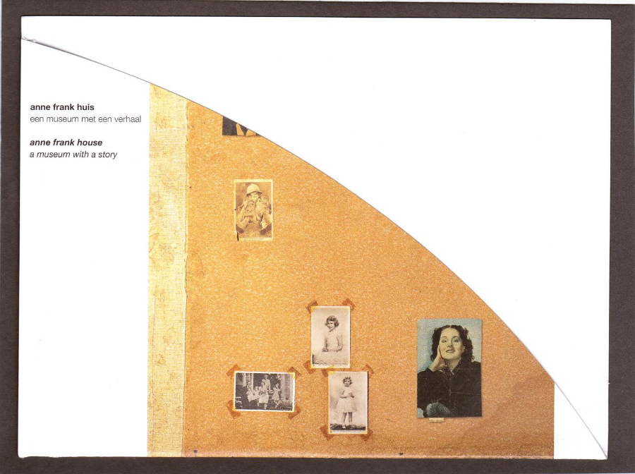
ANNE FRANK’S HOUSE
PART TWO
These are the last of the items that my daughter brought back for me from her visit last month. The first is a postcard showing Anne Frank. The photograph is a little blurred (it’s not my scanning skills for once). Text on the reverse side reads :-
This card is a special issue to commemorate Anne Frank’s 85th birthday, 12 June 2014. The picture is [sic] taken by Victor Kugler, one of the helpers of the people in hiding in the Secret Annexe [sic], July 1941”

ANNE’S MOTHER
This card is a special issue on the occasion of the opening of the Edith Frank-Hollander exhibition on the 3rd of October 2011 in the Anne Frank House.
Edith Frank and her family emigrated from Germany in 1933 due to the rise of antisemitism and ended up in Amsterdam.
The story of the families later two-year period in hiding, two years after the Nazi’s invaded Holland, was recorded in Edith’s daughter’s diary, published after the war.
Edith Frank died on 6 January 1945 (aged 44yrs) in Auschwitz Concentration Camp. It is recorded that she died of starvation.
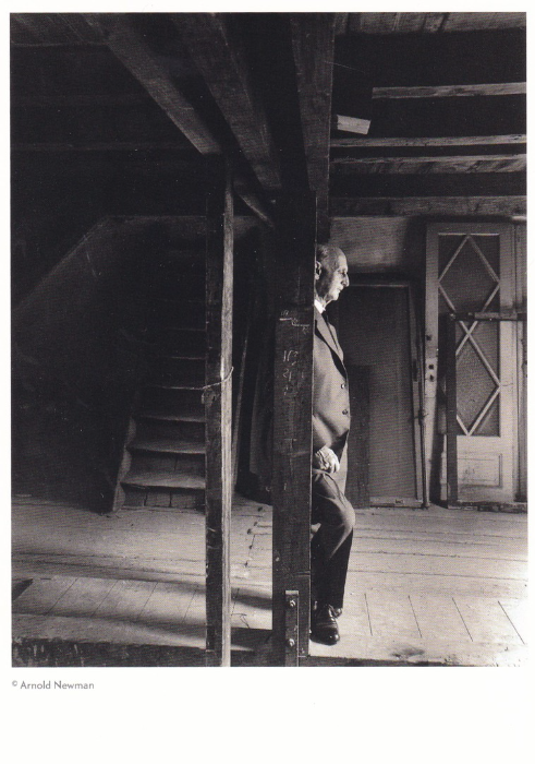
OTTO FRANK IN THE ATTIC OF THE SECRET ANNEX,
3RD May 1960
Otto Heinrich Frank (born 12 May 1889 in Frankfurt, Germany) was a German born Swiss businessman married to Edith Frank and father to both Margot and Anne Frank.
He served in the Imperial German Army during the First World War, having been called up for military service in 1915. He went on to serve at the battle of the Somme in 1916 and at the battle of Cambrai. Otto received a field promotion to Lieutenant in 1917.
Otto and his family, as you know, emigrated from Germany in 1933 and it was Amsterdam that he and his family were arrested and transported to Auschwitz where he was forever separated from his wife and children. Otto was sent to the men’s barracks where he remained until the camp was liberated by the Soviet army on 27th January 1945. It took him six months to travel back to the Netherlands where he set about trying to find his family. By the end of 1945 he knew he was the only survivor of all those who hid in the secret annex.
He was the sole member of his family to survive the holocaust. As inheritor of his daughter’s diary he arranged for its publication as ‘The Diary of a Young Girl in 1947 and oversaw its transition to the stage and screen.
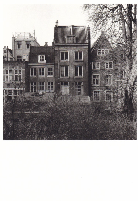
ANNE FRANK HOUSE, SECRET ANNEX, BACK OF THE HOUSE, 1954
Image taken of the house in 1954, six years before it opened as the museum it is so well known to be now. Another museum exclusive postcard.

PASSPORT PHOTO’S OF ANNE FRANK, MAY 1939
Anne’s father did try and obtain visas for his family and although it does not say so on this postcard I wonder if these images are part of that visa application. I think this is possibly my favourite postcard from the selection Rebecca brought back.

ANNE FRANK HOUSE POSTAGE STAMP PRESENTATION PACK
STAMP SHEET
This is a special Nederland (TNT) ‘Anne Frank House’ postage stamp sheet with three stamps depicting the house, the hidden annex entrance and Anne’s diary. I know this is not a postcard but I loved the fact that the boarder area around the stamps shows the wall within the secret annex where photo’s cuttings and postcards were put up. It looks like there is a postcard of the young, then, Princess Elizabeth. This addition makes this a nice supplementary item for my collection.
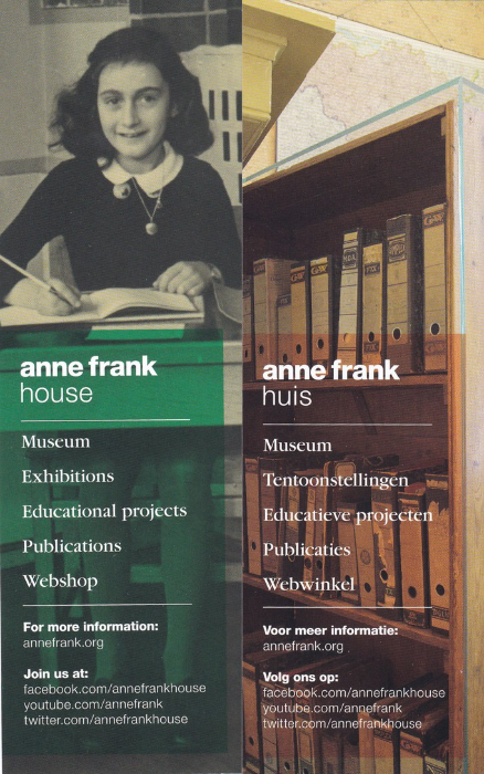
If you like this then copies can be bought online at the Anne Frank House webpage shop
ANNE FRANK HOUSE POSTAGE STAMP PRESENTATION PACK
FOLDER
This is the actual folder within which the above stamp sheet is contained. Text on the back of the folder reads :-
“The rooms of the Secret Annex are empty; that was Otto Frank’s explicit wish. If you would like an impression of how the hiding place looked during WW II, visit : www.annefrank.org”
This makes me wonder if the boarder area depicted on the stamp and the folder is an imagined one put together to show what it did look like and it is not an actual photograph of the true wall. Not that it matters too much either way.
ANNE FRANK HOUSE BOOKMARK
And lastly another non-postcard item but something I could not resist including here. This is a free bookmark available at the house, a promotional item. Here you can see both sides of the bookmark, one in English and the other in I assume dutch. The English sides gets a lovely image of Anne whilst the other side shows the file case which covered the hidden entrance to the secret annex.
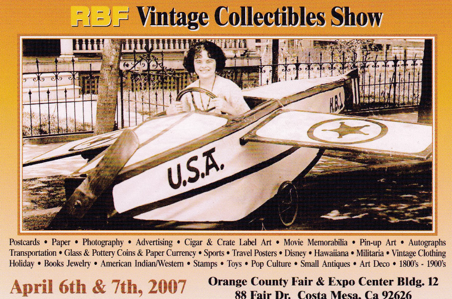
RBF VINTAGE COLLECTIBLES SHOW – 2007
April 6th & 7th 2007
Nice advertising promotional postcard for an American collectibles show where apparently you could find a huge assortment of Photography, paper, advertising, cigar & crate label art (massive in America), movie memorabilia, Pin-up art, autographs, transportation, coins and paper currency, sports, travel posters, Disney, Hawaiiana, militaria, vintage clothing, holiday, books, jewelry, American Indian/Western stamps, toys, pop culture, small antiques, art deco, glass, pottery and apparently so much more…and of course Postcards. Sounds like I would have liked it here.
This particular postcard also entitled you to $1 off the entry fee as well (normally $6)
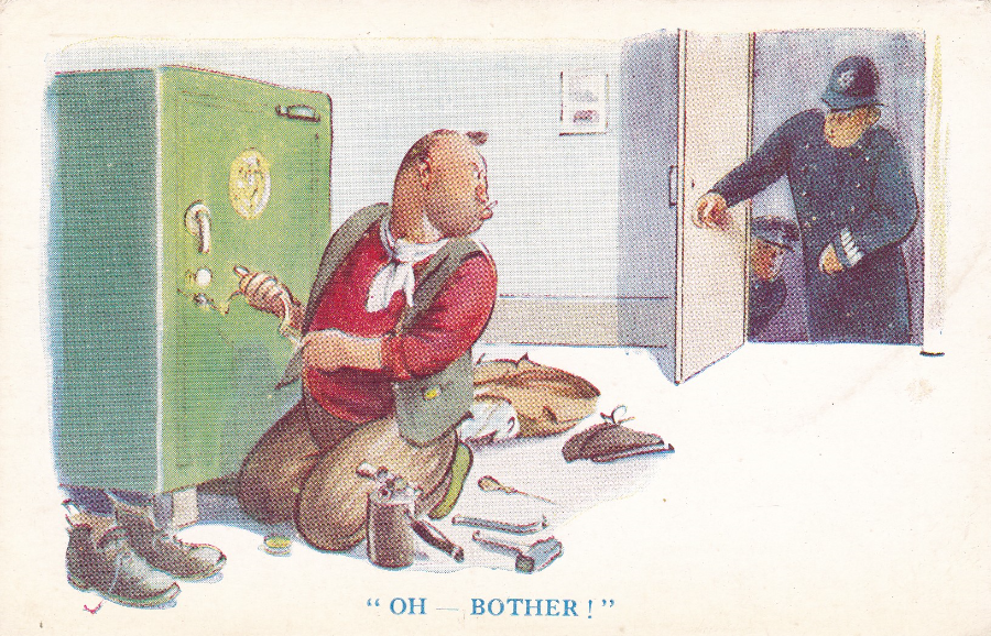
“OH – BOTHER!”
TUCK’S POST CARD
Raphael Tuck & Son’s Ltd
Fine Art Publishers to Their Majesties the King & Queen and to Her Majesty Queen Mary
Ah, the good old days of proper villains and police officers. These days it’s all computer crimes (Digital Data offences). I do miss the pure crimes. This is a cracking early postcard and one which fits nicely into my Police themed collection. It cost me £3.

THE LOCH NESS MONSTER – “NESSIE”
I am one of those people fascinated in the Loch Ness Monster story. I am not sure I truly believe, but I think I want to (there is something about the story that grips people despite the confirmed fakes and complete lack of any true scientific evidence – but when has anything so trifling as evidence ever got in the way of a good myth?).
One person who did believe was Tim Dinsdale who took a famous film (now known as the ‘Dinsdale Film’) of something in the Loch which he was certain was the monster. The film itself was later examined by the Joint Air Reconnaissance Intelligence Centre (JARIC) and after analyzing it they stated that they believed it was an animate object. But others have stated otherwise in an attempt to debunk the film. I only mention all this because his son, Simon, is a friend of mine and I once attended a talk given by Simon on his father’s film and life long search for the monster. At the end of this talk I came away really believing that something could be behind all the myth’s and Simon’s talk was compelling, but then I would expect nothing less from someone who was a high ranking police officer.
These postcards here are part of series, there are more, but no publisher is mentioned (they have the look of a COLOURMASTER INTERNATIONAL publication but that is just because the layout on the reverse side is similar to this company – or possibly SALMON). The cards do have individual reference numbers.
Reference SC100629
“The anglers dream – tackling of the loch ness monster”
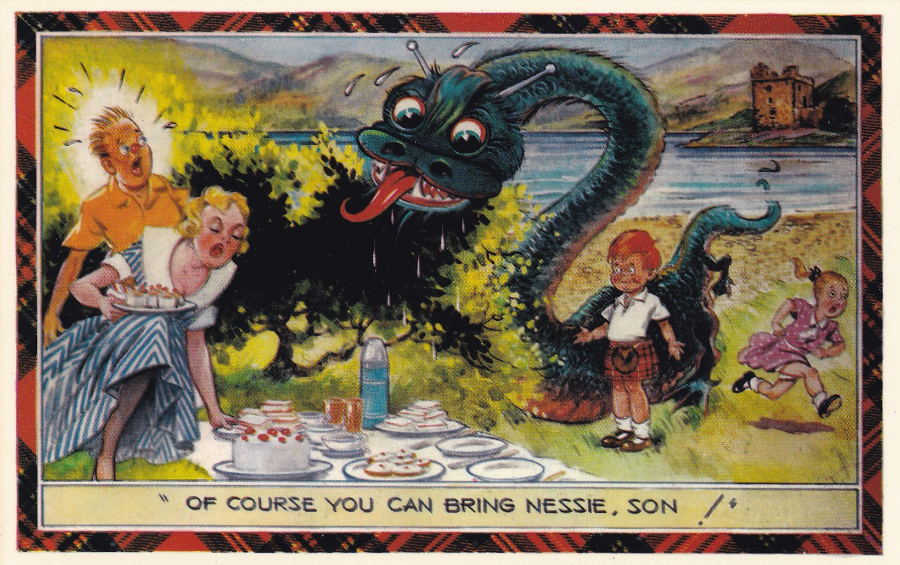
Reference SC100632
"Of course you can bring Nessie, son!"
The Castle that appears in the background on all three of these pictures is of course the famous Urquhart Castle which stands on the side of Loch Ness.
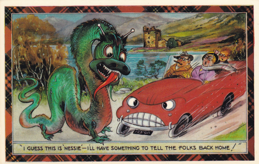
Reference SC100633
"I guess this is 'Nessie' - I'll have something to tell the folks back home!"
Not sure why the car has a face on the front of it though, surely for some just the belief in Nessie alone would be enough without animating the red sports car!
Comments
-
Hi, I have the original art work for this set of 6 postcards and 4 out of the 6 postcards to match. I am trying to find copies of the remaining 2 and would appreciate any assistance you or your followers can give me in obtaining copies of SC100631 and 632.
Many thanks John
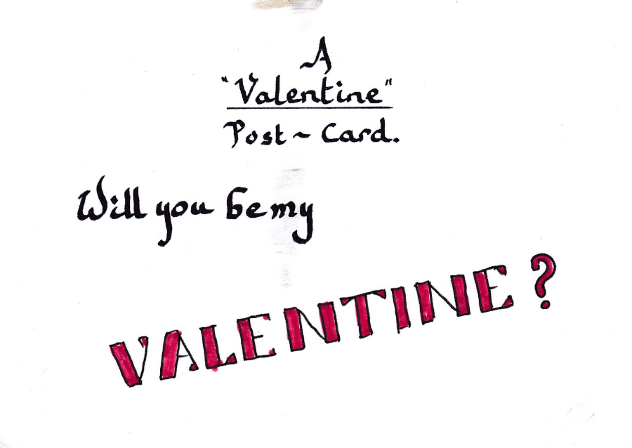
VALENTINES DAY
14TH February 2016
I had wanted to post this yesterday, on the actual Valentine’s Day, but unfortunately I spent the day in bed in the most unromantic of ways possible, ill. I am feeling a little better today and am recovering whilst posting a few cards here to take my mind off my stomach.
This very amusing postcard arrived on Saturday (13th) and was addressed to my good wife Jo. The front is hand written and the’ VALENTINE?’ has been coloured in red.
Did I send this? No. But don’t panic Jo does not have an admirer trying to steal her away (not that I know of anyway). This is another novelty hand-made postcard by my friend David Rye who you may remember I have previously mentioned and who sent me the Picasso face postcard which I posted back in January.
How do I know its David? Well, the postmark gives it away really – its Welsh, and David has a certain style to his writing as well. So my thanks to David for such an interesting item… especially the other side.
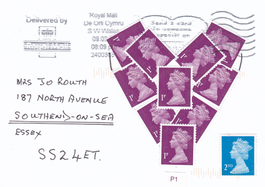
THE OTHER SIDE OF ABOVE POSTCARD
I do like the way that David has applied the 1p machin head postage stamps in a heart shape and how the slogan cancellation, which also depicts a heart actually tops off the heart shape. The 1p stamps need the additional 2nd class stamp to pay the postage. In the golden age of letter writing and postcard sending people often made up designs on cards using old stamp, sometimes cut up to make pictures and David is continuing this tradition
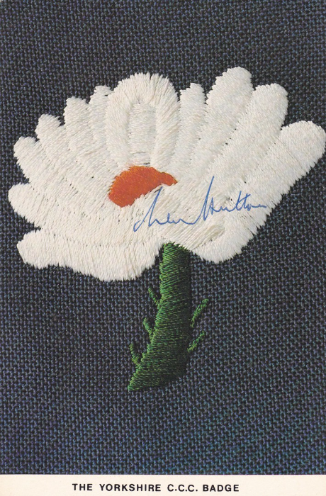
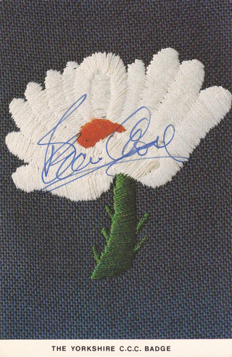
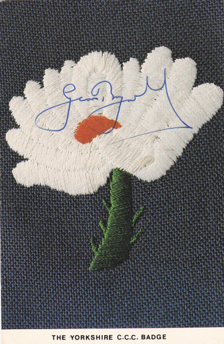
THE YORKSHIRE C.C.C. BADGE
Autographed Yorkshire Cricket Club badge postcards
SIR LEONARD HUTTON
“Len Hutton”
23-06-1916 to 06-09-1990
Len Hutton was both a Yorkshire and an England cricketer and a batsman. He has been described as one of the greatest batsmen in the history of cricket. He set a record in 1938 for the highest individual innings in a test match in only his sixth Test appearance, scoring 364 runs against Australia. Len made his debut for Yorkshire in 1934 and was playing for England by 1937. The second world war interrupted his game and he also suffered a serious injury to his arm while taking part in a commando training course. His arm never fully recovered and he was forced therefore to adapt his battering style. When cricket resumed he again played for England and he became a mainstay of the team and was heavily relied on and he continued to play for both the England and Yorkshire teams. Hutton remains statistically among the best batsmen to have played Test cricket.
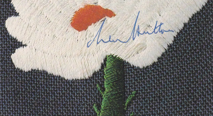
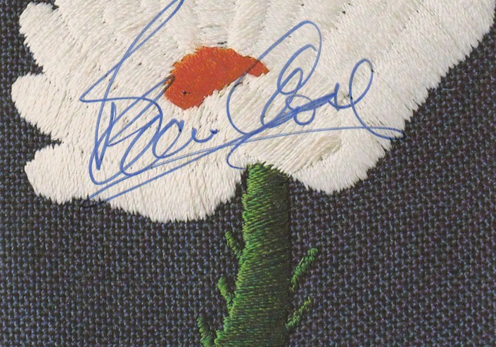
CLOSE UP OF THE AUTOGRAPH
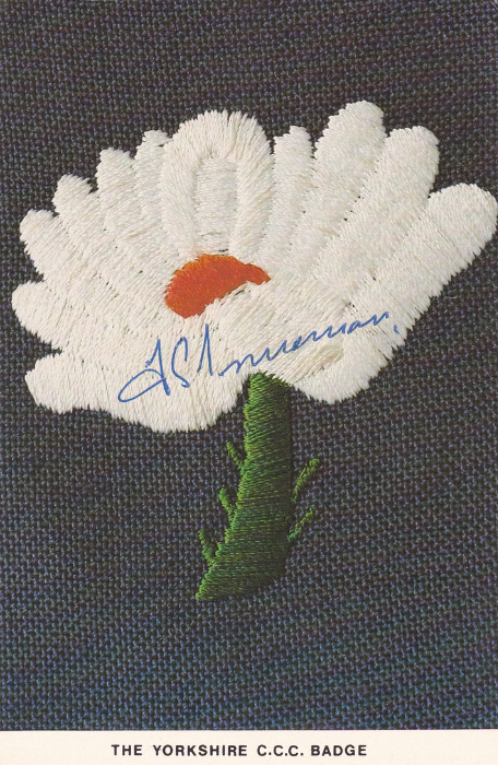
FREDERICK SEWARDS TRUEMAN OBE
“Freddie Trueman”
06-02-1931 to 01-07-2006
Trueman is generally acknowledged to have been one of the greatest bowlers in cricket’s history and would bowl at a fast pace and thus he became known as “Fiery Fred”. He was the first bowler to take 300 wickets. Trueman played for Yorkshire and England being active mainly between 1948 and 1968. Trueman also took a then world record 307 Test wickets.
Trueman was awarded his Yorkshire county cap in 1951 and in 1952 was elected ‘Young Cricketer of the Year’ by the Cricket Writers Club.
After retiring from the game Trueman went on to become a well-known and outspoken radio commentator for the BBC on such programmes as ‘Test Match Special’.
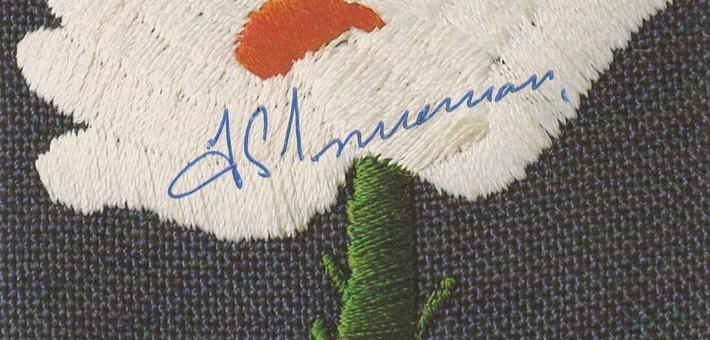
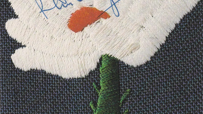
CLOSE UP OF THE AUTOGRAPH
DENNIS BRIAN CLOSE
“Brian Close”
24-02-1931 to 13-09-2015
Close was the youngest man ever to play Test cricket for England after being picked to play against New Zealand in July 1949 when he was 18 years old. Close eventually played 22 Test matches for England and was captain for seven (winning six of them and drawing the other). Close also captained Yorkshire to four county championship titles. He later went on to captain Somerset and was credited with helping along the key players Viv Richards and Ian Botham.
Close’s cricket career lasted from 1948 through to 1977 during which he scored almost 35,000 runs, which included 52 centuries with a highest innings of 198. He also bowled out 1,168 dismissals and had over 800 field catches.
Although clearly a superb player Close did manage to cause controversy and was often in trouble (he was serving a ‘Confined to Barracks’ punishment during his military service when selected for his first International cricket tour to Australia in 1950). He was sacked as England captain for timewasting, and later sacked by Yorkshire for his dislike of one-day cricket. There was also criticism for touring South Africa during the apartheid era, and Rhodesia with a private team.
Close later became chairman of Yorkshire’s cricket subcommittee a post in which he had many run-ins with the then Yorkshire captain Geoffrey Boycott. But despite these arguments he continued to serve Yorkshire cricket, and in his seventies was coaching and occasionally captaining the county’s Colts XI.
CLOSE UP OF THE AUTOGRAPH

RAYMOND ILLINGWORTH CBE
“Ray Illingworth”
Born 08-06-1932
Ray Illingworth played for Yorkshire (1951 – 1968 and 1982 – 1983) and Leicestershire (1969 – 1978) and for England between 1958 and 1973. As of 2015 Illingworth is one of only 9 players to have taken 2,000 wickets and made 20,000 runs in first class cricket. He was also Wisden Cricketer of the Year in 1960.
He made his first-class debut aged 19, was capped in 1955 and became the mainstay of the Yorkshire team through the 1960’s. He made his Test debut for England in 1958 but apparently struggled on his first tour in the West Indies in 1959-1960 and took just 5 wickets in 5 matches. But he found his stride by 1967 and was by then an established team member.
His move from Yorkshire to Leicestershire was as a result of a contract dispute and he subsequently stayed there for eight years. He was made captain at Leicestershire despite having never been a captain before but it was believed that it had been his experience that had previously lead Yorkshire to County Championship victories in 1966, 1967 and 1968.
He played a total of 787 first-class matches over a period of 33 years. As a county cricket bowler he took 2072 wickets.
As a captain he was described as a no-nonsense leader and David Gower said of him “no matter how highly Ray might regard you as a player he would not have you in his team, come hell or high water, unless he was utterly convinced that you could do the job he had allocated to you”
CLOSE UP OF THE AUTOGRAPH
GEOFFREY BOYCOTT OBE
Born 21-10-1940
Boycott was a former Yorkshire and England cricketer who had a prolific, and often controversial, playing career from 1962 to 1986. He made his international debut in a 1964 Test match against Australia and went on to established himself as one of England’s most successful opening batsmen. Boycott did accumulate some impressive statistics and he is equal 5th highest accumulator of first-class centuries, 8th in career runs and was the first English player to average over 100 in a season (1971 and 1979).
Boycott made his Yorkshire first team debut on 16 June 1962 against the Pakistan touring team He opened the batting, scoring four in both innings, the first from a boundary off of his first ball in first class cricket, and taking one catch, but he did not bowl. He then went on to play his first County Championship match the next day, on 20 June, against Northamptonshire. Batting at number four.
Boycott captained Yorkshire for eight seasons from 1971 to 1978, having been appointed following the sacking of Brian Close in 1970.
After 108 Test matches for England Boycott ended his International career in 1982 as the leading Test run scorer with over 8,000 match runs. When he was dropped from the Yorkshire team in 1986 he was the leading run scorer in first-class cricket.
After his cricket career he went on to a successful, but again often controversial, role as a cricket commentator for both radio and television, In 2002 he was diagnosed with throat cancer, but after receiving successful treatment he returned to his commentators job in 2003. In 2009 he was inducted into the International Cricket Council’s Hall of Fame. He went on to become President of the Yorkshire County Cricket Club between March 2012 and March 2014.
CLOSE UP OF THE AUTOGRAPH
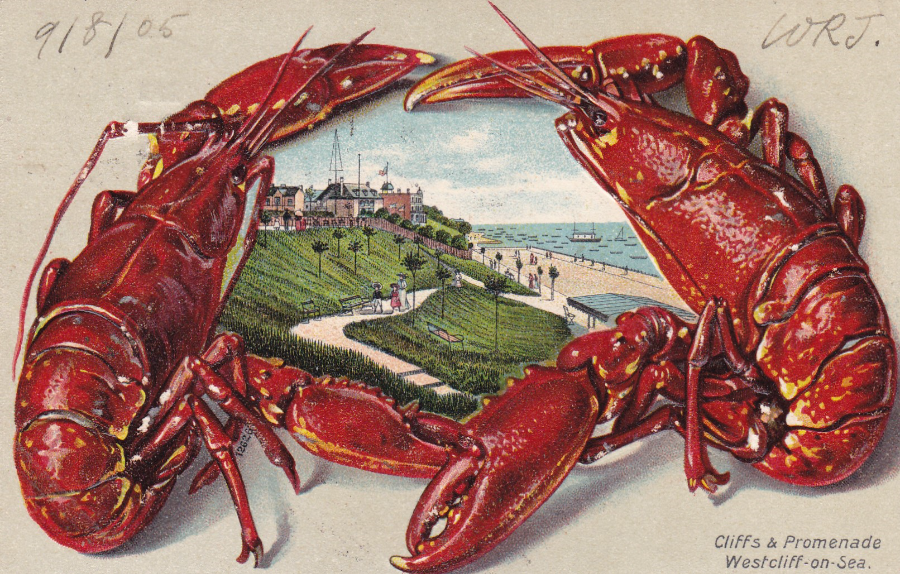
WESTCLIFF – ON – SEA
CLIFFS & PROMENADE
Art Cards published by ‘U. B. Co, Ltd’
Westcliff-on-Sea is a suburb of my home town Southend on the west side. Being by the sea (or if you want to be technically correct on the edge of the River Thames) seafood is a mainstay here and on these two designs you have Lobsters and prawns (possibly shrimp – shrimp are better known down this way – my mother loved shrimp and we would often go down to Leigh and pick up a pint of shrimp and sit on the seawall and peel and eat them – I have now done this with my two grandchildren thus keeping up the family tradition).
Considering the two cards here were sent by different people from different locations they were both posted in 1905.
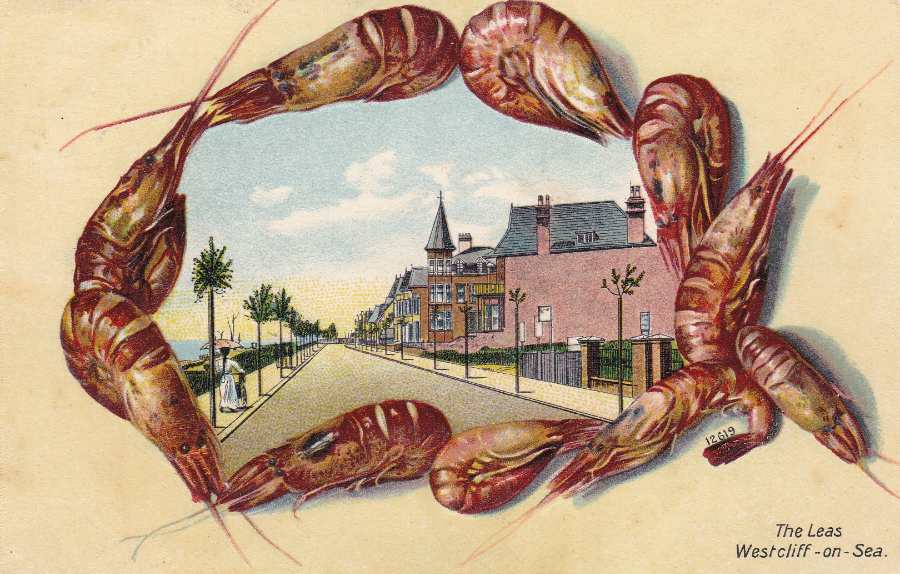
THE LEAS
So what do you think. Prawns or Shrimp?

RUSSELL T. DAVIES
Television Producer
Sometimes it is the reverse side of a postcard which is the most interesting or what makes the postcard have extra value. This is a prime example of this. Here you have a hand written message from the television producer Russell T. Davies, who has also signed the postcard. Perhaps the most interesting addition is that of the blue Doctor Who Tardis which he has drawn onto the card. Of course this is relevant because he was responsible for bringing back Doctor Who in its 2005 revival. And this Doctor Who connection is why the postcard was of such an interest to me. As far as autographed postcards go this is a real cracker.
FRONT OF POSTCARD
DAVE THOMPSON ILLUSTRATION
(THOMPSON 109)
SALFORD QUAYS
SALFORD, GREATER MANCHESTER
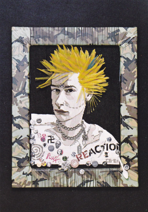
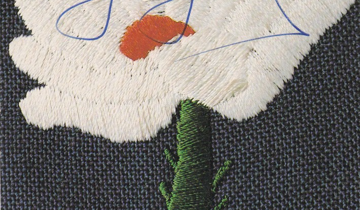
VICTORIA AND ALBERT MUSEUM
“Boy Punk”
Tapestry woven portrait
by
Candace Bahouth 1981
(item T.55 – 1985)
Ref T.364
I was at school when the Punk era hit its heights in the 1970’s and although I was never going to be one to adopt any of its fashions re clothing I did like the music and had a number of the albums and singles. Now of course the whole ‘Punk’ thing is an iconic piece of modern British history, and there are now a number of specialist ‘Punk’ collectors. I think it is the more unusual Punk related postcards like this one that will be the sought after items of the future.
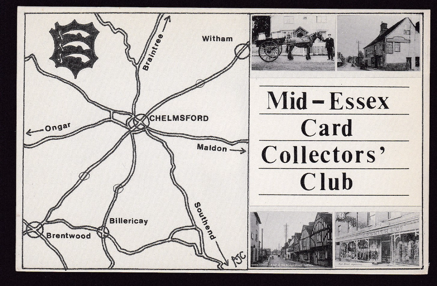
MID – ESSEX CARD COLLECTOR’S CLUB
Details of the club’s meetings is given on the reverse side of this postcard which at that time was held every first Thursday of the month (September to June) at 8 p.m., at St Mark’s Hall, Cottage Place, Chelmsford.
The postcard itself was printed by ‘Thought Factory’ that was a company that printed postcards for private companies and people. I myself have used them to print three postcards of my own, although that was some years ago.
This card here would be of interest to those who collect Map postcards even though the map used is a simple one (I like the fact that my home town of ‘Southend’ gets a mention although its location is off the map itself, its location is indicated by an arrow).
According to the internet the club now meet at the Christchurch URC (Room 1), 164 New London Road, Chelmsford, CM2 0AW and it’s now on the third Thursday of each month except January and August (although still at 8pm).
I am not a member of any postcard club and this is the nearest (I am a member of a couple of Philatelic Societies which are much nearer, one at Shoebury where I used to live) so maybe I will look into this club and maybe even pay it a visit.

BRITISH MUSEUM (NATURAL HISTORY) 1981
THE GEOLOGICAL COLOUMN
Card P2
It is nice that a postcard can be both interesting and educational at the same time. This Natural History Museum card is both. Some of the names on this listing are known to people but none more so than the ‘Jurassic’ period (thanks a lot to the book and subsequent film ‘Jurassic Park’). But for me the interesting one here is the ‘Silurian’ period because there are Doctor Who monsters called Silurians after this period on the table (and I am a huge Dr Who fan going back years – the Silurians turned up with Matt Smith’s Doctor but originally they first appeared in a Jon Pertwee (the Third Doctor) story way back in 1070.
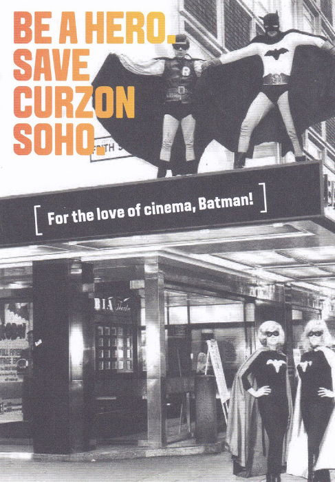
BE A HERO. SAVE CURZON SOHO
SIGN THE PETITION TO PRESERVE SOHO’S ICONIC VENUE
CURZON SOHO
“For the love of cinema, Batman”
Promotional Postcard/Flyer intended to help the campaign to save the Curzon arthouse cinema which had been declared as a ‘surface area of interest’ by Transport of London and could be knocked down to make way for the Crossrail 2 development (as text on the reverse side states). Late in 2015 the actors Stephen Fry and Benedict Cumberbatch joined the campaign to try and save this cinema. At the time of writing I believe the decision is still to be confirmed.
My reason for obtaining this card is that I collect ‘Batman’ related cards however unusual these may be, and this one is certainly unusual.

“WISH YOU WERE HERE”
A Book by
Tom Holt
Published by Orbit in March 1999
I have read a few Tom Holt books and they can be devilishly funny. They are a mix of fantasy and sci-fi and are comedy books which is a difficult combination to make successful but Mr Holt has achieved this many times. I am guessing that judging by the creatures in this picture (which was on the cover of the book) that were they are is somewhere you would not wish to be…
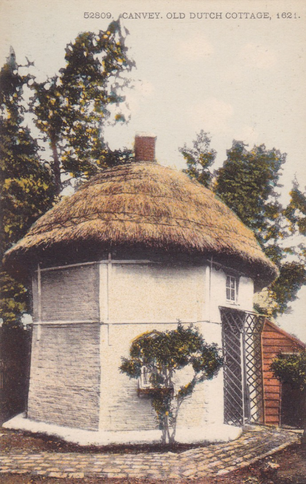
CANVEY, OLD DUTCH COTTAGE 1621
Ref 52809
A golden age postcard depicting one of the two remaining Dutch Cottages located on Canvey Island in Essex. I have mentioned these before and the one shown here is the cottage located at the top of Haven Road.
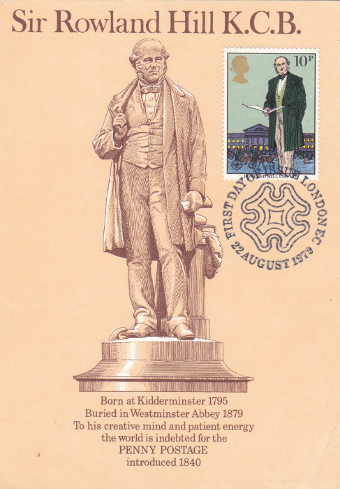
MIDLANDS POSTAL BOARD PICTURE CARD
MPB – Card 3 (Revised)
Sir Rowland Hill KCB
3 December 1795 to 27 August 1879
This is a Postal Region issue postcard and is one of many from the Midlands Board and these are highly collected and have a very dedicated collector base. This copy of the card has had the 1979 10p Rowland Hill postage stamp applied and cancelled first day of issue with a Maltese Cross based special hand stamp.
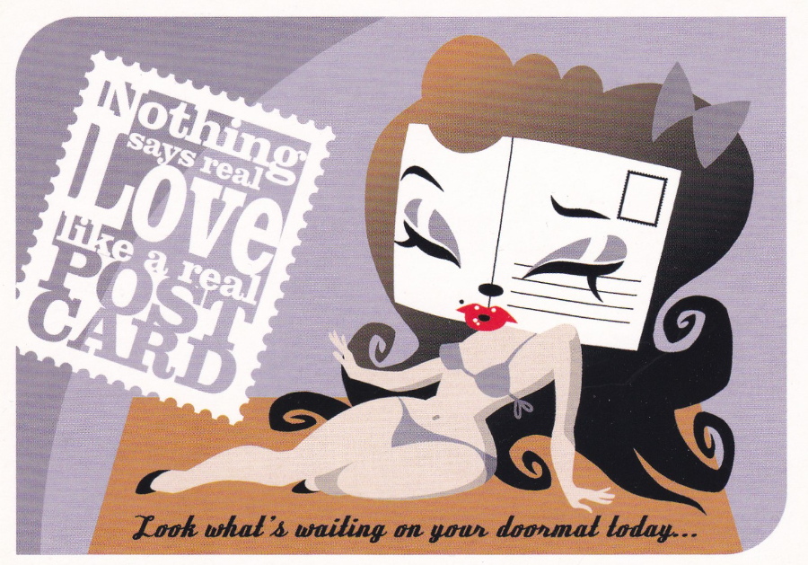
NOTHING SAYS REAL LOVE LIKE A REAL POST CARD
“Look what’s waiting on your doormat today…”
Published by –
BOOMERANG – AMSTERDAM
“Boomerang supports Nationale Weken van de Kaart”
1993 – 2003
(National week of the card)
I do obviously like postcards, some might even say I love them…. but I am not sure even I would describe them as being sexy! This Dutch free rack postcard celebrates the 10th year of the national postcard week.
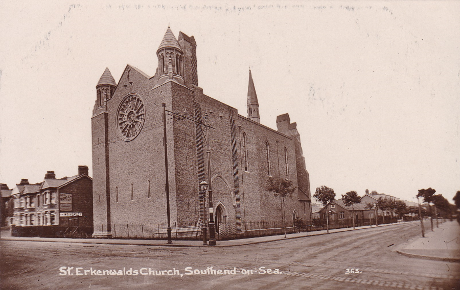
ST ERKENWALDS CHURCH, SOUTHEND-ON-SEA
Published by unknown local publisher
I knew this church really well as my Venture Scout Group ‘The Druids’ used to meet in the hall at the rear of the church on Friday nights. We eventually moved to a building of our own further away but I have fond memories of this location. Memories is all I have now as the church was demolished in 1995 and replaced by a block of flats. There was a fight to save the building but views on it were always mixed and although some loved the church, despite it being made redundant back in 1977, others were vocal in their belief that it was ugly. The church, locally and affectionately (I assume by those who liked it) known as ‘St Erk’s’ was built in 1905 and was designed by the architect Sir Walter Tapper.
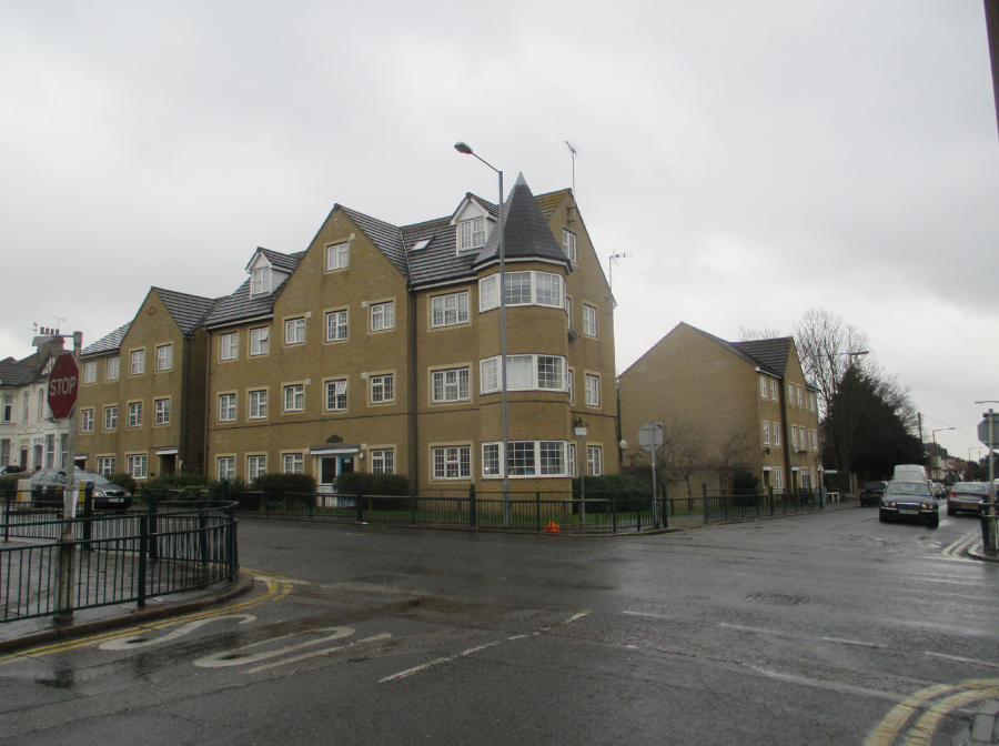
PHOTOGRAPH TAKEN ON
13/02/2016
As you can see the church has gone, replaced by this block of flats which appear to have an almost church like look to them and I wonder if this was a deliberate design. As you grow up areas change and some buildings go up but others come down. This one has gone and is perhaps the image which differs the most from the issued postcard.

“T Rex”
Designed by Shiu-Kay Kan
Table Light 5W12V with plug transformer
(advert postcard for company called SKK, located in Auckland, New Zealand – London, UK – Dublin, Ireland. The shops full addresses are printed on the reverse side of the postcard)
Come on!, That’s Godzilla surely? A T-Rex? No, I think someone sneaked in a Godzilla figure, it’s breathing fire! Godzilla breaths out some sort of radioactive breath does he not? Anyway, if the argument is over (I still think it’s Godzilla) whatever creature this is it is a Lamp! Can you imagine feeling drowsy in the morning and switching your side light on to find Godzilla, sorry, T-Rex breathing fire down on your face. That would wake you up. Love the card though.
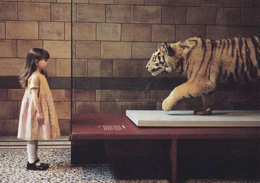
TOTALLY LONDON
“Free entry to 70 museums and galleries. For further information and offers on entry to cultural attractions, dining out, accommodation, and much more go to visitlondon.com or call in at the Britain and London Visitor Centre at 1 Regent Street, near Piccadilly Circus”
(text from reverse side of postcard)
A nice advertising postcard for the attractions of London but you might guess that for me it was the inclusion of the Tiger that made me pick this card up (I have previously mentioned my love of Tiger postcards).
The location is not given but if I am correct I sadly recognize the floor and the brickwork as being the Natural History Museum in South Kensington, London (one of my favourite places as a child and teenager – and for that matter, as an adult). And to be fair, that is their stuffed tiger as well.
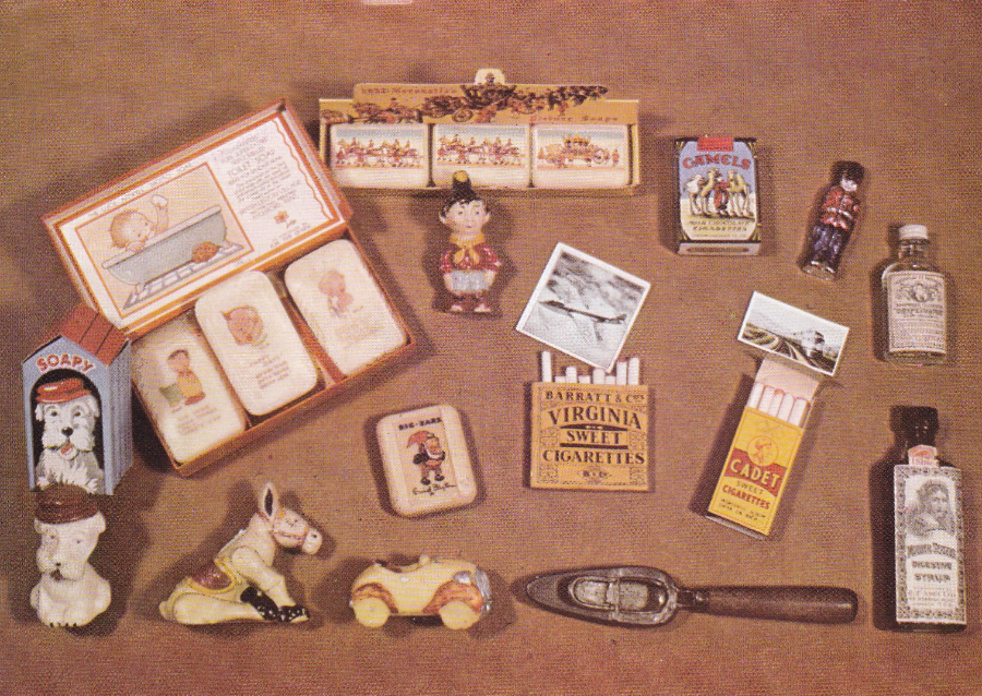
MUSEUM OF CHILDHOOD, EDINBURGH
“Selection of sweets, soap and children’s medicines (with feeding spoon) – British 1880 -1955”
When I was at Nottingham last weekend at the postcard fair my main search was for new Television related postcards. I had been around the fair and was just checking out some cheap boxes and was on one stall with a dealer who knows my interest and we were having a good chat as I picked up one of his 20p boxes and he laughed and said “You won’t find any TV postcards in there, Mark”. I had already bought a selection of TV cards from his main stock (dealers are aware that TV is quite a collectible theme at the moment, and has been for about 4 to 6 years now – when I started over 25years ago with this theme the selection was much harder to find). Anyway, that was a bit of a challenge, although to be fair I really did not expect to find anything in the box that was TV related. That was until I came across this card here. Now I am sure that down in the bottom left corner, beside the Dog shaped soap, is a small ‘Muffin the Mule’ figure. It was Muffin I saw first and was delighted. There is the TV connection for the card. And then I also saw the Noddy figure, and his car and that’s his friend Big Ears on what I assume is a bar of soap (so more TV connections). The dealer and I had a good laugh over my find and again it was proven to me that searching those cheaper boxes is often worthwhile.
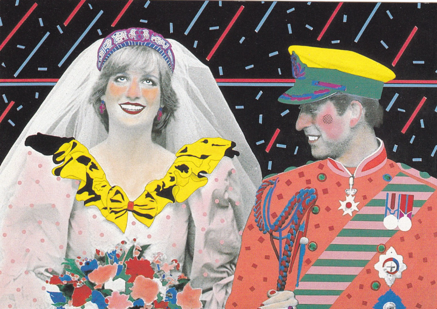
ART UNLIMITED AMSTERDAM
“Finally…”
Design: Paul Koeleman
Ref C484
Printed in Holland
After posting two normal images of the Queen I move on to a highly coloured image of Princess Diana and Prince Charles on their wedding day back in 1981.
Art Unlimited are a prolific Dutch publisher who have produced 1000,s of designs which include artwork images and many artistic photographs both in colour and black & white.
There is an argument, with some truth to it, that the 1981 Royal Wedding was the event that launched the 1980’s ‘Modern Postcard Scene’ where there was an upsurge in postcard issues and the collecting of postcards current to this period. The fascination and surge lasted through to the mid – late 1990’s. This was good timing for me as in 1981 I was 18 and I was still collecting and got caught up in the two decades of supreme postcard publishing – as a result this is still my favourite era and the one which I probably know the most about.
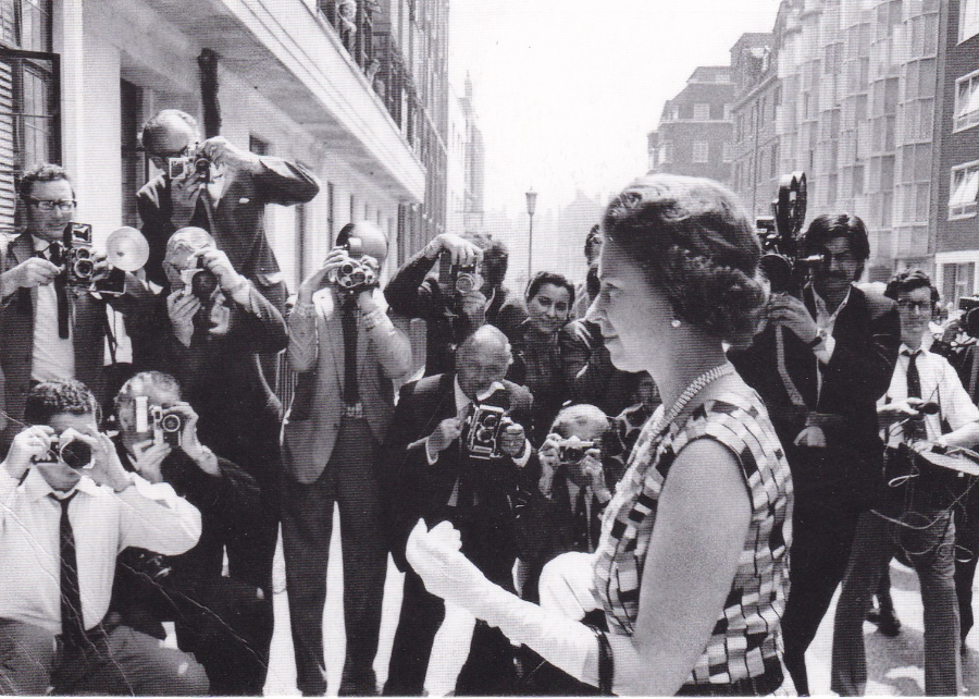
THE TIMES
ARCHIVE COLLECTION
For more incredible and exclusive photos of the Queen, plus thousands of other images of unforgettable world events, visit thetimesarchivecollection.co.uk
Don’t miss the definitive Diamond Jubilee coverage from the paper that has witnessed it all, only inside The Times
(text from reverse side of postcard)
QUEEN ELIZABETH II ARRIVES AT THE KING EDWARD VII HOSPITAL (Chris Travis – 1971)
These are advert postcards which have only been out since around 2012 as they make mention of the upcoming Diamond Jubilee which was in that year. Nice and unusual images which I suspect are only available here on these two postcards depicted.
This one has extra appeal to me as there is a man filming the Queen’s arrival with an old camera – was this for a TV News report?
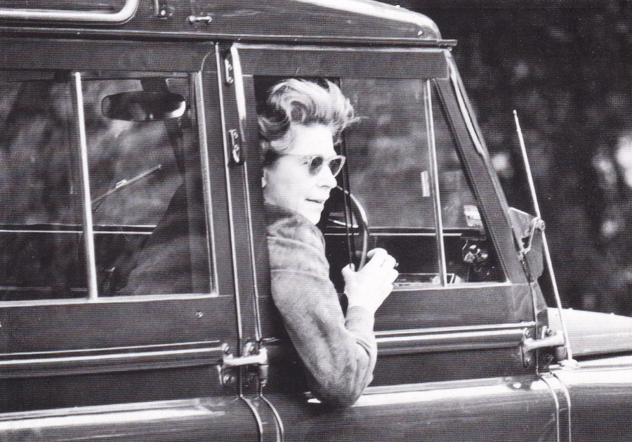
THE TIMES
ARCHIVE COLLECTION
A PICTURE OF QUEEN ELIZABETH DRIVING AT WINDSOR HORSE SHOW (Mark Ellidge – 1976)

ROYAL TERRACE
SOUTHEND ON SEA
Very early undivided back postcard depicting a photograph of the Royal Terrace which is a line of buildings which face out towards the sea up on top of the slope. Between these premises and the road along the seafront down below is a strip of greenery which was once the ‘Never Never land park’. The road along which this man is cycling is still here although now adapted to motor cars but it is an area which has not changed as much as others. Although there is now a an extra layer on top of the Palace Hotel which is the building you can see centre far right in the distance.
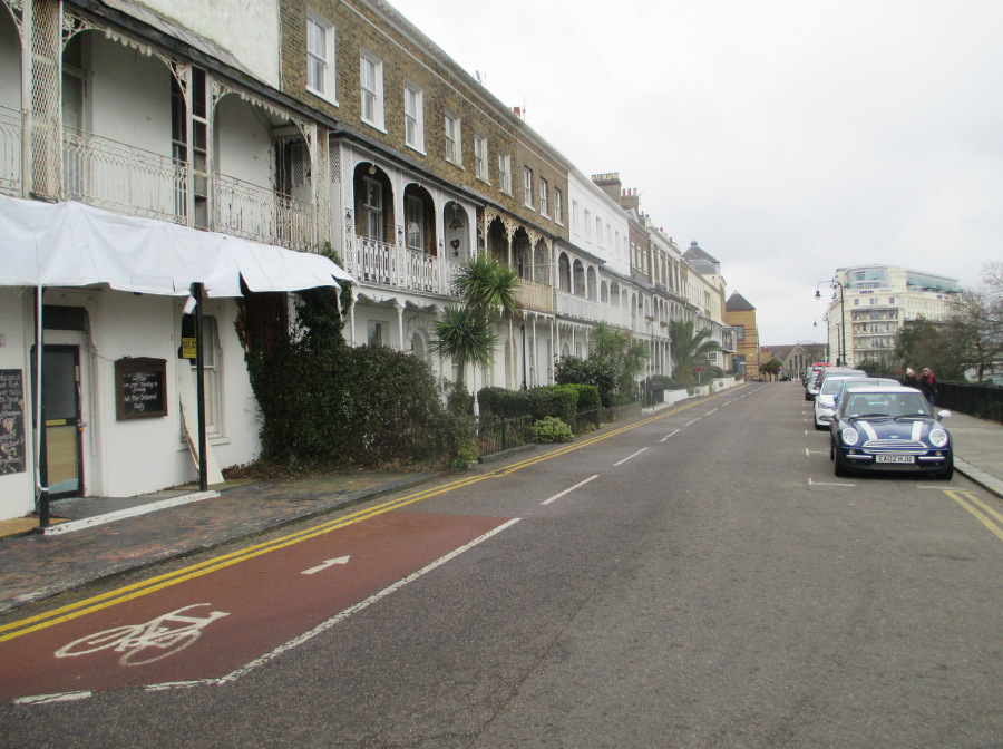
PHOTOGRAPH TAKEN ON
13/02/2016
I love that the houses still retain their fancy metal balcony fences and frameworks. These really are lovely three story premises which have short frontages but which are idealy located for the seafront and the High Street which is just around the corner (in fact the brown pyramid roofed building in the centre in the distance is the Royals Shopping Centre which tops this end of the High Street). The fact that there is a cycle lane amused me as I looked at the postcard of the man cycling along this road over 100 years ago.

GREAT BRITAIN
POSTAL STATIONARY POST CARD
Used 1875
This early British postal stationary post card was posted on 4th November 1875 from London. It is a nice example of an early card. It was normal for Victorians to have a desk spike on which they would pierce their mail in a stack as they dealt with each piece. As a result of this practice it is quite common to find mail, and postcards, from this era with a hole spiked in them somewhere (if the person was neat this is often in the middle but if they were in a hurry it can appear anywhere – in this case it is up in the top left corner area).
These early postcards are quite common as millions were sent out and copies can be obtained for just a few pounds and less if the condition is not too good. Collectors therefore look out for unusual messages or usage of these cards and this one here appealed to me because of the printed message/notice on the reverse side.
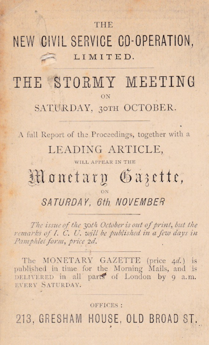
THE
NEW CIVIL SERVICE CO-OPERATION
LIMITED
----------------------------------------
THE STORMY MEETING
On
SATURDAY, 30TH OCTOBER
----------------------------------------
A full Report of the Proceedings, together with a
LEADING ARTICLE
WILL APPEAR IN THE
Monetary Gazette
ON
SATURDAY, 6TH NOVEMBER
----------------------------------------
The issue of the 30th October is out of print, but the
remarks of I. C. U. will be published in a few days in
Pamphlet form, price 2d.
----------------------------------------
The MONETARY GAZETTE (price 4d.) is
published in time for the Morning Mails, and is
DELIVERED in all parts of London by 9a.m.
EVERY SATURDAY
-----------------------------------------
OFFICES :
213, GRESHAM HOUSE, OLD BROAD ST.
These early postcards are smaller than the size we now know as they are 12cms x 7.5cms but I really like these and have a small collection of these early issues. With this one it was the wonderful printed message on the reverse side which made me buy it. I love the way this is printed, especially the centre bit ‘Monetary Gazette’ which is in a very fancy font. When I bought this one it did not cost me much, less than a pound I think but now I would think it would be several pounds.
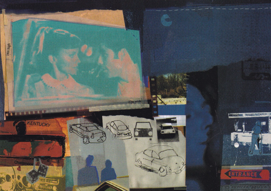
UNTITLED
A piece of artwork by
BEN CHALLENOR
Published by –
BOOMERANG MEDIA
(A free rack postcard)
A most unusual piece of artwork which seems to be a modern piece which references the American ‘Drive – in’ movie scene. For a Film theme collector there would be the main screen image, which is from the movie ‘Grease’. This shows Olivia Newton-John and John Travolta. My first ever long play (LP) album was an Olivia Newton-John one and have been hooked on her music ever since. That is probably why I have kept this postcard.
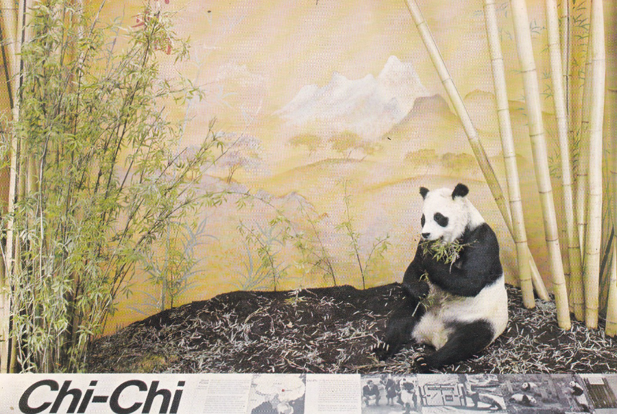
BRITISH MUSEUM (NATURAL HISTORY), LONDON
GIANT PANDA, CHI-CHI
Ref Card A 15
“Chi-Chi was captured in Western China in 1957 and lived in the London Zoo from 1958 to 1972”
As a child I had the experience of visiting London Zoo and seeing Chi-Chi whilst she was still alive. I still remember this visit so it was interesting when only a few years later I saw her again after she had died when she became an exhibit at the Natural History Museum in London (I had the same experience with Guy the Gorilla, but more about him in a future blog).
Almost as soon as the exhibit of the stuffed Chi-Chi went on display this museum postcard went on sale. On a school visit I picked up a copy for my collection and it has been with my ‘Animal’ collection ever since.
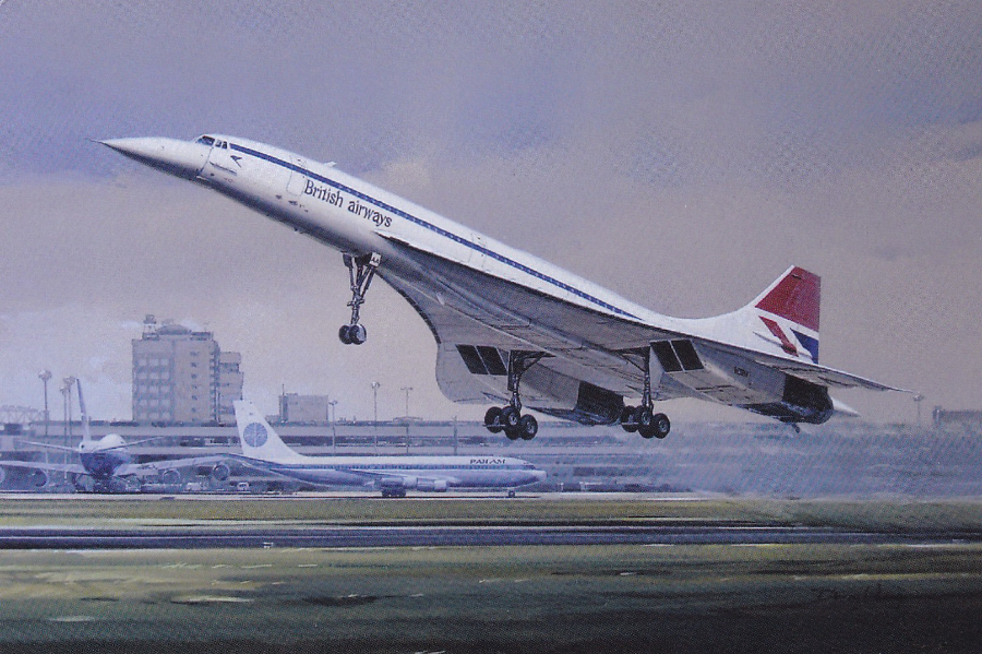
CONCORDE
by ‘DEFINE ART’
Published by
REDBUBBLE
I have been a member of the ‘Concorde Collectors Society’ for a number of years now and although members collect the whole range of collectible items I just collect the postcards.
This one is a nice realistic art card image which is issued by the company REDBUBBLE who are an online company that sell an unbelievably large number of postcard images. Check out their website at:-
But be careful as the number of cards available on all manner of themes and subjects is capable of making a major dent in anyone’s wallet, I know because the TV selection is huge!
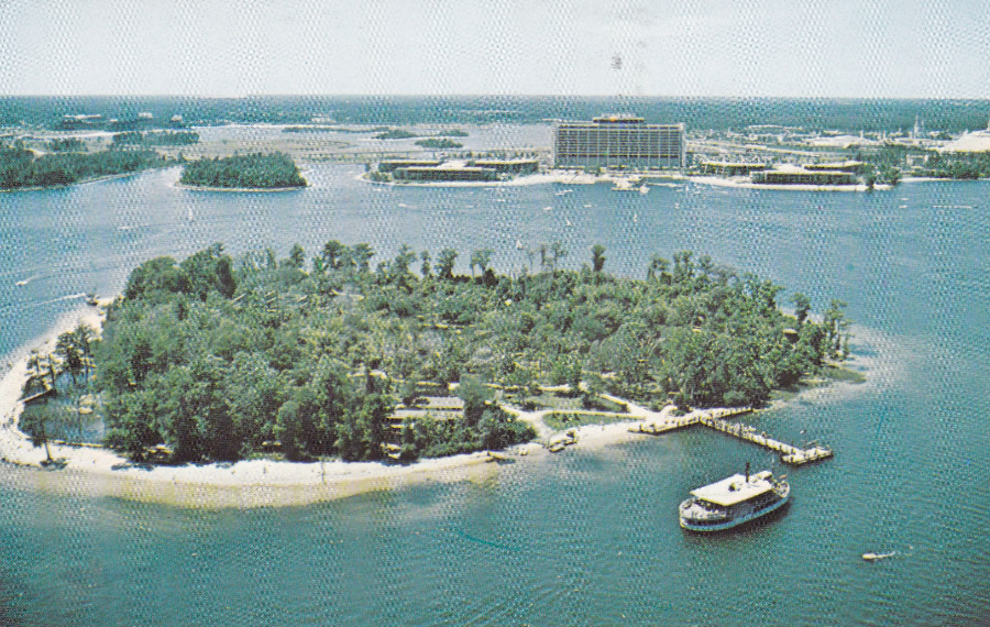
WALT DISNEY WORLD
“DISCOVERY ISLAND BECKONS EXPLORERS”
This copy was posted in 1981
I love a freebie, and this was one. I won an eBay bid recently and the seller sent the card packaged with this card as a piece of card packaging. The strange thing is that despite collecting Disney World postcards for many years I did not have this one so it was a superb little extra gift.
Despite being a great Disney World card this one has extra meaning for me as I visited here in 1993 and I actually went to Discovery Island and it was here that my youngest son, Peter, almost lost his finger by poking it through the wire of a cage containing black vultures who tried to take it off. I also went out in a small motor-boat with my eldest son James and circled the island. In 1993 you could still obviously take a boat (pictured here by the jetty) from the Fort Wilderness campsite beach area across to the island. Unfortunately, this all closed in 1999, and the island is now over-run with trees and undergrowth right up to the edges. All the paths you can see here and the beach areas are all gone. No one tourist wise visits the island any more. The wildlife exhibits, the vultures and other birds and animals, were all moved to the newly opened Animal Kingdom park which had opened in 1998.
When I visited this area last year I stayed in the Contemporary Hotel which can be seen in the background and I took a much large boat out with Jo, Rebecca and Peter and went around the island and across to the waterway gap to the left of the hotel and out onto the main lake. I also had the wonderful luck to see an American Bald Eagle perched on top of one of the trees on this island. This postcard brought back all these memories and that’s one of the things I love about collecting.
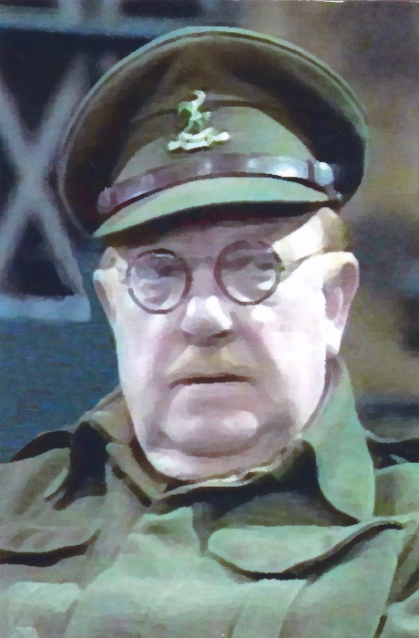
CAPTAIN GEORGE MAINWARING
Postcard published by
SAMPSONS POSTCARD
Ref
“DAD’S ARMY #1”
12th FEBRUARY 2016
I have just returned from my local Odeon Cinema where I have been to see the new feature film ‘DAD’S ARMY’. I enjoyed it but it will not win any awards and I suspect will get so-so reviews but how do you really follow what was such an iconic and perfect TV series as the original Dad’s Army? To be fair they have had a good stab at it and the female characters get much longer screen time and have a wider story line (especially Mrs Mainwaring). The cast here is full of well-known names and they try hard to present an image of the character they portray here, except Bill Nighy who plays Sergeant Wilson (who was played by John Le Mesurier in the TV series), who plays Bill Nighy as he normally does, but with panache.
Having watched the film tonight I have dug out this postcard which depicts Arthur Lowe as Captain Mainwaring from the original TV series (in the film the character is played by Toby Jones). Although this card is described as a Limited Edition there is no indication of how many were produced but it cost me £1 so it is not really common.
BAMFORTH
Saucy Seaside Postcard
Published by BAMFORTH & C0., LTD., HOLMFIRTH, YORKSHIRE
Ref No. 662
“Comic” Series
BAMFORTH postcards are the countries best known saucy postcards and their designs have become famous and they are now highly collected and when the comic image crosses with a popular theme, like television, trains, sport or space, the prices can rise quite high.
When I was at the Nottingham Postcard Fair this past weekend a number of dealers told me that their boxes of these Bamforth cards had been looked at by many collectors and one even had a large number removed from a collection and bought that day. This card here, and the two non Bamforth’s posted below, were all obtained at this fair.
It has been said that the Bamforth saucy postcard is now an iconic piece of British history but copies of some of the cards are still to be found on sale in some locations and designs are periodically re-released sometimes in a larger format.
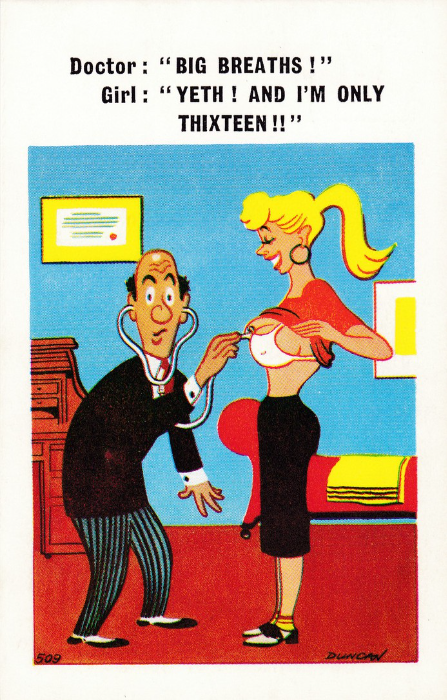
CONSTANCE POST CARD
Published by
D. CONSTANCE LIMITED, LITTLEHAMPTON, SUSSEX
Ref No C 509
This one might be even less politically correct than the previous one but does go to show where the sense of humour was firmly placed in past decades (the ‘Carry On’ film era etc). In a way these comic saucy (often referred to as ‘Saucy Seaside’ comic postcards because of the connection with their sale at such seaside resorts as my home town) postcards have a social history connection and tap into the past. Some are funny, but others were probably more funny at the time and may these days even make people cringe a little. The girl here had to be sixteen for the joke to work but her age now, quite correctly, makes this particular card feel wrong.
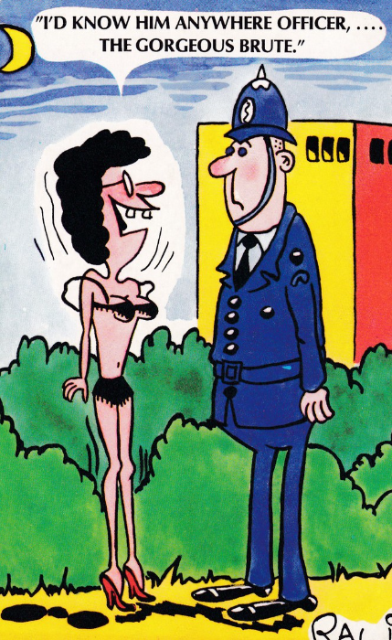
CONSTANCE POST CARD
Published by
D. CONSTANCE LIMITED, LITTLEHAMPTON, SUSSEX
Ref No C 10
Let’s start off by immediately saying that this seaside naughty/saucy postcard is not in any way politically correct. It is also not particularly well drawn either but the inclusion of a Police Officer places it in one of my themes. Almost any seaside town has at some point had racks outside its shops selling these type of postcards although there is some recent discussion around there being fewer on sale than in past decades. I know that there are areas still with some on sale, in my own home town -Southend-on-Sea – you can still pick some of these up. The use of a Police Officer is not unusual either and many comic cards going back to the golden age around 1900 – 1920 had a PC as a common inclusion (with the older cards often depicting a more rotund officer – the likes of which have become a bit more of a rarity these days after the introduction of a yearly fitness test…. to be honest I kind of miss them, not the tests, the rotund friendly officers).