
BELGIUM
Postal Stationery Card
1873 – 5 Centimes violet (shades known) on buff (again shades known)
(Details obtained from ‘The World Postal Stationery Catalogue Second Edition 1977 – Baden to Bushire Section 2 – Belgium, Page 2)
This copy was posted in 1874 and has received a ‘LOUVAIN (STATION)’ circular date stamp. A nice clean usage with a clear date stamp. Although very nice these cards are not valued highly and the 1977 catalogue prices used copies at just 25p (but I suspect one would cost a little more these days – but then I only paid £1 anyway and was happy to do so)
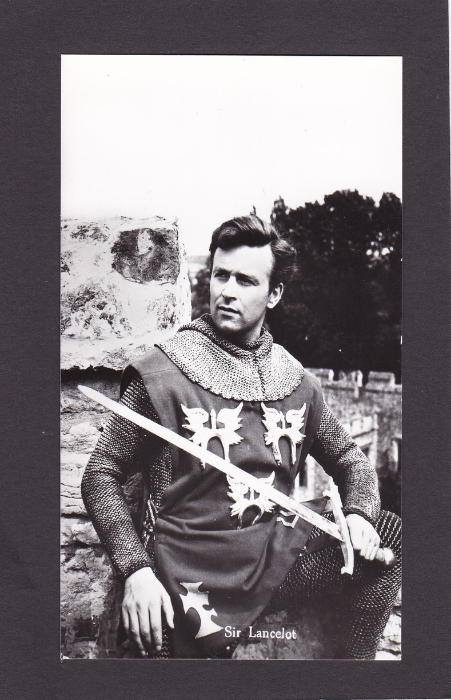
THE ADVENTURES OF SIR LANCELOT
“Sir Lancelot”
Dutch Issued Postcard
“Uitgave: Hercules, Haarlem”
Ref – Echte Foto nr. 1233
This is a postcard depicting the actor William Russell who played the lead character ‘Sir Lancelot’ in this early television series which ran originally between 1956 and 1957. There were 30 episodes in all in just one series (which is quite a large number for a British series). The episodes were 25minutes long and played on the ITV Channel. The series was produced by Sapphire Films for ITC Entertainment. This was one of the few early British television series’ to be screened on a major broadcast network in America, the NBC. This American success apparently led to the last fourteen episodes being shot in colour, making it the very first British television series to ever have colour episodes (although the colour ones were only shown in colour in the US).
I also like the fact that they employed several of the American screenwriters who had been placed on the Hollywood blacklist after the communist witch-hunt of the time (although these did often write under pseudonyms).
The very first episode aired on 15th September 1956 on the London weekend ITV franchise holder ATV (the first episode aired in the US nine days later – the last episode aired in the UK on 20 April 1957 and in the US on 16th September 1957).
William Russell is of course (well, I say of course, but you would need to be a fan like me) better known for playing one of Doctor Who’s first companions, Ian Chesterton who appears in the very first Dr Who episode. And this is one reason why these Sir Lancelot postcards often sell for £6 or more. There is also the fact that these Dutch cards appear to be the only postcards issued for this series (I have certainly not seen any from the UK)
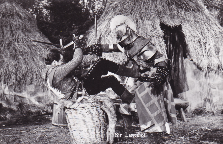
THE ADVENTURES OF SIR LANCELOT
“Sir Lancelot”
Dutch Issued Postcard
“Uitgave: Hercules, Haarlem”
Ref – Echte Foto nr. 1226
A nice action shot from one of the episodes showing Sir Lancelot fighting with a knight in full regalia. Judging from the reference numbers there might well be quite a lot in this series. I certainly have a few more hiding in a box somewhere (If I come across them I will post them here).
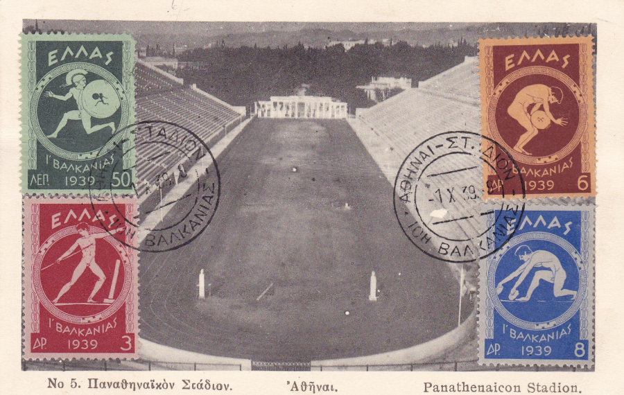
PAN-BALKAN GAMES, ATHENS
Started in 1929 and run yearly (except for the period between 1940 – 1953) the Pan-Balkan Games is a regional athletics competition held between nations of the Balkans.
This postcard here depicts the Athens Olympic Stadium known as the Panathenaic (Panathenaicon Stadion) Stadium which was first built in circa 566 BC but which was renovated in 1869.
I liked this postcard because in 1982 I sat roughly from where this photograph was taken when I visited on a venture scout expedition. So this photograph immediately brought back memories and the stadium was empty as well so it looked just like this.
The four stamps applied to the front were issued to celebrate the 10th Pan-Balkan Games in Athens in 1939. The values are: 50 (green) which depicts a runner, 3d (red) Javelin Thrower, 6d (brown on orange) Discus-thrower and 8d (blue on grey) depicting a Jumper (SG 528 – 531). I assume this is a first day cancel – dated ‘1 X 39’ (1ST Oct 1939). The cancel could possibly be something like ‘Athens Stadium’ or similar (any help with confirmation would be appreciated)
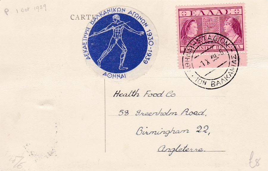
REVERSE SIDE OF ABOVE POSTCARD
Here we have the same cancellation on a different stamp and a round sticker which depicts a Javelin thrower and text which I would have assumed was in commemoration of the tenth Pan-Balkan Games only the first year date is 1930 and the games commenced in 1929, so I am not sure exactly what this sticker represents (again any help would be appreciated).
All in all a nice little postcard which would appeal to stamp collectors, sport collectors and people like me who have actually sat in this stadium.
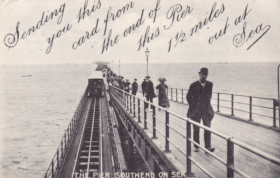
THE PIER, SOUTHEND ON SEA
“SENDING YOU THIS CARD FROM THE END OF THIS PIER 1 ½ MILES OUT AT SEA”
Published by
G. H. WHITTLE, POST OFFICES: PIER END and MARINE PARADE, SOUTHEND-ON-SEA
A lovely postcard showing the Pier here in Southend. This image includes the old trailer car on the single track that was then laid for this electric run system. This particular postcard was posted from Southend-on-Sea on 26th January 1912 and was addressed to London. A nice postcard for my local history collection. I also like the idea of their being a Post Office at the Pier End.
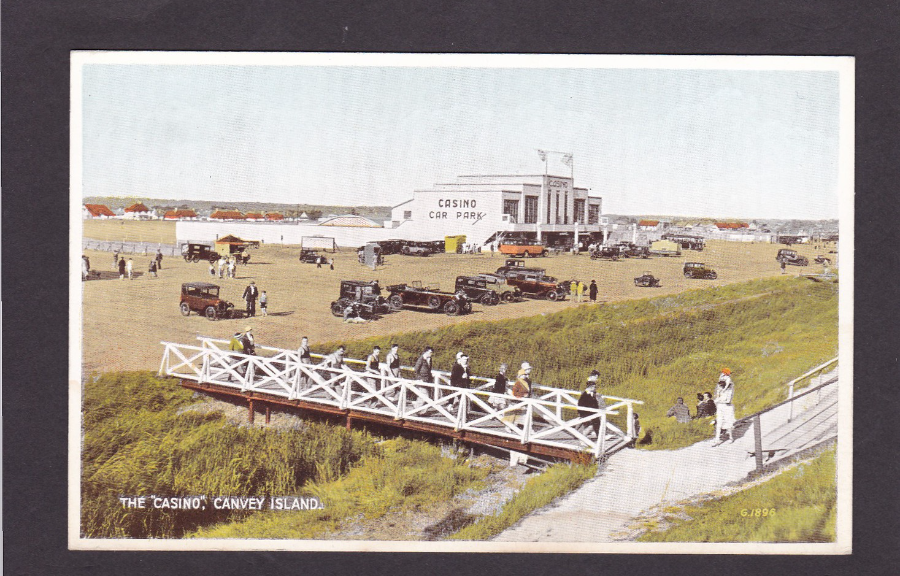
THE “CASINO”, CANVEY ISLAND
Published by
‘A. H. J. Series, Southend’
Ref G1896
Another Canvey Island postcard but this time one showing an early photograph of the seafront area close to where the Labworth Café now stands (although it would appear out of this shot up the wooden looking staircase on the right – although it would not be there at all for this group of people depicted because it had not been built yet – see earlier posts for cards showing the Café).
Judging from the cars in this image and the fact that The Monico Building has not yet been constructed to the left side of the Casino I think that this image is from the mid-1930’s. This area has changed considerably over the years and as mentioned in an earlier blog the Casino building has since been demolished and has been replaced by flats on top of retail premises. The wooden bridge has also long gone as has the ditch it goes over (neither of which were there when I started work on Canvey in April 1988 – but I suspect they were gone long before then).
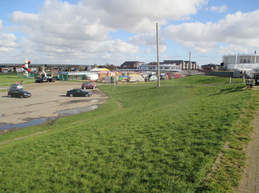
PHOTOGRAPH
Taken on 29th February 2016
This is actually from slightly further back than the image in the postcard was taken but it helps to show the entire area and the edges around where the photograph on the postcard depicts. The Labworth Café is the round white building centre top right, with the big vertical rectangular windows. To the left of this, and in line visually with the café but obviously in the distance beyond it, is a group of three brown triangular topped buildings which are the flats that have been built on the exact plot that the old Casino stood. The white building to the left of them is the Monico public house which does not appear on the postcard (but which is in its own right an iconic Canvey location, but not always for the best of reasons).
The ditch would have run roughly where the bottom of the grass embankment is located in this photograph and although this area is also a car park the area where the cars are located on the postcard is where the fun-fair amusement area is now located seen here in-front of The Monico building (although actually across the road from the Monico)
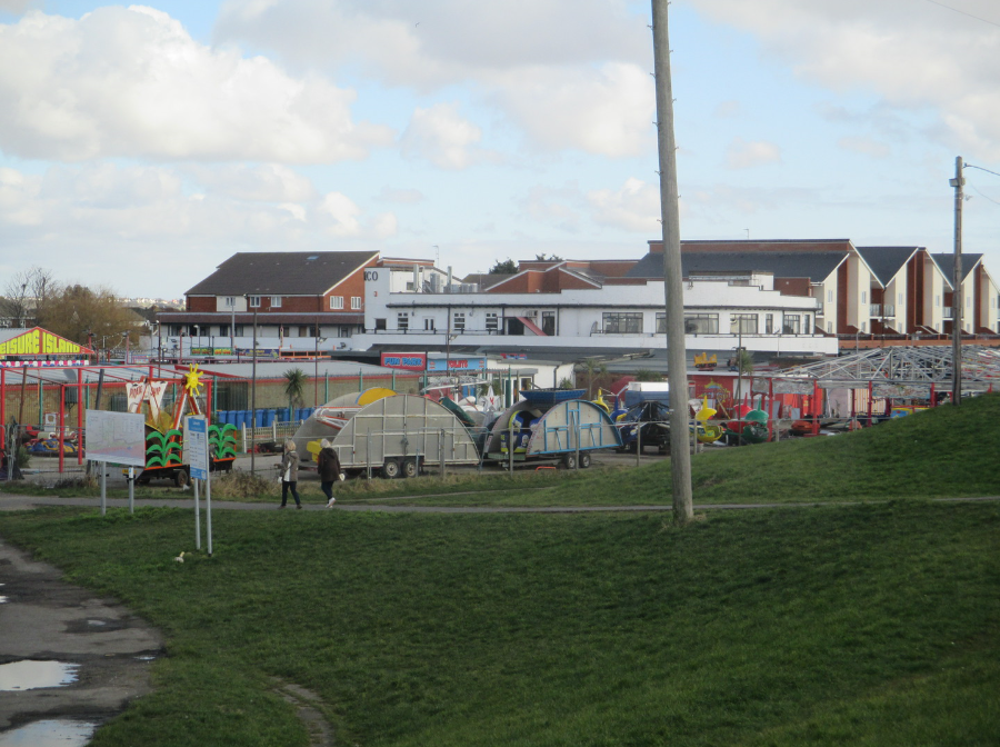
PHOTOGRAPH
Taken on 29th February 2016
On this much closer photograph you can see the flats centre right where the Casino building once stood and you can see the Monico building top level even clearer. The area where the fun-fair equipment is stored up is where the cars are parked up on the above postcard. This photo gives a greater idea of how much change has occurred here.
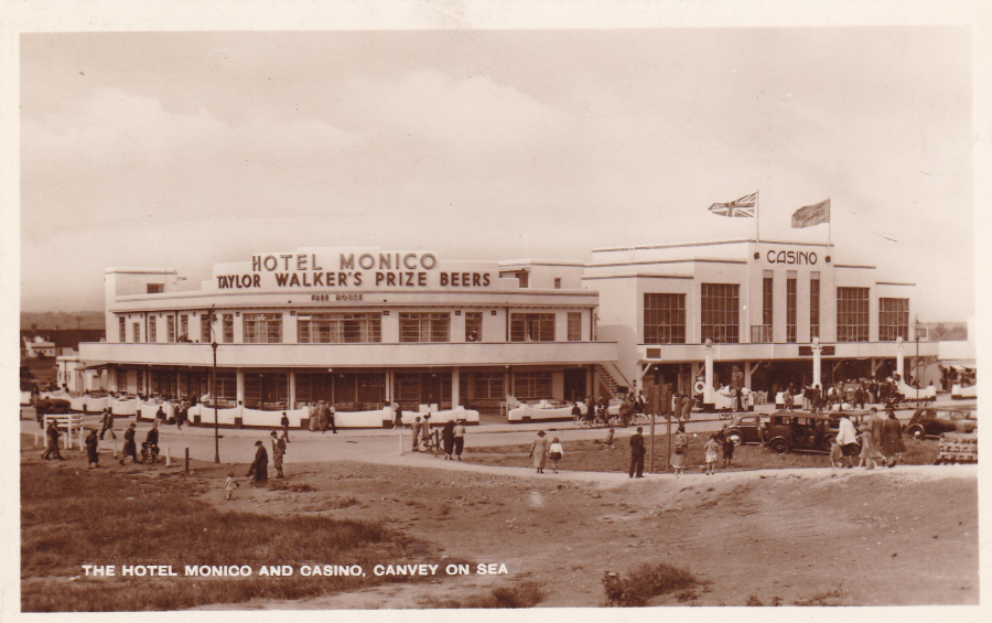
THE HOTEL MONICO AND CASINO, CANVEY ON SEA
Published by
Messrs A. Hyams, 122 Elmstead Avenue, Wembley Park, Middlesex
‘BRITISH MANUFACTURE’
This postcard image is clearly later as the Monico building has now been built onto the side of the Casino building. This copy is mint so has no date cancel to use to roughly date the image itself. The Monico was built in 1938 (apparently it was the first building on Canvey to have central heating!). The building was apparently sold to Messrs Charrington, the brewers, in 1946 for the reported sum of £68,000. As the sign across the front on the image reads ‘TAYLOR WALKER’S PRIZE BEERS’ I am going to assume that if Charrington’s took over in 1946 that this image is pre 1946. So this photograph was taken some time between 1938 and 1946 (possibly, if my assumptions are correct).
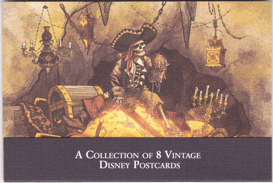
A COLLECTION OF 8 VINTAGE DISNEY POSTCARDS
‘PIRATES OF THE CARIBBEAN’
When I am in Disney World in Florida I am always on the look-out for new Disney postcards. One of the things I have learnt over the years is that you have to look in every single shop and in every nook and cranny (which is a lovely phrase). They are quite clever in their postcard output as they keep a constant change and update of images and produce sets which are sold in different shops. This pack of ‘Pirates of the Caribbean’ sketches I found in only one shop, and found for the first time in 2015 (I had not seen this set on my previous visit in 2013). This was found in the Disney Gallery shop in Disney Springs (what was ‘Downtown Disney’ for those of you who have visited in the past) and was on a shelf display well away from any other postcard spinner or display.
Depicted here is the full package with the fold over sheet stating what the set contained along the bottom. Although this set is very good it was also quite expensive, but then Disney cards are. This expense has none the less not affected their popularity.
This set was priced at $24.95 (pre-tax)

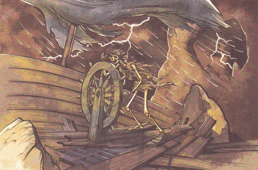
This is the top postcard in the pack depicted without the added wrap around card which gives the details of the pack, as seen on the above image.
The postcards are not individually titled or numbered and strangely no-where on either the cards or the packaging is it mentioned that these are images related to the ‘Pirates of the Caribbean’ ride. This rather strange omission would make these hard to identify for someone who has never ridden the ride or who knew nothing about this otherwise quite well known theme park attraction (one which is at both Disneyland and Disney World).
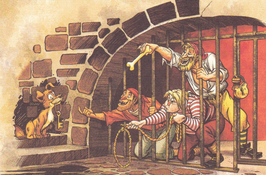
This is one of the iconic images from the attraction and in fact I have a Disney Pin which shows this very skeleton.
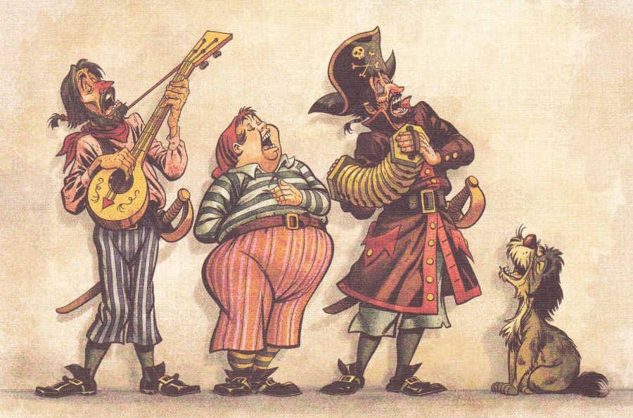
One of the more comical sketches
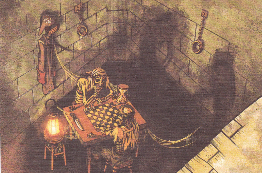
This is one of my favourites from this set because it depicts a scene which many people miss. It is not on the ride itself but is along the queueing area. There is a section where there are barred windows in a wall along one side and round the corner and along a second section. If you just look through the windows you will only see the wall on the other side. You have to get up close and actually look down into the room below. This is why the sketch here looks like you are looking down onto the scene, because that is what you have to do.
Interestingly the chess game being played was researched by the designers (they are called ‘Disney Imagineers’) and is set out in a game position which is impossible to win by any side – thus the players now being skeletons. This level of detail is typical of the Disney people who work on the rides and attractions (and the fact that I know this just shows that I read too many Disney books).
There is little doubt that this is the best known single scene along the ride. It is so well known that it was reproduced almost exactly in the first ‘Pirates of the Caribbean’ feature film (starring Johnny Depp). All the sketches in this set are from the originals but of course after the popularity of the feature films the character Jack Sparrow now appears in several scenes along the ride (the character was not an original one in the ride and was created for the film version – the final set up on the ride now has Jack Sparrow singing in a room full of treasure – If I remember correctly this was originally a skeleton when I first visited and took the ride)
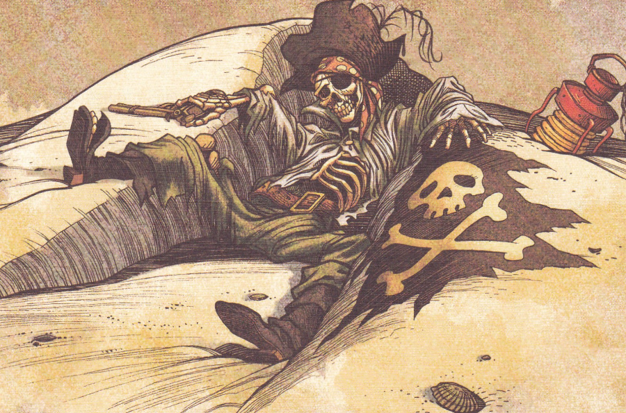
This scene is based on pirates being killed by their captain after burying treasure so that no one else knows where it is located. Although not in this image I love the moving large crab which is located a little further down from this skeleton. Its claws move and click together
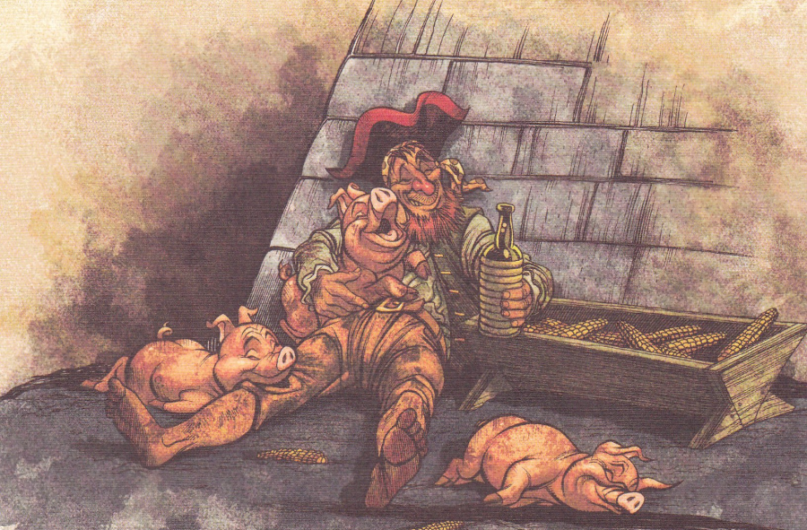
Another well-known scene which is at the end of the burning ransacked town and on the right just before you go under the bridge (again I suspect I have been here too many times!!). The pirate sings and the pigs move around happily in the muck
The last image in the set. I still find it hard to believe that the ride is not mentioned on the actual cards but there is a part of me which likes the fact that Disney believe this is not necessary because they just assume you know exactly what these cards are about, and to be fair in my case that was clearly true.
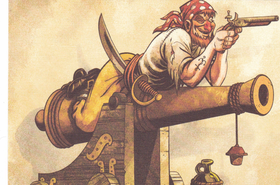
TICKACARDS
Published by Crowley & Heffernon Ltd, Reading
Ref UH/16
Design by L Green
These type of ‘Tick the box’ postcard designs were popular during the 1970’s and into the 1980’s (I bought my very first one in the early 1970’s on a trip to Butlins in Minehead – when I can dig it out I will post it. At the time I was still only collecting animal postcards but as it mentioned ‘Fishing’ as a possible option, with an image of a large fish I could add it to my collection).
This one is very typical of these cards and although this one is mint I actually prefer the used ones (which actually rarely turn up) as these give an indication of what the sender thought of these and often which sex they were and what type of holiday they were having (I have never had enough ‘Cash’ to tick that box!)
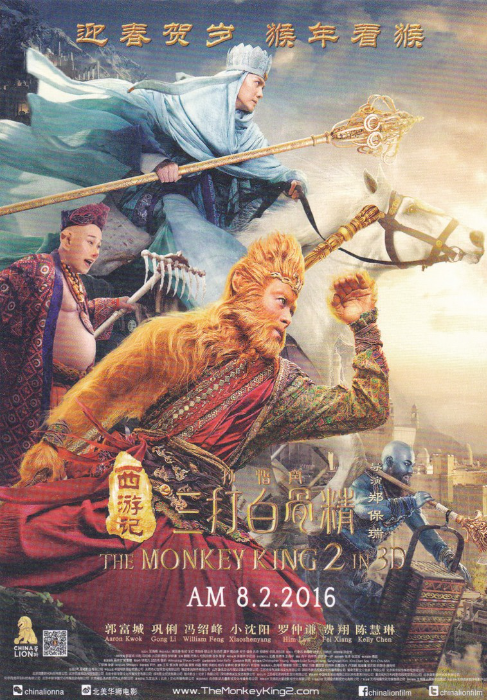
THE MONKEY KING 2
Film Poster
“Happy Chinese New Year”
Charles is a friend of mine at work whom I have known for twenty odd years now. In the internal post at work last week I received a little bundle of postcards which Charles had kindly sent me from a break him and his wife had in Berlin in mid-February. The bonus for me here is that I have received some smashing postcards that I would almost certainly not have been able to get my hands on, unless some dealer managed to get some, which is not that likely. The moral of this story is never be ashamed about what you collect and let your friends and family know because in the end it will pay dividends and your collection will be enhanced from the most unusual sources.
This card here is a real corker depicting a film poster with so much going on that it makes you want to watch it immediately (although I still remember the quality of the TV series ‘Monkey’, not that that stopped me enjoying that all those years ago - I expect the production qualities of this new film are considerably better)
This film coincides nicely with this being the Chines Year of the Monkey, a fact which is mentioned on the postcard itself.
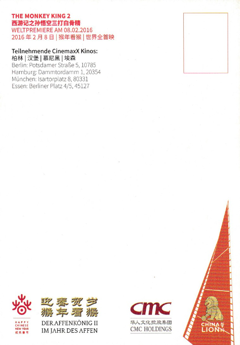
REVERSE SIDE OF ABOVE POSTCARD
Unusually this reverse side is the shiny surfaced side whilst the poster side depicted above is printed on the Matt surfaced side! Unusual, but I assume it was done that way for a reason. As you can see the format here is vertical rather than horizontal but more and more European, and especially Asian, released cards are printed in this way (in Japan this is the norm.
It appears that this film had its world premiere on 8th February 2016.
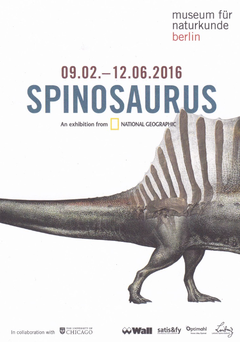
SPINOSAURUS
An Exhibition from NATIONAL GEOGRAPHIC
09.02.2016 to 12.06.2016
NATURAL HISTORY MUSEUM, BERLIN.
Not technically a true postcard as it has an information reverse, with an image of a claw, but it is postcard size and is a smashing advert for what looks like an interesting exhibition (which will be on until 12th June so if you are in Berlin before then give it a look). There is also the bonus that dinosaurs are a very collectible theme and new images are not that common so this one is a real bonus.
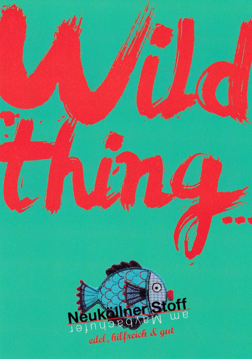
WILD THING…
This appears to be an advert for a Street market area or shopping area which has specialized street food and shopping. The front of the design does not give too much away but the reverse side has more information…
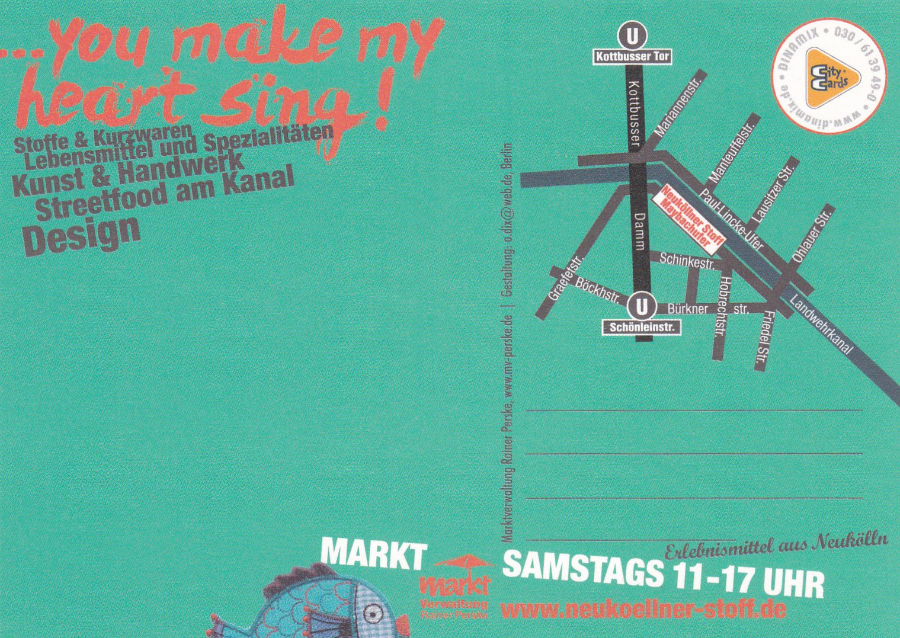
…YOU MAKE MY HEART SING!
REVERSE SIDE OF ABOVE POSTCARD
There is clearly some kind of street map top right and I believe a list of stalls or shops underneath the red/orange text on the left. One of the things I really like about this card is the used of green board so that the reverse side matches the colour of the front. I like it when postcards go away from the normal use of white. I also believe this is a good promotional tool as it makes the card stand out more.
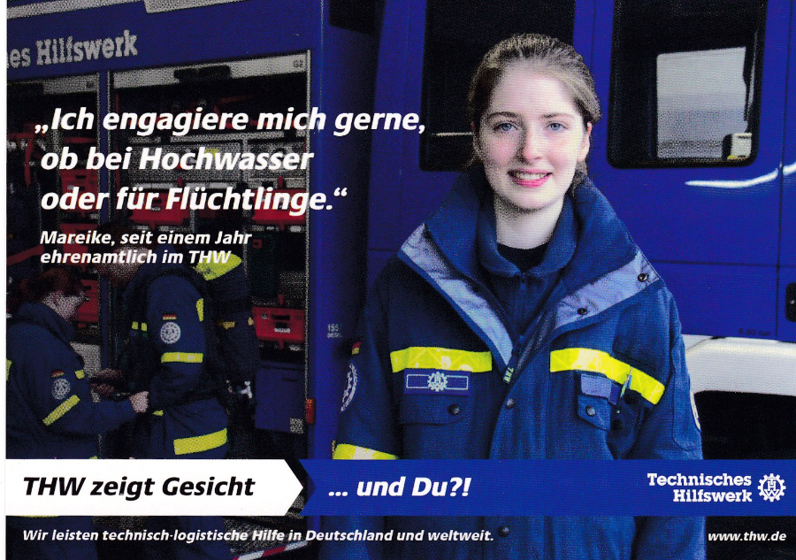
TECHNISCHES HILFSWERK
(TECHNICAL RELIEF)
“ICH ENGAGIERE MICH GERNE, OB BEI HOCHWASSER ODER FUR FLUCHTLINGE”
This seems to relate to relief work for emergency situations as the text seems to relate to flooding as such an event. I believe that FLUCHTLINGE is a place in Germany and was one of the locations flooded in really bad floods in 2013. I assume Mareike, pictured here, attended this location as a technical relief worker and this postcard is a plea for other people to sign up as this type of relief worker (possibly volunteer as such – but with no knowledge of German what so ever this is all a guess). Whatever the truth behind this cards issue it is another topical card which I hope to place in my ‘Disaster’ theme if I can link this to flooding events.
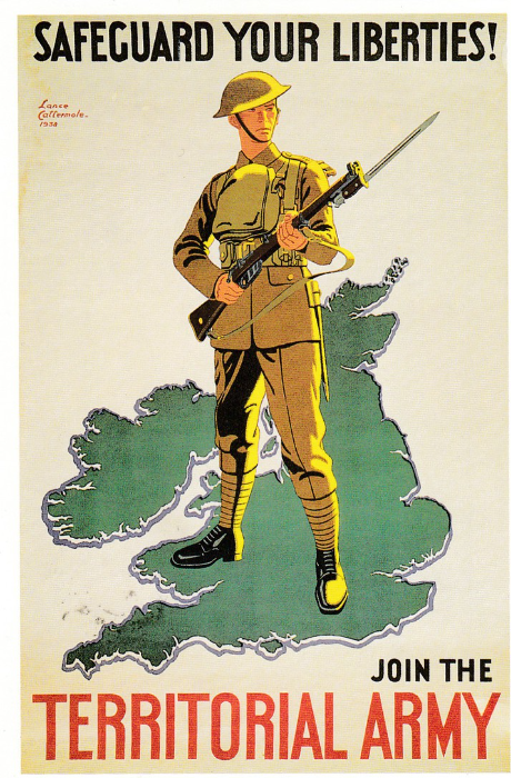
“SAFEGUARD YOUR LIBERTIES! JOIN THE TERRITORIAL ARMY” – 1938
NATIONAL ARMY MUSEUM (CHELSEA - 1997)
Ref 8805-28
Recruiting poster after Lance Cattermole (1898 – 1992), published by the War Office, 1938. This is a good example of the kind of postcard found in these types of museums, which are all over the place up and down the country. Although not all museums do have postcards there are not that many that don’t have any postcard stock at all. I will admit that the choices are not what they were even 10 years ago (and this one here is from 1997) but I always enter a museum shop with expectation, and in the hope that something unusual, possibly even unique will be depicted on a postcard produced exclusively for that museum (sometimes this is shot down by the presence of the ubiquitous spinner of ‘Robert Opie’ advertising postcards – that man truly has conquered the modern museum postcard scene)
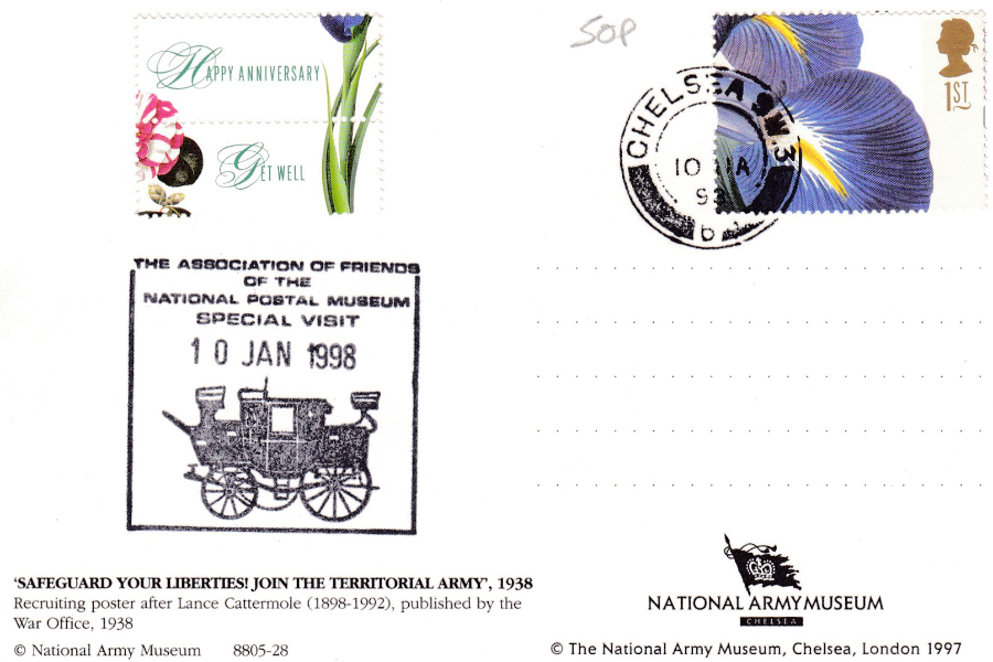
REVERSE SIDE OF ABOVE POSTCARD
The Association of Friends of the National Postal Museum used to produce souvenirs of their visits to certain museums and locations. As you hopefully read in my Stampex post earlier in the month the National Postal Museum underwent a name change (they called it a ‘Brand’ change) and it is now simply called ‘The Postal Museum’. When the old association, still going but this too has now undergone a name change, produced these souvenirs they would have them cancelled at the nearest postal location, so here you have the CHELSEA hand stamp, as this is where the National Army Museum is located. They would then apply their special cachet which would have the date of the visit, which obviously coincides date wise with the cancel on the stamp – here this is for the 10th January 1998. For those on the actual trips these made nice memento’s but they also make for nice philatelic items as well.
This one here cost me just 50p at the Nottingham Postcard Fair and a mint copy would have been worth that alone.
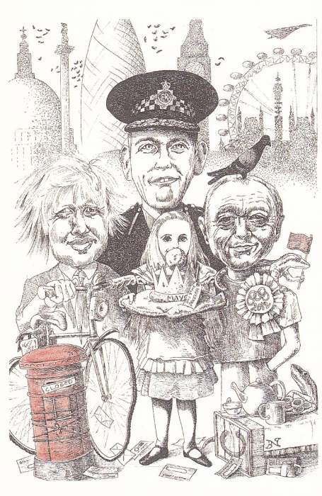
BORIS FOR MAYOR OF LONDON
Published by
P.H. TOPICS
Ref No 472
(‘Spot on [series] 6’)
Artist
Brian Partridge
What was the first postcard to feature Boris Johnson? I don’t know for sure. But I offer up this one as a possibility. The PH Topics series were always issuing very topical political related postcards, amongst many other issues (they sadly ceased producing postcards – I think it was when they reached card No 500, which seemed like an appropriate place to stop).
Text on the reverse side reads:
“After holding the position of Mayor of London for eight years, Ken Livingstone was unseated by Boris Johnson in the Mayoral Election on 1 May 2008
Boris Johnson (Con) 1,168,738 votes
Ken Livingstone (Lab) 1,028,966 votes
Brian Paddick (Lib Dem) Not in final round
There are a lot of themes covered by this design:
London
Post Office Tower (Telecom Tower)
Politics
Police
Alice in Wonderland
The London Eye
Post Box
Cycling
2012 Olympics (see the badge on Livingstones chest)
Concorde (top right corner)
Birds (there is a pidgeon - but don't feed it as its against the rules now)
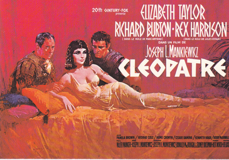
CLEOPATRE
‘CLEOPATRA’
Published by
‘EDITIONS F. NUGERON’
Ref No E56
This is a French version poster for the film (no surprise really as the card was produced by a French postcard company). It is a classic poster and the film itself is famous, not so much for the film itself, but more for all the shenanigans that went on behind the scenes with perhaps the affair between the leads Elizabeth Taylor and Richard Burton. The film was released in 1963 but had struggled under cast changes and massive cost overruns (budgeted at $2 million it eventually run up costs of $31 million) and issues around filming locations. Initially being filmed in London on elaborate sets these were then left when Taylor became ill and the whole cast and crew transferred to Italy where the sets had to be built entirely from scratch again. All the London shoot was abandoned. Despite mixed reviews, although Taylor and Burton’s performances were praised, the film went on to make $26 million in the US ($57.7million worldwide) but it nearly bankrupted 20th Century-Fox because the films combined production and marketing costs actually came to £44 million. So despite it being the highest grossing film of 1963 it ran at a loss and it is still the only highest grossing year film to run at a loss.
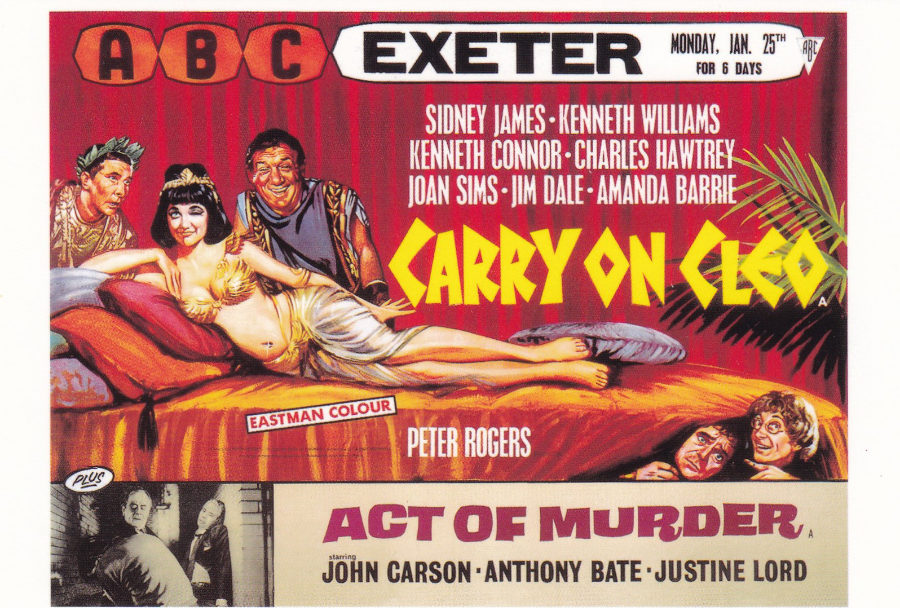
CARRY ON CLEO 1964
“BRITISH CLASSICS”
Published by
LONDON POSTCARD COMPANY
Ref
LU 530 (Series 3 set of 9)
You can clearly see where the idea of the poster design for ‘Carry On Cleo’ came from – compare this to the original Cleopatra film poster above. But there are far more connections between the two films with the biggest being the fact that the Carry on team used the London sets which had been abandoned by the original Cleopatra crew when they moved to Italy. This is why this Carry On film looks so much more professional than some of the others. They also had use of all the costumes as well which were also left behind by the original company. As a result of all this this particular Carry on film is one of the best (in my opinion). I believe it only came about as a result of the writers seeing the abandoned sets and deciding they might as well use them and they came up with this parody on the original film (the carry-on team were not going to be doing a Cleopatra version but they were great at throwing together a quick change as they did here – and Sid James is at his best here and Amanda Barrie deserves a mention for her portrayal of Cleopatra as she managed to do sexy and funny extremely well and at the same time). So all the problems that the original ‘Cleopatra’ film crew and producers had turned into a massive bonus here.
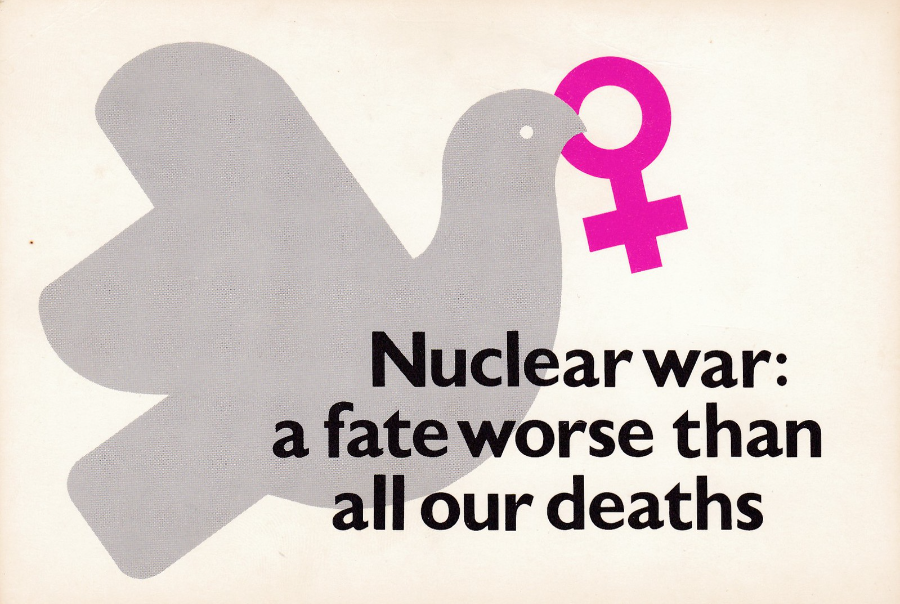
NUCLEAR WAR: A FATE WORSE THAN ALL OUR DEATHS
Published by
“THE WOMEN’S PRESS”
124 Shoreditch High Street, London E1 6JE
© Stephanie Dowrick 1982
I am of an age where I remember the era when we truly believed that nuclear war was going to happen or that it was a potential reality. I can even remember where one of the warning sirens was based in Southend as I used to cycle past it to work, when I was at Asda in Shoebury.
When I started my current job the big red button to set off the warning sirens were still there and I remember seeing the one in Southend Station. These have all gone now and my children have no knowledge of how things were not long before they born and through their very young years.
As a result of these worries there was a strong anti-nuclear campaign process which included a wide number of postcards, many of which were issued in the 1980’s, when this particular card was released. You can put together a really nice collection of postcards on this theme (mine is not brilliant, but it’s not bad either)
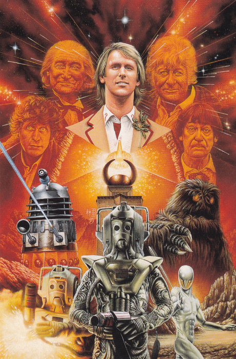
THE FIVE DOCTORS
Published by
‘SLOW DAZZLE WORLDWIDE’
No 14 in a 2nd Series of 18
(Distributed by LONDON POSTCARD COMPANY)
I am a massive Dr Who fan and have been for many years. I collect books, magazines and autographs relating to the show and with the exception (for now) of Peter Capaldi I have the autographs of all the actors who have played Doctor Who (including Peter Cushing from the feature films released in the 1960's).
If I was to be asked what my favourite Dr Who picture is, then this one here would win. It was the image used on the cover of the video (remember video’s – VHS and all that?) in the boxed ‘Five Doctors’ special release which came with a free little Dr Who Postcard Album which was to store the postcards that were then being given away free with the Video releases (the postcards reproduced the cover artwork in full with all the titles). This SLOW DAZZLE WORLWIDE postcard depicts the artwork without the video titles. I really like this picture and I think it really captures the essence of this special anniversary story (which was originally shown on Children in Need)
Although it is not stated on the card anywhere the artist was Colin Howard, and I know this because I met Colin in 1998 at a Dr Who convention in, I believe, the Basildon area.
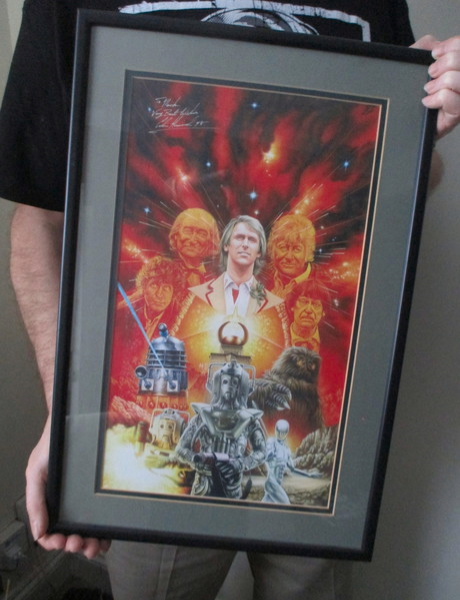
SIGNED PRINT
Signed by Colin Howard
“The Five Doctors”
When I met Colin Howard in 1998 I bought a large print of the Five Doctors artwork which he kindly signed for me – so when I say this is my favourite image I really mean it. The signature appears top left and is dedicated to me. If I remember clearly I believe this was £10 then, but worth every penny to me.

Close up of the signature