
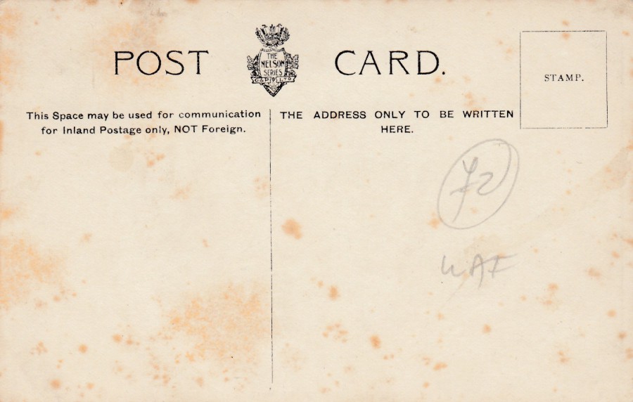
27/10/2018
WESTLANT DEPLOYMENT
1976
HMS ARK ROYAL
Privately produced postcard for the HMS HERMES crew
I loved this card when I saw it, and it was just £1, which I considered to be a bargain. It seems that this postcard was produced, possibly even onboard the ship itself, for a certain deployment in the US in the year 1976, which was also the year of the bicentenary of the American Revolution, as shown by the logo which is repeated across the front of this postcard design. My copy here was sent by a member of the crew, a pilot, and he states that he flew the dark aircraft that can be seen on the ship in this photograph (I am no aircraft expert, but they may be Blackburn Buccaneer’s which I know were stationed onboard HMS Hermes). I think this could be quite a scarce postcard.
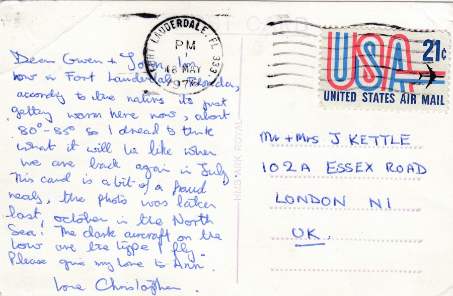
REVERSE SIDE OF ABOVE POSTCARD
The writer says that the photograph used here was taken in the October of the year before in the North Sea, so it seems clear he had a good knowledge of the aircraft carrier and its movements around that time. The 21 cent UNITED STATES AIR MAIL stamp has been cancelled with a ‘FORT LAUDERDALE, FLORIDA 333’ machine cancellation dated 18t May 1976.
27/10/2018
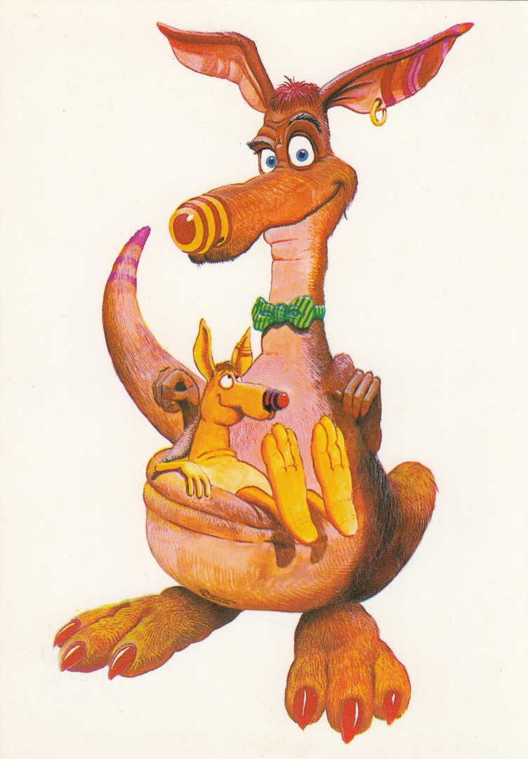
UNTITLED
(Weird looking ‘Punk’ like Kangaroo’s)
Published by
P. A. G. S. A. (Espana)
PROMOTORA DE ARTES GRAFICAS SA (BARCELONA)
ARTIDEA (Italia)
Ref: SERIE PTI-0019
PAG SA COLECCION PERLA [collection Perla]
Quite what these unusual kangaroo’s have to do with Spain I don’t know, but Spain is the original source of this postcard. I like unusual cartoon cards and this one certainly fits that bill.

27/10/2018
BRITISH EUROPEAN AIRWAYS
VISCOUNT “DISCOVERY CLASS” AEROPLANE
Unknown Printer – Publisher
It’s probably time to show you a non-American themed postcard, but I am sure many from my holiday will make their way onto here. So, here is a nice black and white photograph postcard with a nice clear image of a Viscount aeroplane. There are some technical details recorded on the reverse side of this card, so I will depict this below.

REVERSE SIDE OF ABOVE POSTCARD
27/10/2018
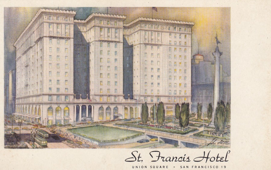
ST FRANCIS HOTEL
UNION SQUARE, SAN FRANCISCO
Official Hotel Postcard
(Unknown Printer)
Before I went away on my trip I scanned a handful of postcards to place on the webpage if I had internet access. As it happened I had no access through out my San Francisco stay, but this postcard was to be used if I had. By some amazing coincidence, because I had not looked them up prior to my holiday, this is the actual hotel we stayed in! How about that for a coincidence. Amazing. This just goes to show how the postcard world can wrap around the real world. This is an older postcard and the message on the reverse side of this copy seems to date it from 1971. There is now a tower block addition to the hotel which now stands behind the left side of the hotel as it appears in this image. It was in this tower that we stayed.
So, what was once a simple cheap postcard I picked up from a cheap box because I quite liked the image is now another reminder of my recent holiday.
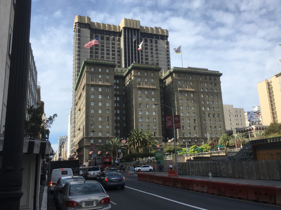
PHOTOGRAPH
One of my own photographs of our hotel, which is now correctly called the HOTEL WESTIN ST FRANCIS. The tower block at the back can clearly be seen here. The front section still remains the same though.
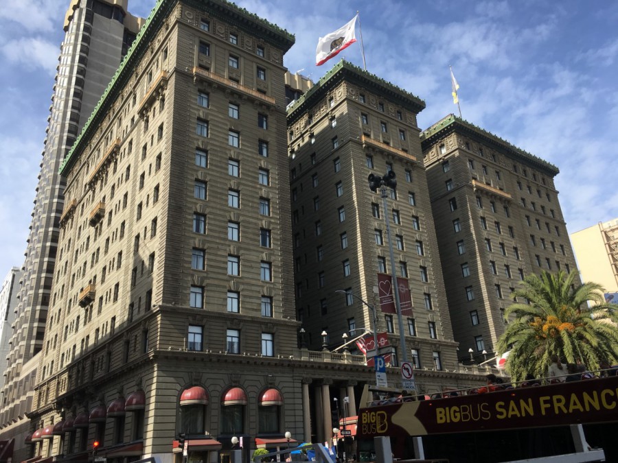
PHOTOGRAPH
One of my own photographs of our hotel, which is now correctly called the HOTEL WESTIN ST FRANCIS. A closer view of the hotel.

26/10/2018
HI… FROM CALIFORNIA
Artwork by
BRENT HARDER
Published by
IMPACT, SOUTHERN CALIFORNIA
(Printed in JAPAN)
Ref: # 5551 (G-2157)
This is a modern interpretation of a long running American tradition of the illustrated letters of a location across a postcard. Although no longer unique to America this type of card is a uniquely American idea and creation, now copied by a range of other countries, but never bettered. My copy here was again posted in the UK as a competition entry card, this time in 1994 (for a ‘Take That’ competition).
26/10/2018
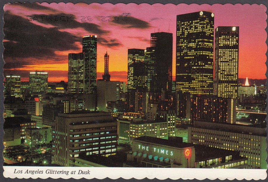
LOS ANGELES
GLITTERING AT DUSK
Photo by
Mason Dooley
Published by
MIKE ROBERTS COLOR PRODUCTIONS
Distributed by
MITOCK PUBLISHERS INC
(7410 GREENBUSH AVE, NORTH HOLLYWOOD, CALIFORNIA)
Ref: B13208
A CONTINENTAL CARD
This postcard was actually-posted in the UK in 1993 as a competition entry card, but it is a little older than this. We spent a day in Los Angeles and had a nice tour of the city with the traditional view of the HOLLYWOOD sign and the Chinese theatre etc. We saw many of the tall buildings as we left the city on our way to the Queen Mary (see below entry), but I don’t think they are the cities best attraction, although they do look good here on this postcard.
26/10/2018
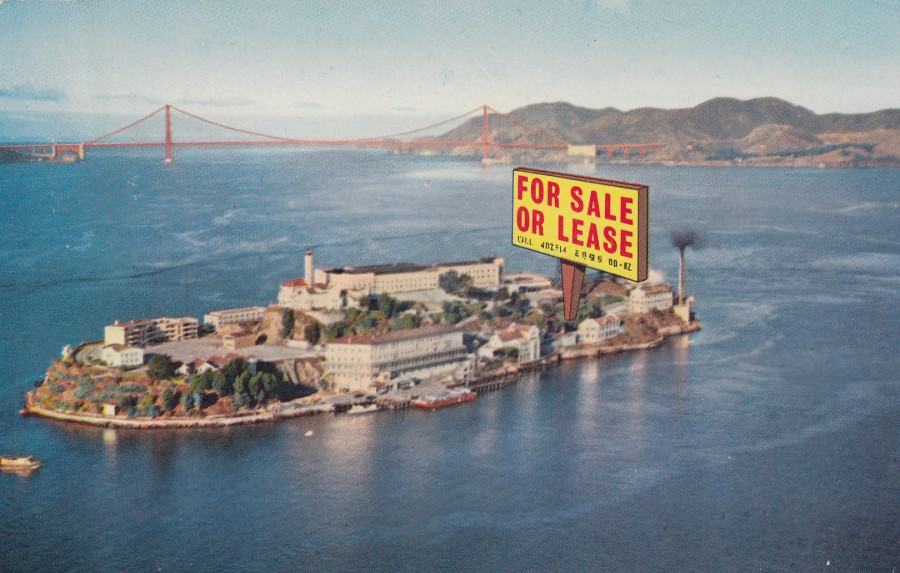
FOR SALE OR LEASE
ALCATRAZ ISLAND
SAN FRANCISCO
Published by
SMITH NEWS Co (460 Ninth St, San Francisco)
Printed by
H. S. CROCKER Co. (San Francisco)
Ref: 5:SF-17 ½ A
The last location on our holiday tour was San Francisco and his gave me the opportunity to see the famous Alcatraz Island. You can clearly see the island from the mainland and I saw it often when I was touring around. I also got a nice close-up look when a ferry I was on travelled close to the island on its trip back from Sausalito (a beautiful location).
The Island of Alcatraz was of course a prison, one which was closed by Robert F. Kennedy in 1963. I wonder if this postcard was issued in the period just after, or around the closure of the prison as the joke about the island being for sale would have been relevant and funny at that time, also the reverse side would fit this period of publication.
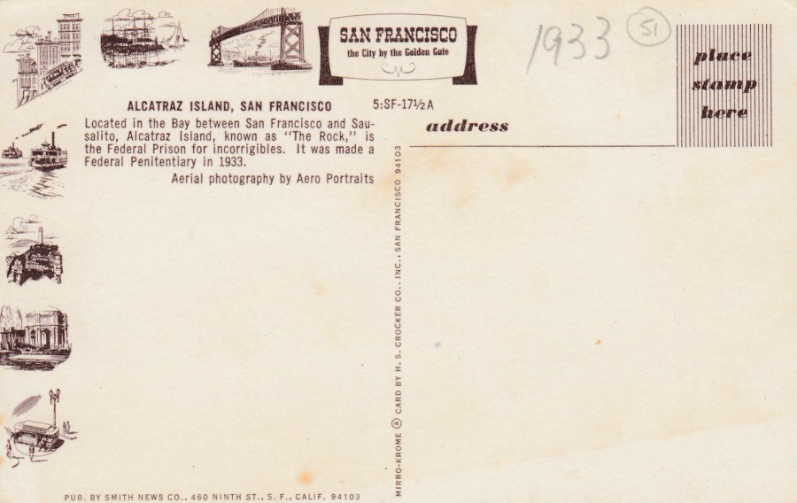
REVERSE SIDE OF ABOVE POSTCARD
I do like these American postcards with their little drawings of local landmarks and tourist attractions down the far-left side. You can find different postcards from different areas with, obviously, different images placed here.

PHOTOGRAPH
My photo of Alcatraz Island taken from the ferry from Sausalito

26/10/2018
CUNARD WHITE STAR
QUEEN MARY
Printed in England
Publisher – Printer details not recorded
Ref: A. 2911
Well, I’m back in the UK after my three weeks in America. The last 5 to 6 days were manic, and there was no wifi access during the crazy miles and stops covered during this period, so there were no webpage postings for a while, but the facebook page had some interesting posts.
One highlight of this last section of my holiday was an overnight stay on the RMS Queen Mary, now permanently moored as a hotel in Long Beach, California. I am a massive fan of the old ocean liners and their history, and as you know I collect RMS Titanic material, especially postcards, and the Queen Mary is the last of these large majestic historical liners that you can still visit. I spent many hours exploring the ship, looking into all the little areas and finding out as much history as I could.
This postcard looks a little strange because the image is printed on a gold foil/shiny surfaced card, although to be more precise it is a matt gold surface which reflects light rather than a true shiny (Duflex styled) card. This is an early example of such an issue and is contemporary to the running of the Queen Mary.
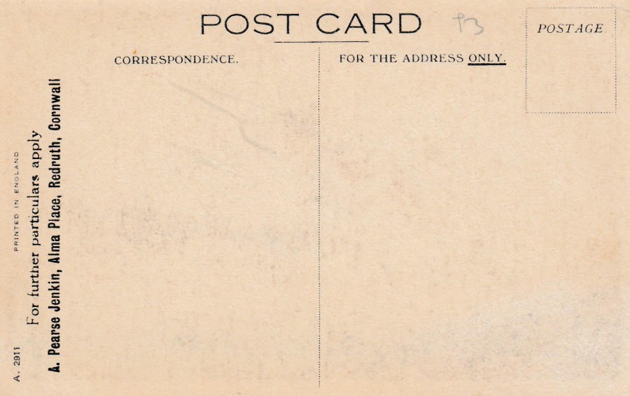
REVERSE SIDE OF ABOVE POSTCARD
This card appears to have been used by a person, or a company as there is added text applied which reads:
For further particulars apply
A. Pearse Jenkin, Alma Place, Redruth, Cornwall
I wonder what ‘particulars’ this advertisement referred to? I have found a reference to a land agent called Pearse Jenkin in Redruth who was the son of an Alfred Jenkin who died in 1872. So, could it be that this person, or even one of their relatives, named after the late Alfred Jenkin is the person who used this card as a company advert card.
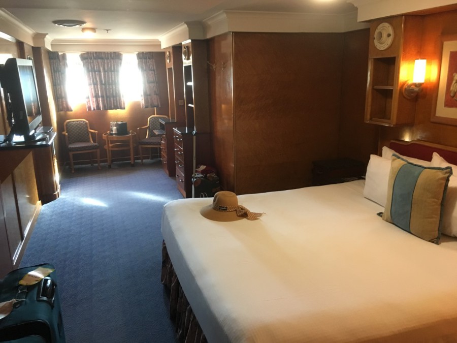
PHOTOGRAPH
Our room on the Queen Mary
17/10/2018
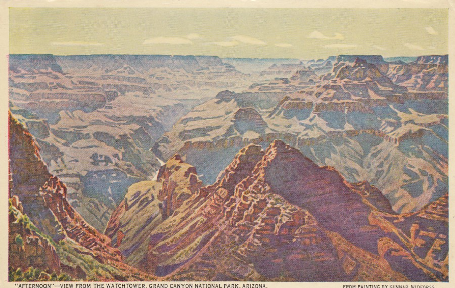
“AFTERNOON – VIEW FROM THE WATCHTOWER
GRAND CANYON NATIONAL PARK, ARIZONA
From a Painting by
GUNNER WIDFORSS
Published by
FRED HARVEY
(HOTELS – DINING CARS – RESTAURANTS – SHOPS)
Ref: H-4488
This lovely painting of the Grand Canyon is very appropriate to me today as tomorrow I shall be heading to the Grand Canyon for my very first visit to this natural wonder. I am really looking forward to seeing this famous natural canyon. Knowing I was going to be visiting I scanned in this card from my collection before leaving the UK. I think this is a real cracker, but I suspect I will be able to pick up some more when I get there.

REVERSE SIDE OF ABOVE POSTCARD
16/10/2018
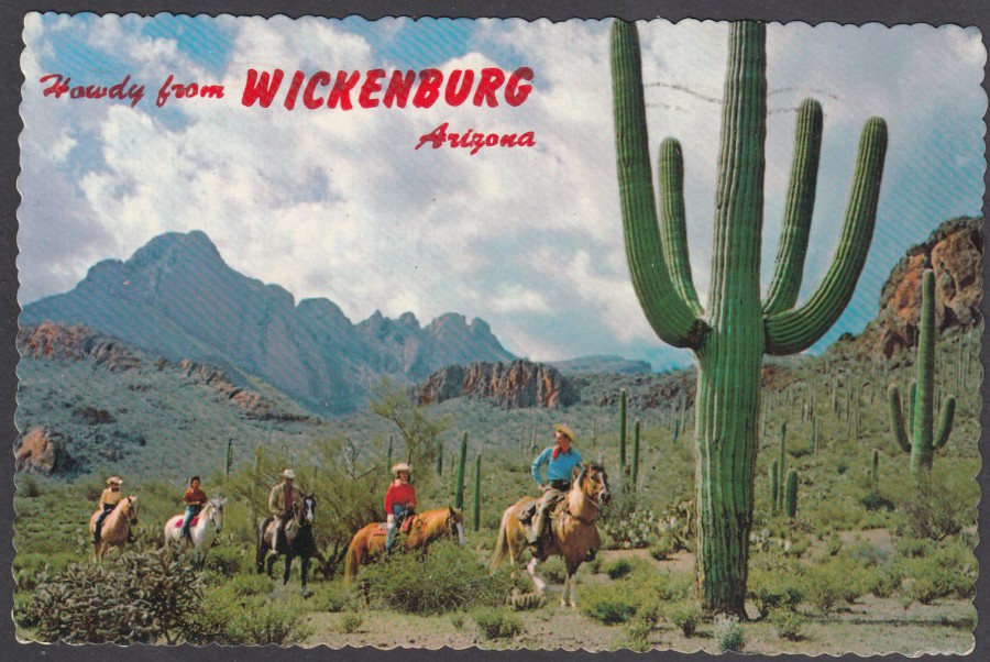
HOWDY FROM
WICKENBURG
ARIZONA
‘DESERT RIDERS’
PETLEY STUDIOS,
PHOENIX, ARIZONA
This is a different area of Arizona than the one I have been travelling through and I didn’t get to see any of these iconic cacti. This is another postcard I had pre-scanned before leaving on this current holiday and it goes to show what was laying around in my collection before I got to make this visit.

REVERSE SIDE OF ABOVE POSTCARD
This was posted in 1977 from CAREFREE (what a great name for a location) Arizona. The stamp, a 21cent airmail, has been cancelled with a CAREFREE AZ large circle cancellation dated 1st August 1977. This was sent to somewhere called BRASSCHAAT which is a municipality in Belgium and upon arrival has received a BRASSCHATT single circle cancel dated 11th August 1977, which means this took ten days to make the trip, which seems like quite a lot even for the 1970’s. Nice clean and clear usage though.
16/10/2018
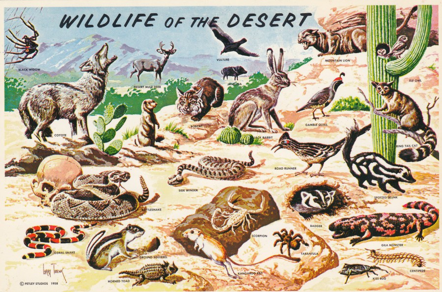
WILDLIFE OF THE DESERT
WILDLIFE IN SOUTHWESTERN DESERT
Published and Distributed by
PETLEY STUDIOS,
PHOENIX, ARIZONA
Ref: K-999-C
(CROCKER)
For the first time ever, I have today been travelling through the desert of Arizona. The views were amazing, and more varied than I expected, as was the weather. I had scanned this postcard before I left home in preparation for todays posting. Unfortunately, the only things I saw from this selection were Prairie Dogs, deer and vultures, but the other critters would have meant a slower and more careful movement through the miles we travelled today. Still a cracking postcard though.
16/10/2018
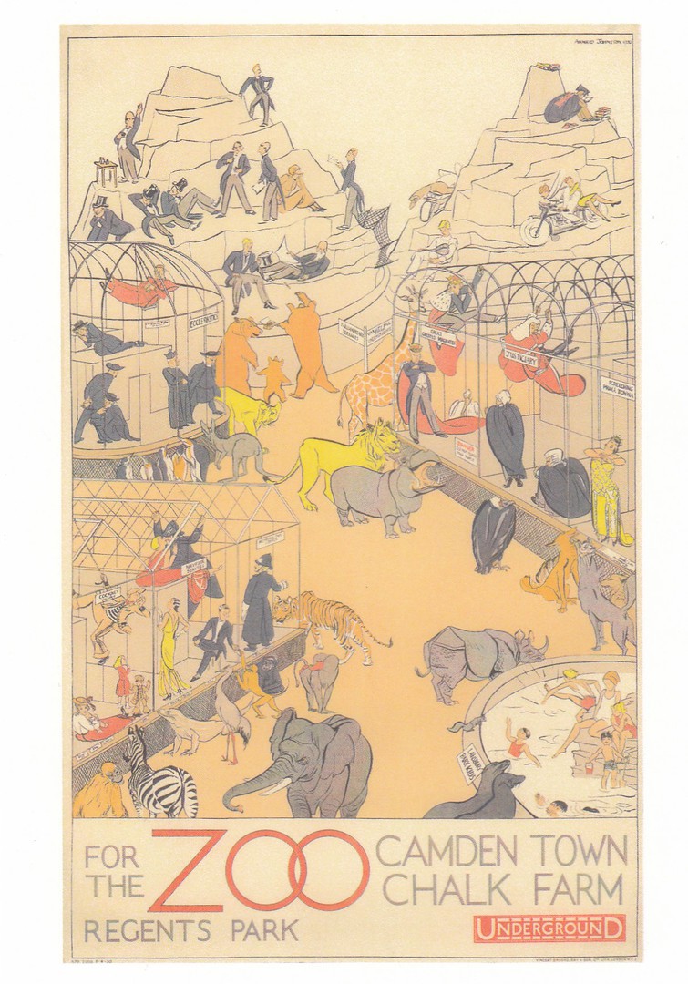
‘REGENTS PARK ZOO’
FOR THE ZOO
REGENTS PARK
CAMDEN TOWN, CHALK FARM
Poster by
ANRID BANNIZA JOHNSTON, 1930
Published by the
LONDON TRANSPORT MUSEUM
In their:
‘POSTER GIRLS – A CENTURY OF ART AND DESIGN’
Series
Ref: unusually this card does not appear to have any LTM number attributed – which appears to be the case with this specific POSTER GIRLS series
This postcard was issued in 2018
I love the fact that here the animals are the visitors and the humans are on display in the cages. It is a wonderful idea and very well depicted. I also like the fact that the artist has included the ‘Maplin Terraces’ at the back. These imitation mountains were built between 1913 – 1914 and are now a Grade II listed structure.
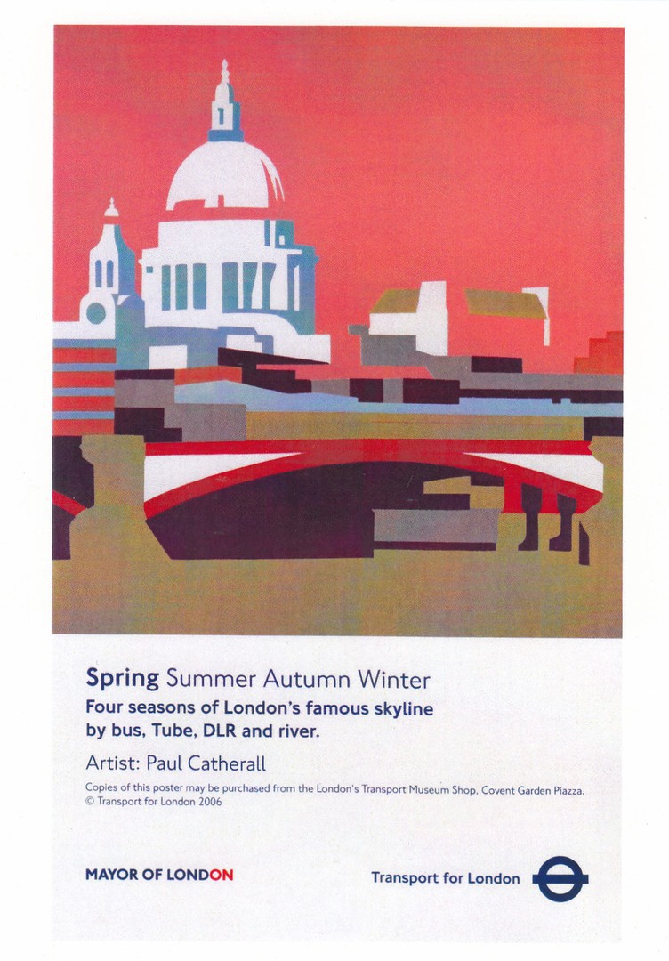
SPRING (FOUR SEASONS)
SPRING SUMMER AUTUMN WINTER
FOUR SEASONS OF LONDONS FAMOUS SKYLINE
Poster by
PAUL CATHERALL, 2006
Published by the
LONDON TRANSPORT MUSEUM
Ref: unusually this card does not appear to have any LTM number attributed
This postcard was issued in 2016
A nice poster design from the first decade of this new millennium. I assume there were also posters for the seasons of Summer, Autumn and Winter. I shall have to check my museum postcard collection and see if the other seasons also appeared on postcards.
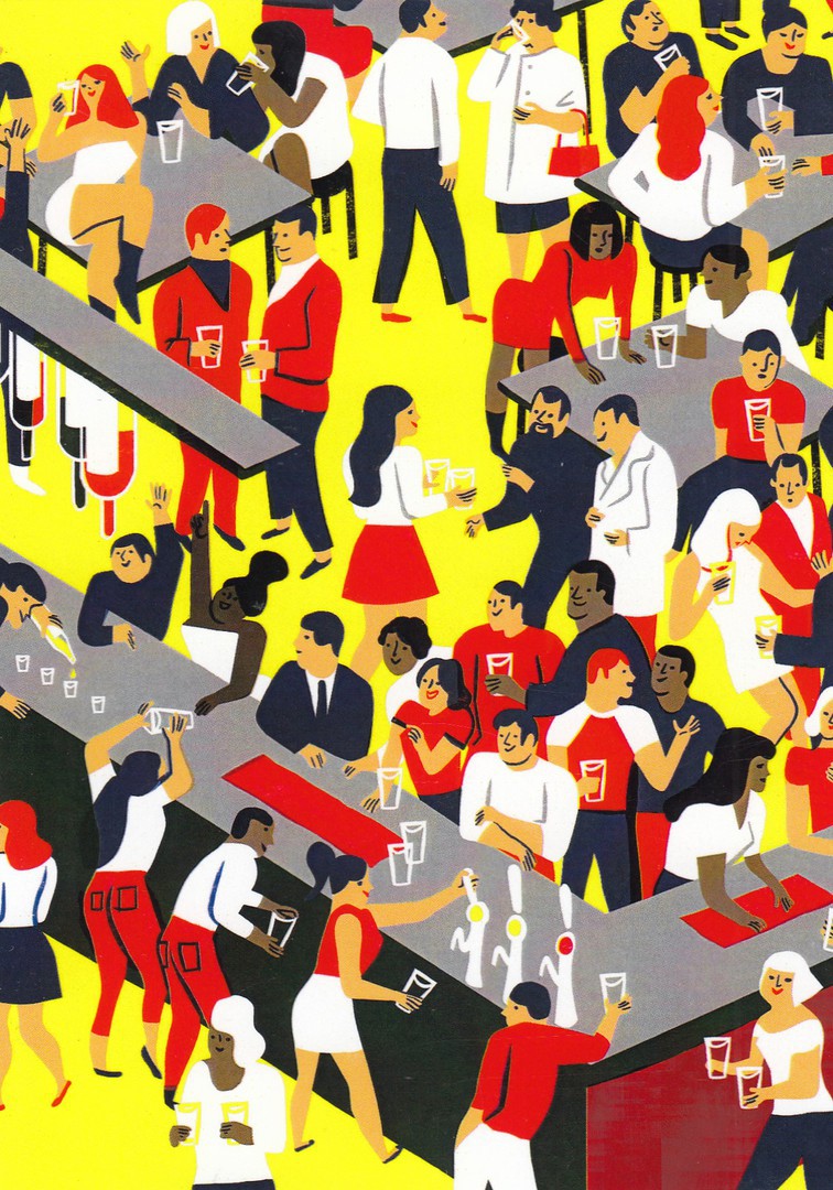
BRIGHTEST LONDON
BARS BY BUS, TUBE, OVERGROUND AND DLR
Poster by
VIRGINIE MORGAND (No year of production given)
Published by the
LONDON TRANSPORT MUSEUM
Ref: unusually this card does not appear to have any LTM number attributed
This postcard was issued in 2016
One of the more unusual of this museum’s recent postcard issues. Text on the reverse side refers to this as a poster design but there is no front text on the poster itself. I wonder if it was a piece of artwork which was commissioned but eventually not used, which might explain why no year is given in the descriptive text for when the design was painted or used. I like this one because it is so different from the other poster designs produced by this museum.
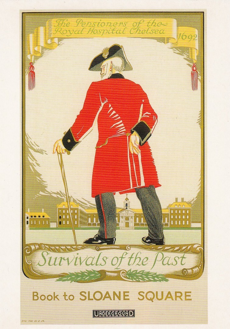
THE PENSIONERS OF THE
ROYAL HOSPITAL CHELSEA
SURVIVALS OF THE PAST
BOOK TO SLOANE SQUARE
Poster by
DORA M. BATTY, 1924
Published by the
LONDON TRANSPORT MUSEUM
Ref: LTM 496
I do like poster designs which I can also place into my military themed collection. This is a lovely one which depicts a part of London’s history as displayed by the year 1692 shown top right in the poster image.
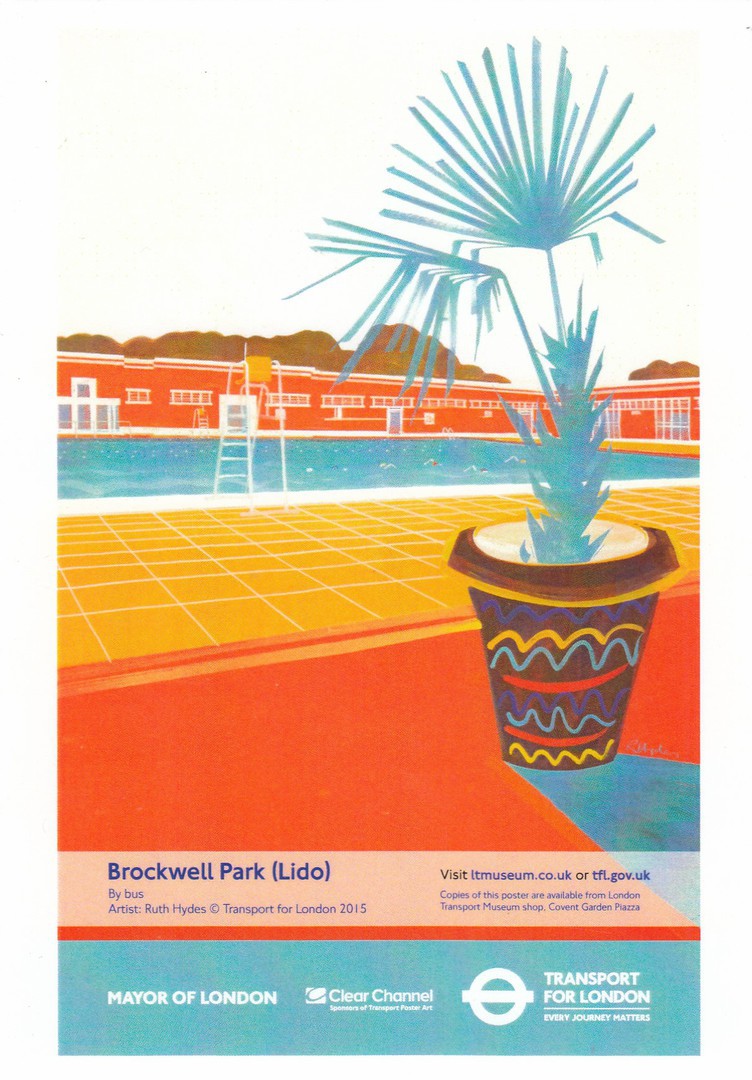
BROCKWELL PARK (LIDO)
BY BUS
Poster by
RUTH HYDES, 2015
Published by the
LONDON TRANSPORT MUSEUM
Ref: unusually this card does not appear to have any LTM number attributed
This postcard was issued in 2016
Another modern design with nothing special about it except its design and modernity, but that is what I like about this series, the fact that they publish the more unusual and even mundane modern poster designs. This postcard came out the year after the poster first came into use.
16/10/2018
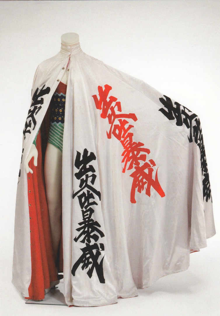
CLOAK DECORATED WITH KANJI CHARACTERS
FOR THE
ALADDIN SANE TOUR
DESIGNED BY
KANSAI YAMAMOTO
1973
VICTORIA & ALBERT MUSEUM
DAVID BOWIE EXHIBITION
(EXHIBITION EXCLUSIVE POSTCARD)
Published by the
VICTORIA & ALBERT MUSEUM
Ref: 120117
Another crazy piece of tour costuming from a David Bowie tour. Another superb Bowie themed postcard from the museum’s excellent exhibition series. I hope you like these, but if not dont worry as there is only another couple to show you before they have all appeared on the webpage.

14/10/2018
LOVE THE BEACH
“Make mine a 99”
RETRO SEASIDE
Design by
JENNY WISCOMBE
Published by
J. SALMON LTD
Ref: 09/80/02/07
I have a few of these designs by Jenny and I like them a lot. They have a sort of nostalgia about them which clearly appeals to the general-public as these postcards can be found being sold up and down the UK in many locations, including my home town (although the company itself ceased producing postcards last December). The combination of images used here is very good and eye catching, especially with the inclusion of the old Ice Cream van, although I say old, but the one that still drives around my area still looks like this one.
For my readers from other countries who may not know what a ‘99’ is I shall explain as to UK readers of a certain age it is iconic. It is an ice cream cone with a chocolate flake stuck in it, something you can get from all UK ice cream vans.
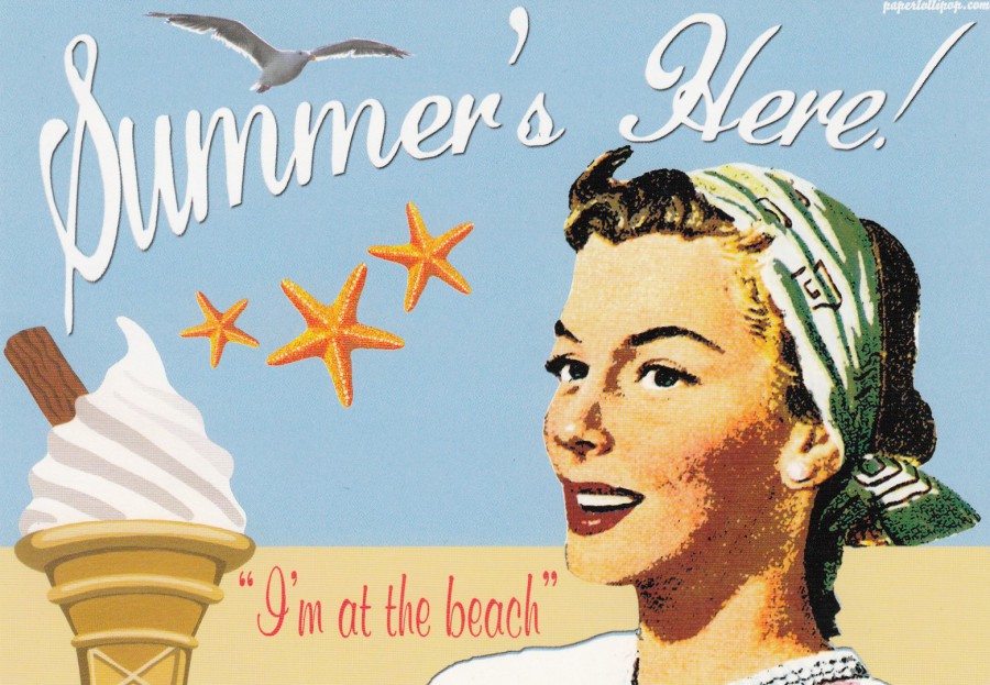
SUMMER’S HERE!
“I’m at the beach”
RETRO SEASIDE
Design by
JENNY WISCOMBE
Published by
J. SALMON LTD
Ref: 09/80/02/01
This is the first card in tis series and for those from other countries who did not know what the ‘99’ was that was mentioned on the above postcard there is one depicted here in the bottom left corner. It seems strange to mention it on the above postcard, but to depict it on another, but then this is a minor point really as the cards in this set are really good, and I like them.

WERE GOING ON A SUMMER HOLIDAY!
RETRO SEASIDE
Design by
JENNY WISCOMBE
Published by
J. SALMON LTD
Ref: 09/80/02/03
Another card from this series, and I am on holiday at the moment so for me it is topical!
14/10/2018
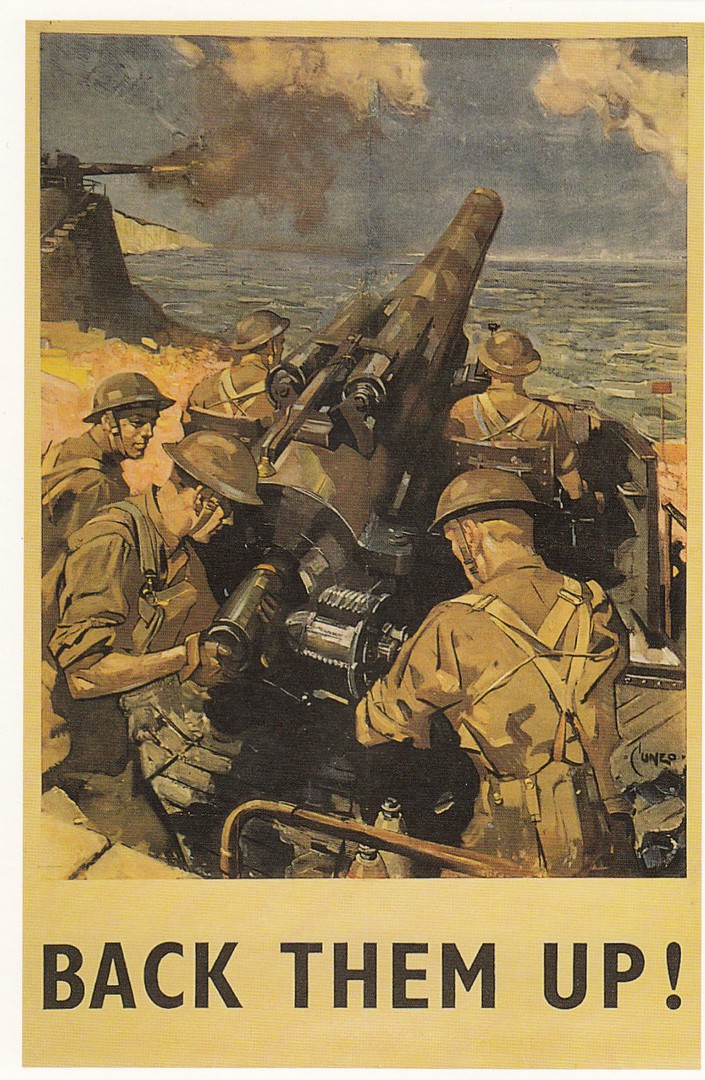
BACK THEM UP!
ROYAL ARTILLERY WITH 4-IN MK 5 ANTI-AIRCRAFT GUNS
DEFEND THE COAST OF BRITAIN circa 1941
Recruiting Poster after
Terence Cuneo (1907-96)
Published by
HMSO c 1941
Published by
NATIONAL ARMY MUSEUM
CHELSEA
Ref: 8511-56
Copyright 1997
Some war posters you see a lot on different postcards, whilst some you see a lot less often, or only once or twice. This is one from the last type, a poster design I had not previously seen before, which was strange as I think this is a cracking poster.

13/10/2018
THE ROYAL FREE, NW3
“THE HEALTH SERVICE IS SAFE IN OUR HANDS”
M. THATCHER
Not published by Private Health Ltd., or Burial Services Inc., or E. Currie plc
(Text from reverse side of postcard)
Published by
POSTCARDS PAST
This would class as a political postcard because the text on the reverse side makes-reference to the policies of the then Prime Minister Margaret Thatcher, which also nicely dates this postcard to the early to mid-1980’s. The ‘E. CURRIE’ mentioned is of course Edwina Currie, a member of parliament with the Conservative party.
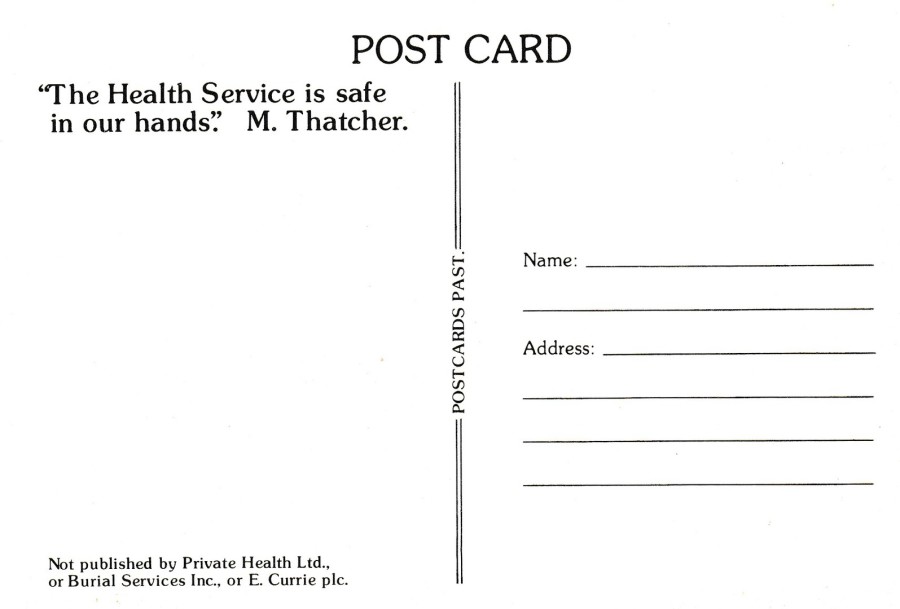
REVERSE SIDE OF ABOVE POSTCARD

“THE HEALTH SERVICE IS SAFE IN OUR HANDS”
M. THATCHER
Not published by BUPA or Burial Services Inc
(Text from reverse side of postcard)
Unknown Publisher
This card’s image is clearly a copy of the above card’s idea (unless of course this version came first), but with different company logo’s and banners on the building. This one is far harder to find than the above card and not all collectors are aware that there are two versions of this idea.
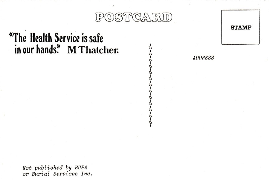
REVERSE SIDE OF ABOVE POSTCARD
This time E. Currie fails to get a mention (I wonder if she would think this a good thing or a bad thing?)
13/10/2018
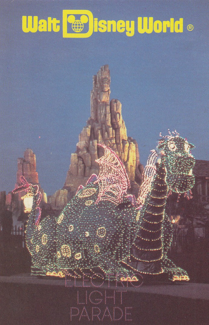
ELECTRIC LIGHT PARADE
Walt Disney world
Official Theme Park Postcard
Ref: HSC-609-P
This parade has now gone from Walt Disney World. They like to change the location of their parades and they move around the theme parks areas. Fortunately, I had seen this one, with its famous dragon, as depicted here, many times. I bought this older postcard from a dealer as it pre-dates any of my visits.
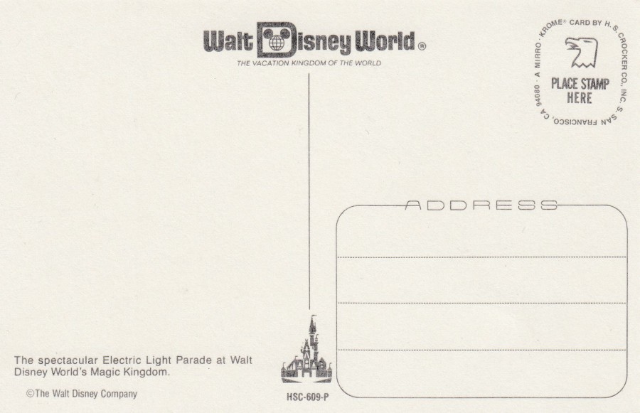
REVERSE SIDE OF ABOVE POSTCARD
12/10/2018
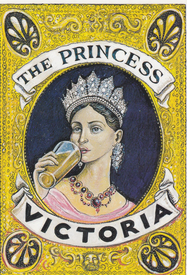
THE PRINCESS VICTORIA
22 UPPER NORTH STREET
BRIGHTON
Real Ales, Log Stove, Excellent Food & Great Atmosphere
COMPLETELY REFURBISHED & REVITALISED
REOPENS ON THURSDAY 25TH APRIL
Privately produced for the Public House
Unknown Printer.
I picked this postcard up from a cheap box on a dealer’s stand at a postcard fair. I wanted it as an unusual addition to my royalty collection. I have not been to this pub, not that I know of anyway, but I have done a couple of stag weekends in Brighton and I don’t remember all the pubs we went into on these. It would be interesting to know when the refit took place and in what year it reopened on the 25th April.
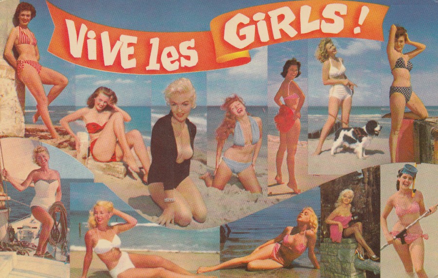
12/10/2018
VIVE LES GIRLS!
Published by
H. S. CROCKER CO, INC., OKLAHOMA CITY
OKLAHOMA
A
MIRRO-KROME CARD
Ref: HSC-388
This is a cracking card which must be from the late 1950’s – 1960’s era. This is a nice collection of swimsuit photographs, one which would be of interest to anyone looking at the history of bikini’s and other swimsuit costumes. Other people I am sure will just look at and admire the pictures.
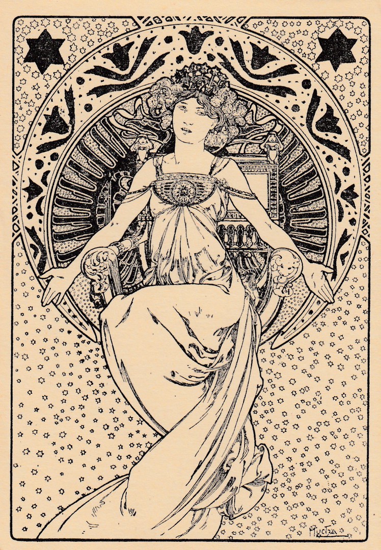
11/10/2018
UNTITLED POSTCARD
Depicting a design by
ALPHONSE MUCHA
Unknown Printer Publisher
Issued in France (I believe)
Golden Age original Mucha postcards are highly sought after and expensive, and quite colourful. This card, despite its undivided reverse side, which makes it appear much older than it is, is a modern release (possibly circa the 1980’s). I believe this was produced for the postcard collector world rather than a general release.
REVERSE SIDE OF ABOVE POSTCARD
11/10/2018
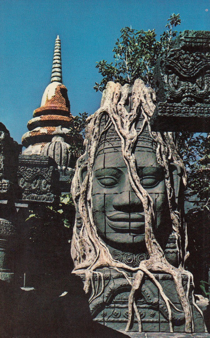
ADVENTURELAND JUNGLE CRUISE
WALT DISNEY WORLD
FLORIDA
Official theme park postcard
Ref: 79913-C
(01110206)
“Amid lost Asian ruins, a python-like Banyan tree grips an ancient stone god in a living vise… one of the spectacular sights in store for guests aboard explorer’s launches on the “danger-filled” Jungle River Cruise”
(Text from reverse side of postcard)
I have mentioned before my love of this ride (But to quickly recap, it was because as a child I loved all things wildlife themed, and every bank holiday in the UK came with the showing of a new ‘Disney’ programme where a UK celebrity would go to the theme park and film segments there which showed bits and pieces of the various rides, characters and other park aspects. I loved this programme and through watching it fell in love with the idea of the Jungle Cruise ride), I ride it every time I visit Walt Disney World. I also try on every visit to try and photograph this face statue, but I fail on almost every trip, so it was nice to find this old postcard on a dealer’s stall which depicts it. It is located just before the boat goes into the tunnel area.

REVERSE SIDE OF ABOVE POSTCARD
This has the very early, first in fact, Walt Disney World logo heading across the top, which I believe places the issue of this card in the 1970’s, possibly early 1980’s (but I am going with the 70’s). The printing is in blue, which I think is attractive and there is a little toucan logo at the bottom of the central dividing line (I think this is reference to the ‘Tikki Tikki Room’ attraction, which is located in the ‘Adventureland’ area).

11/10/2018
WILDLIFE
PHOTOGRAPHER OF THE YEAR
2005
AUSTRALIAN MUSEUM
‘Yawning Fox’ by Bence Mate
Published by
AVANTCARD AUSTRALIA
Free Rack Postcard
Ref: #10238
Issued 2005 (no surprise there!)
Another cracking card from this company which has now sadly ceased producing free postcards in this series. As an initial wildlife-only collector as a kid I would have loved this one even more if it had come out back then.

REVERSE SIDE OF ABOVE POSTCARD

11/10/2018
“I’M THE KING OF THE WORLD”
Published by
BOOMERANG
In their:
“CINEMA IN CARDS”
Series
Ref: No 18
BOOMERANG
“CINEMA IN CARDS”
SERIES
Time for another postcard from this very large series of cards which depict a phrase or quote from a specific film. Some of these are easy to work out, some from the fact that the quote is famous, some from the design of the card and others from personal fandom for that film.
I think this one may be one of the easiest of these cards to identify the film from. It is also of course another Titanic themed postcard for my extensive modern Titanic postcard collection.
11/10/2018
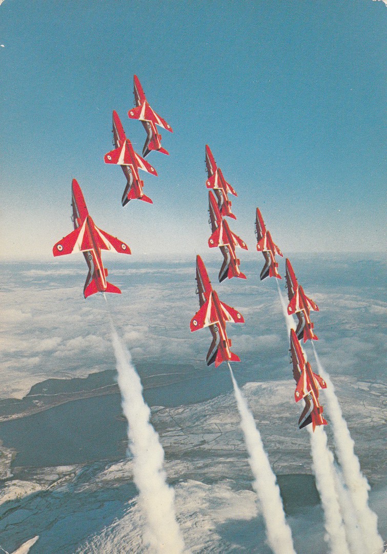
THE RED ARROWS
Published by
CHARLES SKILTON & FRY LTD
(CHARLES SKILTON’S POSTCARD SERIES)
Ref: 367
The Red Arrows are famous in the UK and have performed all over the world (Royal Mail issued a stamp sheet depicting four Red Arrow themed stamps earlier this year). There are any number of themed postcards and at Air Shows and fairs if they had their own stand they used to give out plain backed (or information backed) postcard sized cards of the various pilots (I picked up two when I visited a Biggin Hill air show some years ago). This superb photograph here shows the Red Arrows performing one of their famous flying formations.

REVERSE SIDE OF ABOVE POSTCARD
I don’t think I have shown the reverse side of a Charles Skilton card yet on the webpage, but that have such a distinctive standard design I depict this one to show this.
10/10/2018
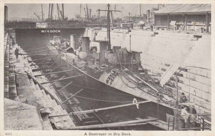
A DESTROYER IN DRY DOCK
Published by
GALE & POLDEN LTD
Ref: 4431
Gale & Polden was a British printer and publisher which was founded in Brompton, near Chatham, Kent in 1868, although they moved to Aldershot, in the 1890’s where they remained until the company closed in 1981, after being bought by media mogul Robert Maxwell. The company specialised in military and naval printing, although they also did general printing as well. Their postcards do mainly have a military theme and this lovely early naval ship image is a classic Gale & Polden release.
REVERSE SIDE OF ABOVE POSTCARD
10/10/2018
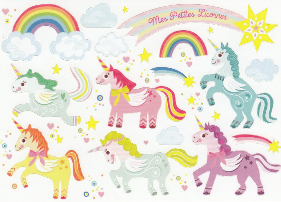
CARTES D’ART
EDITIONS CARTES D’ART
NOVELTY ‘STICKERS’ POSTCARDS
SERIE: CARTES-STICKERS/STICKERS-CARDS
I bought a selection of these on my last visit to France (as mentioned with the previous posting on 20/08/2018) and I was fascinated to find what appeared to be matching cards with the same theme and basic shape of the images depicted but in two different styles, you will see what I mean when you look at these cards:
MES PETITES LICORNES
MY LITTLE UNICORNS
By
CORINNE LEMERLE
Published by
CARTES D’ART
EDITIONS CARTES D’ART
Ref: ST 356
Unicorns are still hot, for the moment
Again, everything is in the same position on both postcard designs. Everything except the small circles and hearts is a sticker (including the small yellow stars here).

LES JOLIES LICORNES
NICE UNICORNS
By
ISABELLE CHAUVET
Published by
CARTES D’ART
EDITIONS CARTES D’ART
Ref: ST 361
Again, everything is in the same position on both postcard designs. Everything except the small hearts are removable stickers. On this occasion it is the previous Unicorn design I prefer.

10/10/2018
MATILDA BEAR
AND
FATHER BEAR
“I LOVE YOU FATHER BEAR”
By
Rachel Sunman
From a book written by
Suzi James
Copyright 2012
Official Book Promotional Postcard
I still like Teddy Bear postcards and some still do get issued and have been issued in the past ten years. This one is a book advert postcard from around 2012. I believe this was originally a free postcard (but this is not confirmed), although now of course it would probably cost you few pennies from a dealer, if you can find a copy.
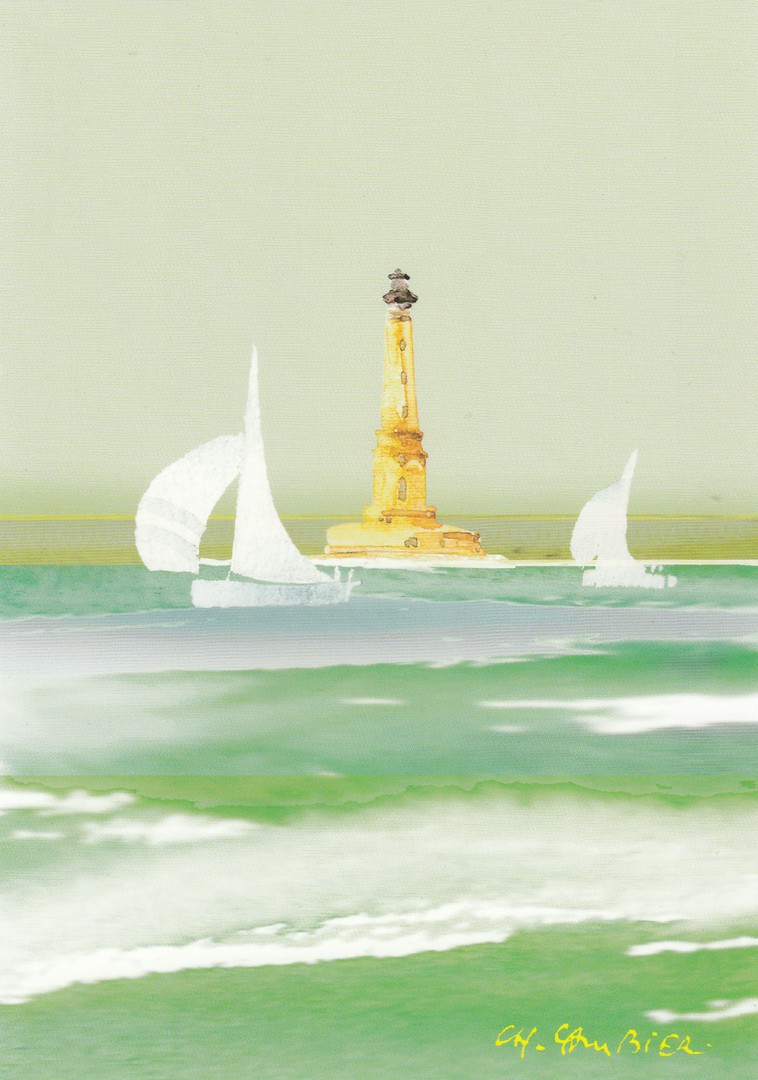
10/10/2018
UNTITLED
LIGHTHOUSE PAINTING
By
CHARLES CAMBIER
Published by
EDITIONS D’ART JACK
Ref: DF 185
I’ve not much to say about this one, except that I bought it in France, where the card was published, on a trip to Saintes, an area I know well, and which has been mentioned here on the webpage many times. The image is a simple one, but one which appealed to my eye, and Lighthouses do have a dedicated band of collectors.
10/10/2018
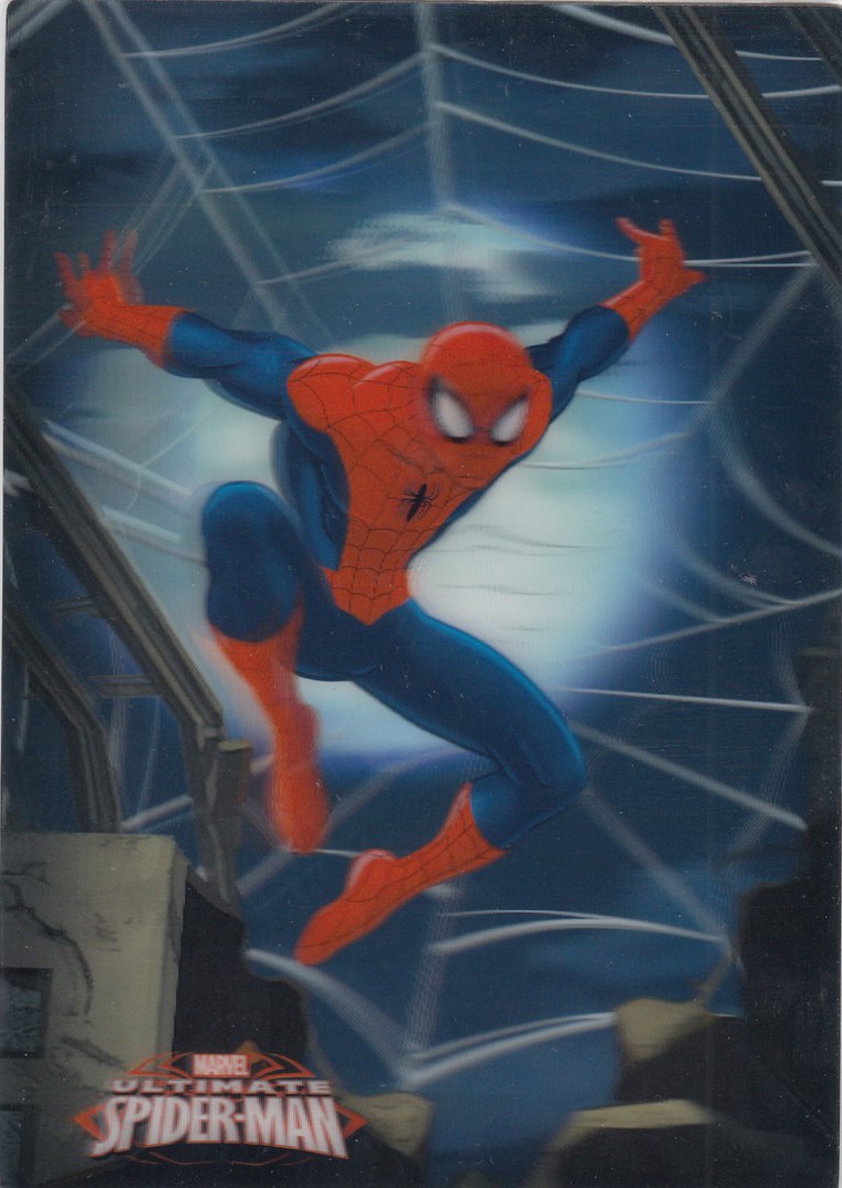
DISNEYLAND PARIS
MARVEL
ULTIMATE
SPIDER-MAN
3D Postcard
Official Disneyland Paris Postcard
Ref: FAC-020877-15090
I bought this 3D postcard way back at the start of this year on a visit to the Disneyland Paris theme park. Because it is 3D it does not scan very well, but I still like to picture these as you at least get an idea what the card looks like, just accept that the effect is much better in reality than as depicted on the scan of the card. Disney of course now owns the Marvel group properties and as a result, connected postcards have been appearing. Exclusive theme park ones like this are top quality cards and very collectible.
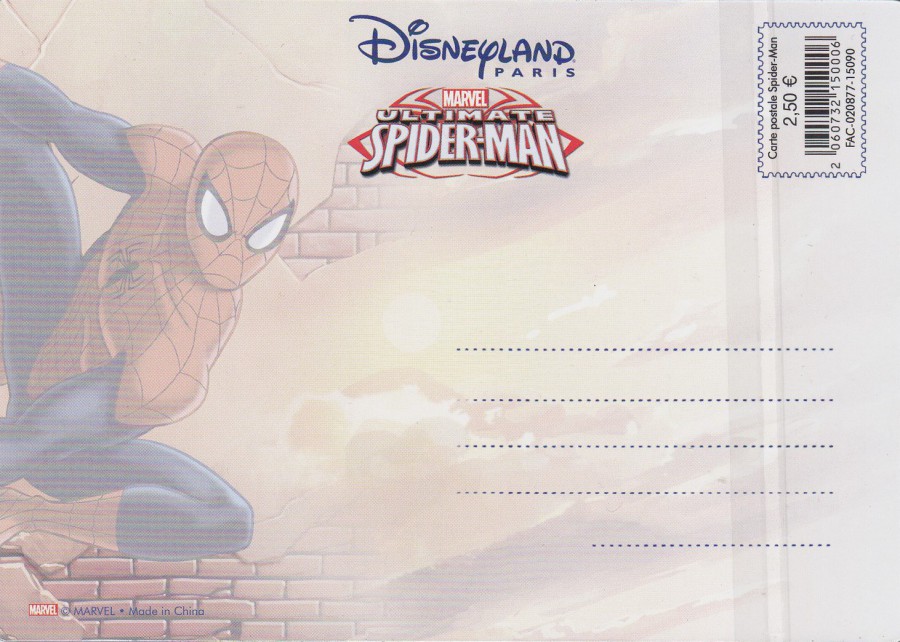
REVERSE SIDE OF ABOVE POSTCARD
These come in a cellophane bag, which I have not removed from my one, so you can still see the lines down the right side where the flap comes over and seals down. The reverse side is quite colourful and attractive, which Disney often achieve with their postcards.

DISNEYLAND PARIS
MARVEL
AVENGERS ASSEMBLE
3D Postcard
Official Disneyland Paris Postcard
Ref: FAC-020877-15090
This card has the same FAC ref number as the Spider-Man card depicted above, so these two cards are connected in a series, possibly of just these two as I found no others on my visit. This one scanned even worse than the Spider-Man card, but it is another cracker when you see it for real.
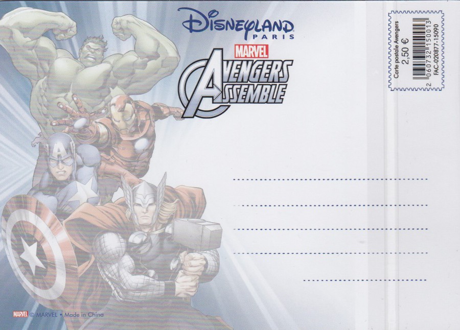
REVERSE SIDE OF ABOVE POSTCARD
These come in a cellophane bag, which I have not removed from my one, so you can still see the lines down the right side where the flap comes over and seals down. This card was obviously issued with reference to the record-breaking film ‘Avengers Assemble’.