EMAIL ADDRESS - markspostcardchat@gmail.com
30/11/2018
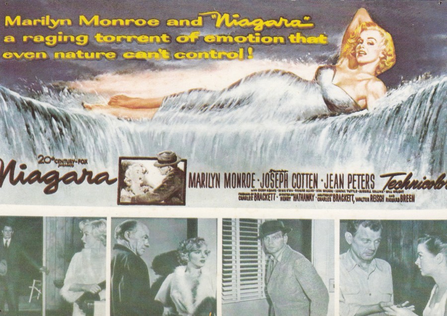
NIAGARA
FILM POSTER
MARILYN MONROE
Published by
AGI SYDNEY
Distributed in Europe by
AGI-D-6301 STAUFENBERG
Printed in Germany
Ref: CP 857
This film manages to cross two very large collecting themes as Film Posters have always been popular and anything Marilyn Monroe based is also highly collectible. So, any Monroe starring film will have a film poster which depicts Marilyn, I mean, why wouldn’t you depict Marilyn on your poster.
Niagara was released in 1953, and although I am not a big fan of the film myself, some of the posters are attractive. This one, with the additional photographs along the bottom is one I had not seen on postcard before seeing this one here.
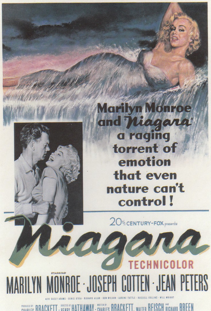
NIAGARA
FILM POSTER
MARILYN MONROE
Published by
CLASSICO SAN FRANCISCO
Ref: 110-007
This is the poster design that I have seen the most, although the artwork of Marilyn laid across the waters edge is the same on both poster designs.
30/11/2018
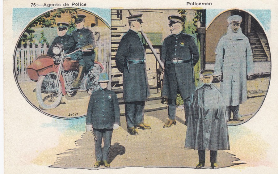
POLICEMEN
AGENTS DE POLICE
Unknown Publisher
(Although there is a logo on the reverse side – a small pot of pencils with a ‘M’ on the pot)
Made in the USA
Ref: 24947
I bought this postcard at the Norwich postcard fair much earlier in the year. I have a reasonable ‘Police’ themed collection, but most are British related postcards (probably understandable), so when I do come across an interesting foreign police themed card, and they are not too expensive, I like to pick them up.
REVERSE SIDE OF ABOVE POSTCARD
29/11/2018
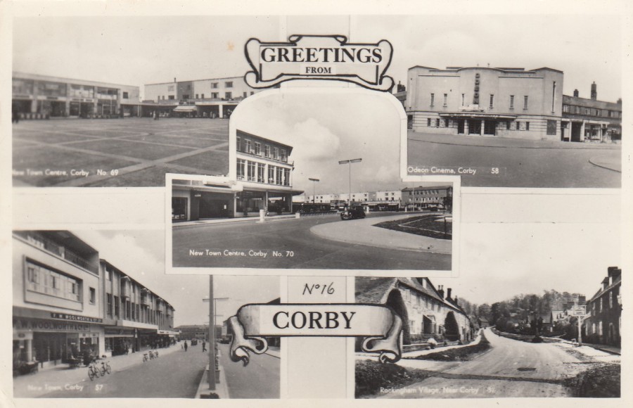
GREETINGS FROM
CORY
NEW TOWN CENTRE, CORBY No 69 – ODEON CINEMA, CORBY No 58
NEW TOWN CENTRE, CORBY No 70
NEW TOWN, CORBY No 57 – ROCKINGHAM VILLAGE, NEAR CORBY – 37
Unknown Printer – Publisher
Ref: No 16
Another 1950’s black and white multi-view postcard (posted 1960). Like the card below, this one has five views which may initially look uninteresting, but I suspect there is a lot of history included in these images. I also suspect that each individual image was also available as a single postcard image and that this multi-view is ‘actually’ an image of five postcards laid down on top of each other with some added text and cuts to make it look like this (which is also why, I think, the left-hand side is slightly out of focus). Cracking card for anyone interested in 1950’s Corby and mid modern era cinemas as the image top right is the local Odeon cinema (l wonder if this structure is still here – is it still a cinema – unlikely – or more likely knocked down or a bingo hall!)
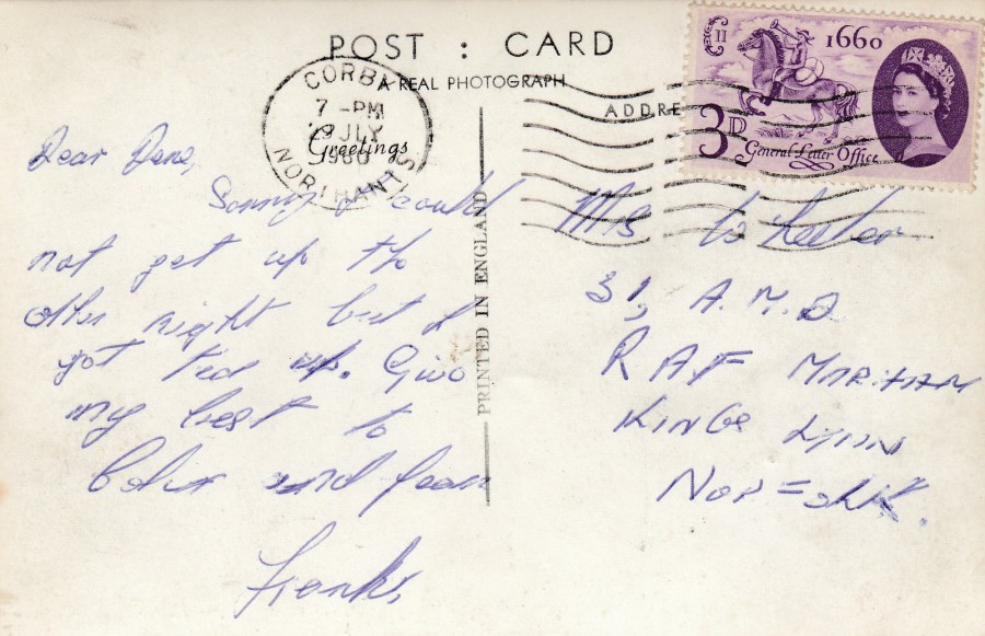
REVERSE SIDE OF ABOVE POSTCARD
Posted from Corby (no surprise there – but a nice locally usage) in 1960 with a 3d ‘Tercentenary of Establishment of General Letter Office’ Great Britain stamp (SG 619)
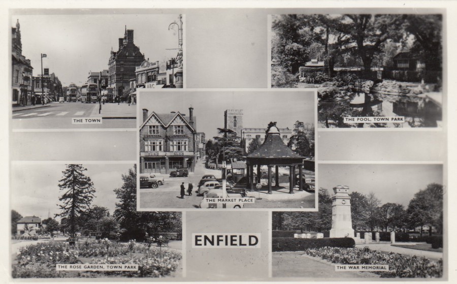
29/11/2018
ENFIELD
THE TOWN – THE POOL, TOWN PARK
THE MARKET PLACE
THE ROSE GARDEN, TOWN PARK – THE WAR MEMORIAL
Printed and Published by
HARVEY BARTON & SON LTD., BRISTOL
I have mentioned before, quite recently, that these early modern, 1950’s and 1960’s black and white view postcards, even these multi-view ones, are becoming more and more collectible. I have been to Enfield and even worked there for a brief time, so when I saw this, and it was very cheap, I picked it up for my collection. I also like War Memorials and am surprised they are not collected by more people.
REVERSE SIDE OF ABOVE POSTCARD
Standard reverse layout for this company for this period
29/11/2018
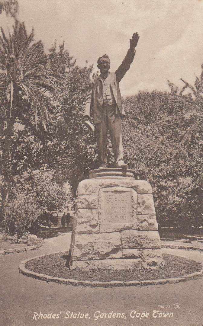
RHODES’ STATUE
GARDENS, CAPE TOWN
Published by
VALENTINE & SONS PUBLISHING Co., LTD., CAPE TOWN
Ref: 500173
Cecil Rhodes was a British businessman, mining magnate and South African politician. Between 1890 and 1896 he was Prime Minister of the Cape Colony. He has become a controversial historical character because of his political opinions and his oft mentioned views on the black population of the country. Recent critics have called him a white supremacist and have stated that he was one of the people who started up what would become better known as ‘apartheid’ in South Africa. As an Imperialist he was certainly integral to the history of southern Africa and its related British history, thus this statue I suppose. He certainly did not come over well in the 1996 BBC-TV series I remember watching, which was called ‘RHODES: THE LIFE AND LEGEND OF CECIL RHODES’, which starred Martin Shaw as the titular character, although the series itself was criticised by some and itself became controversial.

REVERSE SIDE OF ABOVE POSTCARD
29/11/2018
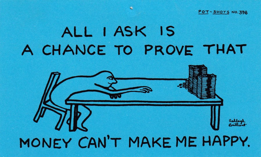
ALL I ASK IS A CHANCE TO PROVE THAT
MONEY CAN’T MAKE ME HAPPY
By
Ashleigh Brilliant
Published by
DODO DESIGNS
Ref: POT-SHOTS No. 398
There were literally 100’s of different designs in the ‘Pot-Shots’ series and for a brief couple of years they were very popular and could be found all of the country in towns and cities across the UK. They were cheap as well (and to be honest, in my mind, they also looked cheap, but were designed deliberately this way). Some of the designs were better than others, and this one is ‘definitely’ not one of the better ones, but it is a very typical example of how this series looked. Each card has a phrase, quote or comment with a small sketch, all done by different people so the style changes across the many cards. I don’t believe these are very collectible, and they certainly are not valuable, in any way, but they are part of the UK postcard story.
REVERSE SIDE OF ABOVE POSTCARD
29/11/2018
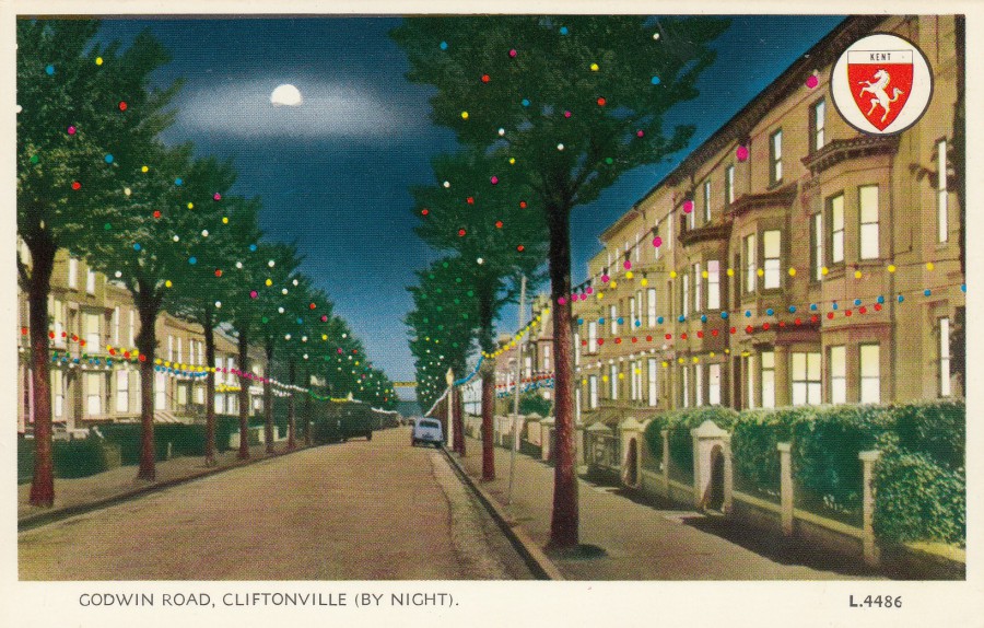
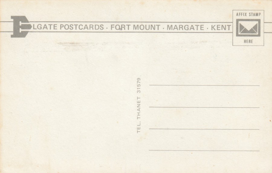
GODWIN ROAD,
CLIFTONVILLE - KENT
(BY NIGHT)
Published by
ELGATE POSTCARDS
(FORT MOUNT, MARGATE, KENT)
Ref: L.4486
I have always liked these artificially coloured photographic postcards, especially those which have such bright colours used which make the scenes look totally unreal. Also, I am aware that many of these ‘By Night’ scenes used daytime photographs, and why not, I bet they were easier to initially take and to add colour to.
REVERSE SIDE OF ABOVE POSTCARD
29/11/2018
‘POSTCROSSING’
Now that I have signed up to the ‘postcrossing’ craze, where you send postcards out to randomly chosen addresses across the world and receive a postcard from a randomly picked person also on the ‘postcrossing’ webpage site, I am receiving unusual postcards from all over the world.
You have no idea what you are going to receive, and I think that is part of the fun of this craze.
I will be depicting the cards I get here on the webpage.
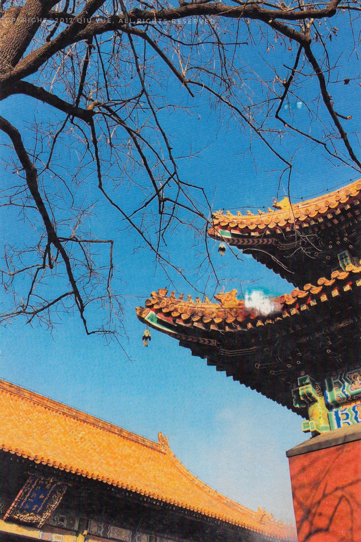
UNTITLED
[I suspect this is a home-made card]
No other details known – although the rooftops shown here are very indicative of those in and around the Forbidden City, China, although the style is common over much of China
This is a nice photograph which I was happy to receive, but as it is a plain backed card, one which I believe the sender has made themselves, which is not that uncommon in the ‘postcrossing’ circles, and as-long-as some care and thought has gone into how this done, I quite like these. This one is also lifted by-the-use of three different and very attractive Chinese postage stamps. This is a different ‘card’, but also possibly unique.
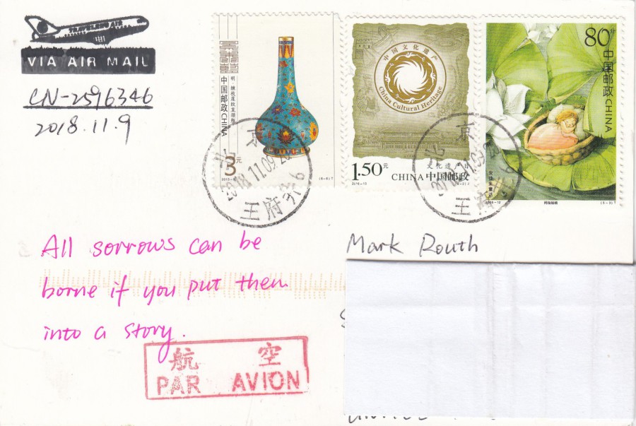
REVERSE SIDE OF ABOVE (POST) CARD

29/11/2018
NORTHERN LINE
THE FIRST 100 YEARS
1890 – 1990
Official Northern Line promotional celebration postcard – sent out as a confirmation of complain/enquiry received
Ref: GM/F
This is a smashing postcard and one which I was unaware of before finding it on a dealer’s stall a few years ago. It is also the only copy of this postcard I have so far seen, and as I go through many dealer’s boxes and check out other sources of modern postcard’s I am happy to say that this does not appear to be a common postcard. Because of its official status, i.e. it looks like it was produced locally and therefore probably distributed only on the Northern Line (which I travel on several times a year when I attend Stampex), I suspect that copies of this postcard are now quite scarce. Does anyone else have a copy?
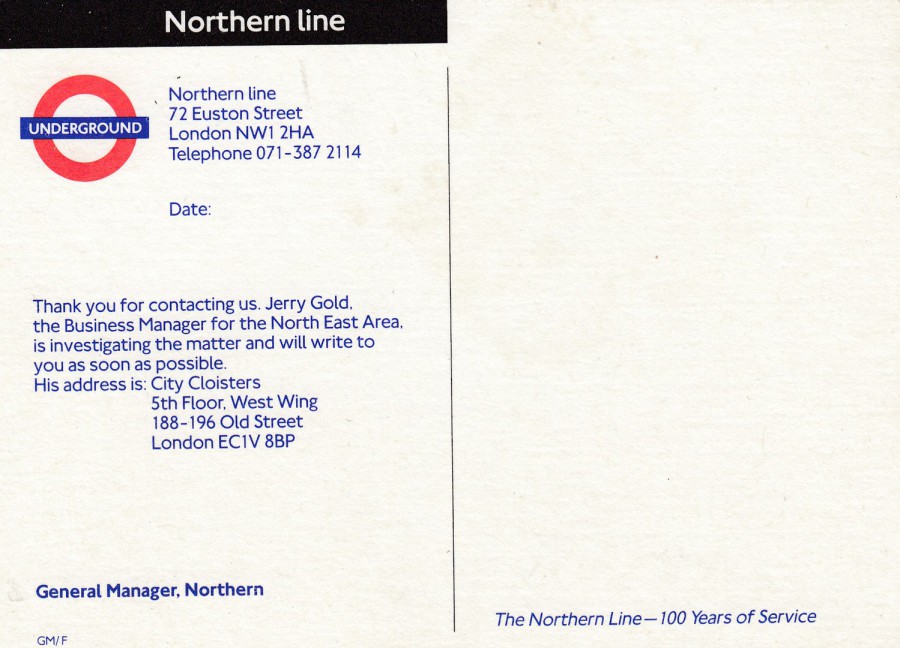
REVERSE SIDE OF ABOVE POSTCARD
This has full colour printing, which I always like on a reverse side, and I also liked that the top NORTHERN LINE bar is in black, as this is the colour of this underground line on the well-known London underground map.
29/11/2018
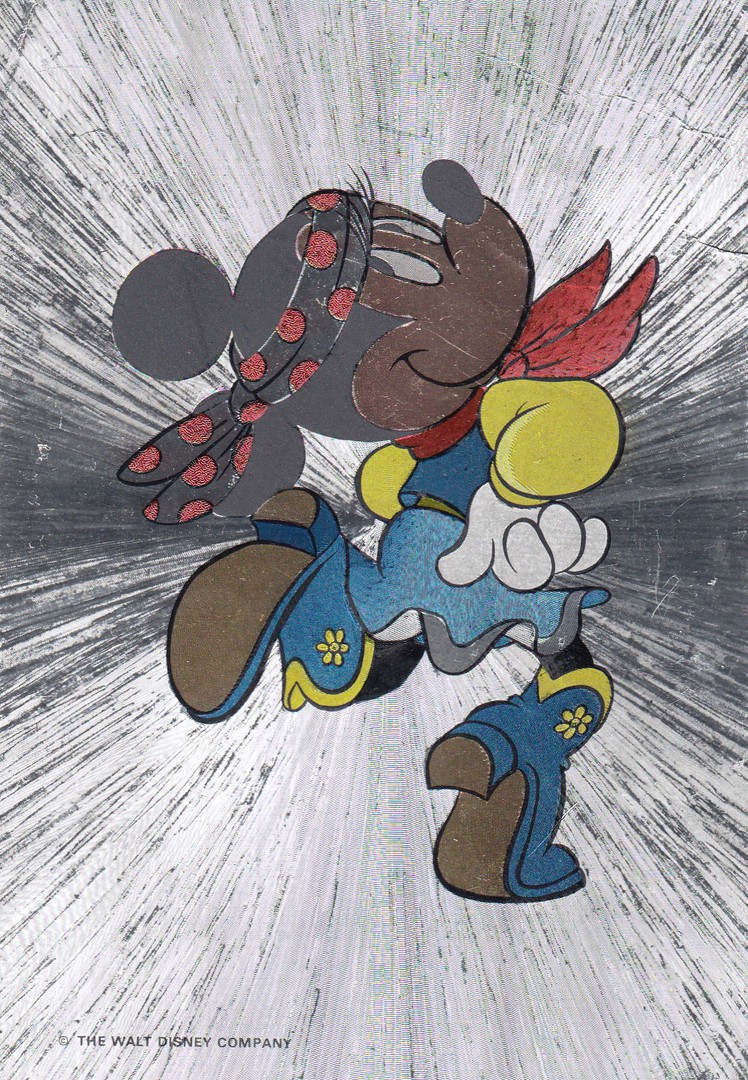
UNTITLED
MINNIE MOUSE COWGIRL
“DUFEX” SHINY SILVER CARD
Published by
F. J. WARREN LIMITED
A ‘DUFEX’ POSTCARD
Ref: 501767
The silver ‘Dufex’ cards have a dedicated band of followers. They were around at their peak during the 1980’s and 1990’s, but they lasted beyond this time issuing full colour shiny cards which were the natural progression beyond the earlier silver ones.
Although these cards are collected on mass, it has always been the early Disney ones which have grabbed the limelight and been the most popular.
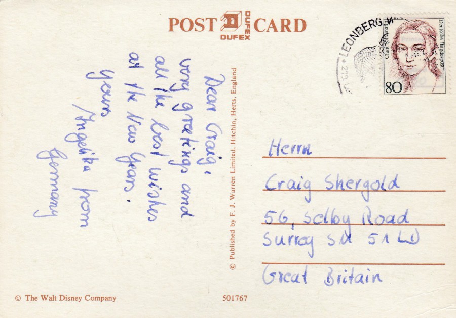
REVERSE SIDE OF ABOVE POSTCARD
Although printed and distributed around the UK, this copy was posted out of Germany, where they may even have been on sale in this format.
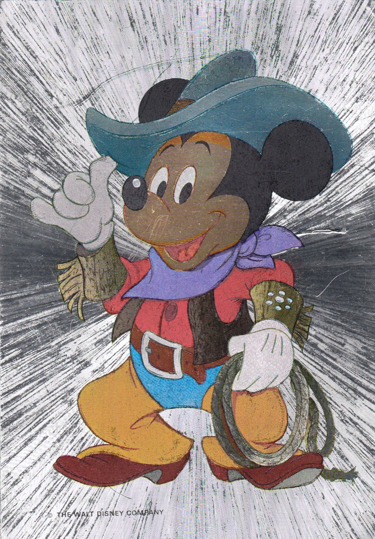
UNTITLED
MICKY MOUSE COWBOY
“DUFEX” SHINY SILVER CARD
Published by
F. J. WARREN LIMITED
A ‘DUFEX’ POSTCARD
Ref: 501767
This one is a type of companion card to the above Minnie Mouse card. I have more than one copy of this card and they have different reverse sides:
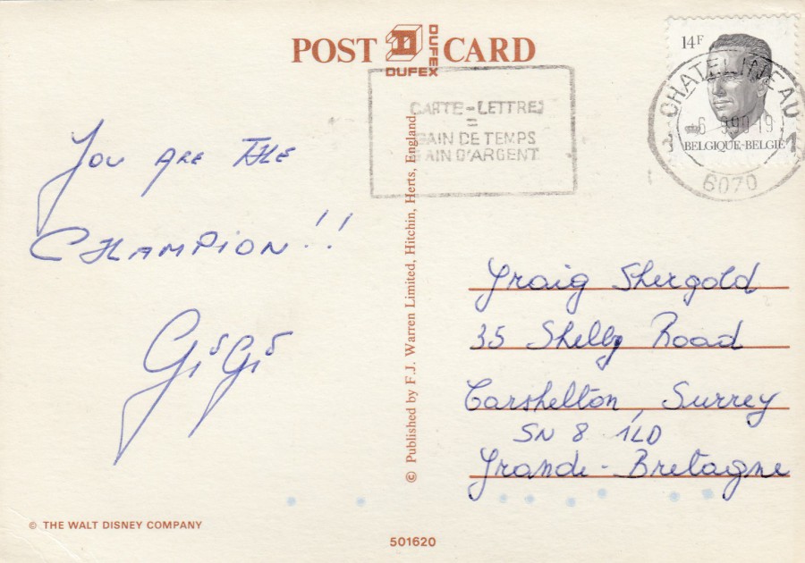
REVERSE SIDE OF ABOVE POSTCARD
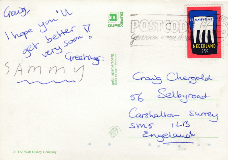
This one has the British reverse side layout with the traditional brown print – this one also has the reference number etc. Despite all the British text etc., this copy was posted out of Belgium in 1990.
REVERSE SIDE OF ANOTHER COPY OF THE MICKEY MOUSE COWBOY POSTCARD
This is clearly a different styled reverse side, although still titled as a “DUFEX” Post card. This has green printing with the centre line descriptive text printed in the Dutch language. This one was, not surprisingly, posted in the Netherland in 1989 (the stamp has been cancelled AMSTERDAM).
29/11/2018
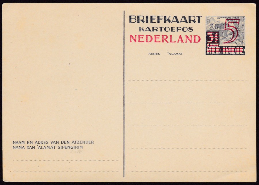
CARD FROM NETHERLANDS INDIES WITH VALUE (3 ½ CENT) AND NAME
BLOCKED OUT WITH RED BARS.
NEDERLAND AND “5” ADDED IN RED
Higgins & Gage, World Postal Stationery Catalog
Section 13
Netherlands - Page 11
Reference No: 236
Issued 1945
A common postal stationery card and one which can be picked up for as little as 50p to £1. The postal stationery cards of the Netherlands are a good place to start collecting as they are common, well many of them, and cheap, but with a range of versions and over-prints which still make it interesting.
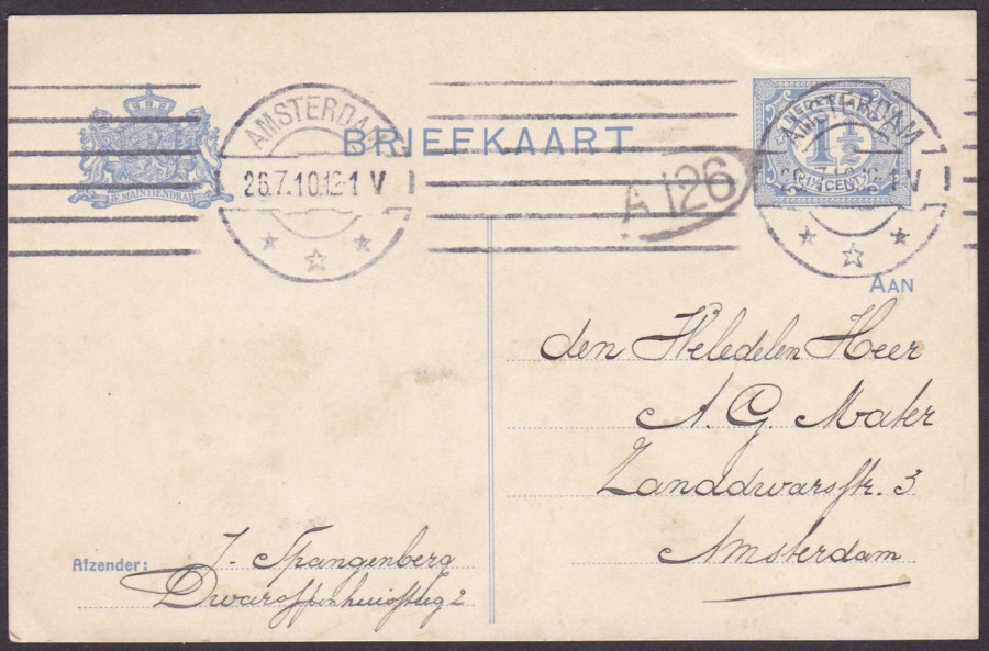
NETHERLANDS POSTAL STATIONERY POST CARD
1 ½ CENT ULTRAMARINE ON CREAM CARD
Higgins & Gage, World Postal Stationery Catalog
Section 13
Netherlands - Page 3
Reference No: 46 (TYPE A)
Issued 1908 – 1909
A nice clean used copy cancelled with an AMSTERDAM machine roller cancel dated 26th July 1910. Posted to a local address within Amsterdam. Also has a small black oval A 126 mark. Beautiful writing and a straight clear machine impression cancel (not that often this happens with machine roller cancels).

TOP
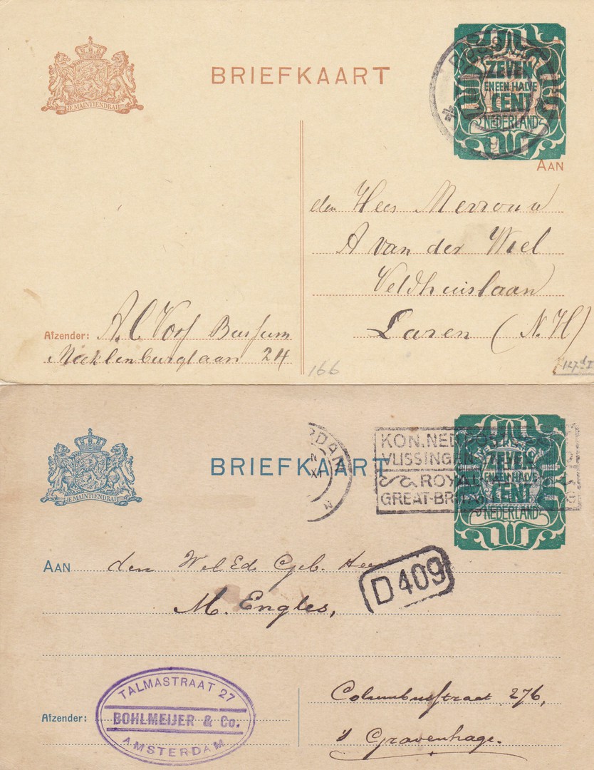
NETHERLANDS POSTAL STATIONERY POST CARD
7 ½ CENT OVERPRINT on 5 CENT CARMINE
Higgins & Gage, World Postal Stationery Catalog
Section 13
Netherlands - Page 7
Reference No: 130
Issued 1908 – 1921
Posted 1922 from S GRAVENHAGE to Rotterdam
BOTTOM
NETHERLANDS POSTAL STATIONERY POST CARD
12 ½ CENT OVERPRINT on 5 CENT CARMINE
Higgins & Gage, World Postal Stationery Catalog
Section 13
Netherlands - Page 8
Reference No: 151
Issued 1908 – 1921
There is a huge range of these overprinted postal stationery post cards, far too many to make the identification, even with the catalogues, easy. I am not even positive about the reference numbers I have placed on these two. As with most Netherlands postal stationery of this period these are cheap to pick up and quite common. A study of these overprinted cards can be a topic just in its own right.
TOP
NETHERLANDS POSTAL STATIONERY POST CARD
7 ½ CENT OVERPRINT on 2 CENT LIGHT BROWN
Higgins & Gage, World Postal Stationery Catalog
Section 13
Netherlands - Page 6
Reference No: 124
Issued 1908 – 1921
BOTTOM
NETHERLANDS POSTAL STATIONERY POST CARD
7 ½ CENT OVERPRINT on 1 ½ CENT ULTRAMARINE ON CREAM CARD
Higgins & Gage, World Postal Stationery Catalog
Section 13
Netherlands - Page 6
Reference No: 122
Issued 1908 – 1921
These are a further two types, both postally used, although due to either a misprinted cancel or so much going on its different to read, I can not make out the year either card was posted, although I assuming the early 1920’s. The lower card also has a nice company cachet applied.
29/11/2018
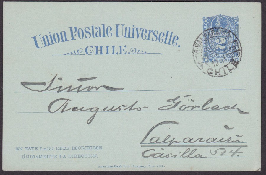
CHILE POSTAL STATIONERY POST CARD
2 CENTAVOS ULTRAMARINE ON LIGHT BLUE
Higgins & Gage, World Postal Stationery Catalog
Section 3
Chile - Page 4
Reference No: 16
Issued 1894
This was a new coloured stock issue which came out some time after the original issues which were in the years 1884 to 1887. The card was posted local within Valparaiso, a port city on Chile’s coast, in 1895.
This has a nice clean look to it and although of little value it is an attractive card.
(I have been posting some older cards today because after the Comic-Con event this past weekend, and the deaths of a number of film related people, there has been a large modern selection placed on the webpage over the last five pages. I don’t apologise for this – it’s my webpage after all – but, I do also like these older cards, and it has been some months since I posted any of the older postal stationery cards)
29/11/2018
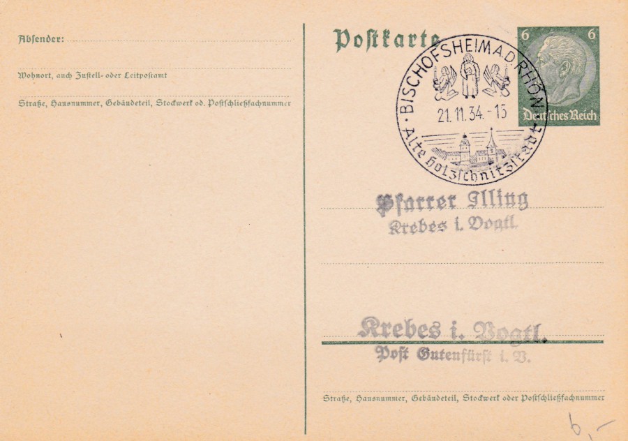
GERMAN POSTAL STATIONERY POST CARD
6 pfg PRE-PRINTED VON HINDENBURG PRE-PAID POSTAGE STAMP
Higgins & Gage, World Postal Stationery Catalog
Section 7
Germany - Page 16
Reference No: 223
Issued 1934
This was the further issue which had the new setting for the word POSTKARTE with the short tail to the letter ‘e’ (the design had been issued in 1932 with an elongated end tail to the letter ‘e’ in Postkarte).
This one has been used to collect a special cancellation: ‘BISCHOFSHEIM A.D. RHON – ALTE HOLZSCHNITZSTADT – 21-11-34’. Bischofsheim is a municipality in Hesse, Germany. ‘Alte Holzschnitzstadt’ means ‘Old Wood Carving City’.
29/11/2018
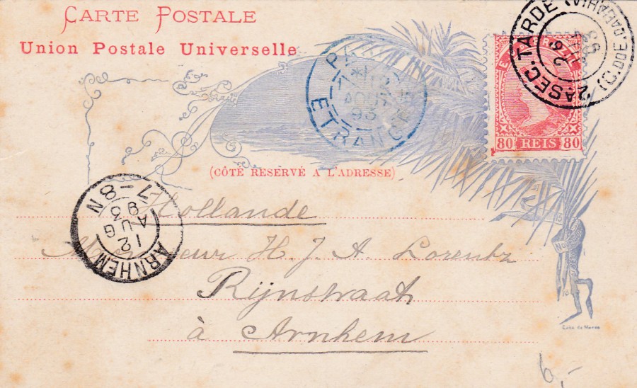
BRAZIL POSTAL STATIONERY POST CARD
80 reis DULL ULTRAMARINE LIBERTY HEAD STAMP
Issued in various formats between 1890 and 1891
Higgins & Gage, World Postal Stationery Catalog
Section 2
Brazil - Page 2 and 3
Reference No: 15 (but there are at least 6 different printings – I think this one is either A or B)
Issued 1890 – 1891 (there are various formats of this design)
This is one of those hard to identify exactly postal stationery cards. In the Higgins and Gage catalogue there are two pages covering this release! This is a nice example though. It was posted on 26th July 1893 with the pre-printed stamp cancelled with a ‘2 A SEC TARDE (C. DDE DA BAHIA)’ double ring cancel.
There is then a blue ‘PARIS – ETRANCE’ cancel which looks like it is dated 1st August 1893 (but it could be 12th August 1893, but I don’t think it could be because of the distance of the journey still remaining, my issue is that I also can not see it taking another 11 days from Paris to Arnhem, but I suppose there could have been delays). Eventually the card has reached Arnhem, in the Netherlands, and been cancelled with an arrival date stamp dated 12th August 1893 (ARNHEM 7-8N double ring cancel).
29/11/2018
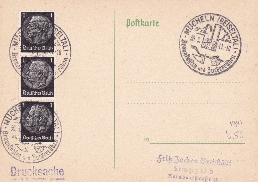
GERMAN PLAIN POST CARD (NO PRINTED STAMP)
With Special Hand Stamp:
MUCHELN (GEISELTAL)
BRAUNKAHLEN ZUCKERRUBEN
Mucheln (Geiseltal) [This is a German city in the Saxony-Anhalt area]
Brown Sugar Beet
Dated:
30th May 1941
This plain post card has a strip of three President von Hindenburg 1pf black definitive stamps (SG 4938) issued in 1933. Clearly this was either a collector or dealer who wanted examples of this special hand stamp.
I placed this on a German postal history facebook page and a kind person (thanks Steve) has said that one of the words is BRAUNKOHLEN, not as I spelt it, which was with an A instead of an O. This apparently means ‘Mining’, so this may also be an element of the cancel
28/11/2018
‘POSTCROSSING’
Now that I have signed up to the ‘postcrossing’ craze, where you send postcards out to randomly chosen addresses across the world and receive a postcard from a randomly picked person also on the ‘postcrossing’ webpage site, I am receiving unusual postcards from all over the world.
You have no idea what you are going to receive, and I think that is part of the fun of this craze.
I will be depicting the cards I get here on the webpage.
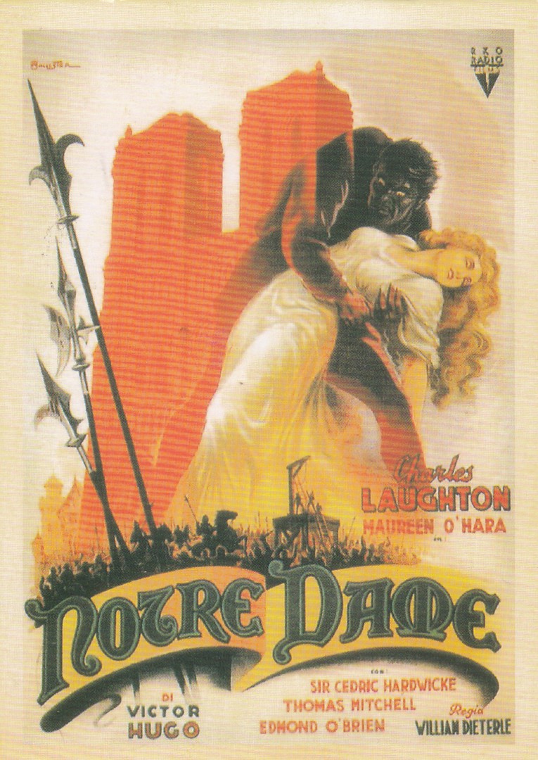
NOTRE DAME
FILM POSTER
(Starring Charles Laughton)
Unknown Publisher
(But, from personal knowledge of the style of the reverse layout I believe this to be an Asian issued postcard)
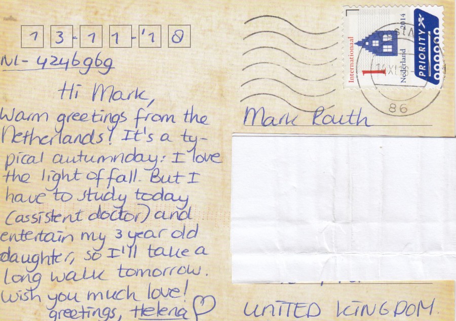
REVERSE SIDE OF ABOVE POSTCARD
Posted from the Netherlands using standard 2014 International priority mail postage stamp.

CARS 2
LIGHTING STUDY
By
SHARON CALAHAN
2010
Published by
CHRONICLE BOOKS
From their boxed set:
THE ART OF PIXAR VOLUME II: 100 COLLECTIBLE POSTCARDS
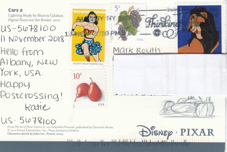
REVERSE SIDE OF ABOVE POSTCARD
Some nice stamps have been used on this one. I was pleased to get a Wonder Woman stamp as so far, I do not have a posted copy of one of these.
28/11/2018
Now that I have signed up to the ‘postcrossing’ craze, where you send postcards out to randomly chosen addresses across the world and receive a postcard from a randomly picked person also on the ‘postcrossing’ webpage site, I am receiving unusual postcards from all over the world.
You have no idea what you are going to receive, and I think that is part of the fun of this craze.
I will be depicting the cards I get here on the webpage.
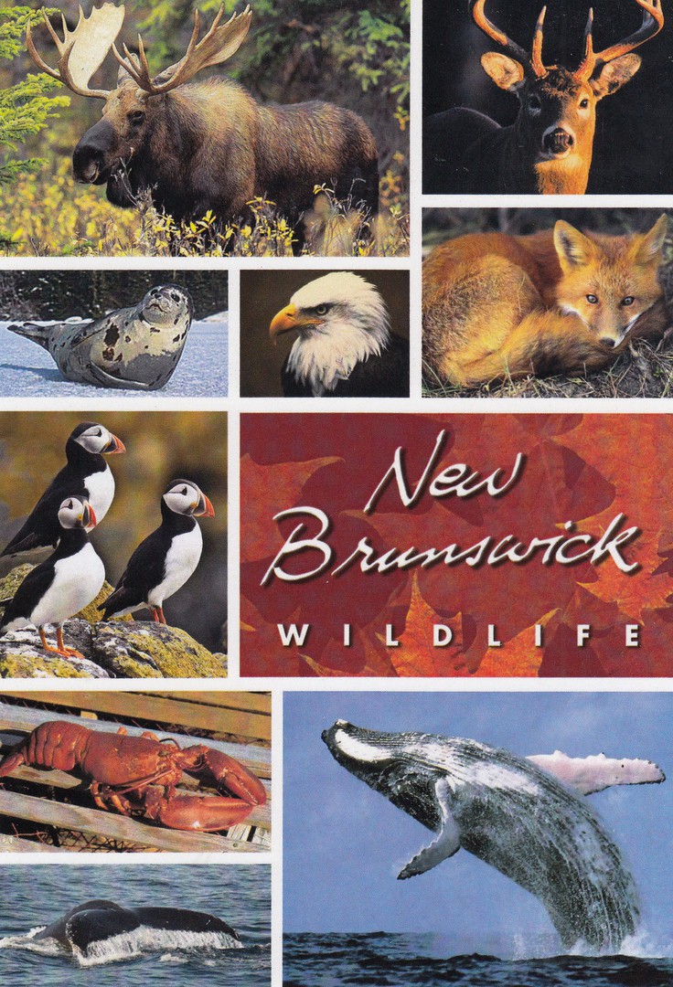
NEW BRUNSWICK WILDLIFE
Published by
THE POSTCARD FACTORY
(PCF SOUVENIRS)
Ref: PC57-NB 3855
This larger than normal postcard was sent in an envelope with a second postcard, the one depicted below, so I received two for the price, so to speak, of one.
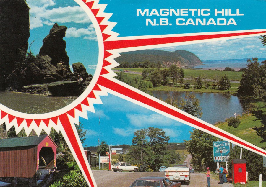
MAGNETIC HILL
N.B. CANADA
Photo by
T. CLIFFORD HODGSON
Printed in Great Britain by
PHOTO PRECISION LIMITED
Ref: R7631
“Magnetic Hill, N. B. [New Brunswick] Canada where cars coast uphill without power – World famous gift shop, Dining Room, Motor Inn, Golf Course, Animal Park”
“Rocks at Hopewell Cape - Covered Bridge at Pt. Wolfe - Fundy National Park”
(Text from reverse side of Postcard)
A postcard of a well-known Canada landmark which was printed in Great Britain and supplied to Canada where it was sold and eventually sent back to me in Great Britain. Another well-travelled postcard and this time one which has not even been posted in its own right

28/11/2018
NON-POSTCARD ITEM
ODEON FREE FILM MAGAZINE
CONTENTS PAGE
NOV/DEC 2018 ISSUE 107
FANTASTIC BEASTS: THE CRIMES OF GRINDELWARD
Last night Jo and I went to see the new ‘FANTASTIC BEASTS: THE CRIMES OF GRINDELWALD’ at the Odeon cinema. I will not be giving any spoilers away if I say that early-on-in-the film the main character Newt Scamander accesses a postcard from Paris, something which obviously caught my interest.
I also picked up a copy of the cinemas own free film magazine. On the inside contents page was a picture of the character Newt Scamander holding a Paris postcard – I suspect I was the only sad person who realised, or noticed, that picture shows him holding a different postcard than the one that he has in the actual film! Strange I thought. Oh, and I really enjoyed the movie as well. I thought it was better than the reviews gave it credit for, but then I am a big Harry Potter fan (i've read all the original books and seen, after last night, all the related films)

28/11/2018
STEPHEN HILLENBURG…..RIP
Stephen McDannell Hillenburg – 21st August 1961 – 26th November 2018
American animator and cartoonist and marine-biology teacher (his original occupation before becoming a cartoonist), best known as being creator of the cartoon character ‘Sponge-Bob Squarepants’ the series of which he also directed, produced and wrote.
POSTCARD
BRAND NEW SPONGEBOB EPISODES
NICKELODEON
Official NICKELODEON promotional postcard issued in AUSTRALIA
Copyright dated 2006
NOVELTY DIE-CUT POSTCARD
This postcard can be folded in the middle but has been die-cut so that the frame still stands up after the area of boarder around the frame is folded over, so that the card can stand up as a mini-framed image.

REVERSE SIDE OF ABOVE POSTCARD
A cracking example of how colour and information can be made to look attractive on a reverse side of a postcard.

PHOTOGRAPH
STEPHEN HILLENBURG
With his creations
28/11/2018
There have been a number of people from the world of film who have recently passed away and who I was both aware of and admired in many ways:
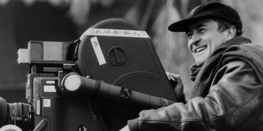
NICOLAS ROEG…..RIP
Nicolas Jack Roeg – 15th August 1928 – 23rd November 2018
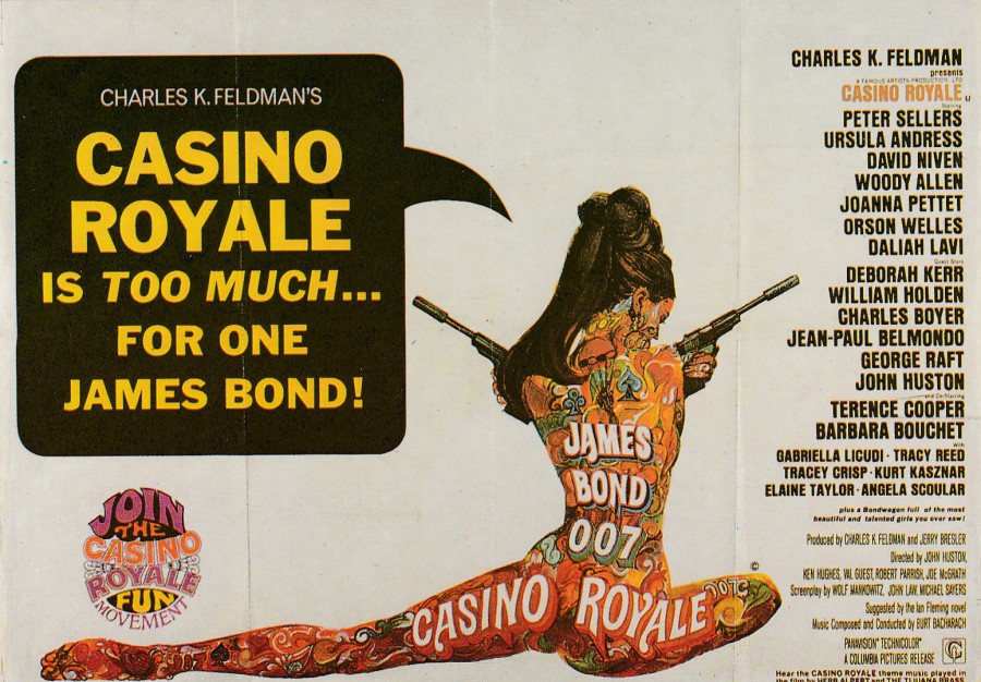
English film director and cinematographer. Best known for directing the films ‘Performance’ (1970), ‘Walkabout’ (1971), ‘Don’t Look Now’ (1973), ‘The Man Who Fell to Earth’ (1976) and ‘The Witches’ (1990). Worked as cinematographer on the films ‘Lawrence of Arabia’ (1962 – second unit photography), ‘The Make of The Red Death’ (1964), ‘Casino Royale (1967 – additional cinematographer) and many others.
POSTCARD
CASINO ROYALE
(Film Poster)
Published by
VINTAGE MAGAZINE Co., LONDON
Ref: JB11
PHOTOGRAPH
NICOLAS ROEG

RICKY JAY…..RIP
Ricky Jay Potash – 26th June 1946 – 24th November 2018
American stage magician, actor and writer – I remember him best for his parts in the films ‘The Prestige’, ‘Boogie Nights’ and the James Bond film ‘Tomorrow Never Dies’ (in which he played the villain ‘Gupta’), but he was apparently a very well respected and admired and very professional magician.
POSTCARD
TOMORROW NEVER DIES
James Bond
Official promotional pre-release Postcard
Originally a free postcard given away in cinemas

PHOTOGRAPH
RICKY JAY
In the film ‘Tomorrow Never Dies’
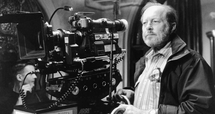
BERNARDO BERTOLUCCI…..RIP
16TH March 1941 – 26th November 2018
Italian film director and screenwriter – perhaps best known for the controversial film ‘Last Tango in Paris (1972) and the multi Oscar winning ‘The Last Emperor’ (1987 – which won Best Picture, Best Director, Best Art Direction, Best Cinematography, Best Costume Design, Best Film Editing, Best Original Score, Best Sound and Best Screenplay Based on Material from Another Medium Oscars)
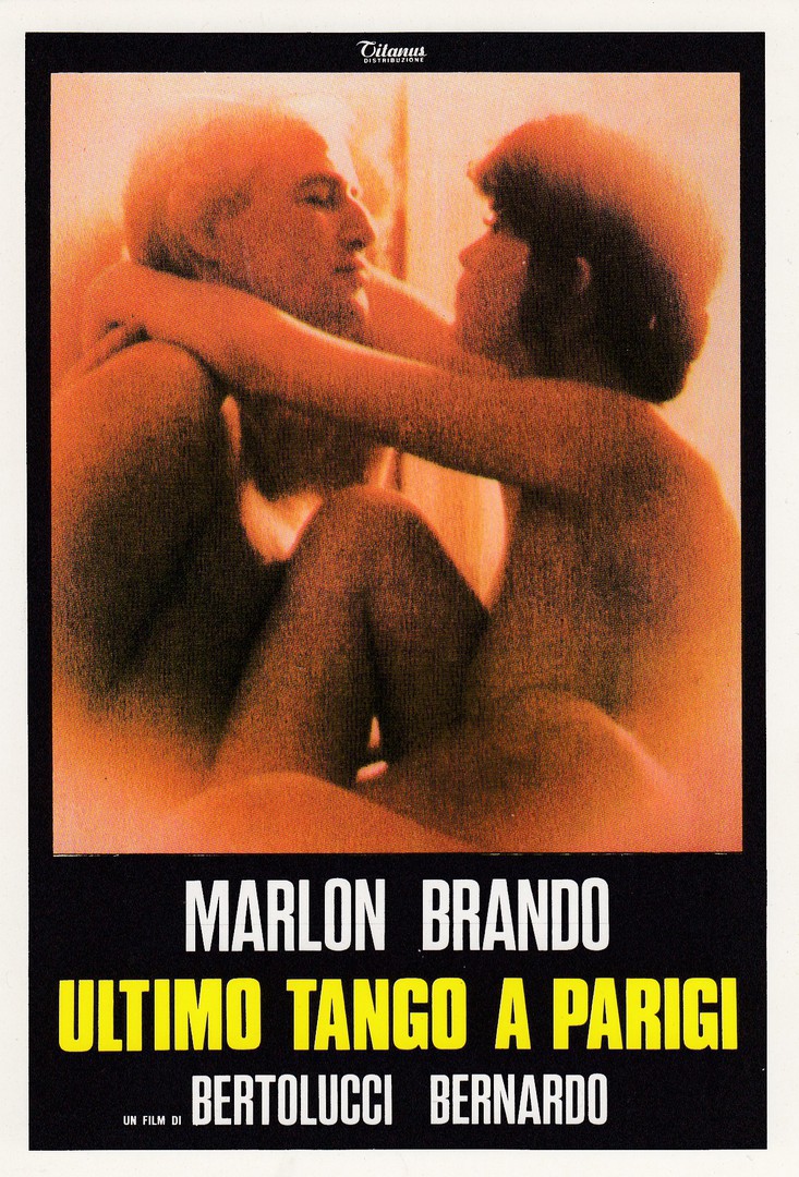
POSTCARD
ULTIMO TANGO A PARIGI
(LAST TANGO IN PARIS)
Published by
S.A.C. ROMA
Ref: XX 900/84
A very controversial film starring Marlon Brando and Maria Schneider (who is strangely not named on this poster design despite being pictured). The films sexual content has caused the film to have a notoriety which considering some of todays films it probably no longer deserves, but when it came out things were very different.
PHOTOGRAPH
BERNARDO BERTOLUCCI
27/11/2018
MCM COMIC-C0N
BIRMINGHAM
24TH NOVEMBER 2018
ARTIST CARD SELECTION OBTAINED AT THE EVENT
PART FOUR
(and the final segment from this years show)
(Visit the previous three pages for the extensive PART ONE. PART TWO and PART THREE sections)
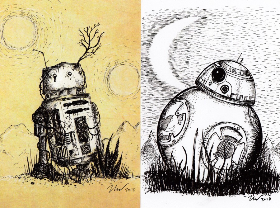
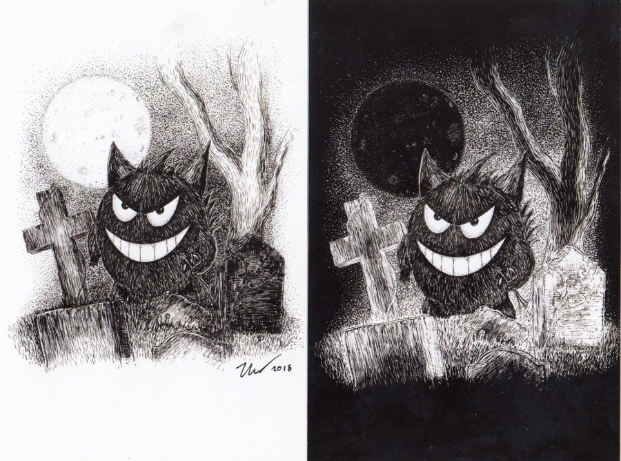
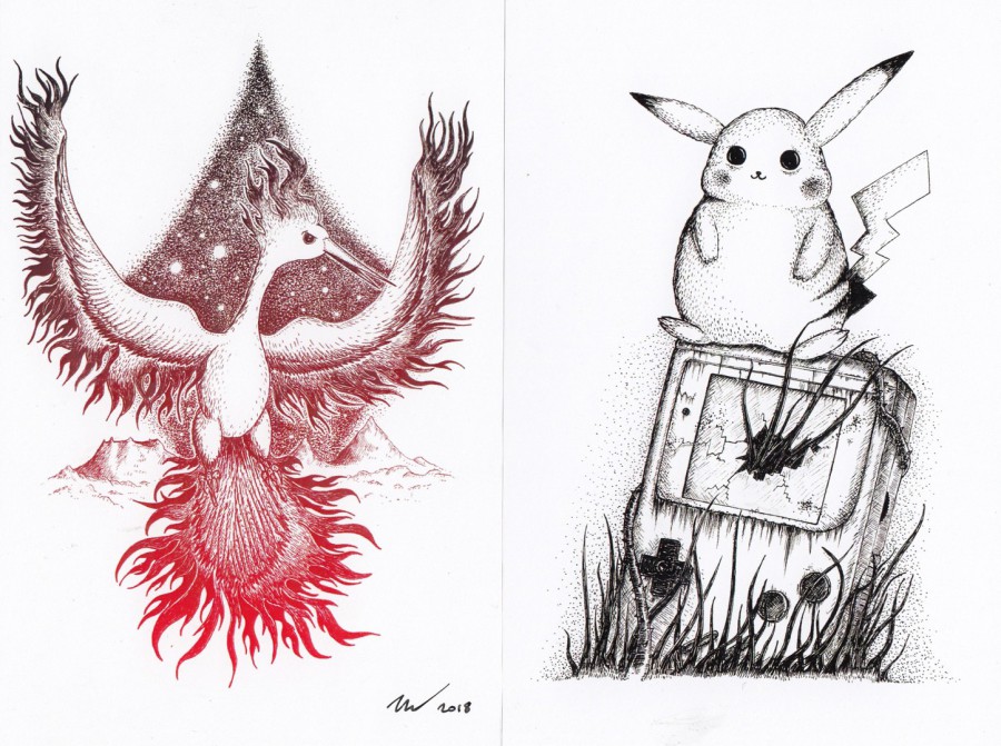
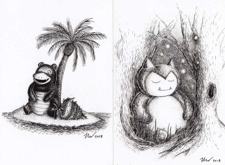
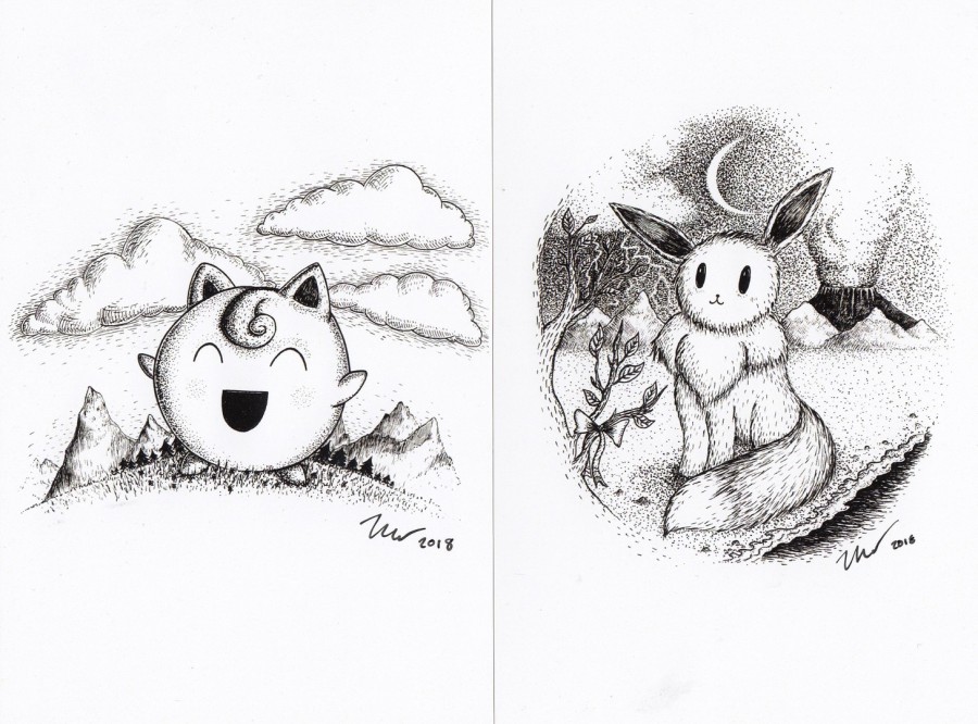
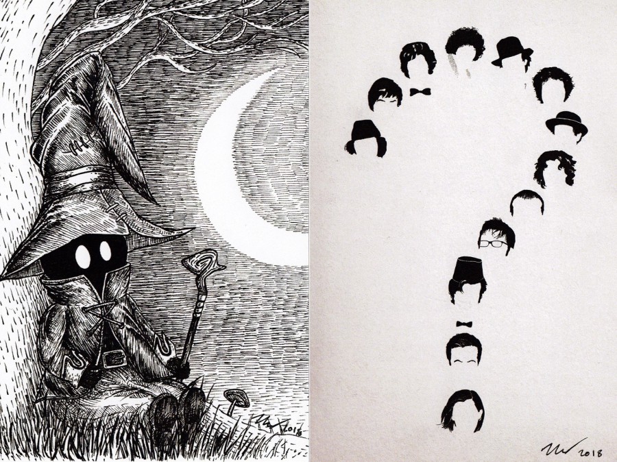
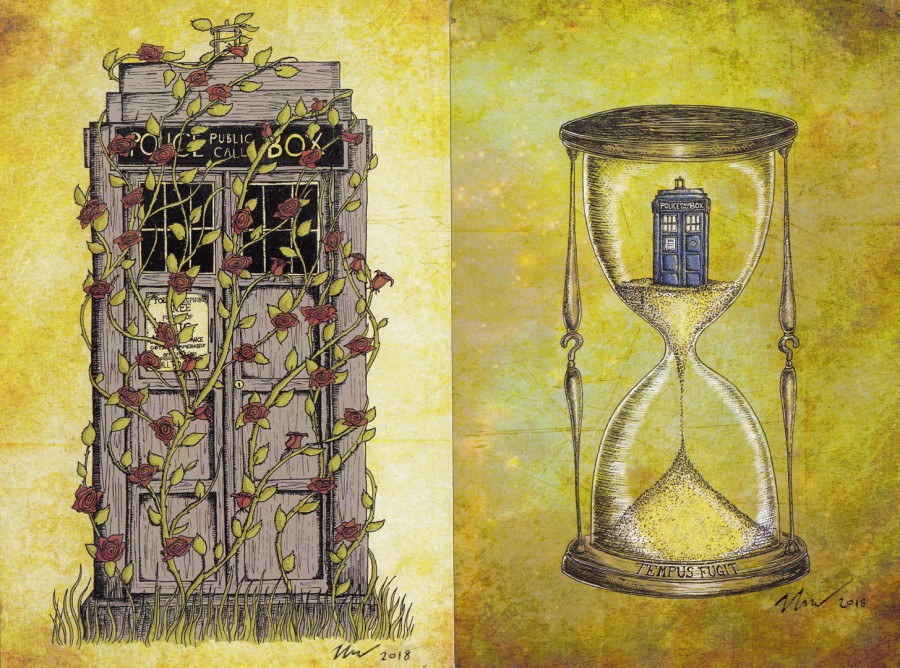
ARTIST: JON TURNER
UNTITLED CARDS
PLAIN BACKED CARDS
Mostly signed on the front by the artist
Jon probably had one of the largest selections of artwork postcard sized cards available, which like some other artists included a wide Pokemon selection. These are untitled, but I really liked his work and his style. I bought 18 postcards, all of which are depicted below.
ARTIST: JON TURNER
UNTITLED CARDS
PLAIN BACKED CARDS

ARTIST: JON TURNER
UNTITLED CARDS
PLAIN BACKED CARDS
ARTIST: JON TURNER
UNTITLED CARDS
PLAIN BACKED CARDS
ARTIST: JON TURNER
UNTITLED CARDS
PLAIN BACKED CARDS
ARTIST: JON TURNER
UNTITLED CARDS
PLAIN BACKED CARDS
ARTIST: JON TURNER
UNTITLED CARDS
PLAIN BACKED CARDS
ARTIST: JON TURNER
UNTITLED CARDS
PLAIN BACKED CARDS
ARTIST: JON TURNER
UNTITLED CARDS
PLAIN BACKED CARDS

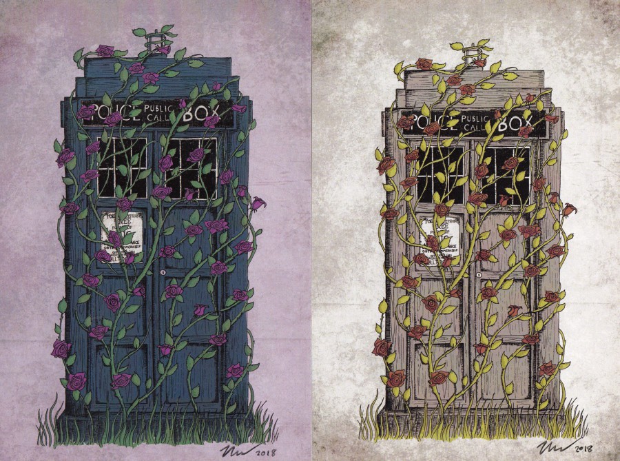
REVERSE SIDES OF THE TWO ABOVE CARDS
For these two designs there were also stickers representing the same image. I bought these and had them applied to the reverse sides, I think they do add something interesting to the cards

JON TURNER
BUISNES CARD (Front and Reverse sides)
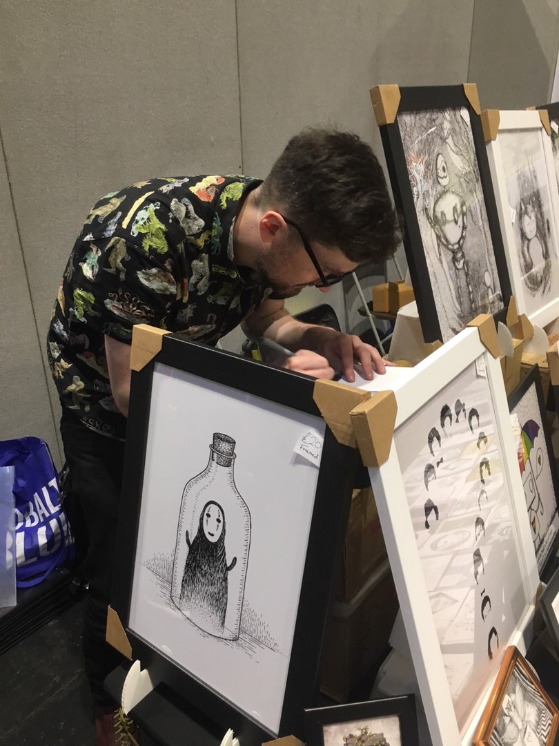
PHOTOGRAPH
24/11/2018
ARTIST: JON TURNER on his stand at MCM Comic-Con