
06/01/2017
IRELAND
A TYPICAL IRISH COTTAGE
Published by
INSIGHT CARDS LIMITED
(INSIGHT IRELAND series)
Ref: SP 123
A lovely and simple tourist postcard, one of many sold all over the touristy areas of Ireland. I like this card but will admit it has nothing startlingly special about it from the front (the photograph is lovely though). But it was something on the reverse side that caught my eye and my interest.

REVERSE SIDE OF ABOVE POSTCARD
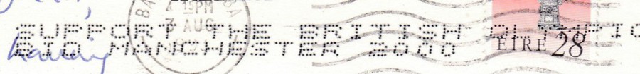
This card was posted from Ireland in what I think was 1993 (the cancel is a little indistinct on the last number – it could be 1998, but I’m going with 1993). On its travel’s, it has received an ink jet printed, dot matrix, promotional advertising mark. This reads:
SUPPORT THE BRITISH OLYMPIC
BID MANCHESTER 2000
This mark is highly collected by those who specialise in Olympic Games material, especially those after unusual British related postal material. Clearly, Manchester did not win the bid (sadly, they never had a Manchester based Olympic Games!). But, the Royal Mail helped with the bid by placing this ink jet mark on mail. I have a couple of examples where dealers and specialised collectors sent mail through to receive this mark, but these are obvious because the postcards have no writing on them other than the address. So, they are considered philatelic items, still nice but contrived. This one here is clearly a genuinely used example and as such is far more collectible and worth keeping. I found in a cheap box (where I always check the reverse side of the used postcards, just in case there is any unusual usage or postmarks etc).
ENLARGEMENT OF INK JET MARK AREA
06/01/2017
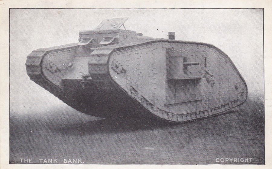
THE TANK BANK
Unknown Publisher / Printer
World War I
After the world became aware of the first British Tanks, which were of course the world’s very first Tanks, some of the tanks were sent around the country to raise funds towards the maintenance of the war. People would attend the showing of the tank, which must have been quite a spectacle at that time and were asked to donate money – thus these were named the TANK BANK’s. Along with your donation you could also obtain postcards depicting the tank. This is a good example of such a postcard. The common ones like this example are only a couple of pounds but you can find real photographic ones of tanks in specific locations and these normally cost much more.
06/01/2017
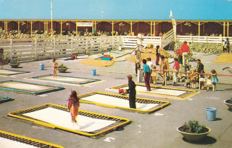
TRAMPOLINES, RHYL
Published by
COLOURMASTER INTERNATIONAL
Ref: PT28563
This is an older postcard from the late 1980’s, or possibly even earlier (although it was used in 1994, as another competition/offer entry postcard). But I thought it interesting that this shows a trampoline area many years before these became the latest craze, as they did so last year, even my daughter went to one of these new(ish) Jump Centres. See, everything comes back into fashion. I once joined a special ‘Trampoline’ club that ran during the lunch time at my senior school. If memory serves me correctly I seem to remember cutting my face open on a front drop! But I still enjoyed doing it.
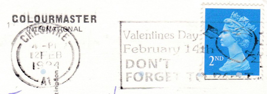
SLOGAN POSTMARK
Taken from the reverse side of above postcard. The addition of a slogan postmark can make a card more interesting. This one is for Valentine’s Day special promotional slogan from 1994.
06/01/2017
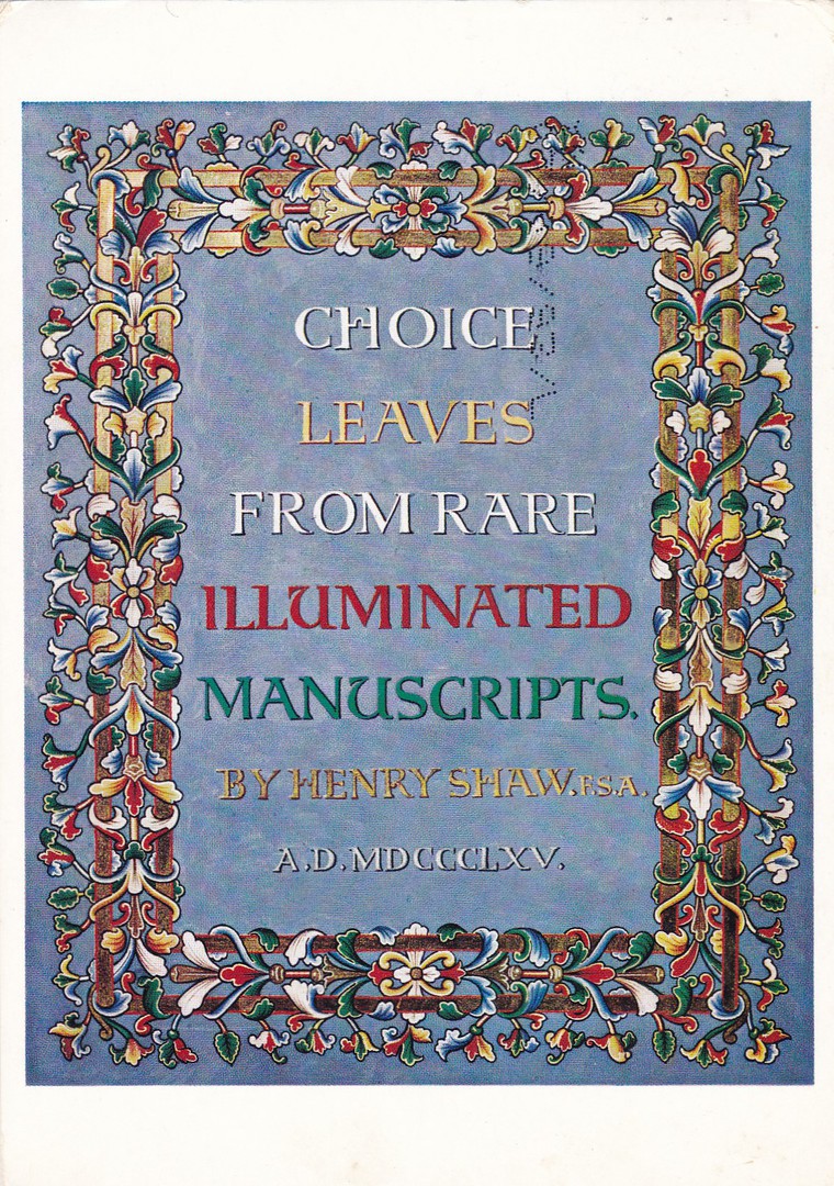
CHOICE LEAVES FROM RARE ILLUMINATED MANUSCRIPTS
By Henry Shaw F.S.A
VICTORIA AND ALBERT MUSEUM
Official Museum Postcard
Ref: L. 132
19TH Century Illumination
Title-page for a series of illuminations by Henry Shaw, 1865
I have three major interests, outside of travel, and they are, Postcards, obviously, Films (and Television) and lastly, Books. Where postcards are concerned, a collector can put together quite an interesting collection of book themed postcards. This one here would be an interesting historic addition but one that possibly might be quite hard to find these days. My copy here was posted in 1993 but I suspect it is older even than that (it was used as a competition entry postcard – my suspicion is that someone had bought this sometime before and then later found it and used it for their ‘Clarks Socks Offer’ entry).

06/01/2017
BIRD SANCTUARY ON DISCOVERY ISLAND
WALT DISNEY WORLD
Official Postcard
Ref: 0111-0122
“Baby Golden Conures, part of an endangered species, live safely on Discovery Island. Here, more than 400 exotic birds roam one of the world’s largest walk-through aviaries”
(Text from reverse side of postcard)
I acquired this postcard via eBay recently and knew I had to have it as soon as I saw it, this was despite paying what could be considered the top price for it (with postage, etc, around £5).
My reason for wanting it was personal. In 1993 my family visited Walt Disney World and we visited Discovery Island and we loved it there. One of our family stories is how Peter, our youngest, was taken by the aviaries containing the black vultures, so taken in fact that he stuck his finger through the wire and came very close to losing it to a vulture that must have thought it was its lucky day. Later I went out on a small speedboat with my eldest son and we circled the Island and I watched a wild osprey dive into the water beside us and surface with a large fish in its talons. So, I have nothing but fond memories of the place and was saddened when I returned in 2003 only to find the Island had ‘closed down’ (the theme park ‘Animal Kingdom’ had over shadowed it and the birds were moved from the Island to this new theme Park). For my memories alone this was well worth £5.
05/01/2017
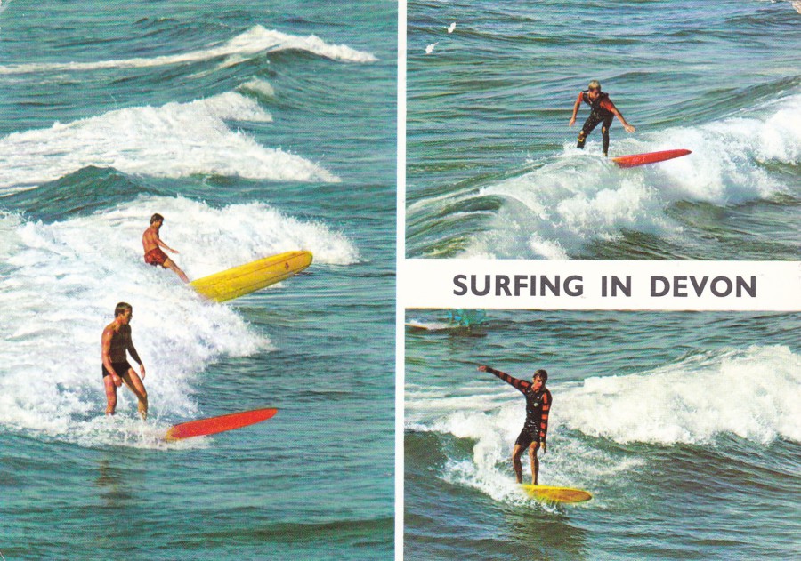
SURFING IN DEVON
Published by
John Hinde Ltd
Ref: 2DC402
This postcard was issued to cash in on the popularity of surfing, which was really catching on in the UK at the time. The West Country was an ideal location for surfing and one could imagine that the photographs depicted here were taken there, it does after all say ‘Surfing in Devon’.
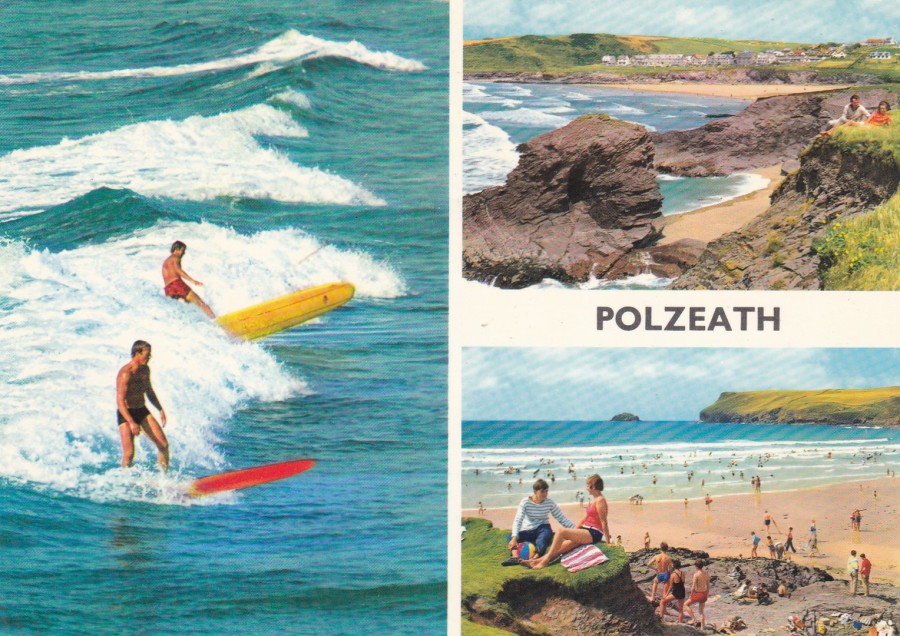
POLZEATH
Published by
John Hinde Ltd
Ref: 2DC 545
Ok, clearly this is the same image of the same two surfers as appear on the top postcard which is from Devon, although here they are apparently surfing in Cornwall (they seem to have travelled around then!). What you actually have here is a good example of how postcard companies would use the same photographs on postcards from different areas. This was obviously a money saver as they would only need to pay for the one picture. Most postcard collectors are aware of this scenario and see it on many 1970’s postcards. But it is fun finding them and matching them up, like I have done here.
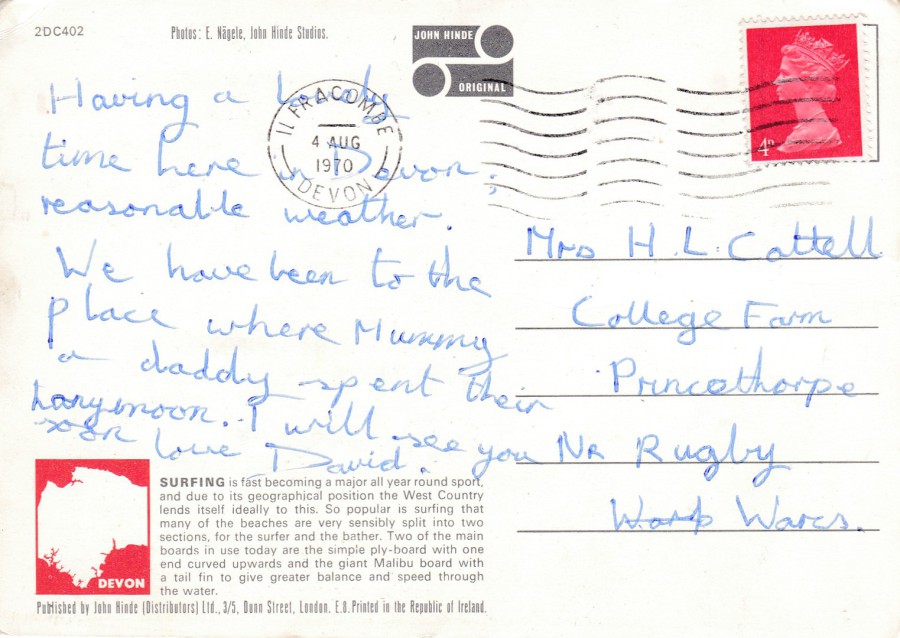
REVERSE SIDE OF TOP POSTCARD
SURFING IN DEVON
This one was posted in August 1970, from Devon, naturally enough
Note the little red boxed map of Devon bottom left
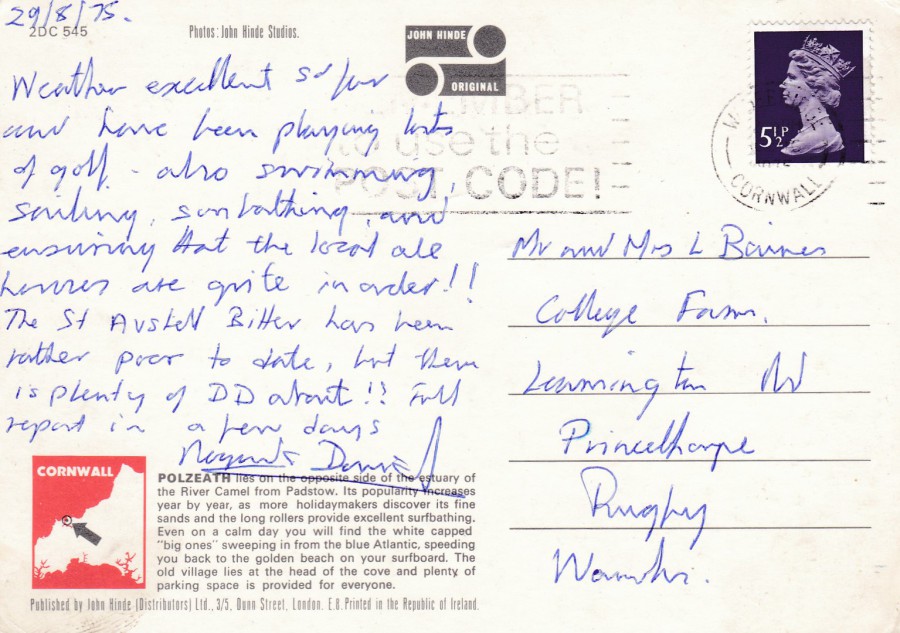
REVERSE SIDE OF BOTTOM POSTCARD
POLZEATH
This one was posted in August 1975 from Cornwall, again naturally enough
Note the little red boxed map of Cornwall bottom left

05/01/2017
THE CAMPING CLUB
WEST RUNTON
Published by
COLOURMASTER LIMITED, CRAWLEY, SUSSEX
Ref: R79395
I was a member of, what should be more correctly referred to as, the Camping and Caravanning Club, for a number years, and I have done some caravanning, but never owned one. I have done much more camping, initially via scouting, which I still do. Camping these days, now I am older, is a little more of an ache, especially without an airbed. I have discovered that I really like Hotel rooms.
The postcard here is a little more interesting than most of this style because it has the club’s logo in the centre.
05/01/2017
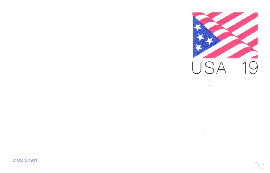
FLAG 19 cents
POSTAL STATIONERY CARD
If I am right, by no means a certainty, this is an official issue released between 1990 and 1993 and has the reference UX153 (in the ‘THE POSTAL SERVICE GUIDE TO U.S. STAMPS – 28th EDITION’ catalogue).
In America, they have a reputation for producing these pre-paid postal cards which have only the pre-paid stamp image printed on them. So, plain unused copies are quite simple, and are probably more of interest to philatelic stamp collectors rather than post card collectors, but I have always had an interest in any postal card item (many examples of which, from other countries, have been posted on the webpage over the past year).
05/01/2017
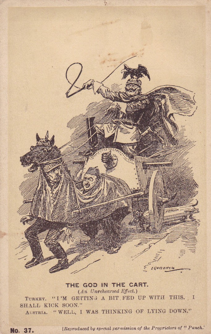
THE GOD IN THE CART
(An Unrehearsed Effect)
TURKEY. “I’M GETTING A BIT FED UP WITH THIS. I SHALL KICK SOON”
AUSTRIA. “WELL, I WAS THINKING OF LYING DOWN”
[Reproduced by special permission of the Proprietors of “Punch”]
Published by
JARROLD AND SONS, LONDON
Ref: No. 37.
Early World War I political/military cartoon postcard depicting the Kaiser on his cart. This one appealed to me because I collect military postcard but also because I am fascinated by Zeppelin themed postcards and if you look closely there is a sausage dog being pulled along by a chain behind the cart, but, this dog has a Zeppelin as it’s body. The early years of the 20th Century were, and for that matter the later years of the 19th century as well, were the prime period of the political cartoon and many appeared on postcards. This is a nice one and would be quite collectible because of its content and theme.

‘CLOSE UP’ OF PART OF THE MAIN IMAGE
Depicts the area showing the Zeppelin bodied sausage dog

DOVER CASTLE
KENT
‘MADE IN ENGLAND’
STANDING STRONG SINCE 1181
Published for
ENGLISH HERITAGE
Ref: 65950 – PC Dover Castle MIE Postcard
A simple but delightful poster styled image sold exclusively by English Heritage at the Dover Castle gift shop. Another of the postcards obtained on my visit a couple of years back.

05/01/2017
SPIDERMAN & SUPERCOW
Cartoon by
Jacques Bosse dit Yack
Published by
NOUVELLES IMAGES
(France)
Ref: CP 2516
I bought this postcard, and the one below, at the same time, on a visit to France to spend some time with my In-Laws who live outside Sainte. The design appealed to me because I collect Super-Hero related postcards. Although I only bought the two which depict this cartoon cow as such heroes there were in fact other images of this cow dressed in other cloths and taking part in other activities. I only saw the postcards on that one trip, over seven years ago, and have never seen them in the UK.

SUPER HEROES
Cartoon by
Jacques Bosse dit Yack
Published by
NOUVELLES IMAGES
(France)
Ref: CP 2475
Here the cow is dressed as a type of almost Batman based costume (not sure about the Lightning strike on its chest!) and, more clearly, Superman. This is my favourite of the two.
05/01/2017
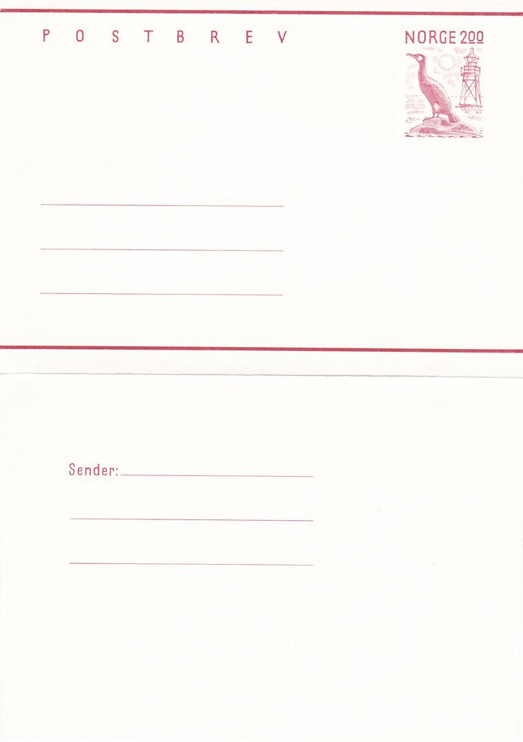
POSTBREV
NORWAY
This is not a postcard, it is a pre-paid folded envelope which has a pre-printed stamp depicting a cormorant. Although it is not a postcard it is a piece of Postal Stationery, so when I saw this in a cheap box I still ended up buying it, but then it is also another item which has a bird on it. For all these reason’s it appealed to me, although I know nothing about it other than what I can see.

04/01/2017
MOTHER AND CHILD
REAL PHOTO STAMP POSTCARDS
Published by
ROTARY PHOTOGRAPHIC SERIES
ROTARY PHOTO F. C.
Ref: K3
Here you can see twelve perforated cinderella – or, if you like, ‘sticker’ – stamps. They depict women with children who are listed as being Mothers and Children. You could of course detach the cinderella stamps and apply them to envelopes or perhaps other posted postcards. What makes this such an unusual item is the fact that the reverse side has a full POST CARD layout. So, technically you could have applied a stamp and posted this whole sheet of stamps through the post as one item. I thought this interesting as the individual stamps are all ‘Gummed’. I had never seen anything like this before so had to buy it when I saw it on eBay recently (it actually arrived through the post this morning).
As these were clearly designed to be used, i.e. each stamp separated and used I do wonder how many of these remain with all 12 stamps still in place. Also, because these were gummed they would become sticky if they became wet in any way, and thus get stuck down to surfaces or other bits of paper. I think at some point this sheet here became damp and the missing top boarder strip became stuck to something and was removed, if you check the image below which shows the reverse side you can see something stuck to the displayed bottom left corner, which is actually the top end in reference to the front design.
Unfortunately, the item is not complete as there was definitely, originally, a white boarder strip across the top, like the ones down each side and across the bottom. Despite this being missing I still think this is a smashing item, and one which I was really pleased to obtain.
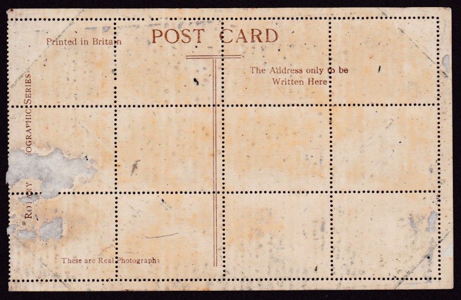
REVERSIDE OF ABOVE POSTCARD

04/01/2017
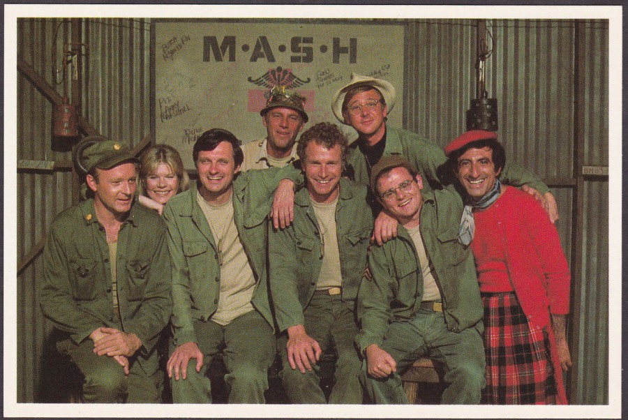
WILLIAM CHRISTOPHER ….. RIP
20th October 1932 – 31/12/2016
Actor, probably best known for playing Father Mulcahy in the television series M.A.S.H. Although he passed away a few days ago, it was only announced on the news today. I loved M.A.S.H. and I am pleased to say that the series was represented by a smashing, and relatively easy to obtain, set of postcards.
POSTCARD
1982 CAST SHOT
Published by
AMERICAN POSTCARD
20th CENTURY FOX POSTCARD SERIES
M.A.S.H
Ref: F32
Although this card here has the reference number F32 I have reasons for suspecting that there are not 32 different M.A.S.H related postcards. I have been collecting these postcards since the 1980’s when they were released and I have bought everyone I have seen, whether it was on a dealer’s stand, on eBay and via contacts. I have seen the ones I already have many times over, which has lead me to believe that the cards were issued over a period of time, with other subject matter issues being released in-between them. If you know otherwise, then please do let me know.
THE ORIGINAL CAST SHOT, 1971
Published by
AMERICAN POSTCARD
20th CENTURY FOX POSTCARD SERIES
M.A.S.H
Ref: F14

CAST SHOT, 1982
Published by
AMERICAN POSTCARD
20th CENTURY FOX POSTCARD SERIES
M.A.S.H
Ref: F12

HOT LIPS, COL. POTER & FATHER MULCAHY
Published by
AMERICAN POSTCARD
20th CENTURY FOX POSTCARD SERIES
M.A.S.H
Ref: F8
03/01/2017
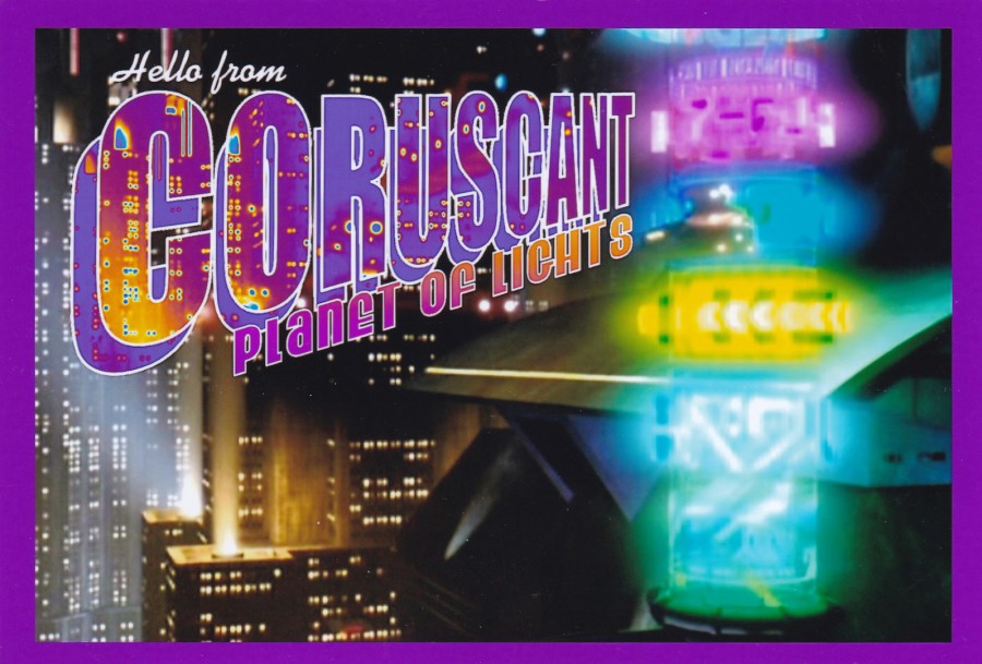
STAR WARS
“HELLO FROM CORUSCANT – PLANET OF LIGHTS”
Unknown Publisher / Printer
Whilst in Florida in November we visited a massive Sci-Fi comic book store off International Drive. It is located inside the ‘Artegon Marketplace’ and is called ‘Gods & Monsters’ and it is a must visit store for anyone interested in the world of comic book characters. They sell all sorts of toys, figures, books collectibles and, of course, comics.
On this past visit to the store I found some postcards on display in their glass display cabinets. There were two different sets, found at different ends of the store and in completely different cabinets. Today I am going to show you the three I found which are Star Wars themed. The designs are based on the American ‘Greetings From’ style of postcard design and each of the three is for a specific Star Wars location.
This one here is for the planet of CORUSCANT, which is a planet covered entirely in a cityscape landscape.

TOP
“GREETINGS FROM SUNNY TATOOINE”
Tatooine is of course the home planet of Luke Skywalker, from the very first Star Wars film. The buildings you can see are where Jabba the Hut had his base, from the third film ‘Return of the Jedi’. In the film, they are seen in the background when C3PO and R2-D2 are moving towards the large door to the base.
BOTTOM
“GREETINGS FROM MOS EISLEY SPACEPORT”
In the first Star Wars film Obi Wan Kenobi calls Mos Eisley a “wretched hive of scum and villainy”, so I am not sure anyone would want to send a postcard from here! Mos Eisley is a spaceport located on the planet of Tatooine (you can now see why I put these two postcards together here).
All three of these postcards have the same reverse, very basic, layout. There are four address lines, a centre dividing line and a stamp box, that’s all, no text and no POST CARD in text across the top. So, these have no titles (beyond the obvious front image design text), no reference numbers and no indicators as to who designed, printed or published these postcards. They cost me $2 each and were, in my opinion, worth every dime.
These are the type of postcards I love finding. They show how it is worth checking every store, shop, stand or rack for postcards. If your shopping with your partner, don’t be bored, look for postcards because you never know (although to be fair this Sci-Fi store is definitely one of my top shopping locations).
03/01/2017
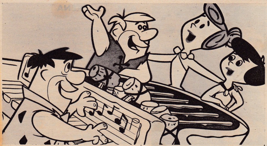
THE FLINTSTONES
Unknown Publisher / Printer
I know nothing about the story behind the release of this postcard. There is no named publisher and no indication who printed it. It has a very simple POST CARD reverse layout, in fact, extremely simple and basic. Someone has at some point written on it and listed the names of the characters (as if anyone would not know them?!?). The front image is nice, and appears to be professional, or at least it looks like a proper image of the characters. But who produced it?
I found this on a dealer’s stall at last year’s Woking postcard fair. I had never seen a copy, and I suspect I won’t again, but, is it worth £5? I am going to be honest and say that it probably is not worth that much. But, what if you knew that the likelihood of you ever seeing another one was extremely unlikely. And, what if television is your specialised top topic or theme? What then? Could you leave it behind? Clearly, I couldn’t.
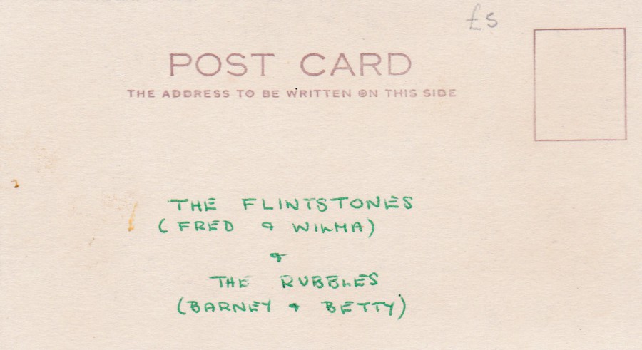
REVERSE SIDE OF ABOVE POSTCARD
03/01/2017
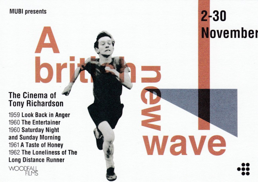
A BRITISH NEW WAVE
The Cinema of Tony Richardson
2nd – 30th November 2016
MUBI Presents
This was a free postcard I found in London late last year. The image used on the front is taken from the film ‘The Loneliness of The Long Distance Runner’ and depicts the actor Tom Courtenay.
MUBI is a global film website that integrates a subscription video-on-demand service. This postcard promotes a season of of films directed by Tony Richardson. For a free postcard this one is not bad.

03/01/2017
WONDERGROUND GALLERY
WALT DISNEY WORLD
FLORIDA
Original Artwork of
“PRINCESS LEIA AND R2-D2”
By Artist
Jasmine Becket-Griffith
In November of last year, I came across this postcard in the ‘Wonderground’ store located in Disney Springs. It is a little more poignant now of course after the sad passing away of Carrie Fisher. It is also quite a nice design and despite not being a massive fan of Jasmine Beckett-Griffith’s work, she specialises in these images of female characters with big heads and very large eyes, my Star Wars interest lead me to buy this one (but to be fair my Disney interest lead me to buy most of the other ones of her work as well, no restraint). Some of the others I shall depict I the future, but this one deserves to be the first one shown here.
02/01/2017
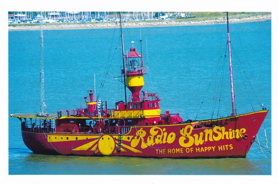
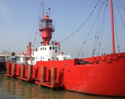
LV18 – LAST MANNED TRINITY HOUSE LIGHTVESSEL, HARWICH HARBOUR
‘Save LV18 for Harwich Appeal’
This was a locally produced postcard for a charity that was trying to raise money for the protection and conservation of this Lightvessel, which looking at this photograph here, was/is also a radio station: ‘Radio Sunshine – The Home of Happy Hits’. The postcard was clearly a promotional item, and was probably only available locally, but then there was no reason for it to be otherwise.
According to the official website the vessel has now been preserved, in its original configuration, which is an all red hull and white block house, so it no longer looks anything like what it does in this image here. It is now owned by The Pharos Trust, a charity, the one which produced this postcard, and who I assume were at least partially successful as the vessel has already hosted various events, including offshore pirate radio revivals and on board exhibitions. The vessel can also be visited daily from 11:00hrs to 16:00hrs from March to the end of October.
PHOTOGRAPH
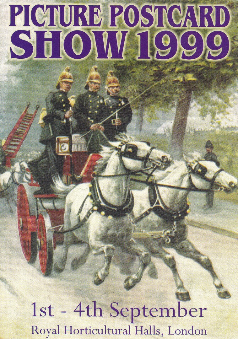
PICTURE POSTCARD SHOW
1999
1ST – 4TH SEPTEMBER
ROYAL HORTICULTURAL HALLS, LONDON
Published by
THE POSTCARD TRADERS ASSOCIATION
Card design and layout by
MICHAEL DAY
(from a circa 1910 original)
Ref: C20608X
This was the free postcard every visitor to the 1999 Picture Postcard Show received. It also acted as the pre-publicity poster, and copies were also sent out in some circumstances as entry tickets and promotion prior to the event. The image is taken from an old postcard featuring a horse drawn fire pump. For a while postcard fair postcards were very much collected, but sadly not so much now.

02/01/2017
AVANTCARD AUSTRALIA
LOOKING FOR FREE POSTCARDS?
DISPLAY FINDER
“Map of Australia”
I have mentioned and displayed a range of different ‘Avantcard Australia’ issues over the last 12 months. This item here is a novelty shaped card which is an advert for the companies own website ‘Display Finder’. On this ‘website’ you can locate where the racks of Avantcard Australia postcards are and thus pay a visit and collect them. It is perhaps not a true postcard itself but it has strong connections and was placed in the racks alongside the postcards, and, as you will have become aware, I do like novelty items.
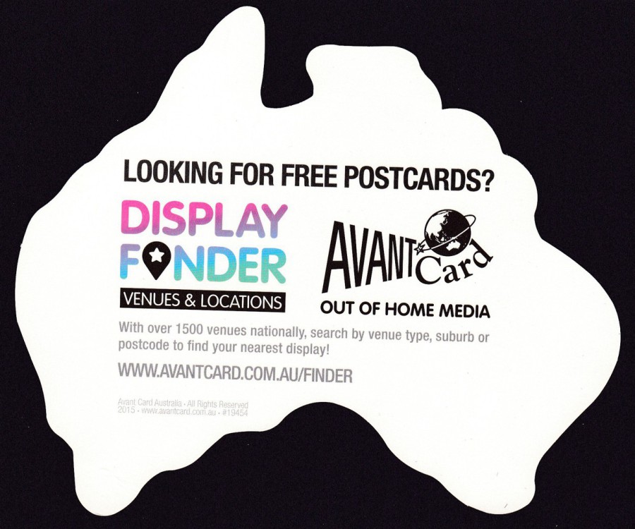
REVERSE SIDE OF ABOVE CARD
Here you can see the full details relating to the website

02/01/2017
POSTCARDS FROM ALDGATE EAST
7: ALDGATE EAST UNDERGROUND STATION
Photo: Turan Miah, 2015
ART IDENTITY MIGRATION
“Whitechapel High Street is a place of comings and goings; commuters emerge from the underground station, buses shuttle passengers to town, car drivers grow impatient as they queue in traffic, an unfortunate cyclist is commemorated with traffic light flowers. Commercial Street was created in the 1840’s to provide an efficient connection to the London Docks, and the underground station first opened here in 1884”
(Text from Reverse side of Postcard)
This is shown as postcard No 7, so I suspect there may have been a series of these. This one here was picked up by a mate of mine (thanks Charles) on a trip to London. It is what I call a ‘Normal Life Postcard’, i.e. one which shows normal people doing normal things, a caught moment of normality, but one which will have more importance in the future, when all that is depicted here has changed as it inevitably will. It is a postcard that will become historically important to the generation after the next.
Although the front image is simple, but no less attractive for being so, it was something on the reverse side that caught my interest – see below.

REVERSE SIDE OF ABOVE POSTCARD
The design of the reverse side includes a printed red one penny stamp from the reign of King George V (The stamp is from the 1934 – 1936 definitive issue – 1d Red - SG440). This stamp even has a partial wavy line machine cancellation on it (although this only appears on the printed stamp and does not transfer onto the postcard design around it). I have no idea why this stamp was printed on the postcard but it does add a touch of colour and, in my mind, makes the postcard a little more interesting.
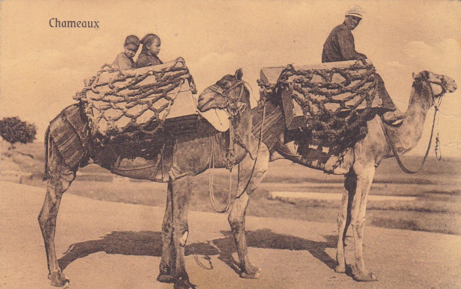
02/01/2017
CHAMEAUX
CAMEL
Published by
THE CAIRO POSTCARD TRUST, CAIRO
Under any other circumstances this postcard would fit into my ‘Wildlife’ themed collection. But, it normally sits in my ‘Military’ themed collection because of how the postcard was used, but more about that below.
The postcard itself is typical of the type sold in and around Egypt during the first world war period. It has that light yellow-brown colour that the cards of this era seemed to have used, which I think has something to do with the heat of the country and the production values for the paper and card used. The result though, is that you can almost instantly recognise North African early postcards just by their colour.
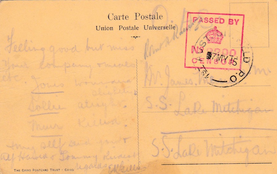
REVERSE SIDE OF ABOVE POSTCARD
1ST AUSTRALIAN DIVISION FIELD POST OFFICE
(1ST AUST DIV. FIELD. P.O.)
This postcard was posted by a soldier in the 1st Australian Division and received the division field post office circular date stamp dated 7th May 1915. As with all military mail the postcard was censored and received the square shaped ‘PASSED BY CENSOR’ cachet number 2200. This square format censor mark design was only in use on the Western Front between December 1914 and March 1915 but it it’s use in Egypt continued well beyond this period, as shown by this usage here.
I have often wondered about the soldier who sent this as the 1st Australian Division were to make the initial assault landing at Anzac Cove, on the 25th April 1915 during the Gallipoli campaign. All soldiers were ashore by 09:00hrs but they failed to progress onwards to further targets beyond the beachhead. He clearly survived this beach assault if he was in it. But I suspect he was a new recruit and perhaps went out to Gallipoli not long after sending this postcard. Did he survive the further fighting between then and the massive August Offensive, where out of an assault force of 2,900 men 1,700 were either killed or wounded.
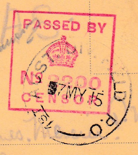
Close up of Censor Cachet and Field Post Office cancel
01/01/2017
The Webpage has been running for a whole year now, who would have thought!
So today is our ‘Webpage Birthday’ – to celebrate I have depicted here a ‘Birthday’ related postcard.
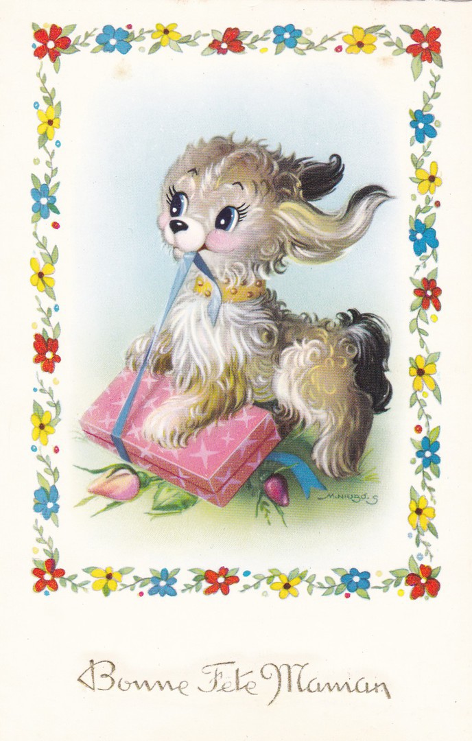
BONNE FETE MAMAN
HAPPY BIRTHDAY MOTHER
Published by
M.D. PARIS
Ref: Series No 2080
French produced and printed postcard depicting a small dog with a present (which it appears to be unwrapping!). Although we no longer send postcards for birthdays the tradition of sending a card of some sort has been around for many years and was even present in ancient China when greeting cards were exchanged with messages of good will for the New Year. The early Egyptians conveyed their greetings on papyrus scrolls. By the early 15th century handmade paper greetings cards were exchanged. So, I believe the move onto Greetings Postcards was inevitable. Postcards for birthdays were in fact very popular throughout the 1950’s and 1960’s but their use waned after this. This is a very simple, but nicely drawn example of such a birthday postcard.
01/01/2017
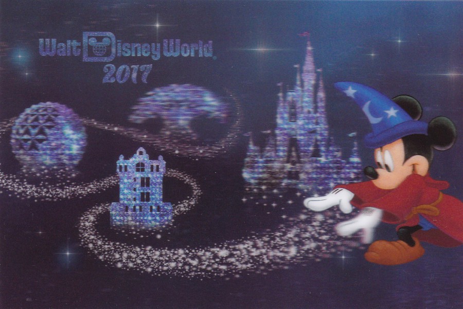
2017
WALT DISNEY WORLD
3D Postcard
This was the first postcard I bought which has been issued for the year 2017. It happened to be issued in mid-November in the Walt Disney World theme park whilst I was on holiday. It was not there for my first week but was placed on sale during my second. I kept a hold of it for today as it seems an appropriate postcard for News Year Day.
Happy ‘NEW YEARS DAY’ to everyone
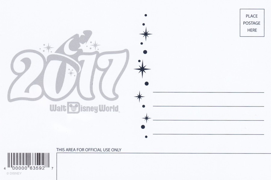
REVERSE SIDE OF ABOVE POSTCARD
The year 2017 even appears here

01/01/2017
BRITISH MUSEUM (NATURAL HISTORY)
FAR LEFT
CRYSTALS : MONOCLINIC SYSTEM
Ref: D53
Printed by
WATERLOW & SONS LIMITED
NEAR LEFT
ORNAMENTAL STONES : QUARTZ
Ref: D37
Printed by
WATERLOW & SONS LIMITED
The British Museum (Natural History), now much better known simply as ‘The Natural History Museum, London’ has been issuing postcards for nigh on a hundred years. It was postcards from this museum that really enforced postcard collecting with me, so the museum has a lot to answer for!! These are slightly older postcards which I was given when someone was clearing out a house. The various crystals and stones are depicted here using coloured drawings on a card format that was used by the museum for many of their postcard designs around the time these were released.
01/01/2017
LEFT ILLUMINATED
By
Janet Mills
1996
Published by
Falmouth College of Arts
(My copy of this postcard was used in 1997)
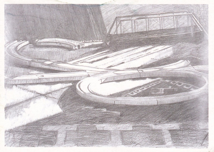
This is a piece of artwork which depicts a children’s toy train track. When I saw this in a cheap box I picked it up immediately, and for a very specific reason. My eldest son is 31 and he has always been fascinated by trains and railways. For most of his youth he played with a toy train set that was made from wood and which was produced by a company called ‘Brio’. Over the years, we bought him additional track, a bridge and various train engines and carriages, including a Thomas the Tank Engine one. And, like any old kid I also built many different track layouts and enjoyed pushing Thomas the Tank Engine around the track and, one bought, the new railway bridge. This postcard depicts the very distinctive ‘Brio’ track wooden pieces that we used to make our track layouts, and seeing them on a postcard brought back all those memories.
01/01/2017
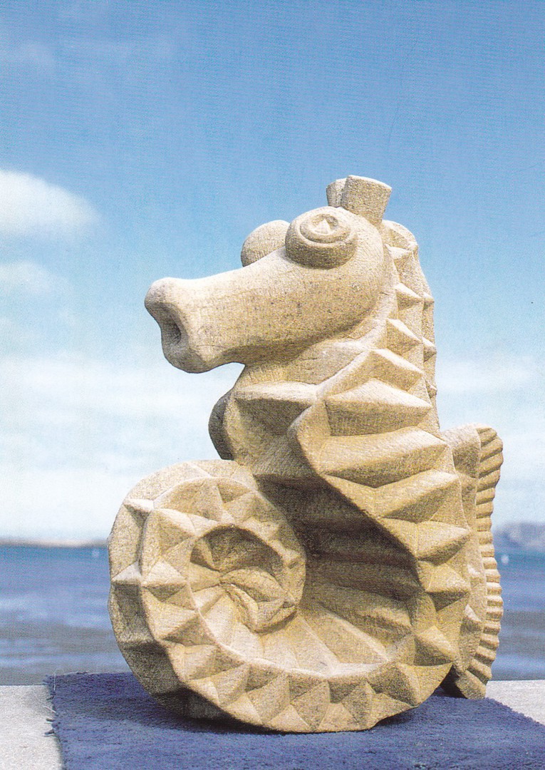
SEAHORSE
BY
DARREN YEADON
This was a postcard sized card printed as an invitation to a private view of an exhibition of sculpture by Darren Yeadon. The exhibition was held at the WEST WALES ARTS CENTRE, 16 WEST STREET, FISHGUARD, PEMBROKESHIRE. Text on the reverse side states that the exhibition private view would be held on Saturday 20th June, between 2pm and 5pm, and then between 7pm and 9pm. The full exhibition ran until the 15th July. Although the year is not given there was a 20th June that fell on a Saturday in 2015, and this card is almost certainly from that year. With me, I just liked the carved seahorse.
01/01/2017
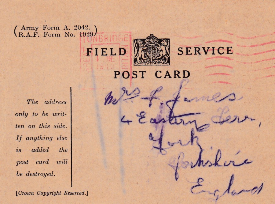
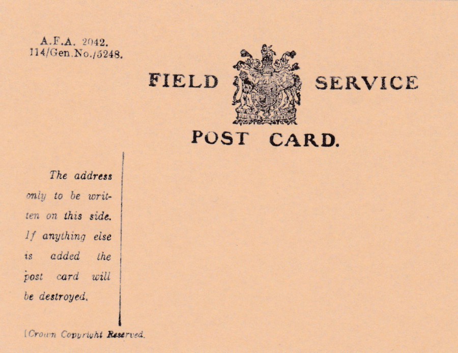
FIELD POSTCARD
WORLD WAR II
ARMY FORM A. 2042
This was the standard ‘Field Post Card’ as issued to soldiers in World War II, designed so that a standard message could be sent under free postage. This one here was sent in June 1940 and received a TONBRIDGE GREAT BRITAIN red boxed ‘PAID’ mark dated 1st June 1940.
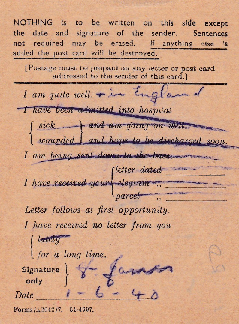
REVERSE SIDE OF ABOVE FIELD POSTCARD
The idea here is simple and the sender could cross out the segments of text not applicable and then date and sign at the bottom. The sender was not allowed to write anything else on the postcard reverse otherwise it would be destroyed. In this case the sender broke the rules and wrote “+ IN ENGLAND” at the top, but, the card appears to have been sent through anyway, so he got away with it.
Proper used versions of these cards are nice to find and of course have some historical interest although the details are often scant. They are also not too expensive as many thousands were used and they are easy to find. This one here cost me just 50p.
FACSIMILE
World War II Field Post Card
IMPERIAL WAR MUSEUM
Of course, if you do not wish to hunt around for a real WWII Field Post Card you can pick up one of these facsimile ones which are sold in the gift shop at the Imperial War Museum. Please note the crest at the top, in the centre, which is different to the one on the actual WWII Field Post card depicted above. This is not unusual as the basic layout of any official civil service document changes frequently, mainly to keep track of use and of course to try and stop forgery.
If I remember correctly this facsimile was more expensive than the real one, 75p I think.
01/01/2017
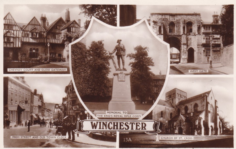
WINCHESTER
Published by
EXCEL SERIES
Ref: 13A
Multi-view postcards like this are a famous type and they can be found for all areas of the country. For collectors of ‘Local History’ they are useful as they, be design, depict interesting or well-known landmarks or areas. As these frequently change these multiple images can give a lot of information. For me this one appealed because I liked the depiction of the ‘Memorial to The Kings Royal Rifle Corps’ in the centre as this means this fits nicely into my military themed collection.
The statue is in bronze and was designed by John Tweed and was unveiled in 1922. The statue is located in Cathedral Close, Winchester.
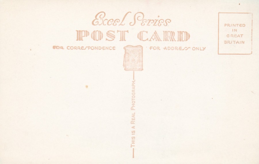
REVERSE SIDE OF ABOVE POSTCARD
A reasonably ornate, but typical postcard reverse. For me the best bit is the logo of an old camera

CLOSE UP OF CAMERA LOGO