18/12/2016
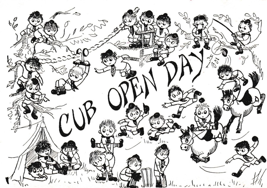
CUB OPEN DAY
To compliment Friday’s ‘CUB 100’ posting I have another cub scout postcard for you tonight. This one is a locally produced (in Birmingham) one which has a smashing black and white cartoon on the front of lots of cubs enjoying themselves at a campsite.
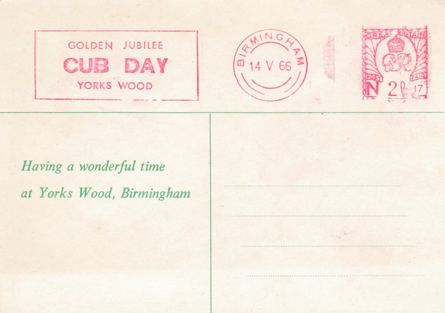
REVERSE SIDE OF ABOVE POSTCARD
I have seen a few copies of this postcard used with this red meter mark slogan cancel which reads:
“GOLDEN JUBILEE CUB DAY YORKS WOOD – BIRMINGHAM – DATED 14TH May 1966”
The postage here is 2d, and this meter mark here has been well struck making this a much desirable scout and philatelic collectible. Printed text, in green, reads:
“Having a wonderful time at Yorks Wood, Birmingham”
18/12/2016
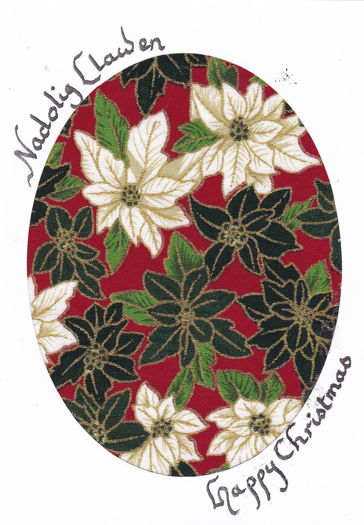
HAPPY CHRISTMAS
Home Made Christmas Postcard
By
David & Pat Rye
2016
My Christmas postcard offering for tonight is a home-made one sent to me by my friend David Rye. The postcard is in both Welsh and English as David is from Wales. Over the last few years David has sent me a number of interesting home-made postcards, and this one adds to the collection
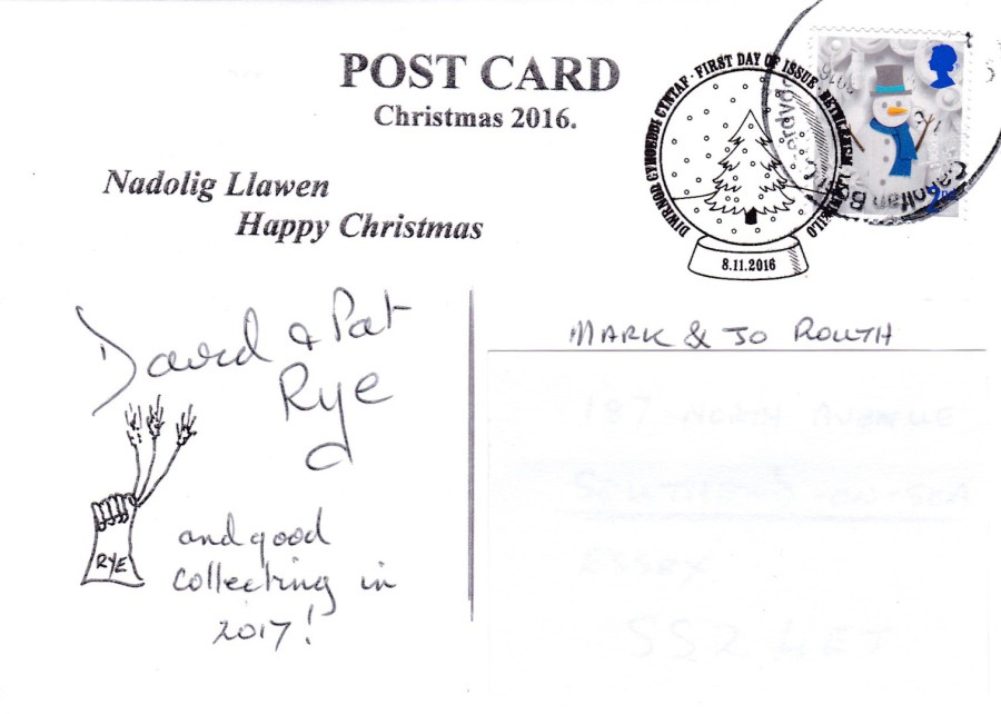
REVERSE SIDE OF ABOVE POSTCARD
This postcard has a second class 2016 Christmas stamp applied which has been cancelled first day of issue with a Welsh language Bethlehem special hand stamp (dated 8/11/2016).
18/12/2016
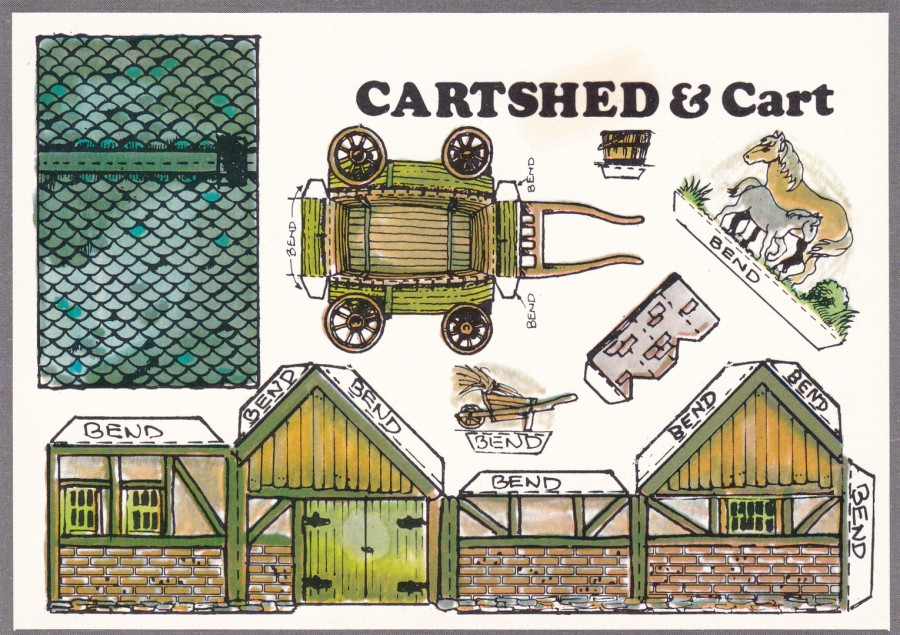
CARTSHED & CART
Cut Out Model Postcard
Published by
FIDDLER’S GREEN CONSTRUCTION CARDS
“Cart Shed & Cart”
“This little saltbox cart shed offers safe storage of a wagon or other farm equipment. The double windows would face south for better lighting at the work bench. The chimney gives evidence of a small forge”
(Text from Reverse side of Postcard)
I have quite a collection of Fiddler’s Green Construction Cards and for a while they were very popular. The early ones are the ones I prefer as these ones have interesting reverse drawings of the cut-out model on the front. Sometimes the cards were re-released but with a much better drawing. This one here is a slightly later, with a re-drawn front image, one with a smaller less ‘rough edged’ drawing on the reverse side as well. I shall dig out some of my other construction cards, especially the early ones, and show you what I mean. In the mean-time, this is a fair example of the company’s output.
REVERSE SIDE OF ABOVE POSTCARD

18/12/2016
INFANTERIE INTERIEUR DU POSTE DE POLICE
(INFANTRY INSIDE THE POLICE STATION)
Published by
AQUA PHOTO PARIS
Ref: 3598
This early, just pre, or early WW1, military themed postcard appealed to me because of the word POLICE, so it fits into two of my collected themes. I would have bought it mint or used, and this one is used, although something is wrong with it. And, it is the stamp that is wrong. The green 5c stamp applied to the front (I have previously explained that it was common for the stamp to be applied to the front of postcards in France, at this time) is not the original stamp, I believe. The stamp has the half of two different cancellations on it, neither of which carries over onto the postcard itself. whilst underneath the stamp there is clearly another cancel, the edges of which can be seen clearly outside three of the stamps edges, and can just be made out along the fourth, the bottom edge of the stamp.
This means one of two things.
-
1 - Firstly, that the person sending the postcard used a previously cancelled stamp in the hope that the post office would not notice.
-
2 - Secondly, and I suspect more likely, that the original stamp was removed by a stamp collector, or came away in some other way, and a dealer has placed another stamp over the original stamps area to make the card look more attractive for sale.
Whichever one of the above it is, it is still an interesting postcard and one I was happy to buy whatever the story behind the stamp truly is.
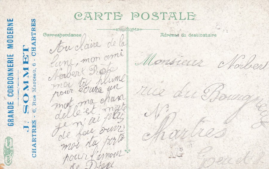
REVERSE SIDE OF ABOVE POSTCARD
The interesting thing with this reverse side is the addition of the blue advert cachet applied on the far-left side. This reads as:
GRANDE CORDONNERIE MODERNE
(LARGE MODERN SHOEMAKING)
J. SOMMET
CHARTRES – 6 Rue Marceau, 6 CHARTRES
18/12/2016
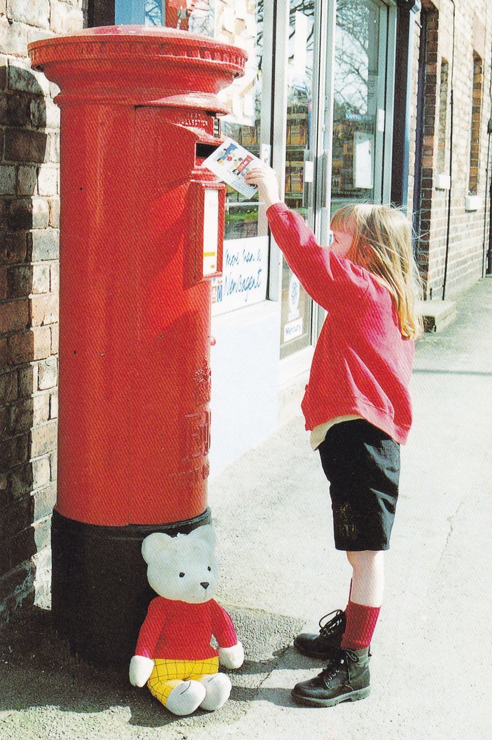
E.I.I.R. PILLAR BOX. 1957
Rillington P. O. (Post Office) N. Yorkshire
Photograph by R. J. WICKS (1997)
Published by – Rosalind Wicks (1997)
Printed by – Thought Factory
LIMITED EDITION of 250
Rosalind Wicks is perhaps better known for her artwork postcards but she did also produce some very nice photographic image postcards as well, mostly of photographs she herself took. Quite often these had a philatelic content (much like her artwork). This is one that is quite hard to find as only 250 were produced, which is a low number for someone whose work is a collected as Rosalind’s was, and is.
For me there is also the added bonus of a Rupert the Bear stuffed toy (another of Rosalind’s trade mark inclusions).
18/12/2016
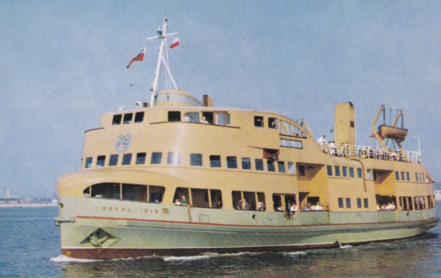
T. S. M. V. ‘ROYAL IRIS’
Wallasey Corporation Transport Dept.
PLEASURE CRUISES ON MERSEY ESTUARY
A nice transport related postcard depicting the MV Royal Iris, a twin screw, diesel-electric ferry built by William Denny & Brothers of Dumbarton. She was launched in December 1950 (and cost £256,000). Her maximum speed was 12 knots, weight 1,234 gross tonnes, length 159 feet, width 48 feet and a draught of 9 feet.
When she arrived on the River Mersey on the 28th April 1951 she was initially owned and operated by the ‘Wallasey Corporation. She went into service on 5th May 1951 and was licensed to carry 2,296 passengers for normal ferry duties but only 1000 for cruises.
She was painted in a green and cream livery and had forward dummy funnel near the bridge and two exhaust stacks amidships, on both sides.
She had the nickname of ‘The Fish and Chip Boat’, which probably came about as a result of a fish and chip saloon on board.
On Friday 7th Sept, 1951 the HMS Duke of York, which was under tow on her way to being broken up, collided with the Royal Iris, which was on a cruise. As a result, a number of people were hospitalised.
She also played host to several performing bands, including Gerry & The Pacemakers and The Beatles.
On the 1st December, 1969 she became part of the Merseyside Passenger Transport Executive, along with six other vessels.
During 1971 0 1972 she was refitted at Harland & Wolff and came out in a blue and white livery and was subsequently used exclusively as a cruise vessel. But, in 1975 (12th January) a fire broke out in the engine room and she suffered extensive damage. But not enough to prevent her later being used, in 1977 (21st June) to carry the Queen and Prince Phillip on their Silver Jubilee journey down the Mersey for the Mersey Review.
In 1984 she had a further change of livery, this time red, white and blue to mark the 1984 International Garden Festival. During a 1985 (April to May) tour she visited London, via Land’s End and the River Thames. She was moored beside HMS Belfast.
In the 1990’s she became surplus to requirement so on 12th January 1991 she ran a farewell evening cruise prior to being taken out of service. But, on the 21st April 1991 a one day licence was granted for her to carry up to 600 people on a cruise to mark the 73rd Anniversary to mark The Zeebrugge Raid of 1918. But, on the 16th August that year she was placed up for sale for the asking price of £100,000.
She moved back and forth through owners, painted different colours but little was done with her and then, eventually, she ended up finally leaving the Mersey on the 12th August, 1993, but not before breaking free from the tow line and smashing into the dock wall, twice on the 10th August.
In 2002 the vessel was towed to a berth on the River Thames after all further plans for her had failed to come to any completion. Apparently, she was to become a floating nightclub, but again this did not happen. In 2010 (6th Feb) the police were called out after someone reported that the vessel had taken on water up to her passenger deck. Evidence was found that squatters had been on board.
In 2014 she was still in this location with little hope of anything being done to bring her back to life. A shame after such an interesting career.
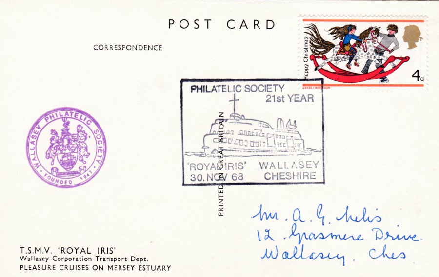
REVERSE SIDE OF ABOVE POSTCARD
Now, to be honest, it was this side that first drew my attention to this card, and was the reason I ended up buying this card. It was bought at a local philatelic club auction many years ago, for just 50p.
The card was used by the Wallasey Philatelic Society to celebrate their 21st year since founding. They even had a special hand stamp designed and authorised for use on items like this. The hand stamp reads “PHILATELIC SOCIETY 21ST YEAR – WALLASEY, CHESHIRE – ‘ROYAL IRIS’ 30. NOV 1968’. The hand stamp also features an image of the MV Royal Iris. The stamp used was the 1969 4d Christmas stamp (SG 775) which was released on 25th November, just five days prior to this use. The card also received a purple Philatelic Society cachet. All in all, a nice little philatelic souvenir.
18/12/2016
SEND ME A POST CARD TODAY
Published by
Plastichrome
A simple postcard design, but an attractive one, especially to any post card collector.
REVERSE SIDE OF ABOVE POSTCARD
This postcard was posted from Albany in 1961 using a 4c stamp issued that year, one commemorating the birth centenary of Senator George W. Norris (SG 1183)
18/12/2016
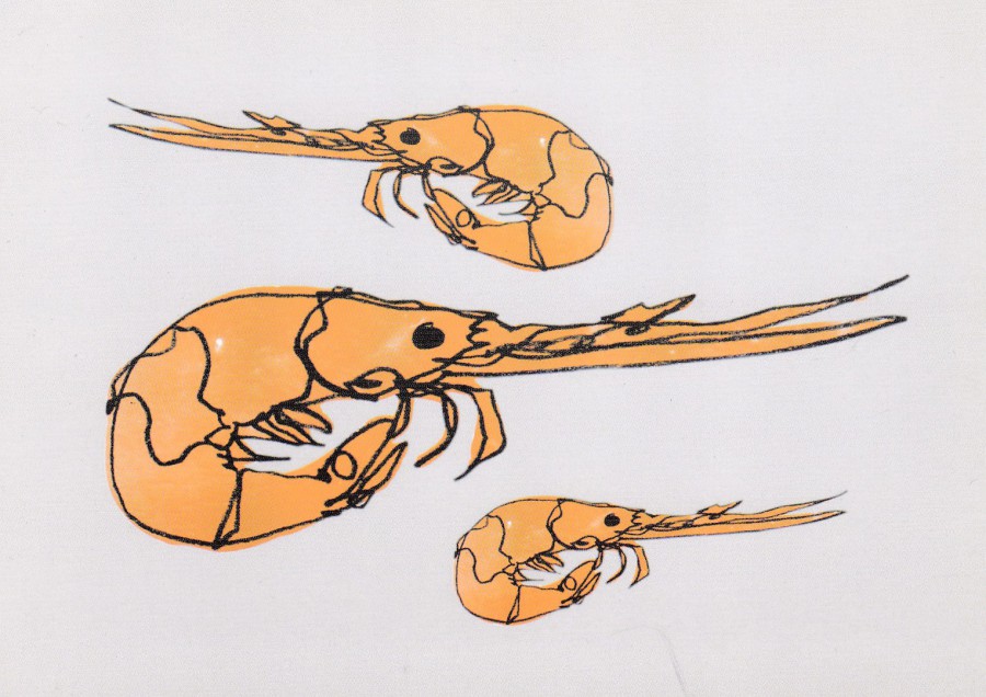
FISH!
PRAWNS
Published by
Cathedral Street, Borough Market, London SE1 9AL
“Prawns, like many crustacea, change colour when cooked, from grey to bright orange. It is these pigments in prawns and shrimps that are responsible for the flamingo’s pinkish hue”
(Text from reverse side of postcard)
Just because I love Prawns, no other reason
18/12/2016
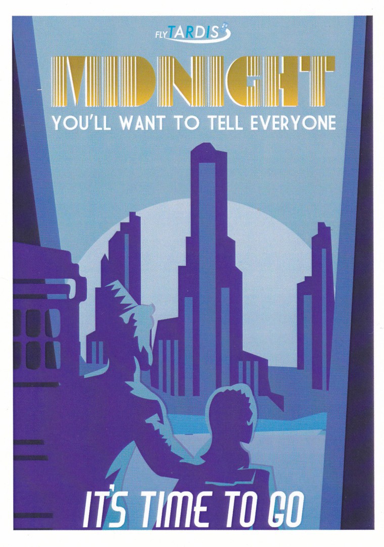
DR WHO RELATED POSTER DESIGNS
“FLY TARDIS”
“IT’S TIME TO GO”
I picked up these three ‘postcard sized’ plain backed cards at a Memorabilia show at the NEC in Birmingham. The designs are cracking and a must have for any Dr Who fan like me, but because they are plain backed you end up not knowing who the artist was, who printed the cards and who published these card items. So, there is a lot I don’t know, but I do know that I had to have them.
Each poster is based on a specific episode title or location as mentioned in the title or, as with the last one, a well-known Dr Who location.
MIDNIGHT
YOU’LL WANT TO TELL EVERYONE
(10th episode of the fourth series – New Dr Who)

THE LIBRARY
EXPLORE ALL KNOWLEDGE
(‘Silence in the Library’ is the 8th episode of the fourth series – New Dr Who)
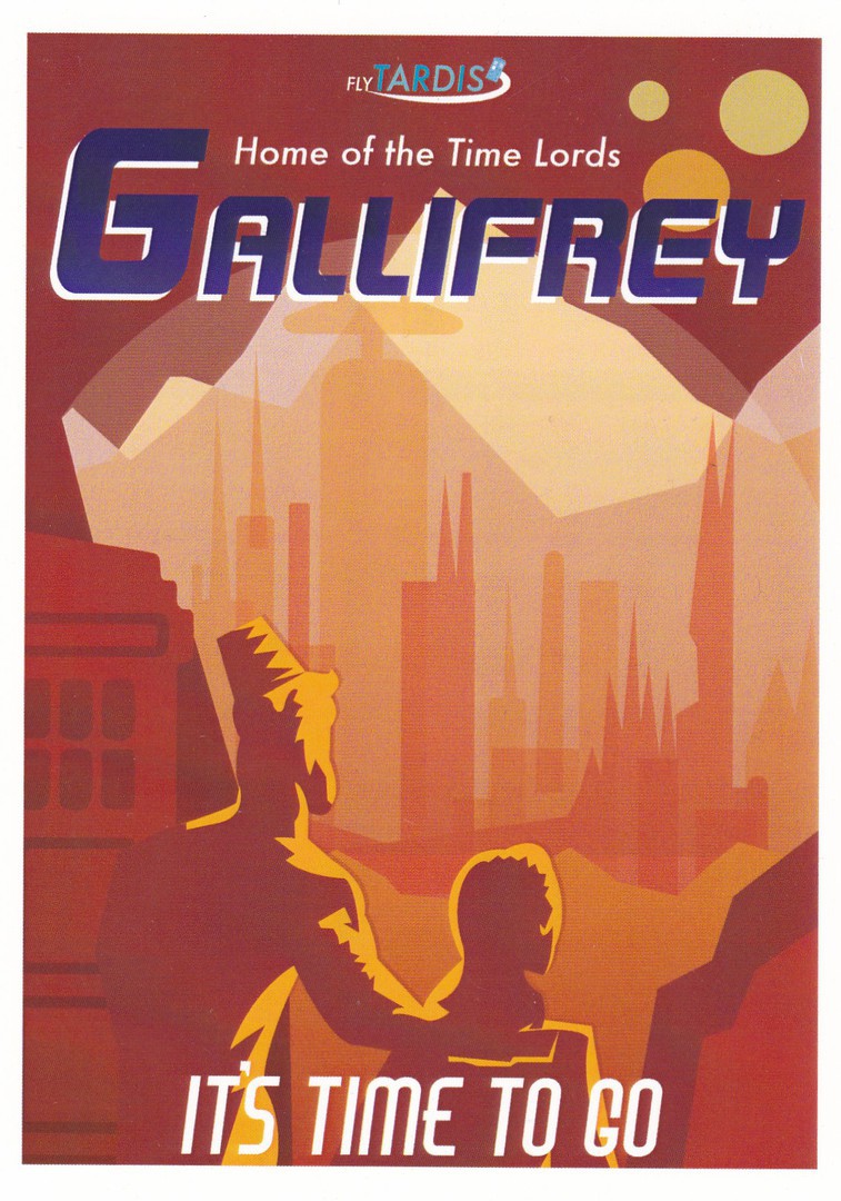
GALLIFREY
HOME OF THE TIME LORDS
(This is of course the home planet from which Doctor Who ran away from, stealing the Tardis as he did so)

18/12/2016
NINE VIEW MECHANICAL
Produced by
E.T.W DENNIS & SONS, LTD
(DENNIS PRODUCTIONS)
“GREETINGS FROM BOURTON – ON – THE – WATER”
I have a handful of these ‘NINE VIEW MECHANICAL postcards, from locations all around the UK. The design is simple enough, you can change the image in the ‘Car Windscreen’ shaped slot at the top (which is cut out of the top piece of card) by turning an interior circular piece of card by the little round knobbly protrusions on the outside edge of this central circular card. You can see where you do this at the top centre edge of the main card where there is a concave semi-circle cut out, within which is the convex semi-circle of the outer edge of the inside piece of circular card, move this and the circular card rotates and a different image moves round into the hole. There are four different images on the circular piece of internal card.
I have no doubt I will show you some others but this one is my favourite because the photograph on the inside have all been colourised (on my others they are all black and white), and, of course, it would have fitted into my very first collected theme of wildlife as one of the interior images, the one I have placed in the hole, depicts a scarlet macaw, apparently, called “George”.
REVERSE SIDE OF ABOVE POSTCARD
You can see how the back piece of card has been placed on here, and a little more of the knobbly edged inner card circle. These items are not scarce, and crop up, fairly, often and should not cost you more than a couple of pounds (used or mint).
18/12/2016
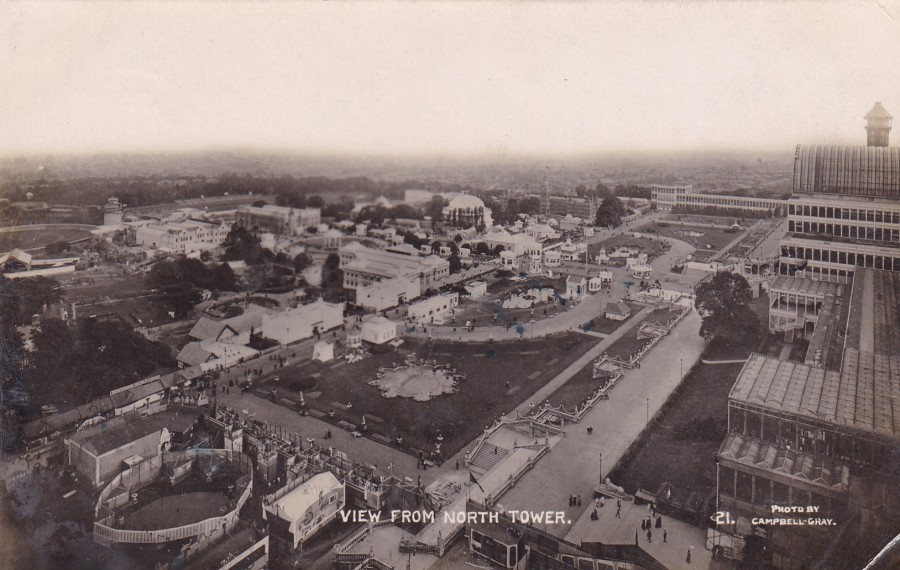
THE VIEW FROM NORTH TOWER
“THE FESTIVAL OF EMPIRE”
THE EMPIRE CITY, CRYSTAL PALACE
Printed by
BEMROSE & SONS, LTD
Ref: 21
Photo by Campbell Gray
I collect Crystal Palace postcards because it was where John Logie Baird (the inventor of television – or, more correctly, the first person to get it to work!) had his offices. When the Crystal Palace burnt down in 1936 it put an end to his ability to fight for the BBC TV contract.
But, this postcard pre-cedes all of that by some years. This one depicts the buildings used for the 1911 the ‘Festival of Empire’ held at the Crystal Palace. The festival opened on the 12 May 1911 and was organised to celebrate the coronation of King George V.

ENLARGEMENT OF PART OF ABOVE POSTCARD
This building here, which can be seen top centre right, is the Canadian building based on the centre block, with Victoria Tower, of the Canadian Parliamentary building in Ottawa.
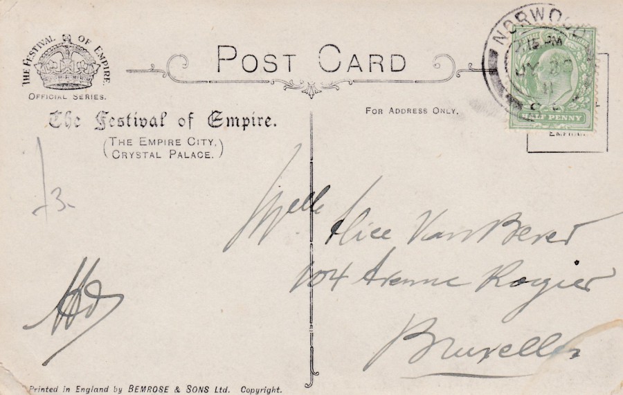
REVERSE SIDE OF ABOVE POSTCARD
This postcard was posted in July 1911 and has received a NORWOOD round cancellation (Norwood is very close to where the Crystal Palace was located so this card was posted locally). The ‘Festival of Empire’ logo can be seen top left which indicates that this was an official postcard for the event.
18/12/2016
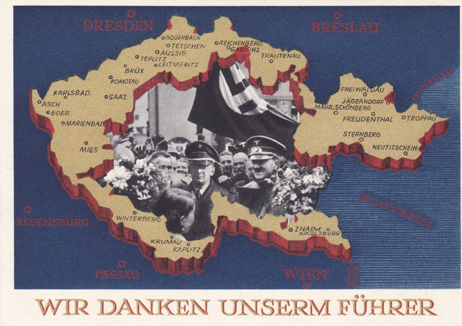
WIR DANKEN UNSERM FUHRER
“WE THANK OUR FUHRER”
This is a map of the Sudetenland in 1938, as it was when Hitler’s army marched into the area in October 1938. The area taken up with the black and white photograph of Hitler was then an area that was part of Czechoslovakia.
This postcard here was issued as publicity for the date of the 4th December 1938 when an election was held in Reichsgau in Sudetenland, during which 97.32% of the adult population voted for the NSADP (The Nazi Party).
This postcard is one of the more common early Nazi related postcards and sells for around £8 to £12 (if you are lucky slightly tatty ones sell around £6, and can be found as many, many of these postcards were printed).
I have thought long and hard about whether to show ‘Third Reich’ postcards, or not. But I have decided to because my interest lies in the actual postcard and its history, and the history of World War II and the reasons why the world went to war. This is one of those reasons, and quite rightly the world went to war against the Nazi’s, this is history, this postcard is part of that history, and is not in my collection because of any political considerations. I also believe that if we do not learn from the past then we are in no position to prevent similar things from happening again, which would be a tragedy.
REVERSE SIDE OF ABOVE POSTCARD
Mint, unused
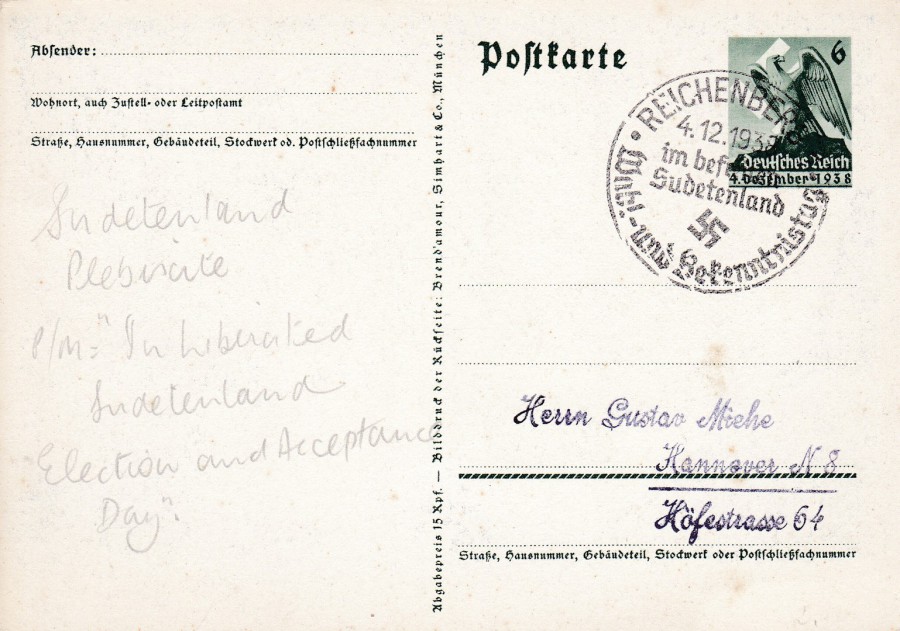
REVERSE SIDE OF POSTCARD
I have a second copy which has the pre-printed stamp cancelled with a special cancellation which incorporates the swastika and text relating to the Sudetenland plebiscite, the election. The text reads as ‘IN LIBERATED SUDETENLAND – ELECTION AND ACCEPTANCE DAY 4TH December 1938’ (I know this because some kind person, an earlier collector who had this card, wrote these details in pencil on the card, as you can see – so I hope they are right!) The use of this cancel would add a small amount of extra value to the card, but not a lot.
18/12/2016
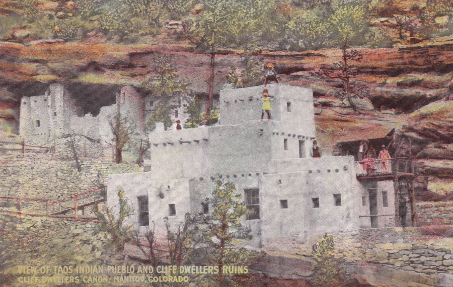
VIEW OF TAOS INDIAN PUEBLO AND CHIEF DWELLERS RUINS
CLIFF DWELLERS CANON (was this supposed to be spelt ‘Canyon’?) MANITOU, COLORADO
Published by
KWIN & CO, CHICAGO, USA
This is an example of a postcard that I would find in a cheap box, under £1, or thereabouts, and which I have to have, because the image appeals to me. It fits into no real theme that I specialise in but I cannot pass it up. I suppose it does class as history, but not really military history, but then I am interested in more than just past times when we have been at war.
This postcard here depicts the Manitou Cliff Dwellings, a group of relocated Anasazi (the name of the Indian, Native American tribe) ruined cliff dwellings. There is also a museum here. This re-location site is just west of Colorado Springs, Colorado in Maintou Springs. The museum and ruins were established in 1904 and opened to the public in 1907, and you can, apparently, walk through the preserved ruins.
The Anasazi lived and roamed in the United States in an area in the southwest known as the ‘Four Corners’. Interestingly they did not actually live in Manitou Springs, but built their houses, as depicted here, severl hundred miles southwest of Manitou Springs. The buildings shown here were taken from an Anasazi site in Cortez which was in ruins. They were transported by rail to Manitou Springs and put back together.
In the title, on the card they make reference to an ‘TAOS INDIAN PUEBLO’. A ‘Pueblo’ is a community of Native Americans and the Taos Pueblo (or Pueblo de Taos) is an ancient pueblo belonging to a Tiwa-speaking Native American tribe.

REVERSE SIDE OF ABOVE POSTCARD
I show this only because I like the American style of reverse printing where they make the words POST and CARD all attractive and in patterned text
17/12/2016
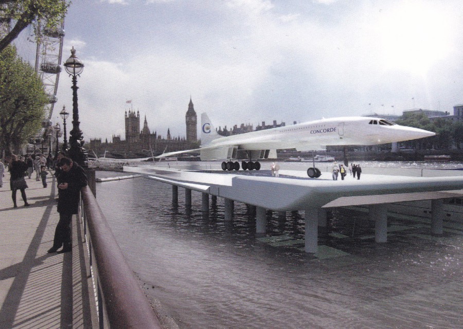
CONCORDE STUDY CIRCLE
Free Postcard with Vol. 38. No 2 issue of circles Newsletter (December 2016)
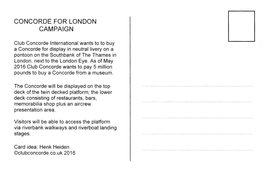
CONCORDE FOR LONDON CAMPAIGN
I have mentioned before that I am member of this study circle (I always refer to it as The Concorde Club). There is always something included with each newsletter whether a leaflet, label or postcard. The most recent issue (which only arrived this week) came with this superb postcard, which was included with the compliments of member Henk Heiden.
Everything you need to know about this image is explained in the text printed on the reverse side of this postcard (see below).
Postcards like this are the reason why it is a good idea to be a member of any specialist club or society related to any collecting interests.
REVERSE SIDE OF ABOVE POSTCARD
It will be interesting to see what comes from this enterprise
17/12/2016
PARTY INVITATION &
THANK-YOU POSTCARD
PACKS
“PARTY PACKS”
Part Two
So, as promised, here is part two of my depiction of these unusual, but rather nice, packs and their contents.
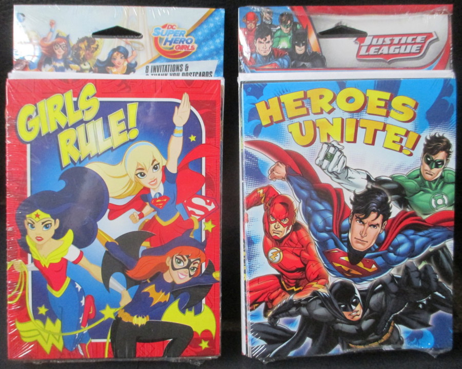
We start off with super-heroes and a selection of DC Comics characters.
FAR LEFT
DC SUPER HERO GIRLS
Published by
‘DesignWare’
NEAR LEFT
JUSTICE LEAGUE
Published by
‘DesignWare’

TOP
DC SUPER HERO GIRLS – ‘THANK YOU’
Here you get five characters for the price of one. The concept behind this series, and this postcard, is that the girls in question are all young and at High School, a ‘Super-Hero’ High School.
The characters are, from left to right, Bumblebee (I had to look this one up), Batgirl, Wonder Woman, Supergirl and Harley Quinn (a baddie, but maybe not in this series, I don’t know because I have not seen it).
BOTTOM
JUSTICE LEAGUE – ‘YOU RULE! THANKS’
Here, all four of the depicted super heroes are better known, So, again from left to right, we have Superman, The Flash, Batman and the Green Lantern.
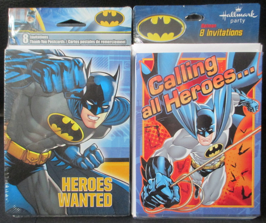
FAR LEFT
BATMAN
Published by
‘DesignWare’
NEAR LEFT
BATMAN
Published by
‘Hallmark’
This second packet is different from the other ones because there are no postcards contained within this one. It is a good example of the need to keep your eyes out as you go through the shelves. This looks the same as the other packs but only contains folded invite cards. I wanted this for my general collection, and I show it here because it sits so well with the first pack.

BATMAN
THANKS! POSTCARD
Batman is a highly collectible character and amongst super heroes there are more Batman postcards than for any other character, including Superman. I think this one here might be one of the best of the postcards from these ‘Party’ packs.
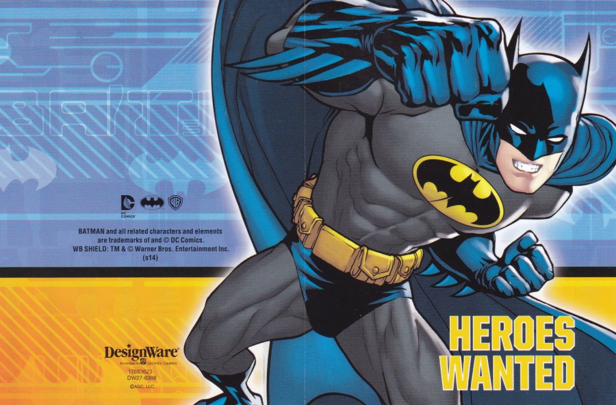
HEROES WANTED
Folded Invitation card
Here I have opened up the ‘invite’ folded greetings styled card from the Batman pack, by ‘DesignWare’. Again, I think the image is really good and the card comes as an added item to keep an example of, with the above postcard.

FAR LEFT
MARVEL – ULTIMATE SPIDER-MAN
Published by
‘DesignWare’
NEAR LEFT
CAPTAIN AMERICA – CIVIL WAR
Published by
‘DesignWare’

POSTCARD
MARVEL – ULTIMATE SPIDER-MAN
‘THANK YOU!’
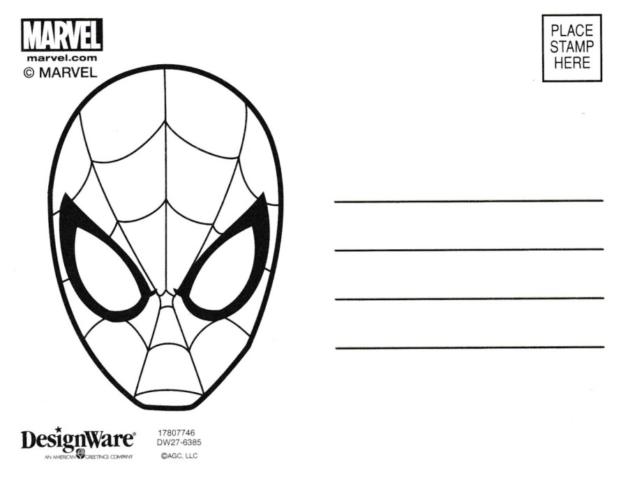
REVERSE SIDE OF ABOVE POSTCARD
Another nice example of where the company have also made the reverse side attractive as well

POSTCARD
CAPTAIN AMERICA – CIVIL WAR
‘THANK YOU!’
Here you get both Captain America and Iron Man, surely this would be a popular postcard.
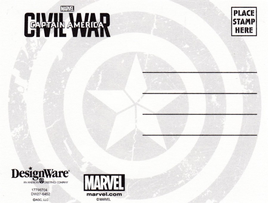
REVERSE SIDE OF ABOVE POSTCARD
The reverse side has the Captain America shield pattern across it (an added bonus for collectors)
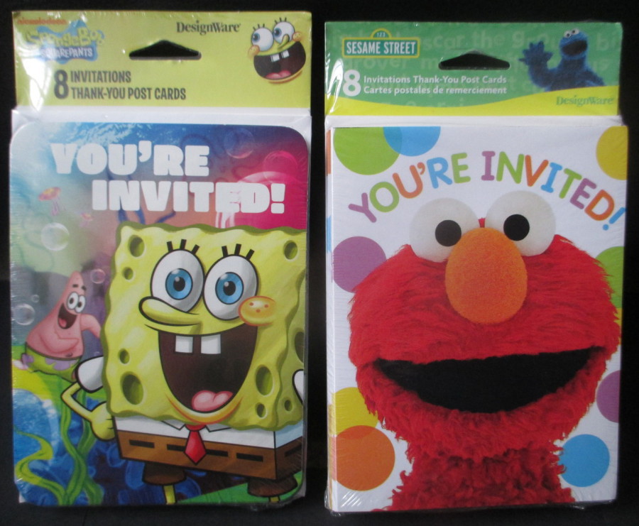
FAR LEFT
SPONGEBOB SQUAREPANTS
Published by
‘DesignWare’
NEAR LEFT
SESAME STREET
Published by
‘DesignWare’

FAR LEFT
THANK YOU! Postcard from the Spongebob Squarepants pack. This postcard has rounded corners (as mentioned on the previous posting, some of these postcards have this rounded corner cut)
NEAR LEFT
THANK YOU! Postcard from the Sesame Street pack. Here you have Big Bird, Elmo and my favourite the Cookie Monster

FAR LEFT
BLAZE AND THE MONSTER MACHINES
Published by
‘DesignWare’
NEAR LEFT
DISNEY PIXAR CARS
Published by
‘DesignWare’

POSTCARD
BLAZE AND THE MONSTER MACHINES – ‘THANK YOU! – VROOOOM!’
Now, when I saw this pack on the shelf I had never heard of ‘Blaze’, but because it had the ‘Nickelodeon’ logo in the top left corner I assumed it was related to a television programme. So, I bought the pack. I later checked and found I was correct about the television connection. Interestingly, last week I was at a friend’s house and their two-year old boy was watching Blaze on TV.

POSTCARD
THANK YOU!
DISNEY – PIXAR – CARS
Another postcard for my Disney collection
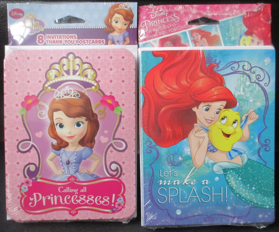
FAR LEFT
SOFIA THE FIRST
Published by
‘DesignWare’
NEAR LEFT
DISNEY PRINCESS
(Ariel)
Published by
‘DesignWare’
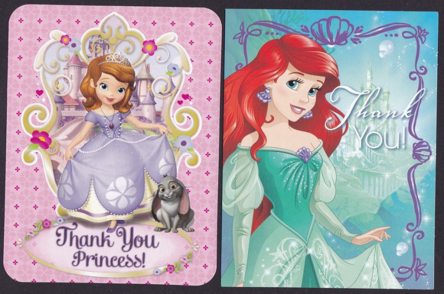
FAR LEFT
POSTCARD
“CALLING ALL PRINCESSES!”
Another Disney postcard related to a Disney Channel children’s programme. Although I had also not actually ever watched any of this programme I did at least know who she was. This is another round cornered postcard.
NEAR LEFT
“THANK YOU!” POSTCARD
Yet another Disney postcard and it depicts the Little Mermaid Ariel, although here she is depicted after she has legs, instead of her fish tail. Makes for an unusual Ariel postcard.
FAR LEFT
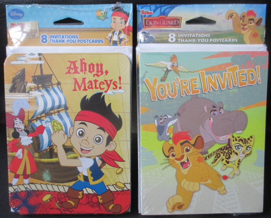
JAKE AND THE NEVER LAND PIRATES
Published by
‘DesignWare’
NEAR LEFT
DISNEY JUNIOR - THE LION GUARD
Published by
‘DesignWare’
POSTCARD
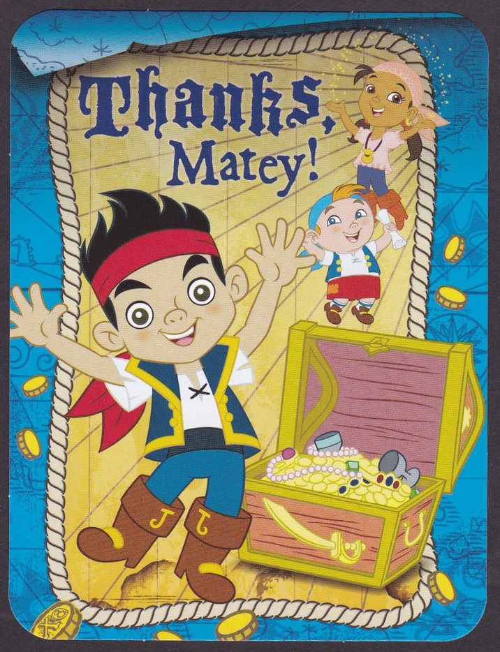
JAKE AND THE NEVER LAND PIRATES
“THANKS, MATEY!”
A postcard with rounded corners
Not sure Jake is as popular as he was a few years ago, but he still makes character appearances at the Hollywood Studios and children still flocked to him for photographs.

POSTCARD
Disney’s ‘The Lion Guard’
This was a programme that I was unaware of. I assume the lion cub character is the son of Simba from the animated film ‘The Lion King’. When I saw this ‘pack’ I knew it had to be related to a television animated series. I clearly bought the pack but I later saw posters of the characters alongside the railway line in the Animal Kingdom theme park.

FAR LEFT
THE GOOD DINOSAUR
Published by
‘DesignWare’
NEAR LEFT
MOANA
Published by
‘DesignWare’

POSTCARD
THE GOOD DINOSAUR
This is my first postcard related to this Disney – Pixar animated film. Interestingly the ‘THANK YOU!’ postcard does not depict the two main characters. This card depicts the dinosaurs that help the main characters in the film. I think it is a cracking postcard and is another one with rounded corners.
I actually watched this film on television once I got back home from America.

POSTCARD
MOANA
Another first! This animated Disney film was a recent release and whilst we were in the ‘Hollywood Studios’ Theme Park we saw a ‘20 minute’ preview of this film and I must admit that it looks good. So, another first for me as a result of buying these packs.
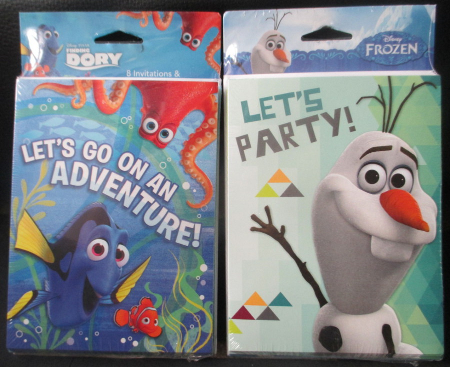
FAR LEFT
DISNEY PIXAR – FINDING DORY
Published by
‘DesignWare’
NEAR LEFT
DISNEY – FROZEN
(OLAF)
Published by
‘DesignWare’

FAR LEFT
THAAAANK YOOUUU!! - POSTCARD
FINDING DORY
Dory takes centre stage on this postcard. When I bought this ‘pack’ I had not yet seen the film but it was one of the films available on the return flight from America, see I saw it then.
NEAR LEFT
THANK YOU! OLAF POSTCARD
An exceedingly popular character from one of Disney’s most popular recent animated movies. Everybody seems to love Olaf (although in my mind he sings by far the worse song in the film).

FAR LEFT
DISNEY – FROZEN
Published by
‘DesignWare’
The folded invite card which can be seen at the front actually opens up in the opposite way to all of the ones depicted above
NEAR LEFT
DOC McSTUFFINS
Published by
‘DesignWare’
This one also has a folded invite card which is round the other way and opens upwards

FAR LEFT
DISNEY FROZEN ‘THANK YOU!’ POSTCARD
Again, you have Olaf, in what is a mirror image of himself from the postcard depicted on the previous postcard he appeared on (above). But here you also get the princesses as well. I suspect this pack has been extremely popular
NEAR LEFT
THANKS! POSTCARD – DISNEY’S ‘DOC McSTUFFINS’
Another fairly new (I think) Disney animated television series, one which I did know about when I found this pack. As with some of the other more uncommon animated programmes this was the first related postcard I had found.
FAR LEFT
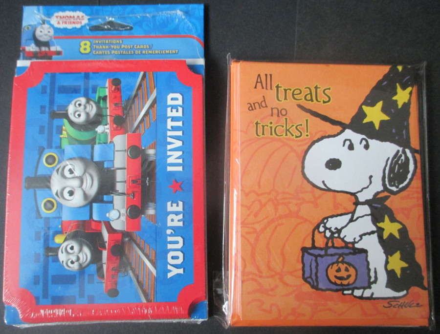
THOMAS THE TANK ENGINE
Published by
‘DesignWare’
NEAR LEFT
PEANUTS – SNOOPY
“All treats and no tricks!”
Published by
Hallmark
This is a pack I saw amongst the Halloween items, which were still on sale despite my visit to America being in November!! As with the Batman pack shown above this one contains just folded greetings styled invite cards, but who could resist a Halloween invite pack? Not me clearly!

POSTCARD
THOMAS THE TANK ENGINE – ‘THANK YOU!’
Thomas the Tank Engine is highly collected in the UK, but I was surprised to find that he also warranted one of these packs. The postcard is also a really good one.
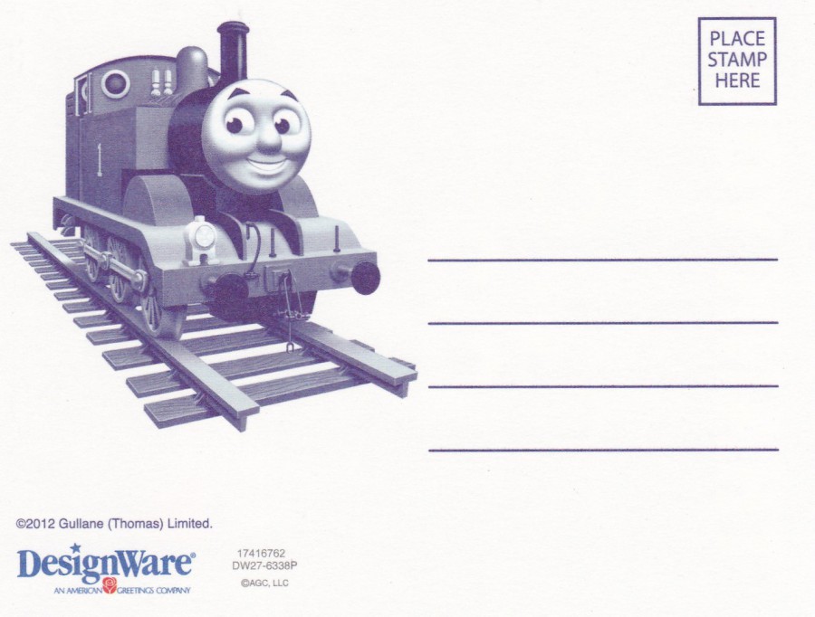
REVERSE SIDE OF ABOVE POSTCARD
This was worth showing you as the blue toned image of Thomas is really good.
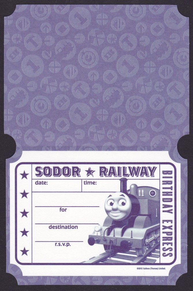
OPENED INVITE FOLDED CARD
You can see the front of the folded invite card showing through at the front of the whole package above. It has concave corners, which is unusual, but, it was when I opened one of these cards that I found something nice. The invite is designed like an Express Railway Ticket for the Sodor Railway (and I am sure you all know that Thomas runs on the tracks which are located on the island of Sodor)
So, have I tempted anyone? If so when you next visit America, or know anyone who is visiting, take a look, or ask them to, in any supermarkets or stores and see if you can obtain some of these, the designs make it well worth it. Good Luck.
17/12/2016
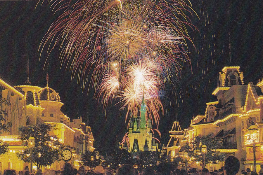
WALT DISNEY WORLD
FANTASY IN THE SKY
“The sky over the Magic Kingdom’s regal Cinderella Castle explodes with brilliant color at night in the traditional Disney fireworks display”
(Text from Reverse side of Postcard)
This particular postcard is no longer on sale in the theme parks but has only recently been removed from sale. In November I found copies on sale in the Disney Outlet store in the ‘Outlets Shopping Area’ at the end of International Drive. It was only 10cents. Therefore, I thought it was the ideal postcard to send home to myself as my posted souvenir.
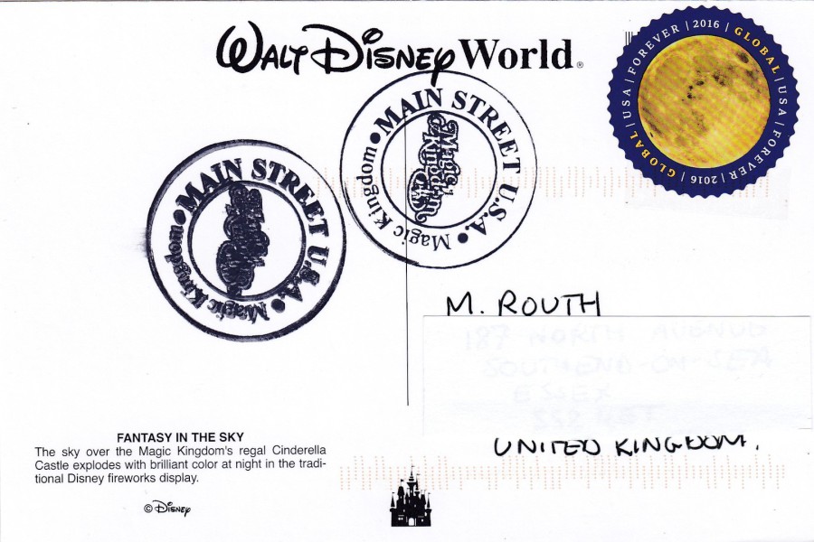
REVERSE SIDE OF ABOVE POSTCARD
I have been after a postcard used with the latest USA Moon ‘Forever’ (which means that the stamp can be continued to be used for the Global postage rate regardless of any price increase) stamp for awhile, since its release earlier this year. This was the perfect opportunity to use this stamp.
At the Magic Kingdom theme park you can have a cachet placed on your mail. The cachet reads ‘MAIN STREET U.S.A. Magic Kingdom’. The availability of this cachet is not publicised and is only really obtained by those who know of its existence, so, let me add you all to this group.
Once you have arrived at the Magic Kingdom Park entrance, after your ferry or monorail journey, you have to go through a bag check and then through the magic bands/tickets stiles. Once on the other side, and before you go through the arches under the railway line and station immediately above, take a look to your left side and there is a small open fronted gift shop area in the very far corner. Here is where you can obtain your cachet. They also sell stamps here. Outside the gift shop on the right side (if you are facing the gift shop front) there is a wall mounted post box as well to put your cards or envelopes in.
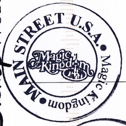
CLOSE UP OF CACHET
17/12/2016
PACKS & CARDS
CHRISTMAS CARD
I am not sure if I have mentioned this before but the PHQ Stamp Cards I collect I receive from a company called ‘Packs & Cards’, with whom I have a standing order.
This morning I received a Christmas Card from them along with a bar of chocolate with a special wrapper. The Christmas card is attractive and the front image (it is a traditional folded card) appealed to me especially as it is ‘Postcard’ based. The card itself is a charity card on behalf of the ‘Alzheimer’s Society’.
www.packsandcards.com

CHOCOLATE BAR
This has a cracking wrapper which includes within the queen’s head a selection of items sold by the company and released by Royal Mail as either a stamp pack or a postcard. As such, there are four PHQ stamp Cards included.