Email: markspostcardchat@gmail.com
15/08/2020
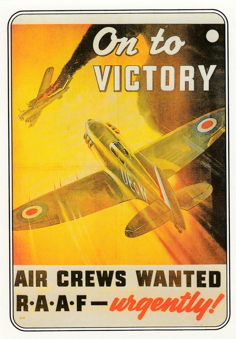
ON TO VICTORY
AIR CREWS WANTED
R.A.A.F. – URGENTLY
Published by
EDEN CAMP
Eden Camp Modern History Theme Museum
Posted in Commemoration of
V. J. DAY
(Victory in Japan)
I was in Plymouth today and it was a good place to be on the anniversary of V.J. Day as there were many naval veterans present for a service of remembrance. Back at home I do have some VJ related cards, but I am in Devon many miles from those, but I did have this WWII poster design scanned into my laptop, so this will have to do. V. J. Day of course, brought-to-an end WWII. This did not of course end the suffering of many Prisoners of War and refugees who were stranded across Europe and Asia. Some of these still had some bitter struggles ahead, but for many soldiers, airmen and naval personnel the bitter fighting was over and although it would take time, many could now consider returning home.

14/08/2020
JAT
YUGOSLAV AIRLINES
AIRBUS A-319
Official Yugoslav Airlines Postcard
IZDANJE MEDIA CENTAR JAT-a
Ref: AVION ZA XXI VEK
I have had this one for a while, but came across it in my scans and thought, what with all the travel disruptions we have all had to put up with (I have had three holidays cancelled, two of which were abroad) why not put on a picture of a cartoon aeroplane, especially as so few passenger ones have been flying this year, and it is a nice postcard.
14/08/2020
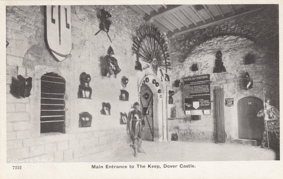
MAIN ENTRANCE TO THE KEEP
DOVER CASTLE
Published by
GALE & POLDEN LTD
Ref: THE WELLINGTON SERIES
7212
A nice clear early black and white postcard image from this prodigious military theme postcard publisher. I have had the pleasure of several visits to Dover Castle and have been standing roughly where the photographer was when this image was taken.
REVERSE SIDE OF ABOVE POSTCARD
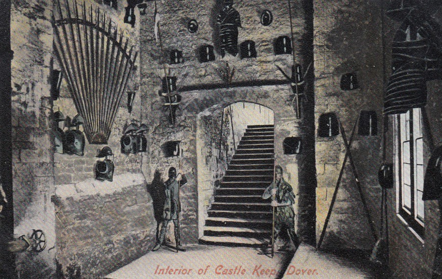
INTERIOR OF CASTLE KEEP, DOVER
Published by
TIMES AND GUARDIAN
(Times & Guardian Series)
Ref: 200686
A different section of the same keep, on what I believe to be an earlier postcard image to the one depicted above. It is always nice to have more than one postcard of a certain building, structure or individual part of a structure, like a room or keep, as is the case with this card. Variety makes a collection or theme more interesting.
REVERSE SIDE OF ABOVE POSTCARD
14/08/2020
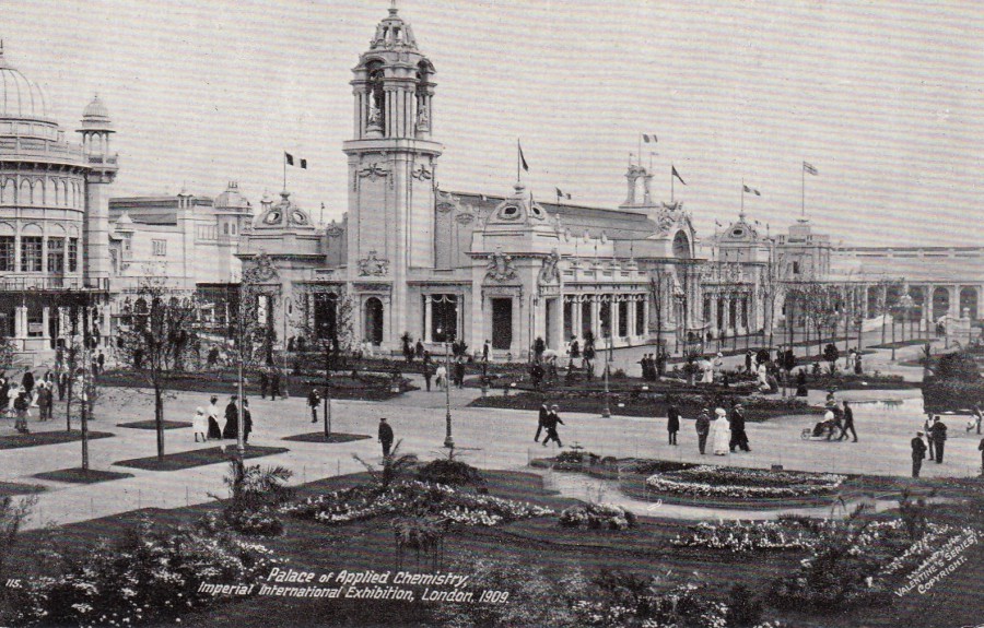
PALACE OF APPLIED CHEMISTRY
IMPERIAL INTERNATIONAL EXHIBITION
LONDON 1909.
Published by
VALENTINE & SONS
Official Imperial International Exhibition Postcard
Ref: 115
I have shown a number of exhibition view postcards from around this period, which was the height of the Exhibition craze, with many such events being held in London at the ‘White City’ location. I like these postcards because the buildings they depict look amazing, and thankfully, as so many were printed and sold, these can be easily found and are often cheap as well (around £1 each, although I have been fortunate to find some priced at just 50p, but normally the very common images).
This ‘particular’ exhibition ran from May (20th) to October. This was the second of five exhibitions to be held at the London White City location. The structures here look great and I kind of wish they could have been saved and we could still see them for real, thankfully we at least have all the postcard images to show us what we are missing.
REVERSE SIDE OF ABOVE POSTCARD
14/08/2020
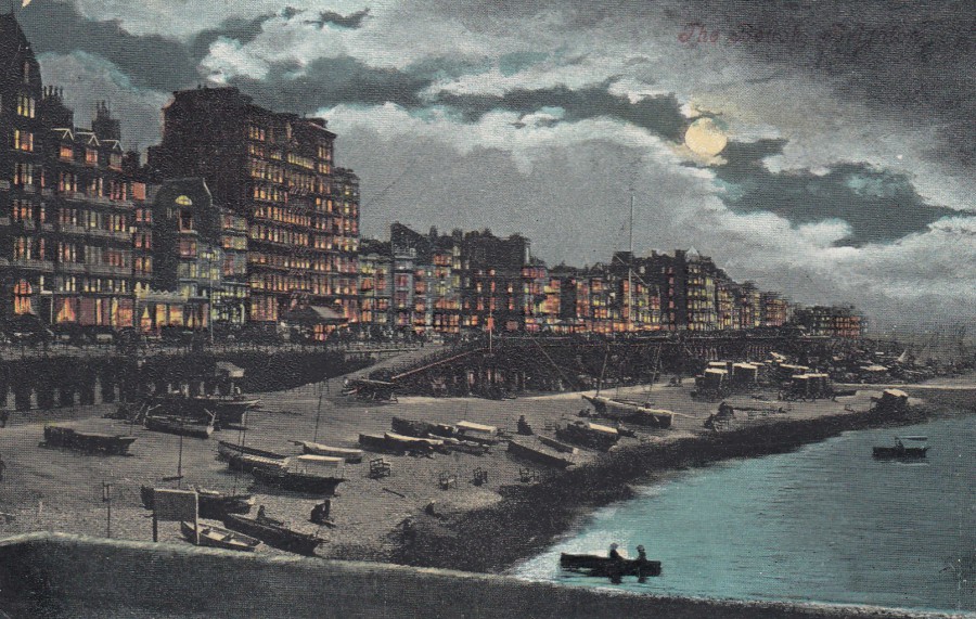
(Unreadable Title – top right corner on front)
The Beach…?
Published by
VALENTINE’S
A nice night-time beach scene but unfortunately the location printing top right is so bad you can not make out where this is supposed to be. I have my money on somewhere in Kent, but that is not confirmed in any way. It was posted within Tunbridge Wells, with the stamp cancelled Southborough, Tunbridge Wells, in 1911, but this location is nowhere near the sea, so the postal usage is not connected with the location. The fact that I do not know where this is does not detract from how nice the card is, it is just that I would not mind having a bit of an idea.
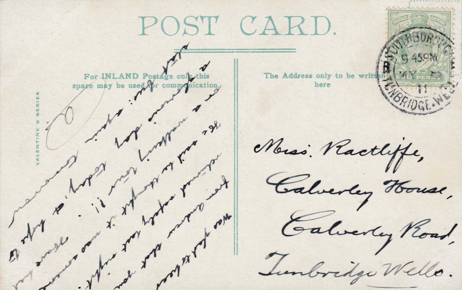
REVERSE SIDE OF ABOVE POSTCARD
13/08/2020
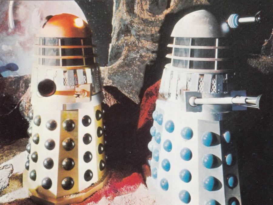
UNTITLED
DALEK POSTCARD
LONGLEAT EXHIBITION
Published by
BBC ENTERPRISES
One of, if not the, best, Dalek postcard issued. When I was a kid my family visited Longleat Safari several times. I obviously loved the animals and all that, but my favourite bit to visit was the Dr Who exhibition which was full of costumes and models from the television series. Everyone who visited this little exhibition received this postcard free. It is one of the most collectible Dr Who postcards around. It depicts the Daleks on display at the Longleat exhibition. It is recorded with three slightly different reverse combinations. Firstly, there is this one, with the big block of text at the bottom on the left side and the second block of black text further up. The second, comes a version which has all that this one has but also has a block of blue coloured text included on the left side. Lastly you have the scarce version. This has the two blocks of printed black text, but it also has a block of text typed onto the card top left. This version is believed to have had an extremely short shelf life between the two previously mentioned types. It is so scarce that collectors have only recorded one surviving copy so far, which was found on sale at a Dr Who convention in the 1990’s. It has crease damage but is so unusual a version that this does not detract too much from its value. The lucky collector who found it amongst a dealer’s stock was delighted to have come across such an unusual and unrecorded type (I know, because I was that collector, he says, smiling).
REVERSE SIDE OF ABOVE POSTCARD

13/08/2020
WHITBY
YORKSHIRE
GOTHS WELCOME
Whitby, North Yorkshire, England – Where Goths come to play
Published by (or at least the design is by)
NEVILLE RHIND
2016
Its been nearly a week since anything appeared here, which is unlike me, but we have been on a campsite in Longleat since Saturday afternoon and there was no easy access internet or wifi there, so I have had a break (forced upon me, but still a break). Postings were still made to my facebook page whilst we were out and about in Wells, Bath, Cheddar and Stonehenge, but we moved to Devon today and we are now at a different campsite, one which appears to have some internet and wifi access (Yay!). So, what to post first? Well, another of my recent breaks was to York (about three weeks ago now – we had internet and wifi there so postings did continue during that break) from where we visited Whitby (the subject of a few postings since). This is another of the cards bought on that most recent of visits. My eldest son and his wife like Whitby for its ‘Goths’ connections.
07/08/2020
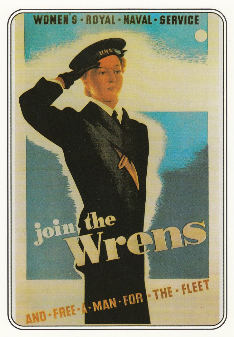
JOIN THE WRENS
World War II Poster
Published by
EDEN CAMP
(Eden Camp Modern History Theme Museum)
I bought this during our visit two weeks ago. With some of the WWII posters you can find them pictured on cards by more than one company. This is not uncommon as some of these posters are well known and iconic even. Unlike some collectors who only want one image of a poster I like to collect them across all the different publishers.
This poster is a classic one, well loved and reproduced in many books and across other media, but I was unaware of one little fact related to it which I discovered whilst walking around the Eden Camp. The image used here is based on an actual person and full details are displayed at the museum as you can see from the below image.

PHOTOGRAPH
23RD July 2020
EDEN CAMP
MUSEUM DISPLAY SHEET
This is how you learn more about postcards in your collection. Connections like this make collecting both fun and educational. I immediately recognised the image and took this photograph so that I had the information to show you.
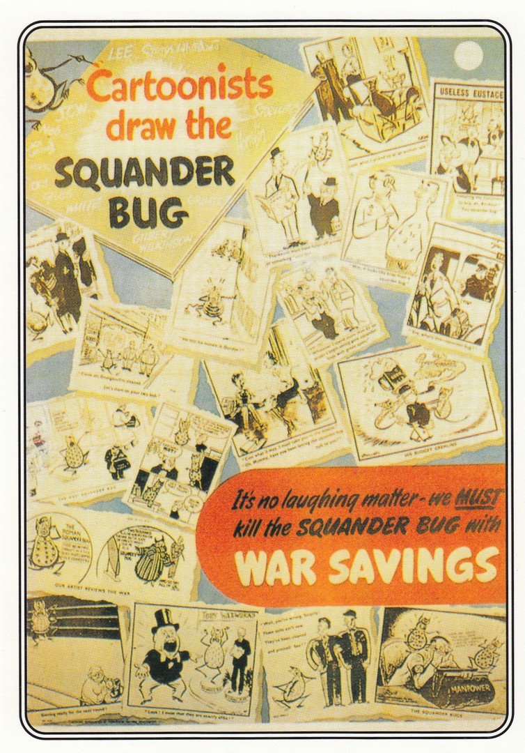
CARTOONISTS DRAW THE
SQUANDER BUG
World War II Poster
Published by
EDEN CAMP
(Eden Camp Modern History Theme Museum)
The Squander Bug was a well-known WWII created character designed to get people to not waste any material, especially food scraps and leftovers etc.
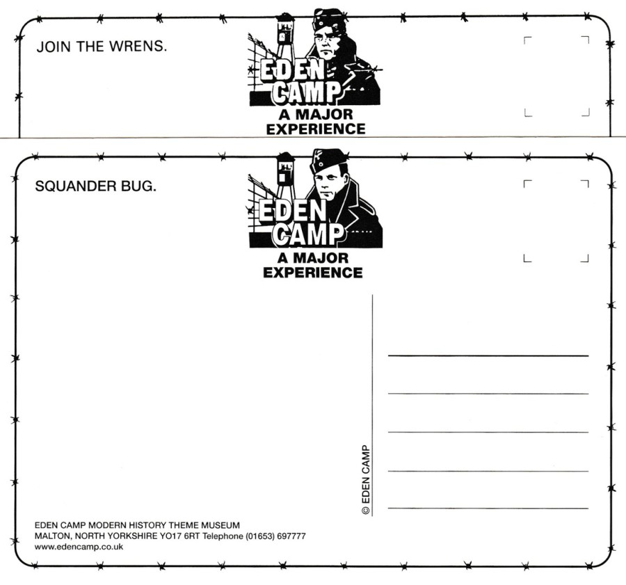
REVERSE SIDES OF THE ABOVE TWO POSTCARDS
I have shown these two cards together because the logos on the reverse side are slightly different. If you check the POW’s face the top card has much more darkness down the right side of the face as you look at it. Most of the cards I saw on sale on this visit had this blacker print logo, which I believe is a printing flaw, although a near constant one across the cards.
The bottom one has the much clearer face image and is the logo as it should appear, although clearly that is not the case as can be seen from this combined image.
07/08/2020
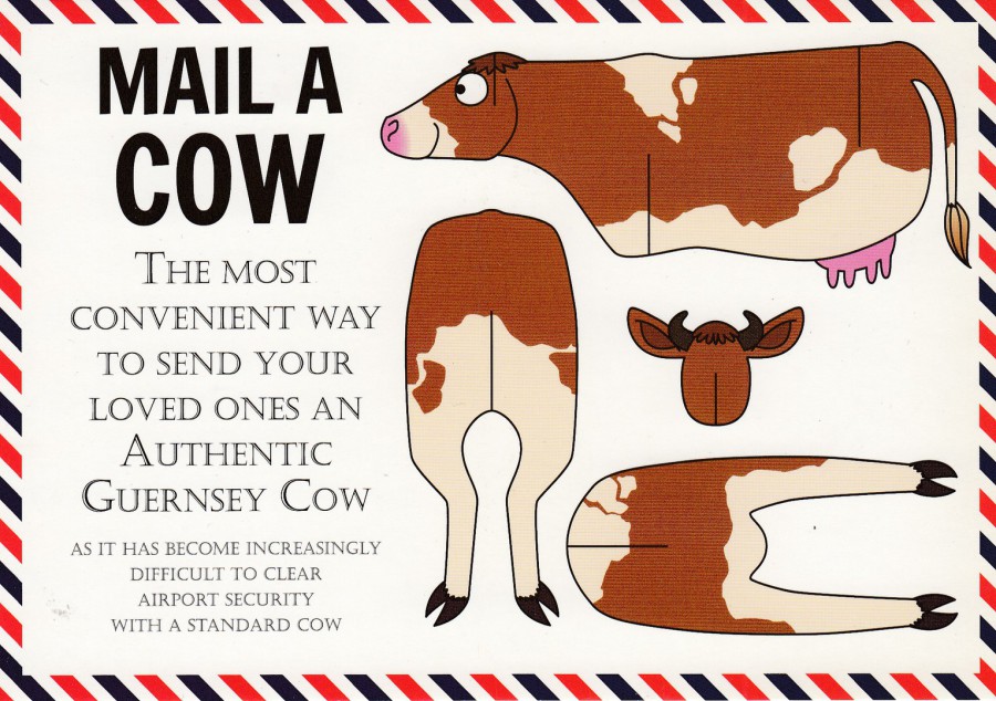
MAIL A COW
The most convenient way to send your loved ones an authentic Guernsey Cow
Published by
GREEN BANANA CARDS
2013
I love this card, and I particularly like the sentence that reads “AS IT HAS BECOME INCREASINGLY DIFFICULT TO CLEAR AIRPORT SECURITY WITH A STANDARD COW”. There is a humour here which is ‘definitely’ down at my childish level, and anything that can give you a giggle is worthwhile. There are a few of these in the set but unfortunately, I only have two of them (I would love to find a copy of the Lobster one, which I don’t have)
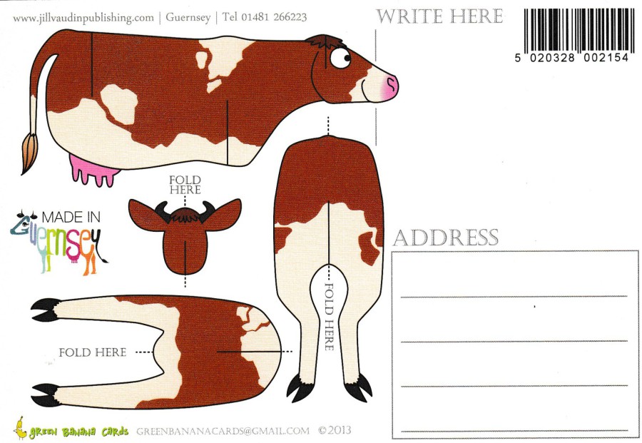
REVERSE SIDE OF ABOVE POSTCARD
This is as good as the front
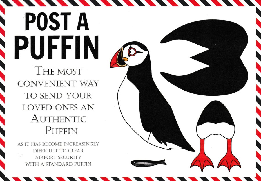
POST A PUFFIN
The most convenient way to send your loved ones an authentic Puffin
Published by
GREEN BANANA CARDS
2013
Companion card to the above Guernsey Cow one. I do like bird themed postcards, but, here I have to admit that this time it is the cow one which is my favourite.
REVERSE SIDE OF ABOVE POSTCARD

06/08/2020
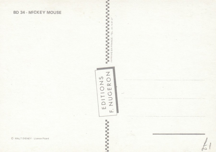
MICKEY MOUSE MAGAZINE
MAY 1939
Published by
EDITIONS F. NUGERON
Ref: BD 34
By now it should be clear that I love a bit of Disney (as I am typing this I am watching YouTube videos of Disney World from 2019 and feeling sorry for myself that I will not be visiting this year now my sept/oct holiday has been cancelled). Anyway, one thing I do like to look out for is Disney related postcards which depict more unusual and lesser known Disney characters. This magazine cover depicts the three little pigs and the big bad wolf, and these certainly do not often crop up.
This postcard is one of those which is worth hunting down as the Editions F. Nugeron postcards are very collectible, so expect to pay £2 or more for this card.
REVERSE SIDE OF ABOVE POSTCARD
05/08/2020
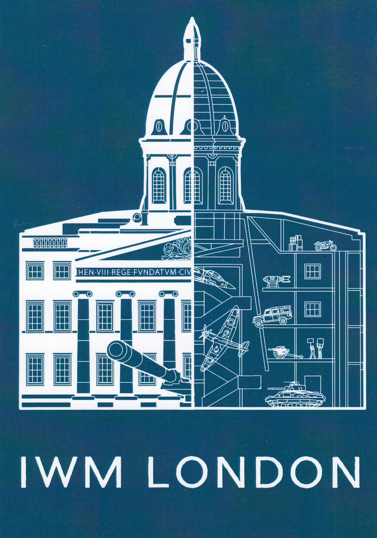
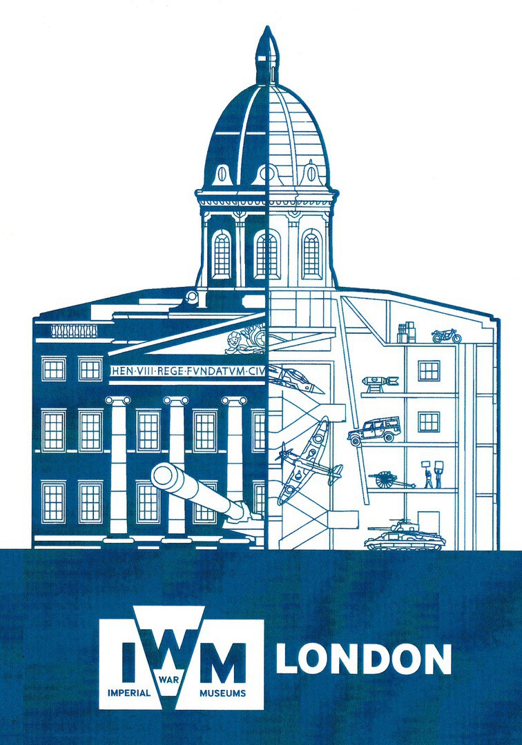
IWM LONDON
(Imperial War Museum)
Published by the
Imperial War Museum
Ref: PPO1880
The Imperial War Museum reopened on the 1st August, so you can visit here again. This superb exclusive postcard was on sale when I last visited around a year ago.
IWM LONDON
(Imperial War Museum)
IWM LONDON BLUE POSTCARD
Published by the
Imperial War Museum
Ref: PPO1880
This sister postcard to the one depicted above has the same reference number but is clearly a different design. I like both of them (but it will be fun in the future for those trying to compile checklists)
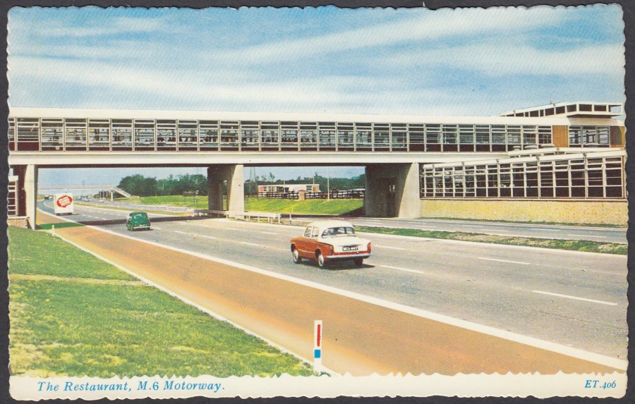
05/08/2020
THE RESTAURANT
M6 MOTORWAY
Published by
VALENTINE & SONS LTD.,
DUNDEE & LONDON
Ref: “VALENTINE’S VALCHROME”
ET.406
I shall be driving away again on Saturday for another break in the campervan. I shall be driving along the M4, but I do not have postcards of that motorway, but I do have some interesting early ones for the M6. I love these postcards because they show a different view of these motorways which is nothing like they are today. Can you imagine driving along this motorway with it being as quiet as it obviously is here. These are historically important and fascinating cards which have been growing in value over the past few years, despite many appearing in a book called ‘Boring Postcards’, actually, I think they are anything but.
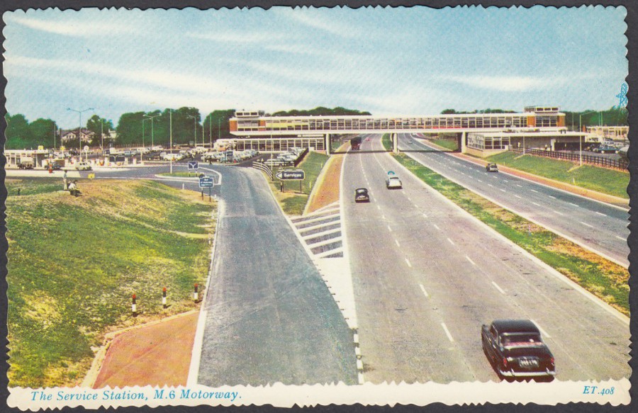
THE SERVICE STATION
M6 MOTORWAY
Published by
VALENTINE & SONS LTD.,
DUNDEE & LONDON
Ref: “VALENTINE’S VALCHROME”
ET.408
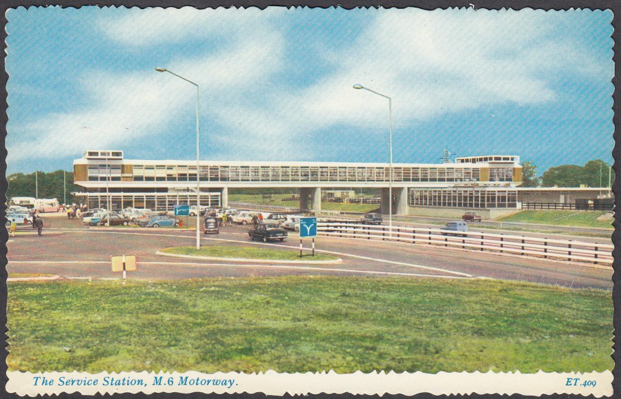
THE SERVICE STATION
M6 MOTORWAY
Published by
VALENTINE & SONS LTD.,
DUNDEE & LONDON
Ref: “VALENTINE’S VALCHROME”
ET.409

03/08/2020
A SHORT SUIT WITH –
(Turn Over)
THE LONG LOOK!
By
AMIN
Published by
COASTAL CARDS LTD (Clacton-on-Sea)
Ref: ‘AMERICAN’ SERIES
A.19
A seaside design which was published by a company that was based here in my home county of Essex in the town of Clacton-on-Sea (a place not that different to my own hometown here in Southend-on-Sea). This is a nice little postcard, although ‘definitely’ not one that would pass the PC checks today. I do like the fact that the front design is also connected to a small image on the reverse side.
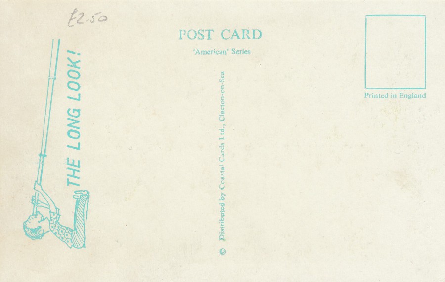
REVERSE SIDE OF ABOVE POSTCARD
03/08/2020
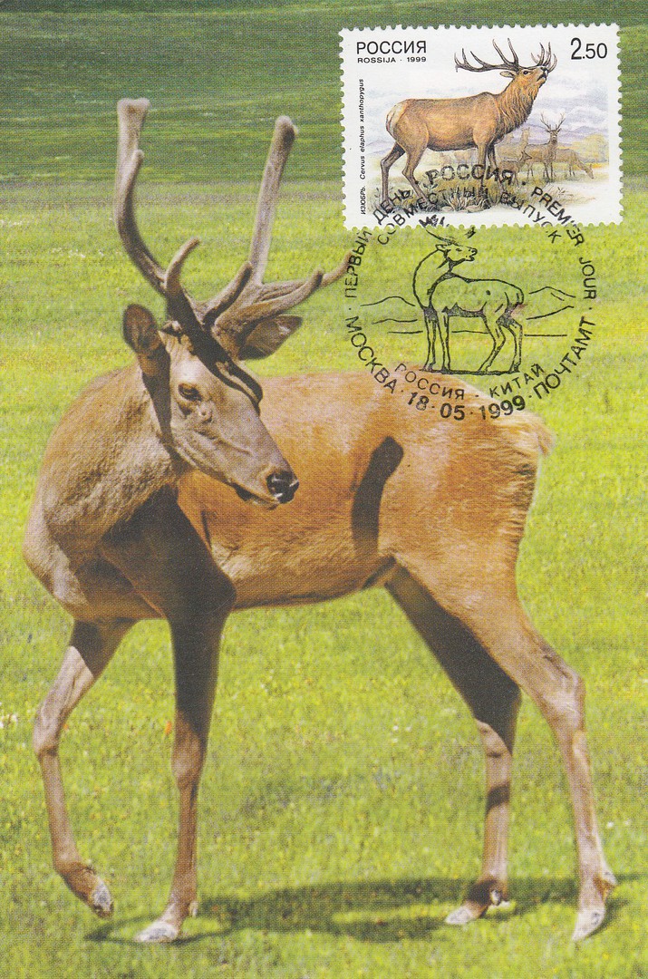
RED DEER
Chinese (possibly Japanese, but I think Chinese) Postcard
Used with Russian ‘Red Deer’ postage stamp
Cancelled with a Moscow Red Deer special cancellation
I recently acquired a collection of animal related maxi-cards from an American collector, so expect to see a few of these cards here on the webpage. This is a very nice red deer card, one which I strongly believe is Chinese (but I do not know the difference between Chinese and Japanese text, although I have gained a feel for the difference between Chinese and Japanese reverse layouts, which is why I believe this is a Chinese card). Despite the Asian origin of this postcard someone has used it here to obtain a special Moscow red deer cancellation on a Russian red deer stamp. The combination is quite nice.

REVERSE SIDE OF ABOVE POSTCARD
03/08/2020
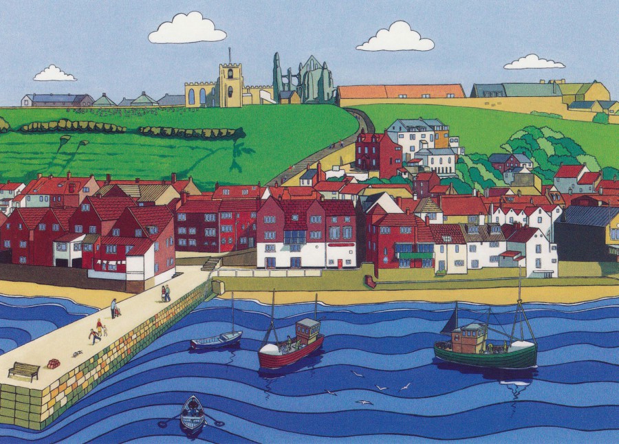
WHITBY HARBOUR
Illustration by
RON DUNN
Published by
AMMONITE DESIGN
2010
Ref: D163
By now my love of Whitby should have become clear, what with the postcards I have already posted since my visit a couple of weeks ago. That is probably why I bought this delightful art card showing the view up towards the ruined abbey and the church, places which I always visit and which I love walking around. A card like this can invoke fond memories of a visit.

03/08/2020
HARRY POTTER
POSTCARD SET OF 5
Original Packet
Published by
ABYSTYLE
I picked up this packet of five postcards from a shop located in the famous ‘The Shambles’ shopping street in York. I found it in a Harry Potter themed shop. I have a large selection of Potter themed postcards but had not seen this set before. The set consists of heraldic designs for the main school and then all four houses within the school, all well known to the readers of the books and the viewers of the equally popular feature films based on the books.

HOGWARTS
Main School Crest
Published by
ABYSTYLE

HOGWARTS
HUFFLEPUFF
Published by
ABYSTYLE
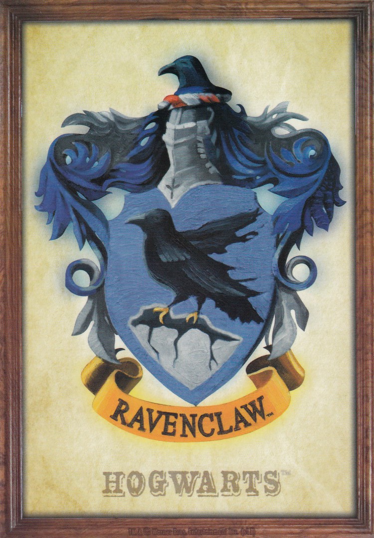
HOGWARTS
RAVENCLAW
Published by
ABYSTYLE
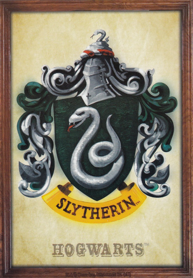
HOGWARTS
SLYTHERIN
Published by
ABYSTYLE
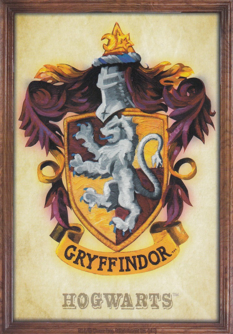
HOGWARTS
GRYFFINDOR
Published by
ABYSTYLE

STANDARD REVERSE SIDE FOR ALL FIVE OF THE ABOVE POSTCARDS
02/08/2020
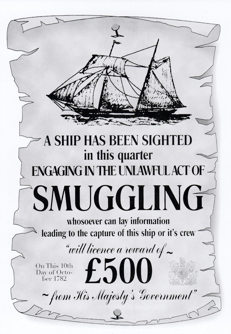
A SHIP HAS BEEN SIGHTED
IN THIS QUARTER
ENGAGING IN THE UNLAWFUL ACT OF
SMUGGLING
Published by
AMMONITE DESIGN
2009
Ref: 000BW
I bought this delightful scroll/poster like design postcard whilst I was in Whitby just over a week and half ago, give or take. I enjoy finding postcards like this as they can make a trip to somewhere all-the-more memorable.

02/08/2020
UNTITLED
STAR WARS CHARACTERS
By
ALE GIORGINI
Published by
STAR EDITIONS LTD
Ref: ALMOVIE001PC
I have a more than reasonable collection of Star Wars themed postcards, I’m not a completist where these are concerned, but I can not resist something unusual when I see it. This one I recently found in a ‘paperchase’ branch.

31/07/2020
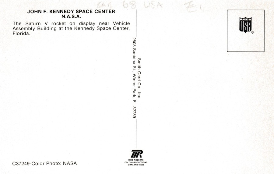
KENNEDY SPACE CENTER
FLORIDA
Published by
SMITH CARD CO., INC
Printed by
MIKE ROBERTS COLOR PRODUCTIONS, OAKLAND
Ref: C-37249
“The Saturn V rocket on display near Vehicle Assembly Building at the Kennedy Space Center, Florida”
(Text from reverse side of postcard)
When I visited here for the first time in 1993 this was how I first saw the Saturn V rocket, laid down and nearly all joined up outside in the open air. I remember the coach-tour stopping off here and walking around the rocket. When I returned for my second visit in 2018, there was quite a gap between our visits (which had nothing to do with the fact that Jo, my wife, had not enjoyed the first visit at all!!), the Saturn V rocket had been moved to a new location in a purpose built building where the individual rocket segments are all suspended from the ceiling allowing you the ability to walk underneath them. I prefer the new attraction as you see more and you are in a nice air-conditioned building, but part of me remembers with great fondness that first outside walk around one of the worlds engineering masterpieces.
REVERSE SIDE OF ABOVE POSTCARD
31/07/2020
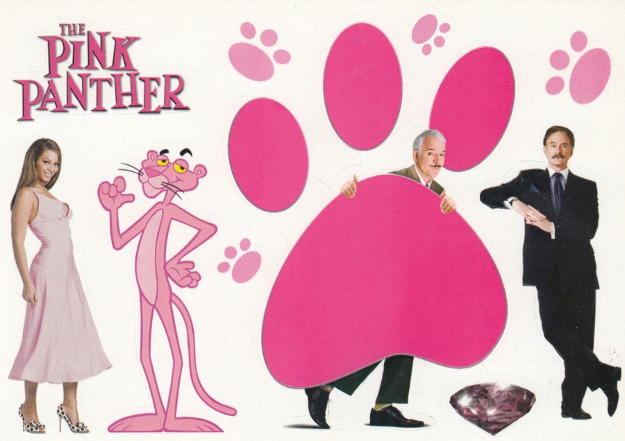
THE PINK PANTHER
Novelty Stickers Postcard
‘Out on DVD 17TH July’
Published by
BOOMERANG (CINEMA)
Nowhere near as good as some of the earlier Peter Sellers Pink Panther films, but possibly (he says waiting for the backlash) a little better than the last few, this new version starring Steve Martin as Insp Clouseau, from 2006, was at least sometimes watchable. Having said that, this sticker postcard is superb and well worth hunting down.

31/07/2020
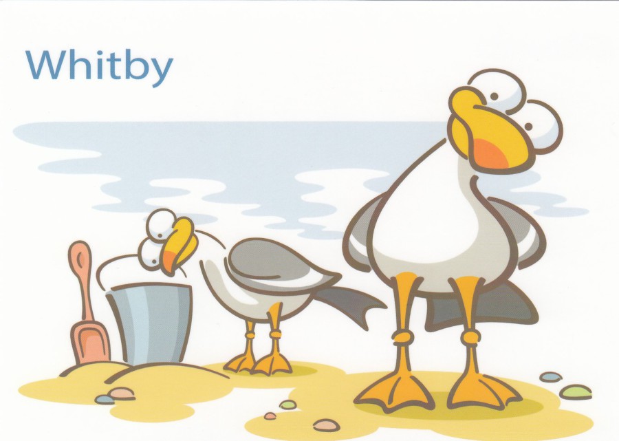
WHITBY
(CRABS)
Published by
KANDY TOYS LTD
Ref: LANDMARK SOUVENIRS
TU6833
This one is a lot more ‘sunnier’ and ‘bright’ than the dark scary Whitby card I depicted yesterday. I suspect this one is far more popular as well, although perhaps not with the goth fraternity that often visit Whitby. I saw this one on a wall mounted rack outside a souvenir shop not too far from the beach. Its bright colours were appealing to the eye, and that is what true tourist postcards are supposed to do. Being thus attracted I had to buy a copy, my own tourist souvenir.
REVERSE SIDE OF ABOVE POSTCARD
I had not heard of ‘KANDY TOYS LTD’ or their ‘LANDMARK SOUVENIRS’ Having looked at the skyline that appear in the logo there is an obvious London theme here so I suspect the company is based in the capital, which is a long way from Whitby. Having looked at this one now I wonder if these crabs cannot be found on a number of these postcard up and down the country in other locations. I would be interested to hear from anyone who has seen these same crabs on a beach card for another location… I bet they are out there.
31/07/2020
WHITBY
(SEAGULLS)
Published by
KANDY TOYS LTD
Ref: LANDMARK SOUVENIRS
TU5842
From the same company as the above crab card I might ‘actually’ prefer this one (nobody tell the crabs). This is another card which would equally fit in anywhere along our tourist coastline with just the location name needing to be changed. It would certainly fit in here in my hometown. You gotta love these cheeky looking gulls.

30/07/2020
“’IM? ‘ES MY OLD MAN, DEARIE…
CHAMPION BREAST-STROKER IN THE NAVY”
Published by
JESTER EDITION
Ref: 124
I have a theory as to why there is a current fascination with the saucy seaside postcards of the past decades. I believe the current very ‘PC’ world situation, and sentiment, has had the effect of drawing people towards these earlier, naughtier and ‘definitely’ not ‘PC’ designs. For some it is a ‘grab towards’ what they believe was a better time, a more open time, although there is a counter argument that these images and ideas were sexist, and to be honest, they were. Are they out of place today? The simple answer, and correct one is yes, but they have a place in the postcard history story, if not the general story of British modern history. They are iconic and I honestly believe they are going to become even more collectible as time passes on and the world, quite rightly, becomes a place of equality for more people, and hopefully, eventually, everybody.

REVERSE SIDE OF ABOVE POSTCARD
I love the logo used by this company. It makes the reverse side of this postcard, to me anyway, as interesting as the front

30/07/2020
MEOWLTING
2016
Published by
BRAINBOX CANDY LTD
Ref: BCP130
(PO 7363)
Another great postcard which can be found in some of the many ‘paperchase’ stationery stores up and down the country. Despite the year date of 2016 I bought this one just last week in the York branch. It is a simple design, but it is a great one, and I love the title.
30/07/2020
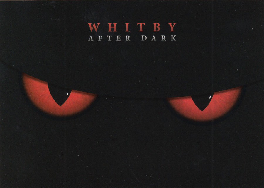
WHITBY
AFTER DARK
Published by
AMMONITE DESIGN
2013
Ref: 1656
Picked this one up in Whitby on my visit there last week. I love Whitby and part of what I love is its adored connection with Bram Stoker and his famous book ‘Dracula’. Having read the book, I must admit my favourite part of the story is the part set in Whitby, and I think the scariest part as well. If you visit here now you will find a selection of horror themed postcards on sale, like this one, and some are superb.
30/07/2020
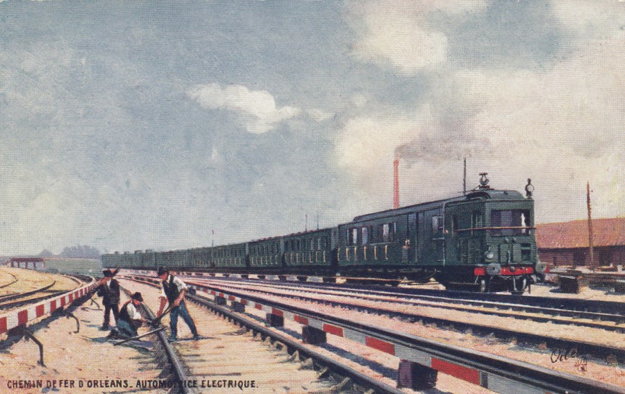
CHEMIN DE FER D ORLEANS
AUTOMOTRICE ELECTRIQUE
Orleans Railway
Self-Propelled Electric
Published by
RAPHAEL TUCK ET FILS LTD, PARIS
Ref: “OILETTE” Serie 124 No. 11
COLLECTION “VIILLES DE FRANCE”
I am not positive, but this might be the only French ‘Raphael and Tuck’ postcard I have in my collection, it is certainly the first one that I have noticed. I found this one last week in an antiques centre in York, so it is a new addition to my collection.
REVERSE SIDE OF ABOVE POSTCARD
29/07/2020
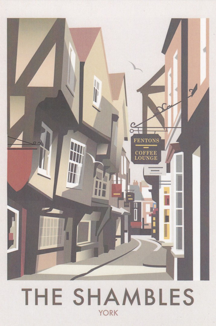
THE SHAMBLES
YORK
Illustration by
DAVE THOMPSON
Printed & Distributed by
STAR EDITIONS LTD
Ref: THOMPSON186
Possibly my favourite location in York. There are two great sweet shops here one of which is a fudge shop and you can watch them making it in the front window (its ‘very’ good as well). There is also a selection of Harry Potter themed shops at one end of the street, and I love Harry Potter merchandise.
I also learnt why the street is so thin. It used to be full of meat shops, butchers, and the thinness of the gap across the street prevented the sun hitting the meat and turning it bad. So, there you go, a touch of history along with a cracking image, what more could you ask for.
29/07/2020
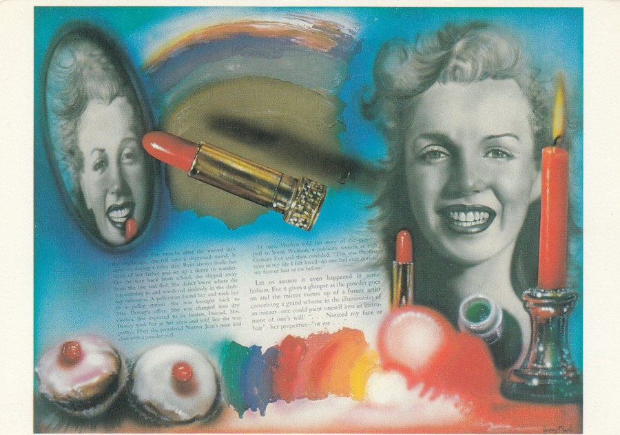
GOLDEN GIRL
Oil on canvas
By
AUDREY FLACK
1979
Published by
ART UNLIMITED AMSTERDAM
Ref: A 2880
I have a nice Marilyn Monroe postcard collection, but it is the more unusual designs which catch my eye these days. This is a piece of artwork, one which was created in the year I left school (which gives me a different feel for its age). This artwork uses images of a much younger Marilyn, or Norma Jean Mortensen as she was called back then. Interestingly, neither name appears anywhere on this card, so you would need to know the photograph that has been artistically rendered here to know who is depicted.

28/07/2020
JO SERRU… HAR GAR VAXELN VARM!
2TELE ADVERT
Published by
CARD GUIDE STOCKHOLM
This foreign television channel advert postcard features an image of Sean Connery as James Bond in a scene from ‘You Only Live Twice’. Since getting back from York Sunday I have had a bit of a Bond watching fest. I have seen ‘Dr No’, ‘You Only Live Twice’ and ‘Thunderball’. I am a big fan of the Bond films, as I have mentioned before. Having watched these films I immediately knew which one this scene came from.
REVERSE SIDE OF ABOVE POSTCARD