24/03/2018
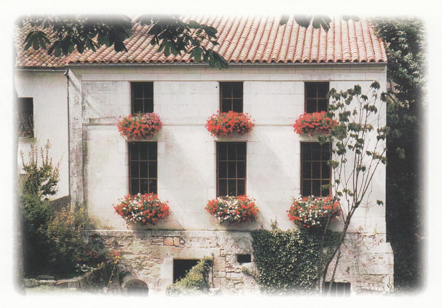
VENERAND
Venerand is a small village just outside the town of Sainte (which I have already mentioned). Venerand is also where my In-Laws house is located, and from where I am typing this segment of text. I have, of course, visited here many times, and about eight years ago I picked up some local postcards of the village. I have not seen these here for many years, so do not know if they are still being sold, but they capture this village really-well.
I make no apologies for showing some more local topographical (view) postcards from this region of France as it is an area which I love. Topographical postcards are without any doubt the most common form of postcard throughout postcard history. Many of these cards are of areas of little or no interest to many collectors, but to those who live there, were born there, or have spent holiday time in these locations, then the postcards depicting the location are memories.
LE MOULIN DE VENERAND
Published by
BOUCHON CREATION
This building houses part of the ancient Roman fountain works which are located here in this small village, and they are fascinating to walk around and free. You can walk into the outside fountain areas at any time, night or day, but the structure inside this depicted building is only open during the day.
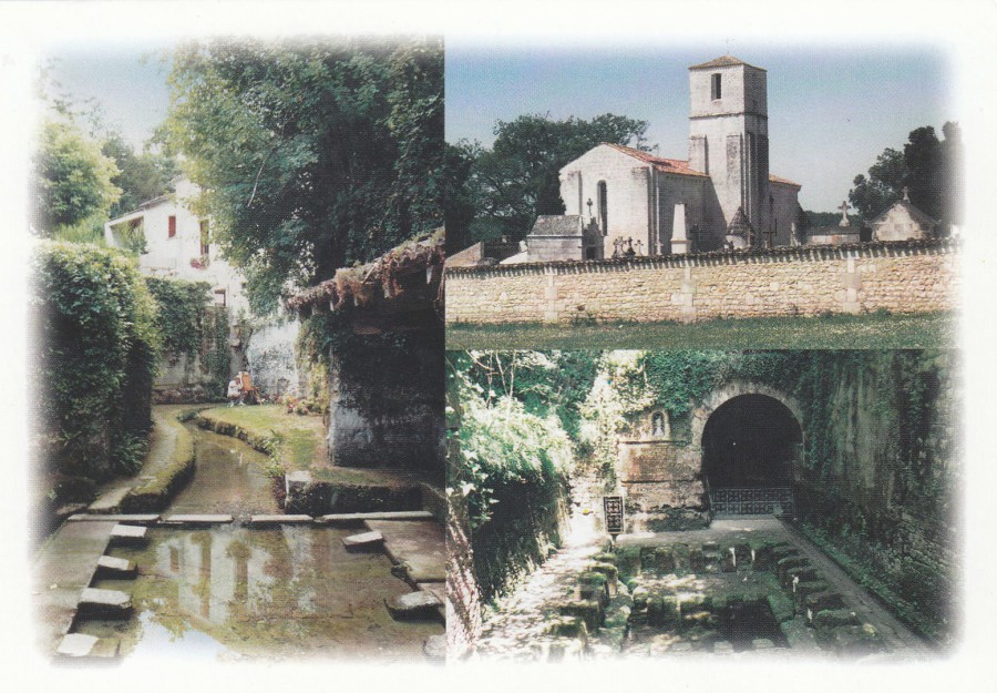
FONTAINE ROMAINE ET SON MOULIN
EGLISE- FONTAINE DE LA ROCHE
Published by
BOUCHON CREATION
The building you can see in the distance in the photograph on the left side of this multi-view postcard is the same building as depicted on the postcard above. Top right is the village church (more details further below). Lastly, bottom right is the area of ancient Roman baths.
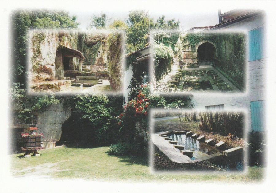
FONTAINE DU MOULIN FONTAINE DE LA ROCHE
FONTAINE DES FONTENELLES
Published by
BOUCHON CREATION
Multi-view postcard depicting more views of the Roman bath’s in Venerand. This area is just a ten - minute walk from the house we are in, so we often walk down and look around this site. With my interest in history I love looking around this site (which makes me wonder how many historians interested in Roman times have visited here to see this site – it also makes me wonder if these postcards could be of interest to people who collect all things ‘Roman’).
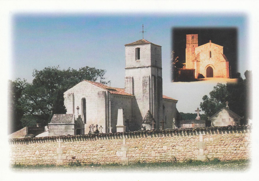
EGLISE SAINTE MARIE DE L’ASSOMPTTION XII
Published by
BOUCHON CREATION
I love walking around this church. In the summer, when it can get very hot here, I often find lizards resting on the church’s stonework. The church is built out of the white stone which so many of the older houses here are built out of, including our current abode.
So, here you have four postcards which I really love, and which are mementos of my many stays here, including my current one.
24/03/2018
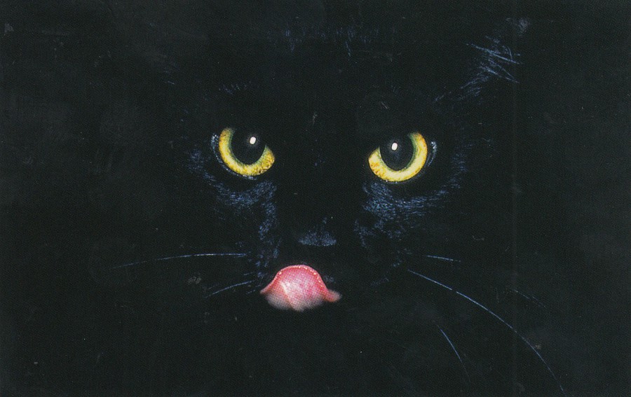
MINOIS DE CHAT
By
B. Maso / Hoa Qui
Published by
EDITIONS D’ART JACK
(COLLECTION MINIJACK)
Ref: C 23
I bought this postcard some years ago on a previous visit to France. It comes under the publishers ‘Minijack’ series, so named because the cards are much smaller, at least a third smaller than the normal modern postcard size. As is common with most postcards sold in this region of France, and many others, the postcard came with an envelope, ones made ‘especially’ to hold these smaller sized postcards.
The publisher ‘Editions d’Art Jack’ is a large postcard publisher in this region of France where I am currently staying (the Charante Maritime area). I have many postcards in my collection which were bought here, and which were published by them, especially local view postcards.

23/03/2018
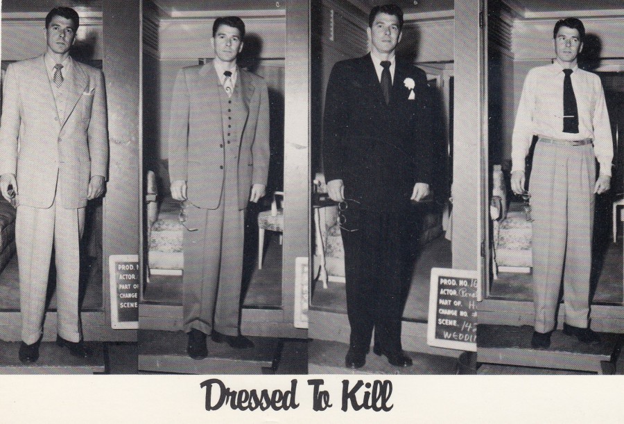
DRESSED TO KILL
(RONALD REAGAN)
Published by
THE AMERICAN POSTCARD Co. Inc
Ref: 858
PHOTO: CHAPMAN COLLECTION
Copyright 1985
When Reagan was President the modern postcard was going through a renaissance, and so he became a popular postcard topic. Many were comedic, but by no means all of them. Although there was the obvious ‘Politics’ theme, and the earlier film career means that he also fits into the more general ‘Entertainment’ theme and thus also into the more specific ‘Film’ category. So, this card here would be of interest to a range of collectors.

23/03/2018
IN THE EVENT
OF A
NUCLEAR WAR
Extract from a speech made by
Lord Louis Mountbatten
Strasbourg,
11 May 1979
Published by
QUAKER PEACE & SERVICE
This postcard was published during the period when the ‘Anti-Nuclear War’ movement was issuing postcards regularly, either through companies like ‘LEEDS POSTCARDS’, or themselves vis organisations like CND and the Quakers (like this one). It may be simple in design, but it is no less dramatic in its content. This is now probably a £2+ postcard, and less common than many of the ‘LEEDS POSTCARDS’ issues from the same era.
23/03/2018
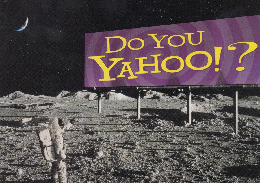
DO YOU YAHOO
Published by
CART’ COM
(Free rack card)
This was originally a free postcard, one of many that appeared in racks around the world during the 1990’s (the craze for ‘Free Rack Cards’ was huge, but like all crazes it eventually faded away, and now, since late last year, even my local Boomerang rack has disappeared from my local Odeon Cinema.
This one here would grace any space themed collection.
REVERSE SIDE OF ABOVE POSTCARD

22/03/2018
ADVENTURE AROUND THE BEND
DISNEYLAND
Official ‘Disneyland’ Postcard
Ref: 0100-11301
“The deep, dark rivers of Adventureland hold stirring surprises for those brave guests who dare to take a Jungle Cruise into the unknown”
(Text from reverse side of postcard)
My favourite ride at Disney World, which is slightly different than the depicted ‘Disneyland’ one shown here. This is one of my favourites rides despite, and not because of, the awful jokes the boat captains use on the tour – anyone who has ridden either of the rides will know exactly what I mean!!!!

22/03/2018
WHERE’S MY HONEY
By
TROW
Published by
HARVEY BARTON
(KIDDICARD)
A nice simple Teddy Bear themed postcard. This copy was posted in the UK in 1968. This would not have any great value, but sometimes that is not important, after all, this postcard is now at least 50 years old!
22/03/2018
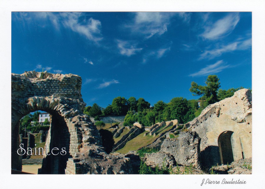
ENTRE TERRE & MER
COLLECTION CHARENTE-MARITIME
All postcards published by
J. P. Boulesteix
We arrived in Venerand, France tuesday evening, unfortunately we arrived at a house with no electricity! This caused some issues, which remain in place today – we will not have any power until Friday (another two days), so, yesterday we went into Saintes, the main local town and did some sightseeing and eating. I have mentioned Saintes before, and depicted some postcards from here, especially some depicting the Germanicus Arch (a Roman era archway).
Depicted here are four postcards which I bought in Saintes a couple of years ago on a previous visit. These are not titled, explained in text form or numbered – they have the same reverse side. They do though, give a nice idea of how tied up in history this town is, well, except the Stork one, which I bought because I love birds. They are also a good example of how well produced some local postcard issues can be, and the quality of the photographs. Here, on these issues the photograph has been mounted on a larger white card, so you can feel the edge of the photograph, because the image is not printed on the larger white card, but, as stated, stuck down on it.


19/03/2018
NOTICE
I shall be travelling to France in the morning, nine hours of driving and around two hours on a ferry. I doubt therefore that I will be posting anything, unless we get to the house earlier than expected and a get some free time, but, if all goes well with my new wifi ‘thingy’ (I have obtained some new piece of technology which is apparently better than the old dongle’s, but we shall see!), I should be posting as normal from Wednesday. If I do find anything whilst travelling I will facebook it – it is always worth checking the webpages facebook page as often material appears here which is not placed on the webpage, especially photographs of postcards in shops, museums and other locations
which gives people an idea of what and where to look for new or interesting postcards.
19/03/2018
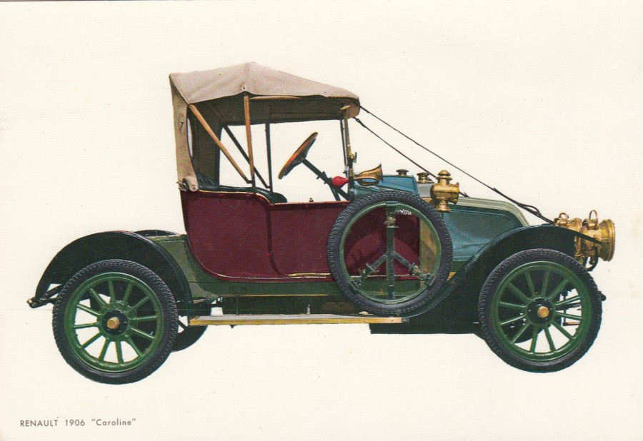
RENAULT 1906
“CAROLINE”
Published by
C.Y.Z.
Ref: 6673
(BARCELONA, ESPANA)
Printed in Spain
This is one of those postcards where the image is all. The card has no details about the car displayed and there are no details on the reverse side except for the country of origin of the postcard. If you knew nothing about this car before buying this postcard, after doing so you would only know what it was called! Still, the image is a good one.

19/03/2018
CARTE POSTALE
PUZZLE
FORT BOYARD
1 carte postale puzzle
+ 1 envelope
Published by
JACK EDITIONS D’ART
I bought this novelty postcard in France around 2010, give or take a few years, when I was visiting the Charente Maritime region of France. This card fits into two of my popular themes, my novelty collection and my television one. The first is obvious as this is a jigsaw puzzle postcard, something that was popular for many years around the 1990’s and 2000’s. The second theme might take some explaining, so, here we go. The unusual ‘Fort Boyard’, located within sight off the coast of this region of France, is the location which was used for a very long running French television game show, first broadcast on 7th July 1990. Versions of the game show were then filmed at this same location by other countries including the UK. The UK version was presented by Melinda Messenger, with the help of Leslie Grantham, between 1998 and 2001. In the end there were 27 French series and five English series. If you take all the series’ made by all the countries here, then the total of episodes reaches 1,689 (up to 2016 – 307 for the French version and 78 for the English version).
All these details mean that for me this is a major TV filming location. Because of this I have always bought all postcards that I found on my trips to this area, and there were many. I probably have over 100 different modern postcards depicting this fort, which gives you an idea of how popular this is in this part of France.

REVERSE SIDE OF THIS JIGSAW PUZZLE PACKAGE
With full instructions etc. The Jigsaw card and the information sheet are contained within a cellophane cover. The postcard image used here on this Jigsaw version was also available as a normal postcard as well.

19/03/2018
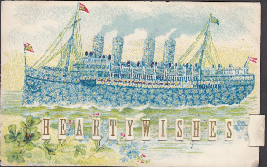
KIND THOUGHTS
HEARTY WISHES
Novelty side pull tab
(Changes the words)
Published by
WOOLSTONE BROS, LONDON E.C.
Ref: No. 0524
The Milton “MECHANICAL” Series
This is a great postcard depicting a painting of an ocean liner made up of small blue flowers, which may be ‘forget-me-nots’. If the artwork design was not enough, and it is very eye-catching, this is also a novelty postcard. There is a tab on one side, bottom right, which can be pulled out to change the letters in the rectangular holes cut into the postcard along the bottom. With the tab pushed in the words read as:
KIND THOUGHTS
With the card tab pulled out the words are changed to:
HEARTY WISHES
Both small phrases do not have the words separated by a gap. The first depiction of the postcard, as shown here, is with ‘KIND THOUGHTS’ in place. I could not resist this postcard when I saw it. I love novelty items anyway, but I also have a collection of ocean liner themed postcards.
SECOND VIEW OF POSTCARD
Here is another view of the above postcard, this time with the side tab pulled out, you can see it bottom right side, slightly sticking out. With the tab pulled out the words along the bottom of the postcard now read:
HEARTY WISHES
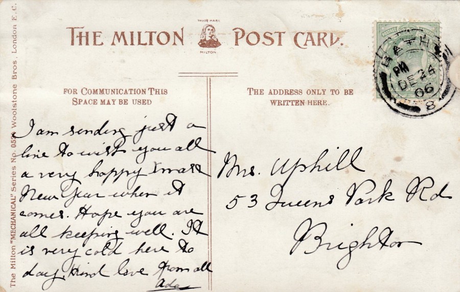
REVERSE SIDE OF ABOVE POSTCARD
This copy was posted close to Christmas from Bath in the UK. The green halfpenny King Edward VII stamp has been cancelled with a double ring, thick inner band, ‘BATH – DEC 24 – 1906’ circular date stamp. This means that this card was delivered on Christmas Eve. Also, note that the pull out tab is up beside the stamp - this means the reverse side printing is upside down in relation to the front image.
19/03/2018
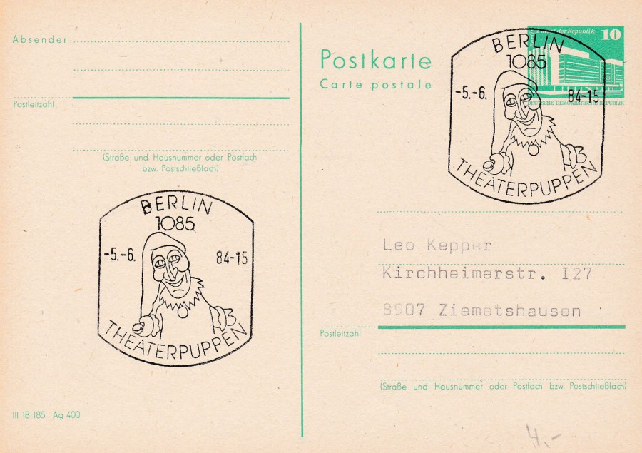
DEUTSCHE DEMOKRATISCHE REPUBLIK
10 Value Postal Stationery Post Card
Used with
‘BERLIN – THEATERPUPPEN - -5 -6 84’
Special Hand Stamp
This card was bought just for the lovely ‘Puppet Theatre’ special hand stamp that has been used. I have a collection of postcards I have bought just for the way they have been used, or for the special hand stamp that has been applied. This is one of those cards.

19/03/2018
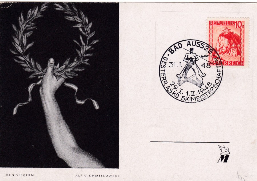
AUSTRIA
WINTER OLYMPIC GAMES
1948
Official Postcard
This is a nice postcard, plain backed though, which was designed to be used with a stamp and cancel on this side, considered to be the front. Here the Austrian 1s + 50g deep ultramarine coloured ‘Fund for Entries to Fifth Winter Olympic Games’ stamp has been applied (SG 1087). This has been cancelled with a special purple coloured cancellation:
BAD AUSSEE
OESTERR. ASKO SKIMEISTERSCHAFTEN
31 – 1 – 48
29. I, 1. II, 1948
BAD AUSSEE is a town in Austria, and I believe Oesterr means Austria. Skimeisterschaften means ‘Ski Championship’. I had some trouble with the word ASKO, but I now believe this is the title for the Austrian ‘Association for Sport and Physical Culture in Austria’ which was called ASKO, and thus it makes sense in this context.
The games commenced on the 31st January 1948, which was the first day of sporting events, the official opening ceremony took place on the 30th January, so this special hand stamp is for the opening day of competition. The closing ceremony of the games was held on the 8th February.
Despite this card and stamp coming from Austria the actual games were held in St. Moritz, Switzerland.
AUSTRIA
WINTER OLYMPIC GAMES
1948
Official Postcard
This time we have the 1947 (re-printed) vermillion coloured Hochosterwitz Castle stamp (SG 1074), which was originally printed in 1945 in both a green (described also as blue-green) and a purple stamp. Here the stamp has been cancelled with the same special hand stamp:
BAD AUSSEE
OESTERR. ASKO SKIMEISTERSCHAFTEN
31 – 1 – 48
29. I, 1. II, 1948
But this time the cancel has been applied with black ink. This copy sits nicely in my collection alongside the above posted version.
19/03/2018
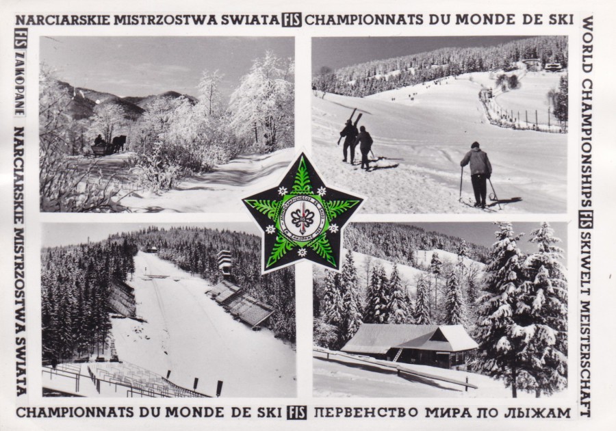
(FIS) SKI WORLD CHAMPIONSHIPS
CHAMPIONNATS DU MONDE DE SKI
F.I.S. INTERNATIONAL SKI CHAMPIONSHIPS
ZAKOPANE
Multi-View Postcard
Anonymous Publisher
This is an official F.I.S. multi-view postcard issued for the 1962 International Ski Championships held in Zakopane. The four photographs are all black and white, and the surrounding text is also in black text. The only colour on the postcard design is the central logo for the event, which I think might have been hand done by the sender of the card (it looks like a felt tip pen of some sort has been used to colour in the green areas – which means that originally this may also have been printed in black and white - There is also a little red as well, which again I also suspect to have been hand applied).
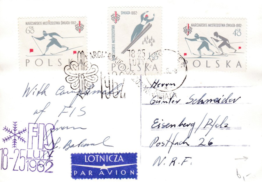
REVERSE SIDE OF ABOVE POSTCARD
Although the front of this postcard is nice, it was the reverse side that made me buy it. Here this card has received three of the 1962 Polish stamps that were part of the set issued for this ski championship. These stamps are as follows, from left to right:
60g value Skier Racing stamp (SG 1288)
1z 50 value Ski Jumper stamp (SG 1290)
40g value Two Skiers Racing stamp (SG 1286)
These three stamps were part of a six-stamp set, with the other three stamps featuring the same three designs but in different colours. These stamps have been cancelled with a special cancellation which reads:
NARCIARSKIE MISTRZOSTWA SWIATA
FIS – 1962 – 18-25 LUTY
ZAKOPANE
This handstamp text translates as:
SKI WORLD CHAMPIONSHIPS
FIS – 1962 – 18-25 FEBRUARY
ZAKOPANE
Zakopane is a town in southern Poland, and the location for the 1962 championships. The only problem I have here is that on this cancellation I cannot make out the day and month from the date, only the year – 62. So, I cannot say for certain whether this cancel is a first day of issue cancel or an event related cancel. Having done some research I have seen what was a first day of issue cancel for these stamps – 14th Feb 1962 – and that was very different to the one used here, as a result I am going to say that it seems more likely that this is an event cancel and was probably dated sometime between the event dates of 18th and 25th February – possibly the first day of the championships – 18th February.
There is also an official purple coloured ‘FIS – 18-25 LUTY – 1962’ cachet applied bottom left. This postcard also seems to have been sent by someone directly connected with the FIS – Federation Internationale de Ski (International Ski Federation). Overall, I think this is a great sports card, especially as it is one I found in a £1 box at a Stampex show last year.
19/03/2018
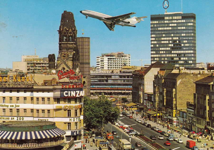
BERLIN
KURFURSTENDAMM
Anonymous Publisher / Printer
Ref: B 1/8258
I have only been to Berlin once (there is chance I may be going again later this year), but I did get to see the ‘Kaiser Wilhelm Memorial Church’, which is the ruined looking structure behind the hotel on the left side. The church has the nickname of ‘der hohle Zahn’, which means ‘the hollow tooth’, and this is because of its shape. The original church was extensively damaged in an air raid on the 23rd November 1943 but a remnant of the spire, which can be seen in this postcard image, remained along with much of the entrance hall. After the war many discussions were held over how to rebuild the church, these went on into the 1950’s. Eventually plans were agreed which would involve tearing down the remnant of the spire. These plans caused an outrage in Berlin with the population who considered the damaged spire to be the ‘Heart of Berlin’. As a result of this outcry, the plans were changed, and the remaining spire was incorporated into a new design, although the rest of the damaged building was removed to make way for a new church on the site, which has the damaged spire as part of its design.
Also, it is clear, that the airliner seen flying in the middle has been superimposed on this image as I doubt very much that any plane would be allowed to fly that low over the city, or in fact any city these days. I think it has been added here to make the postcard more attractive to tourists.
This copy was not posted but does have a hand-written message on it dated 2003, although I suspect the postcard image is older than this, and that this is a card which has been on sale in Berlin for some years.

19/03/2018
MICHEL VAILLANT
Created by
JEAN GRAFTON
RIFIFI
EN F1
Published by
EDITIONS ARNO
(FRANCE)
Ref: 832/1
(Copyrighted to 1982)
I bought this postcard because the image appealed to me, but I knew nothing about its source. I now know that ‘Michel Vaillant’ is a French comic-book character which was drawn by the French cartoonist Jean Grafton (he also later published the albums that his character appeared in as well).
First created in 1957 the character of Vaillant is a French racing driver, who seems to have mainly competed in the Formula 1 competitions. The character’s first appearance was in the ‘Tintin Magazine’ (the first appearance was June 12th, although the character was created on Feb 7th), where he continued to appear until 1976, in both France and Belgium. The first full length adventure, a full comic book (much like the Tintin stories appear), was published in 1959.
The picture depicted here is the front cover of one of these adventures 'Rififi en F1', which was first published in 1982.
I thought it was interesting, as I do have an interest in comic book characters (I’ve read all the Tintin books, the Asterix stories and that type of issue), that I had never heard of this character! So, this postcard has now given me something new to look-into. I understand that the character is well known and popular in France to this day.
18/03/2018
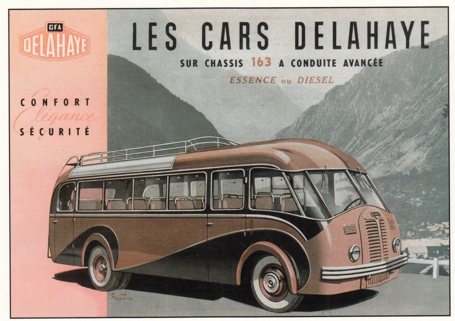
LES CARS DELAHAYE
SUR CHASSIS 163 A CONDUITE AVANCEE
ESSENCE du DIESEL
Published by
CENTENAIRE EDITIONS
13 rue Rabelais – 1700 SAINTES – FRANCE
Ref: VEHICULES UTILITAIRES – 11
Another postcard from this company which is (was?) located in Saintes, France, which is the nearest big town to where my in-laws house is located (well, its now our house really since the sad death of my Father-in-Law in 2017). As with other cards from this company which I have depicted on the webpage the image here is an advertising piece which I have never seen on postcard before. I love this companies issues.
In 48 Hours I will be back in France and back at the above-mentioned house, as we have-to do some work on it again and clear out some of the contents etc. Hopefully I will find some more cards from this company, although I could not find any on my last visit last month.
18/03/2018
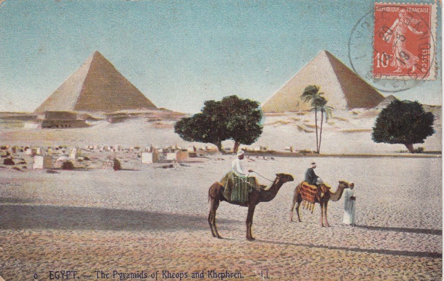
EGYPT
THE PYRAMIDS OF KHEOPS AND KHEPHREN
(La Grande et la seconde Pyramide)
Published by
LL.
Ref: 6
The publishing company ‘LL’ were an extremely well known French postcard publisher who issued a wide range of photographic view postcards of France, UK, Channel Islands and other European Countries and the French colonies and areas of North Africa. This one is one of their Egypt issues, which has been hand coloured (not an uncommon thing with some of the companies issues, although black and white was by far their major issuing format).
This card was posted inside France in 1919, with the stamp applied to the front, which again was a common French thing to do. Some ‘LL’ cards are worth a lot of money, one depicting a specific church on the Jersey Channel Island once sold for £100, but this card here is from the far more-cheaper end of the catalogue range.
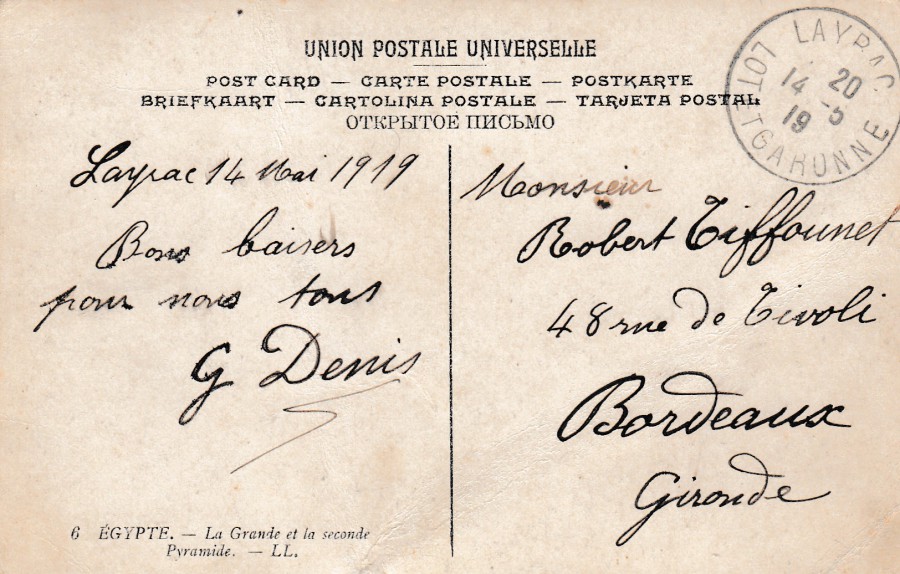
REVERSE SIDE OF ABOVE POSTCARD
18/03/2018
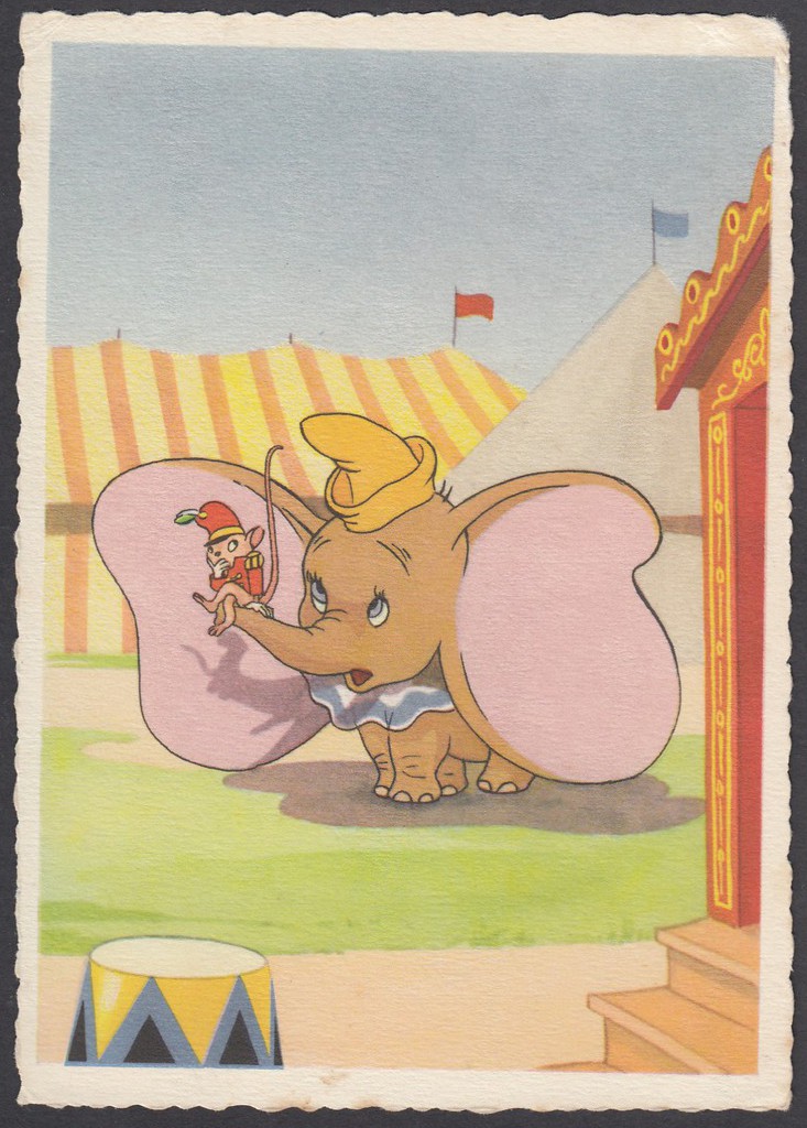
DUMBO LERNT DAS ZIRKUSLEBEN KENNEN
(ZU DEM WALT DISNEY – FARBFILM ‘DUMBO DER FLIEGENDE ELEFANT’)
Translates as:
Dumbo Gets to Know the Circus Life
(From the Walt Disney – Colour Film ‘Dumbo The Flying Elephant’)
Published by
WALT DISNEY PRODUKTION . Kunstverlag Michel, Nurnberg
Ref: 5274
This is an early ‘Disney’ postcard published in Germany. It seems to be an official issue although Dumbo is coloured brown for some reason, instead of the normal grey. I’ve been trying to estimate when this was issued, although there are no direct dateable marks on it. I think this is from the 1950’s era, give or take a few years either side. However old it may be, it is a superb Walt Disney themed card and one which I suspect would cost quite a bit on eBay if it was to appear now.
17/03/2018
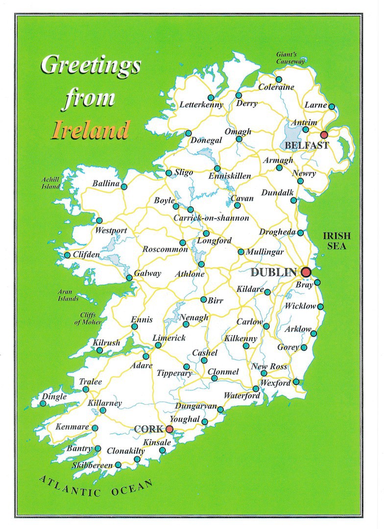
IRELAND
Published by
USEFUL GIFTS LIMITED, IRELAND
HAPPY ‘ST PATRICK’S DAY’
TO ALL MY WEBPAGE READERS
Nice map postcard which I bought on my trip to Dublin in 2016
17/03/2018
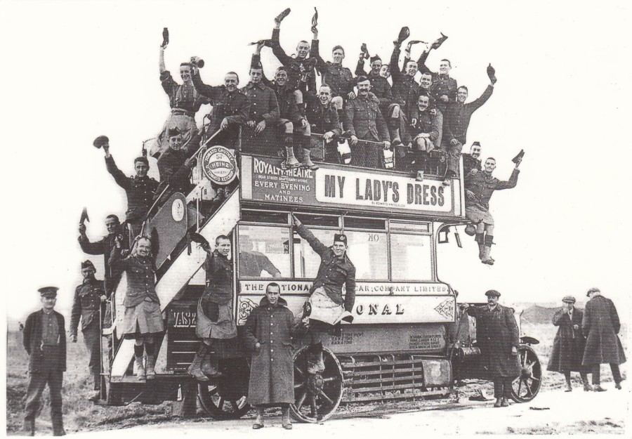
LONDON BUS GOES TO WAR
Published by
MAYFAIR CARDS OF LONDON
Distributed by
THE POSTCARD WAREHOUSE
Ref: 35
“Military authorities were quick to realise the benefits of the bus in moving troops quickly and flexibly in the theatre of war. Over 1,300 London Buses were requisitioned and put to work in France taking troops to the front lines, returning with the wounded, and rushing in reinforcements where necessary.”
(Text from reverse side of Postcard)
This is an interesting WW1 photograph, one I suspect was staged and intended for propaganda and morale lifting use. Interestingly, considering the previous posting on this webpage, the buses were also used as carrier pigeon lofts! The buses were sent over in the early period of the war but what the above text does not tell you is that the civilian London bus drivers went over with them and drove the buses. They would often come under fire and some of the bus drivers were killed.
The memories of one such driver, George Gwynn, make interesting reading:
“We came under fire every night and would think ‘game over’”
“I remember when the driver of the bus in front of mine was killed. Every night we had something like that”
“I slept at the roadside on those buses, with no cover. Each night in the winter we had to get out of our beds and start the engine every two hours. We had to be ready at any time to rush out and pick troops up from their billets”
George was sent to war with his bus in October 1914 and remained on the front for four-and-a-half years (only getting to return home on leave twice in this time). The story of the London Buses, and their drivers, in WW1 is a fascinating one.
17/03/2018
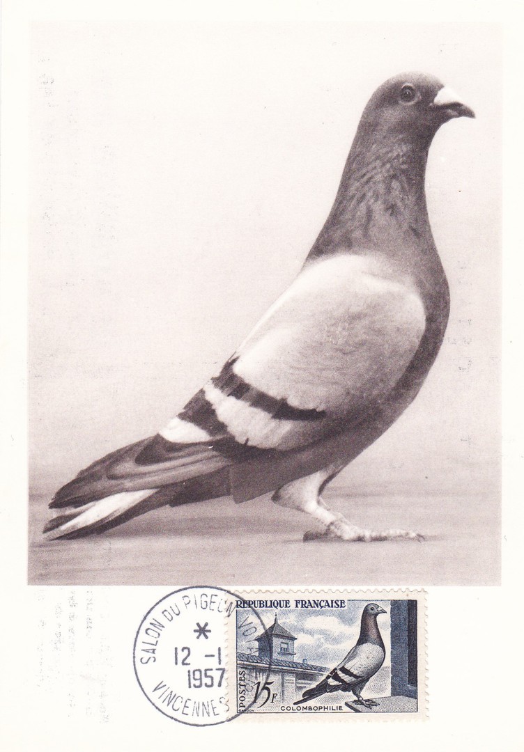
PIGEON “BLEU-SION-LAMOTTE”
DE LA RACE JEAN DONKERWOLCK
SON PROPRIETAIRE A LYS-LES-LANNOY
CHAMPION DU NORD
VALEUR: 50,000 fr
Published by
LES MAXIMAPHILES FRANCAIS (Paris)
This is a French ‘Maximum Card’ for the issue of the 1957 single stamp issue titled ‘Pigeon-fanciers Commemoration’ (SG 1316). The stamp has been applied to the front and has been cancelled first day of issue – 12th January 1957 – with a special (I think to this issue only) ‘SALON DU PIGEON VOYAGEUR - VINCENNES’ single circle date stamp.
The postcard depicts a pigeon called ‘Blue-Sion-Lamotte’ which was the North Champion and valued at 50,000 francs.
This stamp is special to me for two reasons. Firstly, my Grandfather was a pigeon breeder and racer, one of world class level, he had many trophies and awards and sold pigeons to places around the world, even China, which was something amazing to a little kid like me in the 1970’s. He had also been part of the RAF Pigeon unit in WWII, where he bred and trained pigeons for use with military units and forces and those which were used by the resistance and secret service. So, I grew up around racing pigeons and even took part in recording their return, and as a result racing and homing pigeons have always fascinated me.
Secondly, my interest in stamps was cultivated by my mother, and she gave to me her stamp album. She showed me this stamp in this album and told me that it was her favourite stamp, I assume it was because her father, my grandfather as mentioned above, had always had racing pigeons and my mother had grown up with them around.
For these two reasons, as stated above, this became a stamp which hold a lot of memories for me, so when I saw this maxi-card a couple of years ago it was ‘definitely’ bound for my collection. Any postcard I find with this stamp attached will always find its way into my collection.

REVERSE SIDE OF ABOVE POSTCARD
This company have their own cachet which they apply to the back of their cards - these are numbered and dated
16/03/2018
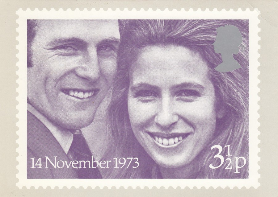
“ROYAL WEDDING – PRINCESS ANNE AND CAPTAIN MARK PHILLIPS”
ROYAL MAIL PHQ STAMP CARD
PHQ 4
( a postcard that reproduces' the Royal Mail stamp release)
Stamps issued – 14TH November 1973
Published by
ROYAL MAIL
This was the fourth PHQ stamp card issued by Royal Mail. In this case although two stamps were issued they again only issued a single PHQ Card, as they had done with the previous three card issues. Here they chose the lower valued 3 ½ p stamp to appear on the postcard. The catalogue ‘Collect Post Office Cards’ (published by Rosendale Stamps Ltd – issued 1994) lists this card and values it as follows:
MINT - £8
FIRST DAY OF ISSUE USED FRONT (basic cancel) - £15.00
FIRST DAY OF ISSUE USED REVERSE (basic cancel) - £12.50
FRONT OF MINT CARD
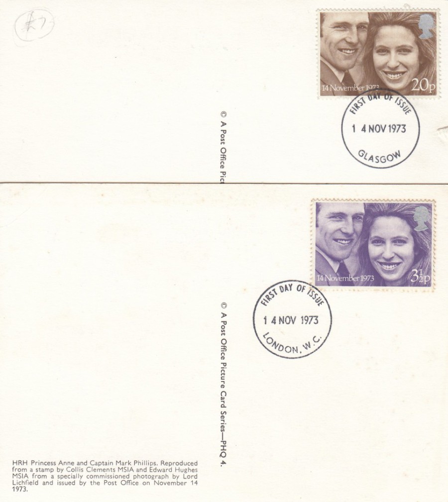
REVERSE SIDE IMAGES
TOP
Used copy with the 20p brown coloured second stamp in the two-stamp set applied. This is not the stamp depicted on the front of the card although the image is the same, it is just the colour used for the image which is different. For obvious reasons far less of these cards were used with this 20p stamp than were used with the ‘front of the card’ depicted 3 ½ p stamp. The stamp has been cancelled first day of issue with a standard F.D.I. GLASGOW single ring date stamp – 14 NOV 1973.
BOTTOM
This copy of the card has been used with the 3 ½ p Royal Wedding stamp, the stamp that is depicted on the font of the card. This time the stamp has been cancelled first day of issue with a standard F.D.I. LONDON. W.C. single ring date stamp – 14 NOV 1973.

REVERSE SIDE OF PHQ CARD
ROYAL WEDDING
Some collectors, because there was only the single card image released, applied the full set of two stamps to the card so that they had a full set of stamps for their collection. This is what you see here. The stamps have been cancelled with a special ‘FIRST DAY OF ISSUE – WESTMINSTER ABBEY – LONDON SW1 – 14 NOV 1973’ hand stamp. Unfortunately, for me, this card has been creased at some point so would be considered as being inferior, but I will keep it in my collection anyway – just because a card is damaged does not mean it should be discarded.
16/03/2018
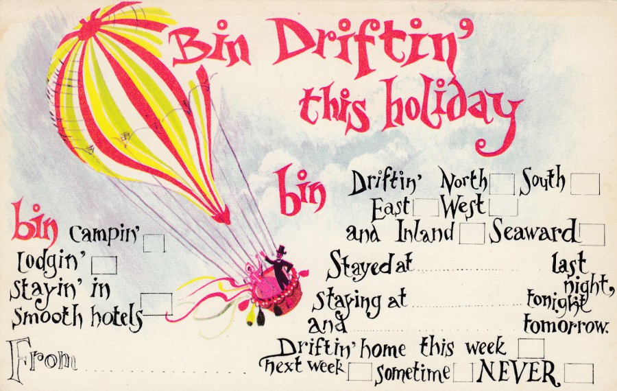
BIN DRIFTIN’ THIS HOLIDAY
Multi-Choice Postcard
(‘Tick the Box’)
Published by
CROWLEY & HEFFERNON Ltd., READING
In their:
‘TICKACARDS’ series
Design by
L. GREEN
Ref: UH/19
There was a brief period during the 1970’s when this type of ‘Tick the Box’ postcard design was popular. Some individual examples have been printed since, but they were at their height back then. I came across my very first card of this design on a childhood holiday to a Butlin’s holiday camp in Minehead during the early 1970’s (fortunately, it had a fish included so I could add it to my then exclusive ‘Wildlife’ collection). This one here, although from the same period, I only obtained just over a year ago. Although this design is very simple I also think it is quite eye-catching.
REVERSE SIDE OF ABOVE POSTCARD
16/03/2018
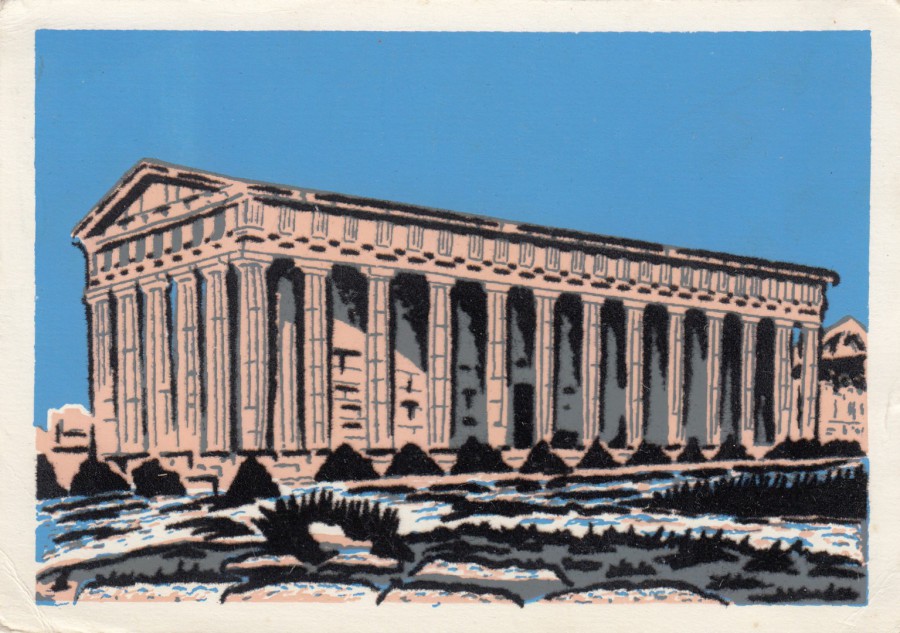
ATHENES
(Athens)
TEMPLE DE THESEE
Anonymous Publisher
(Made in France)
NOVELTY POSTCARD
APPLIED ‘FELT’ SURFACE
On this postcard the orange (its appears a darker orange on the actual postcard) is all applied felt, as is the area of land, with its black bushes and plants, in front of it. Felt, that almost fuzzy soft material, was often applied to postcards, either around an image, or as here, as the actual pictorial part of the image. As a lover of novelty postcards, I often buy ‘felt’ postcards when I come across them, this was a good example and, also an unusual one because of the colour used (black is used far more often than bright colours where ‘felt’ is concerned, for some reason!)
16/03/2018
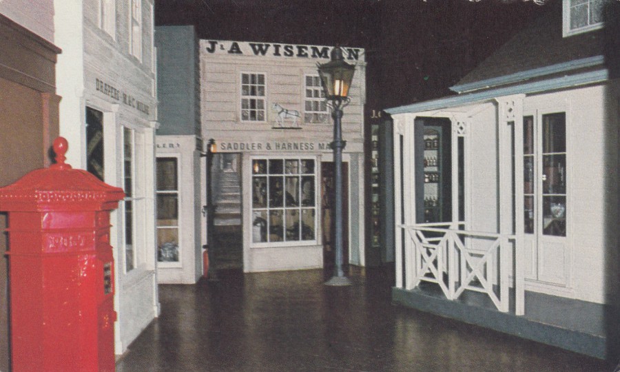
CENTENNIAL STREET
AUCKLAND WAR MEMORIAL MUSEUM
Published for the Museum
(No Printer acknowledged)
“A view along “CENTENNIAL STREET”: A reconstruction of some of the shops which were in the main streets of Auckland about 1866. Time is late evening, and goods in the shops gleam in the glow of gaslight”
(Text on reverse side of Postcard)
Museums have always been a fantastic source of unique postcard images. This one here is from a museum in New Zealand and it is of interest to me because of the early red post box depicted in the foreground on the left side.
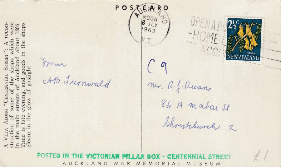
REVERSE SIDE OF ABOVE POSTCARD
The stamp used here is a 1960 issued 2 ½ cent Titoki (plant) definitive stamp (SG 784) which has been cancelled with an AUCKLAND machine slogan cancellation dated 8th July 1969 (with the time shown as ‘NOON’). The slogan, although nearly impossible to make out fully because of the darkness of the stamp, reads:
OPEN A POST OFFICE
HOME LAY BY
ACCOUNT
My favourite addition to this postcard is the single line text cachet, printed in green, which has been applied along the bottom and which reads:
POSTED IN THE VICTORIAN PILLAR BOX – CENTENNIAL STREET
So, this postcard was posted in the red post box which appears on the front of this postcard (as seen above). So, it seems visitors to this museum could post items in this post box and these items would receive this nice museum exclusive cachet. I bet that most, if not nearly all, or all, of the postcards posted here were ones sold by the museum – not a bad source of extra income (although someone would have had to apply the cachet to all of the cards by hand)


16/03/2018
THE BEATLES
Published by
MELISSA KLASIK KARDS
(43 Aberavon Road, London E3 5AR)
Printed by
KESKIN COLOR CO. LTD, TURKEY
Ref: 1513
Beatles postcards have always been popular, they are one of the bands who have maintained their postcard popularity right through to this current day. That is quite an achievement, but with The Beatles perhaps it isn’t really a surprise. Although this is an early publicity photograph the postcard itself is from the 1990’s (there is a hand-written message on the reverse side which is dated 1997). This is a lovely card which is not that common, and it is one that I had not seen before buying this copy last year.

16/03/2018
TOKYO LIFE
NOVELTY STICKER POSTCARD
May 1st – 31st (no year is given)
SELFRIDGES & CO
Published by
BOOMERANG MEDIA (BAR)
Each of the little images on this postcard is an individual peel-off sticker. I liked this card, and as you know I like novelty postcards and postcards with stickers on them falls under this category. Unfortunately, other than the obvious assumption that the Selfridges store had a ‘Tokyo Life’ promotion going on at the time this postcard was released, I don’t know anything else about this cards issue.

15/03/2018
VESPA GS
“AU TENNIS”
Collection Philippe MORO
Published by
CENTIENAIRE EDITIONS
Ref: 121 – RECLAME
This is not the first advert postcard I have depicted from this French company, which is local to Saintes, close to where my In-Laws used to live. We now have their house and will be there next week, but on our last visit, last month, I could not find any of this companies output. I really like their cards, and their use of old advert images and posters. I shall be depicting more of their postcards in the future as they depict images I have not previously seen on postcard here in the UK or abroad (also, I think this image would make an unusual addition to a 'Tennis' themed collection).
15/03/2018
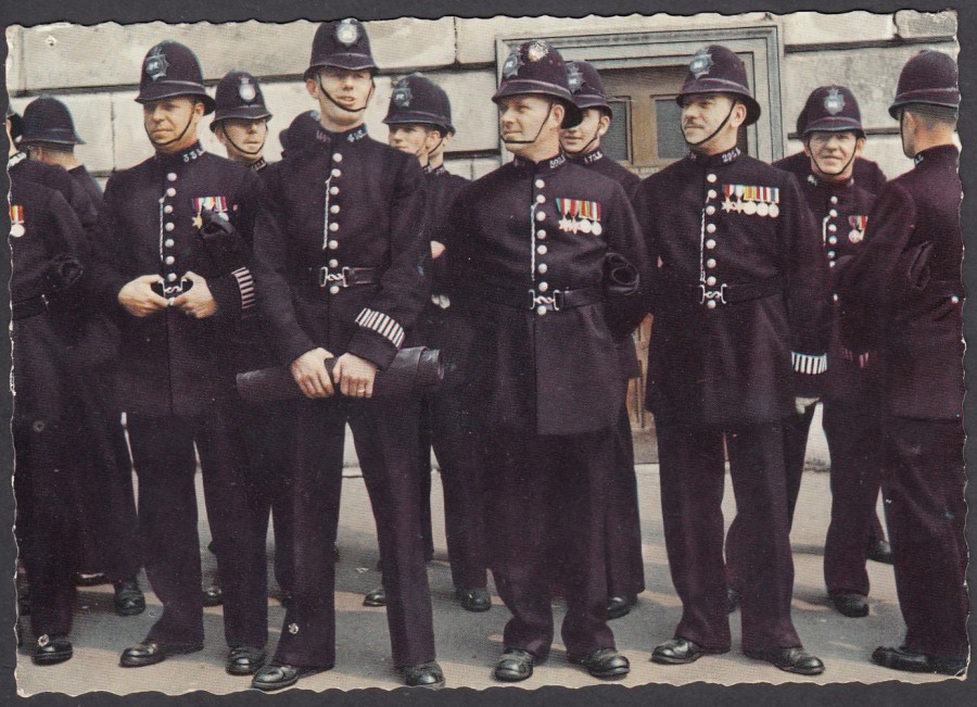
POLICEMEN OF LONDON
Published by
YOUNG’S PHOTO REPRODUCTIONS
LONDON W. 1
(Printed in Italy)
Ref: LD/25
This is a postcard from my ‘Police’ themed collection. The medals that most of these soldiers appear to be wearing look like World War II medals, so I believe this card’s image is from the 1950’s into the 1960’s period (although, of course, the postcard could have been issued a little later than this – maybe as late as the 1970’s).
15/03/2018
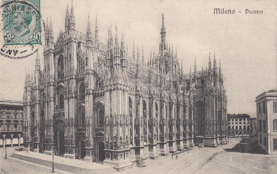
MILANO – DUOMO
(MILAN CATHEDRAL)
Published / Printed
By
CESARE CASIROLI – MILANO, CORSO VITT. EMANUELE 1
Ref: 22472
This postcard was posted on 22nd April 1914 from Italy using a 5c green definitive stamp issued in 1905 (SG 75), which has been applied to the front (a not uncommon practice in some European countries at this time). The Cathedral Church of Milan, Lombardy is dedicated to St Mary of the Nativity and is the seat of the Archbishop of Milan. Apparently, the cathedral took nearly six centuries to complete, and it is also the largest church in Italy. The original building was commenced in 1386 and since the commencement of the postcard era thousands upon thousands of postcards have been produced depicting it.

15/03/2018
LUFTSCHIFF “GRAF ZEPPELIN”
(L.Z. 127) STEUERUNG
Published – Printed by
KUNSTVERLAG FRANZ WALTER,
MUNCHEN (Munich) 19
Ref: LZ. 36
This is a German issued photographic postcard depicting the Graf Zeppelin airship. This card was posted from Cali, Colombia to Barranquilla, in Colombia (so, I assume, that the sender sourced this card from Germany before using it back in Colombia – unless it was a souvenir from a trip to South America by the Graf Zeppelin). The four Colombia stamps have been cancelled with a CALI - ‘SERVICIO DE TRANSPORTES AEREOS’ circular cancellations dated 29th November 1932. The four stamps, from left to right are:
4c - Death Centenary of Bolivar (SG 412)
5c – Yellow Air Mail – no overprint – this is a private air company issue and therefore not listed in Stanley Gibbons Catalogue
10c – Purple – Air Mail – with overprint ‘CORREO AEREO’ (an official stamp) – (SG 414)
5c - Yellow Air Mail – no overprint – another copy of the private air company issue (only the stamps overprinted with CORREO AEREO were official stamps)
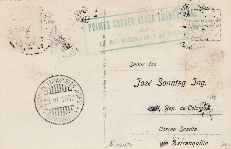
REVERSE SIDE OF ABOVE POSTCARD
On this side you have the BARRANQUILLA - ‘SERVICIO DE TRANSPORTES AEREOS’ circular cancellation back-stamp (arrival mark) dated 29th November 1932. There is also a large rectangular boxed cachet which reads:
PRIMER CORREO AEREO TRANSVERSAL
entre
EL RIO MAGDALENA Y EL PACIFICO
Translates as:
FIRST EMERGENCY AERIAL MAIL
Between
EL RIO MAGDALENA and the PACIFIC
This therefore appears to be a first flight cachet, although this was not by way of the Graf Zeppelin which was in Germany at that time.

14/03/2018
DE HAVILLAND MOSQUITO T.3
Published by
COLOURMASTER INTERNATIONAL
Printed by
PHOTO PRECISION LIMITED
Ref: A6
Collectors series (1-20)
One of World War II’s most versatile aircraft being used for recognisance, precision bombing and night and day flying. The Mosquito was almost entirely built of wood, which resulted in its nick-name the ‘Wooden Wonder’. When photographed this example here was maintained in full flying condition by the British Aerospace.

14/03/2018
“400TH ANNIVERSARY OF BIRTH OF INIGO JONES”
ROYAL MAIL PHQ STAMP CARD
PHQ CARD – PHQ 2
(postcard reproduction of Royal Mail stamp)
Stamp issued – 15th August 1973
cancelled first day of issue with a hand stamp on reverse side
Published by
ROYAL MAIL
ST PAUL’S COVENT GARDEN – ‘THE ACTORS CHURCH’
Initially, for the first few PHQ Stamp Cards they issued just one card from the stamp set. In this case this issue was a three-stamp set but only the 3p St Paul’s Covent Garden church design appeared as a PHQ Stamp Card. This is the second PHQ card issued, but it was the first card to be issued in time to be cancelled first day of issue with the actual stamp (The Cricket PHQ card which preceded this issue was issue was released after the cricket stamps themselves came out – some cards were backdated by request at Birmingham, but these are not true FDI cards because of the true release date of the cards).
The ‘Collect Post Office Cards’ catalogue (published by Rosendale Stamps Ltd – issued 1994) lists this PHQ card, used with the LONDON. W. C first day of issue hand stamp used on the reverse side, at £70.
These first few single PHQ cards were also slightly larger in size to the others that followed. These initial issues are the most expensive cards from the PHQ series to now source. This copy is not in excellent condition, but it is in good/fine condition.
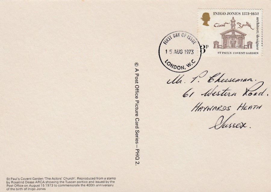
REVERSE SIDE OF ABOVE POSTCARD
Used with copy of the depicted stamp cancelled first day of issue with the ‘LONDON W.C - FIRST DAY OF ISSUE’ circular date stamp – 15th August 1973
14/03/2018
HUBERT DE GIVENCHY ..... RIP
Count Hubert James Marcel Taffin de Givenchy
21st February 1927 – 10th March 2018
French fashion designer who founded the house of Givenchy in 1952. He designed much of the personal and professional wardrobe of Audrey Hepburn and Jacqueline Bouvier Kennedy. He developed his first perfume collection for Audrey Hepburn, who was the face of that fragrance. This was the first time that a star was the face of a fragrance’s advertising campaign (which Hepburn did for free because of their friendship).
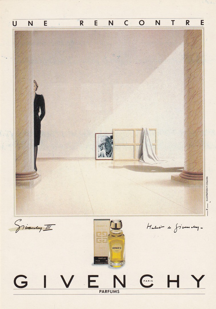
UNE RENCONTRE
GIVENCHY
Perfume Advert
Published by
HUMOUR A LA CARTE
Ref: PU 40
(Ubique Group Pour)
PARFUMS GIVENCHY – Agence : Z – Illustration Pierre Coulon

UNE RENCONTRE
GIVENCHY
Perfume Advert
Published by
HUMOUR A LA CARTE
Ref: PU 42
(Ubique Group Pour)
PARFUMS GIVENCHY – Agence : Z – Illustration Pierre Coulon
Depicted here are four perfume adverts for the Givenchy range of perfumes all with artwork by Pierre Coulon. These were all released by the postcard company ‘Humour A La Carte’ in the mid 1980’s.
BELOW LEFT –
MONSIEUR DE GIVENCHY
Perfume Advert
Published by
HUMOUR A LA CARTE
Ref: PU 41
(Ubique Group Pour)
PARFUMS GIVENCHY – Agence : Z – Illustration Pierre Coulon
BELOW RIGHT –
UNE RENCONTRE
GIVENCHY
Perfume Advert
Published by
HUMOUR A LA CARTE
Ref: PU 43
(Ubique Group Pour)
PARFUMS GIVENCHY – Agence : Z – Illustration Pierre Coulon
