EMAIL ADDRESS - markspostcardchat@gmail.com
28/04/2020
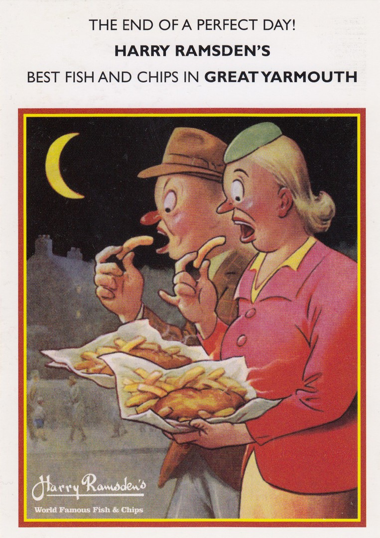
THE END OF A PERFECT DAY!
HARRY RAMSDEN’S
BEST FISH AND CHIPS IN GREAT YARMOUTH
Published as a promotional postcard for
HARRY RAMSDEN
By
BAMFORTH AND COMPANY LTD, 2013
Ref: HR-007
Last year the Harry Ramsden’s ‘fish and chip’ shop(s) were giving away free (I think, they might have been sold as souvenirs, but I need more information to be sure) advertising postcards using seaside saucy postcard like images. I believe there were a few different design’s, but I only managed to obtain this one.
I would like to hear from anyone who has details of other cards in this series.
REVERSE SIDE OF ABOVE POSTCARD

28/04/2020
LE AVVENTURE DI PINOCCHIO
The Adventures of Pinocchio
PRODOTTI ITALIANI
Published by
ANDALU
LA GRAFICA PISANA
Not too much to say about this one really. The card itself is a little larger than the normal modern size, but not greatly. Pinocchio is of course famous and popular outside of the Disney interpretation of the story and it is nice to find a postcard related image which is far from the Disney look.
28/04/2020
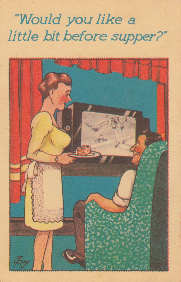
“WOULD YOU LIKE A LITTLE BIT BEFORE SUPPER?”
By
LE RAY (?)
Published by
SEA LION PUBLISHERS LTD, SOUTHEND
It has been a bad couple of days in our household with the sad news of the death of a very close family member, so we, like many people, could do with a little humour.
I bought this postcard originally because of the depiction of a TV set, which as you will have surmised is my main collecting theme. When it arrived I received the added bonus that this postcard was published by a company based here in my home town, one I was unaware of which goes to show that no matter how much you may think you know there is always something new to learn about postcard collecting, which I think is one of my favourite aspects of the hobby.
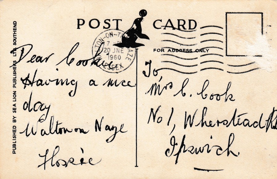
REVERSE SIDE OF ABOVE POSTCARD
Some mad crazed stamp collector has removed the stamp from this card, or possibly it was not applied properly, and it got pulled off in the post. The damage though is minimal, and we can still see that this card was posted from another seaside town, Walton-on-the-Naze (my hometown of Southend is also a seaside town) and has been cancelled the 20th June 1960.
I do love the publishers logo, simple but also attractive.
27/04/2020
JAMES BOND
Maxi-Cards
PART SEVEN
I hoping you have not yet got too bored of these James Bond maxi-cards I have produced. Normally I would not post so many similar themed postcards, but a lot of work went into making these and I think they have turned out ‘really’ well.
JAPANESE POSTER FOR
FROM RUSSIA WITH LOVE (1963)
Home Made Maxi-Card
Postcard from the
JAMES BOND 100 POSTCARDS
Boxed set
I have always liked this film poster and I thought it went well here with the Sean Connery stamp even though the stamp names a different film.

JAPANESE POSTER FOR
OCTOPUSSY (1983)
Home Made Maxi-Card
Postcard from the
JAMES BOND 100 POSTCARDS
Boxed set
I often controversially admit that Roger Moore is my favourite James Bond even though one of his films is at the bottom of my all-time favourite bond listing (Moonraker is my least favourite Bond film. I still enjoy it, but it ranks low against other Bond films – to counter that my top three Bond movies are all Roger Moore ones). Despite the totally ridiculous name of this film it is one I really enjoy.
US POSTER FOR
LICENCE TO KILL (1989)
Home Made Maxi-Card
Postcard from the
JAMES BOND 100 POSTCARDS
Boxed set
Without any doubt, in my mind at least, this was the most violent of the Bond movies. Having said that I also think it was totally right for its time and when I saw it at the cinema, I came away really impressed and I enjoyed it enormously. I still think it holds up well.
US POSTER FOR
GOLDENEYE (1995)
Home Made Maxi-Card
Postcard from the
JAMES BOND 100 POSTCARDS
Boxed set
After Timothy Dalton’s short two movie stint, and a very long gap of six years, something was needed to bring Bond back with a bang. I believe their choice of Pierce Brosnan was inspired. As much as I believe that Dalton played Bond exactly right for that era, I also believe Brosnan had it nailed for the 1990’s.
27/04/2020
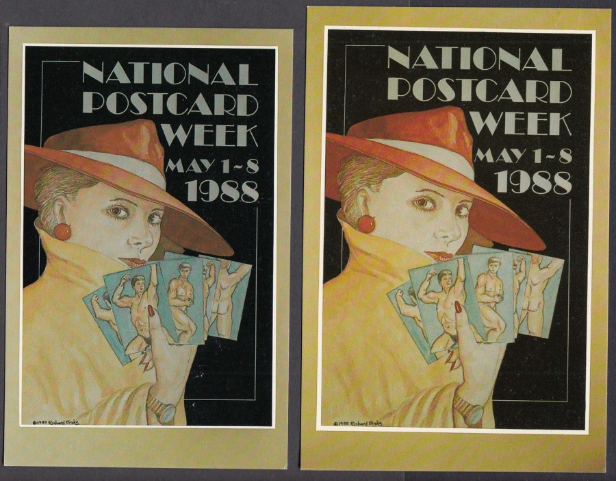
NATIONAL POSTCARD WEEK
MAY 1 – 8, 1988
Design by
RICHARD BLAKE
Published by
P. [Pete] DAVIES
Ref: WHY NOT TRY MODERNS? No. 4 (1988)
Limited Edition of 1000
(Now, was this a total of 1000 covering both sizes, or were there 1000 printed in each size? I believe to be the former)
Knowledge is a wonderful thing, but in the postcard world much of this dies with those small number of knowledgeable collectors (and dealers of course) who pass away with old age before being able to pass these small pieces of information on, as much of it is not recorded anywhere. As an example I have often wondered how many collectors were aware that this postcard here came in two sizes, and it is two distinct print sizes as well, not just cards cut a bit a bit bigger as the actual image is larger on the second card. Perhaps I should ask Pete why. We used to correspond regularly back in the 1980’s and early to mid-late 1990’s but Pete moved and disconnected from the postcard world and I lost touch, but during this lockdown period someone mentioned him and I was able to obtain his current address. So, yesterday I sent him a postcard. Pete was a very important part of my postcard upbringing and I can say for certain that without him I would not be the collector I am today and you would not be visiting a webpage written up by me (I have mentioned this before on a previous posting, but Pete’s importance can never be over stated, not just on my collecting but on many other modern collectors who were building up collections in the 1980’s and after).

REVERSE SIDE OF ABOVE TWO POSTCARDS
I was fortunate on a few occasions to meet the artist Richard Blake and as a result I have a variety of postcards which have been signed by him. Artists have nearly always been happy to sign copies of their postcards placed before them at postcard fairs (in the good old days when artists used to attend such events). Richard was kind enough to sign both copies of this card.
Also, you can clearly see here the difference in card sizes as the two cards are overlaid.
26/04/2020
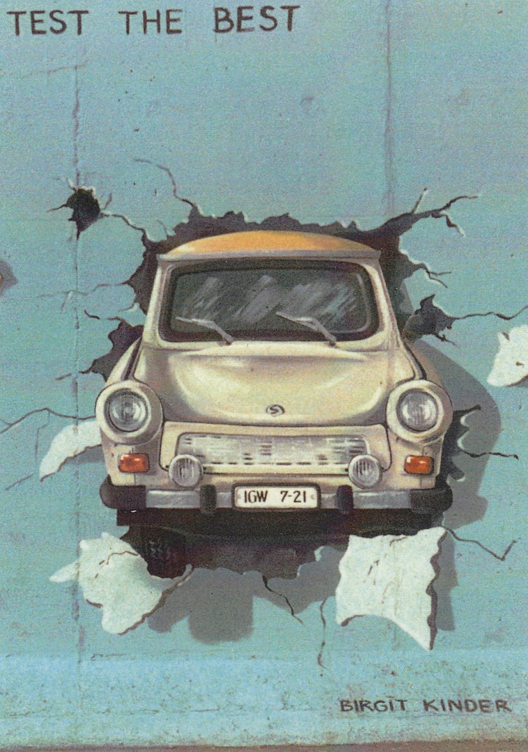
TEST THE BEST
By
BIRGIT KINDER
EAST SIDE GALLERY – THE BERLIN WALL
Published by
SCHIKKUS
Ref: Berlin 7997
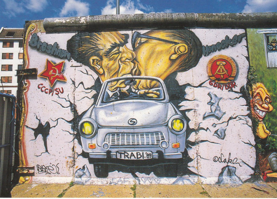
We visited Berlin twice last year, but only got to visit the East Side Gallery on the second visit. This is a long section of the Berlin wall which has remained standing and on which artists have a painted a variety of large paintings or murals. This area has become a major tourist attraction with people having their photographs taken standing beside or in front of some of the now famous images. There are a couple which are far better known than others and you can tell these ones by the queues of people gathered around them. This one here, which shows an East German Trabant automobile, as produced by the East German car manufacturer VEB Sachsenring Automobilwerke Zwickau between 1957 and 1990, breaking through the wall is one of these popular well-known paintings. The popular ones are also the ones which appear on the postcards, which are sold all over Berlin and not just at the East Side Gallery.
REVERSE SIDE OF ABOVE POSTCARD
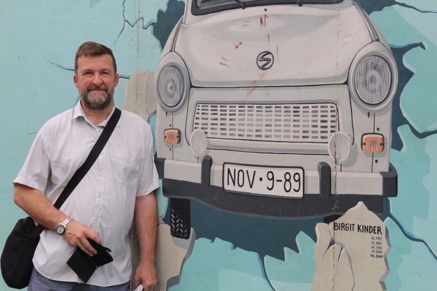
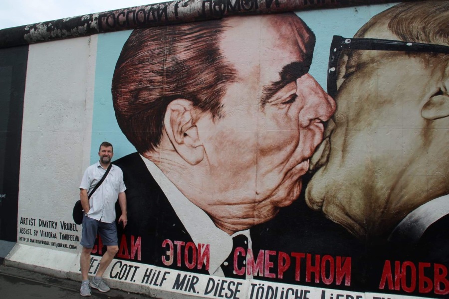
PHOTOGRAPH
19TH July 2019
Yours truly standing beside this painted section of the Berlin Wall

PHOTOGRAPH
19TH July 2019
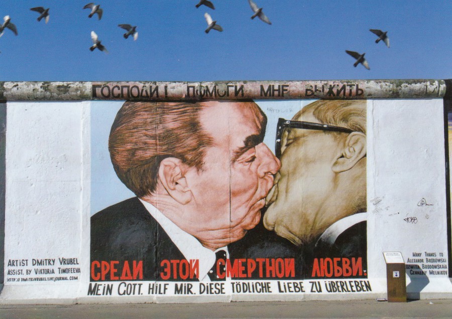
BERLIN
“MEIN GOTT HILF MIR, DIESE TODLICHE LIEBE ZU UBERLEBEN”
“My God help me to survive this death love”
Design by
DMITRY VRUBEL
EAST SIDE GALLERY – THE BERLIN WALL
Published by
SCHIKKUS
Ref: Berlin 8952
If anyone was to wonder which is the most famous of the East Side Gallery images, and which one has by far the longest queues, then without any doubt it would be this one. It is also the one which appears on the most postcards as well. The painting depicts the Russian leader Leonid Brezhnev and Eric Honecker in a socialist fraternal kiss. The image reproduces a famous photograph taken in 1979 during the 30th anniversary celebration of the foundation of the German Democratic Republic.

DER “BRUDERKUSS” DER STAATSOBERHAUPTER
L. BRESHNEW / SOWJETUNION (LINKS IM BILD) U. E. HONECKER / DDR
Bildkunstler: VRUBEL, Moskau
The “Brother Kiss” of the head of states
L. Breshnew [sic] / Soviet Union (left in picture) U. E. Honecker / GDR
Visual artist: VRUBEL, Moscow
Unknown Publisher
PHOTOGRAPH
19TH July 2019
Yours truly standing beside this painted section of the Berlin Wall
WHERE IS THE BERLIN WALL STILL STANDING?
WO STEHT NOCH BERLINER MAUR?
“BIS DASS DAS VOLK UNS SCHEIDET”
(“Until the People divides us”)
Graffiti by
VON CHRISTIAN “LAKE WAHLE”
Published by
GERD GLANZE, BERLIN
Ref: Nr. P4
This is a later piece of graffiti which incorporates the famous kiss piece with the Trabant automobile image. I get the impression that this one is making a bit of a mockery of the originals, or perhaps it is acknowledging the peoples fight in the DDR (East Germany) for unification and how the graffiti shows this.

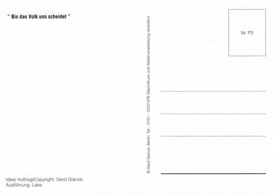
BIS DAS VOLK UNS SHEIDET
Published By
GERD GLANZE, BERLIN
Ref: Nr. P3
An image of the original design sketch for the graffiti depicted on the postcard above.
REVERSE SIDE OF ABOVE POSTCARD

BIS DAS VOLK UNS SHEIDET
Published By
GERD GLANZE, BERLIN
No Reference Number
The same images as on the above postcard but without the fancy boarder and with no reference number in the stamp box on the reverse side.
REVERSE SIDE OF ABOVE POSTCARD
If you place the reference number for the card above this one in the stamp box then you have the same layout exactly
26/04/2020
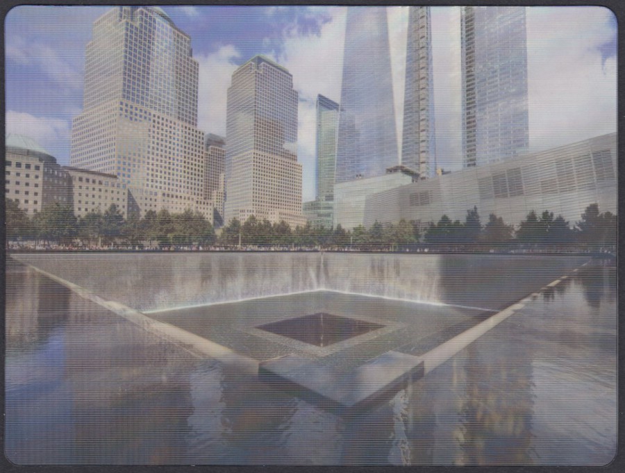
9/11 MEMORIAL
LENTICULAR (MOVING IMAGE) POSTCARD
Photographer
JON ORTNER (2014)
Published by the
9/11 MEMORIAL MUSEUM
This lovely postcard, which this scan does not do justice to, moves from day to night as you tilt it. It shows one of the tower monuments outside of the museum. I love novelty postcard so had to have this one.
If you go to our facebook page I have posted a short film showing the card and its changes as it is tilted.
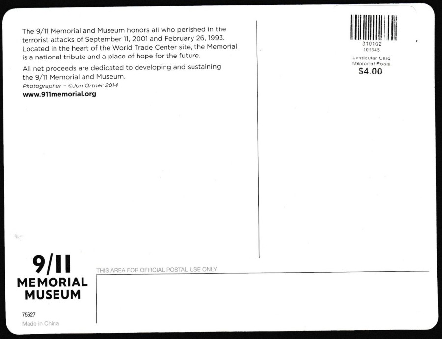
REVERSE SIDE OF ABOVE POSTCARD
I don’t think $4 is a bad price for a card of this quality, but it does go to show that contrary to many old collector’s opinions the collecting of modern postcards is not always the cheaper option.
25/04/2020
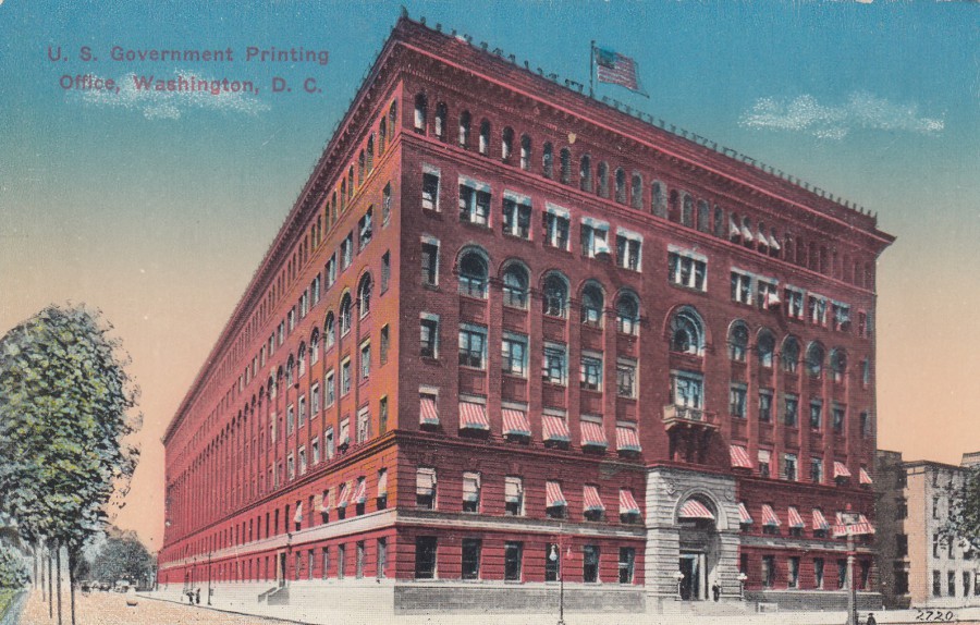
U. S. GOVERNMENT PRINTING OFFICE,
WASHINGTON, D. C.
Published by
B. S. REYNOLDS CO., WASHINGTON D. C.
Ref: 2720
What a lovely postcard and yet another one that I bought on my trip across the US back in 2018 (from an antiques/collectors shop). I don’t even have to write much about the origins of the building as it has a superb write up on the reverse side of the card itself (see below). I do like the bit at the end that tells us that ‘Over 7,000,000 Postal cards have been turned out in one day’. I would have loved to have seen that happening.
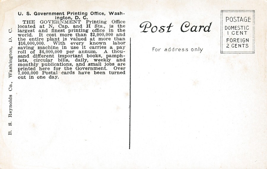
REVERSE SIDE OF ABOVE POSTCARD
I do love a postcard that gives you lots of information about what you are seeing on the card. This one has a great write up.
PHOTOGRAPH
Does not look like this has changed at all, but I bet the surrounding area has

25/04/2020
(LEFT SIDE)
BEACHY HEAD, EASTBOURNE
From and original watercolour drawing by
A. R. QUINTON
Published by
J. SALMON
Ref: 899
(RIGHT SIDE)
BEACHY HEAD & LIGHTHOUSE, EASTBOURNE
Unknown Publisher, Printer
Ref: 6952
A. R. Quinton is a well known and much collected postcard artist and from this one image you can see why. What I like about these two postcards is that you can see how good a landscape painter Quinton was, as they could almost be taken from the same spot these two images, a painting and a photograph. The other thing which really fascinates me is that clearly the photograph was taken some years later and as a result of the time difference the large piece of rock seen coming away from the cliff face in the painting had clearly fallen away by the time the photographer attended to take the photograph. So, you get two views of the same location but with the differences that time and wear, and natural erosion can have on our cliffs. Each of these cards is enhanced because I have the other one in my collection, they compliment each other and are made more interesting through this.
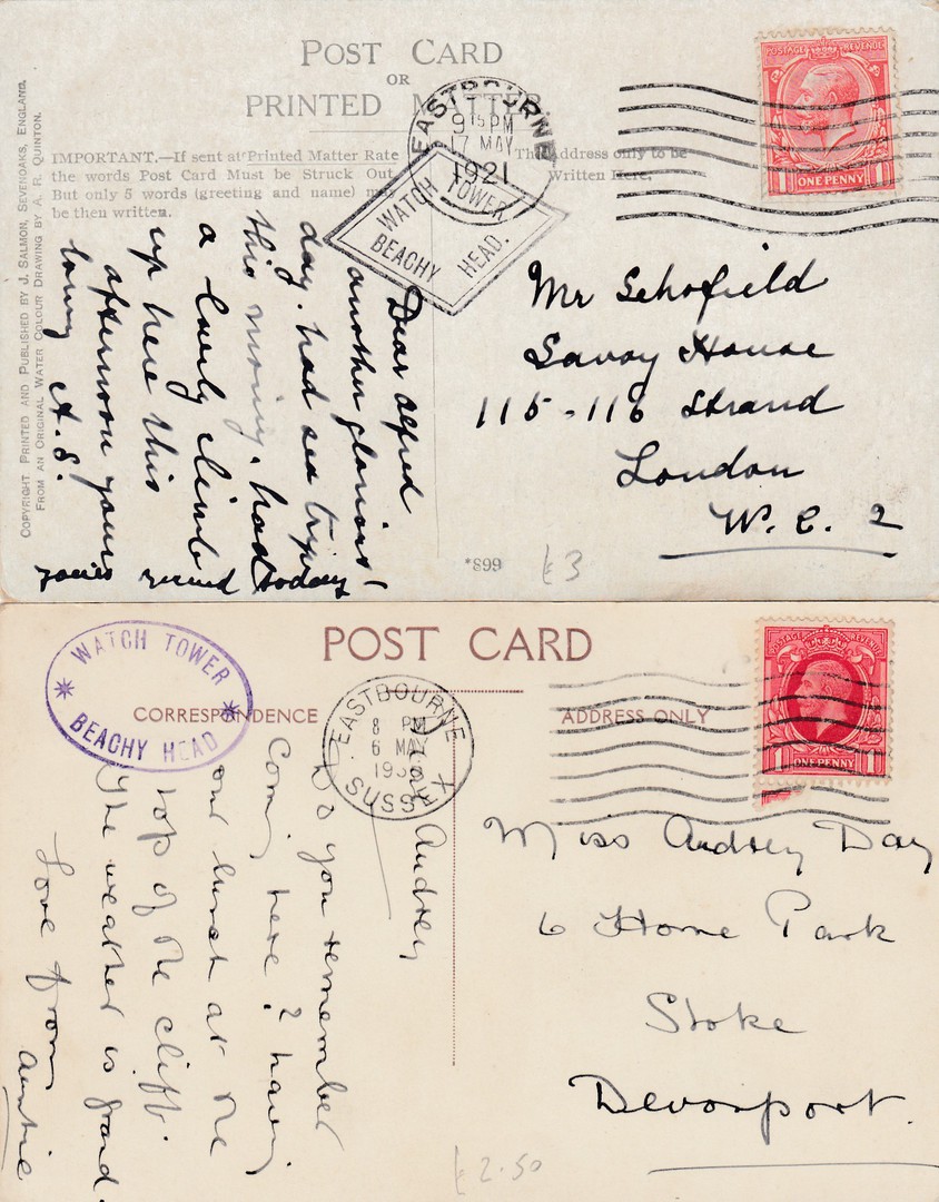
REVERSE SIDES OF ABOVE TWO POSTCARDS
(TOP – The Left side postcard)
This art postcard was posted from Eastbourne in 1921. If you visited the ‘Watch Tower at Beachy Head’ you could have a cachet applied to your postcard. Much like the Land’s End cachets these changed over time.
The cachet applied here is referenced as 24/5 in the 8th edition of the ‘Collect British Postmarks’ (Stanley Gibbons publication) and is valued at £5. The cachet was applied from 1921, so my card here was used in the first year of this cachet usage.
(BOTTOM – The Right side postcard)
This photographic postcard has a later used WATCH TOWER – BEACHY HEAD cachet, one which was first used from 1930. This one is referenced as 24/6 in the 8th edition of the ‘Collect British Postmarks’ (Stanley Gibbons publication). This one is worth a pound more at £6. Interestingly the above reverse side has a cachet applied in black which can also be found in purple, whilst this card has a cachet applied in purple which can also be found applied in black.
Cachets like these ‘definitely’ add value to a postcard, but I also think they add a lot of extra interest as well.

25/04/2020
THE LONGSHIPS LIGHTHOUSE
Published by
F. FRITH & Co., Ltd, Reigate
Ref: 31809(?) [not sure what the last digit is – it may even by an ‘F’]
The Longships Lighthouse is still active today, although its general look has obviously changed at the top with new modernisations. The first lighthouse here was built in 1795, the current lighthouse was built in 1873 (and went fully automated in 1988). The initial lighthouse was made redundant because of its lower height which meant that high seas could obscure it. The building of the lighthouse depicted here commenced in 1869.
Lighthouses have always been a popular postcard theme and any seaside town or coastal location anywhere near a lighthouse had images of it on sale. The Longships Lighthouse is about 1.25 miles off the coast of Land’s End in Cornwall, so images of it have been sold at the gift shop at Land’s End, where this one was bought.
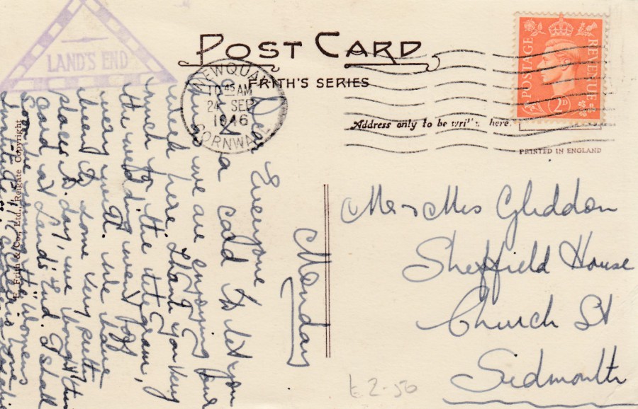
REVERSE SIDE OF ABOVE POSTCARD
The reason why I knew this card had been acquired at Land’s End is because the buyer had the cachet applied to the card, the purple triangular ‘LAND’S END’ one. In my 8th edition of the ‘Collect British Postmarks’ (Stanley Gibbons publication) this cachet is pictured and given the reference 24/95. This excellent book also tells me it was in use between 1901 and 1978 and catalogues its value at £2 (I think its probably a little lower). As those who visit the webpage with any regularity will know, I do like my cachets.
25/04/2020
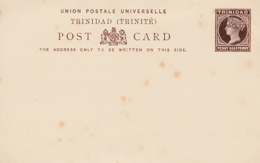
TRINIDAD
PENNY HALFPENNY POSTAL STATIONERY POST CARD
Higgins & Gage, World Postal Stationery Catalog
Section 2
Trinidad - Page 1
Reference No: 4
Issued: 1884
Trinidad commenced issuing postal stationery post cards in 1879, but the original cards required a stamp to be applied, they did not have a pre-printed stamp. It was only the postal card issued immediately before this one here that had a pre-printed stamp. This card here was issued alongside a Half Penny, a One Penny and a Two Penny valued issues in the same basic format, with some minor text differences related to the areas that the postage covered cost to (although, also, the Half Penny did not have the (TRINITE) section of the top text block).
This is another extremely cheap postal stationery post card, one that can be picked up for less that £1, unless postally used.
25/04/2020
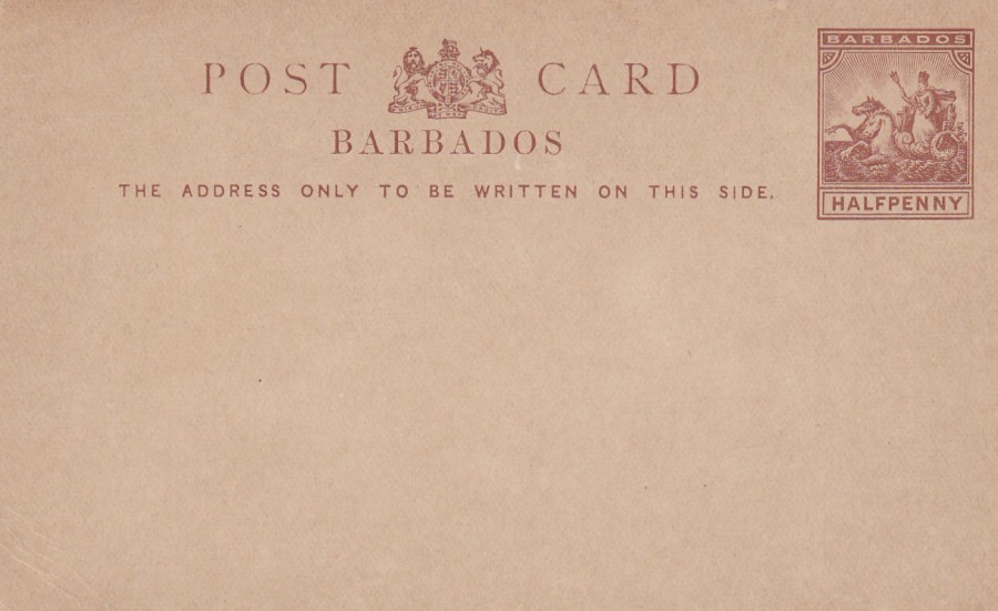
BARBADOS
HALFPENNY POSTAL STATIONERY POST CARD
Higgins & Gage, World Postal Stationery Catalog
Section 2
Barbados - Page 1
Reference No: 8
Issued: 1892 – 1893
A nice mint copy of this earlyish issue from Barbados
25/04/2020
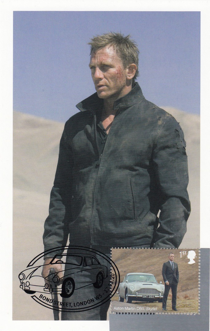
JAMES BOND
Maxi-Cards
PART SIX
When Royal Mail issued their James Bond stamp set last month I decided to buy some of these stamps and stick them on some related postcards to be sent off for special hand stamps. I used postcards from the special JAMES BOND 100 postcards box set. Here are a few more that recently were returned to me, and over the past three days I have had quite a few returned (23 in fact – I shall have to spread these over a few days!!) I shall do a few here which are the same card but with either different cancels or even different cancels and stamps.
DANIEL CRAIG AS JAMES BOND IN
QUANTUM OF SOLACE (2008)
Home Made Maxi-Card
Postcard from the
JAMES BOND 100 POSTCARDS
Boxed set
This postcard has what I think might be my favourite special James Bond hand stamp so far ‘BOND STREET, LONDON W5’, which has Bond’s Aston Martin DB5 as part of the cancels design. The stamp I used here is the one from the miniature stamp sheet that features this car.

DANIEL CRAIG AS JAMES BOND IN
QUANTUM OF SOLACE (2008)
Home Made Maxi-Card
Postcard from the
JAMES BOND 100 POSTCARDS
Boxed set
This one has the ‘JB’ initials Bond Street W5 special hand stamp applied to the ‘JAMES BOND IN CASINO ROYALE’ 1st class stamp.
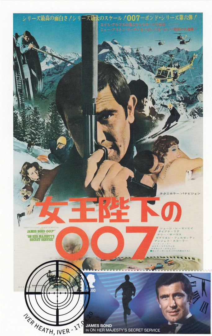
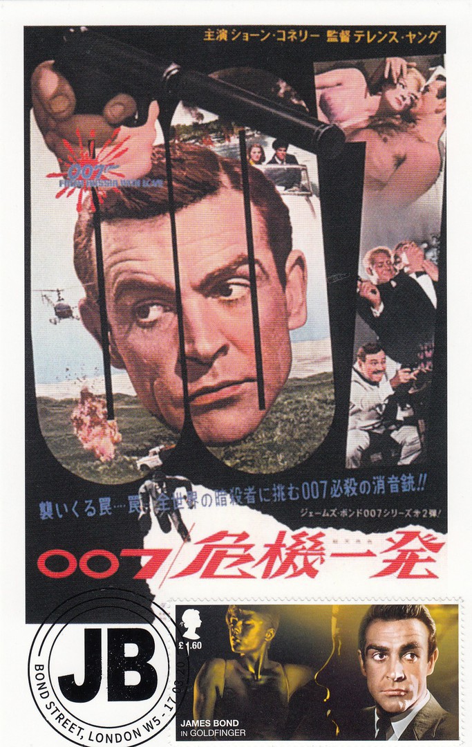
JAPANESE POSTER FOR
ON HER MAJESTY’S SECRET SERVICE (1969)
Home Made Maxi-Card
Postcard from the
JAMES BOND 100 POSTCARDS
Boxed set
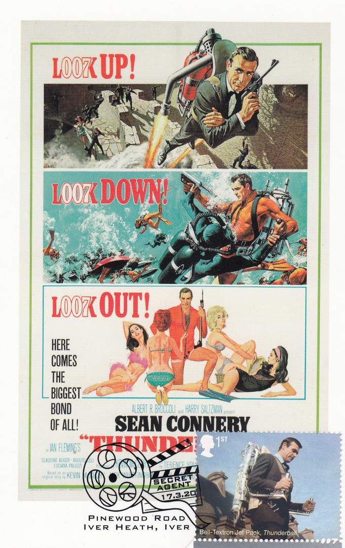
This one has the appropriate stamp applied cancelled with the special ‘Gunsight’ image hand stamp from IVER HEATH, IVER, which is where the Pinewood Studios are located (if you were wondering).

JAPANESE POSTER FOR
ON HER MAJESTY’S SECRET SERVICE (1969)
Home Made Maxi-Card
Postcard from the
JAMES BOND 100 POSTCARDS
Boxed set
The same postcard and James Bond stamp as with the card above but here the stamp has been cancelled with the film reel image PINEWOOD ROAD, IVER HEATH, IVER first day of issue cancel.
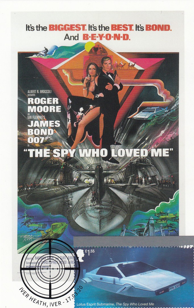
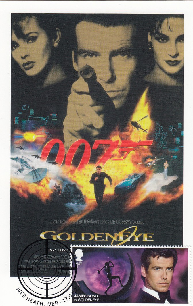
US POSTER FOR
THE SPY WHO LOVED ME (1977)
Home Made Maxi-Card
Postcard from the
JAMES BOND 100 POSTCARDS
Boxed set
My favourite Bond movie. This film poster postcard has had the Lotus Esprit Submarine car stamp from the James Bond miniature stamp sheet applied and cancelled with the ‘Gunsight’ image hand stamp from IVER HEATH, IVER.
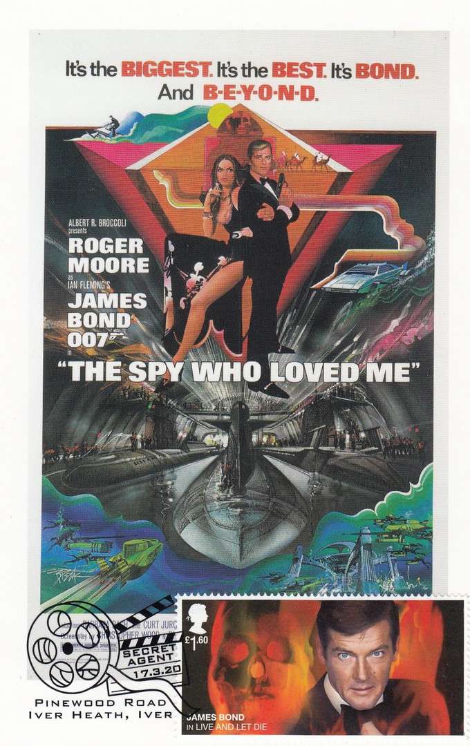
US POSTER FOR
THE SPY WHO LOVED ME (1977)
Home Made Maxi-Card
Postcard from the
JAMES BOND 100 POSTCARDS
Boxed set
The same postcard but here used with the Roger Moore James Bond stamp (which mentions the film ‘Live and Let Die’, my second favourite Bond movie). This has been cancelled with the PINEWOOD ROAD, IVER HEATH, IVER first day of issue cancel.
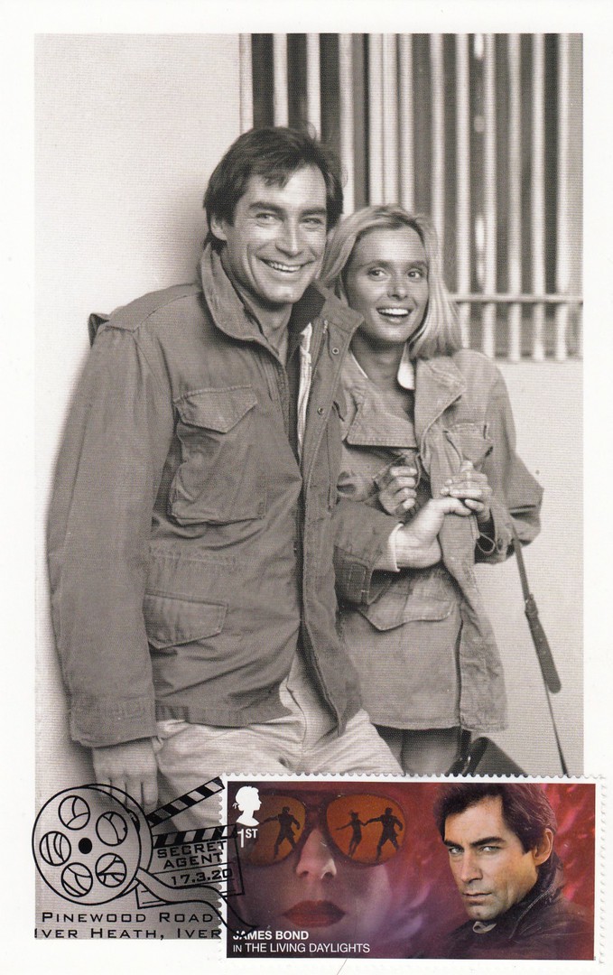
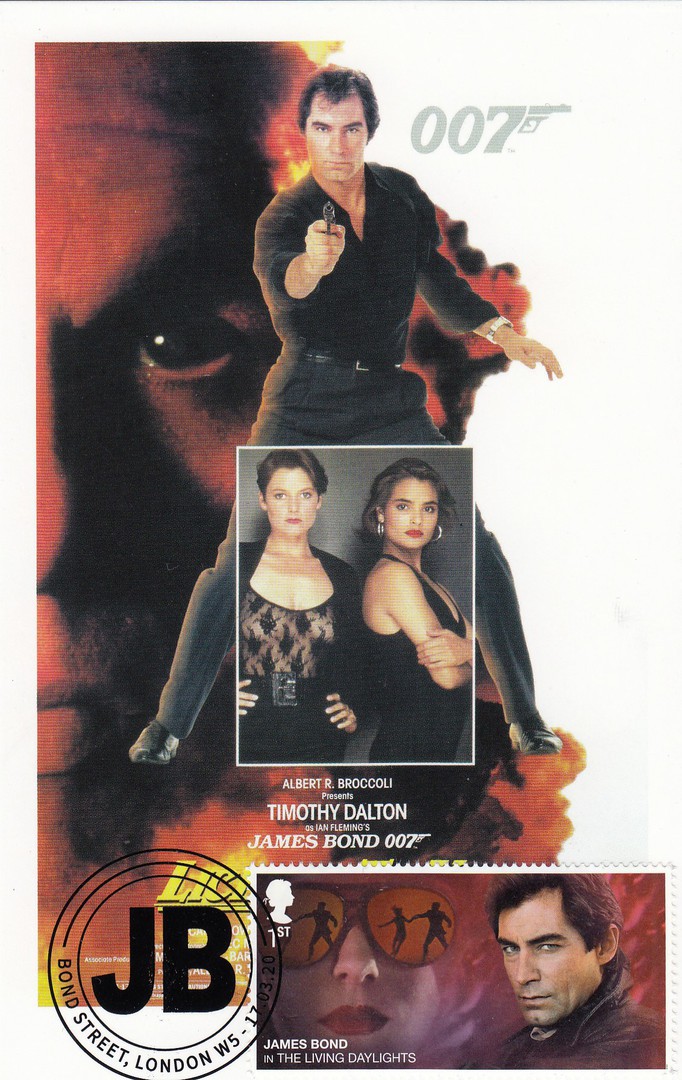
TIMOTHY DALTON (JAMES BOND) AND MARYAM D’ABO (KARA MILOVY) RELAX OFF SET
THE LIVING DAYLIGHTS (1987)
Home Made Maxi-Card
Postcard from the
JAMES BOND 100 POSTCARDS
Boxed set
I have mentioned before that I do like it where I have matched up the postcards image with the correct named James Bond film as mentioned on the postage stamp. Here the stamp has been cancelled with the PINEWOOD ROAD, IVER HEATH, IVER film reel cancel.
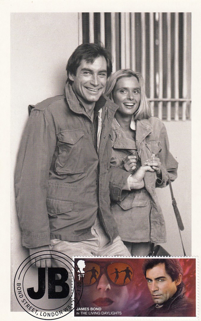
TIMOTHY DALTON (JAMES BOND) AND MARYAM D’ABO (KARA MILOVY) RELAX OFF SET
THE LIVING DAYLIGHTS (1987)
Home Made Maxi-Card
Postcard from the
JAMES BOND 100 POSTCARDS
Boxed set
The same combination of stamp and postcard but here the stamp has been cancelled with the ‘JB’ initials Bond Street W5 special hand stamp
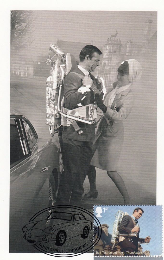
MADEMOISELLE LA PORTE (MARYSE GUY MITSOUKO) HELPS JAMES BOND (SEAN CONNERY) REMOVE HIS JET PACK IN
THUNDERBALL (1965)
Home Made Maxi-Card
Postcard from the
JAMES BOND 100 POSTCARDS
Boxed set
This has a different hand stamp as that used on the previously depicted copy of this postcard which I placed on the webpage on the 16th April

US POSTER FOR
YOU ONLY LIVE TWICE (1967)
Home Made Maxi-Card
Postcard from the
JAMES BOND 100 POSTCARDS
Boxed set
This has a different hand stamp as that used on the previously depicted copy of this postcard which I placed on the webpage on the 17TH April
US POSTER FOR
THUNDERBALL (1965)
This has a different hand stamp as that used on the previously depicted copy of this postcard which I placed on the webpage on the 22ND April
25/04/2020
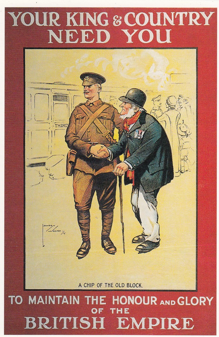
YOUR KING & COUNTRY
NEED YOU.
TH MAINTAIN THE HONOUR AND GLORY
OF THE
BRITISH EMPIRE
“ A CHIP OFF THE OLD BLOCK “
Poster design by
LAWSON WOOD
Published by
THE NATIONAL ARMY MUSEUM
CHELSEA, LONDON
Copyright 1997
“Posters [sic – I think this should have just been ‘Poster’] published by the Parliamentary Recruiting Committee in 1914. Over a million volunteers joined up in 1914. Even so these were insufficient to replace the enormous casualties on the Western Front and conscription was introduced in 1916”
(Text from reverse side of Postcard)
Today is ‘Anzac Day’ and normally I would dig out a related postcard which depicts a soldier from either Australia or New Zealand, but most of my cards are still in storage and travel is limited in these unusual times. So, I have looked through my already scanned images and found this period card from WW1, although from the UK, but at least the British Empire is mentioned.
24/04/2020
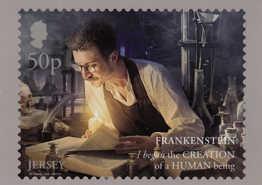
FRANKENSTEIN 200 YEARS
STAMP POSTCARDS
Depicting stamp Set Issued by
JERSEY POST
Released 18th June 2018
Published by
JERSEY POST
I bought this set of stamp cards at the Autumn 2018 Stampex show in London. I thought the stamp set was nice and was delighted to find that Jersey Post had issued a set of postcards depicting the stamp images. This stamp card set was also far cheaper than buying the individual stamps and the £3 stamp sheet that was also issued and which also has its own postcard here in this set.
The postcards are not individually titled, so I have taken the text that appears on each stamp as a title, and they do not have any individual reference numbers.
I thought the artwork on these designs was superb and anyone interested in the Frankenstein story, or who collects Horror themed postcards would love this set,
50p STAMP
FRANKENSTEIN: I BEGAN THE CREATION OF A HUMAN BEING
FRANKENSTEIN 200 YEARS
STAMP POSTCARDS
Depicting stamp Set Issued by
JERSEY POST
Released 18th June 2018
Published by
JERSEY POST

65p STAMP
FRANKENSTEIN: I BEHELD THE ACCOMPLISHMENT OF MY TOIL
FRANKENSTEIN 200 YEARS
STAMP POSTCARDS
Depicting stamp Set Issued by
JERSEY POST
Released 18th June 2018
Published by
JERSEY POST
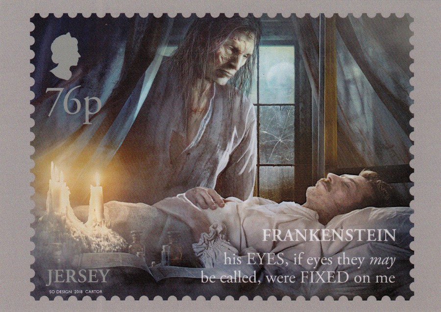
76p STAMP
FRANKENSTEIN: HIS EYES, IF EYES THEY MAY BE CALLED, WERE FIXED ON ME
FRANKENSTEIN 200 YEARS
STAMP POSTCARDS
Depicting stamp Set Issued by
JERSEY POST
Released 18th June 2018
Published by
JERSEY POST
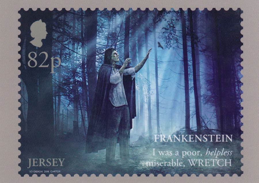
82p STAMP
FRANKENSTEIN: I WAS A POOR, HELPLESS MISERABLE, WRETCH
FRANKENSTEIN 200 YEARS
STAMP POSTCARDS
Depicting stamp Set Issued by
JERSEY POST
Released 18th June 2018
Published by
JERSEY POST
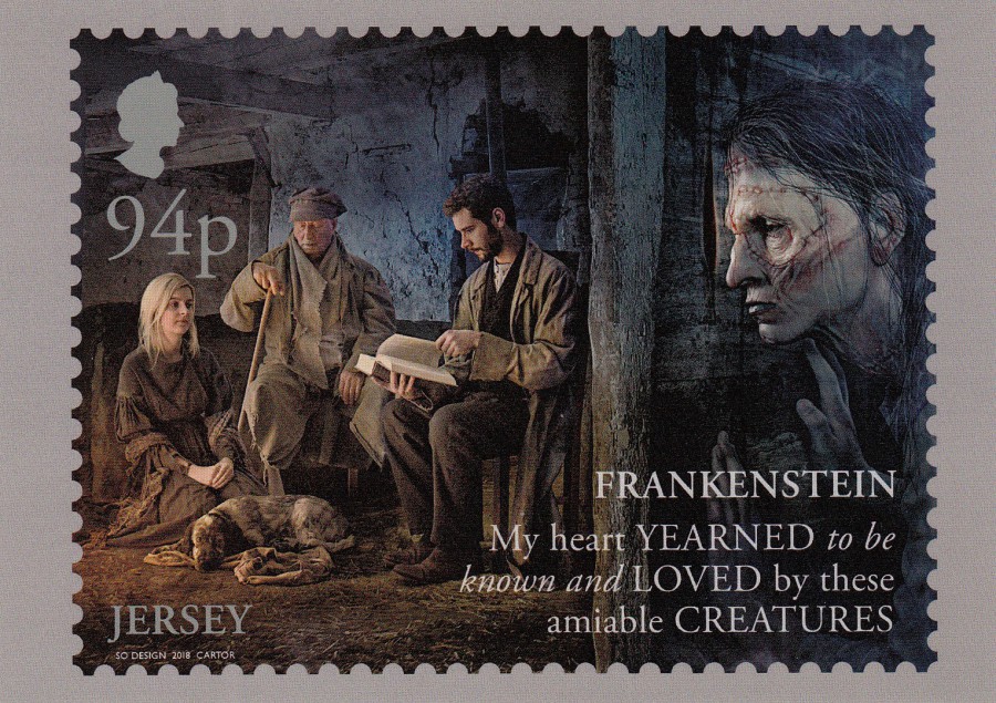
94p STAMP
FRANKENSTEIN: MY HEART YEARNED TO BE KNOWN AND LOVED BY THESE AMIABLE CREATURES
FRANKENSTEIN 200 YEARS
STAMP POSTCARDS
Depicting stamp Set Issued by
JERSEY POST
Released 18th June 2018
Published by
JERSEY POST
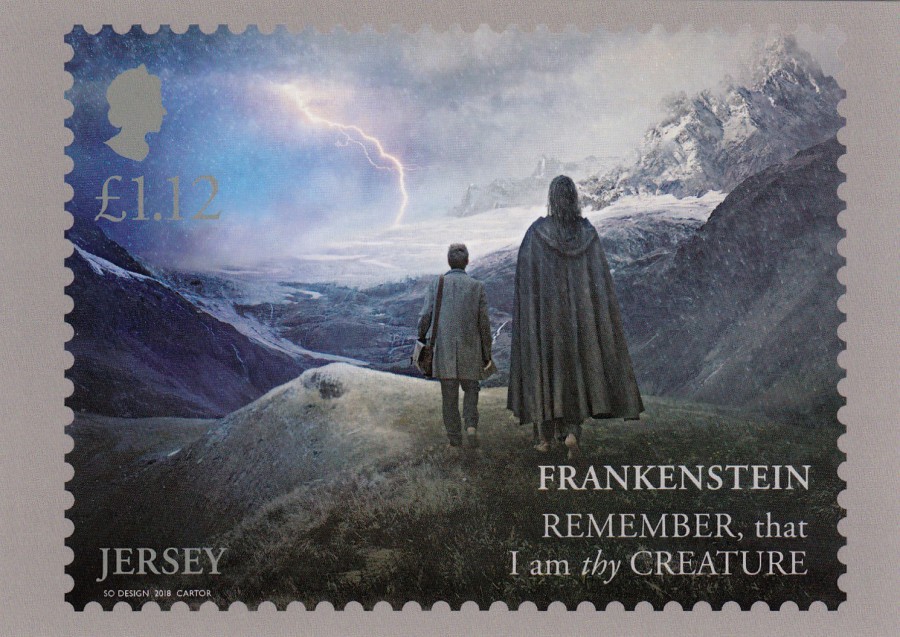
£1.12p STAMP
FRANKENSTEIN: REMEMBER, THAT I AM THY CREATURE
FRANKENSTEIN 200 YEARS
STAMP POSTCARDS
Depicting stamp Set Issued by
JERSEY POST
Released 18th June 2018
Published by
JERSEY POST
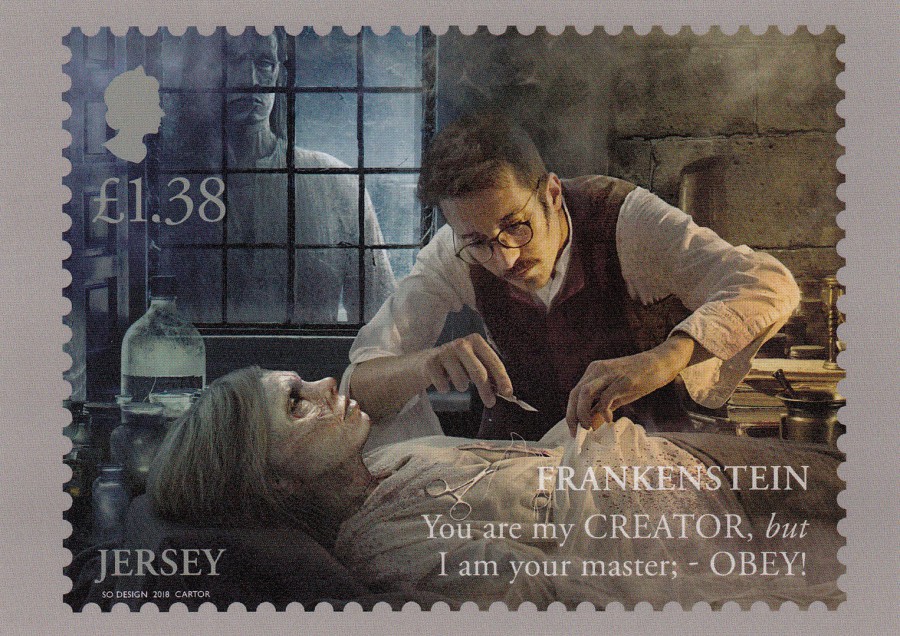
£1.38p STAMP
FRANKENSTEIN: YOU ARE MY CREATOR, BUT I AM YOUR MASTER; OBEY!
FRANKENSTEIN 200 YEARS
STAMP POSTCARDS
Depicting stamp Set Issued by
JERSEY POST
Released 18th June 2018
Published by
JERSEY POST
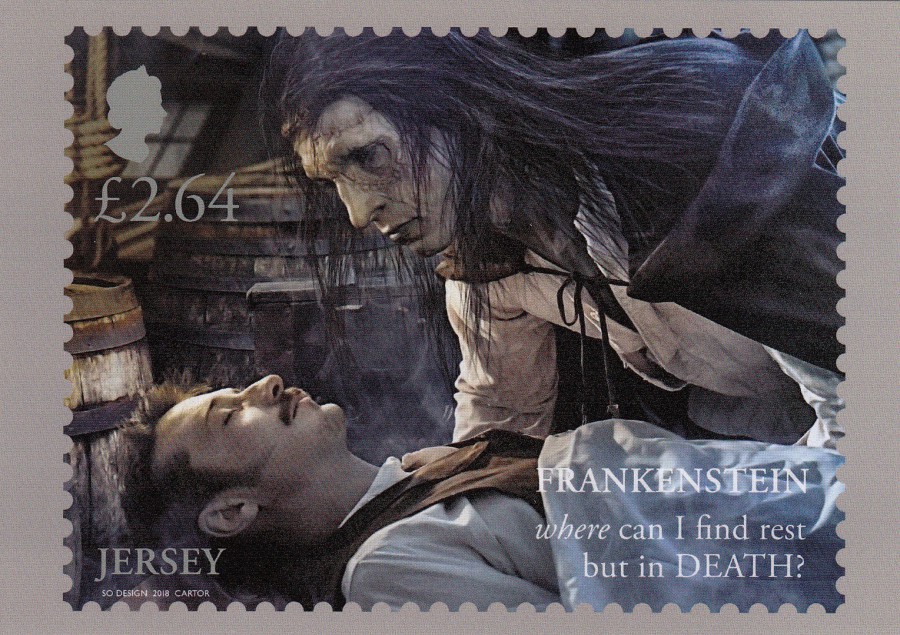
£2.64p STAMP
FRANKENSTEIN: WHERE CAN I FIND REST BUT IN DEATH?
FRANKENSTEIN 200 YEARS
STAMP POSTCARDS
Depicting stamp Set Issued by
JERSEY POST
Released 18th June 2018
Published by
JERSEY POST
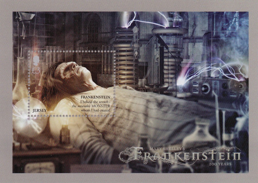
£3 STAMP SHEET
MARY SHELLEY’S FRANKENSTEIN 200 YEARS
‘I BEHELD THE WRETCH, THE MISERABLE MONSTER WHOM I HAD CREATED’
FRANKENSTEIN 200 YEARS
STAMP POSTCARDS
Depicting stamp Set Issued by
JERSEY POST
Released 18th June 2018
Published by
JERSEY POST
Although the postcard image is one dimensional the issued stamp sheet was lenticular, and the monsters face changed as you turned the stamp sheet. The postcard may not do this, but it is still a cracking single image postcard (what fun it might have been if they had also made the postcard lenticular, oh well)
24/04/2020
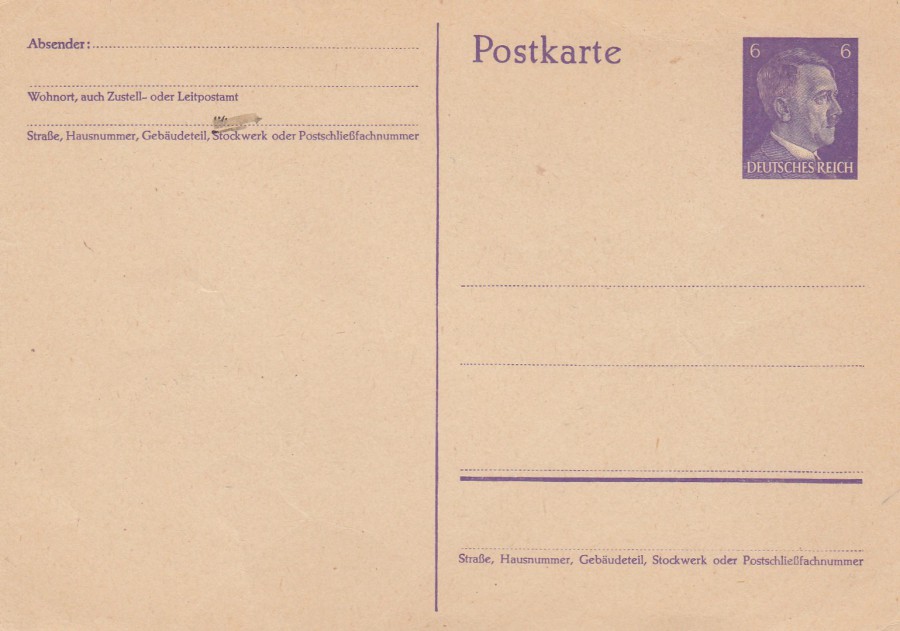
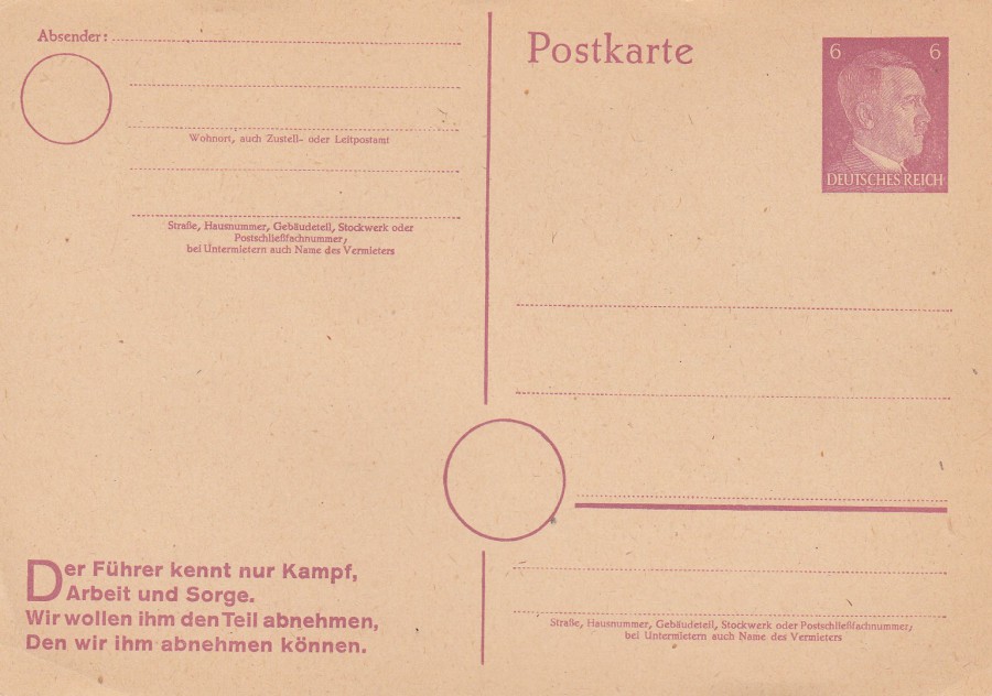
THIRD REICH POSTAL STATIONERY POST CARDS
WORLD WAR TWO
6 Pfg Violet to Purple Hitler Head
(Colours of paper and ink vary considerably for this wartime issue)
Higgins & Gage, World Postal Stationery Catalog
Section 7
Germany - Page 23
Reference No: 292
Issued: 1941
(Michel Reference - Mi P 299)
I have mentioned before the dilemma of collecting philatelic items which were issued by the Nazi’s, before and during world war II. I have chosen to collect these because of my interest in military history, and the postal systems and issues of all countries involved in the conflict are of interest to me. It should also be noted that Third Reich material has always been collectible, by all types of people and with the vast majority, by far, collecting because of an interest in the items and not because of any following or like for the Nazi politics or beliefs. There will always be the odd one or two exceptions to the rule, but I have a wide range of friends both at club level and through social media who collect Third Reich philately, and I have yet to meet a collector of this stuff who in anyway, shape or form is a follower of that type of politics.
These postal stationery post cards are common and should not cost a collector more than a few pounds (between £1 and £4 depending on the issue), this one here probably only £1.
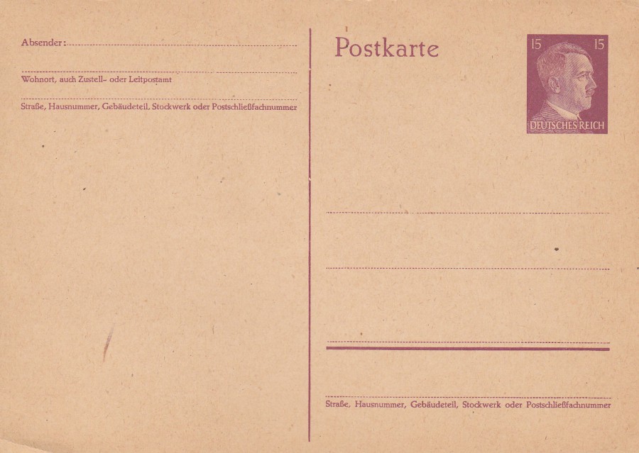
15 Pfg Red violet to Brown Lilac (this one here is towards the Brown Lilac end of the colouring variants)
(Colours of paper and ink vary considerably for this wartime issue)
Higgins & Gage, World Postal Stationery Catalog
Section 7
Germany - Page 23
Reference No: 293
Issued: 1941
(Michel Reference - Mi P 300)
6 Pfg Red violet on buff card – With Slogan [bottom left side]
New setting of card with added circle for district number
Higgins & Gage, World Postal Stationery Catalog
Section 7
Germany - Page 26
Reference No: 313 a
(With Slogan Type 9)
Issued: 1944
(Michel Reference - Mi P 314 II)
This type, with the central circle added for the district number to be written in came along later in the war, 1944. Copies of this design without the slogan printed bottom left are worth considerably more (£15 - £20), this one is much cheaper, catalogued in the old Higgins & Gage at £1.150.
23/04/2020
THE BIG NIGHT IN
BBC 1 Tonight 1900hrs – 2200hrs
There is to be a special comedy fund raiser being shown on BBC 1 tonight. My issue of ‘Radio Times’ magazine informs me that it is a joint effort between the people behind the bi-annual ‘COMIC RELIEF’ and the annual ‘CHILDREN IN NEED’ charities.
This special is to pay tribute to those on the front-line fighting Corvid 19 (the coronavirus) and allow the charities to raise money for the vulnerable people across the country who are being affected by this pandemic and the lockdown.
So, to keep the webpage relevant today I post both a Comic Relief card and a Children in Need postcard.
COMIC RELIEF
INVITES YOU TO LOG ON
TO RUDOLPH’S WEB NOSE AT … [webpage details given]
IT’S BIG, IT’S RED AND IT’S RUDE… IN PARTS!
Published by
BOOMERANG
This is quite an old Comic Relief postcard from some years ago. It has a strange sort of conjoined Comic Relief/Christmas link.
REVERSE SIDE OF ABOVE POSTCARD

CHILDREN IN NEED
2000
Illustration by
JO LEECH
Designed and printed by
THOUGHT FACTORY
Published by
REFLECTIONS OF A BYGONE AGE
REVERSE SIDE OF ABOVE POSTCARD