20/10/2017
CHURCHILL
IN CINEMAS JUNE 16
Film Advert Set
Official Postcard set by unknown printer but probably published for the film distributor
FILM POSTER
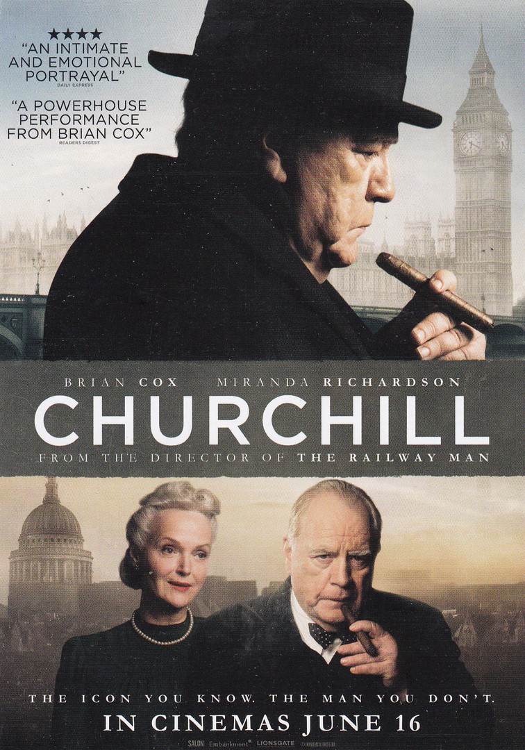
This film poster card was the card that topped the folded strip of five postcards where were all connected via perforated strips down the sides (this one had one perforated strip down the right side whilst the last card in the strip has a perforated edge down the left side – the other three clearly have perforated edges down both sides). The film starred Brian Cox as the titular character and although I rather like this film poster I gather the film itself did not garner many rave reviews. This is a shame as I quite like the actor Brian Cox, so, maybe I will still give it a go when it is on TV.
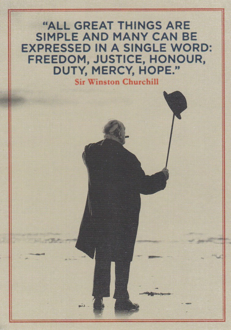
“ALL GREAT THINGS ARE SIMPLE AND MANY CAN BEEXPRESSED IN A SINGLE WORD: FREEDOM, JUSTICE, HONOUR, DUTY, MERCY, HOPE”
Winston Churchill
The four other postcards in the strip all depicts photographs of Cox as Churchill with one of Churchill’s quotes printed over the black and white photographs.
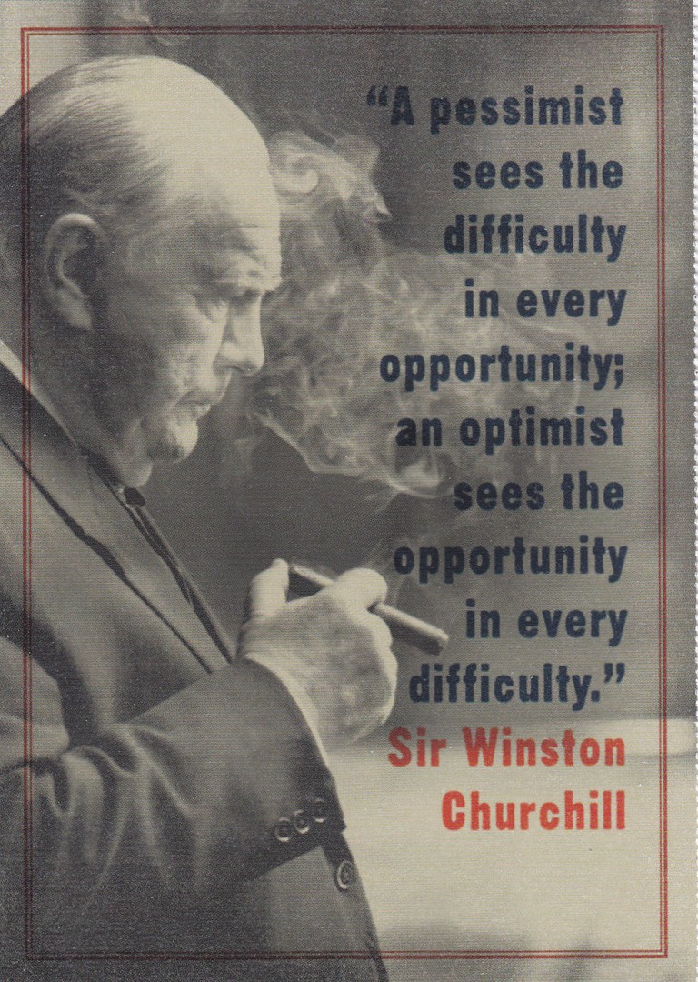
“A PESSIMIST SESS THE DIFFICULTY IN EVERY OPPORTUNITY; AN OPTIMIST SEES THE OPPORTUNITY IN EVERY DIFFICULTY”
Winston Churchill

“SUCCESS IS THE ABILITY TO GO FROM ONE FAILURE TO ANOTHER WITH NO LOSS OF ENTHUSIASM
Winston Churchill
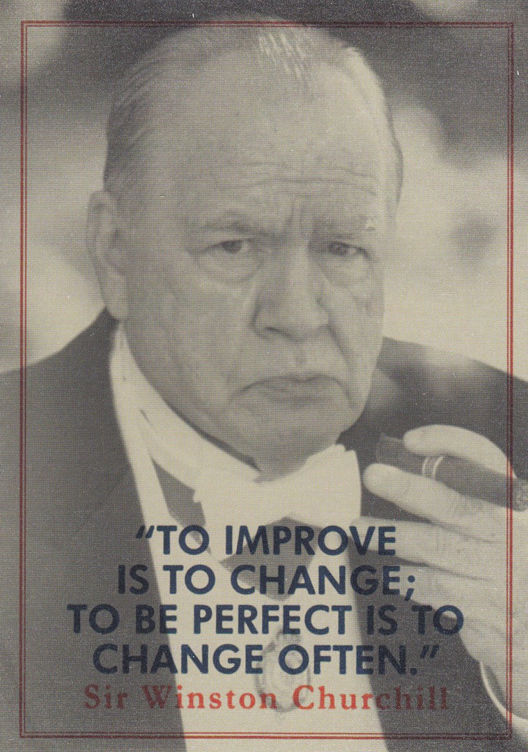
TO IMPRIVE IS TO CHANGE; TO BE PERFECT IS TO CHANGE OFTEN”
Winston Churchill
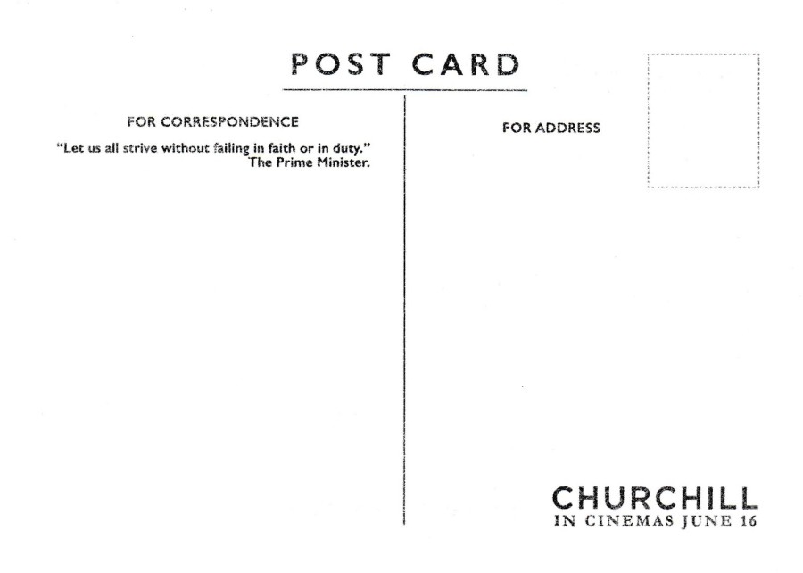
REVERSE SIDE OF POSTCARD
The basic reverse design for all five Churchill postcards is the same

20/10/2017
HATE CANCER?
DO SOMETHING ABOUT IT…
RIDE TO FIGHT KIDS’ CANCER THIS OCTOBER
2016 GREAT CYCLE CHALLENGE
Published by
AVANTCARD AUSTRALIA
Ref: #20086
Issued 2016
A great and simple card, and who has not lost a family member or friend to cancer. This postcard advertises the Great Cycle Challenge which is/was designed to get more people out and about on cycles, and I assume get them fit and less likely to suffer from a cancer based illness. Seems like a good idea.

REVERSE SIDE OF ABOVE POSTCARD
Which gives details of the Great Cycle Challenge
CHILDREN
In the French cartoon style
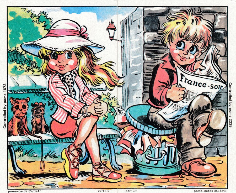
COMPOSITE PAIR OF CARDS
Published by
POMA-CARDS
GIRL
(Far Left Postcard)
Controlled by poma 1673
Ref: poma-cards 85/3247
BOY
(Near Left Postcard)
Controlled by poma 2229
Ref: poma-cards 85/3248
These two composite images, which join-together to make a single image, are by the same publishers as the two Springbok Antelope cards I posted previously on the webpage. Again, these are cards sent out by radio hams (QSL Cards) with the interesting addition that each individual card was sent out by a different radio ham. So, you needed to make-contact with both to obtain the entire image. There is every indication that these operators were located in France, (thus the style that the children have been painted in which was common on postcards and artwork in Northern France in the 1970’s – 1980’s and before). The Springbok cards were from operators in the Nederland’s so poma-cards produced these cards for people in different countries. These are unusual cards, not true postcards, but the same size and thickness quality, but many are either plain backed or have printed areas to be completed by the receiving radio ham, a tick box like format. These two are plain backed, but could technically be posted still.
20/10/2017
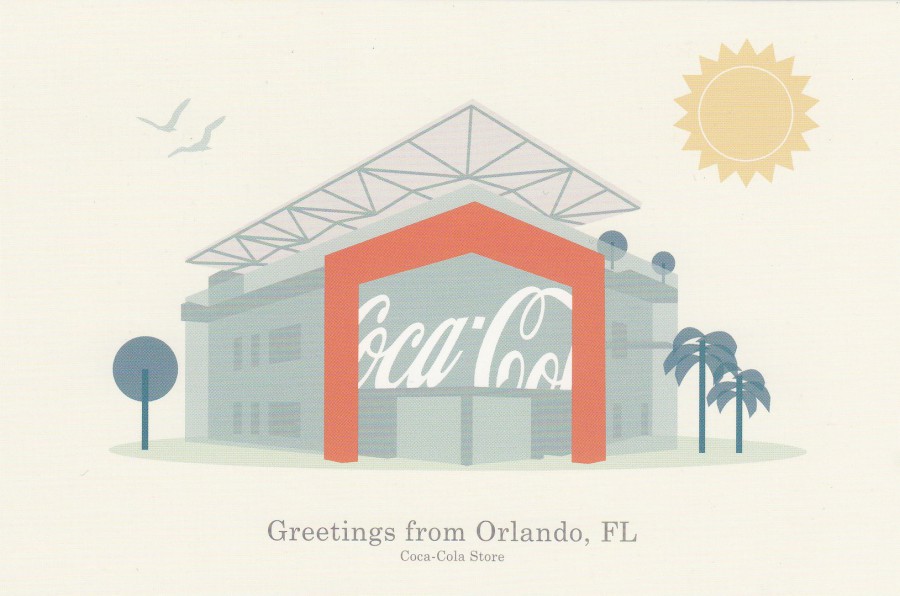
GREETINGS FROM ORLANDO, FL
COCA-COLA STORE
‘ICE COLD SUNSHINE’
Published by
The Coca-Cola Corporation
Ref: #18643
I bought some postcards last year from the Coca-Cola store located in Disney Springs at Walt Disney World and I have posted all of those on this webpage already. But, on this year’s visit I found two new ones which I did not see last year. This art card, depicting a very idealistic view of the frontage of the store, was one of these new ones. I ‘actually’ really liked this one.
If you ever visit here I highly recommend the Fanta Strawberry Float, it is my favourite thing to get from the Coca-Cola bar on the top floor.

GREETINGS FROM ORLANDO, FL
COCA-COLA STORE
Published by
The Coca-Cola Corporation
Ref: #18644
This was the other new to me postcard from the Coca-Cola store in Disney Springs. I think this one shows some sort of artists impression of the front of the store (the people at the top look way too tall for me as it looks like this is not in a true perspective of the actual building – not that this matters to much as the image is still rather nice).
Another recommendation to try at the upstairs bar is the ‘Float Tray’, eight different Coca-Cola drinks each with a scoop of vanilla ice-cream in them (I always ask to swop the Root Beer for a Fanta Pineapple).
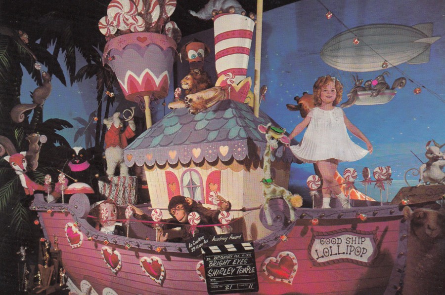
SHIRLEY TEMPLE
‘BRIGHT EYES’
MOVIELAND WAX MUSEUM
Ref: B1649
“Shirley Temple in the 1935 production of ‘BRIGHT EYES.’ The little star’s voice on the original soundtrack sings ‘The Good Ship Lollipop’ aboard her fanciful boat of the same name. The delightful ship is complete with candy goodies and animated toys”
(Text from reverse side of Postcard)
I am not sure I could ever be described as a fan of Shirly Temple but I am ‘definitely’ a fan of this cracking postcard. It was another buy from the Antiques & Props shop I found inside the Universal Studios theme park (like the Superman postcard I have already posted). Again, it was at the expensive end of its catalogue value but chances are I will never see another copy. I just had to have this one.
20/10/2017
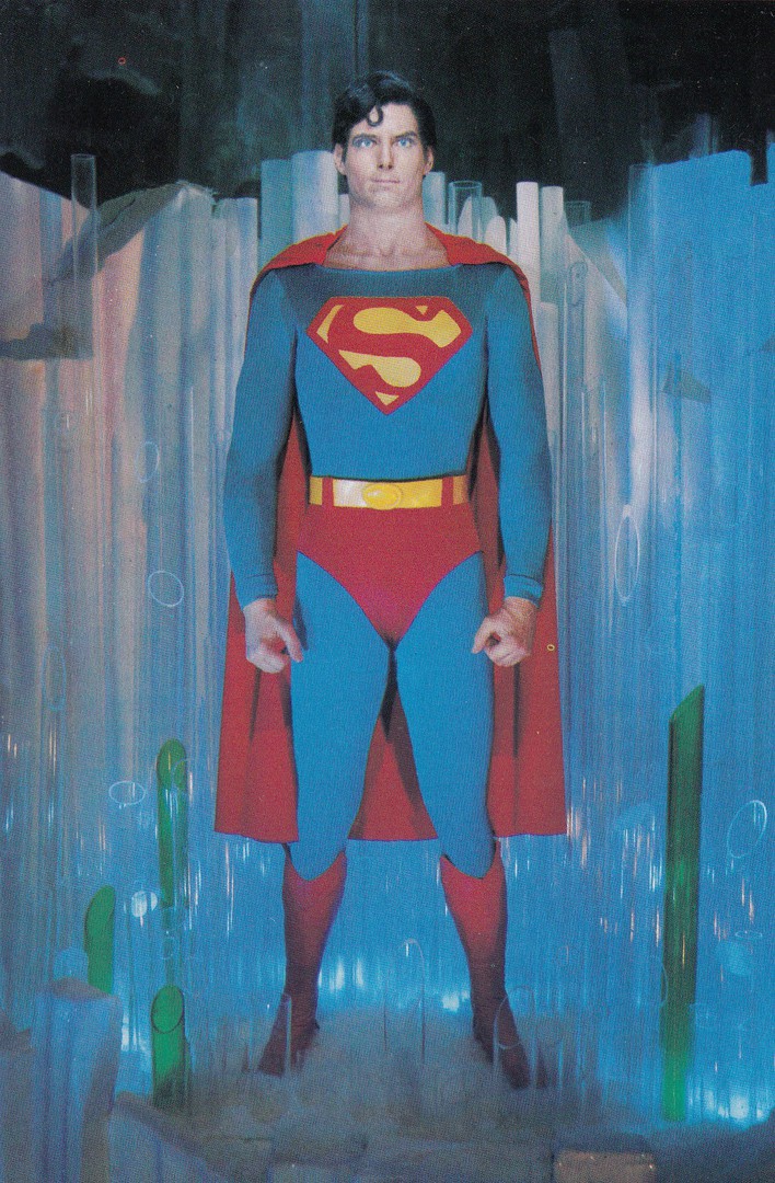
LIKENESS OF ACTOR CHRISTOPHER REEVE
SUPERMAN
MOVIELAND WAX MUSEUM
Ref: B9654
“Likeness of actor Christopher Reeve is created in wax at Movieland Wax Museum, Buena Park, California, in The Fortress of Solitude scene from ‘Superman the Movie’”
(Text from reverse side of Postcard)
This was a postcard I bought in a special Antiques & Props shop located inside the Universal Studios theme park. I posted images of the postcard stack and the inside of the store on the webpages Facebook page (always worth signing up to this one as I often place postcard images from shops and other locations and put bits of other news and snippets on here – look for ‘marks postcard chat’). These were not cheap, and probably at the very top end of their catalogue value (although eBay might be a little higher at times), but, I really wanted to buy one or two postcards from this location, and, this one fits so well into my Superhero themed collection (although I still find the eyes a bit scary)

20/10/2017
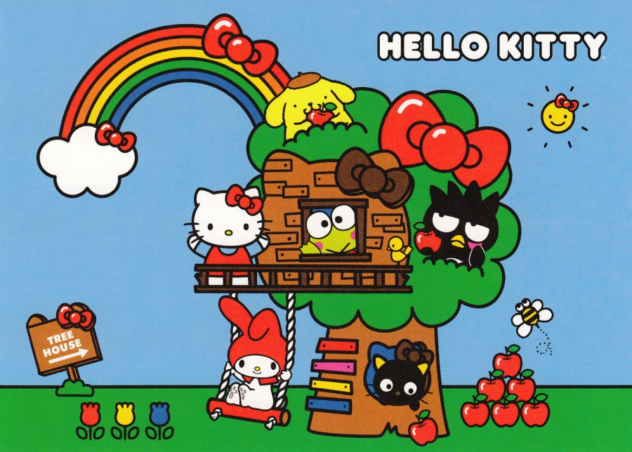
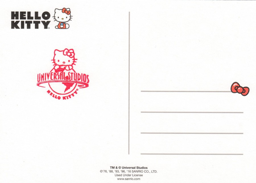
HELLO KITTY
POSTCARD PACK
UNIVERSAL STUDIOS
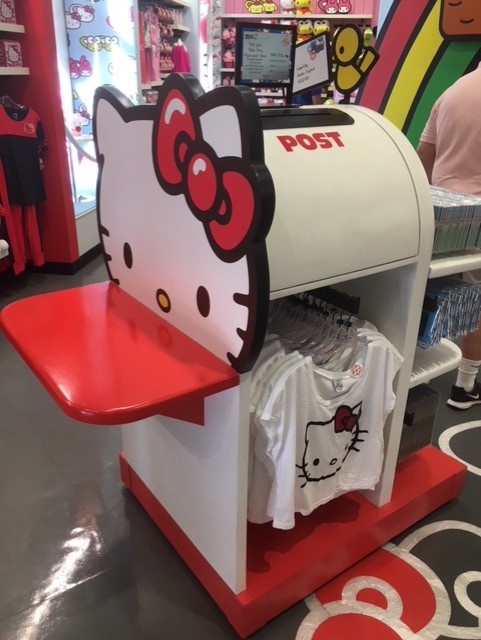
I had some fun in the Universal Studios theme park with the Hello Kitty shop and its special postbox – below are images of what I got up to and the end results
PHOTOGRAPH
FRONT OF POSTACRD PACK
The kitten’s ears and half of the red ribbon stick up above the postcard box behind it
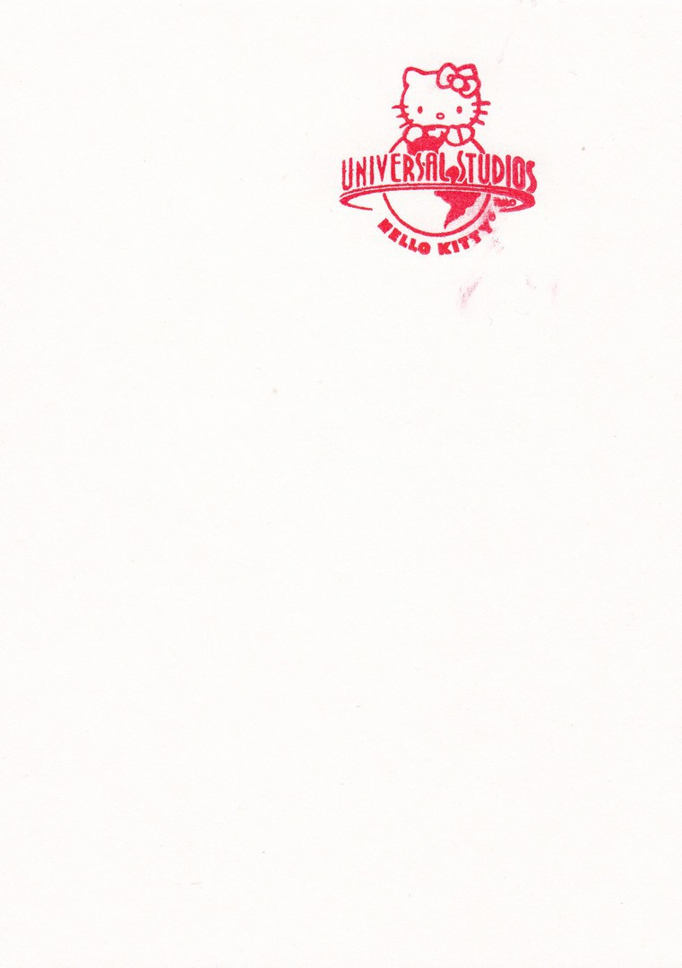
This pack of ten postcards was bought in the Hello Kitty shop located inside Universal Studios theme park in Florida. Initially I had seen a ‘Hello Kitty’ shaped postbox which was inside the shop (see below photograph). A notice on the top of this postbox said that cards and mail could be posted in it and that these cards would get a red ‘Hello Kitty – Universal Studios’ cachet, which was exclusive to this shop (again, see the below photograph). I liked the idea of this but at first, I found it hard to find any postcards. Eventually I was lead to this pack by a member of staff (it was actually on the postbox amongst other Hello Kitty sales items). I decided to post six copies from this pack to myself so that they would receive the cachet and travel through the post properly from this postbox all the way to the UK. The posted postcards are depicted below along with their cachets and hand stamps. I think the end result was quite good.
PHOTOGRAPH
This is the postbox in the Hello Kitty shop AT Universal Studios, Florida
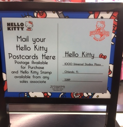
PHOTOGRAPH
This is the information card on top of the Hello Kitty shaped postbox.
The red cachet is shown as are details of how to obtain postage from any sales associate
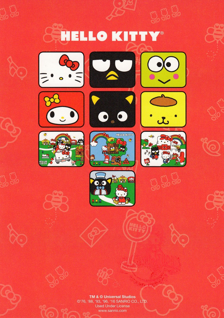
POSTCARD PACK REAR CARD
Rear information card which displays images of the postcards that are inside the pack. This can be seen through a cut-away section at the rear of the postcard package. As can be seen the copyright details t the bottom state this is copyright to Universal Studios, so I wonder if this pack of postcards can only be bought from here.
REVERSE SIDE OF ABOVE INFORMATION CARD
The above card is plain backed. When I found out about the exclusive red ‘HELLO KITTY – UNIVERSAL STUDIOS’ cachet I decided to post some of the postcards to myself to receive this, which I did. I then spoke with the staff in the shop and they very kindly allowed me access to the cachet and I applied it to the reverse side of the remaining four postcards and to the reverse side of the plain information card, as can be seen here.
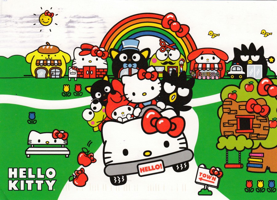
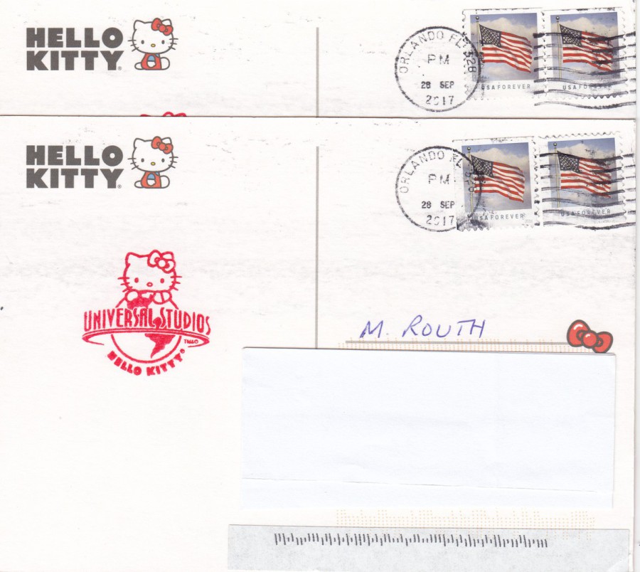
HELLO KITTY PACK POSTCARD
Posted in ‘Hello Kitty’ postbox receiving red cachet
The postcards in the pack are not numbered or titled. This one depicts Hello Kitty in a car with a number of other characters, with some very interesting looking houses in the background

REVERSE SIDE OF ABOVE POSTCARD
Here you can see the red ‘HELLO KITTY – UNIVERSAL STUDIOS’ cachet applied upper centre left. I used two stars and stripes ‘USA Forever’ stamps (FOREVER in this case means that these stamps can be used forever at the standard postage rate – so if there is an increase in the cost of a basic stamp for internal mail then this stamp can be used after that has occurred and will be honoured at the new raised postage rate – it takes two of these stamps to post a card to the UK). These stamps have been cancelled with an ‘Orlando Fl [Florida]’ wavy line machine cancellation dated 28th September 2017.

HELLO KITTY PACK POSTCARD
Posted in ‘Hello Kitty’ postbox receiving red cachet
This postcard depicts Kitty being a post-cat, posting lots of postcards (some of which look like cards from this pack)
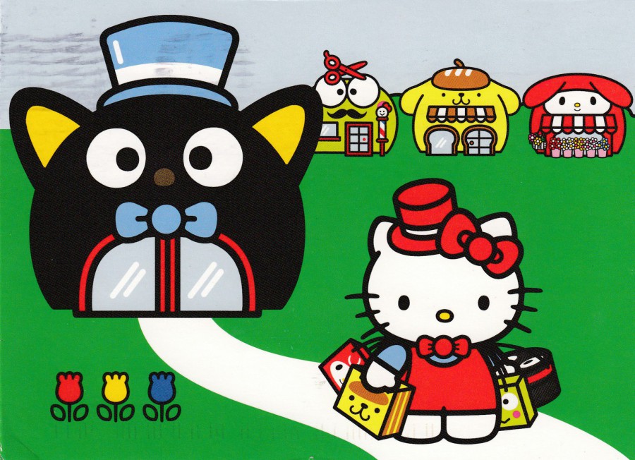
HELLO KITTY PACK POSTCARD
Posted in ‘Hello Kitty’ postbox receiving red cachet
Another of the postcards from this pack
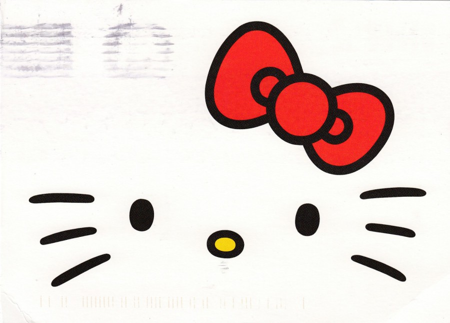
HELLO KITTY PACK POSTCARD
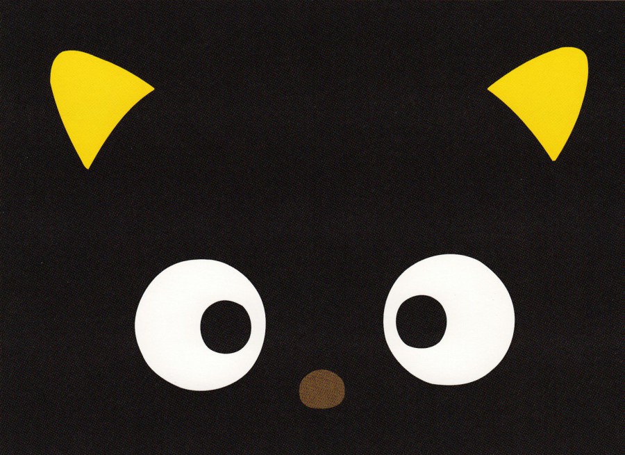
Posted in ‘Hello Kitty’ postbox receiving red cachet
This postcard just shows the main details of Hello Kitty’s face, simple but attractive (the postmark wavy lines can be seen. This is from where the previous card was cancelled and this card was laid on top of it before the ink on the previous card had dried, thus marking the front of this card. This is a not unusual situation and postcards can often be found with cancellation marks on the front side.
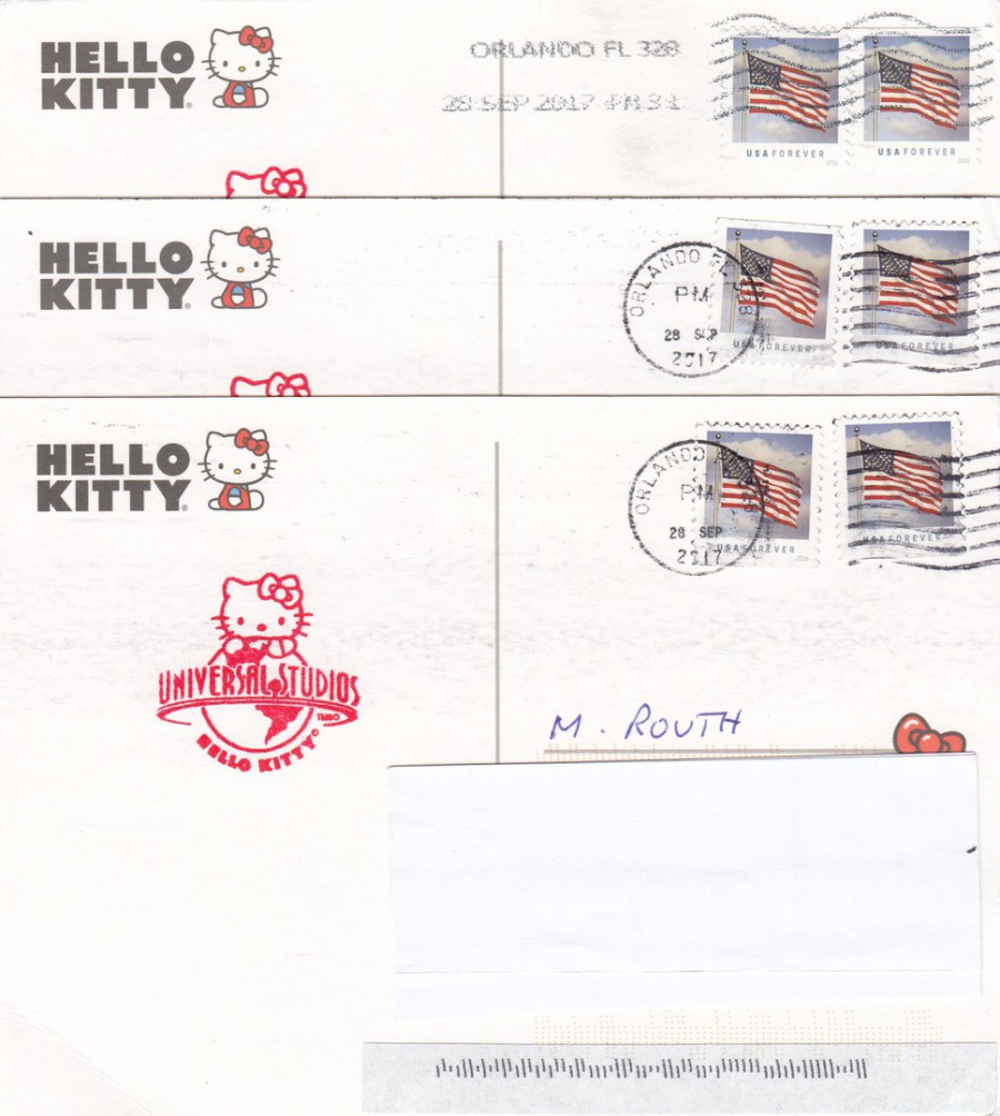
REVERSE SIDES OF THE THREE ABOVE POSTCARDS
Here you can see that two of the postcards received the same wavy line machine cancellation for Orlando Florida – dated 28th September 2017. For some reason the top card (the first of the previously depicted three postcards) received a different cancellation, a straight-line text cancel reading; ORLANDO FL 328 – 28 SEP 2017. Maybe it got through with a separate batch and thus received this different cancellation because of that.
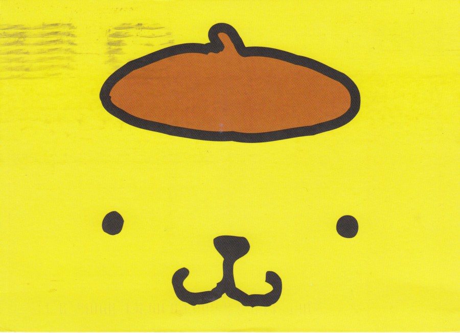
HELLO KITTY PACK POSTCARD
Posted in ‘Hello Kitty’ postbox receiving red cachet
Teddy Bear face

HELLO KITTY PACK POSTCARD
Posted in ‘Hello Kitty’ postbox receiving red cachet
Character’s face
REVERSE SIDE OF ABOVE TWO POSTCARDS
These were part of the six postcards selected for posting in the special Hello Kitty postmark to myself in the UK. They have been posted in the same way and have the two stamps cancelled with the wavy line circular date stamp machine cancel. As with the other four posted cards they all have the red ‘Hello Kitty – Universal Studios’ cachet.
HELLO KITTY PACK POSTCARD
Mint unposted postcard
(with red cachet applied reverse side)
This is one of the four postcards from the pack which I did not post to myself in the special postbox. Despite not being posted this card also had the red special exclusive cachet applied, by me, on the reverse side.
REVERSE SIDE OF ABOVE POSTCARD
With the Red Cachet applied – on the mint cards it almost looks as if this is printed on the card because the cachet is so clean and crisp. This is another reason why I think this cachet has not had much, if hardly any, usage. Also, when I asked about buying postage stamps so that I could post these cards the staff member told me that no one had brought the stamps over that day. It was already the afternoon which means that no one had asked for any stamps that day so far and that probably almost certainly meant that no cards had been posted in the box prior to me doing mine. I really do think that although this is a nice idea nobody is really using it. This does mean that it is probable that very, very few cards exist with this cachet applied. These might be collectible items of the future.

HELLO KITTY PACK POSTCARD
Mint unposted postcard
(with red cachet applied reverse side)
BIRD FACE
(I have not shown the reverse side of this postcard because it is nearly the same as the mint one posted above)

HELLO KITTY PACK POSTCARD
Mint unposted postcard
(with red cachet applied reverse side)
FROG FACE
(or so I believe, please don’t quote me on it though – I think it is a frog)
(I have not shown the reverse side of this postcard because it is nearly the same as the mint one posted above)
HELLO KITTY PACK POSTCARD
Mint unposted postcard
(with red cachet applied reverse side)
CAT FACE
(I have not shown the reverse side of this postcard because it is nearly the same as the mint one posted above)
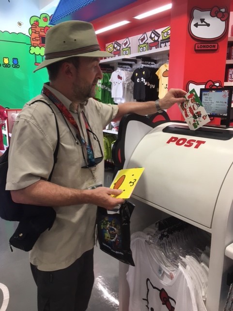
PHOTOGRAPH
This is me posting the cards in the box
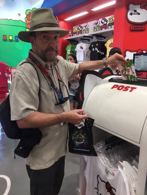
PHOTOGRAPH
Second image of me posting cards in the box
19/10/2017
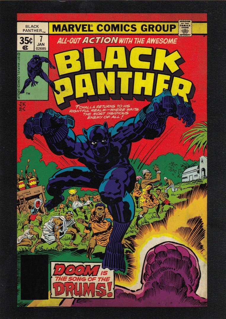
BLACK PANTHER
MARVEL COMICS
(DISNEY THEME PARK MERCHANDISE – LAKE BUENA VISTA)
I have in the past posted two similar cards depicting the Hulk and Iron Man, separately. These were bought in the Marvel shop in Disney Springs, Florida last year (I think – they were posted on the webpage some time earlier this year).
This year in a Disney Outlet store (located off International Drive) I found this third card which is clearly from the same series (although these are not numbered or titled, beyond the obvious title on the comic book cover depicted on the front). This one depicts the Black Panther who has joined the world of the Avengers in the film franchise. The character has recently had his own feature film as well. This, because it was in the outlet store, was far cheaper than the other previous two, which cost $5 each, this one was $2 and a bargain at that price.
As with the other two this is a slightly larger sized postcard (same size as the Disney Wonderground postcards I often depict here on the webpage - and possibly, if not probably by the same unknown - possibly Disney inhouse - printer)
19/10/2017
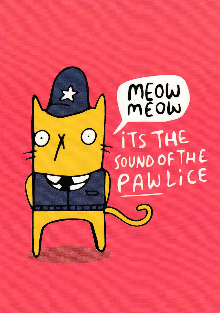
MEOW MEOW
IT’S THE SOUND OF THE PAW-LICE
Design by
KATIE ABEY
Published by
WHALE & BIRD
Ref: KAPC009
Had never heard of this company before buying this postcard in a ‘paperchase’ store. I kind of liked it and it fits nicely into my ‘Police’ themed collection (and into my ‘Cats’ collection as well, and for that matter my ‘Cartoon’ themed collection as well…amazing how one image can cross so many lines).
This was a recent buy so should still be available.
18/10/2017
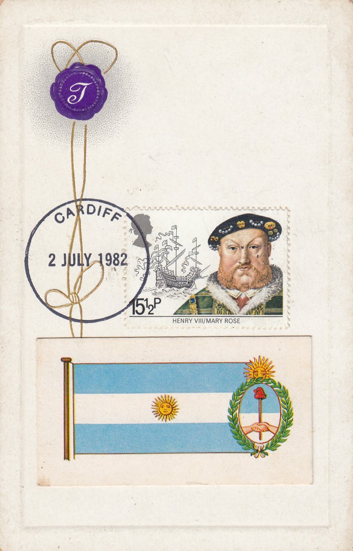
FALKLANDS WAR 1982
PRIVATELY PRODUCED PERSONAL SOUVENIR POSTCARDS
POSTCARD 1
(My numbering system)
These are three postcards which I obtained at STAMPEX in September. One of my very specialised collections is of postcards (and stamps and some other material) relating to the 1982 Falklands War. I like to pick up anything related to this conflict and have a more than reasonable collection. So, if I come across anything unusual I tend to pick it up, and these three cards definitely come under the heading of ‘Unusual’.
What someone has done here is take three postcards from the same series, a series which was issued way back in the Golden Age of postcards, and then use them in 1982 to receive the special ‘SOUTH ATLANTIC FUND – CARDIFF – 2nd JULY 1982’ handstamp. This is a very distinctive circular handstamp with the place name across the top (these can be found with a wide range of different UK locations) with a standard format date bar across the centre which was set up as – ‘2 JULY 1982’. The hand stamp was used on covers to raise money for the South Atlantic Fund, for those injured and the families who lost supportive members during the conflict.
On the front of this card the person has applied the 15 ½ p Henry VIII – Mary Rose royal mail stamp (which was from the nearest issued stamp set to the date of these South Atlantic Fund handstamps – as it was a shipping related series there was also a connection with the South Atlantic Fleet and many of the stamps from this stamp issue can be found used to obtain these handstamps). Also, stuck down underneath the stamp, and hand stamp is a PG Tips tea card (from a flags of the world issue) which depicts the flag of Argentina, a topical addition to the card.
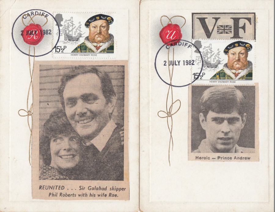
FALKLANDS WAR 1982
PRIVATELY PRODUCED PERSONAL SOUVENIR POSTCARDS
POSTCARD 2
(My numbering system)
FAR LEFT
Here again the 15 ½ p Henry VIII – Mary Rose royal mail stamp has been used, and again this has been cancelled with the SOUTH ATLANTIC FUND – CARDIFF – 2nd JULY 1982 special hand stamp. The unusual addition to the front of this card is a newspaper cutting which depicts the captain of the Sir Galahad, Phil Roberts with his wife Rae. The Sir Galahad was of course badly bombed on the 8th June and caught fire. It was one of the major, or was perhaps the major setback that the British army suffered during the war. The addition of this cutting firmly places this into the Falklands War theme category (although, to be fair, the special hand stamp would also do that as well, in my mind, and that of the person of made these).
POSTCARD 3
(My numbering system)
NEAR LEFT
Here we have another newspaper cutting, this time depicting his Royal Highness Prince Andrew, who was a helicopter pilot who went with the Falklands Task Force to the Falkland Islands for the conflict. It is known that he fought hard to go along with his fellow military helicopter pilots. He was, as mentioned here on this cutting, considered to be a hero. The cutting is taken from newspaper reports on the return of Prince Andrew from the war. The cutting pre-dates the special SOUTH ATLANTIC FUND hand stamp, dated 2nd July 1982 because the stamp has been applied slightly over the cuttings top edge. Again, the stamp is the 1982 issued 15 ½ p King Henry VIII – Mary Rose Maritime History stamp.
I think these are three, probably, unique items now and I have wondered on the person who went to the trouble to make these, and did he make any more? As I understood it these had been in the dealer’s stock for some time and had originally been priced quite high before having at least two reductions in price before I came across them. But I am glad no one else got these as I really like them and they look great in my collection.
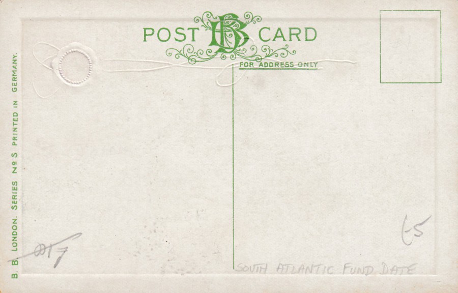
REVERSE SIDE OF ONE OF THESE POSTCARDS
17/10/2017
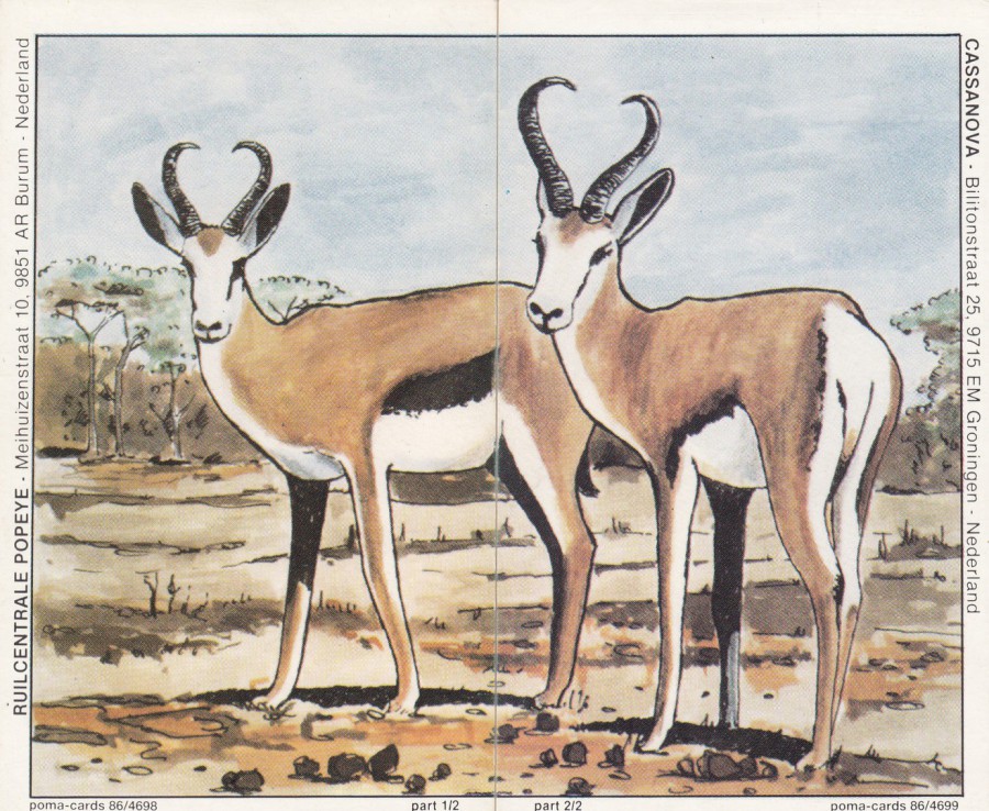
POMA-CARDS
LEFT SIDE CARD
RUILCENTRALE POPEYE – Meihuizenstraat 10, 9851 AR Burum – Nederland
Part 1 of 2 (1/2)
Ref: 86/4698
RIGHT SIDE CARD
CASSANOVA – Bilitonstraat 25, 9715 EM Groningen – Nederland
Part 2 of 2 (2/2)
Ref: 86/4699
This is a composite set of two cards which join-together down the centre to make one image. These are QSL Cards, or Radio Ham Cards, which were sent out by private radio operators who sent them out as confirmation that your radio message had been received by them. Here you have the added interest that you needed to reach two different radio hams to get each card to make up the complete image.
For a long time QSL Cards were looked down on and frowned upon by collectors and little collected. As millions of them were sent out it made them very cheap and bundles of a hundred or more could be picked up for pennies back in the 1970’s, 1980’s and even into the 1990’s and early 2000’s. But, with the introduction of eBay interest began to rise and now interesting examples have been selling for interesting amounts which have also been rising over the past ten years. Personally, I have been collecting these for some time and have quite a handful now. These two here are of added value because of the novelty of there being two cards which makes a single image (it also depicts springbok antelopes so there is the animal theme interest for me here).
I have some more of these composite QSL cards cards from this source and will depict these in the near future.
17/10/2017
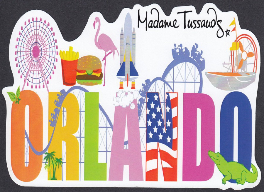
MADAME TUSSAUDS
ORLANDO
Unknown Printer
LARGE SHAPED POSTCARD
The Madame Tussaud’s in Orlando is a relatively new attraction, just a few years old. I first visited here in 2015 and was surprised that they had no postcards on sale at that time. I returned four weeks ago and was pleased to find this single postcard on sale right by the exit till in the end shop. I have a suspicion that this is a basic format postcard which the company have had overprinted with their name, to make it location friendly. If I am right this postcard may be found without the addition of the black text reading ‘Madame Tussauds’ which appears top right. For me though, this is a nice souvenir of my second visit to this very good attraction.

17/10/2017
THE PENFOLD POSTBOX DESIGNED BY JOHN PENFOLD IN 1866
CELEBRATING 500 YEARS OF ROYAL MAIL
“The postbox was unveiled by Their Royal Highnessess The Prince of Wales and the Duchess of Cornwall on 6th September 2016
It commemorates 500 years since the knighting of Brian Tuke, the first Master of the Posts, by King Henry VIII in 1516”
I believe this is an official postcard produced by the Royal Mail to celebrate the unveiling of this commemorative postbox. It is green, as were the original postboxes and looks very ornate. I cannot remember who sent me this postcard but I seem to remember that it was a free postcard (although that would need to be confirmed). It does have the official Royal Mail logo and the ‘Celebrating 500 Years of Royal Mail’ logo on the reverse side.
Postboxes have been depicted on postcards almost since the start of the popularity and during the 1980’s and 1990’s modern postcards depicting them were very collectible. I am not sure if they are still that much of interest but anyone wanting a simple but interesting topic could put together a really nice and quite large collection in very little time (although this one here might be harder to find than some issues)
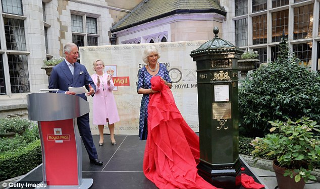
PHOTOGRAPH
Unveiling of Postbox
6th September 2016

17/10/2017
CARTOON PANDA ILLUSTRATIONS
Published by
ORIGINAL ILLUSTRATION BRAND
Issued and produced in China
Here are two lovely panda illustrations which are produced by a company based in China. The cards are designed to be sold in China but there is one other location where they can be found.
I have just returned from Florida where I visited the Walt Disney Epcot theme park which has the world showcase area within it. One of the countries represented here is China. In this area is a large store in which they sell genuine items imported from China for sale, often exclusively outside of Chine, in this store. These postcards here were bought in this store.
This first design depicts an adult with a young panda against a mainly dark pink patterned background.

PANDA POSTCARD
This second design, almost certainly by the same unknown artist that produced the above design, depicts a single adult panda against a mainly green patterned background. Both designs incorporate a number of leaves, which I believe are bamboo shoot leaves. These appeal to my younger collecting instinct, back to my youthful collecting years when I only collected wildlife postcards.
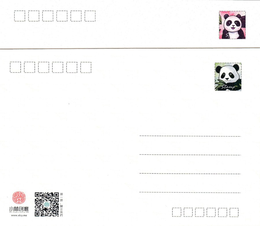
REVERSE SIDES OF ABOVE TWO POSTCARDS
The two postcard designs have, with one exception the same reverse layouts. The exception is a partial segment of the front design used as a stamp box area top right on the reverse side. Here you can see the top segment from the top Panda card (pink) and overlaid upon it is the reverse side of the bottom card (green). The two little images add a touch colour to the reverse sides and make them more appealing.
If you want to see more panda images, and other images available from this company then check out their webpage at:
16/10/2017
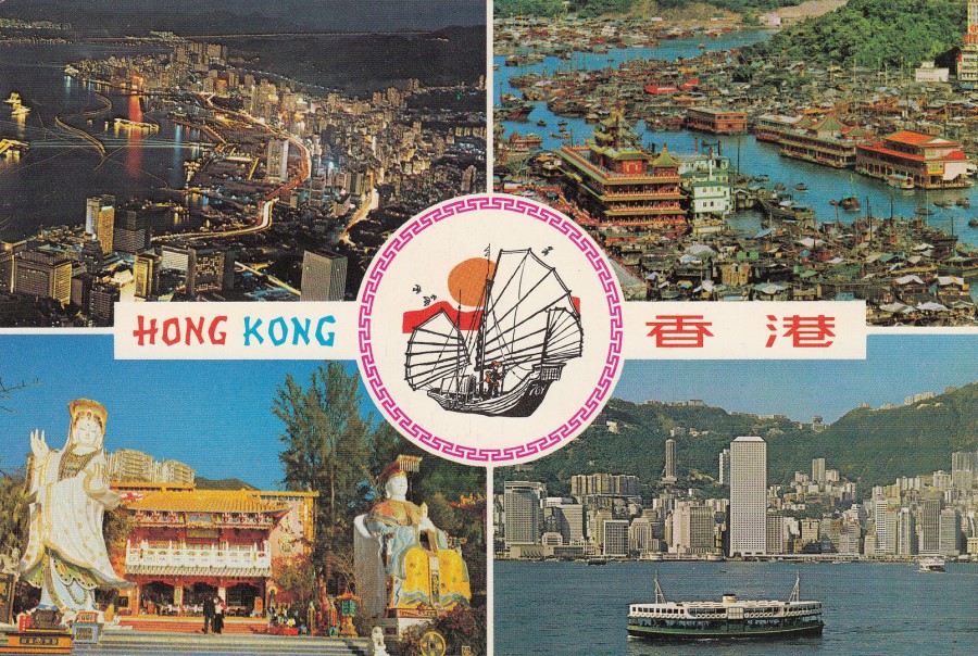
HONG KONG
Published by
NATIONAL Co
Ref: V1 04
TOP LEFT – Hong Kong big night glimmers like stars
DOWN LEFT – ‘Tin Hau’ statue in Repulse Bay on Hong Kong Island
TOP RIGHT – Birds-eye view of Aberdeen
DOWN RIGHT – The grand view of Hong Kong Harbour
(Text from reverse side of postcard)
This card brings back fond memories of my trip to Hong Kong way back in 1981. I travelled several times on the green coloured ferries which crossed from Kowloon to Hong Kong (and which can be seen in the photograph bottom right). I think the boat depicted in artwork in the central circle is supposed to be a Junk, although they are much larger than the image of the man on board this one would make it appear. I know this because I had the chance to steer one of these in Victoria Harbour (and I managed not to crash into any other boats). The harbour at Aberdeen is shown in the top right corner. Our ‘Junk’ sailed through here but fortunately without me at the helm at this point. I have never been back but I intend to, just to see how much has changed. This postcard is from the same period as my visit, early 1980’s, and it captures Hong Kong as I remember it.
16/10/2017
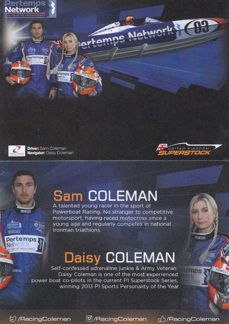
SAM COLEMAN – DAISY COLEMAN
POWERBOAT RACERS
PERTEMPS NETWORK
UNITED KINGDOM SUPERSTOCK
Publicity Flyer Advertising card
TOP
Front of card
BOTTOM
Reverse side of card with details of the powerboat racers
This is postcard size, but is clearly not a postcard. Despite that this is a nice item. It depicts a speed boat racer and Sam and Daisy Coleman who are speedboat racers. The reverse side of the card also depicts the two Coleman’s with some details of their interests and their sports.
On the 17th July 2017 they were holding an International Powerboat Event in Haven where my friend David lives. So, how do you make one of these cards even more interesting? .... Well, see the below posting.
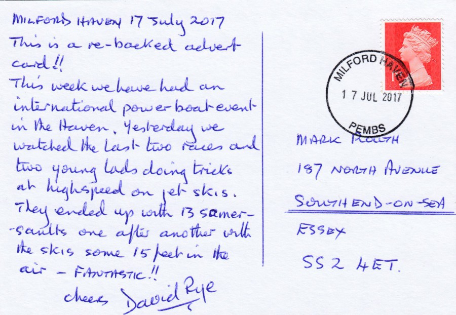
REVERSE SIDE OF A SEPARATE POWERBOAT RACERS CARD
(As per the above card)
David took one of the above cards and stuck a plain white card across the side with the details of the two Coleman’s. This allowed David to post the card to me thus making it a posted card (although some would still argue that it is not a true postcard…not that I care much). It certainly makes for a nice dated card.
16/10/2017
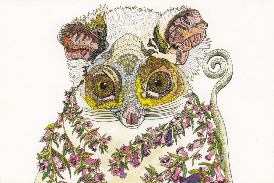
RACHEL THE RINGTAIL POSSUM 2016
PEN/WATERCOLOUR
By
ZINIA KING
Published by
AVANTCARD AUSTRALIA
Ref: #20159 (issued 2016)
Avantcard Artist Project
It has been awhile since I last posted an Avantcard artist promotional postcard and this one I think is a cracker. I like animal postcards and I especially like animal art postcards. As previously posted Avantcard have ceased producing postcards this year, so postcards like this may be a thing of the past, but at least whilst they existed they produced some beautiful postcards.
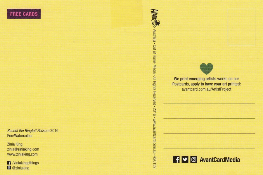
REVERSE SIDE OF ABOVE POSTCARD
I liked the colour they used here
16/10/2017
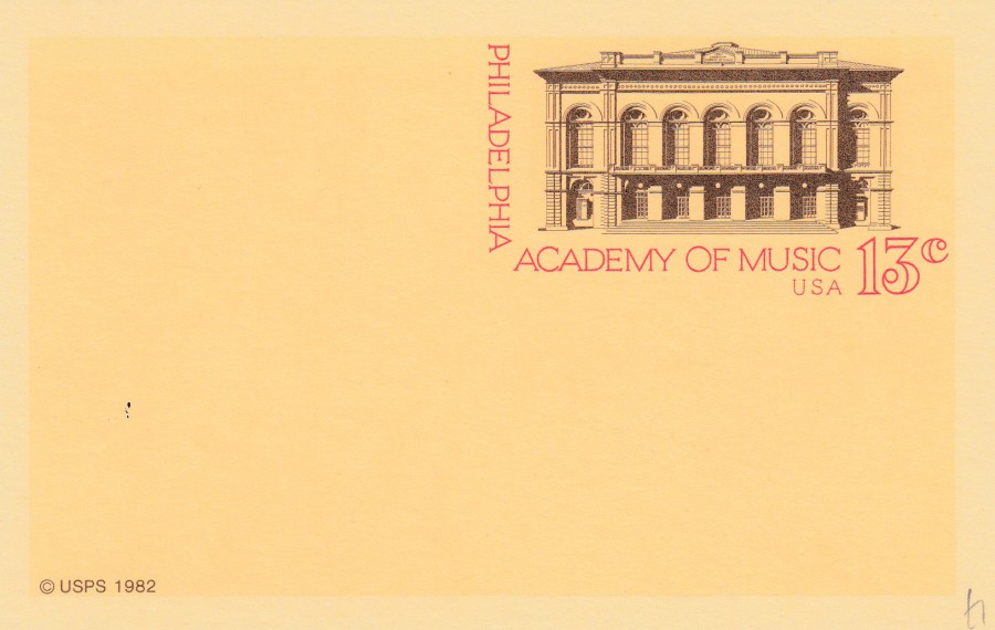
PHILADELPHIA ACADEMY OF MUSIC
UNITED STATES POSTAL SERVICE POSTAL STATIONERY POSTCARD
13cents
Issued 1982
MINT CARD
Reference Number UX96 in The Postal Service Guide to U.S. Stamps
(My edition is the 28th Edition – copyright 2001)
One of the questions I often get asked, once people discover what I collect, is whether postcards are better used or mint, and sometimes they ask which I collect. Mint and used cards obviously often have different catalogue values, which can be quite a difference if the item is used first day of issue. But, personally, I have never understood the type of collector who only collects one form, either mint cards or just used examples. For me, it is the difference between used and mint cards which I find so interesting and as a result I have always collected both. Although the word ‘Both’ does not really do justice to the selections available for just the one card issue. So, here I will show you three pictures of a single card issue to try and explain to you why I like all the options that a card can give you.
This one is clearly a mint copy of this postal stationery post card. The card was issued in 1982 and the pre-printed postage is a drawing of the Philadelphia Academy of music. I like mint cards as you are getting the card as it would have been sold over the counter.
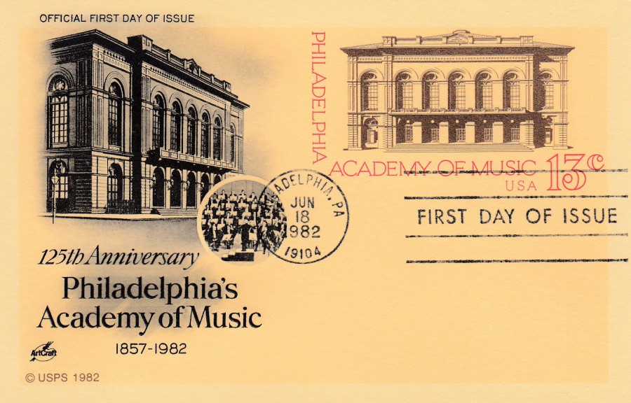
PHILADELPHIA ACADEMY OF MUSIC
UNITED STATES POSTAL SERVICE POSTAL STATIONERY POSTCARD
13cents
Issued 1982
FIRST DAY OF ISSUE CANCELLATION
Quite often first day of issue used postal stationery post cards just have the FDI cancellation but there is also a tradition in the US of taking the mint card and having a pictorial and or text based overprint applied to the plain area of the card, which is normally on the left side opposite the pre-printed stamp. These overprinted cards can be very attractive and can have some very nice pictorial content. I think this is the case with this card. On this card the black print on the front, all of it, has been applied by a company called ‘ART CRAFT’. The text states that this is an ‘OFFICIAL FIRST DAY OF ISSUE’ and the pre-printed stamp has been cancelled with the exclusive Philadelphia 18th June 1982 FIRST DAY OF ISSUE standard slogan styled cancellation.
PHILADELPHIA ACADEMY OF MUSIC
UNITED STATES POSTAL SERVICE POSTAL STATIONERY POSTCARD
13cents
Issued 1982
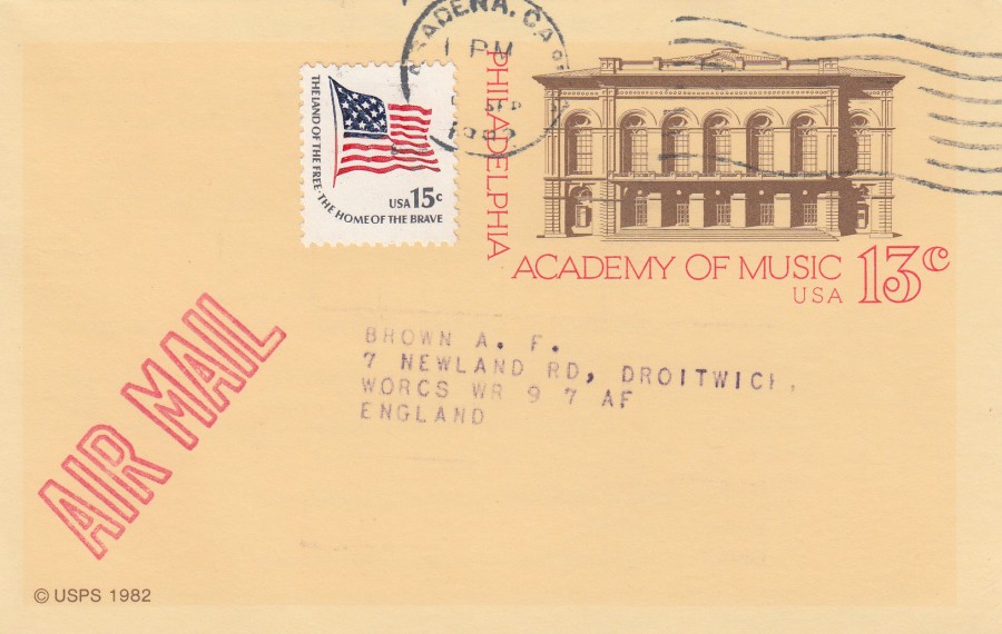
POSTAL USED EXAMPLE
This example was posted in 1982, the year this postal stationery post card was released, but it was posted to England so it required a further 15cents postage to cover the air mail postage (this required a postage stamp which was in total two cents more than the pre-paid postage on the card itself). For me there was added interest in the fact that this card was sent to the UK. The stamps have been cancelled with a Pasadena, California cancel. There is one more interesting aspect to this ‘particular’ copy, but it is on the other side…
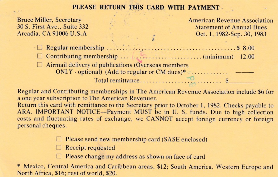
REVERSE SIDE OF ABOVE POSTCARD
This copy was sent out with a printed reverse which is a subscription notification for the ‘American Revenue Association’. I like the fact that this association used postal stationery cards to send out their annual subscription notices. I think Mr Brown did as well as he kept his copies and I had the good fortune to obtain a handful of these, including this one (I shall show some other cards that he received from the association in future posts).