11/07/2018
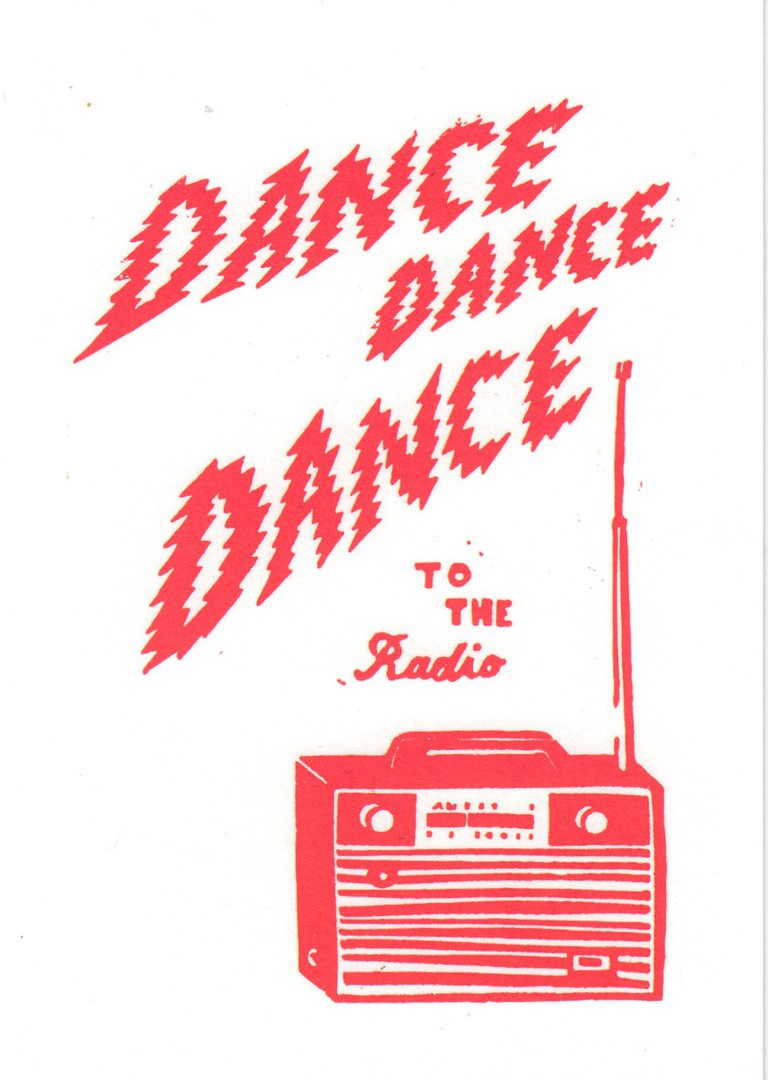
DANCE
DANCE
DANCE
TO THE RADIO
By
PAUL BOWER
Published by
URBAN GRAPHIC
Under their:
PAPER PLANES
Title –
Ref: PAP085
This is a simple design, but I still thought it was an attractive one. This was bought earlier in the year from a branch of ‘paperchase’, although recently I have not seen it in the racks I have been looking at. Radio is a popular collecting theme, although normally collectors like something with a bit more detail, but I think this is an interpretation of the type of radio I had when I was younger.

CLOSE-UP OF THE
‘PAPER PLANES’
Logo from reverse side
11/07/2018
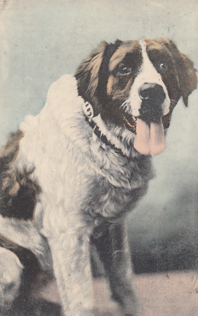
St BERNARD DOG
(UNTITLED CARD)
Unknown Printer (because a stamp covers the details)
Ref: 20807
Surely the St Bernard Dog should be, if it is not already, the national dog of Switzerland, although the breeds origin is also claimed by France and Italy, although Switzerland’s claim is the standard that is accepted. The dogs were originally bred for the rescue of people caught out on the Italian-Swiss boarder at the Great St Bernard Pass (thus the name), and the Little St Bernard Pass on the French – Italian border (thus the French claim to origin). So, the fact that this postcard was posted out of Switzerland should come as no surprise.

REVERSE SIDE OF ABOVE POSTCARD
The sender has used a Switzerland 10c William Tell definitive stamp (SG 280) first issued 1914. This stamp was then cancelled with an ‘INTERLAKEN’ date stamp dated 7th August 1923. Unfortunately, this did not cover postage to the UK, therefore the postcard was taxed, and extra postage was due. The postcard received a large ‘T’, which I think was applied in Switzerland (but this is not confirmed). Once the postcard reached the UK a large ‘2P – I. S. P.’ postage due mark was applied (Ref: 18/169 in the Stanley Gibbons ‘Collect British Postmarks’ catalogue). Then a 2d POSTAGE DUE stamp (SG D4) was applied (these were used between 1914 and 1923, so this was the last year of usage for this design). This stamp was then cancelled with a BURNLEY (I am sure this is a PADIHAM, BURNLEY) cancellation dated either 8th or 9th (I think it’s the 9th) August 1923. This all makes for a great combination and a very attractive usage with a little bit of value as well.
11/07/2018
I don’t have a postcard for any cave system in Thailand, I am sure there are some, but in celebration of the successful rescue from the underground, and flooded, Tham Luang cave system of all the 12 boys yesterday, in what has been described as the largest and most complex cave rescue in history, I have dug out a cave system related postcard.
We should also have in our thoughts the sad death of the ex-Seal Diver, Saman Kunan, who died whilst taking part in the search and rescue attempt. He died returning from giving the trapped boys oxygen, he was overtaken by a flash flood.
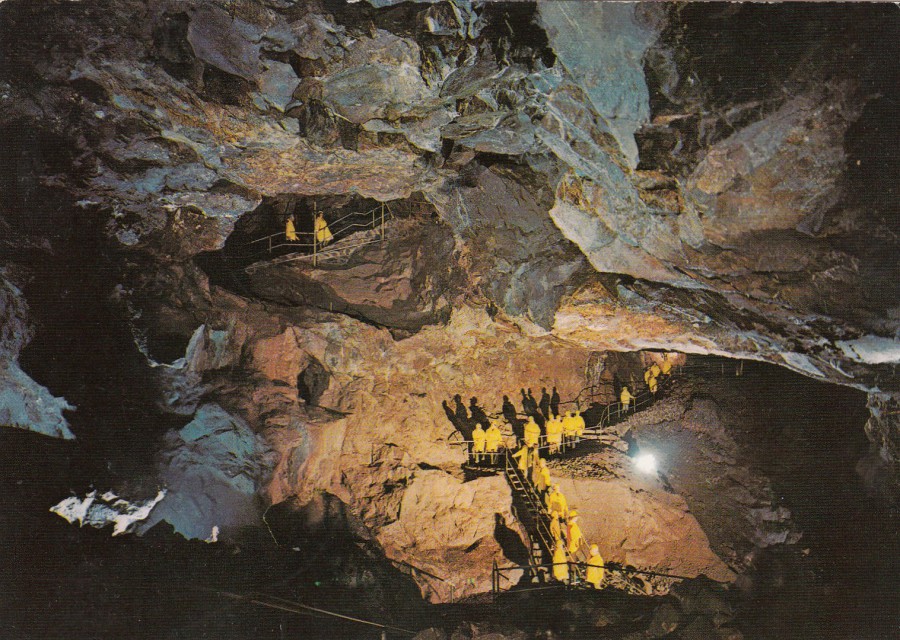
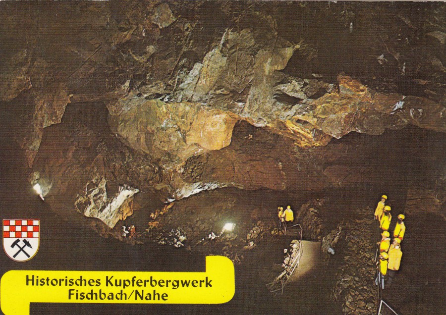
KUPFERBERGWERK AN DER DEUTSCHEN
EDELSTEINSTRABE
(BEL IDAR-OBERSTEIN)
Historic Fischbacher Copper Mine
At German Gemstone Street
(bel idar-Oberstein)
Photo –
STUDIO GREBER, IDAR OBERSTEIN
Idar-Oberstein is a town in the Birkenfeld district in the state of Rhineland-Palatinate, Germany. Although translating is difficult I think this image is of a Gemstone Mine, rather than any natural structure, and looking at the walls this seems a man-made structure. There is the Steinkaulenberg Gemstone Mine in Idar-Oberstein and this could be what is depicted here. I suspect they are tourists wearing protective yellow cagouls and visiting the mine.
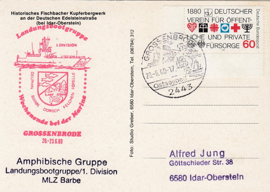
REVERSE SIDE OF ABOVE POSTCARD
Totally unconnected, from what I can see, but a local collector has used this postcard to collect a special red cachet (on the left side) relating to a visit of the ‘Amphibische Gruppe Landungsbootgruppe/1. Division MLZ Barbe’ [Amphibious group Dropship Group/1. Division MLZ Barbe] to Grossenbrode between the 20th and 23rd of June 1980. This collector (or dealer) has then had the card posted in Grossenbrode on the 20th June, the first day of the visit.
This is an unusual usage for this card, but as you know I like cachets and special marks, so this appealed to me, and I think it looks attractive.
HISTORISCHES KUPFERBERGWERK
FISCHBACK/NAHE
AN DER DEUTSCHEN EDELSTEINSTRABE
Published by
CRAMERS KUNSTANSTALT KG, DORTMUND
Ref: Fibt 023
76/6
The NAHE is a river in Rhineland Palatinate and I believe this postcard depicts the same mine as on the card shown above.
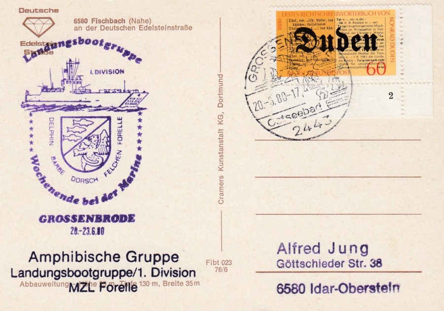
REVERSE SIDE OF ABOVE POSTCARD
This has the same cachet as above, although this time in purple, but the black text cachet along the bottom is slightly different as it reads:
‘Amphibische Gruppe Landungsbootgruppe/1. Division MLZ Forelle’ [Amphibious group Dropship Group/1. Division MLZ Forelle]
The difference is the substitution of Barbe for Forelle at the end of the cachet – a different area or section of the Division. Otherwise the rest is the same. The postcard has been posted to receive the same dated Grossenbrode hand stamp.
11/07/2018
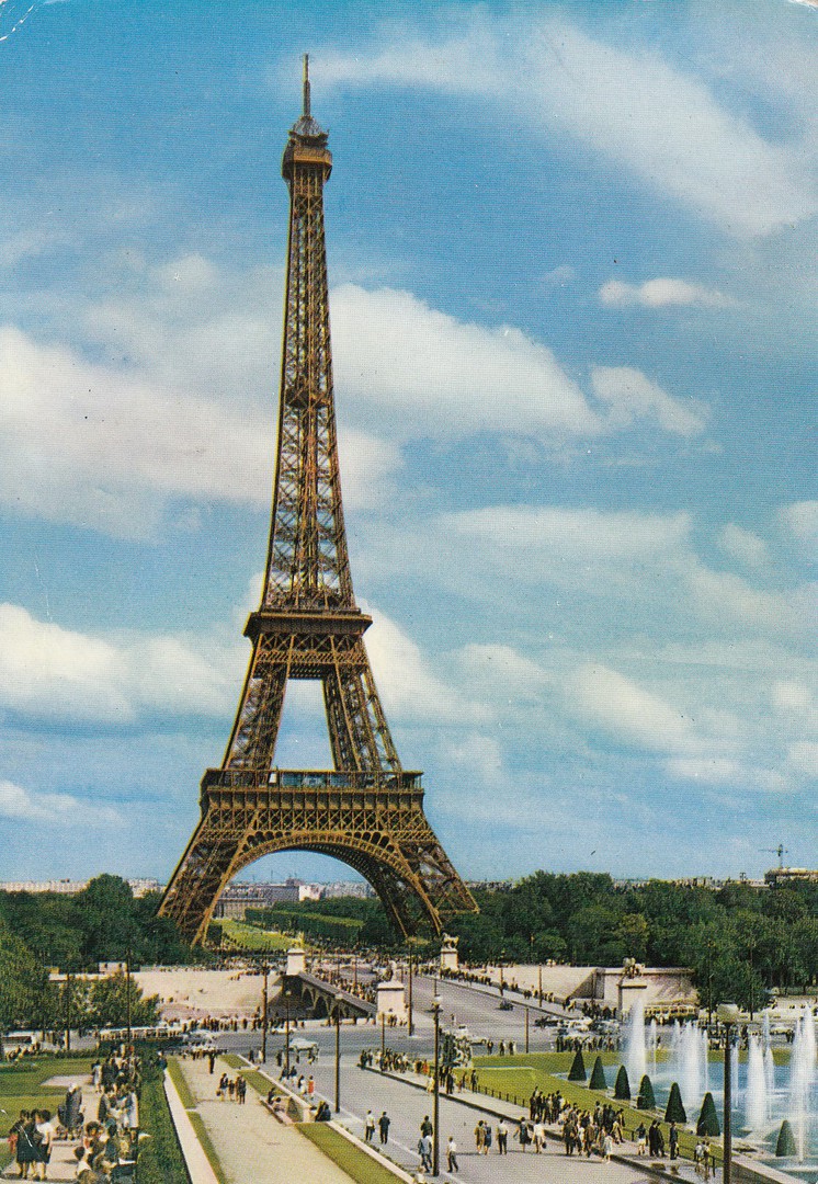
PARIS
EIFFEL TOWER
LA TOUR EIFFEL ET LE PONT D’LENA
Unknown Publisher (although there is a company logo)
Printed in ‘ITALCOLOR’
Ref: 957
Congratulations to the French football team on getting through to the final of the Football World Cup. Who they will be playing will depend on who wins today’s game between England and Croatia, yes, ENGLAND vs Croatia! When I posted a related postcard on the first day of the tournament I said that the England team were not expected to get very far…how wrong was I! Still, todays game is a tough one and I am not feeling confident, hopeful perhaps, but not much and definitely-not confident. What I will say though is that this seems to have been a very unusual World Cup – Germany out - Brazil out – Portugal out – I wonder if anyone predicted any of that happening so early on?
So, France through and therefore I felt a French related postcard would be appropriate and what structure better seems up France than the Eiffel Tower, their capital’s major landmark.
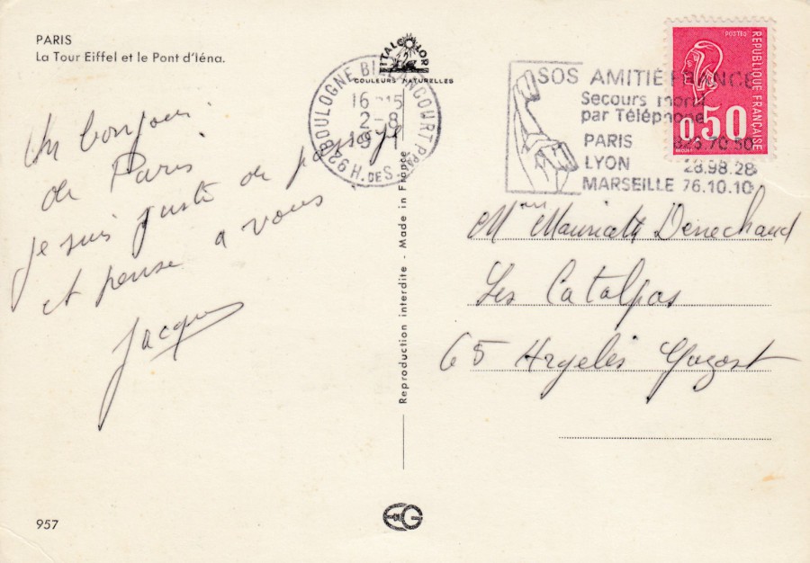
REVERSE SIDE OF ABOVE POSTCARD
This has a nice ‘H92 BOULOGNE BIELANCOURT’ slogan postmark dated 2nd August but with an unclear year – possibly 1971. The slogan is a ‘TELEPHONE’ themed one and as such would appeal to any collector of this theme and the general theme of ‘Communications.

10/07/2018
RAF
ROYAL AIR FORCE
RISE ABOVE THE REST
Published by
BOMMERANG MEDIA
(RAF Official Code – RAFCIN05)
Another highly appropriate postcard for depicting today – the RAF roundel, as marked on all RAF aircraft.
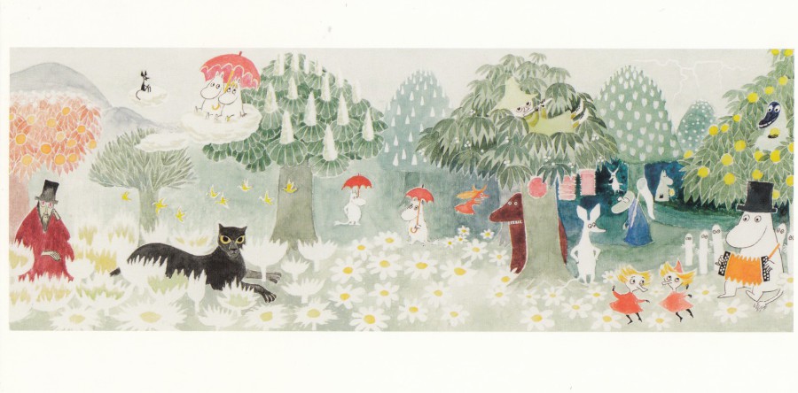
10/07/2018
ILLUSTRATION FROM – ‘FINN FAMILY MOOMINTROLL’
Moomins by Tove Jansson
Published by
PUTINKI OY
Ref: TJ 76
LONG SHAPED POSTCARD
This is another Moomin’s postcard which I bought in the ‘Moomin’s Shop’ located in Covent Garden in London. This is one of the best sources of Moomin postcards that I have found, and they are far cheaper here than on eBay.

10/07/2018
ON LEAVE IN ’40 [1940]
PILOT OFFICER PRUNE
Published by
AFTER THE BATTLE
Cartoon by
BILL (RAFF) HOOPER
Ref: P344
The Pilot Officer Prune cartoons were to be found in the RAF’s official, and ‘restricted’ training memorandum ‘TEE EMM’. The publishing company ‘After the Battle’ issued a number of these cartoons on postcards and they were sold individually and in a boxed set. The cartoons were based on the premise that Pilot Officer Prune was a fool, a clot and a buffoon, thus making his comments and actions foolhardy.
I have chosen this postcard to show you today because of its RAF connection, but not because pilots are buffoons, much to the contrary in fact as today the RAF are celebrating their ‘100 Anniversary’ with a massive 100 plane flypast across Essex and into London. I am hoping to catch this as it passes Chelmsford early this afternoon as I think it could be quite spectacular (fingers crossed).
The reverse side of this postcard has unique usage which I obtained myself for my collection – see below.
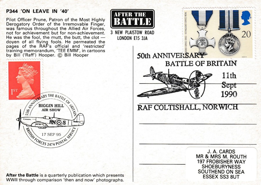
REVERSE SIDE OF ABOVE POSTCARD
On the right side there is a 1990 Royal Mail issued ‘Distinguished Service Cross and Distinguished Service medal’ 20p stamp which has been cancelled with a pictorial Spitfire fighter plane special handstamp which reads:
50TH ANNIVERSARY
BATTLE OF BRITAIN
11TH SEPTEMBER 1990
RAF COLTISHALL, NORWICH
This is a first day of issue hand stamp for this stamp release. Then on the left side I also applied a red 1st class Machin Queens head stamp which has received another pictorial Spitfire themed special hand stamp. This one reads:
55th ANNIVERSARY
THE BATTLE OF BRITAIN
BIGGIN HILL
AIR SHOW
17 SEP 95
BRITISH FORCES 2474 POSTAL SERVICE
I will be surprised if there is not a Spitfire amongst the planes flying today, in fact I suspect he entire ‘Battle of Britain Memorial flight’ to be taking part.
So, my congratulations to the RAF on reaching this momentous anniversary and I hope their celebrations all go to plan.

09/07/2018
DAD’S ARMY
STAMPED ‘MAXI-CARD’ POSTCARDS
Personally produced, postcard souvenirs,
using the Royal Mail issued
Dad’s Army stamps – issued 26th June 2018
My postcards have now all returned, and I am pleased with how these have turned out. Each is potentially unique and a superb addition to my Television themed collection.
DAD’S ARMY EXHIBITION
Fictional Walmington-On-Sea
BRESSINGHAM STEAM MUSEUM
Official Museum Postcard
Used with the Captain Mainwaring 1st Class stamp – cancelled first day of issue with the official ‘Tallents House, Edinburgh’ special hand stamp
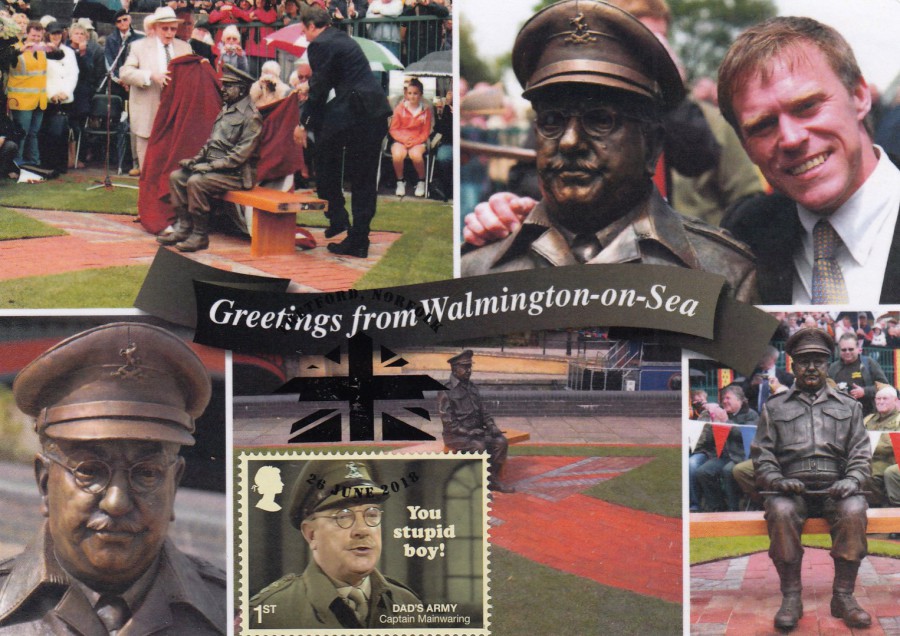
DAD’S ARMY MUSEUM
THETFORD
CAPTAIN MAINWARING STATUE
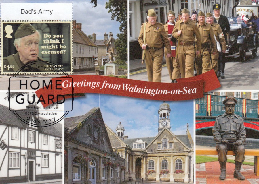
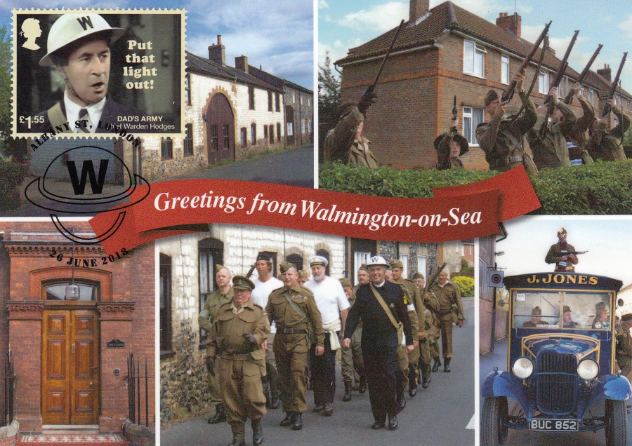
GREETINGS FROM WALMINGTON-ON-SEA
Official Postcard
Multi-view postcard used with the Captain Mainwaring 1st Class stamp – cancelled first day of issue with the ‘THETFORD, NORFOLK’ special hand stamp.
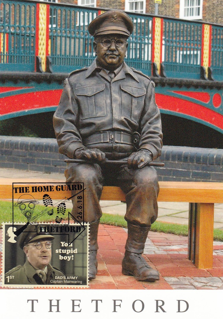
CAPTAIN MAINWARING STATUE
‘THETFORD’S GREAT STATUES’
Published by
VISIT THETFORD
Used with the Captain Mainwaring 1st Class stamp – cancelled first day of issue with the ‘THE HOME GUARD – THETFORD’ special hand stamp. I think this was one of the better special hand stamps produced for this stamp release.
DAD’S ARMY EXHIBITION
Fictional Walmington-On-Sea
BRESSINGHAM STEAM MUSEUM
Official Museum Postcard
Used with the Sergeant Wilson 2nd Class stamp – cancelled first day of issue with the ‘HOME GUARD – THETFORD, NORFOLK – GBFDC ASSOCIATION – DAD’S ARMY’ special hand stamp

DAD’S ARMY EXHIBITION
Fictional Walmington-On-Sea
BRESSINGHAM STEAM MUSEUM
Official Museum Postcard
Used with the Lance Corporal Jones 1st Class stamp – cancelled first day of issue with the ‘THETFORD – WELCOME TO WALMINGTON-ON-SEA’ special hand stamp

DAD’S ARMY MUSEUM
THETFORD
DAD’S ARMY – GREETINGS FROM WALMINGTON-ON-SEA
Official Postcard
Used with the Lance Corporal Jones 1st Class stamp – cancelled first day of issue with the ‘THETFORD, NORFOLK’ special hand stamp. With the image of Jones’ butchers van centre bottom this makes a nice combination.
DAD’S ARMY EXHIBITION
Fictional Walmington-On-Sea
BRESSINGHAM STEAM MUSEUM
Official Museum Postcard
Used with the £1.45 Private Walker stamp – cancelled first day of issue with the ‘HOME GUARD – THETFORD, NORFOLK – GBFDC ASSOCIATION – DAD’S ARMY’ special hand stamp
DAD’S ARMY MUSEUM
THETFORD
DAD’S ARMY – GREETINGS FROM WALMINGTON-ON-SEA
Used with the £1.45 Private Walker stamp – cancelled first day of issue with the ‘THE HOME GUARD – THETFORD’ special hand stamp
DAD’S ARMY MUSEUM
THETFORD
DAD’S ARMY – GREETINGS FROM WALMINGTON-ON-SEA
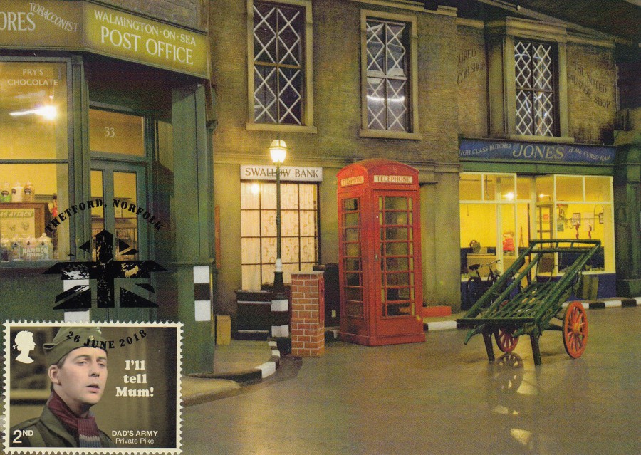
Used with the 2nd Class Private Pike stamp – Cancelled first day of issue with the ‘THE HOME GUARD – MAINWARING DRIVE, SUTTON COLDFIELD’ special hand stamp. This is my favourite of the pictorial special hand stamps, and it was nice to have at least one other, besides the regular ‘Tallents House’, special hand stamp that was not for the Thetford area.
DAD’S ARMY EXHIBITION
Fictional Walmington-On-Sea
BRESSINGHAM STEAM MUSEUM
Official Museum Postcard
Used with the 2nd Class Private Pike stamp – Cancelled first day of issue with the ‘THETFORD, NORFOLK’ special hand stamp.
DAD’S ARMY MUSEUM
THETFORD
DAD’S ARMY – GREETINGS FROM WALMINGTON-ON-SEA
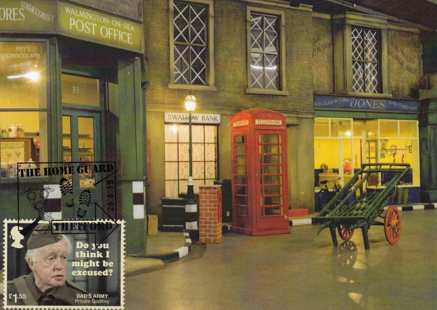
Used with the £1.55 Private Godfrey stamp - cancelled first day of issue with the ‘HOME GUARD – THETFORD, NORFOLK – GBFDC ASSOCIATION – DAD’S ARMY’ special hand stamp
DAD’S ARMY EXHIBITION
Fictional Walmington-On-Sea
BRESSINGHAM STEAM MUSEUM
Official Museum Postcard
Used with the £1.55 Private Godfrey stamp - cancelled first day of issue with the ‘HOME GUARD – THETFORD’ special hand stamp
DAD’S ARMY EXHIBITION
Fictional Walmington-On-Sea
BRESSINGHAM STEAM MUSEUM
Official Museum Postcard
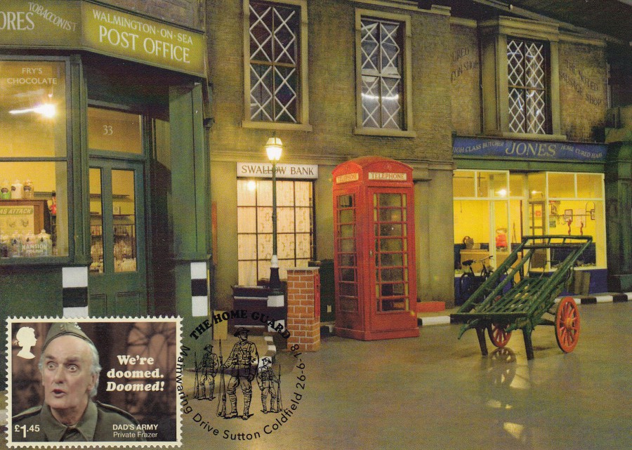
Used with £1.45 Private Frazer stamp – cancelled first day of issue with the ‘THE HOME GUARD – MAINWARING DRIVE, SUTTON COLDFIELD’ special hand stamp.
DAD’S ARMY MUSEUM
THETFORD
DAD’S ARMY – GREETINGS FROM WALMINGTON-ON-SEA
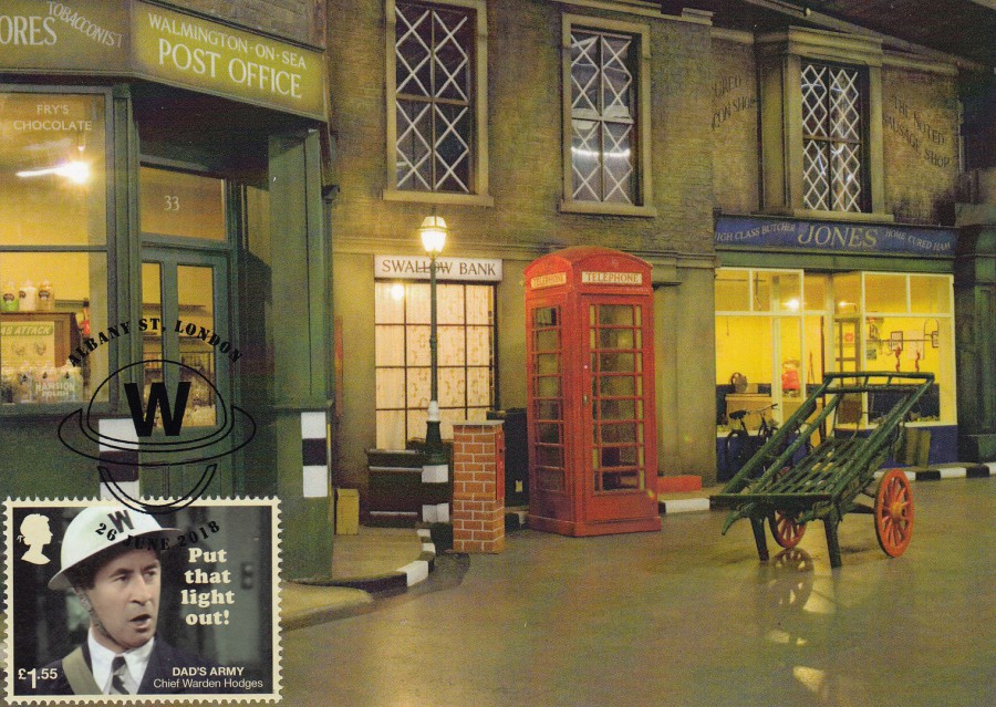
Used with the £1.55 Chief Warden Hodges stamp – cancelled first day of issue with the ‘ALBANY STREET, LONDON’ special hand stamp. This was the only hand stamp which related to the Warden
DAD’S ARMY EXHIBITION
Fictional Walmington-On-Sea
BRESSINGHAM STEAM MUSEUM
Official Museum Postcard
Used with the £1.55 Chief Warden Hodges stamp – cancelled first day of issue with the ‘ALBANY STREET, LONDON’ special hand stamp.
DAD’S ARMY EXHIBITION
Fictional Walmington-On-Sea
BRESSINGHAM STEAM MUSEUM
Official Museum Postcard
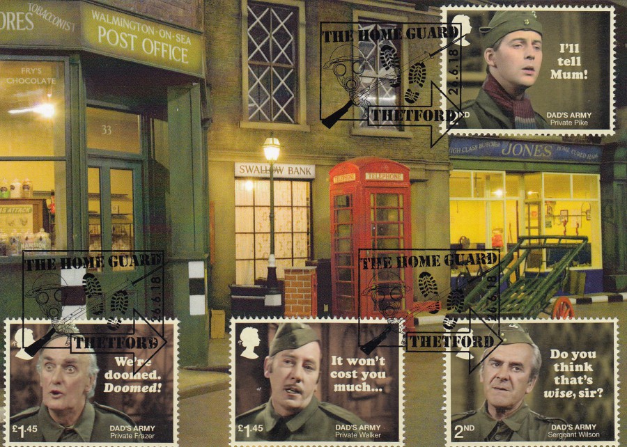
For the last two postcards I applied several of the stamps and had each of the two cards used with my favourite two of the available hand stamps. This one had four stamps applied:
2nd Class Private Pike
2nd Class Sergeant Wilson
£1.45 Private Walker
£1.45 Private Frazer
They have been cancelled first day of issue with the ‘THE HOME GUARD – THETFORD’ special hand stamp
DAD’S ARMY EXHIBITION
Fictional Walmington-On-Sea
BRESSINGHAM STEAM MUSEUM
Official Museum Postcard
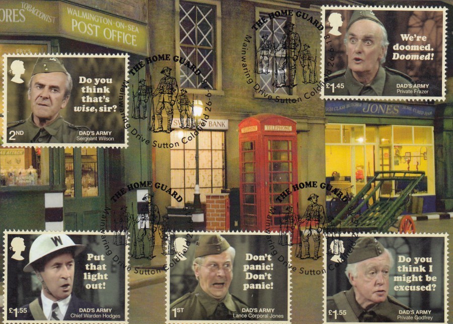
This card had five different stamps applied:
2nd Class Sergeant Wilson
£1.55 Chief Warden Hodges
1st Class Lance Corporal Jones
£1.55 Private Godfrey
£1.45 Private Frazer
This time had them all cancelled with my favourite of the first date of issue special handstamps – ‘‘THE HOME GUARD – MAINWARING DRIVE, SUTTON COLDFIELD’.
It will probably come as no surprise to find out that this is my favourite of the cards I produced.
09/07/2018
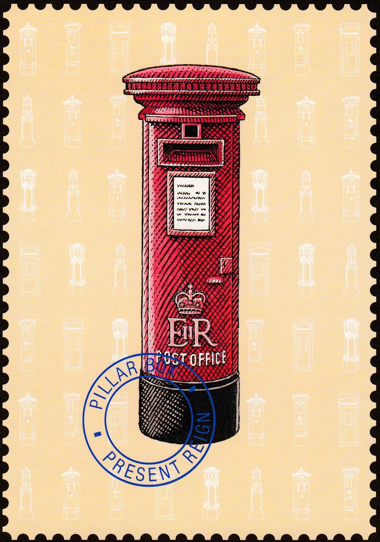
PILLAR BOX
PRESENT REIGN
Published by
POST OFFICE COUNTERS LTD
(ROYAL MAIL)
In their:
COLLECTIONS
Series
“In 1840 Sir Rowland Hill’s great postal reforms and introduction of the Penny Post and the Penny Black stamp generated the need for roadside pillar boxes and domestic letter boxes. The example shown here is the present day pillar box which was first erected in 1952”
(Text from reverse side of Postcard)
In my home town’s main High Street, the Post Office has been located in three different buildings, during my lifetime. The first location, which was where I discovered the wonderments of the ‘Philatelic Counter’. This was where I first started buying PHQ Stamp Cards and getting them posted on the first day of issue of the depicted stamps. I knew the two counter staff members well (I am still friends with one of them as we are members of the same stamp club). When the post office moved out this building was turned into a Pub which they aptly named ‘The Last Post’ in honour of it having been the post office. The post office then moved further down the High Street to a more modern shop like building. This move took place in 1993. It retained its Philatelic Counter for a sometime, but eventually they closed all the Philatelic Counters down, but whilst they were up and running they did issue some interesting postcards for selling from them. This is one of these cards.
The third and final location for the post office was a move to the local branch of W.H. Smith, just a couple of shops away. This latest move only occurred last year (2017) so the post office has not been here that long, just over a year as I believe the move took place in March 2017.
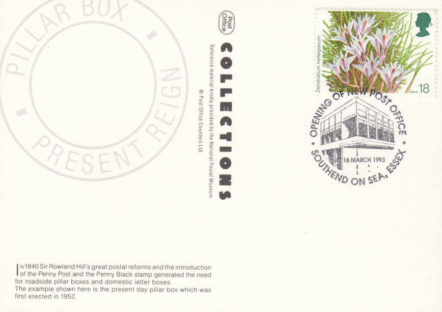
REVERSE SIDE OF ABOVE POSTCARD
Interestingly, someone used this postcard to obtain the special hand stamp which celebrated the Post Office’s move in 1993 to the new premises (as I have mentioned above). The hand stamp depicts the more modern shop like building they moved into. The cancel is dated 16th March 1993. This is a little bit of local postal history now. Not surprisingly there was no hand stamp for the move into W.H. Smith last year, possibly because the town was in uproar and totally against the move – which is still being moaned about even now. The building they moved from is still unoccupied as well!
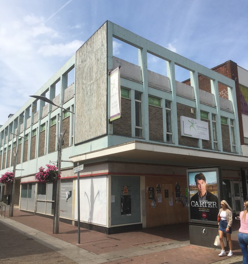
PHOTOGRAPH
Taken 09/07/2018
This is the old post office as it looks today, from the angle that the image in the special hand stamp is from, give or take a bit.

PHOTOGRAPH
Taken 09/07/2018
As you can see it is still boarded up over a year after the Royal Mail moved out and 30 yards down the road into WH Smith.
09/07/2018
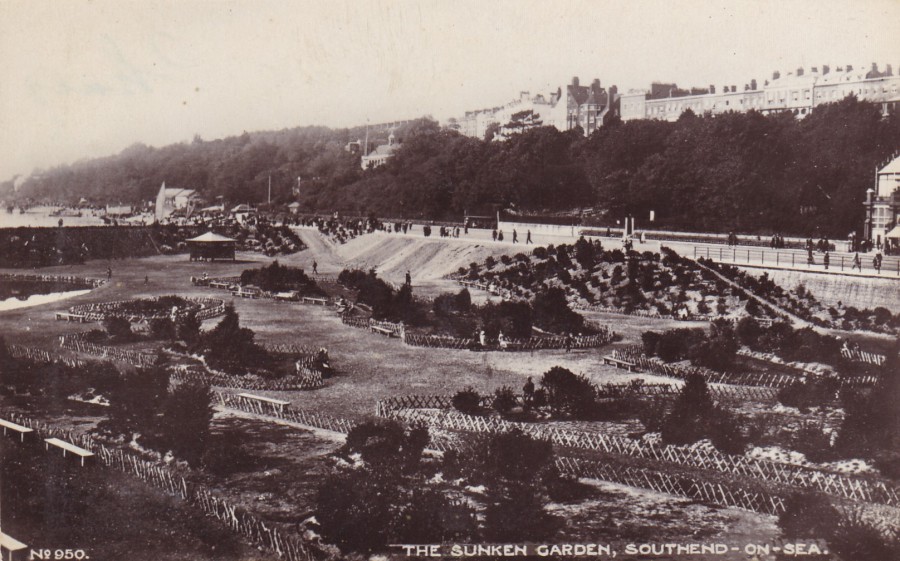
THE SUNKEN GARDEN,
SOUTHEND-ON-SEA
Published by
H. C. E. Series
Ref: No. 950
This is the area on the other side of our Pier from the Boating Lake that appears on the postcard depicted below. The boating lake on the previous card was something I did get to see as that was around whilst I was a child, but this sunken garden was gone long before I was born. In my memory this area has always been an amusement park with dodgem cars, a Crooked House attraction and old Helter-Skelter slide and the earlier smaller carousel type rides, these days of course the rides have been updated to more roller-coaster type attractions (although the Helter-Skelter slide and the old Crooked House are still here – they are little landmarks for this park – in fact, the crooked house is about to go under a major refurbishment but will remain as the Crooked House).
This image here is from the period just after the turn of the last century, so is an old postcard image of my town.
REVERSE SIDE OF ABOVE POSTCARD
09/07/2018
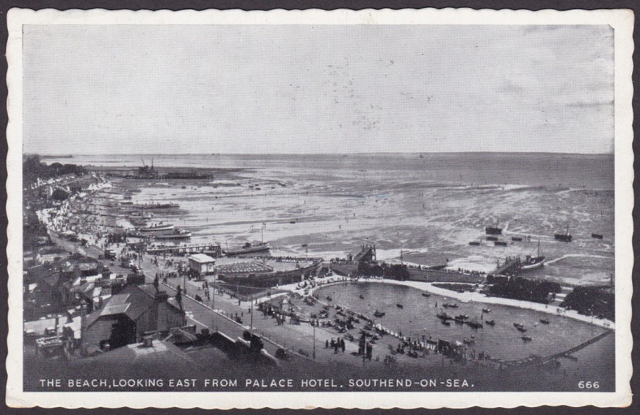
THE BEACH, LOOKING EAST
FROM PALACE HOTEL.
SOUTHEND-ON-SEA
Anonymous Publisher
Ref: 666
Time for another local view postcard from my collection of my home town; Southend-On-Sea. Because we are a seaside town it should come as no surprise that the largest number of view cards are those which depict some aspect of the seafront. This is often the case with all sea-fronted areas because this is where the tourists most often go.
I have many times mentioned that these older postcards, even ones from the 1960’s depict areas which have changed considerably. This is most definitely the case with any card depicting our seafront here. If you look at this one you can see a large boating lake in the bottom right corner. This is now a sunken amusement park with roller coasters and rides. To the left side of this, as you look at this card, there is a raised promenade area which has gone and been replaced with a miniature golf course, with model dinosaurs and a small helicopter decorating the jungle like décor.
You can also see a line of small pleasure boats, once very common here, but now pretty much all gone. I think there was one single one which lasted up until recently, but Jo thinks there is a smaller motor boat which goes out from here in the summer. The first jetty that can be seen after the boating lake, here depicted with a pleasure boat at the end of it, is still here.
This postcard was posted in 1963, so was within, but towards the middle end, of the popular ‘Deckle-Edge’ period.
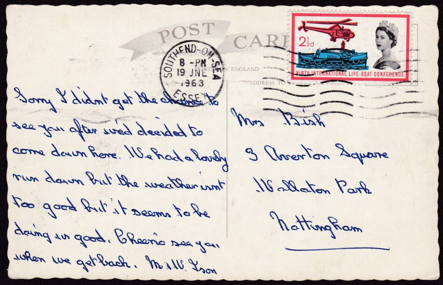
REVERSE SIDE OF ABOVE POSTCARD
This postcard is as old as I am! It was posted in 1963 (19th June) from Southend-on-Sea and the stamp has been cancelled with a Southend wavy-line machine cancellation.
The stamp used is the ‘Ninth International Lifeboat Conference’ 2 ½d from 1963 (SG 639).
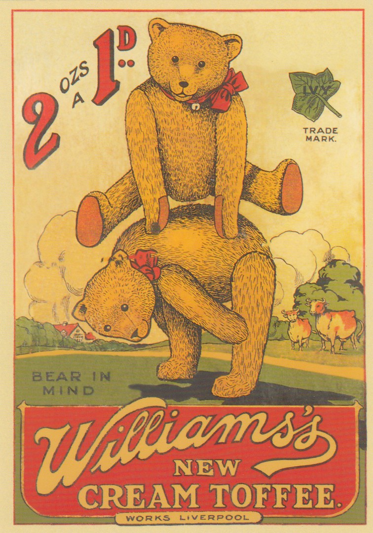
08/07/2018
WILLIAM’S
NEW CREAM TOFFEE
‘BEAR IN MIND’
(TEDDY BEARS)
Circa 1920’ SHOWCARD
Published by
ROBERT OPIE
(ROBERT OPIE COLLECTION)
Another postcard in the massive output by this producer – these can be found in most museums, tourist sites and specialist shops all over the UK – Robert has all but cornered the ‘Modern’ postcard sales market, something Robert will, and should be remembered for
Ref: 01PT 09
In their:
PLAYTIME SERIES
Another cracking postcard image, and another I had not previously seen before coming across this Robert Opie postcard. This is why Robert is slowly (perhaps not that slowly come to think of it) conquering the modern postcard sales scene here in the UK.
08/07/2018
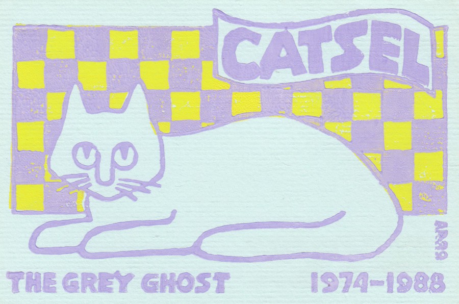
CATSEL
THE GREY GHOST
1974 – 1988
Artwork by, and Published by
ANN RUSNAK
Ref: AR89
LIMITED EDITION OF 136 POSTCARDS
“Despite her eternal vigilance old age carried Catsel away on Valentine’s Day, 1988”
(Text from reverse side of postcard)
I have always liked Ann Rusnak’s postcard designs, and that many were of a personal nature. This design was issued when a much-loved pet cat passed away. Not something you would expect to be commemorated by a postcard release, or one that would be popular! But, you would be wrong, because Ann’s work is much appreciated and with a limited edition of just 136 (it was originally to be 126 I believe, and the print on the reverse side does look like it was originally designed to say 126, but an extra half loop, added by pen and not printed like the rest of the text, has been added to the bottom of the 2 to make it into a 3, so maybe more people wanted one!). Some of Ann’s designs around this time were privately produced personally by Ann who hand printed each card, with a sort of lino-print arrangement where something was pressed down on the card – simple, but effective – and at the time, the 1980’s, an imaginative thing to be doing. This is a great card for cat lovers everywhere.
08/07/2018
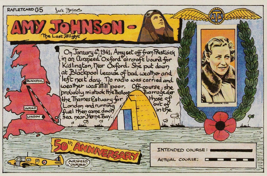
AMY JOHNSON
THE LAST FLIGHT
50TH ANNIVERSARY
Published by
RAFLET STAMP CLUB
Artwork by
JACK FOLLOWS
Ref: RAFLETCARD G5
J/V 1256CX
(This looks like a code used by postcard printers ‘J/V CARDS’)
This postcard was issued in 1991 and commemorated the 50th anniversary of the loss of the famous female aviator Amy Johnson. The tragic flight is of local interest to me as it is believed she ended up flying along the Thames Estuary, which it is believed she mistook for London because of the barrage balloon concentration at this location. It was, as stated, a tragic loss.
Because of the local connection a plan was made to fly along what was believed to be her final flight path on the actual anniversary date. 200 of these postcards were carried onboard the aeroplane used for this flight. These postcards were then sold locally here in my home town at Southend. I believe they were £2 each, and it was at my local stamp shop, long since closed-down, that I was shown and offered one, which of course I bought. So, this is one of those 200 postcards carried on that flight.
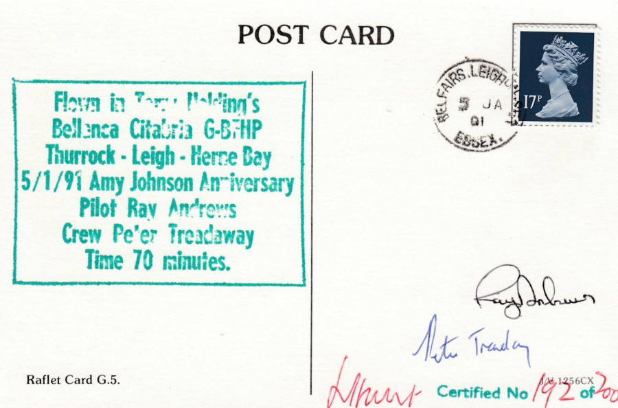
REVERSE SIDE OF ABOVE POSTCARD
This has a large boxed green cachet which gives details of the commemorative flight. This reads as:
FLOWN IN TONY [?] HOLDING’S [the first name is not confirmed – not fully inked on my cachet - potentially it could be 'Tanya' ]
BELLANCA CITABRIA G-BFHP
THURROCK – LEIGH – HERNE BAY
5/1/91 AMY JOHNSON ANNIVERSARY
PILOT RAY ANDREWS
CREW PETER TREADAWAY
TIME 70 MINUTES
Having been carried onboard the aeroplane the postcard was then signed by the pilot and the crew member and then hand-numbered (individually to 200) and signed as a certified limited edition by the person behind the project.
Then a 17p Machin Queen’s head stamp has been applied and the card posted locally to receive the ‘BELFAIRS – LEIGH-ON-SEA – ESSEX’ single ring date stamp which is dated 5 January 1991 (the anniversary date).
Not all the cards received a clear cachet, or a clear dated cancel on the stamp, fortunately I was quite early with the acquisition of my card so had a few to choose through. I got a very good dated cancel and a reasonable boxed green cachet, although I can not quite make out the first name on the top line of the cachet.
08/07/2018
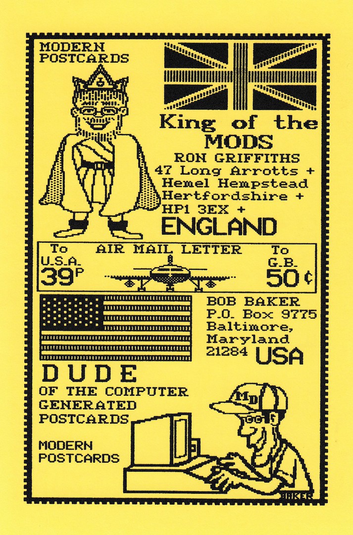
KING OF THE MODS
RON GIRFFITHS
(British Modern Postcard Dealer & Publisher)
DUDE OF THE COMPUTER GENERATED POSTCARDS
BOB BAKER
(American Publisher of Computer Generated Postcards).
Limited Edition Postcard (Number not quoted)
Joint Issue by Ron and Bob
Computers have gone a long way since the 1980’s, and now you can produce almost anything image wise on a postcard from your home, but, in the very early days of computer generated images the designs looked very fabricated, and you could tell instantly that the design had been created using one of the then ‘new-fangled’ home computers. These unusual images were quite hard to produce back then and not many people were doing it. Bob Baker was one of the pioneers. He was producing and selling designs just like this one, pretty much long before anyone else. He was certainly the first person that I was aware of who was doing this. I was introduced to the Bob Baker computer generated postcards by the postcard dealer Ron Griffiths.
Ron Griffiths, at his height, was one of the most knowledgeable postcard collectors and dealers here in the UK. I have bought many postcards from Ron (in all honesty, thousands of cards) and met him various times, once visiting him at his home in Hemel Hempstead (the address as detailed on this postcard). I learnt a lot from Ron and he is one of the two British modern postcard dealers that helped me through my early years and who shaped my own collecting and how I view the hobby to this day (the other was Pete Davies). Ron is a legend, and the name ‘King of the Mods’, as in modern postcards, was given to him and was not self-penned, and it was a title he deserved and lived up to.
Ron and Bob joined up to produce this postcard, and although it does not look like much now you have to view it in the perspective of the time it was produced. Back then it was a new source of postcard production and design and a novelty. It was also ground breaking and card designs like this were another step in the history of postcard production and design in our lifetime.
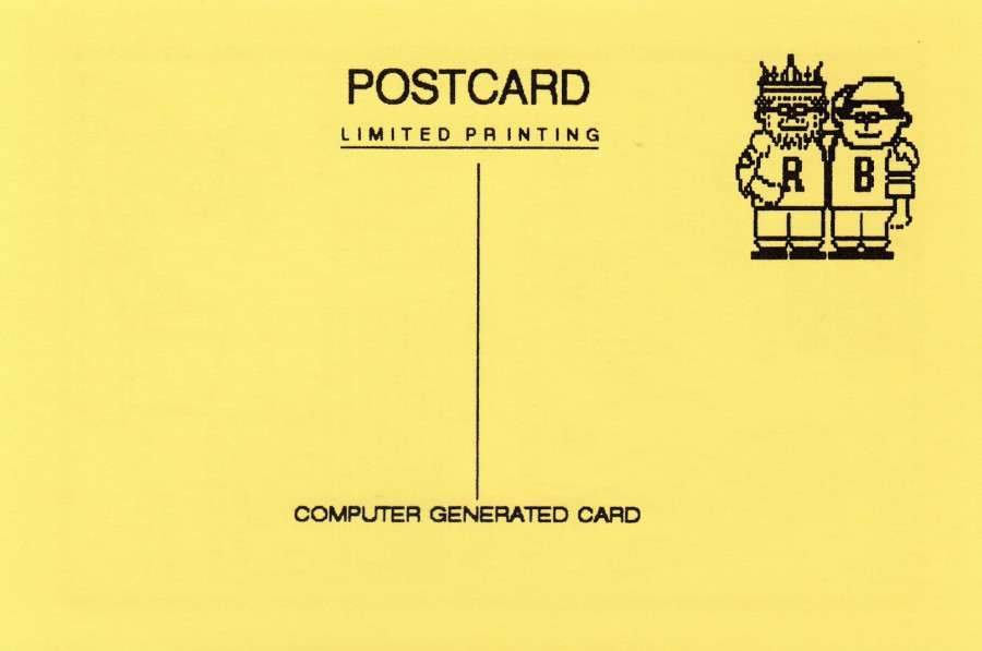
REVERSE SIDE OF ABOVE POSTCARD
Bob also designed the reverse of these cards using his computer

07/07/2018
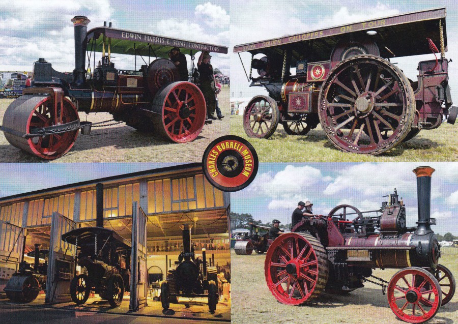
OPENING DAY,
AT THE
CHARLES BURRELL MUSEUM,
MINSTERGATE, THETFORD, NORFOLK.
THE OPENING CEREMONY WAS PERFORMED
BY MRS GILLIAN SHEPHERD MP.,
ON 25TH MARCH 1991
Published by
THE FRIENDS OF THE CHARLES BURRELL MUSEUM
Photograph by
TIMELESS PHOTO’S, MAGDALEN STREET, THETFORD
On my visit to Thetford a few weeks back I visited this museum. It has one of ‘Jones’ Butcher vans from the Dad’s Army television series. It is the van that was re-used in the recent feature film adaptation, having been loaned out for filming by the museum (although, according to a little talk that was given by a member of staff the van was damaged during its loan and the film company had to pay out for repairs!). The other exhibits are steam based, with traction engines being the major draw, as can be seen here.
<< New image with text >>
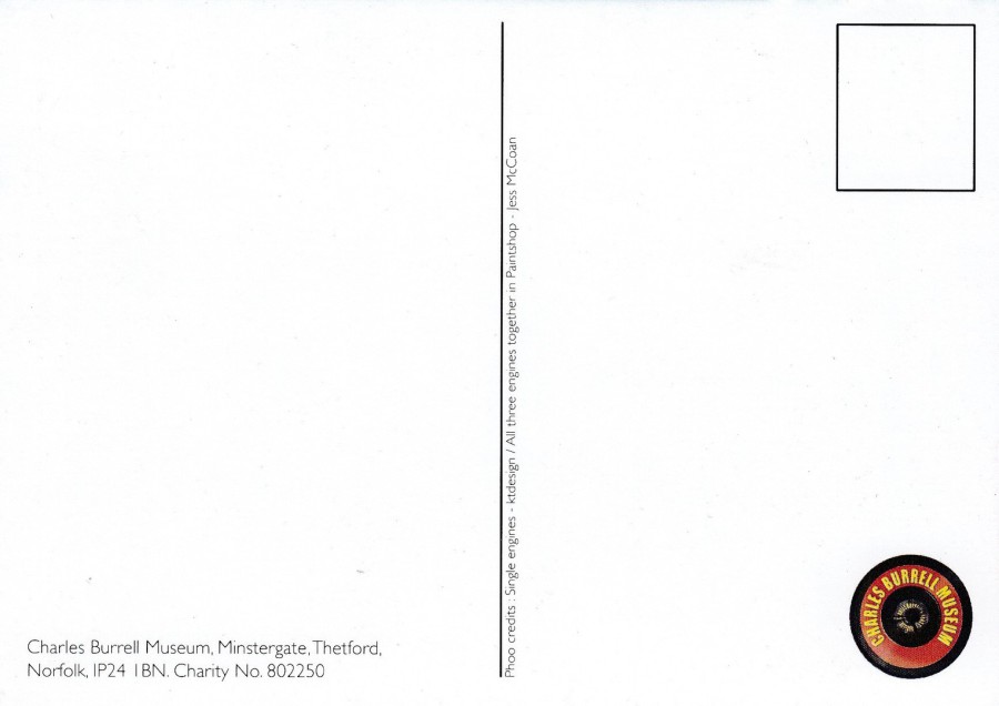
REVERSE SIDE OF ABOVE POSTCARD
I love the little spelling error that appears on this card (its down the centre line – see below)

i am sure that should be 'Photo credits' and not 'Phoo credits'. It is little things like this that I enjoy looking out for, and it is an easy mistake to make, and more importantly does not detract from the superb front images - in fact I doubt anyone else has even noticed! It will be fun to see if on any reprint (or any earlier print if there is one) the spelling mishap is corrected (personlly, I would not bother - but if I go back I will check anyway.... its the kind of sad 'collector' thing that I do.)
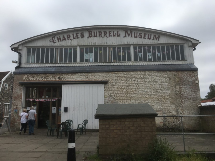
PHOTOGRAPH
This a photograph I took whilst on my visit in June
This is the main entrance, as shown to the left side of the building

PHOTOGRAPH
This a photograph of the ‘Jones the Butcher’ van on display here
(I think they are missing out here but not having a postcard of this vehicle)
07/07/2018
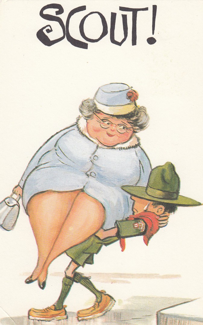
SCOUT!
Plain backed Card
Anonymous Publisher
It is the first morning of Cub Camp after a night of sleeping in my sleeping bag, oh how I hate camping (he says with almost a smile!!) So, as the sun is shining, and the cub scouts are waking up and running around in the fields and wood I thought I would find an appropriate postcard for this mornings post (thanks to the wonderment of my little Wi-Fi gadget thingy I can now post even without an internet connection otherwise). This scout design will do nicely.
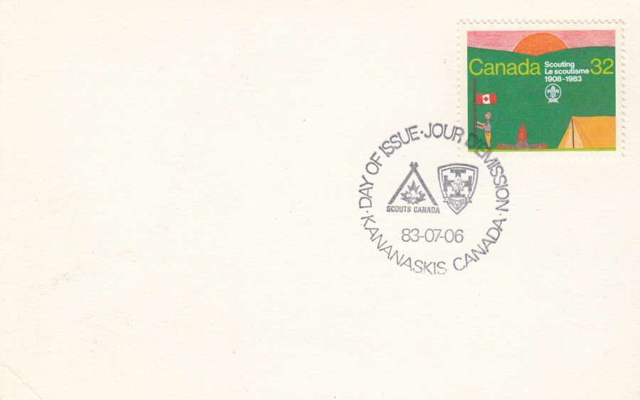
REVERSE SIDE OF ABOVE POSTCARD
This has been used first day of issue with the 1983 Canada single stamp issue celebrating Scouting.

06/07/2018
UNTITLED
(Bear Face, with hat)
Published by
paperchase
(the retail stationery shop)
This is a recent issue, simple, but still appealing – not much else one can say about it really, except at least it’s not another new cat design (he says with a smile)

06/07/2018
SLIPPER CHAPEL
(Walsingham, Norfolk)
Publisher not shown
But text on reverse side reads:
‘CARD SOLD IN SHED CRAFTS,
LITTLE WALSINGHAM’
Another exclusive postcard from this little shop I found in Walsingham (see entry dated 05/07/208 – July Blogs 2018 ‘Greetings from Norfolk’). I have posted previously, an extensive posting, about postcards I found on sale at the Slipper Capel site (see entry dated 28/06/2018 – June 2018 Blog 7 [under the June Blogs 2018 main tab]). This was the only other postcard in the area which I found which depicted the actual chapel, and the only one on my trip which depicted the chapel as it looks today.
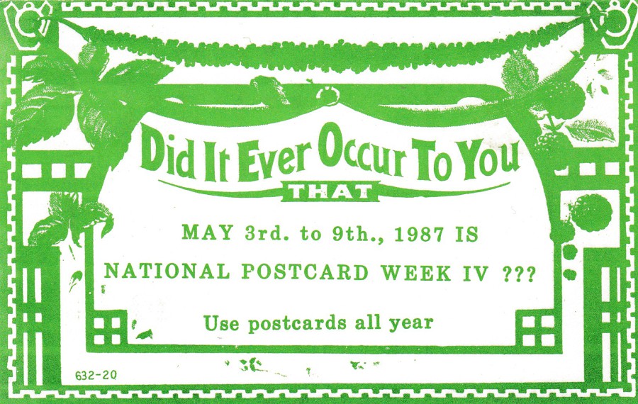
06/07/2018
DID IT EVER OCCUR TO YOU
THAT
MAY 3RD – 9TH., 1987 IS
NATIONAL POSTCARD WEEK IV ???
Use postcards all year
Published by
J. McCLINTOCK
This is an American National Postcard Week postcard privately produced by a postcard collector. These were extremely common during the 1980’s (and other decades, but less so) and collectors across America exchanged their cards with other collectors for their privately produced NPW cards. Some of the designs are quite simple in design, some a bit more elaborate, but what I have found with the US ones is that some of the reverse side designs are elaborate and quite beautiful, better often than the front. I'm not knocking the front of this design, I like it, but the reverse side is lovely.
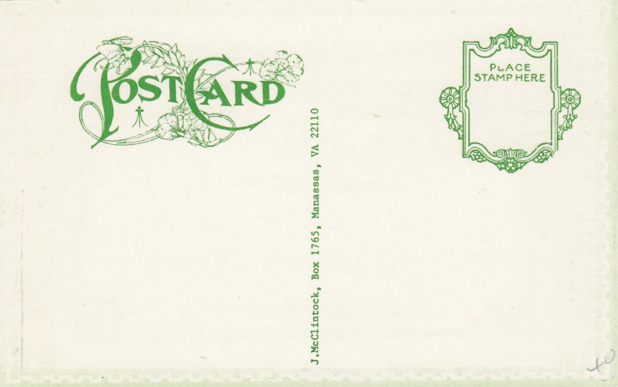
REVERSE SIDE OF ABOVE POSTCARD
See what I mean? A lovely ornate 'POST CARD' text design, which is not uncommon with these privately produced National Postcard Week postcards. When I come across these I always see what the reverse side looks like.