08/04/2017
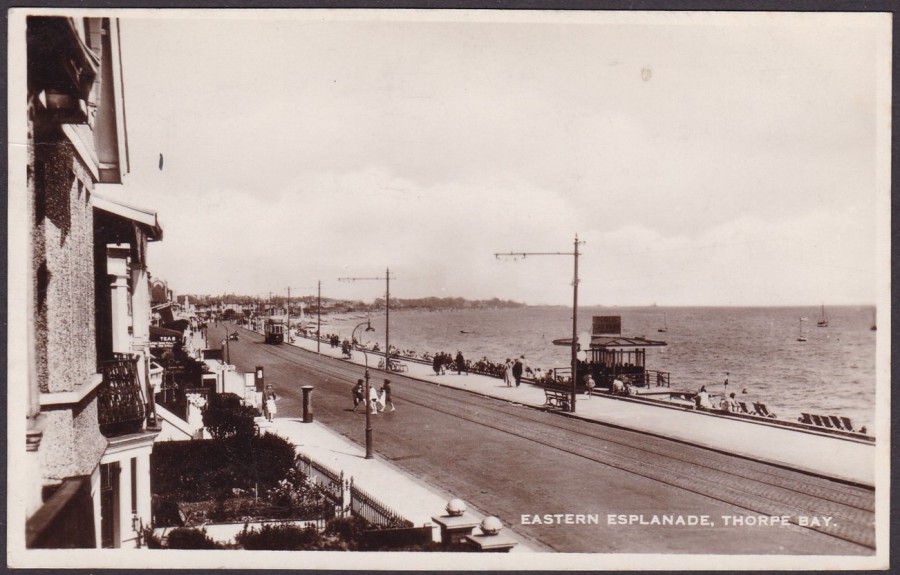
EASTERN ESPLANADE, THORPE BAY
Unknown Local Publisher
Thorpe Bay is part of Southend-on-Sea and is located on the east side between central Southend and Shoeburyness. I know this area really well, although it has changed considerably. There is now a sea wall along the edge of the pavement between the pathway and the beach, roughly where the deckchairs can be seen on the right side. I don’t think the road is really any wider now but the Tram Lines have definitely long gone. In fact, in this image you can see one of the trams in the distance centre left. This is another old postcard from my home town collection. It is probable that collecting old postcards of where you live is the most popular form of postcard collecting, as it incorporates postcard collectors, local history collectors, family history collectors and the organisations based locally that collect images for local libraries and museums. This is why they are also often amongst the most expensive when the image depicted is a rare one.
This particular postcard here was posted on 28th August 1935.
PHOTOGRAPHS
08/04/2017
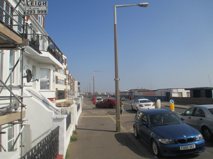
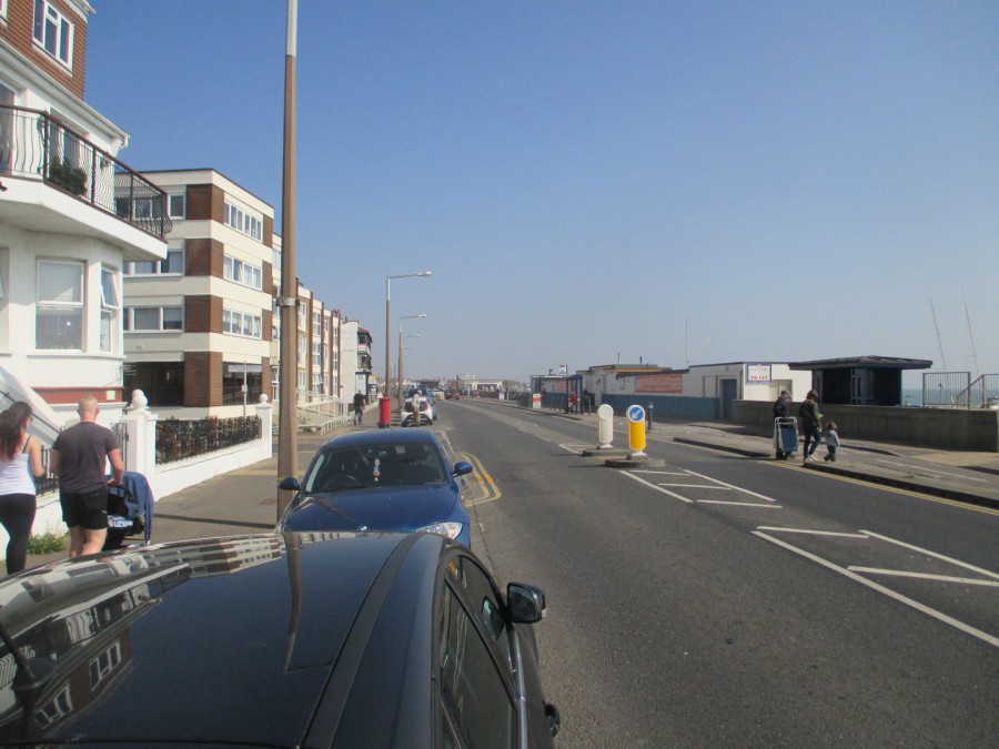
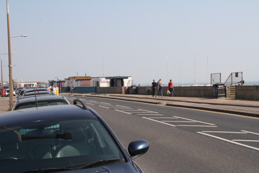
I was never going to be able to get high enough up to reproduce the exact image (it would mean hanging out of someone’s bedroom!!) but, this is the right stretch of seafront. These pictures were taken today by both Jo and me (Jo’s are the better ones as she knows what she is doing)
PHOTOGRAPHS
08/04/2017
As you can see there are a lot more buildings and structures on the beach side of the road now (and a cycle lane), also, best not to mention the horrible modern new street lighting!
PHOTOGRAPHS
08/04/2017

08/04/2017
WONDERGROUND GALLERY
WALT DISNEY WORLD
FLORIDA
Original Artwork of
“FLY DUMBO AIR”
By Artist
Dave Perillo
Make believe poster for the ‘Fly Dumbo Air’ service, which takes its idea from the iconic flying Dumbo ride, which can found in pretty much all of the Disney theme parks around the world (I am not sure if there is any other ride which appears in every one of the Disney theme parks? Is Dumbo the only one?)
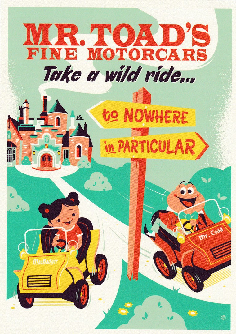
WONDERGROUND GALLERY
WALT DISNEY WORLD
FLORIDA
Original Artwork of
“TAKE A WILD RIDE”
By Artist
Dave Perillo
MR Toads’ Fine Motor Cars. Another nice design by Dave Perillo, who of course I met in 2015 on a previous visit (see previous posting, last year sometime, where I depicted signed postcards and one on which he drew a lovely little sketch for me)
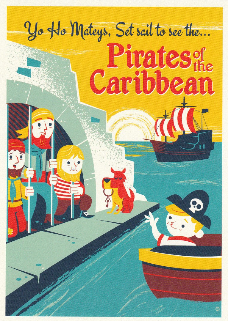
WONDERGROUND GALLERY
WALT DISNEY WORLD
FLORIDA
Original Artwork of
“YO HO, SET SAIL”
By Artist
Dave Perillo
And another from what is almost a series of designs which all seemed to be on sale at the same time. This design is clearly based on the Pirates of the Caribbean ride and is in the same style which is indicative of the designs by Perillo.
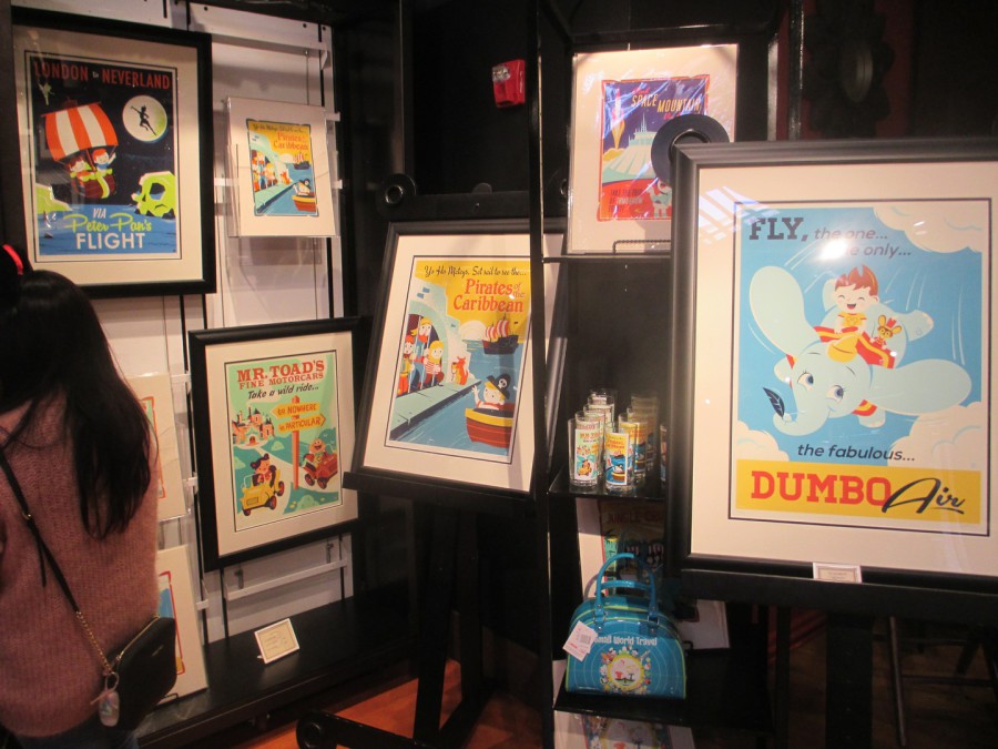
PHOTOGRAPH
NOVEMBER 2016
As you can see these designs, like most of the Wonderground Gallery designs, can be found on other items, like poster prints, framed and unframed, glasses, bags and sometimes items of clothing (although I did not see any such items for these designs)
08/04/2017
PHOTOGRAPH
NOVEMBER 2016
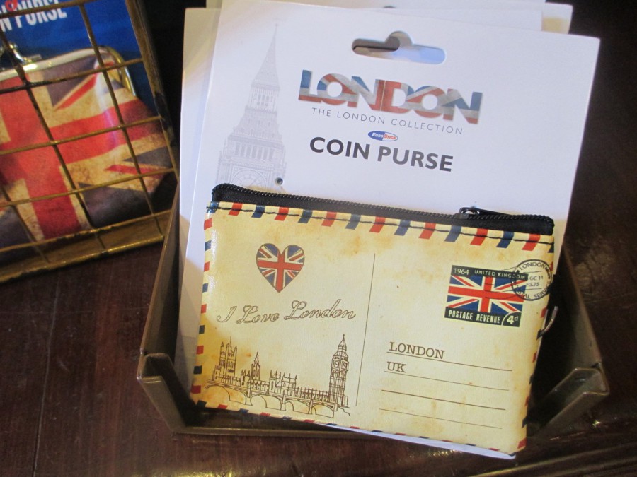
EPCOT (THEME PARK)
WALT DISNEY WORLD
‘GREAT BRITAIN’
WORLD SHOWCASE
COIN PURSE
(POSTCARD DESIGN)
In the ‘Great Britain’ segment of the World Showcase at the Epcot theme park (Walt Disney World, Florida) there are a range of shops which sell all sorts of souvenirs. In one of them I came across this coin purse which is designed to look like a postcard, with made up postage stamp design and a printed hand stamp as well. Something unusual. I did not buy one but did take a photograph.
08/04/207
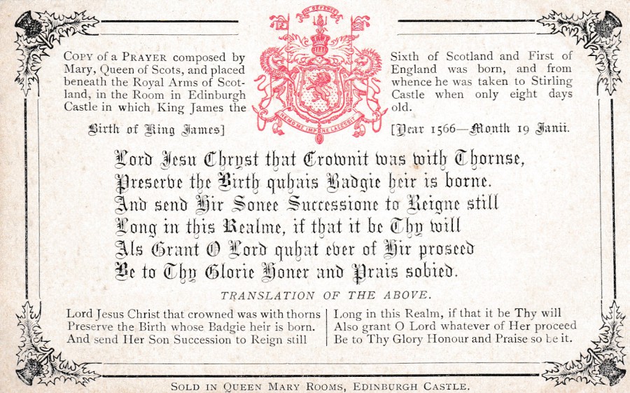
PRAYER
MARY QUEEN OF SCOTS
SOLD IN QUEEN MARY ROOMS, EDINBURGH CASTLE
“Copy of a prayer composed by Mary, Queen of Scots, and placed beneath the Royal Arms of Scotland, in the rom in Edinburgh Castle in which King James the Sixth of Scotland and first of England was born, and from whence he was taken to Stirling Castle when only eight days old”
“Birth of King James – Year 1566 – Month 19th January”
Lord Jesus Christ that crowned was with thorns
Preserve the birth whose Badgie heir is born
And send Her Son Succession to Reign still
Long in this Realm, if that it be thy will
Also grant O Lord whatever of her proceed
Be to Thy Glory Honour and Praise so be it
REVERSE SIDE OF ABOVE POSTCARD
Difficult to date this card precisely but from the layout of the wording used here on the reverse side, if I had to pick a decade I think I would go with the 1960’s (although I accept it could be late 1950s). Very simple POST CARD layout with no publisher or printer mentioned. This could possibly have been a locally printed card produced by a printing company rather than a postcard publisher, which would explain the lack of publisher detail as the local printing workshop would not be set up to add post card details beyond that of a standard print
08/04/2017
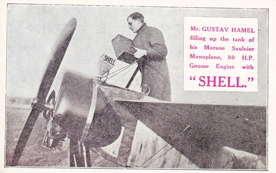
MR. GUSTAV HAMEL
Filling up the tank of his Morane Saulnier Monplane, 80 H.P. Gnome Engine with
“SHELL”
Although the image is old, clearly, this postcard is in fact a far more modern reproduction release. I do not know if the design was originally released as such at the time of Gustav Hamel, but it is possible that this can be found as an original period release.
There is a tragic story behind this image as on the 23rd May 1914 Hamel disappeared over the English Channel on a return flight to the UK. He was flying the 80 HP Gnome Monosoupape engined Morane-Saulnier monoplane which I assume is depicted here. He had intended to compete in an Aerial Derby which was to be held that same day.
On the 6th July 1914 a body was found in the Channel by a fishing vessel somewhere off the coast from Boulogne. No official identification was possible as the body was not brought back, but from the description of the clothing and the fact that a road map of Southern England was found on the body gave strong likelihood to this being the body of Hamel.
REVERSE SIDE OF ABOVE POSTCARD
I actually think that this reverse side is also of a reproduced layout, again possibly from an original postcard. As you look at this here it would be impossible to know that this was a postcard issued, I suspect, around the 1960’s. But if you could see the original you would see that the gloss finish to the card itself has a far more modern feel and look. I am aware that SHELL issued a number of publicity postcards down through the years, many depicting older images, both photographs and poster artwork. This will probably be one of these and may even have been part of a set although no indication is given here that it is.
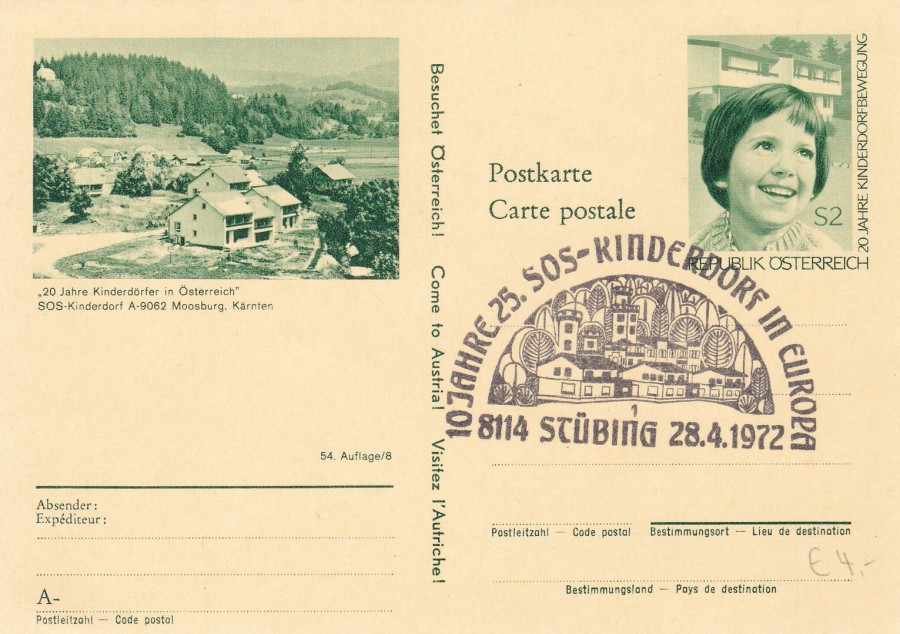
08/04/2017
AUSTRIA
Postal stationery Postcard
20 Jahre Kinderdorfer in Osterreich
SOS Kinderdorf A-9062 Moosburg, Karnten
“20 Years Kinderdorfer in Austria
SOS Children’s Village A-9062 Moosburg, Karnten”
I like postal stationery postcards for all sorts of reasons. This one really appealed to me because I liked the pre-printed stamp image. The stamp design was issued as an actual postage stamp in 1969 (SG 1556) for the actual 20th Anniversary of the ‘SOS Children’s Villages Movement’. I can therefore deduce that this postal stationery card was also issued in that year, 1969. This means that someone has then used one of these cards in 1972 so that they could obtain this 1972 related special cancel:
10 JAHRE 25.
SOS – KINDERDORF IN EUROPA
8114 STUBING 28.4.1972
This hand stamp commemorates the 10th anniversary of the SOS Children’s Homes in Europe. The combination of a rather attractive cancel on a postal stationery card with a beautiful pre-printed stamp, and with the combined common theme, I think makes this a delightful item. And for just £1 I also thought I got it rather cheaply.
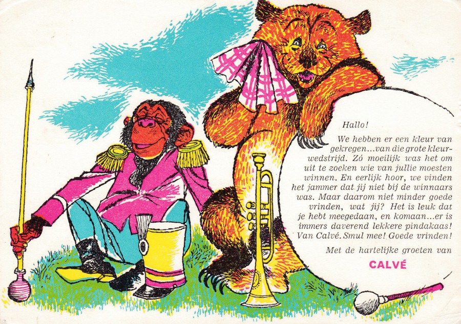
08/04/2017
HALLO!
“We hebben er een kleur van gekregen…van die grote kleur-wedstrijd. Zo moeilijk was het om uit le zoeken wie van jullie moesten winnen. En eerlijk hoor, we vinden het jammer dat jij niet bij de winnaars was. Maar daarom niet minder goede vrinden, wat jij? Het is leuk dat je hebt megedaan, en komaan…er is immers daverend lekkere pindakaas! Van Calve. Smul mee! Goede vrinden! Met de hartelijke groeten van CALVE”
If you place this into a google translator service you get this back:
We have a color ... got those big coloring contest. So difficult was it to find out who had le beat you. And fair enough, we are sorry that you were not among the winners. But no less good friends, you know what? It's nice that you megedaan, and come on ... there is indeed booming yummy peanut butter! From Calve. Feast with! Good friends! With the cordial greetings CALVE
So, although not exactly a precise translation we can assess the details and come up with the obvious fact that this postcard was sent out to someone who entered a ‘Colouring’ competition but did not win. This postcard was sent out to advise them that they were not winners (I wonder what the winners got?). But, what a smashing postcard to receive free through the post. And, thankfully this person saved theirs so that I could pick it up many years later. Unfortunately, despite looking like it was posted, there is no date stamp and no other datable information on this card. But, the image is delightful and as an advertising postcard there is some value here as well.
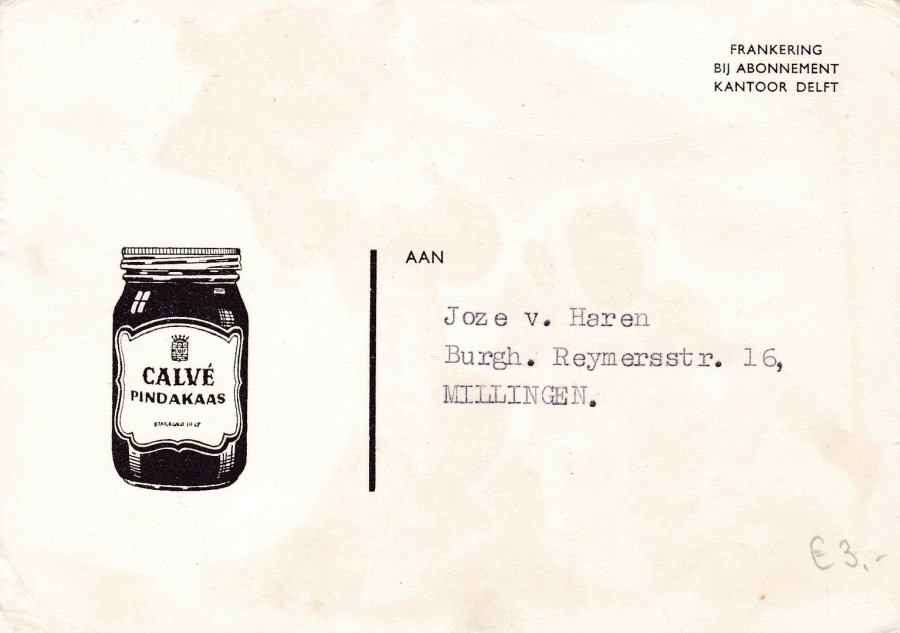
REVERSE SIDE OF ABOVE POSTCARD
Addressed, but no date stamp. But even here the company have depicted an image to increase the advertising. The company started producing Peanut Butter in 1948 so this postcard came after that year. This was another nice postcard that only cost me £1.
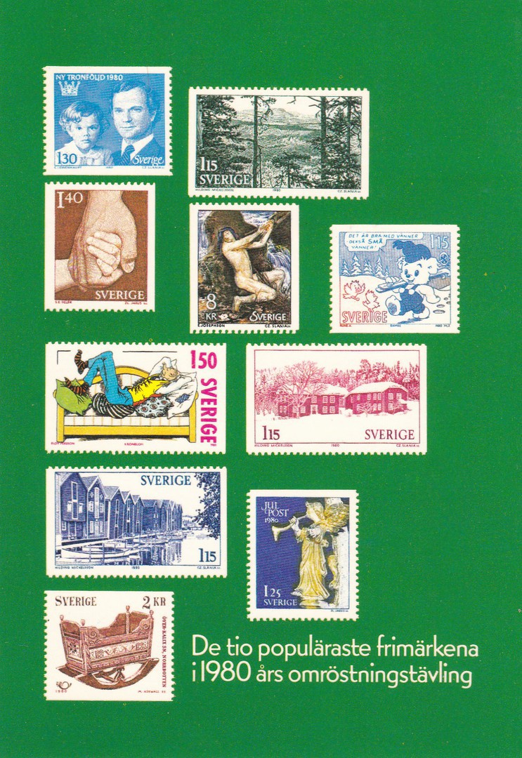
07/04/2017
THE STAMPS OF SWEDEN – 1980
“The ten most popular stamps 1980”
BRITISH PHILATELIC EXHIBITION, LONDON 1981
STOCKHOLM
SWEDISH PFA IN LONDON
I have family in Sweden and they live in Stockholm, so todays awful incident involving what is said to be a hijacked truck which has been driven into a number of pedestrians, and causing a number of deaths, is tragically a little close to home. My thoughts are with them and everyone who lives in this city.
This postcard is an official Swedish post office issue which depicts a number of stamps which were considered to be the top ten of the recent years for a postcard issued for use in 1981. The postcard was available in the UK at the 1981 British Philatelic Exhibition, see below.
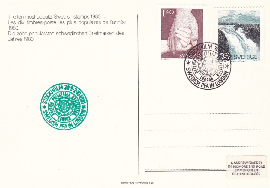
REVERSE SIDE OF ABOVE POSTCARD
Two Swedish stamps have been applied here and cancelled with the special cancellation:
STOCKHOLM
28-9, 2-10 1981
BRITISH PHILATELIC EXHIBITION, LONDON
SWEDISH PFA IN LONDON
This card was produced for, and cancelled at the UK event at the Swedish Post Office stand where you could obtain an exhibition exclusive green cachet, which reproduces the black special hand stamp. The special cachet can be seen here on the left side of the postcard. This is a philatelic souvenir for the exhibition.
The two stamps are:
CARE 1k 40 value – brown (small hand held in larger hand) – issued 1980 (SG 1037)
GREAT FALLS 35ore value – black and blue (waterfall) – issued 1974 (SG 784)
I thought that after todays incident the stamp depicting hands clasped together, and from a set titled as 'Care', seemed an appropriate posting for today. Take care, hold hands and move forward and stand together.
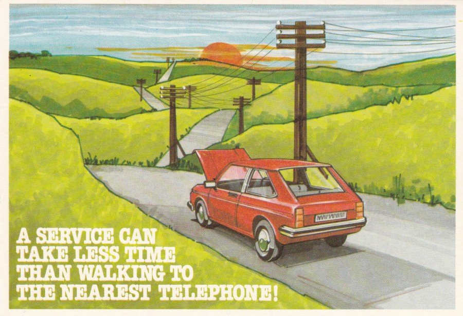
06/04/2017
A SERVICE CAN TAKE LESS TIME THAN WALKING TO THE NEAREST TELEPHONE!
“Dear Customer, Our records show your car is due for servicing. Please ring for an appointment.”
CASTROL SERVICE
SERVICE MANAGER
Ref: RC 1
A nice postcard that could be used by any garage to inform a car owner that their vehicle was due a service. The postcard doubled as an advert postcard for ‘Castrol Oil’. A simple postcard but a nice one.
REVERSE SIDE OF ABOVE POSTCARD
06/04/2017
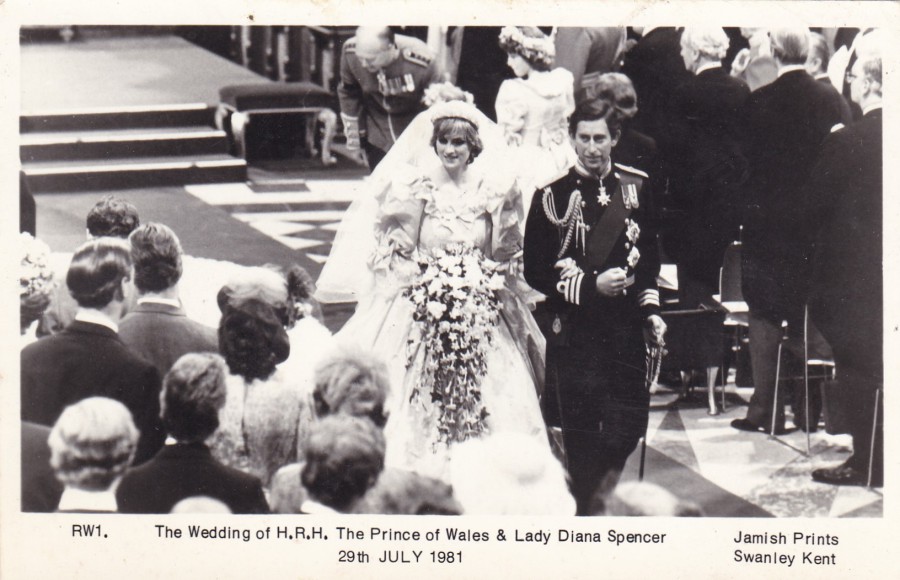
THE WEDDING OF H.R.H. THE PRINCE OF WALES & LADY DIANA SPENCER
29TH JULY 1981
Published by
JAMISH PRINTS
Ref: RW1
There are many, many 1981 Royal Wedding related postcards and they are of course also collected by those who specialise in Princess Diana herself, as she is collected as a theme on her own. This one is quite a nice one and depicts the couple on their route back towards the exit of the church.
05/04/2017
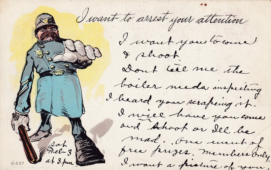
I WANT TO ARREST YOUR ATTENTION
“Write Away Post Card”
Unknown American Publisher
Ref: H 657
I came across this postcard earlier in the year. It appealed to me because of my work through which I have always collected Police related postcards. This one here is an early one and was posted in Feb 1906. The image depicts an old style American police officer reaching out towards the viewer. In his hand, he holds an old wooden truncheon, which is pretty much the same as I was initially issued with at the start of my career back in 1987. Oh, how things have changed!
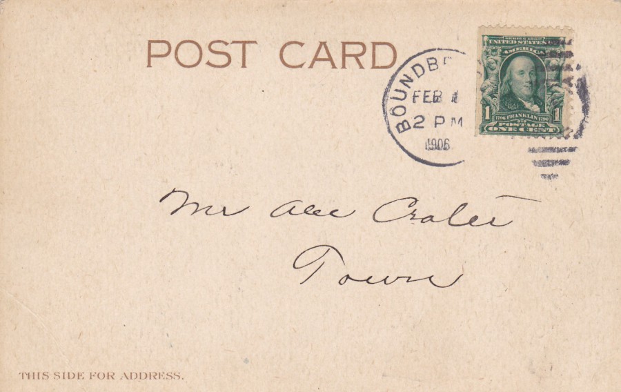
REVERSE SIDE OF ABOVE POSTCARD
This has the shortest address I have ever seen:
MR ALEC GALES (?)
TOWN
How small was the town that you could address a card just to a person’s name? Or was he very well known? Perhaps a distinguished member of the community? Unfortunately, the second half of the cancellations town name has not printed (the stamps edge has meant that a full strike of the duplex hand stamp used here has not adhered because of the raised edge) so I do not know from where it was sent, which is a shame as I would love to know where this came from.
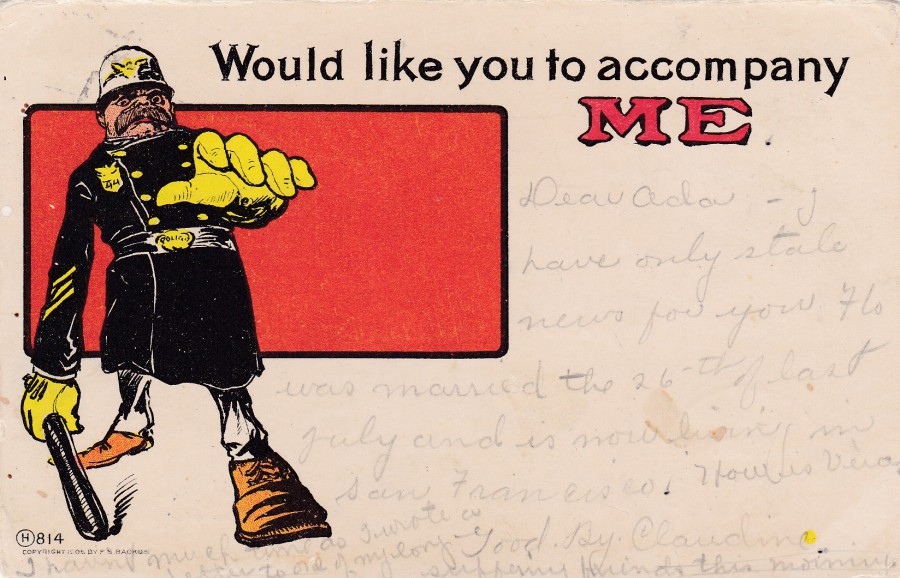
WOULD LIKE YOU TO ACCOMPANY ME
“Write Away Post Card”
Unknown American Publisher
Ref: H 814
Now I am sure you do not need me to tell you that this is clearly the same looking police officer, it’s just that here he has what looks like he is wearing a black coat and yellow gloves (and what looks like a white helmet). He must be the same officer though as he has the number 44 on his badge, just like the officer on the above postcard. This one is clearly by the same unknown publisher but this one was posted in Oct 1906. When I saw this second postcard I wanted it to go with the first, I think they go well together.
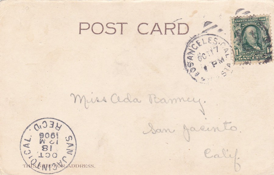
REVERSE SIDE OF ABOVE POSTCARD
At least I know where this one was posted from as the duplex hand stamp is much clearer. This one was posted in Los Angeles, California on the 17th October 1906. It was addressed to San Jacinto, California and arrived there on the 18th October as shown by the receiving mark cancel bottom left.
04/04/2017
THE RUINS OF YPRES
HOSPITAL
This card is from the same source as the two similar postcards posted on the webpage on the 02/04/2017
04/04/2017
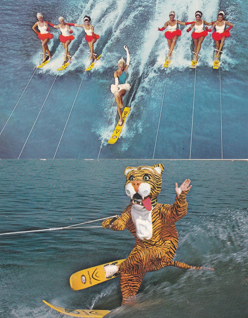
CYPRESS GARDENS
TOP
WATER SKI BALLET AT FLORIDA’S BEAUTIFUL CYPRESS GARDENS
Published by
RIDGE DISTRIBUTING Co
Printed via
CURTEICHCOLOR
Ref: CK. 23
BOTTOM
TIMMY THE TIGER
“…is a favorite part of the water ski show at Florida’s Fabulous Cypress Gardens”
Published by
KOPPEL COLOR CARDS (Hawthorne, N. J.)
Printed by
FLORIDA NATURAL COLOR, INC
Ref: FNC 5809 (124194)
There was a time when water ski shows were the big thing in Florida. I watched one myself back in 1993 at SeaWorld, but I’m not sure they are still around. This one has gone as Cypress Gardens has gone. So, Timmy the Tiger is no longer with us, but, at least he is recorded forever here on this postcard. I found the Timmy card on a stall at an American outdoor antiques fair and he cost me $1. I am not sure where the other card came from but I suspect it was part of a bundle I picked up at the same event. I thought they would go together nicely here.
04/04/2017
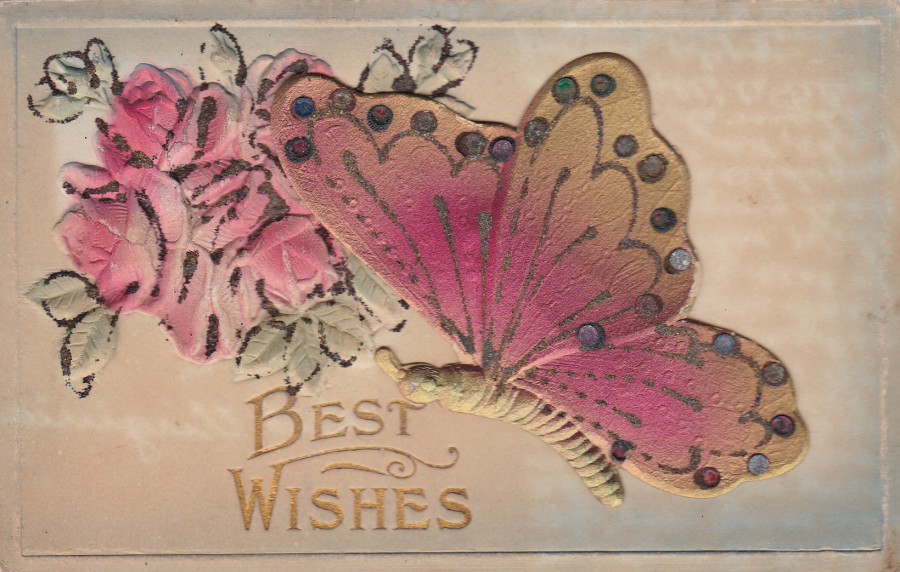
BEST WISHES
Published by an Unknown American Publisher
EMBOSSED ROSES
APPLIED BUTTERFLY MOULD
This early American ‘Best Wishes’ postcard has a moulded piece of thick card, in the shape of a butterfly stuck down to the front. The postcard has then also been embossed, with the bunch of roses pushed out so they are raised above the main card. This is perhaps beset seen from the reverse side (see below).
This would be classed as a novelty postcard. I bought this in America a couple of years ago but it was not posted so I have no exact date for its issue but I suspect pre-World War 1.
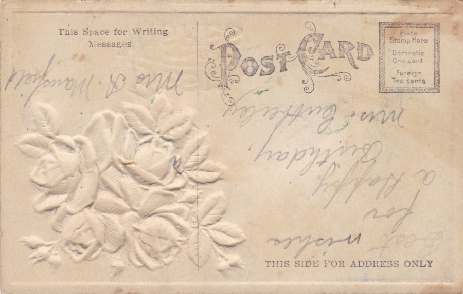
REVERSE SIDE OF ABOVE POSTCARD
You can see the underside of the embossed roses
(and, yes, they are upside down as the reverse side is printed upside down to the front)
03/04/2017
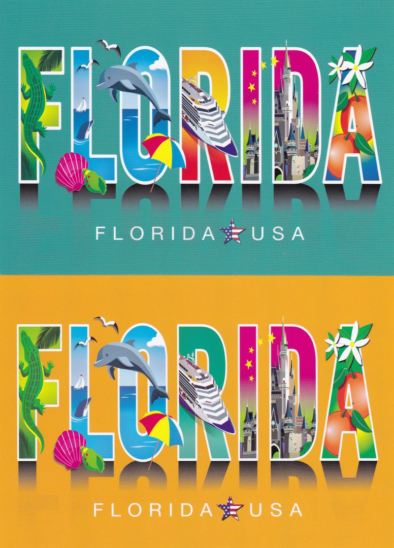
TOP
FLORIDA
“GREEN BACKGROUND”
Published by
THE POSTCARD FACTORY
Ref: PC57-FL 9265
BOTTOM
FLORIDA
“YELLOW BACKGROUND”
Published by
THE POSTCARD FACTORY
Ref: PC57-FL 92650
These two postcards could often be found in the same spinners and racks in shops and stores outside of the theme park areas. Personally, I think these are lovely designs and ones which are quite clever in what they depict. You have the classic symbols of Florida, the alligator, Dolphins (depicted here in the sea but strongly connected with ‘SeaWorld’ as well), Seashells and the famous Florida Oranges. But, you also have a cruise ship, and many of these liners call along the coast of Florida from Miami upwards, so the inclusion of one is appropriate, and is it me? But does the ship have the colouring of the Disney cruise line? If it does, or does not, it is not too important as the Walt Disney World Magic Kingdom Castle is also included across two of the letters making up the word ‘FLORIDA’.
It is not immediately obvious, but check out the background colours within the letters ‘R’ on both postcards. In each case the letter contains the main background colour of the other postcard – a neat little inclusion which matches the two cards together nicely.
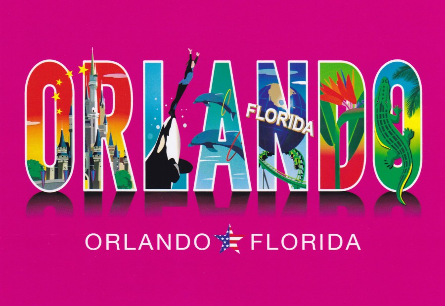
ORLANDO
Published by
THE POSTCARD FACTORY
Ref: PC57-OR 9265
This postcard is a clear companion card to the two above issues. This one though uses the more localised ‘ORLANDO’ instead of the general ‘FLORIDA’. Also, this one is far more theme park based. The Walt Disney World Magic Kingdom Castle takes up the first two letters. Then you have a representation of the ‘SeaWorld’ park with a swimmer being lifted into the air on the front of a killer whale. This does somewhat date this postcard as they have not been putting humans in the pool with the Killer Whales for some years now (after the tragic death of one of the team in 2010). Next up you again have Dolphins but here they do seem to be theme park based with the inclusion of hoops. In the letter ‘N’ you have the first appearance of the ‘Universal Studios’ theme park with their revolving earth globe, which is outside the entrance of the park, and a green roller coaster ride, which has to be ‘The Hulk’. Then you have a nice flower (no idea what it is…). Finally, there is another alligator, although its body is twisted the other way around to that depicted on the other design. Any collector with an interest in this area, Disney or Florida itself would like these, and I know they are still available.
03/04/2017
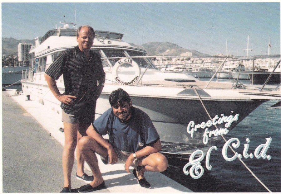
GREETINGS FROM ‘EL C.I.D.’
Published by
GRANADA TELEVISION
“A new 6 part comedy drama from Granada Television starring Alfred Molina and John Bird. Now filming on the Costa del Sol”
(Text from reverse side of Postcard)
It is always nice when you find an official publicity-promotional postcard for a programme that is now probably little known or remembered, despite it being reasonably popular when it was being shown.
The programme (the title is a play on the historical character ‘El Cid’) was a crime drama, of sorts, which ran for three seasons between 1990 (07/02/90) and 1992 (02/03/92). Alfred Molina played a C.I.D. Officer, named Bernard Blake, who takes early retirement and then moves to Spain (thus the title). He and his work partner, Douglas Bromley, played by John Bird, a retired records officer, keep an eye on the ex-pat criminal (Gangsters) community living in Spain. Although the series ran for three seasons Alfred Molina jumped ship after the second series, so this postcard depicts the original line-up and is from the very first series.
A nice postcard for any television postcard collector but one I suspect which would be especially of interest to any fan of the programme (I was not a big fan, but did watch some of the episodes and at least remember the programme).
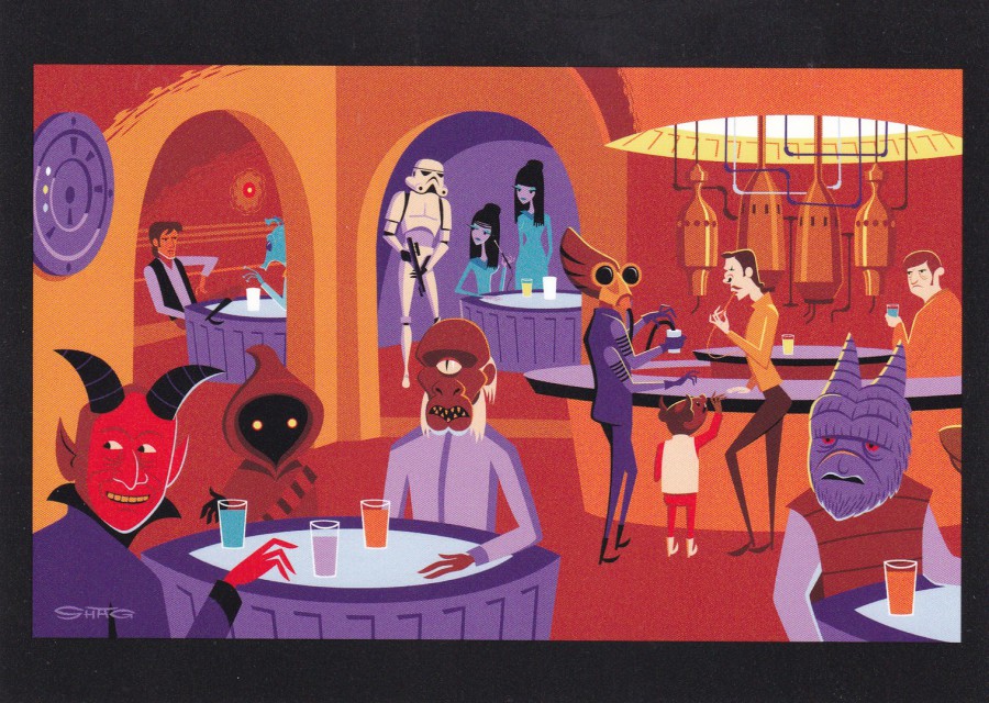
03/04/2017
WONDERGROUND GALLERY
WALT DISNEY WORLD
FLORIDA
Original Artwork of
“A WRETCHED HIVE”
By Artist
SHAG
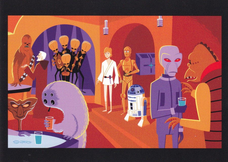
Another cracking Star Wars based postcard design. This one is one of a pair which fit together to make one complete picture. I was aware of these before I went to Florida as I had seen them on eBay (for lots of money) so I was looking out for them. Strangely I did not find the two cards sold together in the same location. This one here I picked up in the ‘Wonderground Gallery’ shop in Disney Springs, whilst the other card (see below) I found in a Disney art shop in the Epcot Theme Park (when you enter go down the right side of the huge globe – Spaceship Earth – and the picture shop is on the right side). This again goes to show that you really do need to hunt around and look I every shop if you want to obtain as many ‘Wonderground’ postcards as possible on your trip.
In this design, you can see Han Solo sitting opposite Greedo in the top left corner (and, yes, Solo did shoot first… a classic scene).
WONDERGROUND GALLERY
WALT DISNEY WORLD
FLORIDA
Original Artwork of
“A WRETCHED HIVE”
By Artist
SHAG
Has the same title as the above postcard but clearly a different image, and one which fits to the right side of the above postcard to make one image. In this one you can see Luke Skywalker with C3-PO and R2-D2, who of course, if you remember the scene from the film, were not allowed in the Cantina Bar as Robots were not allowed in. Also present is Obi Wan Kenobi who can be seen talking with Chewbacca. He is trying to arrange passage off planet.
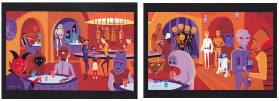
The two cards side by side - one complete picture
PHOTOGRAPH
October 2016
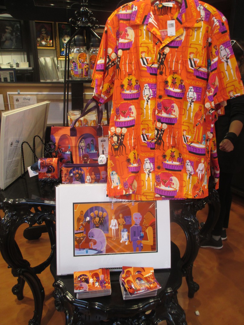
The designs used on these two postcards could also be found on a range of other products including water-bottles, shirts, handbags and prints. This photograph depicts a display of these items in the ‘Wonderground Gallery’ shop at Disney Springs.
02/04/2017
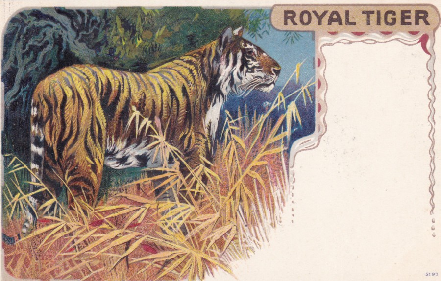
ROYAL TIGER
Published by
S. HILDESHEIMER & CO. LTD
Printed in their works in Berlin
Who could resist such a lovely Tiger image? Throughout the early 1900’s Germany was where the best printing took place, which is why the quality of the cards issued during WW1 by the UK companies dropped off, sometimes considerably as before 1914 lots of companies had their cards printed in Germany.
Despite having their own printing works in Berlin, the company S. Hildesheimer & Co, Ltd (full name ‘Siegmund Hildesheimer & Co’) had offices in London (14 – 16 Silk Street and 8 Chapel St) and Manchester (63 Miller St), and in New York. The company was issuing Christmas Cards as early as 1876. It seems they started producing postcards in 1900 and their colour postcards were, eventually, like this tiger one here, printed in a process called ‘chromolithography’, a process which produced some exceptionally colourful and attractive images.
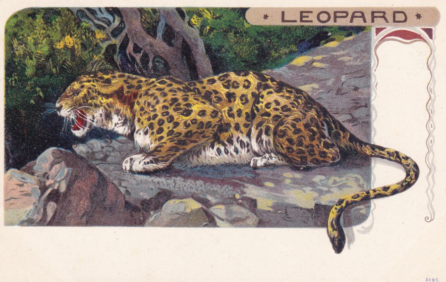
LEOPARD
Published by
S. HILDESHEIMER & CO. LTD
Printed in their works in Berlin
Clearly by the same artist as the ‘Royal Tiger’ picture above. They both have the number 9157 in the bottom right corner, which may be a series reference number. Unfortunately, the name of the artist is not recorded on these postcards. Two lovely cards which show the quality that was achievable, very early on, in the postcard story.

02/04/2017
WONDERGROUND GALLERY
WALT DISNEY WORLD
FLORIDA
Original Artwork of
“WHAT A WOOKIE”
By Artist
Chris Umings
I have already depicted three ‘Wonderground’ postcards from Walt Disney World on which I had applied some of the Royal Mails 2015 ‘Star Wars’ stamps. Those three were not the only cards I did this too. Here is another which features a cartoon image of Chewbacca with two Stormtroopers (thinking back to the first film I wonder if this is Han Solo and Luke Skywalker in disguise, when they go off to look for the princess, Princess Leia). When choosing stamps to put on this one the Stormtrooper one was a given. I also placed the Han Solo stamp on as Chewbacca appears on this one, and if one of the Stormtroopers is a disguised Han Solo then the stamp is doubly appropriate.
I had these two stamps cancelled with a ‘Shuttlewood, Chesterfield – Star Wars – 20-10-2015’ special hand stamp which features the outline of Han Solo’s spacecraft the ‘Millennium Falcon’. Another nice item for my collection and again probably unique.
02/04/2017
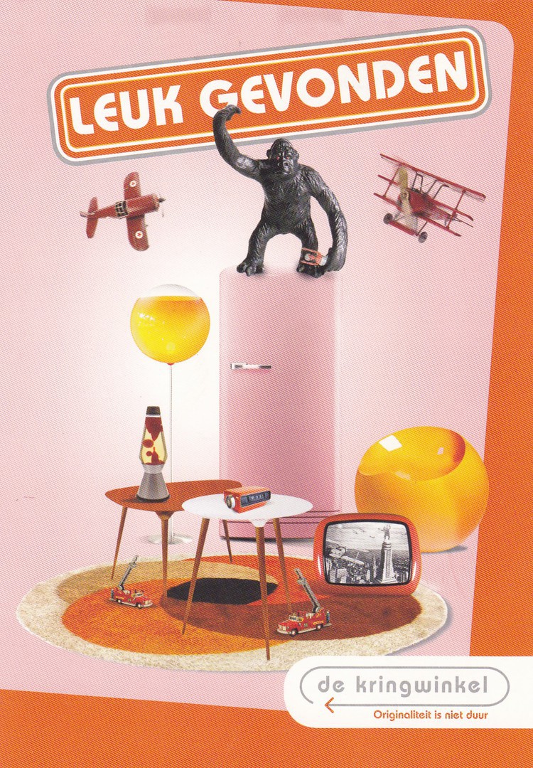
LEUK GEVONDEN
De kringwinkle
German postcard
(KING KONG themed image)
From some of the limited information on the reverse side of this postcard I believe it is from 2012 (the date of Oct 20 also appears). I did initially wonder if this was some sort of artwork piece. But, after some internet translating I got the following. ‘LEUK GEVONDEN’ could mean ‘Liked’, ‘DE KRINGWINKLE’ seems to mean ‘Circuit Shop’. The text ‘ORIGINALITEIT IS NIET DUUR’ means ‘Originality is not Expensive’. There is further text on the reverse side which reads as ‘KIEZEN VOOR DE KRINGWINKEL IS MENSEN EN PRODUCTEN NIEUWE KANSEN BIEDEN’, this translates as ‘Choose the circle shop people and products provide new opportunities. So, I now believe this is a shop advert, and if it is I love the way they have used King Kong as a theme. I love Kong related items and this one really appealed. Plus, there is a TV pictured so it also fits grandly into my television themed collection. I will admit I paid a little on the high side for this card, but when I saw it I wanted it – it was an eBay buy, from Germany (probably not a surprise that!)
02/04/2017
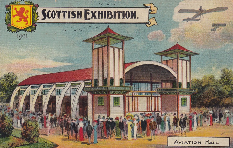
SCOTTISH EXHIBITION
1911
AVIATION HALL
Published in the/by
NATIONAL SERIES
Ref: No. 1597
The full name for this exhibition was the ‘SCOTTISH EXHIBITION OF HISTORY, ART AND INDUSTRY’ and it was held in Glasgow. This was one of three large exhibitions held in the UK during 1911, and all of them were well represented by postcards. Between the years 1901 and 1913 there was at least one major exhibition held in the UK somewhere, often London but also as here in Scotland or Ireland. Clearly this trend ceased at the outbreak of war in 1914. Exhibition postcards are widely collected and have many dedicated collectors and within the stamp world their own society.
02/04/2017
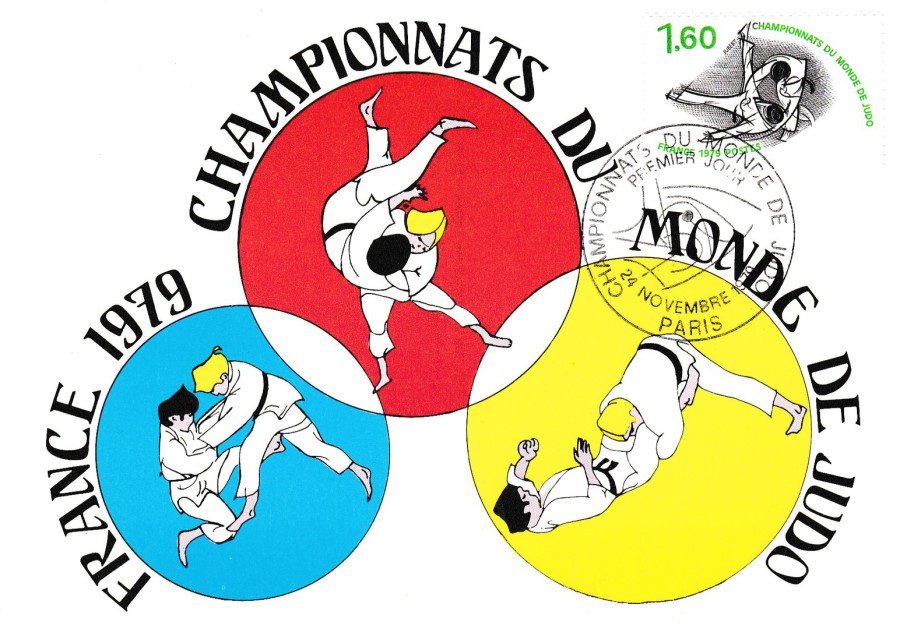
FRANCE
1979 – CHAMPIONNATS DU MONDE DE JUDO
STAMP MAXI-CARD
Published and Produced by
EDITIONS CEF
(in Nice)
The French have a history of issuing delightful stamp maxi-cards (a card where the design relates to a stamp that is applied to the front and cancelled with a hand stamp that also relates to the stamp and postcards design or image). As a result, you end up with some unusual subjects which do not often, otherwise, appear on postcard. Martial arts have been popular for many years but, with the exception of those related to Bruce Lee films (and it is his celebrity that is the result of this rather than the martial arts themselves), the subject does not often appear on postcards. The stamp used on this card is the 1979 ‘World Judo Championships, Paris’ single 1franc 60 valued issue (SG 2333). This has been cancelled with a first day of issue hand stamp: ‘PREMIER JOUR - CHAMPIONNATS DU MONDE DE JUDO – PARIS – 24 NOVEMBRE 1979’.
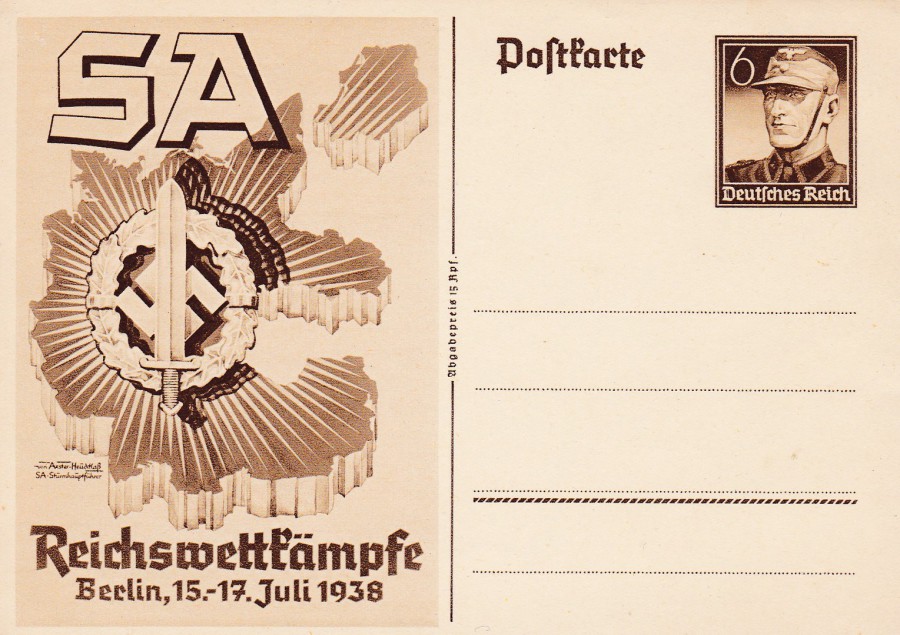
02/04/2017
THIRD REICH 1938
POSTAL STATIONERY POSTCARD
JULY 1938 S.A. (STURMABTEILUNG)
SPORTS MEETING COMMEMORATIVE OFFICIAL POSTCARD
IMPRINTED STAMP OF S.A. TROOPER
Anyone who collects military history postcards, and of course especially those, like me, with an interest in World War II, will eventually come across the many Nazi issued propaganda postal stationery cards that were issued in the years leading up to the outbreak of war. It is well known that they had an excellent propaganda department but amongst those outside of the stamp and postcard collecting world is perhaps not so well known that they used both of these products extensively to promote their party and the Nazi doctrine. These are collected by a wide range of historians and have been catalogued and used to explain how the Third Reich came into being.
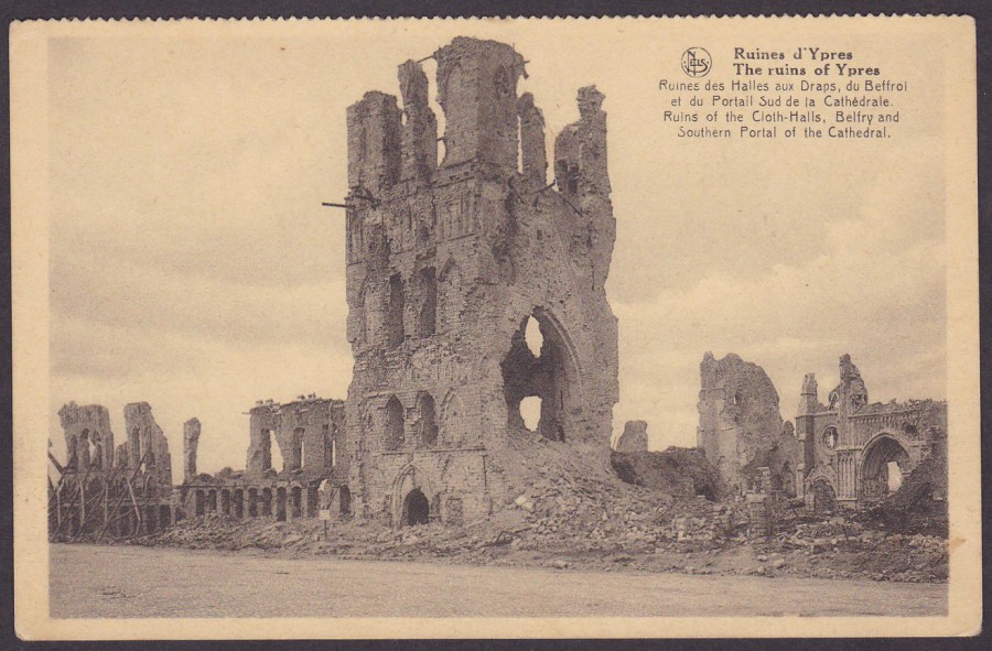
02/04/2017
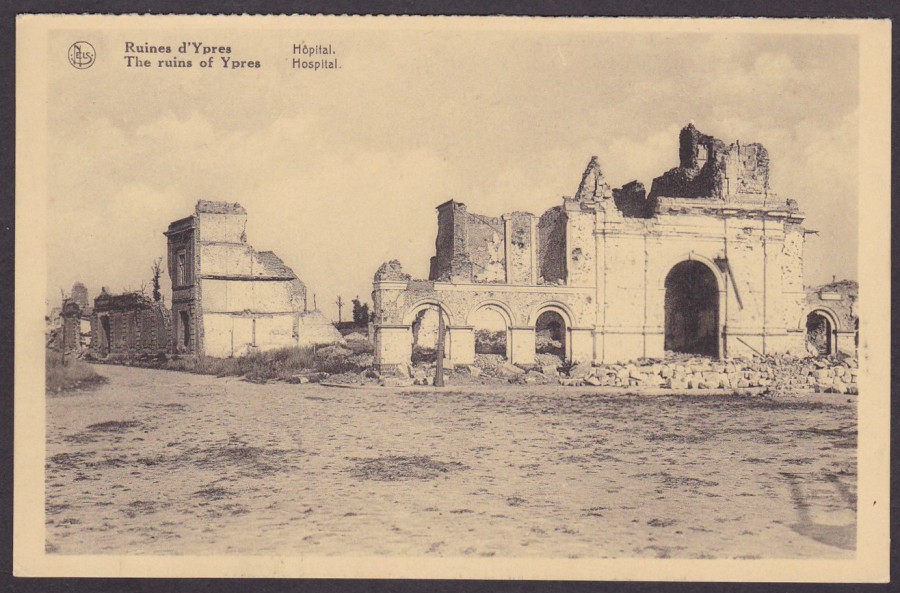
THE RUINS OF YPRES
RUINS OF THE CLOTH-HALLS, BELFRY AND SOUTHERN PORTAL OF THE CATHEDRAL
Published by
NELS (Brussels)
This is one postcard which came from a postcard book. You can see this from the perforated edge across the top. Booklets of postcards were popular during the First World War and complete books can still be found. This postcard depicts the ruins of the famous Cloth Hall. If you visit here now you will see that this has been completely re-built and is a stunning building, which now houses a WWI museum which is well worth a visit.
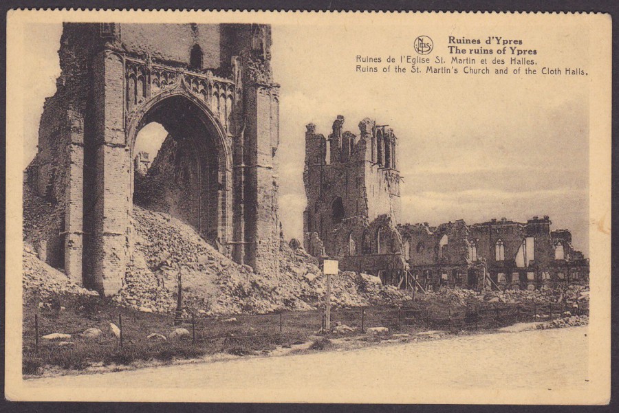
THE RUINS OF YPRES
RUINS OF THE ST. MARTINS CHURCH AND THE CLOTH HALLS
Published by
NELS (Brussels)
A partner card to the one shown above. As you can see, like the above card, this also has a perforated edge across the top. As these both have a straight cut bottom edge it was the fact that I have two cards with just the one perforated edge that helps distinguish these from being postcards that came from a strip (if they were from a strip at least one of them would have to have two perforated edges, obviously).
I have always liked these shell damage postcards, images of the ruins caused by the constant bombardment of towns, cities and villages. Sadly, these are not popular postcards and because so many were produced they have, in the past, been somewhat neglected. This has changed a little with the 100th anniversary of the war and with an upsurge of people interested in the conflict. These historians, rather than postcard collectors, have brought a greater interest into this area of postcard production.
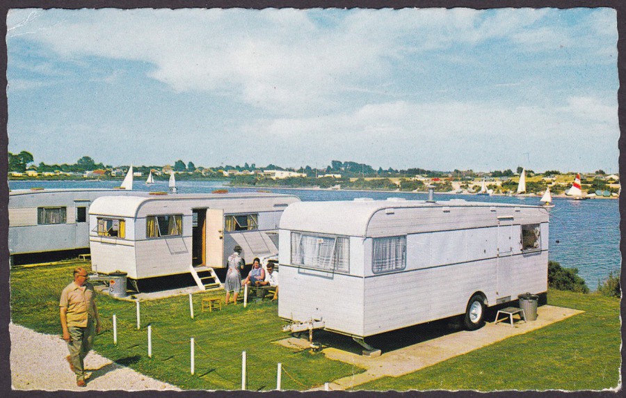
02/04/2017
CHURCH FARM, PAGHAM
LAGOON STRIP
Published by
D. CONSTANCE LTD (SUSSEX)
Ref: V8155
A nice early caravan park postcard, although these are more like mobile homes which have been permanently planted here for either those who live in them throughout the year or those who use them on and off for regular breaks. I doubt these moved very much. I have never met anyone who specialised in collecting caravan themed postcards, but I bet they are out there. This one here is in my ‘Slogan Postmarks’ collection – see below.
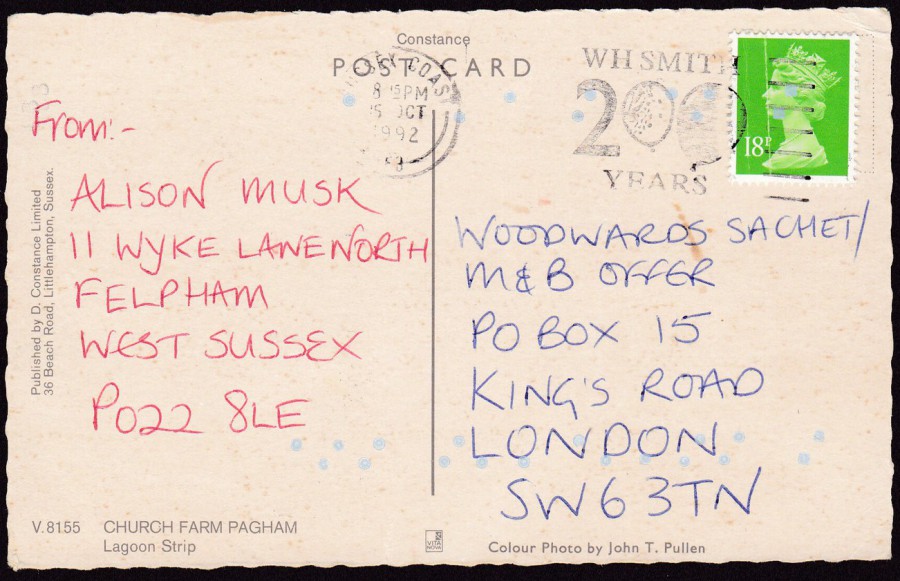
REVERSE SIDE OF ABOVE POSTCARD
This postcard was posted in October 1992 (I have no doubt the image on the front is much older than this – but it is not unusual for a postcard to be published by somewhere like this and for it to be still found on sale ten, twenty, thirty even forty years later). This was another competition/offer entry postcard used by someone to either win or obtain something.
The green 18p Machin Queen’s head stamp has been cancelled with a ‘W.H. SMITH 200 YEARS’ balloon slogan cancel.
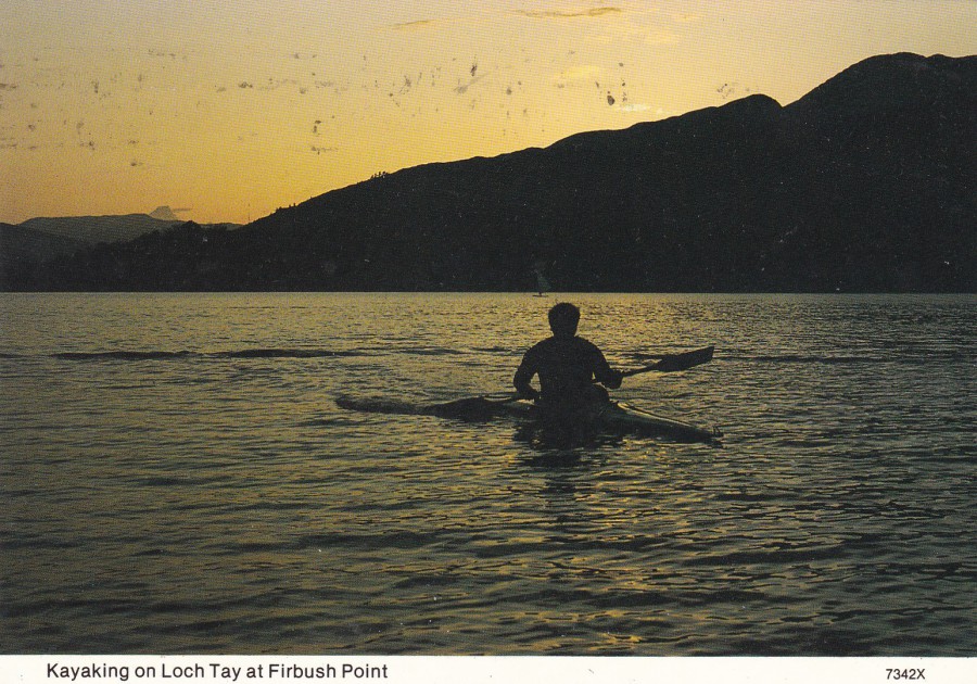
02/04/2017
KAYAKING ON LOCH TAY AT FIRBUSH POINT
Published by
WHITEHOLME (PUBLISHERS) LTD
Ref: 7342X
A simple design, one which might appeal to those who canoe or kayak, or who collect small boats on postcard etc. Again, though, it was something on the reverse side which caught my eye – see below
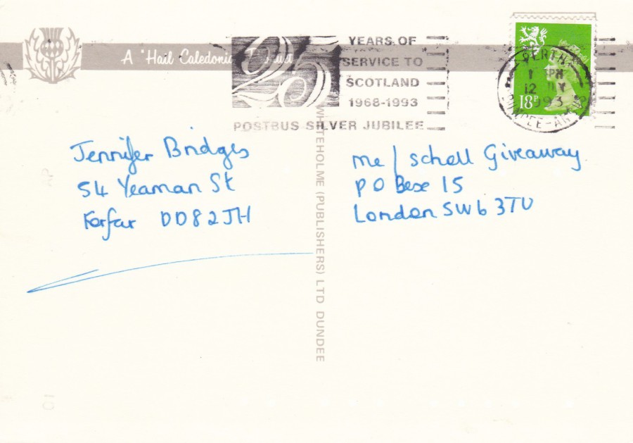
REVERSE SIDE OF ABOVE POSTCARD
The 18p regional Machin Queens head stamp has been cancelled with a nice slogan cancellation that says: ’25 YEARS OF SERVICE TO SCOTLAND -1968-1993 – POSTBUS SILVER JUBILEE – PERTH – 12TH JULY 1993’. This is another ‘Offer’ submission postcard, these are always good for collecting nice copies of slogan postmarks and other cancellations as often very little is required to be written on them. You can also guarantee that these are genuine passed through the mail handstamp/machine strikes.