
29/08/2016
SUPERMARINE SPITFIRE
SCIENCE MUSEUM
Ref: Card 624
“This Supermarine Spitfire 1A (P9444) flew with No. 72 Squadron, R.A.F., in July 1940”
(Text from reverse side of postcard)
Three weekends ago Jo and I went up to London to have a walk around Hyde Park and also for me to re-visit the ‘Science Museum’. I first visited here back in the 1970’s, and this postcard here I bought on a visit in the early 1980’s (or possibly late 1970’s). The aviation hall has always been my favourite display area and the war planes are my favourite. This spitfire has always been on display although it no longer hangs in the same place as shown on this postcard.
Many years after my first visit I bought a collection of signed postcards which included a Spitfire card signed by Air Vice Marshall R. Deacon-Elliott C.B, D.F.C. Through my research into the signatories I discovered that ELLIOTT actually flew the spitfire depicted here. He blacked out in it and only came round just in time to crash land it. The rebuilt Spitfire is now here, hanging from the ceiling of the Science Museum. I love how my hobby combines images with my interest in military history and how research connects items in my collection.
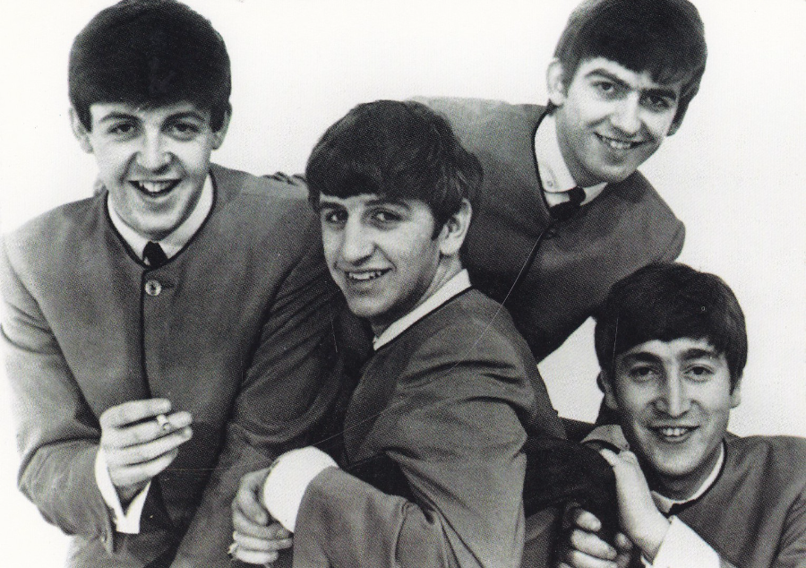
GEORGE MARTIN …. RIP
George Henry Martin CBE, KT
3RD January 1926 – 8th March 2016
Record Producer for Cilla Black, Jeff Beck, Wings and perhaps most famously, The Beatles (amongst many others). He was in fact sometimes referred to as ‘the Fifth Beatle’.
TUSHITA published postcard (German company) – ‘The Beatles’ – Ref No B 588 (acquired in 2000)
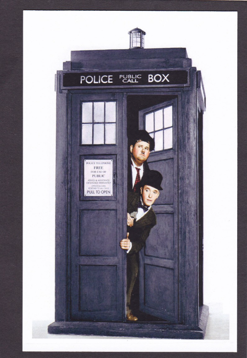
LAUREL AND HARDY
Inside the
TARDIS
This was a postcard (although technically it is a plain backed card) which I acquired in 2014 at a ‘Memorabilia’ fair at the NEC in Birmingham. I loved the mix of the old and the new with the famous early black and white (initially) film stars looking out of the modern Doctor Who time machine, the Tardis (yes I know, it’s a Police Box but the Metropolitan Police failed in their attempt to copyright the image of the police box – their failure was mostly wrapped up in the fact that most people actually know this more as being the Tardis than what the box was originally created for). The bi-annual ‘Memorabilia’ fair is a good source of modern film, TV, Cartoon and superhero related postcard designs with many that are otherwise difficult to source. This cracking card here I found on a spinner of exclusive designs on the ‘Laurel & Hardy Appreciation (Fan Club) Society’ stand. They did also have a range of Dr Who postcards (after all the Doctor is very popular – and I did buy these), but this unusual one was by far my favourite and seemed the most appropriate card to buy from them (the card is not titled or described with text – the heading at the top is my own).
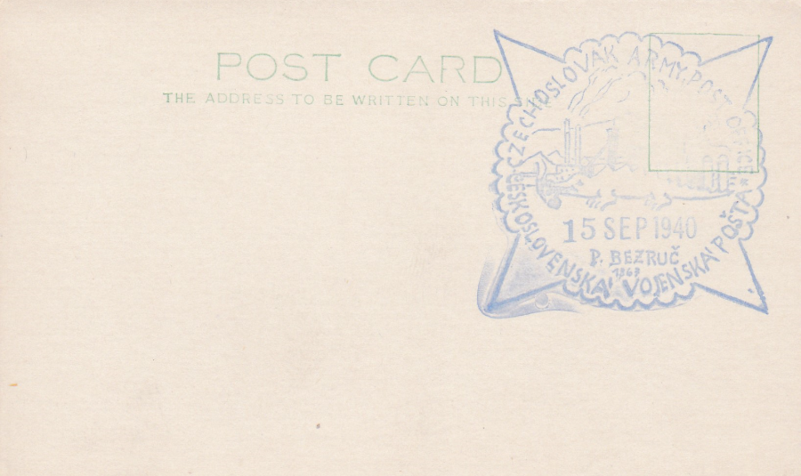
CZECHOSLOVAK ARMY POST OFFICE
15TH SEP 1940
This is without doubt the most-simplest of postcard designs, with just a stamp box and the words POST CARD and THE ADDRESS TO BE WRITTEN ON THIS SIDE. The card itself, on its own would be almost worthless but this one happily has a very interesting large blue cachet used by the Czechoslovak Army in the United Kingdom in 1940 during the second world war. A number of armies escaping the nazi Germany advance across Europe moved to the UK where they issued their own post office cachets (and some stamps – the Polish Army are perhaps the best known and there is a dedicated collectors circle who specialize in the Polish Armies British postal material produced during the war). This cachet makes mention of P. BEZRUC along the bottom – this is Petr Bezruc which was the pseudonym of Vladimir Vasek, a Czech poet and short story writer. He was born in 1867, which is the date under the name on this cachet and passed away on 17th Feb, 1958. Clearly this is of more interest to someone who collects this type of material but then I am interested in cachets and different cancels and marks applied to postcards so this does fit into mine.
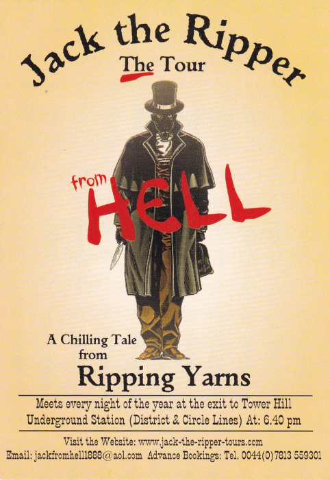
JACK THE RIPPER – THE TOUR
“FROM HELL”
A CHILLING TALE FROM RIPPING YARNS.
I found this free postcard in a slot on the railings outside the Tower Hill Underground station in London during last week. It is a proper postcard and text on the reverse side reads “HI, I’VE BEEN ON THE TOUR ‘FROM HELL’ – YOURS TRULY, JACK THE RIPPER’.
Ripping yarns can tailor tours to meet the needs of corporate, private and educational groups – their website is at:
In 1992 I spent three months with the Metropolitan Police which coincided with the IRA bombing of Canary Wharf. I ended up doing a lot of security patrols around central and outer London in a carrier with a number of other officers. We were on call but had no specific tasks other than to be ready should we be needed. The full night shifts were the most-quiet. I was on one ‘night shift’ with other officers that included one who had a part time job as a Jack the Ripper tour guide. This particular night was dire and nothing was happening at 3am – so the officer took us on a Jack the Ripper tour and I readily admit that in the deserted early morning streets the story was even more disturbing than I expect it would be in more-busier hours. It was good fun and even though you may have to go at a more reasonable hour it is something I can recommend. More details of this particular tour are contained on the front of this free card.
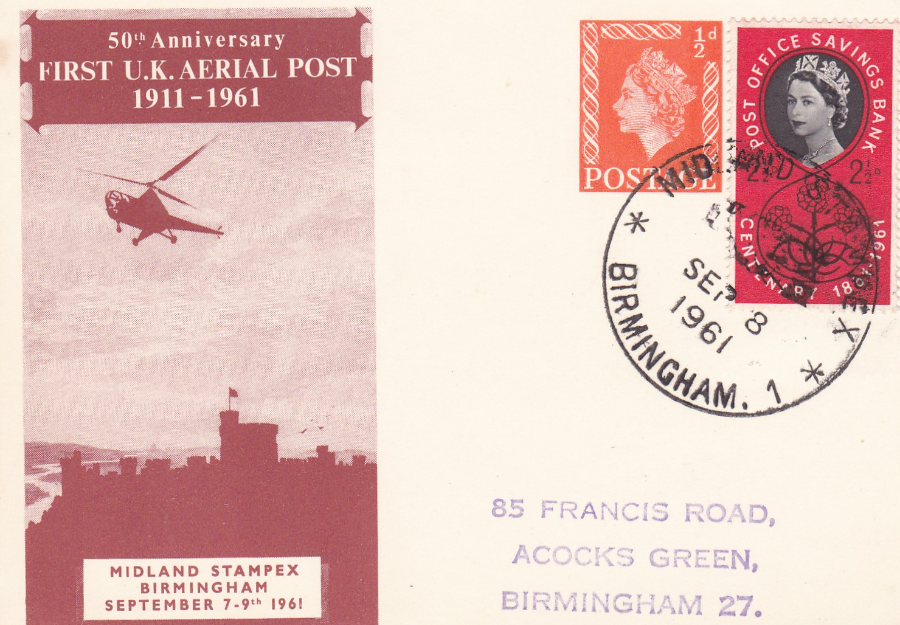
50th ANNIVERSARY – FIRST U.K. AERIAL POST 1911 – 1961
MIDLAND STAMPEX – BIRMINGHAM (SEPTEMBER 7TH – 9TH, 1961)
Postal Stationery Postcard
A nice little item produced to celebrate the 50th anniversary of the first UK aerial post and designed to resemble the original postcard design which was flown on that original flight only that rather than the aeroplane being depicted above Windsor Castle, as with the original design, here you have an image of a small helicopter (bringing the design up to modern times). The orange coloured ½ d Queens Head stamp is printed on the card whilst the 2 ½ d POST OFFICE SAVINGS BANK CENTENARY stamp is an actual stamp stuck down on the card (the stamp is one from a set of three issued on 28th August 1961). The two stamps have been cancelled with a special hand stamp that reads “MIDLAND STAMPEX – BIRMINGHAM – SEP 8TH, 1961” which was the middle day of the three-day Midland Stampex show. The card itself is slightly smaller than the usual size (not unusual with postal stationery cards) but is a nice item (the other side of the card is blank).
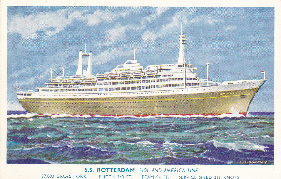
S.S. ROTTERDAM
HOLLAND – AMERICA LINE
37,000 GROSS TONS – LENGTH 748ft – BEAM 94ft – SERVICE SPEED 21 ½ KNOTS
Published by
J. SALMON LTD
Ref No 5455
Artist – C. A. GARMAN
LAUNCHED – 14TH September 1958
MAIDEN VOYAGE – 3RD September 1959
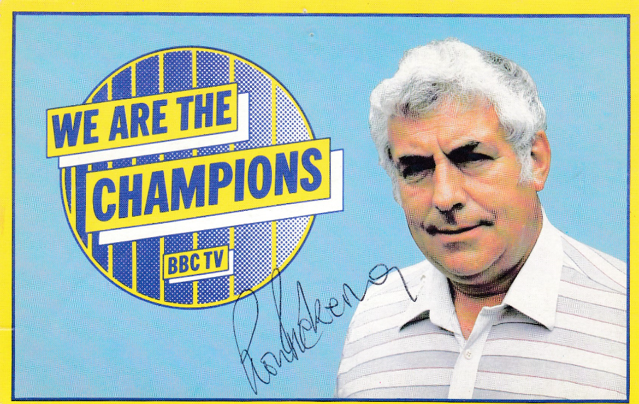
WE ARE THE CHAMPIONS
BBC TV
Official plain backed card
Signed by
Ron Pickering (1973 – 1991)
The children’s TV series ‘We are the Champions’ ran in the UK from 13th June 1973 through to the 25th July 1995 (there was also a special Sport Relief version which was shown in 2010). There was a full series every year up until 1987 and then from 1988 they ran one off specials every year. Ron Pickering, depicted on this card, presented the programme until he died in 1991 and from then Gary Lineker took over for the remaining one-off yearly specials.
The idea for this programme was that it would look just like a traditional British school sports day. Teams of children would take part in sporting like events and competitions. I remember this well and often watched it after returning home from school and it was my memories of the show that made me buy this card when I came across it. It is a souvenir of my youth.
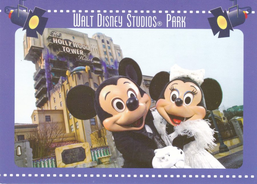
DISNEYLAND PARIS
WALT DISNEY STUDIOS PARK
La Tour de la Terreue
(The Tower of Terror)
Ref – ME – J543 – 9L
As Disneyland Paris is just across the English Channel, and with my in-laws living in France we have had the pleasure of visiting here many times. Just like the Disney parks in Florida the postcards on sale here in France change regularly and multiple visits always bring up new postcards to buy. This one here is a good few years old now but must be post December 2007 as this was when the Tower of terror French version opened (although the building was under construction for some time so the photograph could have been taken prior to its official opening, which was 22nd December 2007). This was quite a popular postcard and was one priced at the cheaper end of the Disney postcard scale at 00.50 euro.
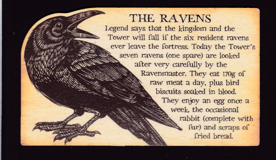
THE RAVENS
WOODEN POSTCARD
(Shaped around the Raven’s head at one end)
‘Historic Royal Palaces’
£3.99
I was in London during the week on official business but at lunch time popped over to the Tower of London shop which is outside the Tower walls close to the river Thames. I have bought cards from this shop before and they have a quite nice selection of exclusive ‘Historic Royal Palaces’ published postcards. On this visit I could not resist this wooden postcard which has the story behind the Towers famous ravens on the front. On the reverse side the words WOODEN POSTCARD and STAMP and ‘Send 1st or 2nd Class Letter Post’ are all cut into the wood in recess cuts which looks very attractive and clever.
I have been mentioning the popularity of wooden postcards for about four years now in Picture Postcard Monthly and the craze has produced some nice examples but few as attractive as this one here. Wooden postcards seem to be priced somewhere between £3 (at the cheaper end) up to £5 which seems to be the general price so at £3.99 this Ravens one was reasonable value. A nice addition to my novelty collection, but not, by far, my first wooden postcard.
WALT DISNEY WORLD
FANTASYLAND PANORAMA
(Blue printing reverse – see other examples posted below)
Ref No. 0111-0075
“Against a backdrop of Fantasyland’s architecture, guests are seen on the way to and from the Skyway attraction. The Skyway offers a thrilling journey between Fantasyland and Tomorrowland as well as a breathtaking view of the entire Theme Park”
The Skyway was the name of the cable-car attraction which took visitors above the theme park in small brightly coloured gondolas. The attraction opened in 1971 (October 1st) and was still running when I first visited in 1993 and I remember riding on it and as someone who loves cable cars and aerial transports it was a favourite of mine that year. I am glad I did get to ride it because the attraction closed in November 1999, before my second visit, so I never got to ride it again. Postcards of it a popular because those like me who did get to ride it want something to remember the ride by, and what better than a postcard image like this one.
This is from a postcard book as it has a perforated edge down the left side. This is also an official Walt Disney World postcard.
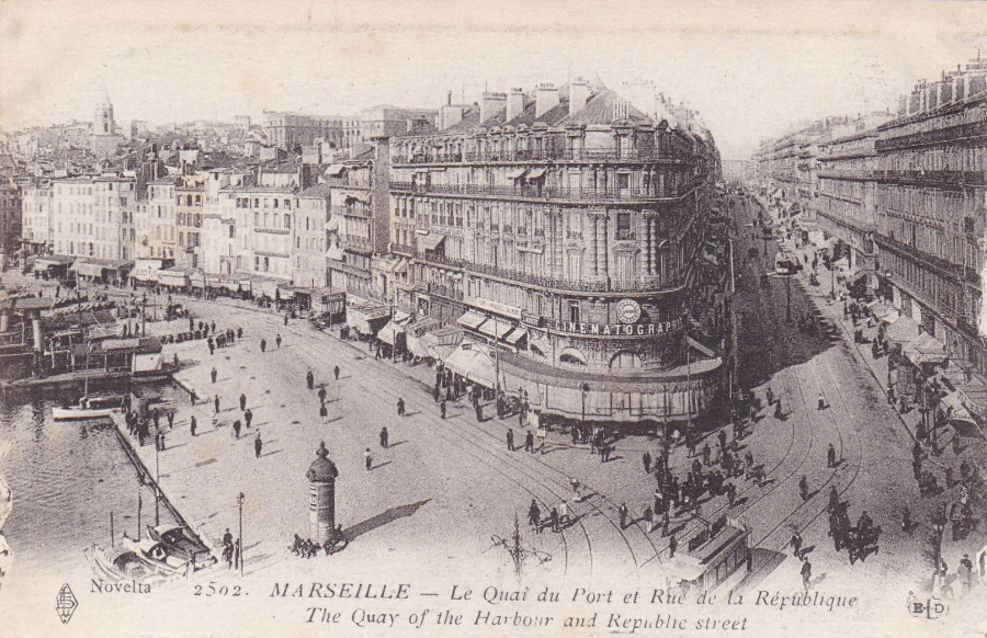
MARSEILLE
The Quay of the Harbour and Republic Street
Novelta – Ref No 2502
Nice early black and white photographic view postcard depicting the harbor and Republic Street in the south of France location of Marseille. This particular postcard was printed in Paris and is from around the period of the first world war, give or take a few years either side. This one appealed to me because of the CINEMATOGRAPHIC sign across the end of the main central building.
VIRGIN HOLIDAYS
ORLANDO
Exclusive Virgin Rep’s postcard
All Disney related postcards are eagerly bought up by collectors but some can-not be bought and these are the cards which for me have added interest. When we go to Florida we book with Virgin Holidays and as such I am now a red card holder and supposedly a valued customer. One of the bonuses you get with a Disney World holiday booked through Virgin Holidays, where you book one of the Disney hotels or resorts for your stay, is that Virgin give you a $200 gift card as part of the holiday package. The gift card is collectible upon your arrival. When we collected ours it came attached to this postcard depicted here. After I carefully removed the gift card I had the addition of a free and exclusive Virgin Representatives postcard. There is something special about a postcard that can-not be bought, especially one featuring Mickey Mouse himself.
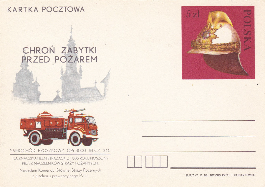
POLAND
“POLSKA”
Postal stationery Postcard with pre-printed stamp
FIRE BRIGADE THEMATIC
Even though I know no polish even I can see that this postal stationery postcard was issued for some sort of Fire Fighting anniversary or for some specific fire brigade section or force. This one is unused so I have no date information from just looking at this lovely, but simple card (and my stationery catalogue for Poland only goes up to 1969 so this postcard was issued after that date).
If anyone can help me with any details about what exactly is commemorated here it would be much appreciated.
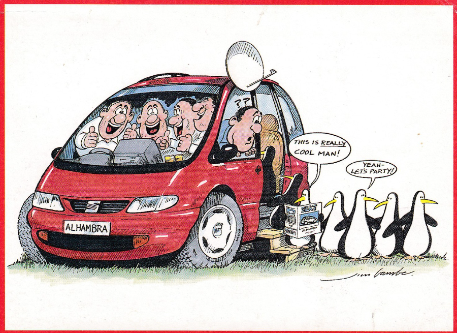
SEAT
MOTOR CAR ADVERTISING POSTCARD
“This postcard was produced for SEAT by Haymarket Motoring Special Projects”
Illustration by
Jim Bamber
For someone who collects postcards on the themes of wildlife, television and transport how could I resist a postcard that depicts a car, full of people watching television, with penguins? I also like the satellite dish attached to the car as well. Quite an amusing little car advert postcard, but still am not sure why the penguins are here (can it really be just because they are trying to say that the car was cool?)
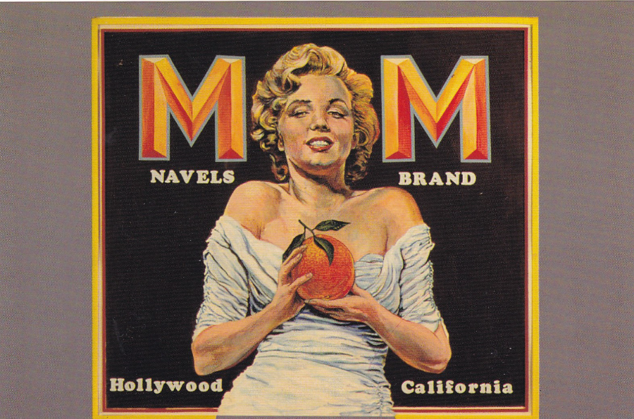
M – M BRAND
ORANGE LABEL SATIRE – ca. 1975
Published by
OUT OF THE WEST PUBLISHING
Distributed by
‘FRESH EXPRESIONS’
Card No #125
Yesterday I posted some large fruit label postcards I bought in Florida last year. I also talked about how I had come across the craze for these items and the postcards issued which depict them. Here I also mentioned a Marilyn Monroe one which had been allegedly withdrawn due to copyright issues (although I suspect it was never as scarce as some people were trying to imply despite being printed in a smaller quantity – the scarcity I believe came about due to the Marilyn Monroe connection which made it more collectible outside of just those after interesting fruit label postcards).
I checked through some albums later last night and came across the card in question and here it is. Interestingly Marilyn Monroe is not named on the brand label, and her name is not mentioned in any of the reverse side text, but as you can see the large MM and the image clearly show that the actress has been used here. I was fortunate and only paid £1.50 for my copy (which was in the late 1980’s so was reasonably high then) but other collectors were paying £5 at the same time (which might be a reasonable price for this card today – 25 odd years later!!). If you had wanted a copy back then you could easily get one, but might have had to pay a bit for it despite it not being as scarce then as some said, but saying that I have not seen a copy for sale for many years now so today it probably is quite a hard card to buy.
NANCY REAGAN ….. RIP
Anne Frances Robbins (Reagan)
6th July 1921 – 6th March 2016
Coral Lee Postcard

AMERICAN FRUIT PACKAGE LABELS
OLD TIME FLORIDA PUBLICATIONS INC
www.oldtimefloridapublications.com
All of the following six postcards have the same text on the back (in fact, with one small exception -see the White Pelican Brand one – they have the exact same reverse layout). There is no individual descriptive text for each postcard:
“Back in the early days of the citrus industry there were many growers throughout Florida. Each distinguished their brand with a unique trademark, which was attached to wooden crates for shipment North and to other markets. This is an exact reproduction of one of those colorful and artistic labels, now prized by collectors and worth as much as $1000 each.”
These six here are very large square cards being 17.2 cm x 17.2cm. I found these in 2015 in a place called ‘Old Town Kissimmee’ (the Saturday night classic car rally held here every week is a real hoot and a cheap night out and the cars from the 1950’s and 1960’s are great and when we were on our way to the event last year we followed one down the highway that we later saw at the show).
There are some nice, and unusual shops in Old Town which includes a shop where cheaper old stock is sold off at bargain prices. This is where I found these six postcards. This one here was a definite for my collection because of the Alligator:
ALLAPATAHATCHEE
“ALLIGATOR CREEK”
INDIAN RIVER
ORANGES and GRAPEFRUIT
“Balls of Juice”
AMERICAN FRUIT PACKAGE LABELS
OLD TIME FLORIDA PUBLICATIONS INC
www.oldtimefloridapublications.com
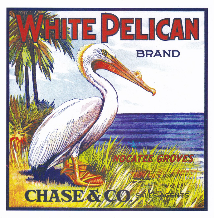
WHITE PELICAN BRAND
NOCATEE GROVES
CHASE & Co sales agents
This is the only card which has a slight difference to the reverse side than the other five, but it is only the addition of a small bar-code bottom left (incidentally I should mention that the text and print is all in blue on the reverse of all of these cards).
Initially it was the wildlife based designs I saw here that caught my eye and I was always going to buy the Alligator one above and this one and the Heron on the card below, but having bought these three the others (two of which also have some animal content) also came along for the ride.
I have previously mentioned the craze for Fruit Label collecting in America, and depicted a Canal brand label on a more normal sized postcard with that label depicting a liner cruise styled ship. The text on the back of these cards (see above beside the Alligator card) gives some indication on the popularity of these labels, especially if some can reach $1000.
Although I did love the Alligator design I think this Pelican one is the best of this bunch. There is the added bonus for me that I have seen white pelicans in the wild in Florida. Last year I went to Merritt Island, which is a huge wildlife reserve, and went to an area of beach where I sat and watched pelicans flying along above the tideline.
AMERICAN FRUIT PACKAGE LABELS
OLD TIME FLORIDA PUBLICATIONS INC
www.oldtimefloridapublications.com
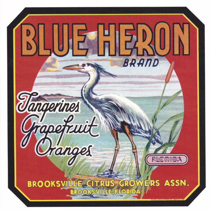
BLUE HERON BRAND
Tangerines, Grapefruit, Oranges
BROOKSVILLE CITRUS GROWERS ASSN.
BROOKSVILLE, FLORIDA
We have herons in the UK but in America they have the Great Blue Heron which is a little bigger than our own heron and although we only have the one heron they also have the little blue heron (much smaller), the Tricolored Heron, the Green Heron, the Black-crowned Night Heron and lastly the Yellow-crowned Night Heron (this last one being the only one of these I have not seen in the wild on my birdwatching trips in Florida, where all of these can be found).
OLD TIME FLORIDA PUBLICATIONS INC
www.oldtimefloridapublications.com
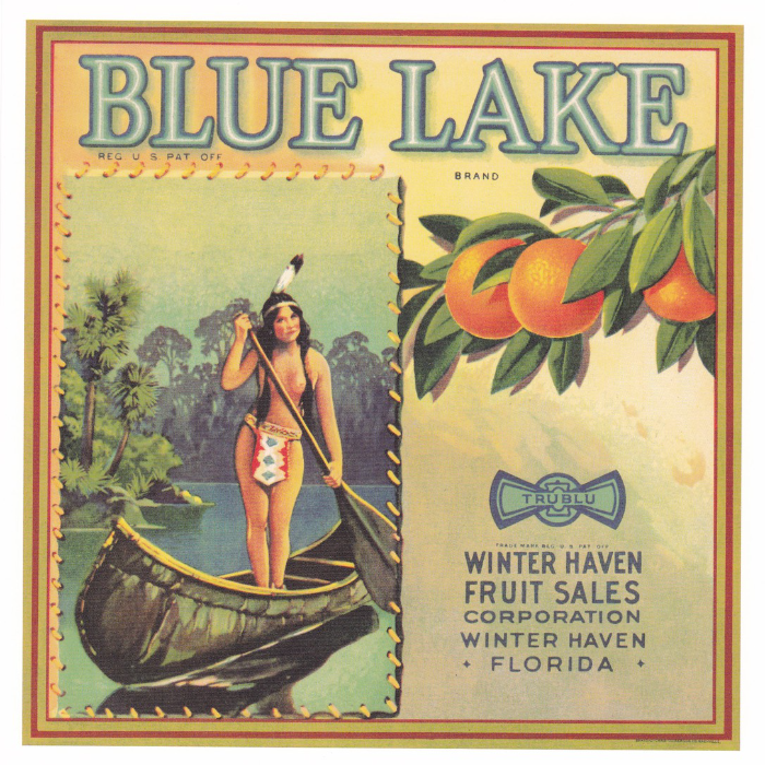
BLUE LAKE BRAND
WINTER HAVEN FRUIT SALES CORPORTAION
WINTER HAVEN
FLORIDA
I assume this is supposed to represent a native Florida resident in an early canoe, although one who appears to not be wearing very much (I know Florida is warm, in fact sometimes very, very hot, but with the insects and other critters I suspect she would have been wearing a bit more just to stop herself getting bitten constantly, especially in the everglade swamps and around the rivers!)
We have pretty much covered the American fascination with these labels which is probably no surprise as they are an American thing. Over here in the UK these were hardly known of. It is also no surprise that postcards were issued which depict these labels. In America there were (and I assume still are as I bought these last year) large sets and series’ of these labels which have been issued for many years now going back into at least the early 1980’s if not before.
Over here in the UK these only really came to notice when one or two dealers started stocking some of these postcards. I remember a lot of talk about a Marilyn Monroe one where she was depicted holding oranges. Because of some alleged copyright infringement this particular card was said to have been printed in far less numbers and was a very collectible version, although there were plenty of copies around when I first encountered this card at the first MODERNS POSTCARD FAIR in Nottingham in the late 1980’s (the very well-known modern’s dealer John Brindle sold me a copy for £1.50). In fact it was at this first modern’s fair that these fruit label postcards first really came into notice in the UK.

OLD TIME FLORIDA PUBLICATIONS INC
www.oldtimefloridapublications.com
JACK – S
FLORIDA ORANGES AND GRAPEFRUIT
JOHN S. BARNES, INC
PACKER & SHIPPER
PLANT CITY, FLORIDA
Another animal one for my collection and a quite attractive one, although to be fair all of these are attractive as they have been designed to catch the eye as a promotional piece of advertising.
Although I have never specialized in collecting these fruit label postcards I have, non the less, managed to buy a few down through the years (many with some animal content or other – no surprise there). I do like these and I do find them attractive and I can see why they are so popular in America, although I must also state that these six cards here are the only ones I have actually found on sale in Florida so I do wonder if the interest in the postcards (as with so many postcards at this time) has waned a little, if not a lot.
Some British dealers do still have some of these split up amongst different depicted themes and perhaps under the main heading of advertising so it is still worth a look if you fancy adding some of these to yur collection(s).
OLD TIME FLORIDA PUBLICATIONS INC
www.oldtimefloridapublications.com
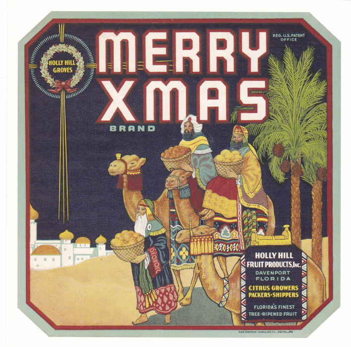
MERRY XMAS BRAND
HOLLY HILL GROVES
HOLLY HILL FRUIT PRODUCTS, INC
DAVENPORT, FLORIDA
CITRUS GROWERS, PACKERS-SHIPPERS
Florida’s finest tree-ripened fruit
A very unusual brand name but they have taken it and produced what I think is a cracking fruit label which takes the Xmas connection and uses it in a very interesting and well-drawn three wise men picture. I like the fact that the three wise men are shown carrying baskets of fruit and in so depicting them like this you could remove the MERRY XMAS title brand and thus have just three travellers with their fruit for a trip rather than on their way to see the son of God. In-fact this normality is part of the images charm as you do immediately think of the three wise men for the nativity story but really the image does not say this is in fact true. You think you see the star, top left but it is really the HOLLY HILL GROVES logo cleverly used to resemble the star. I really like this one as it is clever and subtle at the same time… and it has three camels in it, what more could you want?
COMIC POSTCARDS – TELEVISION RELATED
In the early days of television there was a running joke, or possibly a secret hidden fear, that the person on the TV screen could see you watching them. This idea crops up quite often on seaside saucy comic postcards from this period and I depict some here.
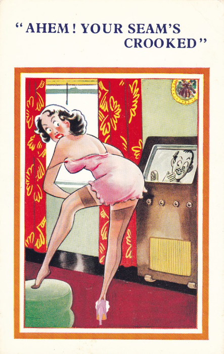
SUNSHINE COMIC POST CARD
Ref Number 5025
“AHEM! YOUR SEAM’S CROOKED”
The classic situation of a woman in her night attire or under-garments (as in this case) being advised by the presenter on the TV screen that something is not quite right with her stockings. A nice piece by unknown artist.
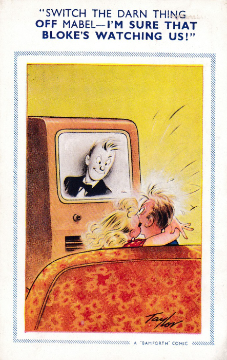
BAMFORTH & Co., LTD
Holmfirth, Yorkshire
“COMIC” Series
Ref Number 1006
“SWITCH THE DARN THING OFF MABEL – I’M SURE THAT BLOKE’S WATCHING US!”
A classic Arnold Taylor picture which again uses the ‘man watching through the TV screen’ idea but this time watching a couple on the sofa (a popular location for these type of designs). Taylor was one of four staff artists working for Bamforth and who contributed the bulk of the companies postcard designs (the others were Douglas Tempest, Philip Taylor and Brian Fitzpatrick).
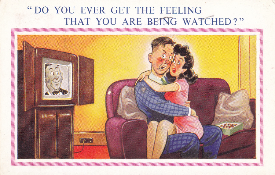
SUPER COMIC POST CARD
Ref Number 5350
“DO YOU EVER GET THE FEELING THAT YOU ARE BEING WATCHED?”
We are on the sofa again with another couple, again being watched by a presenter on the TV screen. One of the interesting things with these drawings is how the TV sets are shown and how different the designs of these sets are. This one here has two doors which can be seen which would close over the TV sets screen when not in use (which would have been quite often in those days).
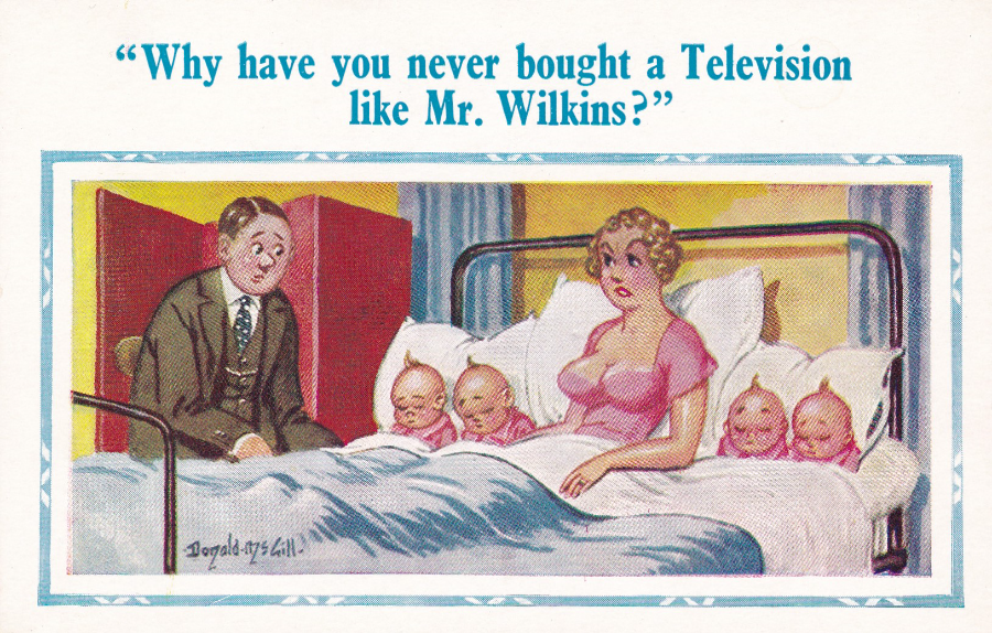
NEW DONALD McGILL COMICS
Published by
D. CONSTANCE, LTD
(Sole publishers of all New Donald McGill comics)
Ref Number 2127
“Why have you never bought a Television like Mr. Wilkins?”
Of course not having a television set could lead to more problems than having one with someone watching you on it! This design here is quite an early television related design because I expect few of us now would believe that anyone would not own a television set.
This is the first Donald McGill postcard I have posted but there will be more because McGill is a legend amongst postcard artists and his designs are iconic. I am a huge fan of McGill and even have a set of original printing plates for one of his designs in my collection (If I can find them I will photograph them and put them on here).

EPCOT CENTER
TIME TRAVELERS
“Mickey and Goofy venture into the future through the magic of EPCOT”
Now this is how Spaceship Earth (The Globe) should look, with no adornments like the previously posted card. Here Mickey and Goofy can be seen in astronaut costumes with Spaceship Earth behind them. This copy here was posted in 1988 from Orlando. This is quite a popular card on eBay and is sometimes quite highly priced. I suspect this is because it is slightly more unusual than the basic Disney park image. It is one that I like and was pleased to find in a bundle of Disney postcards I bought from a charity.
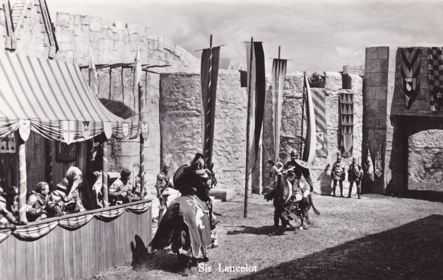
THE ADVENTURES OF SIR LANCELOT
TV series
Dutch Issued postcard
Ref No nr. 1228
I am quickly posting this one to go with the two other Sir Lancelot TV series postcards posted the other week. This one depicts a jousting tournament and is a nice action image although none of the main stars of the series can be seen.
(Read details on previous posting for information on this 1950’s series)
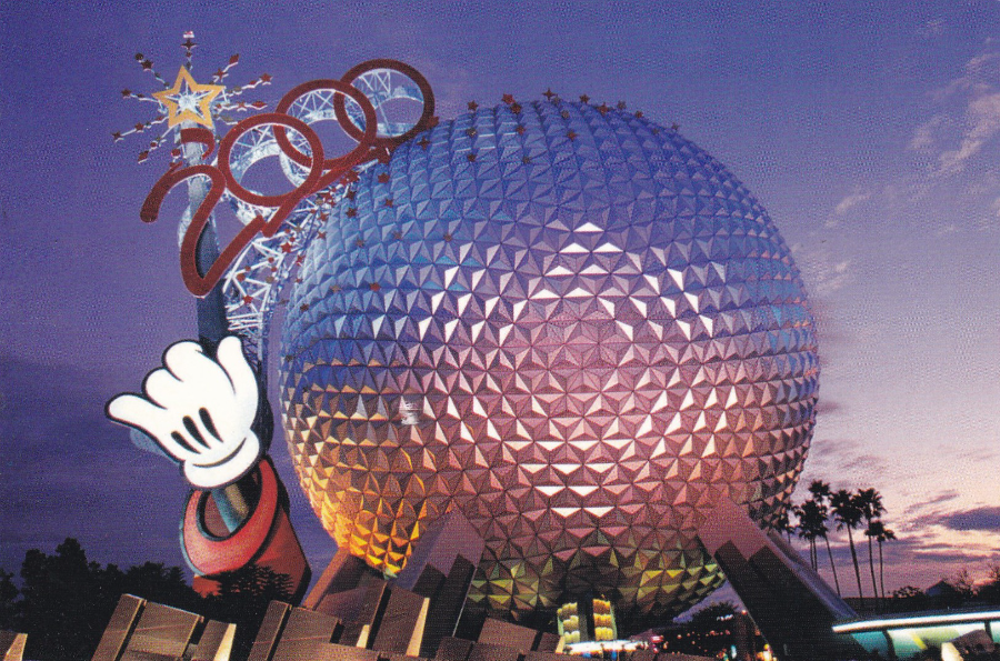
WALT DISNEY WORLD
EPCOT
MILLENNUIM CELEBRATION
“For the Walt Disney World Millenniun Celebration Epcot’s Spaceship Earth is topped off with giant, glittering “2000” numerals. Soaring from a star-topped wand held by Sorcerer Mickey’s unmistakable gloved hand, the whimsical symbol offers guests a larger-than-life welcome”
This postcard here, as the above text from the reverse side of the postcard states, depicts the large wand held by Mickey’s hand, and the 2000 numerals which adorned the Epcot globe near the park’s entrance. This was still here in 2003 when I paid my second visit although it no longer said 2000 as this had been replaced with the word EPCOT (in 2001). This then remained in place until 2007 when it was finally taken down as part of the 25th celebration of the Park.
To be honest I disliked the wand because I thought it destroyed the smooth lines of the globe which to me was the reason for the structure in the first place (I was happy when it came down). Despite my dislike this postcard with the 2000 still in place depicts a sight that was only visible for a year or so. I do not know how long this particular postcard was on sale but would not be surprised to find out it was just a year (this copy here is postmarked 14 June 2000). This could therefore make this a slightly harder find than the very many (better looking in my mind) plain globe postcard images. So, slightly more valuable, slightly more interesting, but no more attractive (admittedly in my mind).
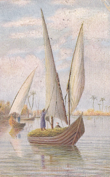
WORLD WAR I
GALLIPOLI CAMPAIGN
EGYPTIAN SAIL BOAT
(depicted on the Nile)
“Voiliers le Nil”
A nice painting of a Nile boat carrying reeds down to some location along the river. The card itself looks nice but is nothing special and is typical of many early 20th century Egyptian postcards. But, then it was not the front of this postcard that made me want to buy it. With this particular postcard it was definitely the written message which made this different and interesting.
The postcard was sent to Edinburgh, and then later redirected to Killin, a village in Scotland located at the western head of Loch Tay in Stirling. Upon arrival at the original location of Edinburgh the card received an Edinburgh double ring cancellation dated 27th December 1915. After being redirected to Killin (I assume because the addressee had moved – a Miss Evelyn Grieve). No cancellation for Killin was applied (but that may not have been necessary and the village may not have had a specific cancel anyway).
The postcard was sent by a soldier who was in the 19th Field Hospital in Alexandria. It was his message that fascinated me as it mentions Gallipoli and it seemed appropriate as 2015 and early 2016 was the 100th anniversary of this World War 1 Campaign that I bought it (this was another Spring Stampex 2016 buy).

REVERSE SIDE OF ABOVE POSTCARD
Message reads:
On Active Service
10 - 12 - 15
“Have got our old complaint again but am nearly well. This is a big Hospital with all comforts. I don’t know when I will get back to Gallipoli but hope to get letter from you here. I am cabling to hold this today so that I may get letter sooner. Love from... [Father?]”
19th Field Hospital Alexandria
The mention of Gallipoli and the knowledge of all the tragedy that took place there makes you wonder what ‘our old complaint’ could have been and exactly why he was in hospital. There is also the question of whether he ever got back to Gallipoli as the army evacuated from the area with the last soldiers leaving on the 9th January 1916 which was just under a month from when he wrote this message. Did he get back? Was he then evacuated? With another near three years of war in front of him one can-not help but wonder if he survived the war.
The card was written on the 10th December and then would have needed to pass through the censor and here received a boxed red censor cachet which his hard to read but which may be No 2854?
There is also a cancel underneath the main bold EDINBURGH cancel. This one is for the ‘BASE ARMY POST OFFICE Z’ cancel and is dated 12th December 1915.
So here I believe is an excellent example of how a postcard can contain a world of history wrapped up in its use. A superb card and one which I was happy to pay £6 for.
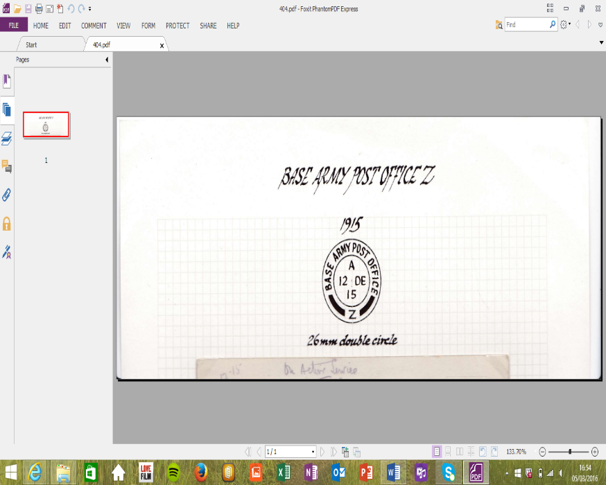
Hand Drawn Reproduction of the BASE ARMY POST OFFICE Z cancel which appears on the above postcard (underneath the EDINBURGH cancel)
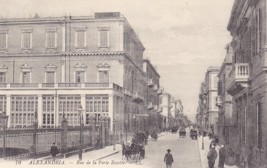
ALEXANDRIA
Rue de la Rosette
‘LL’ published card reference number 77
This postcard came mounted on the same page as the above used postcard of the Nile Boat. This one here is unused in mint condition. I have been unable to trace where in Alexandria the 19th Field Hospital was located and I suspect it was nowhere near the rather grand looking building depicted on this postcard here. But this does give some idea of how westernized Alexandria looked pre-WWI. It is also the first LL published card I have displayed. They were a famous, and now highly collected, publisher of black and white view photographic images of France (where their main output is based) and other countries in and around the edge of Europe. It was also nice as this came as part of the combined £6 price tag (two for the price of one, so to speak)
If anyone has any information on the 19th Field Hospital in Alexandria in World War One and especially around the end of 1915 and early 1916 I would appreciate hearing from you.
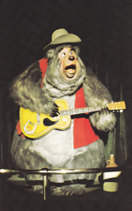
WALT DISNEY WORLD
THE COUNTRY BEAR JAMBOREE
“Big Al” tries to steal the show from his fellow singin, swingin’, guitar-pickin’ bears in Frontierland’s wild, country-western hoedown…The Country Bear Jamboree
This postcard goes nicely with the previous posting as it again depicts Big Al from the Country Bear Jamboree. This is a stand-alone card (i.e. this is not from a postcard book like the previous two and has no perforated edge(s)).
If you look at the whiskey jug you will see it has been moved. Here it is on the right side of Al whilst on the two cards below, on the previous posting, the jug is on the left side of Al (maybe he picked it up and had a swig between photographs!).
In another example of swapping and changing and re-using things the descriptive text on this card is exactly the same as that used on the cards on the previous posting (so descriptive text also can-not be relied on to indicate different cards…gets difficult does it not, and that’s why collectors keep lists).
Here you need to use the Reference code number to help you out, as although the picture is different it is also similar enough to confuse you when going through a dealer’s stock quickly. The reference number for this release is:
0100-10217
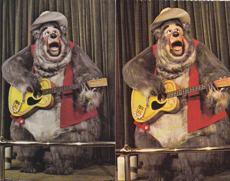
WALT DISNEY WORLD
THE COUNTRY BEAR JAMBOREE
“Big Al” tries to steal the show from his fellow singin, swingin’, guitar-pickin’ bears in Frontierland’s wild, country-western hoedown…The Country Bear Jamboree
Here we have a situation identical to the previous posting. Again these two images are the same photograph but again one has been zoomed out to actually show more, in this case you can see more of the stage under the bears feet (this again is the blue print reverse version – see bellows images of the reverse sides). Again there is a perforated edge, across the top of both cards, which as previously indicates they came from a postcard book.
Unlike the canoes on the previous two postcards this attraction is still going and is a firm favourite of visitors to this day (although when I last visited in 2015 the exterior was undergoing some major work).
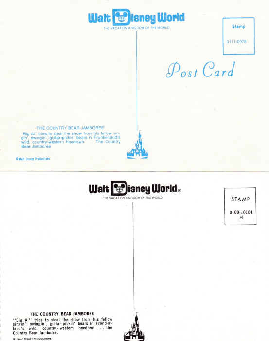
WALT DISNEY WORLD
THE COUNTRY BEAR JAMBOREE
Reverse sides of the two postcards above
This time the blue printing reverse layout is at the top and this one would almost certainly have come from the same postcard book as the one the Canoe postcard below came from as it has the same reference number – which indicates that all the postcards that were in this particular book had the same reference number (this fact helps when you are trying to group together cards that have been removed from the primary source – the same number helps indicate which versions belong together). As with the canoe postcard the reference number used here is:
0111-0078
The black print reverse version has the same Reference number as that used on the Canoe postcard below but in this case has a different final capital letter which allows for each card to have a slightly different number whilst still allowing a collector to group them together as having come from the same primary source book. The reference number used here is:
0100-10104 H
There is one other major difference here and that is that the blue version now has the perforated edge down the far right side, whilst the black version has the perforated edge down the far left side. This means the positioning of the reverse printing has been alternated between the two designs. These are little things but they show change, variety and how much some people examine these issues.
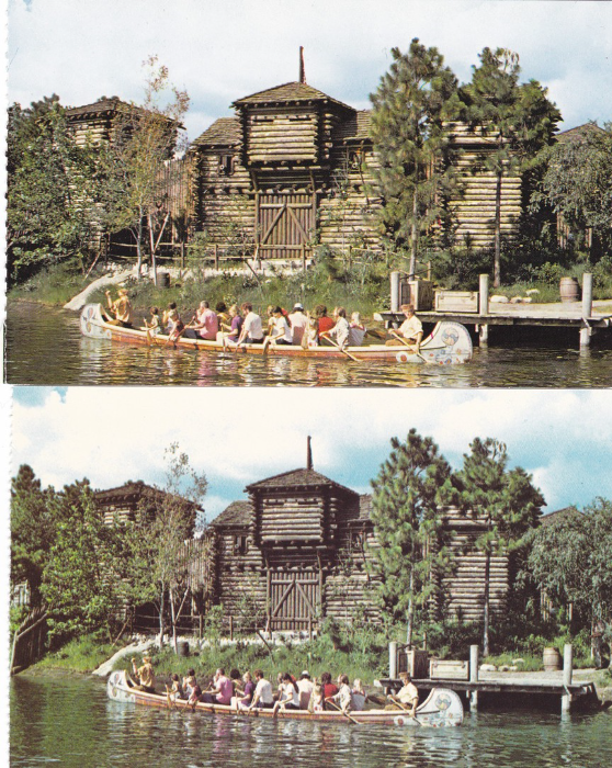
WALT DISNEY WORLD
FRONTIERLAND CANOES
“Youngsters of all ages can experience the thrill of paddling an Indian war canoe down the Rivers of America. As everyone paddles together, their Frontierland guide keeps a sharp eye out for river pirates or unfriendly Indians”
Now this is either a good piece of advice about watching out carefully as you try and add new cards to your collection, or an example of how obsessive some collectors (i.e. me) can be.
At first glance these two designs look the same and to be fair it is the same image although the bottom one has zoomed out a little giving you more water visible under the canoe. They also both have perforated edges down the left side so are probably from a pull-out postcard book (an item which was popular once but which you see far less of now – in fact I have not seen one at Disney for many, many years). For the main difference between these two cards see below.
In the meantime, I want to mention this image for another good reason and that is the fact that these canoe rides are no longer an option. Originally called ‘Davy Crockett’s Explorer Canoes’ these were one of only three Frontierland attractions that were actually open when the Magic Kingdom park (which is where Frontierland is located for those who didn’t know) first opened its gates in 1971 (the other two were the County Bear Jamboree – more about this one later – and the Walt Disney World Railroad station). The canoes apparently operated until 1994. My very first visit was in 1993 and I have a vague memory of seeing them.
Although many of the Disney official postcards were, and are, issued in great numbers, with huge numbers sold to visitors, some of the older cards are still collectible because they show attractions and rides which are no longer with us (and Disney changes constantly – just look at the new upcoming changes in the Hollywood Studios park with the massive Star Wars expansion [which has caused my favourite little café bookshop to close this year] and the Toy Story area increase). This is a good example of an image which would bring back memories to those who rode these canoes.
WALT DISNEY WORLD
FRONTIERLAND CANOES
Here you have the reverse sides of the two postcards illustrated above. And these show why serious collectors should, and probably most do, check both sides of a postcard. Those who just want a copy of each image would be happy with just one of these but mad collectors like myself would immediately be excited by the first and obvious difference…the colour of the printing. The top card has black reverse printing and the bottom one has blue printing. I do not know which card was issued first, my gut feeling, looking at the reverse layouts is that the blue one did but this could not be the case if the reference code numbering system ran numerically (which it may not have done). Disney had one really good system for the release of postcards and that was that every single card had its own unique reference number and that if there was any change in the design, in anyway, a new reference number was allocated (although some postcards contained with a single postcard book could all have the same code - which is the case with the blue reverse issue shown her). Thus the top card has the reference number:
0100-10104
Whilst the card underneath, with the blue printing on the reverse side, has been allocated the reference number:
0111-0078 E
The location of this number, in the stamp box, does of course cause issues if the example(s) you have were posted, as the stamp(s) would now be covering this important information. Luckily for me these two are mint and I have access to the numbers.
With the blue printing I also like the elaborate ‘Post Card’ type-set used above where the address would go. This does not appear on the black reverse version.
So, always check the reverse side because it may be that the card you are holding is not the same as the one you already have.
LITERARY POSTCARD MENTIONS
I love it when postcards get mentioned in books that I am reading even if it is just on the one page or used as a small, or large, important device within the story. I shall list here the ones I come across. This will include, as here, when factual books also mention or depict postcards.
Number 5
SNOW & STEEL – THE BATTLE OF THE BULGE 1944 – 45
By
Peter Caddick-Adams
Arrow Books
This is an excellent study of this last ditch effort by the German army to capture ground against the Americans towards the end of the second world war. One would perhaps not expect any postcard references here but there are a couple.
Page 5 – pictured here is a postcard of the Schloss Kransberg. It is from the author’s own collection and is depicted here because behind the small castle shown was located a series of secret concrete bunkers which were the headquarters of Hitler and which were disguised as a country cottage and named ‘Adlerhorst’ (Eagle’s Nest). Hitler followed, and interfered with the campaign from this location.
Page 103 – “Using the name [Wacht am Rhein – Watch or Guard on the Rhine] tapped deep into the psyche of the Fatherland. ‘The Watch on the Rhine’ had become a patriotic favourite in the early days of building the German nation, with huge sales of books, sheet music and picture postcards on the theme of guarding the frontier..”
Although the battle plan from the Germans was originally named ‘Wacht am Rhein’ it was later changed again to Herbstnebel. But it was nice to see how postcards got a mention so early on in the book (which is 723 pages long)
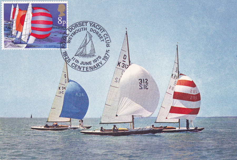
J. ARTHUR DIXON
‘Yachts in the International Dragon Class off Cowes’
Ref SS. 2345
Some clever collector has here taken a colour postcard depicting a photograph of a certain type of yacht and has applied the 1975 8p (Racing Keel Boats) stamp from the ‘Sailing’ set and has had this cancelled with a ‘ROYAL DORSET YACHT CLUB CENTENARY – 1875 – 1975, Weymouth, Dorset’ hand stamp dated 11th June 1975 which was the first day of issue date for the stamp used. So what you end up with here is an attractive postcard and stamp combination.

AUSTRIA POSTCARD
Sometimes it is not the postcard itself which is of interest or which would have any value, as with this one. The postcard is a simple quite papery thin card with no printed stamp and a blank reverse side. The most-simple of postcard designs. But here it has received an Austrian definitive stamp (a 1948 5g Provincial Costumes – “Salzburg Pinzgau” stamp – ref SG 1109) cancelled with a special ‘Postal Day – Philatelic’ hand stamp dated 1956 from ‘Wien’ (Vienna). It also has a green cachet, centre bottom which reads ‘Verwaliungs-Kanzlei’ (which appears to be a location cachet). Perhaps the most interesting addition to this card is the green ‘POSTAUTOBUS’ (Post Bus) fox illustrated cinderella stamp which has received a large red boxed cachet which reads ‘Lord Baden-Powell – Chief Scout’ and which has a central pictorial portrait of Baden-Powell.
I don’t have enough knowledge to put together the full story behind all the ingredients that make up this item but that is part of the joy of collecting, having something to work on and discover the story of. So what is the cachet? What is the Baden-Powell cachet on here for, and why on a Post Bus stamp and why did someone go to all this trouble…answers on a postcard, please.

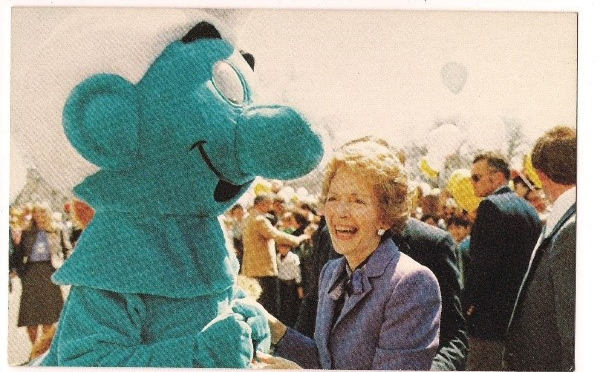
NAJUBRIA 1994
12. Nationale Briefmarkenausstellung der Jugend 1994 Mainz
(National Youth Stamp exhibition 1994 – Mainz)
German Postal Stationery Postcard
Germany has issued a lot of these type of postal stationery cards and they were produced for all sorts of events and commemorations down through the years. This one, as with all these type of cards has a pre-printed stamp already on the card. This one is for a Youth stamp exhibition held in 1994 and which appears to have had a couple of mascots, who are depicted on the illustration, and have the names Dino (not the most imaginative of names for a dinosaur) and Philrabbit (which is an excellent name, what child stamp collector could possibly have resisted a character called ‘Philrabbit’?)
I also like the elaborate special event cancellation which depicts a very nice image of a dinosaur (A Tyrannosaurus Rex I believe). If you collected dinosaurs this might make a nice addition to a dinosaur themed collection, but for me this will fit nicely into my Philatelic themed collection, and not bad for £1.
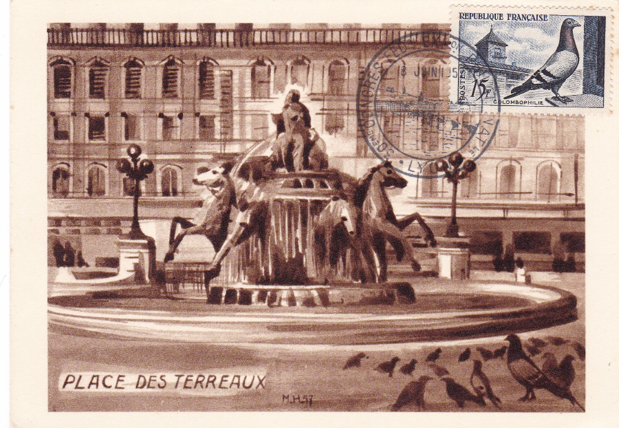
PLACE DES TERREAUX
“Carte officielle editee par l’Union des Societes Philateliques Lyonnaises a l’occasion du XXX’ Congres National de la Federation des Societes philateliques Francaises. Penecote 1957”.
(Official Postcard published by the union of philatelic societies of Lyon on the occasion of the XXX National Congress of the Federation of French Philatelic Societies - 1957).
Postcard used with Pigeon stamp cancelled with the ‘30th CONGRESS FED’ EXP’ PHILAT’ NAT’ – LYON’ special hand stamp dated 9 Juin 1957 (a second strike of this cancel appears on the reverse side – a system often found on French postcards).
I collected stamps as a child and to help me with my collection my mother gave me her childhood stamp album. One of the things she told me was that although she had enjoyed collecting all stamps she was mostly into French stamps because she had visited the country when she was younger (my mother never travelled abroad during my lifetime and only holidayed in the UK – so I believe France was the only foreign country she did visit). When she showed me the pages of French stamps I noticed that one single stamp appeared on a page all by itself. It was a copy of the Pidgeon stamp which appears here on this postcard. My mother informed me that this was her favourite stamp (not a total surprise as her father, clearly my Grandfather, was a major pigeon breeder and won many competitions re homing pigeons and even sold well-bred champion pigeons to China – I spent many days helping out in the pigeon hutch so I understood the fascination). So, the reason I bought this postcard was the stamp because I to have grown to really like this one.
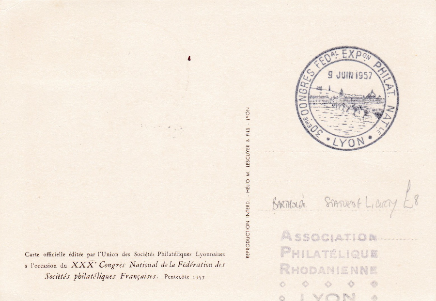
REVERSE SIDE OF THE ABOVE POSTCARD
Showing a clearer strike of the Congress special cancel
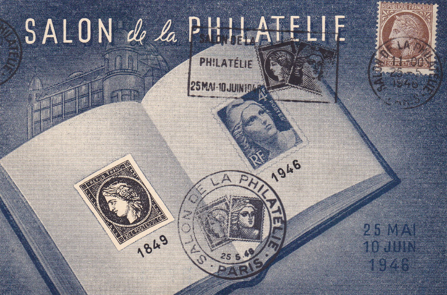
SALON de la PHILATELIE
25 Mai – 10 Juin 1946
Compare the below stamp/postal history exhibition postcard, from 1990 with this one depicted here from 1946 (and remember that this was just one year after the end of World War II). This a lovely design incorporating an image of an 1849 French stamp and the then current 1946 stamp. I think this is a lovely design and I am a great fan of the early philatelic show postcards. This one has been used on the first day of the show with the special ‘SALON DE LA PHILATELIE – PARIS – 25 -5-1946’ special slogan cancellation. The card has also received the special event cachet (centre bottom) which again reads ‘SALON DE LA PHILATELIE – PARIS - 25-5-46’ and which depicts the two stamps which feature on the postcard design. All in all I think this is a lovely combination and this echoes down through the years as collectors at similar events now try and produce items with the same kind of marks and cancels.
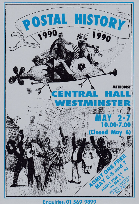
POSTAL HISTORY 1990
METHODIST CENTRAL HALL, WESTMINSTER
May 2nd – 7th (Closed May 6th)
“ADMIT ONE FREE – or for £1 on 2nd May”
Postcard used as an entry ticket for the 1990 ‘Postal History’ fair/exhibition held in May 1990. Printed on a silver coloured card this unusual design depicts people in an early, fictitious looking, flying machine dropping items of mail down upon the people below. The ticket gave admission to the bearer for free on the 3rd, 4th, 5th and 7th May, when entry was only £1 per day, and for the price of £1 on the 2nd May when entry was £2 per person.
A number of postcards were produced for this event over the years it was run and they are nice philatelic based designs although many are retained by those who attended as a souvenir of their visit. I sadly did not visit any of these events but managed to buy this card, and the others in my collection, from dealers.
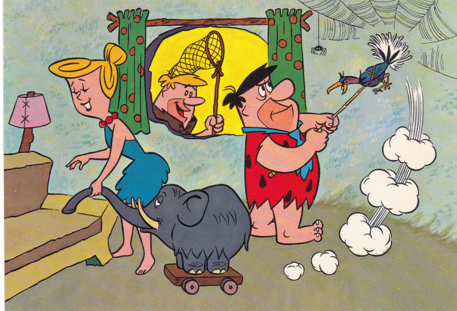
THE FLINTSTONES
FACET LUNTEREN – HOLLAND
Printed in Holland
© Hanna-Barbera Productions, Inc., 1964
Card No 2
Typical of many of the Dutch 1960’s postcards these have the card number in the stamp box so, as I have already mentioned once, used copies would have a stamp covering over this information making hard to know which one in the series you have (without better access to knowledge or a descriptive listing – of which does not exist as yet – although I am working on one).
There is another little twist with these Dutch cards and that is the colouring. Barney Rubble seems to have bright yellow hair on some of these and Wilma has gold coloured hair when in reality it should be more orange as in the TV series. Also she wears a white dress in the TV series but in two of the three designs here she wears a blue one (Betty Rubble of course wears a blue dress in the TV series – but in her one appearance amongst these three designs she is depicted wearing a red dress). Fred Flintstone is correctly attired in the first two pictures here, his orange clothing with black patches and a blue neck tie. But in the third image he is suddenly depicted, seated at the table, wearing a blue top with a red neck tie! (also look at Barney’s clothing in the last design for a another strange colour change).

THE FLINTSTONES
FACET LUNTEREN – HOLLAND
Printed in Holland
© Hanna-Barbera Productions, Inc., 1964
Card No 3
Despite the above mentioned, sometimes, unusual colours used for some of the characters this does not reduce the collectability of these postcards which are eagerly sought after and can, on eBay, reach prices around £5 - £7 each. From dealers at postcard fairs they can be found much cheaper and the three depicted here I obtained for £1 each which was a very reasonable price
THE FLINTSTONES
FACET LUNTEREN – HOLLAND
Printed in Holland
© Hanna-Barbera Productions, Inc., 1964
Card No 6
This last design is one that has a number of colour peculiarities, including Fred’s clothing. But with Wilma, shown at the forefront of the design perhaps the character furthest removed from her TV appearance (that blue dress for a start).
The Flintstones of course was the cartoon with the highest number of episodes for many years, before it was eventually eclipsed by the more modern, and extremely popular also, cartoon series called ‘The Simpsons’.

COLCHESTER ZOO
COLCHESTER ZOO – HAND IN HAND – WITH ACTION FOR THE WILD
HUMBOLDT PENGUIN
Colchester Zoo is my nearest big zoo and one that have been attending since I was a child with my parents. Like many zoos they have had to adapt and change over the years but the work they have put in over the last ten years has greatly improved this zoo and it is, and has been for many years, one of the most popular days out in Essex.
I have very fond memories of Colchester Zoo and it was one of the first places me and my future wife had a day out to and, with many family visits in between, I took our grandchildren there (not for the first time) in November last year (2015 - Jo was away in France at the time and it was me and my daughter Rebecca that went this time with the grand kids).
Like many establishments trying to keep up with souvenir hunters the zoo has regularly changed and updated its postcard stock, which has always included exclusive images only available here.
In November I found a range of very large shaped animal postcards, which again are exclusive to the zoo. I really liked these and bought the four different one available.
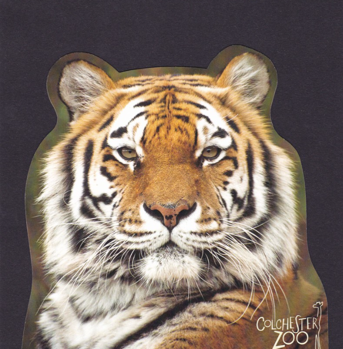
COLCHESTER ZOO
COLCHESTER ZOO – HAND IN HAND – WITH ACTION FOR THE WILD
AMUR TIGER
This is the second shaped card in this series that I bought at the zoo. I have previously mentioned that these large shaped postcards are not popular with collectors but do seem to be popular with the general buying public. I am a little bit different as I do like these as I believe they fit into my novelty collection, and I believe they represent the period of the last 15 years or so and if they do fade out of existence in the near future, or beyond, I want examples to show what they were like – and this one of course is a cracker as it depicts a Tiger (as previously mentioned, my favourite animal)
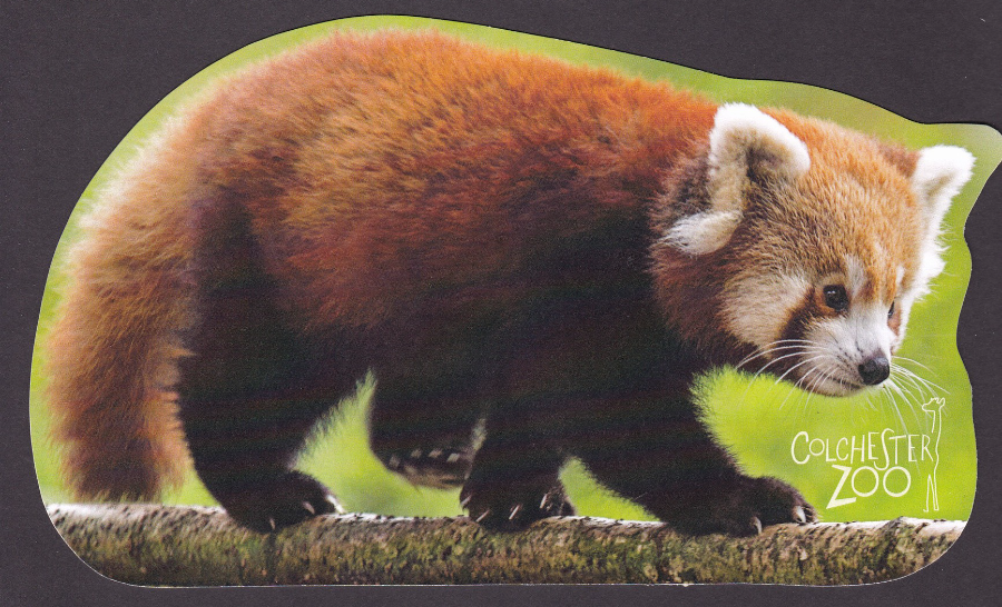
COLCHESTER ZOO
COLCHESTER ZOO – HAND IN HAND – WITH ACTION FOR THE WILD
RED PANDA
This one is a massive postcard and depicts a lovely photograph of this animal, which also appeared on one of the previously posted Whipsnade Zoo postcards. Information on the reverse states that these are nocturnal animals but one was out and running about on my last visit and the grand kids were fascinated by the creature.
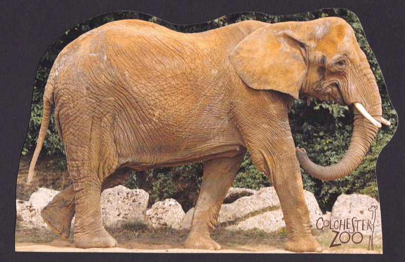
COLCHESTER ZOO
COLCHESTER ZOO – HAND IN HAND – WITH ACTION FOR THE WILD
AFRICAN ELEPHANT
The elephants in my youth were located by the entrance but they have been moved to a much larger enclosure over the back of the zoo in a massive area which was not there when I visited with my parents all those years ago. Even better the grand kids and I got to feed the elephants when we visited, which is fun.
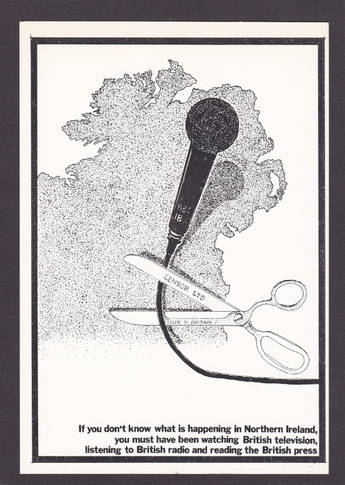
Graphics by INFORMATION IRELAND
(1 North End Road, London W14)
Produced by SOCIALISTS UNLIMITED
(265 Seven Sisters Road, Finsbury Park, London N4 2DE)
“If you don’t know what is happening in Northern Ireland, you must have been watching British Television, listening to British radio and reading the British press”
I wanted this postcard for my ‘Television’ collection because I literally collect any postcard that makes mention, in any way, the subject of television. This design here is clearly an anti-British design which is pro-Northern Ireland. The scissors have the word ‘CENSOR LTD’ printed across the top blade and there is ‘BBC’ printed across the stem of the microphone. I am not sure where I stand re the political backing that this card has but, as I said, any postcard that can be added to my TV collection is in (and it is an unusual card for this theme – I expect this would fit more comfortably into any political themed collection).
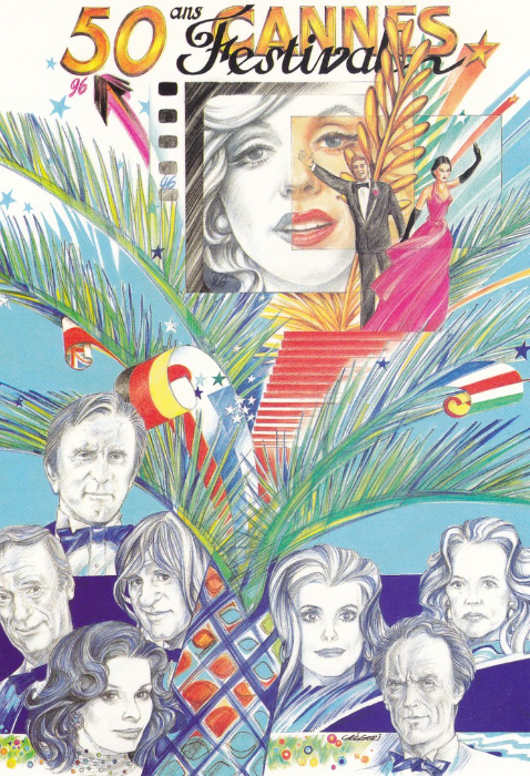
50th ANNIVERSARY OF THE CANNES FESTIVAL
Club Neudin – Carte No 70
Design by Christian Gregori
Limited to 2000 Examples
There is a little ‘96’ under the 50th across the top of the card but I am going to say that this was the year that the artwork was done because the actual 50th Cannes Film Festival was held between 7th – 18th May 1997.
This is now probably as good a time as any to talk about French limited edition postcards. Throughout the 1980’s and into the 1990’s and beyond and through the 2000’s France has been well known within the modern postcard collecting world for issuing huge numbers of postcards with small limited print runs (this one at 2000 is actually very high). Print runs of 150 or 200 were not uncommon and some were even lower (I have a hand-made Princess Diana French postcard which was limited to just 3 copies, and another where only 8 were made, but these are extreme examples and even back when issued these were £12 each). The quality of the designs was often mixed with some almost childlike in simplicity and style but with others of really good quality with this example being towards the better end. Anyone who was buying postcards from modern dealers through this period (from the likes of Pete Davies and Ron Griffiths, both modern dealers who brought many foreign and local postcards to collectors – I am probably still a collector because of these two who both helped me build up the collection I have put together – I am indebted to them both) will have some of these French cards, especially thematic collectors.
So when anyone asks which country is the modern postcard issuing prime country then the answer is France.

GREENPEACE
© 1990 KELLY J. HALL
“GREENPEACE BEGAN IN 1971, WITH A CAMPAIGN TO STOP NUCLEAR WEAPONS TESTING. TODAY, GREENPEACE WORKS ON MANY ENVIRONMENTAL ISSUES IN 23 COUNTRIES”
Text from reverse side of postcard.
The dove and the olive branch has long been a symbol of peace and has been used on many peace related postcard designs (it was a dove and olive branch design that appeared on the previous Anti-Nuclear postcard design I posted). Greenpeace have issued a number of postcards over the years with many being issued for specific campaigns and these are the hardest ones to find. This one here is a standard ‘Greenpeace’ advertising postcard attached to no specific campaign.

BIPEX 1989
“BRITISH INTERNATIONAL POSTCARD EXHIBITION”
Kensington Town Hall 13th – 16th September
This was the free postcard given to all who attend this postcard fair (Exhibition) in 1989, and this one is my particular copy as I was one of those who went. For me there was the added bonus with this card that it depicted the RMS Titanic. I have a nice collection of modern Titanic themed postcards and this was another for my collection. This event was held annually for many years bad sadly has now ceased. A nice collection of BIPEX related postcards can be put together for very little expense.

NATIONAL POSTAL MUSEUM (London)
‘DATAPOST’ SALOON RACING CAR
Ref - SS/36 1/86
Text on the reverse side reads:
“This card shows the ‘Datapost’ saloon Racing Car and is issued by the National Postal Museum to commemorate the Exhibition of the ‘British Motor Industry’, commencing 14 January 1986. This is to coincide with British Industry Year and the Centenary of Motoring. This card will remain on sale until 27 March 1986”
This has always been one of my favourite of the museums many postcards and it is a superb image which would be of interest to those after an unusual postal themed card whilst definitely being a must for any transport collector. It is not an uncommon card and can be found for anything between 50p to £1.50p.