20/04/2017
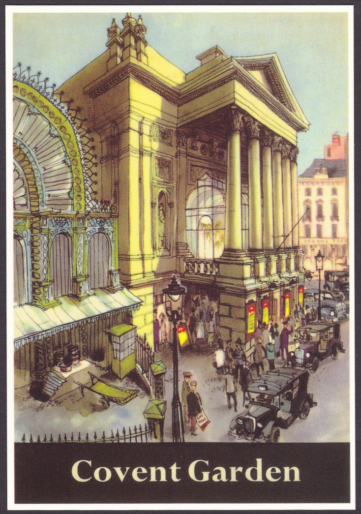
ROYAL OPERA HOUSE
COVENT GARDEN
Published by
MAYFAIR CARDS OF LONDON
BEST OF BRITISH SERIES
Ref: BB 799
“The Royal House was originally established in Bow Street during the eighteenth century. At the end of the twentieth century it was extended and updated at a cost of 215 million pounds. It is one of the finest Opera Houses in the world and every lover of music should experience its beauty and delights when visiting London”
(Text from reverse side of Postcard)
This is a nice painting, with early motor cars and a police officer standing by the wall at the bottom of the nearest pillar. This looks like it could have been a poster design but there are no details of its age or who painted this in the cards descriptive details, which is shame (but then they might not be known of course). I visited Covent Garden many times and it is one of my favourite London locations.
19/04/2017
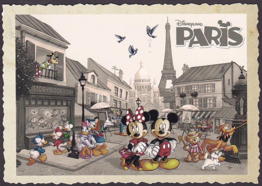
DISNEYLAND, PARIS
Official Postcard made in France
Posted in June 2015
This was a very popular ‘Disneyland Paris’ postcard and it was well produced. Although you cannot see it here in this scan the figures of Mickey and Minnie Mouse are embossed, pushed out in raised relief. The card was also produced with a rough-cut deckle like edging.
The card was posted by Sean and Ethan, apparently, Sean’s favourite ride was the Indiana Jones and the Temple of Peril whilst Ethan’s was Big Thunder Mountain… good choices.
19/04/2017
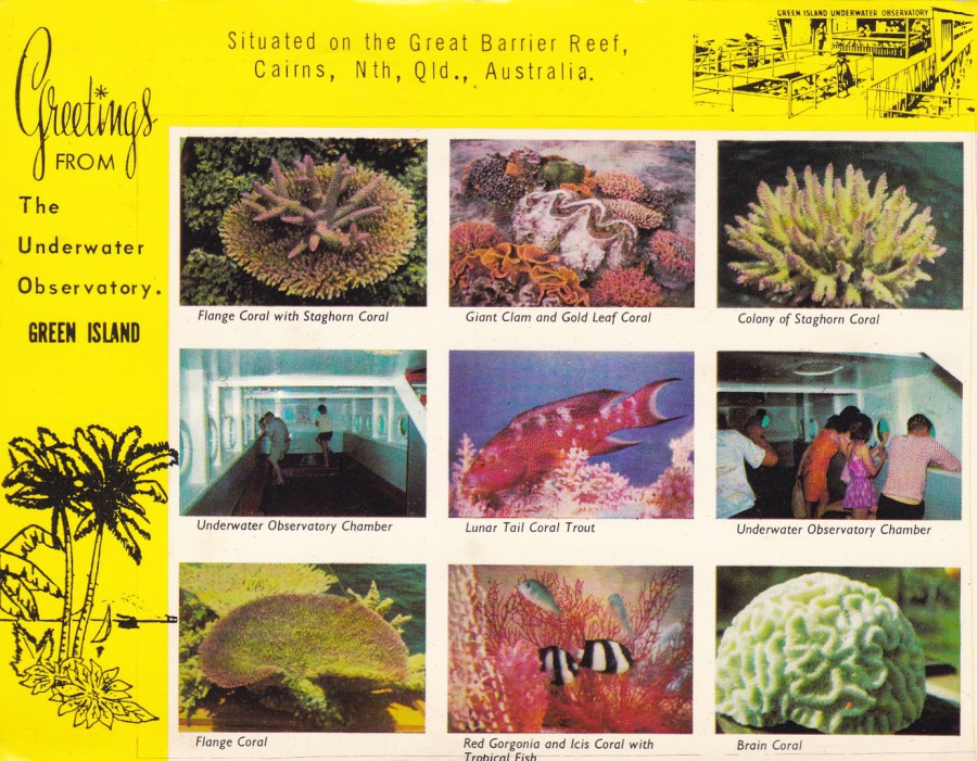
GREETING FROM
THE UNDERWATER OBSERVATORY
GREEN ISLAND
Situated on the Great Barrier Reef, Cairns, North Queensland, Australia
Published by Unknown Local Publisher
I recently watched a documentary about the Great Barrier Reef which was looking at how the coral and reef life is being eroded. There is apparently evidence that the reef is slowly being taken away and that in the future it may be lost to us forever, although that is some time off. It is still, a sad thought that this wonder of the natural world could be destroyed. If this does occur then any souvenirs depicting the reef life will gain some extra interest (but I really hope this will not be in my lifetime)
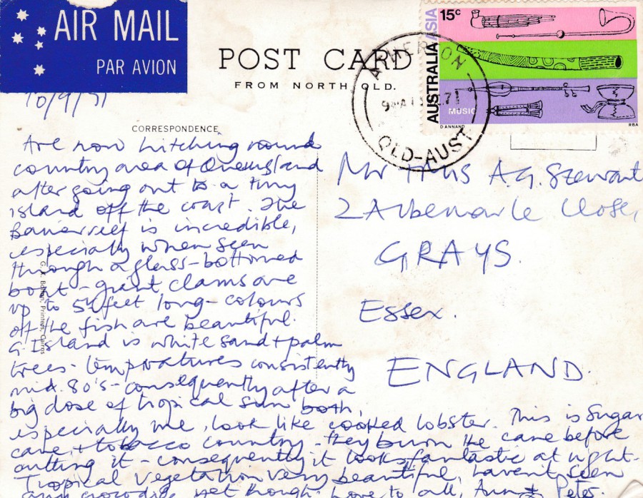
REVERSE SIDE OF ABOVE POSTCARD
This postcard was posted from Atherton, Queensland, Australia using a 1971 “Australia – Asia” 28th International Congress of Orientalists, Canberra 15cent ‘Music’ stamp (SG 484).
The sender saw the barrier reef and mentions this in their message:
“The Barrier Reef is incredible, especially when seen through a glass-bottomed boat – great clams are up to 5 feet long – colours of the fish are beautiful”
19/04/2017
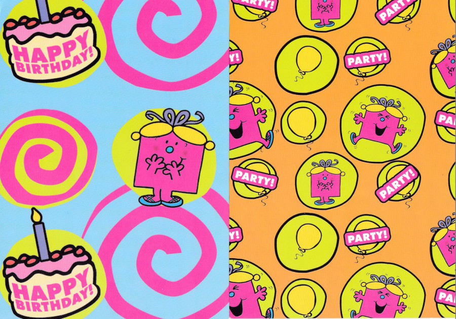
LITTLE MISS BIRTHDAY
2006
Published on behalf of
EGMONT UK LTD
35TH Anniversary 1971 – 2006
For the 35th anniversary of the Mr Men books, and the later Little Miss books, the book company Egmont released two new books titled ‘Mr Birthday’ and ‘Little Miss Birthday’. These two postcards here depict the Little Miss Birthday character. These were free postcards produced to pre-promote the release of these two new books in April 2006. I do wonder if these are the only postcards that depict this character (I also wonder if there were any released that featured the other character ‘Mr Birthday? I would be interested in hearing from anyone who knows if there are any – please use the message option below).
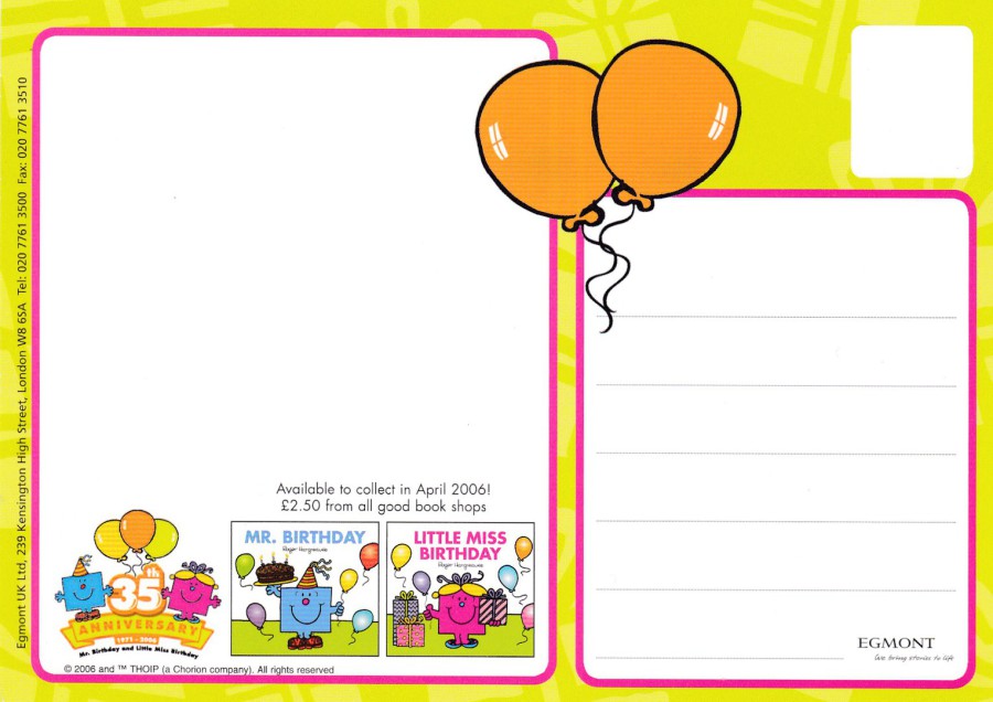
REVERSE SIDE OF POSTCARD
Both, of the above postcards have the same reverse side. Here you can see the covers of the two new books that were released in 2006. The use of colour here makes the back almost as interesting as the front, there is ‘definitely’ more information on this side.
19/04/2017
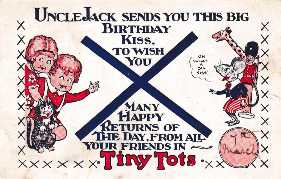
TINY TOTS
UNCLE JACK SENDS YOU THIS BIG BIRTHDAY KISS,
TO WISH YOU MANY HAPPY RETURNS OF THE DAY,
FROM ALL YOUR FRIENDS IN TINY TOTS
Hand dated for 7th March
Posted London 1929.
This is a very collectible postcard which was sent out to children on their birthday when they were part of this club. There are a ‘number’ of different ‘Uncle Jack – Tiny Tots’ postcards and they are popular because they are attractive and come with pictures on both sides.
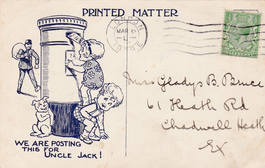
REVERSE SIDE OF ABOVE POSTCARD
Although the year of posting is not clear on the ‘LONDON 6TH March – L –‘ wavy-line cancellation I believe it was posted in 1929. Although clearly a postcard in shape, these cards had so much text on them and images that they were required to be marked up as PRINTED MATTER across them, and this can be seen here where the more normal Post Card would have been printed.
There is also a nice extra cartoon drawing on this side on the left side. This depicts children posting what is supposed be this card. Again ‘Uncle Jack’ is mentioned.
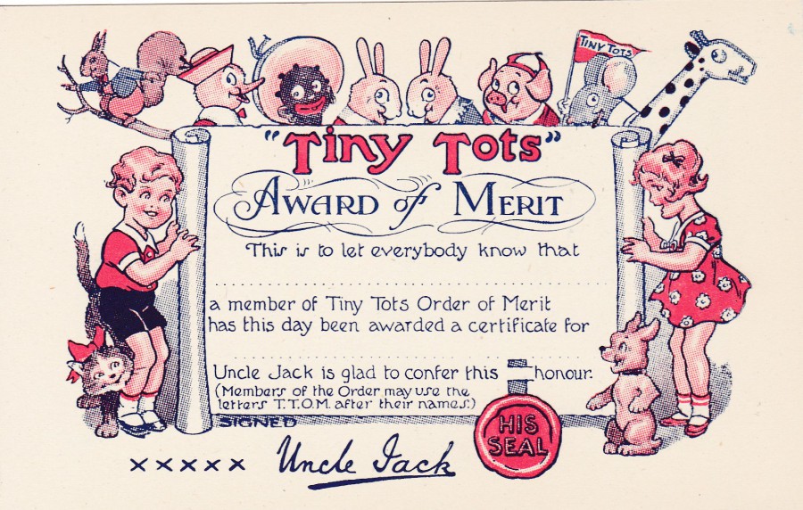
TINY TOTS
AWARD OF MERIT
This is to let everybody know that
……………………………………………………
a member of Tiny Tots Order of Merit
has this day been awarded a certificate for
……………………………………………………..
Uncle Jack is glad to confer this honour.
Signed
Uncle Jack
This is a mint copy of this ‘Award of Merit’ postcard which I assume was sent out to child members who had done something worthy of such an award. It would be interesting to find a used one which was properly sent out, but I suspect they are not so common as I have never seen one, but to be fair, this is the only unused copy I have seen as well.
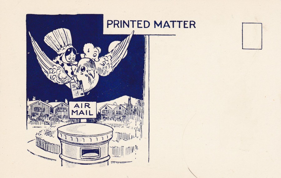
REVERSE SIDE OF ABOVE POSTCARD
This one again has an additional drawing on the reverse side and this one really appealed to me. It shows an AIR MAIL post box (in ‘reality’, these were painted blue and were used, naturally enough, for air mail only – there is one still in Windsor, although I am not sure it is still used as a post box – I think the slot is covered). Again, the card is shown as being posted by cartoon characters riding a bird. Also, at the top you will again see this is marked ups as PRINTED MATTER.
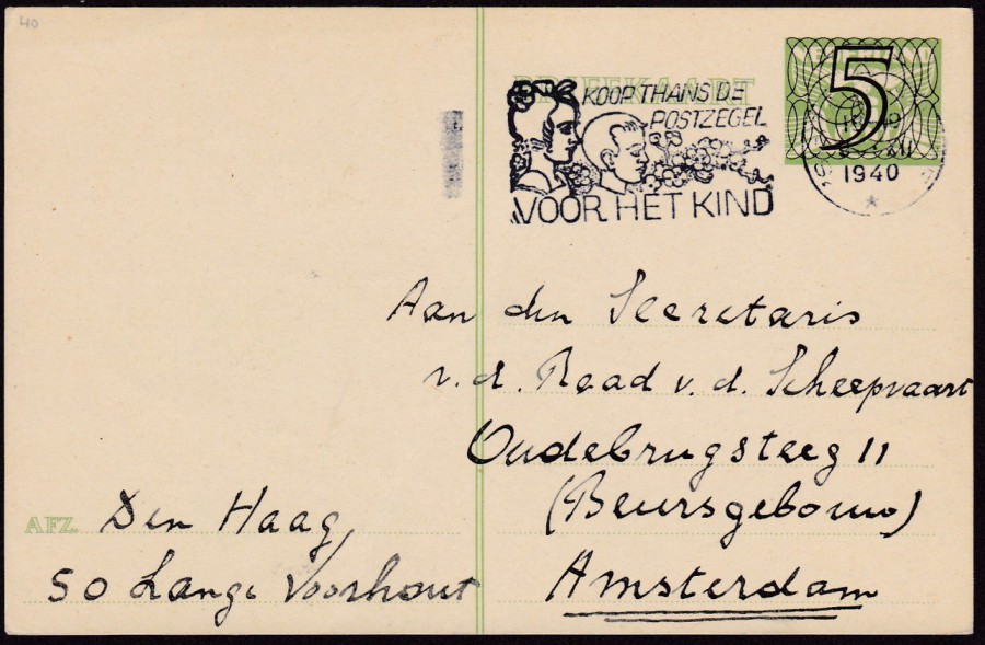
18/04/2017
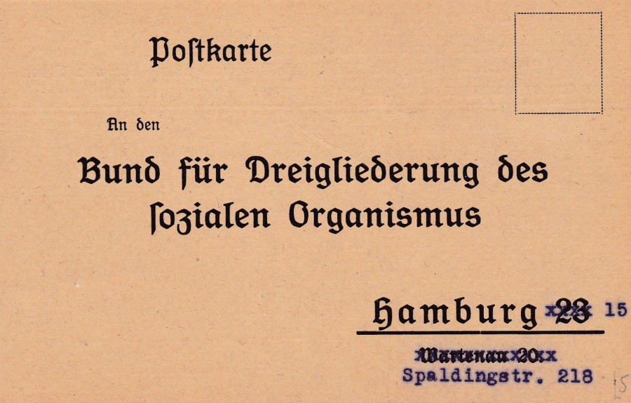
POSTCARD
(Addressed to organisation in Hamburg)
An den bund fur dreigliederung des sozialen organismus
The translation for the above came back as:
To the federation for the triple organism
This appears to be a membership type card which is pre-addressed (but unused in this case) to an organisation called ‘Dreigliederung des sozialen organismus’. This was an organisation which believed in something which I am trying still to get my head around. It was called ‘Social Threefolding’ (Triple Organism) and it seems to have meant that the belief was that the basic structure of a society, where the whole coordination of the social life does not take place centrally through the state, or a leadership elite, is self-administered in three autonomous subsystems:
CULTURAL LIFE, EDUCATION (SCIENCE, RELIGION AND CULTURE)
LEGAL LIFE (THE LAWS, RULES AND AGREEMENT OF SOCIETY)
ECONOMIC LIFE (PRODUCTION, TRADE AND CONSUMPTION OF GOODS AND SERVICES)
It is all way above me but clearly there was a group of people in Germany who were looking at this and joining together. This postcard seems to have been intended to bring people into the organisation, or some group which was trying to follow this idea, or incorporate it into their society.
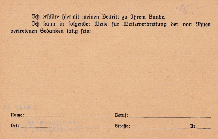
REVERSE SIDE OF ABOVE POSTCARD
Tch erklare hiermit meinen Beitritt zu Ihrem Bunde
Tch Kann in Folgender Weise fur Weiterverbteitung der von Thnen
Vertretenen Bedanken tatig sien
The translation for the above came backs as:
I declare my accession to your covenant
It Can be used in the following way for further communication of the
Represented reflections
18/04/2017
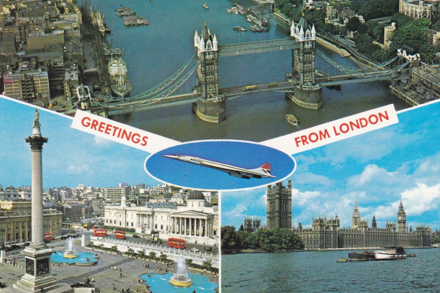
GREETINGS FROM LONDON
Published by
KARDORAMA LTD
Ref: K601
(Brown printing to reverse side and Reference number bottom right)
Aerial view of Tower Bridge and the City of London.
Aerial view of the Houses of Parliament, Big Ben, Westminster Abbey and Whitehall, London.
Concorde (By courtesy of British Airways)
(Descriptive Text from reverse side of Postcard)
Concorde postcards are numerous, and I have depicted many over the months the webpage has been running. But, not all of them are elaborate art or photographic designs, some are simple and depict the Concorde as just a segment of a bigger design, or the Concorde is included for its ‘Britishness’ (the French also do the same thing to show that the Concorde is a French icon). This postcard is an example of this type of postcard. It is also another example of looking closely at your cards and checking everything because…..see below.
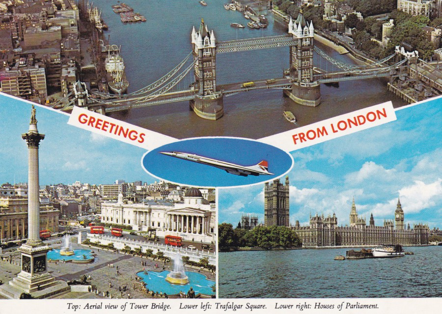
GREETINGS FROM LONDON
Published by
KARDORAMA LTD
Ref: K601
(Black printing to reverse side and Reference number)
Top: Aerial view of Tower Bridge.
Lower Left: Trafalgar Square
Lower Right: Houses of Parliament
(Above text appears along an additional white strip across the bottom of the postcard)
Both postcards depict the same images and from the front the only difference is the white strip across the bottom. So, it could easily be missed that there is a difference, especially when they have the same reference number. It is the little differences like this that make postcard collecting more than just a collection of images, if you should want it to be more than this (and there is nothing wrong in not doing so).
17/04/2017
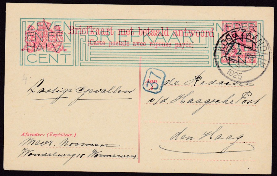
NETHERLANDS
POSTAL STATIONERY POST CARD
7 ½ Cent green overprint on 5 + 5cent carmine on yellow card.
ISSUED 1924
Higgins & Gage Ref: 169
One of the interesting things about collecting Netherlands postal stationery post cards is that there are so many different overprints where the value had to be changed. This was often done on an older postal stationery card upgrading the value for current use. This green overprint is one of the largest I have seen and covers the entire red printed original information, stamp and crest. It was the size of the overprint that caught my eye first. This copy was used and the stamp is postmarked ‘KOOG ZAANDIJK’, 26th April 1925.
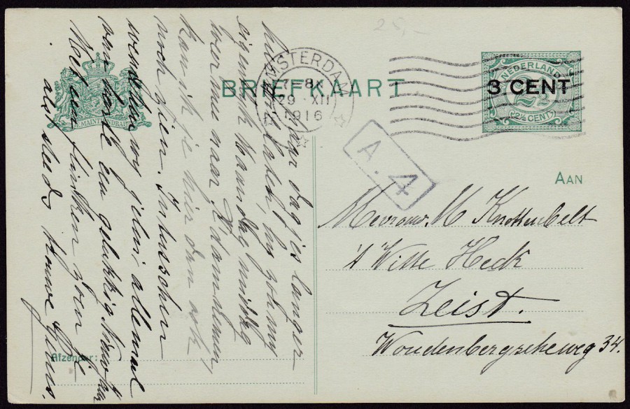
NETHERLANDS
POSTAL STATIONERY POST CARD
3 CENT overprint on 2 ½ CENT Green Postal Stationery Post Card
Higgins & Gage Ref: 58 (With Type A – centre dividing double line)
Issued 1916 – 1917
These overprinted cards were issued during the First World War and there are no true records existing as to quantities produced, or at least this is what the note states at the heading of the section relating these overprints in the Higgins & Gage catalogue. Some are quite scarce although not this one, which is one of the easier of these overprint cards to obtain.
This copy was posted from Amsterdam on 29th December 1916.

NETHERLANDS
POSTAL STATIONERY POST CARD
5 cent overprint (in red gothic text) on 2 ½ cent Green Postal Stationery Card
Higgins Gage Ref: 80 (With Type A – centre dividing double line)
Issued 1920
This copy was posted in Amsterdam and has the roller machine cancel dated 5th September 1920.
NETHERLANDS
POSTAL STATIONERY POST CARD
5 cent (number with black swirl boarder) overprint on 3c yellow green Postal Stationery Post Card
Higgins & Gage Ref: 219
Issued 1940
This copy was used in 1940 although details are scarce as the details in the postmark circle are too feint to make out clearly. Germany invaded the Netherlands on 10th May 1940 and I suspect this card was posted in September of that year so around four months after the invasion.

NETHERLANDS
POSTAL STATIONERY POST CARD
3 cent (number in red) on 4 cent blue Postal Stationery Post Card
Higgins & Gage Ref: 209
Issued 1938 – 1939
This one is unused
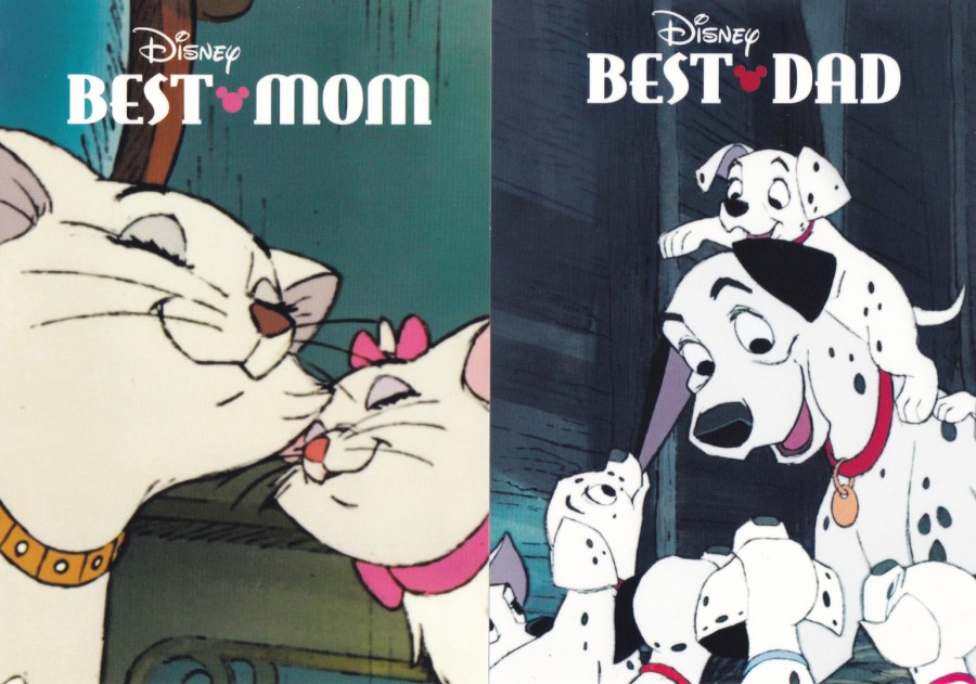
17/04/17
DISNEYLAND
PARIS
2017
My daughter visited Disneyland Paris in January of this year and bought me these postcards which appear to be in some sort of series although they have no numbering system. On facebook at the time I posted a photograph of a rack containing these postcards. They were 1.50 euros each.
DISNEYS
BEST MUM
THE ARISTOCATS, 1970
DISNEYS
BEST DAD
101 DALMATIANS, 1961

DISNEYS
BEST FRIENDS
THE JUNGLE BOOK, 1967
DISNEYS
BEST FRIENDS
THE LION KING, 1994

DISNEY
LOVE
BAMBI, 1942
DISNEY
LOVE
LADY AND THE TRAMP, 1955

DISNEY
LOVE
THE LION KING, 1994
All, of the above postcards have the same basic reverse layout with the only difference being films title and year of release which appears bottom left. The ‘DISNEYLAND PARIS’ word logo appears top left and there is a price and reference code for the bar-code which is all contained within the stamp box top right.
17/04/2017
SALON NAUTICO
(NAUTICAL LOUNGE – BOAT SHOW)
SPAIN
Last year I picked up five postcards for this annual event. As you will have gathered I like postcards used with special hand stamps and other applied items. These cards fit the bill perfectly, especially the ones where the shows poster label was also applied. Where I have these, you can see that the label has the same design as the official postcard. Because these are used examples you also get a nice range of Spanish stamps as well.
The ones I have here are from the mid 1960’s to the early 1970’s and I suspect that there were ones issued in the years that I have missing, but you do not often come across these so I doubt I will be filling any gaps soon. I was also interested to find that this event is still running.
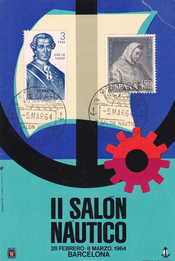
II SALON NAUTICO
28 FEBRERO – 8 MARZO, 1964
(28TH February – 8th March)
BARCELONA
The poster design for 1964’s event with two stamps applied to the front and cancelled with the events special hand stamp dated 5th March 1964.
STAMP (left side) – 3p Jose de Galvez – from the 1963 ‘Explorers and Colonizers of America (3rd Series) – (SG 1593)
STAMP (right side) – 1p 50c St Pedro Nolasco – from the 1963 ‘75th Anniversary of the Order of Mercy (SG 1585)
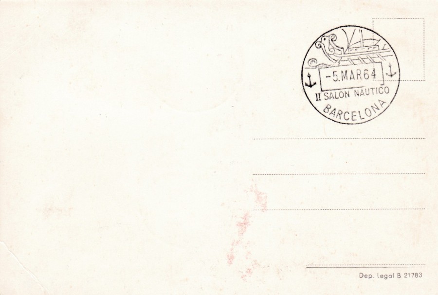
REVERSE SIDE OF ABOVE POSTCARD
Here you can see a nice clear strike of the handstamp
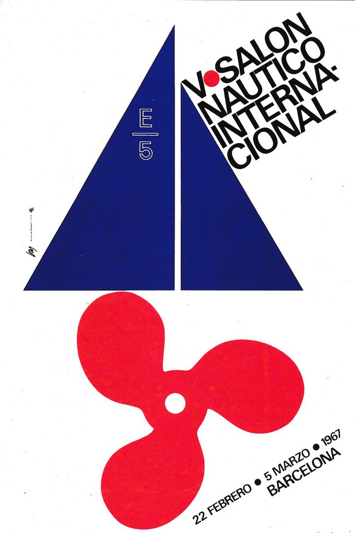
V SALON NAUTICO
INTERNACIONAL
22 FEBRERO – 5 MARZO, 1967
(22ND February – 5th March)
BARCELONA
Poster design postcard

REVERSE SIDE OF ABOVE POSTCARD
Here you can see a 1p Naval Week, Barcelona stamp (SG 1797), issued in 1966, cancelled with the first day of use of the shows special hand stamp for this year’s Boat Show.
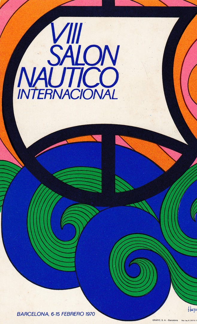
VIII SALON NAUTICO
INTERNACIONAL
6 FEBRERO – 15 FEBRERO, 1970
(6TH February – 15TH February)
BARCELONA
Poster design Postcard
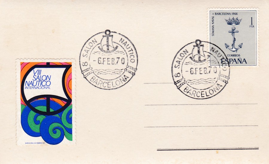
REVERSE SIDE OF ABOVE POSTCARD
This postcard has also received the 1p Naval Week, Barcelona stamp (SG 1797), issued in 1966, which has been cancelled with the first day of use of the shows special handstamp.
This is also the first of the cards that I have which has the shows ‘Poster Stamp’ label attached. The poster stamp design is the same as appears on the front of the postcard.
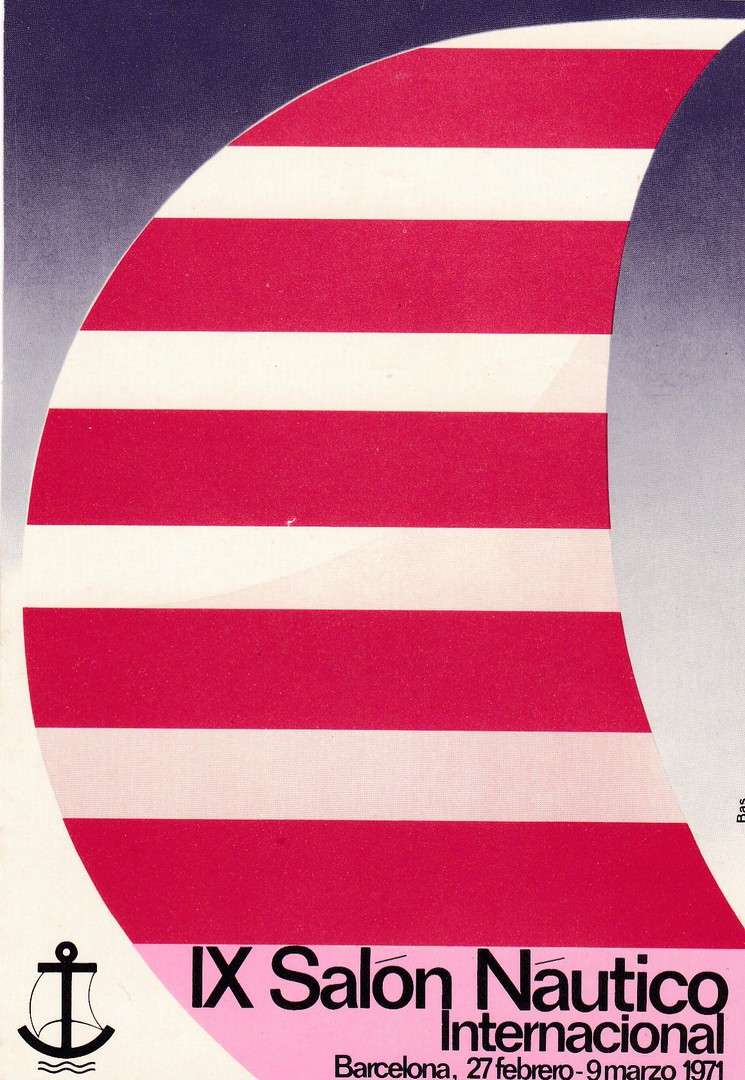
IX SALON NAUTICO
INTERNACIONAL
27 FEBRERO – 9 MARZO, 1971
(27TH February – 9TH March)
BARCELONA
Poster design Postcard
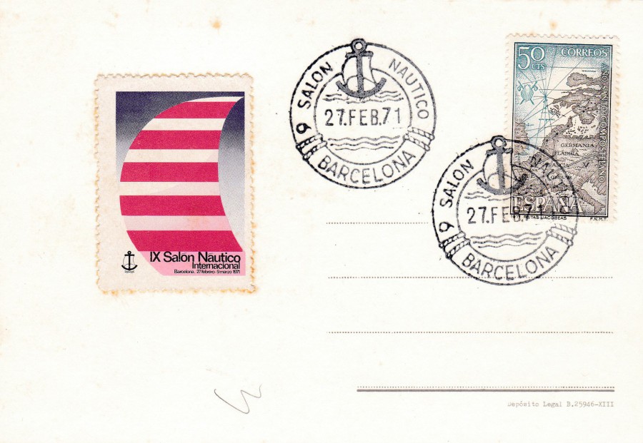
REVERSE SIDE OF ABOVE POSTCARD
The stamp used here is the 1971 50c Pilgrims Route Map (SG 2066) from the ‘Holy Year of Compostela (1st Issue) “St James in Europe” stamp issue. This has been cancelled with a new styled show special hand stamp dated 27th February, the first day of use for this new special cancel.
Again, this card has received the special ‘Poster Stamp’ label for this year’s boat show.
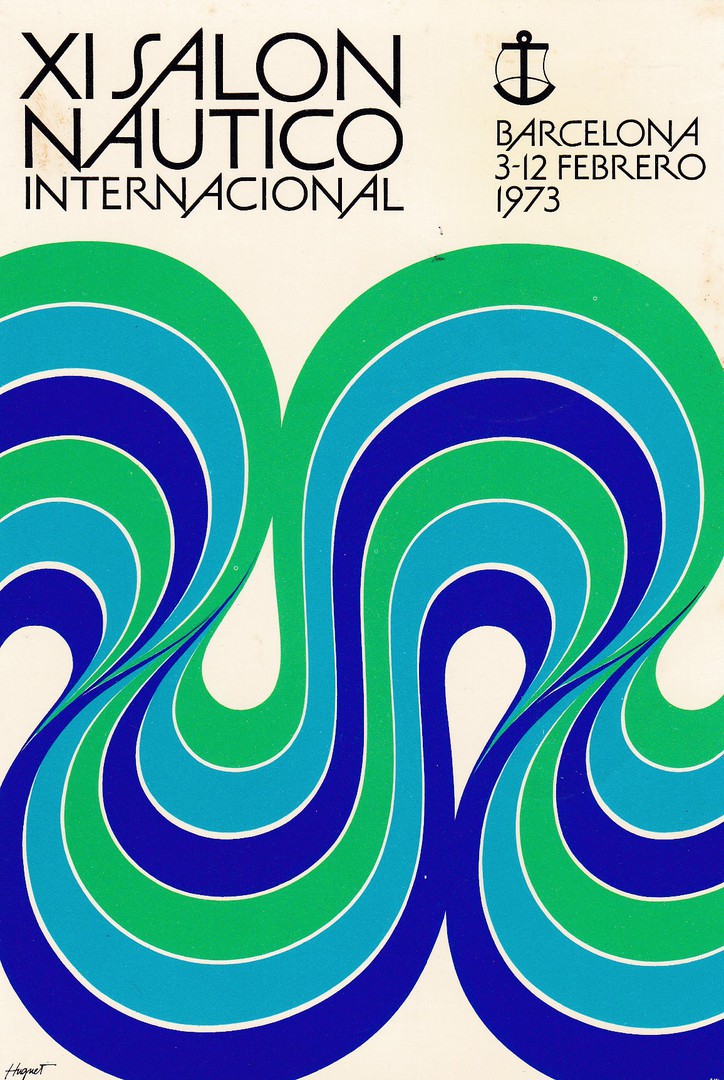
XI SALON NAUTICO
INTERNACIONAL
3 FEBRERO – 12 FEBRERO, 1973
(3RD February – 12TH February)
BARCELONA
Poster design Postcard
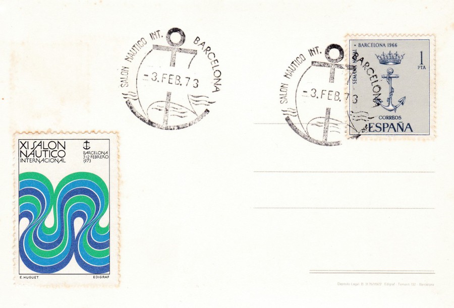
REVERSE SIDE OF ABOVE POSTCARD
This postcard has also received the 1p Naval Week, Barcelona stamp (SG 1797), issued in 1966, which has been cancelled with the first day of use of the shows new special handstamp, used on the first day of use for this year’s new design, 3rd February.
Again, this card has received the special ‘Poster Stamp’ label for this year’s boat show.
17/04/2017
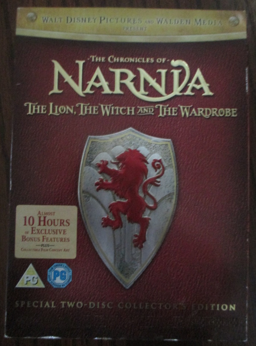
THE CHRONICLES OF NARNIA
THE LION, THE WITCH AND THE WARDROBE
Special Two-Disc Collector’s Edition DVD
I have mentioned before that Jo believes I have a postcard radar, and this DVD boxed special edition is a good example of it working. I saw this in a CEX second hand DVD/Electronics shop in my home town. I picked it up and opened it. Inside the case I found three exclusive art-cards. As the whole thing was priced at a more than reasonable 50p (yes, 50p! how bad does a movie have to be, to be priced at such a low price? Personally, I don’t think it is that bad). I would have paid 50p for each of the three cards, but there you go.
DVD BOX
PHOTOGRAPH
CONCEPT ARTWORK
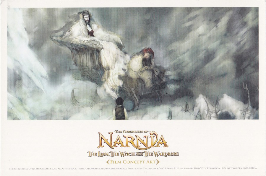
THE WHITE WITCH
All, of these postcards (or ‘Artcards’ as these are often called) depict concept artwork used for the film. As is often the case with these DVD freebies, these are plain backed, but I have never seen this as a good enough reason not to collect them
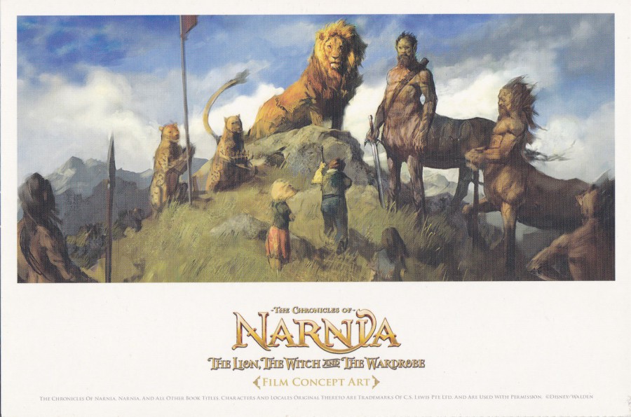
CONCEPT ARTWORK
ASLAN THE LION AND OTHER CHARACTERS
The three cards came joined together in a strip, so will have at least one perforated edge. This one here was in the middle of the strip so has perforated edges along the top and the bottom
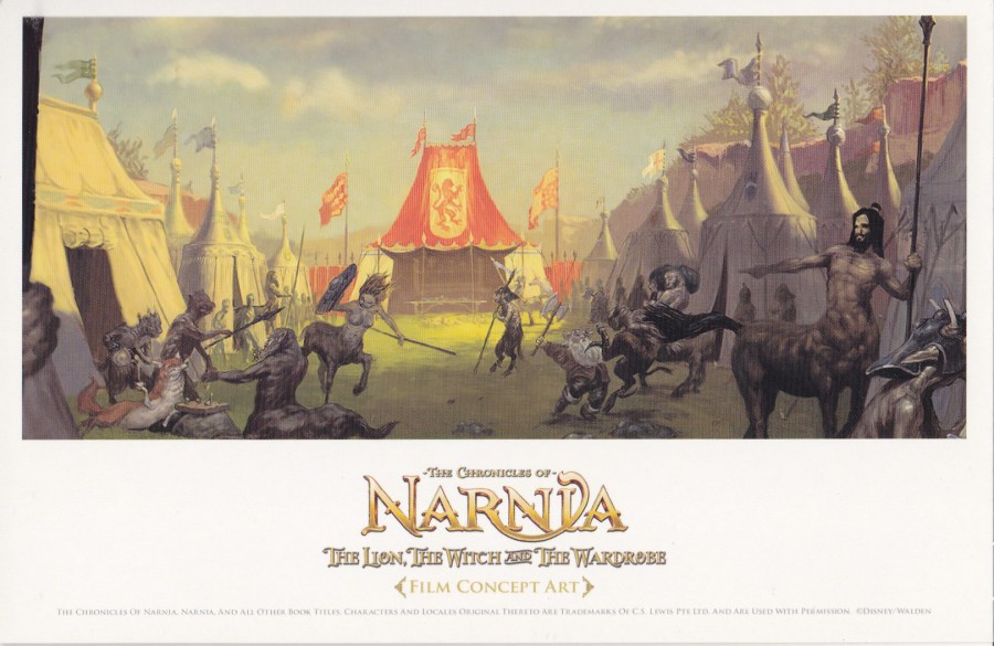
CONCEPT ARTWORK
CAMP
These were ‘definitely’ worth the 50p layout – Special Edition DVD’s and Blue Ray films are always worth a look at to see if they have any special cards included, as some can be quite spectacular.

PHOTOGRAPH
INSIDE OF DVD BOX
WITH THE PLASTIC DVD CASE REMOVED FROM ITS SLOT

17/04/2017
LUCKY LION
Published by
THE ART GROUP
By
JOJO NORRIS
If you like this Lion postcard it is currently on sale in branches of ‘paperchase’ for 75p
17/04/2017
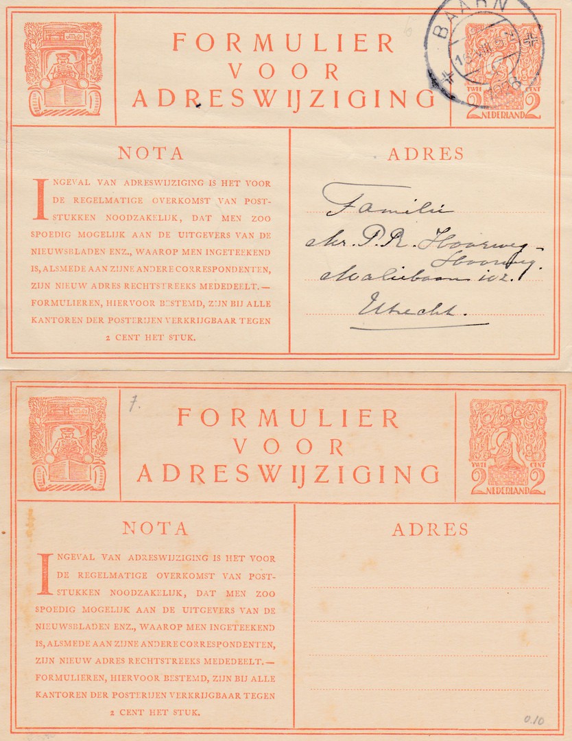
CHANGE OF ADDRESS POSTCARDS
NETHERLANDS
1923-1924
2c Orange on cream card
Higgins & Gage Ref: 6 (page 25 - NETHERLANDS)
TOP
USED EXAMPLE 1928
BOTTOM
MINT, UNUSED EXAMPLE
At STAMPEX this year I managed to buy a selection of postal stationery card items from the Netherlands from a single dealer. The selection included some change of address card with pre-printed stamps. These get their own section in the Higgins & Gage catalogue. I was pleased to be able to get both used and mint copies of three of these cards. These ‘orange’ printed cards were the earliest I obtained.
REVERSE SIDE OF BOTH OF THE ABOVE CARDS
USED – TOP
MINT - BOTTOM
1931
1 ½ Cent red violet on cream card
Higgins & Gage Ref: 11 (page 26 – NETHERLANDS)
TOP
USED EXAMPLE 1934
BOTTOM
MINT, UNUSED EXAMPLE
REVERSE SIDE OF BOTH OF THE ABOVE CARDS
USED – TOP
MINT – BOTTOM
1938
1 ½ Cent grey on cream card
Higgins & Gage Ref: 13 (page 26 – NETHERLANDS)
TOP
USED EXAMPLE 1942
BOTTOM
MINT, UNUSED EXAMPLE
REVERSE SIDE OF BOTH OF THE ABOVE CARDS
USED – TOP
MINT – BOTTOM
The second line on the reverse side reads ‘BEROEP, KWALITEIT’ – an earlier version of this postcard, from 1935 has the second line of text as ‘BEROEP, BETREKKING’ (Higgins & Gage Ref: 12) – I shall have to keep an eye out for one of these to go with these I already have.
17/04/2017
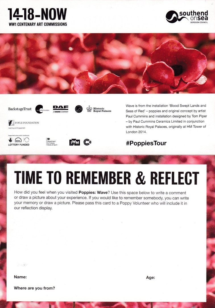
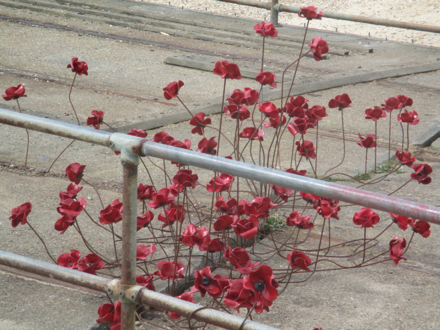
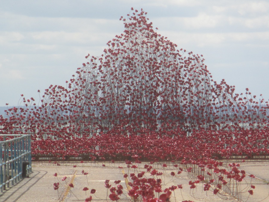
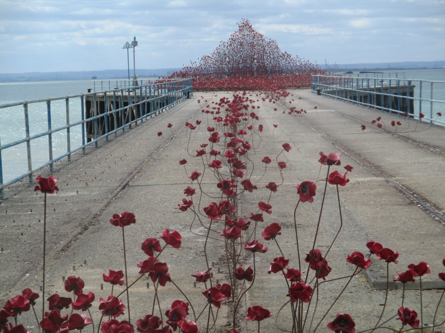
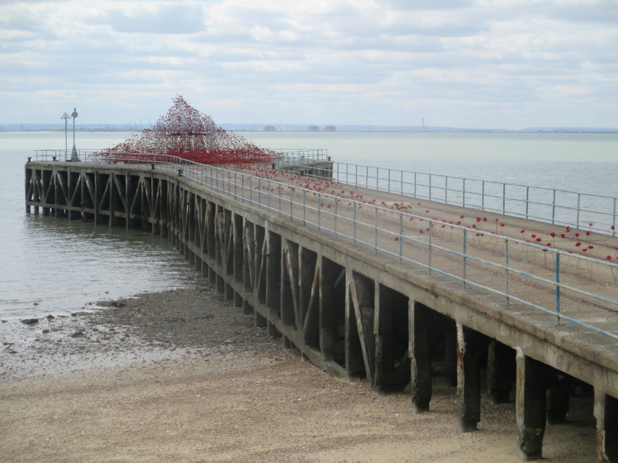
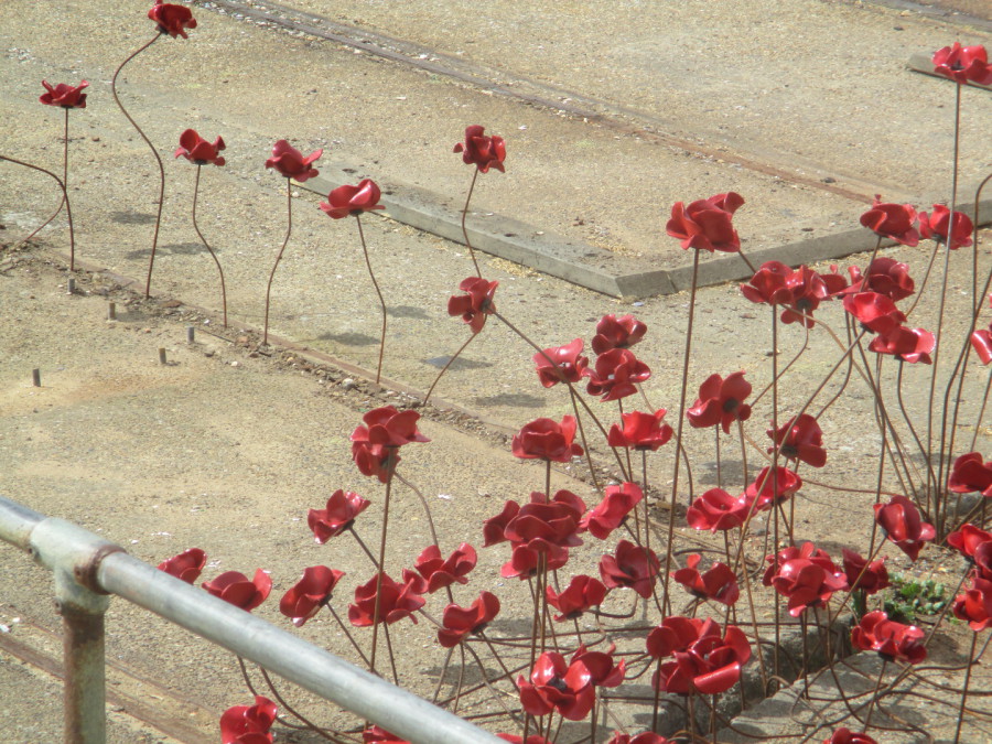
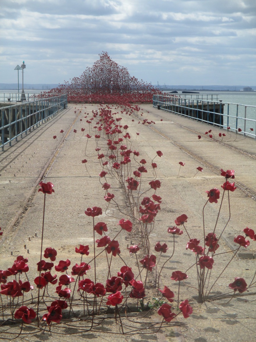
POPPIES: WAVE
SOUTHEND-ON-SEA
ESSEX
From the 12th April until 25th June (2017) there will be a display of some of the poppies that made up the fantastic artwork display at the Tower of London in 2014 which was called ‘Blood swept Lands and Seas of Red’. I saw the original London display several times, and bought one of the poppies when they came up for sale. But, a ‘large’ number of the poppies were not sold, and are currently on a tour. Yesterday I paid a visit to the exhibit here in my home town (although technically it is in Shoeburyness). The installation is titled POPPIES: WAVE. When you arrive, you are given a card, postcard sized, on which you can record your feelings on seeing the exhibit. Here is my card, not a postcard but a nice card souvenir regardless.
TOP
Front of card with details of the exhibition
BOTTOM
Reverse side of card where visitors could write their feelings on seeing the exhibit
(I am pleased to say that there was a regular flow of visitors to this exhibit whilst I was there and it certainly seems to be popular with local people)
PHOTOGRAPH
16/04/2017
PHOTOGRAPH
16/04/2017
PHOTOGRAPH
16/04/2017
PHOTOGRAPH
16/04/2017
PHOTOGRAPH
16/04/2017
PHOTOGRAPH
16/04/2017
16/04/2017
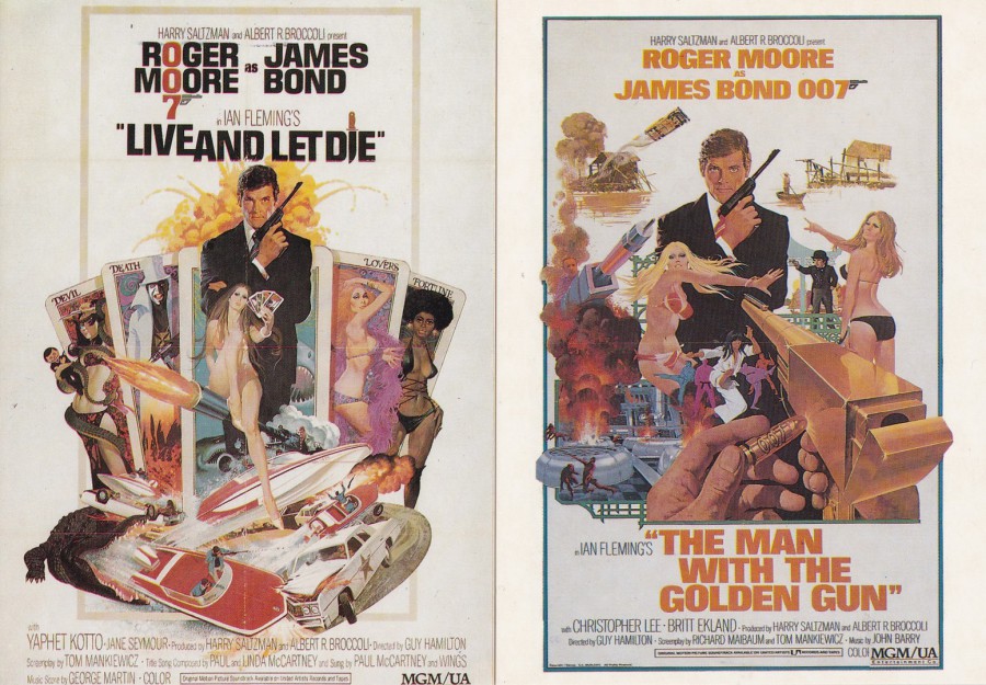
CLIFTON JAMES ….. RIP
George Clifton James
29th May 1920 – 15th April 2017
Actor – Without a doubt best known here in the UK (and elsewhere around the world) as Sheriff J.W. Pepper in two of the Roger Moore James Bond movies; ‘Live and Let Die’ and ‘The Man with the Golden Gun’. ‘Live and Let Die’ was the first James Bond film I saw, and as a result it is still one of my favourites, and I remember with fondness the scenes involving the sheriff. I remember well that scene when he is told by his boss that Bond is a secret agent and says “‘SECRET AGENT? On WHOSE side?”
FAR LEFT
‘LIVE AND LET DIE’
Film Poster Postcard
Published by
VINTAGE MAGAZINE Co
Ref: JB1
NEAR LEFT
‘THE MAN WITH THE GOLDEN GUN’
Film Poster Postcard
Published by
VINTAGE MAGAZINE Co
Ref: JB15
(Can also be found with the Ref: JB13)
The Vintage Magazine Co issued a set of all the James Bond film posters, up to and including ‘Licence to Kill’. Some people have been confused by seeing two of the same posters design with different reference numbers, this happens with many of the cards (although JB16 is ‘Goldfinger’ in both releases, JB5 for ‘Diamonds Are Forever, JB2 ‘A View to a Kill’ and JB17 ‘A View to a Kill’ are also same numbered cards). I do not know the reasons for the different reference numbers across the two separate releases but I do know the source for them. In one case the cards were released, and sold, separately. In another case the 17 postcards were printed and placed together in a special green coloured envelope and sold as a set. If you bought both the separate cards and the packaged set then you discovered that most of the cards had different reference numbers (but this does not explain why at least four of the posters had the same reference number on the separately issued and set issued versions!). The numbering system for these cards will confuse and annoy collectors in the future but at least you now know why they are as they are – although there is also one other change as the two different releases were cut to different sizes. One is smaller than the other (the smaller ones were released in the green envelope set). I remember being fascinated by this release and being initially confused by the numbering, but at least I could see the source as I had bought both the enveloped and separately released sets.
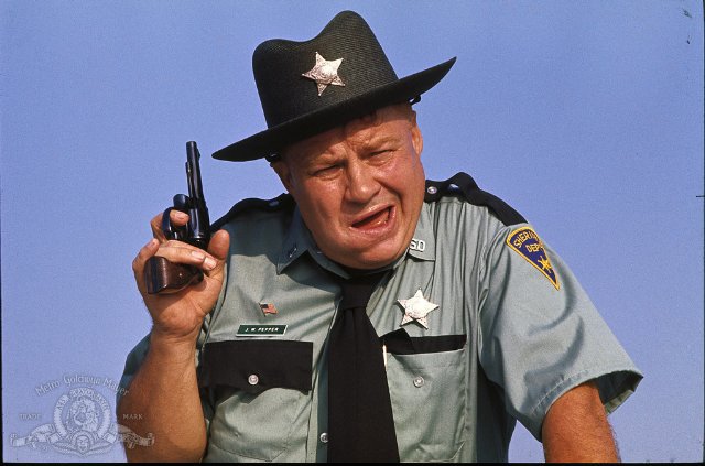
Clifton James as Sheriff J. W. Pepper in 'Live and Let Die'
16/04/2017
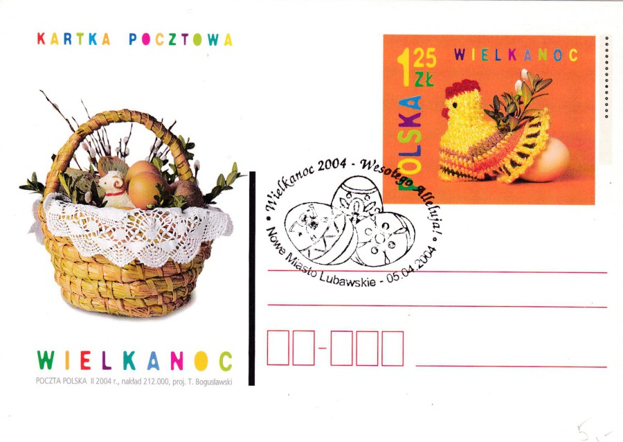
HAPPY EASTER SUNDAY TO EVERYONE
POLAND
Postal Stationery Post Card
WIELKANOC – EASTER
Special ‘WIELKANOC – EASTER’ cancellation
5th April 2004
(Probably a first day of issue handstamp as Easter Sunday was the 11th April in 2004)