04/02/2018
DISNEYLAND PARIS
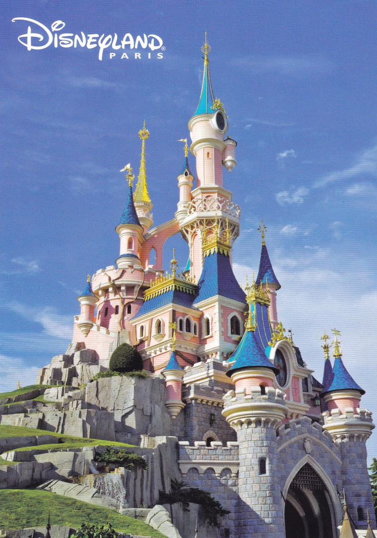
LE CHATEAU DE LA BELLE AU BOIS DORMANT
(The Castle of the Sleeping Beauty)
Official Disneyland Paris theme park Postcard
Ref: FAC – 020296 – 16340
(original retail price 00.80 cents)
You may, or may not, know that each of the different theme parks has a different main castle. In Disneyland Paris (or ‘Disneyland Resort Paris’ as it is now known) the castle is that of The Sleeping Beauty; Princess Aurora. The parks I have visited sell single postcards which depict the castle. In Florida they have sold several over the years I have attended, and it is the same here in Paris. This is a card which I bought on one of my previous visits.
When I visited Disneyland Resort Paris on Saturday I picked up another copy of this postcard. I do this because you never know when something on th reverse side is different. Serious collectors like to build collections of similar, or the same card design with different reverse layputs or details.
The postcard I bought yesterday has exactly he same front photograph but has a different reference number:
FAC-020296 - 17100
This would be my second piece of collecting advice today - even if you have the card already it is still sometimes worth buying another as later you may find that it is still different in some minor but collectible way.

04/02/2018
JUST SURF
WOODEN NOVELTY POSTCARD
BAMBOO MADE
Produced and published by
The gva (A GREEN VALUE ATTITUDE)
Distributed by
ORVAL CD
I found a spinner of wooden postcards in a Hyper U store in France last week (images were placed on our facebook page). There was only one single non-Christmas themed wooden postcard design on the entire filled spinner, and this was that card (although obviously the word ‘Card’ is a bit of a ‘non de plume’ here considering this is made of wood!). I found it rather amusing that there was this single ‘Summer, Beach and Holiday’ themed design in amongst all the winter and Christmas ones. It is also a good example of something which I regularly do, and which I assume other modern postcard collectors do as well. If I see a spinner or a rack of cards I always go through each of the blocks of cards in each individual section of the spinner or rack. This is because sellers like to have their spinners full, it looks better, and sometimes they use different designs to ‘pad’ out each holder or place new cards in front of older ones to keep it full. Therefore, if you look through these you can find some nice different cards at the back. This was how I found this VW Campervan design, hidden behind a stack of snowflake designs.
So, that’s one of my pieces of advice, always check through postcard display stacks.
04/02/2018
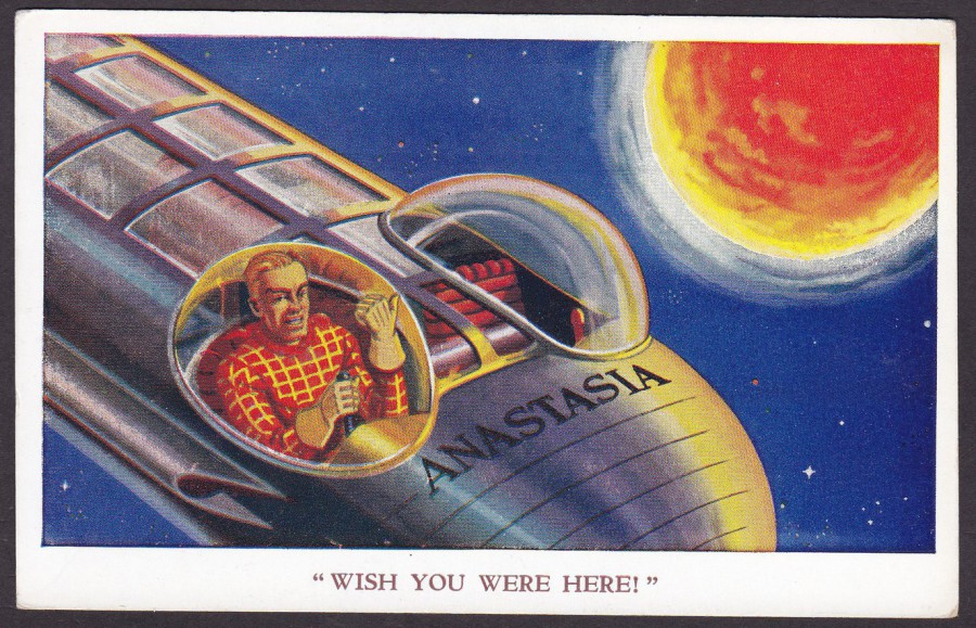
“WISH YOU WERE HERE”
DAN DARE
In his spaceship
ANASTASIA
Published by
VALENTINE & SONS LTD (DUNDEE)
By Permission of the Eagle Comic
Ref: 5097
(Dan Dare Series)
This is a superb 1960’s postcard featuring the Eagle Comic’s character ‘Dan Dare’. There are not too many Dan Dare related postcards, and even fewer issued when the comic strip was at its height in the early days of the Eagle Comic. This is one of three that I am aware of in this set (one of which has already previously been depicted on the webpage) and they all sell somewhere between £15 - £25 each, depending on their condition (I have even seen a perfect copy of one of these priced at £30). I love these and am pleased that I have the three copies that I am aware of, but I would like to hear from anyone who knows if there are more than three by this publisher (I have searched for over 45 years through postcard stock, collections, magazine articles and books and I have only seen the three different cards).
04/02/2018
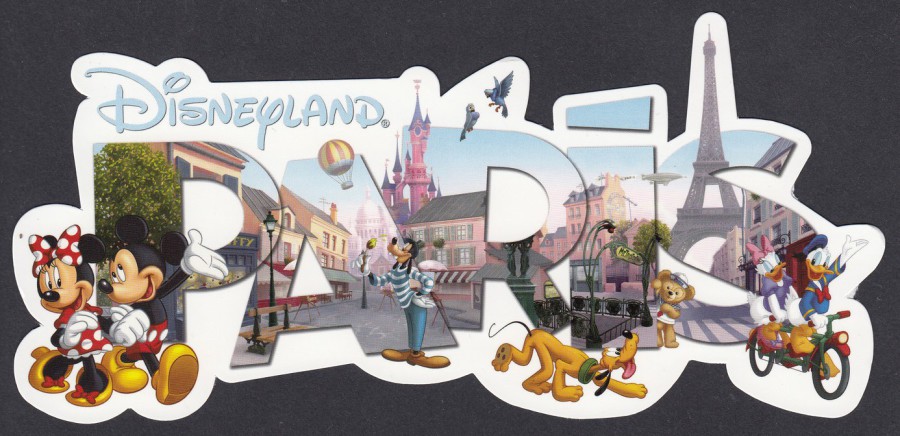
DISNEYLAND RESORT PARIS
Long Shaped Postcard
OFFICIAL THEME PARK POSTCARD
Ref: FAC-022768-15162
(Original retail price 2 euro’s – 2018)
We got back home after midnight, around 00:30hrs this morning, but yesterday we did spend a fun day at the Disneyland Resort Paris theme park (followed by a long drive to Calais and then a ferry trip to Dover and then a two hour drive home). I had forgotten just how long it had been since I had been here and despite the afternoon drizzle (after all this is ‘definitely’ not Florida!), we had a great time, and I did manage to pick up a nice range of new postcards.
The basic layout for this postcard design has been around for a quite a few years and I had previously picked up a large normal edged postcard with these illustrated letters on it. This one here is obviously different as it is shaped around the edge of the individual letters. I liked this one but, I have mentioned before that shaped postcards, especially large ones, are rarely collected by postcard collectors (I am an exception to this rule), in fact they are somewhat looked down upon I think. Amongst the general-public though, they are reasonably popular.
02/02/2018
Hopefully, assuming this has posted, the wifi at this Disney hotel in Disneyland Resort Paris is workin– which means, for today at least, I am back posting. As I am in France I thought I would post this unusual postcard composite set.
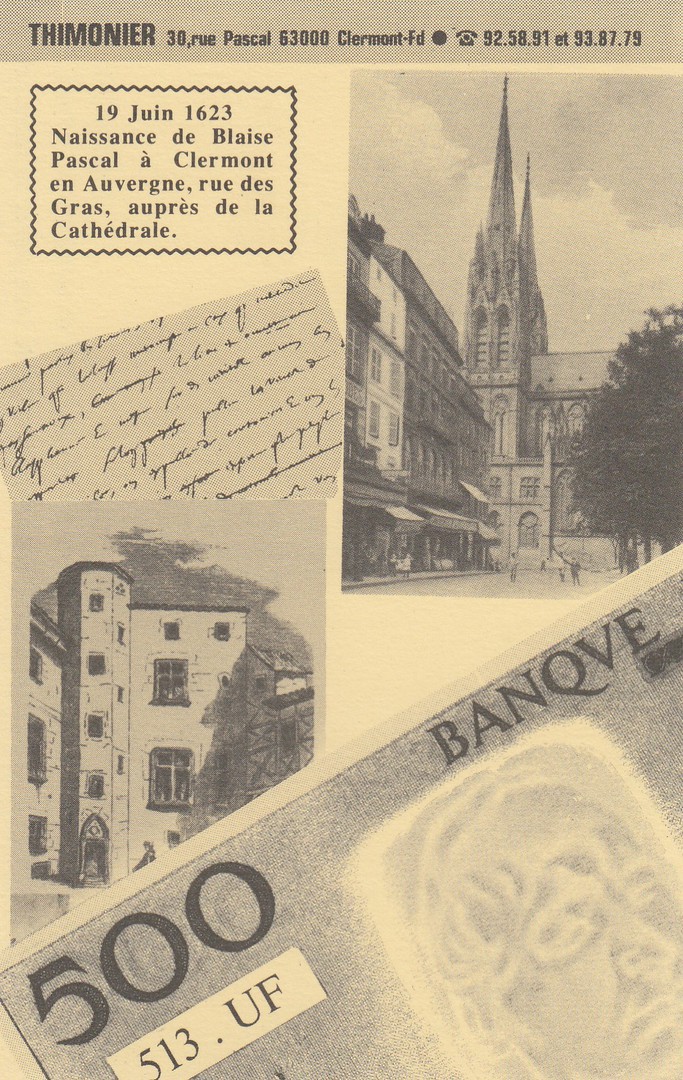
THIMONIER
30 RUE PASCAL
63000 Clermont Fd
19 Juin 1623 – Naissance de Blaise Pascal a Clermont en Auvergne, rue des Gras, aupres de la Cathedrale
(“June 19, 1623 – Birth of Blaise Pascal in Clermont auvergne, rue des Gras, near the cathedral”)
MONTAGE COMPOSITE SET OF POSTCARDS
SIX POSTCARD SET
I bought this set of six cards ‘really’ cheaply, in fact I thought they were my bargain of the day when I got these from a dealer stall at Woking postcard fair much earlier in the year. The six cards fit together in two rows of three to make up one complete image. From what is written on the front I believe these are publicity postcards for a specialist collectors shop (but this would need to be confirmed). I like these, but then I like novelty postcard set ups and composite sets are especially attractive. The postcards depict items which relate to the life of Blaise Pascal, who was a French mathematician, physicist, inventor, writer and Catholic theologian. He seems to have been a bit of a child prodigy as he wrote a significant treatise on the subject of ‘Projective Geometry’ at the age of 16! He has been referred to as one of the most important authors of the French Classical Period.
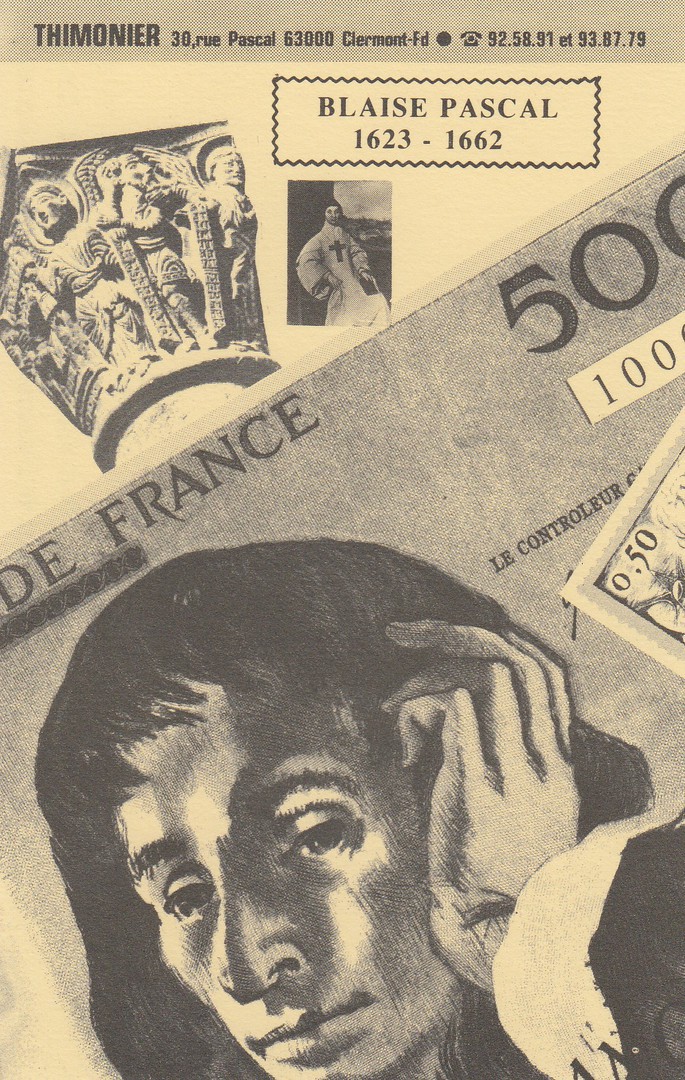
The six postcards in this set are not numbered or titled so I will just depict them here as the appear across the top of the composite design from left to right and then again across the bottom row, again from left to right. The central motif of this card set is the depiction of the 500 French Francs note which depicts Blaise Pascal.
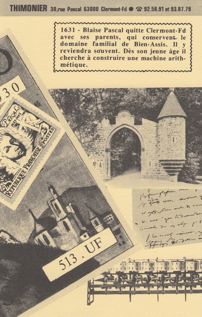
This is the third and last card across the top row

FIRST CARD FROM BOTTOM ROW
Here you can see the card which commences the bottom row of three on the left side. The segment of the bank-note, which appears here shows the Cathedral which is mentioned in the text on the first depicted card above. Nice to see part of an old postcard included here.
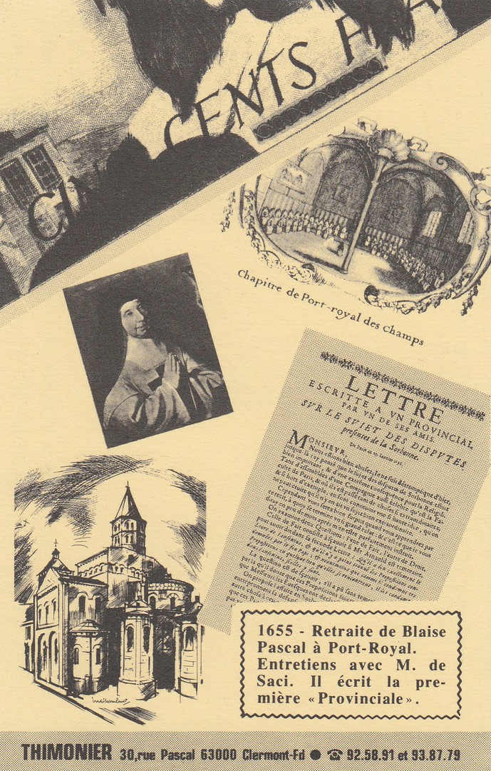
THE MIDDLE CARD FROM THE BOTTOM ROW

THE LAST CARD FROM THE BOTTOM ROW
The images shown here include an image of the death mask of Blaise Pascal which was taken upon his death on 19th August 1662. The person who put this together has constructed a superb combined item and which would be a delight t anyone who is interested in this famous Frenchman (which I am sad to admit I had not heard of before researching this postcard collection – but that is the added joy of any collection, the work around research and study of the card itself and the image(s) shown).
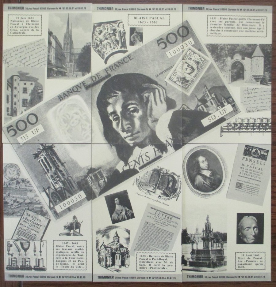
PHOTOGRAPH
Complete set of six postcards placed together to make complete picture
28/01/2018
There will almost certainly not be any posting tomorrow (Monday 29/01/2018) as I am travelling through France heading for a small village outside Sainte. It is a seven-hour drive from Calais and I am unsure what internet access I will have upon arrival, so the next posting may be dependant on what can be set up. But, postings will recommence as soon as possible.
28/01/2018
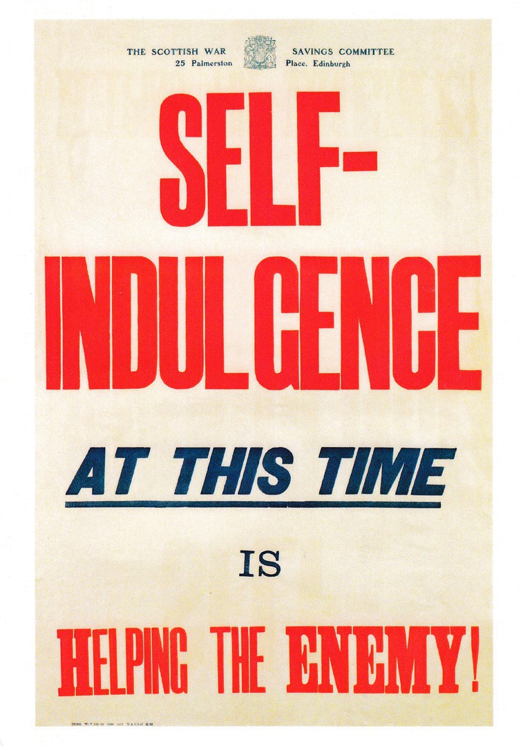
SELF – INDULGENCE
AT THIS TIME
IS
HELPING THE ENEMY
“THE SCOTTISH WAR SAVINGS COMMITTEE”
BRITISH WAR SAVINGS POSTER
FIRST WORLD WAR
Published by
IMPERIAL WAR MUSEUM
Ref: PPO1394
What I like about the Imperial War Museum is that they have continued to change and update their postcard releases. They have also produced some which depict historically interesting posters and artefacts without these always being pictorially impressive. This one here is a text only poster, but well done to the IWM for placing it on a postcard as I think it fits nicely into my military themed collection.

28/01/2018
LA GRANDE GUERRE 1914 – 15
CHATEAU DE VERMELLES (P. de C.)
Enleve d’asault aux allemands le 1er Decembre 1914 – Au premier plan les trenches de cheminement
THE GREAT WAR 1914 – 15
CASTLE OF VERMELLES (P. de C.) [Pas – de - Calais]
Removed from the Germans by assault on 1st December 1914 – in the foreground are the trench tracks
Publisher and reference details
Vise Paris 519
‘PHOT EXPRESS’
IMP. BAUDINIERE NANTERRE
This is another World War I war damage postcard, so popular during the war, especially in the first years, and 1914 was the first year of the war. The Chateau, as you can see here on this postcard image, was ‘entirely’ destroyed. The Chateau was a major German strong-point and on the 4th December 1914 was blown up from underneath by a mine that had been placed underground by sappers who had dug out an underground gallery in which explosives were placed (so the date on this card - 1st December - may be wrong). The Chateau was said by eyewitnesses to have disappeared in a cloud of smoke. It seems clear that German soldiers lost their lives in this explosion, but there is a hand-written pencil note on the reverse side of this postcard which indicates that there may have been quite a major loss to the German defenders when the Chateau was blown up. The hand-written note reads:
“It is said that 2 generals of the Germans are underneath”
It looks very much like this pencil annotation was pencilled onto the postcard around the time that it was bought by whoever owned the postcard initially, and it would be logical that the person, possibly a soldier, and from the writing this would have been British soldier, bought it locally and therefore would have been in the right place to pick up any stories, or rumours about generals being buried underneath the rubble.
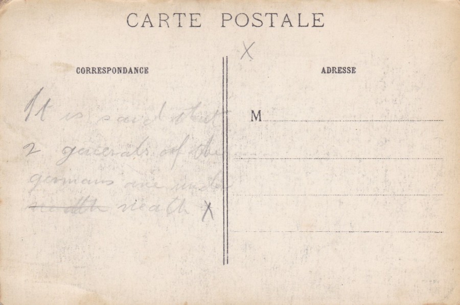
REVERSE SIDE OF ABOVE POSTCARD
With the hand pencilled annotation about the German Generals. In these times this note seems ghoulish, but we need to remember, that the sender was involved in a war with the Germans and the loss of any superior enemy officers would have been a propaganda boost. For those reading this today, like me, there is an historical interest. Is this information correct? Were there German generals on these premises? I do know that the chateau fell into German hands in September 1914 (the war having started in August). It seems the Germans then spent a couple of months fortifying it and turning it into a major strong-point, as mentioned above. We also know that the Chateau was blown up in an early use of the tactic of underground mining by sappers, again as mentioned above. So, it is plausible that officers were killed in this explosion. But was the information about generals just the good old rumours of soldiers at the front, or deliberate propaganda spread to give some believed good cheer to those fighting on the front. So far I have been unable to confirm if this is true or not.
ENLARGEMENT OF WRITTEN AREA
28/01/2018
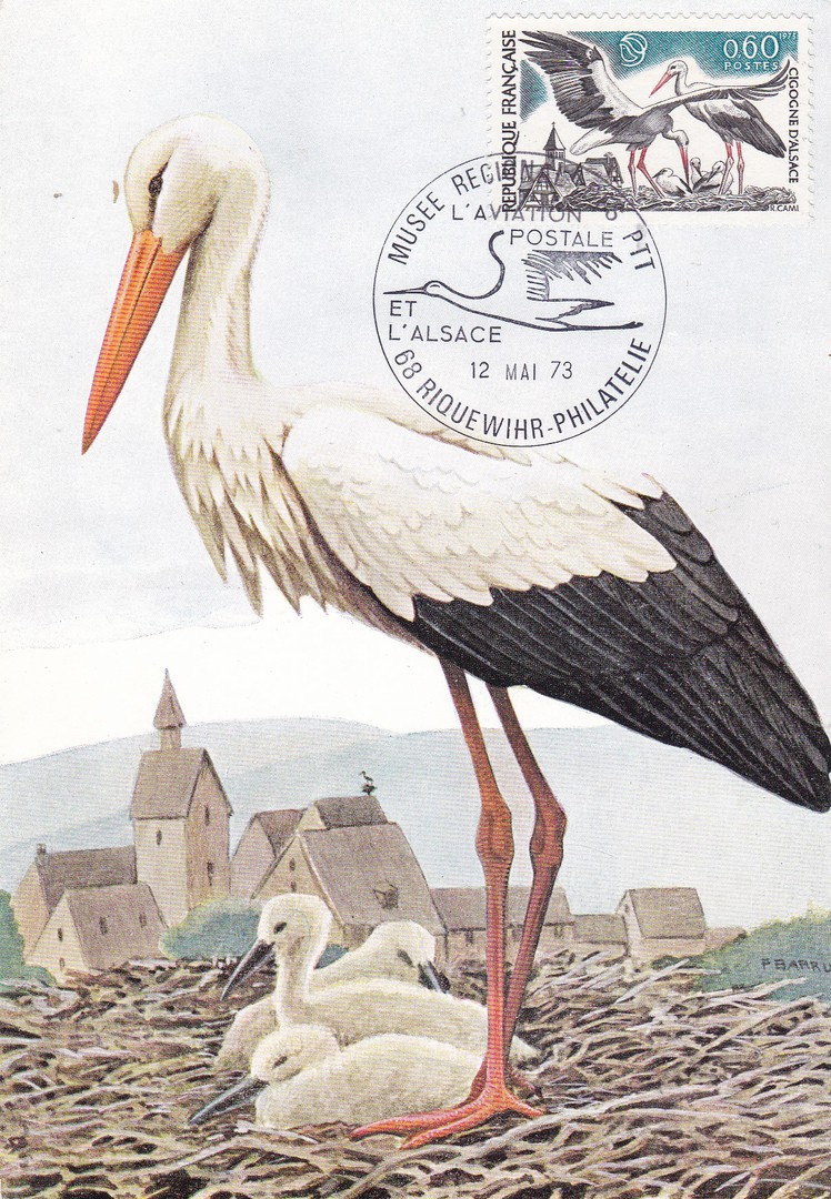
CIGOGNE BLANCHE
WHITE STORK
(Weisser Storche)
(Ciconia ciconia)
FRENCH MAXIMUM POST CARD
Published by
EDITIONS N. BOUBEE (et Cie, Paris)
This is a beautiful postcard which I strongly suspect was designed to receive the French issued STORK stamp, part of the two stamp Nature Conservation set issued in 1973. It gets a bit confusing if your using the Stanley Gibbons Stamps of the World catalogue as this shows this stamp to be part of, as mentioned above, a two-stamp set. The Stork stamp being reference GS 2003, the other stamp depicts a racoon and is reference SG 2002. But, if you check further, into specialised catalogues, like my’ Michel Europa-Katalog West 1989/90 (A-L’) you find that the Racoon stamp was issued on the 23RD June 1973 whilst the Stork stamp, despite having a higher SG reference number, was issued earlier on the 12th May 1973. This is a good example of how a collector like me needs a range of different catalogues to help with identifying correctly what is being handled.
So, I now know that this is a first day of issue cancellation on the stamp on this postcard. I suspected it was, but you can never be sure without confirmation (unless the hand stamp used states that it is F.D.I., which this one does not). The combination here of a nice postcard illustration, a stamp featuring the same bird and then a special cancellation which also includes an image of a stork, is quite delightful. This postcard cost me just £1, and it was every penny.
27/01/2018
GERMAN POSTAL STATIONERY POST CARD
ANNIVERSARY (CENTENNIAL) OF THE BIRTH OF DR. VON STEPHAN
(Secretary of State)
8 Pfg grey black on cream card
Higgins & Gage, World Postal Stationery Catalog
Section 7
Germany - Page 13
Reference No: 191
Issued ….1931
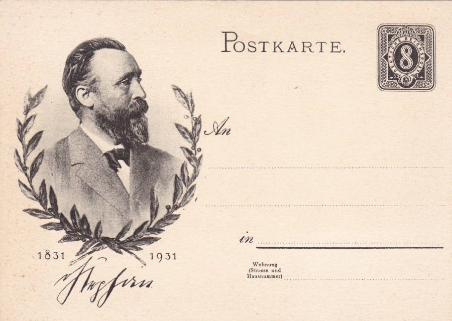
Heinrich von Stephan was the general post director for the German Empire, becoming Postmaster General of the German Empire in 1876, but he is best remembered philatelically as being integral in the founding of the Universal Postal Union in 1874. He organised the International Postal Conference in Bern in 1874 where the Universal Postal Union was established. In Germany he is also remembered for introducing the telephone to Germany in 1877, or at least he is credited with this. In 1880 he became the Undersecretary of State in charge of the post office, and in 1895 he was Minister of Postal Services for Germany.
For all the above held positions, or any of them for that matter, he would deserve his place here on this postcard, but, perhaps he deserves it most for being the person who introduced the postcard to Germany, which he first suggested in 1865, and which, if had been taken up would have been the worlds first postcard, but his idea was not implemented by Germany at that time. Austria subsequently took up the idea and issued the actual world’s first postcard in 1869. For his initial idea of the postcard there is some truth behind the often-stated position that the postcard was invented by Von Stephan, although some dispute this, but I think there is no doubt that he has a strong connection with the initial ideas around the creation of the idea of what the ‘POSTCARD’ became in its formative years. Dr. von Stephan passed awy on 8th April 1897.
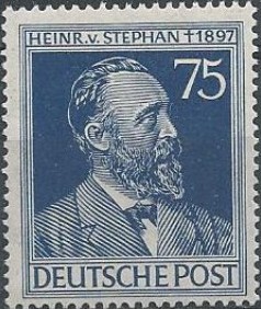
PHOTOGRAPH
Dr. Von Stephan German Postal Stamp
I have depicted this to show you that Dr. von Stephan appears on other German philatelic items as well
27/011/2018
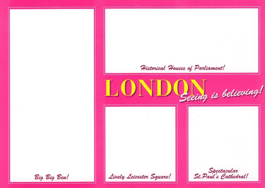
LONDON
SEEING IS BELIEVEING
Published by
BOOMERANG MEDIA
(Free Rack Card)
The front of this card is, surprisingly as there are missing images, designed to catch your eye and make you initially curious enough to pick up the card and hopefully turn it over. The unusual front design is explained by the advert for the event which this card was issued to promote – see below.
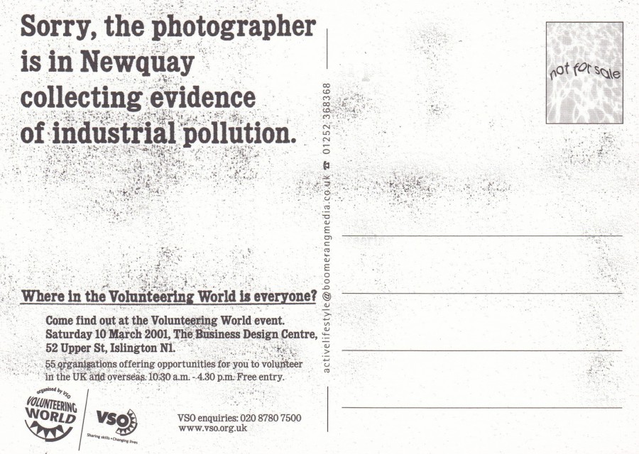
REVERSE SIDE OF ABOVE POSTCARD
“SORRY, THE PHOTOGRAPHER IS IN NEWQUAY COLLECTING EVIDENCE OF INDUSTRIAL POLLUTION”
Where in the Volunteering World is everyone?
‘VOLUNTEERING WORLD EVENT’
10TH March 2001
The business Design Centre
Islington
There are a couple of things I like about this card, one is the way it has deliberately been printed to look as if it is dirty and scruffy looking (those black splotches were not my scanner playing up, they are part of the printed design). The second is that this event was held at the Business Design Centre, which is where the bi-annual STAMPEX exhibitions are held, and I have posted about this event at least five or six times now. And I have depicted many cards I have found at these exhibition shows.
I thought this was a clever design with an interesting concept, and voluntary work around the world is important so I hope the event (text states there were 55 organisations attending the event looking for volunteers) was successful. The idea here, then, is that the photographer was away doing something more important than taking pictures for a postcard! (although as collector I would say that anything for postcards is also important to me!!)
27/011/2018
GREAT BRITAIN POSTAL STATIONERY POST CARD
QUEEN VICTORIA HALF PENNY Lilac pre-paid postage on buff card
Higgins & Gage, World Postal Stationery Catalog
Section 7
Great Britain - Page 1
Reference No: 2
Issued …. 1875
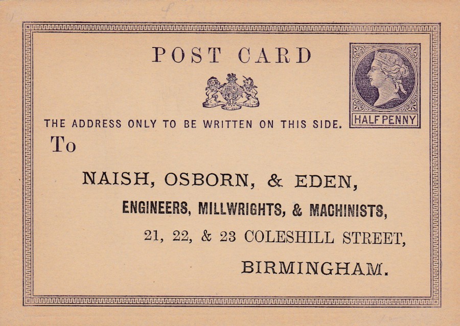
PRINTED ADVERT ADDRESS POST CARD
NAISH, OSBORN, & EDEN
ENGINEERS, MILLWRIGHTS, & MACHINISTS
21, 22 & 23 COLESHILL STREET
BIRMINGHAM
From the very first day that postal stationery post cards were issued companies took copies and printed adverts on the back and pre-printed addresses on the front, normally there own so that people could use them to correspond direct with the company, which was especially important for order placement. This card here was used by a company in Birmingham, although the card itself was not used and is in mint condition with the companies added back printing. Because of the Post Office rules only the address could be placed on the stamped side of these cards, but on the plain reverse side anything could technically be printed.
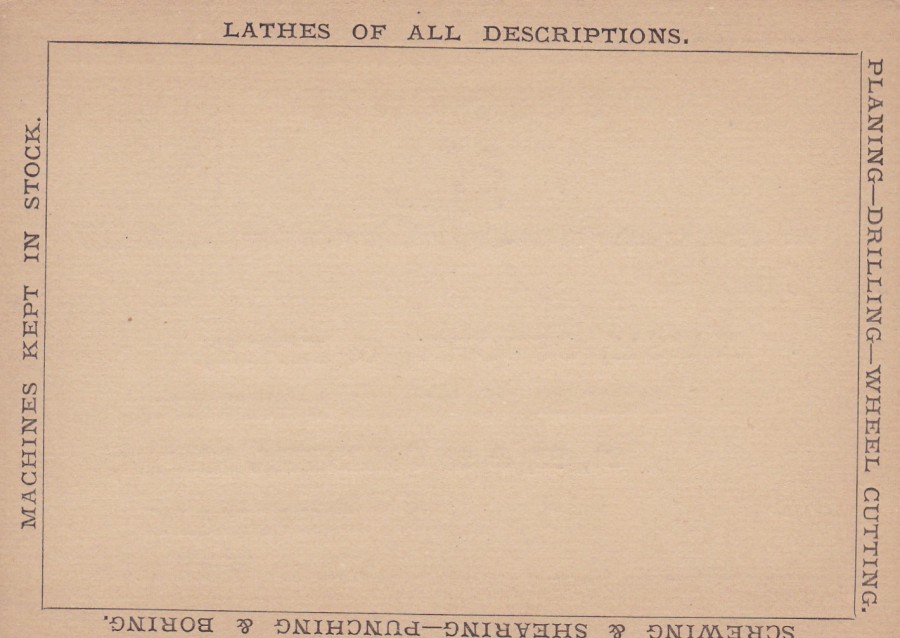
REVERSE SIDE OF ABOVE POSTAL STATIONERY POST CARD
The company have had added to this side a black box, which the person could use to place their message, order, request inside. Then details of the company’s goods and services are listed around the edge in added text:
PLANING – DRILLING – WHEEL CUTTING
SCREWING & SHEARING – PUNCHING & BORING
MACHINES KEPT IN STOCK
Postal stationery post cards with added adverts and text areas are catalogued higher than copies of theses cards without any additions. They are also more attractive (which partly explains the higher values). This one is a simple example, not too elaborate, but it is in lovely condition and can be considered a piece of both philatelic history and social history, one especially interesting to anyone looking at the business history of the area of Birmingham.

26/01/2018
UNITED STATES POSTAL STATIONERY POSTCARD
FIFTH INTERNATIONAL PHILATELIC EXHIBITION
NEW YORK 1956
2 CENTS Carmine on buff card
Higgins & Gage, World Postal Stationery Catalog
Section 18
United States - Page 8
Reference No: 64
Issued ….1956
This postal stationery card has an interesting 2 cents red triangular pre-paid postage stamp overprinted in black:
FIFTH INTERNATIONAL
PHILATELIC EXHIBITION
NEW YORK
1956
This is not a very valuable card, being catalogued in the 1974 Higgins & Gage catalogue at just 25cents, but today it would be between 50p and £1.
TOP
MINT COPY
BOTTOM
Copy Cancelled
FIRST DAY OF ISSUE
This bottom copy has a ‘NEW YORK – 4th MAY 1956 – FIPEX STATION – FIRST DAY OF ISSUE’ machine applied cancellation.
26/01/2018
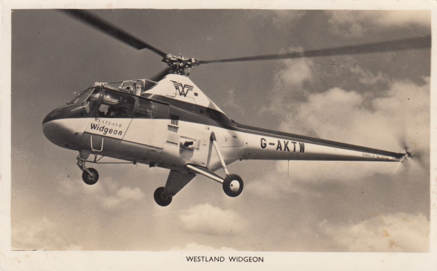
WESTLAND WIDGEON
WESTLAND AIRCRAFT LIMITED
YEOVIL, SOMERSET
Privately Issued Official Postcard
Normally, I would do some research and look - into the history of an aircraft which appear on a postcard in my postcard collection but here they have saved me effort as there is a quite detailed history already printed on the reverse side of this postcard (see below)
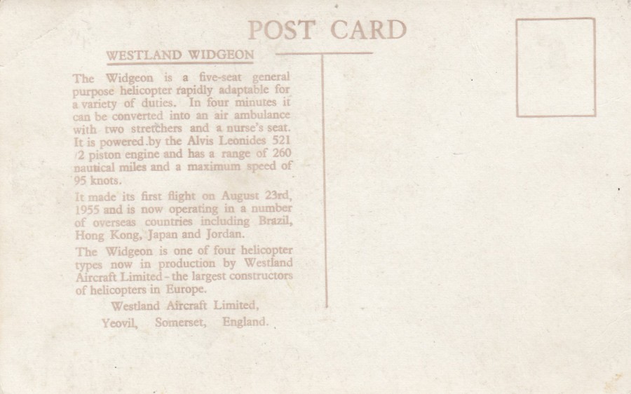
REVERSE SIDE OF ABOVE POSTCARD
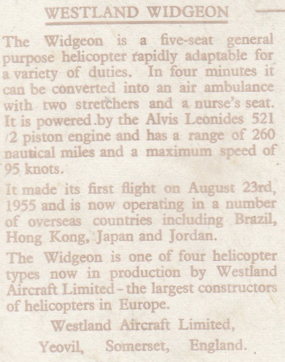
Enlargement of printed text area

26/01/2018
CAN YOU SURVIVE
JURASSIC PARK: THE LOST WORLD
SONY PLAYSTATION GAME
Published by
BOOMERANG MEDIA
As I type this I am watching a documentary film called ‘DINOSUAR 13’, it is about the discovery of a Tyrannosaurus Rex fossilised skeleton in the US. More importantly it is about the governments subsequent seizing of this skeleton and the attempt by the US Government to take the fossil finders and their institute to court. It is a fascinating story and there is no doubt that the fossil hunters, all professionals and seemingly, from what I can see, going about their hobby, which they had turned into a respectable business, with all the right intentions, were not criminals. The story is catastrophic, in my opinion, and I recommend it to all those who enjoy an interesting true story. The film was the winner of the 2015 Emmy Award for Outstanding Science & Technology Programming. The Tyrannosaurus skeleton found was named, by the fossil finders who recovered her, ‘Sue’ after the female palaeontologist who made the initial discovery, Sue Hendrickson. The most amazing part of the skeleton was the skull, the largest found at the time. After a complicated set of events the skeleton was sold by Sotheby’s in Oct 1997 for $7.6 million. The skull depicted here on this postcard jumped out at me when I was going through my scanned postcard images and therefore had to posted. It also cost me nothing as it was a free Boomerang card, although now you would expect to pay 50p from a dealer (and £1+ on eBay) for this card – much cheaper than $7,500,000
26/01/2018
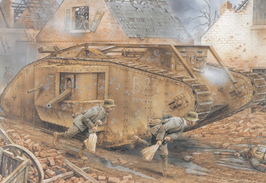
THE CRIPPLING OF ‘BANDIT II’
FONTAINE – 23RD NOVEMBER 1917
Artwork by
PETER DENNIS
From the OSPREY PUBLISHING BOOK: CAMBRAI 1917 (Book Reference: Campaign 187)
Published by
OSPREY PUBLISHING LTD
Postcard from:
BATTLE
SCENES FROM HISTORY’S GREATEST CONFLICTS
(BOXED SET)
A SET OF 40 POSTCARDS
Last night I attended the first ‘Essex Police Military History Club’ talk of 2018. The talk was about the use of tanks during the first world war Palestine campaign. The facts were fascinating despite their only being eight tanks involved in the campaign. It would be interesting to know if there were any postcards issued at the time depicting any of these tanks, but there may not be.
All the talk about tanks lead me to looking through some of my collection to see what I could find to post today in recognition of a talk I enjoyed very much. I have some original WW1 tank postcards, but I also remembered this smashing artwork of an actual tank involved in the Cambrai offensive.
The postcard is from a boxed set of 40 ‘Battle’ postcard images taken from the campaign books published by Osprey Publishing, probably some of the best individual campaign books you can find. The cards in the set are all quite large, around A5 size, but this does show off the superb artwork used. The cards over many periods from 933AD through to WWII. As you can see from the quality of this design the cards contained in this box set are excellent and it is well worth seeking out.

25/01/2018
DE MORT
I suspect this card was published by DE MORT and that this is not the title of the card, despite this being the heading on the reverse side.
This unusual skull design depicts a skull with roses for the eye-sockets and what appears to still be its brain on display. It is ‘definitely’ a striking design and I know it will be one which splits people’s views. There is something gothic about this image which is why I think it appealed to my son and his wife who bought it for me for Christmas, amongst other cards, including one already posted. I have always liked the unusual and thus this appeals to me, in a weird sort of way. I also doubt this has a wide circulation.
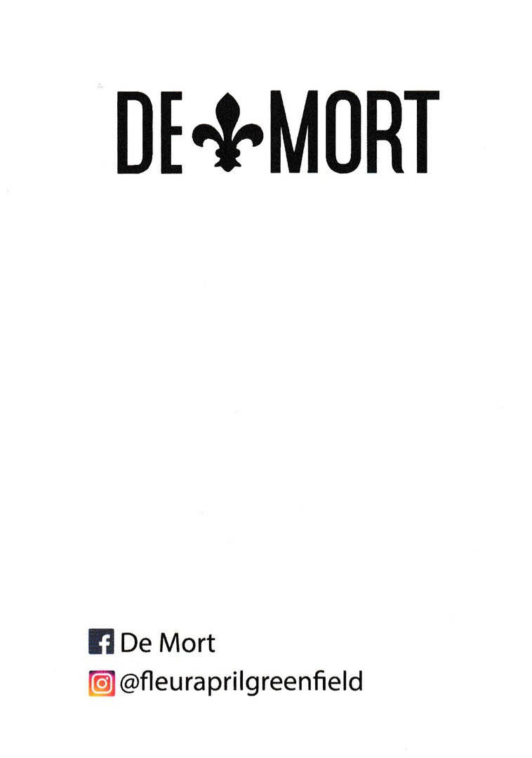
REVERSE SIDE OF ABOVE POSTCARD
25/01/2018
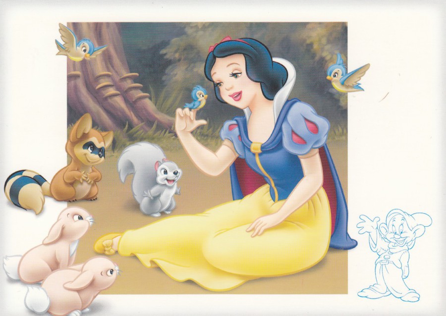
SNOW WHITE
DISNEYLAND RESORT PARIS
Official Theme Park Postcard
This Snow White design is from a series of similar styled postcards where aspects of the design, mostly characters, bleed over into a thick white boarder. They also have a small uncoloured character, related to the main character depicted on the postcard, in one of the bottom corners. Here the character is one of the seven dwarfs, Dopey.
I bought this postcard for just 99p, which would have been a good enough price on its own except this postcard has a little extra addition on the reverse side.

REVERSE SIDE OF ABOVE POSTCARD
Signed at the Theme Park
By the character
SNOW WHITE
I am always interested by the large number of people who I see queueing up to meet the characters at the various Disney Theme Parks. To be fair, I have done this myself for a couple of ‘meet & greets’, mainly the Mickey Mouse one located in the Town Square building at the start of Main Street in the Magic Kingdom, Florida. In fact, I have already depicted the Mickey Mouse signed postcard I obtained on that occasion.
Although I am not someone who goes out of my way to meet & greet I can see how the children, and many adults, enjoy these encounters. I have also watched the children obtain the signatures of the many characters in autograph books, although you do also occasionally see other things being signed as well. I often wonder though why more postcards are not used to obtain these signatures as it seems to me that these are ideal and would make for a really nice collection.
One fact I am aware of is that the people who portray these characters all have specific training for that character. This training includes how to do the signature for that character. This way all the signatures always look the same, no matter when obtained, which theme park obtained in and how many different times it is obtained. This is one of those little things which make Disney so special.

PHOTOGRAPH
Snow White Character at Disneyland Paris

25/01/2018
L’OREAL
NEW ID COLLECTION
IDENTITE
FREE TATTOO TRANSFER
Anonymous Printer / Publisher
NOVELTY POSTCARD WITH ATTACHED FREE PACKAGED TATTOO
From the front of this postcard it would be hard to tell it is a novelty item. But, you can just see the ends of the staple that has gone through to this side on the actual card, although here on the scan you can not see it. There is a tattoo of a lizard on the neck of the female in the photograph. A free copy of this lizard tattoo is attached to the rear of the postcard (held on by that previously mentioned staple). I have always collected postcards with unusual additions like this either applied or attached to them. I think this might be the only one I have with a tattoo attached.
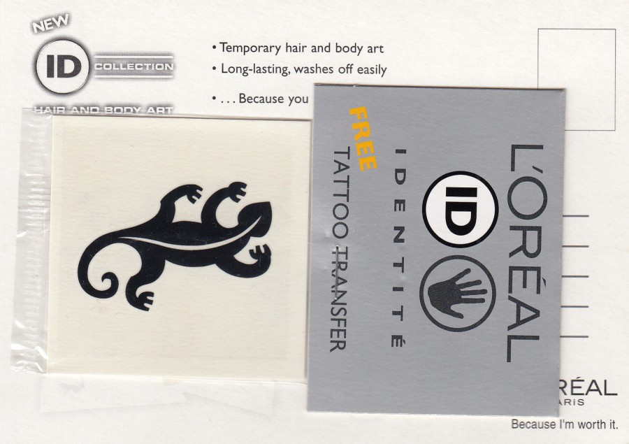
REVERSE SIDE OF ABOVE POSTCARD
The free Tattoo, one from the then new L’Oreal ID Collection, has been attached to the card, as previously stated above, by a staple (I wonder if this was done by a machine or by hand? I just have this vision of someone sat a desk just stapling these together!). I suspect some of these were used, possibly most of them, so mint copies with unused tattoo’s still attached might be quite scarce.
24/01/2018
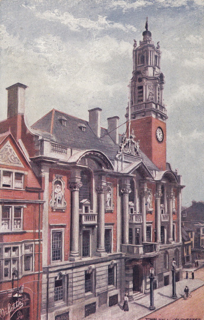
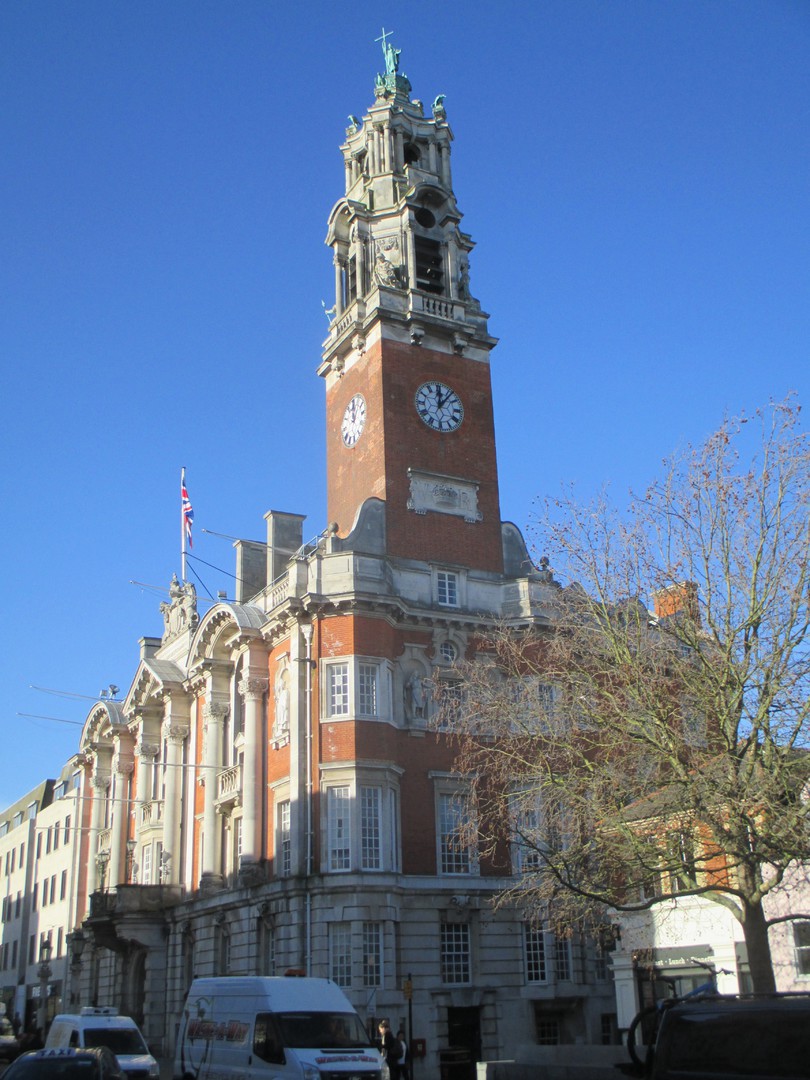
COLCHESTER
TOWN HALL
Published by
RAPHAEL TUCK & SONS
In their:
“OILETTE” Series
Ref: [Regd.] Postcard 7209
Posted 28th May 1914
I have previously depicted an old photographic postcard of this building and the street it is located in. The building is much the same now as it was back when this painting of it was done. I visited Colchester last week and got to take some photographs of it as it is now (see below). I couldn’t capture a photograph from ‘exactly’ the same point as on the postcard as I would have had to be inside, and on an upper floor of a building on the opposite side of the street to have been able to do this. Still, I got some good street level images looking upwards on the building.
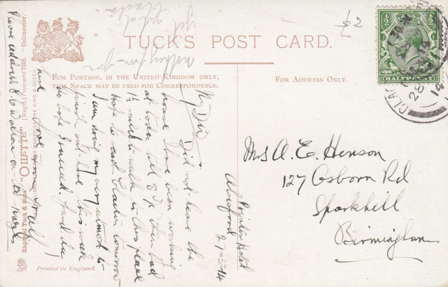
REVERSE SIDE OF ABOVE POSTCARD
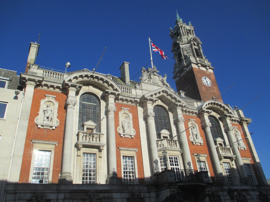
PHOTOGRAPH
Taken 18/01/2018
PHOTOGRAPH
Taken 18/01/2018
This photograph was taken from the other side than that as depicted on the postcard
24/01/2018
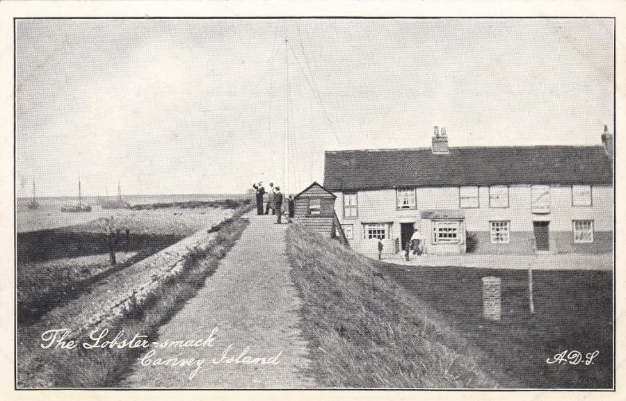
THE LOBSTER SMACK
CANVEY ISLAND
This is a pub located by the seawall in a rather isolated and out of the way location on the Island. Locally it is a well-known drinking establishment, but it is one you would only see if you went out of your way to visit it, as it has no signposts and is at the very end of a road which has not a lot else along it. Despite its isolation it seems to appear on a range of postcards:
THE LOBSTER SMACK
CANVEY ISLAND
Published by
A.D.S.
In
THE STOCKDALE SERIES
This is a black and white printed postcard, matt surface and not on photographic paper/card. This is at the cheaper end of postcard publication and was in a process that allowed for much higher production runs and prints. This is probably the oldest image in the selection which appears here.
REVERSE SIDE OF ABOVE POSTCARD
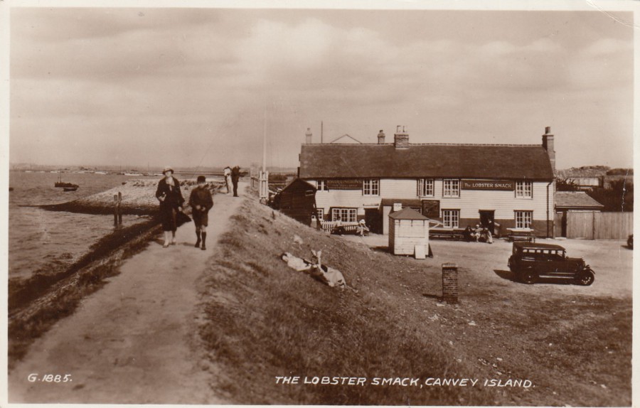
THE LOBSTER SMACK
CANVEY ISLAND
Published by
VALENTINE’S
Ref: G.1885.
The printing process here uses photographic card and the image is printed in an almost brown/sepia tone which was often used during the 1930’s (this copy here was posted in 1938). The old car adds an extra level of interest in this picture.
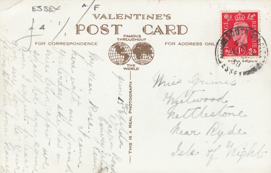
REVERSE SIDE OF ABOVE POSTCARD
The 1d postage stamp has been cancelled with a SOUTH BENFLEET, ESSEX circular date stamp dated 16th June 1938. I thought it slightly amusing that the card was going from one island to another; Canvey Island to the Isle of Wight.

“THE LOBSTER SMACK”
CANVEY ISLAND
Anonymous Publisher
Ref: 7212
This is what is classed as a ‘Real Photographic Post Card’. Almost certainly locally produced and probably the hardest of the three postcards depicted here to find. It is also the highest catalogued of the three cards as well. I paid more for this card than I did for the other two put together. But, then it is also the best image and by far the most collectible card of this selection.
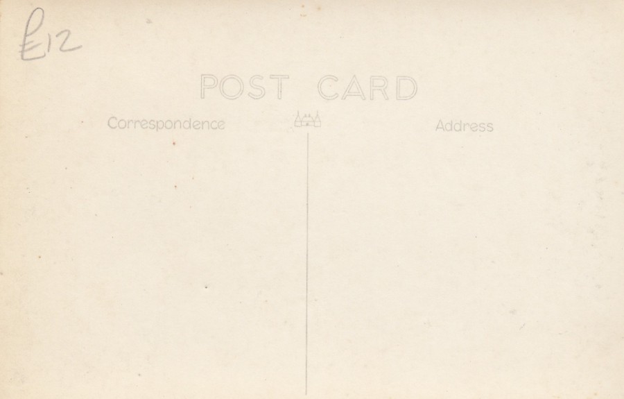
REVERSE SIDE OF ABOVE POSTCARD
As you can see, this cost me £12 when I bought it some years back, it was worth that price.
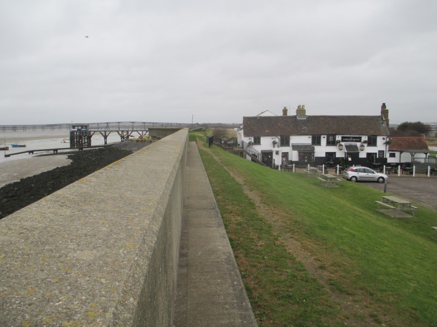
PHOTOGRAPH
Taken 07/12/2017
I took two photographs to go with this posting. This one is from slightly further back and shows more of the sea wall which went up after the floods of the 1950’s. Really, it is only this seawall which has changed the view here.
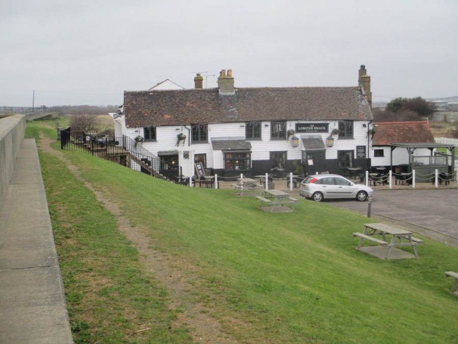
PHOTOGRAPH
Taken 07/12/2017
This is from a bit nearer and shows the pub changes. The entrance has been built outwards with a small slanting roof to the porch area, and there has been an extension built on the right side of the pub. Also, the old wooden rail going up to the seawall area has been replaced with a black metal railing. Otherwise, very little has changed here over the years - there is even a car parked in the same position, near enough, as in one of the above postcards.
24/01/2018
UNITED STATES OF AMERICA
TWO CENTS carmine on cream card
Higgins & Gage, World Postal Stationery Catalog
Section 18
United States - Page 7
Reference No: 55
Issued …. 1951
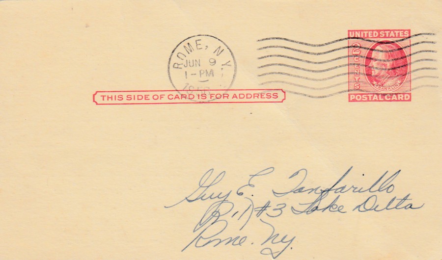
This is a much later postal stationery card as that previously posted below. This one has a carmine pre-printed postage stamp which has been postmarked with a ROME, NY [New York] machine cancel dated 9th June 1956. This was posted and delivered locally as it is also addressed to a Rome NY address.
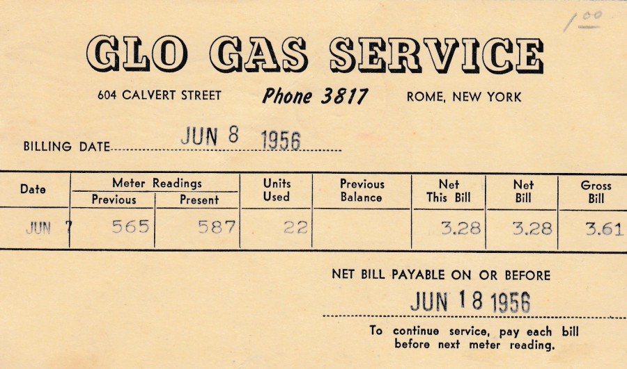
REVERSE SIDE OF ABOVE POSTAL STATIONERY POST CARD
GLO GAS SERVICE
ROME, NEW YORK
To be honest, it was this privately printed reverse side that drew my attention first. I like postal stationery cards with company adverts and other printings on this side, and this Gas Bill appealed to me. It is a piece of philatelic history and, also a piece of social history as well.
24/01/2018
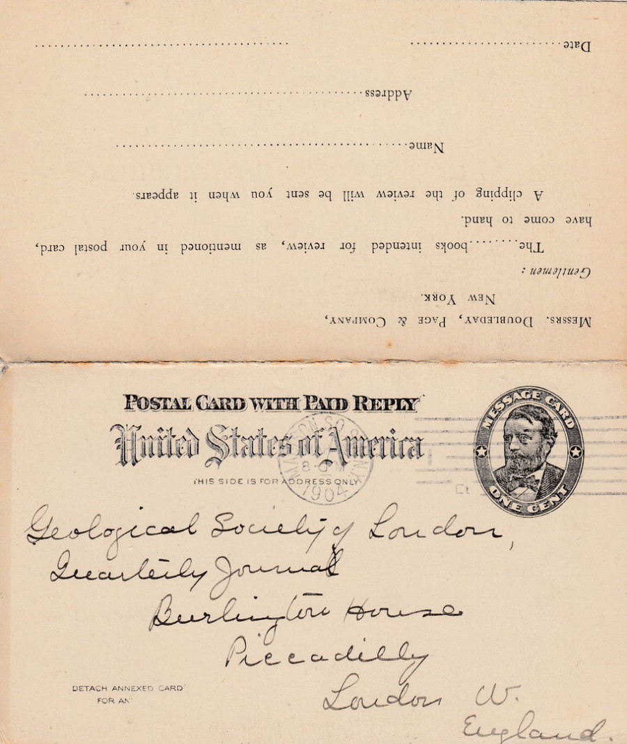
UNITED STATES OF AMERICA
POSTAL CARD WITH PAID REPLY
REPLY POSTAL CARD
ONE CENT + ONE CENT Black on light buff card
Higgins & Gage, World Postal Stationery Catalog
Section 18
United States - Page 2
Reference No: 11
Issued …. 1892
The pre-printed postage stamp (in this case stamps as this was a Reply Card) was a new stamp design featuring the head of President Grant. Here you can see the original out-going side with the card addressed to the ‘GEOLOGICAL SOCIETY LONDON’. The stamp has been cancelled with a ‘MADISON SQ. STA. NY’ [Madison Square Station, New York] straight line machine-cancel dated March 4th, 1904. The card was sent by the company DOUBLEDAY, PAGE & COMPANY.
This is a nice used example with the REPLY half still attached, as can be seen by the top part of the image.
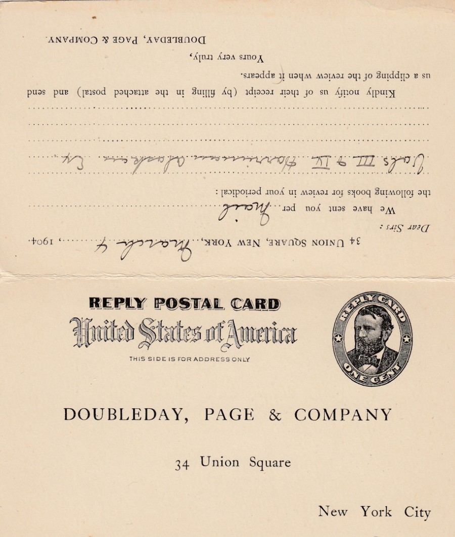
OPPOSITE SIDE OF ABOVE
REPLY POSTAL CARD
The half of the card designed to be used to send a reply to the original sender
For some reason the Geological Society did not reply to the sender and this half of the REPLY POST CARD was not used, thus the pre-printed stamp has not been cancelled and the card was not used as it was designed to be. On the top half, upside down here on this scan, you can see the original message as sent out by the company from New York. I like these early postal stationery cards and now that I have my own Higgins & Gage catalogues I can find out much more about these than I used to be able as the ones I did have had missing sections, including the USA sections.
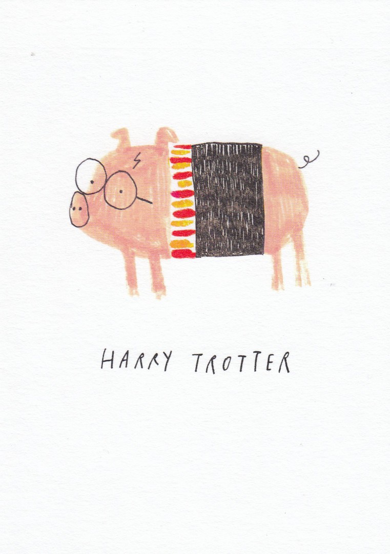
23/01/2018
OHH DEER LTD
CARTOON POSTCARD SERIES
Artwork by
Alex Willmore
I came across this series in November 2017, in another ‘paperchase’ branch (I have since seen them in one or two more branches, but not always the full series). I liked them because of their film and television connection and the often-irreverent content, but always in a comical way.
HARRY TROTTER
Harry Potter never looked like this!
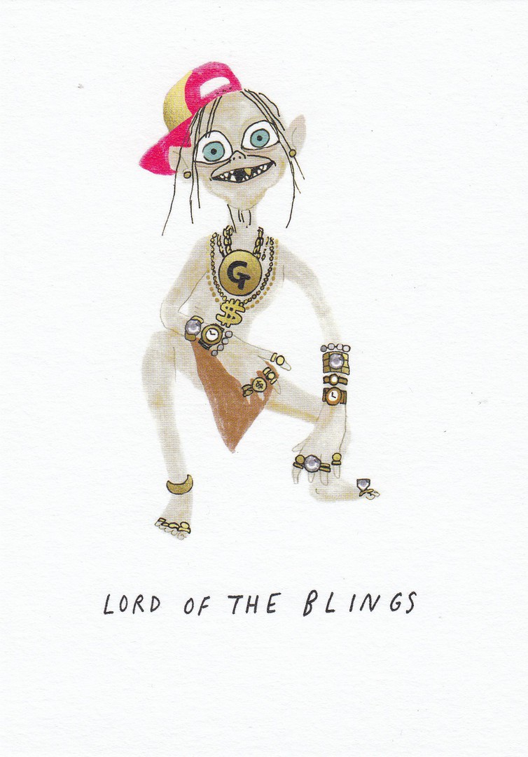
LORD OF THE BLINGS
Ref: AWM-PO-002
Gollum from the feature film version of the ‘Lord of the Rings’

GAME OF SCONES
Ref: AWM-PO-003
This one caused a slight giggle, and if you do not watch ‘Game of Thrones’ this is John Snow, as a scone

CAPTAIN’S LOG
Ref: AWM-PO-004
I suspect this would be classed as the most irreverent of the images in this series, and perhaps the most-naughty. I collect Star Trek related postcards and would have bought this one for that collection as the image is clearly representative of Captain Jean-Luke Picard from the Star Trek: Next Generation television series and films. It is also another card for my friend who collects toilets on postcard (someone has to I suppose, and why not).

FINDING EMO
Ref: AWM-PO-005
This is an intriguing series and I would love to find out if there are any more. In the shops I have so far searched in it is only these five, or an assortment of them, which have been placed out on sale. It is possible that the ‘paperchase’ shops are now one of the best places to search out new issue unusual postcards. I recommend you have a look inside, when you next pass one.

23/01/2018
TOMMY THE PONY
CLAIRVOYANT FROM TELEVISION
Anonymous Publisher / Printer
Plain Backed Card
But with hand written addition of:
‘August 1963’
I am always on the look-out for unusual television related cards so when I saw this one on eBay I decided to get it. I had not previously heard of Tommy the Pony, and if the handwritten date on the other side is correct, and I see no reason why it would not be, then this card is from the year I was born, so it is no surprise perhaps that Tommy was not known to me previously. To be fair I still know nothing about him as I can not discover any details. Still, it gives me something to try and find out and I like a mystery.