EMAIL ADDRESS - markspostcardchat@gmail.com
23/02/2020
(Top)
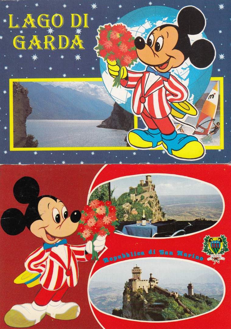
LAGO DI GARDA
Published by
GRAFICHE BIONADETTI SRL (VR)
FOTOEDIZ. RIVETTA SOUVENIRS – VIALE ITALIA 11/B – BRESCIA
Ref: 112/B
Made in Italy
(Bottom)
REPUBBLICA DI SAN MARINO
Published by
GRAFICHE BIONADETTI – VERONA
Ed. B. MARCACCINI - RIMINI
Ref: N.88/D
Made in Italy
There was a time back in the 1980’s when this type of postcard could be found all over Italy. I have only ever visited the country from a cruise ship, and I did not see any in Rome, Pisa or Naples where I got off, but I know that back s few decades ago I would have done. They were in fact so common that you often come across them in dealers stock and often priced at just 50p, although as an older type of Disney related postcard they are starting to gain some popularity with collectors and I expect that catalogue prices are due an upgrade.
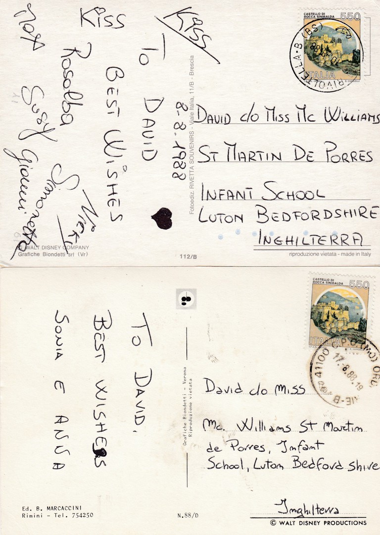
REVERSE SIDES OF ABOVE TWO POSTCARDS
Both these postcards are from the collection of ‘David’ a young boy who was attempting to enter the Guinness book of records for having the world’s largest postcard collection. The collection was later broken up and sold to dealers and collectors and there are now thousands of cards in collections addressed to ‘David’, normally care of Miss Williams. It should also be noted that although cards were sent to David from all over the world, I have seen more originating from Italy than almost any other country, with the possible exception of the USA.
23/02/2020
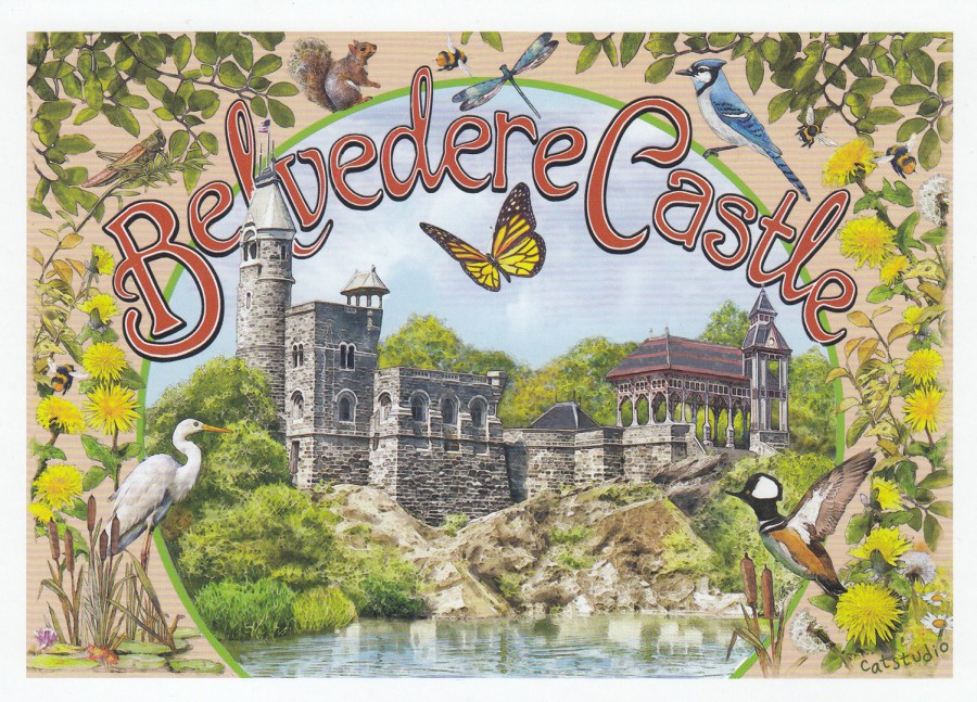
BELVEDERE CASTLE
Published by
CATSTUDIO
(PAPER COLLECTION)
Printed in PETALUMA, CALIFORNIA
2019
“Original artwork by catstudio of Central Park’s Belvedere Castle built in 1869 as a miniature whimsical structure. Belvedere means “beautiful view” in Italian, as the castle provides the highest, most breathtaking views of The Park”
(Text from reverse side of Postcard)
I did not know this beautiful structure existed until I came across it whilst walking through Central Park, New York with my daughter. It is a wonderful structure and you can walk up to the top of the tower that can be seen on the far-left side of this image.
I also liked the wildlife that appears in this design. In the bottom right corner of this design, you can see a Hooded Merganser taking off. I have had the good fortune to have seen these birds on several occasions in America, but only when I have visited during the winter months and especially February. Top right you have the Blue Jay which is a common bird which I saw in Central Park and which I have often seen in Florida as well. On the left side you have the Great Egret which can be found in Central Park and just about everywhere across Florida. I thought this was a lovely postcard and the only one that was on sale in the small but delightful gift area inside this unusual structure. I bought a copy as a great souvenir of finding this place.
23/02/2020
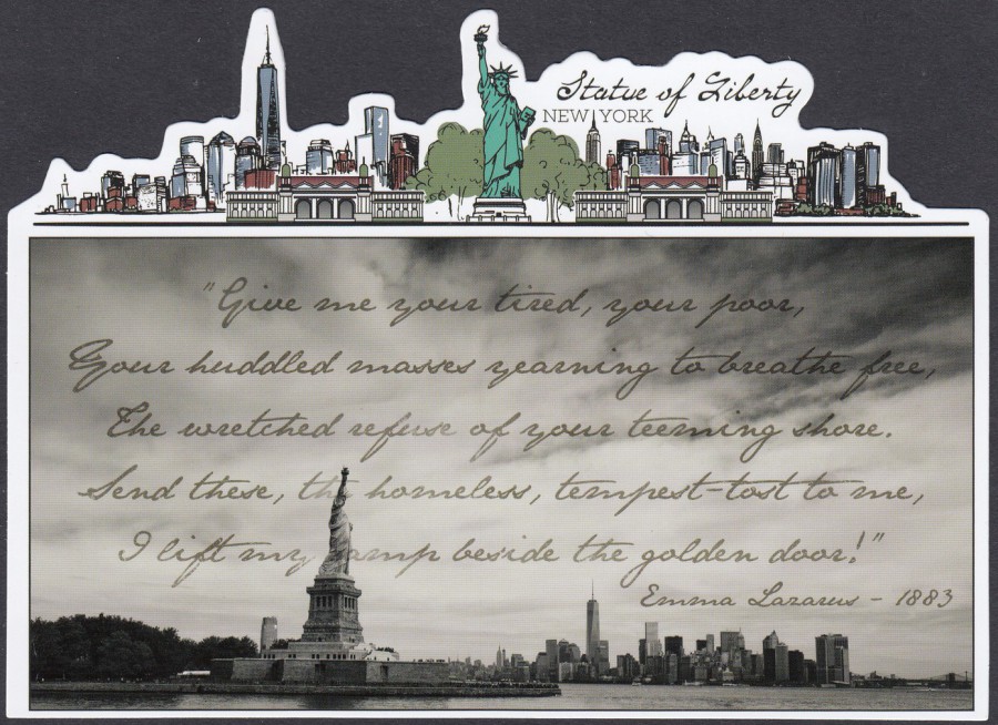
STATUE OF LIBERTY
NEW YORK
Novelty Shaped Postcard
Made Exclusively for the Statue of Liberty Museum Shop
Ref: LIB1722
I make no apologies for the number of New York themed postcards which have already appeared and will appear in the near future here on my webpage, but in my defence this time last week I was still in New York City, so the place is still uppermost in my thoughts and I did buy a lot of what I consider to be interesting postcards. This one here is one that is exclusive to the Statue of Liberty museum shop on the island where the statue is based.
REVERSE SIDE OF ABOVE POSTCARD
22/02/2020
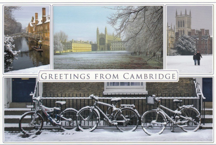
GREETINGS FROM CAMBRIDGE
Top Left: Queen’s Mathematical Bridge
Top Centre: King’s College Chapel
Top Right: St John’s College
Bottom: The Ubiquitous bicycle!
Published by
FOTOGENIX
Ref: SP 21
I am probably interested in this postcard at this time because I am reading a book called ‘The Mathematical Bridge’ which is a crime novel by Jim Kelly set in Cambridge in 1940. The book was only published last year and is the second in a series (the first book is titled ‘The Great Darkness’ which I have also recently read). The bridge from the main title is depicted top left and it is nice to see what it looks like for real. I should also say that if you like a good police procedural story set in the very early years of WWII then I can recommend this book and the one that preceded it.

THE MATHEMATICAL BRIDGE
By
JIM KELLY
Well worth a read
22/02/2020
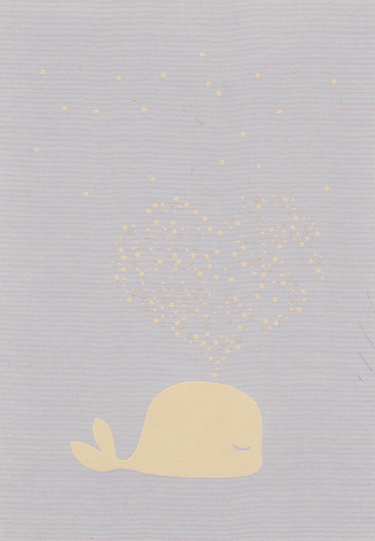
UNTITLED
WHALE & HEART
Published by
PAPERCHASE
This one is a relatively new addition to the collection and is another one of the many art designs available from this stationery store and its many branches
22/02/2020
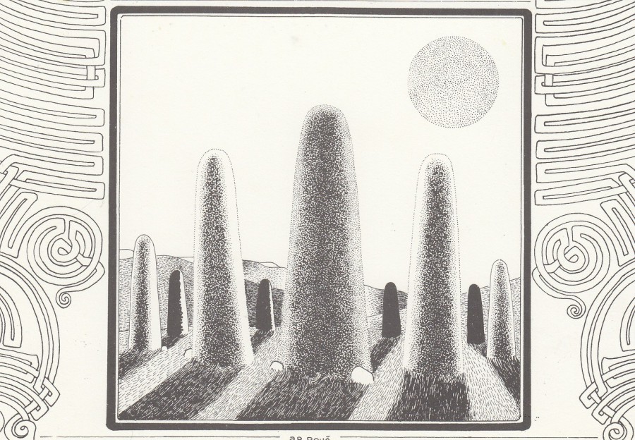
“MENHIRS”
ITINERAIRE GRAPHIQUE D’AR ROUE
Published by the Artist
A.R. ROUE
Printed by
CELTOIDES CREATIONS
MARQUE DEPOSSE BEL AIR 85290 ST LAURENT S/SEVRE 1984
Ref: LA SERIE No 2 COMPREND 6 CARTES DESSINS AR ROUE
The unusual black and white sketches by AR ROUE are a bit of an acquired taste, but they were very collectible during the 1980’s and in France AR ROUE was a very popular postcard artist and the cards were often issued in limited editions and were also often available signed by the artist. For some reason I have always liked these often-unorthodox images and their simplicity in design, black and white drawings, appeal to me. I now have the bonus that unlike during the 1980’s and 1990’s they are much cheaper now to buy when you can come across them. Originally these were over £1 each, a bit more if signed, but now, 20 to 30 years later, you can pick up copies for less than 50p sometimes, if your lucky.
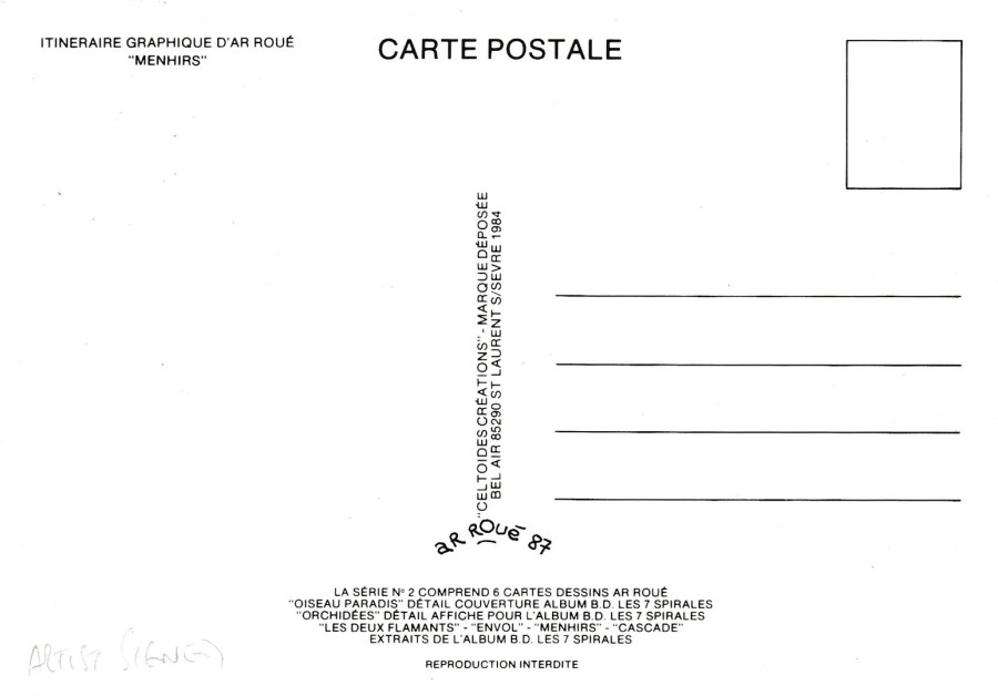
REVERSE SIDE OF ABOVE POSTCARD
SIGNED BY THE ARTIST
A R ROUE
The artists signature is often missed on these cards because the signature is so nicely and neatly applied. The signature appears underneath the two vertical centre lines of text, and as is normally the case the artist puts the year date numbers that he signed it as well, so here it reads as ‘AR ROUE 87’. I suspect that you can now see why dealers often miss the fact that these cards are signed, but if you see this arched signature then you will now know that your card is signed.

QUISTINIC (Morbihan)
POUL FETAN
Village du 16 e’ S.
by the Artist
A.R. ROUE
Printed by
L’AVENTURE CARTO – 56310 QUISTINIC
1986
Another design by this artist. The designs are very simple in that they are flat black and white images, but I think the images are intricately drawn and quite beautiful on the eye.
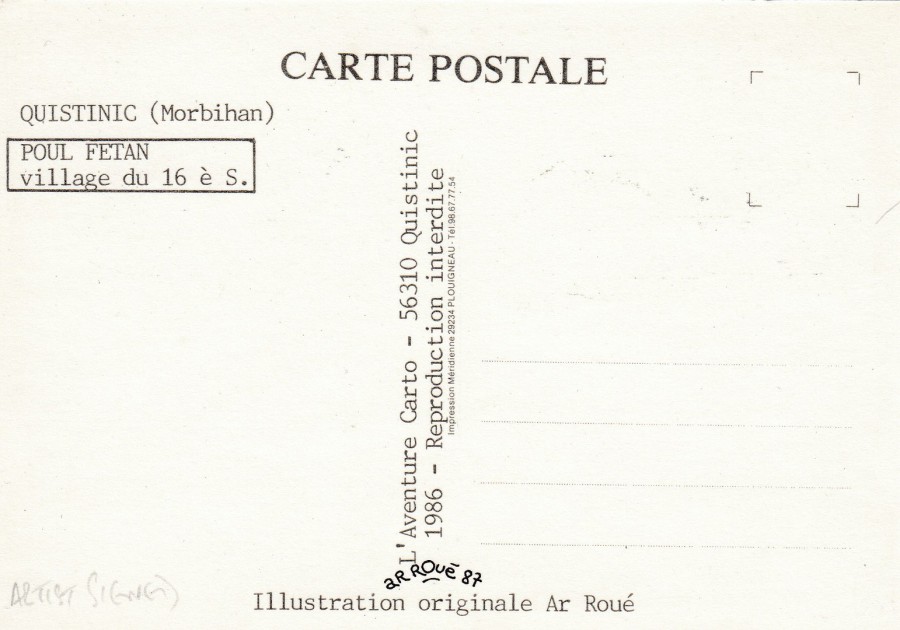
REVERSE SIDE OF ABOVE POSTCARD
SIGNED BY THE ARTIST
A R ROUE
Another signed copy. Signed in the artists arched style in the normal location of centre under the vertical centre lines of text.
22/02/2020
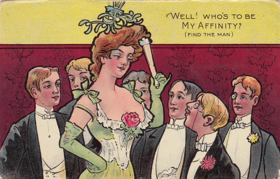
WELL! WHO’S TO BE
MY AFFINITY?
(FIND THE MAN)
Unknown American Publisher
Ref: AFFINITY SERIES No 1
The humour here is wrapped up in the meaning of the word ‘Affinity’ which is:
“a feeling of closeness and understanding that someone has for another person because of their similar qualities, ideas or interests : a liking for or an attraction to something : a quality that makes people or things suited to each other”
So, there you go, hopefully you now get this old golden age era joke, mild as it may now be, I suspect it had more of a risqué tone back then.
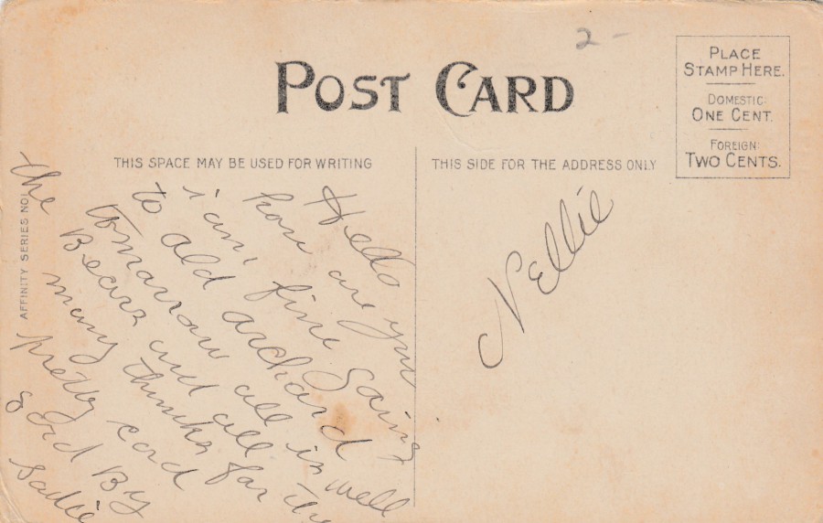
REVERSE SIDE OF ABOVE POSTCARD
21/02/2020
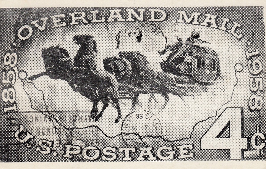
1858 – OVERLAND MAIL – 1958
U.S. POSTAGE 4c
Unknown Publisher
Plain Backed Card
This postcard image shows the 1958 US Overland Mail Centennial 4c stamp issued on the 10th October 1958. The ‘SAVE THE EASY WAY – BUY THE BONDS OF – PAY ROLL SAVINGS’ slogan cancellation is dated the 10th October 1958, the first day of issue date for the depicted US stamp on the postcard, although no actual stamp is applied to this side.
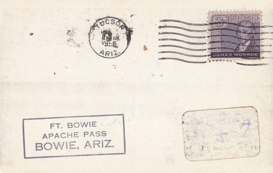
REVERSE SIDE OF ABOVE POSTCARD
(Although this appears to have originally been a plain backed card)
This has a 3c James Monroe postage stamp applied (US #1105) which was issued on the 28th April 1958. This appears to have been cancelled with a TUCSON wavy line cancel with an unclear date stamp although the year 1958 can be made out.

21/02/2020
GRAND PRIX CIRCUIT
SILVERSTONE
By
GAVIN McCLEOD
Published by
ATHENA INTERNATIONAL, LONDON
Ref: 9331
This card was my favourite from the small set of these ‘Grand Prix Circuit’ Athena postcards. Other designs feature the circuits at Monza and Monaco, although I always liked the John Player Special paintwork on this formula 1 car.

21/02/2020
CLEY WINDMILL
NORFOLK
Novelty WOODEN Postcard
Published by
THE WOODEN POSTCARD COMPANY
Design by
WHITE-ONE-SUGAR
Printed on FSC wood
Another of the currently available (although you may need to visit Norfolk) wooden postcard designs that are still maintaining their popularity. I think this design might be a unique one which has not appeared before.
21/02/2020
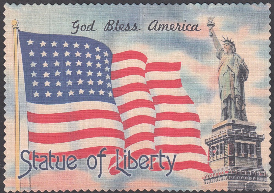
GOD BLESS AMERICA
STATUE OF LIBERTY
Published by
IMPACT PHOTO GRAPHICS
Ref: 57875
I liked the look of this one when I saw it and I also like the linen effect of the card, something the earlier modern American postcard companies used, and which is an iconic American type. I was not aware that this type of card was still being used so was delighted when I saw this on sale when in New York last week.

21/02/2020
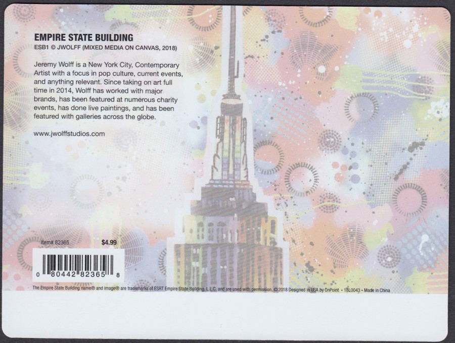
EMPIRE STATE BUILDING
LENTICULAR NOVELTY POSTCARD
Design by
JEREMY WOLFF
(Mixed Media on Canvas 2018)
Official Empire State Building Postcard
Ref: ESB1
Item# 82365
This superb moving image postcard was bought last week in the Empire State Building gift shop. It was not cheap at $4.99 (before tax), but it such an interesting design I had to buy it. If you want to see the full effect of this postcard there is a short video of it on our facebook page.
REVERSE SIDE OF ABOVE POSTCARD

21/02/2020
US BANKNOTE POSTCARDS
I found these very large us banknote postcards on the Statue of Liberty island in the smaller of the two gift shops (the one connected to the café/restaurant). The quality of the printing on these postcards is very high so I was surprised when I saw that these were just 99c each (before tax). The size means that a lot of collectors would not like them, but as regular viewers will know I do like large and unusual sized postcards and do add them to my collection.
It had some issues when scanning these cards and most of them would not scan at all, probably because of the colour changes across the notes in question, so, a small number of these images are proper scans whilst the majority are photographs which have been transferred over. The photographs will not be as good in quality as the scans.
Most of the details you need about the history of the depicted bank note is printed on the reverse sides, so I have depicted these to save me writing them all up.
$1 BANK NOTE
Large Sized Postcard
Published by
PIGMENT & HUE, INC
Made in the USA

REVERSE SIDE OF POSTCARD
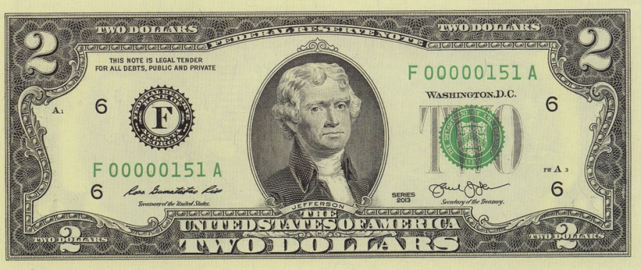
$2 BANK NOTE
Large Sized Postcard
Published by
PIGMENT & HUE, INC
Made in the USA
In all my visits to America, 12 now I believe, I have only ever received one $2 note, which I have kept for my collection as a souvenir.
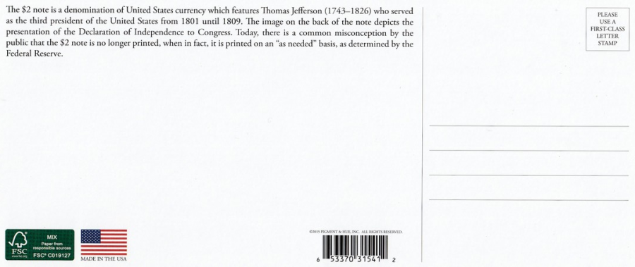
REVERSE SIDE OF POSTCARD

$5 BANK NOTE
Large Sized Postcard
Published by
PIGMENT & HUE, INC
Made in the USA
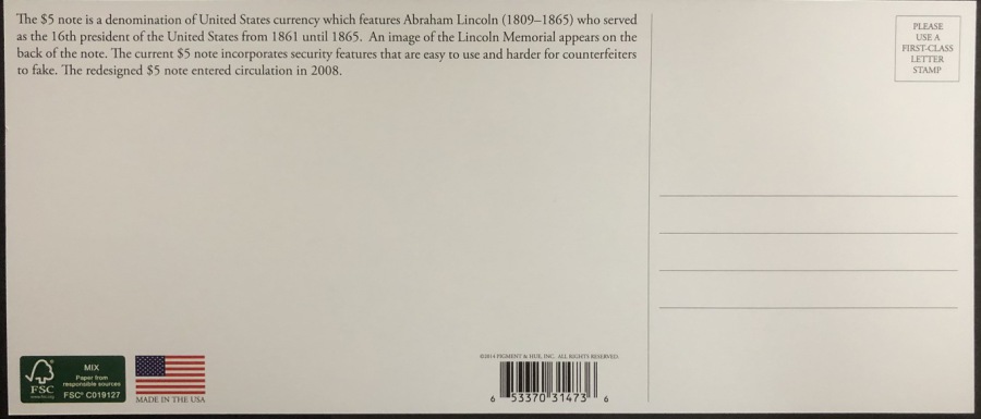
REVERSE SIDE OF POSTCARD

$10 BANK NOTE
Large Sized Postcard
Published by
PIGMENT & HUE, INC
Made in the USA
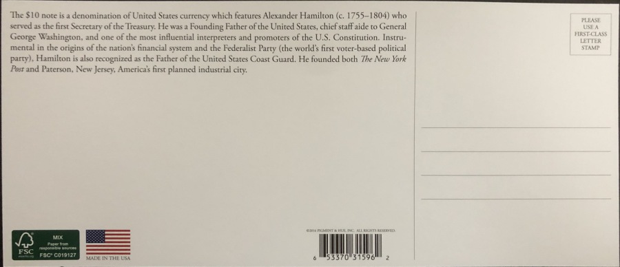
REVERSE SIDE OF POSTCARD
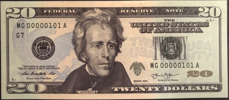
$20 BANK NOTE
Large Sized Postcard
Published by
PIGMENT & HUE, INC
Made in the USA
REVERSE SIDE OF POSTCARD
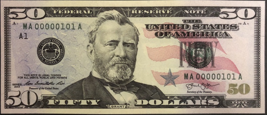
$50 BANK NOTE
Large Sized Postcard
Published by
PIGMENT & HUE, INC
Made in the USA
REVERSE SIDE OF POSTCARD
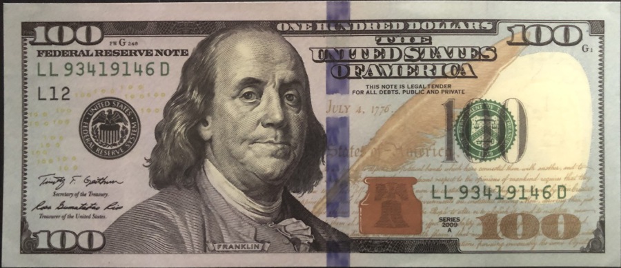
$100 BANK NOTE
Large Sized Postcard
Published by
PIGMENT & HUE, INC
Made in the USA
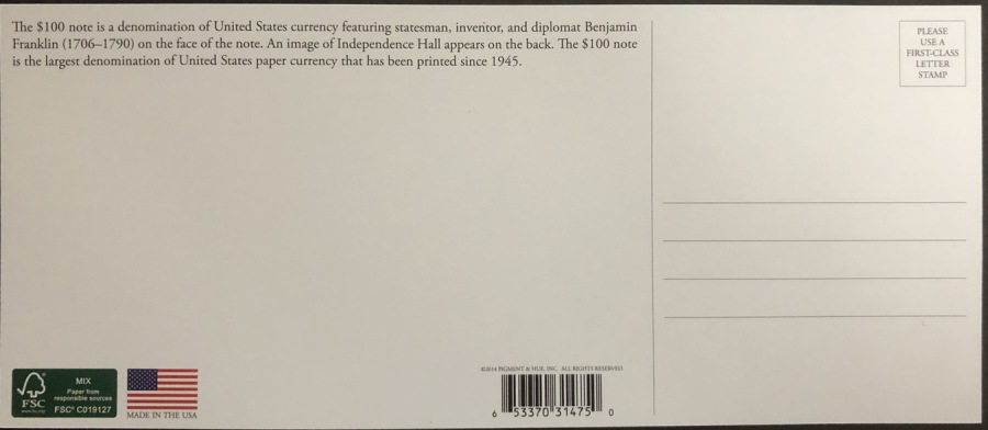
REVERSE SIDE OF POSTCARD
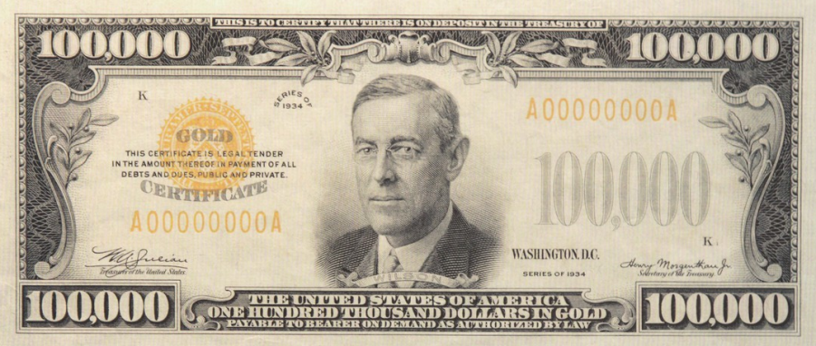
$100,000 BANK NOTE
Large Sized Postcard
Published by
PIGMENT & HUE, INC
Made in the USA
This was one high value bank note, but its no longer issued
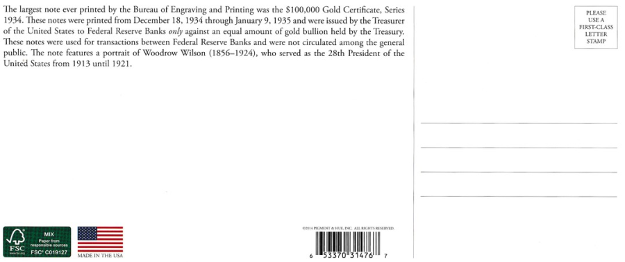
REVERSE SIDE OF POSTCARD

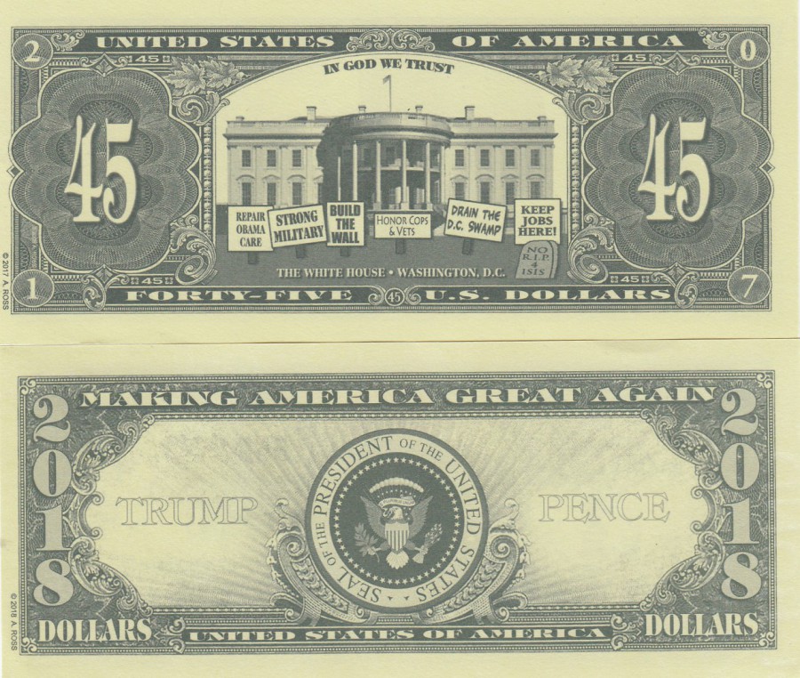
NON-POSTCARD ITEMS
FAKE US DOLLARS
These sell for between $1 and $2 each in tourist souvenir shops
There has been a popular trend for fake celebrity bank notes for many years now here in the UK, but the tradition goes back much further in the US. On my recent trip to New York I picked up these two Donald Trump bank notes as curiosity items and souvenirs.
19/02/2020
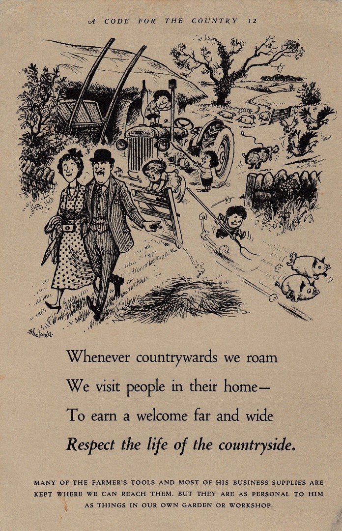
CODE FOR THE COUNTRY
“RESPECT THE LIFE OF THE COUNTRYSIDE”
By
NORMAN THELWELL
Prepared for the
NATIONAL PARKS COMMISSION
By the
CENTRAL OFFICE OF INFORMATION
Printed in England for Her Majesty’s Stationery Office
By
T. L. Ltd
Ref: CODE FOR THE COUNTRY 12
This is one postcard design in what was quite a large series of cartoon images especially drawn by well known British cartoonist Norman Thelwell (23/5/1923 – 7/2/2004) who is perhaps best known for this drawings of children on horses and ponies who are often depicted taking part in Gymkhana’s. I have a small selection of these cards but am far away from having a full set as these cards do not turn up very often. These are far harder to source than their value indicates. If you come across one and like it then I suggest buying it, especially if its under £3.
REVERSE SIDE OF ABOVE POSTCARD
19/02/2020
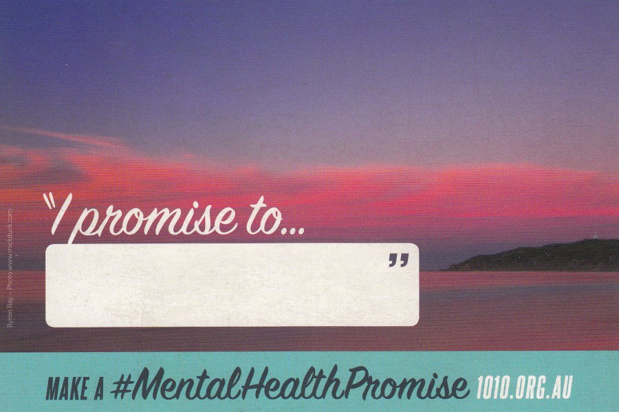
“I PROMISE TO…”
MAKE A # MENTAL HEALTH PROMISE
MENTAL HEALTH BEGINS WITH ME
2016 OCTOBER 10TH
WORLD MENTAL HEALTH DAY
Published by
AVANTCARD AUSTRALIA
Ref: #19981
A very simple postcard design, but one with a very important message. This card is unlikely to ever be very valuable, but not every postcard will be or needs to be.
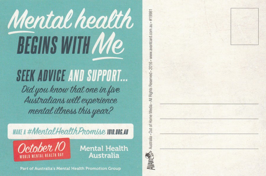
REVERSE SIDE OF ABOVE POSTCARD

18/02/2020
WICHITA POSTCARD CLUB
18TH WICHITA INTERNATIONAL
(POSTCARD FAIR)
21 -22 OCTOBER 1995
Show Theme: Advertising Postcards
Design by
RICK GEARY
Published by
WICHITA POSTCARD CLUB
Yet another Rick Geary postcard design. I have often mentioned that his artistic style is immediately recognisable. I have always liked his cards and have tried to obtain as many as I can.
18/02/2020
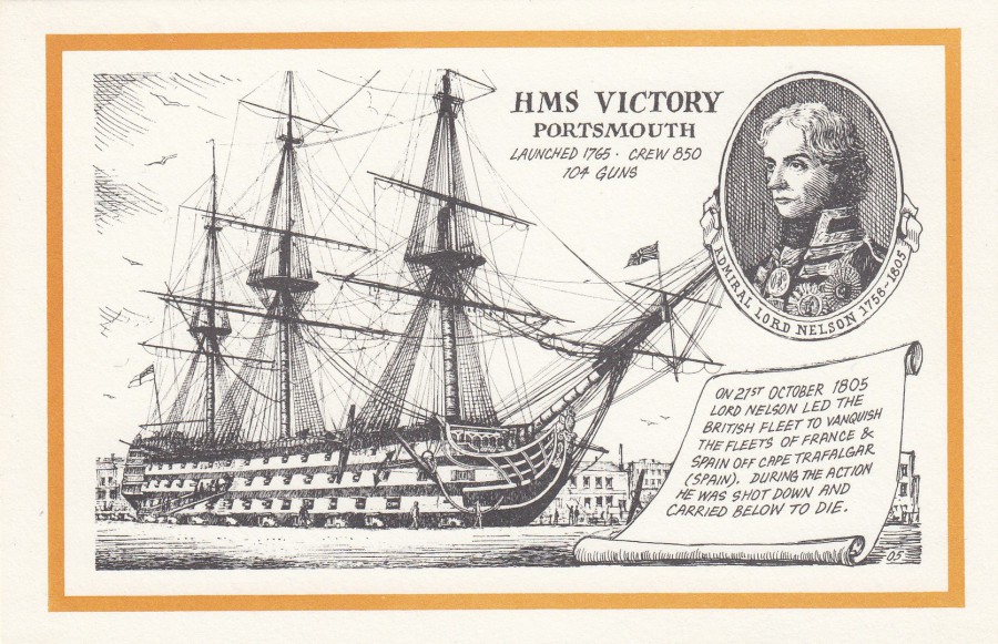
HMS VICTORY
PORTSMOUTH
Artwork by
JOHN MORTLOCK
Published as
SOUVENIR VIEWCARD
Ref: 05
I came across this postcard, and the one below, whilst going through a cheap box at a postcard fair. I thought the artwork here was lovely, but even more important though is the way this has been designed, as in the whole image and text combination. Looking at this postcard. Although there is no informative text detail related to where this card was published or sold, I obviously assume it is a card sold locally in Portsmouth, and perhaps the artist is also from this location, or nearby.
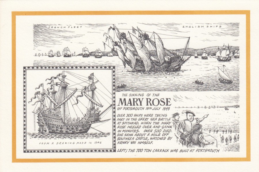
THE SINKING OF THE
MARY ROSE
OFF PORTSMOUTH 19TH JULY 1545
Artwork by
JOHN MORTLOCK
Published as
SOUVENIR VIEWCARD
Ref: 03
Having found the HMS Victory card, I then found this card further along in the cheap box. I think the HMS Victory design is the better of the two, but that does not detract from this excellent design. I have been interested in the Mary Rose story since she was brought up from the seabed and later preserved, well, one half of her frame anyway. I have also visited the exhibition and seen the recovered section of her hull. Quite a lot of postcards were issued around this time and I collected many of them, although I missed this one, although I think this one may have come out a little later.
REVERSE SIDE AS USED FOR BOTH OF THE ABOVE POSTCARDS
18/02/2020
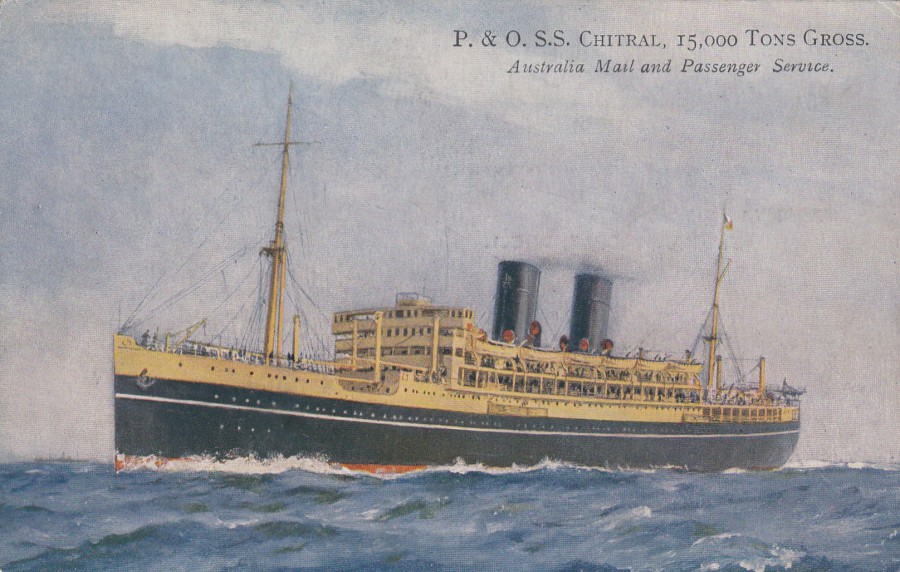
P. & O. S.S. CHITRAL,
15,000 TONS GROSS
AUSTRALIA MAIL AND PASSENGER SERVICE
Printed and Published for the
PREMIER HOTEL, RUSSEL SQUARE, W.C.1
Chitral is the capital of the Chitral District situated in Pakistan. The ship depicted here was built in Linthouse, Glasgow in 1925 by Alexander Stephens & Sons. Initially the ship ran between London and Australia via Suez and Colombo. In 1932 Bombay was added to her route. She was commissioned as an armed merchant cruiser in October 1939 and rescued the survivors of the HMS Rawalpindi off Iceland in that same year (23/11/1939). Later in the war, in 1948, she became a troopship and remained in naval service until the end of the war and beyond. She did not resume on her Australian route until 1948. She was broken up at Dalmuir in Scotland in 1953.
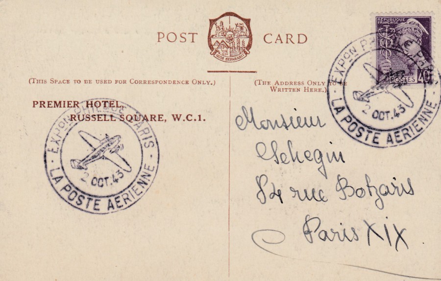
REVERSE SIDE OF ABOVE POSTCARD
This copy was posted in France from a philatelic exposition held in Paris in 1943. The French stamp has been cancelled with a special airmail cancellation for the event. So, what you have here is a British postcard used in France during the period of German occupation during world war II. I think this fact alone is enough to make this postcard that little bit more interesting.
17/02/2020
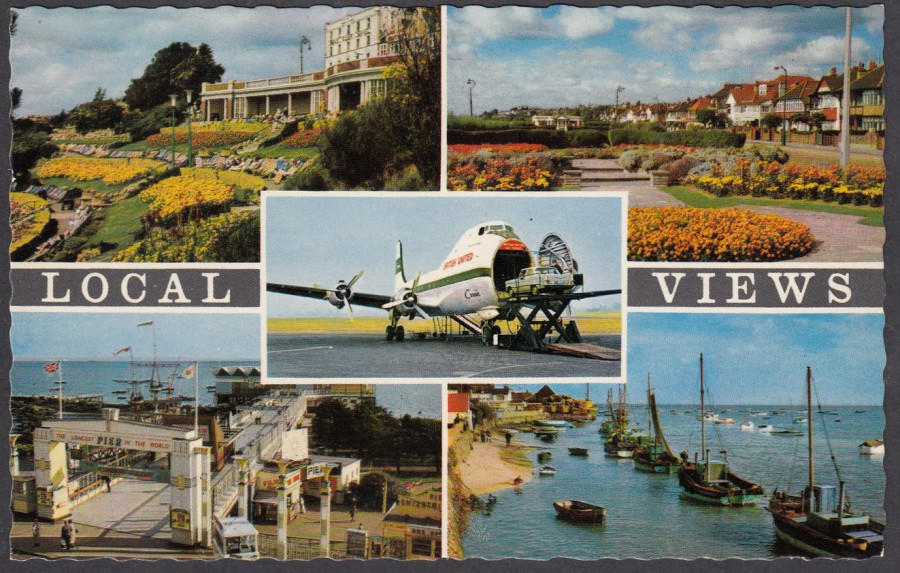
LOCAL VIEWS
SOUTHEND ON SEA
WESTCLIFF-ON-SEA Cliff Gardens LEIGH-ON-SEA Marine Parade
SOUTHEND AIRPORT
SOUTHEND-ON-SEA The Pier LEIGH-ON-SEA Cockle Boats
Published by
COASTAL CARDS LTD, Holland-on-Sea
Printed in Holland by
VITA NOVA
Ref: K. 632 A
We are back in our hometown of Southend-on-Sea after a few days in New York (which was covered by a variety of posts on our facebook page). Therefore, I thought I would post this older modern postcard which depicts some views of my home area. The top two views have only changed a little bit whilst I believe that the depicted Leigh cockle boats, bottom right, may well still be working (perhaps not all of them, but certainly some).
The biggest change would be in relation to the aeroplane shown in the middle. This is a ATL-98 Carvair and if you are a James Bond fan you may remember that this was how the films baddie ‘Auric Goldfinger’ flies his Rolls-Royce Phantom III put of the country, and this scene was filmed here at Southend Airport. This film scene was the first thing I thought of when I saw this postcard on eBay.
REVERSE SIDE OF ABOVE POSTCARD
15/02/2020
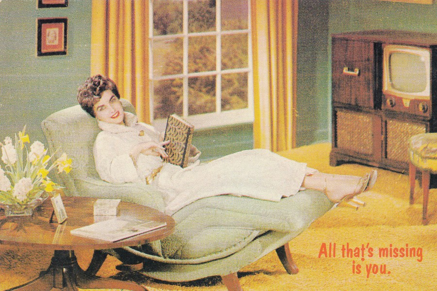
ALL THAT’S MISSING IS YOU.
Published by
MODERN TIMES
Distributed by
MAINE LINE CO., ROCKPORT
Printed in the USA
Ref: MT 045
An early US modern postcard from my television collection. Looking at it today I realise that it could also have been posted yesterday as a vague(ish) valentines day postcard, the message is corny enough
REVERSE SIDE OF ABOVE POSTCARD
15/02/2020
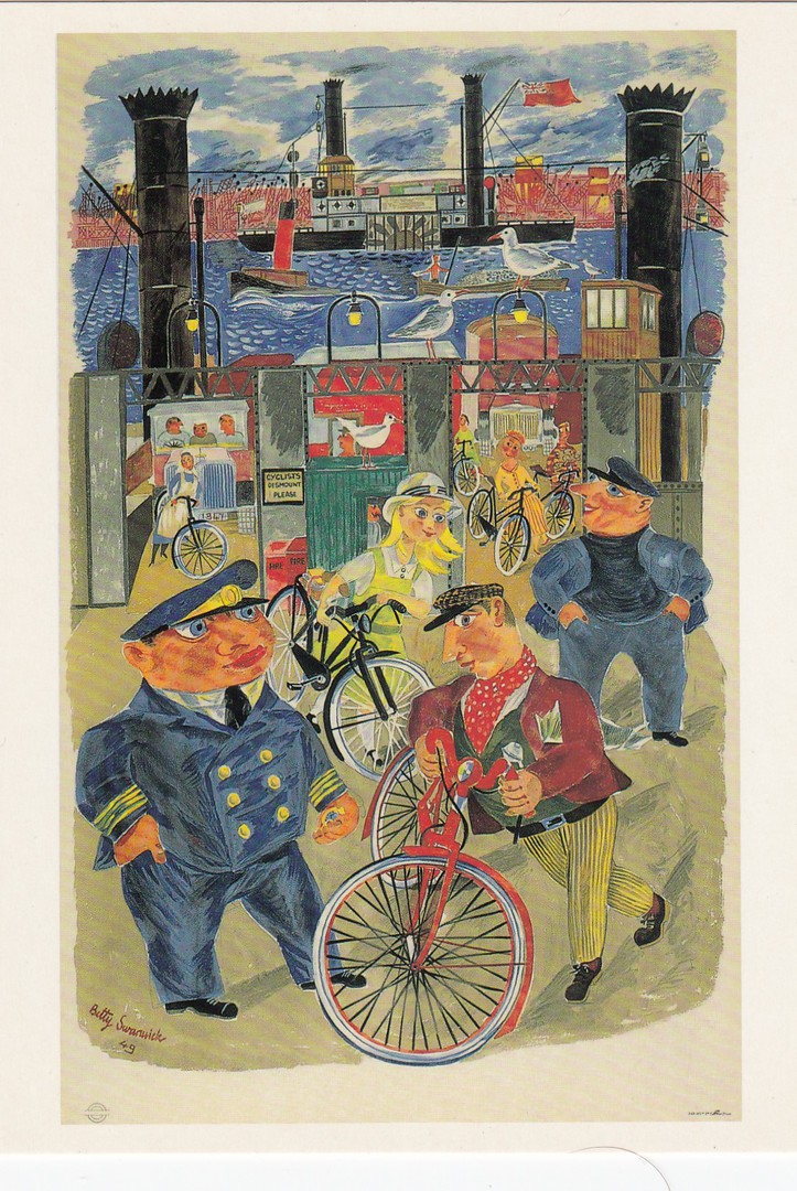
THE RIVER
By
BETTY SWANWICK
1949 POSTER
Published by the
LONDON TRANSPORT MUSEUM
Ref: LTM 667
Another good example of how this museum postcard series has covered all eras. This is a nice example of an early post WW2 poster from the museums collection.
15/02/2020
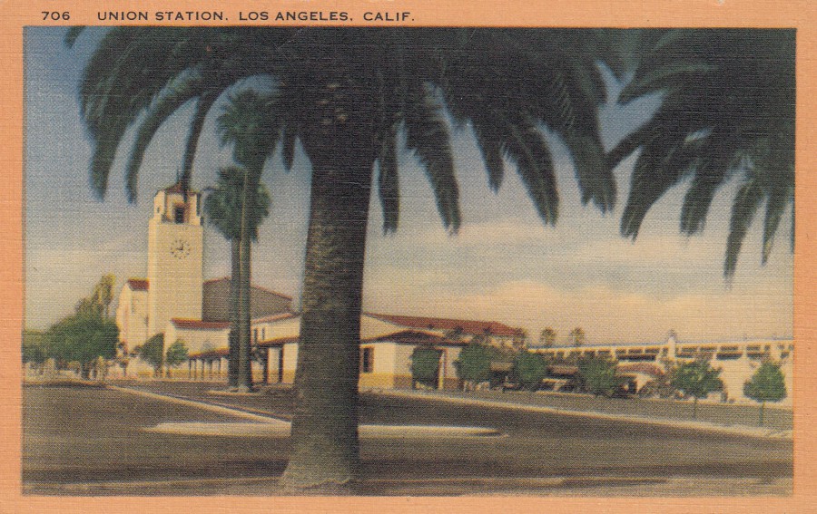
UNION STATION
LOS ANGELES, CALIFORNIA
Published by
LONGSHAW CARD CO., LOS ANGELES, CALIF
Ref: 706
(Linen Postcard)
This station covers 40 acres and cost 11 million dollars to build. It is in the Spanish architecture style of Southern California.
This was one of the stations we pulled into during our cross America train holiday back in 2018. I remember it well as I thought it one of the more beautiful exteriors of the stations we visited, not the most impressive (I think Washington DC was perhaps that) but certainly a lovely looking station.
Having only flown in and out of Florida on my previous US holidays I did not know much about US rail stations and I admit I had not known that more than one station was called ‘Union Station’. When I came across several on my trip I realised that it was not just a single name for one impressive station but is the standard name for stations which where the facilities are shared by more than one separate railway company (this allows passengers to connect between them for travel). Something which makes sense when you know it, but it was something I learnt and is why I enjoy travel so much (that and the ability to access more postcards of course…)