EMAIL ADDRESS - markspostcardchat@gmail.com
26/01/2020
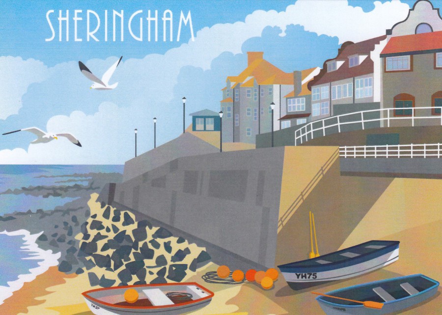
SHERINGHAM
“WISH YOU WERE HERE”
No Artist Named
No Publisher or Printer Named
Sheringham is a lovely seaside town in Norfolk (UK). It is located along the coastline to the west of Cromer, where I stayed for a few nights in our camper van late last summer.
I do like this style of block colour artwork, especially for local scenes. Clearly this one is sold locally in Sheringham and along this stretch of coastline, one very popular with summer tourists.
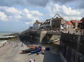
PHOTOGRAPH
This shows you how good the above artwork is in capturing the look of the place
REVERSE SIDE OF ABOVE POSTCARD

26/01/2020
STER CENTURY CINEMAS
NOVY SMICHOV
UVADI
NEJVETSI FILMOVE TRHAKY
DUBEN – CERVEN 2002
The Largest Film Markets
April – June 2002
Published by
BOOMERANG FREE CARDS
(BOOMERNAG MEDIA)
PRAHA
(Prague)
This is a proper advert postcard with lots of images and tons of text. It has a ‘Film’ theme and depicts scenes from four feature films:
TOP LEFT – THE SCORPION KING (starring the ‘Rock’ or Dwayne Johnson as he is now known in the film world)
TOP RIGHT – STAR WARS – ATTACK OF THE CLONES
BOTTOM LEFT – SPIDER-MAN
BOTTOM RIGHT – ASTERIX & OBELIX: MISSION CLEOPATRA
Needless-to-say, all these films came out in 2002 which is why they appear here on this cinema advert.
I know that Star Wars collectors will take anything that relates to the films and that the more unusual the better, and I think this would be a very unusual addition to a Star Wars collection.

REVERSE SIDE OF ABOVE POSTCARD

26/01/2020
WEDGWOOD MUSEUM
TRAIN,
FROM ‘TRAVEL’
Designed by
ERIC RAVILIOUS
Artist, Designer and Illustrator
(1903 – 1942)
Published by
MUSEUMS & GALLERIES MARKETING LTD
For the
WEDGWOOD MUSEUM
Ref: 232874PC
(Copyright 2011)
I love something different, and the best places to get postcards which depict something different is museums. The more unusual the museum, and more specialised, the greater the chance that they have, or did have in the past, postcards depicting subject matter unique to their displays. I don’t think you would find an image like this from any general postcard publisher.
REVERSE SIDE OF ABOVE POSTCARD

26/01/2020
GETTING MARRIED
“I FEEL SO WONDERFUL! –
AND THEY SAY THAT YOU FEEL EVEN BETTER AFTER YOUR FIRST DIVORCE!”
Published by
CHIC PIX
Ref: R105
This is a typical CHIC PIX styled postcard. They took black and white photographs from older eras, the 1950’s was popular, and then spot coloured them in and added pop art like boarders and colours which gave them this distinctive style. Then some sort of comic phrase or speech was added to finalise the design. This one relates to marriages and divorce.
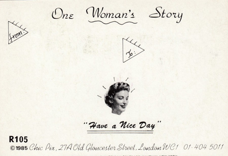
REVERSE SIDE OF ABOVE POSTCARD
The company also worked on the designs they put on the reverse side. They added little photographs and additional titles and other little bits and pieces, like the FROM and TO triangular shapes used here. Each postcard release had a different reverse side.
26/01/2020
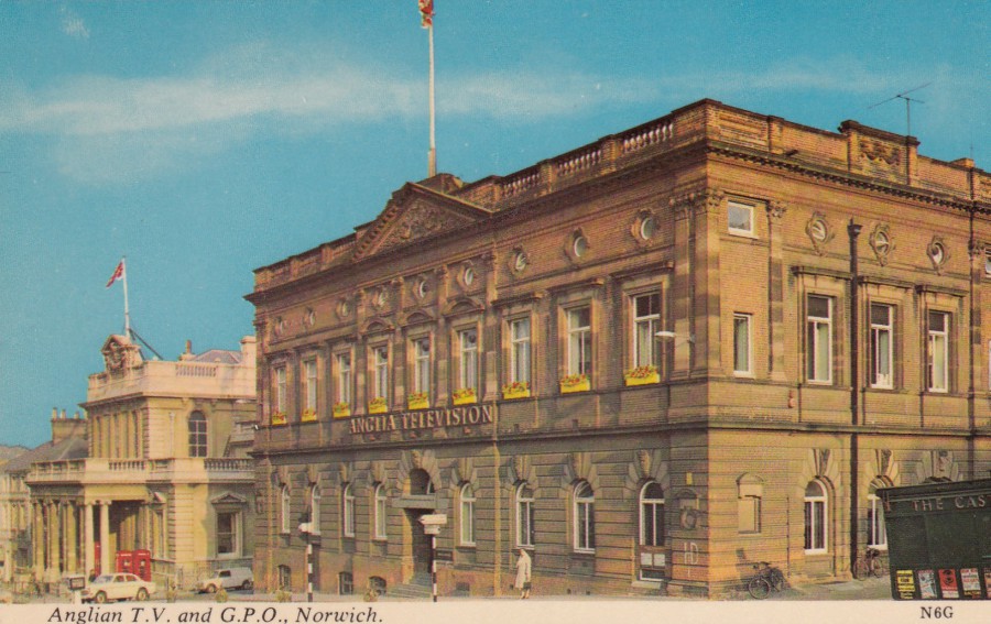
ANGLIAN T.V. AND G.P.O., NORWICH
Published by
HARVEY BARTON
(Harvey Barton Viewcard)
Ref: N6G
This is an excellent and unusual postcard from my television collection. The most popular TV cards are those related to specific programmes and actors, which is probably obvious, but I have always liked the ones which show studios, offices and other buildings like transmission towers and the like. This is probably why I like this card so much.
26/01/2020
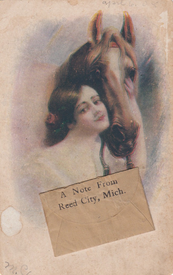
A NOTE FROM
REED CITY, MICH.
Novelty Postcard with attached brown envelope on the front
Unknown Publisher
American Postcard
This is another postcard I came across whilst in Florida. It is a ‘golden age’ postcard with a nice simple painting of a woman and a horse. This appealed to me because it has a small brown paper envelope attached to the front of it towards the bottom. I would probably have been interested in this item whatever, but when I opened the top of the envelope, I saw that there was a small piece folded paper inside which once removed had a message written on it. Seeing this I then had to have this.
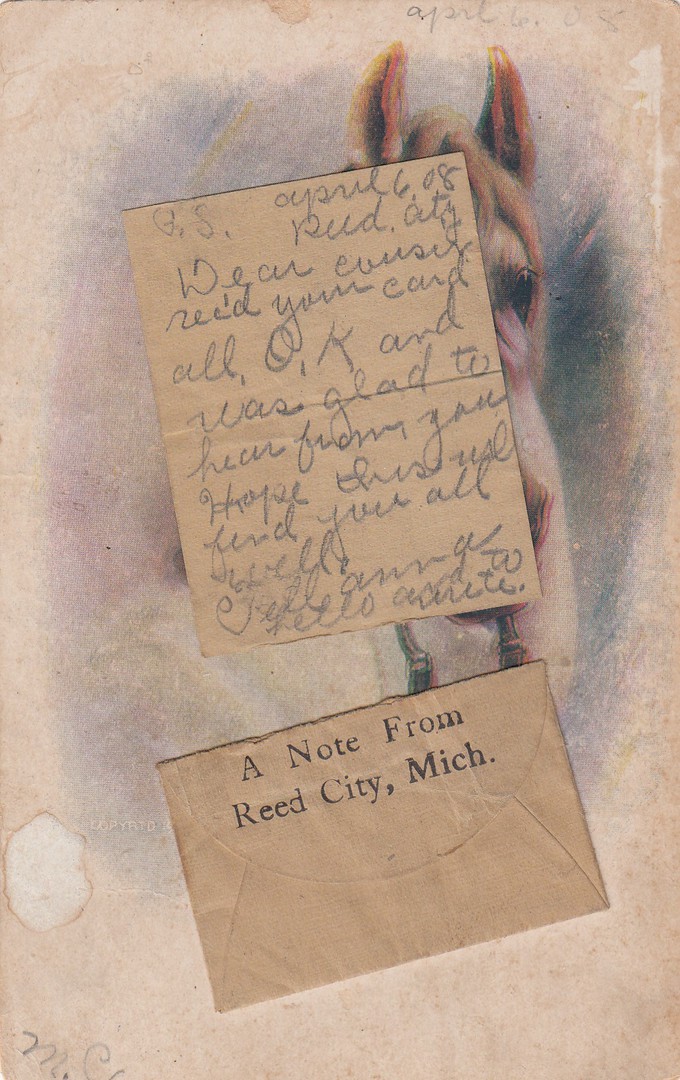
This is a scan of the same postcard but with the small piece of paper removed from the envelope and laid down on top of the card. The message is dated April 6th 08 [1908] and has REED CITY underneath this, which coincides with the location printed on the front of the envelope attached to this card. Having the written message still within the envelope adds interest for me, and I suspect would for many collectors, but I doubt it adds any intrinsic value to the item [I only paid $1 for this card, so it was certainly not considered valuable to the seller].

REVERSE SIDE OF ABOVE POSTCARD
This card has a 1c US postage stamp cancelled with a REED CITY, MICHIGAN cancellation of a type I have not seen before. It looks like there are dotted lines on the right side of this cancellation which could indicate an early machine applied cancel, but one I don’t know anything about. This cancellation is dated the 8th May 1908, which is two days after the hand written date on the letter which was inside the envelope on this card.
26/01/2020
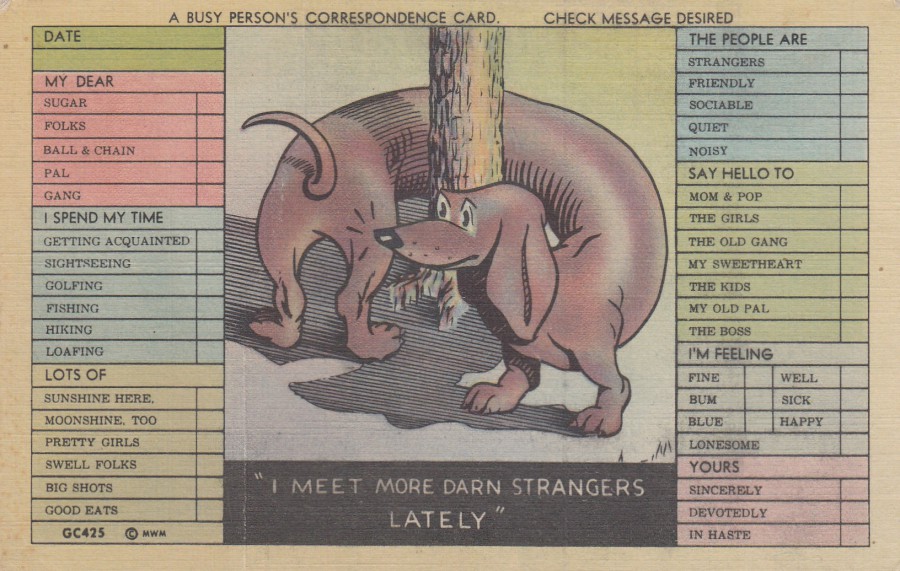
A BUSY PERSON’S CORRESPONDENCE CARD
“I MEET MORE DARN STRANGERS LATELY”
Published by
MWM- AURORA, MO
COLOR-LITHO POSTCARDS made only by MWM
Ref: GC425
I had to have this one as soon as I saw it. I came across it in Florida at the oft mentioned antiques fair at Mount Dora. It has a crease which can be seen but which I think does not distract greatly from how good this cards image is. I like novelty cards and this theme can include postcards which have been designed to be used in different ways. ‘Tick the Box’ designs have been around for a while, but this is a great early American version, and it has an amusing dog on it, who could resist!
REVERSE SIDE OF ABOVE POSTCARD
26/01/2020
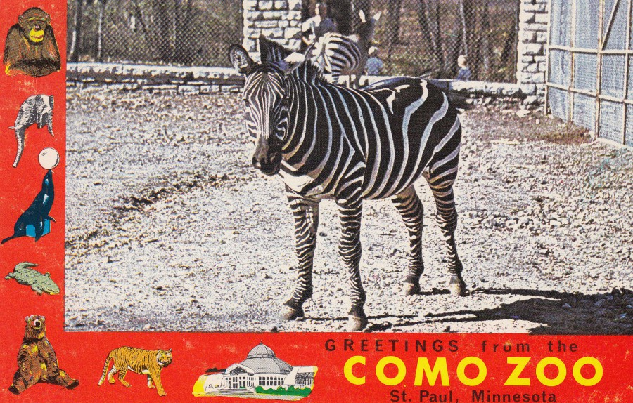
GREETINGS FROM
COMO ZOO
ST PAUL, MINNESOTA
ZEBRA
Published by
NORTHERN MINNESOTA NOVELTIES, CROSSLAKE, MINNESOTA
Ref: AUTHENTIC MINNESOTA SCENE J-90
308
Since being a kid, I have always loved zoo’s, and I visit zoo’s wherever I travel. I also have a collection of zoo postcards, not only ones from zoo’s I have visited. This card here I bought whilst in Florida when I attended an antiques fair. I couldn’t resist this one.

REVERSE SIDE OF ABOVE POSTCARD
26/01/2020
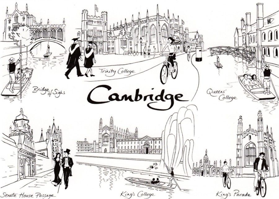
CAMBRIDGE
Bridge of Sighs – Trinity College – Queens College
Senate House Passage – King’s College – Kings Parade
Pen Drawings by
K. J. LEWIS
Published by
CAMBRIDGE ART.COM
Ref: BW1
Copyright 2011
We popped to Cambridge for a visit last week and spent some time exploring the local shops. I love doing this in tourist locations as it is a great way of hunting down postcards, and Cambridge did not disappoint. The three postcards depicted here caught my eye as they depict many of the Cambridge sights which I have seen through my many years of visits. I liked the simplicity of these and think the black and white drawings are superb (only one of which is repeated across the many images spread across the three cards).
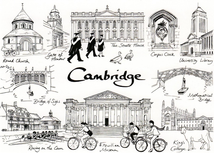
CAMBRIDGE
Round Church – Gate of Honour – The Senate House – Corpus Clock – University Library
Bridge of Sighs – Mathematical Bridge
Rowing on the Cam – Fitzwilliam Museum – King’s College
Pen Drawings by
K. J. LEWIS
Published by
CAMBRIDGE ART.COM
Ref: BW2
Copyright 2017
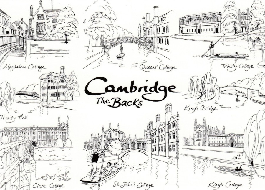
CAMBRIDGE
THE BACKS
Magdalene College – Queens College – Trinity College
Trinity Hall – King’s Bridge
Clare College – St John’s College – King’s College
Pen Drawings by
K. J. LEWIS
Published by
CAMBRIDGE ART.COM
Ref: BW3
Copyright 2017
26/01/2020
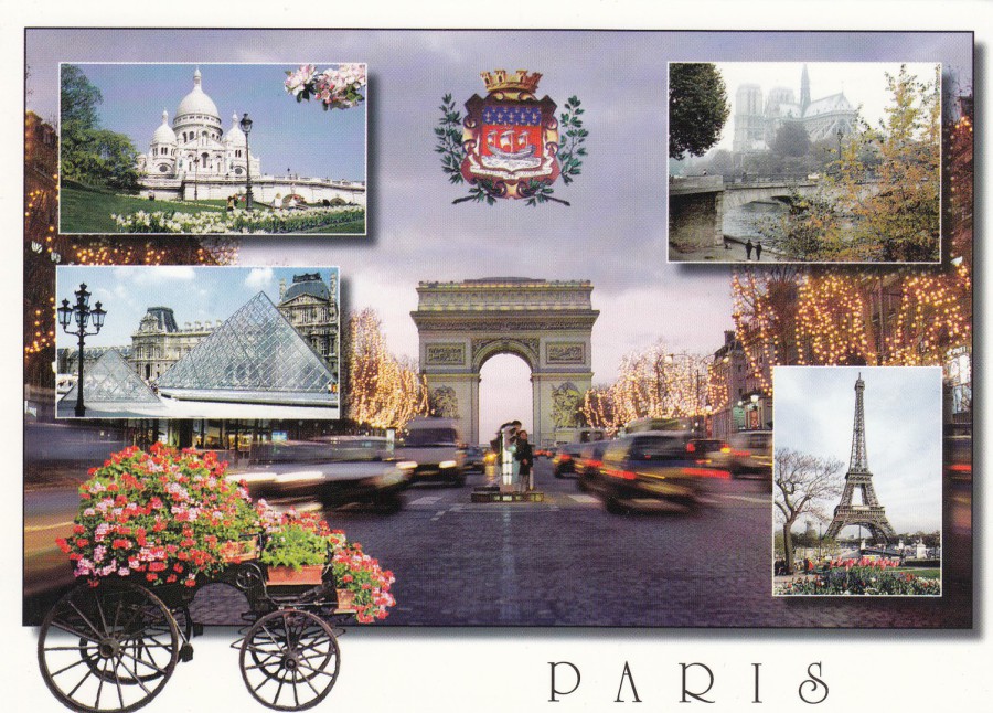
PARIS
PARIS ET SES MERVEILLES…
Published by
EDITIONS “GUY” – PARIS
Ref: PRODUCTION LECONTE
ALLIANCE CARTERIE
2688
I really must visit Paris one day as I have been fascinated with the city since I was young and have collected postcards depicting the Eiffel Tower since I started collecting postcards other than wildlife ones. Postcards like this one are clearly common tourist postcards, but this does not mean that they are bad, or not worth collecting and keeping. This multi-view card depicts many of the most tourist visited locations in this city. I am as interested in a modern issue like this as I am in one from 1930 or 1905, the postcard story continues on around us and a card like this is as important to the story as one which is over a hundred years old.
REVERSE SIDE OF ABOVE POSTCARD
26/01/2020
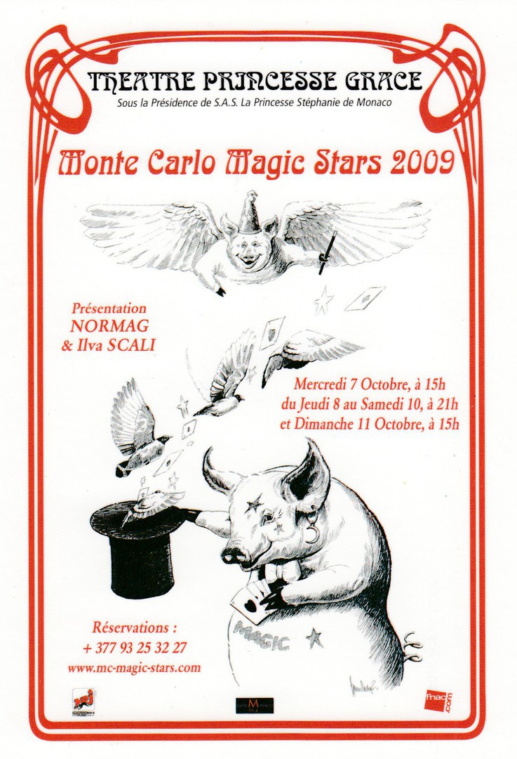
MONTE CARLO MAGIC STARS 2009
THEATRE PRINCESSE GRACE,
MONACO
Illustration by
SPENCER HODGES
Official Monte Carlo Magic Stars Event Postcard
I worked with someone who when he retired became a magician, specialising in small table entertainment close-up magic. He became a member of the Magic Circle and has travelled around performing magic and attending events. Jim attended one event where he managed to obtain an example of this postcard which was an exclusive one. This is the type of postcard I would almost certainly never have come across and is another example of why I have never shied away from letting people know that I collect postcards. One or two may laugh, but for every one of them there are ten or twenty who have been interested and have later obtained postcards during their travels for me. This is an excellent example of such a postcard, superb in every way.

REVERSE SIDE OF ABOVE POSTCARD
25/01/2020
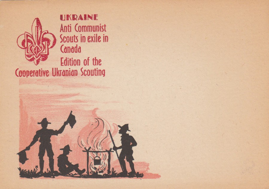
UKRAINE
ANTI COMMUNIST SCOUTS IN EXILE IN CANADA
EDITION OF THE COOPERATIVE UKRAINIAN SCOUTING
Published by the
EDITION OF THE COOPERATIVE “UKRAINIAN SCOUTING”
Ref: 17
This is quite a scarce postcard from the era immediately following the end of World War II. After the war a number of Ukrainian independent scouting organisations were set up in Western countries following the creation of such subgroups of scouting in Austria and Germany in Displaced Persons Camps and then people from these camps moving to such countries as the United States, the UK, Australia, and, as with this card, Canada. This postcard cost me a little bit, but I knew it was an unusual card and I had not seen a copy before.
I think this card is collectible because it covers a couple of topics that are collectible in-their-own right, which is Scouting and Politics. The anti-communist connection makes this an unusual scouting postcard, but you cannot deny that this reference to communism adds extra interest to this card, and through that, a higher sales price than most of the scouting cards of this era.
REVERSE SIDE OF ABOVE POSTCARD
25/01/2020
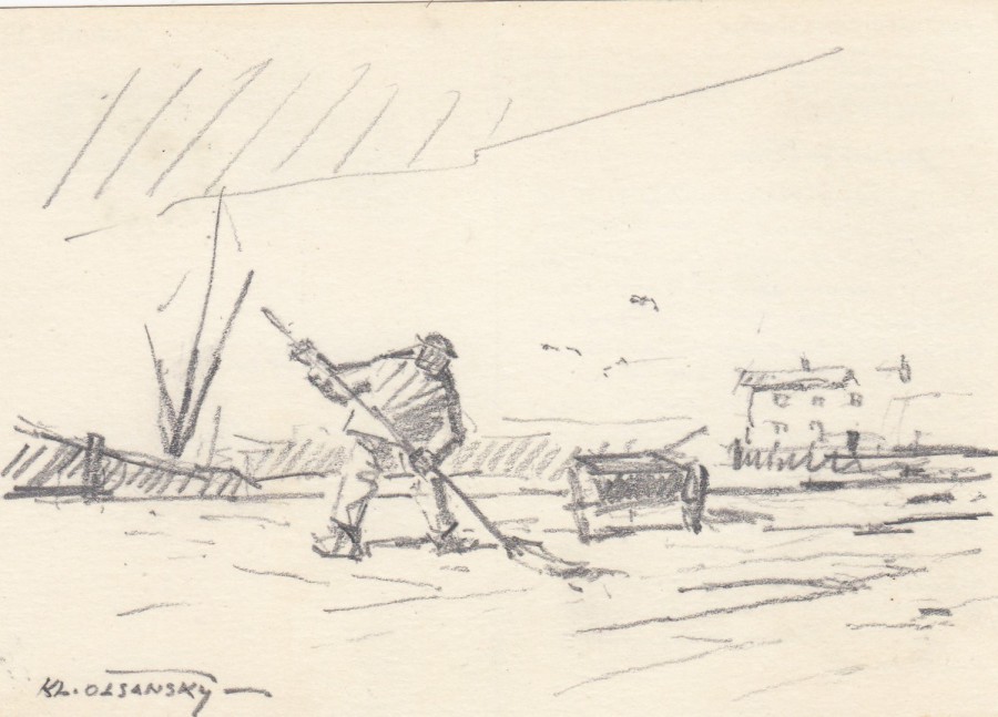
ORIGINAL PIECE OF ARTWORK
PENCIL SKETCH
On Canadian Postal Stationery Post Card
Hand-drawn pencil sketch by the artist
KLEMENT OLSANSKY
I bought this item many years ago in an auction of unusual modern postcard material. At first glance it does not look like much, but this is a unique hand drawn pencil sketch by the Canadian artist Klement Olsansky RCA (1909 – 1963).
Olsansky was born in Brno, Czechoslovakia and studied in the National Academy of Painting, Prague and the Art Institute of Chicago. He later taught at the University of Toronto before moving to Quebec in 1945. He then resided in Canada until his death.
Olsansky may not be a famous painter but his work is appreciated and does sell, so it is nice to have such a unique piece, and the fact that he drew this little sketch for a friend and possible business partner as the message relates to producing paintings for an exhibition.
I love this piece.
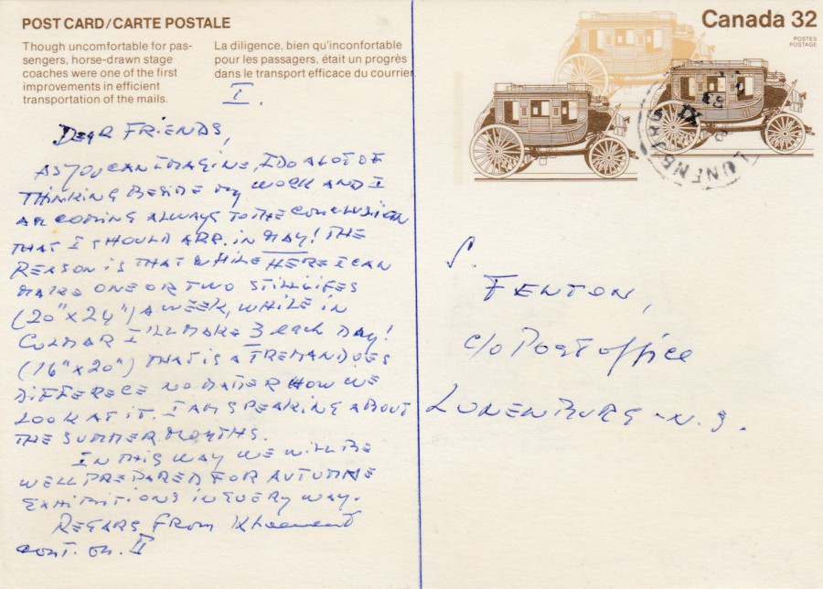
REVERSE SIDE OF ABOVE POSTAL STATIONERY POST CARD
The message here reads:
“Dear Friends
As you can imagine, I do a lot of thinking beside my work and I am coming always to the conclusion that I should [? RR] in May! The reason is that while here I can make one or two still life’s (20” x 24”) a week while in Colmar. I’ll make 3 each day! (16” x 20”). That is a tremendous difference no matter how we look at it. I am speaking about the summer months. In this way we will be well prepared for Autumne [sic] Exhibitions in every way.
Regards from Klement”
I think this message, hand-written by the artist, adds a nice interesting touch, and of course provenance to the front artwork and adds a little extra value.
I think this is a great card and I suppose it could also be considered as a piece of art as well. It would be interesting to have this valued to see what it was worth today.
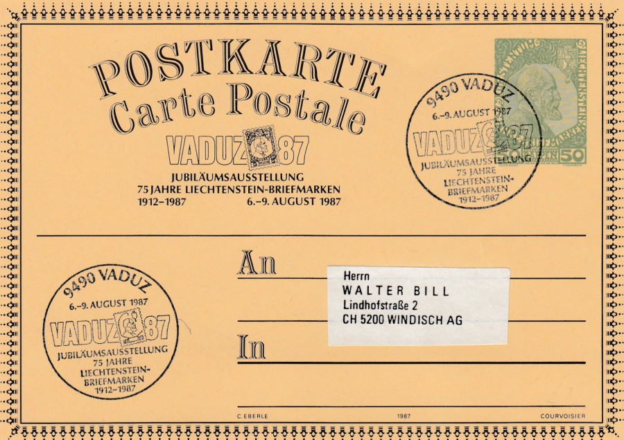
24/01/2020
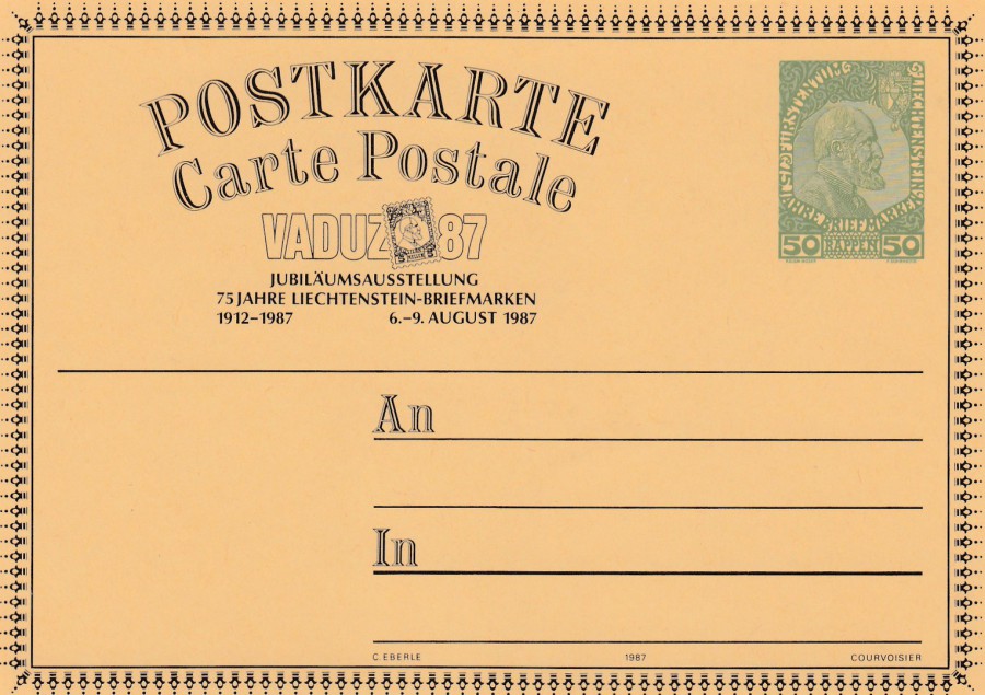
VADUZ 87
POSTKARTE
CARTE POSTALE
JUBILAUMSAUSSTELLUNG
75 JAHRE LIECHTENSTEIN-BRIEFMARKEN
1912-1987
6 – 9 AUGUST 1987
VADUZ 87
Postcard
Carte Postale [Postcard]
Anniversary Exhibition
75 Years of Liechtenstein
1912 – 1987
6-9 August 1987
Official Liechtenstein Stamp Anniversary Exhibition Postal Stationery Post Card
Plain backed postal stationery post card with pre-printed postage stamp. This postcard was issued as a promotional postal stationery post card for the VADUZ 87 stamp exhibition held in August 1987. These cards were available before the event. This is clearly a mint unused card.
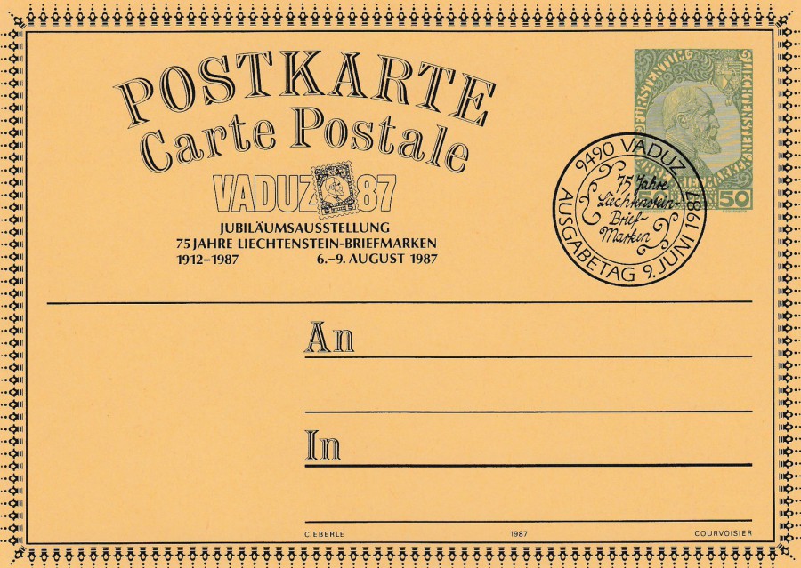
VADUZ 87
POSTKARTE
CARTE POSTALE
JUBILAUMSAUSSTELLUNG
75 JAHRE LIECHTENSTEIN-BRIEFMARKEN
1912-1987
6 – 9 AUGUST 1987
VADUZ 87
Postcard
Carte Postale [Postcard]
Anniversary Exhibition
75 Years of Liechtenstein
1912 – 1987
6-9 August 1987
Official Liechtenstein Stamp Anniversary Exhibition Postal Stationery Post Card
This copy of the postal stationery post card has received a special cancellation:
9490 VADUZ
AUSGABETAG 9. JUNI 1987
75 JAHRE LIECHTENSTEIN BRIEF MARKEN
9490 Vaduz
Issue Date June 9, 1987
75 Years of Liechtenstein Stamps
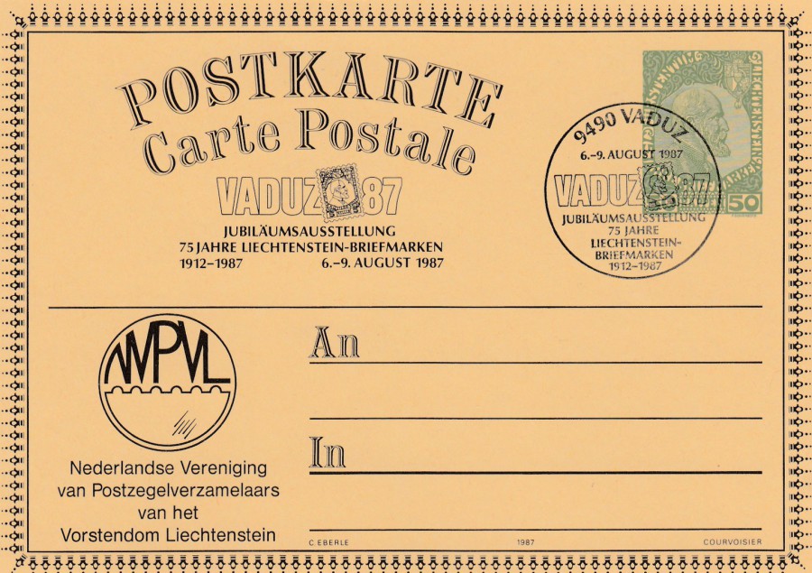
VADUZ 87
POSTKARTE
CARTE POSTALE
JUBILAUMSAUSSTELLUNG
75 JAHRE LIECHTENSTEIN-BRIEFMARKEN
1912-1987
6 – 9 AUGUST 1987
VADUZ 87
Postcard
Carte Postale [Postcard]
Anniversary Exhibition
75 Years of Liechtenstein
1912 – 1987
6-9 August 1987
Official Liechtenstein Stamp Anniversary Exhibition Postal Stationery Post Card
This copy of the card has a special cancellation used for the Vaduz 87 Stamp Exhibition:
9490 VADUZ
6 – 9 AUGUST 1987
JUBILAUMSAUSSTELLUNG
75 JAHRE LIECHTENSTEIN-BRIEFMARKEN
1912 – 1987
This is a cachet like cancellation which was in use to celebrate the stamp exhibition Vaduz 87. The reason I think this is more cachet like is that it has no individual date, so I suppose it could have been applied during any day of the event.
This card also has an additional print bottom left side which reads:
NEDERLANDSE VERENIGING
VAN POSTZEGELVERZAMELAARS
VAN HET
VORSTENDOM LIECHTENSTEIN
Dutch Association
Of Postage Stamp Collectors
From the Principality of Liechtenstein
This postal stationery post card has been overprinted especially for this stamp association as part of the Vaduz 87 Stamp Exhibition participation.
VADUZ 87
POSTKARTE
CARTE POSTALE
JUBILAUMSAUSSTELLUNG
75 JAHRE LIECHTENSTEIN-BRIEFMARKEN
1912-1987
6 – 9 AUGUST 1987
VADUZ 87
Postcard
Carte Postale [Postcard]
Anniversary Exhibition
75 Years of Liechtenstein
1912 – 1987
6-9 August 1987
Official Liechtenstein Stamp Anniversary Exhibition Postal Stationery Post Card
This copy has been used with same cachet/cancellation as appears on the above postcard, but this one has two strikes of this mark and does not have the club overprint bottom left. The second mark has been applied bottom left corner where the added overprint appears on the above copy.
24/01/2020
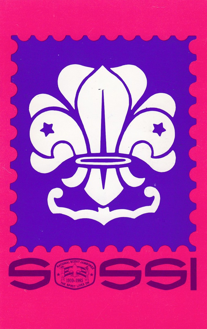
SCOUTS ON STAMPS SOCIETY INTERNATIONAL
NEW YORK
NATIONAL STAMP JAMBOREE
1985
Official Scouts on Stamps Society International Jamboree Postcard
This postcard was produced by this American scout stamp collecting society for the 1985 National Stamp Jamboree. Scout stamps, and Scout themed postcards have a very dedicated band of collectors who have a wide and prolific number of items to look through. I have been a member of the scout organisation for many years and as a result have picked up hundreds of scout themed postcards from all over the world.
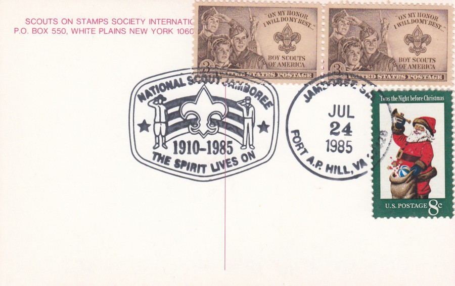
REVERSE SIDE OF ABOVE POSTCARD
Someone has applied two copies of the 1950 issued 3c Boy Scouts of America postage stamp (the first US stamp to honour the Boy Scouts of America) and an additional 8c US Christmas (issued 1972). These three stamps have been cancelled with the official ‘NATIONAL SCOUT JAMBOREE – 1910-1985 – THE SPIRIT LIVES ON – JAMBOREE ST(ATION) – FORT A.P. VA [Virginia] – JUL 24, 1985’ pictorial cancellation for the first day of this Jamboree ( which ran between 24/07/85 – 30/07/85).
23/01/2020
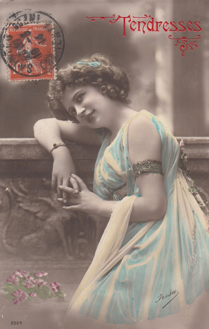
TENDRESSES
‘Affection’
Unknown Publisher [Possibly ‘Frisa’]
French Issue Postcard
Ref: 2964
Another early French postcard posted on the 10th March 1914 with the stamp applied to the front as was normal for this period.
REVERSE SIDE OF ABOVE POSTCARD
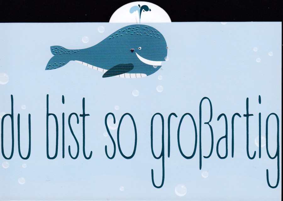
23/01/2020
DU BIST SO GROBARTIG
You’re so Great
Design by
R. LOOIJ
‘NOVELTY SHAPED POSTCARD – Semi-circle cut along top edge’
Published by
CITYPRODUCTS
Ref: ‘HAPPY PEOPLE’
ART. NR. 3476
MADE IN GERMANY
I found this delightful, and strangely shaped, postcard in December 2018 when I visited Nuremburg. I like animal cartoon art cards and judging from the variety I found on sale in Germany then so are the Germans.

REVERSE SIDE OF ABOVE POSTCARD
23/01/2020
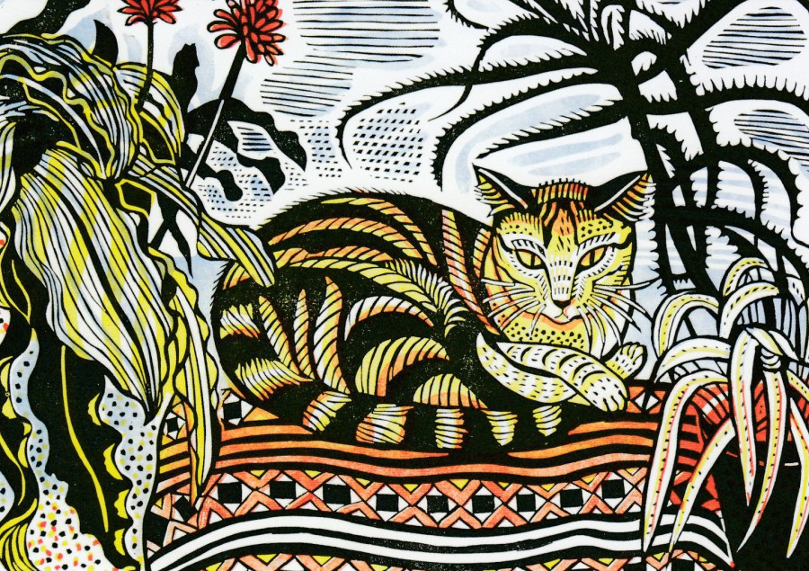
JESSY
By
RICHARD BAWDEN
Iinocut print
Published by
ART ANGELS
By now my liking for cat postcards should have become evident as I have posted quite a few on the webpage. This card was a recent buy from my trip to Cromer last year. I am always interested in new artist postcards (well, new to me) and this card, and the one below I liked a lot (and when I did art at school, I did a linocut design myself for my art exam)
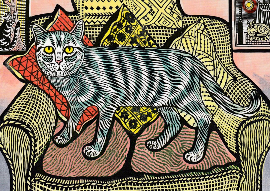
FIZZ
By
RICHARD BAWDEN
Iinocut print
Published by
ART ANGELS

23/01/2020
THE REICHSTAG BUILDING AT THE END OF THE WAR IN 1945
BERLIN 1945
Photo - ULLSTEIN
Published by
PUBLICON VERLAGSGESELLSCHAFT MBH – POSTSTR. 12. 10178 - BERLIN
Ref: PUBLICON B 92
In Berlin you can find lots of postcards which show the damage the city received at the end of World War II from the allied bombing raids and the fighting in the city between the Russian troops and the remaining German soldiers and civilians. In popularity these WW2 themed postcards only come in second to those related to the Cold War and the Berlin Wall, and I collect both, so Berlin is an expensive postcard city for me.
23/01/2020
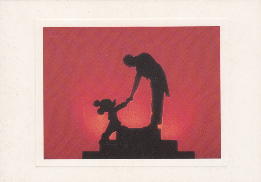
MICKEY MEETS THE CONDUCTOR
From the Disney film “FANTASIA” 1940
Published by
THE ART GROUP LTD
Ref: DISNEY, THE ARCHIVE COLLECTION
8737
Yesterday we were discussing this year’s trip to Orlando and what Disney tickets we would require. We are not staying in a Disney property this year so will be doing Disney a bit differently, which will be a nice slower approach, hopefully. So, as Disney is currently the topical subject again in our household, I thought it was time for another Disney posting. This one is from a set which I really liked, and I managed to pick up a few of them, but it was a very big series.

22/01/2020
UNTITLED
TALL SAILING SHIP
NOVELTY – 3D POSTCARD
Published by
WONDER CO, TOKYO,
MADE IN JAPAN
Ref: (SSP-367)
Probably the best 1960’s and 1970’s produced 3D postcards came from Japan. This is a nice example of a Japanese 3D postcard from this era. Obviously, it is hard to scan the 3D effect, but you can see how the image works, so to speak.
22/01/2020
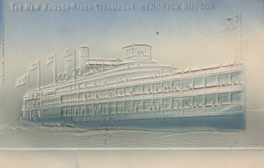
THE NEW HUDSON RIVER STEAMBOAT
‘HENDRICK HUDSON’
Novelty Embossed Postcard
Published by
ILL. POSTAL CARD & NOV. CO. N.Y.
This is a lovely early American postcard which has a superb embossing on it of this steamship. I suspect this card is from sometime early-on in the last century, say 1905 to 1910, although I am thinking 1906 or thereabouts.
This style of embossing, on a blue card, a which shows up the embossing quite nicely and which I have seen on other American postcards of this era, is common for this period.
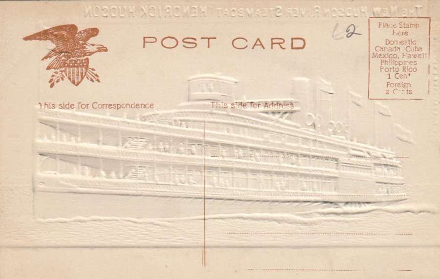
REVERSE SIDE OF ABOVE POSTCARD
22/01/2020
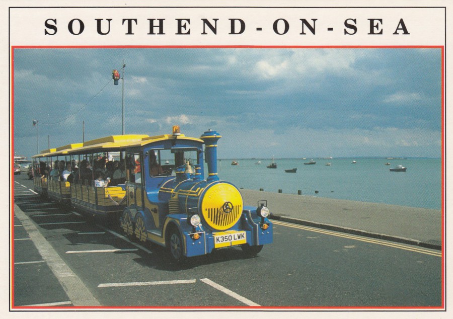
SOUTHEND-ON-SEA
LAND TRAIN [text reads as ‘LANTRAIN’ on reverse side]
WESTERN ESPLANADE
Photograph by
S. R. SEARLE
Published by
E.T.W. DENNIS & SONS LTD, SCARBOROUGH
(DENNIS PRINT & PUBLISHING)
Ref: S004083L
A postcard from my hometown of Southend-on-Sea. There is very little information on this postcard about the service of this land train, but fortunately this is my hometown. The train depicted here was a second attempt at such an enterprise by a private operator. The service commenced in July 1999 using two Dotto P90 land Trains painted in a blue and yellow livery. One of these two trains had the registration K350LWK (which is depicted here), the other was K27?JML (researchers have been unable to find out details of the missing digit here – pity then that this image depicts the known registration). This postcard was on sale for a few years despite the actual land trains only lasting for one season and ending in September 1999 (high operating costs were listed as the reason the enterprise failed). I remember these trains and saw them many times during the one season the trains were in operation, so this postcard is a nice local card to me, and one showing a very short-lived operation. Modern history on a postcard.

REVERSE SIDE OF ABOVE POSTCARD
Note the spelling bottom left ‘lantrain’ which I cannot find anywhere else as a spelling for such a vehicle, so I believe this is a misspelling of Landtrain. This is an error which may well have appeared on every copy of this card.

.

22/01/2020
PELNE
UCZESTNICTWO
I ROWNOSC
MIEDZYNARODOWY ROK INWALIDOW I OSOB NIEPELNOSPRAWNYCH
‘Full Participation and Equality.
The International Year of Invalid and Disabled People’
Official Polish Postal Stationery Post Card
(TOP)
Copy of Postal Stationery Post Card
Used First Day of Issue with a special cancellation dated
25th September 1981
(BOTTOM)
Mint copy of Postal Stationery Post Card
I have a fellow collector who specialises in stamps, covers and postcards that are themed around disability. I am sure she would like these two cards. I found these in a £1 box at a stamp fair in London. Having found the mint card and picked it out to buy I then had to have the used one when I later found it in the same box.
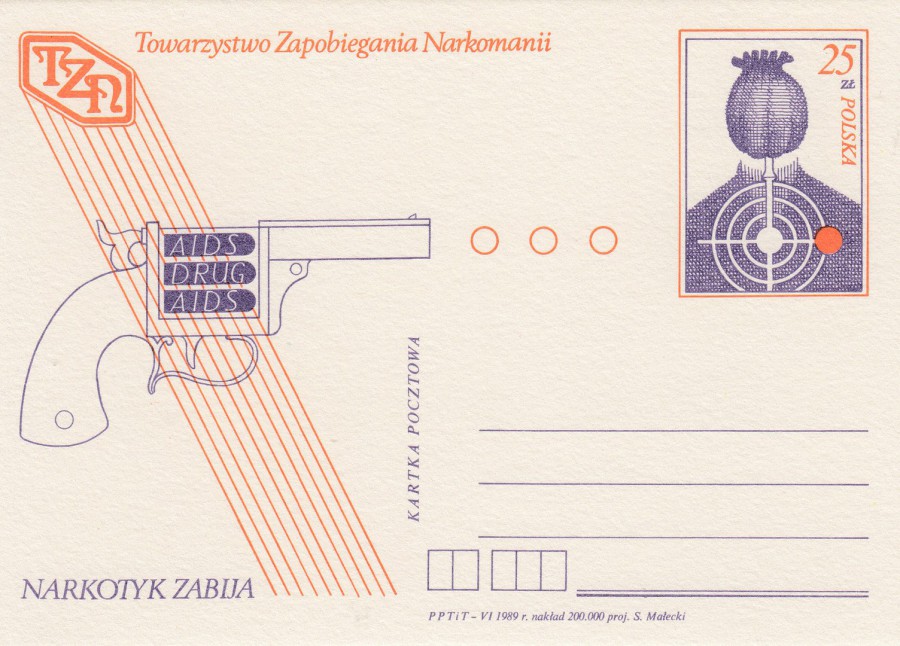
22/01/2020
TOWARZYSTWO ZAPOBIEGANIA NARKOMANII
AIDS – DRUGS – AIDS
NARKOTYK ZABIJA
‘Company prevention drug addiction
Aids – Drug - Aids
The Drug Kills
Official Polish Postal Stationery Post Card
1989
The subject of Drug usage and addiction appears on more postcards than one might expect, but it is an issue which has grown through the period of postcard history. It is now a major issue and I think it is one which needs to be confronted and perhaps looked at through the use of anti-drug postcard promotion, although I have to admit that postcards have also been used to promote the use of cannabis, which is counter to what I think postcards should be used for, although again I do not wish to force censorship on postcards either, there is a fine line here somewhere. This 1989 Polish card is blunt in its approach, DRUGS KILL, which is true, but users know this and continue with their use, whilst those who do not take drugs also know this, but this message will not prevent those who are going to try them from doing so. Another approach is required, but whilst the world is in a recession and government cut-backs is the norm I don’t think anything is going to improve in the short term.

22/01/2020
STAMP COLLECTING IS FUN,
WHY NOT –
START NOW
Published by
UNITED NATIONS POSTAL ADMINISTRATION,
NEW YORK
Pre-addressed postcard which could be used to receive more information about the stamps produced by the United Nations, who produce a wide range of stamps every year.
I started out by collection stamps, but soon moved on to collect postcards, but I never fully stopped having an interest in stamps and still collect any television themed stamps, but despite stamps being the worlds top collectible, I still prefer postcards (if possible, used with stamps, which nicely combines both collectibles)
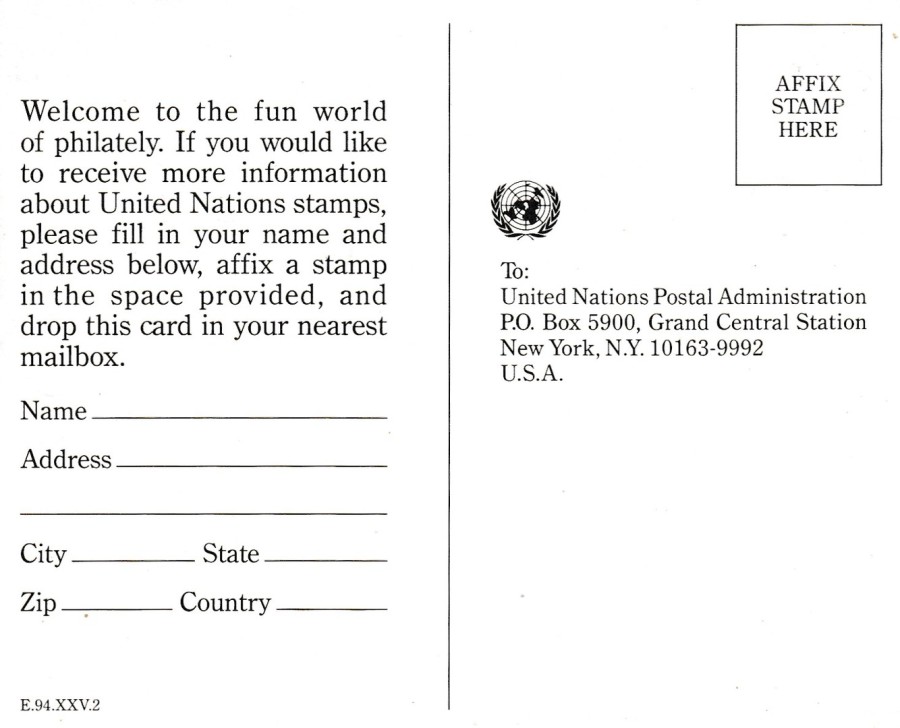
REVERSE SIDE OF ABOVE POSTCARDS
22/01/2020
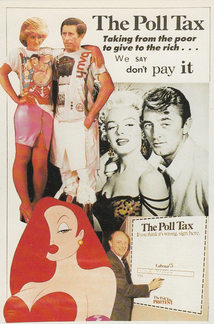
“DON’T PAY IT”
THE POLL TAX
TAKING FROM THE POOR
TO GIVE TO THE RICH…
WE SAY DON’T PAY IT
Published by
COMMUNITY CARDS
Ref: PC1/90
This postcard came out in early 1990 and I have always thought it was the best anti-Poll Tax postcard released. This one has the bonus that besides the obvious political theming due to the very political aspect of the Poll Tax implementation there is also the added theming of Films and Royalty, not to mention Disney and the separate Marilyn Monroe connection (Monroe is still very much collected). Not only does this have a royalty addition to it, this is probably the most collected modern member of the royal family, not Charles by the way, but Diana, who is still very much collected on postcard.
The Disney connection is through Jessica Rabbit from the unusual animated film, with real actor Bob Hoskins matted in, ‘Who Framed Roger Rabbit’ (1988).

22/01/2020
“I WONDER HOW WE AMUSED OURSELVES BEFORE WE GOT TELEVISION!”
By
TAYLOR
Published by
BAMFORTH & CO., LTD (HOLMFIRTH, YORKSHIRE)
Ref: ‘COMIC’ SERIES No. 1666
This quite amusing design was published by Bamforth and sold in various decades and was an extremely popular design, especially in the very early days of television, which is when I suspect the humour worked best. I bought this postcard for my television collection, where I think it sits very well.

.
22/01/2020
TERRY JONES ….. RIP
Terence Graham Parry Jones - 1st February 1942 – 21st January 2020
Actor, writer, comedian, screenwriter, film director, author and historian, but he will always be best remembered as one of the members of the ‘Monty Python’ comedy team.
LEFT SIDE
‘OH, IT’S A HARMLESS LITTLE BUNNY, ISN’T IT?’
Published by
BOOMERANG MEDIA
(Free Rack Postcard)
Official advert for the ‘Spamalot’ musical appearing at the Palace Theatre, Shaftsbury Avenue, London
This set of four postcard designs are all based on the Spamalot musical show which is itself based on the feature film ‘Monty Python and the Holy Grail’. This was the first Monty Python film I saw, and I loved it although I was a bit too young at the time to get the weird ending!
I have been a fan of Monty Python since seeing this film and when the television series was ‘re-run’ I tried to catch episodes. I am not sure they always managed to hit the nail on the head, but there were moments of complete brilliance and that is why the team are so well loved by a certain generation. So, it was sad to hear today that this team is now down another member.
RIGHT SIDE
MONTHY PYTHON’S
SPAMALOT
‘ALWAYS LOOK ON THE BRIGHT SIDE OF LIFE!’
BOOMERANG MEDIA
(Free Rack Postcard)
Official advert for the ‘Spamalot’ musical appearing at the Palace Theatre, Shaftsbury Avenue, London
This is the poster that was used all over London to promote the theatre show whilst it was running in London (the show had its premiere in Chicago on the 21st December 2004 and went on to appear in Broadway in 2005 and then on to the West End of London in 2006). The show was a massive success wherever it was played and brought in huge profits for all the Monty Python team, although the musical was all the work of just one member, Eric Idle. Terry Jones of course co-directed the original film that this musical is based on.
.
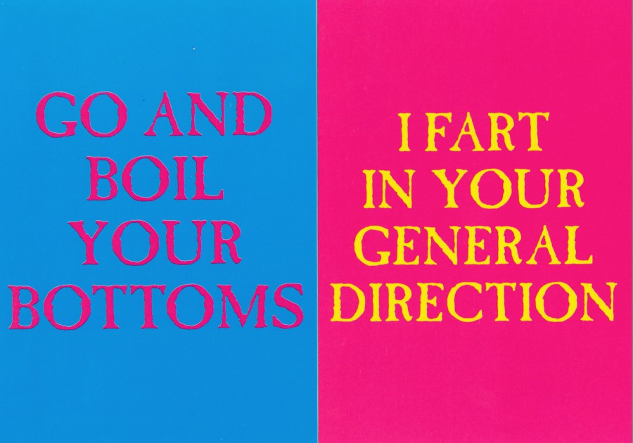
LEFT SIDE
‘GO AND BOIL YOUR BOTTOMS’
BOOMERANG MEDIA
(Free Rack Postcard)
Official advert for the ‘Spamalot’ musical appearing at the Palace Theatre, Shaftsbury Avenue, London
RIGHT SIDE
‘I FART IN YOUR GENERAL DIRECTION’
BOOMERANG MEDIA
(Free Rack Postcard)
Official advert for the ‘Spamalot’ musical appearing at the Palace Theatre, Shaftsbury Avenue, London
These word-only designs all show quotes from both the original feature film ‘Monty Python and the Holy Grail’ and the musical ‘Spamalot’, which as stated above is based on this film (which came out in 1975.
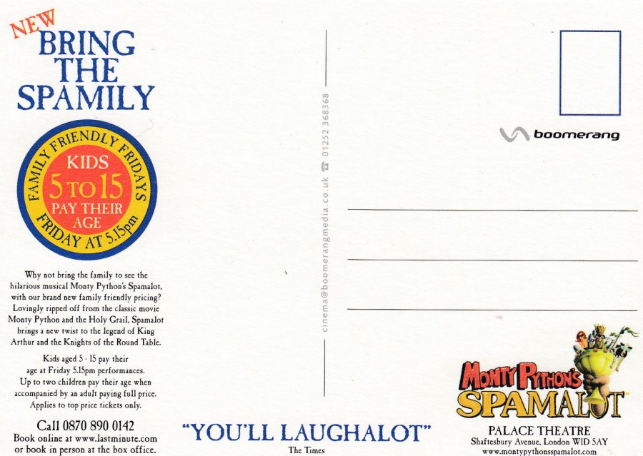
STANDARD REVERSE SIDE LAYOUT FOR ALL FOUR OF THE ABOVE POSTCARDS

PHOTOGRAPH
Terry Jones