EMAIL ADDRESS - markspostcardchat@gmail.com
13/02/2021
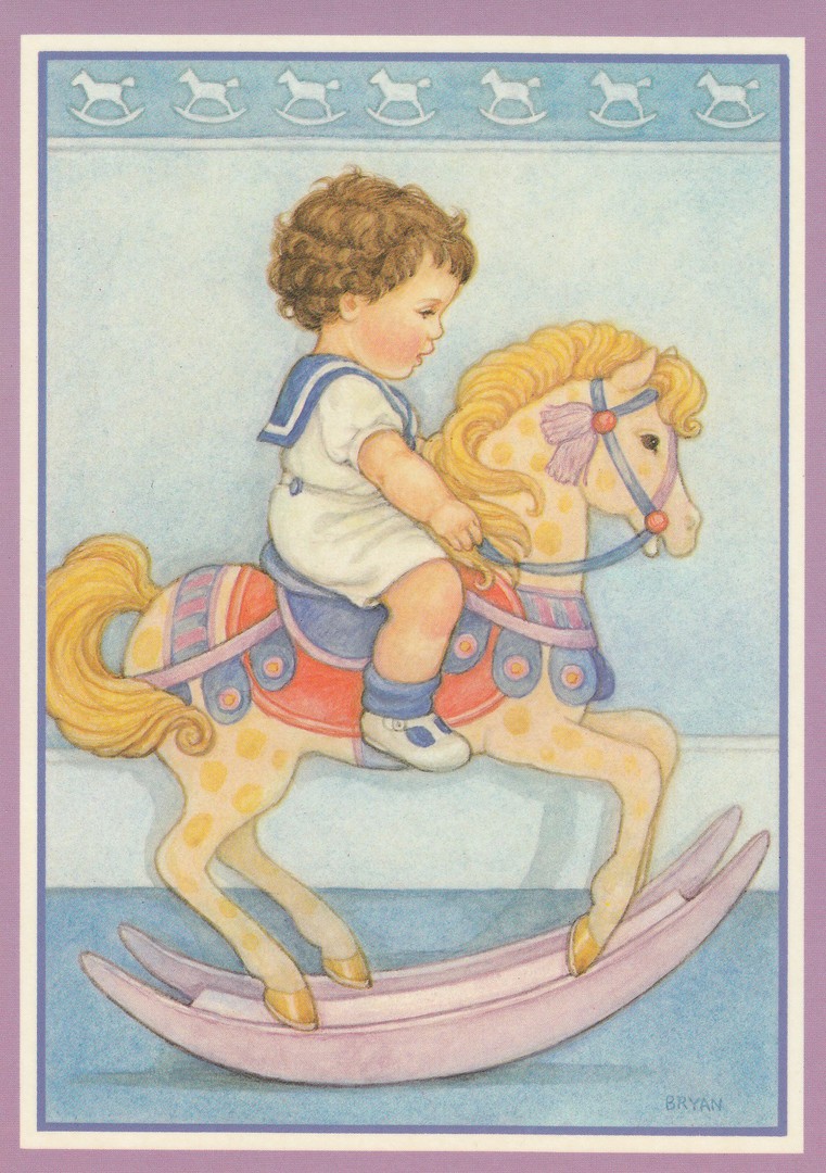
RIDING HORSE
By
BRYAN
Fraser & Co (1986)
Published by
CAMDEN GRAPHICS
Ref: PC 902
I know a few people who collect the postcards published by Camden Graphics, which I think I have mentioned before (so, sorry about that). Camden Graphics were one of the best and most inventive, with art designs, of modern postcard publishers during the period around the 1980’s and 1990’s (although they commenced in the late 1970’s and went on I believe into the early 2000’s). This design is not untypical of their output, although to be fair their output was eclectic, but anyone knowing their card designs would probably guess that this is one of theirs.
12/02/2021
12022021
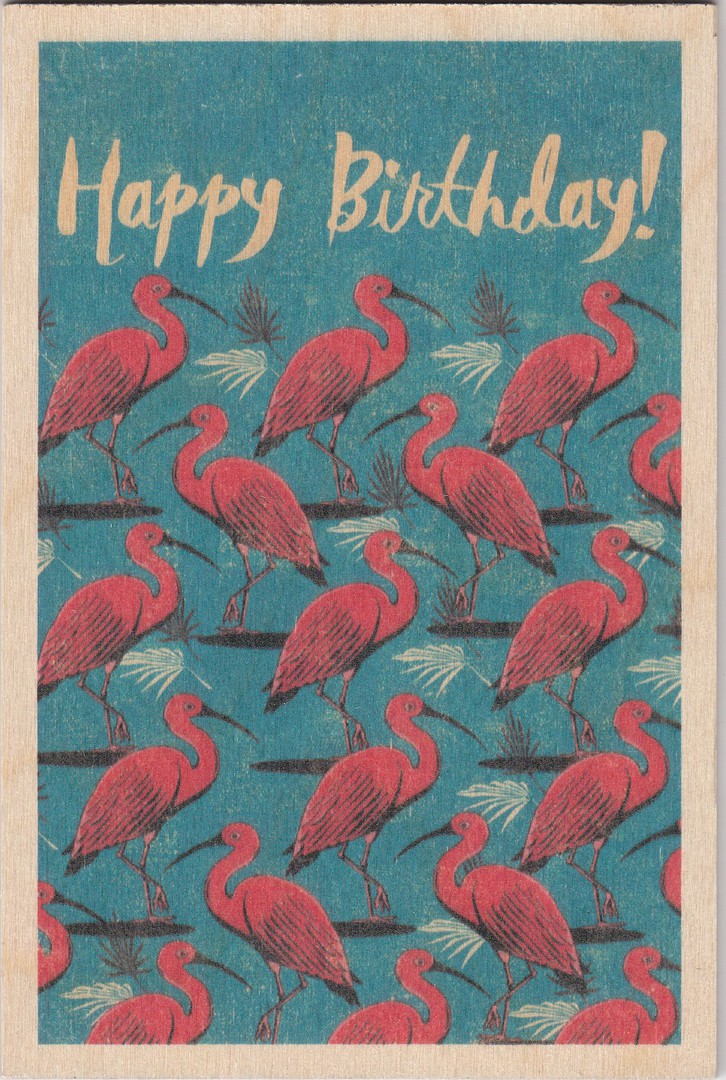
HAPPY BIRTHDAY
Novelty Wooden Postcard
Published by
TIMBERGRAM
(TREEAID wood used)
You may have noticed that I have put the date at the top in two formats. This is because today’s date is a palindrome, which means it can be read the same from each end, i.e., from left to right and from right to left. It is also an ambigram, which means it can be read the same upside down. So, the date today is a special one, especially so as it is also, and most importantly my birthday, which hopefully explains the postcard depicted.

REVERSE SIDE OF ABOVE POSTCARD
09/02/2021
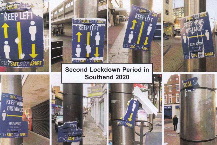
SECOND LOCKDOWN PERIOD IN
SOUTHEND 2020
Published by
MARK ROUTH (Me, of course)
Limited Printing of 500
Ref: markspostcardchat Card No. 3
I am not sure if I have shown this one before, but I think not. All the photographs depicted on this postcard were taken by me on the 20th November and they depict social distancing signs along the High Street, Southend, or more correctly, what is left of some of these signs which were originally placed out at the end of the first national lockdown in preparation for the opening up of all the shops after that initial lockdown period. Interestingly, all the signs depicted here were removed just a week later and replaced with brand new signs with new designs. So, everything you see here was gone not long after I photographed them. I have been fascinated with all the signs placed out in connection with the pandemic and I decided that I needed to record a bit more of the ones in Southend, after my first two lockdown postcards came out earlier in the pandemic, so I published this third postcard.

REVERSE SIDE OF ABOVE POSTCARD
Having published three lockdown postcards, I have gone on to have small numbers posted on important local lockdown and pandemic dates. On the 16th December 2020 Southend, my home town as depicted on my three postcards, was placed into Tier 3. So, I decided to have five copies of my postcard postmarked on this date. I then produced a pictorial sticker with the required information and applied these to the cards. Obviously, I kept one of these postcards for myself. I was very pleased with how these turned out.

07/02/2021
THE QUEEN’S SILVER JUBILEE
1977
Published by
JOHN ESPENET CARDS, LONDON SW11
Printed by
EAST CHESHIRE PRINTING Co. Ltd, Wilmslow
Ref: JUBILEE
Yesterday, the 6th Feb, was the anniversary of the ascension of Queen Elizabeth II. On the 6th February 1952 Princess Elizabeth was in Kenya when her husband Prince Philip informed her that her father King George VI had died and that she was now Queen.
Today, the Queen is the longest-lived and longest-reigning British monarch, and she is also the longest-serving female head of state in world history. To add to this impressive list, she is also the world’s oldest living monarch, longest reigning current monarch and the oldest and longest-serving current head of state. This is an impressive achievement.
This postcard here was issued to celebrate the Queens silver jubilee back in 1977. I remember the silver jubilee and have fond memories of the street party me and my brother went to. The event was ‘very’ popular, and many street parties were held all over the country and many souvenirs were produced, especially mugs and other china and porcelain items. Although not prolific, postcards were also issued in various designs. This one is a ‘very’ basic issue, but attractive none the less.
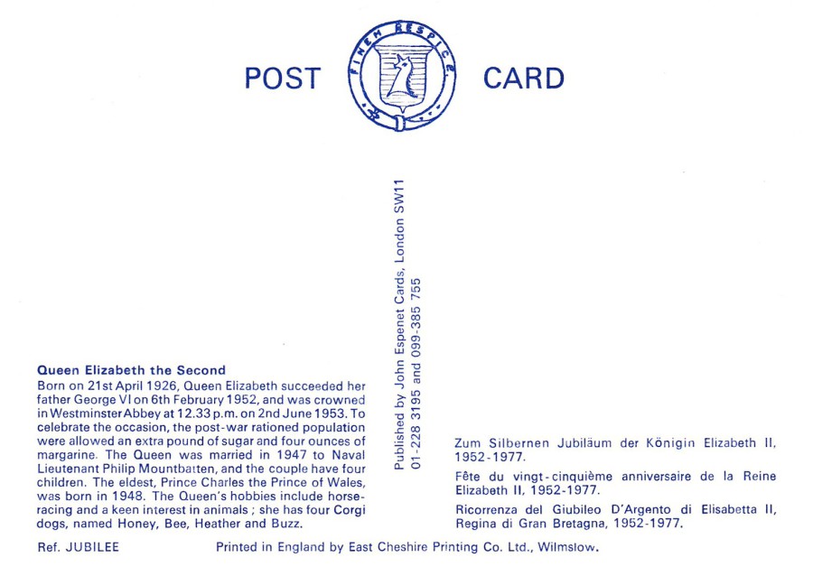
REVERSE SIDE OF ABOVE POSTCARD
06/02/2021
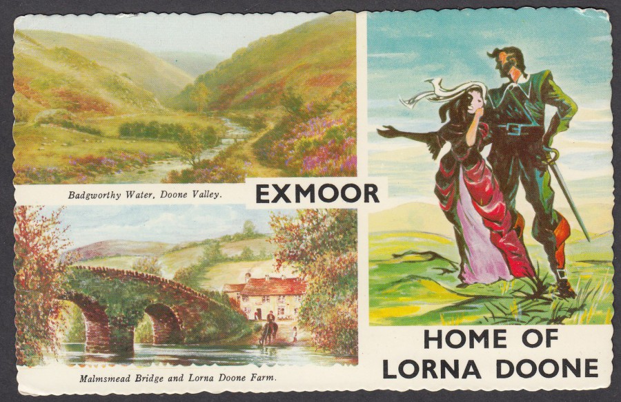
EXMOOR
HOME OF LORNA DOONE
Badgworthy Water, Doone Valley
Malmsmead Bridge and Lorna Doone Farm
Published by at least two postcard publishers:
1) BAMFORTH & CO. LTD. PUBLISHERS, HOLMFORTH, YORKSHIRE
2) VALENTINE PRINTERS & PUBLISHERS, DUNDEE & LONDON
Ref: Both companies used the same reference number:
ET.5608
When me and my brother were kids, our parents used to regularly holiday in Minehead, and we would drive across from here to Lynton which meant driving across the Exmoor National Park. I remember once we took a diversion so that my mother could see Doone Valley. Having said that, whenever we drove across Exmoor, we saw signs related to Lorna Doone with many saying that we were about to enter Lorna Doone country. Personally, I have not read the book (first published in 1869 and written by Richard Doddridge Blackmore) but I am aware of its popularity, possibly because I used to see references to it when I was on these holidays when I was younger.
Related postcards are of course commonplace, but I am fascinated in the way a single design could be published and printed by different companies, as is the case here (see below).
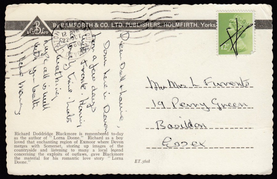
REVERSE SIDE OF BAMFORTH EDITION
This copy was posted in October 1980, although of course that only means that the sender obtained it and sent it at that time. The card could of course have been printed many years earlier. If you look at this image and compare it to the one below, you will see that this has the same reference number and the same block of text although the publisher is clearly different.
As you can see here, pen cancels are nothing new!
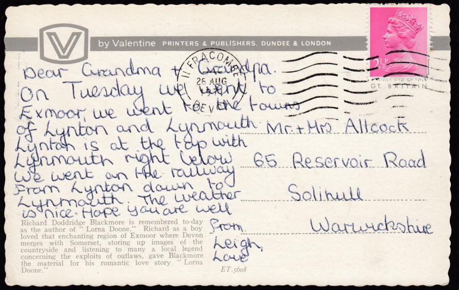
REVERSE SIDE OF VALENTINE EDITION
This copy, by another publisher than the one above, was posted in August 1971, a good-few-years earlier than the above copy, although again, this is just the posted date and does not mean the card was not available for many years before this year. This is an aspect of postcard collecting that I really enjoy, the study of postcard types and their stories.
05/02/2021
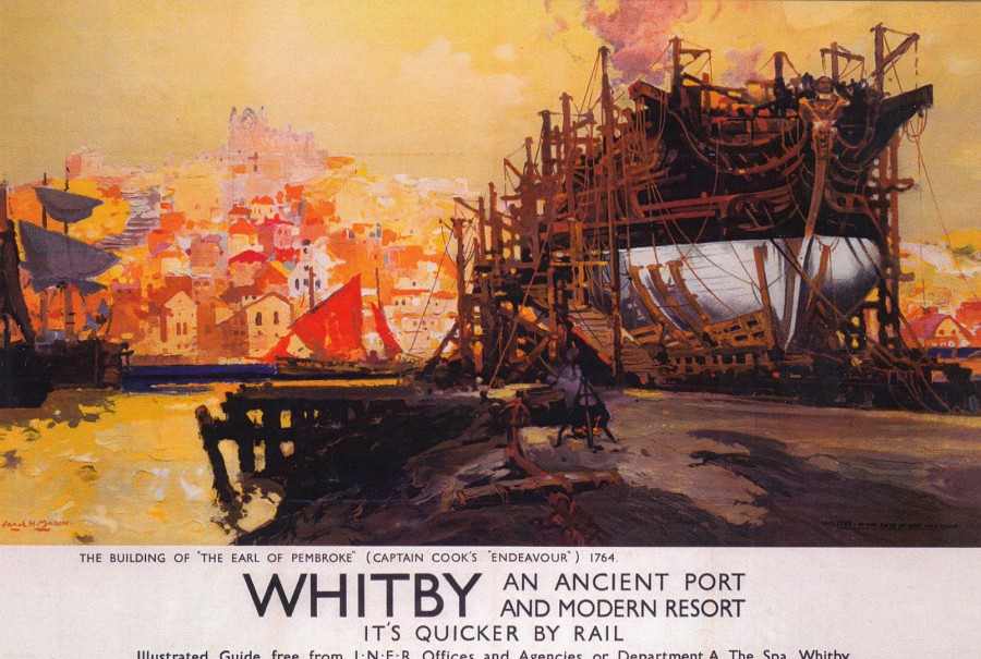
WHITBY
AN ANCIENT PORT
AND MODERN RESORT
‘IT’S QUICKER BY RAIL’
The Building of ‘The Earl of Pembroke’ (Captain Cook’s ‘Endeavour’) 1764
L.N.E.R. (London and North Eastern Railway) Poster
Printed and Distributed by
STAR EDITIONS LTD
From the National Railway Museum
Ref: RAIL368
Once the first lockdown started last year all foreign travel ceased, certainly for us, and this remains the case, but in the break between Lockdown 1 and Lockdown 2 we did get to take the campervan out for a couple of UK breaks. Whitby was one of the locations we visited, which is not surprising when you realise it is one of my favourite UK locations. It is one of the UK’s gems with great food, sites and views. Because of this I cannot resist any related postcards when I come across them. This wonderful poster artwork was a must have when I came across it in a dealer’s stock.
05/02/2021
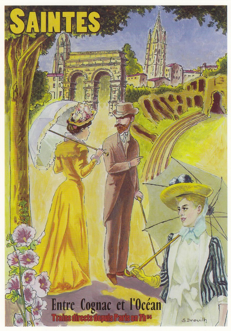
SAINTES
ENTRE COGNAC ET L’OCEAN
By
SERGE DREUILH
Published by
CENTENAIRE EDITIONS (SAINTES, FRANCE)
Ref: 17 – TOURISME
When, and lets really, really hope it is ‘When’, foreign travel opens back up again me and Jo’s first location to visit will be a small village in France just outside Saintes. We inherited a house here which due to other commitments in 2019 and the pandemic last year has not now been visited in over two years! People have sent us images of it, and it looks like it is now located in the amazon jungle! We cannot wait to go back, not just to get hacking at the undergrowth, but also because it is an area of France which we love. Saintes has appeared here on the webpage a selection of times as I have shown both artist-drawn and photographic (both modern and old) postcards of some of its landmarks, which also appear here on this poster like design. My favourite structures are the ancient roman ones, the arch and the amphitheatre, where gladiatorial games took place. I have visited all of these numerous times, and I have also amounted a nice little collection of postcards depicting the arch (again, many of which have been shown on earlier pages of this website). Fingers crossed it will not be too long before we get to return and see them again, but in the meantime this delightful piece of poster artwork reminds me of what I have been missing.

04/02/2021
NORTH NORFOLK RAILWAY
NORFOLK
Novelty ‘WOODEN POSTCARD’
Design by
WHITE-ONE-SUGAR
Published and made by
THE WOODEN POSTCARD COMPANY
Made in the United Kingdom
I bought this when I was in Norfolk back in 2018 (possibly 2019, but definitely-before all this lockdown malarky). The name of the station on the wall is Sheringham and I have visited here (only noticed the station name today as I was looking at it for this write up). Without a doubt it was the steam train that caught my eye here, and what a cracking looking piece of artwork this is.
It will be interesting to see if after all the issues and lockdowns we have had, and when things open back up again to travel and tourists, if wooden postcards are still going to be popular. There is no doubt that ‘The Wooden Postcard Company’ were the company producing the most, and possibly the best before the travel bans.
REVERSE SIDE OF ABOVE POSTCARD

SHOPS PACKAGING SALES BAG
“GLITTER & MUCK”
WELLS-NEXT-THE-SEA
This is the shop where I bought the above wooden postcard (and few others as well, some of which have already previously appeared on this webpage). Bags like this, with the shops name either printed on it or stamped on it with a cachet, let me know, or remind me exactly where I bought a postcard (or postcards) from. I have a small collection of these, many still with the bought postcards still inside. Wells-Next-The -Sea is one of my favourite Norfolk locations and I have been here quite a few times now (and I will go back).

03/02/2021
PACIFIC NORTHWEST POSTCARD CLUB
SINCE 1980
Official Club Postcard
My good postcard friend Heidi Belinsky sent me this lovely postcard which promotes a club still going (which is a fine achievement in this age). This was sent with some nice US postage stamps (see below) and I am interested in modern US stamps as I have many on postcards and envelopes sent to me and I have picked up some mint ones from my US holidays.
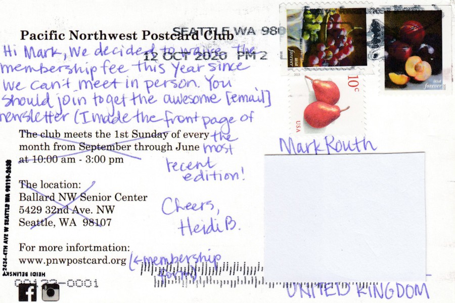
REVERSE SIDE OF ABOVE POSTCARD
03/02/2021
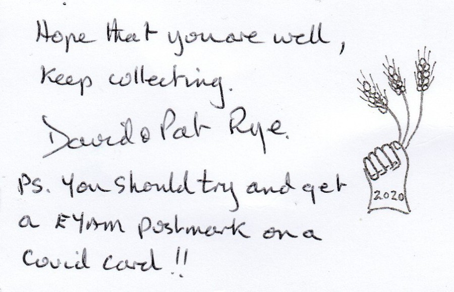
HOME MADE POSTCARD
Unique one-off Postcard
Made by
David Rye
(Pat & David Rye)
Posted to me in 2020
It is always a nice surprise when someone sends you something unique through the post. I often get unusual postal items coming through the post from David and Pat. Sometimes David makes several copies of an item, but I believe this is a one-off which he made exclusively for me because the image immediately brought me to mind when he saw it. It is a lovely item, and it brought a smile to my face when I received it (this came last year in what was a year that any smile was a bonus).

Top half of the reverse side of above postcard
I have cut this to remove my address, but you get the idea. Sadly, the stamp was not cancelled with a date cancellation, but the pen cancel has at least been applied in a reasonable way (and pen cancels are a known comidity throughout the history of postal material)

02/02/2021
CAPTAIN SIR THOMAS (CAPTAIN TOM) MOORE … R.I.P
30TH April 1920 – 2nd February 2021
Raised over 30 million pounds for NHS Charities last year by walking around his garden becoming a national legend in the process during the first national lockdown. Sadly, in this third lockdown Captain Tom has succumbed to the coronavirus.
FIGHT COVID 19
By
RACOONBROTHER
Published by
REDBUBBLE


02/02/2021
HAPPY GROUND HOG DAY
EVERYBODY
(To be fair... everyday is Ground Hog Day at the moment!... Lets hope we all get a chance to move onto something new soon)

31/01/2021
RECRUTEMENT
CETELEM
Novelty Shaped Postcard
Published by
CART.COM
(Free Rack Postcard)
I found this one some years ago in a little antique shop in France, back in the days when we could travel (remember those days?). I have always liked novelty shaped postcards and I have shown quite a few on this webpage over the years. This one is shaped around the mans face down the right side. It appealed to me and although initially it would have been free from an advertising postcard rack, I was still happy to pay 50cents for it in the shop.
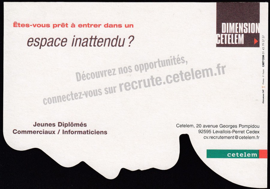
REVERSE SIDE OF ABOVE POSTCARD
Some might argue that this is not a true postcard, but Cart.Com were (possibly still are) a postcard producing company who were part of the craze for free advertising postcards placed in restaurant’s, hotels, pubs, cinemas and other suitable locations. The trend died a few years ago now, but I know many people who collected ‘Rack Cards’, and there was even a club which was for such people. The cards are now collected in relation to the theme depicted on them rather than being generally collected as ‘Rack Cards’.
30/01/2021
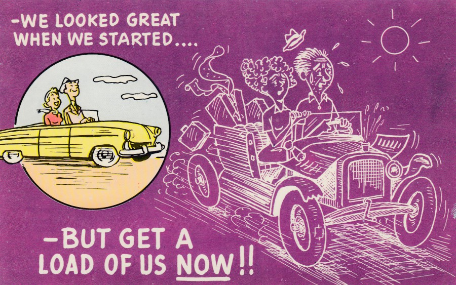
WE LOOKED GREAT WHEN WE STARTED…
- BUT GET A LOAD OF US NOW!!
Published by
COLOURPICTURE PUBLISHERS, INC., BOSTON U.S.A.
‘PLASTICHROME’
Ref: P50344
An American cartoon card through and through, from the style of the new coloured motor car to the old styled outlined motor car and from the dress of the two people and the unusual colours used. Having said its American I bought it from a UK dealer and as its mint I suspect it may have been bought as a souvenir postcard from someone visiting the states back in the 1960’s (maybe early to mid-1970’s) when I suspect this card was first circulated (although it is always worth remembering that a postcard printed in the 1960’s could technically still be on sale in shops and retail locations for decades, meaning it could still have been around in the 1980’s and into the 1990’s in out of the way places. Other than confirmed postmark dates and known dateable reverse layout styles, it can be hard to precisely date a mint card – even a postmark only shows the card was at least available then, it could have course have been sale for decades before).
REVERSE SIDE OF ABOVE POSTCARD
A standard layout set up for Plastichrome
29/01/2021
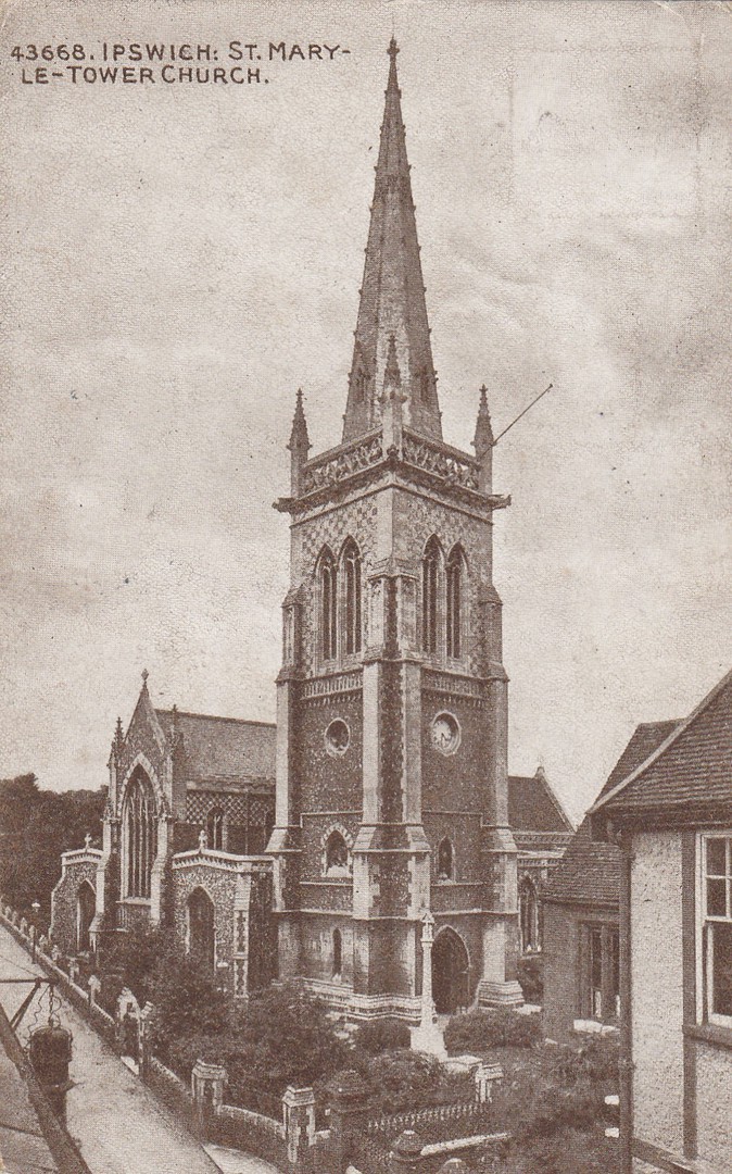
IPSWICH: ST MARY-LE-TOWER CHURCH
Published by
THE PHOTOCHROM CO., LTD
(London and Tunbridge Wells)
Ref: “SEPIATONE SERIES” 43668
A nice early view of the local church in Ipswich, one still in place and still in operation and listed now as being the Town and Civic Church of Ipswich. It is a Grade II listed building, and it was in the churchyard of St Mary that the town charter of Ipswich was written in 1200. St May Le Tower was mentioned in the Doomsday Book which means that a church has occupied this site since at least 1086. Although a medieval church the building is mostly from 1860-1870, when it was built by Richard Phipson.
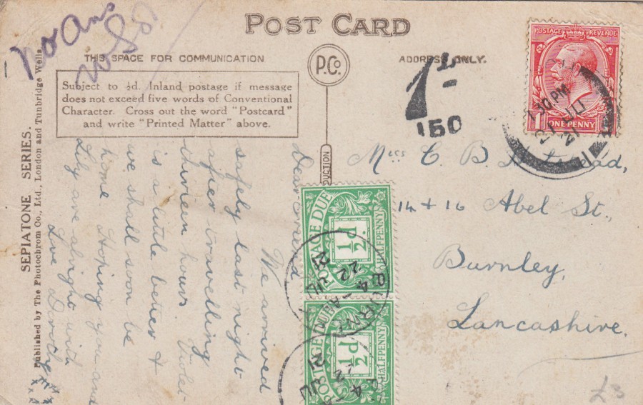
REVERSE SIDE OF ABOVE POSTCARD
On the 13th June 2021 the cost of sending a postcard within the UK went up from 1d to 1 ½ d (it went back to down to 1d on the 29th May 1922). This meant that the sender of this postcard and underpaid the postage because they only used a 1d stamp. There fore a postage due fee was surcharged on the card. Postage due is valued at twice the outstanding amount, thus this being a ½ d under paid a full 1d fee was placed on the card. This was shown by the addition of two ½ d Postage Due stamps. The 1d red stamp was cancelled with an Ipswich cancel dated 21st June 1921. The two ½ d postage due stamps were cancelled at point of destination by two single ring Burnley date cancels dated 22nd June 1921. To the left of the red 1d stamp there is also a nice 1d postage due cachet mark with the number 150 underneath it. This is the number for the Burnley postal region. I think this is a nice combination with lots of postal history going on. For me, without a doubt, the reverse side of this postcard is more interesting than the front.
29/01/2021
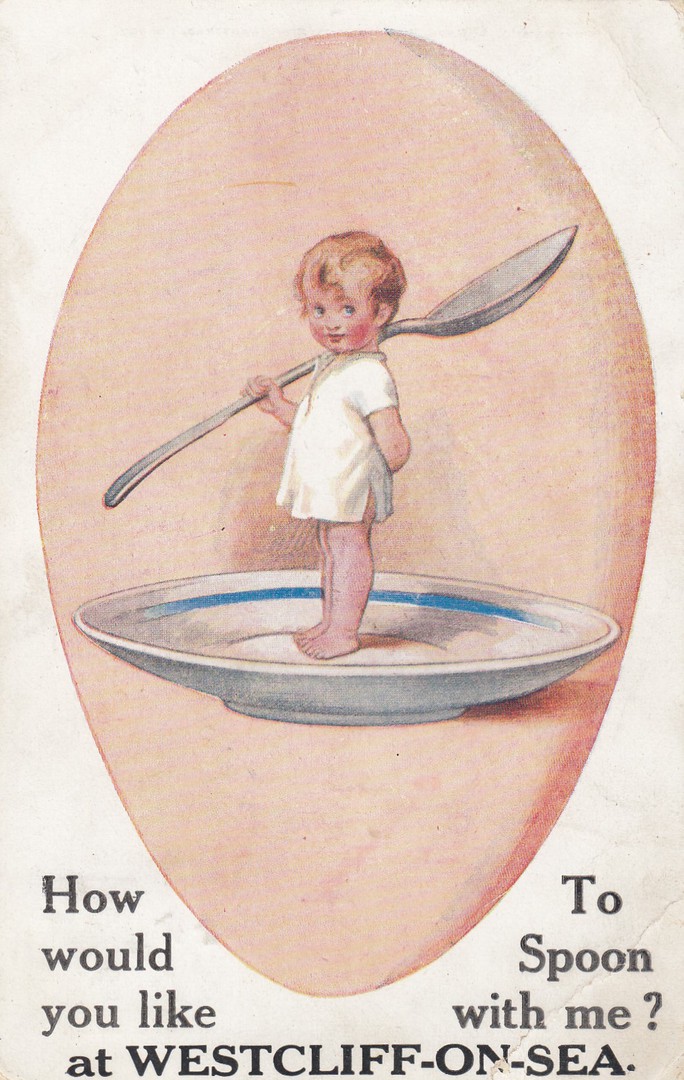
HOW WOULD YOU LIKE TO SPOON WITH ME?
AT WESTCLIFF-ON-SEA.
Published by
E. MACK. KING HENRY’S ROAD, HAMPSTEAD, LONDON
Ref: 397
This is another good example of a standard postcard design that could be overprinted with a location, in this case Westcliff-on-Sea which is part of my general hometown of Southend-on-Sea. Nothing special perhaps, and not very valuable, but a lovely mention of a local area to me.
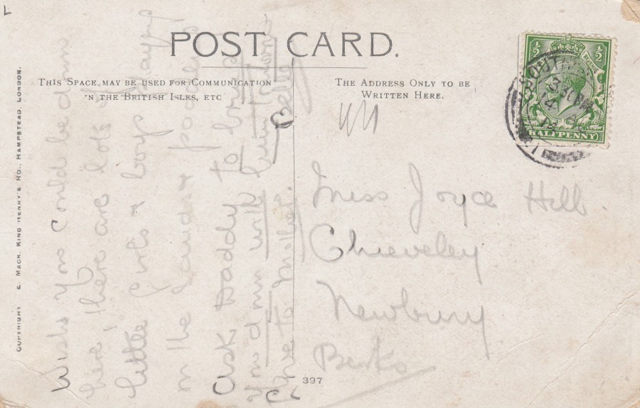
REVERSE SIDE OF ABOVE POSTCARD
This card was posted from Southend on the 14th August 1914. This was during the first months of WW1, and on this day the army of Alsace launched a massive attack on German positions. This is also only 10 days after Britain itself declared war on Germany and the world of the sender and receiver of this postcard was very much about to change.
28/01/2021
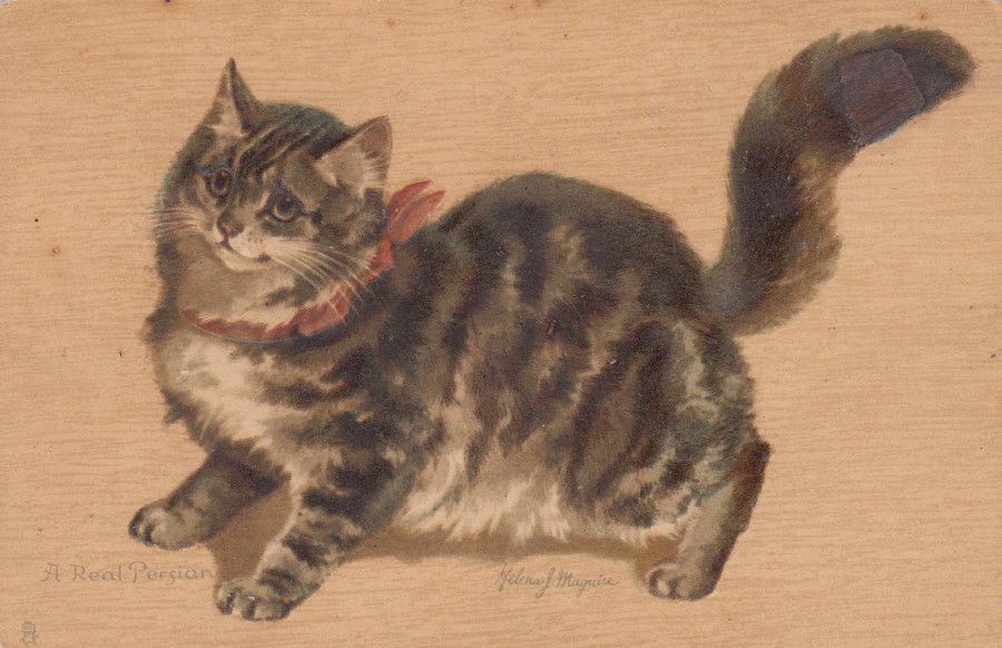
A REAL PERSIAN
By
HELENA J. MAGUIRE
Published by
RAPHAEL TUCK & SONS
Ref: “ANIMAL STUDIES” Series
6714
Chromographed in Saxony
The postcard designs by Helena McGuire are very collectible and often sell in excess of £10 (I have a tiger one which is catalogued at £50+, which gives you an idea of what value the much better ones can reach). McGuire often drew images of cats, which is what she is probably best known for, and they are popular. This one is a nice one although there is some minor foxing (this is the name for the small areas of brown marks, almost like little circles of rust like colour which can be seen more clearly on the back of this card – this is a type of mould which affects old paper and card and is a common affliction to postcards that have not been stored well in the past – the condition cannot be cured but can be paused in its progression with an anti-foxing agent, and also with good storage in a protective sleeve).

REVERSE SIDE OF ABOVE POSTCARD

28/01/2021
THAT’S A NASTY COUGH
YOU’VE GOT THERE!
By
BILL KIMPTON
Published by
RAINBOW CARDS LTD
(RAINBOW POSTCARDS)
Ref: RCP-063
I do think this one is funny, although the current era makes any form of coughing rather anti-social and worrying but let us ignore that and just gain some amusement from what is after all a meant to be a funny and entertaining comedic cartoon.
27/01/2021
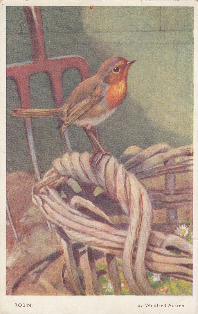
ROBIN
By
WINIFRED AUSTEN
Published by
VALENTINE & SONS LTD (Dundee and London)
Ref: “NATURE SERIES” POSTCARD
1304
This nice artwork postcard was posted in 1952. I have always collected bird postcards and have found that those issued around, and in, the 1950’s are particularly delightful, especially the painted ones. I think it may be the matt printing which gives a certain look and feel to the postcards.
REVERSE SIDE OF ABOVE POSTCARD
I like the little addition in red which has been added by the senders in the top left corner; “LOVE TO HEDGEHOG, GREY SQUIRREL AND SQUIRREL FROM HARE”. It is little things like this which make postcards more interesting.

27/01/2021
DROSTE’S
CHOCOLATE PASTILLES
HAAGSCHE COURANT 1924 – 1926
Official Droste B. V. Postcard
I do like flamingos, and I have a friend (who I have not seen for over a year now because of the pandemic closure of my stamp club) who collects Flamingos as her theme (she collects all philatelic items; stamps, covers, hand stamps and postcards). I found this delightful advertising design in a cheap box of postcards at a postcard fair I managed to attend during a break between Lockdown 1 and Lockdown 2. The image caught my eye and I had to have it.
25/01/2021
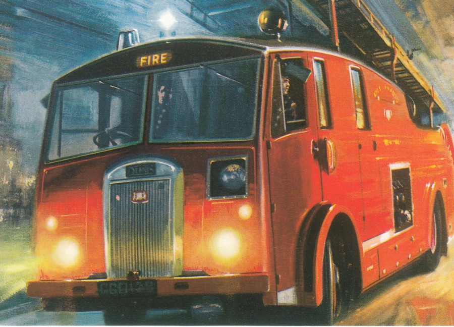
DENNIS FIRE ENGINE
Published by
VINTAGE AD GALLERY LTD
2006
Ref: COD39APC
As a policeman I had a good working relationship with our local fire brigades in the various areas I worked. There was of course some friendly rivalry as well as is to be expected between different emergency services. This has always led to an interest in Fire Service-related postcards, and when I recently saw this smashing painted image, I had to have it. It was £1, which is up there at the top of its value in my opinion, but you have-to agree it is worth having.
25/01/2021
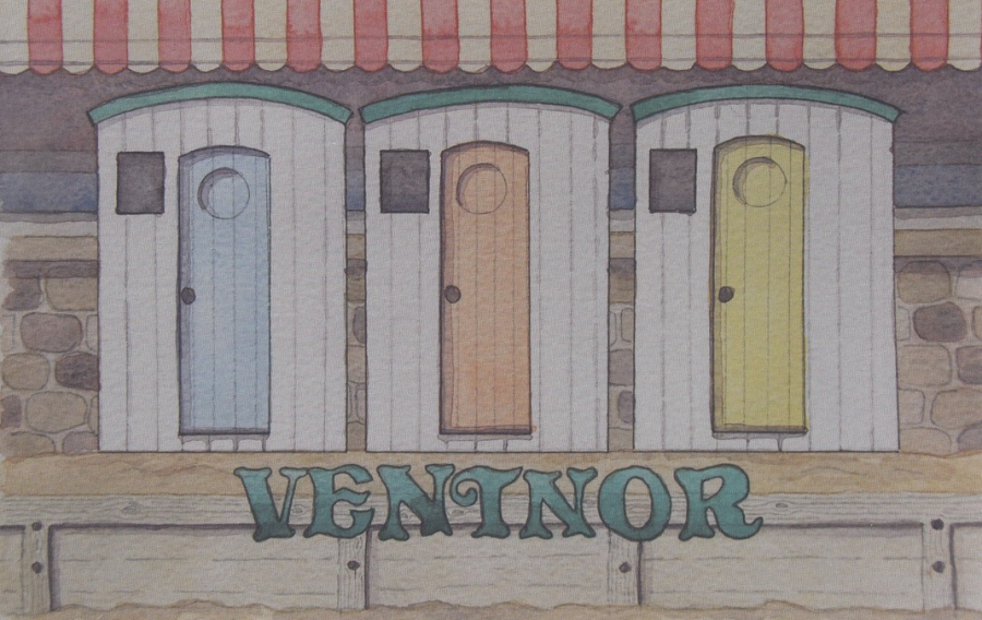
VENTNOR
Published by
TRUDI BRIDGEMAN DESIGNS
Ventnor is on the Isle of Wight, which I assume many of you know, certainly those in the UK. The island is one of my favourite locations in the UK and I have now been there four times I think, maybe five. It is also somewhere we are looking at for our next move. We have started to look at some houses there to see what might-be-an option when we get around to a move (which is dependant on the sale of our house, something which is obviously interrupted by the lockdowns and the pandemic). I am not sure that Ventnor will be where we might consider, but this large sized lovely postcard (a Christmas present from my eldest son and his family) is attractive and catches the eye, which is what they are supposed to do after all (maybe it will be here after all).
23/01/2021
CORONAVIRUS
By
TROCK6
Published by
REDBUBBLE
So, all the news today is around the new variant of Coronavirus and whether the vaccine is less effective against it or not. Like many people I suspect, I had hoped that 2021 would advance forward with things getting better, but now twenty-three days in I am not so sure (admittedly not helped by my hospital stay last weekend which although not due to Covid it did give me an insight into the still ongoing, maybe even increasing problems due to the pandemic). I think there is a light going forward, and I have my fingers crossed that we reach a point where this is behind us. In the meantime, TAKE CARE – STAY SAFE – STAY WELL everyone.
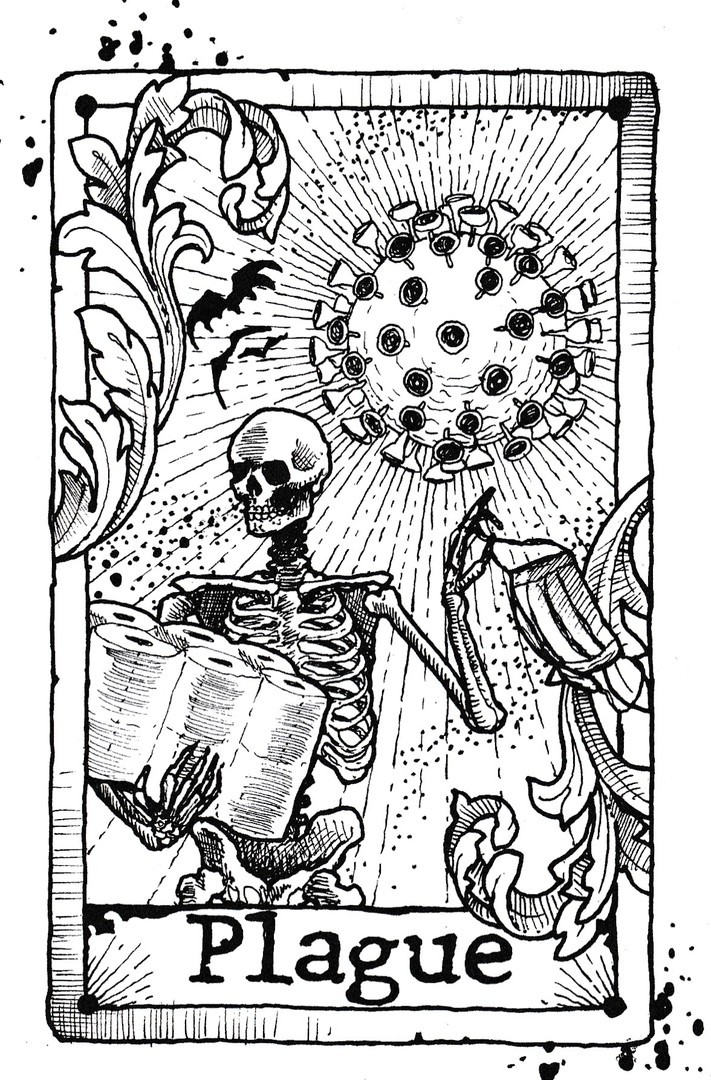
COVID-19
By
MIKE GUINN
Published by
REDBUBBLE
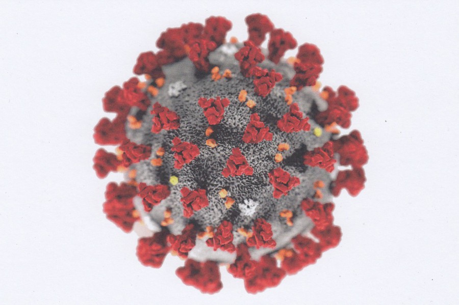
I am not going to lie, I thought this was a cracking design and one which incorporates all that was connected to the coronavirus during the first months of the pandemic; Mask, Toilet Paper (and the hoarding of such things), bats and that coronavirus bug shape (see postcard above for colour version). Looking to me like a Tarot Card I thought this a very clever piece and a postcard which fits superbly into my Covid-19 collection (which is still growing weekly)

20/01/2021
NEW YORK CITY
Photograph by
JON ORTNER 2011
Published by
IMPACT
Ref: 49580-4LN
Eyes are on America today as a new President is inaugurated. I have watched the proceedings on CNN and am glad they seemed to go ahead without trouble, which I suspect was not totally anticipated but was hoped for.
As many will have worked out from my previous postings, I have a fascination with America, and with Florida in ‘particular’ in past years, but it is a country I have visited several times and I have visited Washington DC where all the main events have been happening, but I notice that events have occurred in other major American cities and states, including New York. I have more postcards of New York than any other American city (even than Orlando in Florida) but then I have been here twice, and it has iconic structures which I am interested in historically. I suspect there is no more iconic a New York building than that of the Empire State Building.

REVERSE SIDE OF ABOVE POSTCARD

UNION STATION
WASHINGTON D.C.
Published by
B. S. REYNOLDS CO., WASHINGTON D.C.
In 2018 we arrived by train at Union Station in Washington D.C. The station was a marvel to me, and I have mentioned it before and depicted another old postcard showing it previously elsewhere on the webpage. As we exited the front of the station, we had a few minutes to wait for a coach. I got to look across the road and across an area of green towards a tall building sticking up clearly in the distance. This building was the United States Capitol, often called the Capitol Building and the scene of rioting and an unlawful forced entry by a large crowd who caused damage and what some have called insurrection. Today of course the building has been the scene of the inauguration of a new president. I got to have a better look when our coach gave us a tour of the area of Washington D.C.
It has been interesting as someone here in the UK to see the images from both events and to see them in context to locations I have visited.
Going back to Union Station itself, I visited it three times in all, on my arrival and my departure days and to have a walk around on a separate day whilst waiting for the Postal History Museum to open (which is located next door). I had a nice breakfast here and returned for an ice cream lunch after visiting the museum. I loved the structure and its complexity, and I subsequently became a big fan of the large Union Stations we visited across the country, so much better than our UK train stations.
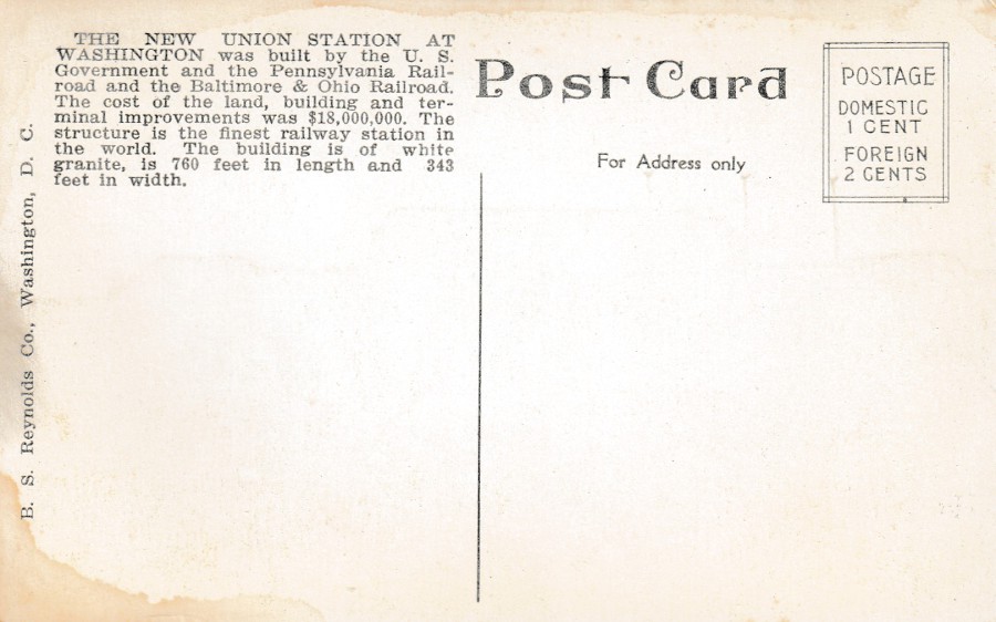
REVERSE SIDE OF ABOVE POSTCARD
This has a nice block of informative text
19/01/2021
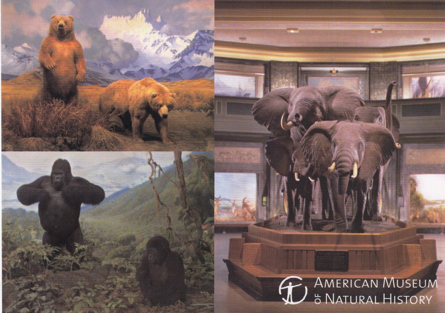
AMERICAN MUSEUM OF NATURAL HISTORY
WINDOWS ON NATURE
From Alaska brown bears in the Hall of North American Mammals to elephants and mountain gorillas in the Akeley Hall of African Mammals, art and science come together in the animal habitat dioramas for which the museum is famous.
(Text from reverse side of postcard)
Published by and exclusively sold at the
AMERICAN MUSEUM OF NATURAL HISTORY
Printed in Korea
Ref: 56514
This museum is located in New York, and I was fortunate enough to visit it last year, back in February just a month before the city was struck down by the coronavirus pandemic causing a shutdown of the city.
I have always been fascinated by wildlife displays, either live animals in zoos or stuffed exhibits such as those shown here. For me, this museum is perhaps the best one for animal dioramas. Some of them are just outstanding and if you have any interest in animal history then I totally recommend a visit here. Although the museum was superb, I did think the postcard selection was quite small and sadly few now depict the dioramas, but this one did and had to be bought.
19/01/2021
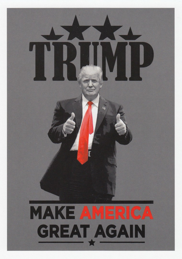
TRUMP
‘MAKE AMERICA GREAT AGAIN’
Unnamed Publisher
(I bought this postcard from a tourist gift shop in New York just off-of Times Square in February 2019)
Last Full Day.
Enough Said
18/01/2021
It has been just over a week since I last posted here, but in my defence, I was initially ill for several days before ending up in hospital for a few more. I was released yesterday and was still quite weak and tied. This incumbrance, still not over yet but heavily medicated, meant that I did not find the ability to show you any cards. This hopefully will not occur again for a while as I will be laid up here at home. So here is my first return postcard posting:
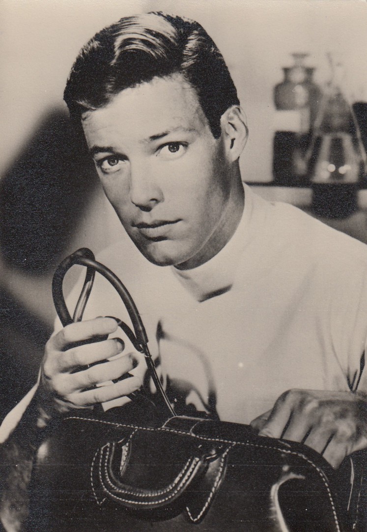
RICHARD CHAMBERLAIN
As
DR KILDARE
Published by
UNIVERSUM-FILM - A. G. BERLIN-TEMPELHOF
Licence for UK & COLONIES, D. CONSTANCE LTD, LONDON
Ref: WP Nr. 119
I suppose that having spent several days in hospital that some sort of medical theme would be attached to the postcard I depicted. Well, in some ways that is possibly correct. Personally, I am a little young to remember this television programme as it ran between 1961 and 1966 and I was born after the series commenced. I do remember my mother saying that she was a huge fan of the programme, in fact she was a lifelong fan of the actor Richard Chamberlain and watched anything he was in, often more than once and oh how I dreaded any re-run of ‘The Thorn Birds’!

REVERSE SIDE OF ABOVE POSTCARD
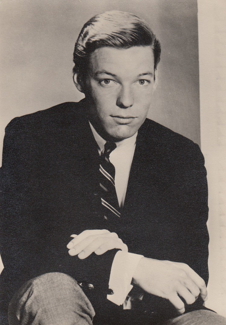
RICHARD CHAMBERLAIN
As
DR KILDARE
Published by
UNIVERSUM-FILM - A. G. BERLIN-TEMPELHOF
Licence for UK & COLONIES, D. CONSTANCE LTD, LONDON
Ref: WP Nr. 120
10/01/2021
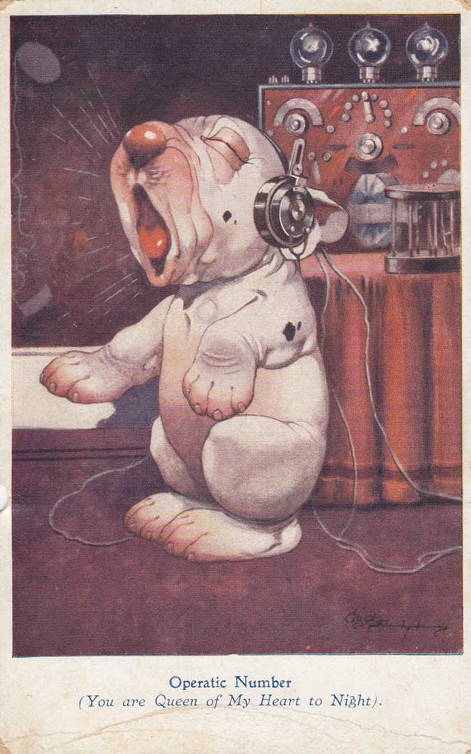
OPERATIC NUMBER
(YOU ARE QUEEN OF MY HEART TO NIGHT)
Bonzo the Dog
By
GEORGE STUDDY
Published by
THE R.P.S. SERIES POST CARDS
Ref: 1045
The cartoon character of Bonzo the Dog was created in 1922 by the comic strip artist George Studdy. The character became extremely popular and went on to appear on many products including a large selection of postcards right through the 1920’s, especially the earlier years post 1922. Around 500 different postcards are believed to have been produced (although I have never seen a check list). This one is also popular with those who collect radio as a theme (which is a very popular topic).

REVERSE SIDE OF ABOVE POSTCARD
Posted 1924 (12th September)

07/01/2021
UNTITLED
Novelty – Applied real feathers
Hand Painted Background
Unnamed Publisher
(Has a logo on the reverse side – an upside-down triangle with the letters ‘WM’ across the top and ‘B’ at the bottom)
I have three cards by this company all with real feathers applied. What appealed to me though was the hand painted backgrounds on these cards, and by hand painted I mean each card individually hand painted, which must have been an unusual process for the time, although hardly greatly detailed so I suppose each card would not have taken long. Are these attractive? I am not sure, but they are certainly interesting. I will depict the other two postcards in a future posting.
07/01/2021
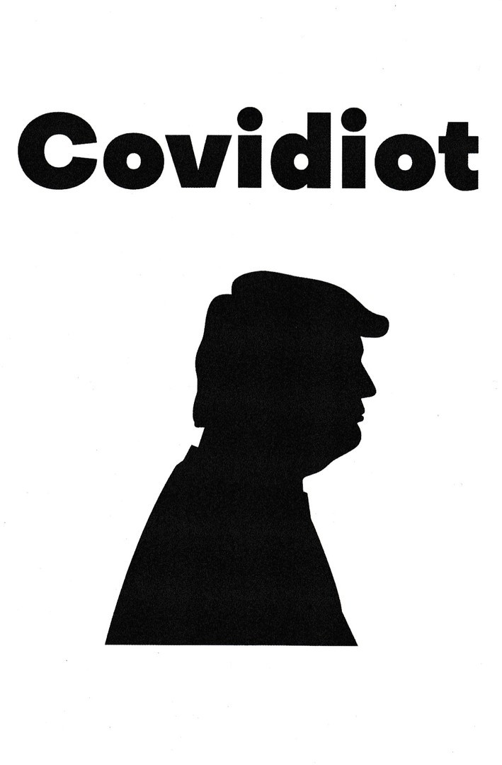
COVIDIOT ANTI TRUMP
By
CURSOTTI
Published by
REDBUBBLE
America had an interesting day yesterday and last night, although more properly Washington DC had an historic happening. The invasion of the Capitol building was something I had not expected to see, and I was glued to CNN for hours watching it all evolve. Who was ultimately responsible? Well, many seem to have one individual whom they blame. Now, I have tried to keep this website politically neutral, and will remain to try and do so, but postcard publishers often go in ‘very’ specific directions and this published design ‘definitely’ does that.
06/01/2021
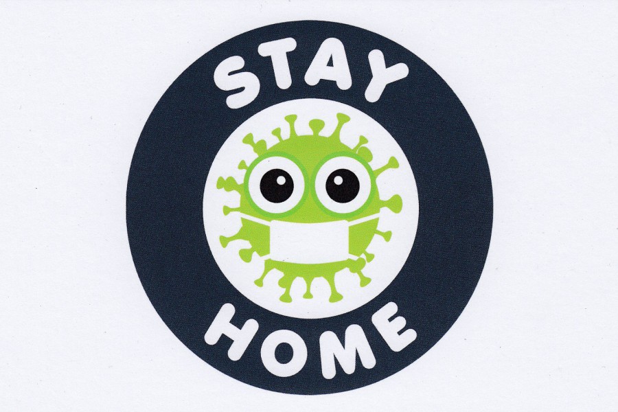
STAY HOME
‘Untitled’ (as described on the reverse side)
By
NABIL-1996
Published by
REDBUBBLE
Well, here we are again back in Lockdown (mark 3!). The announcement was made on the 4th January by Boris Johnson and although he did say it was to commence immediately, the first full lockdown 3 day was the 5th (yesterday). As we are all supposed to be staying at home unless there is a real need to go out, I suppose this design is as appropriate as any.

06/01/2021
I SURVIVED THE PANDEMIC
Published by
GAILENA / GAILENA SHOP
BERNALILLO
Ref: NM 87004
The green bug depicted here is clearly from the same image as used on the above Redbubble issue although this card here was obtained many months prior to the above card. This one here was sourced through a Spanish based company. I find it interesting how these days a single image can be used by different companies with what appears to be little copyright usage, although the images are not identical (although based on the same basic premise).
Although this design is a bit premature, lets hope it becomes so for all fairly soon.
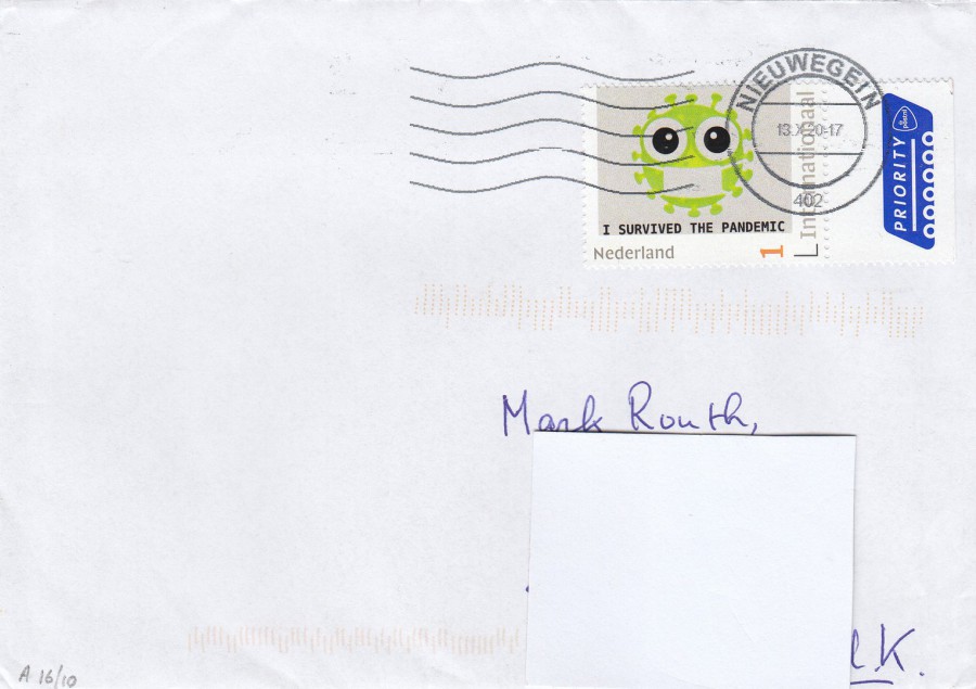
NON-POSTCARD ITEM
Envelope Posted from the Nederland
As you can see this personalised stamp has the same design as appears on the postcard above. I obtained a mint copy of this stamp from a collector in the Nederland and he used another of the stamps on the envelope he used to post it to me.