03/04/2018
BOOK LISTING
I have added a new section to the webpage tonight. If you look along the bottom line of tabs there is a new one titled – BOOK LISTING – if you click on this, and then click on the ‘BOOKS 1’ tab you will open-up a page of book illustrations. These are all books about postcards or which I use as reference books for my collection. All of these are books from my own collection. There will be more books added on future dates, but there has been a fair number placed there tonight as an introduction to the page.
02/04/2018
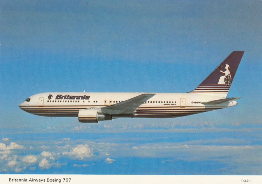
BRITANNIA AIRWAYS BOEING 767
OFFICIAL COMPANY RELEASE
Ref: 0341
Britannia Airways was a charter airline here in the UK which commenced service in 1961, although originally the service came under the name Euravia (London) – the company was re-branded to Britannia Airways on the 16th August 1964. By 1972 Britannia Airways was the largest charter airline in the UK.
In 2000 the airline was acquired by a German company called Preussag AG (TUI Group). The result of this acquisition was that the company was re-branded as ‘Thomsonfly’ on the 1st November 2005.

02/04/2018
RMS TITANIC MONTH
April is the anniversary month for the RMS Titanic leaving Southampton on her maiden voyage
and, the month that the ship hit the iceberg and sunk.
To commemorate this tragic event, I intend to place at least one TITANIC postcard on the webpage each day up until the anniversary of the sinking on the 15th.
DAY TWO
TITANIC AND NOMADIC APRIL 1912
3D NOVELTY POSTCARD
(The 3D effect is hard to scan which is why this image appears blurred)
Artwork by
Stuart Williamson
Published by
JOHN HINDE (3D)
Ref: OO – TPC – 3D – 1910
(‘Greetings From Ireland’ Series)
Published and Printed in Ireland
“On the evening of 12th April 1912, the tender Nomadic loaded 270 passengers on to the Titanic before it sailed for Queenstown (now Cobh) which was to be her final port of call”
(Text from reverse side of painting)
Although this scanned image does not portray it very well, this is a cracking picture, made all the better by a very good 3D effect. Novelty Titanic postcards are not very common, so this was a nice find. It is also nice to have a design which features the Nomadic tender, which does not appear on many of the Titanic themed postcards. There are plenty of Southampton and Queensland (Cobh) based views for the Titanic, mainly art but some photographs as well, but the Titanic’s call at Cherbourg, France is far less covered. Passengers boarding at France had to be shipped out to the Titanic by tender – the Nomadic, as pictured.

REVERSE SIDE OF ABOVE POSTCARD
A better view of the front image, scan wise anyway – always nice when the reverse side receives some design work as well.
01/04/2018
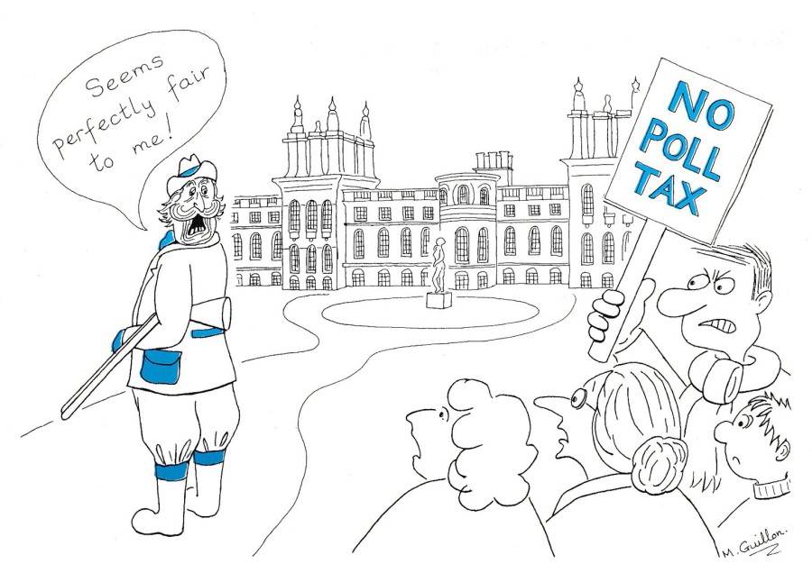
PERFECTLY FAIR
“NO POLL TAX”
By
MAGGIE GUILLON & TRUDY BEGG
Published by
MAGGIE GUILLON
The ‘POLL TAX’ or ‘COMMUNITY CHARGE’ as it was officially known was a tax implemented by the Tory Party, under Margaret Thatcher. It was started in Scotland in 1989 and England and Wales in 1990. Because the tax provided a single flat rate tax per adult it meant that a family with adult children would be paying more than a single aristocrat in a stately home. The implementation of this tax was to lead to riots and mass protest here in the UK. It also resulted in a wide selection of anti- Poll Tax related postcards. This was another topic which I collected as the cards came out, and for awhile they were very, very popular and quite expensive as the topic became a top news item after some major riots, especially a large one in London. Eventually the Poll Tax was removed, the public for once being successful against a government project. Because the Poll Tax did come to an end, and, was only in place for what would be considered a short time politically – legislation came in during 1992 which changed the Poll Tax over to what was called the Council Tax from the start of 1993/1994 financial year – there is a finite number of related postcards on this theme. This means you can, if you can find them, complete a collection of related cards as no news ones came out after 1993. This one here was one of the best and can still cost a few pounds to buy.
01/04/2018
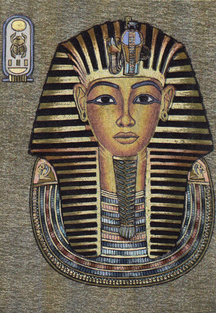
MASK OF TUTANKHAMUN
Published by
F. J. WARREN LIMITED
A “DUFEX” POSTCARD
Ref: 501865
A superb ‘Shiny’ surfaced – very GOLD coloured – DUFEX postcard. When I was a child I saw this mask on a visit to London. I was fascinated by my visit and this was the start of my interest in the history of ancient Egypt. Since then I have also visited Tutankhamun’s tomb in the Valley of the Kings in Egypt. As a result of both of these trips I have always picked up any postcards that I come across which depict anything related to this young pharaoh.

01/04/2018
LEAF DESIGN POSTCARD
Undivided Back Postcard
Published in France
Unknown Publisher
This very simple design was posted in France in 1905. It was the simplicity of this design that appealed to me. I do not think it has any real catalogue value, but to me it is a nice early art postcard.
REVERSE SIDE OF ABOVE POSTCARD
Note the edge of the stamp folded over from the front
01/04/2018
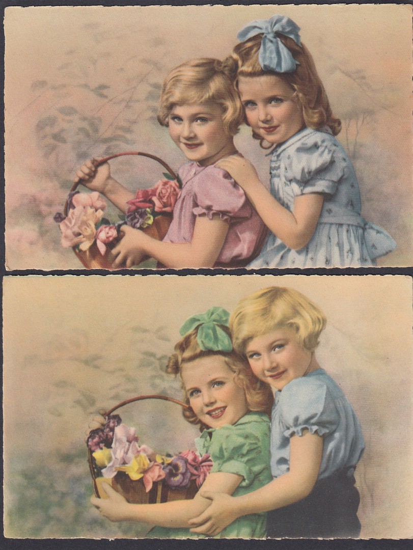
CHILDREN POSTCARDS
Published by
A. NOYER
In their:
COLLECTION CHROMATIQUE No 7
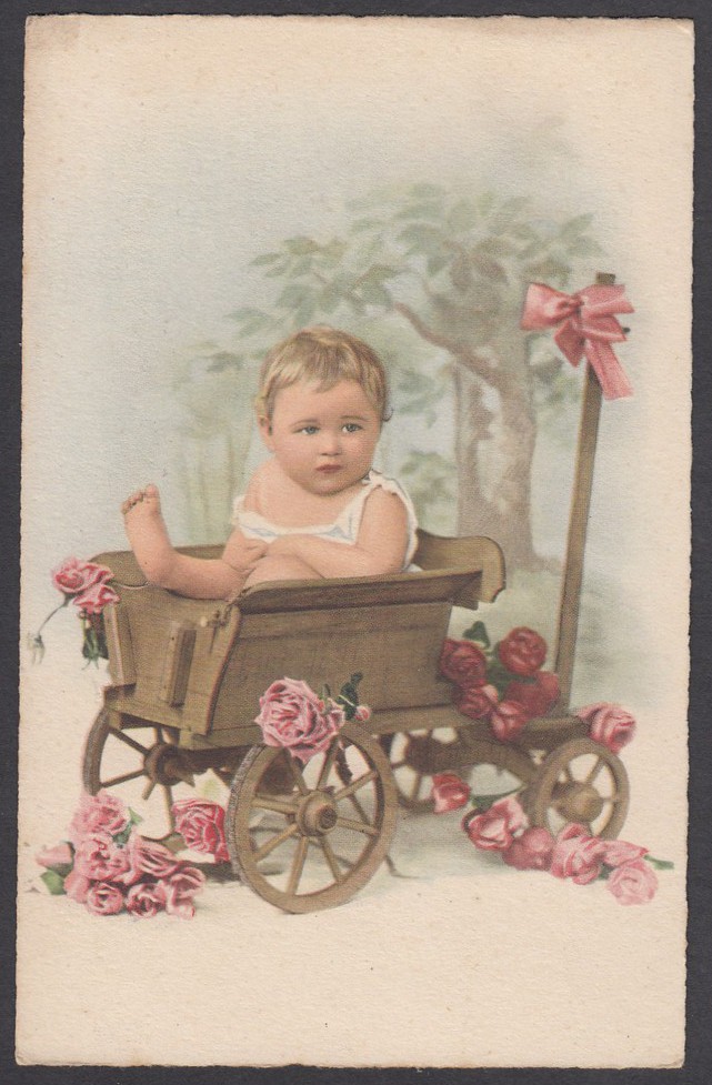
I bought these eight postcards in an antique collector’s shop in Sainte, France last week. They have no titles and no descriptive text to distinguish between them. The first three postcards clearly depict the same two children, changing places on the first two postcards. One of these also appears on the fourth card, in what is my favourite image from this selection. These only cost me 20 cents each, so five for just 1 euro, a major bargain in my mind.
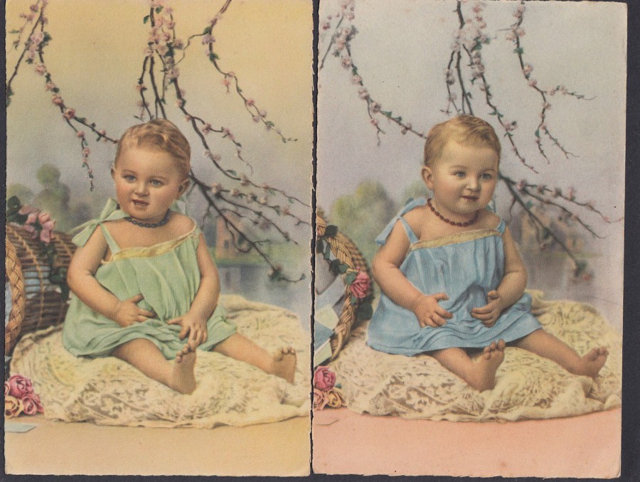
The next two down are clearly the same baby, in the same cloths and from the same photo-shoot, but the clothing colours have been changed in the hand colouring process used in the printing of these images. There was a trend for ‘Improving’ the colours on these such cards. I believe it was to catch the ye of the buyer, and they are certainly attractive colour wise. These are nice examples of this type of card and although not very valuable they should have cost me way more than they did.
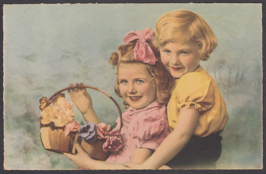

This is my favourite postcard from this selection.
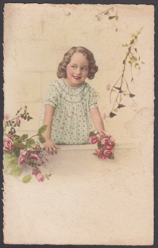
The smile on this girls face is quite captivating, and I suspect a good postcard selling point.

01/04/2018
HAPPY EASTER
To
Everyone
JOYEUSES PAQUES
(HAPPY EASTER)
Published by
EDITIONS DE LUXE G. PICARD – PARIS
This is actually a novelty postcard as the basket of eggs, and the little yellow bird on the handle, are on a shaped piece of card which is attached to the front of the card so, sticks out. These types of card are called ‘Applique Postcards’, applique meaning ‘Applied’ which is where the name originates.
01/04/2018
RMS TITANIC MONTH
April is the anniversary month for the RMS Titanic leaving Southampton on her maiden voyage
and, the month that the ship hit the iceberg and sunk.
To commemorate this tragic event, I intend to place at least one TITANIC postcard on the webpage each day up until the anniversary of the sinking on the 15th.
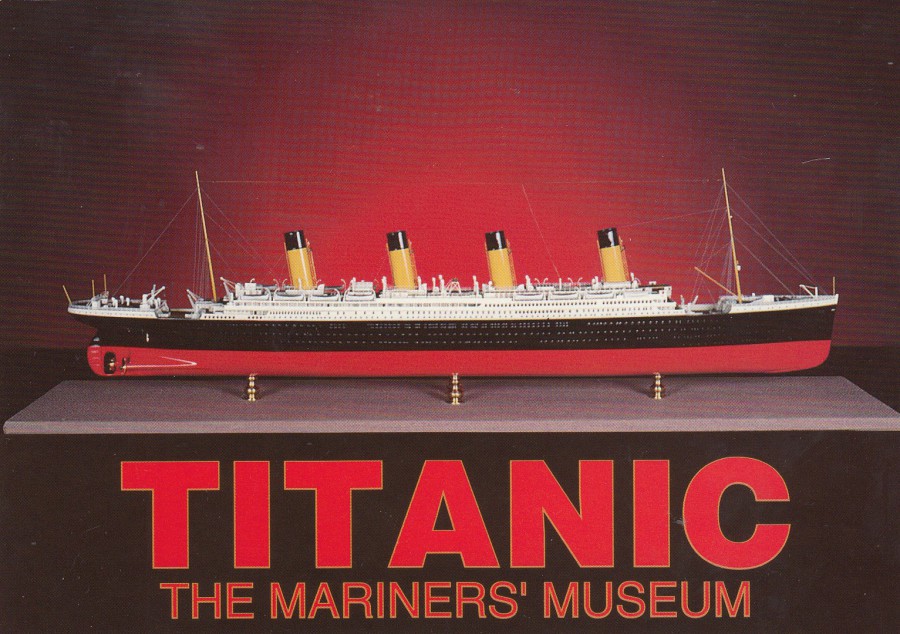
TITANIC
THE MARINER’S MUSEUM
NEWPORT NEWS
VIRGINIA
RMS TITANIC MODEL
Published by
MILLER-BICAST Pub. Co.
(Williamsburg, Virginia)
Ref: MM-7 CP11954
This is a photograph of a model which is located in the ‘Great Hall of Steam’ in the Mariner’s Museum in Virginia, US. It is the more unusual Titanic related postcards, like this one which I like to track down. This one was an eBay buy from a UK seller, despite this card originating from the US. Over the coming days I will hopefully display for you some interesting modern and, as we get closer to the 15th April, older Titanic postcards.
31/03/2018
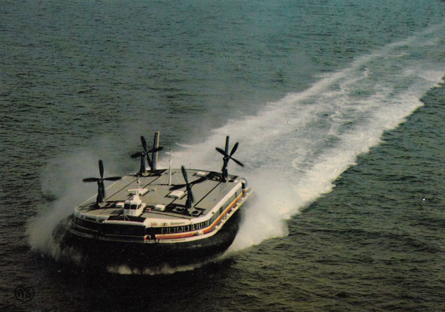
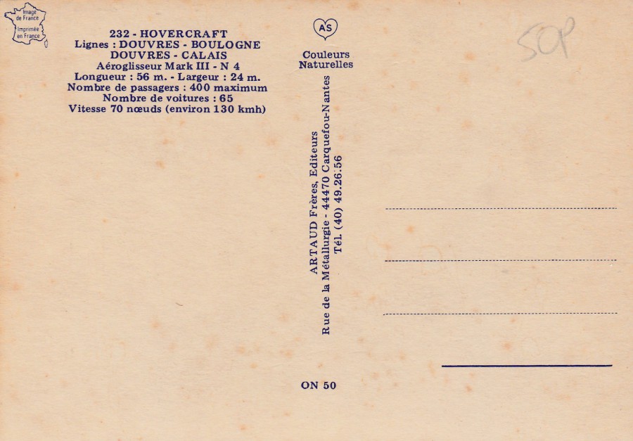
232 – HOVERCRAFT
Lignes (Lines) – DOUVRES (Dover) – BOULOGNE
DOUVRES – CALAIS
Aeroglisseur Mark III – N 4
Longueur : 56 m. – Largeur : 24 m.
Nombre de Passagers : 400 maximum
Nombre de voitures : 65
Vitesse 70 noeuds (environ 130 kmh)
Published by
ARTAUD FRERES EDITEURS
(Couleurs Naturelles)
Ref: ON 50
Hovercrafts on postcard have remained a popular theme despite the actual demise of the hovercrafts themselves. Perhaps their continued popularity could be linked to the fact that they no longer run across the channel between the UK and France. Maybe it is people’s fond memories of their journeys that keep the subject going. Whatever the reason for the continued interest it can not be denied that Hovercraft postcards maintain some high catalogue values. This is a French example which I bought in Calais back in the very early 1990’s, possibly even in the last couple of years of the 1980’s.

31/03/2018
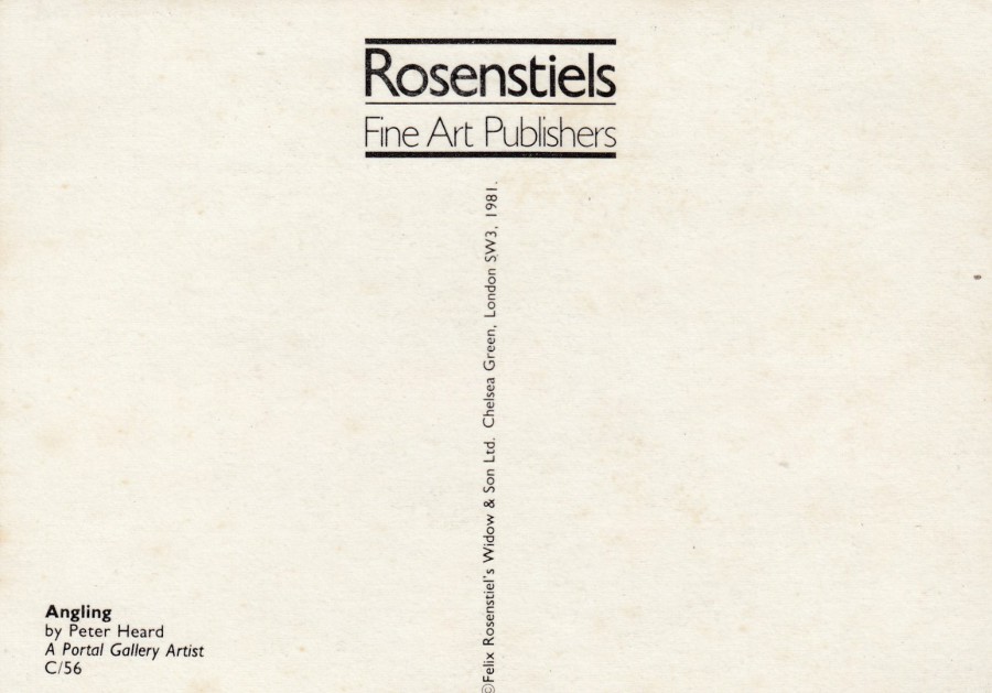
ANGLING
By
PETER HEARD
A Portal Gallery Artist
Published by
ROSENSTIELS FINE ART PUBLISHERS
(Felix Rosentiel’s Widow & Son Ltd,
Chelsea Green, London)
Ref: C/56
I remember going into a shop somewhere way back in the 1990’s sometime and coming across this postcard. There was a about five or six copies of it on display at I think just 10p each, it might even have been just 5p, I do know they were so cheap I bought the entire small stack. This was an example of me being in the right place at the right time.
31/03/2018
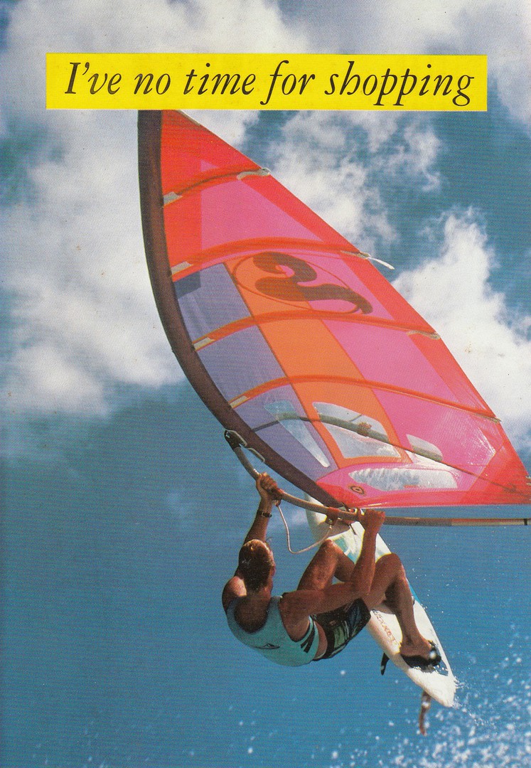
I’VE NO TIME FOR SHOPPING
FREEMANS CATALOGUE
Pre-Paid free advert postcard
From the front this looks like a lovely windsurfing sport related postcard, one which I am sure would grace any sport related collection, but, it is a card which was more often thrown away than kept, and one which was often derided as not a proper postcard. This was because it was printed on quite thin paper like card, and because of its reverse layout – see below.
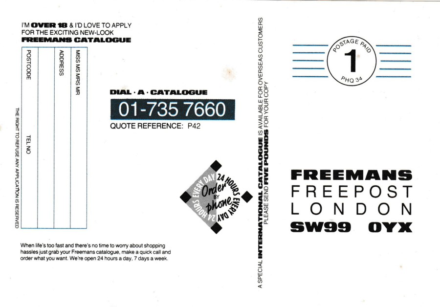
REVERSE SIDE OF ABOVE POSTCARD
As you can clearly see this a reverse side which is fully packed out. It has a printed address, pre-printed postage mark and an address side which contains lots of adverts and a box to be filled in if the sender wanted their ‘Freemans’ catalogue. There was a time when opening any magazine meant having a wad of advertising material fall out. This used to include this type of material, often referred to as ‘Junk Mail’. Much of this was simply thrown away, and as a result, many of these such items are now extremely hard to source by collectors. Fortunately, I saved these when I came across them – although many would wonder why I had a box of ‘Junk Mail’ items in my collection!
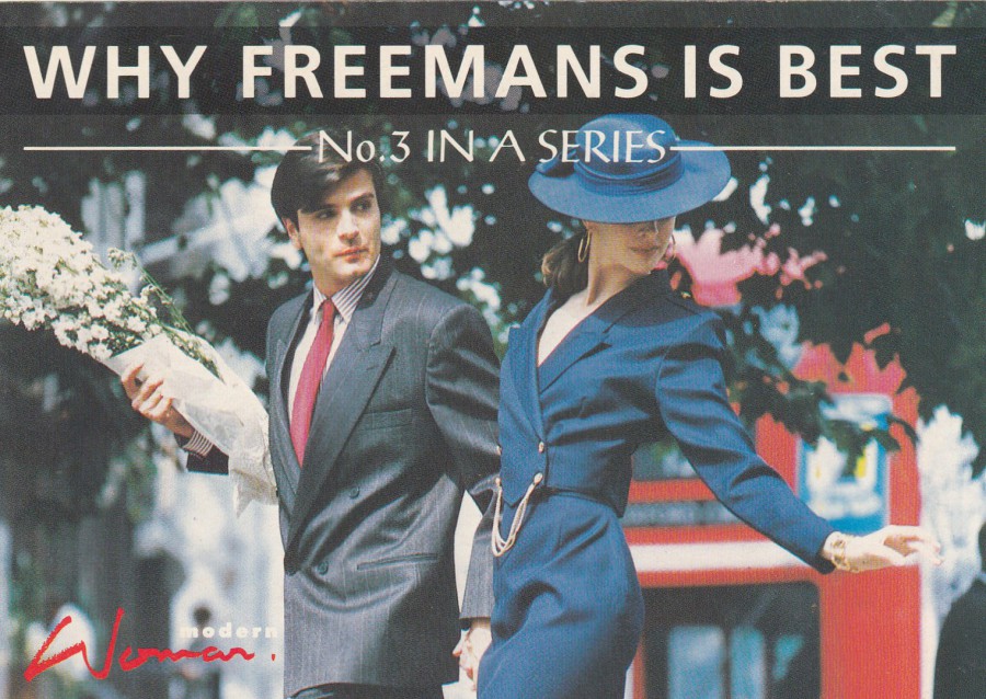
31/03/2018
WHY FREEMAN’S IS BEST
No 3 IN A SERIES
MODERN WOMAN
FREEMANS CATALOGUE
Pre-Paid free advert postcard
They even tried to make these items seem collectible by issuing them in a series. This almost worked, as the cards from this series are slightly more collectible than the standard front images like the surfboard one above. These are still quite hard to find though.
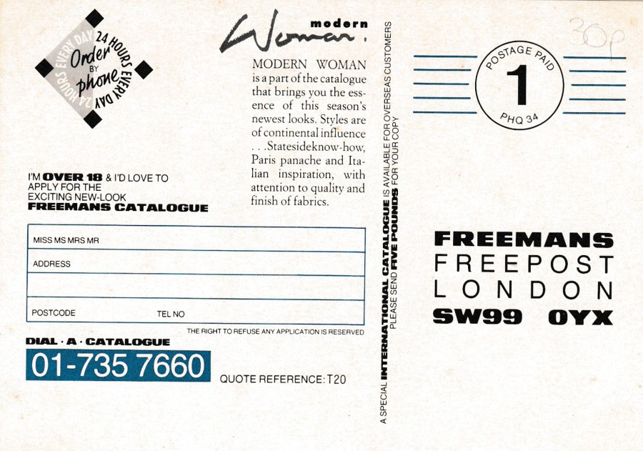
REVERSE SIDE OF ABOVE POSTCARD
31/03/2018
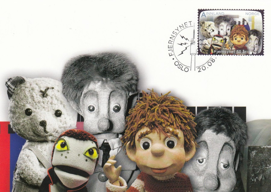
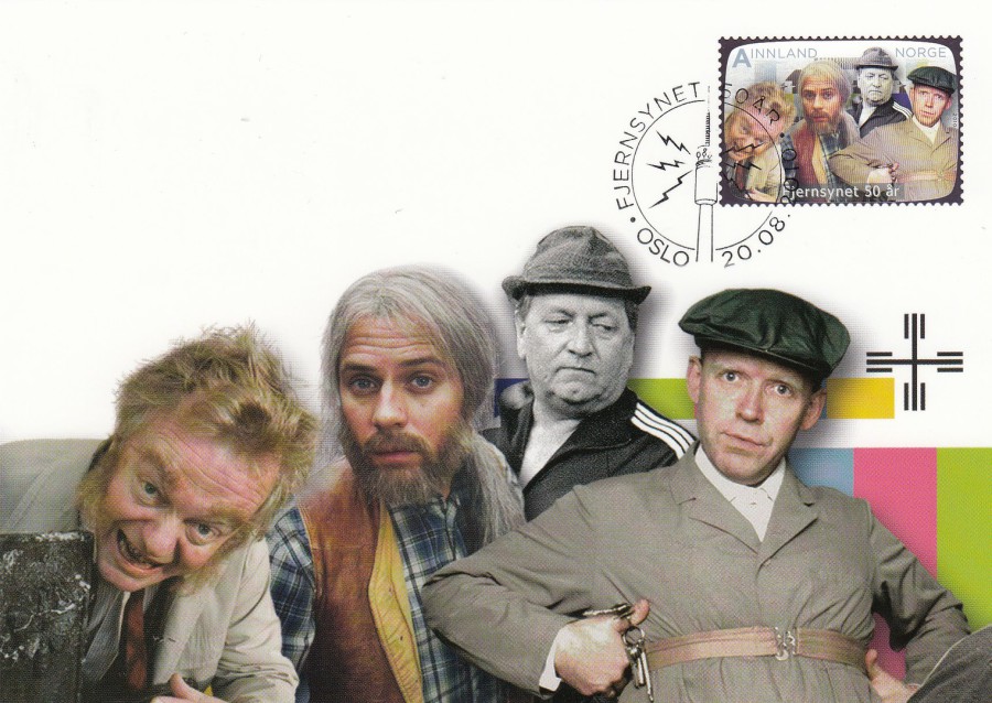
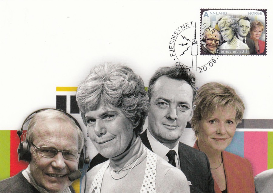
FJERNSYNET 50 AR
(50 Years of Television)
NORWAY
OFFICIAL MAXI-CARD SET OF 4
Photo-Design by
MAKING WAVES
Collage Designs
Issued in 2010
With my love of television related postcards this set was always going to be something I would want, although I struggled to get it for a while. I already had the stamp set but these cards eluded me. Thankfully I now have them, but, as much as I would love to tell you more about these, I can’t, as the people and characters depicted are all unknown to me – it would appear my knowledge of the television of Norway is zero, but perhaps that’s no real surprise. This lack of knowledge though, by no means reduces my real fondness for this set, which I think is excellently put together.

31/03/2018
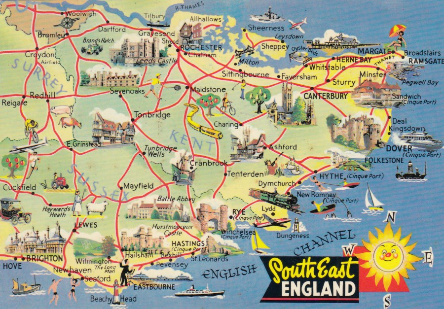
SOUTH EAST ENGLAND
MAP POSTCARD
Published by
E. T. W. DENNIS & SONS LTD
(A DENNIS POSTCARD)
Ref: S.053001L
Dennis & Sons produced postcards just like this for areas all over the UK. These were once extremely popular and during the 1980’s and 1990’s you would find examples on nearly every postcard spinner in any city or town. What happened? Why are they no longer popular? The collecting of map related postcards was extremely popular during the 1980’s and 1990’s, there was even a Map Collectors Postcard Club (that issued its own postcards, which are now very, very scarce). So, why has the theme been in such a decline? My only real answer to this seems to be the basic situation where themes and fads come and go, often in waves. Maps are obviously at a low point at the moment, but perhaps they will again become popular in the future, who knows? They are lovely cards, so should be due an increase in popularity in my mind. There are lots of smaller images included which cover other themes as well - Trains - Planes - Hovercraft - Farming - Animals - Castles - Military (there is a cannon top left) - Cars - Sport (someone is playing Tennis, another golf, and shooting could be considered a sport as well - not by all I admit, but many) - Etertainment (there is a orchestra conductor) and Lighthouses. Thats quite a lot of themes covered by a single postcard!
31/03/2018
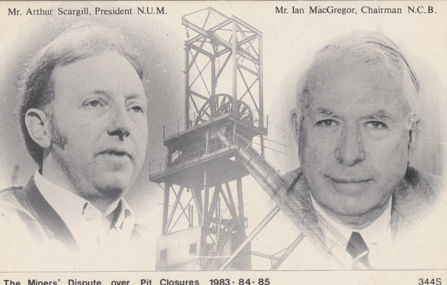
THE MINERS STRIKE
THE MINERS DISPUTE OVER PIT CLOSURES
1983 – 84 – 85
MR ARTHUR SCARGILL, PRESIDENT N.U.M (National Union of Mineworkers)
MR IAN MacGREGOR, CHAIRMAN N.C.B. (National Coal Board)
Published by
J/V POSTCARDS
(P. W. JUDSON & A. C. VEASEY)
Ref: 344S
I remember the ‘Miners Strike’ well, it lasted from October 1983 through and into 1985. It was the big news item of the mid-1980’s and as a result there were lots of postcards issued which related to it. Nearly all the postcards were issued by pro-miner publishers or by the miners themselves, or miner related organisations, so these tend to be issues which are biased towards the miner’s position. J/V Postcards were a pro-miner, their base was in Nottingham where much of the dispute also was to take place, but their cards were also a bit different as they concentrated on the news side of events. This card here is a nice neutral design as it shows the considered leaders of both sides. It is also a very collectible postcard from the companies output (valued around £3 - £5 today). This came out at the height of my early multi-theme collecting and I built up a really-good ‘Miner’s Strike’ collection as a result.
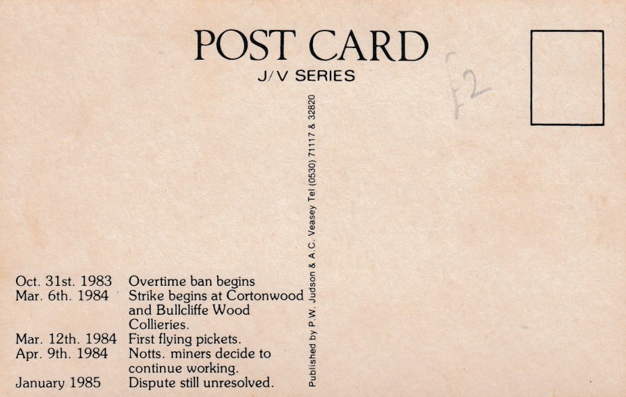
REVERSE SIDE OF ABOVE POSTCARD
Very - Short potted history of the strike, from the Nottingham Miners point of view
31/03/2018
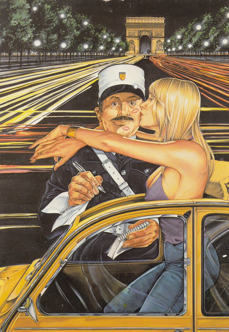
UNTITLED
(French Police man – Paris – Arc de Triomphe)
Artwork by
ROGER PEARCE
Published by
BEECHWOOD PUBLICATIONS LTD
Ref: 553643
This company had a habit of not titling their postcards, most of which – if not all of which – were unique designs to them. I was a big fan of their postcards, although I will admit that many were very simple designs, but some, like this one, were superb little pieces of postcard artwork. For me, it is the policeman connection that appeals, but it is also a ‘Glamour’ card as well. The location is identifiable due to the Arc de Triomphe in the background, an iconic monument located in Paris. This card is from the mid to late 1980's.

30/03/2018
THE FRONT
BRIGHTON
Unknown Publisher
Posted 1922
To all intent and purpose this is a standard view postcard, like so many thousands of such-like location postcards published. This one does show the shore end of the pier though, and some attractive garden areas so has some historic information to someone who was looking into the history of this area. It is also somewhere that I have visited a few times and really like. I have even walked along this very promenade, but, I must be honest, and say that it was the reverse side which caught my eye (and how often have I said this?)
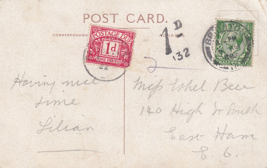
REVERSE SIDE OF ABOVE POSTCARD
The sender of this postcard used a ½ d King George V definitive stamp (issued between 1912 – 1936) as postage. Unfortunately, the postcard rate changed in 1922 to 1d, so the payment was incomplete by 1/2d. Any charge made for insufficient postage is charged at double that which is underpaid. So, in this situation the 1/2d underpaid is doubled to 1d and that became the under-paid fee. Therefore, a 1d postage due stamp has been applied (Ref SG D2) and there is also a 1D (132 – this number is the royal mail office number – 132 was the number for Brighton) mark in black (type 18/2 in Stanley Gibbons ‘Collect British Postmarks’ catalogue). The combination is not very scarce, but I do think that in this case it is an attractive looking usage, and I do like ‘TO PAY’ or ‘POSTAGE DUE’ stamps when they appear on postcards.
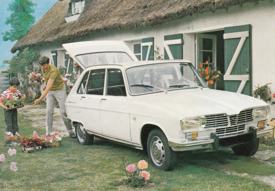
30/03/2018
RENAULT 16 TA
Competition Postcard
France
Posted from Paris in 1970
Ref: 06 AD
I like transport related postcards anyway, but this one has an added bonus as it is one sent out with a printed message on it, looking like it has been hand written (because, believe it or not, it has been proven that we are more likely to read something which has the look of a personal touch – like a hand written message – than we are a typed or obviously printed official like message). The printed message here advises the reader that there is a chance to win one of six Renault 16 TA motor cars. This card is now forty-eight years old, so although many would still consider it a modern postcard I suspect many non-collectors would consider it an old item (the ins and outs of what collectors and dealers consider to be classed as a modern postcard is another ‘whole’ story in itself! I have some contentious views about this myself – one day I might explain it all to you, who do not know)
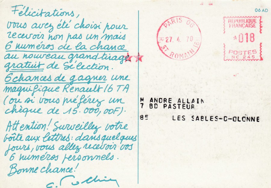
REVERSE SIDE OF ABOVE POSTCARD
With pre-printed message and ‘PARIS’ pre-paid postage mark in red – dated 27 – 4 - 1970
30/03/2018
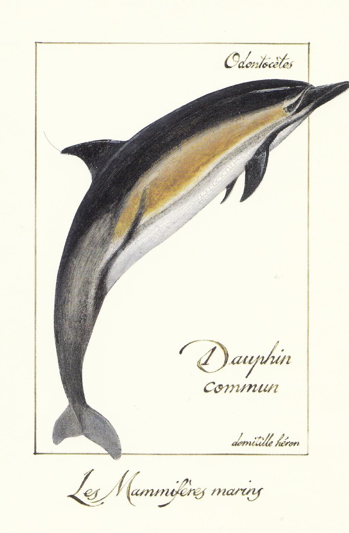
GULF STREAM 1998
MARINE CREATURES SERIES’
THE MARINE MAMMALS
THE CRUSTACEANS OF OUR COAST
This is a lovely series, or couple of series’, which I found in France some years ago now. The concept is quite simple, but the execution of the designs is good. I depict here the five postcards I have so far found.
DAUPHIN COMMUN
(Common Dolphin)
Artwork by
Domitille Heron
Published by
GULF STREAM 1998
Ref: CF 02/1
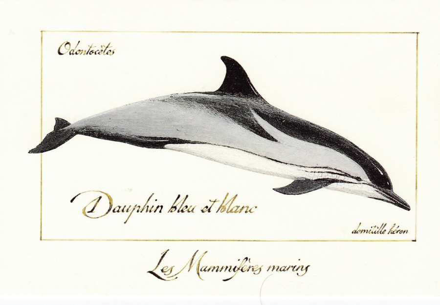
DAUPHIN BLEU ET BLANC
(Striped Dolphin)
Artwork by
Domitille Heron
Published by
GULF STREAM 1998
Ref: CF 02/2
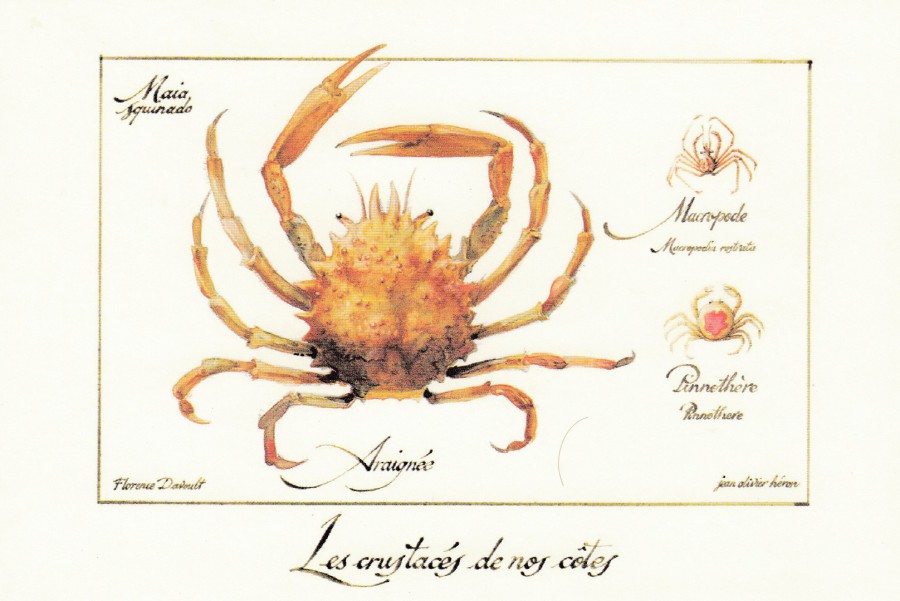
ARAIGNEE
(Spider Crab)
Artwork by
F. Davoult and J.O. Heron
Published by
GULF STREAM 1998
Ref: CF 03/2
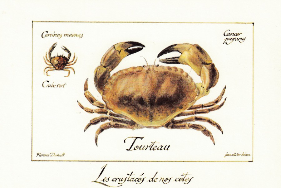
TOURTEAU
(The meaning here is not as simple as some translations – this may be called an ‘Edible Crab’, or also ‘Brown Crab’)
Artwork by
F. Davoult and J.O. Heron
Published by
GULF STREAM 1998
Ref: CF 03/3
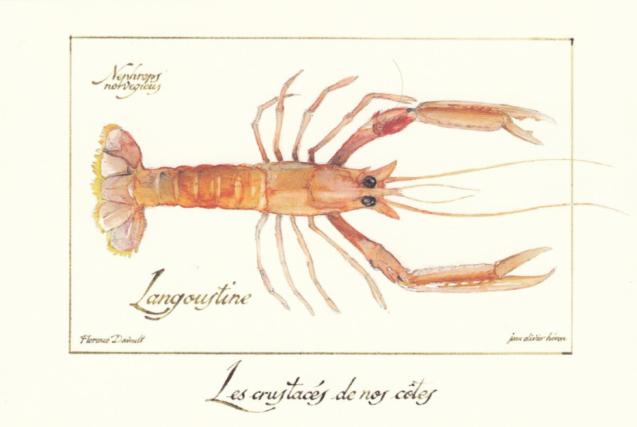
LANGOUSTINE
(This is the same word as used here in the UK – but you might to know that it is actually a descriptive name for ‘Norway Lobster’)
Artwork by
F. Davoult and J.O. Heron
Published by
GULF STREAM 1998
Ref: CF 03/4
To be honest I prefer the crustacean images to the dolphin ones, but I would be interested to see what other creatures are displayed in the ‘marine mammals’ series. I don’t know how long these cards were around, but I have not seen any in France for many years now.
30/03/2018
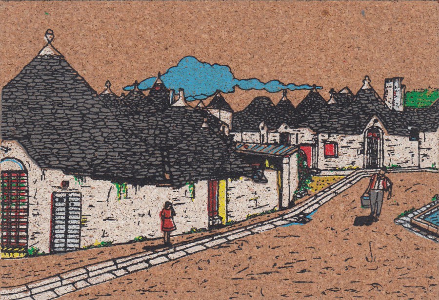
ALBEROBELLO m. 450
LA CITTA’ DEI TRULLI
UNKNOWN PUBLISHER
NOVELTY –
CORK POSTCARD
From Italy
(Posted 1982(?))
Another postcard from my novelty collection. Postcards have been made from a number of different materials (I have previously posted images of Leather postcards and an Aluminium tin postcard) and one of the common unusual ones are those made of cork.
This one here is a colour painted cork postcard from Italy. This is also a posted example, which is always nice to find, and this does prove that examples could be sent through the post.
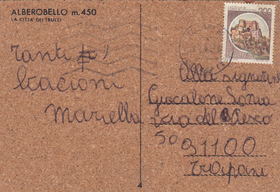
REVERSE SIDE OF ABOVE POSTCARD
This has been posted using one of the many Italian issued ‘Castle’ definitive stamps issued in 1980. This one is the 200I value ‘Cerro Al Volturno’ (SG 1664).

28/03/2018
IMAGES
BAUDETS ET ANE DU POITOU
Published by
EDITIONS MARCOU (Royan)
Ref: 179153
These shaggy looking donkeys are a breed which is common to the area of France around the Charente Maritime region. I have seen many of them in the fields and around the area close to where my In-Laws house is located. When my children were much younger, 12 to 15 years ago, they used to call these donkeys ‘Bob Marley Donkeys’, clearly because they looked like they were wearing their hair in dreadlocks, like the singer. In our family the name has stuck and that it was what we now call them. They are such an iconic local animal that they often appear on local postcards like this. They even have some in the zoo at La Palmyre Zoo which we visited last week (check entry on our facebook page).
28/03/2018
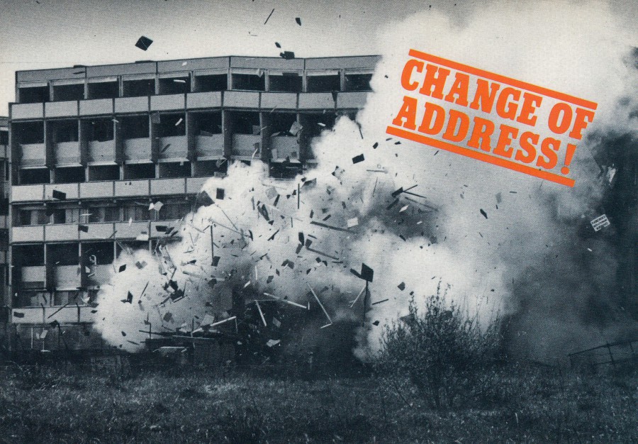
CHANGE OF ADDRESS!
Demolition of flats in Tower Hill, Kirkby
(1982)
Published by
ACME CARDS
Ref: PM1
Acme Cards did a small series of these ‘Change of Address’ cards, I seem to remember one depicting a bungalow on the back of a low loader lorry. They all showed photographs, and they obviously all depicted something unusual involving buildings. This one was always my favourite.
28/03/2018
27/03/2018
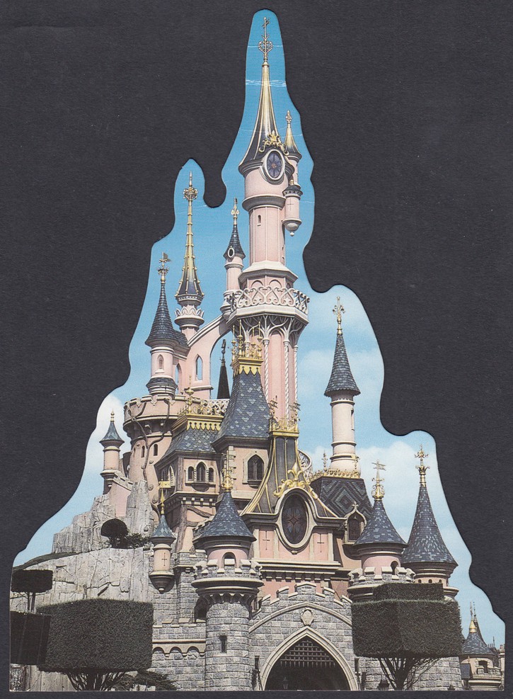
DISNEYLAND RESORT PARIS
LE CHATEAU DE LA
BELLE AU BOIS DORMANT
(Sleeping Beauty’s Castle)
Official Theme Park Postcard
(No reference number)
LARGE NOVELTY SHAPED POSTCARD
This one I bought through eBay as it is one I have not seen on any of my actual visits to the Disneyland Resort Paris theme park. I think it is a slightly older card. It is a lovely photographic postcard featuring the main castle from the Magic Kingdom Paris park. This copy is unused, but, it does have one minor bend towards the very top of the castle, but as it was still cheap I can live with this.
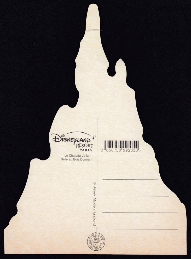
REVERSE SIDE OF ABOVE POSTCARD

27/03/2018
DISNEYLAND RESORT PARIS
Official Theme Park Postcard
Ref: FAC-020296-17161
We arrived here this afternoon and have already booked into our hotel (and got a free upgrade to the main building – neat). We are staying at the Sequoia Lodge (Jo and I have stayed here before, but our two youngest, who are with us, have not), an official ‘Disney’ Hotel, which is close to the parks, where we will be going in the morning. Today we have visited the hotel’s swimming pool, and spa and are now just resting in the room (after all it was a five hour drive up to here from where we have been staying!). We have a meal booked for 180hrs and are now pretty much picking up the ‘Disney’ break vibe.
This lovely postcard is one hat I bought on my previous visit just over a month ago. The postmarks are part of the design and are printed on the card whilst the red heart shapes are filled with red glitter (so, technically you could almost class this as a novelty card – almost). This is a lovely card and a good example of why so many people collect the Disney park postcards

26/03/2018
THE ‘STAMPEX’ WOMBLES STORY
50 YEARS OF THE WOMBLES
ALDERNEY WOMBLE
THE WOMBLES
The Island of Alderney
Before I attended the Spring STAMPEX show back in February I was already aware that on the first day of the show the island of Alderney was releasing a six-stamp set related to the children’s book characters called ‘The Wombles’ (their creator had lived on the island – I have previously posted on the webpage a signed Wombles postcard from my collection). The island had a postal stand at STAMPEX and I was aware that I could pick up copies of the stamps there. I may have previously mentioned that besides numerous postcard topics I also collect stamps and covers related to the theme of television, and the Wombles was turned into a very successful children’s television series.
At the show I was able to pick up a first day cover for the six stamps, another for the miniature stamp sheet which contains the six stamps and a presentation pack which contained six mint stamps. I also got to check the postal authorities sales catalogue which showed me that I had everything they advertised.
I paid for these and carried on looking around the long stall, which also covered the postal authorities of the islands of Jersey, Guernsey and the Isle of Man. Whilst looking around I saw a small (very small as it happens) stack of postcards which depicted the Wombles character Alderney Womble. This was the artwork which was used on the first day covers that I had bought. I asked about the postcards and found out they were for sale, despite there being no information around their release. It seems it was an exhibition special which was not available elsewhere, other then on the stand and, I assume, at the main postal office on the Island (but this later place is not confirmed).
These postcards were mint and as they fitted so well into my collection I bought a couple. I then bought a complete set of the six stamps and applied these to the back of one of the cards. As the stand itself classes as a postal office when the show is open they are authorised to hand stamp items there. So, I had the six stamps, which I had applied to the card, cancelled with the GUERNSEY post office ‘P’ cancel dated 14th February 2018, which was also of course the first day of issue of the stamps (the island of Alderneys postal system is overseen by the Guernsey Postal Authority). I also asked about a Stampex cachet, which they had so I asked for this to be applied as well, as this authenticates where the item was produced. This cachet was applied along the bottom right edge.
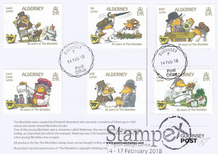
REVERSE SIDE OF
ALDERNEY WOMBLE
The Island of Alderney
Official Postal Authority Post Card
Used with all six of the Wombles issued stamps
First Day of Issue:
14th February 2018
Also used with ‘STAMPEX 2018’ cachet
Applying the stamps to one of these cards and having them first day of issue hand stamped seemed an obvious thing to do to me (and I was surprised that the postal authority had not done this themselves), but, I saw no one else doing this. I returned to the stand towards lunchtime and found that the postcards were no longer on display, so they had been on sale for less than two hours! I had a chat with the salesman, who recognised me from my earlier buys. During this chat I asked if anyone had done what I had done and placed a complete set on a card and had it cancelled. I was told that no one had put any stamps on any card, they had all been sold mint and no one other than me had asked for any cancels to be applied to any stamps on any of the cards. He also confirmed that they had no more cards to sell that day. Therefore, it seems more than possible that my card with the six stamps applied is a unique item. I certainly am pleased that I did this, and the card will have pride of place in my collection.
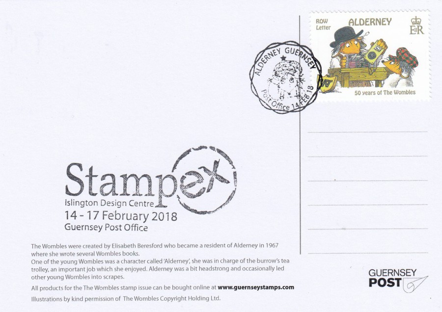
REVERSE SIDE OF
ALDERNEY WOMBLE
The Island of Alderney
Official Postal Authority Post Card
Used with a single Wombles issued stamp
First Day of Issue:
14th February 2018
Also used with ‘STAMPEX 2018’ cachet
When I returned on the second day of the Stampex show I again visited the Alderney stand (never assume that because you attended a stand on the first day that there will not be anything new on the second – that is one of my pieces of advice for stamp shows and exhibitions). To my surprise I saw a very small stack of the postcards again, but this time a few of them had one of the stamps applied on the reverse side (the ROW LETTER rate) which had been cancelled with a lovely ALDERNEY - GUERNSEY POST OFFICE – 14 FEB 18 cancellation which features the face of the Womble character called Orinoco, which was a completely different one to that used by me the day before. I again had a chat with the salesman, who admitted that they had produced a handful of these hand-stamped F.D.I. postcards the night before, and that there were only a few done as they did not have many cards left.
I ended up buying two of these, the sales were restricted because there were so few, and I again had the STAMPEX cachet applied to both. This card here is one of the two had done. The man in the queue behind me, when asked what he wanted, said “I’ll have the same as what he has just got”. So, there are at least four of these cards with one stamp, cancel and cachet. These few single stamped cards were all gone within an hour of the second day opening. I have been advised that no more cards appeared over the remaining days of the show (I attended again on the fourth day and there were certainly no more cards on sale, mint or otherwise).
Taking all of these known facts into consideration, I suspect that used copies of this postcard are very scarce, and I think obtaining any copies, even a mint one, but especially any used ones, is going to be a major challenge (and no, I am not parting with any of mine!).
26/03/2018
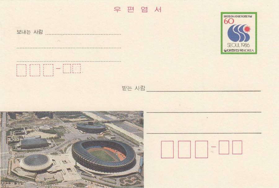
SEOUL 1986
SOUTH KOREA
Postal Stationery Post Card
Despite all my reference books, which mainly cover the pre- 1960’s era world issued postal stationery post cards, and those published after the 1960’s in European countries, I have no details surrounding the issue of this South Korea issued item.
Judging from the image which appears bottom left, and assuming that this is a sports stadium, this card appears to have a sporting related theme. It could be football, athletics or something similar. One day I will do some further research into this one, but for now it sits in my sports collection awaiting confirmation of its subject matter.

26/03/2018
TENERIFE
Multi-View Postcard
Distributed by
JUAN ALVAREZ LEON
PUERTO DE LA CRUZ
Without any doubt this is an example of tourist holiday postcard. Any serious postcard collector would inform you that this card, on first appearance, is worthless. This would be even more so as the card is seriously damaged. If you look you can see the card has been torn quite badly from the top left side of the top centre photograph down across the bottom right corner of the top left photograph and down into the bottom left photograph. This is quite a major tear. So, is this card worthless? Well, it would be if it was not for something on the reverse side, and this something relates directly to that tear…
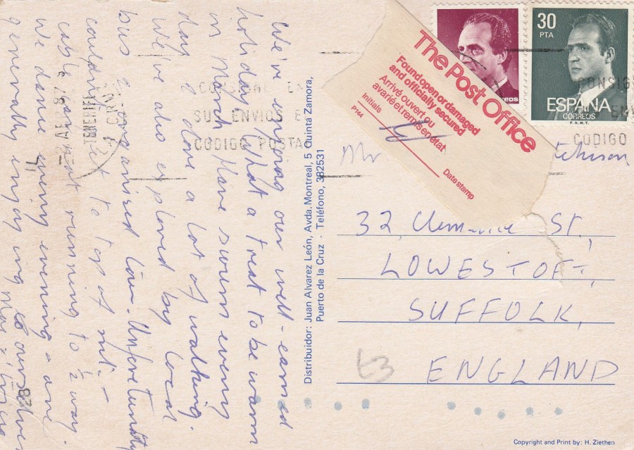
REVERSE SIDE OF ABOVE POSTCARD
The postcard was posted from Tenerife using two Espana (Spanish) definitive stamps. Whilst in transit, or possibly at point of posting, the postcard was torn, as we have seen. Because of the damage the Royal Mail have applied a piece of official sticking tape over the tear to try and repair it. What fascinated me is that this is an official item!
The Post Office
Found opened or damaged
And officially secured
Arrive ouvert ou
Avarie et remis en etat
Initials ……………..Date Stamp
P144
I am aware that all Royal Mail Post Office paperwork, of any type has an official reference number, and this piece of tape has the reference number ‘P144’.
In all my years of collecting this is the only postcard I have seen with this type of official ‘Repair Sticker’ applied. The card has the pencil price of £3 on it which someone in the past must have paid for this item, thankfully not me as I picked it up from a cheap box at a stamp fair. As you will have become aware, I do like unusual usage, cachets, marks and other applied stickers and pieces which make individual cards so interesting. This one, despite of, or more correctly, because of its initial damage has had something very interesting stuck down on it. I may not have paid the £3 price tag, but I ‘definitely’ think it was worth that price, perhaps not to a postcard collector but definately to a collector of Postal History.
25/03/2018
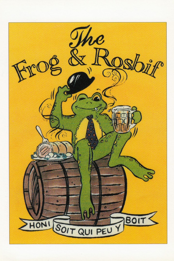
THE FROG & ROSBIF
23 rue Ausone, 33000 BORDEAUX
14 rue de l’ Industrie, 31000 TOULOUSE
116 rue Saint-Denis – 75002 PARIS
Published by
SAINT-MICHEL – BORDEAUX
This was almost certainly a free advertising postcard, one which was probably obtained from the premises located in Bordeaux, as this is quite near to where I bought it from a collector’s shop in central France. The same postcard was (is?) available from probably all three of the above listed public houses (‘Pubs’ to you and me) which appear to have had the same name, so this was (is?) still a chain of pubs.
I know a couple of collectors who collect ‘Brewery’ themed postcards, which includes pub advert postcards, although these are not as common as some topics.

25/03/2018
DINKY TOYS
(Fire Service Vehicles)
VEHICULES POMPIERS DINKY TOYS
Page de catalogue
Published by
CENTENAIRE EDITIONS
13, rue Rabelais – 1700 SAINTE – FRANCE
(This is the series of postcards which I discovered in the town of Sainte, which is located close to where my In-Laws house is located, in Venerand, France. The cards depict old adverts from all periods, but I particularly like the ones from the 1950’s, 1960’s and 1970’s, and those depicting farm equipment & vehicles, Cards, Vans, Motorcycles and other forms of transport – many of which I have not seen on postcard before. I also like the fact that these postcards were locally published in Saintes. I like this series a lot and I have previously posted some examples)
Ref: 06 - JOUETS
I think this is a cracking image, which is a single page from an old French Dinky Toy catalogue. I would not be surprised if this is the only time this advert has appeared on a postcard. This is another good example of why I like this publisher so much. Anyone who collects ‘Fire Engines’ or anything to do with the fire service would love this card.
25/03/2018
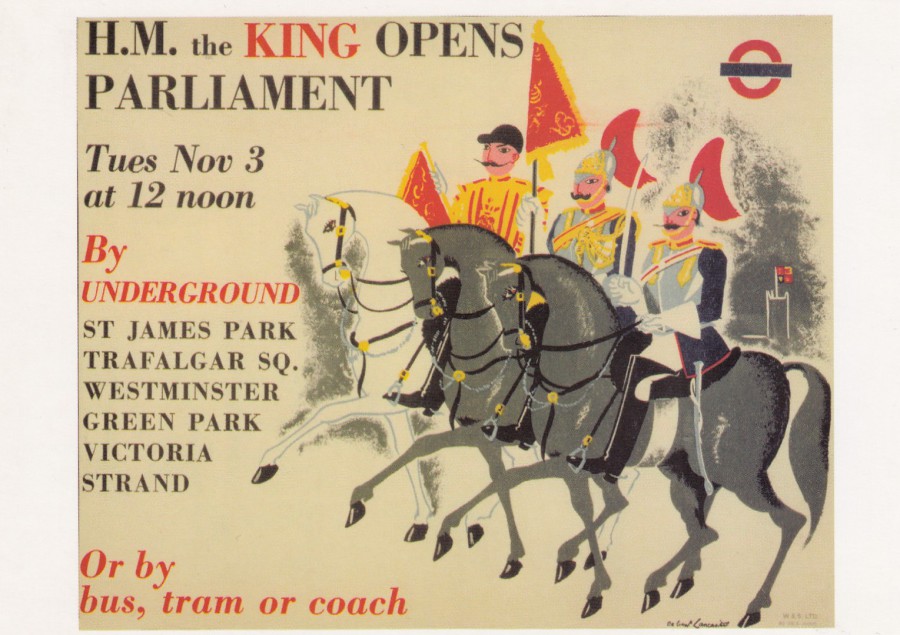
H.M. THE KING OPENS
PARLIAMENT
Tues Nov 3
At 12 noon
By
Underground
Artist – Osbert Lancaster
Published by
LONDON TRANSPORT MUSEUM
Ref: LTM 704
Copyright 2007
Yet another of the long series of Underground Train poster postcards published by the London Transport Museum. There can be little doubt that this museum publishes some of the best transport posters currently available, and which have been available over the past ten to twenty years. Many of their posters only appear on their own series of postcards, which makes a trip to the museums shop a must do thing for every trip to London I make. This one here was bought last year.