24/07/2018
THE BEATLES
Published by
CLASSICO SAN FRANCISCO
Ref: 268-006
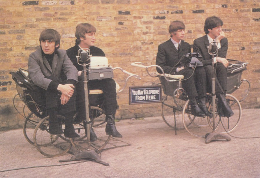
I have to admit that I had not seen this one of them sat in two prams before setting eyes on this postcard. It is one of the more unusual promotional photographs of the group that I have seen. It is also one of a large series of Beatles related photographic images issued by Classico San Francisco.

24/07/2018
ROBERT REDFORD
Published by
TRAVELLING EDITIONS (Paris)
Printed in France
Ref: CP 115
A superb black and white photograph of the actor in costume. I believe this is taken from his appearance in the World War II based feature film called ‘A Bridge Too Far’ which was the story of Operation Market Garden where the allied forces made major parachute drops across the Netherlands in the attempt to capture the bridges between them and Arnhem, but despite the parachute regiment reaching and holding Arnhem Bridge the main army column failed to reach Arnhem and relieve them. Judging from the reverse design style of this postcard I think it was released in the 1980’s maybe early 1990’s (the film came out in 1977)

24/07/2018
UNTITLED CARTOON CARD
MOUSE POSTMAN RIDING LARGE GRASSHOPPER
Publisher details on reverse side recorded as:
Urheberrechte bei
Vertriebsorganisation Mebs – BHG – Behinderten/Heimarbeit GmbH-8000Munchen
Nachdruck verboten !
(This last line of text relates to the copyright factor of reproduction prohibited)
This image is on a postcard from Germany posted out in 1988. Unfortunately, and this is not uncommon with some postcards, no artist, title or descriptive text is included on the reverse side. I found this card in a cheap box at a postcard fair and the image caught my eye and appealed to me a lot. It is a great card with a great image and some nice usage on the reverse side.
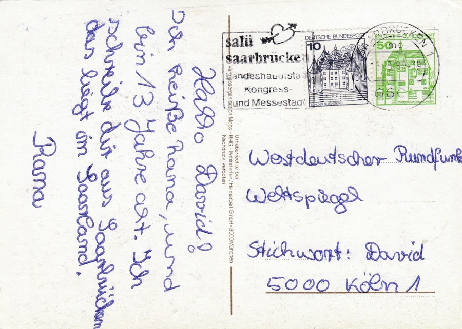
REVERSE SIDE OF ABOVE POSTCARD
I do like special cancels and this one has a nice arrow pierced heart on it cancelling two German definitive stamps. It is also another of the many ‘David’ record breaking collection set (David was a child with a life threatening medical condition who wanted to be a record breaker by having the largest collection in the world – which he achieved through a promotional publicity campaign – there was another boy who did this as well called Craig and I have many postcards addressed to one or another of them).
24/07/2018
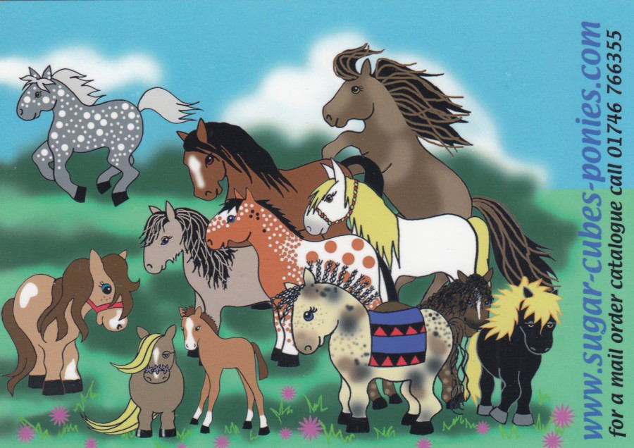
WWW. SUGAR – CUBES – PONIES . COM
Mail order catalogue promotional postcard
Published by
SUGAR CUBE PONIES
(who also designed the image material)
A British company based in Bridgnorth. Here they have produced a very nice postcard, which I assume was a free one (although I had to buy my copy from a dealer – but it was only 15p, so no great hardship). Ponies are of course very popular here in the UK, and in many other countries around the world, especially with young girls and women, apparently, although I have no personal knowledge in this arena having only ridden a horse three, maybe four times in my life (although I will be doing a horse ride through the Florida swamps later this holiday with Jo and our grandchildren – we did this a couple of years ago, just Jo and I and we really enjoyed it so cannot wait to do it again. Whilst out on the horses last time we disturbed an American Bitten which flew up right in front of my horse. As a birdwatcher this was the highlight of my ride and showed what could be seen by travelling in the wilds in this way).
23/07/2018
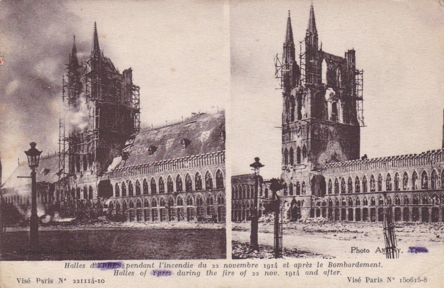
HALLES OF YPRES
DURING THE FIRE [Bombardment] OF 22 NOVEMBER 1914 AND AFTER
Picture references:
LEFT SIDE: Vise Paris No. 221114-10
RIGHT SIDE: Vise Paris No. 150615-8
Published by
IMP. PHOT. NEURDEIN ET CIE. – PARIS
Ypres is in Belgium, and here on this card you have images of the Cloth Hall, the famous structure at the towns centre, one which was, as can be seen here, damaged during the first world war. This is a classic WWI shell damage postcard, the type of postcard of which thousands were produced during the war to be sent home or bought as souvenirs by the soldiers. The Cloth Hall was a popular postcard image throughout the conflict as it became more and more damaged by further shelling as the war continued.
Reverse side of above postcard

23/07/2018
UNTITLED IMAGE
(WOMEN AND DALMATIAN DOG)
Published by
COLECCION PERLA
(PROCESO P.A.G.S)
Ref: 210/3
When I saw this postcard in a 20p box at a postcard fair I immediately thought it was a great piece of postcard artwork which immediately looked French to me, which proved to be correct. This card here was posted from Ally Sur Noye in the Somme region of France on the 14th May 1987.
Reverse side of above postcard
23/07/2018
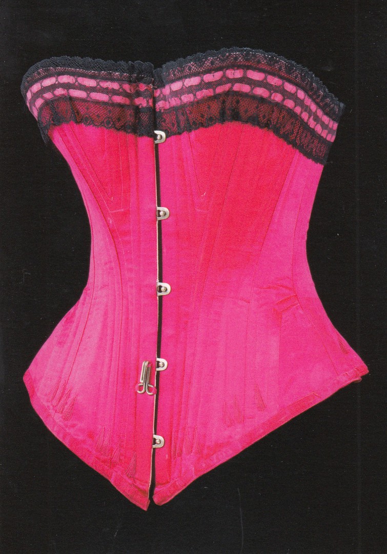
CORSET
SILK SATIN, MACHINE-MADE LACE, SILK RIBBON
AND WHALEBONE (BALEEN) WITH STEEL BUSK
AND METAL EYELETS
Possibly England, 1890 – 95
Published by the
VICTORIA & ALBERT MUSEUM
Ref: 145640
The V&A museum has a large and impressive collection of items of clothing through many historic periods including many modern items. There is a section in the museum where they have a permanent display of garments from various periods. This corset is a good indicator of the diversity of this collection. It is a very colourful image and stands out on the museums wall mounted postcard racks in their main shop.

23/07/2018
WELL LOVED TEDDIES
By
DELYTH LLOYD at Meiklejohn Graphics
Published by
ATHENA INTERNATIONAL
Ref: 0650312
Another postcard from the height of the Teddy Bear postcard craze. This is now, as previously mentioned, long over, but the postcards it produced are still delightful cards especially the artist drawn ones which I always preferred over the photographic issues, although I collected both.
23/07/2018
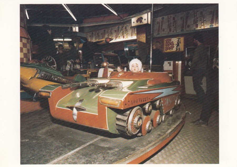
UNTITLED
NEW BRIGHTON, ENGLAND
1983 – 85
Photograph by
MARTIN PARR
Published by
FOTOFOLIO (New York)
Ref: Z120
Even to this day you can find these little merry-go-round rides up and down the UK. I remember going on many of these when I was much younger, and I have fond memories of them which may be why this postcard image appealed to me so much. It could also of course be the fact that this is a little tank like vehicle, although those look far more like machine guns than any cannons. I do like the more unusual postcard images and this one definitely-fits into that bill, a cracking image.
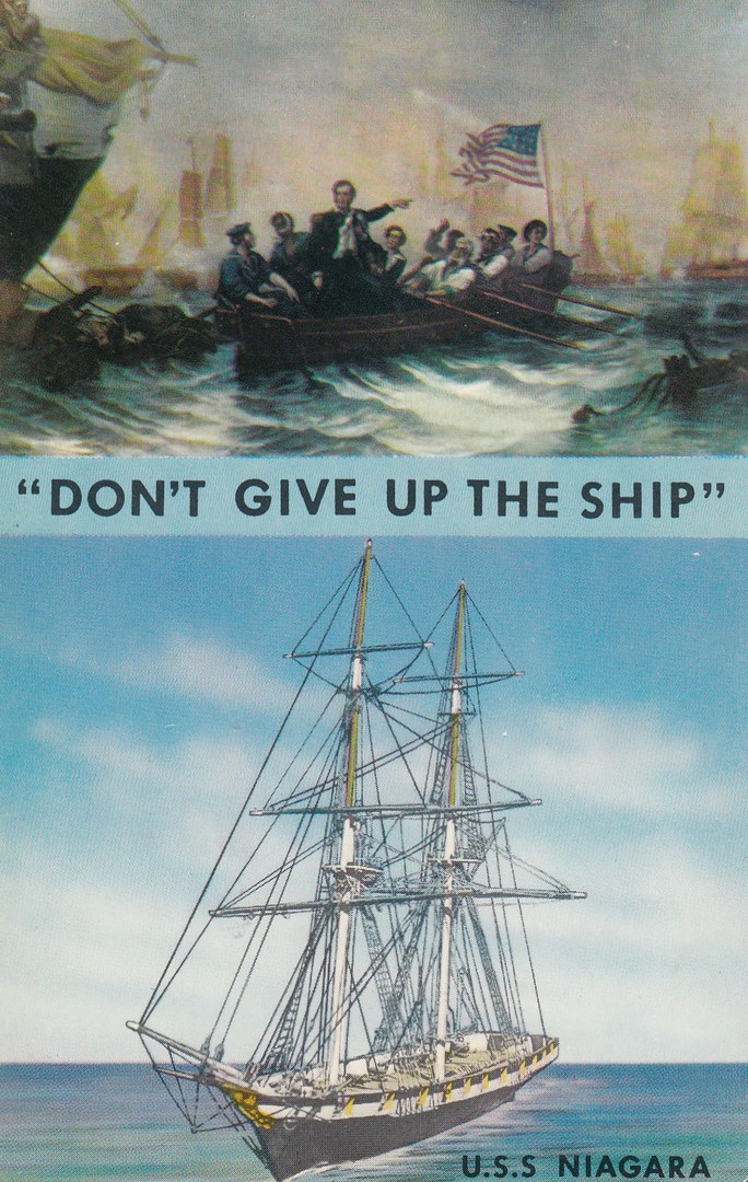
22/07/2018
“DON’T GIVE UP THE SHIP”
U.S.S. NIAGARA
Published by
TICHNOR BROS INC, BOSTON
Printed in
“LUSTERCHROME”
Ref: K-7451
The story behind this phrase and the ship itself are recorded on the reverse side of this postcard – so I have depicted this below. History is always popular and somewhere someone is looking into this story either as a school project or for a book or something, so this postcard would appeal to them. Every postcard has someone out there who is looking for it. Personally, I love history and I love learning through postcard images, especially ones telling stories for countries that I like to visit, and I am of course in the US as I type this (actually, its 06.40hrs, and I am watching the sun come up over Universal Studios, or rather the river way which connects the parks and City Walk to the hotels. It is a lovely view out of my room window and it has made the normal first day early rise (different time zones adjustment) a joy.
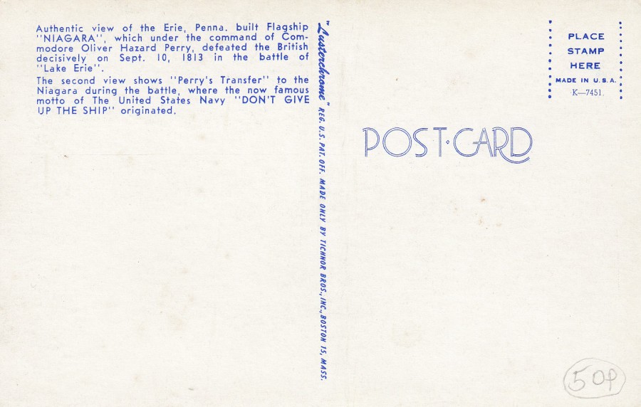
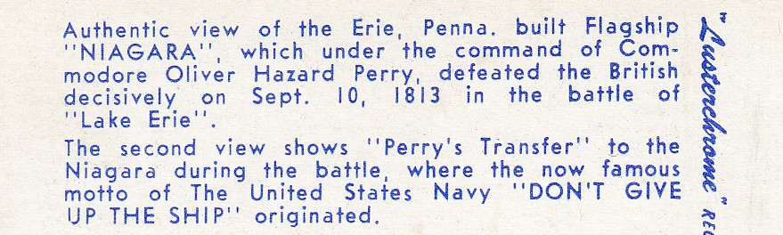
REVERSE SIDE OF ABOVE POSTCARD
It is great when a postcard has extensive text which describes what is being depicted. This does not always occur, but, in truth, I am in two minds re this – let me explain why both having and not having everything explained on the card is a good thing:
1 Everything on the card – easy really, means that you are immediately made aware of the story behind the image, the history and who was involved etc. This means you are learning through your card collection.
2 No information printed or explained – this is also great because it can excite your interest in an event, person or period in history and thus lead you into investigating the story. Through this investigation you also learn about the images story and often also learn other stuff. A card like this can lead you on all sorts of information journeys.

22/07/2018
m & m’s
m&m’s crispy
Published by
GO (C ) ART
This is clearly from an oriental source and was probably a free advertising postcard (possibly a ‘Rack Card’). To me, and I am no expert by any description, this looks a bit more Chinese than Japanese, but what do I know! Whichever of the countries is its source it is a typically colourful and animated design (so very popular in Japan but also China as well).
When there was just the plain chocolate or peanut m&m varieties I was not a fan, I preferred the British ‘Smarties’, but over the last couple of years through trips to Florida I have discovered the crispy m&m’s which I do like, but I am a massive fan of two varieties which you can-not yet get in the UK unless you want to spend a lot of money in specialist USA import sweet shops, and one these flavours you cannot get at all. The first is the caramel m&m’s which cost £2.79 for a very small individual bag over here in London (even in my local specialist shop they are £1.50!) I fell in love with these last year in Florida and already we are looking forward to buying large bags from Walmart when we visit on this current trip. The second flavour is one I have still not seen in the UK – Pretzel m&m’s. This was another Florida find and another flavour which I am looking forward to trying again when I go shopping here in Florida sometime this week, if I can find them.
Yesterday at Gatwick Airport I came across a new limited-edition m&m’s flavour – Crispy Caramel. I had to try these. They are not as good as the soft caramel ones I mention above, but they are not bad. Me and the grandkids ate a load on the flight over.
REVERSE SIDE OF ABOVE POSTCARD
Both Japan and China have an issuing policy of vertical reverse layouts, so again, this does not help identify the country of origin. This is another good example of a colourful reverse postcard, which anyone who has looked back through the back catalogue of this webpage will know I am fond of.
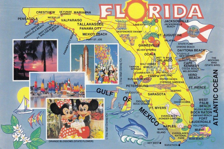
22/07/2018
FLORIDA
MAP POSTCARD
Published by
(or distributed by)
Southern Card & Novelty Inc
(Ormond Beach, Florida)
Ref: HSC/46FL – 4023 (PC700)
So, here we are, back in Florida on yet another holiday. This one is a long one though as we are here for five weeks, well, sort of, as you will see. Currently we are staying at the Hard Rock Hotel in the Universal Studios theme park area. Interestingly this theme park does not appear on this postcard, and this is interesting because ‘Wet ‘N’ Wild’ is on this map and this water park was right next door to the Universal theme park. I had driven past Wet ‘N’ Wild many times but we never visited it, and now we never will as last year it has gone, and I mean gone! The whole area had been flattened, every water ride removed and just a plain of dark brown soil. So, already this map contains details of something now gone. Also listed here is Cypress Gardens which is also now gone, although this garden park went some years back as the area is now Legoland Orlando (we have never visited here but then we have never visited the one in the UK either, no real reason why, just always found other things to do).
Because we have now been here so many times, this is in fact our tenth Florida visit, I always pick up any Florida related postcards I come across. This one here I found in a cheap box at the last Woking Postcard Fair back in May. I also really like these map postcards as they show how things change as with the two locations mentioned above.
So, here we are, and I am sure we will come across more postcards during our visit this year so keep an eye out on this webpage and the facebook page as I suspect many images will appear there as well.
20/07/2018
There won’t be any postings tomorrow – 21/07/2018 – because I will be on an aeroplane flying to Orlando in Florida. It is a nine- hour flight and I suspect I will be a ‘tadge’ tiered by the time I arrive at the Hard Rock Hotel. Postings will be spasmodic over the next five weeks or so whilst I am on holiday, but I will attempt to maintain a reasonable number of postings. Also, don’t forget that there will be facebook postings throughout of any postcard or postal things I come across, so remember to check out the webpages linked facebook page.

20/07/2018
SERGEANT
BILL BLUE
“I’ve met Sergeant Bill Blue”
THAMES VALLEY POLICE
(Plain backed card, but it has been posted)
Official Force Printed Card
I don’t know anything specific about this card, but I can make some assumptions. This looks like something produced to connect with the younger segment of the public – I am picturing some poor office or back room staff member having to wear a giant ‘Sergeant Bill Blue’ teddy bear costume – I suspect this was a ‘Meet & Greet’ situation where kids would meet Bill Blue and receive a card, one of these, as a souvenir. Whoever received this card, or another family member using it later, posted it as a competition entry postcard. Using it as an unofficial posted item does sort of turn it into a postcard, possibly a unique one as well. I liked it enough to buy it from a dealer and add it to my ‘Police’ themed collection.
REVERSE SIDE OF ABOVE POSTCARD
As you can see this has been used as a postcard with the sender (user) drawing a central dividing line and then writing on it as if it was a postcard and sending it through the post – so, does this make it a postcard? I think it does. Not an official issued postcard, but a card that has been posted as if it was a postcard.
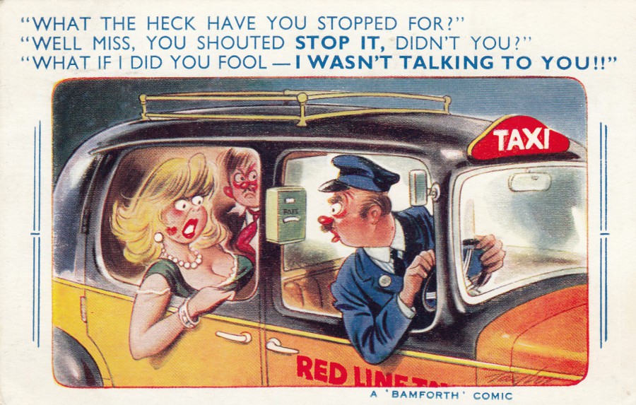
20/07/2018
“WHAT THE HECK HAVE YOU STOPPED FOR?”
“WELL MISS, YOU SHOUTED STOP IT, DID’NT YOU?”
“WHAT IF I DID YOU FOOL – I WASN’T TALKING TO YOU!!”
Cartoon by
Taylor
(A ‘BAMFORTH’ COMIC)
Published by
BAMFORTH & CO. LTD HOLMFIRTH
Ref: No. 1880
In their:
“COMIC” Series
Another of the classic styled ‘Taylor’ comic postcard designs. This copy here was posted in 1962. Look at the work that went into this design to make it both funny and eye catching.
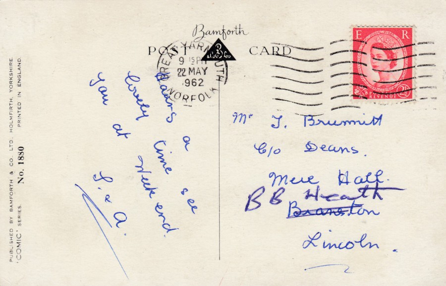
Reverse side of above postcard
20/07/2018
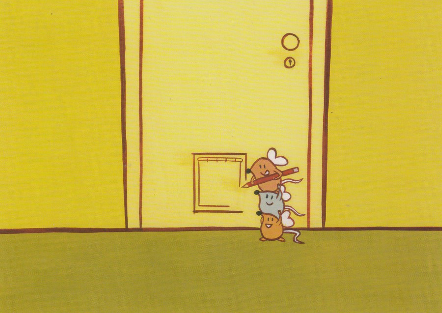
DON’T QUIT NOW,
THINGS ARE ABOUT TO GET INTERESTING.
To find out more about your options after GCSE’s
Call 0845 608 6087
CONNEXIONS
DFEE
(DEPARTMENT FOR EDUCATION AND EMPLOYMENT)
Published by
BOOMERANG (CINEMA)
This is an official government department promotional postcard for a line to help people obtain information after receiving their GCSE results (for those outside the UK, the GCSE’s are the national exams taken by students here in the UK).
I like the cartoon used here. I assume this is a cat flap the mice are drawing on the solid door! Very ‘Tom & Jerry’ like.
20/07/2018
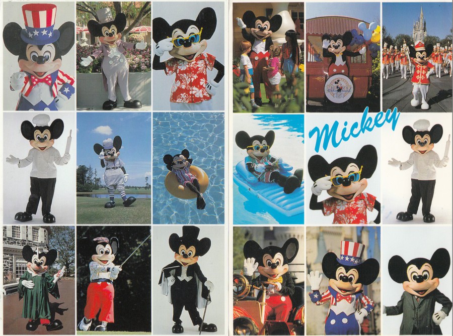
THE MANY FACES OF MICKEY MOUSE
MICKEY UNLIMITED COLLECTION
TRAVEL TIME PRODUCTS
Managed and Published by
LAWSON MARDON POST CARD
Distributed by
SCENIC CARD & NOVELTY (ORLANDO)
Ref: 709-A3046
(Card shown far left or left side)
Posted in 1997
THE MANY FACES OF MICKEY MOUSE
MICKEY’S COLLECTION
Published by
H. S. CROCKER CO., INC (SAN FRANCISCO)
Ref: HSC/46CH-3001
(PC709)
(Card shown near left or right side)
Posted in 1990
Two similar, one of the photographs is even the same one – the Chef Mickey with rolling pin – postcard designs. I also noticed that some of the individual images are also ones used on individual postcards, the one of Mickey floating on the large yellow rubber ring can be found with FLORIDA written across it, also the band leader one, top right corner, is also available on an official theme park postcard.
We leave today, getting picked up around 2ish, to go to the airport to book in our cases and then overnight at the hotel before flying out tomorrow morning. So, tomorrow we will be in Florida. We won’t see Mickey for a few weeks as doing other things in the Florida area first with a stay at the Universal Studios ‘Hard Rock Hotel’ being our first port of call, but we will be seeing Mickey, quite a lot of him I suspect as the grandchildren are looking forward to that.
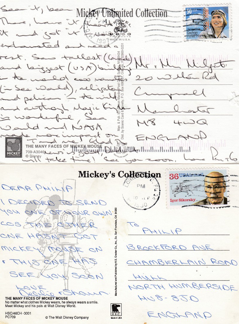
REVERSE SIDES OF THE
ABOVE TWO POSTCARDS
Both cards were posted from the US to the UK. The top one in 1997 and the lower one in 1990. The top stamp is a 50c ‘Jacqueline Cochran – Pioneer Pilot’ stamp. The lower stamp is the 36c (postage costs went up a bit between these seven years!) Igor Sikorsky US Airmail stamp. This last stamp is one I find often on postcards from this era as it was a popular postcard sending period still and I have a large number of Disney park postcards used with this one, it may even be the most commonly used stamp in my used USA collection.
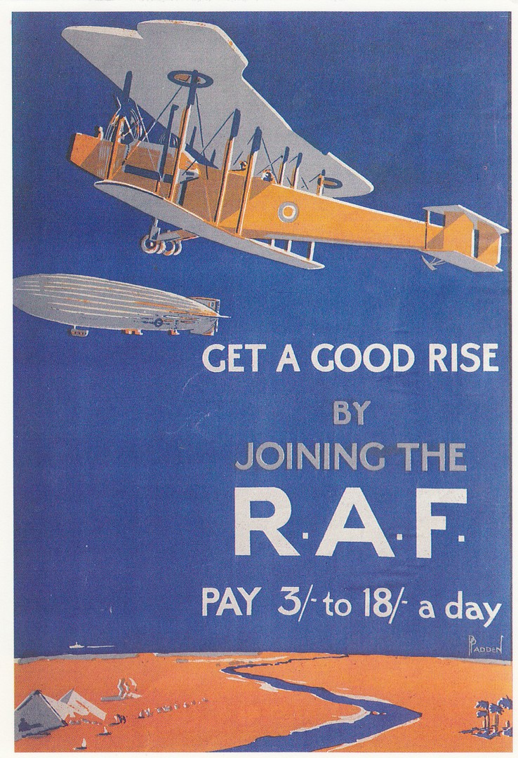
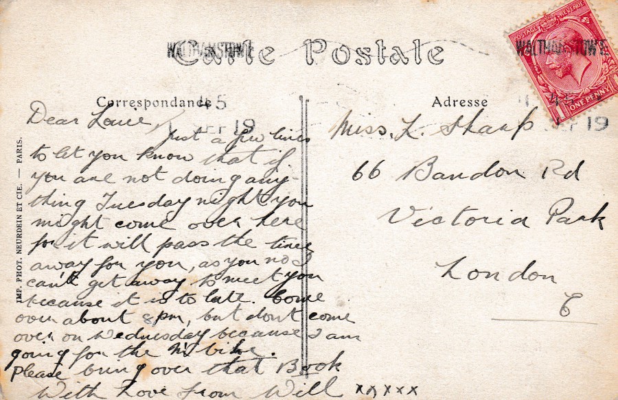
19/07/2018
GET A GOOD RISE
BY
JOINING THE
R.A.F.
PAY 3/- to 18/- a day
Published by
SANTORO GRAPHICS LTD
(CROYDON)
Ref: M669
The company ‘Santoro Graphics’ produced a range of quite superb old posters depicted on postcards, many of which I have not seen on any other modern postcard releases. Unfortunately, they did not supply any details about the posters themselves, like dates of use, issue (this one looks like it came out not long after WWI, maybe the early to mid 1920's), or the artist(s) involved. This does not make the images any less interesting, it just leaves people with a thirst for more information.
This one here seems a great postcard to show here in the year of the 100th Anniversary of the RAF. As I also collect airship related postcards this is a poster which really appeals to me.

19/07/2018
UNTITLED
Cat’s Face
Published by
THE POSTCARD STORE
You know that expression ‘In Your Face’? This image would seem to represent this saying quite literally! A great postcard image for any cat lover, and a scary one for everyone else.
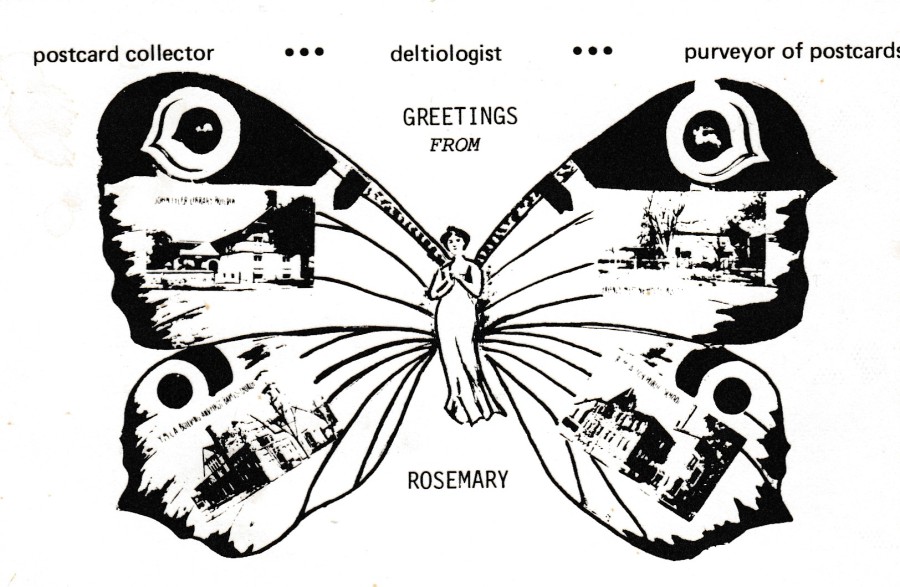
19/07/2018
GREETINGS FROM ROSEMARY
POSTCARD COLLECTOR …
DELTIOLOGIST …
PURVEYOR OF POSTCARDS
Privately produced postcard by an American collector / seller
This postcard issue, a private production for Rosemary (I wonder what her surname is/was?) is typical of the many such postcards produced by collectors across America throughout the 1980’s, many for National Postcard Week(s), this may even have been used by Rosemary during National Postcard Weeks as her exchange postcard, or it was just a publicity free card, although none of her details are recorded on the card so it was not an advertising one (which is what leads me to believe even more that was an NPW issue which just didn’t include NPW in the design itself). I not only like the front design I also love the reverse side of this card as well.
(and if you were not already aware, a 'Deltiologist' is a postcard collector and one that both collects and studys the cards. The term is much used in America, but is not popular in the UK where it is somewhat shunned).

REVERSE SIDE OF ABOVE POSTCARD
Another trend for these American private issues (issued around the 1980’s) was to make the reverse side attractive, elaborate and ornate with the POST CARD heading, and to add an image or two all with the intention of making the design of the reverse side look like an older ‘Golden Age’ styled reverse. I love the way these were produced and this one here is a cracker.
19/07/2018
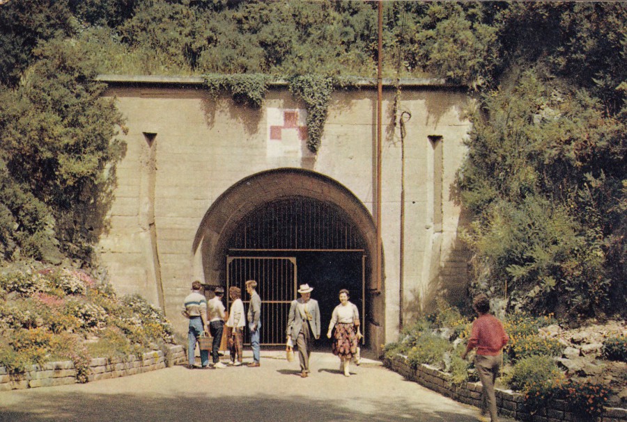
GERMAN UNDERGROUND HOSPITAL
JERSEY
Printed and Published by
J. ARTHUR DIXON
Ref: JER 1228
“The Underground Hospital was excavated during the war of 1939 – 1945 by the German occupying forces. Over 14,000 tons of rock were removed by ‘slave’ workers from Eastern Europe. The tunnels contained 600 beds, an operating theatre, and all the amenities of a modern hospital”
(Text from reverse side of postcard)
I have only visited Jersey once, way back in 1984, but I loved it there and do want to return. On my weeks holiday on the island I visited the German Underground Hospital as it fell into my military history interests. I bought a selection [well, let’s be honest here, all the different postcards on sale] of postcards on my visit (which are still in my collection somewhere!), but this one depicted here pre-dates my visit by at least a decade. This view of the entrance with the big red cross over it is perhaps the most common postcard view of this island tourist attraction.

19/07/2018
NATIONAL POSTCARD WEEK
UK
MAY 4 – 10, 1986
“PROMOTION OF POSTCARDS AS A HOBBY THROUGHOUT THE UK”
OFFICIAL NPW POSTCARD
Designed by
GILLIAN RICE
Printed by
THOUGHT FACTORY (LEICESTER)
(as this was the official card, and although it does not state it, I suspect the ‘Postcard Traders Association’ were also involved with this cards release – they may even have been the publishers as such)
This follows on from the previous posting below, the NPW card for 1984. This one is for 1986 and if I remember correctly here in the UK we had the National Postcard Week every two years (in the US it was, and may still be, held every year I believe), so this would have been the next official card on. One of the things I liked about this design is that three of the boxed postcard images placed around the map of the UK are based on PHQ Stamp card releases. These are the soldier and flag one at the top, the ‘Bull’ one over Wales and into Southern Ireland and heraldry one at the bottom to the right side. As a collector of these cards I recognised these immediately.
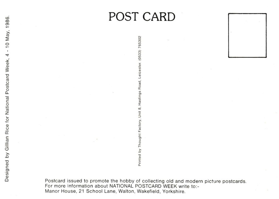
REVERSE SIDE OF ABOVE POSTCARD
19/07/2018
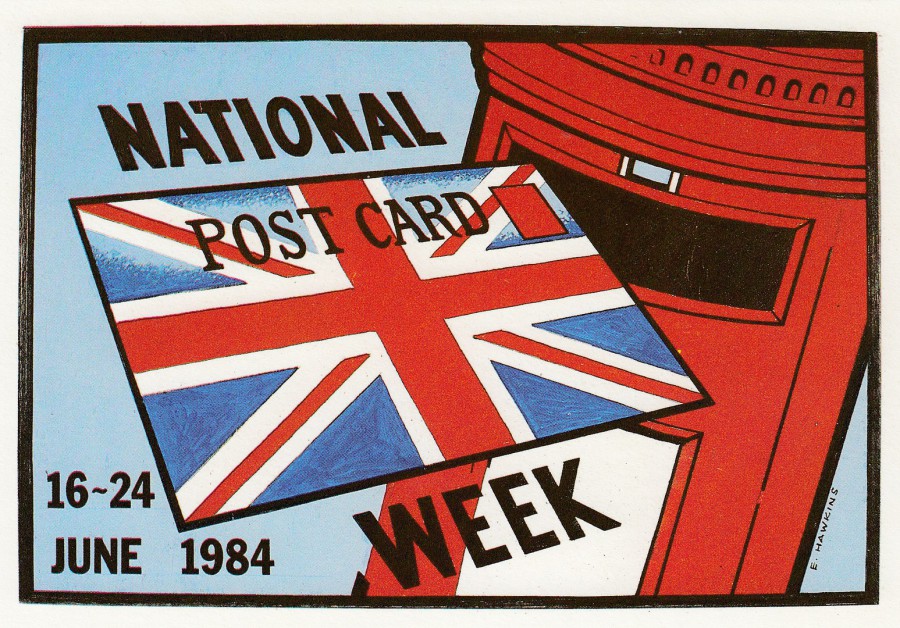
NATIONAL POSTCARD WEEK
UK
16 – 24 JUNE 1984
Design by
E. HAWKINS
Sponsored by
POSTCARD TRADERS ASSOCIATION
Printed by
J ARTHUR DIXON
The ‘National Postcard Week’ idea was tried here in the UK for a while, but it never really took of here with the same fever that it did in the US. Having said that the Postcard Trader Association did produce this smashing postcard in 1984 when a big push was made to get the NPW up and running here.
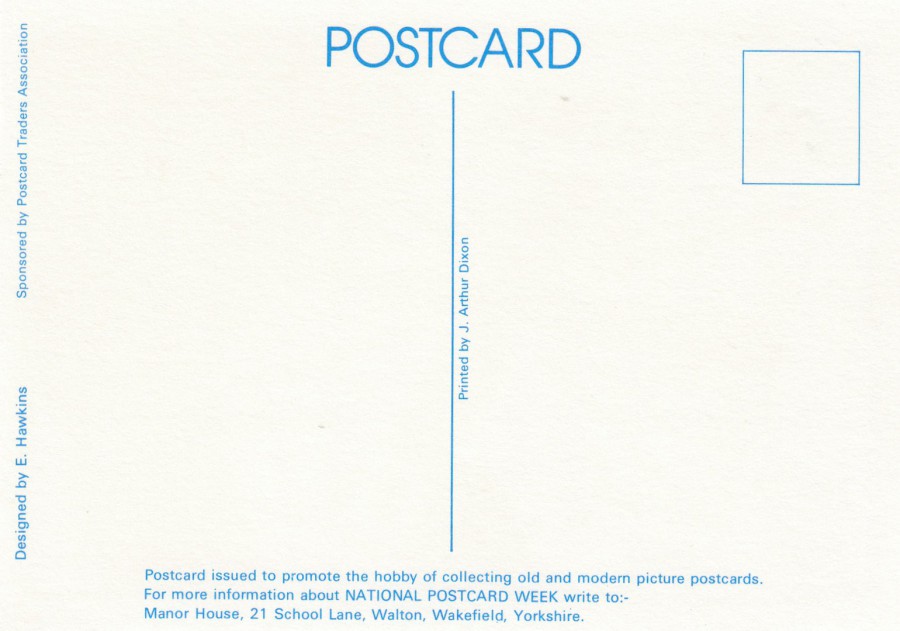
REVERSE SIDE OF ABOVE POSTCARD
The postcard printing company J. ARTHUR DIXON used blue printing on the back of their own postcards, so it was nice to see it also being used here on this private commission.
18/07/2018
It has been awhile since I placed anything under the CENSORED tab listing, so today I have placed a single card under the BULL FIGHTING tab and 10 cards, including an 8 card ‘Strip Tease’ set from France under the ‘Censored 1’ tab (accessed via the CENSORED main tab – as is the ‘Bull Fighting’ tab).
18/07/2018
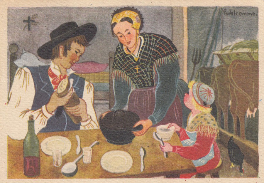
WELCOMME
EN SAVOIE
Le repas
Published by
EDITIONS ARTS REGIONAUX
CHAMBERY
(Made in France)
Ref: (7)
Savoie is an area, or department, in France in which the company that issued this postcard was based. The French have a history of issuing artist postcard representations of the country life and traditions of the rural areas. This is a fine example of this type of card, a type which can still be found on more cards in these such areas.
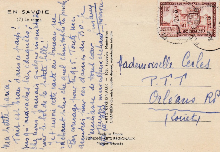
REVERSE SIDE OF ABOVE POSTCARD
Unfortunately, I can not make out the date on the cancellation used on this stamp, so my only dating material is the date the stamp was issued, as clearly the usage of the card can not pre-date this (although of course the card itself could have been issued and been on sale prior to this.
The stamp used here is the 1949 issued 12f value ‘600th Anniversary of Cession of Dauphiny to King of France’ which depicts the Collegiate Church of St Bernard, Romans (SG 1065). So, this card was possibly posted in 1949, if not then certainly after, and I suspect close to this year.
18/07/2018
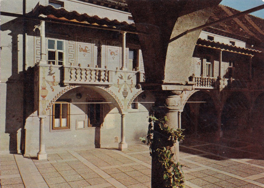
LJUBLJANA
KRIZANKE – ENTRANCE TO THE OPEN-AIR THEATRE
Published by
Publicistlcko-izdavacki zavod “Jugoslavija”, Beograd
Printed in Yugoslavia by
LJUDSKA PRAVICA,
LJUBLJANA
This is such a typical tourist postcard. Someone has visited this open-air theatre either on a trip or perhaps to see something here and then bought a souvenir postcard and sent it to either family or friends back in France.
Krizanke is now of course in Slovenia where you can still visit the outdoor theatre, which is used in the summer for festivals which are set up inside the courtyard of the former Monastery of the Holy Cross. The theatre was created in the 1950s by Joze Plecnik who used the confiscated former Monastery to produce this theatre especially for the Ljubljana Festival.
The front of this card may not be all that awe-inspiring, but then I bought this for the stamp that was used on the reverse side.

REVERSE SIDE OF ABOVE POSTCARD
As soon as I saw this stamp I knew I had to have this card. I have always liked wildlife and when I was a kid I had this stamp in my stamp collection. To come across it many years later used on a postcard just brought back fond memories of school playground stamp swaps and chats.
This is a 1962 issued 20d value ‘Spotted Salamander’ stamp from that years ‘Amphibians and Reptiles set of nine stamps (SG 1048). This was obviously bought at the time as the cancellation used is dated 1962. So, this is a nicely used pictorial postage stamp bought and used at the time of its issue. Looking at the pictorial slogan cancellation I suspect the wings on the envelope depicted refers in some way to the air-mail service.
18/07/2018
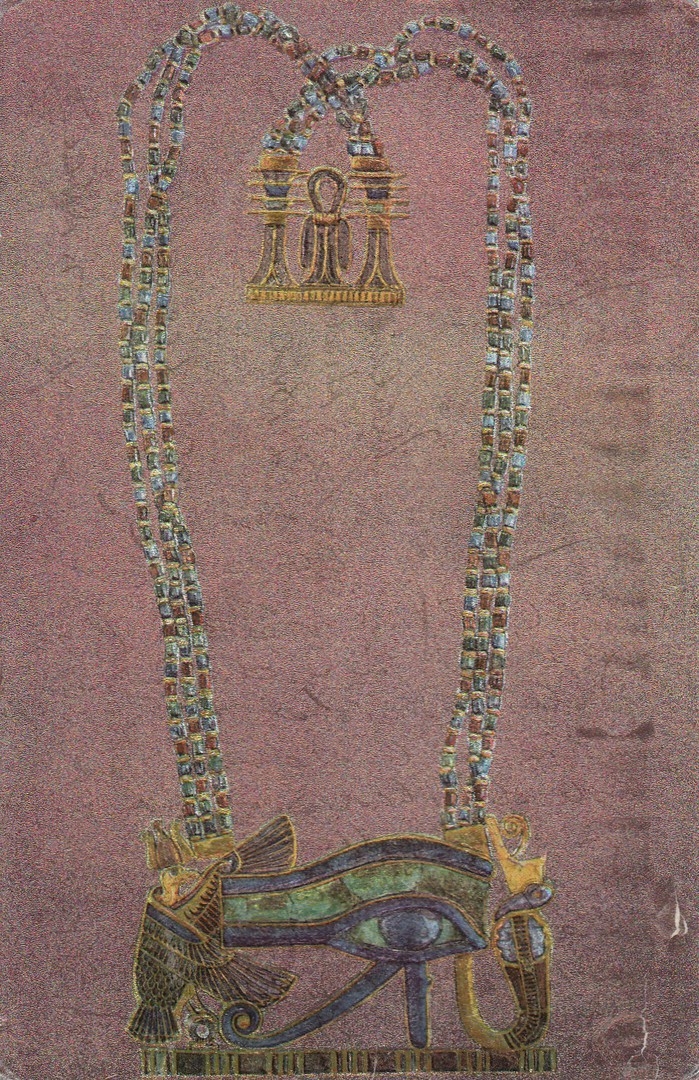
CAIRO
EGYPTIAN MUSEUM
‘Pectoral of gold represents the magic eye’
NOVELTY ‘SHINY’ SURFACED CARD
Published by
LEHNERT & LANDROCK
K. LAMBELET & Co., CAIRO
ART PUBLISHERS
This type of shiny surfaced ‘glittery’ card is often called ‘Dufex’ here in the UK because that was the name of this type of card when they were published here in the UK by the British company F. J. WARREN, who published a wide range of ‘silver foil’ postcard images, and later full colour ‘shiny’ board postcards. This one is a little less sophisticated that the F.J. Warren issues, but it is still a nice novelty card, and an excellent example of this type of printing originating from abroad.
REVERSE SIDE OF ABOVE POSTCARD
This was posted out of Egypt in 1985 using a 1985 issued 30p Giza Pyramids stamp (SG 1572) from the ‘Air Mail’ series. This stamp was the highest value in this issue.
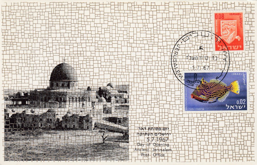
18/07/2018
DAY OF OPENING
ANCIENT JERUSALEM
POST OFFICE
5 – 7- 1967
5th July 1967
Published by
SIMON’S MAXIMUM CARD
This is typical of the style of many of the official type maximum postcards that originate out of Israel. This one is from 1967 and celebrates the opening of an ancient post office in Jerusalem. The two stamps applied have been cancelled with a JERUSALEM cancellation. The stamps are as follows:
SG 265 – ‘Undulate Triggerfish’, 2a value stamp issued in 1963 (from the 2nd series of fish stamps titled ‘Red Sea Fish)
SG 298 – ‘Beer Sheva’ 8a orange coloured definitive stamp from the 1965 ‘Civic Arms’ (1st series) stamp set
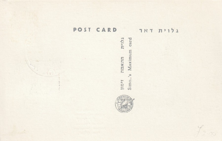
REVERSE SIDE OF ABOVE POSTCARD
18/07/2018
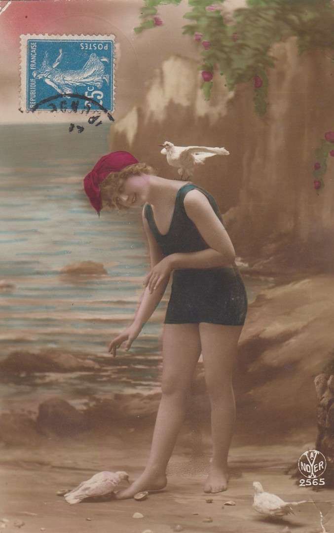
UNTITLED
Women in early swimming costume
FRENCH POSTCARD
Published by
Noyer
Ref: 2565
Although it is hard to make out the year date on the partially applied cancellation on the front of this card I believe it is 1921. The stamp used is an originally issued in 1906 25c blue ‘Sower’ stamp (the issue with no ground at the figures feet – SG 341). This is a typical early studio portrait styled photograph with a painted backdrop. The image was originally in black and white, but here it has been colourised.
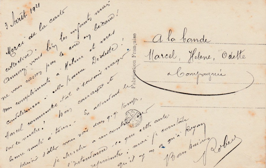
REVERSE SIDE OF ABOVE POSTCARD
There is nothing particularly special about this reverse printing, but when I bought this postcard in a French antique shop earlier in the year I also bought others from the same sender, so I have a selection of cards with this very slanted and compacted, but strangely attractive writing. As I have a few of these I will also post the reverse side of the other cards as I come to post them on future pages.
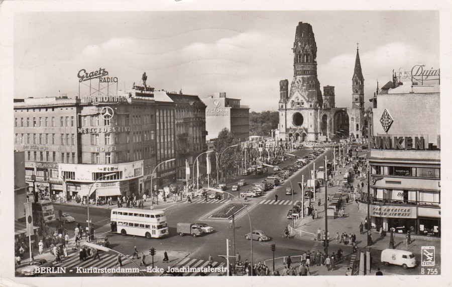
18/07/2018
BERLIN
KURFURSTENDAMM – ECKE JOACHIMSTALERTS
Published by
INDUSTRIE-FOTOGRAFEN KLINKE & Co.,
BERLIN-TEMPELHOF
Ref: B 755
This is great 1950’s black and white photograph of an area of Berlin. I have actually travelled down this street and seen the WWII bomb-damaged church that can be seen in the background (which has appeared on a postcard previously on this webpage – I gave its history then). This postcard was posted by a member of the armed forces based in Berlin and was partially cancelled with a FIELD POST military cancel.

REVERSE SIDE OF ABOVE POSTCARD
Posted to the UK using a 1956 issued ‘Federal Council Meeting’ 10pf stamp depicting the eagle and arms of Berlin (SG B147, Germany [West Berlin]). This has been cancelled with a (1) BERLIN wavy line machine cancel, dated 1956 and has also received at the bottom a FIELD POST circular date-stamp which is so far off the card that no details can be made out (but the addition of this seems to indicate this being sent by a military person).
The card has also received a delightful, and of special interest to me, purple cachet related to the Berlin radio tower:
1926 – 1956
30 Jahre
Berliner
Funkturm
150m hoch
This cachet celebrates the 30th anniversary of this radio tower, which appears on many postcards and stamps issued by the GERMANY (WEST BERLIN) postal authority. The cachet is quite collectible and adds a little value to this already attractive postcard.
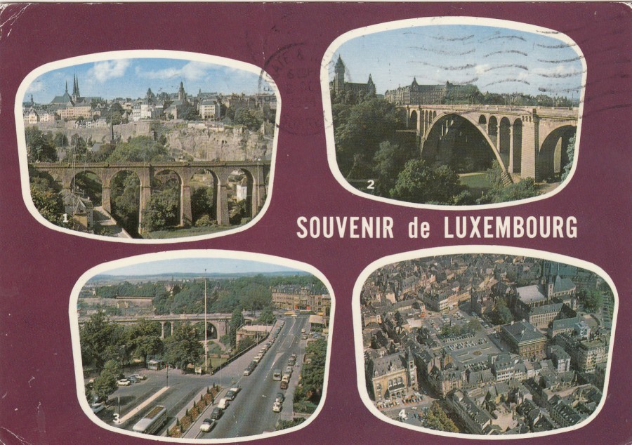
18/07/2018
SOUVENIR DE LUXEMBURG
1. ROCHER DEU BOCK
2. PONT ADOLPHE
3. BOULEVARD ROOSEVELT
4. VUE AERIENNE
Published by
E. A. SCHAACK
(printed in France)
Ref: 1114
A nice different styled multi-view postcard design sold in Luxemburg. This copy here was posted to the UK in 1974.
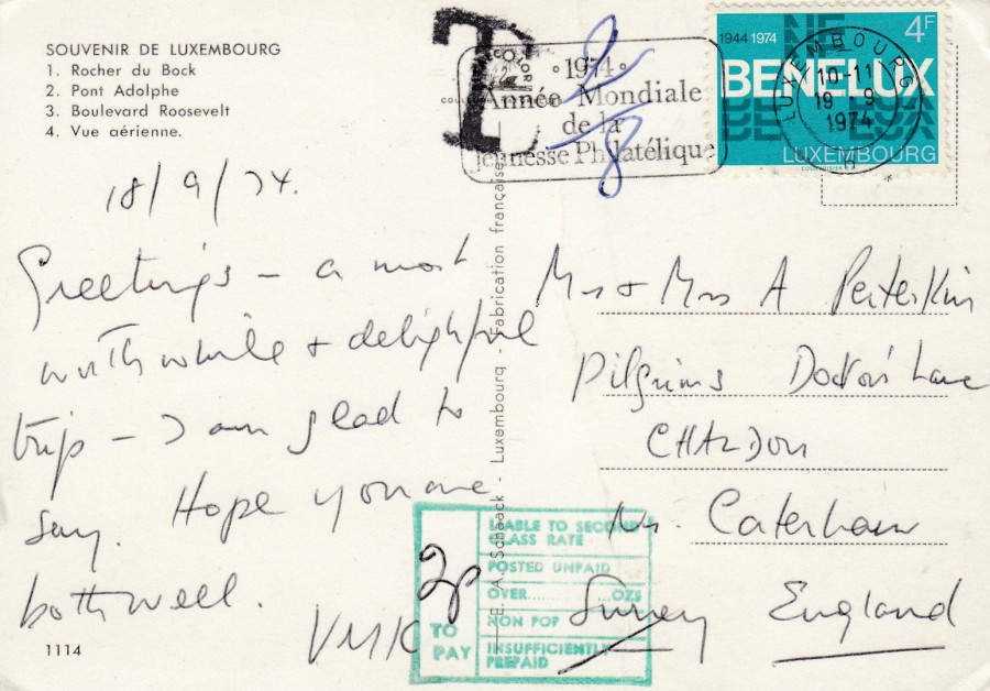
REVERSE SIDE OF ABOVE POSTCARD
The sender has used a 1974 issued 4f value stamp which celebrated the 3oth anniversary of Benelux, the customs union (SG 935). This stamp has been cancelled with a ‘LUXEMBURG – H’ slogan cancellation which reads:
1974
Annee Mondiale
De la
Jeunesse Philatelique
1974
World Year
Of the
Philatelic Youth
This slogan cancellation is dated 19th September 1974.
Unfortunately, this stamp did not cover the full cost of postage to the UK at that time, so, a large ‘T’ information mark was added and handwritten beside this was 2/8 in blue pen, the tax required on the underpayment of postage. Once the card reached the UK a green boxed ‘INSUFFICIENTLY PREPAID’ mark was applied, and it was noted that 2p was to be paid by the receiver as the postage due amount owed. The combination of postage due marks, and a nice stamp as well make this a nice philatelic item.

18/07/2018
LION’S HEAD
FROM THE VICTORIA ROAD
CAPE TOWN
With an additional added printing:
“CHRISTMAS GREETINGS FROM SOUTH AFRICA”
From an original water colour drawing by
A. R. QUINTON
Published by
PERRY & CO., CAPE TOWN
Ref: No. 4
A. R. Quinton is a famous landscape and view artist whose work appeared on a huge range of issued postcards, although it is his views of UK locations which I am more aware of and which people seem to avidly collect here. This one is a little more unusual as it is a South African view. I also liked the addition of the Christmas greetings message which I assume was added for cards being sold at this time as the card was posted in December 1924.
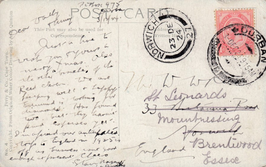
REVERSE SIDE OF ABOVE POSTCARD
The sender has used the 1d red definitive of the time (SG 4), which was issued in 1913, but which remained in use for many years, certainly up until 1925. This stamp has been cancelled with a DURBAN circular cancel dated 3rd December 1924. The card was addressed to the UK, although with some error it seems as originally this addressed to a Norwich address, and thus received a NORWICH circular receiving cancel dated 23 December 1924. Someone has then written another address in, I suspect either the addressee had moved or was away for Christmas (it was not unknown for mail to be forwarded to someone at another address that they were staying at during this time). This second address was in Essex and has clearly been written in another hand. There is no further cancel so we have no idea if this card reached the recipient on or before Christmas day (this would depend on how quickly it was re-addressed by the person in Norwich).
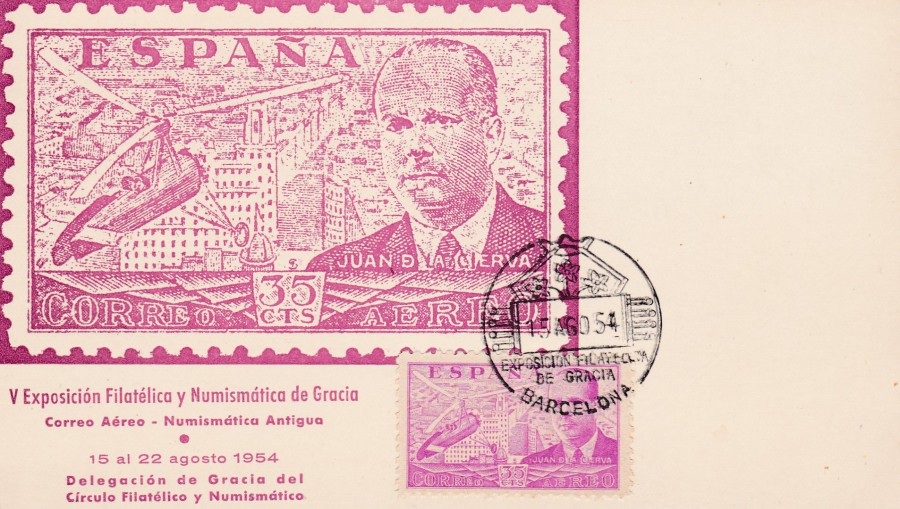
18/07/2018
SPAIN
V EXPOSICION FELATELICA Y NUMISMATICA DE GRACIA
CORREO AEREO – NUMISTMATICA ANTIGUA
15 al 22 AGOSTO 1954
5TH Philatelic and Numismatic Exhibition of Grace
Air Mail – Antigua Numistmatica
August 15 to 22, 1954
Official event postcard issue
For those unaware ‘Numismatics’ is the word used for the collecting of coins and bank notes, so this postcard advertised a fair for both coins and stamps. The stamp this depicted on this card is the 1939 issued ‘Air’ 35c stamp issue depicting Juan de la Cierva and his Cierva C.30A Autogyro (SG 943 – the colour of the stamp is described as mauve). A copy of the actual stamp has been applied to the front of this card (which is plain backed) and this has been cancelled with a BARCELONA special cancellation for the event dated for the first day – 15th August 1954 (15 ARGO 54). I suspect the stamp was chosen because this event was ‘Air Mail’ themed. The combination of card, stamp and cancellation is very attractive.

18/07/2018
JAPAN
MAXI-CARD
“FERRIS WHEEL BRINGING HEARTS TOGETHER”
By
HIROSHI MATSUDA
60 yen postage stamp
Relating to:
WORLD COMMUNICATIONS YEAR
Stamp (from a two-stamp set)
Issued:
17TH OCTOBER 1983
Published by
JAPAN STAMP PUBLICITY ASSOCIATION
Ref: 481. -B
In the Stanley Gibbons Stamps of the World catalogue this lovely little art stamp is catalogued as SG 1717. This official maxi-card was a great little cheap find at a STAMPEX show in London a few years ago. I collect many different themes under the general heading of ‘Communications’ and many countries have issued stamps for the regular ‘World Communications Year’ celebrations. Many of these stamps can be found on max-cards like this one and they make a nice addition to any postcard collection, but you have to remember that stamp collectors are also looking out for cards like this for their collection as well.
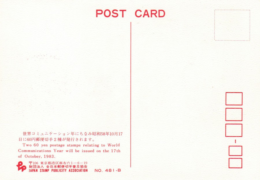
REVERSE SIDE OF ABOVE POSTCARD