18/03/2017
AUSTRIA
POSTAL STATIONERY POST CARD
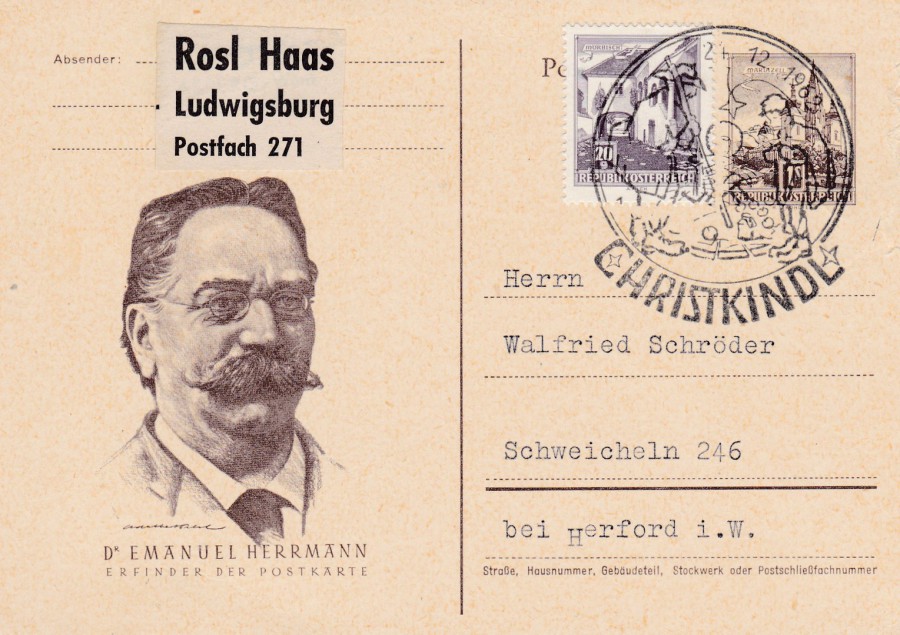
DR EMANUEL HERRMANN
It may well be that the name of Dr Emanuel Herrmann is not known to you, but to postcard collectors the name should be famous. Herrmann was an Austrian professor of political economy at the Military Academy of Wiener-Neustadt. On the 26th January 1869, he published an article in the ‘Neue Freie Presse’ in which he discussed the financial burden on the State which was caused by an ever-increasing amount of postal correspondence. Dr Herrmann deduced that one third of the mail was made up of letters with ordinary information and in conclusion that people wrote longer letters just to in-part a smaller amount of important information, such as despatch notices, receipts, accounts, orders, short commercial announcements and greetings for New Year and other celebrations and holidays. Dr Herrmann put forward a suggestion that the government should introduce cards the size of envelopes with writing space to contain ‘not more’ than twenty words or hand writing or print, to be sent through the post openly, and franked with a 2 Kreuzer value stamp. A letter, at this time, cost 5 Kreuzer to post, so a saving would also be made to the sender.
The idea received approval and was accepted as a proposal in full and on the 22nd September 1869 a Post Office Regulation No 21.18.916.1832 was raised and proclaimed that:
“Regarding the introduction of correspondence cards for internal communication. In agreement with the Royal Hungarian Secretary of Commerce, the Postal Department will issue correspondence cards, starting October 1 of this year, according to the details given below [a set of instructions on their use followed on after this section]. They will be used for short written communications to all places of the Austro-Hungarian Monarchy regardless of distance and will require a uniform fee of two (2) Neukreuzer [new Kreuzer]”
And, thus Austria, on the 1st October 1869, became the first country to officially produce Post Cards, or more precisely, Postal stationery post cards. This means that Dr Emanuel Herrmann is recorded as the inventor of the post card, although to be fair the story is a little more complicated than this and the idea was not an original one and had been previously proposed in Germany but had not been taken up. But, it cannot be denied that Dr Herrmann caused the first Post Card to be mass produced and introduced to the world.
This modern postal stationery postcard celebrates the fact that Dr Herrmann invented the postcard and depicts him. Tis copy was posted in 1962 and received a ‘Christkindl’ cancellation.
(I obtained a lot of the information, and much of my knowledge around the introduction of the postcard, from an excellent book titled “THE PICTURE POSTCARD & ITS ORIGINS” by Frank Staff, printed in 1966 by the LUTTERWORTH PRESS, LONDON. If you can find a copy of this book it is a must read for those interested in the history behind our collecting)
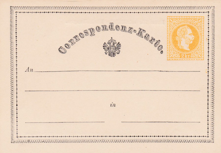
AUSTRIA
Worlds First Postal Stationery Post Card
2 Kreuzer pre-printed stamp
And here is what that very first Postal Stationery Post Card looked like. They were very popular, very quickly and it is recorded that 2,926,102 cards were sold in Austria-Hungary during the first three months of sale. Despite this being the first post card copies are quite easy to obtain, and this is because of the massive numbers produced, sold and used. A mint copy can be picked up for around £3 - £5, whilst a postal used copy, without any special or rare additional postage material, can be found anywhere between £6 and £9. First day of issue used copies – on the 1st October 1869 – will cost a lot more. This mint example is another from my collection.

Worlds First Postal Stationery Post Card
2 Kreuzer pre-printed stamp
These can be found printed on different quality card which makes their colour look different – this one is far more orangey than the white one depicted above
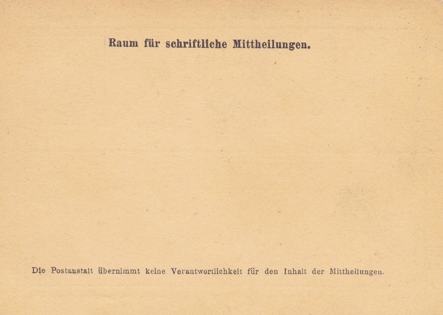
REVERSE SIDE OF ABOVE POSTCARD
Later these were normally plain backed, but initially they had two pieces of written instruction as per the Postal Regulation, as above, which did also allow for extra printed text to be added if needed. The additional text reads as:
RAUM FUR SCHRIFTLICHE MITTHEILUNGEN
(Space for written communications)
DIE POSTANSTALT UBERNIMMT KEINE VERANTWORTLICHKEIT FUR DEN INHALT DER MITTHEILUNGEN
(The Postmaster shall not be responsible for the contents of the communications)
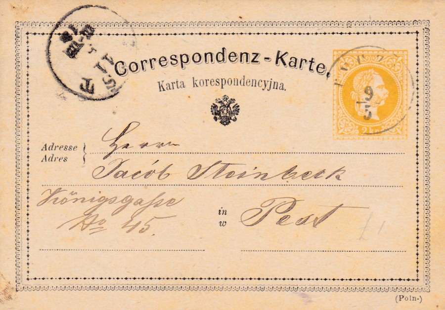
AUSTRIA
2 Kreuzer Postal Stationery Post Card
Postal Used
Update bilingual issue
The layout and design of this first post card did change over time. Here you can see a later used copy which has added text across the top and with the ‘address’ and ‘IN’ areas. This is because when the cards were initially released they were printed in the German language only (see above card). This is especially obvious by the text on the reverse side. This caused people to complain and there was resentment amongst the Slavonic areas of the Austria-Hungarian Monarchy where German was not spoken. This caused the Austrian Government to issue new postcards, under an order dated 8th September 1871, in bilingual text. Various language formats were issued and this post card here is one of these new ones. This copy was posted in 1873.

REVERSE SIDE OF ABOVE POSTCARD
Here you can see that the instructional text has been removed

18/03/2017
SILVER SUN
POP GROUP
Publicity Postcard
Signed by band members
James Broad
Paul Smith
Richard Buckton
Richard Sayce
(or so I think - I am not sure about all o them)
Silver Sun are a British ‘Power Pop’ band who first came together in 1995 in Camden in London. Their first album was released in 1997 and have released a couple of major label albums and some independently released ones. Their music is described as a combination of harder-edged alternative rock and classic power pop (what-ever-that-is). To be honest I bought the postcard because I love dodo’s! (In fact, I have a thing for all extinct animals and wrote my History exam project on extinct creatures during the advent of man).

PHOTOGRAPH
If I am right this is an image of the band – an old one I think
18/03/2017
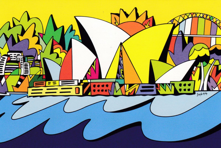
OPERA HOUSE
SERIES SYDNEY 2015
Published by
AVANTCARD AUSTRALIA
Ref: #19580
Design by
Bruno Mota
I have previously posted some of the Avantcard artist cards where they print a postcard of an emerging artist’s work as free publicity (remember the ice cream eyeball one?). This is yet another one and this time the artwork depicts the iconic Sydney Opera House.
18/03/2017
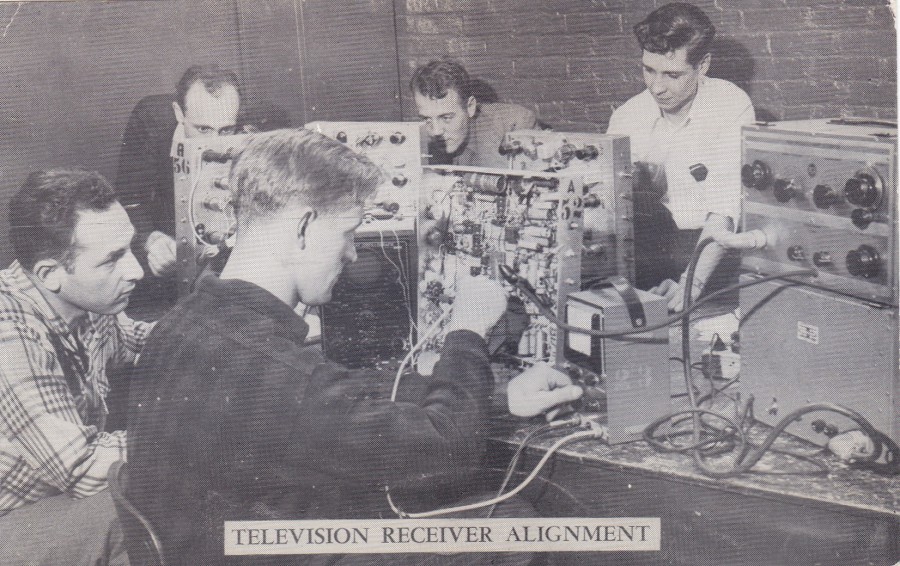
TELEVISION RECEIVER ALIGNMENT
MADISON INSTITUTE
Formerly N. Y. Technical Institute
Obtaining early, and by early we mean pre-1955, television related postcards is quite difficult, and even more so in the UK than in the US. So, therefore these four postcards, depicted here, all with an early television connection, are good examples of the type available from America. This image depicts students at the institute where they individually build an 18-tube Television set.
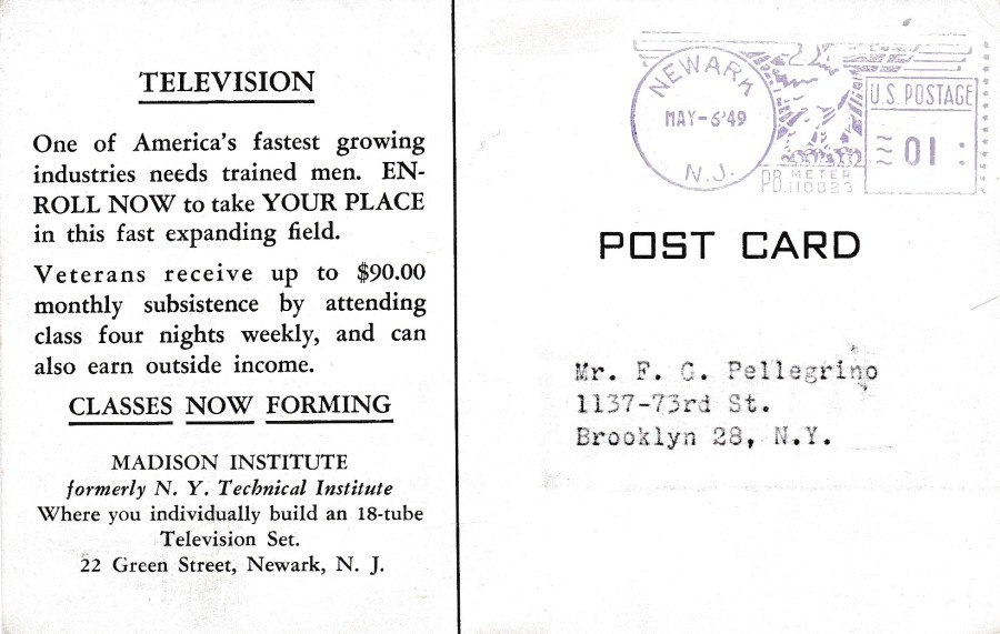
REVERSE SIDE OF ABOVE POSTCARD
This was posted out on the 6th May 1949 and has a NEWARK N. J. purple eagle pre-paid postage mark. The text on the left side gives details of the course, and I really like the fact that television is described as a ‘Fast Expanding Field’.

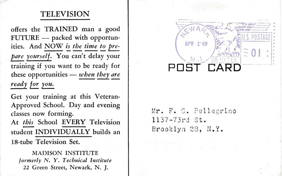
TELEVISION RECEIVER SERVICING
MADISON INSTITUTE
Formerly N. Y. Technical Institute
Another postcard from the same source as the one above. This one goes nicely with the above postcard and depicts the inside of several television sets and shows how complicated they were to put together (not a ‘flat screen TV’ in sight here).
REVERSE SIDE OF ABOVE POSTCARD
Addressed to the same person as the above postcard this one has a different printed advertising text on the left side. It was again posted from NEWARK N. J. but the date for this one is the 1st April 1949.
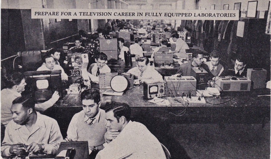
PREPARE FOR A TELEVISION CAREER IN FULLY EQUIPPED LABORATORIES
N. Y. TECHNICAL INSTITUTE OF NEW JERSEY
“Where you individually build a Television set”
This is an earlier postcard as this is from the N. Y. Technical Institute before it changed its name to the Madison Institute, as mentioned on the top two postcards. The popularity of the television course can be seen by the number of people depicted here building their own television set on the course. I liked this one because you can see a fully built TV set centre left side. This is a nice depiction of such an early set, and the screen is so small. Postcards depicting such early sets are not common.
REVERSE SIDE OF ABOVE POSTCARD
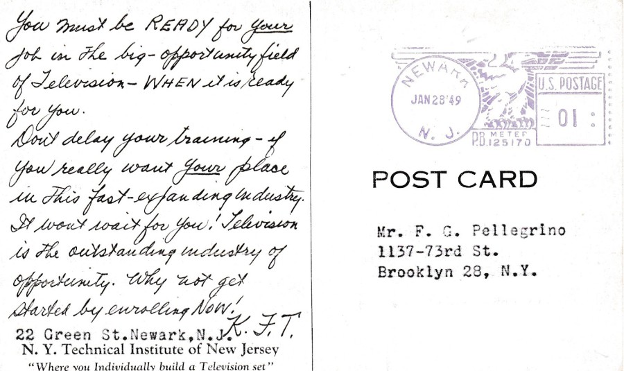
Clearly this one is again posted from Newark N. J. but this one was sent out some months earlier on 28th January 1949, again to the same recipient. I do wonder if Mr F. G. Pellegrino ever got around to going on the course. Also, the advertising text on the left side is again in a different format being printed as if hand-written, but its not. A clever idea which makes the message seem more friendly and personal.
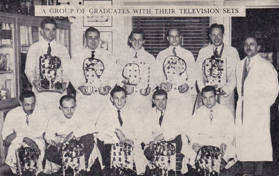
A GROUP OF GRADUATES WITH THEIR TELEVISION SETS
N. Y. TECHNICAL INSTITUTE OF NEW JERSEY
“Where you individually build a Television set”
Although not last in posted date order, I thought this image should be posted last as it depicts the people who have passed through and completed the internal machinery of their TV sets. They are nearly all smiling and, not surprising for the era, all men. I am assuming the gentleman standing on the right is the tutor (he appears not to be smiling…teachers rarely seem to smile in old pictures!)
REVERSE SIDE OF ABOVE POSTCARD
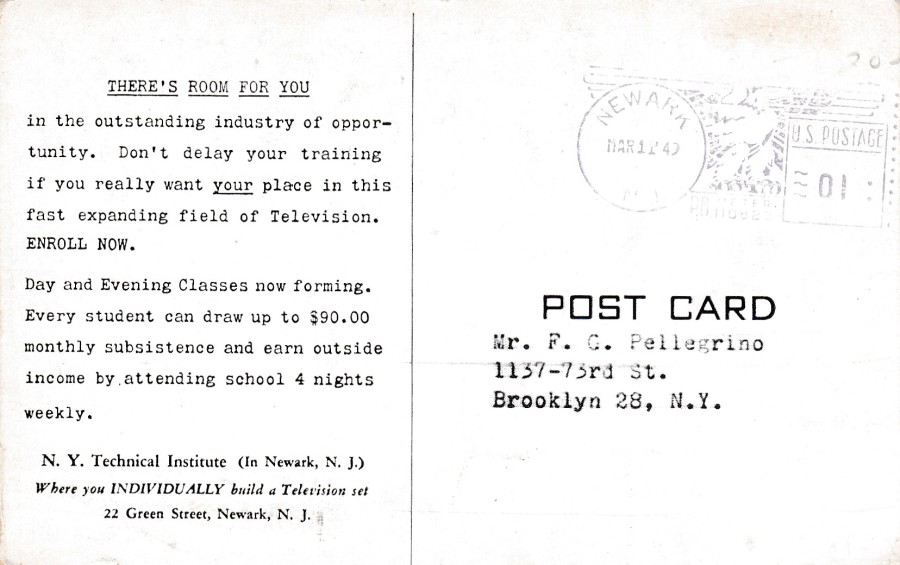
As already stated this is not the oldest posted of the four postcards here. It was again posted out whilst the establishment was called the N. Y. Technical Institute on 11th March 1949 (which means the name change to the Madison Institute happened between the posting of this postcard, on 11th March 1949, and the second one posted above, which went out on 1st April 1949 – so there is history and information contained here which shows the benefit of having these postcards kept together).
The advertising information text is again in a completely different format and you have got to applaud the effort that went into these postcards – but I still wonder if it worked on Mr F. G. Pellegrino? They certainly seem to have wanted him to enrole!
18/03/2017
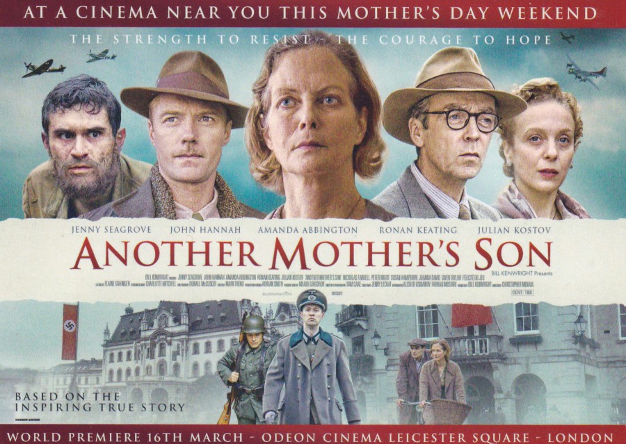
ANOTHER MOTHER’S SON
Film Poster Postcard
Published by
BOOMERANG (Media Cards)
“World Premiere 16th March”
I came across this during the week when I visited my local Odeon cinema. So, this is available out there now in the Boomerang free postcard racks and spinners. It is a useful poster image as it connects the collectable themes of ‘FILM’ (obviously), ‘TELEVISION’ (Amanda Abbington has recently portrayed the character of Mrs Watson in the highly popular TV series ‘Sherlock’. And, of course Jenny Seagrove first came to attention in the TV series ‘A Woman of Substance’ – I have always rather liked her), ‘MILITARY HISTORY’ (you have the uniforms and the depiction of Spitfires and US Bombers – so ‘AVIATION’ sneaks in as well) and, by no means least ‘MUSIC’. Music? Yes. Because one of the people appearing in this film is the ex ‘Westlife’ band member and later solo artist Ronan Keating. He is depicted in the line-up and although I believe this is not his first film appearance I believe it is his first film poster postcard showing.
All in all, not bad for a free postcard.

18/03/2017
DONALD TRUMP
PRESIDENTIAL INAUGURATION DAY
20TH JANUARY 2017
Published and produced by
POSTCARDCOVERS
(www. postcardcovers. Com )
I collect political themed postcards. I may not always agree with those who are depicted on these, after all I have an extensive Margaret Thatcher postcard collection but I never voted for her, but to exclude a postcard because of what or who it depicts has never been my way (although I will shun a scenario where my buying of a postcard in anyway finances anything I am against – I normally wait until this type of postcard comes onto the secondary market via dealers etc.).
This one here depicts the ‘swearing in’, or more precisely, the inauguration of Donald Trump as the latest President of the United States. The front depicts a scene from the actual ceremony with Trump with his hand on the Lincoln bible (Trump’s own childhood bible was also placed with the Lincoln Bible). The Lincoln Bible was the personal bible of President Lincoln which his family donated to the Library of Congress (President Obama also used this bible at his inauguration).

REVERSE SIDE OF ABOVE POSTCARD
As you can see here this postcard was produced to receive the ‘PRESIDENTIAL INAUGURATION STATION’ – WASHINGTON DC’ cancellation for the date of the inauguration – 20th January 2017. I also liked the fact that the producers have also depicted the cover of the New York Times on the left side, which adds extra interest and style to the overall card. It was also appropriate to use the Stars & Stripes flag stamp to receive the cancel. At least 100 of these were produced I believe, possibly more but not necessarily. Presidents come and go but there will always be an interest in the history behind those who occupy the post.
18/03/2017
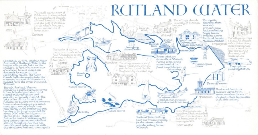
RUTLAND WATER
Large and long Map Postcard
Published by
MENDIP CARDS
Printed by
HAMPTON PRINTING (BRISTOL) LTD
Those amongst you who know about the map postcards of ‘FAGA’ (pen name for Fred Foley) might have looked upon this and believed it to be another of his excellent issues, from the 1960’s and 1970’s. But, it is not. As FAGA’s map postcards became more and more popular his techniques were copied and FAGA on many occasions had to sue companies for copyrighting infringement of his ideas and issue format(s). I do not know if this design here was subject of such a court case or if one was approached but it clearly, and blatantly copies his early map designs. It copies the text and heading fonts, the size and unusual shape, the use of one or two different coloured inks for the images and texts and in almost every aspect it shouts out, mistakenly and with intent, that this is a FAGA design.
Although not recorded on the postcard the seller, well known and respected modern postcard dealer Ron Griffiths (the ‘King of the Mods’ as someone quite appropriately called him) has informed me that the postcard depicted here was issued in the 1970’s and that the artist was a Sue Harrison (all essential information for any postcard collector and Ron has always been a fantastic source of modern postcard information – Ron is also the expert on FAGA postcards and produced the catalogue on his work which all we collectors still use to this day).
REVERSE SIDE OF ABOVE POSTCARD
It does have a nice company logo though

18/03/17
K BAR
Enjoy a King of Queen’s Gate at K Bar
COCKTAILS – WINES – SPIRITS – MASTER CLASSES & EVENTS
109 – 113 Queen’s Gate, London SW7 5LR
Earlier this week my youngest son and his partner attended this bar for the ‘Tales as old as Time’ afternoon tea event (based on the Walt Disney film ‘Beauty and the Beast’). Whilst there they picked up this postcard for me which was given out with the bill.
18/03/2017
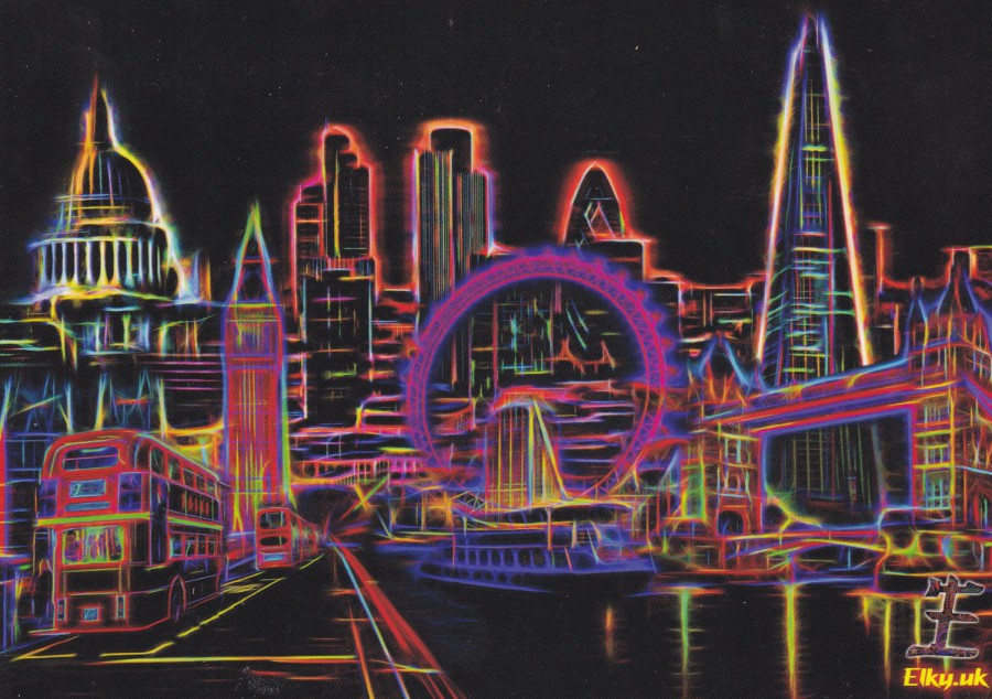
GRAPHIC ART OF LONDON
Published by
PAGEANTRY POSTCARDS
Ref: JEF304
Artwork by
‘Elky’
I work in Basildon, Essex and often find myself in the Town Centre shopping area. There is a WH Smith here and like many (possibly most in the South East) they have a spinner of postcards published by Pageantry Postcards on sale. This very week I was there and this postcard caught my eye. I do not believe I have seen it before.
There are probably more London pictorial and artwork related postcards than for any other location in the UK, and quite rightly as it is our capital city in the UK. With so many basic views of the main landmarks of this city, Big Ben, Tower Bridge, London Eye, St Paul’s Cathedral, amongst many others it is unusual to find a London postcard which manages to capture something different or which reveals these landmarks in an interesting style – here I depict one which I believe does (and a bargain at 50p).
18/03/2017
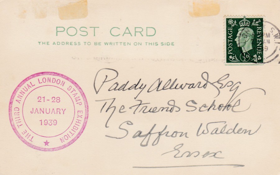
THE THIRD ANNUAL LONDON STAMP EXHIBITION
1939
Plain green texted POST CARD
I have an interest in Stamp Exhibition postcards as I collect these when I attend the modern events that are still held today. Despite my interest, I don’t really like to spend too much on older cards for my collection, with one or two exceptions. This was one of them.
This card was posted from the Third Annual London Stamp Exhibition on what was its first day, 21st January 1939 (the exhibition was held between the 21st and 28th January). The ½ d stamp has been cancelled with a LONDON cancel dated 21/01/1939.
The card has also received the large round red Exhibition cachet:
THE THIRD ANNUAL LONDON STAMP EXHIBITION
21 – 28 MAY 1939
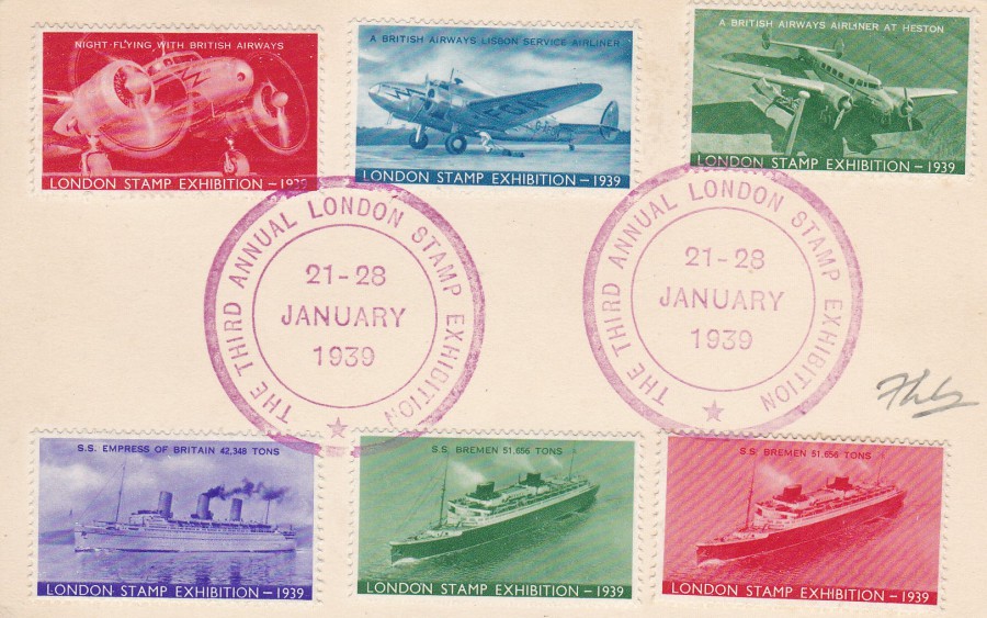
REVERSE SIDE OF ABOVE POSTCARD
Now here is the reason why I wanted this very postcard. The sender has applied six special Cinderella stamp like exhibition labels to this side of the postcard. These labels were produced for this 1939 exhibition, and have text along the bottom which reads ‘LONDON STAMP EXHIBITION – 1939’. The individual stamps depict:
TOP LEFT (Red) – Night Flying with British Airways
TOP MIDDLE (Blue) – A British Airways Lisbon Service Airliner
TOP RIGHT (Green) – A British Airways Airliner at Heston
BOTTOM LEFT (Purple) – SS. EMPIRE OF BRITAIN 42,348 Tons
BOTTOM MIDDLE (Green) – SS BREMEN 51,656 Tons
BOTTOM RIGHT (Red) – SS. BREMEN 51,656 Tons
The six Cinderella labels have been cancelled with two strikes of the large round red cachet for the Exhibition (as mentioned above, and depicted on the front of the postcard).
18/03/2017
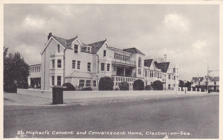
ST MICHAEL’S CONVENT AND CONVALESCENT HOME
CLACTON ON SEA
Published by
THE GRANGE PUBLISHING Co., LONDON
Unfortunately, this is the type of postcard which is often considered as of little value, in fact I received this as a free postcard when it was used as a stiffener card for another postcard I had bought on eBay. So, it cost me nothing. It would also probably have been of little interest to me as well except that I have been to Clacton-on-Sea as this is the Essex ‘Opposite’ of my home town as we are in the south of the county and Clacton is in the north.
This postcard is, I think, from the 1970’s, possibly the late 1960’s but, interestingly the building is still with us and is still operating as it was although now simply called the ‘St Michael’s Care Home’. It is located at 93 Marine Parade East, although this information is not included on the postcard. In fact, considering the lack of contact details on this card (front and back) I suspect it was designed for use by the people in the home itself rather than a straight forward publicity card.

PHOTOGRAPH
Here is the care home as it appears today
18/03/2017
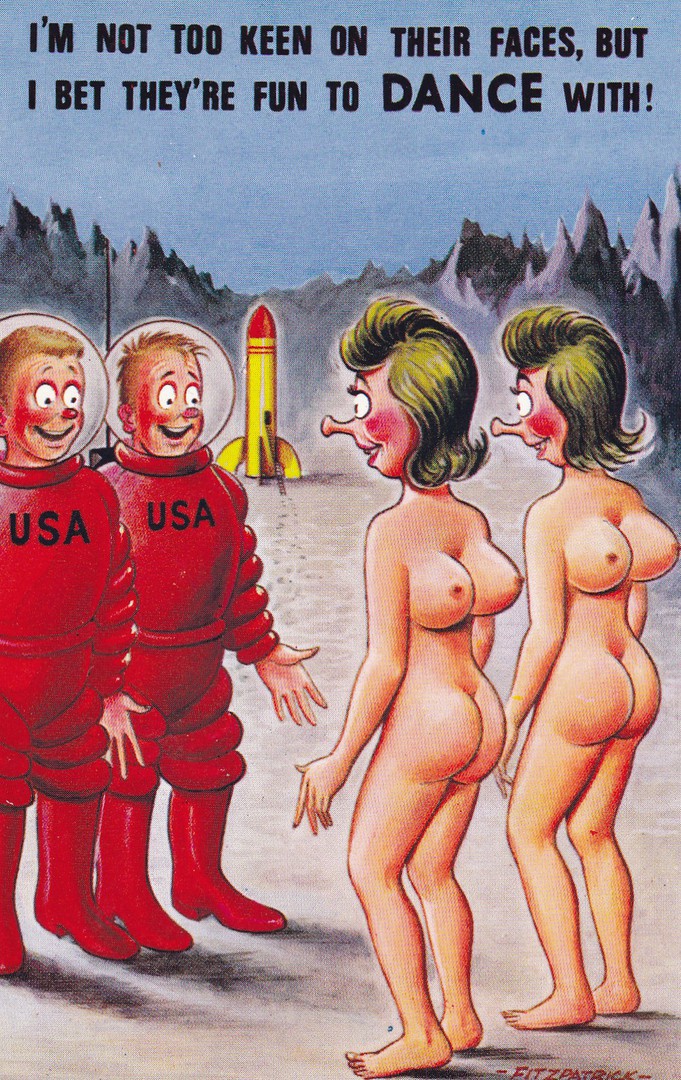
I’M NOT TOO KEEN ON THEIR FACES,
BUT I BET THEY’RE FUN TO DANCE WITH!
Published by
BAMFORTH & CO., LTD
“COMIC” Series
Ref: No. 2487
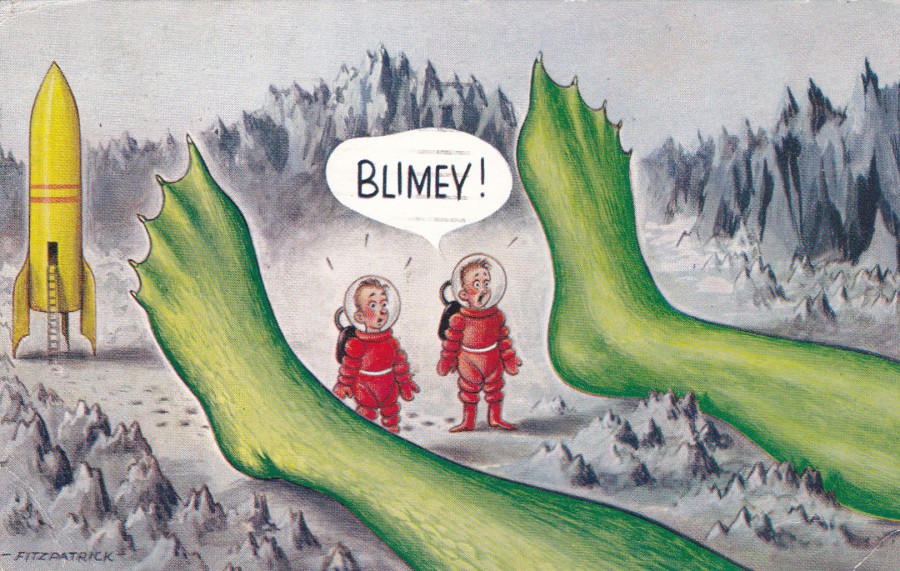
I have had this comic postcard, drawn by well-known Bamforth artist ‘Fitzpatrick’ for many years now. I like space related postcards and funny ones are just as interesting as the photographic history based ones. Although produced and printed in the UK they still stuck with the astronauts being from America, who were of course considered at the forefront of space travel (yes, I know the Russians were there first but we were in the middle of a Cold War with them at the time this postcard was printed so there was little chance they would get a look in).
BLIMEY!
Published by
BAMFORTH & CO., LTD
“COMIC” Series
Ref: No. 2380
As I already had the above postcard when I first saw this one, despite it being at the high end of its value, I knew I wanted it. The design is again by Fitzpatrick, but what amused me was the similarities between the two images. The space rocket has very similar colouring, it’s just missing a red nose cone, the background landscape has the same jagged edges look as the above card. And, lastly the space costumes are not only the same colour but also of the same design (but minus a USA on the front). I think the two postcards go together very nicely.
REVERSE SIDE OF ABOVE POSTCARD
This postcard was posted from the Isle of Man on the 14th August 196(7?) using an Isle Man Queen Elizabeth 3d definitive stamp. The stamp has been cancelled with a slogan postmark:
FOR HAPPY HOLIDAYS
THE ISLE OF MAN
18/03/2017
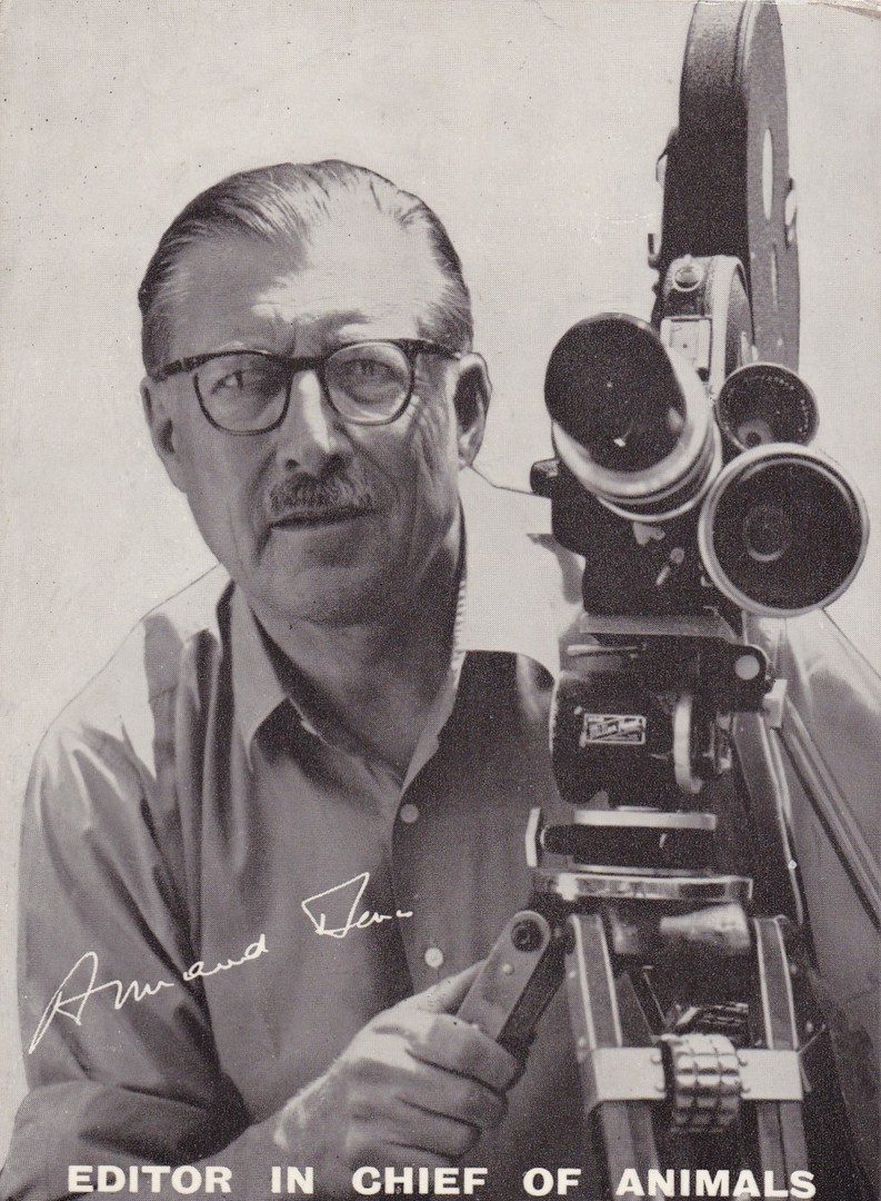
ARMAND DENIS
(2ND December 1896 – 15th April 1971)
EDITOR IN CHIEF OF ANIMALS
Black and White plain backed publicity card
Armand Georges Denis is shown here with one of his film cameras. He was a Belgian-born documentary filmmaker who made some pioneering films about the wildlife of what was then remote parts of Africa and Asia. He was certainly best known in the UK for presenting and directing wildlife films on television during the 1950’s and 1960’s, often co-presenting with his equally famous wife Michaela (the TV connection is my main interest although I have always been a big wildlife documentary lover).

AUTOGRAPH
on piece
'ARMAND DENIS'
"ON SAFARI"
When I saw this card on eBay I was aware that I already a copy of it but this sale also came with a nice little signed piece, a small piece of card (about 3” x 2”). I put in a very low bid, mainly because I already had a copy of the card, I just thought the signature was nice and would go nicely into my collection. I was fortunate as I was the only bidder and got the items for next to nothing, although I was surprised.
So, here is the signed piece which I store with the card in one of my TV albums.

17/03/2017
4d GREAT BRITAIN QEII POSTAL STATIONERY POSTCARD
25TH ANNIVERSARY
BATTLE OF MONTE CASSINO
1944 – 1969
DOCUMENTARY EXHIBITION
16 – 17 – 18 MAY 1969
Union of Polish Philatelists
Specially produced, overprinted in black on left side for a special exhibition held in 1969 in Birmingham, Queen Elizabeth postal stationery card. This commemorates the Polish Troops contribution to the attack on the monastery of Monte Cassino in Italy during World War II.
The 4D QEII printed Machin Head stamp has been cancelled with a special hand stamp which reads:
25th ANNIVERSARY
BATTLE OF MONTE CASSINO
1944 – 1969
DOCUMENTARY EXHIBITION
16 MAY 1969
BIRMINGHAM
17/03/2017
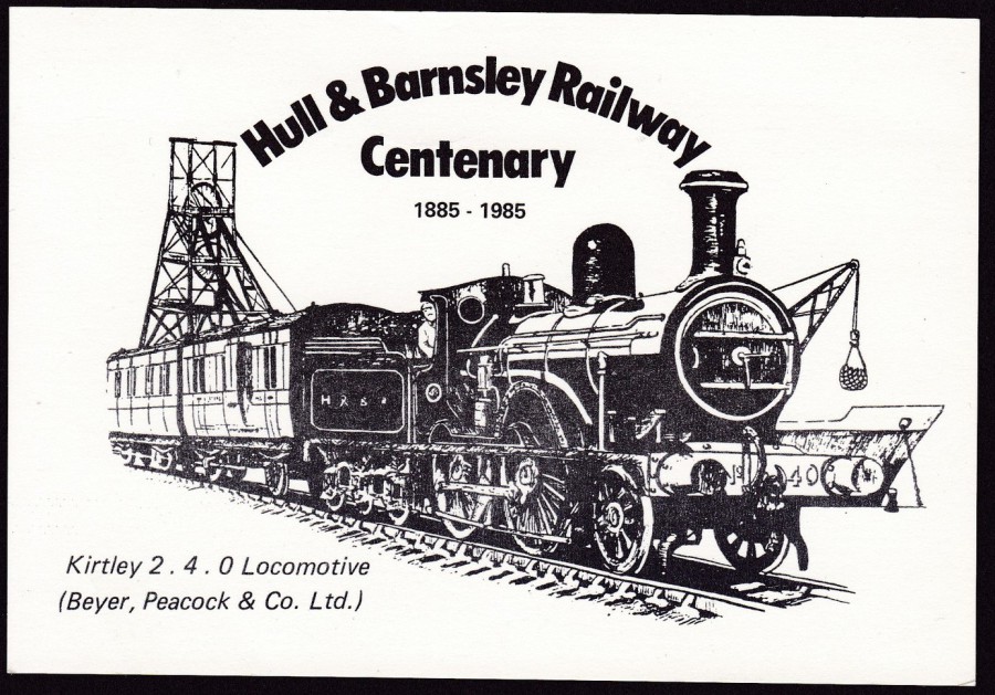
HULL & BARNSLEY RAILWAY
CENTENARY
1885 – 1985
KIRTLEY 2. 4. 0 LOCOMOTIVE
(Beyer, Peacock & Co. Ltd)
Published by
Barnsley Philatelic Society
(on 27/07/1985)
Official Postcard designed by Barry Dye
A nice artwork design issued for a specific anniversary
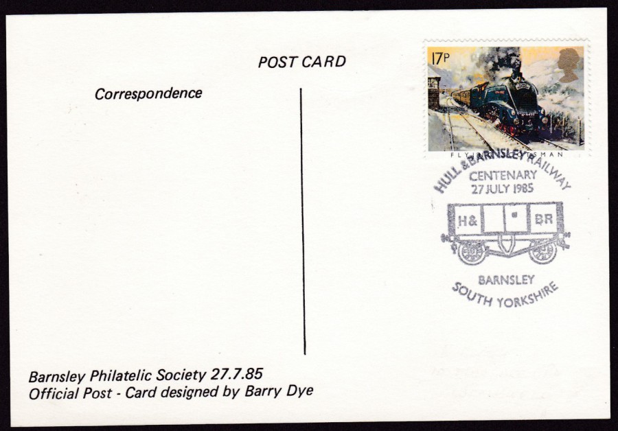
REVERSE SIDE OF ABOVE POSTCARD
The Barnsley Philatelic Society have here produced a very nice commemorative postcard and then taken it one step further. The postcard has been used with a 17p Flying Scotsman ‘Famous Trains’ stamp from the set issued on 22/01/85. This stamp has then been cancelled with a special related hand stamp which reads:
HULL & BARNSLEY RAILWAY
CENTENARY
27 JULY 1985
BARNSLEY
SOUTH YORKSHIRE
The hand stamp clearly celebrates the centenary for which the postcard has been designed and issued for. It makes for a nice combination, it is also now 31 years old.
17/03/2017
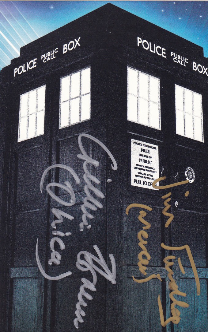
POSTCARDS FROM TIME AND SPACE
THE TARDIS
(Single postcard from the boxed set of 100 Doctor Who postcards)
Signed on the front by:
JIM FINDLEY
Gold Ink
(Played the character ‘Mercer’ in the story ‘Resurrection of the Daleks’)
And
GILLIAN BROWN
Silver Ink
(Played the character ‘Ohica’ in the story ‘The Brain of Morbius’)
It is always nice to get signatures on items and where possible I try to obtain these on postcard (although I also have a wide range of signed photographs which have obtained at the same time as I was collecting signed postcards). With the many years, and many episodes and stories in the back history of Doctor Who there are hundreds of actors and actresses that have played parts. Many of these attend conventions and signing events and attendance at these allows collectors to amass some very interesting, and large collections.

PHOTOGRAPH
Jim Findley
As
‘Mercer’ in Doctor Who
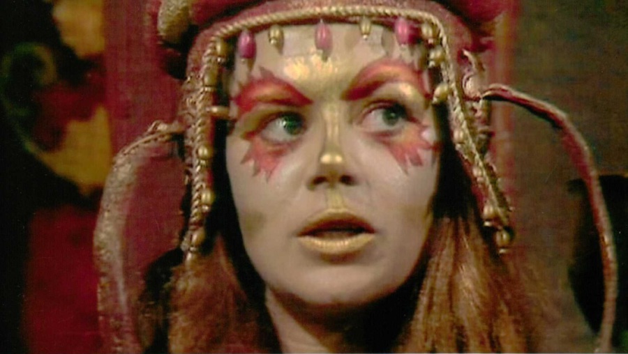
PHOTOGRAPH
Gillian Brown
As
‘Ohica’ in Doctor Who
17/03/2017
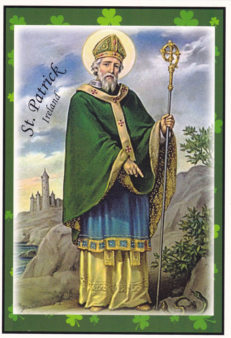
HAPPY ST PATRICK’S DAY
ST. PATRICK, IRELAND
‘Greetings from Ireland’
Published by
LIFFY ARTEFACTS 2013
Ref: SPC36
This is a postcard I bought in Ireland during my visit last year.
I thought it the ideal postcard for posting today.
16/03/2017
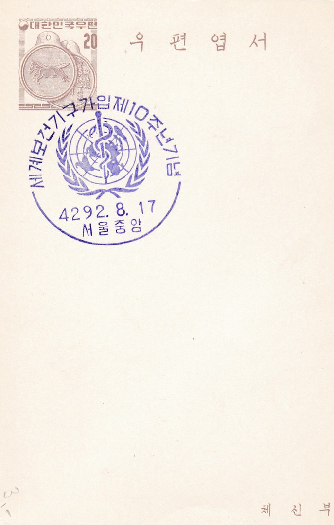
JAPANESE POSTAL STATIONERY CARD
Here is another one, see below, and again I have no proper information for you but even I can surmise that the blue cancellation has a medical theme, I am thinking something along the lines of the ‘World Health Organisation’ or some world, or United Nations doctor’s organisation. Having checked the internet the image does appear to be the logo for the ‘World Health Organisation’ so my first thoughts were correct. So sometimes you can work some things out just from the images involved.
16/03/2017
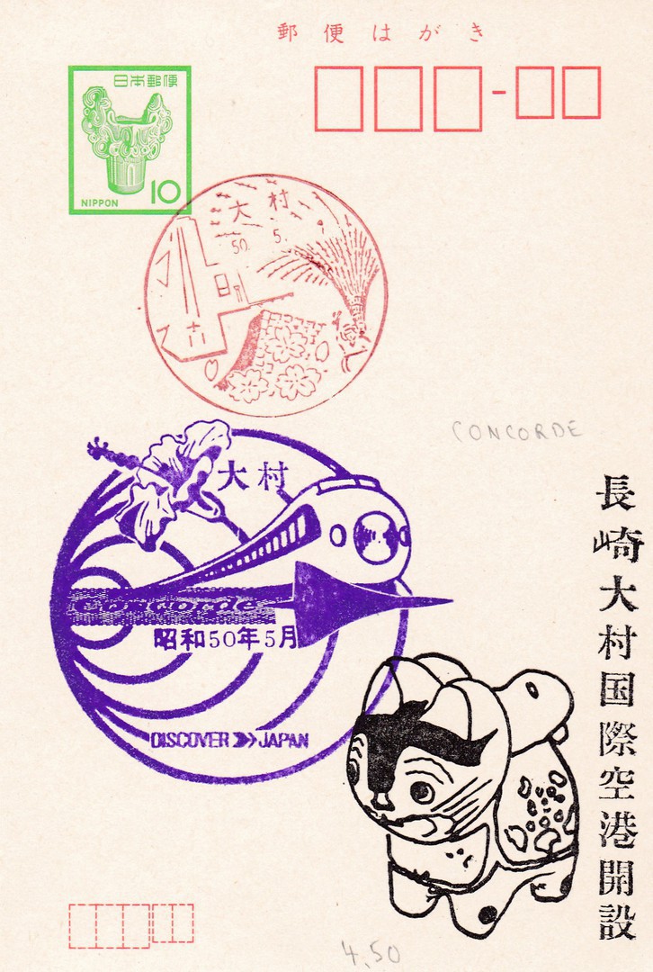
JAPANESE POSTAL STATIONERY CARD
I have previously stated that I know almost nothing about Japanese postal stationery cards, except that they are vertical in format rather than horizontal. My lack of knowledge though does not decrease my enjoyment in obtaining these and wondering the meaning of the various cachets and cancels that can be found on them. Sometimes it is something specific in the cancel/cachet that catches my eye. With this one it was the inclusion of the Concorde aeroplane, under the bullet train, in the large purple cachet (it might be an actual cancel but I think a cachet describes it best). I also think the black cat, with black text, in the bottom right corner has also been applied later, possibly as a cachet or further promotional addition to the card. Also, I do not understand how the date lines up in the date cancels so I do not even know what year this is from. But, as stated, I still like these.
(If anyone can help with any translation or information it would be much appreciated – please use the comments box below)

16/03/2017
SCHLACHT BEI LILLE
‘BATTLE AT LILLE’
Published in Germany by
L&P
Ref:1709.
Artist – Arthur Thiele
This World War I German propaganda postcard was painted by the well-known postcard artist Arthur Thiele (Real name Carl Robert Arthur Thiele) who was born in Leipzig on 2nd November 1860 (he died in the same city on 18th June 1936). Thiele was well known for his anthropomorphic animal images, which were, and are very popular on postcard. But, he also drew for books. Although perhaps best known for his dressed animal pictures he did also paint other images including some WWI propaganda postcards of which this is a nice example. As it is a German postcard it depicts the Germans attacking the French.
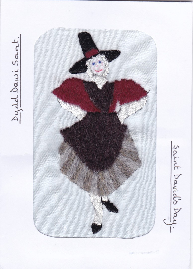
16/03/2017
DYDD DEWI SANT
SAINT DAVID’S DAY
Hand Made Woollen Stitched Postcard
Made by my old friend David Rye
2017
It is always nice to receive something unusual in the post and David never fails to supply just such an item

REVERSE SIDE OF ABOVE POSTCARD
The postcard has been posted using a Welsh definitive dragon AF/1St Class stamp which has been cancelled with a ‘ROYAL MAIL – PROUD TO SUPPORT – STROKE’ slogan dated 27/02/2017 (St David’s Day was of course the 1st March and the card arrived in time for this celebration). This is not the first David Rye item I have posted and I hope it will not be the last.
16/03/2017
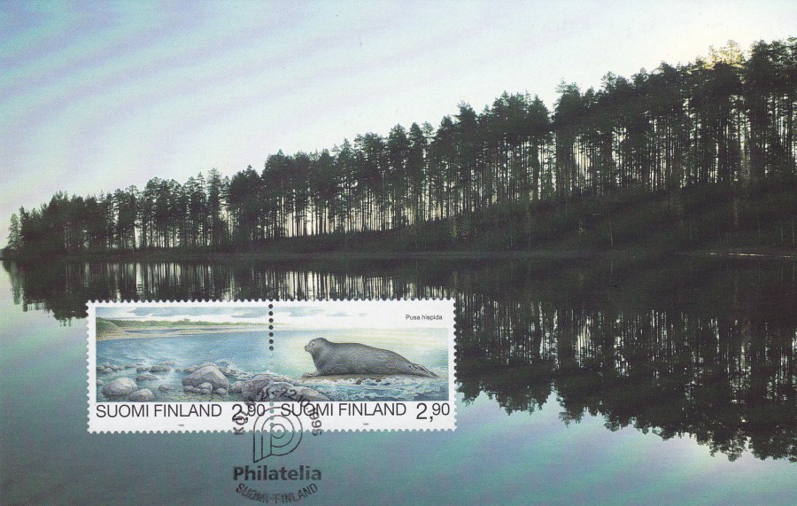
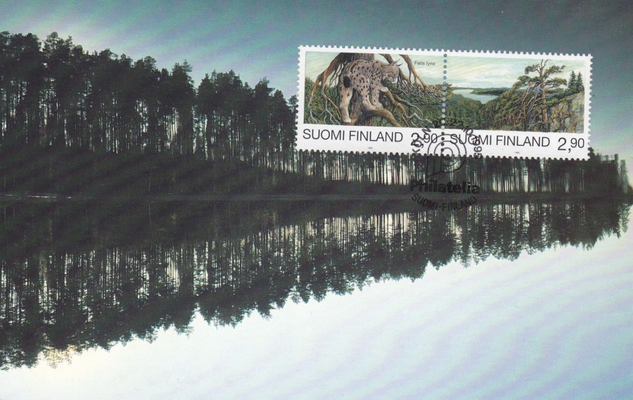
FINLAND
EXHIBITION CARD 95
‘PHILATELIA 95’
Every year, or at least in the past for every year, as I do not know if they still do this, the Finland Postal Authorities issued an ‘Exhibition Card’. The card was then used at the various Stamp Exhibitions in Finland, and where appropriate, around the world where they had a stand. A special cancellation/cachet was used for each different stamp exhibition and stamps were applied, normally to the front, for collectors to obtain from the stand. This Exhibition Card displayed here was used in 1995. It has two stamps on the front which are from a four-stamp set titled ‘Endangered Animals’ from 1995:
2m.90 value Shoreline stamp – SG 1389 (forms composite image with below stamp)
2m.90 value Ringed Seal stamp – SG 1390 (forms composite image with above stamp)
The two stamps have been cancelled with the PHILATELIA 95 – KOLN – 20-22/10/1995 Exhibition cancellation.
FINLAND
EXHIBITION CARD 95
‘PHILATELIA 95’
Contrary to how it may at first appear this is the same Exhibition Card as the one depicted above only the stamps have been applied to the card whilst it was upside down. An easy mistake to make as the image of the reflected trees in the water is at quick glance difficult to discern which is which, the actual tree-line or the reflection of the tree line.
The two stamps here are the remaining two stamps from the four-stamp set titled ‘Endangered Animals’ from 1995:
2m.90 value Lynx stamp – SG 1387 (forms composite image with below stamp)
2m.90 landscape stamp – SG 1388 (forms composite image with above stamp)
The two stamps have been cancelled with the PHILATELIA 95 – KOLN – 20-22/10/1995 Exhibition cancellation.
The fact that the card is technically upside down does not really detract to much from the value and look of this postcard, in fact it makes it a bit of a curiosity, and I wonder how many times this happened as I doubt my copy here is unique.
Upside down or otherwise these are nice example of stamp exhibition souvenir cards which also allow the collector to add four very nice stamps to their collection at the same time.
15/03/2017
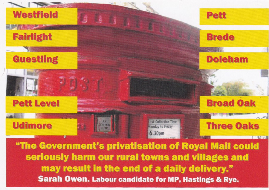
SAVE ROYAL MAIL
Political Campaign Postcard
“The Government’s privatisation of Royal Mail could seriously harm our rural towns and villages and may result in the end of a daily delivery.”
This campaign was run on behalf of the Labour candidate for MP for Hastings and Rye, Sarah Owen, who was running in the General Election of 2015. Clearly the then topic of the privatisation of Royal Mail was a hot topic and was being used here as a political campaign trail subject.
Many of these postcards will have been used, posted to the pre-printed address and used in the campaign itself. A large number will also have been thrown away as junk mail items. If you take into account that this item was only used in the one constituency area, and thus already had a limited circulation, then the fact that at least this one copy has made it into a postcard collectors collection is a good thing as I suspect not too many did survive. It would of course also be a piece of history for those who collect ‘Postal History’ items as its reason for existence revolves around the story of the Royal Mail privatisation story.
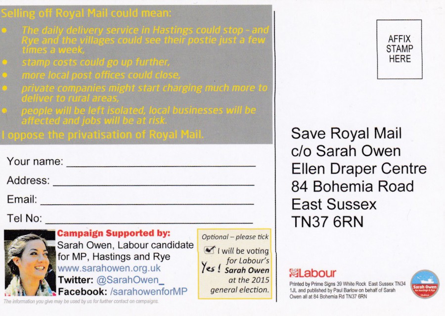
REVERSE SIDE OF ABOVE POSTCARD
Nicely put together and eye-catching, with an image of the candidate as well, this is well produced, if you accept that it is printed on thin cheap card, as would be accepted considering its source and that the cost would be placed on the local political party candidate.
Unfortunately, having checked the internet it seems Sarah Owen was not successful in her run to be the MP in the 2015 elections. But, her loss does not change the interest in this smashing unusual postcard.
15/03/2017
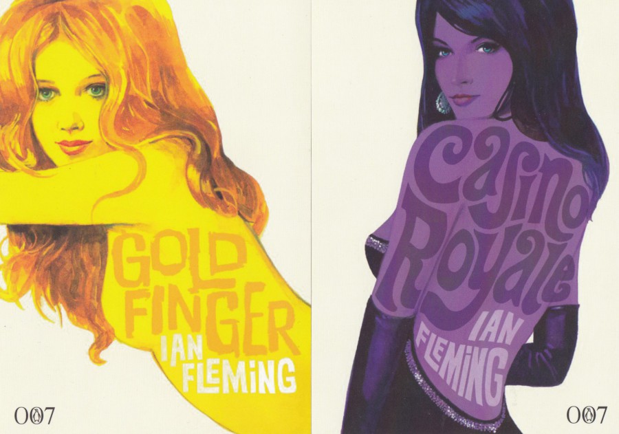
JAMES BOND
BOND IS BACK
28 MAY 2008
‘DEVIL MAY CARE’
On the 28th May 2008 a new James Bond book was released written by Sebastian Faulks, bestselling author of ‘Birdsong’ and ‘Charlotte Gray’. To advertise the release of this new ‘Bond’ story a set of advertising postcards were released which depict new artwork covers for some of Ian Fleming’s well known James Bond spy novels. Although released in 2008 I had not known of these until I recently saw these five being sold on eBay. I am a huge James Bond film fan so immediately bought them. I paid what would be considered the top end price for these postcards but I don’t mind when they are as good as these are.
FAR LEFT
GOLDFINGER
NEAR LEFT
CASINO ROYALE
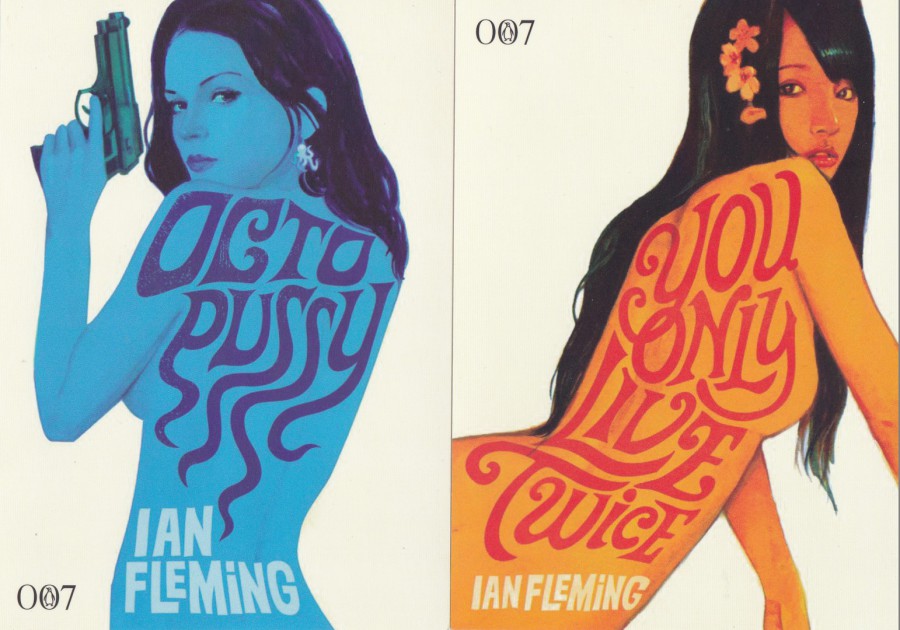
FAR LEFT
OCTOPUSSY
NEAR LEFT
YOU ONLY LIVE TWICE
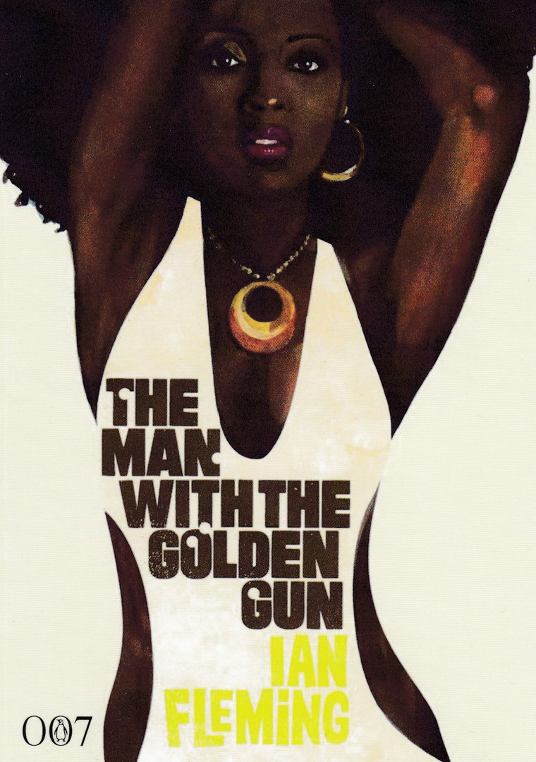
THE MAN WITH THE GOLDEN GUN
I think these are lovely postcards and are indicative of the feel of the original stories, and they also manage to capture that same early film tone. These are the only five I have seen but it does not mean that these are the only five that were printed. I suspect, and it seems fairly obvious, that these postcards were free and may have been used by bookshops as pre-promotional items. Does anyone know if there were more to this series? I have checked images on Google but there is one picture that one depicts just these five cards I have shown here. If anyone has any information I would appreciate hearing from you.
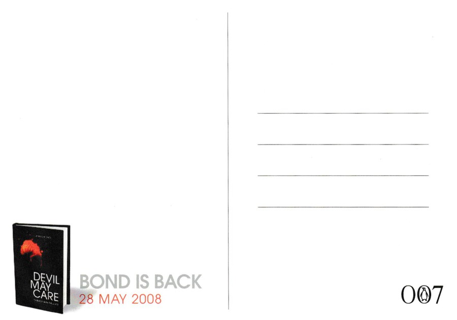
REVERSE SIDE OF ABOVE POSTCARD
The reverse design is the same across all five postcards