JACQUELINE PEARCE ….. RIP
20th December 1943 – 3rd September 2018
British film and television actress who was best known for playing the villain Servalan in the British science fiction television series ‘Blake’s 7’
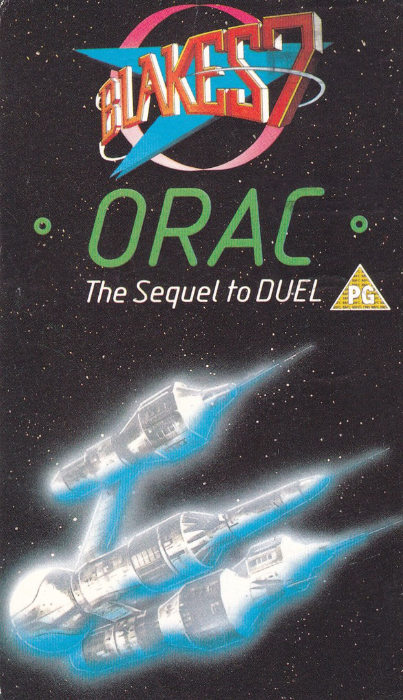
ORAC
BLAKE’S 7
“The Sequel to DUEL”
Official BBC Video Postcard
This postcard, which is a strange long thin shape, came free in the video release of one of the television series episodes (you had to buy this video to obtain this postcard). It has always been a popular postcard although not a very common despite the many that much have been produced to go with all the videos sold. I have managed to obtain a couple of copies of this card. I bought one from a postcard dealer many years ago, for my television themed collection. I then later found a copy of the actual video in a charity shop for £1, and this still had the postcard inside, so I had to have that one as well.
When the first episode of ‘Blake’s 7’ was shown on television on 2nd January 1978 I was 14 years old and it could have been aimed at me, and I loved it. I was not alone as it was immediately very popular. My memories of it are better than perhaps the actual quality of the episodes now appear but is this not often the case with older programmes like this. I have nothing but very fond memories of the original first season (subsequent seasons dropped in quality as cast members left the show, including the titular character ‘Blake’ himself at the end of the second season, and who was therefore missing for the following four seasons only turning up at the end of the final episode.
The ‘ORAC’ from the title was a super-computer which the team obtained during the first season.

PHOTOGRAPH
Jacqueline Pearce
Here playing the character Servalan in the television series ‘Blake’s 7’

03/09/2018
SUMMER SALES
QUICKLY REACHED BY
UNDERGROUND
Poster by
MARY KOOP, 1925
Published by the
LONDON TRANSPORT MUSEUM
Ref: unusually this card does not appear to have any LTM number attributed, something which has become apparent with very recent issues (2017 onwards)
This card was published in 2017
A lovely early poster design for the 1925 summer sales. All those umbrellas! I assume somewhere out there, there is a dedicated, probably small, group of ‘Umbrella’ theme postcard collectors! They would like this one.

LAZY DAYS,
BY TUBE
Poster by
SANDRA FISHER, 1991
Published by the
LONDON TRANSPORT MUSEUM
In their:
‘POSTER GIRLS – A CENTURY OF ART AND DESIGN’
Series
Ref: unusually this card does not appear to have any LTM number attributed – which appears to be the case with this specific POSTER GIRLS series
This postcard was issued in 2018
Another nice modern era, 1990’s, used Underground train poster design. This ‘POSTER GIRLS’ series has produced some delightful postcards, and with the modern ones it is always nice when it is a poster you remember seeing at the time, and I do very much remember this one.
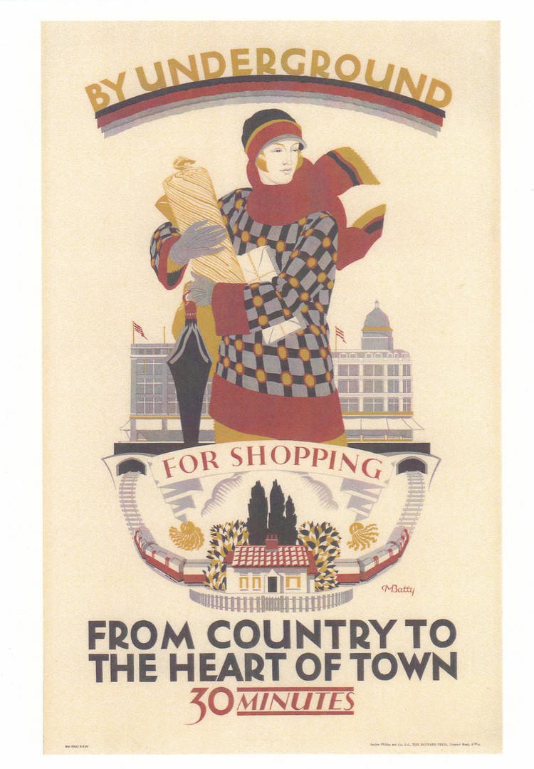
BY UNDERGROUND
FOR SHOPPING
FROM COUNTRY TO
THE HEART OF TOWN
30 MINUTES
Poster by
DORA M. BATTY, 1925
Published by the
LONDON TRANSPORT MUSEUM
In their:
‘POSTER GIRLS – A CENTURY OF ART AND DESIGN’
Series
Ref: unusually this card does not appear to have any LTM number attributed – which appears to be the case with this specific POSTER GIRLS series
This postcard was issued in 2018
It is interesting how many of the posters, especially from the 1920’s, but also some other eras, advertise the ‘Shopping’ aspect of a trip by Underground train.
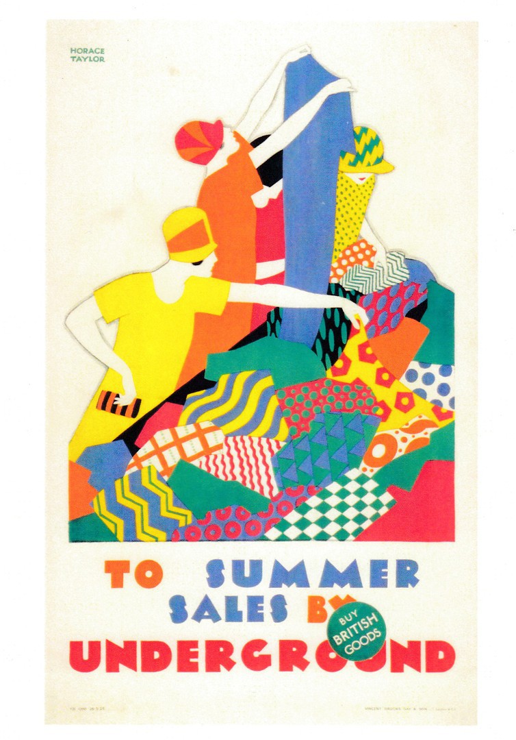
TO
SUMMER SALES
BY UNDERGROUND
“BUY BRITISH GOODS”
Poster by
HORACE TAYLOR, 1926
Published by the
LONDON TRANSPORT MUSEUM
Ref: unusually this card does not appear to have any LTM number
This postcard was issued in 2016
This is yet another 1920’s Underground poster which is related to ‘Shopping’, a popular poster theme for this decade.

03/09/2018
PRE-RELEASE STUDIO ALBUM PUBLICITY SHOOT
FOR DIAMOND DOGS
PHOTOGRAPH BY
TERRY O’NEILL
LOS ANGELES, WINTER/SPRING 1974
VICTORIA & ALBERT MUSEUM
DAVID BOWIE EXHIBITION
(EXHIBITION EXCLUSIVE POSTCARD)
VICTORIA & ALBERT MUSEUM
Ref: 120110
SQUARE SHAPED POSTCARD
Bowie at his most ‘sharp’
Another cracker from this museum exclusive postcard series. I am working my way through these as I am a big fan of his work, but there are only four more to go.
03/09/2018
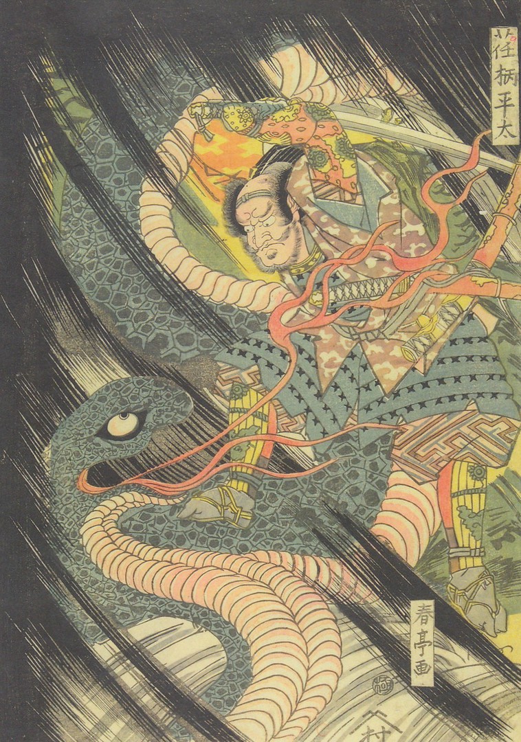
THE WARRIOR EGARA NO HEITA BATTLING
WITH A GIANT SERPENT
KATSUKAWA SHUNTEI (1770 – 1820)
WOODBLOCK PRINT
JAPAN, 1815 – 20
Published by the
VICTORIA & ALBERT MUSEUM
Ref: 129023
I have always liked oriental art, some of this fascination probably came from my 1981 visit to Hong Kong, but I am also very interested in monsters and creatures of myth, legend and fable, both modern and historic. There is a word for the study of such like creatures and this is ‘Cryptozoology’. This area of interest, considered a pseudoscience, fascinates me and as a result I collect any postcard which depicts any type of monster, whether in art or other style of image. This woodblock depicts a giant serpent and therefore fits nicely into this theme of mine. When I saw it on the museum postcard rack, well one of them as the museum has a number, I knew I had to have this one.
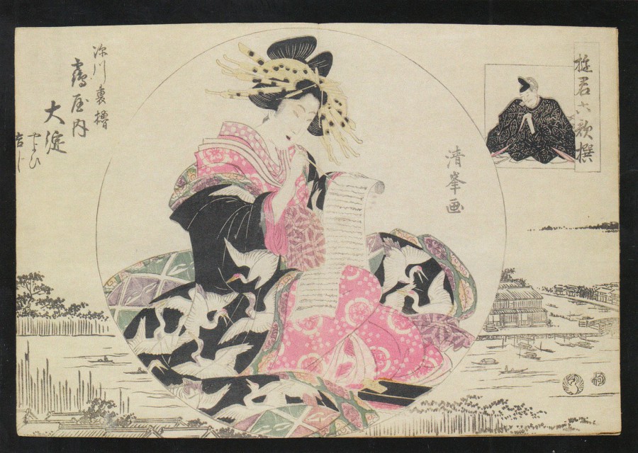
COURTESANS AS THE SIX POETRY IMMORTALS
TORII KIYOMITSU II (KIYOMINE)
WOODBLOCK PRINT ON PAPER
JAPAN
BEFORE 1918
Published by the
VICTORIA & ALBERT MUSEUM
Ref: 130761
This one is another piece of oriental art from the museums collection and an image I could not resist. There is something about oriental art that I find attractive and appealing. It might be the flowing garments the courtesans wear, or their hairstyles and hair adornments, but I adore these images.
03/09/2018
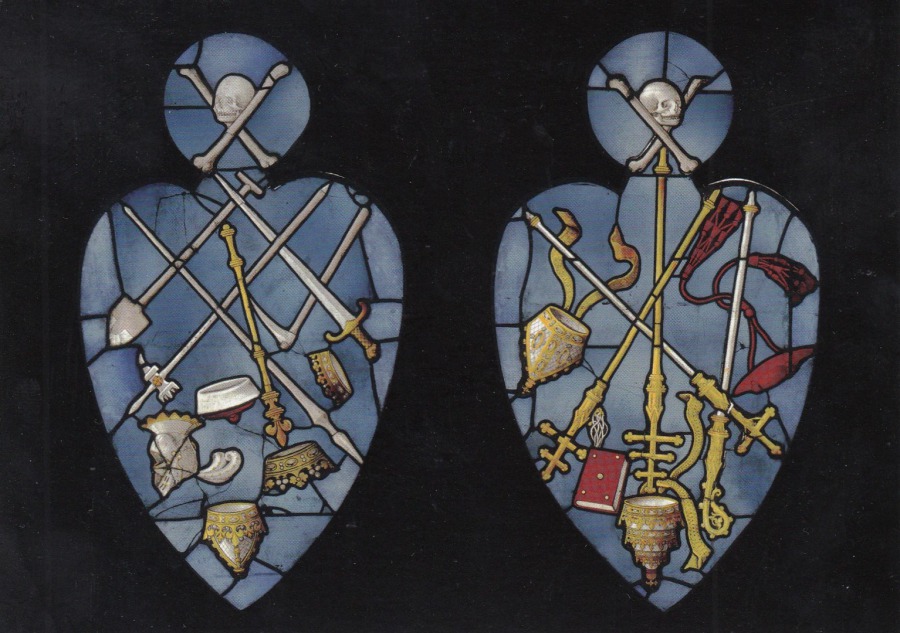
TRIUMPH OF DEATH OVER THE LEITY/CLERGY
Two panels of clear and coloured glass
With painted details
Normandy, France 1520 – 30
Published by the
VICTORIA & ALBERT MUSEUM
Ref: 129028
I have a friend in one of my stamp clubs who collects stained glass windows as a theme on both stamps and postcards. He would like this one which is an example of a very early and eye-catching pair of designs. For me, and I hate to be morbid about this, it was the addition of the skull and crossbones at the top of each window which drew my interest and lead to me buying this card. I might have this upside down, but it is in line with the reverse side - and I Like the skull and crossbones so automatically put these at the top (and this would also seem to gel with the pieces title, so perhaps this is the right way up!)
02/09/2018
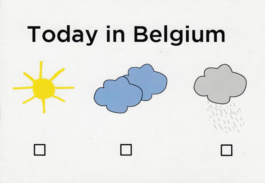
TODAY IN BELGIUM
By
BETTANY SOUFFI
Winning creation for May 2011
Published by
BOOMERANG (BELGIUM)
(ECO PRINTED)
A very simple design, but one which is of a design type which is popular with, or at least was, many postcard publishers. References to the weather, normally bad, can be found on many UK cartoon postcard images. To be fair it does rain here, but its not as bad as many make out. I was in Florida recently and it ‘definitely’ rained there quite a few times during my visit, and quite hard on some occasions. The thunder and lightning shows were extremely impressive.
02/09/2018
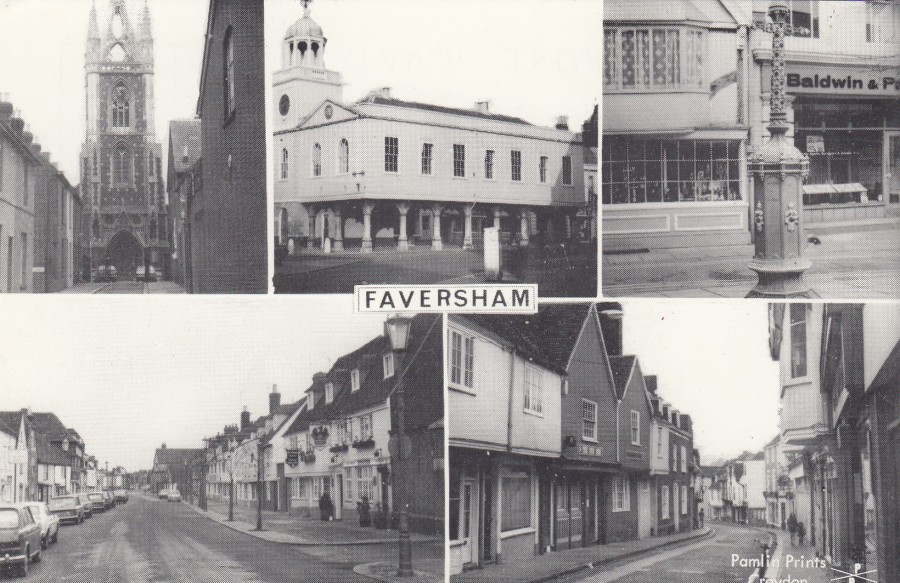
FAVERSHAM
Published by
PAMLIN PRINTS
(CROYDON)
Pamlin Print issued a wide range of postcards many of which have become quite collectible, especially the themed ones. The hardest ones to now source are these topographical ones, although this has not resulted in any great value increase in the actual cards themselves. This may because the cards like this are mainly going to be of interest to those who live in and collect postcards of the Faversham area (or any other area depicted on one of their cards).
Faversham is a market town in Kent, about ten miles from Canterbury and it is located next to the Swale, a strip of sea separating mainland Kent from the Isle of Sheppey. This modernish card may not be worth much, but it is a nice example of an early modern period multi-view.
02/09/2018
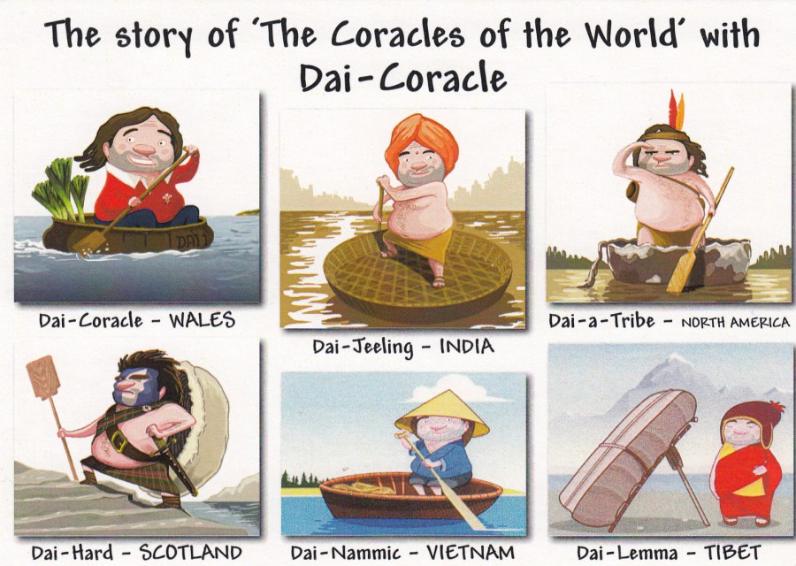
THE STORY OF ‘THE CORACLES OF THE WORLD’
WITH DAI-CORACLE
Published by
THE NATIONAL CORACLE CENTRE
CENARTH, CARMS
I have recently placed this card, and the one below, in my article in ‘Picture Postcard Monthly’. These two cards were sent to me by my postcard friend and contact David Rye. I am not sure if there have been that many coracle themed postcards, certainly some, so it was nice to see that some interesting modern ones are available. The idea of a Coracle Centre is intriguing and if you should ever visit Cenarth then it may be worth a look.
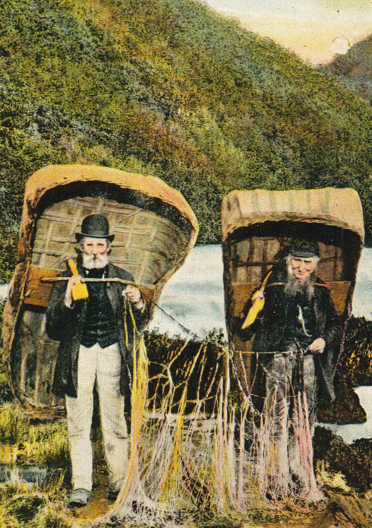
CENARTH FALLS
CIRCA 1910
Published by
THE NATIONAL CORACLE CENTRE
CENARTH, CARMS
This is clearly an old photograph, and one obviously topical to the centres theme. It is also nice as it depicts an old scene from the local area where the Coracle Centre is located. When I saw this card, I did wonder if it was an image taken from an old postcard. It could be an old postcard image reproduced here on a modern card. If so, then it would be fun to keep an eye out for a copy of the original postcard.
02/09/2018
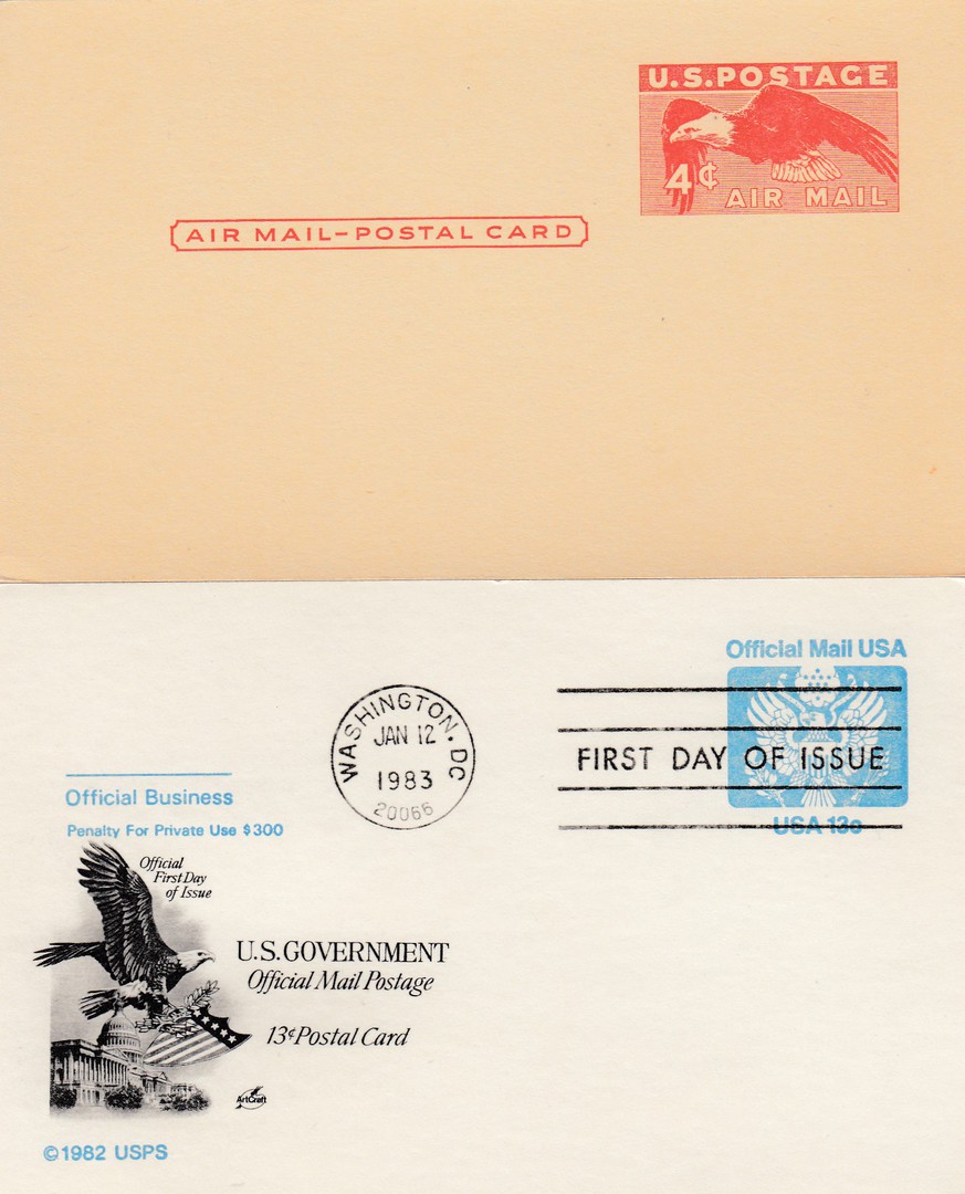
(TOP)
UNITED STATES OF AMERICA
POSTAL STATIONERY POSTCARD
4c AIR MAIL POSTAL CARD
Higgins & Gage, World Postal Stationery Catalog
Section 17/T
United States - Page 34
Reference No: 1
Issued 1949
(BOTTOM)
UNITED STATES OF AMERICA
POSTAL STATIONERY POSTCARD
13c OFFICIAL BUISNESS POSTAL CARD
Issued 1983
Reference Number UZ2 in The Postal Service Guide to U.S. Stamps
(page 541)
(My edition is the 28th Edition – copyright 2001)
Two postal stationery post cards from America. The top card is their very first official Air Mail postal stationery post card issued in 1949. I think the American Bald Eagle stamp design is one of the better stamp designs used on these pre-paid postal stationery post cards.
The bottom card is one of the official business pre-paid cards. This one has been used first day of issue (12 January 1983 – Washington D. C.) and has an additional attractive black pictorial print applied by the person/company that produced the first day of issue version. This additional black print has an American Bald Eagle flying over the state capital building. The combination of cancellation and additional black printed image and text makes these copies far more attractive than the plain cancelled or mint copies, although I like to have examples of both.
02/09/2018
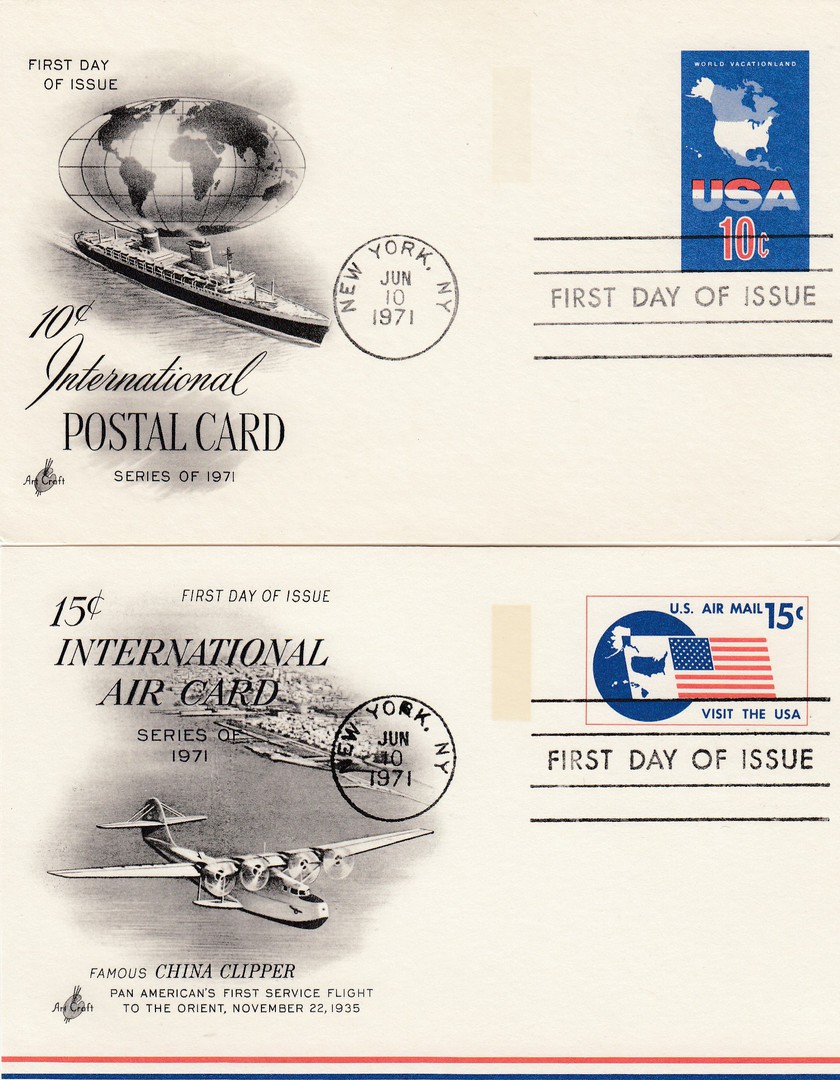
(TOP)
UNITED STATES OF AMERICA
POSTAL STATIONERY POSTCARD
10c INTERNATIONAL POSTAL CARD
SERIES OF 1971
Higgins & Gage, World Postal Stationery Catalog
Section 17/T
United States - Page 11
Reference No: 87
Issued 1971
(BOTTOM)
UNITED STATES OF AMERICA
POSTAL STATIONERY POSTCARD
15c INTERNATIONAL AIR CARD
Higgins & Gage, World Postal Stationery Catalog
Section 17/T
United States - Page 35
Reference No: 11
Issued 1971
Both of these postal stationery postcards have been used first day of issue (Both – 10th June 1971 – New York). They also both have an additional printed image and information on the left-hand side, which is normally blank. The top card has an Ocean Liner depicted with a map of the world. The bottom card has a fantastic image of a China Clipper flying boat. I bought both of these cards from a dealers cheap box at a Stampex stamp show in London.
02/09/2018
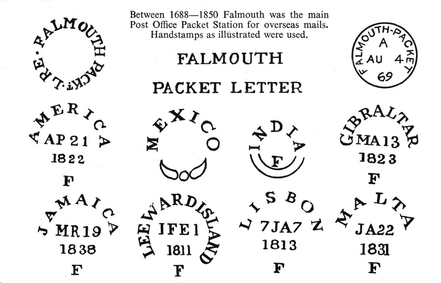
FALMOUTH
POSTMARKS POSTCARD
(FALMOUTH PACKET LETTER CANCELS)
Published on behalf of:
THE POSTAL HISTORY SOCIETY
For their:
29th ANNUAL CONFERENCE
25TH October – 29th October 1973
Held at:
THE BAY HOTEL, FALMOUTH
In Philatelic circles the ‘Postmark Postcard’ has been popular for many years and there has been a dedicated band of collectors who seek out the many different cards available. This one is from 1973 and was produced for a specific event, a conference, held in Falmouth that year. The card can be found mint and used with a special event cancellation, as this copy has been (see below).
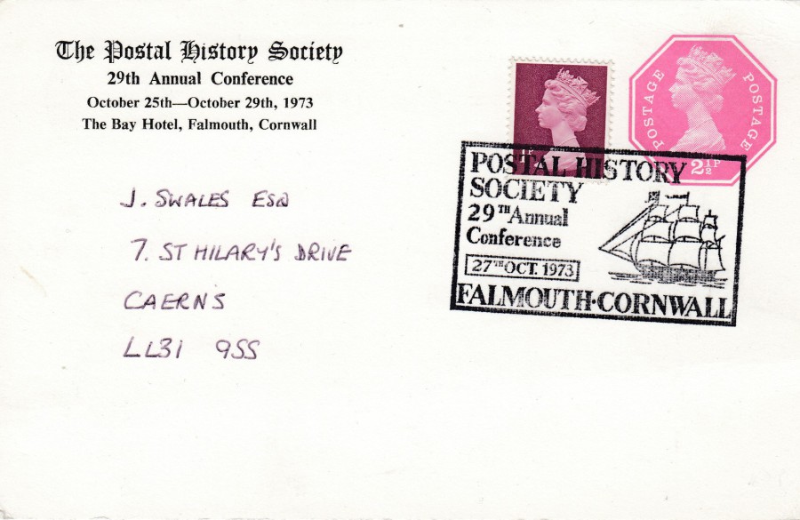
REVERSE SIDE OF ABOVE POSTCARD
As you can see this post card is a postal stationery postcard as the hexagonal 2 ½p Machin Queens head stamp has been printed on the card. The postage has been up-rated by the addition of an applied 1p Machin head stamp. These have been cancelled with a rectangular boxed special hand stamp: POSTAL HISTORY SOCIETY – 29TH ANNUAL CONFERENCE – 27TH OCTOBER 1973 – FALMOUTH, CORNWALL. I suspect this hand stamp was in use throughout the dates that the conference was being held, 25th – 29th October. The date on this cancel is for the middle of this period.

02/09/2018
WELSH GIRLS IN NATIONAL COSTUME
Published by
J. SALMON LTD
Ref: 1 – 99 – 00 – 24A/4713c
Always popular with tourists these postcards depicting the Welsh National Costume have been around since almost the beginning of the picture postcard story. Anyone collecting these cards as a theme can ad cards to their collection from every decade of picture postcard production. This one here was posted in 1970. I have a postcard contact who does collect these cards and he has an impressive collection.
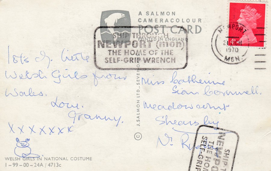
REVERSE SIDE OF ABOVE POSTCARD
The slogan cancellation used here – “SHIP THROUGH – NEWPORT (mon) – THE HOME OF THE SELF-GRIP WRENCH” – was a locally used one which has the reference number LP.818t. It was in use between 22nd June 1969 and 11th October 1970 (information from ‘Collecting Slogan Postmarks’ by Cyril R H Parsons, Colin Peachey and George R Pearson – page 193). So, this slogan cancel was around and in use for some time, but who could resist a slogan that promotes Newport as the home of the ‘Self-Grip Wrench’?
01/09/2018
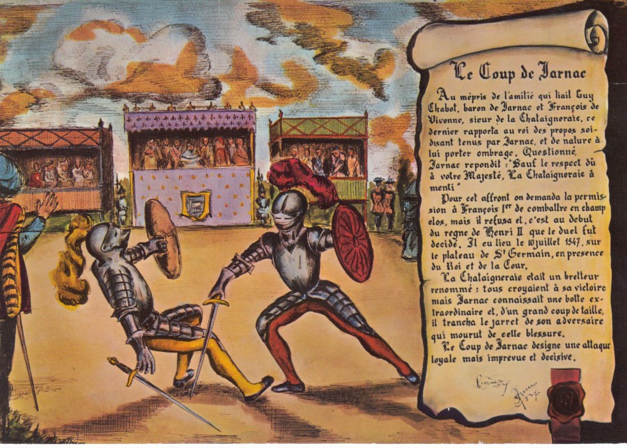
LE COUP DE JARNAC
Published by
CARTES POSTALES GILBERT (JARNAC)
(LYONCOLOR)
Ref: 16 K – 17
I bought this postcard from a dealer some years ago as I wanted it for my early military collection. This postcard image depicts the Judicial combat of de Jarnac (Guy Chabot Baron de Jarnac) and La Chataigneraye (Francois de Vivonne, sieur de la Chataigneraie) in France in 1547. It is one of the most celebrated and best- known duels. The term ‘Le Coup de Jarnac’ comes from this duel and it is now a well-known fencing term and although it originally referred to a crippling blow to the back of the opponent’s exposed knee or calve, it has since come to be a reference to any ‘tricky’ mode of attack. Duelling in 1547 involved full armour and real knight like swords, not with the fencing type foils and unarmoured approach we see in films and which we are perhaps more familiar with, so any hit with a sword, especially on an unprotected part of the body, like the back of the knee, would cause serious damage. History shows that it was Jarnac who sliced through the leg (or legs) of Chataigneraie thus winning the duel as Chataigneraie could not fight on.

REVERSE SIDE OF ABOVE POSTCARD
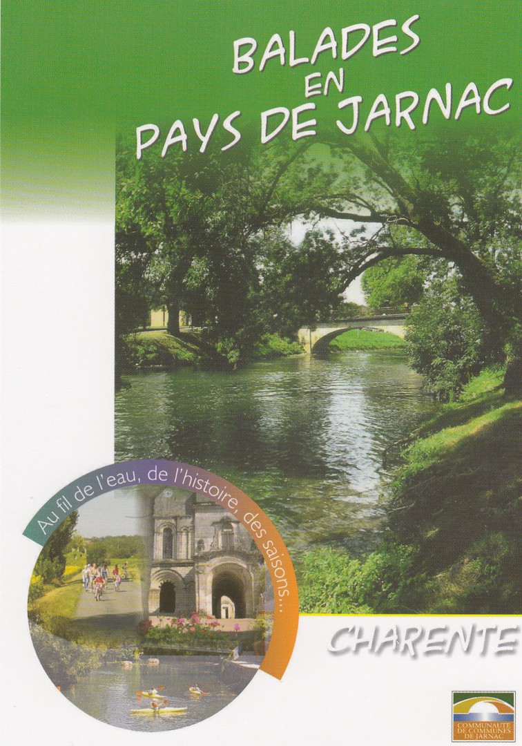
BALADES
EN
PAYS DE JARNAC
CHARANTE
(“WALKS IN THE COUNTRY OF JARNAC”)
Published by the
OFFICE DE TOURISME DE JARNAC
(TOURIST INFORMATION)
I was in France earlier this year when I came across this free postcard in a Tourist Information centre. The front has a nice image and the design is appealing to the eye, although there is nothing exceedingly special about the card, that was until I turned it over! Guess what I found on the reverse side? Yes, it’s the same duelling image that appears on the above much earlier postcard. The two cards now fit together quite nicely in my album.
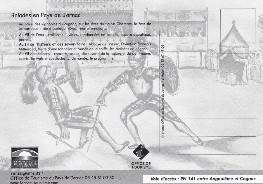
REVERSE SIDE OF ABOVE POSTCARD
See what I mean. It never ceases to amaze me what you find in the world of postcards.

01/09/2018
THE INCREDIBLES
EXPECT THE INCREDIBLE
NOV 2004
Free Rack Card
Published by
BOOMERANG (MEDIA CARDS)
Four weeks ago, I was on a Disney cruise ship in the Caribbean and I got the opportunity to see the new ‘Incredibles 2’ animated film (in 3D as it happened). My Grandson Leo really enjoyed it and reckons it is better than the original film, something I have heard many others say. I still prefer the original, but this new sequel is a superb follow up. I do not have any postcards yet related to the new film, but there are plenty of postcards for the original film, many of which are poster designs like this one.

REVERSE SIDE OF ABOVE POSTCARD
01/09/2018
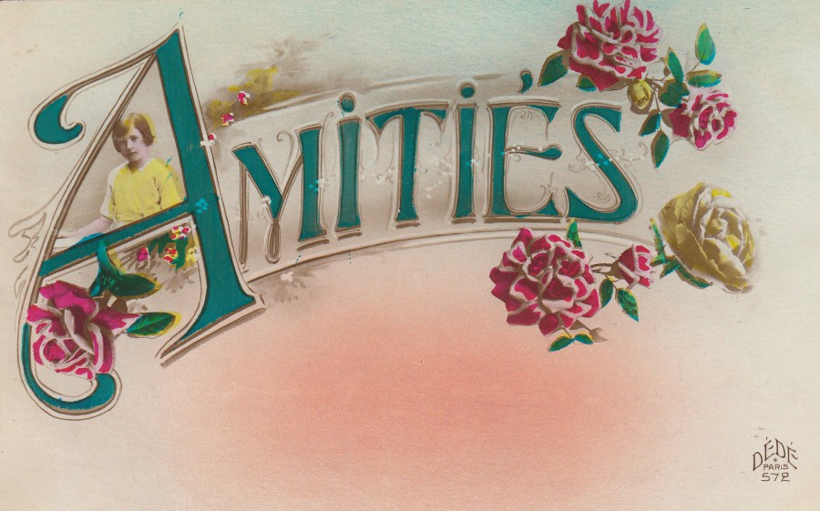
AMITIES
Published by
DEDE, PARIS
Ref: 572
Amities is French for ‘Friendships’ but it is also used at the end of messages as a ‘Best Wishes’, ‘Regards’ or ‘Thank You’. One definition state’s that it means ‘friendship: peaceful harmony, mutual understanding and a peaceful relationship, especially between nations; peace; accord. So, maybe this is the equivalent of a ‘Greetings’ postcard, but perhaps with more affection.
01/09/2018
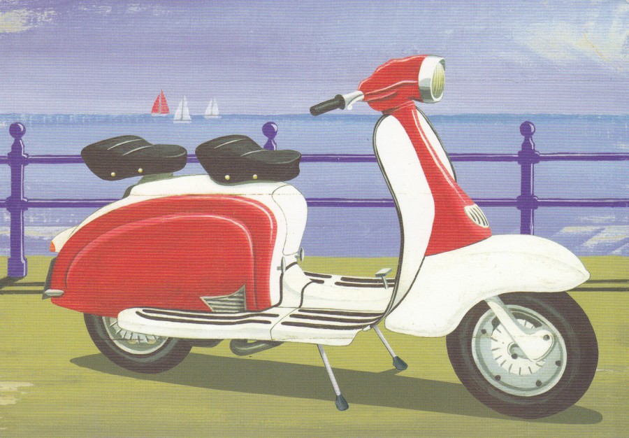
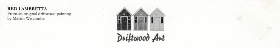
RED LAMBRETTA
From an original driftwood painting by
MARTIN WISCOMBE
Published by
J. SALMON LTD (SEVENOAKS)
In their:
DRIFTWOOD ART (series)
Ref: 09/80/00/70
The company ‘Salmon’ may no longer be producing postcards but their ‘Driftwood Art’ series postcards are still on sale in many towns and cities up and down the UK. I have only recently come across this one, but it is one I really like.
The top part of the reverse side of the above postcard
This depicts the series logo

01/09/2018
FAIRY BRIDGE
ISLE OF MAN
Published by
LILY PUBLICATIONS LTD
RAMSEY, ISLE OF MAN
In their:
VISIONS OF MANN (series)
Ref: 5-2014
I love postcard images which have a fantasy, myth or legend theme to them. Fairies I think are smack bang in the middle of the ‘Fantasy’ arena. This is another of the cards that my old work colleague Mark sent me from the Isle of Man where he lives. This one I thought was superb.

01/09/2018
CHINSTRAP PENGUIN AND CHICK
Published by the
BRITISH ANTARCTIC SURVEY
NATURAL ENVIRONMENT RESEARCH COUNCIL
MADINGLY ROAD, CAMBRIDGE
Printed by
BERIC TEMPEST & Co. LTD
(CORNWALL)
Ref: BAS-44
There is a fascination with the Antarctic which means that all postcards related to this part of the world are very much collected. There is also a dedicated, and quite large, band of stamp and postal history collectors who specialise in material from this continent. This postcard is an official ‘British Antarctic Survey’ postcard which would have appealed to me because of the wildlife image – a Chinstrap Penguin – but, the reverse side is magnificent.
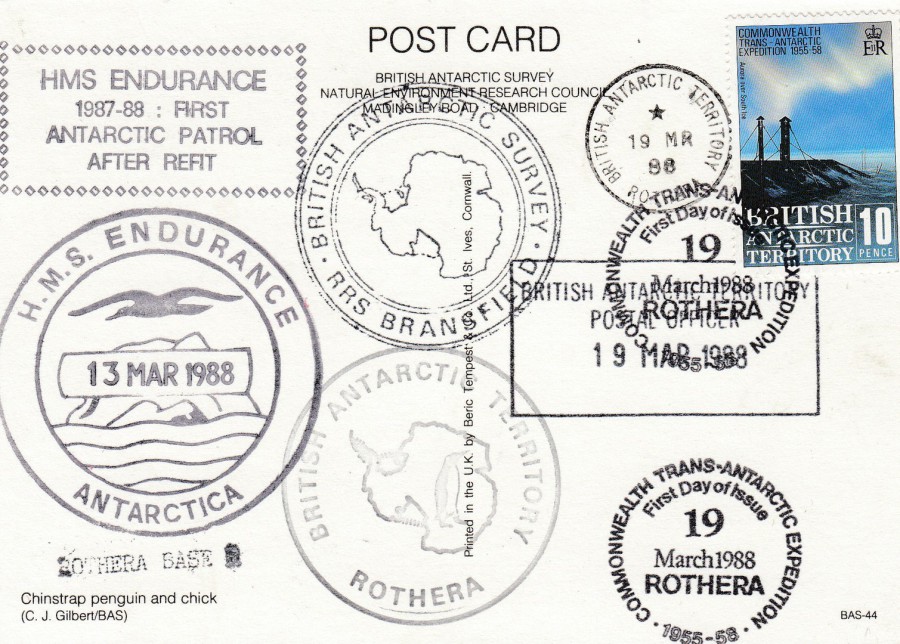
REVERSE SIDE OF ABOVE POSTCARD
Whoever arranged for this collection of cachets and hand stamps went a bit berserk, but it means the card has a fine collection of marks:
TOP LEFT: ‘HMS ENDURANCE – 1987-88 : FIRST ANTARCTIC PATROL AFTER REFIT’ fancy boxed cachet, unique to this particular patrol.
BOTTOM LEFT: ‘H.M.S. ENDURANCE – ANTARCTICA – 13 MAR 1988’ black double ringed ships cachet (for many years this ships cachet was applied in red ink – but here black has been used). HMS Endurance was an Antarctic Survey ship which patrolled the Antarctic, and which was involved in the Falklands War of 1982, and which had patrolled this area for many years prior to this conflict.
VERY BOTTOM LEFT; small straight-line text cachet ‘ROTHERA BASE’
TOP CENTRE: ‘BRITISH ANTARCTIC SURVEY – RRS BRANSFIELD’ pictorial map double ringed ships cachet. The RRS Bransfield was an ice-strengthened cargo vessel which was purpose built for the British Antarctic Survey.
BOTTOM CENTRE: ‘BRITISH ANTARCTIC TERRITORY – ROTHERA’ circular cachet with central amp and penguin image. Rothera is an Antarctic Research Station located at Rothera Point on Adelaide Island. Rothera also serves as the capital of the British Antarctic Territory.
There are also some cancels down the right-hand side. In the centre there is a boxed rectangular dated cachet which reads: ‘BRITISH ANTARCTIC TERRITORY POSTAL OFFICER – 19 MAR 1988’ this was clearly applied prior to the stamp being stuck down on the card as the top right corner is underneath the stamp.
There is also a small circular ‘BRITISH ANTARCTIC TERRITORY – ROTHERA – 19 MAR 88’ to the left side of the applied stamp which also looks like it was applied before the stamp was stuck down as it looks like some of the perforations cover some of the cancels outer ring.
Then there are two strikes of the ‘COMMONWEALTH TRANS-ANTARCTIC EXPEDITION – 1955-58 – FIRST DAY OF ISSUE – 19 MARCH 1988 ROTHERA’ cancellation, one of which cancels the applied stamp.
The Stamp itself is the 10 pence British Antarctic Territory 1988 issued ‘30th Anniversary of Commonwealth Trans-Antarctic Expedition’ stamp (SG 163).
The total combination makes for a very interesting used postcard, and as it should have become apparent by now I like different cachets and mark’s and this card provides these in spades.
31/08/2018
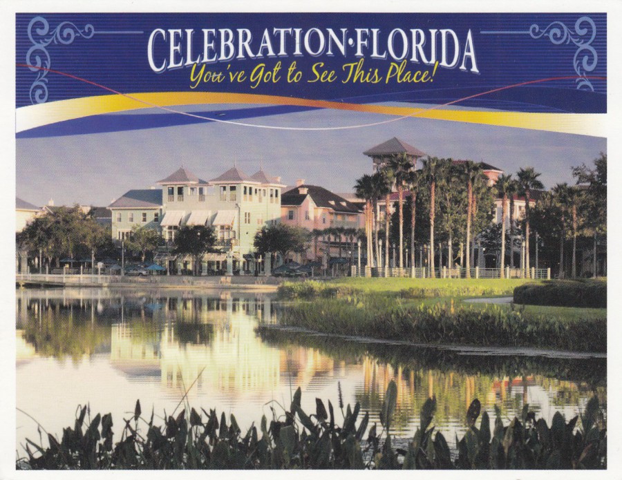
CELEBRATION
FLORIDA
“You’ve Got to See This Place!”
Locally sold view postcard available in one shop in the Main Street
Celebration is a town in Florida just outside the main theme park area, but which is a ‘Disney’ town. It looks like a perfect American town, the type I think of as the perfect television series American small town – I think they are referred to as ‘White Picket Fence’ towns. It is an area little visited by tourists, or Florida locals too much I think, but it is a lovely place. We have visited here over the last four or five holidays now, I admit it was curiosity that caused us to initially visit, but it is the beauty and quietness of the location that draws us back. Another reason for my visits is that there is a Post Office here, something which is strangely quite hard to find in this part of Florida. I have posted many postcards from here, a handful most visits. Normally I buy a handful of these ‘Celebration’ postcards and then try and use different USA stamps to post them to myself. This time I used stamps from two different sets – see below
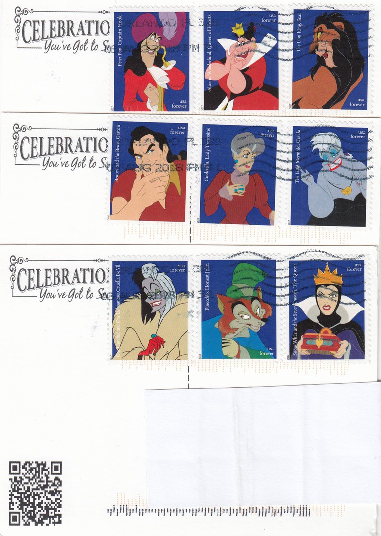
REVERSE SIDES OF THREE COPIES OF THE ABOVE POSTCARDS
It takes three USA FOREVER stamps to post a postcard to the UK (there is a single International stamp that can be used, but I wanted a more selective range of stamps). These three cards each have three different stamps from the ‘Disney Villains’ stamp sheet applied. I like these stamps and have a mint sheet of them which I bought on last years visit. This was a chance to buy a second sheet and have the stamps used on postcard to add something different to my collection.
Captain Hook (Peter Pan)- Queen of Hearts (Alice in Wonderland) - Scar (The Lion King)
Gaston (Beauty and the Beast) - Lady Tremaine - (Cinderella) - Ursula (The Little Mermaid), Cruella DeVil (101 Dalmations), Honest John (Pinocchio), The Queen (Snow White and the seven Dwarfs)
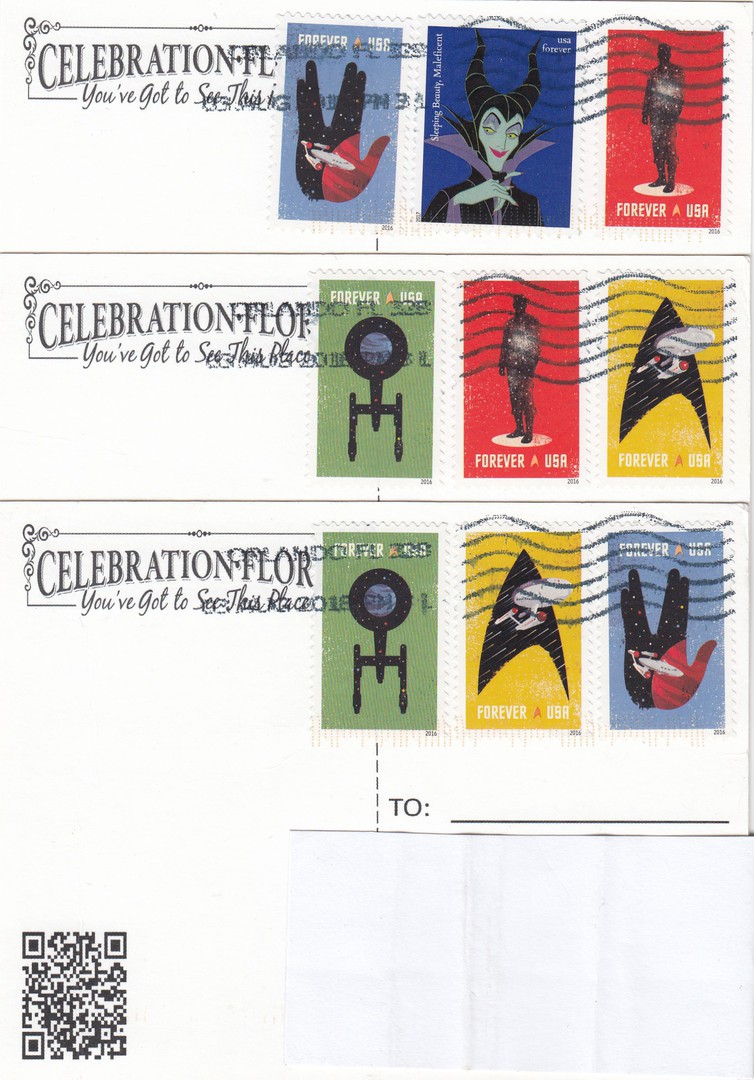
REVERSE SIDES OF THREE COPIES OF THE ABOVE POSTCARDS
The top postcard has one single stamp from the ‘Disney Villains’ stamp sheet (this one depicts the character ‘Maleficent’ from the animated film ‘Sleeping Beauty’). The other stamps are from last years ‘Star Trek’ anniversary stamp sheet (again I bought a mint sheet of these stamps for my collection last year). I also collect television themed postage stamps, and this was another opportunity to have some of these stamps postal used on postcards. All six of these postcards are personal souvenirs of this year’s visit. I shall dig out some of my previous posted cards from this location and let you see which stamps I have previously used.
31/08/2018
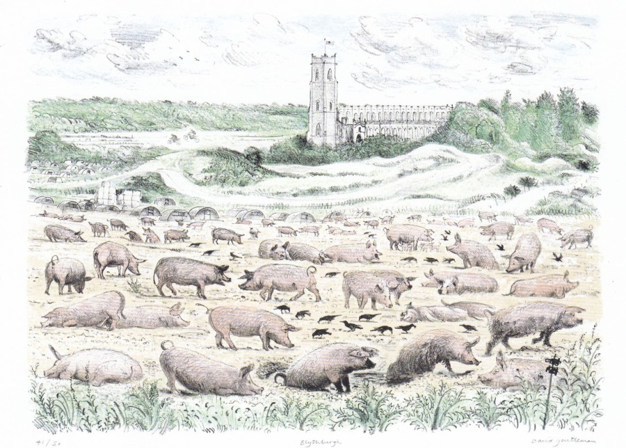
BLYTHBURGH CHURCH
By
DAVID GENTLEMAN
2005
Lithograph 600 x 500mm
Published by
ALDEBURGH MUSIC
This postcard was bought at the Concert Hall Gift Shop in Snape, Maltings on Wednesday night. On our travels around the area we had passed a couple of fields of pigs which immediately came to mind when I saw this postcard, a postcard which I suspect could be an exclusive card to this particular- gift shop.
David Gentleman is an artist I have actually met once, at the 2000 Stamp Show at Earls Court. Besides being a well-known artist and illustrator, he has also been responsible for many British stamp designs including the four stamps from my favourite Royal Mail set issued in 1972 titled ‘BBC & Broadcasting History’. So, this card has a philatelic connection as well as being just a really-nice illustration.

31/08/2018
A SUFFOLK DREAM
SNAPE, MALTINGS
By
Matthew Rice
A limited Edition Postcard (exact details not shown)
Believed printed and published locally at Aldeburgh
The above long postcard was a recent buy when I attended the Concert Hall at Snape Wednesday night. It is the sort of postcard you can only really pick up through travelling around. It was on sale in one of the shops located in the complex of structures around the Concert Hall (not in the Concert Hall Gift Shop itself, but a book and card shop in another building). I liked it.
31/08/2018
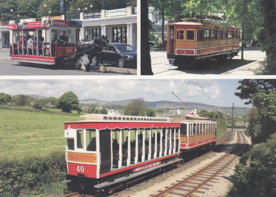
TRAMS
ISLE OF MAN
Published by
LILY PUBLICATIONS LTD
(Ramsey, Isle of Man)
VISIONS OF MANN (series)
Ref: 15-2016
As a police officer you meet many colleagues down through the years and thanks to the wonders of facebook it is possible to maintain contact with them when they or you move on. In my first couple of years I met someone else called Mark. After some time, Mark moved to the Isle of Man police force, from where in the last month he has retired. I recently sent Mark some of the Warden Hodges Dad’s Army stamps as he had played the character in a recent play. As a thankyou Mark has sent me some postcards from the Isle of Man. If all goes well I intend to try and visit the Island next year. If I do Mark has said he will give us a tour, sounds like a plan. So, here is one of the cards Mark sent me. Keeping contact with people is never a bad thing.
30/08/2018
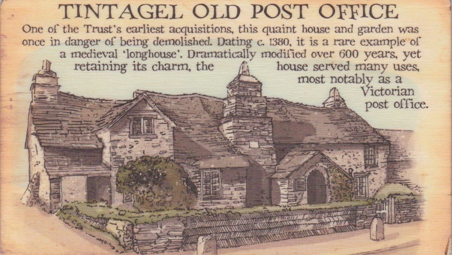
TINTAGEL OLD POST OFFICE
WOODEN POSTCARD
Published by
LITTLE HISTORIES
Whilst I was in America with my grandchildren their parents had a holiday in Cornwall. Whilst there they posted a couple of items to me from the old Tintagel Post Office. The first is this lovely wooden postcard. I have mentioned before both here and in my Picture Postcard Monthly articles that wooden postcards have been very popular for around five years or so now. Generic issues are nice, but I prefer the ones which can only be obtained from specific locations, like this one.
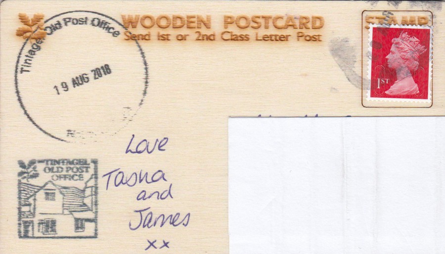
REVERSE SIDE OF ABOVE WOODEN POSTCARD
Items posted at the Old Post Office in Tintagel receive a large ‘TINTAGEL OLD POST OFFICE – NATIONAL TRUST’ dated cancellation (here dated 19 AUG 2018). You can also obtain a small boxed pictorial ‘TINTAGEL OLD POST OFFICE’ cachet (here applied bottom left) as well, and my son and daughter -in-law had this applied to the postcard. This covers many of my interests, especially ‘Postal History’ and it is a great addition to my collection.
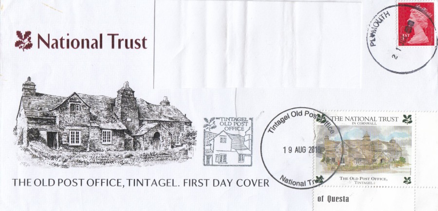
POSTAL SOUVENIR COVER – TINTAGEL OLD POST OFFICE
They also sent me this envelope which can be obtained at the Old Post Office, Tintagel. This has the same cancels as on the above wooden postcard, but here the Machin Queens Head stamp has a clear PLYMOUTH dated cancel – 21 JUL (08?), a date which pre-dates that in the large National Trust circular date stamp (19 AUG 2018 – the date of my son and his wife’s visit). Basically, this means you buy an already dated cover and can have this sent through the post to receive the date of your visit. Here a THE NATIONAL TRUST – THE OLD POST OFFICE – TINTAGEL cinderella label which has here been applied to receive the dated large cancellation. This makes a nice additional item to go with the above wooden postcard.
Update: 31/08/2018
I have spoken with my son today and he says that the red Queens head Machin stamp was applied by them and was not cancelled when they posted this cover - this therefore means that Plymouth post office sorting station were using a cancel with the wrong month in it - clearly no one has changed the JUL (July) centre portion over to the correct AUG (August), so, therefore this date of JUL is an official error!

30/08/2018
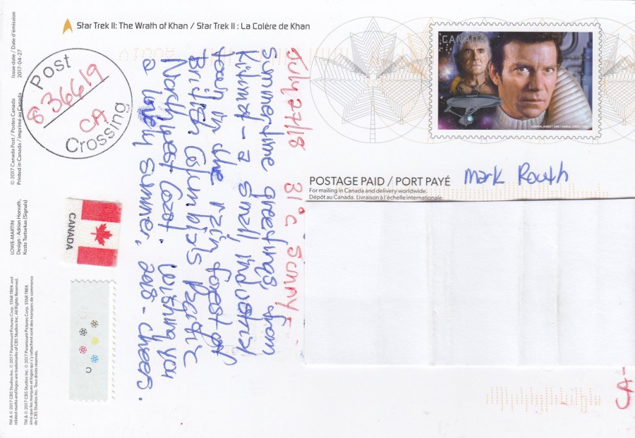
STAR TREK II
THE WRATH OF KHAN 1982
Pre-Paid Postal Stationery Post Card
Published by
CANADA POST
Issue Date 27/04/2017
Just before I went on holiday, over five weeks ago now, I decided to try out the very popular hobby of ‘POSTCROSSING’. This involves signing up to a postcrossing site on the internet and then you send out postcards to addresses supplied by the site. For every postcard you send out someone somewhere in the world is allocated you as a postcard receiver. I don’t know why I have not done this before, but I sent out six postcards before I went away. This meant that I had six postcards waiting for me upon my return. So, what are my views of this hobby? So far, they are very positive. The six postcards I have so far received have been all very, very good. This one here is a cracker. I had heard about this pre-stamped Star Trek postcard set issued by Canada Post, but I did not have any examples. Now I do, and I am delighted.
REVERSE SIDE OF ABOVE POSTCARD
The Captain Kirk postage stamp is printed on the postcard and these postcards were exclusive to Canada Post.
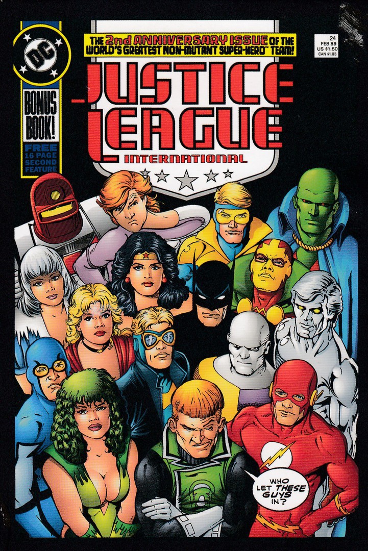
JUSTICE LEAGUE INTERNATIONAL
From the box set:
THE ART OF VINTAGE DC COMICS: 100 POSTCARDS
Published by
CHRONICLE BOOKS
Card Ref: No. 24
This card was sent by a Postcrosser from Germany. I already had a mint copy of this postcard because I have the complete box set it came from, but I still liked receiving a postally used copy. This was especially so because I did not have a used copy of the ‘Peanuts’ stamp used by the sender (and I collect television and cartoon related postage stamps)
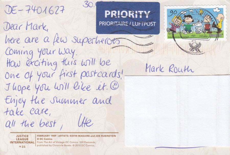
REVERSE SIDE OF ABOVE POSTCARD
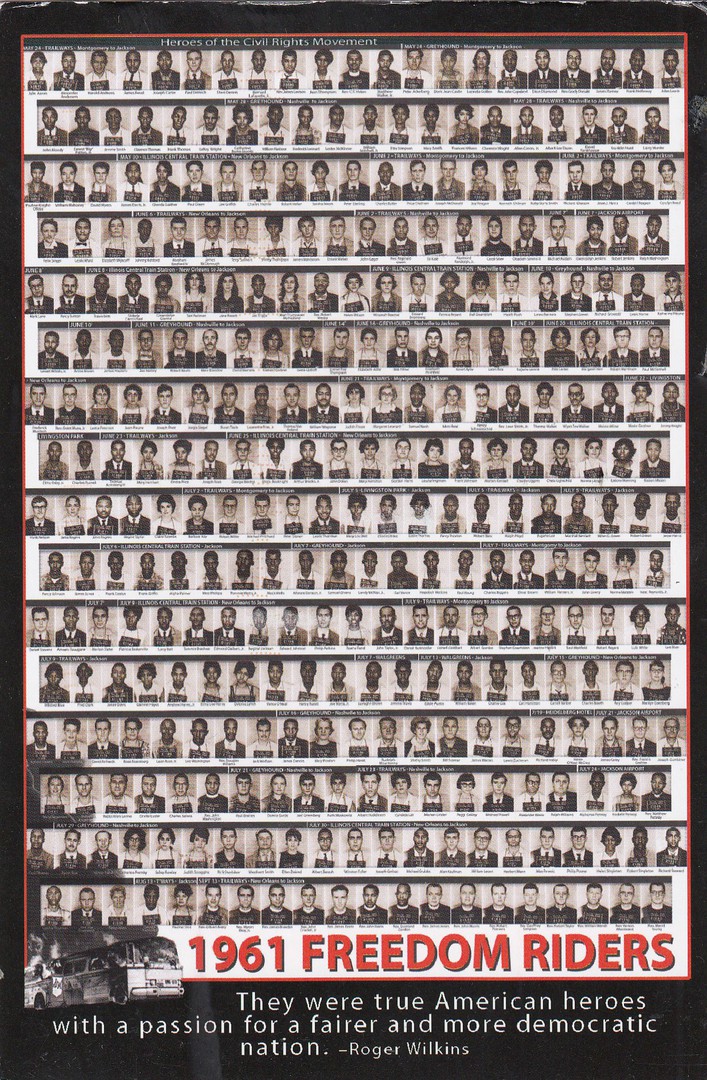
1961 FREEDOM RIDERS
MUG SHOTS BY JACKSON, MS POLICE DEPARTMENT
Publisher details covered by postage stamps applied to card
This sending is from America and it is an historically fascinating postcard piece. The people depicted were ‘Freedom Riders’, civil rights activists who rode interstate buses into the segregated southern United States in 1961 (and subsequent years). This was done in-order to challenge the non-enforcement of the United States Supreme Court decisions that had ruled that segregated public buses were unconstitutional. This ruling had been ignored by some Southern States so 436 individuals (clearly not all depicted here) participated in at least 60 separate freedom rides. A great postcard for my collection.
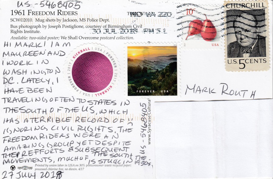
REVERSE SIDE OF ABOVE POSTCARD
Some nice stamps used here. The Churchill one is an old stamp from 1965 (SG 1246), but the round shaped ‘KICKBALL’ stamp is a recent issue from this year.

THE EVOLUTION OF THE DALEKS
DOCTOR WHO
From the boxed postcard set titled:
POSTCARDS FROM TIME AND SPACE: 100 DOCTOR WHO POSTCARDS
This is another postcard which I have a mint copy of, again because I have the boxed set that it comes from (this Dr Who box set has been very popular since its release a few years ago). Again though, it was used with an interesting stamp which adds something to my collection (and of course I love Doctor Who anyway – I can’t wait for the new upcoming series).
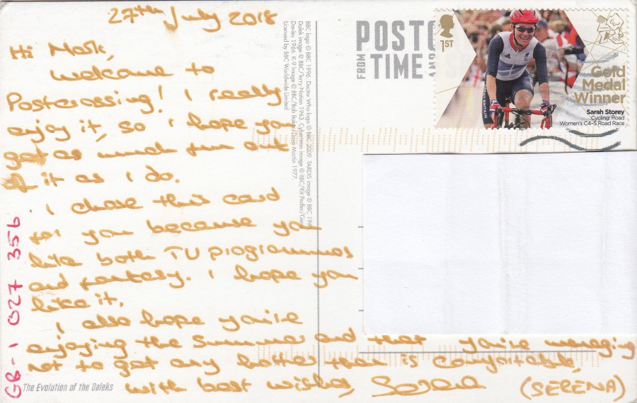
REVERSE SIDE OF ABOVE POSTCARD
This has been used with one of the Gold Medal winner’s stamps issued in 1912 during the London Olympics (it hardly seems like 6 years ago!). Like many people I got caught up in collecting material related to the Olympic Games and the Paralympic games. This stamp is from the Paralympics and depicts Sarah Storey (cycling road women’s C4-5 road race gold medallist) – SG 3398.

KEEP EARTH HUMAN
Unknown Published (details covered by stickers applied by sender)
This postcard has a very ‘Transformers’ feel and look to it, although I can not confirm that this is the source of this image (I suspect it might not be). It is a great postcard image though and the card was sent from Belarus, a country in Europe. The stamp used is lovely and this might be my first postal used postcard from this location.
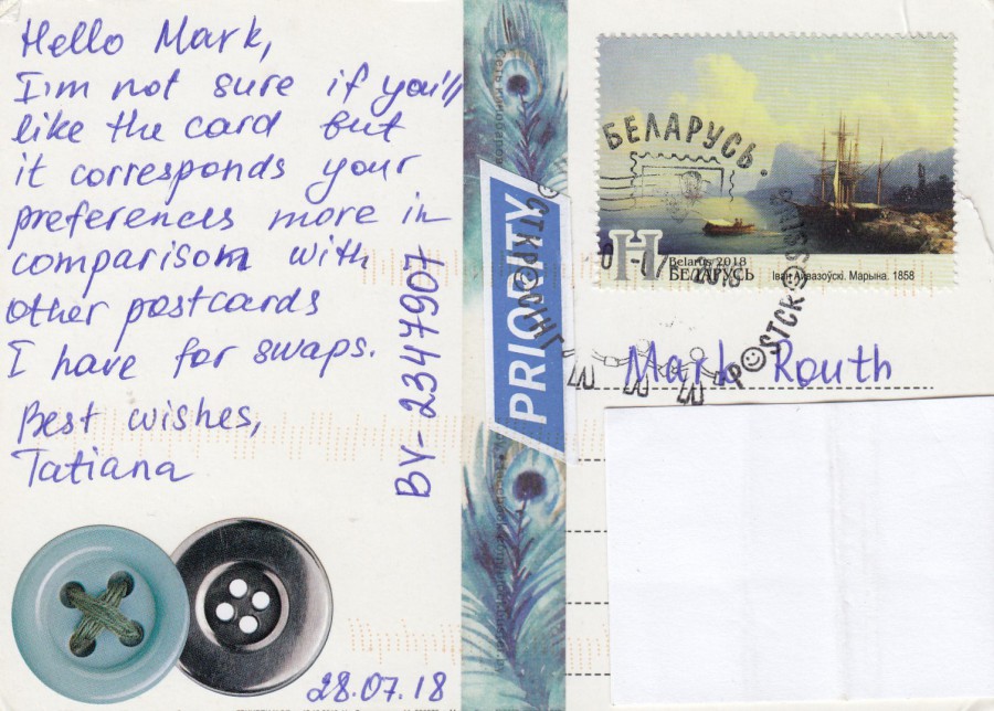
REVERSE SIDE OF ABOVE POSTCARD

PRINCESS LEIA
Published by
STARWARS.COM
HEYE
KV&H VERLAG GmbH
This lovely Star Wars postcard depicts the late actress Carrie Fisher as she appeared in the Star Wars film ‘The Force Awakens’. This is a great addition to my Star Wars collection and is a good example of why it is a good idea to register some interests on your profile on your Postcrossing profile page, it has certainly worked for me, although it would also be fair to say that I enjoy all types of postcards really.

REVERSE SIDE OF ABOVE POSTCARD
2 nice German postage stamps to add to my collection
30/08/2018
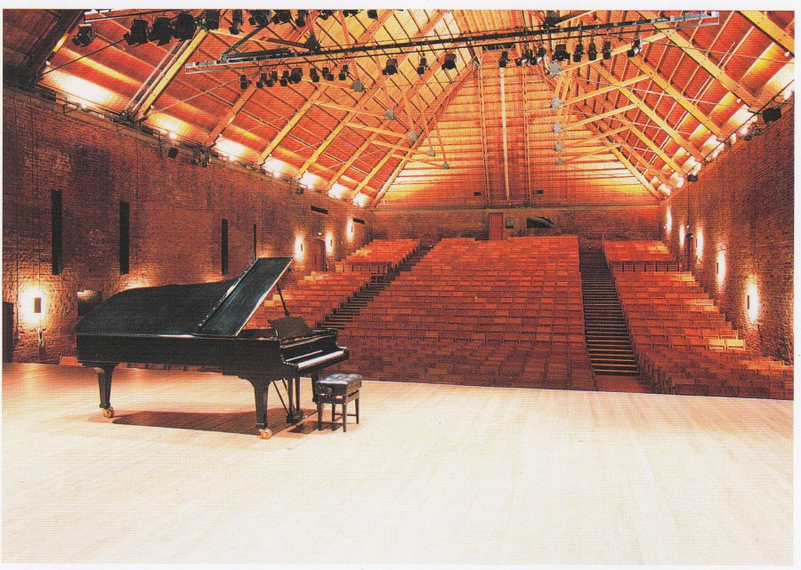
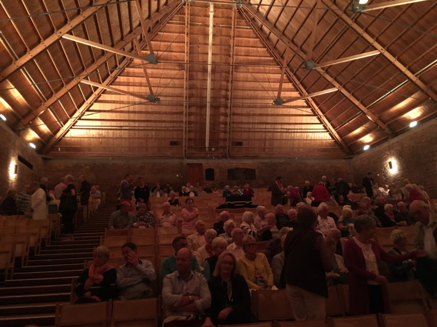
SNAPE MALTINGS CONCERT HALL
SNAPE, SUFFOLK
Printed for the Concert Hall Shop
For ‘Aldeburgh Music’
Official Postcard
“Founded by Benjamin Britten in 1948, Aldeburgh Music today has a year-round programme of events, many of them staged in the Concert Hall world-famous for its acoustics”
(Text from reverse side of postcard)
I was at this concert hall last night for a concert by the BBC Concert Orchestra which was being recorded by BBC Radio for BBC Radio 2’s ‘Friday Night is Music Night’ (which should be being broadcast tomorrow – 31/08/2018). This was my first time here and the concert was superb, especially a James Bond theme medley which concluded the two-hour concert. I also got to see Craig Revel Horwood who was the ‘guest-presenter’ for the show. We arrived early at the location and I got to check out the attached gift shop where I bought a range of postcards including this lovely one which depicts the inside of the concert hall (the only one directly related to the concert hall).

PHOTOGRAPGH
29/08/2018
This is the stage area seen from the audience area, so the opposite view that can be seen on the above postcard image. The instruments and seats for the BBC Concert Orchestra can be seen
PHOTOGRAPH
29/08/2018
This is a photograph looking towards the high roof area at the back of the audience area of the Concert Hall. We were sat down near the front of the audience in an area they clear of chairs and where you can sit down directly on the floor. Most people, including us, brought along cushions to sit on. This photo was taken before the hall became packed out with music fans – the concert was popular and sold-out. Although this our first such event it will not be our last as we had a great night.