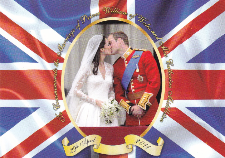
TO COMMEMORATE THE MARRIAGE OF PRINCE WILLIAM OF WALES AND MISS CATHERINE MIDDLETON
29TH APRIL 2011
Published by
Judges of Hastings
I was in London yesterday to see the ‘War of the Worlds’ stage musical but I arrived in London with some time to spare so did a bit of shopping around and as always I checked out the postcard racks and was surprised to find this one in a shop down Charring Cross Road. It is almost five years old now but there was quite a little stack of them in the wall mounted display. Surprisingly I don’t think I have seen this one before so was pleased to add it to my Royalty collection. As I write this of course the Duke and Duchess of Cambridge are on an official tour of India and have appeared in the news regularly so it is nice to be topical.
GARETH THOMAS ….. RIP
Gareth Daniel Thomas
12th February 1945 – 13th April 2016
Welsh actor best known for his role as Roj Blake in the BBC science fiction television series ‘Blake’s 7’ but he also appeared in The Avengers, Coronation Street, Z-Cars, Children of the Stone, Who Pays the Ferryman, Bergerac, The Adventures of Sherlock Holmes, London’s Burning and Torchwood, amongst many others.
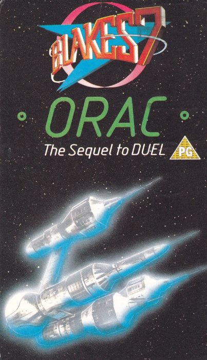
BLAKES 7 postcard – ORAC ‘The Sequel to Duel’. BBC Official postcard (slightly unusual shape as long and thinner than normal sized postcard). This postcard was an exclusive free postcard which came in the video release and was enclosed inside the video case. Although a number were obviously printed to go into the many videos that were bought these are not very common and I rarely see them.
I was a massive fan of the television series ‘Blake’s 7’ and I was hooked from the first episode.

DISNEY’S TARZAN
‘PLAYSTATION COMPETITION’
Printed by
GRAPEVINE POSTCARDS
Ref: #0679
Don’t quote me on this but I think ‘Grapevine Postcards’ is/was a free rack card company from South Africa (this is from my memory of some previous cards I have which I think came from South Africa which I think were from the same printer/publisher as this).
It is always nice to find more unusual Disney themed postcards and this one is nicely unusual. I love the computer game console pads hanging down with the jungle backdrop. For those who want something more obviously Disney there is the full TARZAN film word logo on the reverse side. This card also, of course, nicely fits into a computer game themed collection. The reverse side is pre-addressed to the competition address and was designed to be filled in and submitted so it is nice to have a mint copy (I suspect any that were submitted were destroyed at the end of the competition so probably only mint copies actually remain).
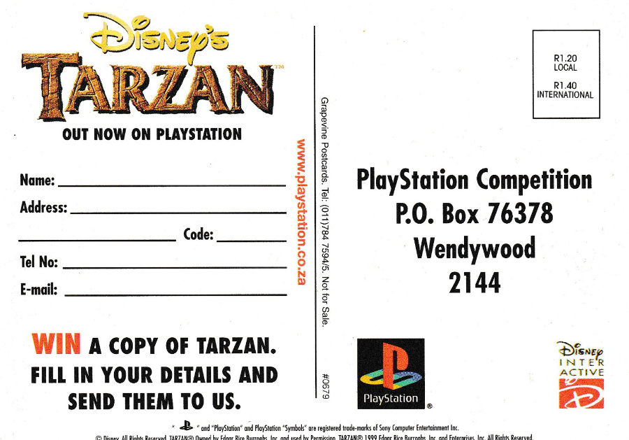
REVERSE SIDE OF ABOVE POSTCARD
Here you can see the TARZAN film logo and the PlayStation logo, all in colour, which is nice and adds another little dimension to the card. The ‘DISNEY INTER-ACTIVE’ logo is also a bonus.
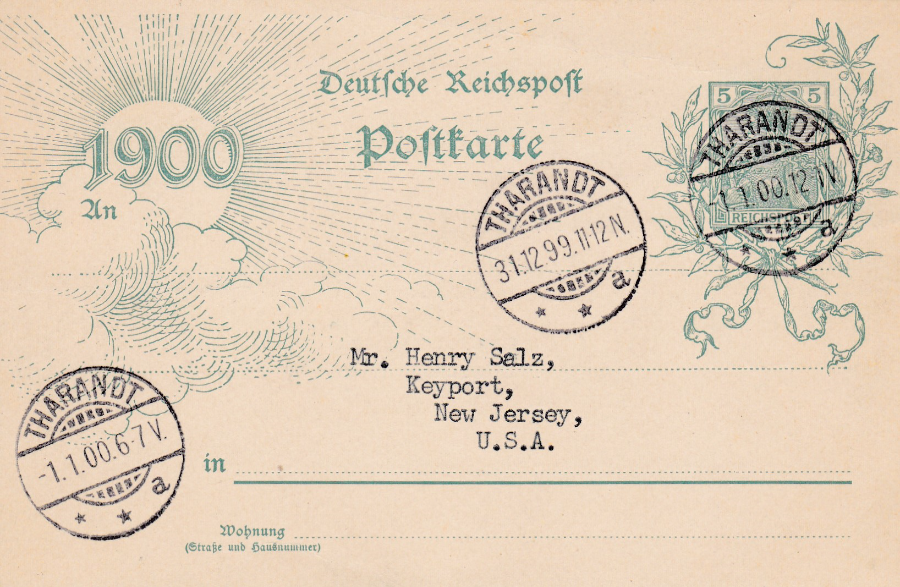
DEUTSCHE REICHSPOST
1900
THE NEW CENTURY
1899 – 1900
When the nineteenth century came to an end it was the first time within the history of postcard production that a new century was coming for collectors. In an attempt to produce exciting souvenirs a special postcard (actually a Postal Stationery Card) was issued in Germany which could be used to produce what was then a unique item. People would take this card and post it on the 31st December 1899 and then the post office would deliver it on the 1st January 1900. Posted in one century and delivered in another, who could resist doing this.
This copy here was posted in Tharandt, which is a municipality of Saxony, Germany (nine miles southwest of Dresden). It has received a single strike of a double circle THARANDT cancel dated 31-12-99 (31ST December 1899). The pre-printed stamp has subsequently been cancelled with a THARANDT cancel dated 1-1-00 (1st January 1900). The cancel on the stamp has the details ’12-1V’ after the date numbers. There is a second cancel with the same date but with ‘6-7V’ after the date. This particular copy was posted to America and is a nice example of this type of cross century’s postcard. Although this did travel through the post it seems clear that this was done by a collector and was designed to be a collectible item.
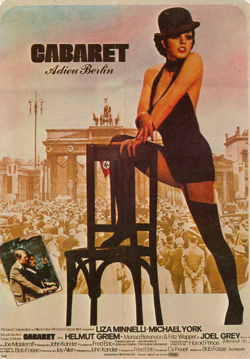
CABARET
Feature Film Poster
Published by:
EDITIONS F. NUGERON
Ref: E86 – “Cabaret”
Liza Minelli (spelt wrong with just one ‘N’) – Michael York – Bob Fosse
Cabaret is of course a well-known and popular musical film with an outstanding performance by Liza Minnelli who I think is the best thing in the film. This is perhaps indicated here on this poster as Liza Minnelli is the main person depicted and takes up the best part of the design. The films story is set in Berlin in 1931 during the days of the rise of the Nazi Party and they form the terrifying backdrop behind all the gaiety and singing and dancing contained within the film.
Beside Liza the film also starred Michael York and was directed by Bob Fosse. The film was released on 13th February 1972 and it had a box office take of $42,765,000 (the budget was $2,285,000) and it is now considered a classic.
Liza Minelli was of course briefly married to David Gest. They married on March 16th, 2002 but separated in October 2003. David Gest of course was sadly found dead in his hotel room yesterday in London (He was born on May 11th, 1953 in Los Angeles).
GUINNESS
IRELAND
It was no surprise to me that there were a number of Guinness based postcards to be had during my visit to Ireland, after all it is almost the national drink (I know Jo enjoyed several pints of it during our break). As I have previously mentioned I do not drink but despite this apparent lapse I have still always been interested in the advertising artwork used by Guinness. I already had a collection of early Guinness advertising postcards so I was eager to find some new ones. This I certainly did:
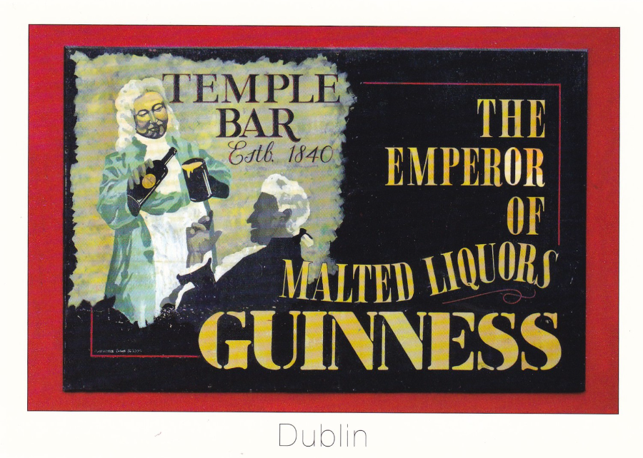
THE EMPEROR OF MALTED LIQUORS – GUINNESS
TEMPLE BAR Est 1840
DUBLIN
Published by
REAL IRELAND DESIGN
Ref: TB-1
“THE EMPEROR – Sign on the wall of the famous Temple Bar Pub, Temple Bar, Dublin City, Ireland. For more than 160 years, patrons have flocked to the Temple Bar. Whether you are alone or with friends, the craic is mighty and you will feel at home.”
(Text from reverse side of postcard)
There was another smaller image of this sign on one of the Dublin postcards I posted recently and I mentioned there that there was a postcard which depicted this sign on its own – and here it is.
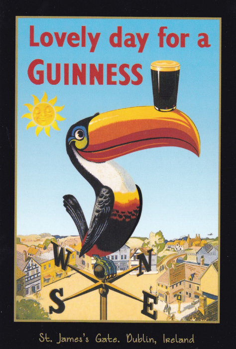
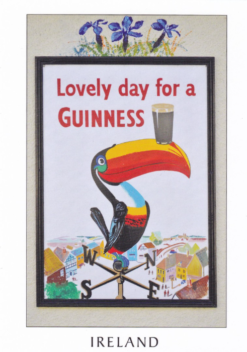
LOVELY DAY FOR A GUINNESS
“St. James’s Gate. Dublin, Ireland”
Produced Under License by
SHAMROCK GIFT COMPANY, DUBLIN, IRELAND
“Lovely Day for a GUINNESS – Circa 1955. The Toucan, one of artist John Gilroy’s most popular GUINNESS characters, made his first appearance in 1935.”
The Toucan has always been my favourite character on the Guinness posters and I remember as a kid a large hoarding at the end of my road which for many months had a massive advertising poster of a flock of toucans flying over a small village with each toucan having a pint of Guinness on its beak. I loved that poster and still think that it was that poster that got me interested in the Guinness advertising artwork.
The image on this postcard is also a cracker.
REVERSE SIDE OF ABOVE POSTCARD
LOVELY DAY FOR A GUINNESS
IRELAND
“A POSTCARD FROM IRELAND”
Published by
TRAD GIFTS
The same design as the above postcard but a different painting – check out the greater details on the buildings in the design above and the chest feathers on the two toucans. This is a good example of looking twice and always buying postcards which initially appear to have the same image because later you may well discover that there are differences.
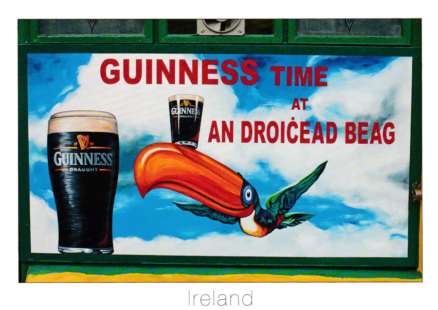
GUINNESS TIME AT AN DROICEAD BEAG
IRELAND
Published by
REAL IRELAND DESIGN
Ref: SP 704
‘Pub sign, Dingle, Co. Kerry, Ireland’
Another cracking painting of the Guinness toucan, flying with a pint of Guinness on its huge beak. This is a nice photograph and it does show how these poster boards appear all over the place and must be fun to hunt down. Dingle was not a location I visited on my holiday but I wouldn’t mind going to try and find this sign.

IRELAND
“A POSTCARD FROM IRELAND”
Published by
TRAD GIFTS
I suspect these are painted boards used as advertising signs in pubs around Ireland. They are copies of well-known Guinness poster designs (with the two on the right side certainly taken from poster designs by John Gilroy – I had the originals depicted on individual advertising postcards in my collection already – the ostrich one is quite a well-known design and has the classic MY GOODNESS – MY GUINNESS ‘tag line’). I assume these are local and the dirt on the sign bottom right does give the idea of age and regular use. A nice and unusual Guinness related postcard.
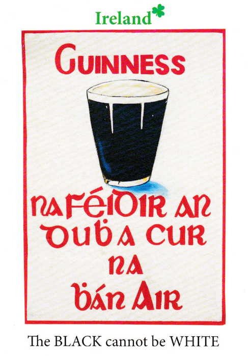
IRELAND – GUINNESS
The BLACK cannot be WHITE
“Sign on pub wall Ireland”
Published by
REAL IRELAND DESIGN
Ref: SP 81
A full poster design which also appears, all be it in a different painted version, on the postcard above (bottom left corner). There is one difference between the texts where on this card here the first word under the pint glass in spelt ‘NA’, whilst on the smaller image above it is spelt ‘NI’. I would be interested to know why and also to know exactly what is being said here. Any help with a translation would be appreciated.
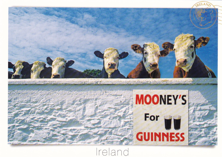
MOONEY’S FOR GUINNESS
IRELAND
Published by
REAL IRELAND DESIGN
Ref: SP 324
“Milk Stout”
One of the more unusual Guinness postcards I picked up
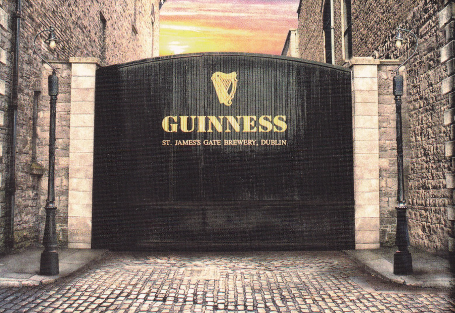
GUINNESS
ST. JAMES’S GATE BREWERY, DUBLIN
“Crane Street Gate”
Guinness Brewery. St. James’s Gate, Dublin
Produced Under Licence by
SHAMROCK GIFT COMPANY, DUBLIN
The main gates with the advertising displayed across them in the black of the drink itself
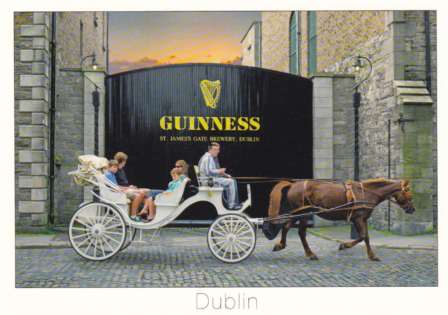
HORSE AND TRAP PASSING THE ENTRANCE GATE TO THE ICONIC GUINNESS BREWERY, ST JAMES’S GATE, DUBLIN CITY, IRELAND.
Published by
REAL IRELAND DESIGN
Ref: SP 675
‘DUBLIN’
Another image of this iconic gate this time with a little bit of added character with the inclusion of a horse and trap. The white border and the classic central bottom text makes for, I think, a more attractive postcard than the one above. But having said that I would still rather have them both.
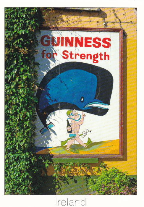
GUINNESS FOR STRENGTH
IRELAND
“Sign on pub wall, Ireland”
Published by
REAL IRELAND DESIGNS
Ref: SP 25
This is another adaptation of a classic John Gilroy poster design and is another one to be found hanging outside a pub on their wall (although the location is not given)
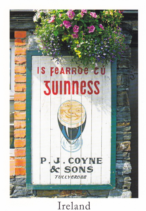
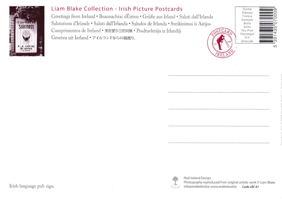
IRELAND
P.J. COYNE & SONS, TULLYCROSS
“Irish language pub sign”
Published by
REAL IRELAND DESIGN
In their
LIAM BLAKE COLLECTION – IRISH PICTURE POSTCARDS
series
(Larger sized postcard)
Ref: Code LBC 61
I assume ‘Tullycross’ is the location where this pub sign can be found although this location is on the west coast of Ireland and some way away from where I was (on the opposite coastline to be more precise). Another wooden pub advertising sign using a classic Guinness advert poster design.
REVERSE SIDE OF ABOVE POSTCARD
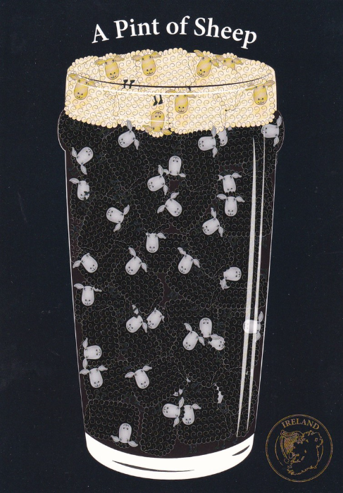
A PINT OF SHEEP
Published by
REAL IRELAND DESIGN
Ref: SP 448
“A taste of Ireland”
A comic design using black and then white sheep to make up the pint of Guinness (although the actual drink is not mentioned by name – but to be fair it really does not need to be does it). I have included this one to end this section on a comical note (and I like cartoon postcards).
Hopefully this shows you what can be found in respect of just one topic – I may not like drinking the stuff but I do love the advertising images.
Comments
-
My first job aged 15 was in a pub selling pints of Guinness for one and threepence. But the customers did not know that the slop trays and any leftovers were poured back into the barrel. So I have never tasted it but used to enjoy later going into pubs and leaning over the counter saying in a loud voice; "Excuse me but why is all this porter slopping around in the trays?"
LITERARY POSTCARD MENTIONS
I love it when postcards get mentioned in books that I am reading even if it is just on the one page or used as a small, or large, important device within the story. I shall list here the ones I come across. This will include when factual books also mention or depict postcards
Number 7
THE BLIND ASSASSIN
By
Margaret Atwood
Paperback version published by ‘Virago’
This one was the winner of the 2000 Booker Prize, but it somewhat defies being easily described. It is also the book with the most postcard references so far.
PAGE 83
“I didn’t want realism anyway: I wanted things to be highly coloured, simple in outline, without ambiguity, which is what most children want when it comes to the stories of their parents. They want a postcard.”
PAGE 318 – 319
“She stands him up, fibs about why she couldn’t make it – claims she didn’t see the chalked markings on the park wall, didn’t get the message – the new address of the non-existent dress shop, the postcard signed by an old friend she’s never had, the telephone call for the wrong number”
PAGE 365
This is the first page of a chapter titled:
“Postcards from Europe”
The entries below for pages 372 and 375 are from this chapter.
PAGE 372
“My postcards were to Laura and to Reenie, and several to Father. They had photographs on them of the buildings I had been to visit- picturing, in tiny sepia detail, what I ought to have seen. The messages I wrote on them were fatuous. To Reenie: ‘The weather is wonderful. I am enjoying it’. To Laura ‘Today I saw the Coliseum, where the used to throw the Christians to the lions. You would have been interested’. To Father: ‘I hope you are in good health. Richard sends his regards”
PAGE 375
“I thought of my postcards from Europe, arriving at Avilion with their cheerful, trivial messages. They were probably still on the table in the front hall. ‘I hope you are in good health”

THE HERITAGE CENTRE – PEMBROKE DOCK
THE PEMBROKE DOCK SUNDERLAND TRUST
This is a smashing little museum located right next to the docks and it is a smashing place to spend an hour or two if you are early for the Irish ferry (which is how I came to pay a visit here – don’t tell Jo but I was hoping to visit here so left plenty of time for the journey). The centre is located right next to the hanger where the Sunderland flying boats were housed during the 1930’s and 1940’s. It was in fact the largest flying boat base in the country. Since I was a little boy I have been fascinated by the Sunderland flying boats, especially the Sunderland III that flew during the Second World War. I have collected postcards depicting this plane ever since and many years ago actually saw one on display in Hendon. So visiting this museum with its various artifacts relating to the Sunderland was a must do. As a bonus they had a range of exclusive postcards as well. I can recommend a visit here if you have an interest in this sort of history.
(although you cannot actually go into the huge hanger where the Sunderland’s were housed you can see the outside of it and Star Wars fans might be interested to know that it was here that the original full size Millennium Falcon was constructed for the film – a nice piece of film history which is mentioned in the museum where they show a photograph of it being built)
THE HERITAGE CENTRE – PEMBROKE DOCK
THE PEMBROKE DOCK SUNDERLAND TRUST
Issued postcard
Depicts the front of the museum (heritage centre)

THE HERITAGE CENTRE – PEMBROKE DOCK
THE PEMBROKE DOCK SUNDERLAND TRUST
Issued postcard
Untitled Postcard
Although the postcard is untitled it actually displays a print available from the centre and exclusive to the Pembroke Dock Sunderland Trust and which is titled ‘T9044; Flight from Oban’ (the A3 print is in a limited edition of 210 – the artist is Tim Jenkins)
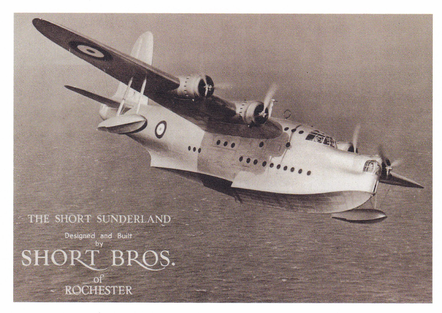
THE HERITAGE CENTRE – PEMBROKE DOCK
THE PEMBROKE DOCK SUNDERLAND TRUST
Issued postcard
‘THE SHORT SUNDERLAND Designed and Built by SHORT BROS. of ROCHESTER’
A superb black and white photograph of one of my top two favourite aeroplanes (it is actually in second place – I shall let you know what is in first place in a future article – no, it is not the Concorde – that is possibly in third place)

PHOTOGRAPH
19/03/2016
Picture of part of recovered engine from Sunderland Flying Boat
On display in museum
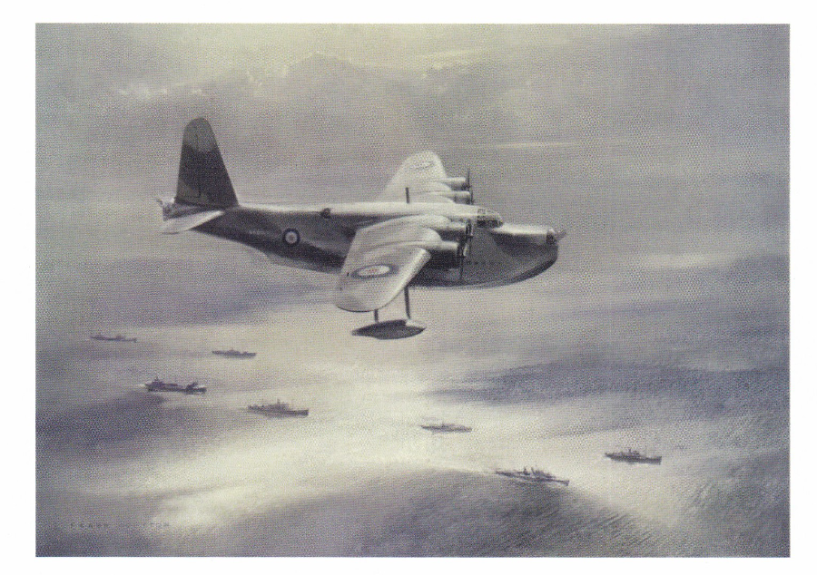
THE HERITAGE CENTRE – PEMBROKE DOCK
THE PEMBROKE DOCK SUNDERLAND TRUST
Issued postcard
Reproduced from an original oil painting by Frank Wootton
THE HERITAGE CENTRE – PEMBROKE DOCK
THE PEMBROKE DOCK SUNDERLAND TRUST
Issued postcard
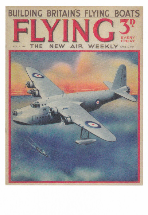
BUILDING BRITAIN’S FLYING BOATS
FLYING
THE NEW AIR WEEKLY
Magazine cover (original price for magazine 3d). This depicts the Sunderland Flying Boat.
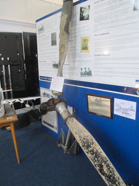
PHOTOGRAPH
19/03/2016
Picture of an actual recovered propeller from a Sunderland
On display in the museum
THE HERITAGE CENTRE – PEMBROKE DOCK
THE PEMBROKE DOCK SUNDERLAND TRUST
Issued postcard
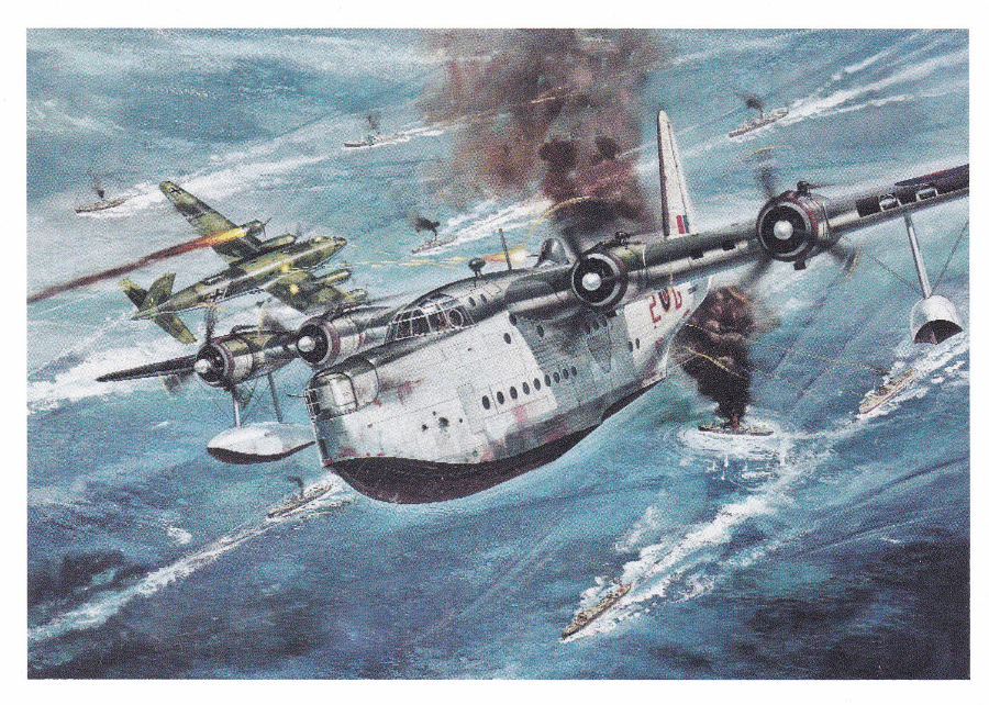
AIRFIX model box artwork. The card does have a small AIRFIX logo on the reverse side but there is no real information that this is the source of this painting. This was my favourite of all of the available postcards as I immediately recognized that it is the artwork from the Airfix kit. This is because I have one, all still boxed and ready and waiting for my retirement so that I can have a go at putting it together. The model was a birthday present from my oldest son, James.
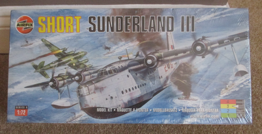
PHOTOGRAPH
This is my boxed Airfix Sunderland III kit
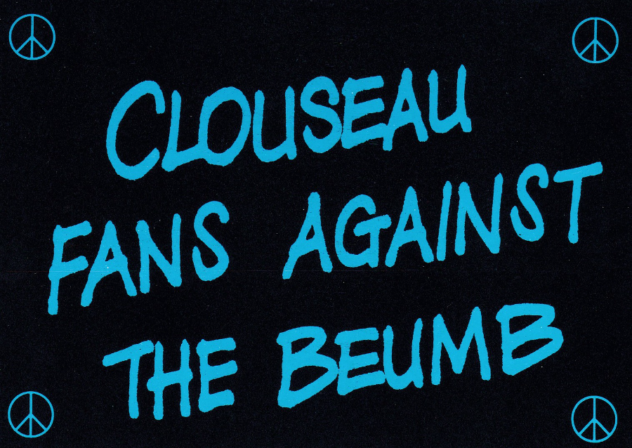
CLOUSEAU FANS AGAINST THE BEUMB
Design by
Paul Morton
Published by LEEDS POSTCARDS
Reference Number L145
A poster styled design with CND badges in each corner (Campaign for Nuclear Disarmament ). The character CLOUSEAU is of course Inspector Jacques Clouseau from the Pink Panther feature films, as played by Peter Sellers (and also Steve Martin in two more recent versions). The text makes fun out of a famous scene in one of the movies where Insp Clouseau has trouble explaining that it is a bomb.
How often does a good political campaign postcard fit into a film collectors theme (and as the characters also appeared in a television animated cartoon series it could also be placed into my television collection as well)
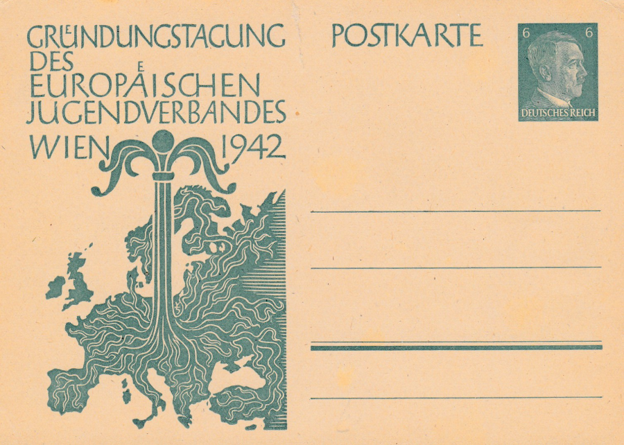
THIRD REICH POSTAL STATIONERY CARD
(GERMANY)
VIENNA 1942
LEAGUE OF EUROPEAN YOUTH
This postcard was issued to commemorate a conference held in Vienna to discuss the formation of a league of European Youth. This was an official release, but at this time there was very little that was not.
Printed in simple green on buff card this is one of many postal stationary postcards issued by the Nazi party during this period.
The Nazi’s had a reign of terror which ran through the 1930’s right through to the conclusion of the second world war and there is absolutely nothing about them, and their period in charge, that should in any way be celebrated. Any posting of political or propaganda postcards from this period shows no intent on my behalf in any way to justify their existence.
But, having said all that there is a large collecting circle who specialize in collecting philatelic items, stamps, envelopes, handstamps and postcards from this era. I have a personal interest in the second world war as both my Grandfathers served in the forces and I have items connected to both of their war experiences (which were very different). I also collect items from the forces they were fighting and from the political party that caused the war. I believe we should never forget what they did. I will post more items in the future, all from my collection, obviously, but I will also tell the stories behind them.
LITERARY POSTCARD MENTIONS
I love it when postcards get mentioned in books that I am reading even if it is just on the one page or used as a small, or large, important device within the story. I shall list here the ones I come across. This will include when factual books also mention or depict postcards
Number 6
A MAN WITHOUT BREATH
By
Philip Kerr
Paperback version published by ‘Quercus’
This is another novel in the series about the character Bernie Gunther, who I have mentioned previously and who has had a previous posting in one of these mentions.
This time it is 1943 and Bernie is caught up in the German investigation into the polish bodies found in Katyn Forest.
PAGE 36
Bernie is speaking here:
“No, I said firmly. ‘Forget about it. It’s an old habit of mine, being a detective. Some people collect stamps, others like postcards or autographs; me I collect trivial questions. Why this, why that? Of course any fool can start a collection like that, and it goes without saying that it’s the answers to the questions that are really valuable, because the answers are a lot harder to track down”
DUBLIN
2016
During my two visits to Dublin I bought a number of postcards which depict some of the sites in the city. I use these postcards as a souvenir of my visit, although I do take photographs but I have found that I can-not take photographs which are as good as those that appear on the postcards.
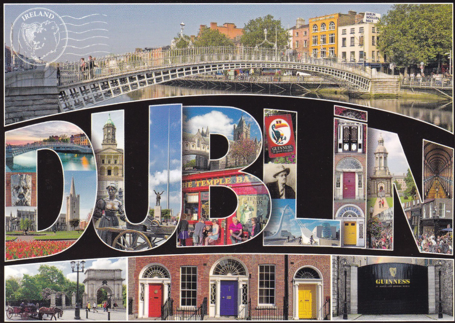
DUBLIN
Published by
REAL IRELAND DESIGN
Ref: SP 516
“Dublin City, colourful, vibrant, exciting. The living capital city of Ireland”
Nice use of multiple images placed in the letters which make up DUBLIN. Although a typical tourist postcard it is still worth taking a look at postcards like this as they are often very well designed and they really catch the eye (after all they are designed to catch the attention of passing people – this one really does do that)
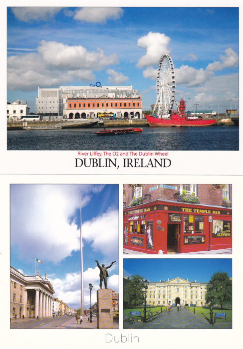
TOP POSTCARD
“River Liffey, The O2 and The Dublin Wheel’
Published by
JOHN HINDE
In a series titled ‘BEAUTIFUL IRELAND’
Ref: 2D-090
“Point Village situated beside The O2 houses a massive 60 meter Big Wheel, a vibrant weekend market complete with an open-air concert stage, Harrys Bar and the four star Gibson Hotel. This is a great day out for all the family. The Point Village is easily accessible via the new Luas Line”
(Text from reverse side of postcard)
BOTTOM POSTCARD
“Dublin”
Published by
REAL IRELAND DESIGN
Ref: SP 163
“Dublin City (Dubh Linn, meaning Dark Pool), is the capital city of Ireland. There is much to see and do for the visitor. This card shows the Temple Bar Pub, Trinity College and the General Post Office and Spire”
(Text from reverse side of postcard)
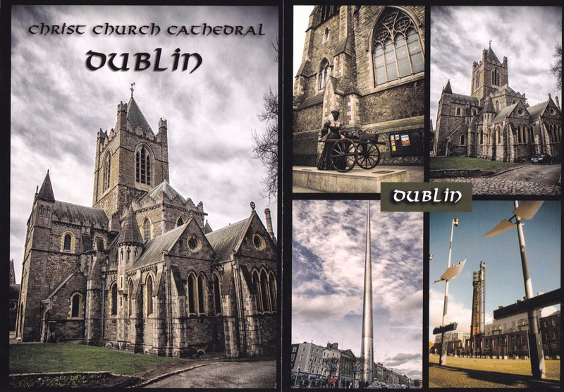
PHOTO by Qbaska
(a series of postcards locally produced but with no reverse title or descriptive text or numbering system)
POSTCARD FAR LEFT
Christ Church Cathedral, Dublin
POSTCARD NEAR LEFT
DUBLIN
Multi-view postcard showing the Molly Malone statue top left, the Christ Church Cathedral (the same image on the postcard far left) top right, the Spire outside the General Post Office bottom left and another structure bottom right which I saw from the tram I used to travel into the city but unfortunately I do not know where this is.
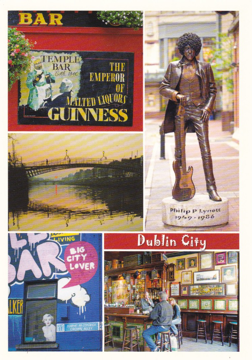
DUBLIC CITY
Published by
REAL IRELAND DESIGNS
Ref: SP 575
“Dublin, city of culture and craic, Ireland”
The Guinness advert that appears top left was also available separately on a single postcard (I shall post it later when I will depict a number of Guinness related postcards under their own heading). There is also the bonus of a painting of Marilyn Monroe in a window in the bottom left corner which would make this a very unusual Monroe postcard for the many collectors who seek these out.
But my main reason for buying this card is the Philp (Phil) Lynott statue which we found and photographed. I had the pleasure of seeing Phil Lynott live in 1984 when he fronted his new band called ‘Grand Slam’ but thankfully they still performed some of the big hits from his ‘Thin Lizzy’ days.
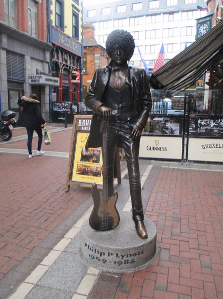
PHOTOGRAPH TAKEN
30/03/2016
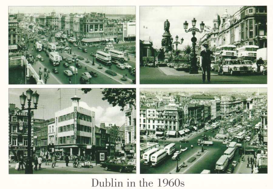
DUBLIN IN THE 1960’s
Published by
JOHN HINDE
Ref: 2/D-058
“Top left: Buses on O’Connell Bridge. Top right: Garda directing traffic on O’Connell Bridge with Daniel O’Connell monument in the background. Bottom left: The Gael Linn building on corner of Grafton St. and South King St. photographed from St. Stephens Green. Bottom right: View looking up O’Connell St. towards the G.P.O.”
(Text from reverse side of postcard)
I thought this was quite an unusual postcard but copies were being bought and although from an historical point of view I was interested, and thus bought a copy, I did wonder what the fascination was with general tourists. But it does show that if a postcard depicts something interesting it can still sell.
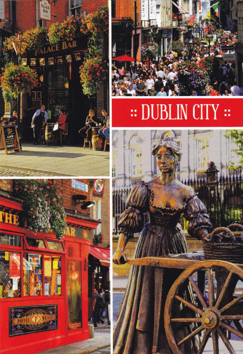
DUBLIN CITY
Published by
INSIGHT CARDS LTD
In a series called:
INSIGHT IRELAND
Ref: D 2055
Again a standard styled tourist postcard but the images are none the less very good. The Molly Malone Statue is shown (more about this further down) and you get an idea of the colour and brightness of Dublin City’s many bars and side streets.
Although the front does have interest it was the reverse side of this postcard which I found fascinating as it has a street map of central Dublin in fade out as a background design. It is interesting little things like this which make some postcards stand out from others.
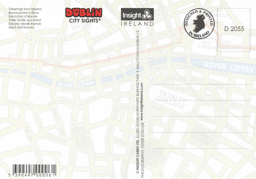
REVERSE SIDE OF ABOVE POSTCARD
The map can be seen in the faded reverse design
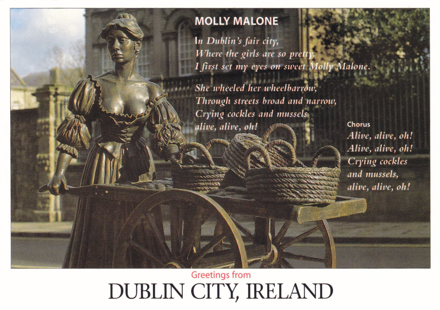
MOLLY MALONE
Greetings from DUBLIN CITY, IRELAND
Published by
JOHN HINDE
Ref: 2D-002
“The famous Molly Malone Statue is located in Suffolk St., in front of the Tourist Information Office. Designed by Jeanne Rynhart the statue is life size and is made from bronze. Legend tells us that Molly Malone was a fishmonger (a person who sells fish) on the streets in the 1600s”
(Text from reverse side of postcard)
This is from a lovely series of white boarder designs with some cracking photographs. The text on the reverse side is correct for anyone who remembers this statue being in Grafton Street. ‘Molly’ was moved to this new location in April 2014 to allow for construction work to be done on the Luas (tram) city link line project. Rumour has it that she will be returned to her original spot in 2017 on completion of the work.
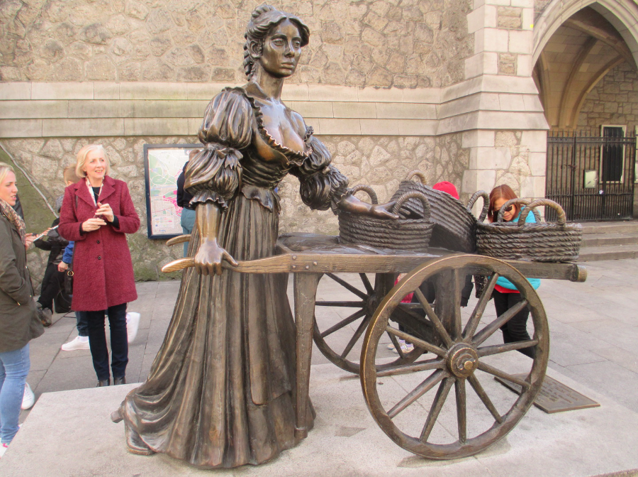
PHOTOGRAPH TAKEN
30/03/2016
(I was quite pleased with this photograph – one of my better ones)
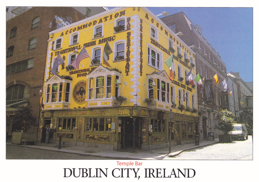
TEMPLE BAR
DUBLIN CITY, IRELAND
Published by
JOHN HINDE
Ref: 2D-009
“Temple Bar the cobbled maze between Dame Street and the River Liffey is Dublin’s most cultural quarter. Theatres, galleries, clubs and pubs flourish in a bohemian atmosphere. Aromas wafting from exotic eating-places, music drifting from street and studio, provocative sculptures and experimental exhibitions all weave the unique spell of this colourful, vibrant part of the city”
(Text from reverse side of postcard)
Now normally I probably would not have picked up this postcard but earlier in the day I had stood outside this pub and tried to take a picture which would capture its colour and life. My photo was not bad (see below) but this postcard really captured this fantastic building.
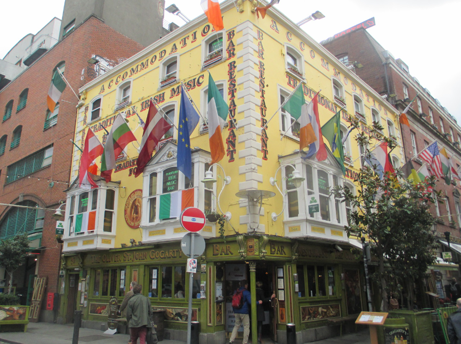
PHOTOGRAPH TAKEN
30/03/2016
(This was my second attempt - see below for my first - I thought this one was not too bad)
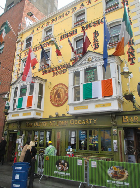
PHOTOGRAPH TAKEN
27/03/2016
Comments
-
I knew that Garda directing traffic. His first name was Senan and he was from County Clare. He obviously did not know about the pollution he was inhaling.

IRISH WRITERS
Whilst in Ireland I picked up postcards in thematic groups. I have already posted some of my Easter Rising postcards (there will be some more very soon). One of the groups was cards related to Irish writers which are well celebrated by them.
IRISH WRITERS
Published by
REAL IRELAND DESIGN
Ref Code LBC 24
“Some of the great Irish writers whose works are internationally renowned”
John Millington Synge 1871 – 1909
George Bernard Shaw 1856 – 1950
Oscar Wilde 1854 – 1900
Sean O’Casey 1880 – 1964
James Joyce 1882 – 1941
Patrick Kavanagh 1904 – 1967
Samuel Beckett 1906 – 1989
William Butler Yeats 1865 – 1939
(This is a large postcard)
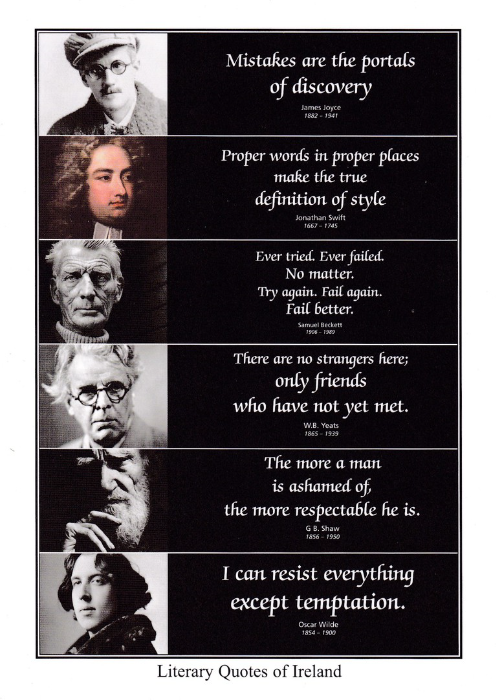
LITERARY QUOTES OF IRELAND
Published by
USEFUL GIFTS LTD
James Joyce
Jonathan Swift
Samuel Beckett
W.B. Yeats
G.B. Shaw
Oscar Wilde
(This is a large postcard)
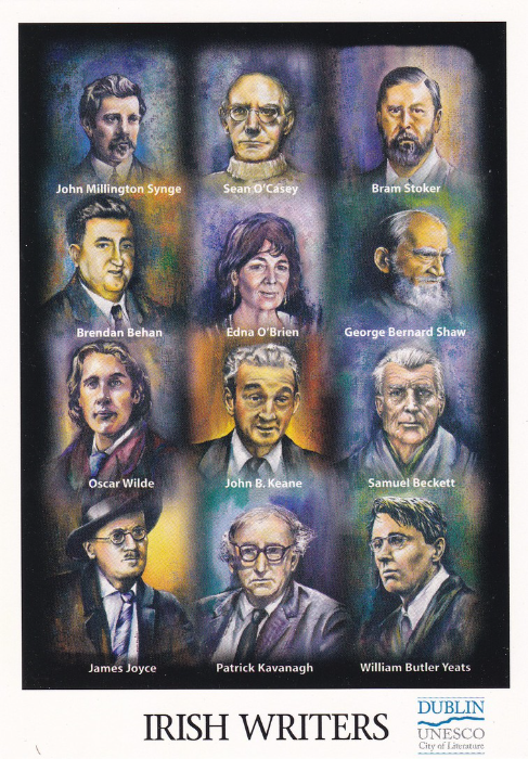
IRISH WRITERS
Published by
JOHN HINDE
Under the series title
‘BEAUTIFUL IRELAND’
Dublin is a UNESCO City of Literature
JOHN MILLINGTON SYNGE
SEAN O’CASEY
BRAM STOKER
BRENDAN BEHAN
EDNA O’BRIEN
GEORGE BERNARD SHAW
OSCAR WILDE
JOHN B. KEANE
SAMUEL BECKETT
JAMES JOYCE
PATRICK KAVANAGH
WILLIAM BUTLER YEATS
(It was nice to see Bram Stoker included here – he was born on the north side of Dublin in Clontarf)

FAMOUS IRISH WRITERS
“IRISH WRITERS”
Published by
REAL IRELAND DESIGN
Ref: SP 461
JAMES JOYCE
G B SHAW
W B YEATS
FLANN 0’BRIEN
JONATHAN SWIFT
SAMUEL BECKETT
PATRICK KAVANAGH
SEN O’CASEY
J M SYNGE
BRENDAN BEHAN
OSCAR WILDE
OLIVER GOLDSMITH

IRELAND’S WRITERS
Published by
JOHN HINDE
Ref – 2PP-012
Designed, printed and published in Ireland
JAMES JOYCE
THOMAS MOORE
J.M. SYNGE
JONATHAN SWIFT
OSCAR WILDE
PATRICK KAVANAGH
SEAN O’CASEY
BRENDON BEHAN
G. B. SHAW
W. B. YEATS
BRAM STOKER
SAMUEL BECKETT
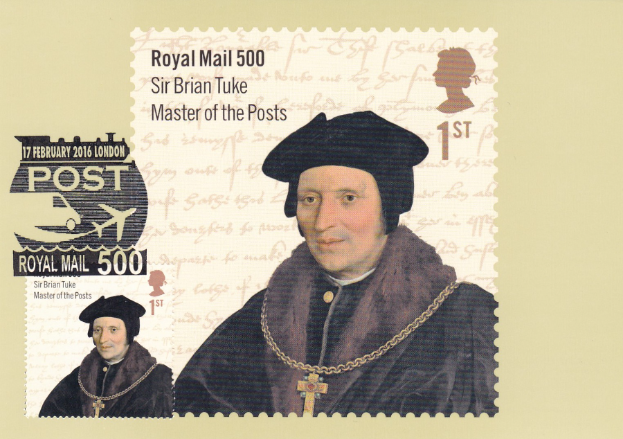
ROYAL MAIL 500
Royal Mail PHQ Stamp Cards
Stamps issued 17th February 2016
This stamp set was issued to commemorate the 500th anniversary of the Royal Mail. This was quite a large set because there was a stamp sheet issued alongside the individual stamps from the set.
As previously stated I have my cards used first day of issue with the appropriate stamp applied to the front and cancelled with a special F.D.I. (First Day of Issue) handstamp
PHQ 411 (1) 2. 16
Sir Brian Tuke, Master of the Posts
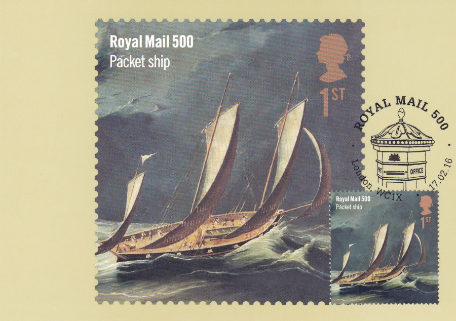
PHQ 411 (2) 2. 16
Packet Ship
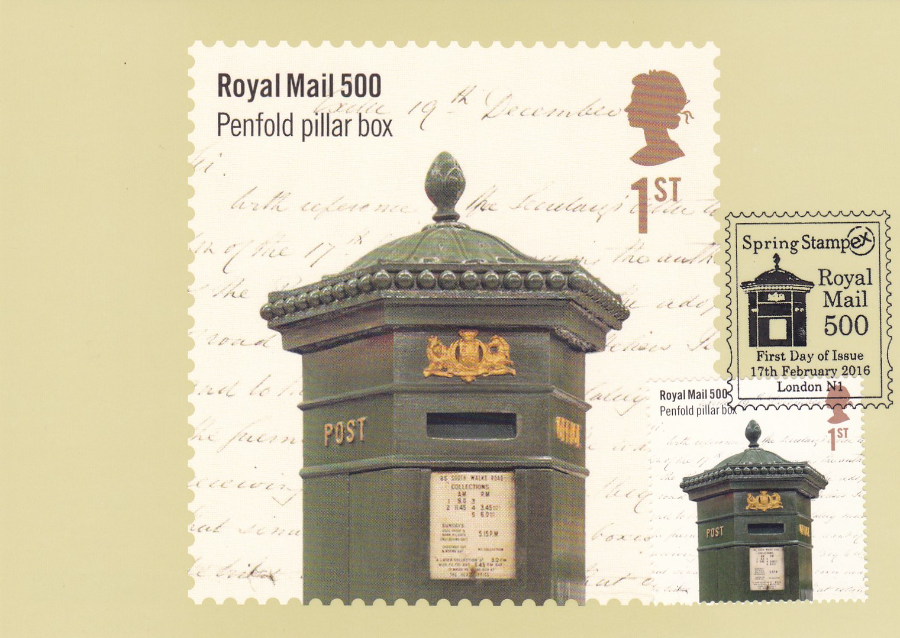
PHQ 411 (3) 2. 16
Penfold Pillar Box
PHQ 411 (4) 2. 16
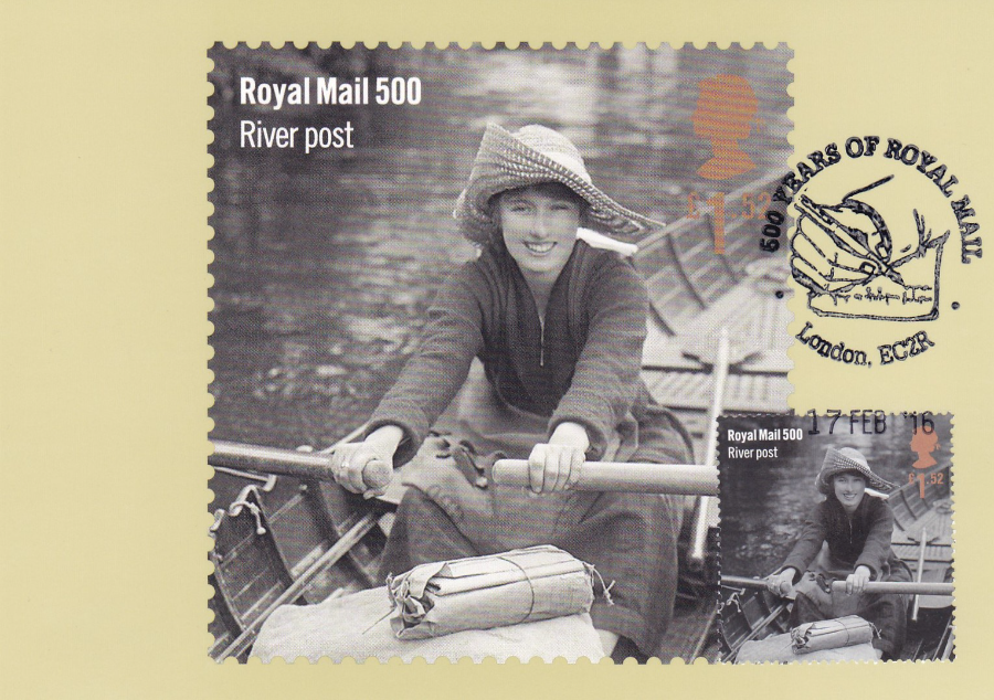
River Post
PHQ 411 (5) 2. 16
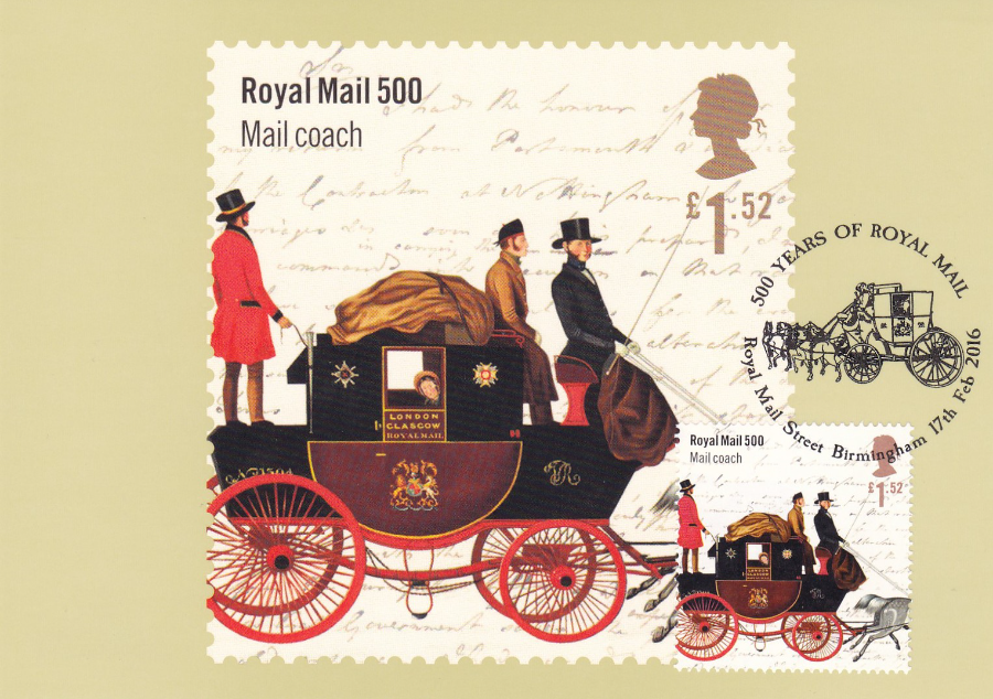
Mail Coach
PHQ 411 (6) 2. 16
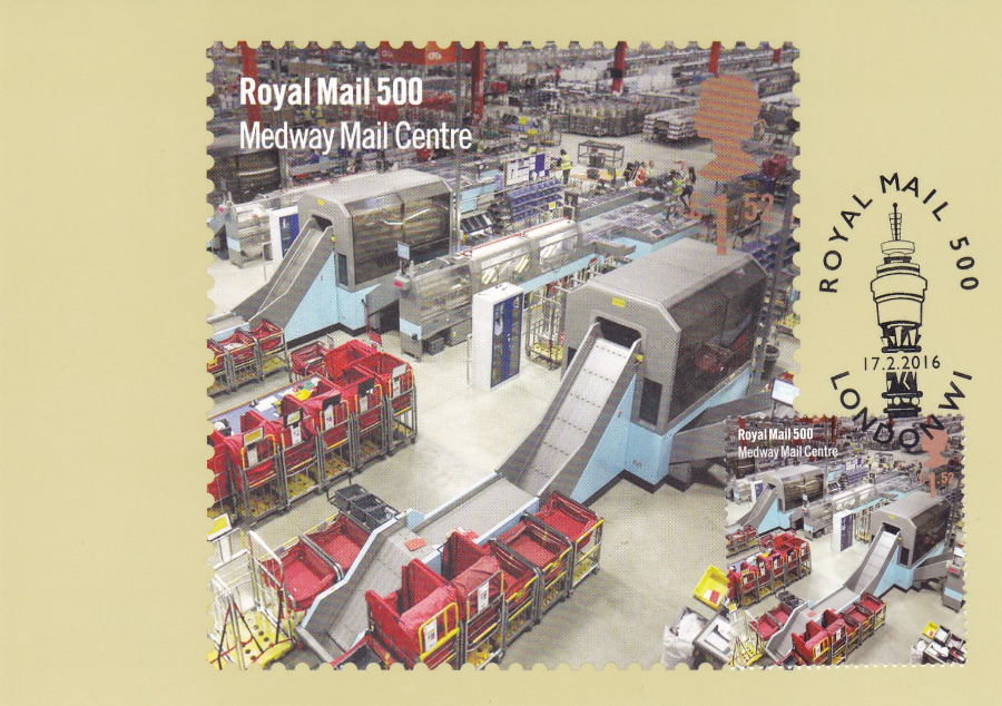
Medway Mail Centre
(this one is cancelled with my favourite of the available handstamps for this issue – this features the Telecom Tower – once known as The Post Office Tower)
PHQ 411 (7) 2. 16
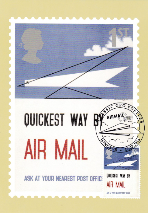
ROYAL MAIL 500: CLASSIC GPO POSTERS
(Depicts Stamp from the miniature stamp sheet)
“Quickest Way by Air Mail”
PHQ 411 (8) 2. 16
ROYAL MAIL 500: CLASSIC GPO POSTERS
(Depicts Stamp from the miniature stamp sheet)
“Address Your Letters Plainly”

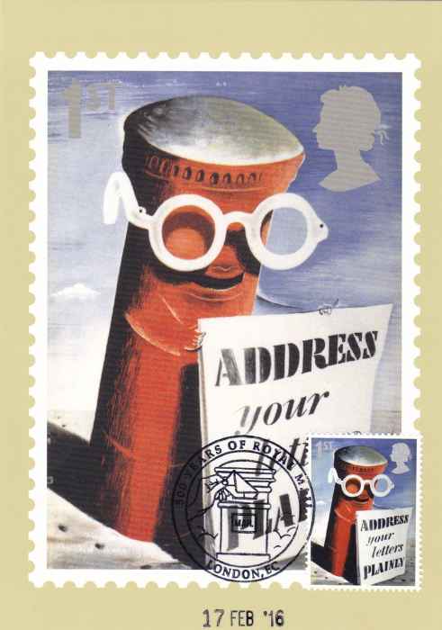
PHQ 411 (9) 2. 16
ROYAL MAIL 500: CLASSIC GPO POSTERS
(Depicts Stamp from the miniature stamp sheet)
“Stamps in Books Save Time”
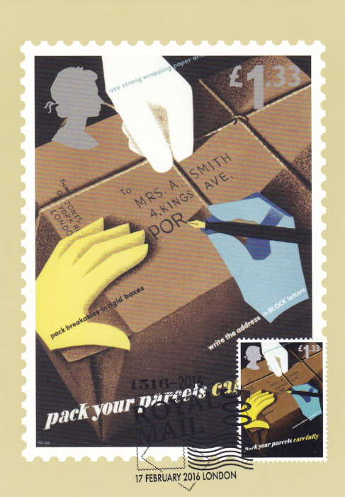
PHQ 411 (10) 2. 16
ROYAL MAIL 500: CLASSIC GPO POSTERS
(Depicts Stamp from the miniature stamp sheet)
“Pack Your Parcels Carefully”
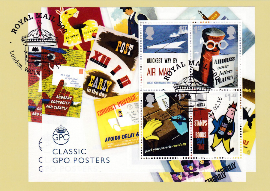
PHQ 411 (7) 2. 16
ROYAL MAIL 500: CLASSIC GPO POSTERS
(Depicts the entire miniature stamp sheet)
My copy here has an entire miniature stamp sheet applied to the front and cancelled. Yu may remember that this set was released during this year’s Spring STAMPEX show and I have previously posted images of the ‘STAMPEX’ overprinted version of this sheet and the card which depicted that overprinted version.