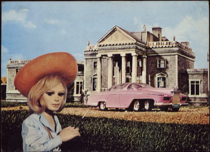
EDDIE POWER
“FROM 1 LIFE 2 ANOTHER”
BASED ON A TRUE STORY
By
EDDIE POWER
‘TRAFFORD PUBLISHING’
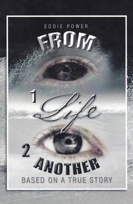
This was a free postcard that I found in the Tourist Information centre in Cobh in Ireland today. It is an advert card for a book which I think is mainly about better and positive living. My main reason for being happy to obtain this is that it was the very last one they had (so my visit was well timed). The front image is quite good and I assume is the one used on the cover of the book.
eddie.pwll@gmail.com
www.trafford.com
IN HONOUR OF THE
ROYAL WEDDING
2nd OLYMPIA EXHIBITION
30th November – 1ST December 1973
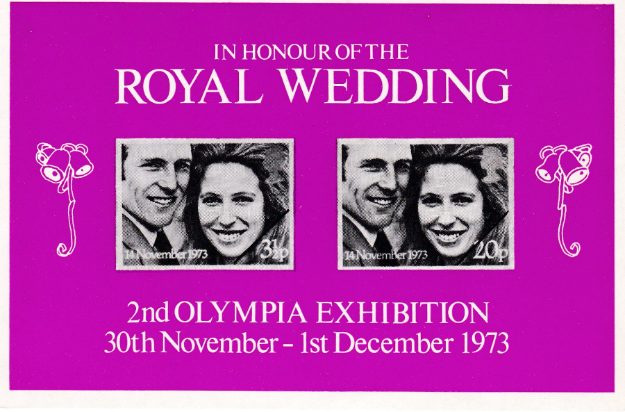
This is an unusual item which probably does not truly belong here. In truth it is probably best known as being an ‘imperf’ (this means that there are stamps depicted here which do not have perforations around them) black print (this is where stamps that are in colour in their original form are printed on a souvenir item, either a sheet or on a card, as with here, in single black ink (or other print format) – sometimes the actual stamp print is used – but that is not the case here) souvenir sheet. This one has been printed on card and is postcard size, but has a plain back. Stamp collectors would collect this as a stamp exhibition souvenir sheet but I have bought it as a plain backed card and have it in my royalty collection – the decision is always up to you, but my opinion has always been that if I like it I get it.
“TELL ME MISS – HAVE YOU EVER HAD AN EMBARRASSING MOMENT?”
Published by
BAMFORTH & CO., LTD (Holmfirth, Yorkshire)
“COMIC” Series
No 1206
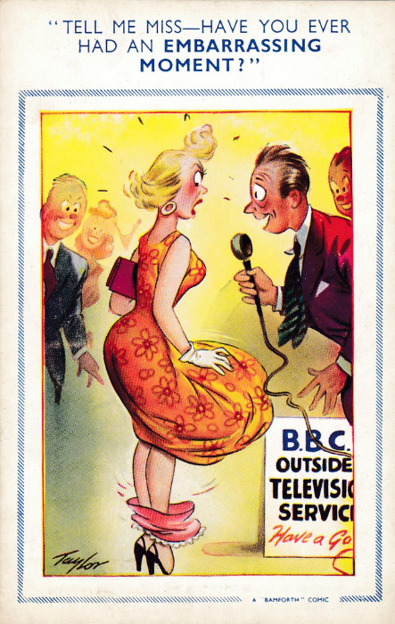
A nice early Bamforth comic postcard by ‘Taylor’ and another example of how you can add postcards from different publishers and topics into your theme. The Television connection here is more obvious and is on the sign bottom right, which reads:
B.B.C. OUTSIDE TELEVISION SERVICE
If you were looking casually through a box of dealer’s stock, and were a TV collector like me you could easily overlook this card. Fortunately I am aware that there are some very nice seaside comic postcard with a TV connection (although interestingly Bamforths is no-where near the sea and the connection with this title of ‘Seaside Comic’ comes from the belief that these types of card were mainly sold at seaside resorts – This is actually a perceived view which is not entirely correct as they could be bought in London and many other major towns with no sea frontage – but the idea of the ‘Saucy Seaside Postcard’ is now iconic and firmly placed in people’s minds and they were prevalent at such seafront locations as my home town, which was a short train journey from the metropolis of London and many came here to sample the beach and the amusements and to send postcards to relatives and friends).

WESTGATE MARKET, MANSFIELD
Published by
‘VALENTINE & SONS, LTD., DUNDEE AND LONDON’
“COLLO COLOUR” POSTCARD
Ref No K 7608
View postcards in my collection are mostly of areas that I have either visited or where there was some historic event, battle, meeting or person residing there that I have an interest in. With this particular postcard it was none of these. As I have already mentioned my main theme is Television and I will buy anything that has an unusual TV connection. With this image it was the advert on the side of the building which is centre right, which reads “VP wine at TV time”. I have enlarged this area in the image below – this might seem a bit excessive but what a cracking image.
I also quite like the BRITISH HOME STORES store on the left which has the modern white frontage but which still has the awnings out over the pavement (and also take a look at that old car out front of the store).
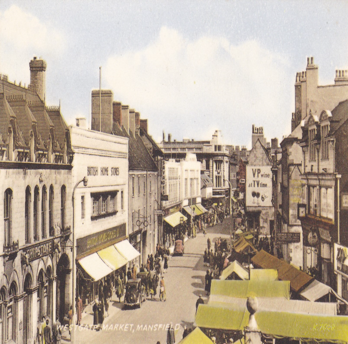
This is the advert which appears on the side of the building in the above postcard image. It was a huge sign but I thought it was an interesting one. This is a superb example of how you can take a theme and stretch it to include some postcards with a very different picture within which many would struggle to see the connection with your theme. Once you have most of the common cards within your main theme it is looking in some completely unrelated areas that often brings up postcards overlooked by your fellow collectors.
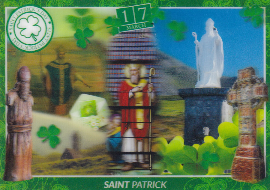
SAINT PATRICK
17TH MARCH
ST PATRICK’S DAY
Published by
John Hinde Group Ltd
‘John Hinde 3D’
Ref No TPC-3D-1011
This is a 3D postcard (which is why it may look a little blurred in places as 3D cards do not naturally scan well) so this fits nicely into my Novelty collection. The 3D effect is actually quite good here and the eye is drawn to St Patrick’s hand and pointing finger. Because of the surface that is needed to produce this effect these can be easily scratched so if you buy any try and keep them in storage plastic sleeves or protected in some way to avoid the surface being scratched. There was a range of these 3D cards, with a number of views where the buildings stuck out, but this one here was the only one which I wanted for my collection. They were priced at 1.99 euro each.
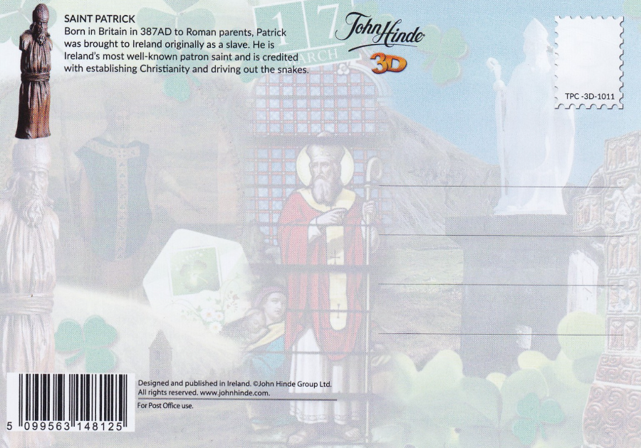
REVERSE SIDE OF ABOVE POSTCARD
ST PATRICK’S DAY
John Hinde Group Ltd
‘John Hinde 3D’
Ref No TPC-3D-1011
I have a real love of the modern craze with publishers for having a faded photograph or image across the reverse side of postcards. This first came to my notice with postcards in Germany and then Spain and then across Europe. It has been done here in the UK for some years now as well and it is a trend I hope lasts for some years yet. Here on this card the design from the front is reproduced in a what is called a ‘Fade Out’ but here it is in colour which is a little more unusual as in the past these have been in grey and given a black and white (although grey in faded tone) version of the front image.

SNOOPY
Published by
AYDIN KARTPOSTAL
ISTANBUL
Ref No: 29/24
(There is also a number in the top left corner on the reverse side – 3567)
This particular postcard appealed to me because it was just so wrong on so many levels. Firstly, as I am sure you all know, Snoopy is white, has been white since his creation and has never had any ‘Yellow’ period that I am aware of (perhaps he once had a guest appearance on ‘The Simpsons’ – or not!).
Still, they saved ink as Woodstock is shown as correctly being yellow so maybe doing Snoopy the same colour was a money saving device!
Next up we have the dinosaur in Snoopy’s hutch (I assume it’s Snoopy’s – it has ‘minik’ on it which maybe his name in this part of the world). The dinosaur bears an amazing resemblance, except for the colour, to the character ‘Dino’ who is the pet of the Flintstones in their animated series. Dino is of course purple where-as the dinosaur here is green, but then again Snoopy is yellow!
An unusual postcard which fits nicely into my television collection.
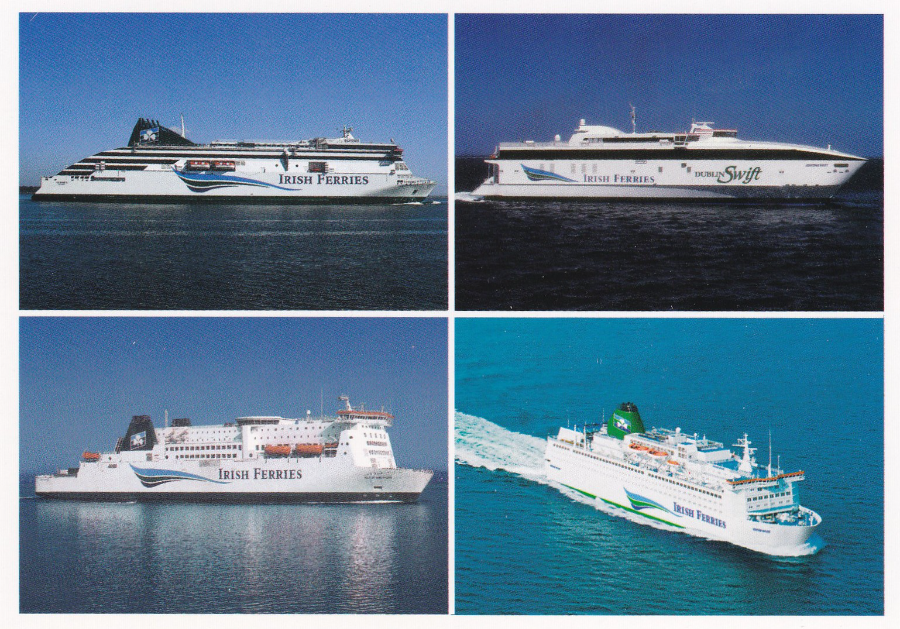
IRISH FERRIES
Card Ref 2/3306
Printed by John Hinde Ltd
I am in Ireland for my first ever visit to this country. We came over yesterday on an Irish Ferries ferry called the Isle of Inishmore. In the on board shop was this postcard which pictures our ferry and three others:
TOP LEFT – Ulysses
TOP RIGHT – Jonathan Swift
BOTTOM LEFT – Isle of Inishmore
BOTTOM RIGHT – Oscar Wilde
Whenever I cross the English Channel, or as here the Irish Sea, on any ferry I always check out both the shop and ships information counter as most will have either an exclusive single ship postcard or a multi-view postcard showing various of that companies ships. These make a nice souvenir of any trip and are often reasonably priced – this one was 75cents (remember that Ireland is in the euro currency market so prices her on my trip will be in euro’s).

GREETINGS FROM IRELAND
Card Ref 2COM 015
Published by
John Hinde Ltd
Food related postcards are quite common and if you travel you will find different versions all over the world. Some depict what is considered a typical meal, sometimes real and sometimes with a wry sense of humour added (as I suspect is the case with this one – but then I am sure many would happily have this for Breakfast). Others will actually give a full meal cooking instructions or a list of contents in a national or specific region meal, these are obviously often called ‘Menu Cards’.
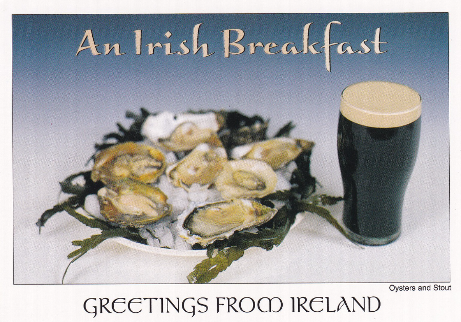
AN IRISH BREAKFAST
GREETINGS FROM IRELAND
Card Ref 2/PP-007
Published by
John Hinde Ltd
This has the same image as used on the above postcard, but then it is by the same company – although it has a different reference number. Here the cards design has a white boarder around the front which is a design style which has come back into fashion after a decade of full front designs without boarders.
Where this sort of thing happens it is a nice indicator of how postcard design styles change.
Both this card and the one above were found in the same slot on a rack located in the shop on board the Irish Ferries ferry that we crossed on (another hint from me is that you should never assume that any single slot contains just the design that is clearly seen at the front – always check through the stack as it is not unusual to find multiple designs placed in one rack slot to make it look fuller – I have picked up a number of postcards down through the years by doing this – this happens quite often with larger postcard sets where the shop owner does not have enough individual slots to show all the different postcard so they group them up in slots).
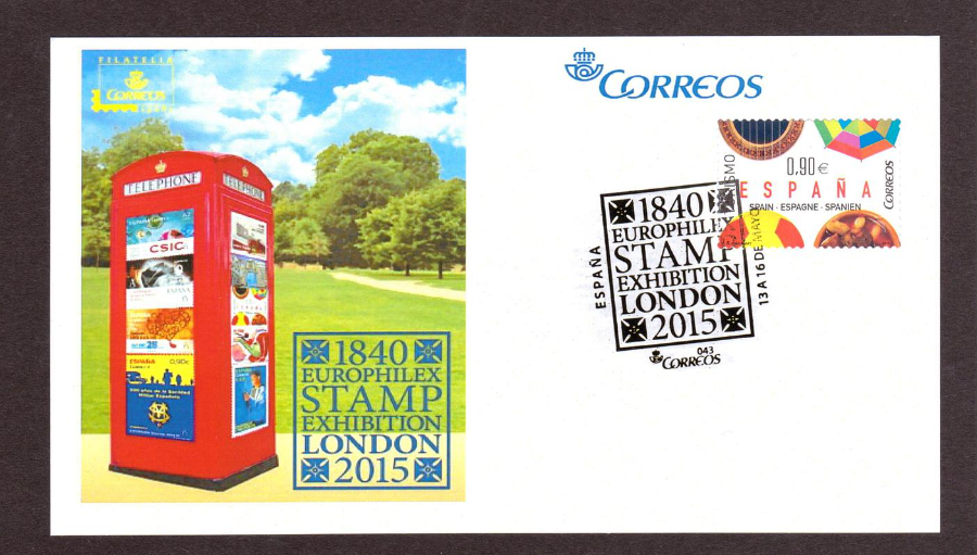
SPAIN
EUROPHILEX 2015
London Exhibition Special Postcard
I have previously mentioned the 2015 Europhilex Stamp Exhibition and have posted a number of the postcards I obtained during my visits to the show. Despite my many days spent seeking out the shows postcards I never did find this one at the actual event. I actually did not even know it existed until I saw it on eBay some months later. As I had already put together quite a nice related collection I had to have this one. The card is plain backed but the special cancel used on the stamp made nice use of the exhibitions logo, which also appears in blue in the design that has been used on the postcards picture.
I really don’t know how I missed this one but I am thankful that I still managed to obtain a copy.
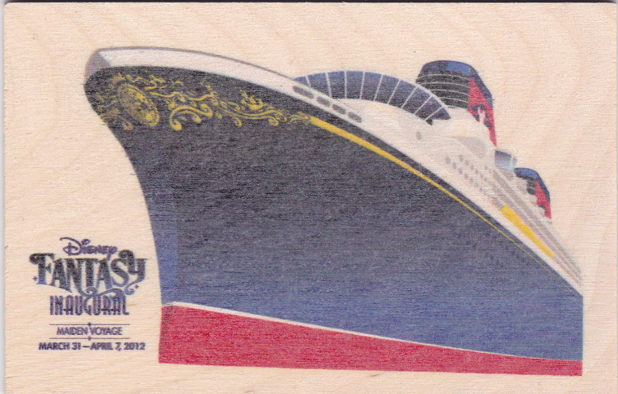
DISNEY FANTASY
INAUGURAL MAIDEN VOYAGE
MARCH 31 – APRIL 7, 2012
DISNEY VACATION CLUB
exclusive
“WOODEN POSTCARD”
There are benefits to being a Disney Vacation Club member, not that I am of course as there is no great point being here in the UK, but if I lived in America I think I might be. This wooden postcard was issued to celebrate the maiden voyage of one of Disney’s ocean liners (in March 2014 Jo and I enjoyed a cruise on the Disney Magic around the Mediterranean and the ship lived up to all my expectations and I will do another Disney cruise in the future).
As I am not a Disney Vacation Club member so I had to buy my copy from an eBay seller but fortunately it was not too expensive.
As a collector of Disney postcards it’s the unusual ones like this that I look out for.
REVERSE SIDE OF THE
DISNEY FANTASY
INAUGURAL MAIDEN VOYAGE
MARCH 31 – APRIL 7, 2012
DISNEY VACATION CLUB
exclusive
“WOODEN POSTCARD”
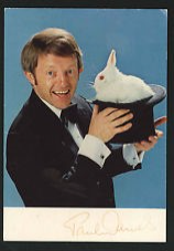
PAUL DANIELS ….. RIP
Newton Edward Daniels
6th April 1938 – 17th March 2016
Personal publicity Postcard (signed on front)
Well known magician who was perhaps the most popular and most famous British Television magician.
"You'll like this, not a lot, but you'll like it"
SYLVIA ANDERSON ….. RIP
Sylvia Beatrice Anderson, nee Thomas
27th March 1927 – 15th March 2016
Best remembered as the voice of Lady Penelope in the television series ‘Thunderbirds’, but was also a film producer, writer and costume designer who worked alongside her husband on many of his earlier series’. She was married to Gerry Anderson between 1960 and 1981.
Postcard published by C. G. WILLIMAS Ltd, Maidstone, Kent.
Printed by Plastichrome by Colourpicture.
Card Series Number Ref TB 6
(Card No P81314 – printed in stamp box)
1960's postcard
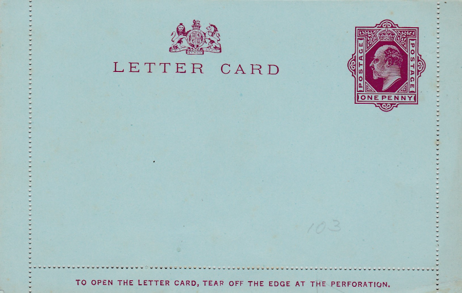
LETTER CARD
King Edward VII
Issued 1904 (an earlier issue was released in 1902 but without text on the reverse side)
Reverse side has two lines of red text with the second line starting with the word ‘Supplied’ – with the first letter ‘S’ under the middle of IS in TRANSMISSION in the top line of text.
I thought it might be time to introduce you to Letter Cards, if you were not already aware of them. These were items, which resemble postcards from the front but which were actually a larger piece of card which is folded in two and which has a perforated outer edge which goes all the round. The idea was that you wrote your message on the inside of the card, keeping it within the perforated area. The edging along the outer edge of the perforated line has an adhesive which was activated by saliva/water and then this could be stuck down. The person receiving the Letter Card would tear the card open along the perforated edging and thus access the sealed up message. These were designed to combat the fear that others were reading their messages. These were issued right up and into the Queen Elizabeth era.

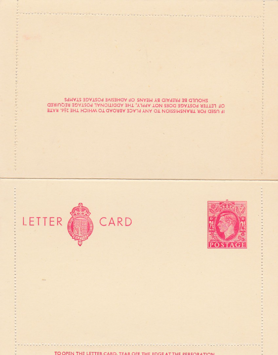
LETTER CARD
King George VI
Issued 1940
1 ½ d Brown Satmp
Reverse side has three lines of brown text which reads:
‘IF USED FOR TRANSMISSION TO ANY PLACE ABROAD TO WHICH THE 1 ½ d. RATE
OF LETTER POSTAGE DOES NOT APPLY, THE ADDITIONAL POSTAGE REQUIRED
SHOULD BE PREPAID BY MEANS OF ADHESIVE POSTAGE STAMPS”
Here you can see a fully opened King George VI Letter card. This allows you to see the way the perforations travel around the inner edge of the letter Card. The other side of this opened Letter Card is blank.
LETTER CARD
King George VI
Issued 1951
2 ½ d Red Stamp
Reverse side has three lines of red text which reads:
‘IF USED FOR TRANSMISSION TO ANY PLACE ABROAD TO WHICH THE 2 ½ d. RATE
OF LETTER POSTAGE DOES NOT APPLY, THE ADDITIONAL POSTAGE REQUIRED
SHOULD BE PREPAID BY MEANS OF ADHESIVE POSTAGE STAMPS”
Here you can see a fully opened King George VI Letter card. This allows you to see the way the perforations travel around the inner edge of the letter Card. The other side of this opened Letter Card is blank. This later issue came out when the cost of postage increased.

LETTER CARD
King George VI
Issued 1940
2 ½ d Blue Stamp
Reverse side has three lines of blue text which reads:
‘IF USED FOR TRANSMISSION TO ANY PLACE ABROAD TO WHICH THE 2 ½ d. RATE
OF LETTER POSTAGE DOES NOT APPLY, THE ADDITIONAL POSTAGE REQUIRED
SHOULD BE PREPAID BY MEANS OF ADHESIVE POSTAGE STAMPS”
Here you can see another fully opened King George VI Letter card. This time the stamp and printing is in blue, this one was issued before the red one depicted above.
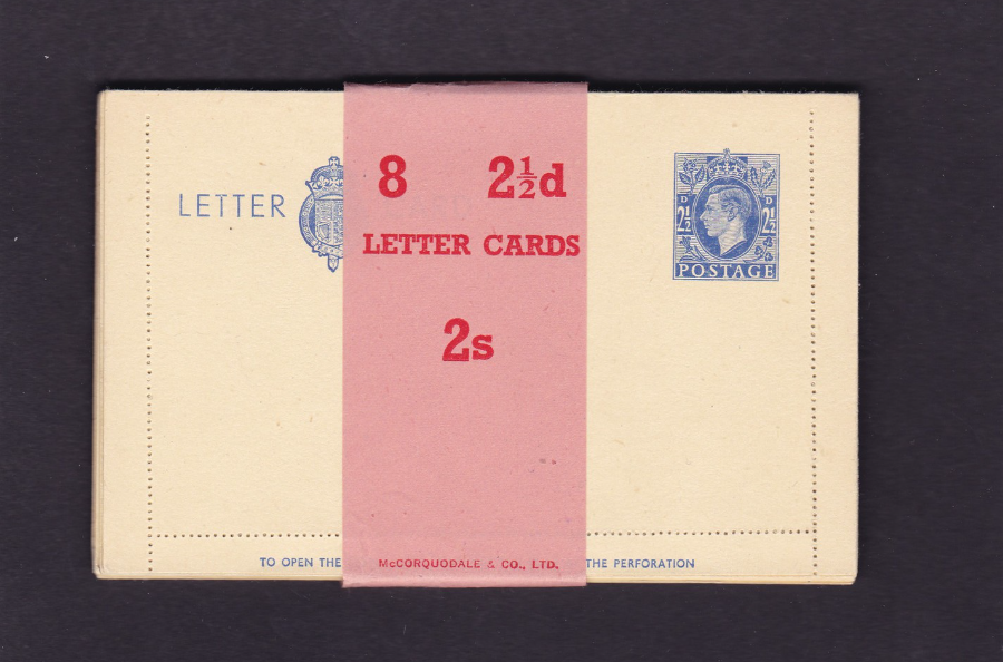
LETTER CARD
King George VI
Issued 1940
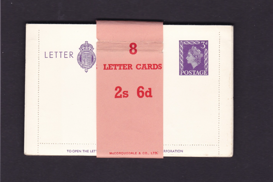
2 ½ d Blue Stamp
Full pack of 8 LETTER CARDS still with the sale wrapper around them
2s
These complete packs of Letter Cards still with their sales wrapper seal around them are a nice find and although not extremely common they can be found and they make for a nice display item and also show how the Letter Cards were sold so have philatelic importance.

LETTER CARD
Queen Elizabeth II
Issued 1957 - 58
3d Violet on white
Reverse side has six lines of violet text which reads:
‘IF USED FOR TRANSMISSION TO ANY PLACE ABROAD TO WHICH THE 3d. RATE
OF LETTER POSTAGE DOES NOT APPLY, THE ADDITIONAL POSTAGE REQUIRED
SHOULD BE PREPAID BY MEANS OF ADHESIVE POSTAGE STAMPS”
LETTER CARD
Queen Elizabeth II
Issued 1957 - 58
3d Violet on white
Full pack of 8 LETTER CARDS still with the sale wrapper around them
2s 6d
These are nice if you can find them and make for an unusual addition to a collection

GREAT BRITAIN
FIRST POSTAL STATIONERY CARD (Postcard)
Issued 1870 (1st October)
Queen Victoria head facing left in violet on cream to light buff card
HALF PENNY
The first ever British postcard. This first issue can be recognized by the inclusion of the word ‘TO’ on the left side of the top address line. The subsequent second issue had this removed (the second issue was issued from 1875 – other than the removal of the ‘TO’ the design was the same).
This particular copy was posted to a London address but the pre-printed stamp has not been cancelled. The card was posted from Herne Bay and the senders name and the location has been written down the far left side on the front in black ink:
Mohan (or possibly Mohun)
Herne Bay
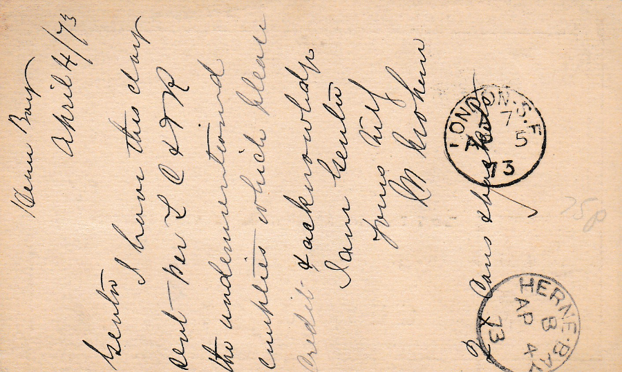
REVERSE SIDE OF ABOVE POSTCARD
It appears that the cancellations have been applied to the reverse side, which is not unusual for what is called a receiving mark, which is a cancellation applied at the posted items destination. Having been posted from Herne Bay this has a small single ring HERNE BAY – ‘B’ – 4th April 1873 cancellation which is the same date as is hand written at the top of the card. The card is addressed to London and upon arrival received a LONDON – S.F ‘A 7’ – 5TH April 1873 cancellation. The Herne Bay cancel should have been applied to the tamp on the other side but for some reason has been applied on this side.
A nice example of the UK’s earliest issued postcard and one which is now 143 years old.

PORT -SAID
Village Arabe
(Arab Village)
Early Egyptian undivided back postcard in the typical style of postcards issued around 1900 where one or two images are displayed in boxes with a fancy boarder design, which here is a plant with flower buds. Postcards like this appeared across Europe, being particular numerous in Germany, and, as seen here in north Africa. The photographs used here have been ‘colourised’ to make the card more attractive to tourists and they did sell well. Despite this being an early postcard, attractive and a nice example of early postcard design it only cost me £1 (I expect I got it a little cheaply but this does go to show that the collecting of postcards does not have to be an expensive hobby – don’t get me wrong, some postcards can cost money, but the vast majority can be bought for just over, or just under £1).

REVERSE SIDE OF ABOVE POSTCARD
I like the use of green print here on this undivided postcard reverse.
UNION POSTALE UNIVERSELLE
EGYPTE
CARTE POSTALE
UNIVERSAL POSTAL UNION
EGYPT
POST CARD
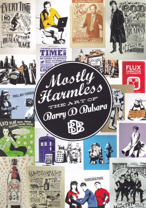
MOSTLY HARMLESS
THE ART OF BARRY D, BULSARA
This was a free advertising postcard which I was given at Barry’s stall at a Memorabilia Fair at the NEC in Birmingham. The postcard depicts a number of different hand pulled, limited edition screen prints that are by Barry and which have a heavy science fiction and fantasy theme, based on the world of television programmes and feature films. I have depicted this card quite large so that you can see the designs which are on it (many with a humorous touch). As television is my main theme I loved this postcard an if you look closely you can see designs for; Sherlock, Star Trek, Better Call Saul (a character which originates from the very popular series ‘Breaking Bad’), Batman, Doctor Who, Back to the Future, Star Trek, The Big Bang Theory, Harry Potter and Monty Python. A cracking combination and a card which would fit into many different collections.

CARTES D’ART
EDITIONS CARTES D’ART
SERIES: TOUR EIFFEL No34 / M. GAU 149
(Eiffel Tower Series – No 34)
By
Monique Gauriau
(LA COMPTINE DE PARIS / PARIS’S NURSERY RHYME)
I collect any postcards that depict the Eiffel Tower (and I think I have mentioned this before – I collect these because the Tower is connected to the story of early French Television).
This cartoon image appears to depict a tower of mice (or could they be rats?) with a tape measure trying to measure the height of the tower.

REVERSE SIDE OF ABOVE POSTCARDS
This particular Eiffel Tower postcard was posted from the Eiffel Tower and received the Towers exclusive ‘PARIS TOUR EIFFEL’ circular special hand stamp which is only applied to mail (mostly postcards) that is posted in the postbox actually at the Eiffel Tower. The Tower has had a range of different special hand stamps and cachets going right back to its early days and they are avidly collected and I have a few different examples in my own collection. Always check the back of any Eiffel Tower postcard as you may find it has something like this on it.

BATGIRL
Print by
Adam P. Booth
(Adam P. Booth Art)
www.AdamPBoothArt.co.uk
Adam Booth is another artist who attends the Memorabilia fairs at the NEC and I bought this card from his stand in 2014. The artists who attend do sell a few cards but I am always amazed that not that many people ask them to sign these cards. I always do and I think it adds a little something to the card. Adam has kindly signed and dedicated this one and this can be seen top right. Anyone who attends the Memorabilia fairs has the opportunity to obtain these unusual postcard sized prints (some do have full postcard backs and some have plain backs whilst some, like this one here, have stickers with details attached to the back). I recommend a visit, especially if you collect film or television related postcards.

TOWN HALL, SHEFFIELD
CUNARD’S SERIES
Postcard made of TIN (a metal postcard)
Posted 27th August 1904
In the golden age of postcards (the period best described as being the years up to the end of WWI) there was an ongoing competition to try and produce more and more unusual postcards for all the people out there who were collecting them. One of the things they could do was make the actual postcard out of a different material. Wood was one, and I have shown a modern wooden postcard before, but there was also metal, and Tin was an ideal material to use. This card here is made of a thin sheet of tin and an image has been produced onto it. The image is of the Town Hall in Sheffield, and the postcard was actually posted from there in august 1904 (see below image).
This definitely fits into my Novelty collection and as it only cost me a £1 it was a bargain as well (this was another buy at this year’s Spring Stampex).

REVERSE SIDE OF ABOVE METAL POSTCARD
Used 27th August 1904
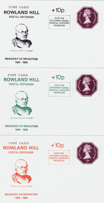
ROWLAND HILL
POSTAL REFORMER
“he gave us penny postage”
RESIDENT OF BRIGHTON
1844 – 1946
7p Postage Pre-Paid Postal Stationery Card
+ 10p charge
“For the International Postal History Museum”
Three postcards (plain backed) which have the pre-printed 7p brown postage paid machin head stamp printed upon them. The three cards then have a special ROWLAND HILL image, with text printed on the left side. These were available in three colours:
BLACK
GREEN
ORANGE
An extra 10p was charged, over the basic 7p postal rate, to raise money for the INTERNATIONAL POSTAL HISTORY MUSEUM and a text filled information box was applied to explain this.
This cards are of interest to philatelic history collectors and the extra charge makes them of postal interest as well.
I liked these because they make for something different and I was unaware of them before finding them on a stall at STAMPEX this year.

SOUTHEND ON SEA
Night time illuminations and lights set
Published by
VALENTINE’S & SONS, LTD., DUNDEE AND LONDON
‘WELCOME, SOUTHEND-ON-SEA’
Ref
T.2098
This is an unusual series of postcards and it would be fair to admit that some of the images are not what many would think were attractive. But now they show some of Southend’s then landmarks which are now no longer there. For a collector of local history postcards these now have an interest beyond the somewhat simple images they depict.
This one here seems to depict some sort of over-head gantry of lights reading WELCOME. This was almost certainly along the seafront but I do not remember ever seeing it. Jo says she does remember this and it was located on what was called the Golden Mile between what is now called Adventure Island and the area just beyond where The Kursaal is still located.
SOUTHEND ON SEA
Night time illuminations and lights set
Published by
VALENTINE’S & SONS, LTD., DUNDEE AND LONDON
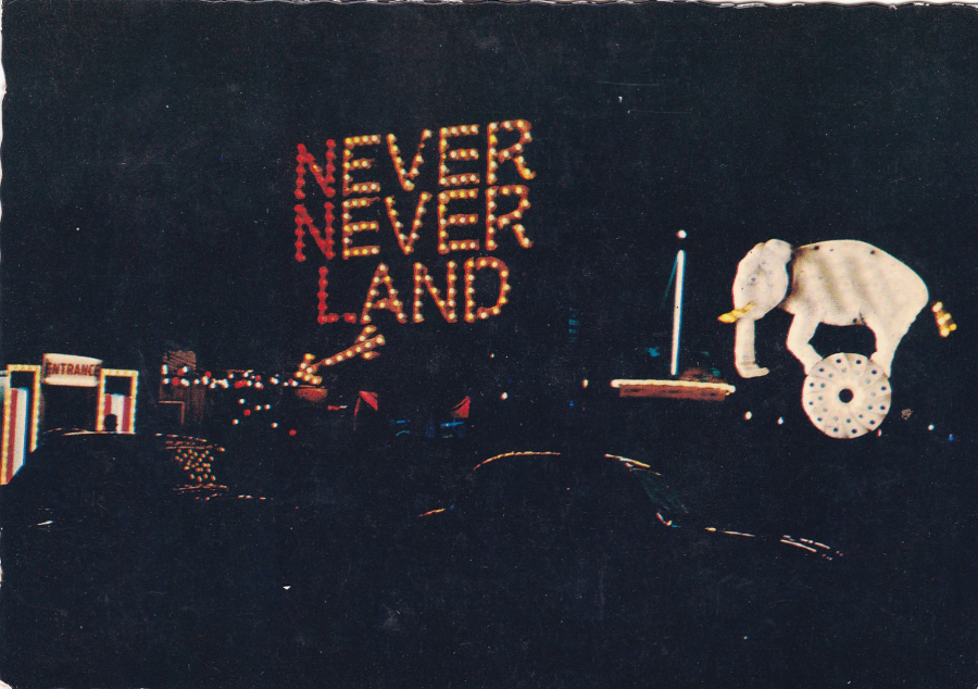
‘NEVER NEVER LAND, SOUTHEND-ON-SEA’
Ref
T.2059
The illuminated direction sign to what was the NEVER NEVER LAND park area which was on the cliffs opposite the old Peter Pan’s Playground (now called Adventure Island). This went some years ago and was later replaced when someone tried to revive the idea some years later, but this new version also came to an end. I do like the elephant that is on the far right side of this photograph.
SOUTHEND ON SEA
Night time illuminations and lights set
Published by
VALENTINE’S & SONS, LTD., DUNDEE AND LONDON
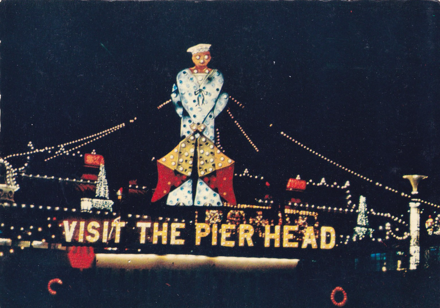
‘THE PIER, SOUTHEND-ON-SEA’
Ref
T.2095
This is my favourite image from this little series (although of course there may well be others which I do not have – the numbering system used means that either a large number of designs were issued or that there was some gap between the issue of each individual card).
This was the sailor illuminated sign which was at the seafront end of the Pier entrance and which advertised the fact that you could visit the Pier Head. For any local historian it is images like this which add both interest and useful information to the knowledge of an area.
I suspect that these are from the late 1950’s (they could also be early 1960’s but my money is on an earlier issue)

SOUTHEND ON SEA
Night time illuminations and lights set
Published by
VALENTINE’S & SONS, LTD., DUNDEE AND LONDON
‘NEVER NEVER LAND, SOUTHEND-ON-SEA’
Ref
T.2058
This is one of the many illuminated statues and scenes which were spread out over the cliffs in the Never Never Land park area. These seem so simple now after people have visited such places as Disneyland and other major attractions and theme parks but back in the 1950’s at the height of its fame there were long queue’s to get into this Southend attraction and many people have very fond memories of it. I can remember going when young so that would have been in the late 1960’s and early 1970’s.

SOUTHEND ON SEA
Night time illuminations and lights set
Published by
VALENTINE’S & SONS, LTD., DUNDEE AND LONDON
‘SOUTHEND LIGHTS FROM THE PIER’
Ref
T.2099
A view along the seafront from the start of the Pier at the seafront end. The area immediately in-front, and on the left side, is the Speedway go-kart track in Peter Pan’s Playground (as mentioned this is now called ‘Adventure Island’ and the go-karts are still here although faster and more modern these days, but still in the same location). As you can see the illuminations along the main road were quite elaborate back then.
All five of these postcards have a deckle edge and are described as being a:
‘VALCHROME’ 1320V STYLE POSTCARD
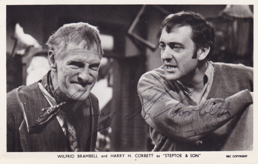
WILFRED BRAMBELL and HARRY H. CORBETT
as
“STEPTOE & SON”
BBC COPYRIGHT
Signed by
HARRY H. CORBETT
This would be a nice card for my Television collection regardless but the fact that it has been signed by Harry H. Corbett lifts this into a completely different collecting sphere – the collecting of Autographs. The television theme does lend itself naturally to the collecting of autographs and as such I have a wide range of these on postcard, probably several hundred. Postcards are a nice size and with an appropriate image of the person in question or a related image or painting (perhaps a painting of that person or with artists a painting by that person) then the addition of a signature can not only make the item attractive it can and should increase its value. This signed card here is a good example of this.
Harry H. Corbett was born in 1925 and died on 21st March 1982 (aged just 57). He was definitely best known for his starring role in the long running BBC television sitcom Steptoe & Son (although it is now well known that he considered this role to be beneath him as a well-known and serious actor and it is a shame that it appears he gained no pleasure from the role and seems to have thought it brought him down). To be honest I prefer him in his one and only Carry on appearance in the film ‘Carry On Screaming’, which I consider to be one of the better Carry on films (it was released in 1966).
He died of a heart attack and is buried in Penhurst, East Sussex (he actually died in Hastings, East Sussex).
His autograph has subsequently become quite collectible and is not an easy one to acquire. I have looked at prices and believe that a reasonable price for a signed card is anywhere between £80 and £100 (although there is one priced at £175 on eBay which I think is a little too high).
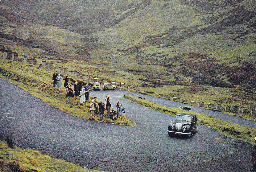
J. ARTHUR DIXON
(Photogravure Post Card)
“THE QUEEN’S CAR AT THE ‘DEVL’S ELBOW’, PERTHSHIRE”
“The Queen is on her way to Balmoral with Prince Philip driving, negotiating the notorious double bend on the Cairnwell road between Blairgowrie and Braemar”
Ref 3665
This is a good example of where it can be important to read the text on the back of a postcard. At first glance this just looks like a simple view card with little to make it stand out from the many other 1000’s of such like images. But, having read the text information on the reverse side I discovered that this is actually quite an unusual Royalty themed postcard.
I assume all the security people are in the car with them as these days this would be in a convoy with cars in front and behind and several motorcycles as well but I suppose things were a bit more relaxed back then as it looks like this card was issued around the late 1950’s possibly into early 1960’s (but copies could have course have been around for much longer in shop’s awaiting their sale).
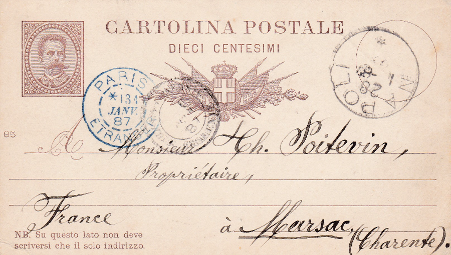
ITALY
10c Brown on White postal stationery postcard
1885
If you look closely at the centre far left side there is a small ‘85’ which denotes the year of issue of this particular postcard (these can be found with 81, 82, 83, 84, 85, 86, 87, 88 and 88). This particular copy was posted from Napoli (Naples) on 28th January 1887 to France and has a PARIS 13th January 1887 blue double ringed cancellation from where it was sent out to its final destination which I believe is Meursac which is in the Maritime Charente area of France (actually not far from where my in-laws currently live – and I have actually visited here). I assume the rather feint black double circle cancellation next to the Paris one is for the final destination, or just prior to its arrival there.
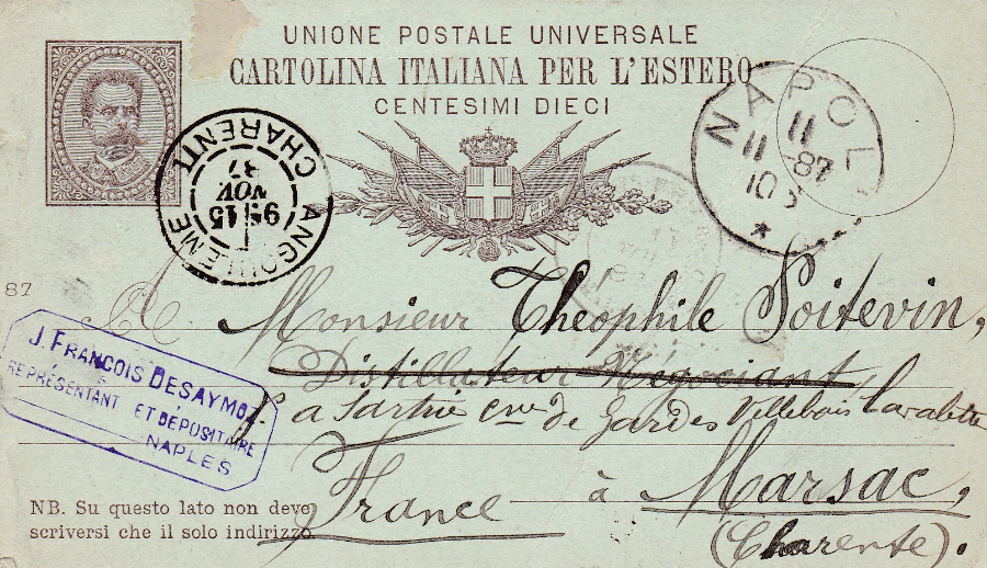
ITALY
10c Brown on Green postal stationary postcard
1887
As with the above card there is a small number against the left side in the centre which this time reads ‘87’ and this again denotes the year of issue (with this issue you can find these with 84, 86, 87 and 89). This has again been posted from Napoli (Naples) but this time on 11th November 1887. It is addressed to the same recipient in the same location of Meursac although this time the card has passed through Angouleme in the Charente area of France and has received the double ring cancellation dated 15th November 1887. The address includes the village of Villebois-lavalette (this appears above the Meursac – which looks like MARSAC which is bottom right) and there is a double ring ‘VILLEBOIS – LAVALETTE’ cancellation on the reverse side dated 16th November 1887 so the card must have gone through here before its final destination was reached.
Two very interesting early post cards which have interesting marks but which do not have much value, but non-the less I thought these were worth buying and I enjoyed looking into the marks and locations involved.
All card details were taken from the ‘Higgins & Gage world postal stationery catalog Section 9 – Iceland to Ivory Coast. Italy pages 1 and 2.
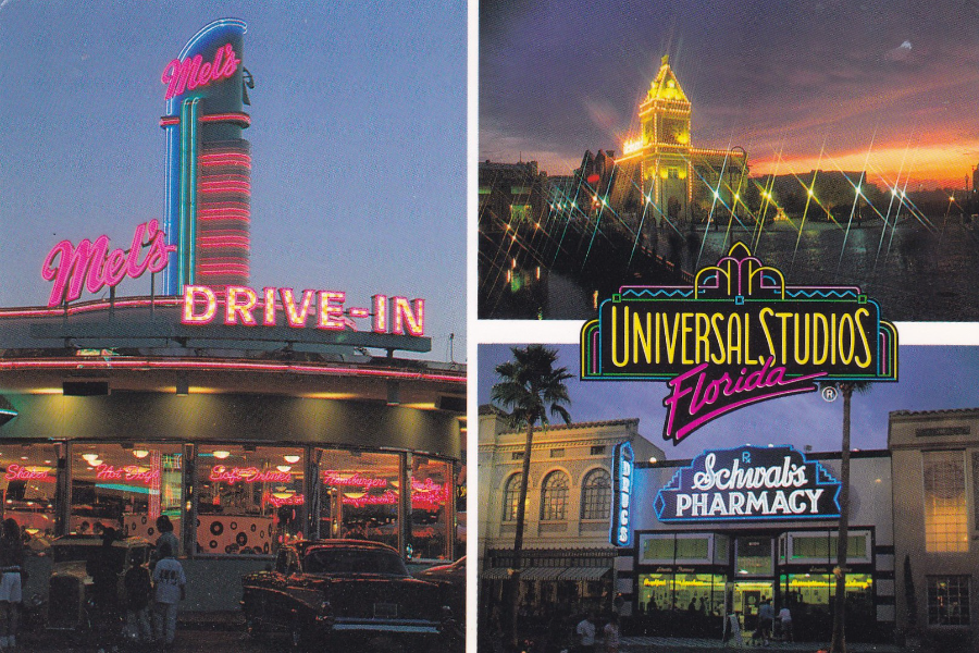
UNIVERSAL STUDIOS FLORIDA
“Step inside the real world of make believe”
Ref No 380147
Disney do not have it all their own way in Florida as Universal Studios also have two very good theme parks and since these have added the worlds of Harry Potter (Hogsmeade and Diagon Alley) they have become an essential requirement of any Florida holiday.
This particular postcard pre-dates the Harry Potter additions and is copyrighted to 1993, and was posted in February 1994.
I have eaten in Mel’s Drive-In on quite a few occasions. It is a burger establishment and their burgers are pretty good, although their onion rings are outstanding and if you pay a visit I recommend getting a side order of the onion rings to go with whatever you order as they are worth the visit alone.
Schwabs Pharmacy, bottom right, is an ice cream parlour that is also worth a look although so far I have not actually eaten in this one (maybe next year – I am only visiting Disney this year so will be giving Universal a miss, but will definitely be back next year as they have a new King Kong attraction which I really want to try out)
THE POSTAL MUSEUM
STAMPEX 2016 (Spring)
The six postcards here were a little bit of fun I had at Stampex back in February. On the first day of Stampex Royal Mail released a new set of Post & Go stamps titled ‘Royal Mail Heritage: Transport’. The six stamps depicted a Post Boy, Mail Coach, Falmouth packet ship, A Travelling Post Office (Train), Airmail plane and lastly a Royal Mail Minivan.
When I visited the stand of the newly named ‘The Postal Museum’ they had their latest set of postcards on sale and they had very cleverly, I thought, issued a set of postcards which depict images which individually relate exactly to each of the six images on the Post & Go stamps issued that day.
I immediately thought that it would be a nice idea to obtain a set of the Post & Go stamps and apply each individual stamp on the matching related postcard. I then thought I might as well obtain a set of the Machin Head Post & Go stamps overprinted with ‘500 Years of Royal Mail’ which were also released that day and exclusive to Stampex (and this was of course the reason for the release of the Heritage-Transport Post & Go issues anyway).
And Then I heard over the speakers that the designer of the said ‘Royal Mail Heritage: Transport’ Post & Go stamps was signing covers on the Royal Mail stand. I then decided that I would apply the two separate stamps to each of the postcards and then get the designer to sign each of the postcards.
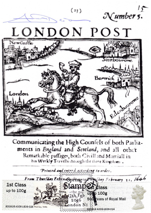
So here you have the first of the postcards in question:
London Post – The Post boy. From an original woodcut showing a boy riding on horseback with a post horn in one hand
The Royal Mail Heritage: Transport ‘Post Boy’ Post & Go stamp is bottom left whilst the Machin Head ‘500 Years of Royal Mail’ Post & Go stamp is bottom right. Both are cancelled with the first day of Spring Stampex 2016 hand stamp dated 17th February 2016 (first day of each for both of these stamps).
The designers signature is top left in blue ink.
(See below for images of the artist at Stampex)
The image on the Post & Go stamp is described as:
Post boy 1640s - Post boys could be of almost any age and carried messages between relay points some 20 miles (32km) apart, the distance a horse could travel at speed before being
replaced. Post boys
kept to time and carried a horn, blown periodically, to warn of their approach.
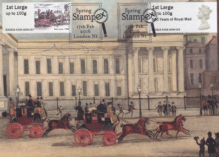
A colour print of the General Post Office (at St Martin’s-le-Grand) in London. Pollard, James (1828)
The Royal Mail Heritage: Transport ‘Mail Coach Post & 1790’ Post & Go stamp is top left whilst the Machin Head ‘500 Years of Royal Mail’ Post & Go stamp is top right. Both are cancelled with the first day of Spring Stampex 2016 hand stamp dated 17th February 2016 (first day of each for both of these stamps).
The designers signature is top left in blue ink under the Mail Coach stamp and across the top of the depicted building.
(See below for images of the artist at Stampex)
The designer was unfortunately using a blue ink pen which means that the signatures (with the exception of the postcard above) are sometimes not very clear to see (but each card is signed). This particular card was one where the hand stamps can also be clearly seen and were not obscured by being placed over a section of the postcard image which obscures the hand stamp or some section of the hand stamp (see the postcard directly below for an example of this).
The image on the Post & Go stamp is described as:
Mail coach 1790s - The first mail coach ran between Bristol and London on 2 August 1784. At the time, coaches were among the swiftest vehicles on the road. The only postal employee on board was the heavily armed mail guard. The last London-based mail coach ran in April 1846.
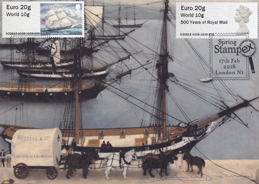
Loading the Transatlantic mail at Falmouth. Williamson, Harold Sandys (1934)
The Royal Mail Heritage: Transport ‘Falmouth Packet Ship 1820’s’ Post & Go stamp is top left whilst the Machin Head ‘500 Years of Royal Mail’ Post & Go stamp is top right. Both are cancelled with the first day of Spring Stampex 2016 hand stamp dated 17th February 2016 (first day of each for both of these stamps).
The designers signature is bottom right in blue ink, right in the corner, it starts under the two horses on the far right of the horse line up.
The hand stamp on the top left stamp is obscured quite a bit by the image of the rigging of the depicted ships but there was no other way of applying this stamp and hand stamp without spoiling the look of the postcard. At least the hand stamp on the right side stamp is nice and clear.
The image on the Post & Go stamp is described as:
Falmouth packet ship, 1820s - The earliest packet ships were designed for speed rather than security and were subject to many hazards, including poor seas and the possibility of
being attacked by pirates.
Falmouth became an important port for ships sailing to the West Indies and the Mediterranean.

Night Mail – Artwork for a poster – Keely, Pat (1936)
The Royal Mail Heritage: Transport ‘Travelling Post Office 1890’s’ Post & Go stamp is top left whilst the Machin Head ‘500 Years of Royal Mail’ Post & Go stamp is top right. Both are cancelled with the first day of Spring Stampex 2016 hand stamp dated 17th February 2016 (first day of each for both of these stamps).
The designers signature is directly underneath the stamp placed top right (although this one is not the stamp that was designed by him, it was the stamp on the opposite side of the postcard but the area underneath that stamp was much darker so less appropriate for the blue signature).
This particular postcard worried me as the poster design is quite dark and I feared that the hand stamps would not show up too well. As it happened the hand stamp on the right is quite clear and you can actually see the one on the left so it ended up alright in the end. The problem actually ended up being the designers signature which is very hard to see on the blue coloured background and although I know it is there it really is the hardest one to see. The setup of the stamps along the top and the NIGHTMAIL along the bottom does otherwise make this a nice looking postcard (even if the signature fades into the background design)
The image on the Post & Go stamp is described as:
Travelling Post Office, 1890s - The first purpose-built Travelling Post Office (TPO), in which mail was sorted en route, ran on 20 January 1838. Many of the trains exchanged mail pouches without stopping via trackside bag exchange apparatus. The last exchange took place in 1971. Today, mail still travels in sealed train carriages.

Hand-coloured photographic Lantern slide of an Imperial Airways biplane aeroplane at Croydon
The Royal Mail Heritage: Transport ‘Airmail 1930’s’ Post & Go stamp is top left whilst the Machin Head ‘500 Years of Royal Mail’ Post & Go stamp is top right. Both are cancelled with the first day of Spring Stampex 2016 hand stamp dated 17th February 2016 (first day of each for both of these stamps).
The designers signature is all but invisible here and this is the hardest by far to see as it is actually on the bottom wing to the left side of the letter G’ on the underside of the wing – it is actually easier to see here on this scanned image than it is on the actual postcard – a shame it is so hard to see but held in the right light it can at least be seen)
This is my favourite postcard in the set and the image is cracking and would be of interest to collectors of aviation as well as those into philatelic history. The hand stamps are also nicely placed. It is just the signature that is a bit disappointing.
The image on the Post & Go stamp is described as:
Airmail, 1930s. - The world’s first scheduled airmail service began on 9 September 1911. The use of airplanes for long-distance transport of mail increased significantly during the 1920s and 1930s. Originally intended for Imperial Airways’ European mail routes, HP 45 G-AAXE Hengist first flew on 8 December 1931.

A Royal Mail minivan delivering post (1974)
The Royal Mail Heritage: Transport ‘Royal Mail Minivan 1970’s’ Post & Go stamp is top left whilst the Machin Head ‘500 Years of Royal Mail’ Post & Go stamp is top right. Both are cancelled with the first day of Spring Stampex 2016 hand stamp dated 17th February 2016 (first day of each for both of these stamps).
At last another designers signature which can actually be seen – along the bottom on the left side, this is also the biggest signature so is the one that is the clearest.
Another nice design where the image very cleverly depicts the era from which the minivan was in use.
The image on the Post & Go stamp is described as:
Royal Mail Minivan, 1970s - Minivans were purchased in large numbers in the 1970s following the demise of the Morris Minor. They were ideal for smaller collection and delivery duties in towns, but low height and limited ground clearance made them less suitable for rural deliveries.
All in all I was very pleased with how most of these turned out and I did have fun putting these together and I wonder if anyone else came up with the same idea as I had here, if not these could well be unique.
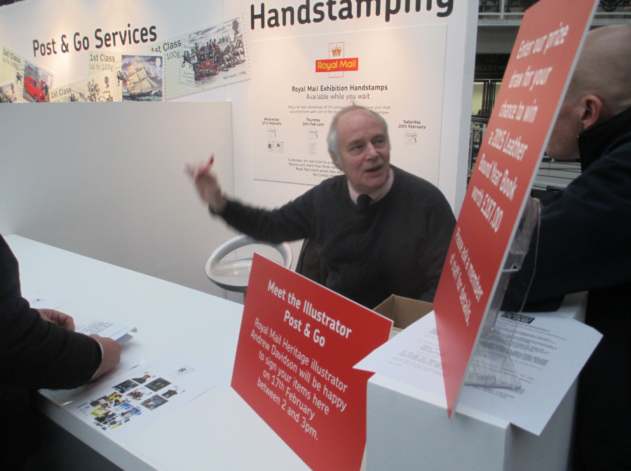
PHOTOGRAPH
(Taken by myself on 17th February 2016)
The designer and artist Andrew Davidson who designed The Royal Mails Post & Go 'Royal Mail Heritage: Transport' stamps
Here he can be seen on the Royal Mails stand at Spring Stampex 2016
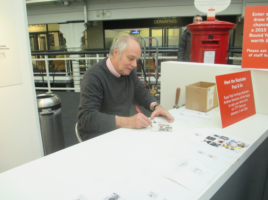
PHOTOGRAPH
(Taken by me on 17th February 2016)
Another photograph of Andrew Davidson here seen signing a first day cove
PHOTOGRAPH
(Again taken on the 17th February 2016)
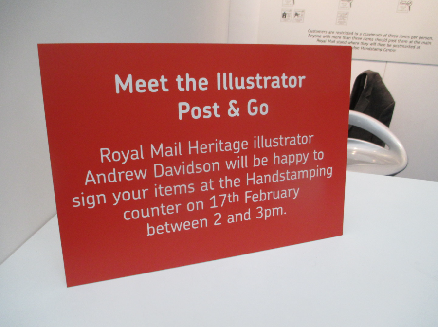
This is the sign on the stand which gave the information that Andrew Davidson was signing at this event on the 17th February 2016. As you can see he was only signing here for an hour
PHOTOGRAPH
(Taken on 17th February 2016 at Spring Stampex)
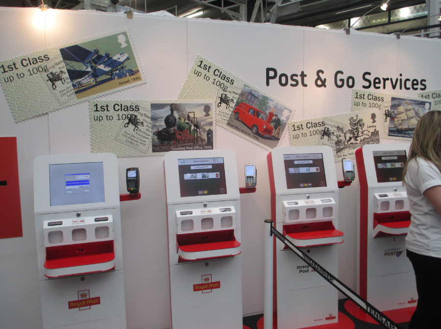
These machines here are the Post & Go machines which dispensed the strips of Post & Go stamps which I used on the six postcards posted above. These machines here can only be used by people with debit and credit cards as this is the only form of payment accepted. The most recent 'Royal Mail Heritage: Transport' Post & Go stamp images were displayed on the wall above and behind the machines. These are the same stamps as applied to the above postcards. These machines can be interesting to use for the first time and you often see new collectors struggling with the screen instructions but once you have used them they can be a bit addictive as each machine issues different strips (and many people queue at each and every machine and obtain a complete set of strips from each of them - I used to do this but have eased off over the last couple of years.)
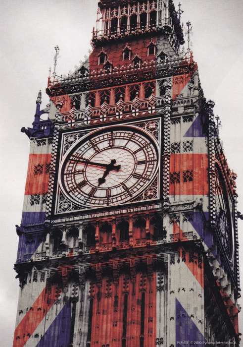
LONDON LANDMARKS
So, here is the question. Which four London structures appear on more postcards than any other? I am not sure what the definitive answer is but the top ten would definitely include:
Big Ben, St Paul’s Cathedral, Buckingham Palace and Tower Bridge. Personally I think the list would also include the Houses of Parliament, Trafalgar Square (so Nelson’s Column would be the structure) and Westminster Abbey. You may well be able to nominate others (I would have included the London Eye but despite numerous postcards depicting it, it does not have the many historic years of postcard issues behind it).
When I was in London Last week I found the four postcards depicted here and I really loved them so bought all four and was pleased to find that they were only 25p each.
London postcards being so numerous there is sometimes a slightly skewered view of them and they are considered as not collectible and most dealers will not stock London view cards because of this factor. There is some truth to all this and as most of the landmarks are regularly appearing on new postcards you can pick up these view cards really cheaply.
But these four I thought were superbly designed and attractive with the union jack colouring over the buildings.
BIG BEN (UNION JACK)
Published by
PYRAMID INTERNATIONAL
Ref PC9817
Yes I know that it’s the bell inside that’s called big ben (actually it’s called the Great Bell, but everyone knows it as Big Ben). The Clock Tower building itself is called Elizabeth Tower.
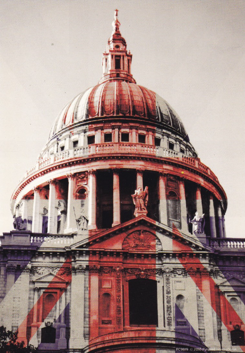
ST PAUL’S CATHEDRAL (UNION JACK)
Published by
PYRAMID INTERNATIONAL
Ref PC9819
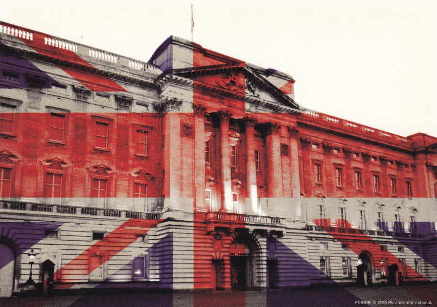
BUCKINGHAM PALACE (UNION JACK)
Published by
PYRAMID INTERNATIONAL
Ref PC9818
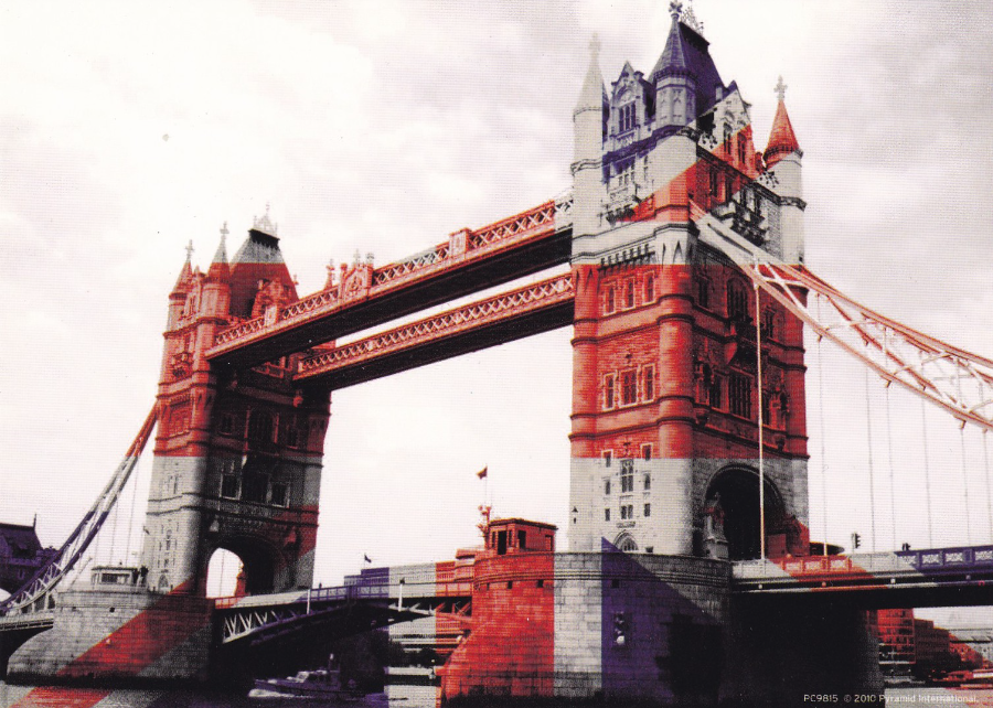
TOWER BRIDGE (UNION JACK)
Published by
PYRAMID INTERNATIONAL
Ref PC9815
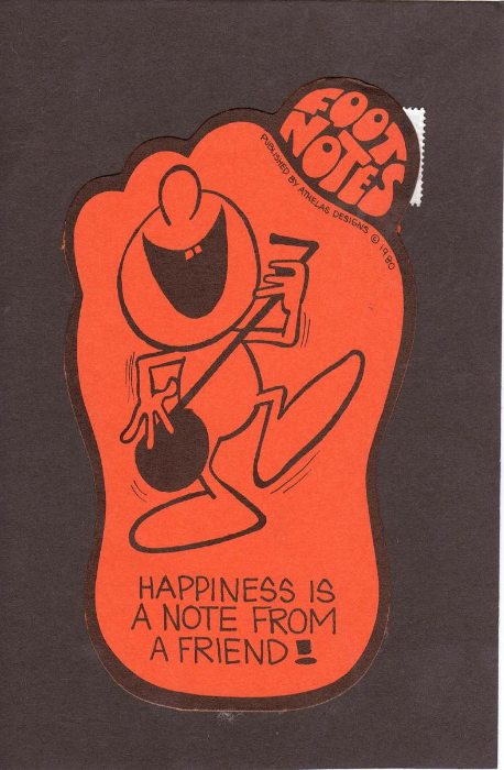
FOOT NOTES
Published by
ATHELAS DESIGNS (C) 1980
"HAPPINESS IS A NOTE FROM A FRIEND!"
A shaped card, which is now only a post card becasue this particular copy was actually posted (see below). This is an item which firmly sits in my Novelty collection. If you look at the top right corner you can see the back of part of the postage stamp that was applied to the other side to allow this item to travel in the post. The card is clearly not unique, in its design, but I do wonder how many people have a postal used copy.
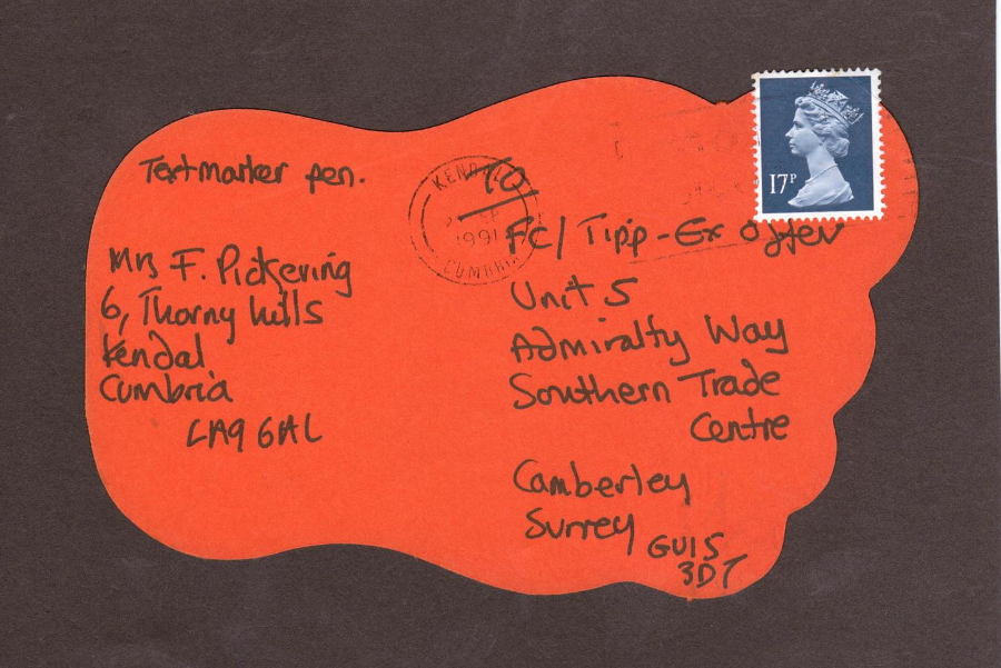
REVERSE SIDE OF THE ABOVE CARD
Posted in 1991
from 'Kendal, Cumbria' with a slogan postmark cancel
This was obviously used as an entry postcard for a competition and may have been used in hope that its unusual shape might have made it stand out and thus make it more likely to be picked out as a winning card (unfortunately I doubt that it worked because it has ended up in a dealers box and then made it's way into my collection).