
13/12/2017
JUST LIKE THE IVY
I’LL CLING TO YOU
Published by
MILLAR & LANG, ART PUBLISHERS
GLASGOW & LONDON
In their:
“NATIONAL” SERIES
I have a professional interest in police related postcards and have always liked the comedy cartoon ones. This is a smashing one which is from a style of postcard image where an image is related to a line from a song of the time. This one is an old postcard and was posted in 1903.
This is a topical postcard for me as today was my last working day as a police officer. I do not officially retire until next week (my official last day is the 20th Dec), but, with annual leave and time owing me I will not be going back into work now again. I have been doing this job for nearly thirty years now and it will be strange to no longer be in this position, but I am looking forward to more travel – and showing the postcard’s that I pick up on these trips – and spending more time on my collection (with hopefully more cards appearing here and more promotion work being done on the webpage).
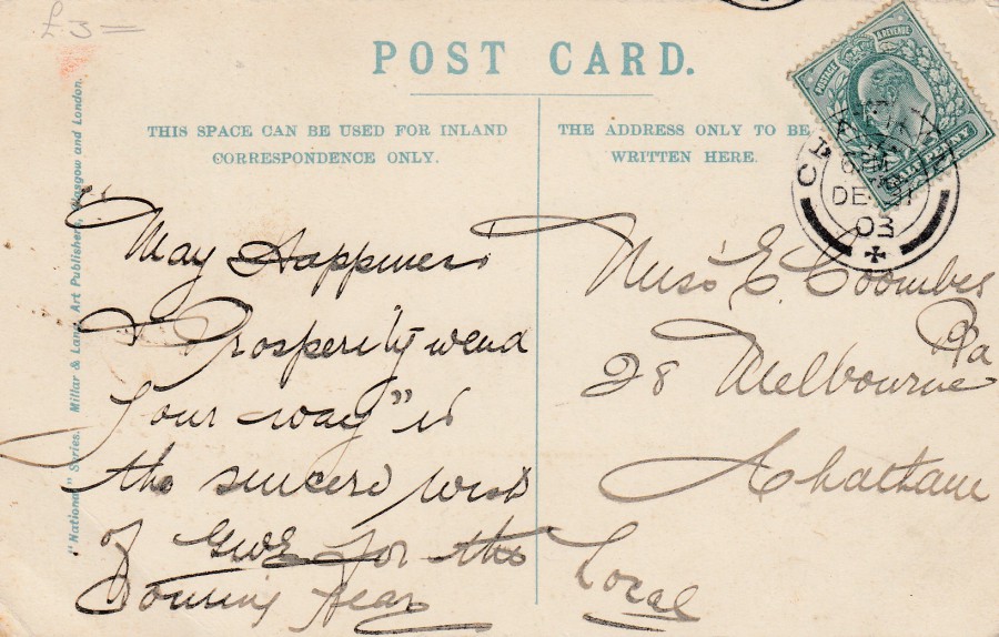
REVERSE SIDE OF ABOVE POSTCARD
Posted from Chatham – 31st December 1903
Posted locally to a Chatham address – the sender has written ‘LOCAL’ on the address side
12/12/2017
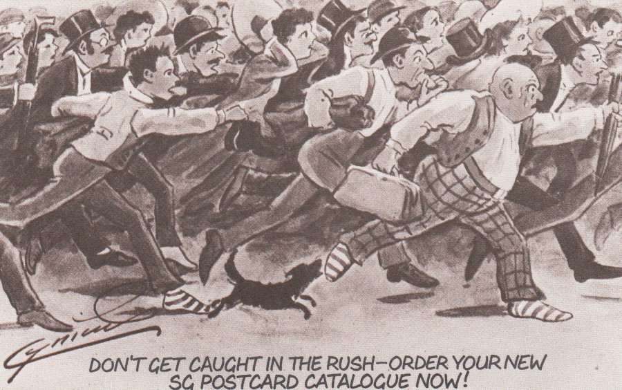
DON’T GET CAUGHT IN THE RUSH –
ORDER YOUR NEW SG POSTCARD CTALOGUE NOW!
Published on behalf of
STANLEY GIBBONS
This was an advert postcard for the 3rd Edition of the Stanley Gibbons Postcard Catalogue. This was quite a good catalogue, I think I ended up with four of the editions myself, which I think ran to only 7 or 8 anyway. This advert postcard reproduces and older ‘Cynicus’ postcard cartoon from the golden age of picture postcards (the original would have been in full colour whilst this is a sepia toned brown print of the cartoon).
REVERSE SIDE OF ABOVE POSTCARD
With full advert details
12/12/2017
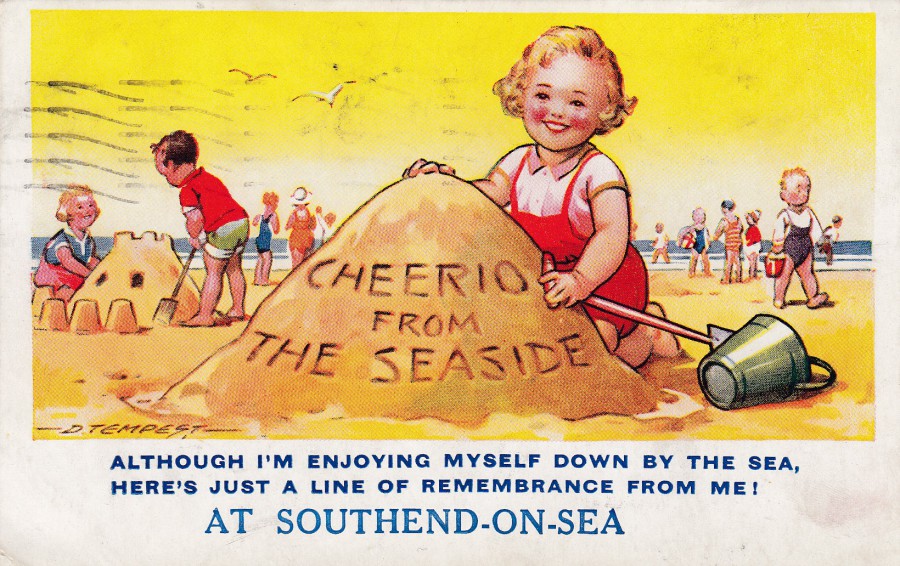
CHEERIO FROM THE SEASIDE
ALTHOUGH I’M ENJOYING MYSELF DOWN BY THE SEA,
HERE’S JUST A LINE OF REMEMBRANCE FROM ME!
AT SOUTHEND -ON- SEA
Design by D. Tempest
Published by
BAMFORTH & CO., LTD., PUBLISHERS (HOLMFIRTH)
Ref: “SEASIDE COMIC” SERIES
No. 4213
This is another of those designs which was styled so that it could be used at any seaside location. You can clearly see that the ‘SOUTHEND-ON-SEA’ is printed in a different sized font and with a lighter shade of blue to the other printed text. If you look around you will be able to find this same card with different locations printed at the bottom. I clearly wanted this one because Southend is my home town.
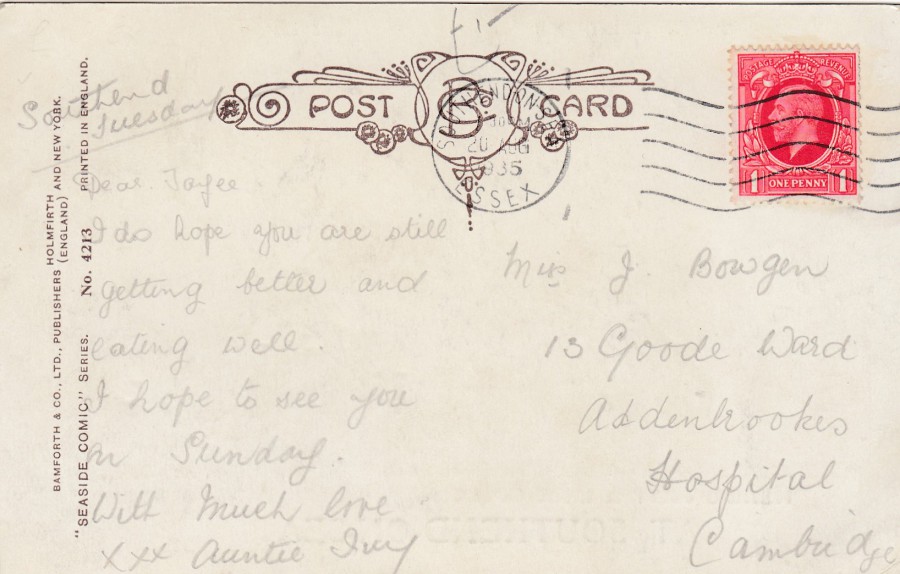
REVERSE SIDE OF ABOVE POSTCARD
The red coloured George V one penny stamp has been cancelled with a Southend-on-Sea wavy line machine cancellation dated 20th August 1935. The card is addressed to Addenbrookes Hospital in Cambridge. If I was in hospital recovering I am not sure how I would feel receiving a postcard from someone on holiday at the seaside!!
12/12/2017
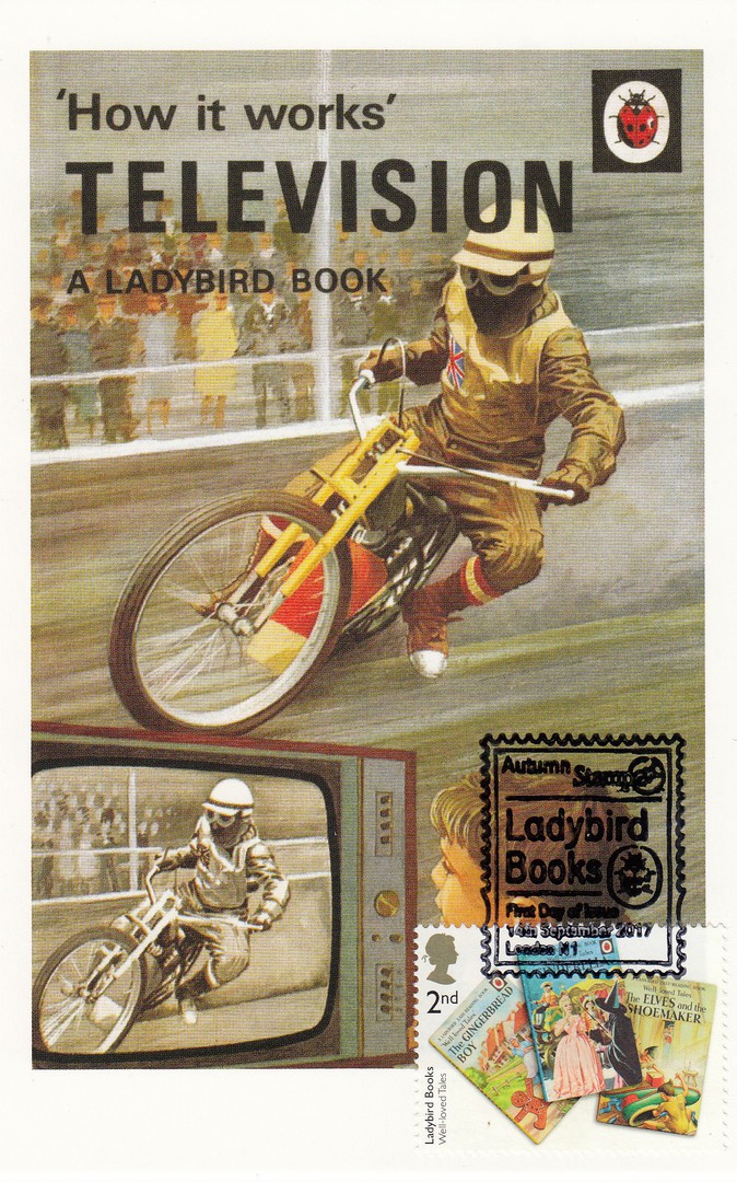
LADYBIRD BOOK COVER POSTCARDS
From the boxed set of 100 Ladybird Book Covers
Used on the front with a Royal Mail ‘Ladybird Books’ Stamp 2017
Cancelled with a special AUTUMN STAMPEX 2017 special hand stamp.
‘HOW IT WORKS’
TELEVISION
This is another of the postcards which I had a ladybird stamp applied to and cancelled first day of issue at the last STAMPEX show. I had a number of these done and I think these are quite attractive and made for some great souvenirs. Because of my interest in television postcards I knew in advance that I would have to use this postcard. This one is for my television album and is one of my favourite’s as a result.
12/12/2017
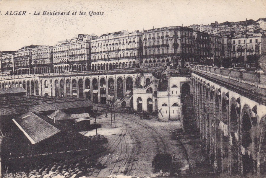
ALGER
Le Boulevard et les Quais
ALGIERS
(North Africa)
The Boulevard and the Quays
A postcard from the period of World War I, which could have been guessed from the quality of the card itself if it was not obvious from the date and usage (see below). The sender, a soldier, has marked the front with a small pencil ‘X’, which I assume is where he has been staying (the ‘X’ is centre right).
There was a major campaign in what is now the Arab world during WWI and many of those soldiers used here, and in the attack against the Turkish Coast in Gallipoli, started out from North Africa or rested in this region. This postcard was almost certainly sent by someone at rest or who had just arrived and was awaiting placement towards the front.

REVERSE SIDE OF ABOVE POSTCARD
Posted “ON ACTIVE SERVICE”
7TH February 1917
FIELD POST OFFICE Cancel dated 8th February 1917
Purple Triangular ‘PASSED BY CENSOR’ Cachet – No 4261
Addressed to Grays, Essex
A postcard from WWI but from an area far less known about than that of the Western Front in France. I do like to find cards posted from North Africa during WWI, although I find them much harder to find than those from France during the same period. This was another postcard which cost me just 60p some years ago, but this card has not raised that much in value as it is a very basic card. But, with the growing interest in WWI postcards like this are starting to become attractive to collectors.
12/12/2017
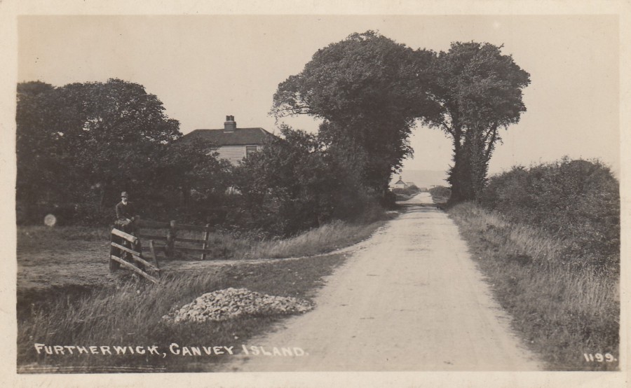
FURTHERWICK
(FURTHERWICK ROAD)
CANVEY ISLAND
Anonymous Publisher
Ref: 1199
Furtherwick Road is now one of the major roads on Canvey Island (located in Essex). It leads to their beach area (and the Labworth Café – which has previously appeared on this webpage) and the main shopping High Street and shopping centre. On this postcard it looks more like a country lane! This is one of those postcards where the image you are looking at has absolutely no similarities with how the area looks today.
PHOTOGRAPH
Taken 07/12/2017
As you can see here, this is now a very different road indeed
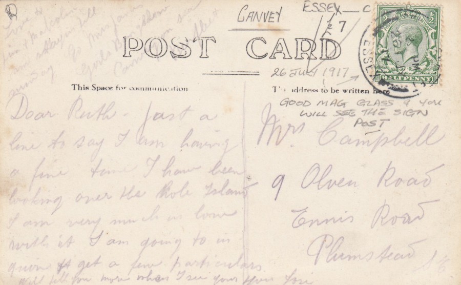
REVERSE SIDE OF ABOVE POSTCARD
Stamp cancelled 26th July 1917
12/12/2017
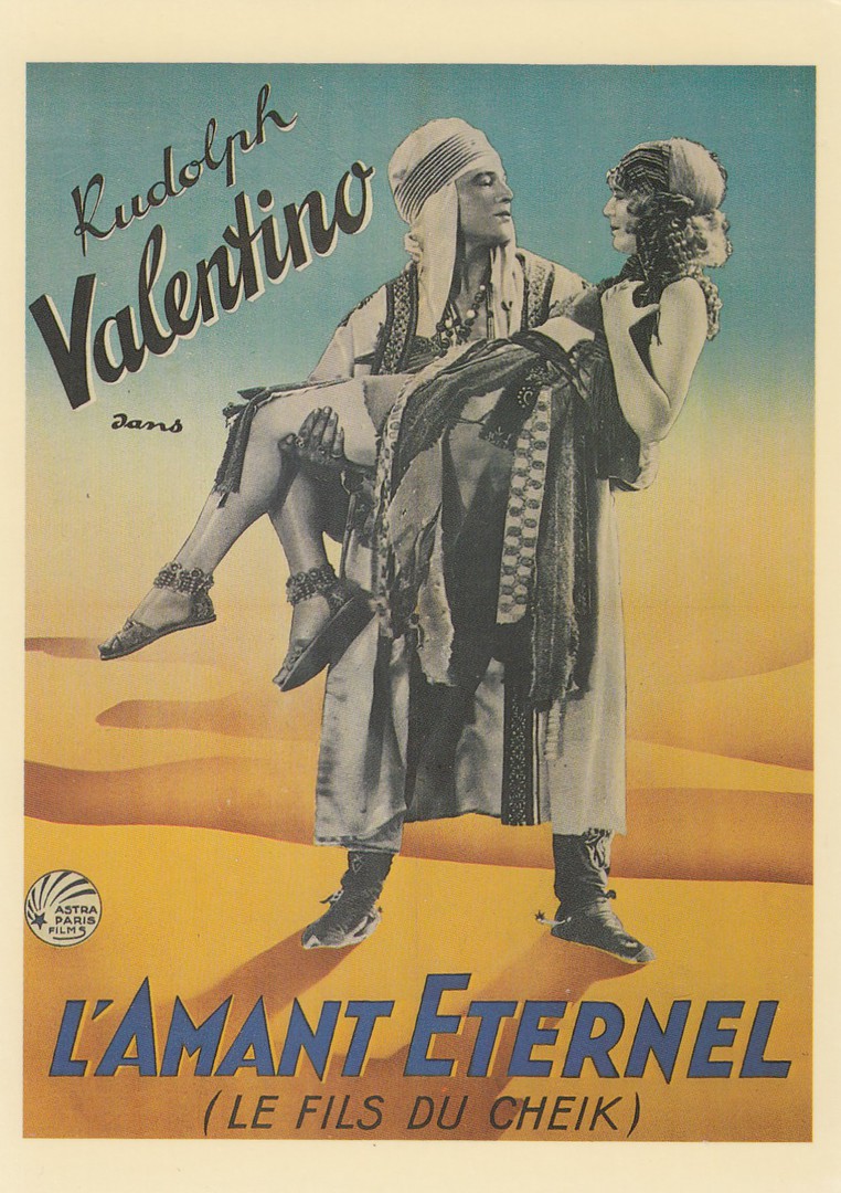
L’AMANT ETERNEL
(The Eternal Lover)
LE FILS DU CHEIK
(The Son of the Sheik)
Published by
CAMDEN GRAPHICS
Ref: PC 190
Camden Graphics were one of the great postcard publishers of the 1980’s and 1990’s. Many people collect their postcards because they were individually numbered and as such check lists could be made (and appear in the great little book titled ‘Collect Modern Postcards’, a catalogue of modern postcards by Pete Davies). Many of their earlier postcards are several pounds each. Issue No 1 is catalogued at £8 (and can be sold for this as well).
The film poster postcards are very collectible because of the theme. This one is very unusual, and it may well be that this is the only time this poster has appeared on a postcard, which adds to its collectability (it’s probably a £2 - £4 card).
The film poster depicted is for the feature film’ The Son of the Sheik’ starring, as mentioned, the great silent era actor ‘Rudolph Valentino’. In this film he plays both the father and the son. The film was released in 1926 and was a sequel to the 1921 hit film ‘The Sheik’, which also starred Rudolf Valentino. The Son of the Sheik was to be Valentino’s last film and was released two weeks after his death from peritonitis at the young age of just 31. The female depicted on the poster is the actress Vilma Banky, a Hungarian born American silent film actress. Banky was born in 1901 and lived through to 1991. She starred in 24 films but only eight of these still exist in their entirety, but this does include The Son of the Sheik.

11/12/2017
PANDA POSTCARDS
CHINA
Published by
XLCY
I bought these two postcards in 2016 at the shop located in the China area of the World Showcase in the Epcot theme park in Walt Disney World, Florida. These are not the first panda postcards obtained from here which I have placed on the webpage. I believe the company XLCY were also responsible for the publishing of the previous cards as well.
These two are vertical in format but different in content. The far left one is a realistic interpretation of a group of young pandas with an adult whilst the near left image is more cartoon like in its style. The reverse side of the two postcards are also very attractive (see below)
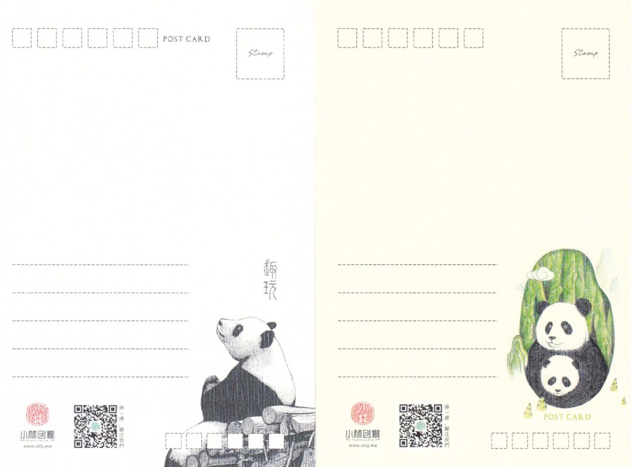
REVERSE SIDES OF ABOVE POSTCARDS
11/12/2017
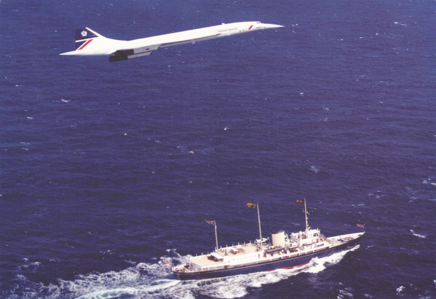
AN HISTORIC OCCASION
THE ROYAL YACHT BRITANNIA & CONCORDE
Published on behalf of
THE ROYAL YACHT BRITANNIA
Two iconic forms of craft on the one postcard. For me the interest here is the inclusion of the Concorde, which you will have realised by now is a fascination of mine (I suspect more postcards of this craft have appeared on the webpage than any other means of transport, and of any other theme except perhaps for ‘Disney’ related cards). With this image you also have the added-bonus of a royalty connection as the Royal Yacht Britannia was a favourite vessel of the Queen. The yacht has since been decommissioned as the royal yacht and is now a tourist attraction (I believe). This postcard I suspect is now available to those visiting it (can anyone confirm this?).
11/12/2017
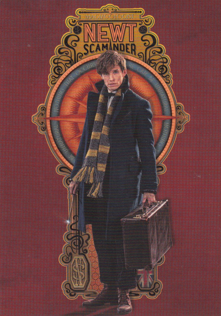
FANTASTIC BEASTS AND WHERE TO FIND THEM
WARNER BROTHERS STUDIO TOURS
‘J. K. ROWLING’S WIZARDING WORLD’
Exclusive postcard series
This is a set of postcards which I believe are exclusive to the Harry Potter Studio Tour just outside London. My daughter picked these up for me on her last visit. All, of these postcards relate to the new connected film ‘Fantastic Beasts and Where to Find Them’. The postcards in the set are very attractive but are not titled (on the reverse side) or numbered – so the descriptions below are my own. Some of these designs are very clever and because of the continuing popularity of the Harry Potter world these postcards are very collectible.
NEWT SCAMANDER
Poster styled design
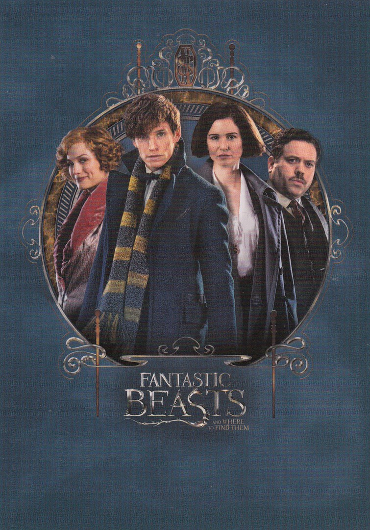
MAIN CAST
Poster styled design
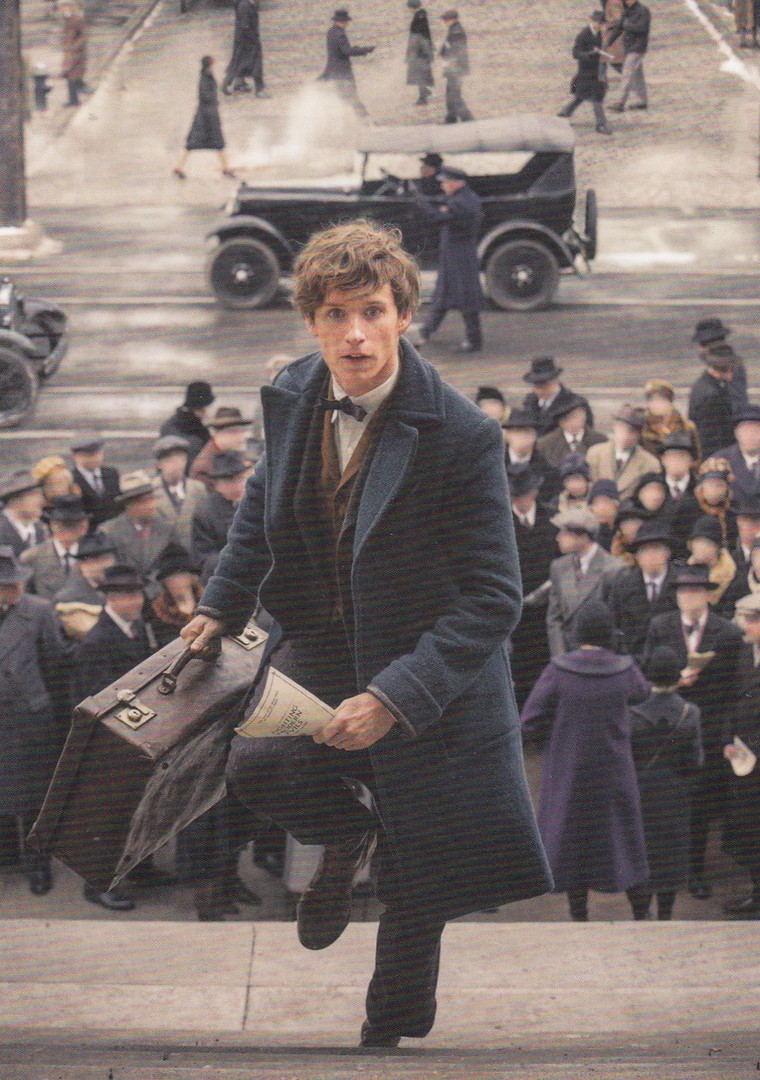
NEWT SCAMANDER
Scene from film – on the main steps

PUBLICITY STILL
MAIN FOUR CAST MEMBERS
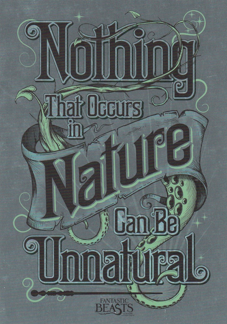
NOTHING THAT OCCURS IN NATURE
CAN BE UNNATURAL
Word poster design
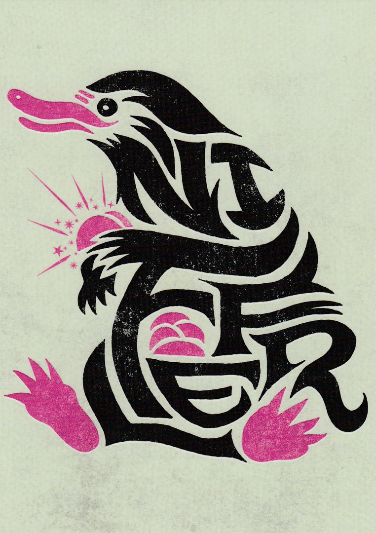
NIFFLER
Poster design
The Niffler is one of the creatures that escapes from Newt Scamander’s collection which is kept in his suitcase. Although the creature is cute looking it is a little thief and steals anything valuable and shiny.

YOU’RE ONE OF US NOW
Word Poster design
This is what the magical character Queenie Goldstein says to the non-magic (No-Maj) character Jacob Kowalski

MUGGLE = NO-MAJ
Word poster design
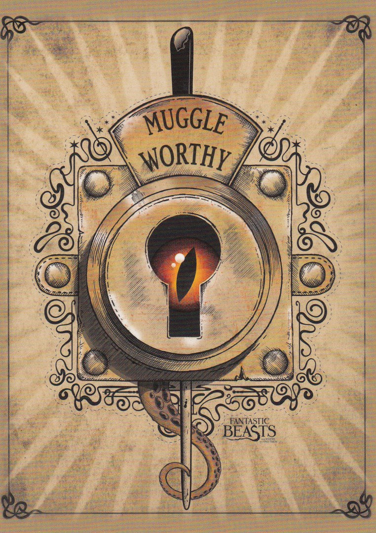
MUGGLE WORTHY
Poster design
This is designed to look like a creature looking out through the keylock mechanism on Newt Scamander suitcase. The words are part of the locking mechanism which allows the contents to look like that of a simple suitcase if opened by a muggle (No-Maj)

REVERSE SIDE OF POSTCARD DESIGNS
These all have the same layout with the only difference being the number under the barcodes
10/12/2017
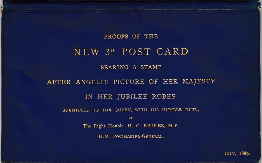
BLUE DYED ANIMAL SKIN ENVELOPE/WALLET
Overprinted on the front in Gold with:
“PROOF OF THE
NEW 3D POST CARD
BEARING A STAMP
AFTER ANGELI’S PICTURE OF HER MAJESTY
IN HER JUBILEE ROBES.
SUBMITTED TO THE QUEEN, WITH HIS HUMBLE DUTY,
BY
The Right Honble. H. C. RAIKES, M.P.
H.M. POSTMASTER – GENERAL
JULY, 1889”
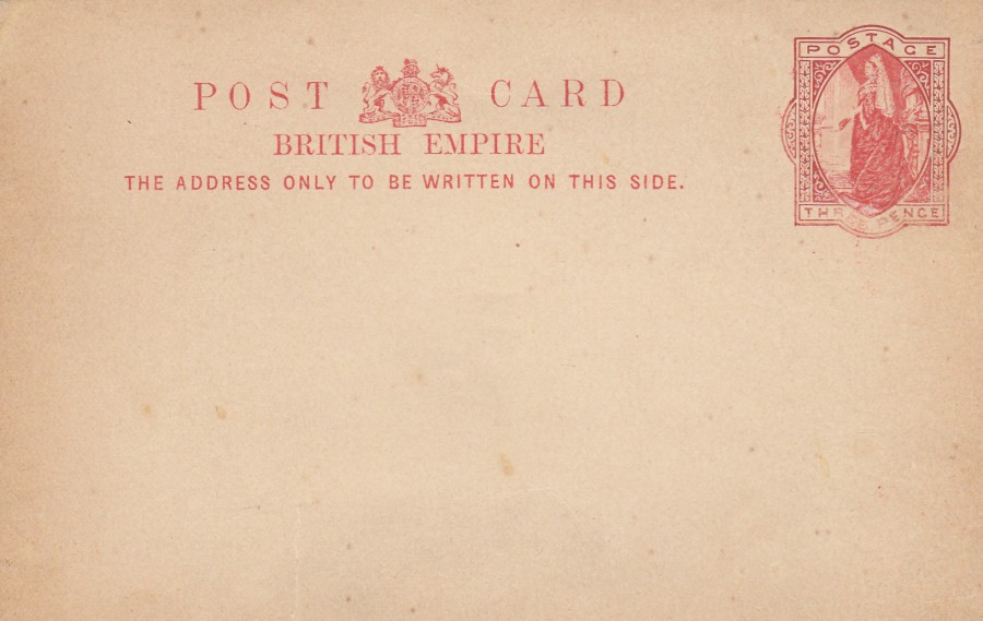
Every collector wants to have something in their collection which is, in some ways, special, or unique, or preferably both. This item could be described as both. It is the original animal skin envelope, with a lovely gold coloured metal clasp on the rear, within which was placed some proof copies of the 3d postal stationery post card before being sent to Her Majesty Queen Victoria. I am assuming the Postmaster-General was sending the proofs to her majesty so that she could agree to the design so that the cards could be issued. One can surmise that Queen Victoria herself may have handled this very envelope, and its contents, before later giving it as a gift to one of her people. It has probably been passed down through a range of owners before being bought in auction this year by me. This item fits in so well with my Postal History Postal stationery post card collection. I adore this item.

REVERSE SIDE OF THE BLUE DYED
ANIMAL SKIN
ENVELOPE
With the gold coloured metal clasp
PROOF COPY
QUEEN VICTORIA
THREE-PENCE
BRITISH EMPIRE
POSTAL STATIONERY POST CARD
This is the single remaining ‘Proof’ copy of the 3d British Empire postal stationery post card that still - remains with the above blue animal skin envelope. This proof copy does have some differences to the issued version, but these are minor and easier to show with a pictorial comparison to an issued card – see below
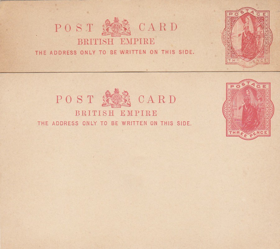
ISSUED QUEEN VICTORIA 3D POSTAL STATIONERY POST CARD
Overlaid over the above Proof Copy
The proof copy printing is across the top with the issued version underneath (with the card shown in full). If you look at the top ‘Proof’ version, you will see that the words’ BRITISH EMPIRE’, within the main central top text area, are taller than the same words on the issued design beneath it. The Proof copies pre-printed stamp mark also has some differences. The Queens face is far less defined than on the issued stamp, as is the detail of the veil down her back. There is also less definition in the background details behind the Queen on the left side, on the issued version the scenery is much more defined. The same can also be said for the pre-paid stamp marks boarder area which has slightly different shaped and more uniformed shapes making up the interior boarder pattern. Also, the corner area markings are less defined and shaped than those on the issued cards And, lastly, the words:
POSTAGE
THREE PENCE
along the top and bottom of the pre-paid stamp mark are much thicker printed on the released version.
In a strange quirk of value this ‘Proof’ copy of the postal stationery post card may have more real postal history value than the blue dyed envelope it came in. But, it was the envelope that caught my eye in the auction catalogue.
So, there you have it. One of the unique and valuable items from my collection, and, I think something very different and interesting.
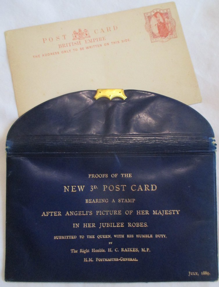
PHOTOGRAPH
Wallet and Proof Postal Stationery Post Card
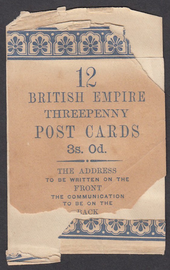
SALES WRAPPER
For
3d BRITISH EMPIRE
POSTAL STATIONERY POST CARDS
x 12
This rather ‘distressed’ wrapper was also included in the auction lot with the above items. It has suffered down through the years but still has some interest as I collect these items. I suspect it was originally around the bundle of postcards from the which the issued 3d Post Card illustrated above was removed and placed with its ‘Proof’ copy. Possibly bought for a card comparison and then kept, to go with this selection of material.

10/12/2017
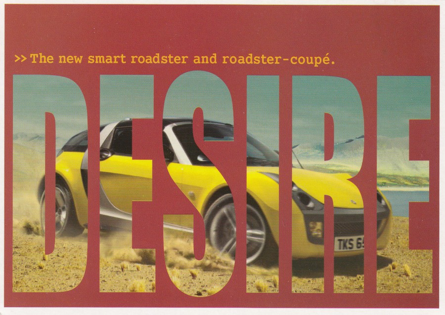
LUST
THE NEW SMART ROADSTER AND ROADSTER – COUPE
C SMART
OPEN YOUR MIND
Published by
BOOMERANG (MEDIA)
Smashing free car advert postcard distributed in the Boomerang free racks – this was one of at least two
DESIRE
THE NEW SMART ROADSTER AND ROADSTER – COUPE
C SMART
OPEN YOUR MIND
Published by
BOOMERANG (MEDIA)
This postcard goes with the one above and they appeared in the free Boomerang postcard racks at the same time. It is nice to have both copies in my collection. It is possible that there are more in the series, but these are the only two that I am aware of.
10/12/2017
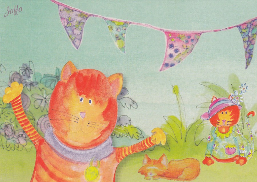
JAFFA’S
HEALTH CENTRE FOR CATS
(52 ST FRANCIS ROAD, SALISBURY)
Privately Produced Advert Postcard
Who would have thought it? A health Centre for cats? Still, at least they had the good sense to use postcards as a form of advertising. Also, they seem to have produced a very attractive design as well. They also went to the trouble of making the reverse side interesting in its layout as well, which, as I have previously stated, makes a postcard more interesting.
I know I have posted a few cat related cards on here recently, but they do seem to be making a ‘postcard come-back’. I don’t know how old this one is as I got it from a dealer this year, but I don’t think it is too old. I liked this one and don’t mind admitting that the thought of a Health Centre for cats brought out some unusual visuals in my head!
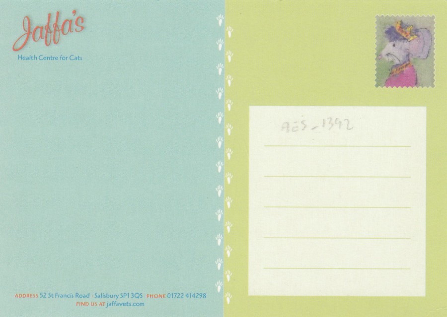
REVERSE SIDE OF ABOVE POSTCARD
10/12/2017
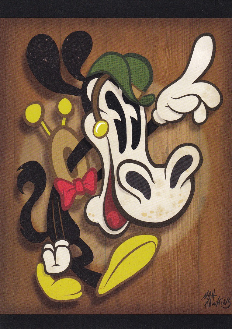
WONDERGROUND GALLERY
WALT DISNEY WORLD
FLORIDA
Original Artwork of
“HORSECOLLAR”
By Artist
Matt Hawkins
There can-not be too many postcards which depict the Disney cartoon character ‘Horace Horsecollar’. The character was created in 1929 by the famous Disney artist Ub Iwerks and Walt Disney himself. The character is a black horse who is friends with Mickey Mouse.
10/12/2017
BARBABELLA
Copyright 1974 Annette Tison and Talus Taylor.
A license of Frank Fehmers Productions,
Amsterdam
Barbabella was the wife of Barbapapa, the main character in a 1970’s children’s picture book by the French-American couple Annette Tison and Talus Taylor. The characters became popular and the original book, and many subsequent ones, have been translated into many languages (over 30 according to the internet). My interest in the characters from this book is that they have also appeared in a television animated cartoon series of the same name. But, despite the popularity of the characters I have seen very few postcards depicting them. The fact that Barbabella appears on this Dutch issued postcard must mean that here are others in the series depicting the other characters, especially Barbapapa himself (a big pink blob of a character). In all my years of searching this is only one of three related postcards I have found, and the most-scarce of those three (the other two depict the same group picture but with different background colours – I found these on sale in a shop in France about five years ago and they were new issues). I will continue to seek out more related card’s, but I do wonder if I will find many.

REVERSE SIDE OF ABOVE POSTCARD
10/12/2017
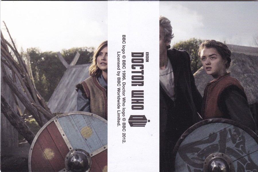
DOCTOR WHO
SERIES 9: PART 1
POSTCARD SET
BLUERAY EXCLUSIVE SET
There was a set of four exclusive postcards given away with the Blue-ray release of the first part of series 9 of Doctor Who. The four cards came with a wrap- around band, that can be seen in this image.
This series starred Peter Capaldi as the 12th Doctor. The postcards are not titled or described through any individual text and are not individually numbered. They appear to mostly depict publicity shots, well, at least two of them do, maybe three.
ORIGINAL WRAP AROUND BAND AROUND POSTCARD SET
My advice is to keep the wrapper band with the postcards as this type of thing is often thrown away or lost. In the future collectors will want the complete package as we can be sad like that.
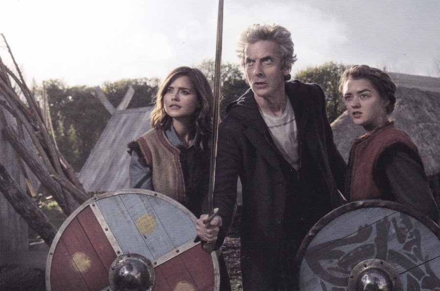
THE GIRL WHO DIED
This is a scene, or publicity shot from this episode (Episode 5) from the 9th series. This introduces a recurring character for this series called Ashildr, depicted far right in this image
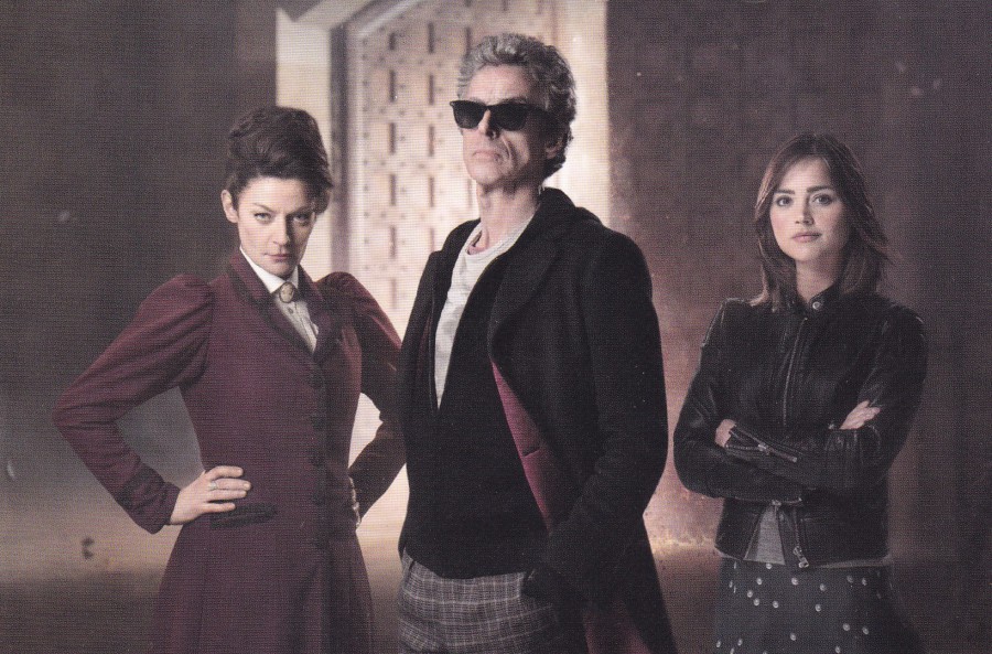
MISSY, THE 12TH DOCTOR and CLARA
This could possibly be a publicity shot relating to the 2nd episode titled ‘The Witch’s Familiar in which the character Missy appears.
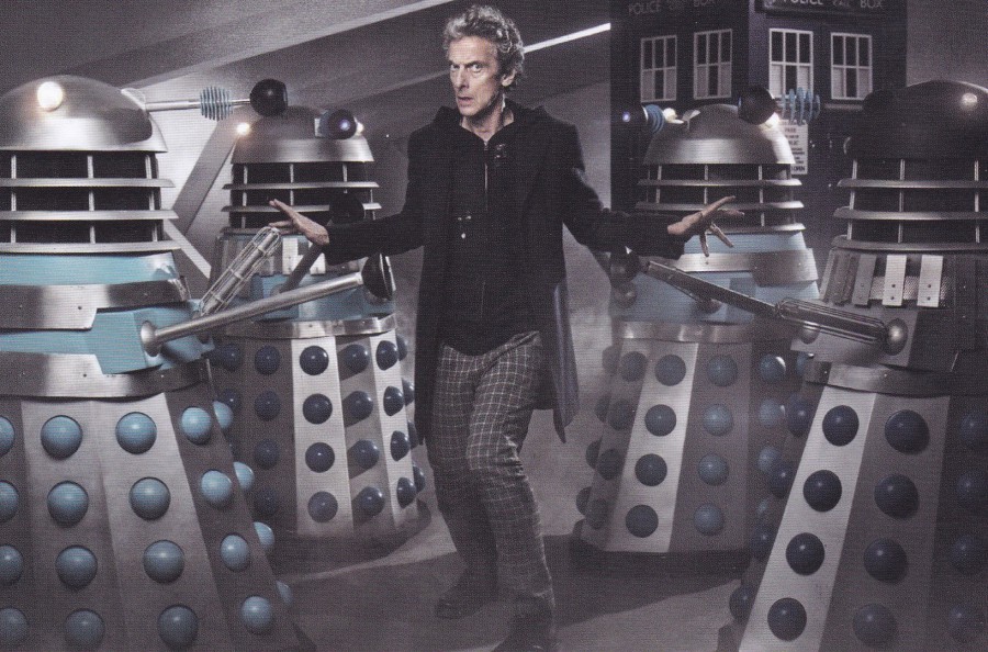
DOCTOR WHO
with DALEKS
Publicity photograph
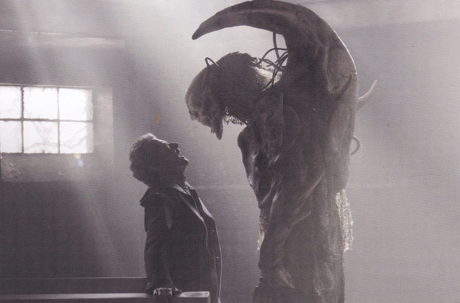
BEFORE THE FLOOD
Episode 4 from Series 9
I think this is a creature that was called the Fisher King
Obviously originally you needed to buy the Blue-ray release to get these postcards, but, sets have been appearing on eBay recently (although I would not pay the £9+ they seem to want for them). There is also another set of four postcards which came with the Blue-ray release SERIES 9: Part 2.
09/12/2017
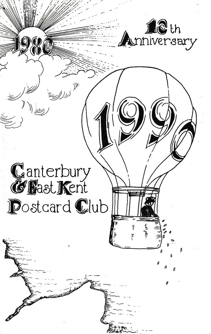
CANTERBURY & EAST KENT
POSTCARD CLUB
10TH Anniversary
1980 – 1990
This hot air balloon design was issued by the Canterbury & East Kent postcard club for their tenth anniversary in 1990, twenty-seven years ago now, which makes me feel old as I remember when this was first released. It is a simple design, but these club cards often are as they quite often depicted artwork drawn by one of the club members. These do not often have a great deal of value but contain local postcard club history.
09/12/2017
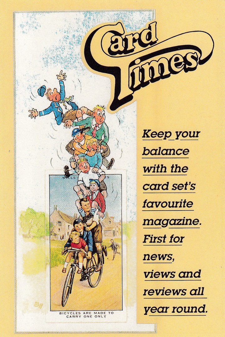
CARD TIMES
CALENDAR CARD 1997
Calendar issued with CARD TIMES, January 1997
Illustration based on Wills Safety First 1934 cigarette card.
‘Card Times’ was/is a magazine especially for cigarette card collectors. For many years they gave away a postcard sized free calendar card in their January issue. This is one of those cards. Obviously not a true postcard, but still an interesting item and if the image related to anyone’s collecting theme then these made an unusual addition to their collection. I have a handful of these and quite like them.
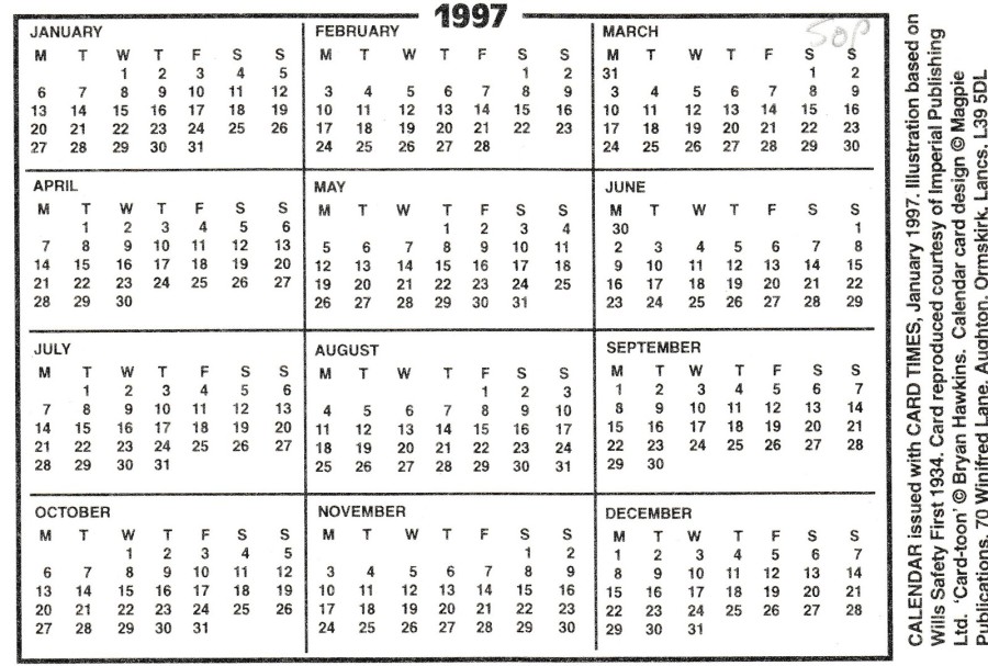
REVERSE SIDE OF ABOVE CALENDAR CARD
Despite the reverse print layout these are still very collectible and can be found in postcard dealers stocks
09/12/2017
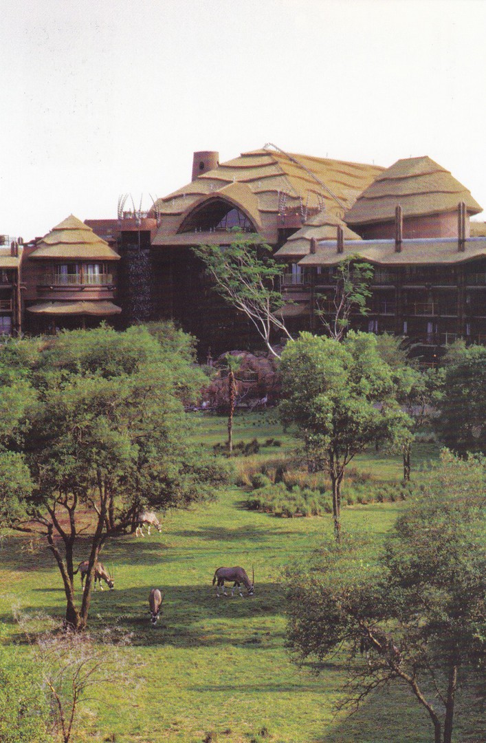
ANIMAL KINGDOM LODGE
WALT DISNEY WORLD
FLORIDA
Official Resort Postcard
Pretty much each of the many different Walt Disney World resorts have their own exclusive postcard sold only at the hotel or resort itself. To get these you either have had to stay at the resort or visit it to obtain the card (sometime cards – but rarely more than two different). I have had the pleasure of staying at the Animal Kingdom Lodge, and have visited it a further two times to eat in one of their restaurants. The view on this postcard is of the savannah area which the hotel circles and in which live wild African animals, on the card you can see some Oryx antelopes. When I stayed here I had a balcony room which overlooked this area and there is nothing stranger than having breakfast in your room whilst watching a giraffe walk past your window. It is expansive to stay here, but well worth the extra cost for the experience.
09/12/2017
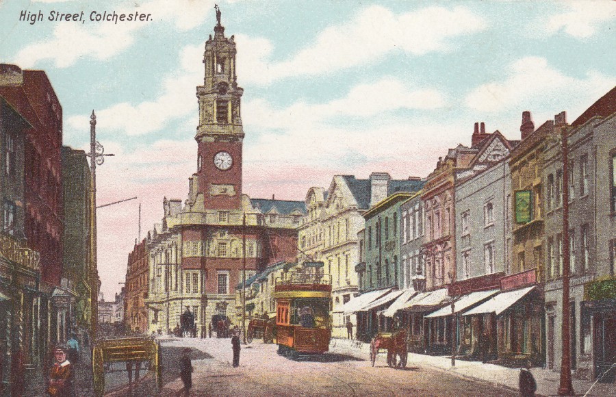
HIGH STREET
COLCHESTER
Published by
H. G. R., C.
From Photo by ‘Gill’
This is an example of a colourised print from a black and white photograph. I liked this one because it depicts a street tram and a horse and carriage together in the street, in fact there are a couple more horse carriages behind the tram as well. Colchester is in my home county of Essex and is a place I have visited often. Colchester is also considered by many to be the oldest town in Britain, and was the capital of Roman Britain, for a while at least. The main clock tower building in the background is the Colchester Town Hall.

REVERSE SIDE OF ABOVE POSTCARD
08/12/2017
MR BRAINWASH
Mr. Brainwash is the name used by a Los Angeles based street artist whose real name is Thierry Guetta who was born in France in 1966. His work has been described as being a ‘Pop – Graffiti’ street style of art. His work has now appeared at a number of exhibitions, held up and down America (and in London in 2012). Postcards have been used to promote these exhibits and I assume postcards are also sold at these exhibitions (but this is by no means confirmed as all the cards may be advert cards only).
I first came across his work via eBay where a range of postcards depicting his work have appeared for sale. Unfortunately, they are rarely cheap, and they seem to be very collectible, if, in my opinion, often over-priced. My interest was in the fact that Mr. Brainwash often uses television based themes, or at least Superhero ones, which is a subject I do collect. The prices initially scared me off, but slowly over time a few better priced ones started to appear. I doubt anyone will get any of these cards for less than £6 each, but expect to pay between £6 and £10 to get a reasonable price (more if you really, really want them). I have so far managed to obtain four different pieces on postcard. Unfortunately, the titles of these pieces are not recorded on the postcards, or maybe they do not have titles (some artists can be a bit weird like that – having checked over the internet these really may not have titles).
So, here are the four cards from my collection:
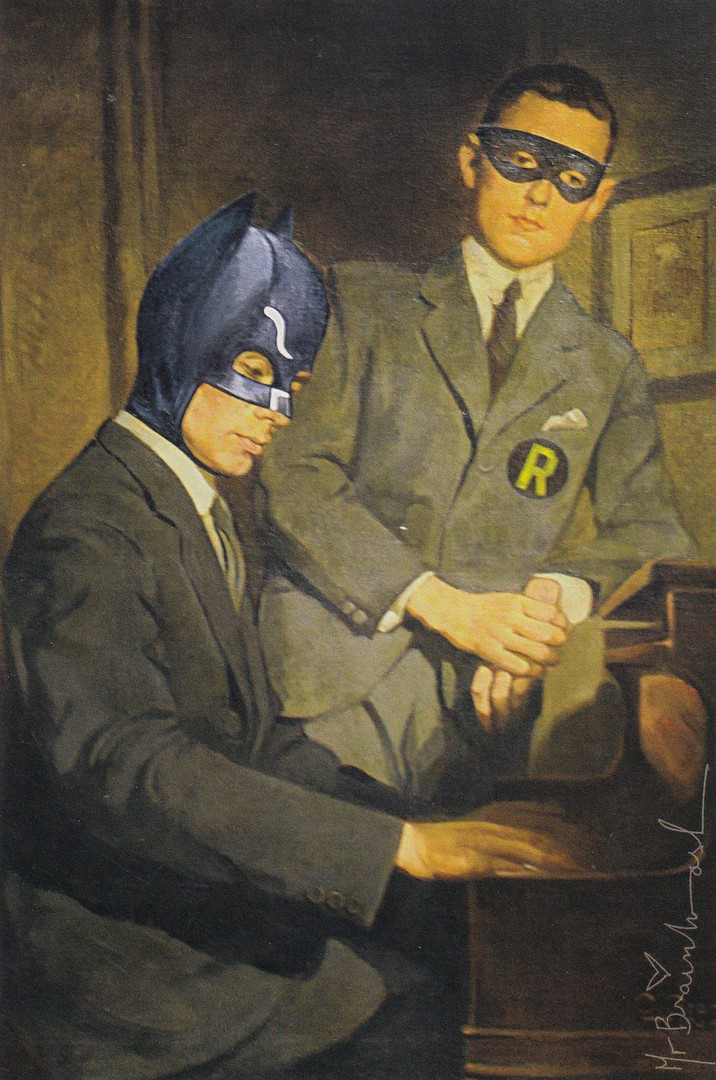
BATMAN & ROBIN
Official Postcard Release
MR BRAINWASH
“Mr Brainwash solo show “Under Construction” 25,000 sq. ft. of art installations, 2000 Collins Ave between 20th and 21st Street, Miami Beach, Florida 33139. Open December 2nd 2010 until…”
(Text from reverse side of postcard)
The Miami exhibition was held at ‘Art Basel’ and was titled “Life is Beautiful: Under Construction”. As you can probably guess my interest in this postcard is the Batman connection. This is ‘actually’ one of his cards which I have only seen once, and only once on eBay (which was this one here that I bought – I think it cost me around £6.75). I like this one. I think it is very unusual.
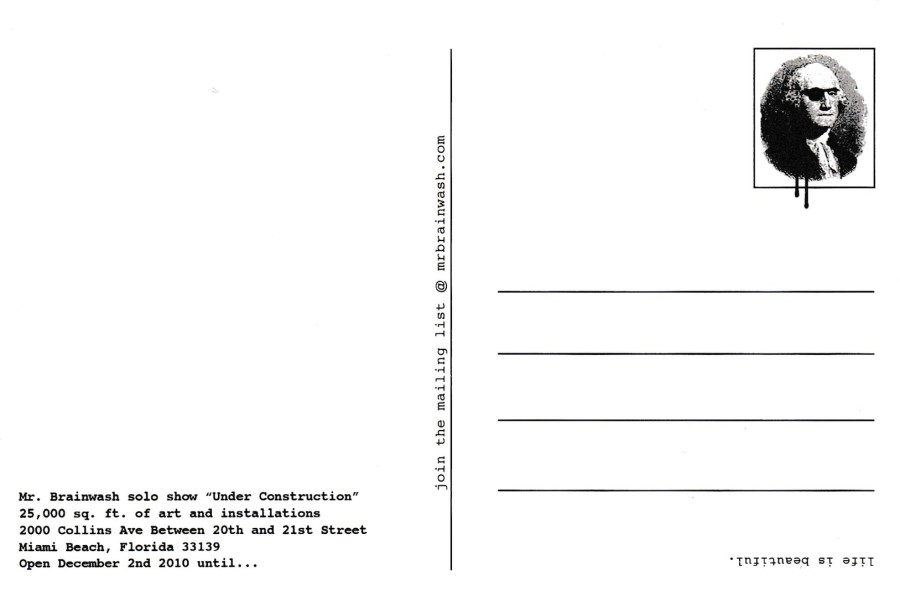
REVERSE SIDE OF ABOVE POSTCARD
This has the artists trademark ‘Washington with eyepatch’ picture in the stamp box area

OBAMA AS SUPERMAN
Official Postcard Release
MR BRAINWASH
(Text from reverse side of postcard)
The ‘Icons’ exhibition commenced on 14th February 2010 and was the artists second show, and was held in New York. The full title of the show was “Life is Beautiful: Icons”.
This is one of those cards from this artist which comes in a range of prices on eBay. I was lucky, and this was another I picked up quite cheaply at £7 (if you consider £7 to be cheap for a very modern postcard!). I have seen this one sell at $19.99 so I believe that if I had wanted it this was possibly what I was going to have to pay for it! But, I saw it in amongst a collection of cards and thus got it at a better price. It is one of the popular cards I have seen, which may explain its prices, and I assume this is because Obama is, mostly, and certainly outside America in the Western World, a popular political figure. The use of the Superman costume makes this collectible in another theme as well.

REVERSE SIDE OF ABOVE POSTCARD
This time Washington is also wearing a baseball cap!

SUPERMAN
Official Postcard Release
MR BRAINWASH
This time there is no text on the reverse side except the ‘Life is Beautiful’, printed upside down in the bottom right corner (this is also on the Batman card where-as the Obama card has ‘Life is Wonderful’ instead, all printed upside down - a sort of trademark of these cards) and ‘Mr. Brainwash’ in the bottom left corner. This is one of the most sought after of the Mr. Brainwash issues and I saw one sell on eBay for an amazing $50 (plus a load of postage costs on top!). This price makes my £6.75 look extremely cheap. I can see why it is a popular piece. Superman is of course one of the top superheroes to collect (probably only Batman is more collected) and this design is attractive…not worth $50, perhaps… but attractive.
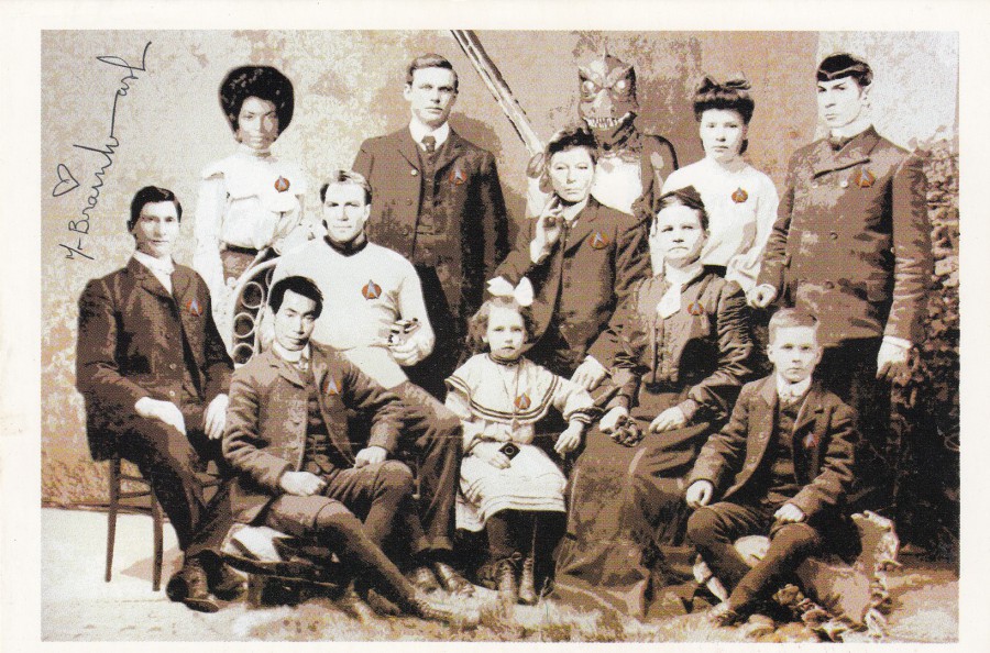
STAR TREK
Official Postcard Release
MR BRAINWASH
“Mr. Brainwash presents ‘Icons’, a 15,000 square ft. solo exhibit of fine art and installations. 415 W. 13TH St. Meat Packing District, New York City, 10014. Check MrBrainwash.com for show information. Part 1”
(Text from reverse side of postcard)
This wins the award for the strangest design amongst these four. Here you have the faces of some of the members of the original Star Trek television series; Kirk, Spock, McCoy, Uhura and Sulu planted on the heads of the people depicted in this old photograph. My favourite addition is the head of the alien ‘Gorn’ which can be seen at the back. This is another of those cards which sold (perhaps ‘sells’ would still be relevant) for high prices, £30+ was a regular price for this one, and interestingly when I checked eBay recently there was not a single copy on offer, at any price so maybe it is a bit more-scarce.
This one has ‘exactly’ the same reverse layout as the Obama Superman card.
08/12/2016
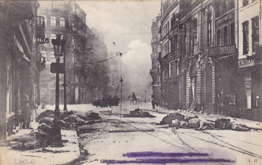
LILLE, FRANCE
WORLD WAR I
STREET SCENE AFTER BOMBARDMENT
Published by
A. R. PARIS
This was one of the very first World War I postcards I bought. To this day it still amazes me that someone took this picture and thought it would make a good or saleable postcard! The image depicts a bombardment, which is still taking place, you can see the smoke rising in the background on the right. Scattered across the street in the foreground are the bodies of horses which have been killed by the shelling. It is, I think, a sad image, and one which shows the horrific impact shelling could have nit just on the soldiers and civilians, but also on the animals drafted in to work in the war. Because of the need to maintain the spirit of those back in the UK it soon became clear that postcards depicting horrible scenes like this heavily impacted on morale. Thus, they were soon banned, or censored and not allowed to be passed onwards. In the end they ceased to be produced, and quite quickly. This means that if you do come across a card baring an image like this it was almost certainly issued during the first 10 months, too a year, of the war. They are, as a result, harder to find than other WWI related images (and perhaps that is no bad thing, considering how upsetting such an image can be).
As was the requirement with censorship during the war the printed details across the bottom have been heavily covered by hand with a pencil. This was done when a soldier was to post the postcard so that if the card was captured during transit it could offer the enemy no information on where it had come and what military units might therefore be in that area.

REVERSE SIDE OF ABOVE POSTCARD
Posted “ON ACTIVE SERVICE”
23RD April 1915
British Expeditionary Force, France
FIELD POST OFFICE Cancel dated 26th April 1915
Purple Triangular ‘PASSED BY CENSOR’ Cachet – No 548
Addressed to London
As you can see, this postcard cost me 60p, but this was over 35 years ago. I would need to part with a bit more these days. With the current 100th anniversary of the years of WWI images and items from the conflict have again become of interest, and therefore have raised slightly in value, and importance. The more impactive images, and I think this one would come under that heading, are the ones being sought after by the modern, younger collector, those looking for the more unusual releases.
08/12/2017
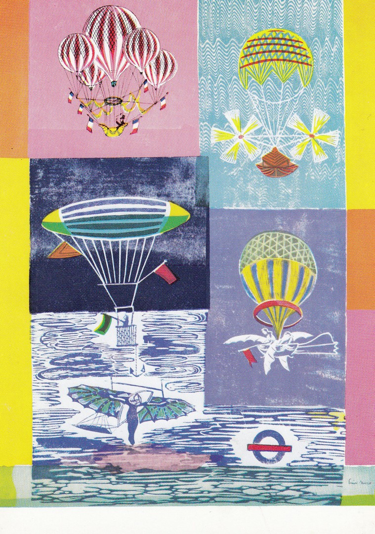
SCIENCE MUSEUM
By
Enid Marx
From a London Transport Poster of 1964
Published by
London Transport
Ref: 152
(1070/2457RP/IM)
This series of early London Transport posters is highly collected and contains, I think, some of the more unusual posters of the 1960’s era (although it also contains older posters as well). This poster is almost as old as I am, and it has a great ‘Hot Air Balloon’ content. These cards can often sell for £2 each and are worth seeking out (some other cards from the series have been posted previously on the webpage)