19/02/2018
APPLE STORE
2012 LONDON OLYMPIC GAMES
CELEBRATION PIN POSTCARDS
Published for
APPLE STORES
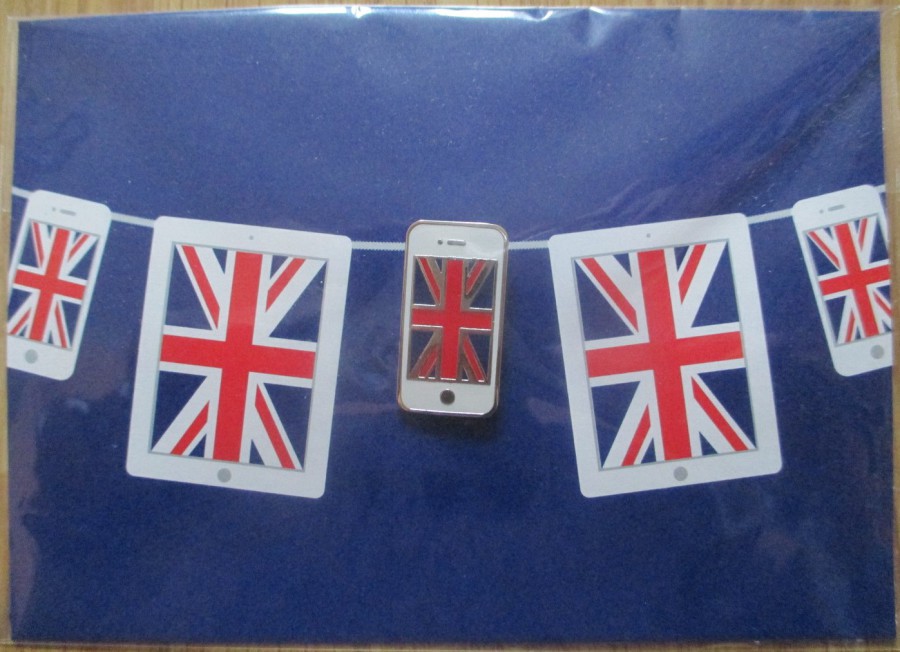
I-PHONE Pin – WHITE FRAME
(Blue Background Card)
During the London 2012 Olympic Games I was in London on a couple of occasions. London during this two-week period was an amazing place to be, and the city was celebrating the fact that the Olympic Games were there.
On one of my trips I was walking past the large ‘Apple’ computers store in Regent Street (close to its junction with Oxford Street). In the entrance there were two members of staff handing out cards. I am always curious when I see this, and I am also always in the hope that the cards are postcards. So, I went in and received my card. To my utter joy, not only was it a postcard, it was a postcard with a metal pin attached to it. The pin was shaped like a small I-Phone, with a union jack screen. What a fantastic free-gift to be giving out to everyone. The pin is placed so that it looks like it is on a washing line of I-Phones and I-Pads, the other ones being printed on the card.

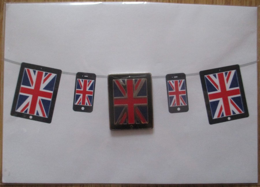
I-PAD Pin – WHITE FRAME
(Blue Background Card)
As I left the store I had a chat to one of the members of staff to ask them about the special cards and pins. They were being given out over a range of days that the Olympic Games were on and were a direct commemoration of the event, although due to the copyright issues around using the Olympic Games rings logo, or even just mentioning the games themselves they had by-passed this by not making any direct mention to the event. Despite this I believed, and still believe that this was a fantastic Olympic Games themed item. The staff member then asked me what card I had received. I showed him my I-Phone card and he immediately, now knowing I was a collector, handed me this I-Pad pin one. This is identical in format to the I-Phone item but has a larger pin on it which is designed to look like an I-Pad. I was delighted.
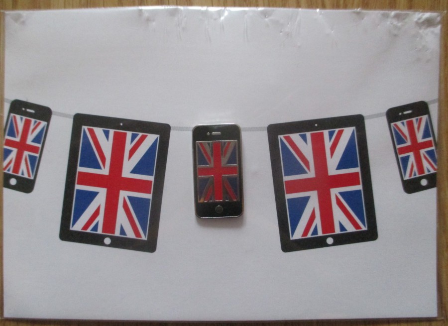
I-PHONE Pin – BLACK FRAME
(White Background Card)
Having obtained the top two cards I also kept an eye on eBay, as at the time I was collecting any postcard that related to the 2012 Olympic Games. Whilst looking through lists I came across another two pin cards from Apple. This card here is one of those and has an I-Phone pin attached which has a black frame and which is attached to a white background card. The card has some damage top right (but I have found one on eBay today which is in perfect condition, so I have bought this, and it was this buy that triggered me digging out these cards here and deciding to place them on the webpage - so, by this time next week I should have a perfect copy of this one in my collection).
I-PAD Pin – BLACK FRAME
(White Background Card)
This is the last of the four cards that I am aware of. If you like the look pf these then there are copies on eBay as I write this – there are ten different lots, mostly single cards but there is one lot of three different. The price range is a bit wide, with the cheapest ‘BUY NOW’ price being £2.50, plus £1 postage (there is a single auction one which has a start price of just 99p, but this does have a £1.99 postage price). Somewhere between £4 and £5 seems to be a more general price although there is a single card on for £14.99, and another one for an even more impressive £20.00 (plus £3.40 postage on top of that).
So, you can still put together a collection of all four of these pin cards, and I am happy that there are only the four as over the last five odd years I have not seen any other types, and I have been checking.
I think these are great and a must have for anyone putting together a London 2012 Games collection.
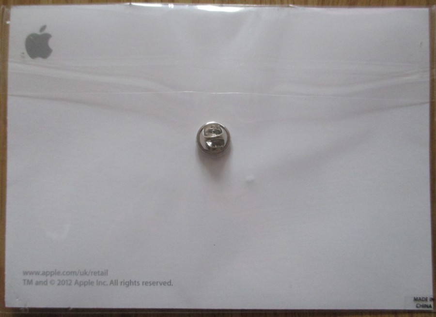
REVERSE SIDE OF ABOVE PIN CARD
All four have the same basic design
Here you can see the pin fastener, and the fact that the cards have been wrapped in a plastic outer bag
18/02/2018
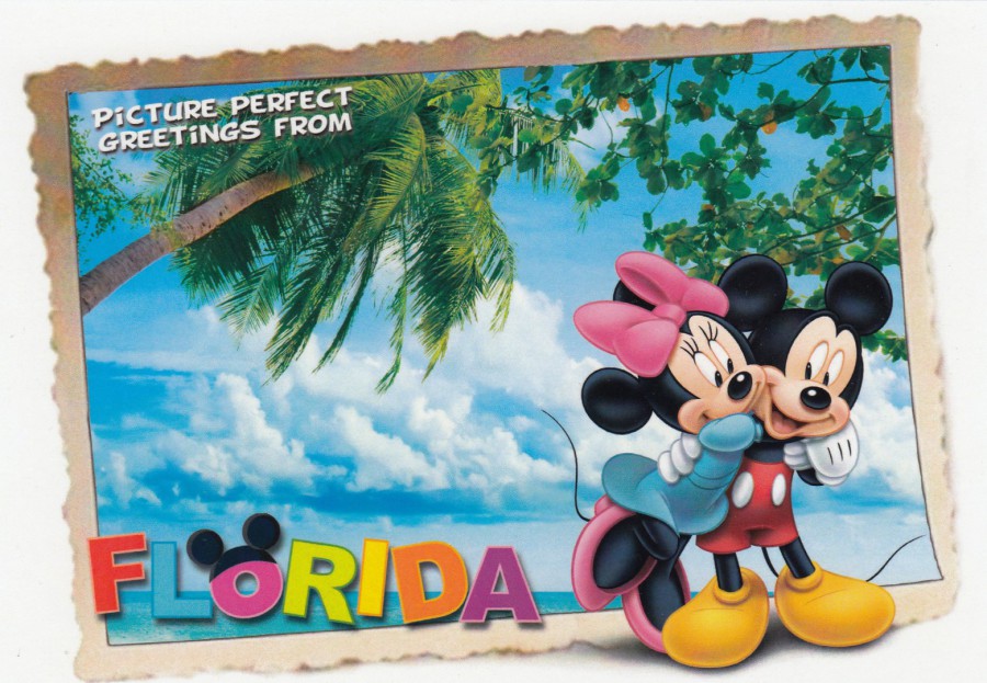
PICTURE PERFECT
GREETINGS FROM
FLORIDA
Published by
THE POSTCARD FACTORY
Ref: PC57-WD-FL 763
A design which is kind of like a ‘Postcard on a Postcard’. I like this one and it is a design which appears in pretty much all the gift shops which stock the cards from this company. Some of the designs I have posted are only available in one or two of the shops, but they all seem to want to stock this one, which does not surprise me as it is a cracker.
18/02/2018
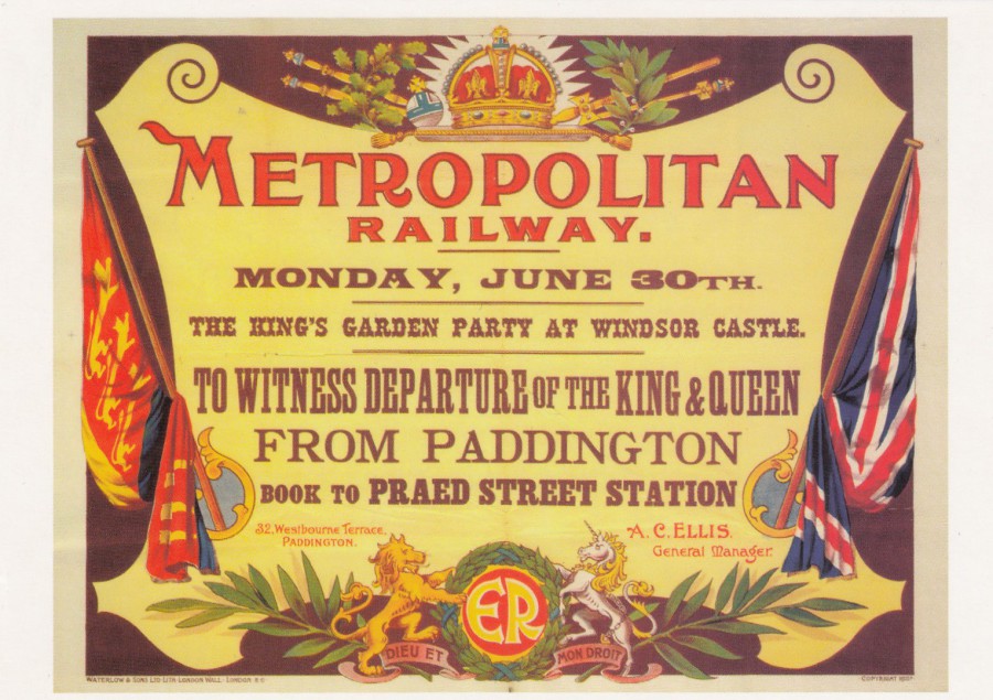
THE KINGS GARDEN PARTY AT WINDSOR
ARTIST UNKNOWN
POSTER PUBLISHED IN 1902
Published by
LONDON TRANSPORT MUSEUM
Ref: LTM 685
Lovely METROPOLITAN RAILWAY poster for the event of the King and Queen leaving via Paddington Station, to attend the Kings Garden Party in Windsor. This makes for a very unusual addition to any Royalty collection, but of course it would more fittingly also sit in a railway collection.
The date for the King and Queen departing appears to have been Monday 30th June, I wonder if the Garden Party was the same day?
18/02/2018
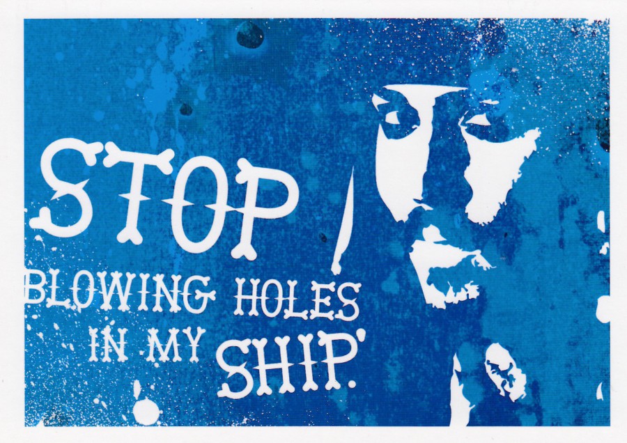
STOP BLOWING HOLES IN MY SHIP
Published by
BOOMERANG
In their:
“CINEMA IN CARDS”
Series
Ref: No 142
PIRATES OF THE CARIBBEAN
Time for another postcard from this very large series of cards which depict a phrase or quote from a specific film. Some of these are easy to work out, some from the fact that the quote is famous, some from the design of the card and others from personal fandom for that film.
This was probably one of the easiest to get as the image is clearly that of the pirate Captain Jack Sparrow. I also think it is one of the better cards in this long series (the series had reached number 142 by the release of this card.
17/02/2018
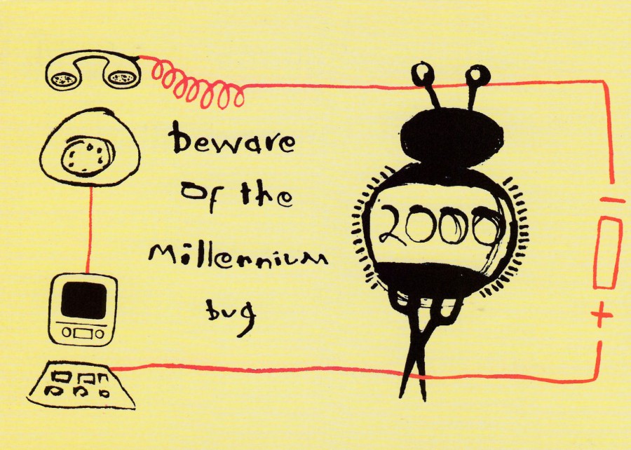
BEWARE OF THE MILLENNIUM BUG
By
ENDAF AMOS
Published by
BOOMERANG
“What machines are affected and not affected in all the rooms in your house? Make a list and check them out - www. bug2000 .co.uk”
(Text from reverse side of postcard)
Do you remember all the fear that was circulating around in the lead up to the year 2000? All the stories of how the computers were going to shut-down? How everything run by them was going to fail? How the ‘Millennium Bug’ was going to transport us back to the days of the horse and kart. Oh, how they built up the worry, and oh how pointless it all was in the end when, to my mind, absolutely nothing happened. In the lead up to the end of 1999 there were various postcards released which depicted the creature which we all thought we knew existed, the Millennium Bug. This is just one of those, although this one was a free card, and judging from the text on the reverse side it was also one of those which seems to have been adding to all the fear.
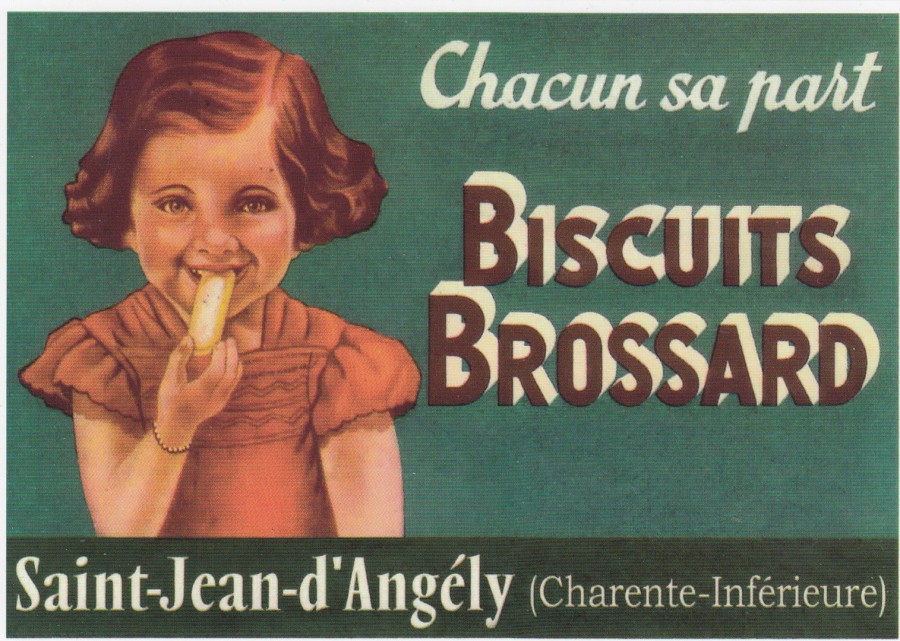
17/02/2018
BISCUITS
BROSSARD
SAINT-JEAN-D’ANGELY
Published by
CENTENAIRE EDITION
(13, rue Rabelais, 17100 SAINTES – FRANCE)
Ref: 106 – RECLAMES
Advertising postcards have always been popular, especially poster styled ones. Some can be quite common and appear on postcards published by more than one postcard publisher, but others are almost certainly unique to one publisher, and this is even more the case when the advertisement shown is a local one. This one here is for biscuits which come from a town called Saint-Jean-d’Angely. I have visited here a number of times because it is just 20 minutes up the road from my in-laws house in Venerand. I like the fact that this is a local piece of advertising and that it was also published in the local area as well, in Saintes, which is the major town in this part of France and is where the publisher ‘Centenaire Edition’ is located. This company have published a smashing, and very large series of posters, magazine adverts and other publicity material, mostly based around cars, vans, farming equipment, especially tractors and combine harvesters. Over several years of visits to the Saintes area I have built up a nice collection of their postcards, of which I am a big fan.
16/02/2018
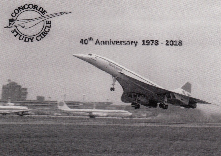
CONCORDE STUDY CIRCLE
40TH ANNIVERSARY
1978 – 2018
A Peter Cooper / Henk Heiden Production
This postcard has gone out to each member of the Study Circle. It is an appropriate posting as tomorrow the Concorde Study Circle will be holing a special 40th anniversary meeting at the Stampex Exhibition in London. As a member I shall be attending, and I have a couple of items to display to them as well. I suspect that other members will also have items to display and there are normally a few items to buy as well, which nearly always includes a selection of postcards. I am looking forward to meeting up with people again and celebrating the circle’s 40th anniversary.
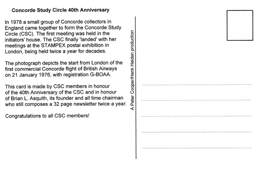
REVERSE SIDE OF ABOVE POSTCARD
Some interesting facts recorded here
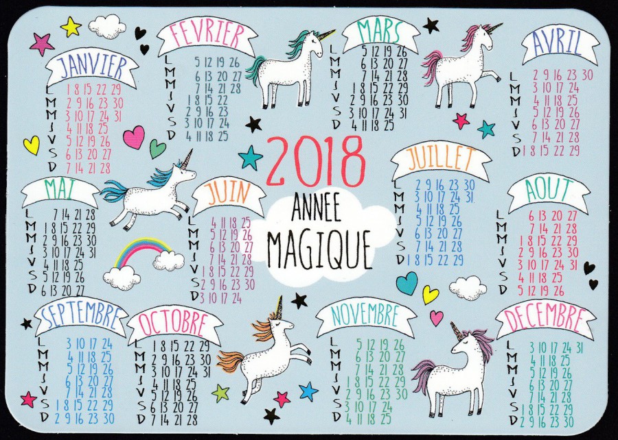
16/02/2018
2018
ANNEE MAGIQUE
(MAGIC YEAR)
HAPPY 2018
Published by
EDITIONS CARTES D’ART
(CARTESDART PARIS)
Ref: DC 620
When I saw this postcard two weeks ago in a shop in Saintes, France I knew I had to buy it there and then, firstly, and most importantly, because I liked it, but also because it is a card with a limited shelf life, about another nine months I reckon (ordinary non-postcard collecting tourists and locals are not going to want this towards the end of this year). I have previously found calendar cards, abroad and here in the UK, but the designs are normally quite bland, calendar sections with maybe a few local photographs, but this one here is beautifully drawn and constructed, crafted even. It also has unicorns, and, at the moment unicorns are very much in fashion.
16/02/2018
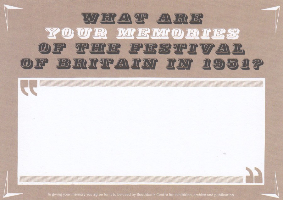
WHAT ARE YOUR MEMORIES
OF THE FESTIVAL OF BRITAIN
IN 1951?
Postcard sized information request card
This is a card I picked up at the Southbank Centre, London on a previous trip up to London back in December 2017. It was (and may still be) being used to obtain peoples memories of their visit to the 1951 Festival of Britain. It is the type of history gathering that I approve of and I hope people have completed cards for them. It is also a card which would nicely fir into any ‘Festival of Britain’ related collection as something modern.
16/02/2018
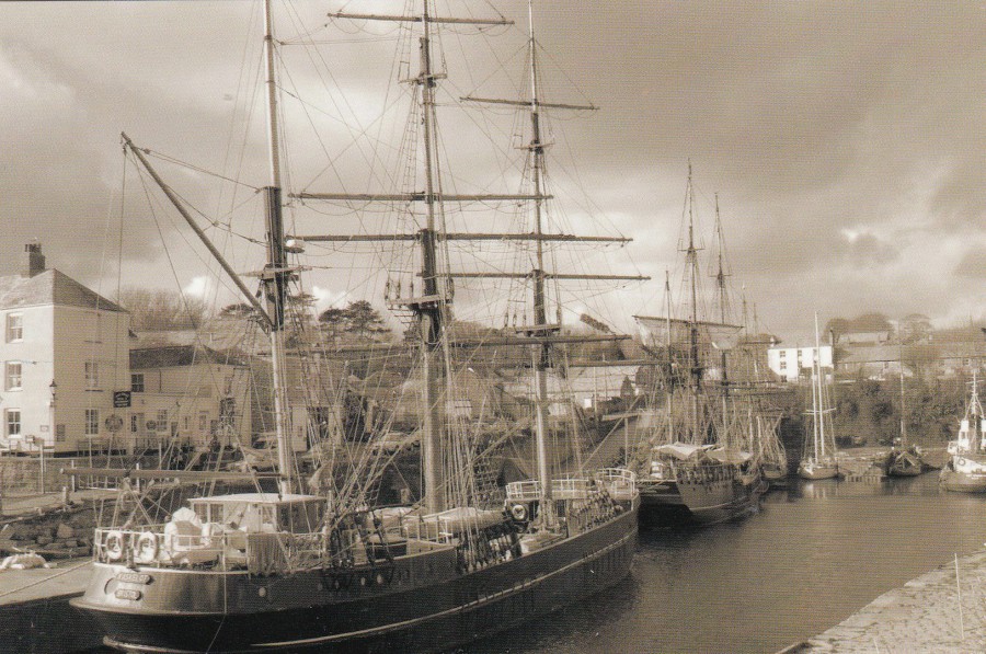
CHARLESTOWN
CORNWALL
Published by
PICTURESQUE CORNWALL
Ref: PC08003
This is one of the postcards I got for Christmas from my eldest son and hi family. It from their holiday last year in Cornwall (I have already posted some of their postcards on the webpage). The range of images and postcard types they bought me was nicely eclectic, and very well chosen (I have obviously trained them well, he says, grinning). This one is a lovely modern view postcard which has been printed in black and white, which makes it more atmospheric and therefore, as is often the case with this style, more appealing as well. View cards will be of interest to those who collect local images of their home town, place of birth or location where they have either worked, holidayed at or lived in for any period, but this one here would also fit nicely into any Maritime themed collection.

15/02/2018
DON’T QUIT NOW,
THINGS ARE ABOUT TO GET INTERESTING.
To find out more about your options after GCSE’s call 0845 608 6087
Perhaps I should have depicted this one yesterday! I am also not sure what the dog cartoon has to do with GCSE’s and the world that comes after them, but it makes for a nice dog related theme, which is probably about time after all the recent cat cards, but then this is a card from a few years back.

15/02/2018
SAINTES
Copyright
CHARLES CAMBIER
Published by
EDITIONS d’ART JACK
TOP POSTCARD
Ref: DF 711
BOTTOM POSTCARD
Ref: DF 710
I have mentioned the town of Saintes before because it is the nearest town to where my in-laws house is located (the house is in the village of Venerand, just 15 to 20 mins up the road from Saintes). We are currently in the process of selling the house on, but it needed some work done and that is why we were in France two weeks ago (despite the work that we were doing I still managed to pick up some postcards, and some have already been posted here on the webpage).
In olden times Saintes was a Roman town and it still has some Roman structures which are worth a visit. On a previous post I illustrated a number of postcards which depicted the Arch of Germanicus which is still located in the town, but this is not the only impressive Roman structure worth a visit. There is also the Roman Amphitheatre, which is one of the oldest and largest in existence in France. The Amphitheatre dates back to 40AD, and it is in an area of France which was dominated by the Romans for 40 years. It was commenced in the reign of emperor Tiberius and finished under the reign of Claudius. At its height it could hold between 12, 000 and 18,000 people.
I have visited and walked around this amphitheatre a few times now, but rarely during the winter months as this area is known for its flooding and it is possible to see the whole of the ground level of this amphitheatre under water, which somewhat restricts access. Clearly then, summer is the best time to visit the landmark, and many do.
These two art postcards both depict the amphitheatre from the same prospective. The top postcard I found in the local Tourist Office (located just along from the Arch of Germanicus mentioned above). The second postcard, the lower one, I found in a card shop further into the town itself. At first, I almost missed that they were different designs, but fortunately I had only bought the top card earlier that morning, and I had really liked the bright yellow sky, and when I saw the second card I noticed that the sky was blue. So, I also bought this one. They are a nice souvenir of my visits to Saintes and the Amphitheatre, and they are also unusual, and different, illustrations of the structure (childlike almost in their style, but they still have appeal)
14/02/2018
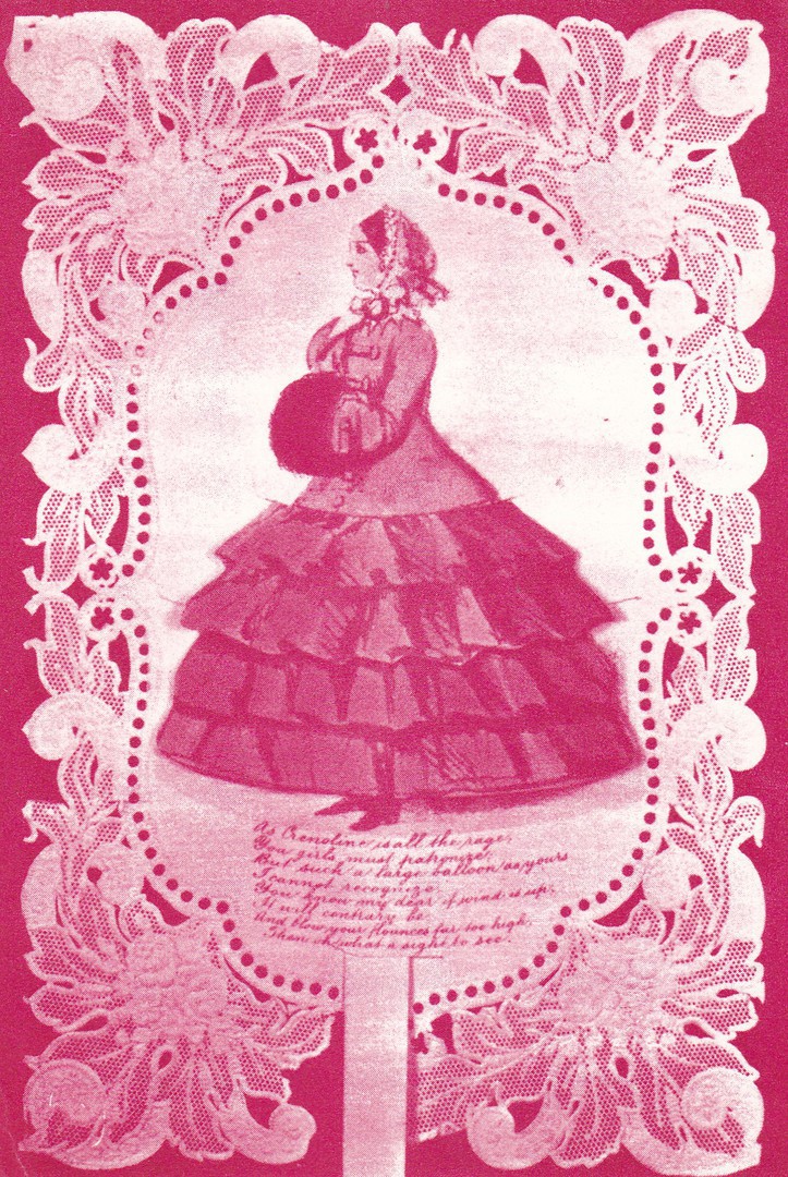
HAPPY VALENTINE’S DAY
BE MY VALENTINE
EXETER EMERGENCY DELIVERY SERVICE
EXETER VALENTINE SPECIAL
2ND EDITION
“Card sent from the Crimea by a soldier to his loved one and now in the collection of Melita Watson”
(Text from reverse side of postcard)
VALENTINES DAY
1971
This is a superb image of an early Valentine’s Day card, one sent by a soldier from the Crimea, so sometime between 1853 and 1856, when soldiers were in the area fighting in the Crimean War. I could not think of a more appropriate card to depict today, and here is a bonus as well as the reverse side is also interesting

REVERSE SIDE OF ABOVE POSTCARD
This copy has received the 10p ST VALENTINE’S DAY, 1971, EXETER EMERGENCY DELIVERY STAMP. This is a Cinderella stamp item used by a private organisation to pay for postage of an item on St Valentine’s Day whereby the sender would pay for the delivery stamp and the organisation in Exeter would deliver the item on the 14th February, or anytime around this date.
There were a number of emergency postal systems being used at this time as there was a postal strike between January and March 1971. Various organisations created their own, normally local, postal services and in many cases also created their own stamp like designs. You quite often see these on special envelopes created for sale to the stamp collecting world, but it is far rarer to see postcards used in this way, even ones created, like this one has been, purely for the collector’s market. Most of the envelopes can be bought now for just a few pounds, and this postcard is probably around this price, maybe £2.50. There are some dedicated collectors of these 1971 Strike covers and they can be found on eBay and on some dealer’s stalls.
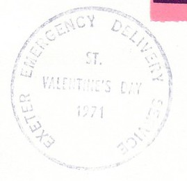
CLOSE UP OF THE CANCEL APPLIED TO THE STRIKE LABEL
“EXETER EMERGENCY DELIVERY SERVICE – ST. VALENTINE’S DAY – 1971”

13/02/2018
HARDY KRUGER
Published by
EAST – WEST PUBLISHERS
Printed by
HOWARD BRUKMAN (PTY.) LTD
This German postcard (although all printing on it is in English and in blue) depicts the film actor Hardy Kruger, who was born in 1928 (12th April). He appeared in more than 60 films, including one of my favourites from my schooldays; ‘The Wild Geese’ (1978). Here is a list of just a few of his film appearances:
JUNGE ADLER (YOUNG EAGLES) – 1944
THE LAST SUMMER – 1954
LIANE, JUNGLE GODDESS – 1956
THE ONE THAT GOT AWAY – 1957 (This the true story of Oberleutnant Franz von Werra who was a German POW in the UK during WWII and who was the only known prisoner of war to escape and return to Germany whilst the war was still on. He escaped whilst in transit across Canada to another POW Camp. He escaped in to neutral, at the time, North America. He reached Berlin on 18th April 1941 but was shot down and killed on 25th October of that same year)
BLIND DATE – 1959
HATARI – 1962 (This one starred John Wayne and was a story about big game hunters in Africa – it is one of those strange films where, although quite a bit does happen, there appears to be no actual story thread running through it, well, not much of one really – But, despite this fact, this was one of my favourite films as a kid. I think it was because of the wildlife connection, and the mild comedy elements running through the story)
THE FLIGHT OF THE PHOENIX – 1965 (The one where those involved in an aeroplane crash in the dessert build a working plane out of one of the crashed plane’s wings - Kruger plays the German aeronautical engineer who comes up with the plan to build a plane and for those left strandard as a result of the crash to fly out)
THE RED TENT – 1969
PAPER TIGER – 1975
BARRY LYNDON – 1975
THE SPY WHO NEVER WAS – 1976
A BRIDGE TOO FAR – 1977
THE WILD GEESE – 1978
He also played the real part of Field Marshal Erwin Rommel in the television miniseries ‘War and Remembrance’.
This postcard is probably from the early 1960’s, but it could potentially be a late 1950’s release. Kruger is an actor that I had not come across on a postcard before I bought this card.

CURT JURGENS
Published by
EAST – WEST PUBLISHERS
Printed by
HOWARD BRUKMAN (PTY.) LTD
Another postcard from this publisher, depicting another German actor (known as Curt Jurgens in his English-speaking films but Curd Jurgens in German ones). Born in 1915 (13th December – passed away on 18th June 1982). Again, here is a very partial film appearance list:
THE UNKNOWN – 1936
TANGO NOTTURNO – 1937
OPERETTA – 1940
WHOM THE GODS LOVE – 1942
WOMEN ARE NO ANGELS – 1943
BONUS ON DEATH – 1950
THE DISTURBED WEDDING NIGHT – 1950
1, APRIL 2000 – 1952
THEY CALL IT LOVE – 1953
THE LAST WALTZ – 1953
ORIENT EXPRESS – 1954
DEVIL IN SILK – 1956
AND GOD CREATED WOMAN – 1956 (This is best known for starring Brigitte Bardot – not her first film but probably the film that launched her into the spotlight)
THE ENEMY BELOW -1957 (A WWII U-Boat themed film)
THE INN OF THE SIXTH HAPPINESS – 1958
FERRY TO HONG KONG – 1959 (I like this one. It stars Orson Welles as well, as the ferry captain)
THE BLUE ANGEL – 1959
THE LONGEST DAY – 1962 (Well known, and extremely popular film about D-Day)
LORD JIM – 1965
DIRTY HEROES – 1967
THE KARATE KILLERS – 1967
THE ASSASSINATION BUREAU – 1969
BATTLE OF BRITAIN – 1969 (Just a small cameo appearance at the start of the film)
CANNABIS – 1970
KILL! KILL! KILL! KILL! – 1971
FALL OF EAGLES – 1974 (A television appearance)
THE SPY WHO LOVED ME – 1977 (Possibly my favourite James Bond film, and Jurgens plays a great baddie)
SMILEY’S PEOPLE – 1982 (BBC TV television series – this was his final film role)
13/02/2018
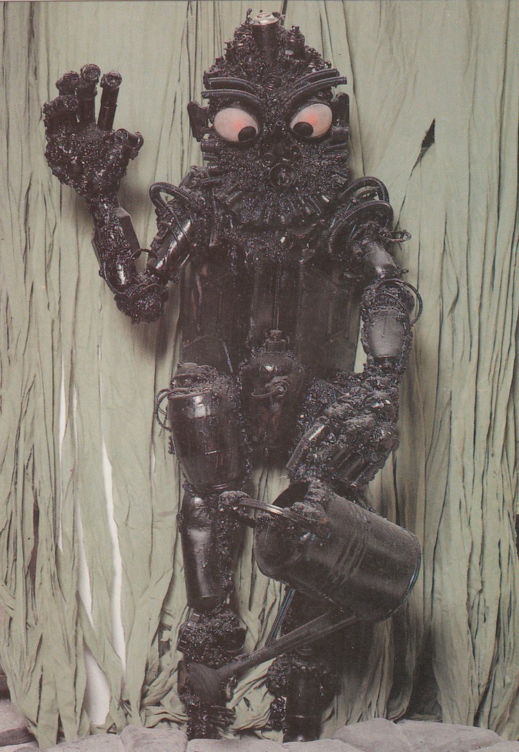
GET RID OF THE MONSTER PROBLEM
Published by
THE DEPARTMENT OF THE ENVIRONMENT
“Chemicals can kill, use household and garden products sensibly – get rid of them with care”
There was a time when government departments gave out information postcards, some designed to catch the eye and then impart useful and safe information via the text on the reverse side. This is a good example of this type of card. From the front this just looks like a card depicting a piece of modern art! But the robot looking man, made up of cans and containers, has been designed to impart a message about chemical containers, however small they may be. This message is as important today as ever, but there are no postcards advising you about it anymore (that I know of).
13/02/2018
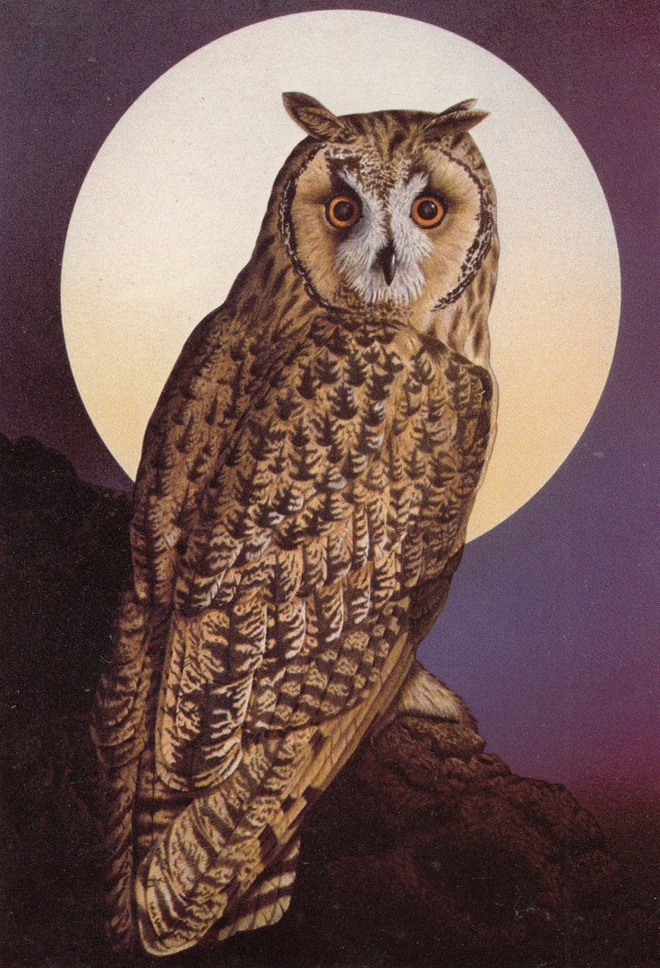
UNTITLED
(OWL)
By
ADRIAN RIGBY
Published by
BEECHWOOD PUBLICATIONS LTD
Ref: 553592
I recently posted some simple coloured word designs by this company (see tab ‘February Blogs 2018’ – 05/02/2018) and said that I would be posting some of their better full image art designs. This is one of these. I think this is a long eared owl, although it would be remiss of me not to say that others have said this is an eagle owl, but I think the shape of the face is wrong, and I did have to catch an escaped eagle owl once that had been swooping down on cycling paper-boys! So, I have been up close to one. Regardless though, it is a great piece of what I suspect is postcard artwork.

12/02/2018
HAPPY BIRTHDAY
Published by
PAPERCHASE
Ref: FSC C014059
A nice Happy Birthday design, and one which could actually be used as a nice change from the normal folded ‘Greetings’ styled type of birthday card. It seems strange to post this here myself as I will be celebrating my own birthday today, and no, I will not be telling you how old I am, just assume ‘Very’!!
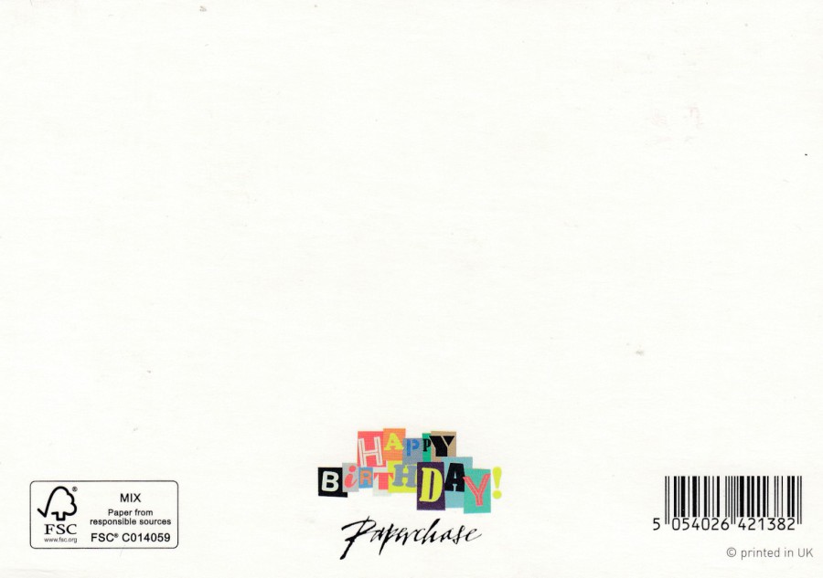
REVERSE SIDE OF ABOVE POSTCARD
Nice use of colour again along the bottom
12/02/2018
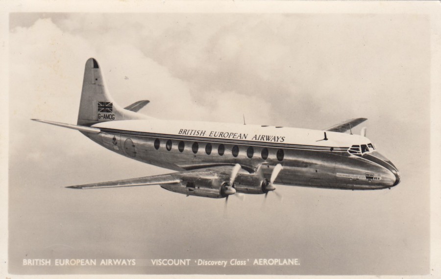
BRITISH EUROPEAN AIRWAYS
VISCOUNT ‘Discovery Class’ AEROPLANE
By
ANNOYMOUS PUBLISHER
(Official Postcard?)
“World’s first turbo-prop airliner: 47 passengers, five crew. Four Rolls Royce Dart propeller-turbines. Cruising speed 291 m.p.h. Designed and built by Vickers Armstrongs Ltd”
(Text from reverse side of postcard)
The Vickers Viscount was an airliner first flown in 1948 (16th July), although it did not enter airliner service until 1953 (April 18th). The plane was in service until 2008, when they were retired, although they ceased being produced back in 963. Several types of the plane were built: the prototype [Type 630], a second prototype [Type 663], the first production version [Type 700], and later an improved variant with longer fuselage [Type 800]. A much-improved version with a longer range came along later [Type 810]. Having looked at the statistics of these I strongly suspect that the one depicted here is the Type 700.
12/02/2018
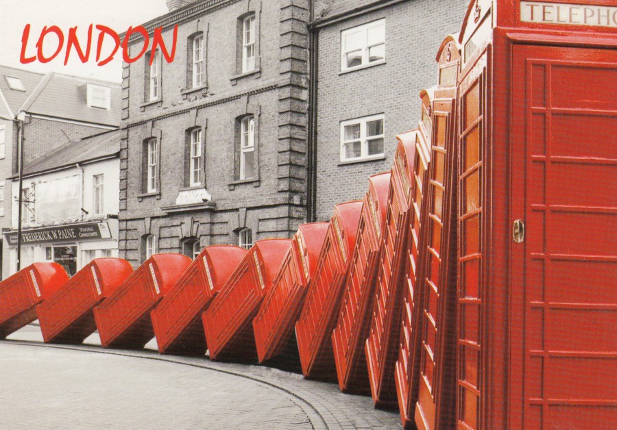
LONDON
(TELEPHONE BOXES)
Published by
FISA
Photograph by
Jeff Ayres
Ref: 612
Although not mentioned on the postcard this is an art installation called ‘OUT OF ORDER’ by David March, which was installed in the Old London Road, Kingston upon Thames, London. I don’t know if it is still there, but it was certainly there for a few years (2014 and 2015 definitely).
This is one of those cheap London postcards, just 15p I believe, and copies can still be found on some London stands an in those souvenir shops which look so tacky, but which are so great to look around.
I think I decided to post this card because I will be in London for a large chunk of this week, Wednesday to Saturday, staying up there Thursday and Friday night. I shall be attending the Spring Stampex show (which has been given a name adjustment this year to ‘STAMPEX INTERNATIONAL’), and I will be posting images on our facebook page, and I have no doubt new postcards will be bought which will appear later on here on the webpage.
11/02/2018
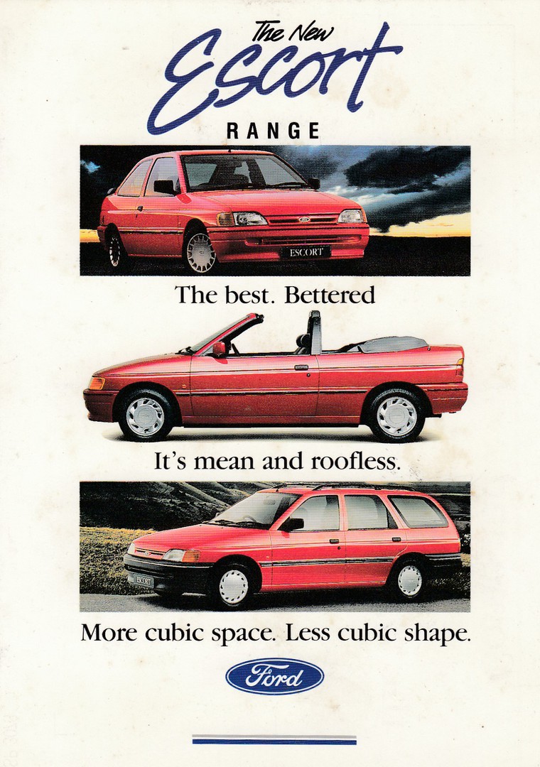
THE NEW ESCORT RANGE
THE BEST. BETTERED
IT’S MEAN AND ROOFLESS [sic]
MORE CUBIC SPACE. LESS CUBIC SHAPE
FORD
“COME AND TEST DRIVE THE NEW ESCORT”
Official FORD MOTOR COMPANY postcard
Ref: SP 3078
This was an official postcard designed to be used by Ford Motor dealers to advertise the new car and to offer test drives. There is a space on the reverse side for each individual company to place their showroom cachet, the one with their full address details (they all used to have one, probably still do).
This type of card fits into an ‘Advertising’ collection and, obviously, into a ‘Transport’ collection.
If I am right (I am no car expert, by any means), this is an advert for what was the Fifth Generation of Escort, which were on release between 1990 and 1997, which means, if I am correct, this card is from 1990, or thereabouts, (it may have been in use for a while). Copies of this card do not turn up often, I checked eBay and there is only one copy on there, priced at £5 (the seller refers to it as a Mk 5 so maybe I am right with the type!).
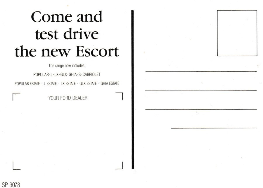
REVERSE SIDE OF ABOVE POSTCARD
MINT
UNNUSED
(No company cachet applied)
11/02/2018
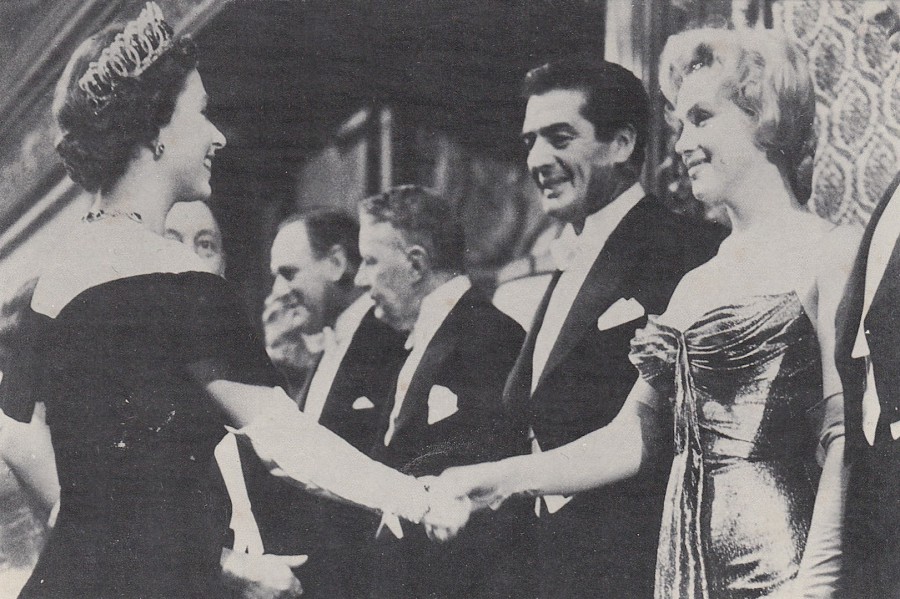
MARILYN MONROE 1956
THEATRE D’EMPIRE, LONDRES
(EMPIRE THEATRE, LONDON)
Published by
EDITIONS DUPLESSIER
Ref: CP25
Superb photograph of the actress Marilyn Monroe meeting her Majesty Queen Elizabeth II. This quite rare image depicts their meeting on 29th October 1956 at the premiere of the film ‘The Battle of the River Plate in Leicester Square, London. Monroe was in London after having just finished filming ‘The Prince and the Showgirl’. I think this is a very collectible postcard and I seem to remember that it was published in a quite small print run, although there are no details of this on the card itself, in-fact there are no details about the meeting on the card except Monroe’s name and the year (as in the title above). For any Movie Star, or film collector this would be a great card, but then it would also be a fascinating card for any ‘Royalty’ collector as well.

11/02/2018
A VERY IMPORTANT LITTLE PENGUIN
By
MATTHEW BOOTH
Published by
BOOMERANG MEDIA (CINEMA)
Another example of an artist using the Boomerang offer of having a piece of artwork published and distributed in the free postcard racks. This one is quite a few years old now, and I came across it in one of my storage boxes. Sometimes a design appeals to me for what it is, without being related to anything special, this is one of those cards (and who can resist penguins?).
11/02/2018
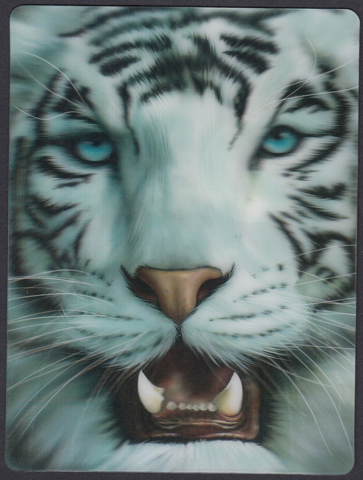
WHITE TIGER
(3D POSTCARD)
LIVELIFE POSTCARD
Published by
DELUXEBASE LTD
Ref: No. 8205
(made in China)
Another new novelty card which I recently added to my collection. There is an issue with scanning 3D postcards, one which we have encountered before on previous postings, and that is the fact that they rarely scan very well, because of their 3D nature. This means that some good 3D effects are lost in the translation from reality to depiction on this page. This is again the case here as this is a smashing card which has an impressive effect with the teeth sticking out at you.
I picked this on up in the Rainforest Café shop attached to the restaurant in the Disney Marketplace in Disneyland Paris. These are normally 4 euros each, but they were having a sale and they were reduced to 2 euro’s. So, another postcard for my ‘Tiger’ collection.
11/02/2018
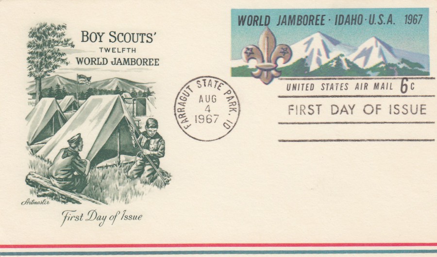
12TH BOY SCOUT WORLD JAMBOREE
UNITED STATES OF AMERICA
Postal Stationery Post Card
6 Cent multicoloured on white
Higgins & Gage, World Postal Stationery Catalog
Section 18
United States of America - Page 34
Reference No: 7 (under AIRMAIL POSTAL CARDS)
Issued 1967
This is a superb example used first day of issue with the ‘FARRAGUT STATE PARK. ID [IDAHO] standard ‘first day of issue’ cancellation dated 4th August 1967. The pre-paid postage mark depicts the Borah Peak in the Lost River Range with the Boy Scouts emblem on the left side. The Jamboree was held at Farragut State Park between 1st and 9th August 1967.
The artwork of the two boy scouts putting up the tent on a campsite which appears on the left side of this postcard has been applied by a cover dealer – ARTMASTER (?) – and does not appear on the standard issued card, which was plain white except for the pre-printed postage mark. I think this addition of an extra piece of artwork, which was common practice by some cover/card dealers, makes this a lovely item.
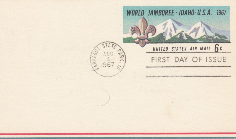
12TH BOY SCOUT WORLD JAMBOREE
UNITED STATES OF AMERICA
Postal Stationery Post Card
6 Cent multicoloured on white
This is a standard postal stationery post card, as issued, without any additional printed image or text on the left side. This has again been cancelled as first day of issue (as the above postal stationery post card.
11/02/2018
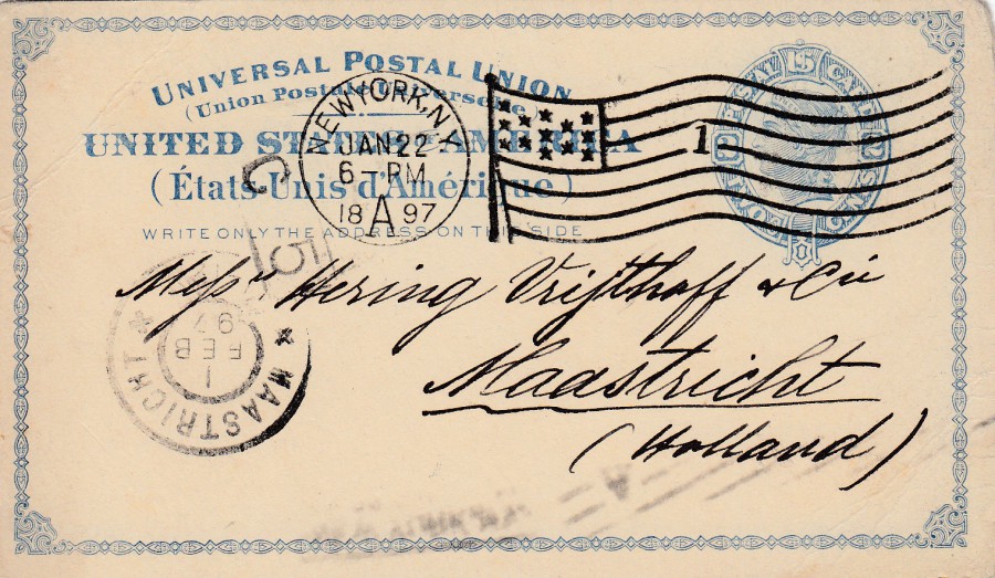
UNITED STATES OF AMERICA
Postal Stationery Post Card
2 cents Blue on pale bluff card
Higgins & Gage, World Postal Stationery Catalog
Section 18
United States of America - Page 1
Reference No: 5
Issued 1879
This is a really nice used example of this postal stationery post card. It was posted from New York to Maastricht in Holland (the Netherlands). The pre-printed postage mark has been cancelled with a nice NEW YORK – STARS AND STRIPES FLAG – No 1 – cancellation dated 22nd January 1897 which has been clearly applied here. There is also a boxed C 5 mark which I think relates to the sorting or sending office area. Upon arrival in Holland this received a receiving mark cancel for MAASTRICHT dated 1st February 1897.
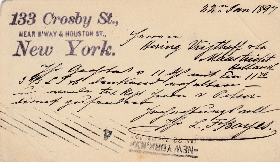
REVERSE SIDE OF ABOVE POSTAL STATIONERY POST CARD
This has a hand written and dated message and the senders address applied like a cachet top left. There is also a further NEW YORK cancellation across the bottom, which is upside down and appears to be another machine applied line cancel with the Number 4 in it. In my 1984 catalogue they price used examples of this card at $5, so its a higher rated postal stationery card than most of the South American ones I usually post.
11/02/2018
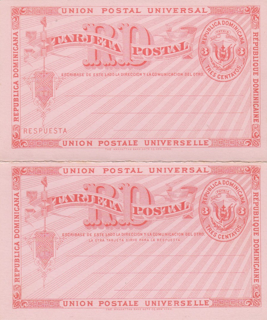
DOMINICAN REPUBLIC
3 cent + 3 cent
REPLY CARD
Higgins & Gage, World Postal Stationery Catalog
Section 4
Dominican Republic - Page 1
Reference No: 8
Issued 1881
These cards were issued for exterior use and were printed on six different colour card stocks; cream, light green, pink, blue grey, white and greenish gray. This example is printed on the pink card stock. This is a mint unused example, and these are quite common, but used example are very rare and my catalogue, which prices a mint copy of this card at just 50 cents states that a used example would be worth 150 times this value.
11/02/2018
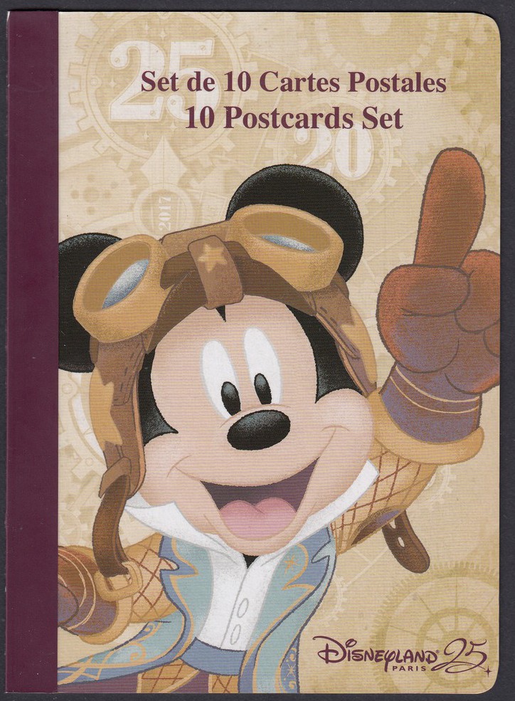
DISNEYLAND PARIS 25TH
SET DE 10 CARTES POSTALES
10 POSTCARD SET
POSTCARD BOOK
FRONT COVER OF POSTCARD BOOK
Recently I attended the Disneyland Resort Paris (or is it just called’ Disneyland Paris’ again? As the 25th merchandise seems to just have this on it) where they are at the end of their 25th Anniversary celebrations. I have already depicted the special single postcard issue (see posting on 08/02/2018) but I also wanted to show you the postcards that were contained within the special 25th Anniversary postcard book. So, I bought two and have disassembled one of these and individually scanned the postcards contained within. Depicted here is the front cover of the book. On the left side is the sticky strip which wraps around the package and holds it all together, this leaves a straight edge down that side. On the right side you can see it has rounded edges, and this transfers over to the postcards which therefore also have two rounded edges on one side, or along the bottom if horizontal in format.
The postcards are depicted here in the order that they appear with the book. The postcards are not titled or numbered, and all have the same very simple reverse layout (see further below)

REAR CARD COVER OF THE POSTCARD BOOK
Here they give you a sneak look at the ten postcards contained within the book
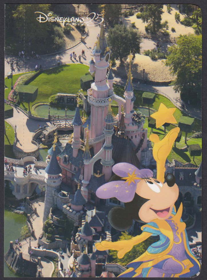
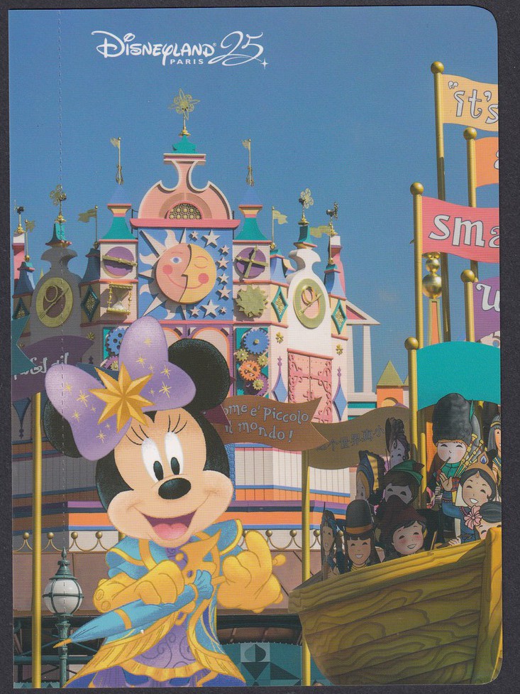
FIRST POSTCARD
MINNIE MOUSE
With
SLEEPING BEAUTY’S CASTLE
This design is vertical in format. If you look down the left side, you can just about see the line of perforation which allows the card to be removed from the book. Because I ‘actually’ dismantled the book each of the cards still has the strip attached which held the card into the spine area. Although it is not so clear on this design it is on some of the others shown below.
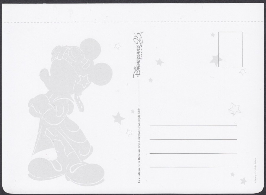
REVERSE SIDE OF ABOVE POSTCARD
This is also the standard reverse side for all ten of the postcards contained within this postcard book. They all have the shadow outline of Mickey Mouse in his flying helmet hat. Here you can also see more clearly the perforated line which is where the cards would normally end once detached from the book by normal means. All the postcards have the same width of strip either at one edge or along the top.
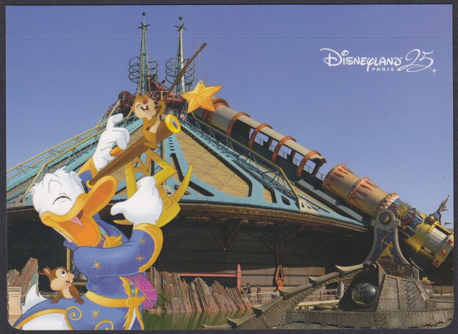
SECOND POSTCARD
DONALD DUCK
With
SPACE MOUNTAIN
(or as it is now called – STAR WARS HYPERSPACE MOUNTAIN)
This is the best card for seeing the perforated line across the top, as it shows up clearly here across the blue sky. I suspect that most single cards you will see will have the top strip missing as people will ordinarily remove the cards from the book format via this perforated strip.
I only discovered that this ride had a new name on my visit this time. I did not ride it so do not know if anything has been physically changed (but I don’t believe so). This is another example of how big Star Wars has become again.
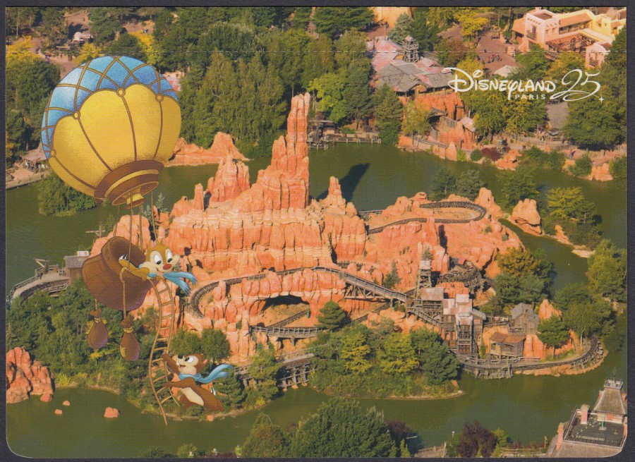
THIRD POSTCARD
CHIP ‘N’ DALE
(or ‘Tic and Tac’ as they are called in France)
With
BIG THUNDER MOUNTAIN
FOURTH POSTCARD
DAISY DUCK
With
MAD HATTERS TEA-CUPS
FIFTH POSTCARD
MINNIE MOUSE
With
IT’S A SMALL WORLD
(Oh, that song….once in your head, it stays there)
SIXTH POSTCARD
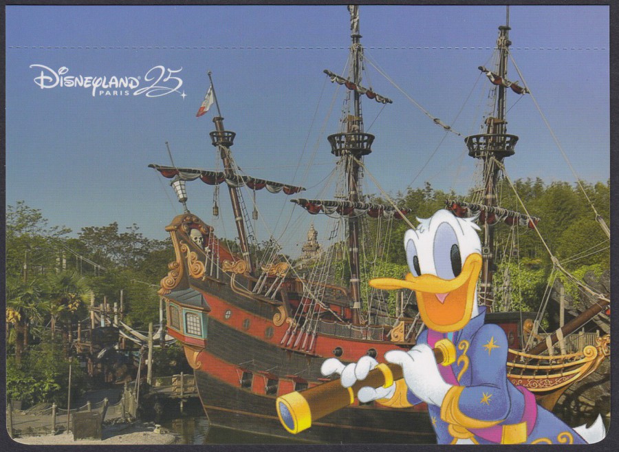
DONALD DUCK
With
PIRATE SHIP
(from Peter Pan)

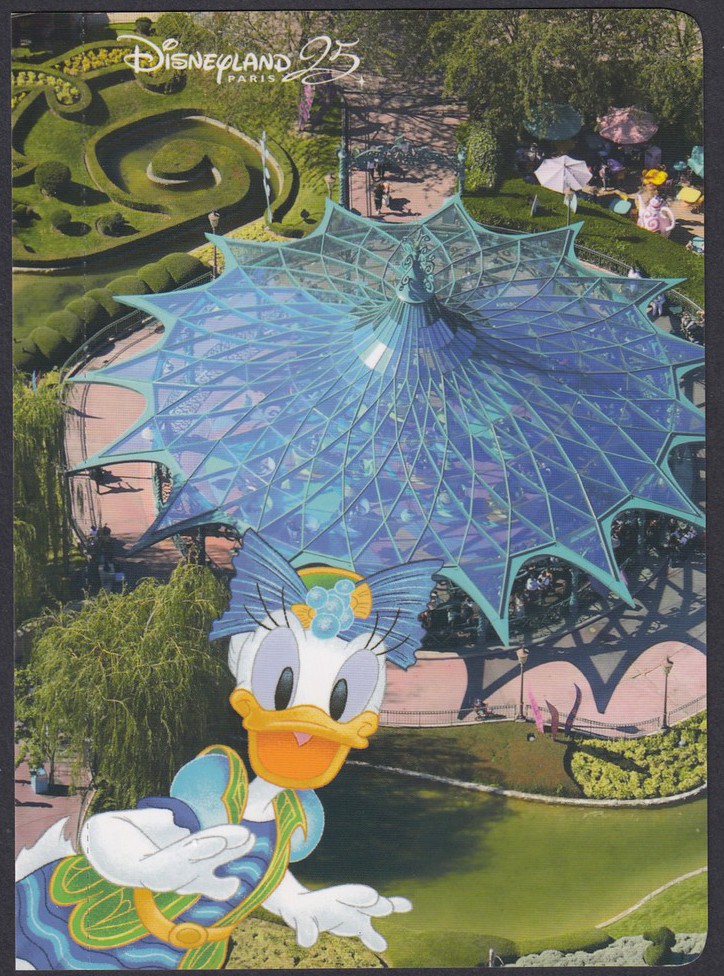
SEVENTH POSTCARD
DAISY DUCK
With
ALICE’S CURIOUS LABYRINTH
(ALICE IN WONDERLAND MAZE)
I love this area as they do not have this in America
EIGHTH POSTCARD
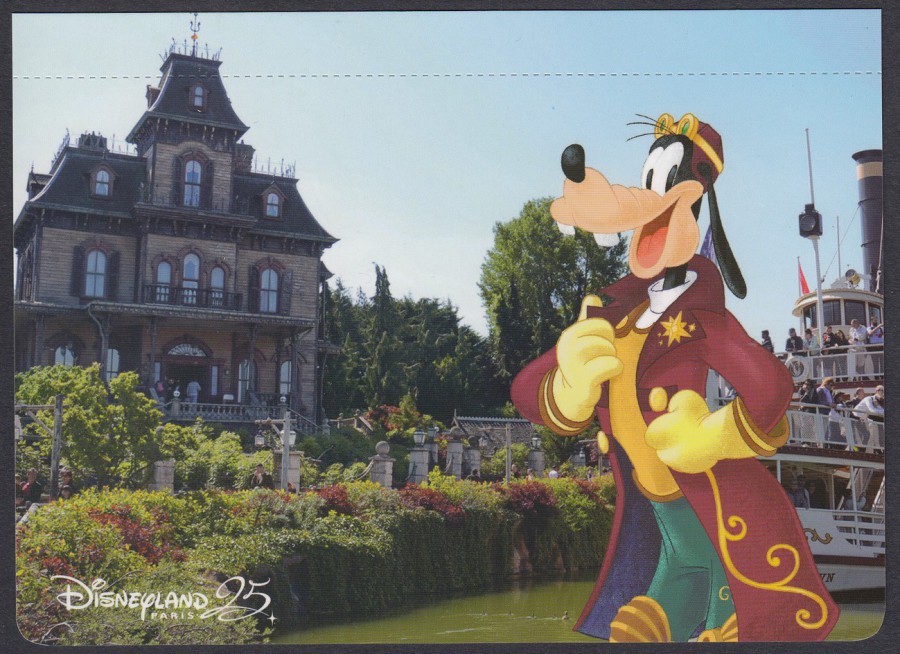
GOOFY
With
PHANTOM MANOR
(The Paris version of THE HAUNTED MANSION)
NINTH POSTCARD
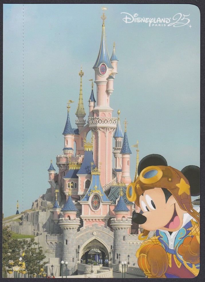
MICKEY MOUSE
With
SLEEPING BEAUTY’S CASTLE
Micky only gets the one postcard appearance here, I wonder why?

TENTH POSTCARD
MINIE MOUSE
With
THE DISNEYLAND HOTEL PARIS
This is ‘definitely’ Minnie Mouse’s book as she appears on three of the postcards, Donald and Daisy Duck have two each whilst the others have just the one, which is a surprise as I would have thought Mickey would have had more, but this just goes to show that Disney do not always take the obvious route. I thought this was also well priced at just 9.99 euros for the book (in the US I would have expected to pay over $20 for something similar (probably well over). All in all, this is a superb commemorative for their 25th anniversary.