EMAIL ADDRESS - markspostcardchat@gmail.com

22/04/2020
DISNEY’S
ANIMAL KINGDOM
2005
Large Shaped Postcard
Official Walt Disney World – Animal Kingdom Postcard
It is always nice to find these dated postcards, especially the unusual large shaped ones. Today is the 22nd birthday of the Animal Kingdom Theme Park, which opened on the 22nd of April 1998, so I decided to show one of my Animal Kingdom related postcards. This one is a cracker, especially as I also collect Tiger themed postcards.

REVERSE SIDE OF ABOVE POSTCARD
Rarely see these postal used and still in a reasonable condition as they do not travel through the post easily. Normally they have major bends and damage around any protruding bits. This one seems to have fared rather well considering. There is a POSTAGE DUE mark under the stamp, but there is no amount written in so I believe no charge was actually made.
22/04/2020
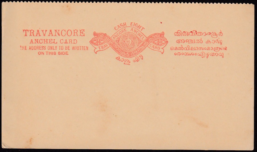
TRAVANCORE
INDIAN STATE
CASH EIGHT
POSTAL STATIONERY POSTACRD
Higgins & Gage, World Postal Stationery
Catalog
Section 9
Indian States – Travancore - Page 1
Reference No: 3
Issued 1892
The perforated edge across the top shows that this is one half of what was a double card (reply card). This is one of those unusual things you pick up for a few pennies and then at some point wonder exactly what it is. I have had this one for a good few years in a box, but dug it out just before the lockdown and scanned it in intending to look-into it, which wasn’t hard as I own a set of the Higgins and Gage books.
The Kingdom of Travancore was an Indian kingdom (or State) which ended in 1949. The emblem that can be seen in the centre of the circle in the design top centre of this postal stationery card is a conch shell, the same that appeared in the centre of the kingdoms flag (which was a basic red block with the conch shell motif in the centre).
22/04/2020
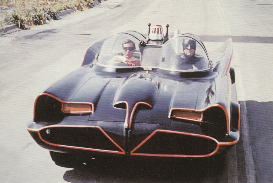
UNTITLED
BATMOBILE
CARS OF THE STARS MOTOR MUSEUM
KESWICK, CUMBRIA, ENGLAND
Published by the
CARS OF THE STARS MOTOR MUSEUM
This museum sadly closed some years ago, but I did get the chance to visit it once many years ago, when we took the kids to the Lake District for a camping holiday, so we are talking may be 26 or more year. I loved the museum and I try and pick up any postcards from there when I come across them. This one I bought only last week off eBay. I was really pleased with it as I have a reasonably large Batman postcard collection and am always glad to add to it, especially anything directly related to the 1960’s TV version.

REVERSE SIDE OF ABOVE POSTCARD

22/04/2020
GREETINGS FROM THE FALKLAND ISLANDS.
RACECOURSE AT STANLEY.
MOUNTS WILLIAM AND TUMBLEDOWN AND THE Two Sisters
Copyright
STEVE WHITLEY, MBE
Photographed in the Falklands
Printed by
ARCH PRESS (LONDON) LTD
I already had one of these postcards, but when I read the message on this one I had to have it. I collect items related to the Falklands War and although this card was posted two years later it has been sent back to the UK by a member of the armed forces
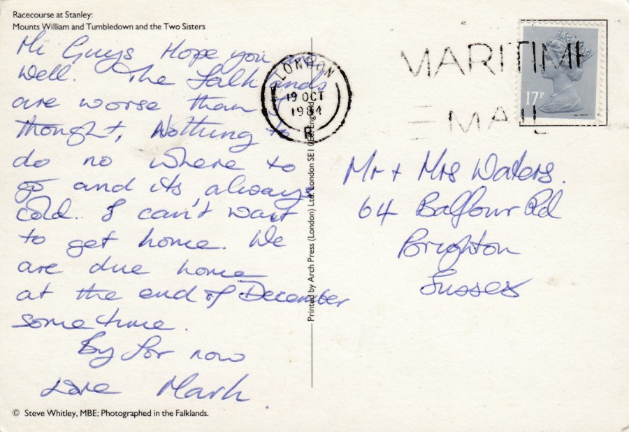
REVERSE SIDE OF ABOVE POSTCARD
The 17p Queens Machin head stamp has been cancelled with a LONDON – MARITIME MAIL cancellation dated 19th October 1984. What attracted me to this card is the message which reads:
“Hi Guys. Hope you are well. The Falklands are worse than I thought, Nothing to do no where [sic] to go and its always cold. I can’t wait to get home. We are due home at the end of December sometime.
By [sic] for now. Love Mark”
I think Mark was not too impressed with the Falkland Islands, what do you think? What a great message, and it gave me a laugh.
22/04/2020
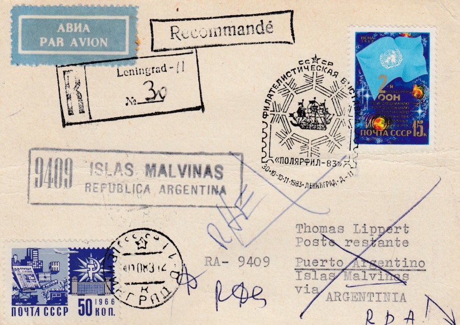
PLAIN POSTCARD
Posted from Russia to the Falkland Islands
1983
Returned to Sender
This only arrived yesterday. It was a lucky eBay find. This has some connections to the Falklands War and has two cachets on the reverse side which I have been after copies of for some time now, but more about them below. In the meantime, let’s talk about the front here. This has a nice stamp, issued for the Second UN Conference on the Exploration and Peaceful uses of Outer Space, which was held in Vienna (SG 5243 – issued in 1982), which has been cancelled with a nice special hand stamp dated 1983 (possibly October). There is a boxed LENINGRAD registered mail cachet applied, a nice blue PAR AVION airmail label (sometimes in the real world called ‘stickers’ and in the professional collecting world called ‘Etiquettes’) and a definitive stamp bottom left corner (SG 3357 – Postal communications, issued 1966).
The most interesting addition, in my mind, is the boxed ‘9409 – ISLAS MALVINAS – REPUBLICA ARGENTINA’ mark (centre left side) which had been in use in Argentina during the Falklands War and which continued in use after the war ended. It was normally used on mail going into the Falkland Islands from Argentina. It was especially used on any mail where the name Falkland Islands was written or printed, which they scrubbed out and then applied this cachet, which is a postal and political comment on ownership of the islands. 9409 is the postal number allocated to the Falkland Islands by the Argentine postal service; Encotel. This last cachet alone would have been enough for me to buy this cover, but there are other cachets on the reverse side…
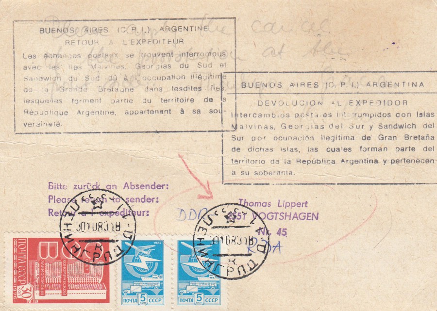
REVERSE SIDE OF ABOVE POSTCARD
There are two large boxed cachets applied here, one in Spanish and one in French. The text on these cachets, applied in Argentina, reads:
“Return to Sender
Postal exchanges are interrupted with Malvinas Islands, South Georgia and Southern Sandwich due to the illegitimate occupation of Great Britain in said islands, which form part of the territory of the Argentine Republic belonging to its sovereignty”
These cachets were applied to mail after the war which had been routed through Argentina, often incorrectly. It was these two cachets which made me want this card. As will become apparent to anyone clicking on the above tab ‘FALKLANDS WAR PHILATELIC DISPLAY’ I am a big collector of postal material related to the Falklands War conflict, both the propaganda pre-war material and that which occurred post war. These cachets are an important part of the post war story.
There also some further stamps bottom left, all from Russia, the red coloured one is a 1976 issue, 30 k value for the Council for Mutual Economic Aid Building (SG 4543). The two blue coloured stamps I have been unable to identify, not an uncommon position and Russia issued lots of stamps, and my specialised Russia catalogue only goes up to 1980 and these have the year 1982 printed on them. They look like definitive issues so may have been a 1982 reprint of an earlier definitive issue.
22/04/2020
JAMES BOND
Maxi-Cards
PART FIVE
When Royal Mail issued their James Bond stamp set last month I decided to buy some of these stamps and stick them on some related postcards to be sent off for special hand stamps. I used postcards from the special JAMES BOND 100 postcards box set. Here are a few more that recently were returned to me.
HONEY RYDER (URSULA ANDRESS) MEETS JAMES BOND
(SEAN CONNERY) IN
DR. NO (1962)
Home Made Maxi-Card
Postcard from the
JAMES BOND 100 POSTCARDS
Boxed set
I applied one of the ‘Smiler’ sheet stamps with its corresponding Cinderella label on this one. I also included a small block of the sheets boarder area which had the 007 gun styled logo on it. I think it worked including this little extra.

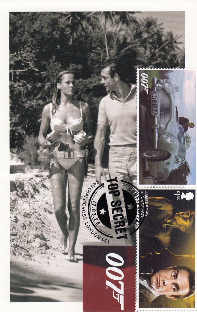
ADVANCE CHARACTER POSTER FEATURING EVA GREEN AS
VESPA LYND
CASINO ROYALE (2006)
Home Made Maxi-Card
Postcard from the
JAMES BOND 100 POSTCARDS
Boxed set
This was a great combination of poster postcard, stamp and cancellation. This ‘TOP SECRET’ special hand stamp was a nice dark heavy one which works nicely on some of these cards
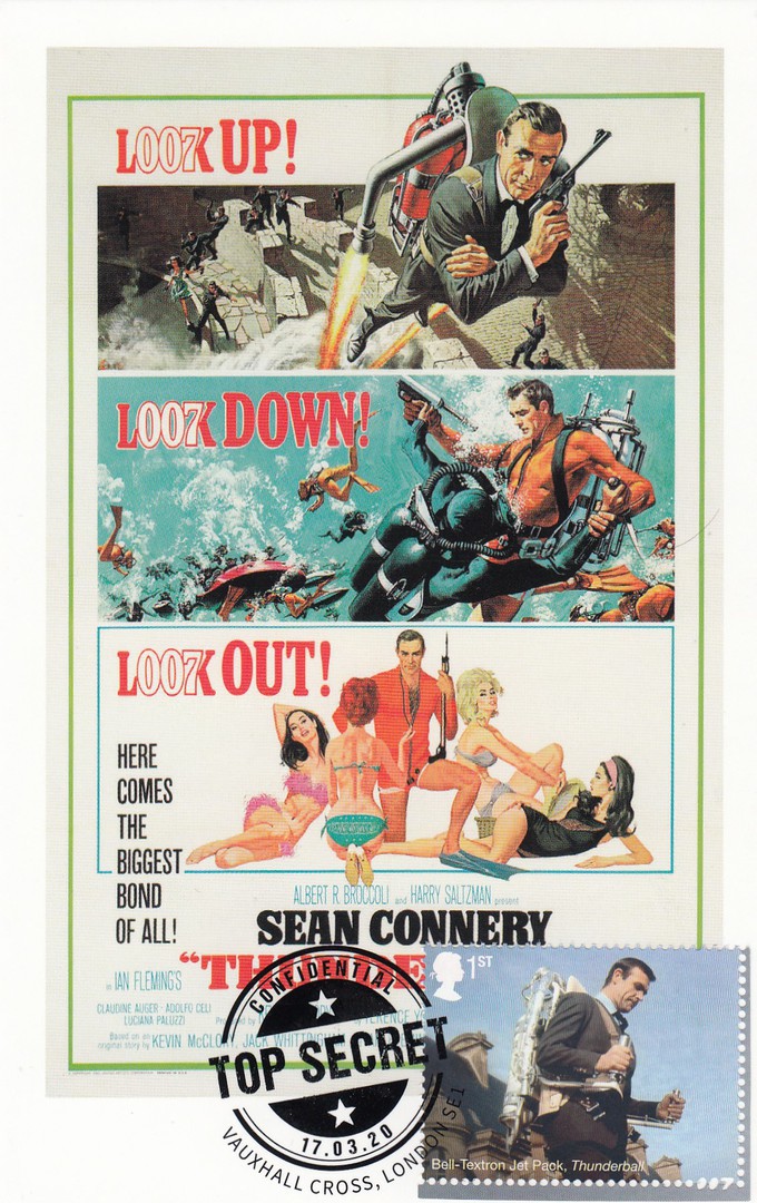
US POSTER FOR
THUNDERBALL (1965)
Home Made Maxi-Card
Postcard from the
JAMES BOND 100 POSTCARDS
Boxed set
As the top piece of artwork on this film poster depicts James Bond using the jet-pack then clearly this was an ideal postcard to receive the 1st class ‘Bell-Textron Jet Pack- Thunderball’ stamp from the miniature stamp sheet. This combination again works well.

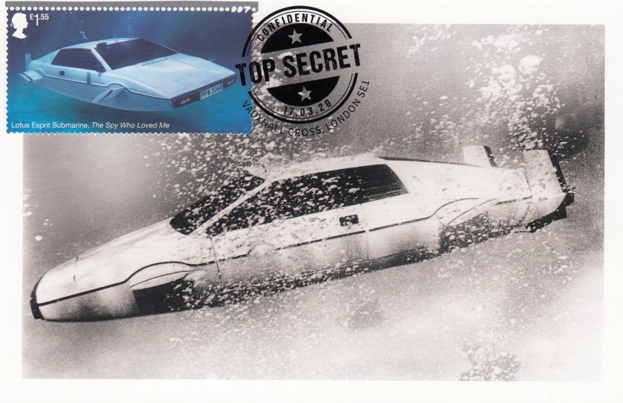
BARBARA BACH AS MAJOR ANYA AMASOVA AND ROGER MOORE
AS JAMES BOND
THE SPY WHO LOVED ME (1977)
Home Made Maxi-Card
Postcard from the
JAMES BOND 100 POSTCARDS
Boxed set
An appropriate postcard image to receive the ‘Lotus Esprit Submarine’ car stamp from the miniature stamp sheet. This stamp was £1.55 but was worth adding to this card.
JAMES BOND’S LOTUS ESPRIT S1 “WET NELLIE”
THE SPY WHO LOVED ME (1977)
Home Made Maxi-Card
Postcard from the
JAMES BOND 100 POSTCARDS
Boxed set
My favourite postcard from today’s returning. I had to play around a little with the stamp to get it onto this one in the right way. This meant cutting away most of the boarder area across the top, but I left enough of it so that the 007 perforation top right could still be seen. I do like the inclusion of this 007 perforation as it adds something to the stamp, but if the stamp is fully removed from the boarder you lose it, so I think this was the best approach to keeping it visible.

21/04/2020
WINTER RELIEF FUND
Fishing Trawlers
POSTAL STATIONERY POST CARD
Higgins & Gage, World Postal Stationery Catalog
Section 7
Germany - Page 18
Reference No: 251
Issued: 22ND November 1937
Michel Reference: Mi P 266
This postal stationery post card was designed by von Axster-Heudtlass with the pre-printed 6 Pfg (+ 4 Pfg extra charged) postage stamp featuring a 15th Century sailing ship. This postal stationery post card remained postal valid until the 30th June 1938.
The collector who owned this ‘particular’ copy clearly liked his special cancellations as there two on the front with a further three on the reverse side.
On this side, you have one cancelling the pre-paid postage stamp mark:
BERLIN – TAG DER NATIONALEN SOLIDARITAT [day of national solidarity] – 4.12.1937 [4th December 1937]
The second cancellation reads:
BREMEN – 44 DEUTSCHER PHILATELISTENTAG - MS. OCEANA – 13.6.38 – SCHIFFSPORT – BREMEN – BREMERHAUELL [44 German philatelist day – M.S. Oceana – 13th June 1938 – Shooting – Bremen – Bremerhauell(?)]
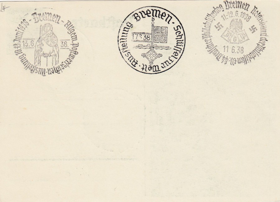
REVERSE SIDE OF ABOVE POSTCARD
This side has three further cancellations, from the left side across:
1) BREMEN – ALLEGM POSTWERTZEICHEN AUSTELLUNG 10-13 JUNI 1938 – 13.6.38 [ General Post Stamp Exhibition 10-13 June 1938 – 13th June 1938]
2) BREMEN – SCHLUSSELZUR WELT AUSTELLUNG – 17.6.38 [Key to the World Exhibition 17th June 1938]
3) BREMEN – REICHSBUND DER PHILATELISTEN ?? DEUTSCHER PHILATELISTENTAG 11-12. 6. 1938, 11/6/38 [Empire of Philatelists (??) German Philatelist Day 11-12.6.1938 – 11th June 1938]
Clearly this collector liked the cancellations of the philatelic events held in Bremen during the early half of 1938. This is an entirely philatelic collectible, a souvenir I suspect for attending these events, but it is still a nice item.
21/04/2020
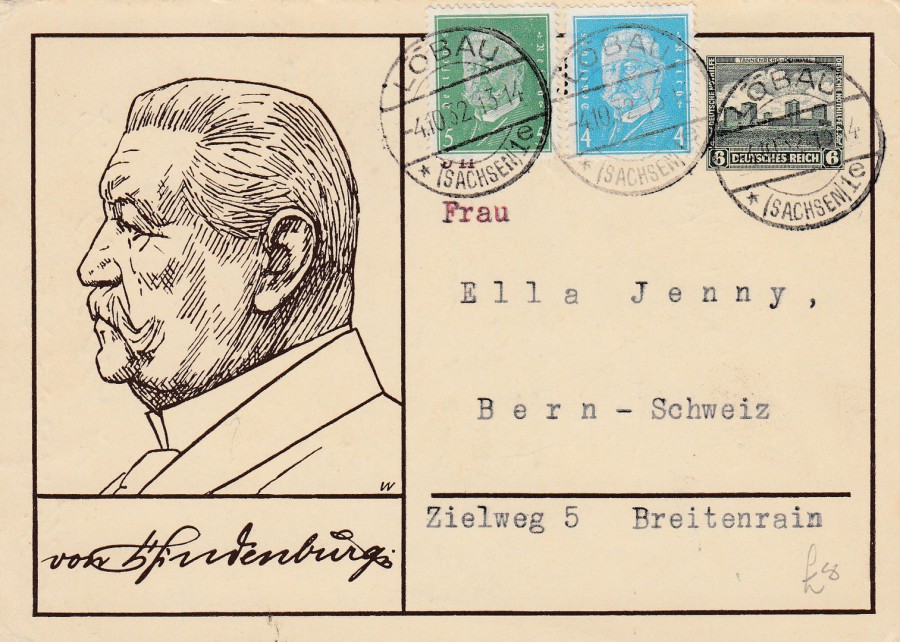
TANNENBERG MEMORAIL MONUMENT
Postal Stationery Post Card
Higgins & Gage, World Postal Stationery Catalog
Section 7
Germany - Page 14
Reference No: 208
Issued 1932
This was a charity issue with the pre-paid postage stamp priced at 6 Pfg on top of which was added 4 Pfg as a money raiser for charity. The portrait on the left side is of President Hindenburg. This ‘particular’ card was addressed to Switzerland so had two extra stamps applied to cover postage; a 4 Pfg blue definitive (SG 425) and a 5 Pfg green definitive (SG 426), both issued in 1928 AND BOTH DEPICTING President von Hindenburg. These stamps have been cancelled with a LOBAU circular cancel dated 4th October 1932. Lobau is a city in Saxony, Germany. The card itself is not of any great value catalogue wise, but this one has some nice usage with the extra stamps and clear cancels and a foreign destination.
21/04/2020
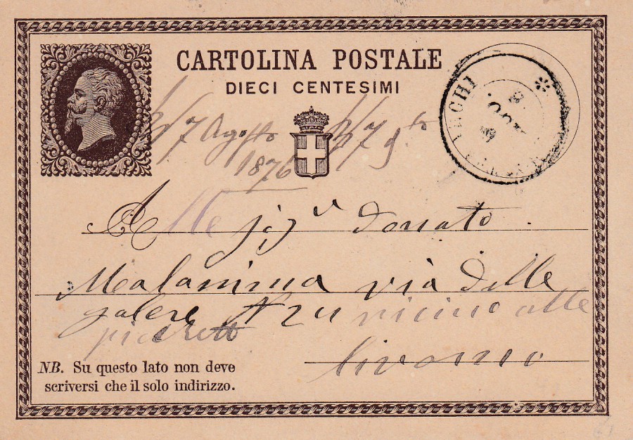
ITALY
10 Centesimi Value
POSTAL STATIONERY POST CARD
Higgins & Gage, World Postal Stationery Catalog
Section 9
Italy - Page 1
Reference No: 1
Issued: 1874
This was Italy’s very first postal stationery post card issue. Unlike most postal cards of this era the stamp imprint, featuring the head of King Victor Emanuel, was placed on the left side of the card. Also, the stamp imprint has no value attached to the design, the postage value appears in words underneath the top CARTOLINA POSTALE (POST CARD) header, the value is shown as DIECI CENTESIMI (10 Centesimi). The cancellation applied is unclear, but there is a hand-written date on the card, which is for 1876, and you can make out the number 6 at the bottom of the cancel, so 1876 it probably is. Although the first Italian postal stationery post card, and important for that fact, this is a cheap card to pick up.

21/04/2020
PENNY POSTAGE JUBILEE 1890
GUILDHALL, LONDON
FORGERY
This is a word or warning I suppose as the original Penny Postage Jubilee 1980 postcards are quite valuable at around £25 for a nice mint copy. The original cards were issued for the Penny Postage Jubilee event held at the Guildhall in London on the 16th, 17th and 18th May 1890. The initial 10,000 copies printed sold out on the first day so a further 1,500 were printed for the rest of the event days. The original card was Britain’s first piece of commemorative postal stationery.
Now, the card has always been popular which I suppose is why these forgeries were produced. I do not know who produced these, and I am not sure it is a known who did, but there has been some suggestion it may have been a Thomas Bray who forged copies of another Victorian postal card, the large Christmas 1890 card, and was taken to court and found guilty of that offence – was he also responsible for the forgery of this Penny Postage Jubilee card? What is known is that they appeared in the 1960’s (Thomas Bray, as mentioned above, was taken to court in the late 1970’s for the known forgery of the other item).
Anyway, how do you tell the difference between a real 1890 penny postage jubilee card and the forgeries? Well, the forgeries are printed on a much yellower coloured card and appear brighter and sharper than the originals which were printed on a buff matt coloured card. Also, although harder to tell without a bit of knowledge is the fact that the originals are printed in a carmine red whilst the forgeries are printed in a sharper scarlet red. My best advice around these forgeries is that if the card looks too good to be true, and too perfect in condition, then its probably one of the forgeries, after all, the originals are now 130 years old.
19/04/2020
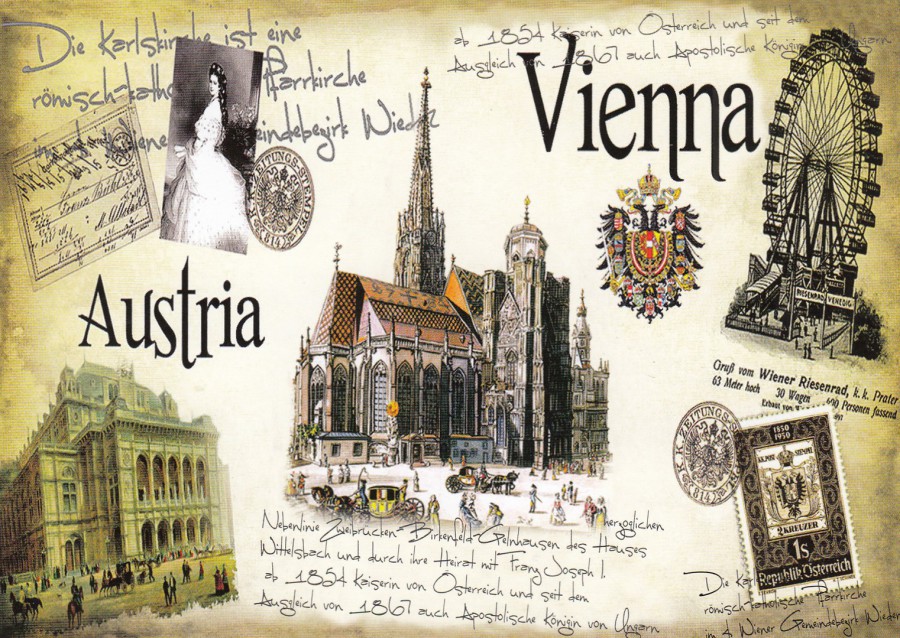
AUSTRIA – VIENNA
Published by
AUSTRIA ARTS
Like most people in the western world I am in lockdown and can not travel, which I love to do. Last year I visited Vienna and bought this postcard as one of my souvenir postcards. I have three categories of postcards I buy:
1) Postcards for a specific collecting theme – I have a number of these, but my top ones are Television, Film, Falklands War, Military History and Philatelic.
2) Miscellaneous Themes – Postcards which appeal to me and although not in any of my main collecting themes I like them, or they are cards people have given or sent to me, which I keep.
3) Souvenir Postcards – These are postcards I buy whilst on holiday, the same sort of cards all tourists buy and either send or keep. I am no different to anyone else here, although I suppose that I generally buy a few more of these than most people.
This postcard here is ‘definitely’ a category 3 postcard. Although having said this, the postcard depicted here does have a lot going for it. There is an old postcard depicted top left which is an image of the world’s first postal stationery post card (which celebrated its 150th anniversary last year, the UK’s first celebrates its 150th anniversary this year). There is also a nice postage stamp shown bottom right which is a 1950 issue (SG 1210) which celebrated the centenary of the first Austrian postage stamp, which is depicted on this commemoration stamp (the first stamps were the ‘Arms of Austria’ issue from 1850 – the 2k (kreuzer), reference SG 7, value is depicted on this commemorative issue).
This card also depicts landmarks all of which I saw. I rode the large wheel depicted, and Jo attended Mass in the depicted cathedral. So, this is a lovely souvenir, and a nice card as well, but most importantly it is a reminder of the joys of travel (which will come back, at some point in the not- too-distant future).
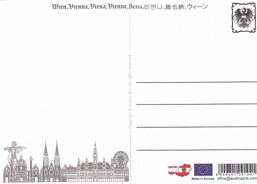
REVERSE SIDE OF ABOVE POSTCARD
19/04/2020
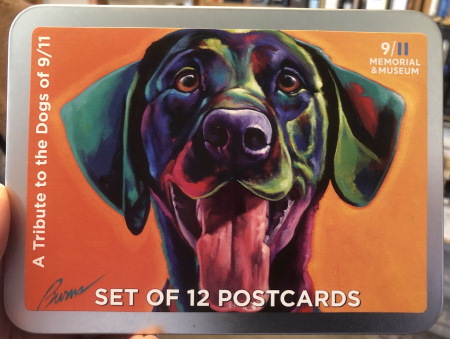
SET OF 12 POSTCARDS
(Actually 6 different designs with two of each in the tin)
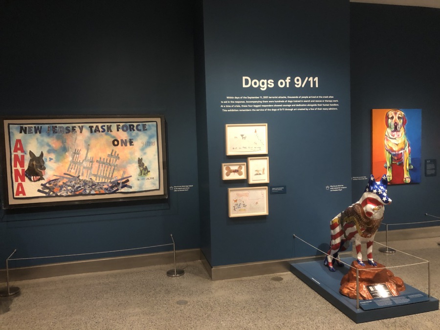
Exclusive 9/11 Museum Postcard Tin Set
FRONT OF TIN COVER
When we were in New York in February I had my first chance to visit the 9/1 MEMORIAL & MUSEUM. I have visited the memorial outside once before, back in 1918, but was unable to visit the museum on that trip, which was remedied on this year’s trip.
As a police officer who watched the disaster unfold live on television I was quite affected by what happened, especially when I watched the first tower come down because I knew that there were people inside, and I knew that would include firemen and police officers. So, this museum was a ‘must do’ on this trip, and if I am honest it is one which I believe anyone should visit, especially as it is a far better museum than, even I anticipated.
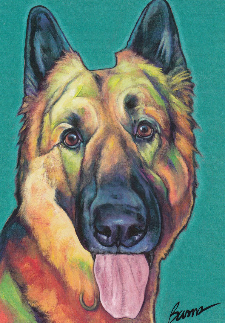
In the gift shop they sell a set of postcards in a special tin which depict working dogs which were involved in 9/11. I had to have one of these, but I was given a choice as although the cards are the same in each tin you have a choice of covers to choose from. I chose Everest.
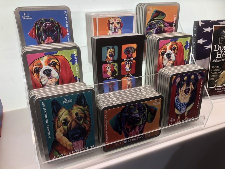
PHOTOGRAPH
13TH February 2020
9/11 MEMORIAL & MUSEUM GIFT SHOP
This photograph shows the shelf in the museum gift shop with the tins set up for sale. Here you can see five different tin covers. I did like the fact that you could choose which dog you wanted on your tin.
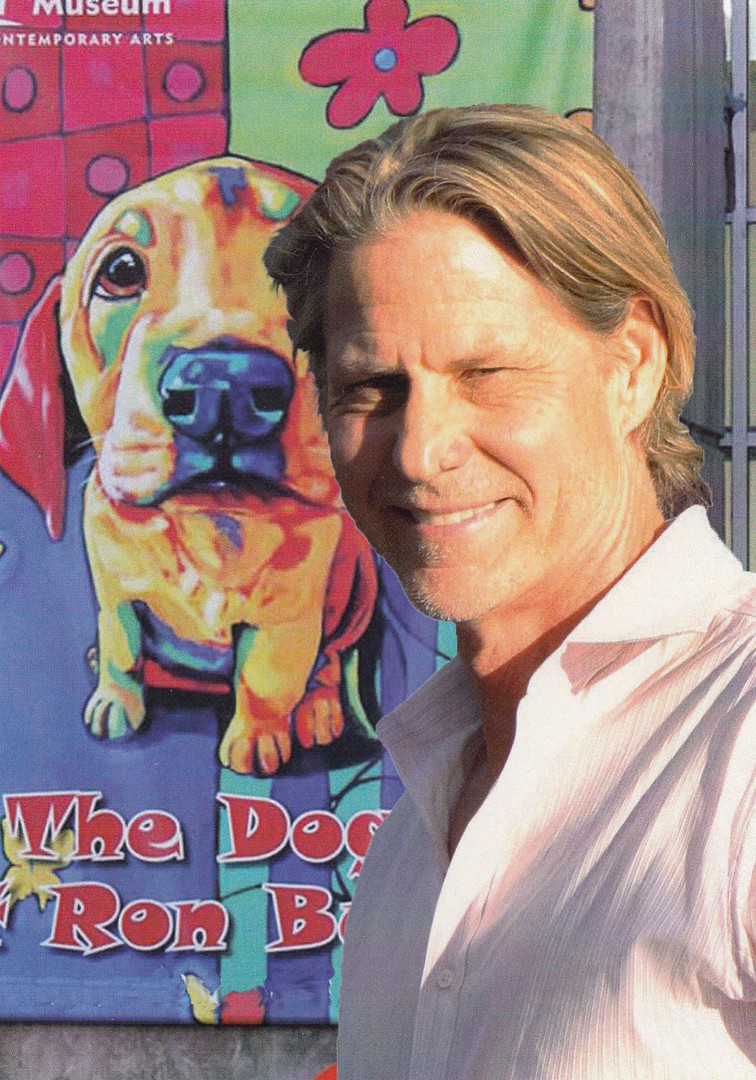
FRONT OF INFORMATION CARD
Which comes inside the tin with the postcards
Artist
RON BURNS
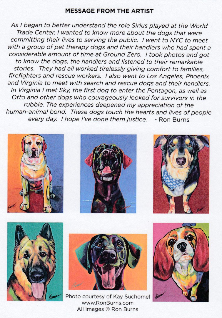
REVERSE SIDE OF ABOVE INFORMATION CARD
This has the artist explaining how he came to paint the images of these dogs and a little of the story behind how he became involved in the story of these 9/11 Dogs. This helpfully explains things far better than I could and saves me having to write up his story.
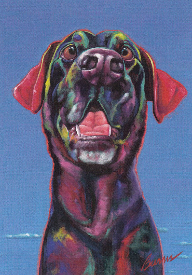
‘SIRIUS’
Explosive Detection
Port Authority Police Department K9
A TRIBUTE TO THE DOGS OF 9/11
By
RON BURNS
Published by and exclusive to the
9/11 MEMORIAL & MUSEUM
‘SKY’
Search and Rescue - FEMA
A TRIBUTE TO THE DOGS OF 9/11
By
RON BURNS
Published by and exclusive to the
9/11 MEMORIAL & MUSEUM
‘WUSEL’
Pet Therapy
Therapy Dogs International
A TRIBUTE TO THE DOGS OF 9/11
By
RON BURNS
Published by and exclusive to the
9/11 MEMORIAL & MUSEUM
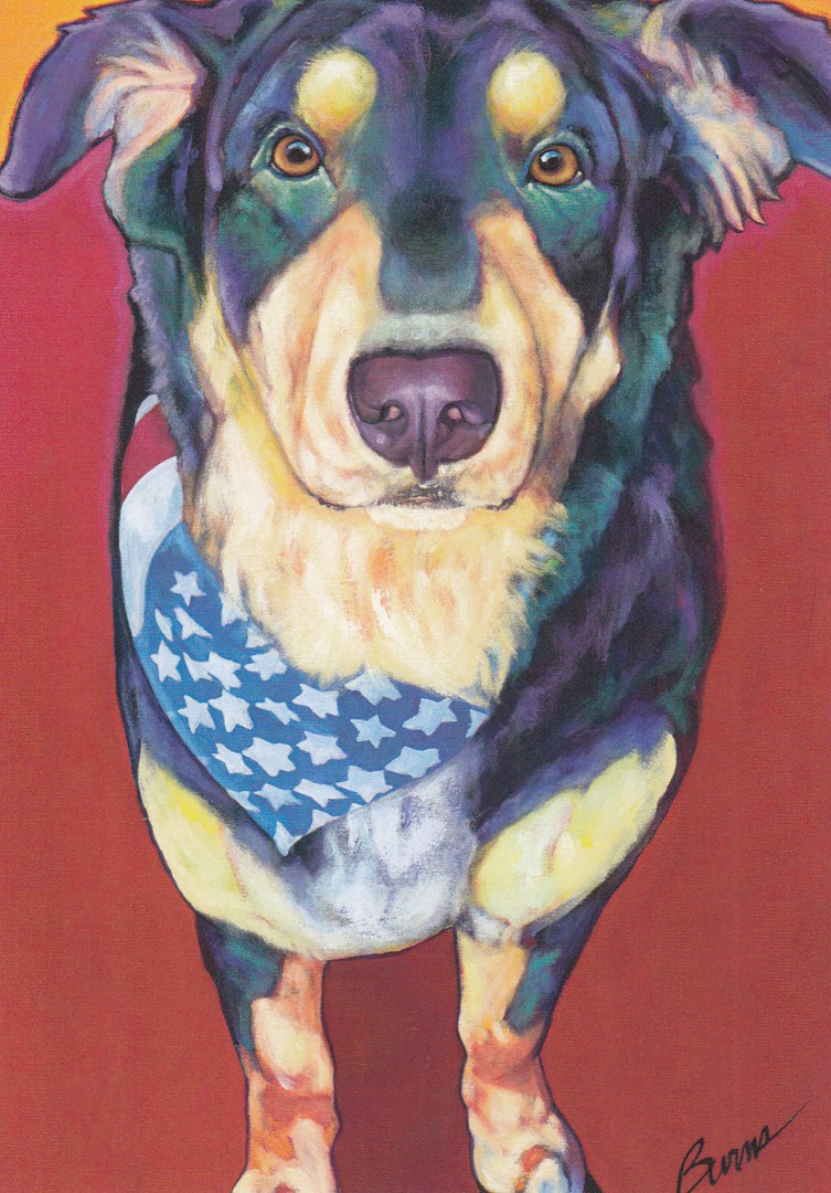
‘OTTO’
Search and Rescue
Virginia Task Force 1
A TRIBUTE TO THE DOGS OF 9/11
By
RON BURNS
Published by and exclusive to the
9/11 MEMORIAL & MUSEUM

‘ANNIE’
Pet Therapy
Delta Society
A TRIBUTE TO THE DOGS OF 9/11
By
RON BURNS
Published by and exclusive to the
9/11 MEMORIAL & MUSEUM

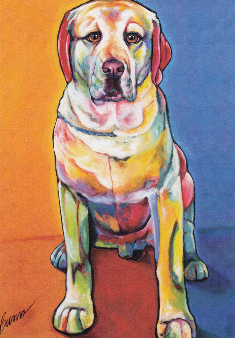
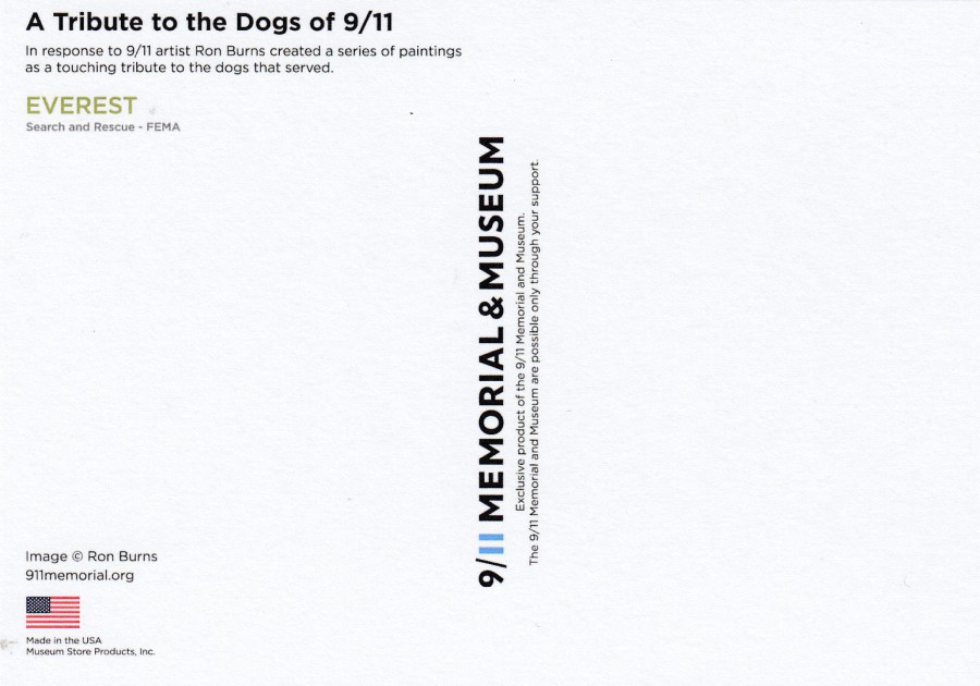
‘EVEREST’
Search and Rescue - FEMA
By
RON BURNS
Published by and exclusive to the
9/11 MEMORIAL & MUSEUM
And of course, Everest was the dog that I chose for the cover of the tin which I bought. He does look like a happy dog, and although I did not know it before choosing Everest I am glad that he is a Search and Rescue dog as although all the dogs here had their own important part to play in the 9/11 story I liked the idea of having a search and rescue dog because I have a friend in Canada who is a trained search and rescue dog handler.
REVERSE SIDE OF ABOVE POSTCARD
All the postcards have the same basic design layout although of course the dog’s names and work description change, also each dogs name is in a different colour:
SIRUS – Light Green
SKY – Light Blue
WUSEL – Deep Purple
OTTO – Light Brown
ANNIE – Pink
EVEREST – Light Green
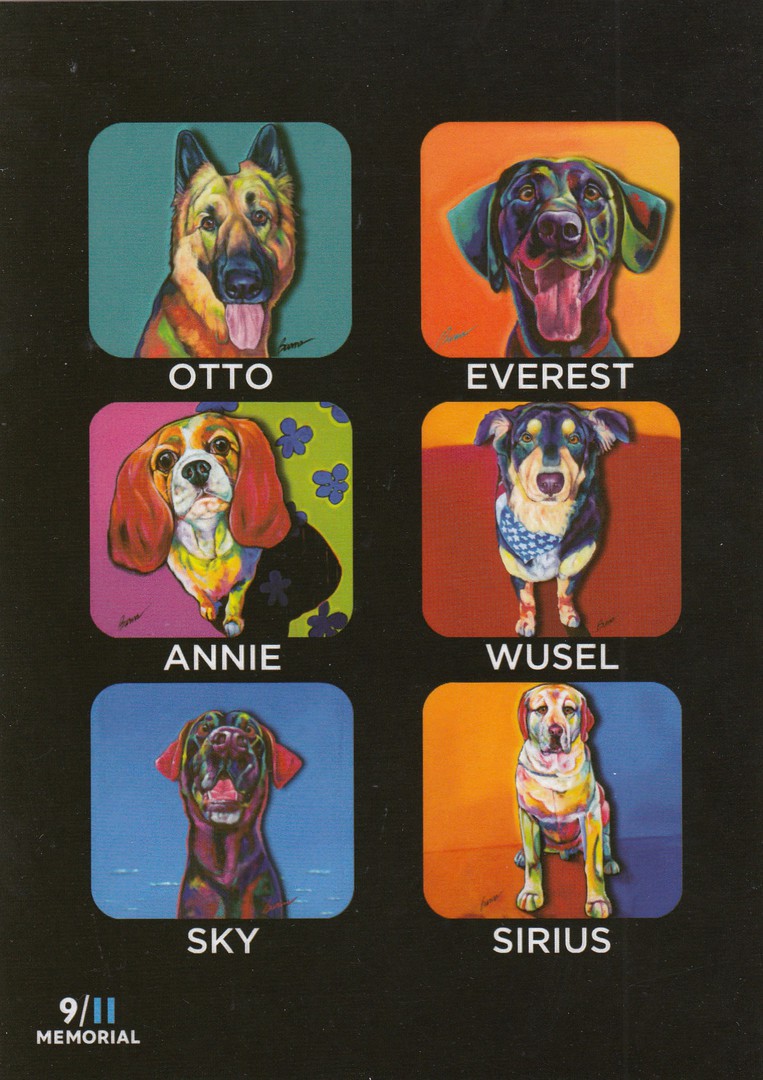
INDIVIDUALLY SOLD POSTCARD
(This one is not inside the tin – but can be seen in the photograph of the shelf in the Museum gift shop, as depicted further above)
A TRIBUTE TO THE DOGS OF 9/11
OTTO – EVEREST
ANNIE – WUSEL
SKY - SIRIUS
By
RON BURNS
Published by and exclusive to the
9/11 MEMORIAL & MUSEUM
Even if you had bought the tin, I am sure most people would also want this individually sold postcard depicting all six of the dog paintings… I did.
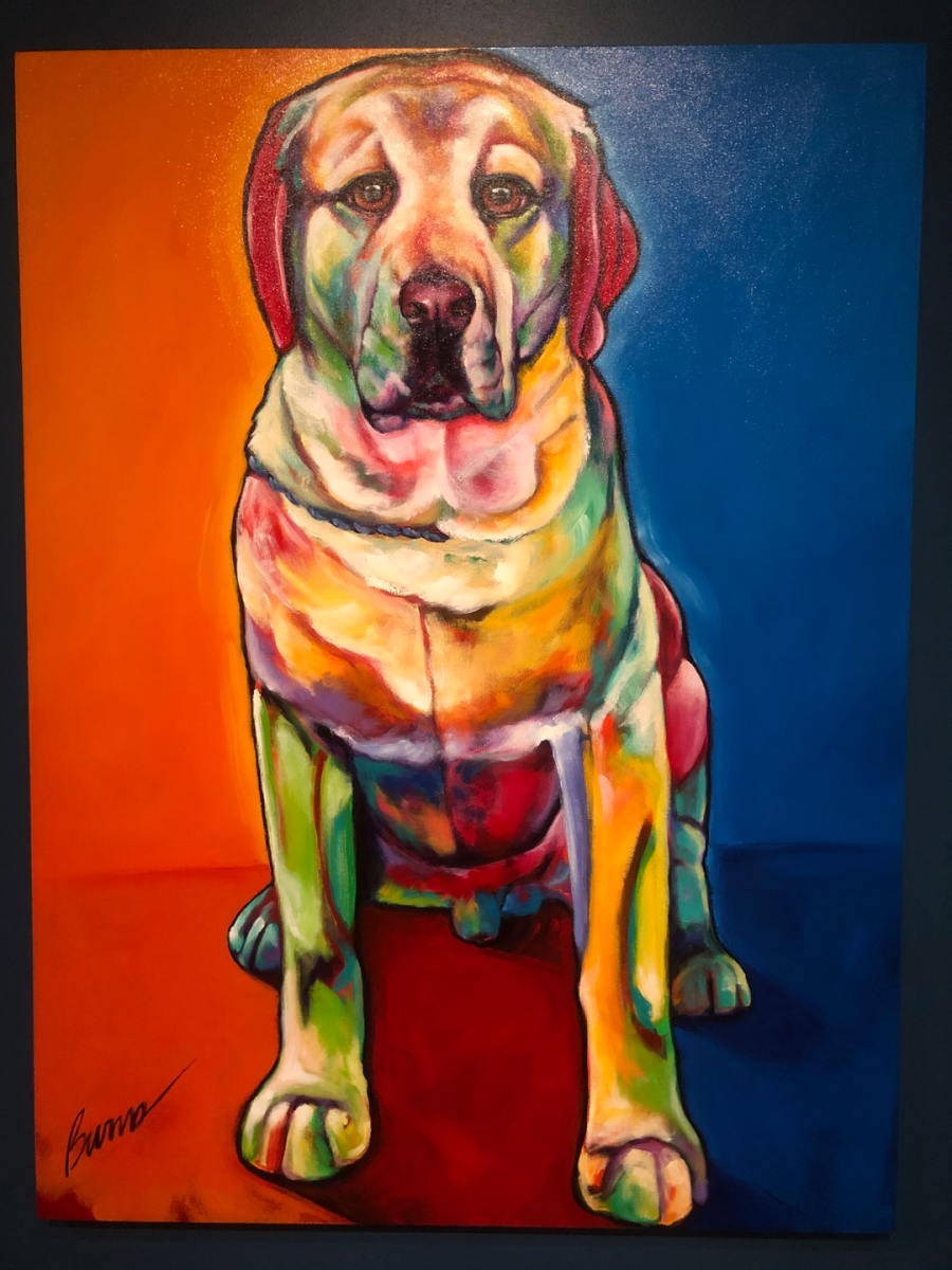
PHOTOGRAPH
13TH February 2020
‘SIRIUS’
By
RON BURNS
This is my photograph of the original painting of Sirius that hangs in the special exhibition area of the 9/11 Museum dedicated to the ‘DOGS OF 9/11’
PHOTOGRAPH
13TH February 2020
Exhibition area titled: ‘DOGS OF 9/11’
This is just a small section of the museums dedicated dog exhibition which also has a selection of photographs of the dogs involved and some more paintings.
18/04/2020
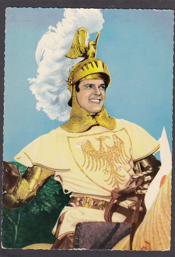
IVANHOE
Starring
ROGER MOORE
Late 1950’s TV series
This television series was before my time really as I have no recollections of having seen any episodes in re-runs and its original run was before I was born. 39 episodes were filmed, and the original run was between 1958 and 1959 with the premiere appearing on ITV on the 5th January 1958.
So far, I am not aware of finding any UK produced postcards for this series (although there is one plain backed photo-card which is postcard sized and which depicts the same image as appears on the first postcard shown here – I depicted it here on the webpage when Roger Moore passed away), but postcards from the Netherlands seem to have been far more popular, as you will see here.
Collecting these can be interesting as you get colourised and black and white postcards for the same image and adaptations of an image across several issues. Also, these can be very hard to source here in the UK because they were not issued here (out of curiosity I checked eBay today and there are no copies being offered at all). As you will see as you scroll down, I have been fortunate to get my hands on a small number.
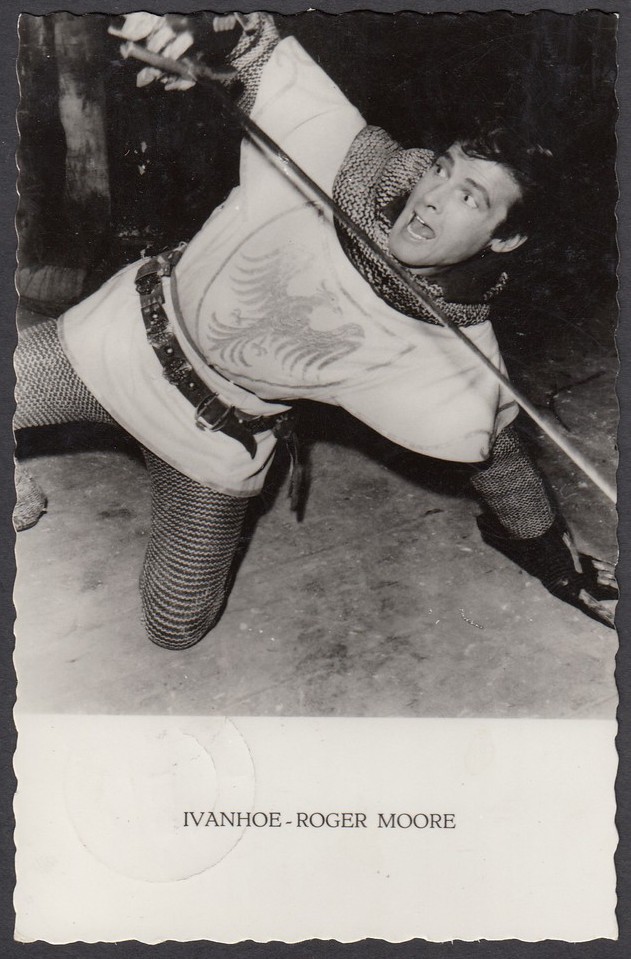
IVANHOE
ROGER MOORE
Unknown Publisher
Netherlands issue
A nice deckle-edged issue showing what is probably the best known image from the series, and the image most commonly (if you can use the word common for cards that rarely turn up) seen on postcard here in the UK.
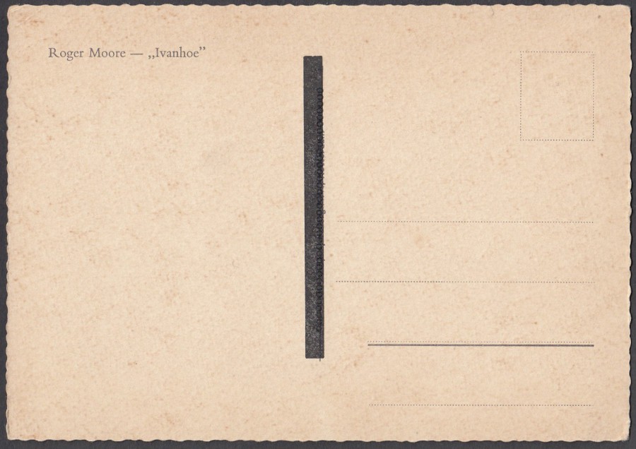
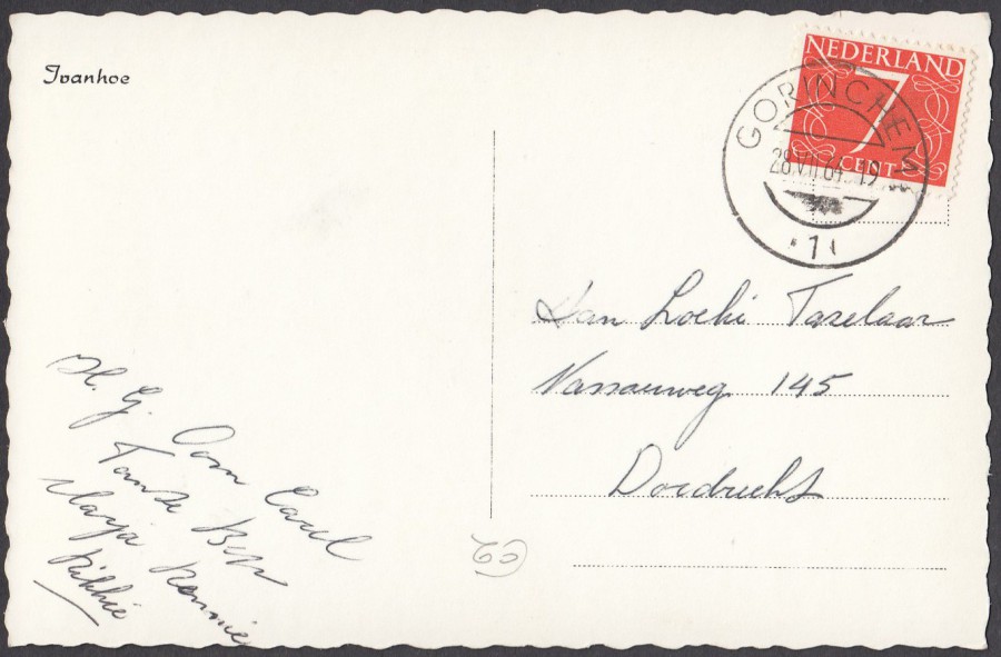
REVERSE SIDE OF ABOVE POSTCARD
On this postcard I do not know why the central line of text has been obscured by the thick black block. Maybe there was an error in the print or maybe the card was sold elsewhere and there was a need to cover over this information. Whatever the reason it does make this side a little more interesting. There are two more reverse sides like this further down this selection.
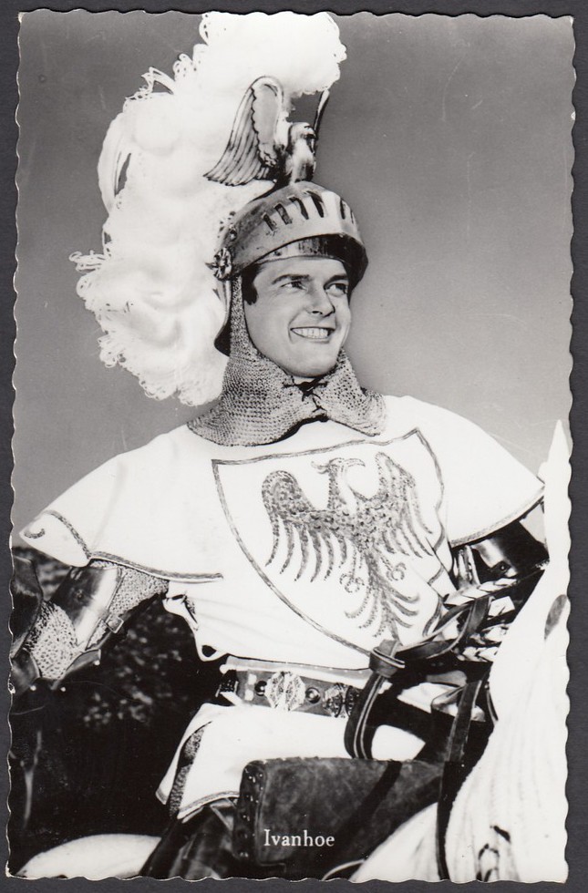
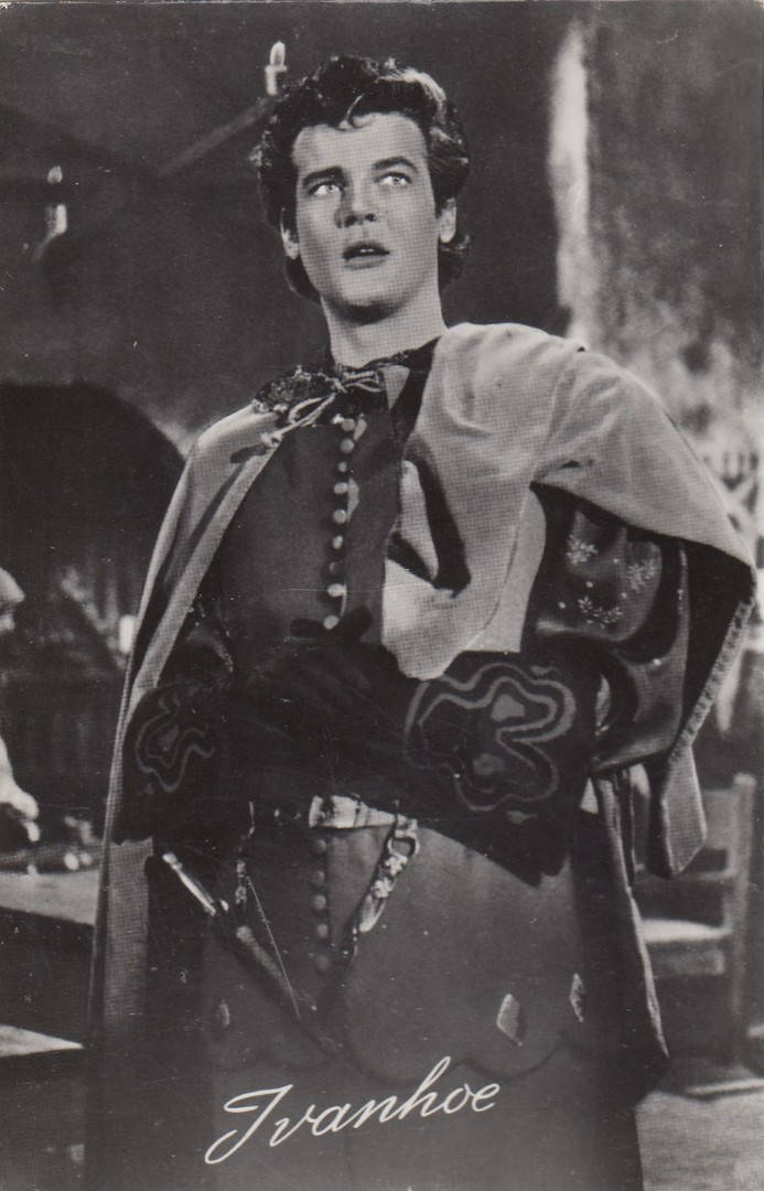
IVANHOE
Published by
ECHTE FOTO
263
Ref: nr. 789
This is the same image as on the postcard above, but on a smaller sized postcard and in the original black and white. The card still has a nice slight deckle-edging, which was so popular in the 1950’s.
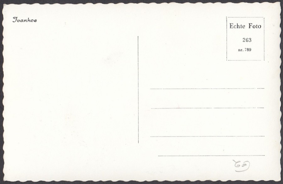
REVERSE SIDE OF ABOVE POSTCARD
Standard reverse layout style for this series, although obviously the reference number changes. One of the problems with these cards is if they are posted the stamp covers over the reference number, and issue which I have with a few in my small collection.
I will not bother show each reverse side for this company’s cards below unless they are used or to indicate the differences between the reverse sides of postcards baring the same image. With the mint ECHTE FOTO cards shown below I will not bother to show the reverse sides, they will be the same format as this.
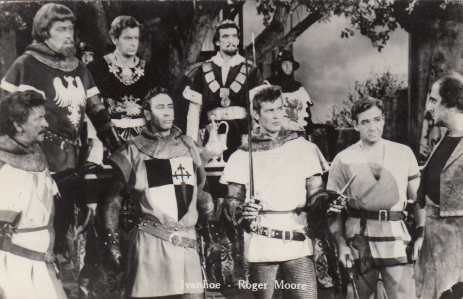
IVANHOE – ROGER MOORE
Unknown Publisher
Unknown Reference Number
The above details may have been printed in the stamp box area, but this is a used copy
A postcard from the Netherlands again only this time with straight edges, which is a little more unusual. This is clearly a scene from one of the episodes and one which shows you a selection of the actors and also allows you to see the quality of the costumes used in this series.
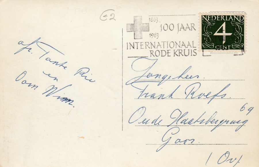
REVERSE SIDE OF ABOVE POSTCARD
Used in the Nederland’s (Netherlands) with the stamp cancelled with a very-nice ‘100 YEARS OF THE INTERNATIONAL RED CROSS’ slogan cancellation from 1963.

IVANHOE
Published by
ECHTE FOTO
263
Ref: nr. 788
IVANHOE – ROGER MOORE
Published by
ECHTE FOTO
163
Ref: nr. 736
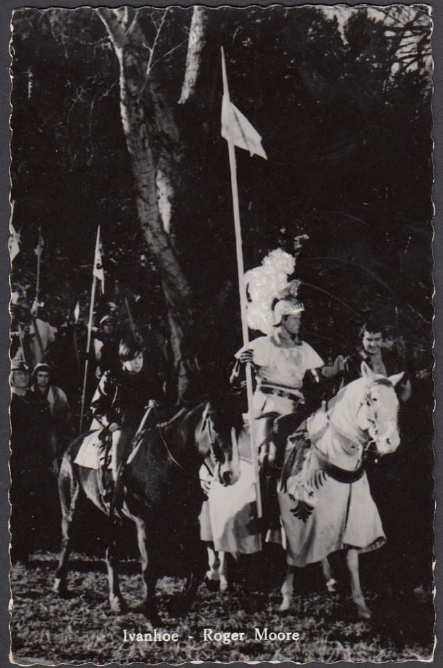
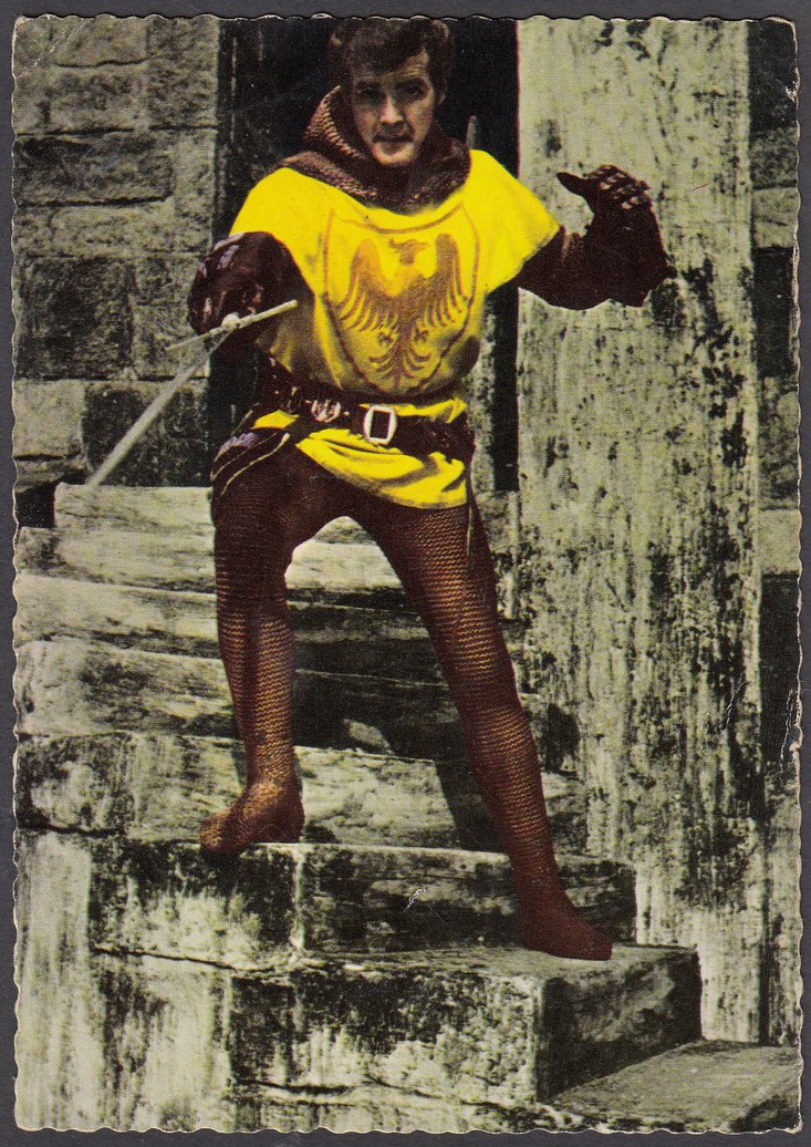
Back to the deckle-edging again for a vertical format image depicting Roger Moore on a horse in full knight regalia.
IVANHOE – ROGER MOORE
Published by
ECHTE FOTO
(Almost certainly – but the details would have been printed in the stamp box area and this is a used copy - which means we also do not have access to the Reference Number either)
A nice action shot from the series, possibly a publicity photograph but also possibly a scene from one of the episodes.
REVERSE SIDE OF ABOVE POSTCARD
Nice clean usage from GORINCHEM, which is in the south of Holland. The cancel is dated 28th July 1964.
ROGER MOORE “IVANHOE”
Unknown Publisher
Unknown Printer
Netherlands issue
On this photograph Roger Moore (or ‘Ivanhoe’ I suppose) and the costume he is wearing have been colour painted over a black and white photograph. I wonder what colour this costume originally was.

REVERSE SIDE OF ABOVE POSTCARD
This time the card has been posted from the Netherland city of HILVERSUM in the northern part of Holland. The date is hard to make out, but I can read that its November (IX), possibly the 1st and possibly 1966.
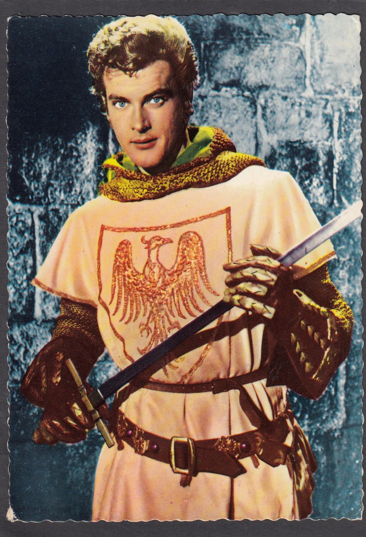
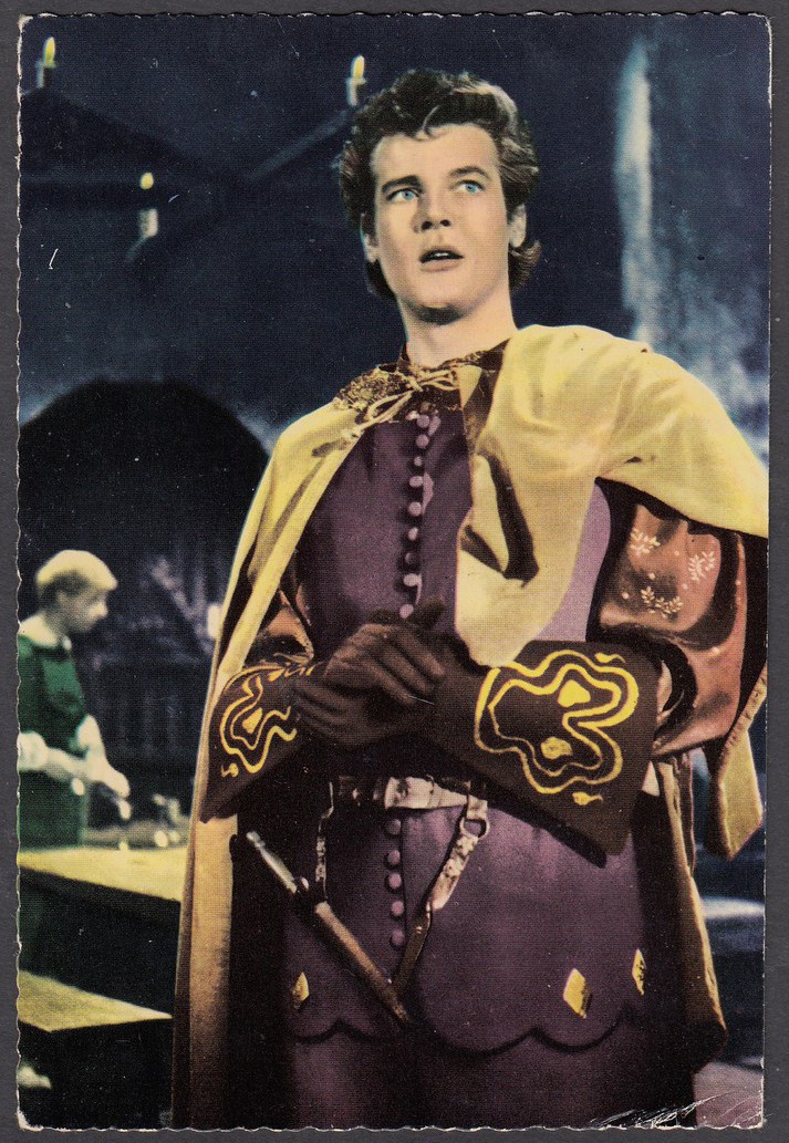
ROGER MOORE “IVANHOE”
Published by
Gebr. Spanjersberg N. V., ROTTERDAM
Another colourised black and white photograph.This one looks like could have been quite a popular one looking at the image. There is some very clever use of colour addition here, especially with the large crest on his chest.
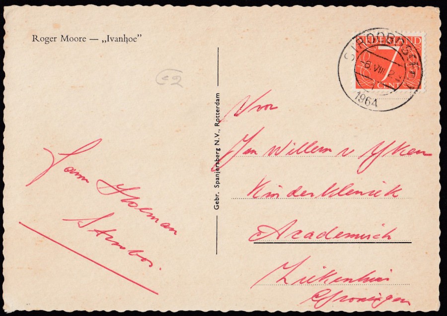
REVERSE SIDE OF ABOVE POSTCARD
I think this was posted from the Netherlands village of STROOBOS, but there appears to be more letters in the cancellation, but these may be referring to the villages province of Friesland, its hard to know and I am not an expert in any way on the cancellations of the Netherlands. I do know the cancel is dated 6th August 1964
ROGER MOORE “IVANHOE”
Unknown Publisher
Netherlands issue
Another colourised photographic image
REVERSE SIDE OF ABOVE POSTCARD
Another issue with this central black block covering over the central text bar.
The straight edge along the bottom here interests me. Was this from some sort of perforated sheet or book collection? Or, for that matter, is it just a straight edge that occurred by accident or the positioning of this card on the printed sheet.
IVANHOE
Published by
UITG. TAKKEN UTRECHT
Ref: No. AX 5017
Black and white photograph which is the same as the above colourised version.
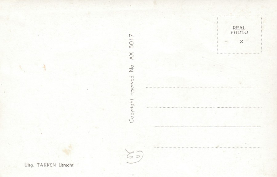
REVERSE SIDE OF ABOVE POSTCARD
ROGER MOORE “IVANHOE”
Published by
Gebr. Spanjersberg N. V., ROTTERDAM
This is one of my favourites from the ones I have so far managed to obtain. It is another colourised photograph, but I think it is one of the better-quality ones.
REVERSE SIDE OF ABOVE POSTCARD
Used in 1965 (13th July) from SCHERPENZEEL with a 1953 issued 15c red Queen Juliana definitive postage stamp (SG 777)
IVANHOE – ROGER MOORE
SIR MAURICE – ANTHONY DAWSON
Published by
ECHTE FOTO
163
Ref: nr. 737
Gebr. Spanjersberg N. V., ROTTERDAM
This one gives you details of the name of the knight that Ivanhoe is fighting in the image, and the name of the actor that played him.

REVERSE SIDE OF ABOVE POSTCARD
A straight edged postcard issue with a slightly different reverse layout to the other ECHETE FOTO cards depicted above, mainly through the text down the centre.
ROGER MOORE “IVANHOE”
Unknown Publisher
Netherlands issue
Now, this is an interesting photograph as it must have been a popular one, as you will see below. This one here has been colourised, which, as you have seen, was not an uncommon process for these postcards.

REVERSE SIDE OF ABOVE POSTCARD
Another issue with this central black block covering over the central text bar.

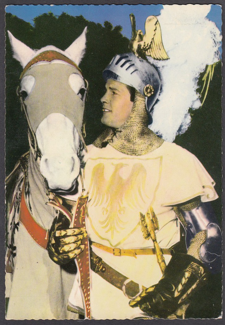
IVANHOE – ROGER MOORE
Published by
Gebr. Spanjersberg N. V., ROTTERDAM
Ref: 290 [Centre bottom reverse side]
962 [Bottom right corner on reverse side]
Black and white photograph depiction of the above colourised image. There is no additional text on the front of this one (see below)
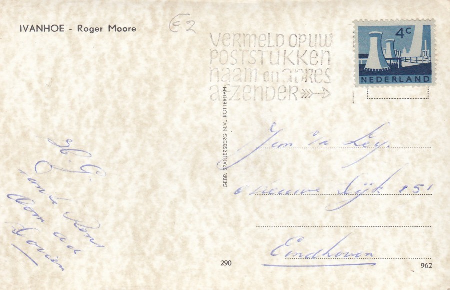
REVERSE SIDE OF ABOVE POSTCARD
You can not make out the location or date sections of this cancellation, but the stamp used is the 4c deep blue Cooling towers, State mines, Limburg postage stamp (SG 935) issued in 1962.
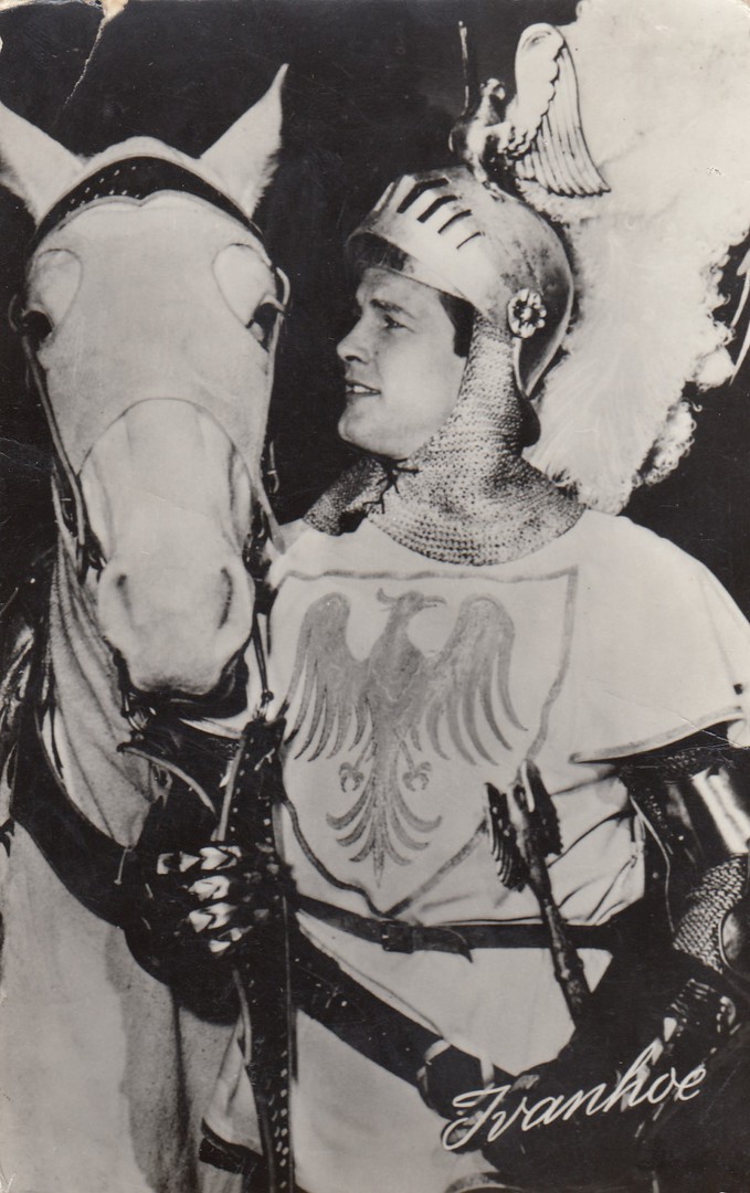
IVANHOE
Published by
UITG. TAKKEN UTRECHT
Ref: No. AX 5213
I almost missed this in a foreign dealer’s stock when I was going through it because I thought, initially I already had it, but I went back to it and decided to buy it anyway. I am glad I did because this one is different because of the addition of the slanted ‘IVANHOE’ across the bottom right corner. This does not appear on the other card I had depicting this photograph (see next postcard above). It might seem a bit extreme, but I love this aspect of collecting, the little changes between publishers and issues.
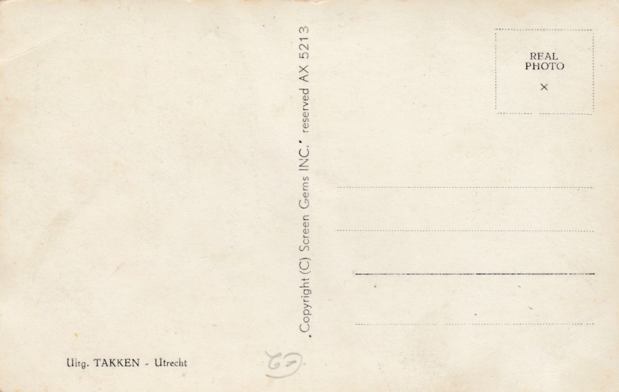
REVERSE SIDE OF ABOVE POSTCARD
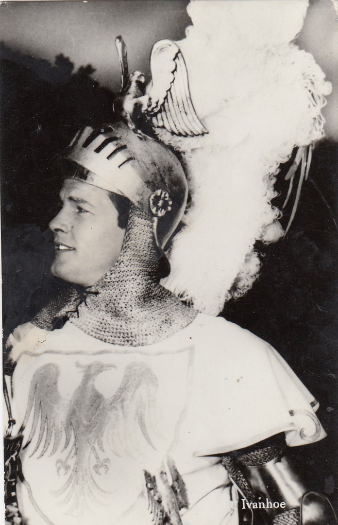
IVANHOE
Published by
ECHTE FOTO
Ref: nr. 766
Gebr. Spanjersberg N. V., ROTTERDAM
SPARO
This time this publisher has cropped the photographic image that appears on the two previous postcards. Here the horse has been cut-away. I do not know why this was done, perhaps to produce yet another image for collectors or more likely at that time fans, which ever it was it has resulted in another card for us new collectors.
REVERSE SIDE OF ABOVE POSTCARD
Two things to note here, firstly the lack of a middle ‘centred’ number in the stamp box text, other cards have all had a number here. Secondly, the addition of a logo bottom centre: ‘SPARO’, which again has not appeared on any of the other cards above.