
22/04/2016
DOCTOR WHO
THE RUNAWAY BRIDE
Starring David Tennant and Catherine Tate
Official BBC WALES Dr Who Postcard
This was a Christmas Day special episode of Doctor Who first shown on 25th December 2006. This was the second Christmas Day special episode and 9.35 million viewers tuned in to watch it.
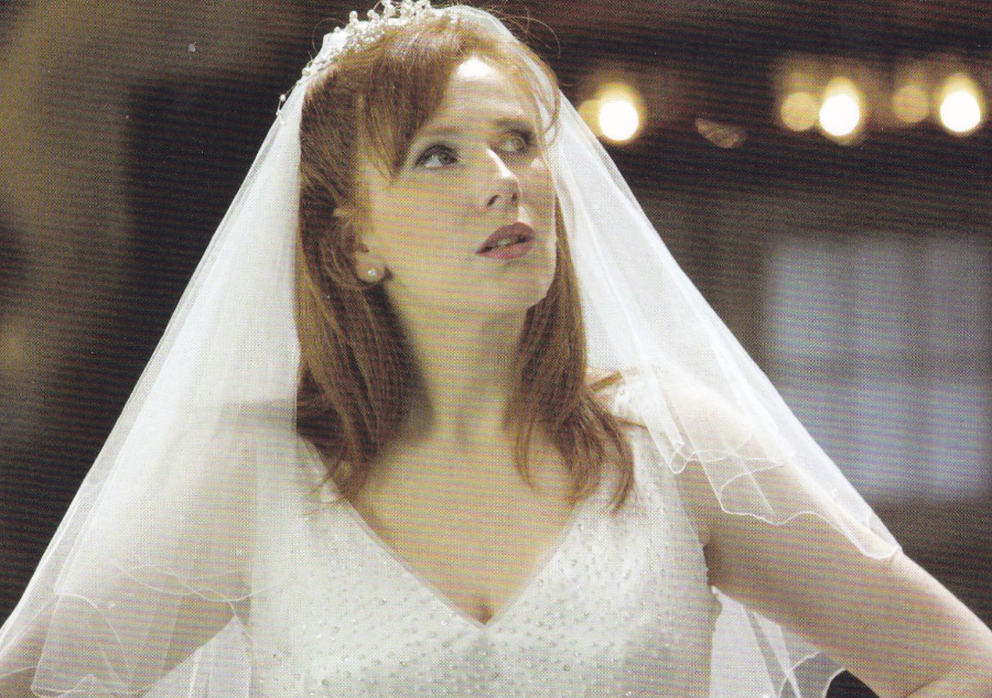
DOCTOR WHO
CATHERINE TATE as DONNA NOBLE
“The Runaway Bride”
Official BBC WALES Dr Who Postcard

22/04/2016
INEQUALITY FEED IMPRISONMENT
“FLAT OUT”
Published by – AVANTCARD, AUSTRALIA
Ref: #19023
Issued 2015
“Most women are in prison as a result of experiences of abuse and family violence, poverty, homelessness, mental illness, drug and alcohol addiction and racism.
Prison is expensive and harmful. It costs $100,000 to imprison someone for one year. In comparison, the median cost of a rental property for one year is $14,000. Around 40% of people return to prison within two years and homelessness is the greater predictor of a person’s re-imprisonment”
(part of the text from the reverse side)
The issues and situation being mentioned here is not dissimilar to that in the UK and in my own work experience I am aware that homelessness is one of the greatest causes of re-offending in both sexes.
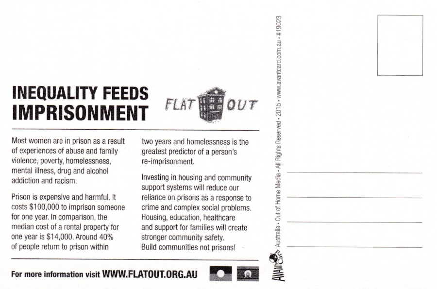
REVERSE SIDE OF ABOVE POSTCARD

22/04/2016
THE X-FILES
‘I WANT TO BELIEVE’
2008 Feature Film
Published by
EST CARD – EST MEDIA
BUDAPEST
As a collector of television related postcards anything related to the X-Files is of interest to me including any designs related to the feature films based on the series. This 2008 feature film was the second film based on the X-Files and unlike the first film this was entirely a ‘stand - alone’ story.
This rather interesting, and quite scarce, postcard does not feature the two main stars but has the elements of the background of the original film poster design. On the actual film poster Mulder and Scully can be seen in the foreground between the red blood like X on the ground and the police line-up and helicopters in the background. This design here is an advert for the Motorola PEBL U9 phone, three of which are shown top left.
22/04/2016
“HELLO ELISABETH”
By
Jean Lagarrigue
Published by
EDITIONS F. NUGERON
Ref: H 9 – ILLUSTRATEURS
A cheeky little artist piece published in France by this famous modern French postcard publisher. Editions F. Nugeron ran a series under the heading ‘ILLUSTRATEURS’ where some cracking and sometimes very unusual images were released. This one here has always been a popular one and despite some people’s opinions I have never considered this to be a disrespectful picture.

22/04/2016
SMASH HITS
Free postcard given away with the ‘SMASH HITS’ magazine
1980’s (postmarked 1986)
TOP LINE
PET SHOP BOYS – DEPECHE MODE (original line up) – FEARGAL SHARKEY – FIVE STAR – MADONNA
BOTTOM LINE
PRINCE (who of course sadly died yesterday) – PAUL YOUNG – DURAN DURAN – this next one is really annoying me as I recognize these two but just can’t remember their name. It will come to me later but at the moment it escapes me – STYLE COUNCIL.
Thursdays are busy days for me as I help out as an assistant cub scout leader and by the time I have finished there and then eaten it is often quite late. So yesterday I got in expecting to just post a few quick postcards of the Queen only to find that Prince had been found dead and I thus went on a searching journey through my collection for a related postcard. By the time I had found one it was getting late so I posted just the one of the Queen and one of two postcards I found depicting Prince. That postcard seemed the best one to post yesterday but as I had also dug out this card I thought I would post it today.
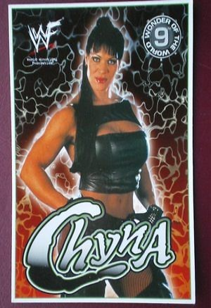
CHYNA ..... RIP
Joan Marie Laurer
27th December 1969 – 20th April 2016
Professional wrestler who came to notice here in the UK through the World Wrestling Federation (the WWF). I sadly almost entirely missed her passing away because she was over shadowed by that of Victoria Wood. But here I remedy this earlier omission.
'London Postcard Company' Postcard

THE WOMEN OF WWF
POSTCARD PACK
Cover of the postcard pack, containing nine postcards, published by 'The London Postcard Comapany'
Chyna is depicted front and centre.
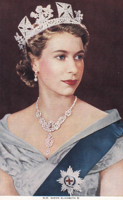
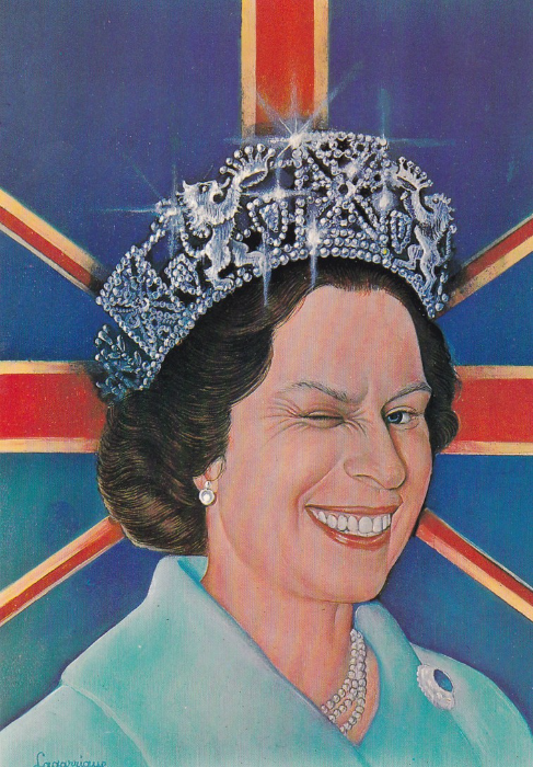
21st APRIL 2016
HAPPY BIRTHDAY TO HER MAJESTY THE QUEEN
H.M. QUEEN ELIZABETH II
Early postcard by unknown printer / publisher
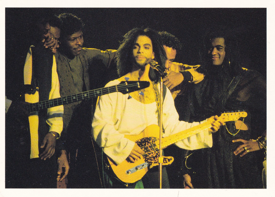
PRINCE….. RIP
Prince Rogers Nelson
7th June 1958 – 21st April 2016
Musician and Pop Star
Prince – International Picture Service. Postcard published by Magna Books (a postcard from the postcard book titled ‘Rock Stars’)

VICTORIA WOOD CBE …..RIP
19th May 1953 – 20th April 2016
Comedian, Actress and all round performer and writer.
Having grown up with Victoria Wood's many TV appearances and laughed out loud at her sitcom ‘Dinnerladies’ I was greatly saddened to hear of her death today.
Royal Mail PHQ/Stamp Card

GREETINGS FROM IRELAND
Published by
REAL IRELAND DESIGN
Ref: SP 335
“Ireland. Wild, beautiful and steeped in history and legend”
There is no more traditional a postcard design than that of the ‘GREETINGS FROM…’ format. Used all over the world since almost the dawn of picture postcards this is still in use today, as clearly seen with this superb IRELAND version, bought in Dublin in March of this year. Attractive and picturesque this design here has been made to catch the eye of the tourist postcard buyer looking for a card to send back to friends and family. Postcards like this one are bought and sent constantly but funnily enough do not often find their way into a traditional postcard collection. I consider this to be a shame as these are to nice to ignore in such a way.
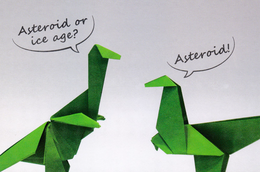
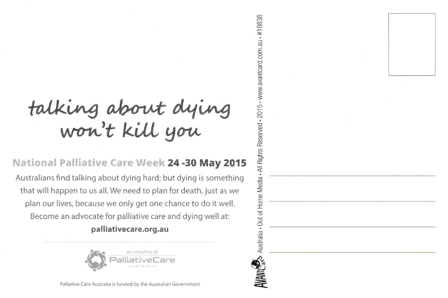
AVANTCARD
AUSTRALIA
REF: #18838
(Issued 2015)
“ASTEROID OR ICE AGE?”
NATIONAL PALLIATIVE CARE WEEK 24 – 30 MAY 2015
“Australians find talking about dying hard; but dying is something that will happen to us all. We need to plan for death, just as we plan for lives, because we only get one chance to do it well. Become an advocate for palliative care and dying well at: palliativecare.org.au”
I can never resist a Dinosaur postcard, even when they are origami dinosaurs. I liked this design because I am fascinated by the ‘Asteroid’ theory of the extinction of the dinosaurs. There is something really fatalistic about the Earth being impacted by objects, whether asteroid, comet or meteorite (it is certainly a popular film idea as they have had comets, asteroids and giant meteors heading our way, but only sometimes destroyed before impact).
REVERSE SIDE OF ABOVE POSTCARD
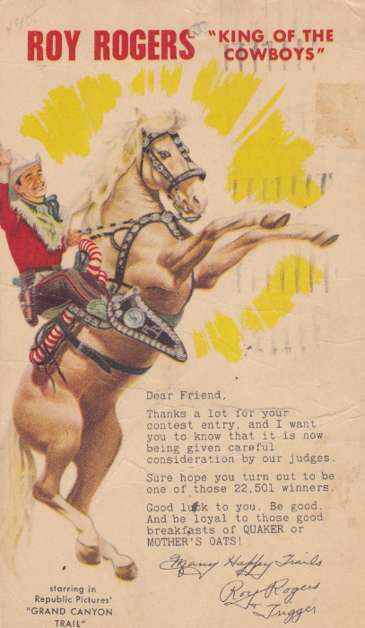
ROY ROGERS
“KING OF THE COWBOYS”
‘Starring in Republic Pictures “GRAND CANYON TRAIL”
Competition entry confirmation postcard
POSTAL STATIONERY POSTCARD
This early film/television related postal stationery card was sent out to those who had entered a contest and the text message on the front informs the receiver that their entry “is now being given careful consideration by our judges”. The front image makes nice use of an artist’s impression of Roy and his famous horse Trigger.
This particular copy here is a little battered by postal usage and age, but in my opinion this adds some history to the item and it is not an easy card to obtain a copy of here in the UK.
The reverse side has a pre-printed 1 cent US POSTAGE stamp depicting Jefferson (third US President and an American Founding Father who was principal author of the Declaration of Independence). The stamp has been cancelled with a CHICAGO machine wavy line cancel with circular end date stamp dated 29th November 1948 (this nicely dates the card as it was clearly initially used at this time in this year for this singular competition so I expect most copies will have been used around this time).
This would clearly be valued more in America where Roy Rogers is still well known and still collected but I am pleased to have a copy here in the UK.
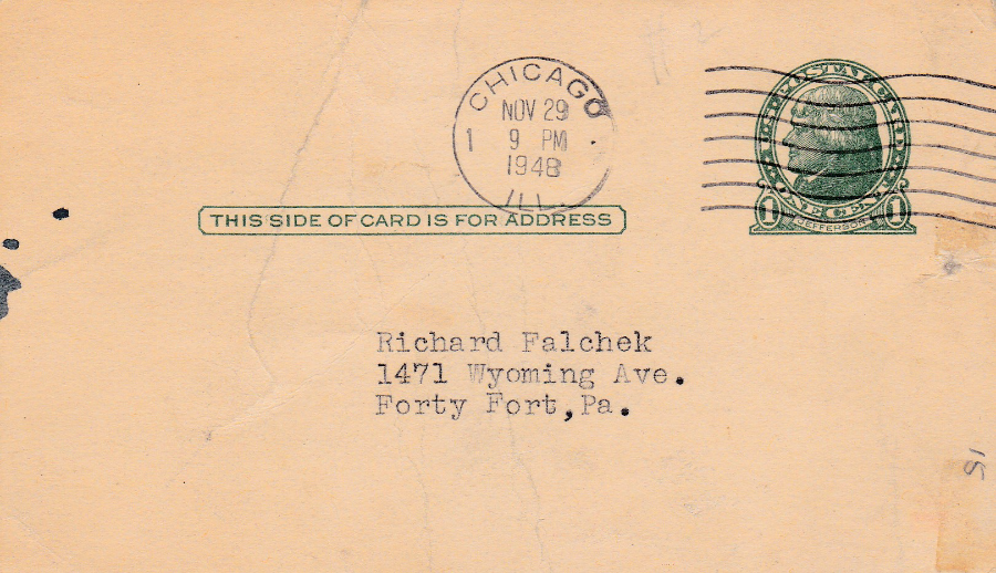
REVERSE SIDE OF ROY ROGERS POSTCARD
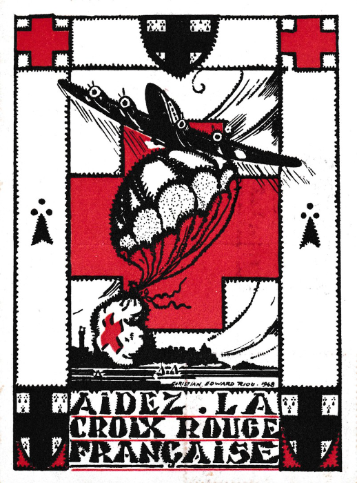
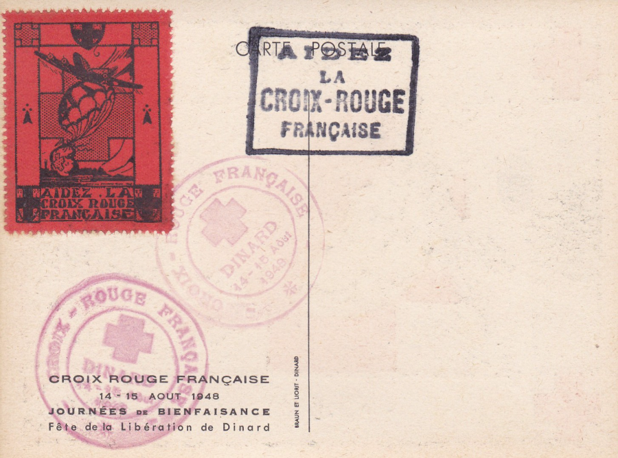
AIDEZ LA CROIX ROUGE FRANCAISE
‘FRENCH RED CROSS AID’
CROIX ROUGE FRANCAISE
(French Red Cross)
14 – 15 AOUT 1948
(14 – 15 August 1948)
JOURNEES DE BIENFAISANCE
Fete de la Liberation de Dinard
(Charity day – Celebration of the liberation of Dinard)
Dinard is located in Brittany in Northwestern France. Here you have a postcard (technically there are two postcards but the front design is identical on both so I am going to only show the front of one of these – it is the cachet on the reverse which is different) which depicts the artwork which was used on a special cinderella stamp like charity label issued to raise money for the Red Cross.
The charity label itself is applied to the back of the postcards. The label is printed in black on a deep orange (some might call it red) perforated paper. The stamp, on both copies of the postcard I own, has then been cancelled with a red circular cachet which has a central large red cross and text reading ‘CROIX ROUGE FRANCAISE – DINARD – 14-15 Aout 1948’. The card has then received a boxed text cachet which reads as ‘AIDEZ LA CROIX – ROUGE FRANCAISE’. The reason why I have two copies of this postcard is that one has this boxed cachet in red ink whilst the second has it in black.
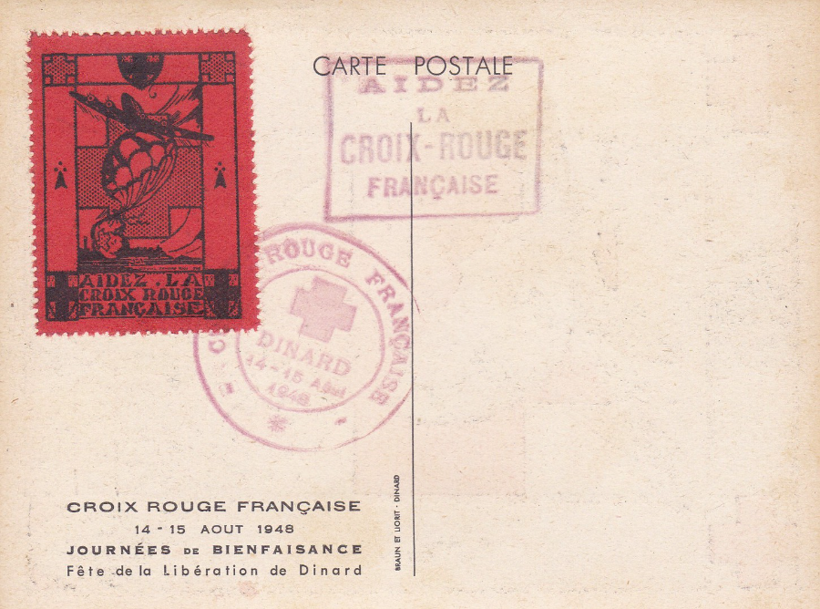
REVERSE SIDE OF ONE OF THE ABOVE POSTCARDS
RED BOXED CACHET
REVERSE SIDE OF THE SECOND COPY OF THIS POSTCARD
BLACK BOXED CACHET
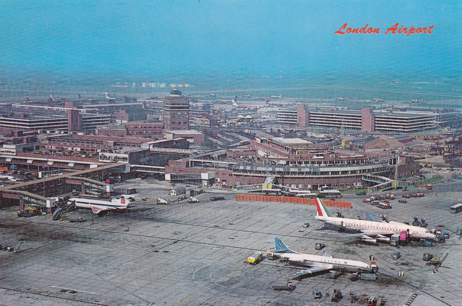
LONDON AIRPORT
Aerial view of LONDON Airport
Published by
THE PHOTOGRAPHIC GREETING CARD CO. LTD., LONDON
‘NATURAL COLOUR SERIES PHOTO GREETINGS U.S.A.’
Ref No: 557
(There is also the number CC21719 located under the stamp box top right)
A nice aerial view of what is now better known as London Heathrow Airport, after the opening of London Gatwick in 1958. Airport postcards have been popular for a good number of years now and any that included images of early planes are even better. This one is quite nice but the planes are quite small so it’s not at the better end of this type of card. So the price of 1 euro that I paid for this one in a tatty, but fascinating little shop in Kilkenny was reasonable (and this is one of the cards I bought alongside the Dachau cards previously posted).
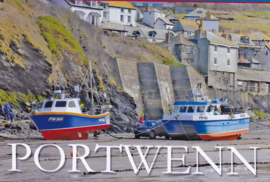
PORTWENN
CORNWALL
Some of you will know of this location but for those that do not I fear that looking on a map of the UK will not help you very much. Portwenn is in fact a made up location. It is the home of the television character Doc Martin, from the series of the same name.
The real location of Port Isaac covers as the fictional village of Portwenn and it is located on the North Cornwall coast. The character of Doc Martin (Martin Ellingham) is played by the actor Martin Clunes.
The location of Port Isaac is of course very picturesque and you can buy postcards that depict the aspects of the village. But it would unfortunate if the character of Doc Martin was seen walking past, or indeed standing in front of a postcard spinner which had postcards captioned as ‘PORT ISAAC’. Therefore, a number of postcard designs were created and printed on simple photographic paper which could be slipped in-front of the real postcards on spinners outside (or inside if required) shops where the character of Doc Martin is to be seen. This gives a more authentic look to the scene and saves any embarrassment when people look closely at the scene. For collectors like me there is the bonus that occasionally some of these unusual items actual appear for sale. I suppose really they are prop items and they are smashing things to own even if they are rather simply made.
TELEVISION POSTCARD PROP ITEM
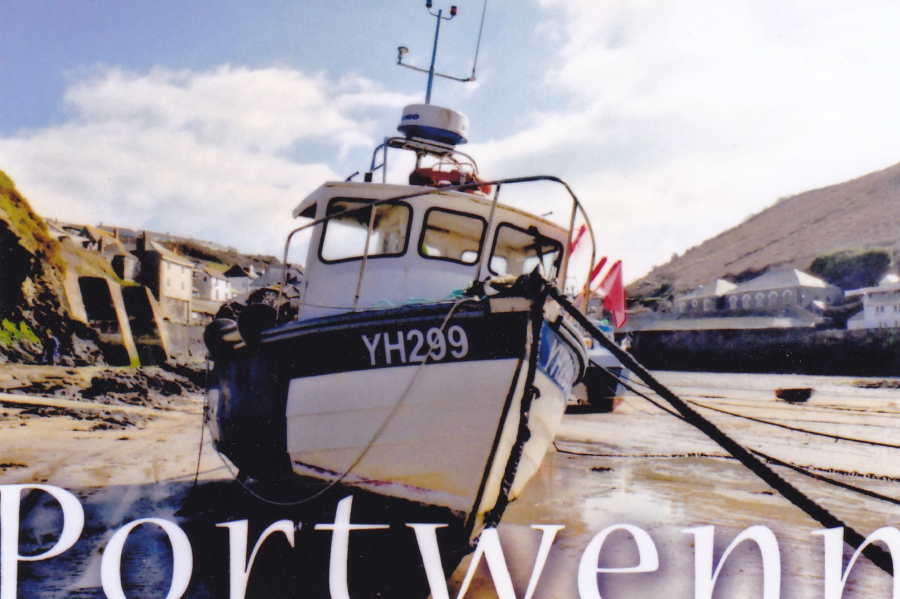
TELEVISION POSTCARD PROP ITEM
LITERARY POSTCARD MENTIONS
And POSTCARD BOOKS
I love it when postcards get mentioned in books that I am reading even if it is just on the one page or used as a small, or large, important device within the story. I shall list here the ones I come across. This will include when factual books also mention or depict postcards
Number 9
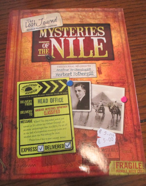
MYSTERIES OF THE NILE – THE LOST JOURNAL – UNSOLVED MYSTERIES DEPARTMENT
Published by Carlton Books
This is something very different as although it is a book it is also has a pocket which contains other paper items like maps and sticker sheets and stuff. From the front cover you could be forgiven for passing it by as there is no mention of any postcard(s) but I have learnt to look at everything which might potentially have a postcard in it.
This book/package is designed for children and educates them about Egypt and is designed so that children have to use the items in the packet to solve little mysteries.
FRONT COVER OF THE BOOK/PACKAGE
No mention of any postcards here…
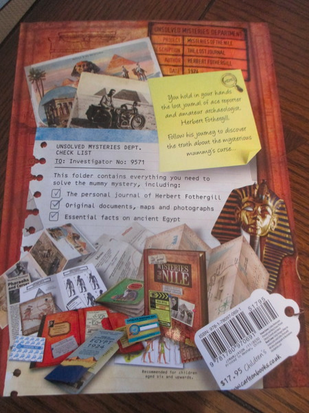
REVERSE COVER OF BOOK/PACKAGE
This is where I saw the strip of postcards bottom left and wondered if they were included in the package. Fortunately, there was an opened copy of the item which could be looked at and yes the depicted strip of postcards is included.
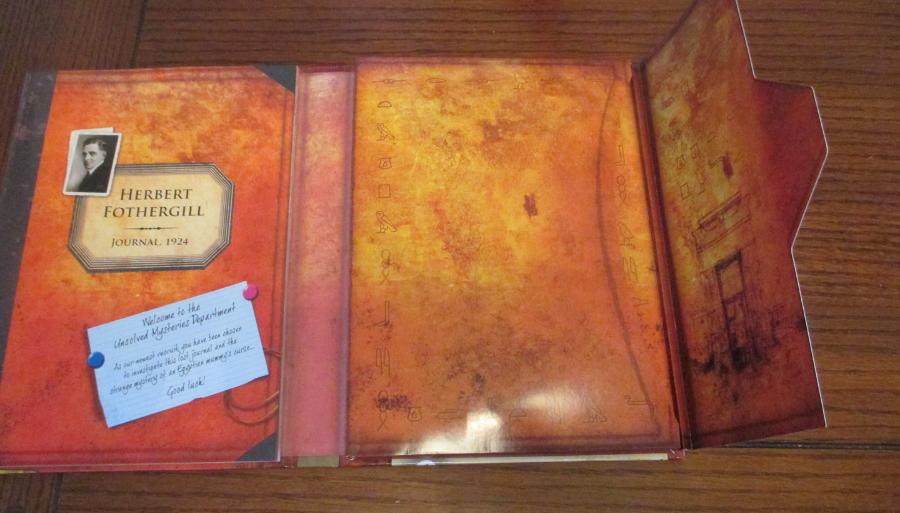
INSIDE THE OPENED BOOK/PACKAGE
The journal is on the left side and the pocket containing all the documents is on the right side
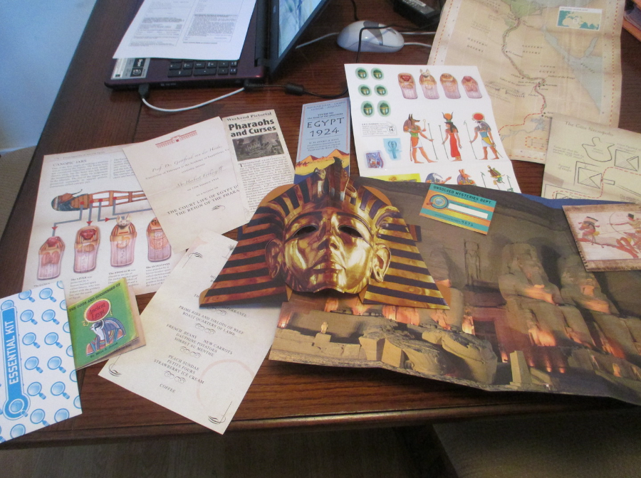
PHOTOGRAPH
DOCUMENTS FROM INSIDE THE PACKAGE
Notice the King Tutankhamun face mask
TOP
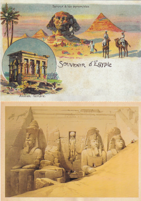
Reproduction of an actual old ‘SOUVENIR d’EGYPTE’ postcard
(perforated along bottom edge)
BOTTOM
The Great Temple of Ramesses II
Abu Simbel
This image shows artwork of the Abu Simbel temple still half covered by sand after its discovery. This fantastic temple was moved to a site much higher when the Aswan Dam was built as its original location was flooded. It is quite a drive into the desert to reach its current location, I know as I have been there and have seen this superb monument.
(perforated along top edge)
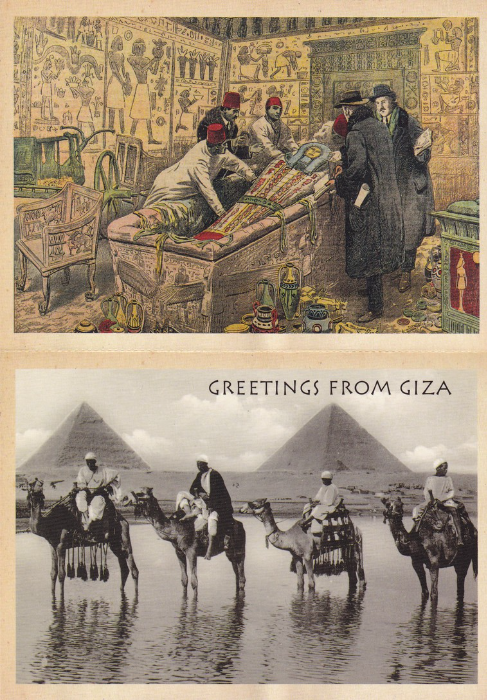
TOP
The opening of King Tutankhamun’s tomb
This is actually a really nice image
BOTTOM
SOUVENIR OF EGYPT
GREETINGS FROM GIZA
The other three postcards all have a proper postcard reverse side and can be detached from the strip and actually used. This one here is the exception as it has a printed message on the reverse side and is a clue as it is supposed to have been written and sent by the character in the mystery.

REVERSE SIDE OF THE POSTCARDS
The top one has the printed message on it which is part of the clues needed to solve the mystery.
The bottom one has the basic layout which is used for the other three postcards.
I found my copy of this book/package in a book shop in a side street in Kilkenny (I love bookshops and look into all of them just in case there is something interesting which might crop up). I am aware that these type of things have sometimes contained postcards so was looking through them and this one turned up. Now, I will admit that I would probably not pay $17.95 for this one, which is the price printed on it on the back, but as it was only 5 euros here I was happy to grab a copy.
It is an unusual item but sometimes these are the items which make a collection that little bit special.
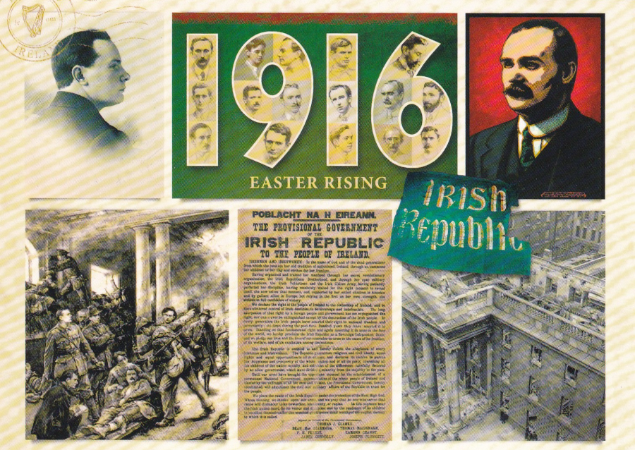
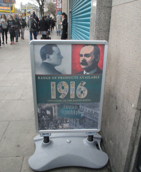
EASTER RISING
I have already posted this image before, whilst actually in Ireland but after posting it I came across the below sign outside a shop and wanted to show this to you as well. It is clearly a sign using the postcard elements - or did the sign come first?
PHOTOGRAPH
29/04/2016
After I posted the above postcard the first time I again visited Dublin and whilst walking around I saw this sign outside a tourist gift shop and could not resist taking a photograph as it fitted so well with the postcard I had already bought.
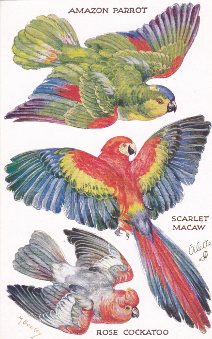
BIRDS ON THE WING – Series II
AMAZON PARROT – SCARLET MACAW – ROSE COCKATOO
Published by
Raphael Tuck & Sons
OILETTE Postcard No 3775
This is a cracking novelty postcard where the wings of the birds have cut away edges which means you can actually punch the wings out and bend them to stand up (but of course that would now damage the postcard and greatly reduce its value but you can imagine when these first came out people doing just that). I have always liked these cards but they can be expensive and building up any complete sets can set you back a bit so I only buy these if I come across them at bargain prices.
Oilette was a copyrighted name used for the process of colour printing used by the company on their postcards and it can be seen on many Raphael Tuck & Sons postcards.
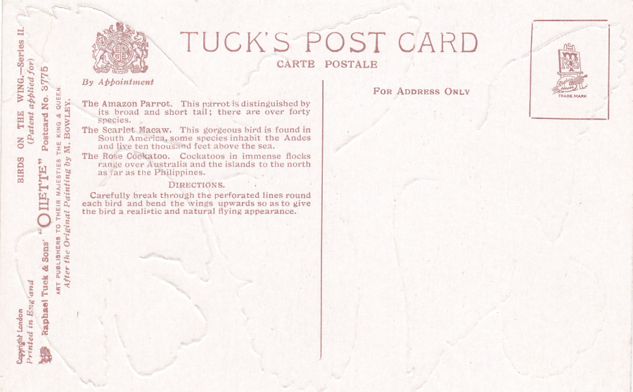
REVERSE SIDE OF POSTCARD
Here you can see the cut edges around the wings of the birds.
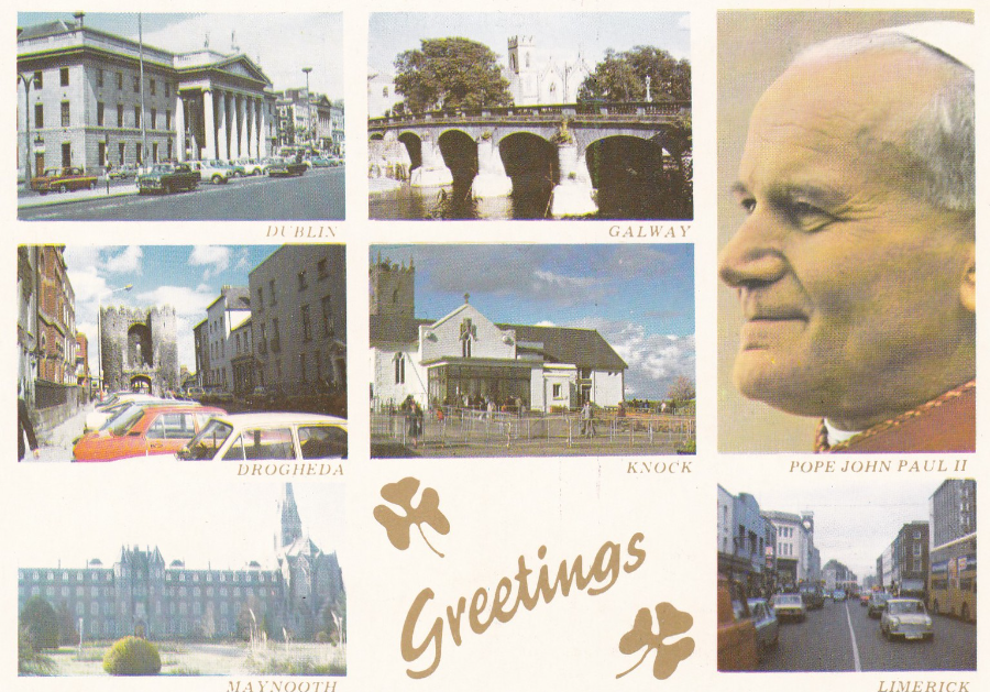
POPE JOHN PAUL II
1979 Visit to Ireland
Published by
CELTIC GREETINGS, IRELAND
“During September of 1979 the Holy Father paid a visit to Ireland and during his tour of the Country he visited many parts. The highlight of his mission was his visit to Knock Shrine to Commemorate the Centenary of the Apparition of Our Blessed Lady”
Older Irish postcards were much harder to find during my visit and to be honest I only really found this one. I saw copies in the window of an antiques shop in Killkenny (although on two trips I still never found it open!). Fortunately, on a rainy afternoon on our last day we visited Carlow and here in a second hand shop they had a small handful of these cards at just 50 cents.
I have decided to post this now as it depicts the GPO Building in Dublin from where I posted the postcards shown below from.
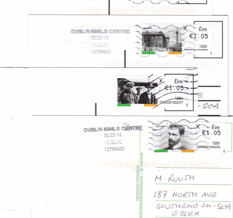
EASTER RISING POST & GO STAMPS
Postcards Posted in the GPO Building, Dublin
As a postcard collector I am also very interested in the actual process behind the mail systems and the various stamps available when I visit post offices abroad. I spent some time in the GPO Building in Dublin and wanted to post a card or two to myself from there as a personal souvenir. Having decided to post Easter Rising postcards, as we had been in Dublin on the Easter Sunday for the parade three days before (when the GPO was shut for the day) it seemed logical to use the Easter Rising Post & Go stamps which had been issued.
Here you can see the reverse side of the four postcards that I sent to myself.
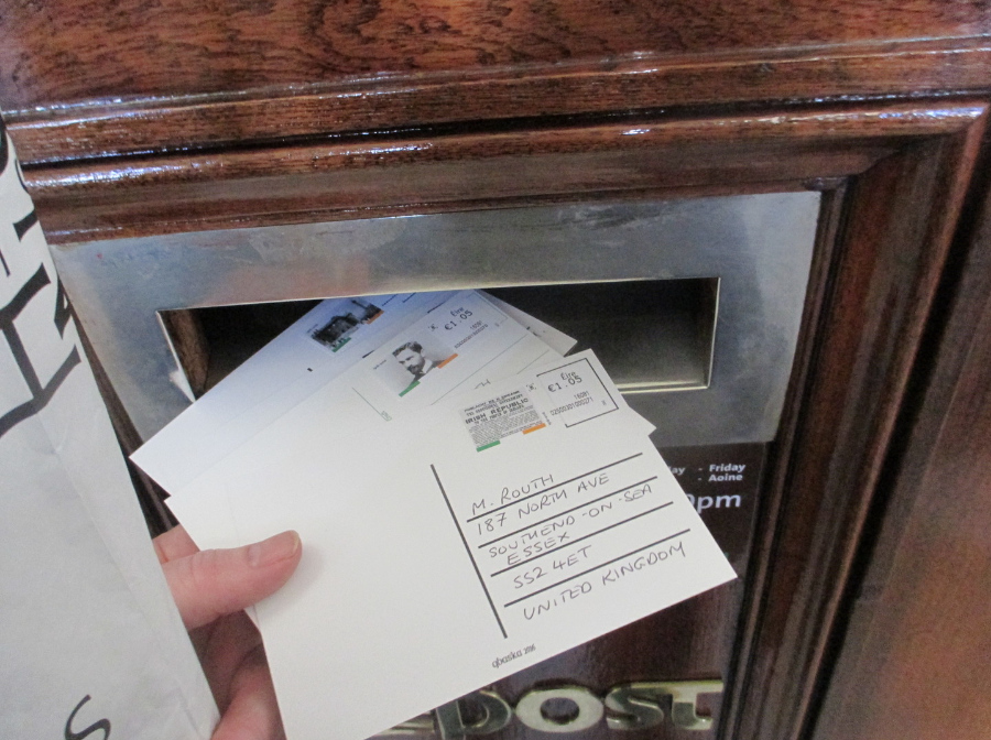
PHOTOGRAPH
This is my four postcards going into the postbox

PHOTOGRAPH
This is the postbox inside the GPO building
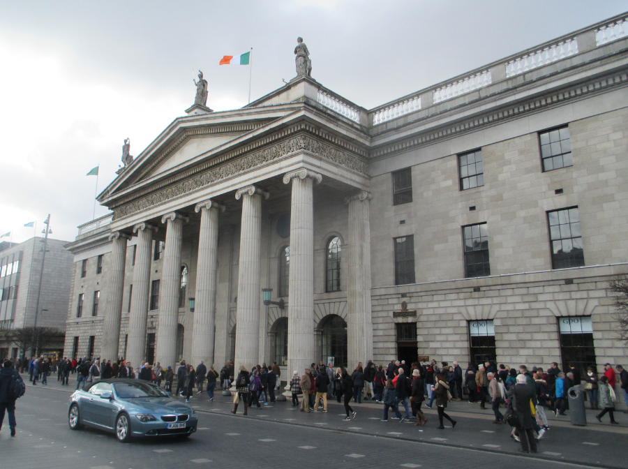
PHOTOGRAPH
front of the GPO Building
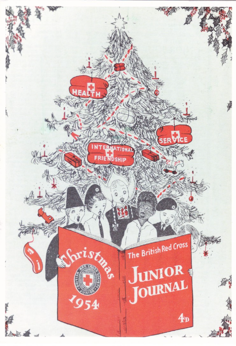
BRITISH RED CROSS
A5 Sized Postcard
‘Thank You’ postcard sent out to those who have given ongoing support.
The image is taken from the cover of a 1954 journal
The reverse side has a long printed message
The card was delivered by Royal Mail under the ONEPOST scheme.
A nice postcard which you could not of course buy which makes it much harder to obtain a copy but it is a lovely card and one I thought went well with the Humanitarian stamp cards posted earlier (see below)
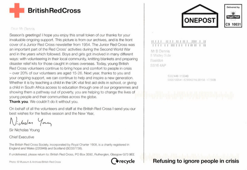
REVERSE SIDE
Comments
-
Many is the day I stood outside that Dublin GPO selling the United Irishman, the monthly paper of Official Republicanism and am now PRO for the successor Workers' Party in Britain.
ROYAL MAIL PHQ/Stamp Cards
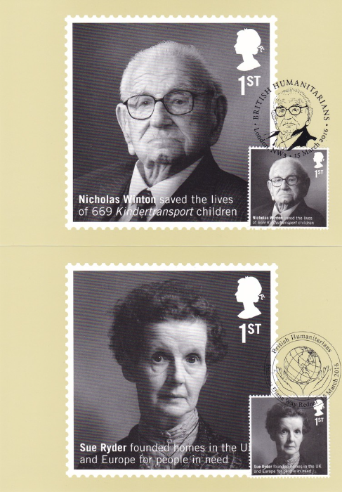
BRITISH HUMANITARIANS
Issue date 15th March 2016
NICHOLAS WINTON
PHQ 412 (1) 3.16
If ever there was a person more deserving of a stamp issue under the heading of ‘Humanitarians’ I would be surprised. Mr. Winton died in 2015 but he never really made mention of what he did and never considered himself to have been worthy of mention. But he was wrong in that respect as he was credited with saving the lives of 669 mostly Jewish children from probable death in Nazi concentration camps. He organized their evacuation from Czechoslovakia to Britain or Sweden in 1939. He personally visited refugee camps and compiled lists of eligible children and then went on to find foster parents for them and organized their safe travel over Europe via his Kindertransport trains. His story only really came to light just after his death and there was a push at the time for him to be honoured. I think this stamp issue goes some way to doing just that, and deservedly so.
SUE RYDER
PHQ 412 (2) 3.16
Ryder volunteered as a relief worker in Europe after the second world war and worked with refugees and orphans and also with concentration camp survivors. A lot of this work was in Poland. In 1953 she set up the Sue Ryder Foundation which was responsible for the creation of over eighty homes and hospices set up around the world for people with physical and mental disabilities. She married Leonard Cheshire who was awarded the Victoria Cross during the war (I have his autograph in my collection).
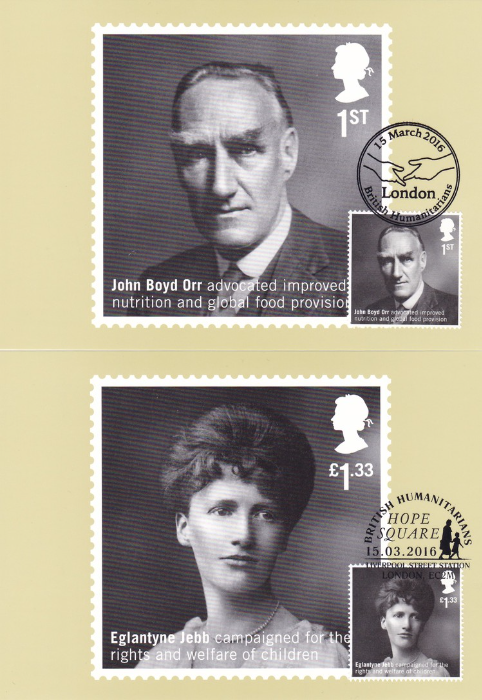
JOHN BOYD ORR
PHQ 412 (3) 3.16
Included here for his work around the promotion of nutrition improvement and global co-operation over food provision in order to fight poverty and to ensure peace. In 1945 he was appointed the first Director-General of the United Nation’s Food & Agriculture Organisation. In 1946 he established the International Emergency Food Council which was set up to address post-war famine. He was awarded the Nobel peace prize for his fight against world hunger.
EGLANTYNE JEBB
PHQ 412 (4) 3.16
Jebb founded the ‘Save the Children Fund’ in 1919 after WW1 to help Austrian and German children placed into poverty after the war. Help was also given to victims of the Russian famine that followed.
Jebb was also responsible for drafting the Declaration of the Rights of the Child, which was adopted by the League of Nation in 1924.
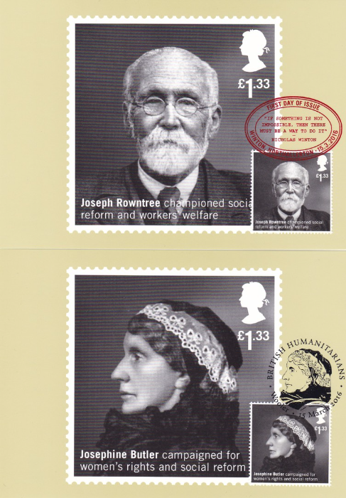
JOSEPH ROWNTREE
PHQ 412 (5) 3.16
We all know about the Rowntree’s sweets and Joseph ran this family business in York but he also went on to improve the quality of life of his workers and introduced medical and education services with sickness benefits and pension schemes. In 1904 he used his own money to endow trusts to promote social reform, adult education and houses which could actually be afforded by the working class.
JOSEPHINE BUTLER
PHQ 412 (6) 3.16
A campaigner for women’s rights and access to better education. She was in favour of female suffrage and fought successfully to repeal the Contagious Diseases Acts which were used to deny civil rights to women suspected of being prostitutes. She also campaigned against child prostitution.

JERSEY OCCUPATION STAMPS
As you probably are aware the Channel Islands were occupied by the Germans during the second world war. Despite the occupation there was still a requirement for the postal services to continue. When the supplies of stamps ran out the Bailiff of Jersey asked retired British army officer and artist Col. Norman Victor Lacey Rybot, resident on the island, to submit designs for a penny and a halfpenny stamp. Rybot worked from a photograph of an original Guernsey stamp design that was going to be issued under similar conditions but which had not yet been issued. Rybot was given instruction that the design could not bear the portrait of the King (George VI) or any symbol connected with Great Britain. Two trial designs were submitted and these were adapted to reflect a medieval style of the coat of arms. These designs were passed for printing by the German intelligence officers.
Two stamps were printed, although released separately, and were printed by the Jersey ‘Evening Post’
A 1d vermillion coloured stamp was issued on 1st April 1941 and the 1/2d green, in the same design as the 1d, was released on the 29th January 1942. For those with a philatelic interest the stamps were perforated 11 and were not watermarked.
I have always found it interesting that despite all the killing and deprivations and troubles going on across Europe during this period that the delivery of mail continued and that the collecting of stamps and postal material also quite healthily continued. Here you have a plain fronted simple postcard privately produced (locally printed obviously) by a collector (possibly even a dealer – but more likely a mixture of both) used to obtain a first day of issue usage of two of the 1/2d new stamps, cancelled with a JERSEY CHANNEL ISLANDS ‘5’ single circle date stamp for 29th January 1942.

NATIONAL PORTRAIT GALLERY
I have previously posted a selection of postcards obtained on a previous visit to here but as I stated then this is a museum/gallery shop well worth repeated visits. The range of available postcards is fairly constantly updated and I have never failed to pick up at least one new postcard (although normally several – they have a bu5 get 6th free offer, so I normally manage at least six!).
I also visited here last night (15/04/2016) and did indeed pick up six postcards for my collection.
KENNETH WILLIAMS (1926 – 88)
Anthony Buckley, 1957, Modern bromide print from original negative
(NPG x 76113)
This is another one for my television collection although best remembered for the Carry-On films
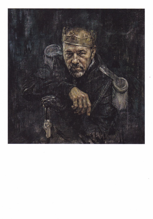
KEVIN SPACEY (b. 1959)
Jonathan Yeo, 2013. Oil on canvas, 1270 x 1270mm
Another film and television related postcard and an interesting painting as Spacey was the artistic director of the ‘Old Vic theatre in London. He is also a CBE and a KBE.
2019 update
oh, how things have changed! Needless to say this postcard has long been out of print and off sale since Spacey's fall from grace and the now numerous I believe offences which have been brought against him. Gives this postcard a different slant, especially what I wrote above!
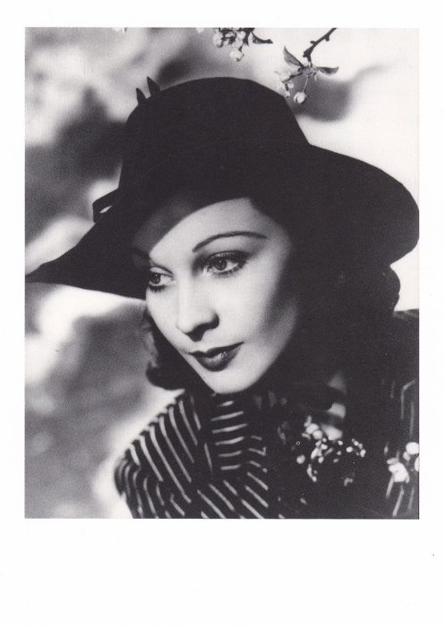
VIVIEN LEIGH, 1913 – 67
Angus McBean, 1938, Matte bromide print, 403 x 328mm
(NPG x 30432)
I hadn’t seen this one before but I had to have it as soon as I saw it because I recognized the image immediately. This is because I had seen it before on a stamp, a Royal Mail stamp issued in 1985 as part of the British Film Year stamp set – the 31p Vivien Leigh stamp (SG 1301). I have a number of first day covers with this stamp and of course there is the Royal Mail PHQ/ Stamp Card which depicts this stamp. Therefore, this postcard here makes a nice addition.
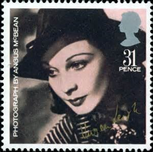
The stamp as mentioned above
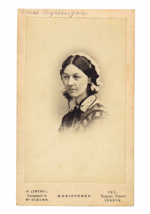
FLORENCE NIGHTINGALE, 1820-1910
William Edward Kilburn, c 1856. Albumen carte-de-visite, 87 x 54mm
(NPG x 46634)
This one I bought because of what is depicted rather than just who is depicted. Florence Nightingale of course should require no introduction (but in case she does then look up the Crimean War and the Lady of the Lamp). But more interestingly she is depicted on what is called a carte-de-visite. These are interesting items and are basically a photograph mounted on a card mostly with some printed details along the front bottom and often with very interesting advert styled backs (although some have plainer backs – some also have rounded corners rather than straight edges as depicted here). These cards are a sort of fore-runner to the postcard and were used to pass photographs around between family and friends so were distributed quite freely. Any person of standing could attend a studio and have their photograph taken (or a group photograph – a couple – or a family). Some famous people of these times used them as publicity and some companies even made money selling carte-de-visite’s of such personalities.
I have a few of these in my collection as interesting side items but I liked the fact that one is depicted here on this postcard and one of a very worthy lady.

HELENA BONHAM CARTER (b. 1966)
Derry Moore, 1992. C-type colour print, 293 x 292mm
(NPG x 126972)
This is a very nice simple and attractive photograph and one which I can place into my Harry Potter collection although her acting history covers a much wider spectrum.
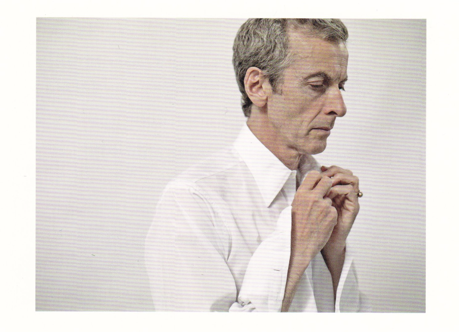
PETER CAPALDI
Paul Stuart, June 2014
(Photographic Portrait Prize 2015)
And we come to the postcard that set me on my little spending spree to find five others to go with it. This is definitely the first time I have seen this particular postcard as I would definitely have bought it if I had seen it before because this fits nicely into my absolute favourite television programme collection; Dr Who. As an extreme Dr Who fan this one was always going to come my way and it again shows how you can get postcards for specific themes from some very different places.

LITERARY POSTCARD MENTIONS
And POSTCARD BOOKS
I love it when postcards get mentioned in books that I am reading even if it is just on the one page or used as a small, or large, important device within the story. I shall list here the ones I come across. This will include, as here, when factual books also mention or depict postcards
Number 8
NEW YORK IN POSTCARDS 1880 – 1980
“The Andreas Adam Collection”
Hardback Edition Published by ‘Scheidegger & Spiess’
I was in London last night (15/04/2016 – as already stated I was attending the ‘War of the World’s’ musical) and I can never resist visiting the bookshops along Charing Cross Road and my favourite is ‘Henry Pordes Books’ (58-60 Charing Cross Rd). Over the years I have picked up some really unusual and interesting books from here. On this visit I picked up this cracking visual book which is packed with postcard images. What I liked about this book most was the fact that it covers the whole range of postcard history and places images from the early 1900’s beside those from the 1970’s. The range of images is superb and it nicely covers all of the different postcard styles and designs. As a collector of postcards depicting the Empire State Building (there is a television connection – trust me) and the World Trade Centre Twin Towers there are lots of images in this book which appealed to me. This is a cracking specialist book and a nice addition to my Postcard Book Collection.
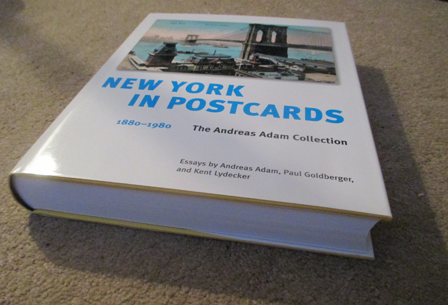
As you can see this is quite a large book!
PLEASE RETURN TO TOP OF PAGE TO CONTINUE READING VIA DATE TABS - CHECK OUT THE 'April Blogs 2016' TAB AND THEN THE 'April Blog 2' TAB FOR PREVIOUS PAGE