
J. ARTHUR DIXON
PHOTOGRAVURE
Ref T. 6333
STOCKTON & DARLINGTON RAILWAY “LOCOMOTION”
“Locomotion” is to be seen at Darlington Main Line Station and although more than once rebuilt, it retains its original appearance. Its wheels, however, are of a pattern introduced by Timothy Hackworth. The engine was built to the specifications of George Stephenson at the Forth Street Works, Newcastle, founded by him and his son Robert, also Thomas Richardson and Michael Longridge in 1823. It opened the world’s first locomotive-worked public railway on September 27th, 1825, when it was driven by George Stephenson himself.
Text from reverse side of postcard
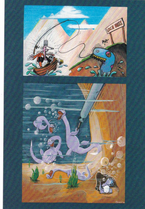
BOOMERANG
“The Finest Joke”
Another Loch Ness Monster cartoon but this time a free one which came in the Boomerang racks. Our fascination with ‘Nessie’ seems never-ending.
OUT OF THE WEST PUBLISHING
FRESH EXPRESSIONS
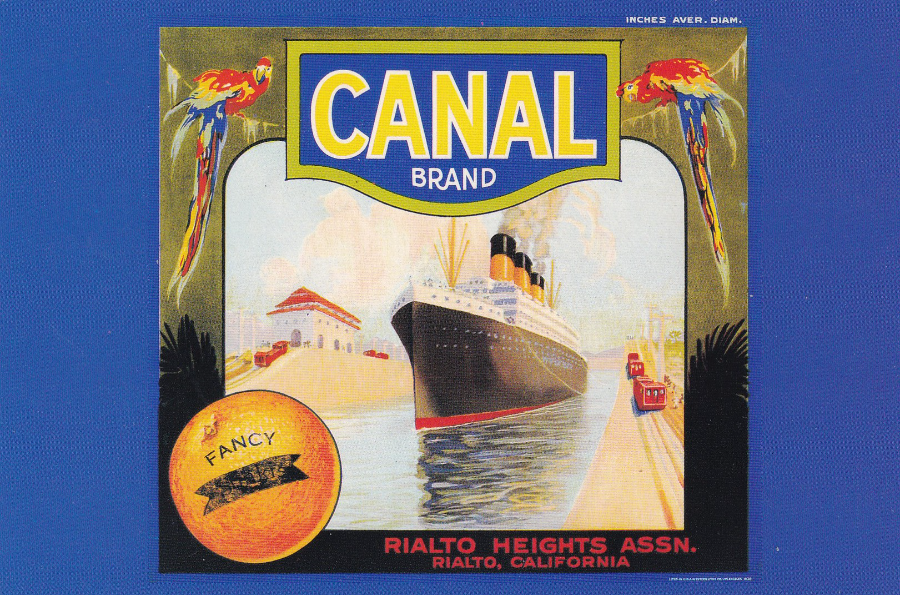
“CANAL” circa 1920
“© 1988”
Ref #315
In America there is a big collecting circle who specialize in fruit case labels. Some of these are very colourful and very pretty and the images depict all sorts of wildlife, transport and in some cases people (there is a very popular Marilyn Monroe one which appeared on postcard which can be very hard to obtain – when I find my copy I will post it in the future). This one depicted here shows a nice ocean liner in a canal.
CONCORDE STUDY CIRCLE
CONCORDE POSTCARDS OBTAINED
PART 2
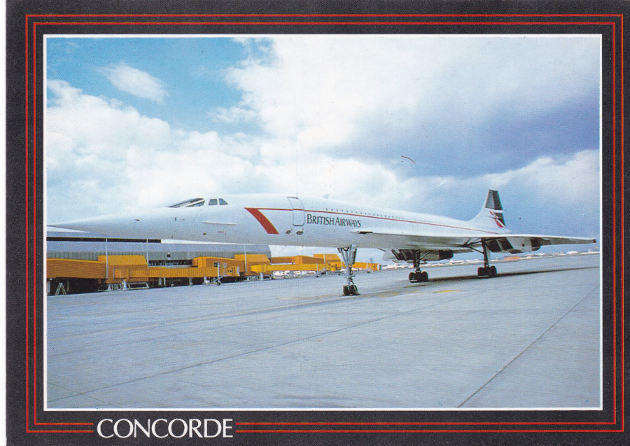
Yesterday’s postings were mainly (with the exception of the Besley cartoon) normal sized postcards. The selection I am going to show here today are all over sized postcards. I know large cards are not popular with all collectors but I have always liked them.
FISA
CONCORDE
Ref L-133
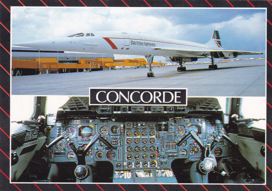
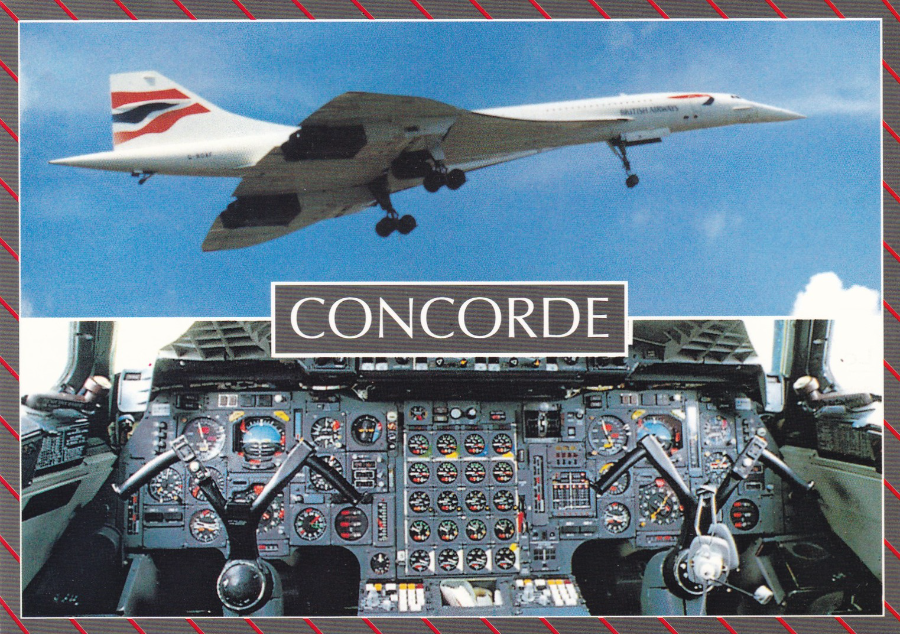
FISA
CONCORDE
Ref L-134
This postcard has the same top image as that one used on the whole of the above postcard. The other image is the cockpit area of Concorde which makes for a nice double image postcard
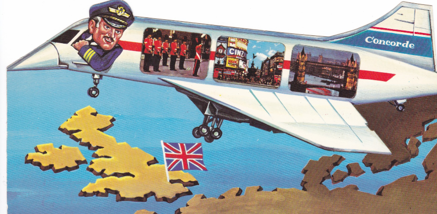
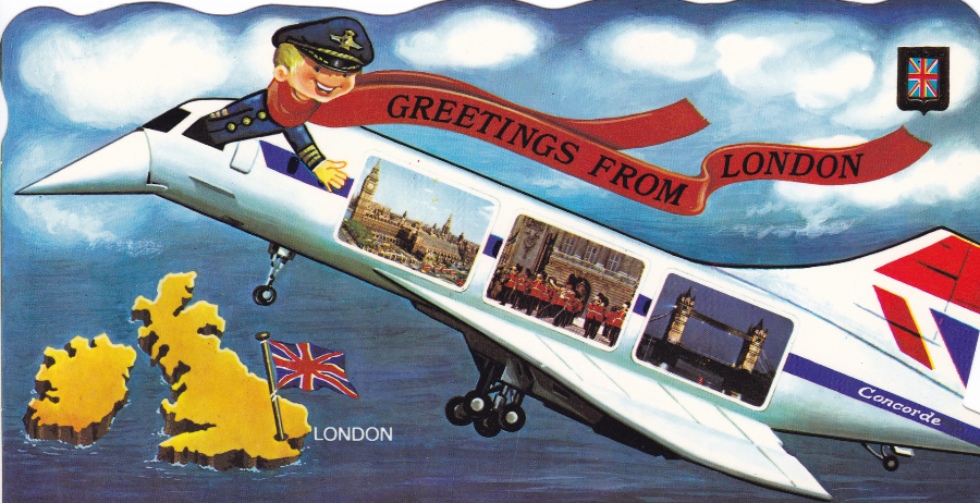
FISA
LONDON
(this one is not titled on the reverse side as ‘CONCORDE’ like the above two – it also has a different reverse layout which is in black, the above two are in blue)
Ref L-302
This postcard is the reverse of the above as it retains the cockpit area image from the above postcard but changes the top image to one of Concorde taking off. These last three postcards make a nice little series.

CONCORDE BIDS FAREWELL TO BIRMINGHAM
By
JON WESTWOOD
(This is quite large at 17.7cm x 12.7cm)
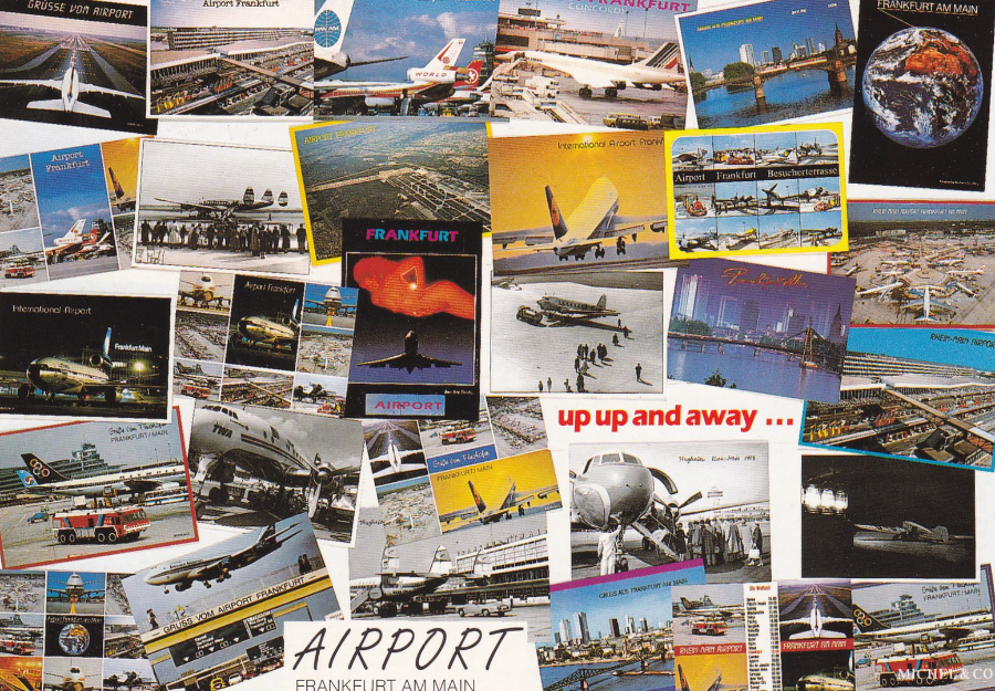
FOTOGRAFIC COLLECTION
FRANKFURT/MAIN
Reference No 870
Collage design by Conny Desugn
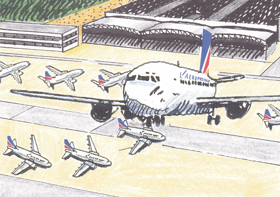
This is a nice idea where the image is a collage of other postcards featuring planes and scenes at Frankfurt airport. Concorde appears on the top centre right image (this dedication to finding Concorde images on postcard always fascinates me. I am not a dedicated fanatic re Concorde, I mainly just buy the ones I like or find unusual but I know some people want every card they can find and this is an example where this search finds unusual examples)
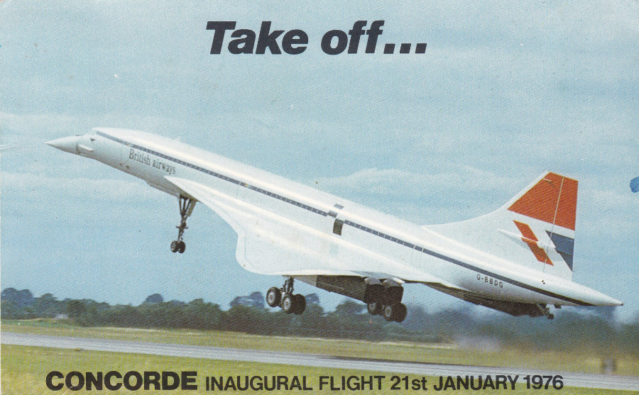
Take off…
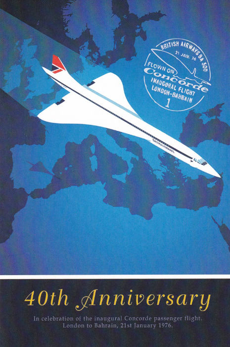
CONCORDE INAUGURAL FLIGHT 21ST JANUARY 1976
Advertising promotional special hand-stamped large card (20cm x 12.5cm)
This is a quite scarce (so I have been informed) postcard sent out to Dental Surgeon’s advertising a number of dental products and claiming speedy delivery of said items (thus the use of Concorde on the front image). With my stamp hat on I am aware of items called ‘Doctor’s Covers’ where Doctors were sent advertising material in an envelope which was posted out on the first day of issue of a set of stamps and one of these stamps was used to post that cover. The idea of the cover being unusual (and potentially collectible) was to make it more likely that the Doctor would actually open and keep the item. I have one of these for the 1972 BBC stamp issue. This card is in the same mode as those covers only this card has a special hand stamp instead.
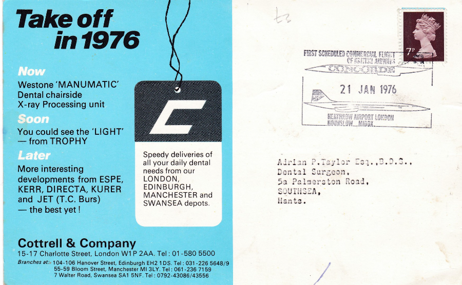
REVERSE SIDE OF ABOVE POSTCARD
The hand stamp reads “FIRST SCHEDUELD COMMERCIAL FLIGHT OF BRITISH AIRWAYS CONCORDE”
21 JAN 1976.
This is one of those Concorde items which has a little more value than the more standard issue postcard – this is an item worth keeping an eye out for.
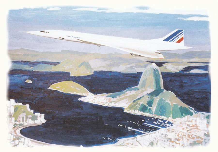
LE CONCORDE A’ RIO
ARCHIVES LATE’COE’RE
Dessin Philippe Mitschke’
I.V.P. Ltd (LONDON)
INTERNATIONAL DISTRIBUTERS
CONCORD
(wrongly spelt without the E on the end)
Ref CO-1009
Large shaped postcard (cut away the white area along the top and you have the actual shaped edge of the postcard
FISA – G.B. – London
Concorde Supersonic Airliner
Ref G – 7
(NOVELTY)
Novelty large shaped postcard (the shaping is around the top and down the right side where there is a bowed edging)
This one is clearly based on the design of the card above, or vice versa but I suspect this one might have come out first. The designs are so similar it is difficult to believe the designer of the second was not aware of the issue of the first. Either way the two cards go nicely together and they are very unusual Concorde designs.
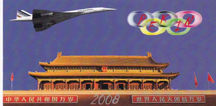
Editions: labellecartepostale.com
Premier vol du Concorde en Chine
Photo: Bernard Charles
http://www.art-avia.eu
Cre’ation: http://www.legrenierdelacartepostale.com
This is one very long postcard – 21cm x 10.5cm
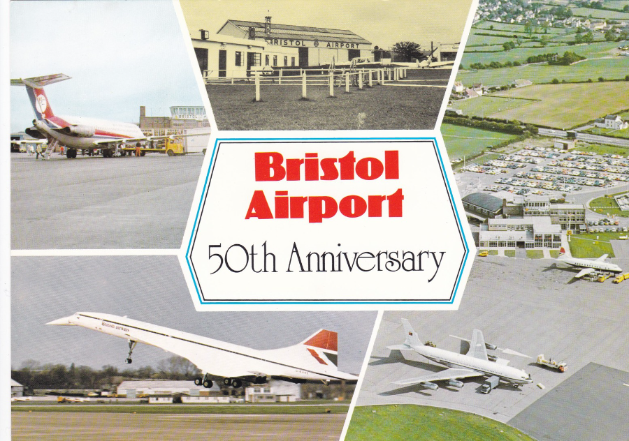
BERIC TEMPEST COLOURCARD
BRISTOL AIRPORT
50TH ANNIVERSARY
“CITY OF BRISTOL ENTERTAINMENTS & PUBLICITY DEPARTMENT”
By far the largest of the postcards of Concorde depicted here as this is 21cm x 14.7cm buts it’s a cracker to bring this Concorde selection to an end. Text on the reverse side reads:
“Bristol Airport was officially opened on 31st May 1930 by Prince George, Duke of Kent; at the time it was only the third civil airport in the country. It moved from Whitechurch to Lulsgate in 1957, being officially opened by Princess Marina, Duchess of Kent, on 1st May 1957”
PHOTOGRAPH
20/02/2016
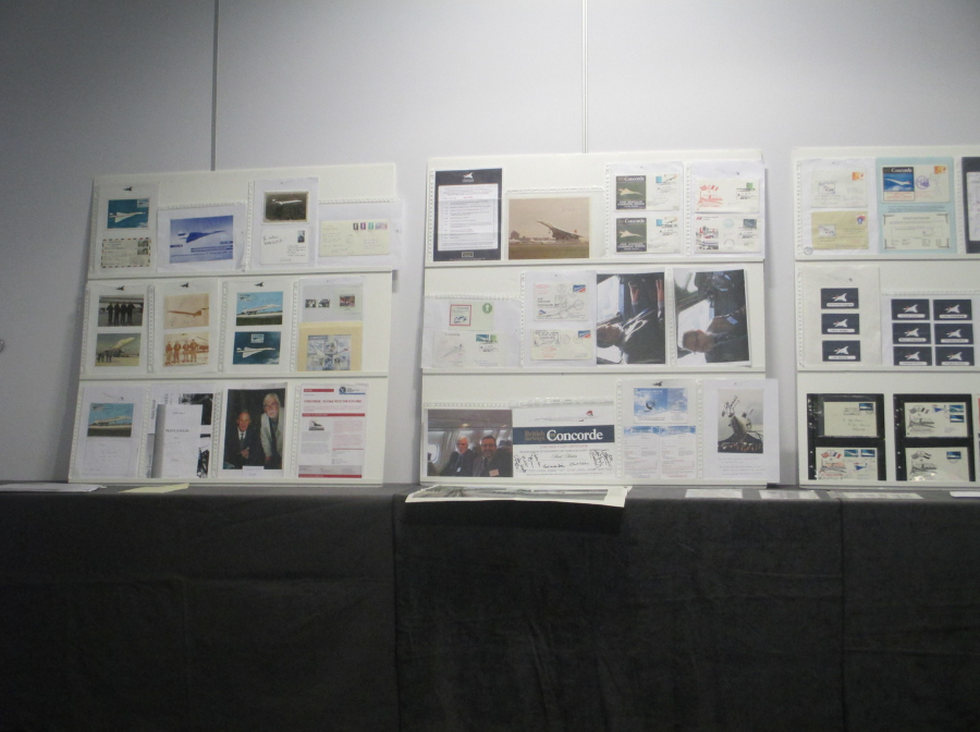
One of the displays given at the STAMPEX meeting of the Concorde Study Circle which includes some signed postcards across the centre of the board on the left.
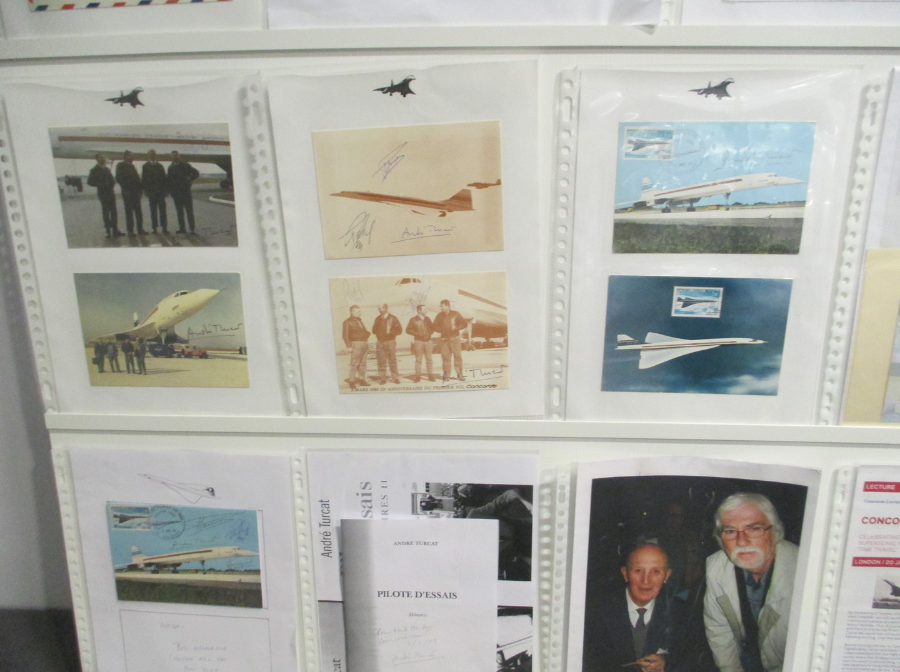
PHOTOGRAPH
Close up of the signed postcards from the above display.
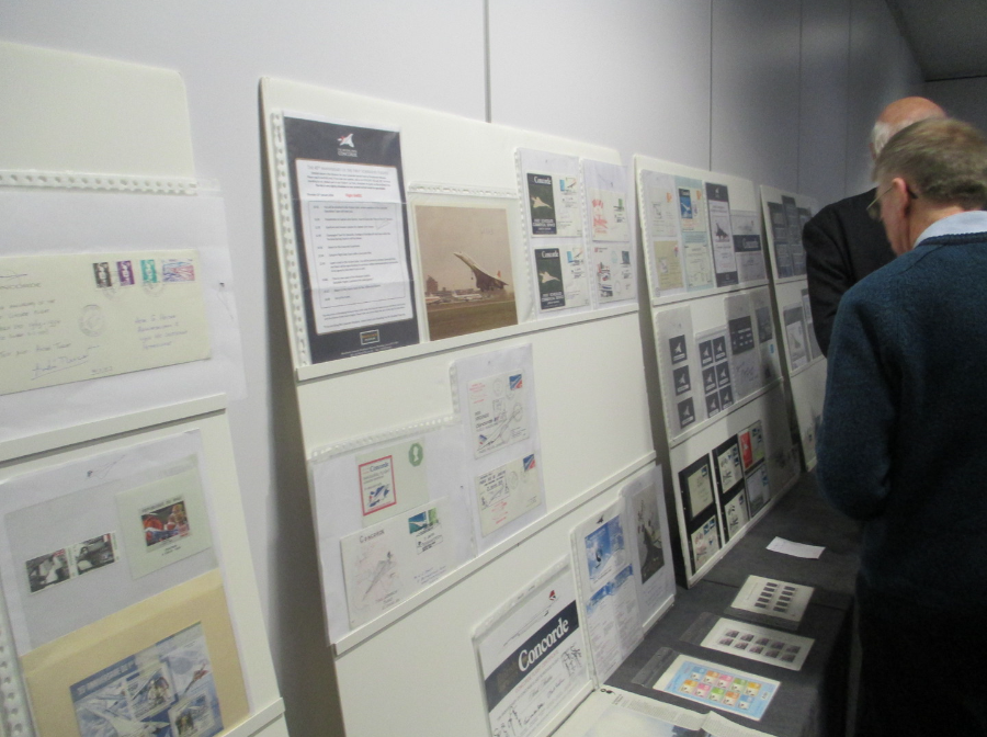
PHOTOGRAPH
Some of the members taking a look at the display
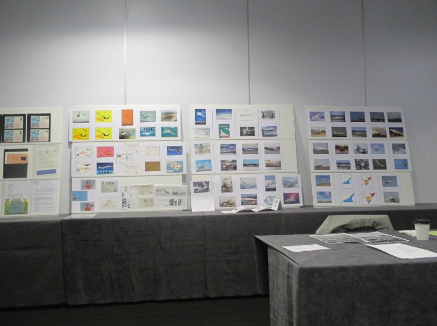
PHOTOGRAPH
These are the postcards put up by Peter Cooper who is perhaps the most knowledeagble Concorde Postcard collector in the club. In fact a number of the cards I bought were bought from Peter and were doubles and swaps and bits from his massive collection. I really don't think there is anyone out there who knows more about concorde postcards than Peter. Most of the cards on the board to the left side of the three is made up of QSL Radio cards

PHOTOGRAPH
Brian L. Asquith
The Editor of the clubs newsletter
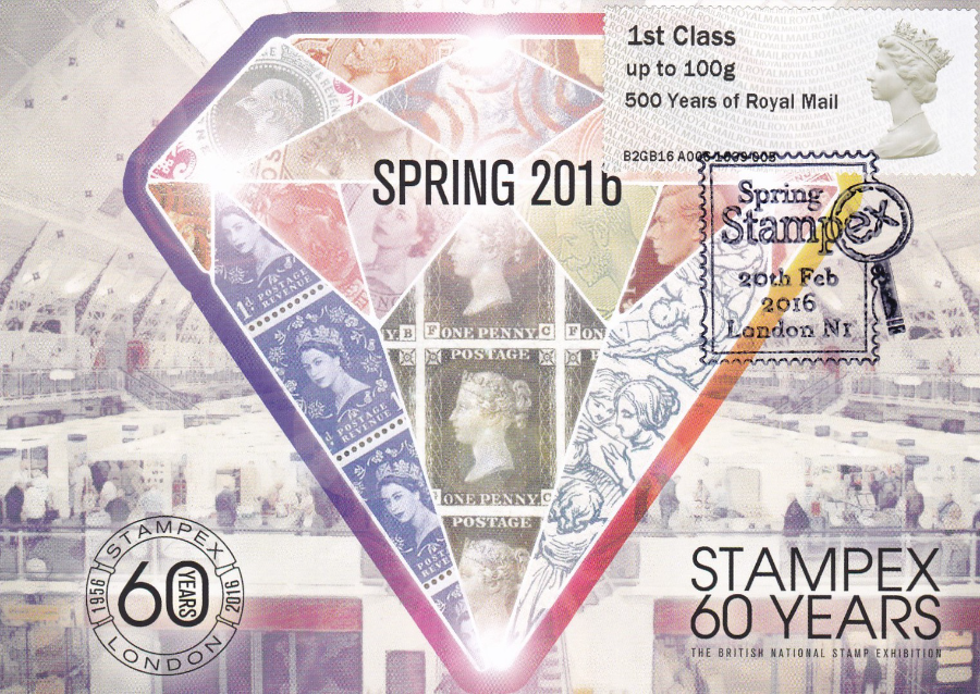
SPRING STAMPEX 2016
‘LAST DAY – 20TH Feb 2016’
CONCORDE COLECTORS CLUB MEETING
“Personal souvenir of today’s visit – show exclusive postcard cancelled with special hand stamp on show exclusive Post & Go stamp overprinted ‘500 Years of Royal Mail’”
I picked up a number of Concorde related postcards from members at the meeting – to show what can be obtained by being a member and attending these such meetings I depict here the Concorde postcards bought.
(The write ups are just the card details – a more detailed Concorde write up will appear at a later date with other depicted postcards – this here is just a round up)

CONCORDE STUDY CIRCLE
CONCORDE POSTCARDS OBTAINED
PART 1
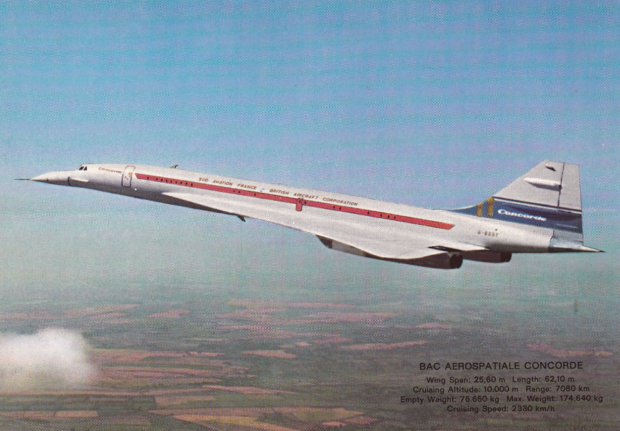
THE BRITISH AIRWAYS CONCORDE, POWERED BY 4 ROLLS-ROYCE SNECMA OLYMPUS 593 TUROJETS PRODUCED BY BRITISH AIRCRAFT CORPORATION AND AEROSPATIALE-FRANCE
(text from reverse side of postcard – no publisher given)

FOTO-FLUG
Luftbild: Flughafen Leipzig/Halle
“Aerial photography of: Airport Leipzig/Halle
Ref KS 288
(Concorde top right)
EDITE PAR LE SERVICE PUBLICITE AIR FRANCE
CONCORDE
Ref 60 291 B
REVERSE SIDE OF ABOVE POSTCARD
(with applied transfers – possibly by a child)
The TV connection of these Stickers/Transfers was not why I bought this card – but they did add an interesting and totally unconnected bonus

BRITISH AIRWAYS
Official ‘AMSTERDAM’ – Dutch ‘CLUB EUROPE’ entry postcard
BAC AEROSPATIALE CONCORDE
Published by ‘Kruger’
Postcard from the Netherlands
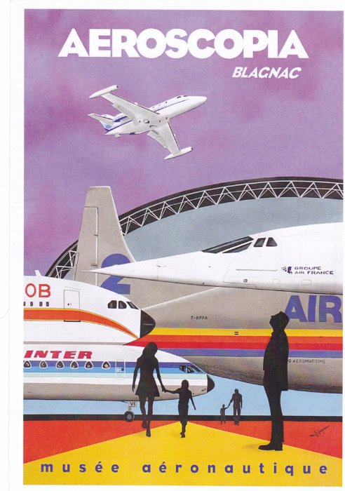
No 147 - "Aeroscopia seven" (88 x 60)
www.descollagesdusud,fr
musee aeronautique

EDITION DES ESCARGOPHILES
COLLECTION 1993 No 21
“SIZI”
Illustrator JER
Le Concorde
Limited Edition of 300
CONCORDE (F-BVFA)
Une belle histoire ecrite par la main del l’homme
REALISEZ VOS CARTES POSTALES
Peinture a L’aerographe (2001)
Didier CHEMIN
Limited Edition 1000
STEPHEN MILLERSHIP
Ref MILLSHIP060
“A series of contemporary illustrations inspired by the golden age of travel poster art”
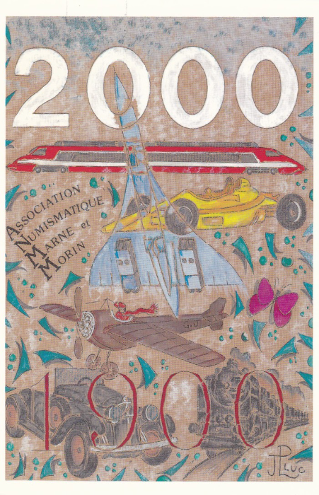
ASSOCIATION NUMISMATIQUE DE MARNE-ET-MORIN
XI – MIM
“Carte Postale de Collection 1843 – 10/1999”
Illustrator - Jean-Luc
Limited Edition of 2000
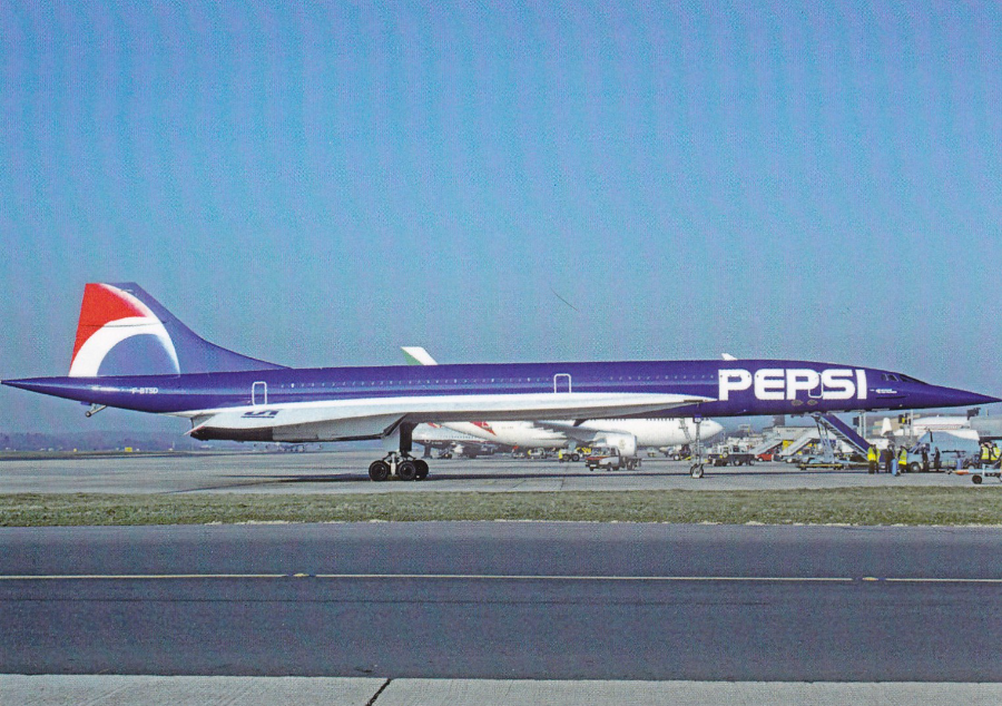
Compagnie aerienne No 1
Serie Limitee 300 ex
(series limited to 300 examples)
AIR FRANCE (couleur pepsi)
CONCORDE
F BTSD C/N 213
Collection C Volpati
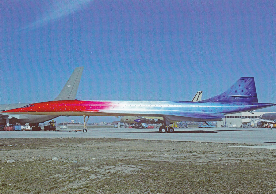
Compagnie aerienne No 2
Serie Limitee 300 ex
(series limited to 300 examples)
Aerospatial / British Aerospace
20th anniversaire du concorde
F WTSB C/N 201
Toulouse 1989
Collection C Volpati
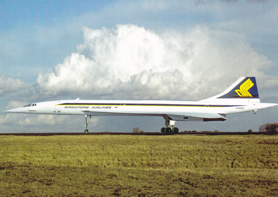
Compagnie aerienne No 3
Serie Limitee 300 ex
(series limited to 300 examples)
SINGAPORE AIRLINES
CONCORDE
G BOAD C/N 210
Collection C Volpati
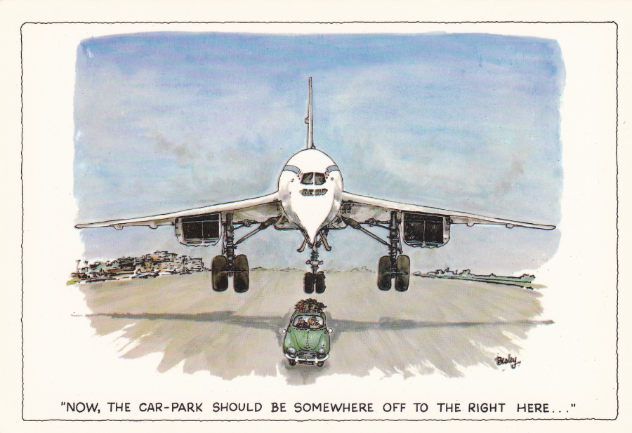
J. ARTHURE DIXON
‘Besley’s London’
No 51
(PLO-00051-L)
My first depicted ‘Besley’ cartoon postcard – I have a huge collection of his postcards and this is but one of the London series which were slightly larger than the normal sized postcards. His artwork is very collectible and there is a dedicated collectors circle for his cards.
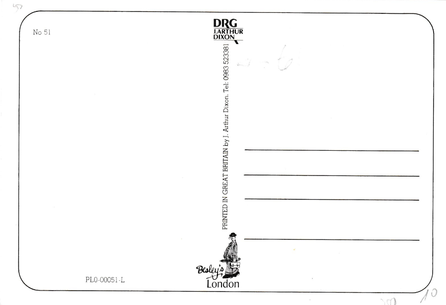
J. ARTHURE DIXON
‘Besley’s London’
No 51
(PLO-00051-L)
Reverse of Concorde Postcard – The fanatical collectors of his work seek out all the different prints and reverse layout types – on this card note that there is a telephone number at the top of the vertical centre line of text

J. ARTHURE DIXON
‘Besley’s London’
No 51
(PLO-00051-L)
On this one (which is the same size but reduced here) note that the telephone number has now been removed (or more likely this one came first and the telephone number was added to reprints) – these type of little changes are eagerly sought out by top level collectors of Besley’s work
Thats one small selection of Concorde Postcards - I will display some more tomorrow to complete the picturing of postcards bought today. I hope this selection shows why it is a good idea to be a memeber of a specialist society or club as it opens up availability to you and helps you with your knowledge and also gets us out of the house and meeting up with fellow collectors.
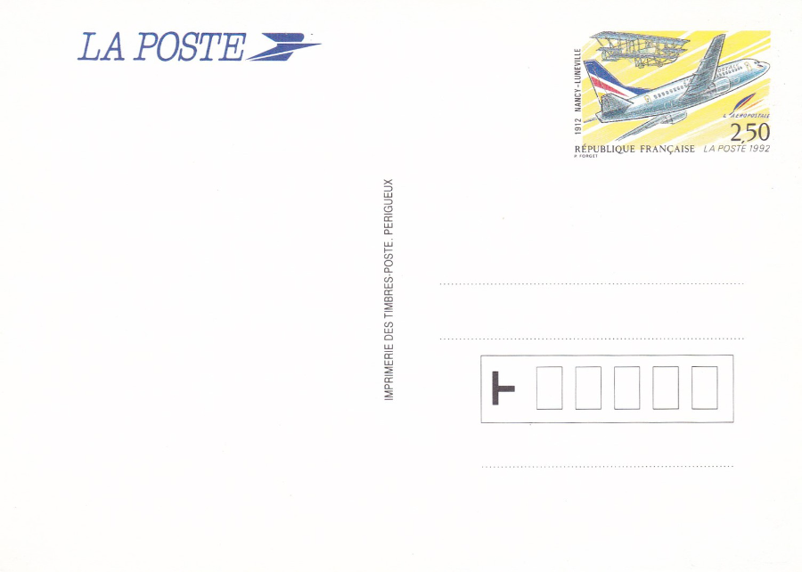
LA POSTE
French Postal Stationary Postcard
1992 (this is the date I believe this came out – the year appears as part of the printed stamp design)
Artwork image depicting airplanes in French livery
(acquired at Spring Stampex 2016)
REVERSE SIDE OF ABOVE POSTCARD
The stamp is printed onto the card, which obviously is what makes this a Postal Stationary Card, but there is no descriptive text or title for this card printed upon it. I assume it was issued for some airplane or airport celebration or anniversary.
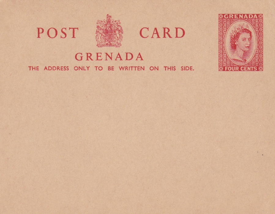
GRENADA
QUEEN ELIZABETH POSTAL STATIONARY POSTCARD
(Acquired at Spring STAMPEX 2016)
Four Cents red on dark buff card issued 1959 (information from the HIGGINS & GAGE WORLD POSTAL STATIONARY CATALOG – SECTION 6).
A mint copy of this early Queen Elizabeth era postal stationary postcard.
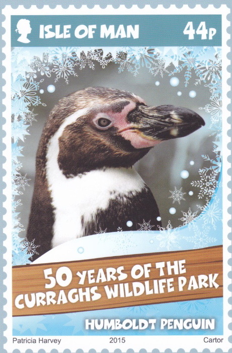
ISLE OF MAN STAMPS & COINS
ISLE OF MAN POST OFFICE STAMP CARD SET
Celebrating 50 Years of the Curraghs Wildlife Park
“CURRAGHS WILDLIFE PARK 50TH ANNIVERSARY”
Stamp Card No. 31 (1)
HUMBOLDT PENGUIN
(This Set was acquired at SPRING STAMPEX 2016)
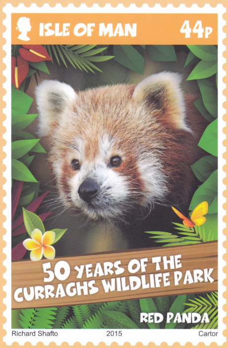
ISLE OF MAN STAMPS & COINS
ISLE OF MAN POST OFFICE STAMP CARD SET
Celebrating 50 Years of the Curraghs Wildlife Park
“CURRAGHS WILDLIFE PARK 50TH ANNIVERSARY”
Stamp Card No. 31 (2)
RED PANDA
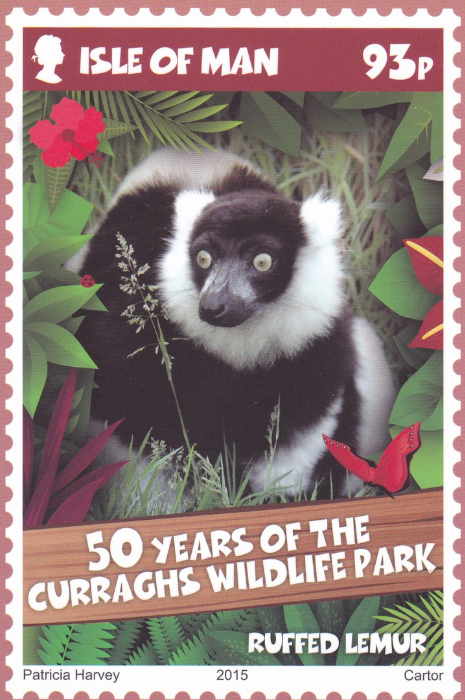
ISLE OF MAN STAMPS & COINS
ISLE OF MAN POST OFFICE STAMP CARD SET
Celebrating 50 Years of the Curraghs Wildlife Park
“CURRAGHS WILDLIFE PARK 50TH ANNIVERSARY”
Stamp Card No. 31 (3)
RUFFED LEMUR
ISLE OF MAN STAMPS & COINS
ISLE OF MAN POST OFFICE STAMP CARD SET
Celebrating 50 Years of the Curraghs Wildlife Park
“CURRAGHS WILDLIFE PARK 50TH ANNIVERSARY”
Stamp Card No. 31 (4)
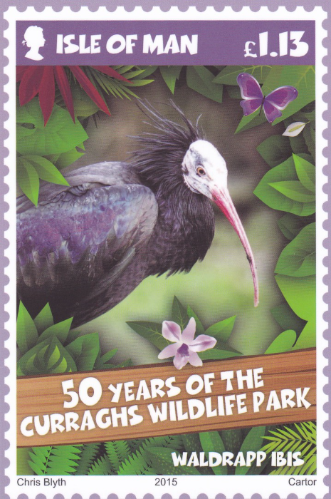
WALDRAPP IBIS
ISLE OF MAN STAMPS & COINS
ISLE OF MAN POST OFFICE STAMP CARD SET
Celebrating 50 Years of the Curraghs Wildlife Park
“CURRAGHS WILDLIFE PARK 50TH ANNIVERSARY”
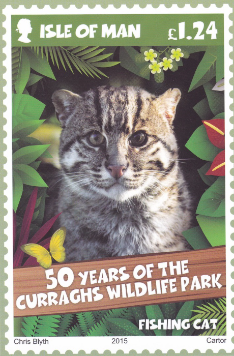
Stamp Card No. 31 (5)
FISHING CAT
ISLE OF MAN STAMPS & COINS
ISLE OF MAN POST OFFICE STAMP CARD SET
Celebrating 50 Years of the Curraghs Wildlife Park
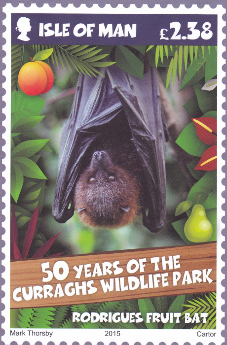
“CURRAGHS WILDLIFE PARK 50TH ANNIVERSARY”
Stamp Card No. 31 (6)
RODRIGUES FRUIT BAT
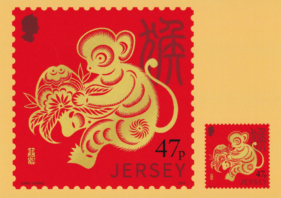
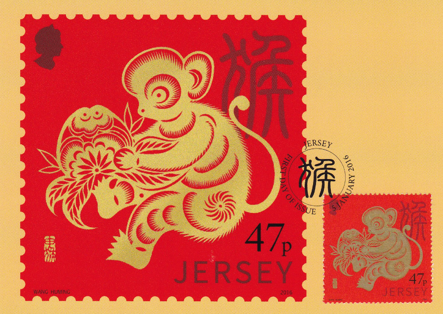
JERSEY POST
2016 LUNAR NEW YEAR - YEAR OF THE MONKEY
POSTCARD
depicting
47p Stamp designed by Wang Huming
Issued by Jersey Post on 5th January 2016
(Bought at Spring Stampex)
Mint Postcard with printed version of the 47p stamp bottom right corner (this is not an applied stamp)
JERSEY POST
2016 LUNAR NEW YEAR - YEAR OF THE MONKEY
POSTCARD
depicting
47p Stamp designed by Wang Huming
Issued by Jersey Post on 5th January 2016
This Postcard has an actual 47p Year of the Monkey stamp applied over the printed stamp (as seen on the above posted postcard – if you look closely here you can see that the gold ink used to print the monkey on the actual stamp makes the monkey seem darker than it appears on the above postcard).
This stamp has been cancelled first day of issue with a Jersey F.D.I. cancel dated 5 January 2016.
This postcard cost me £1.20 at STAMPEX
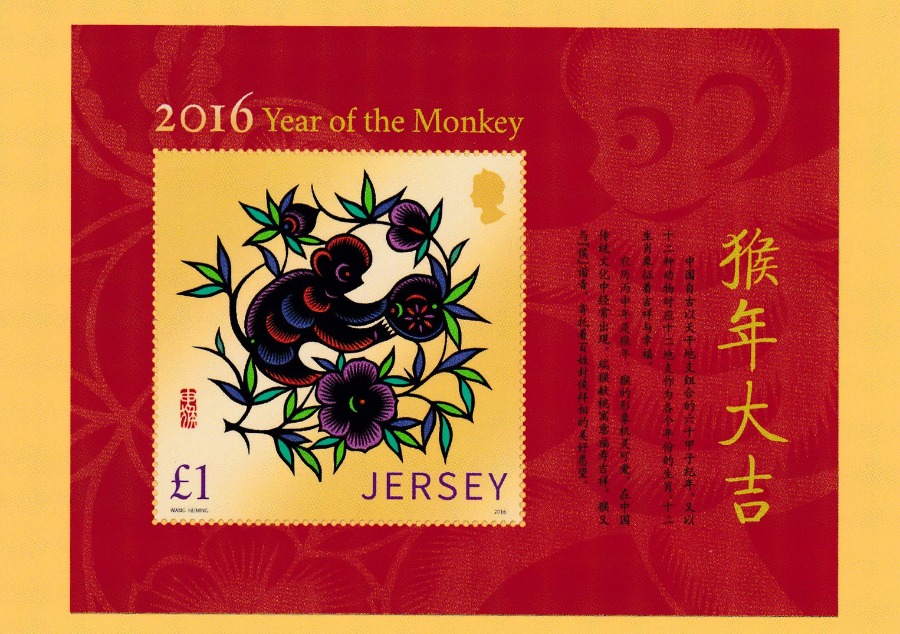
JERSEY POST
2016 LUNAR NEW YEAR - YEAR OF THE MONKEY
£1 value – 2016 YEAR OF THE MONKEY Miniature Stamp Sheet
Designed by Wang Huming
Issued by Jersey Post on 5th January 2016
Mint Postcard which pairs with the mint postcard depicted two images up
SPRING STAMPEX
17TH February – 20th February 2016
PART TWO
There were a number of postcards to buy at the STAMPEX show but there was also a handful of freebies, but not many, and also not always easy to obtain either.
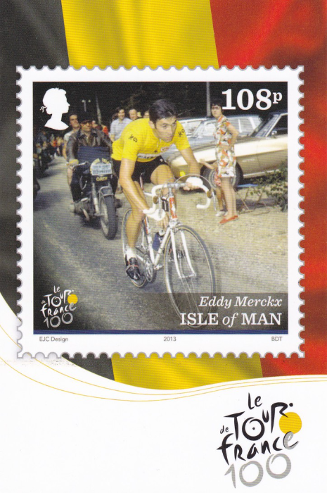
On the ISLE OF MAN STAMPS & COINS stand they were clearly selling their recent issues but I noticed two stacks of cards at the side of the stand. I have always found that there is no harm in asking and I was chatting to one of the stand workers, and had bought a few cards anyway so I thought, why not. I discovered that the cards were free and was given one of each. I noticed though that few of the cards were being given out. I got the impression that the staff had sort of forgotten about them. I depict the two cards here (I believe they may be from a larger set)
ISLE OF MAN STAMP & COINS
ISLE OF MAN POST OFFICE STAMP CARD
No. 28 (8)
EDDY MERCKX
Eddy Merckx aka ‘The Cannibal’, won the Tour de France five times and holds the record for the total number of stage wins.
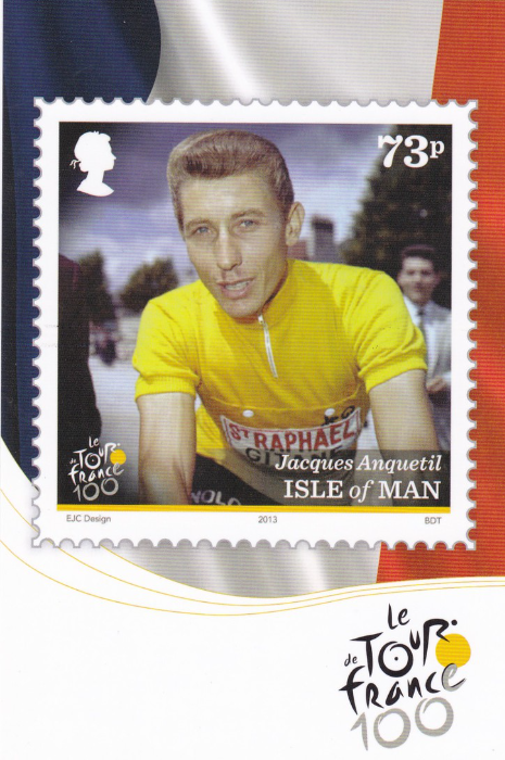
ISLE OF MAN STAMP & COINS
ISLE OF MAN POST OFFICE STAMP CARD
No. 27 (8)
JACQUES ANQUETIL
Jacques Anquetil who in 1964 became the first rider to win the Tour de France five times

THE POSTAL MUSEUM
‘Revealing your history through the post’
On the 4th February 2016 what was the National Postal Museum (which was previously called The British Postal Museum & Archive) underwent a name change and held a brand launch for the new name – THE POSTAL MUSEUM. A building to hold the new styled museum was found last year and funding was raised and the work has commenced to construct the inside of the new museum which should be opening in Spring 2017.
At their stand at STAMPEX they were giving away this free blue postcard depicting a photograph of mail being delivered to an airplane and being transferred from an old Royal Mail van directly into the airplane. The image is not captioned nor described on the reverse side but from my knowledge (little as it is) I recognized this to be an image from Croydon Airport. A nice, simple but interesting postcard and perhaps the first one to show the museum’s new logo on the front.

THE POSTAL MUSEUM
‘five facts about Mail Rail’
Another free card, not a true postcard as it has an information reverse side, but it is the same size, and on the same board as the blue postcard pictured above.
MAIL RAIL is a second project being worked on besides the Museum building mentioned above. Not many people, outside of those in the philatelic world, know that here was a pneumatic rail system underneath London which runs for a distance of 6.5 miles and which was first used to transport mail across the capitol without delay and efficiently. The system came to a halt many years ago but plans are underway for the railway to re-open as a tourist attraction where you can ride the tracks in a special carriage (much, much smaller than a normal train’s because the line was not designed for the carriage of people, only sacks of mail – so technically you will be replacing those sacks). When the new attraction opens I am looking forward to riding this myself as I have long been interested in this system. It will consist, apparently, of a 15-minute ride through one section of the tunnels.
As an interesting side note details on the reverse side of this card inform you that the Rosetta Stone and art treasures were stored in these tunnels during the first world war to protect them from Zeppelin air raids.

SCHLEGEL
AUCTION HOUSE FREE ADVERTISING POSTCARD
This lovely photograph of the Brandenburg Gate in Berlin appears on a free postcard which is self-addressed back to the German auction house company and which is designed to be completed with your details as a request for the next auction catalogue to be posted to your address. All text on the reverse side is in German.
This is an example of what I call a ‘Paper-card’. This is where the item resembles a postcard in every way except for the material it is printed on because it is paper thin instead of actual card. A lot of business styled postcards are printed like this because it saves considerably on the cost. These were clearly free to pick up on their stand.
SPRING STAMPEX
PART ONE
SPRING STAMPEX
First Day – 17th February 2016
I’ve just got back from a long first day at STAMPEX UP AT THE Business & Design Centre in Islington, London. I have normally attended on the first day and use it to obtain the special stamps and Post & Go items which are sometimes (always these days with Post & Go) released on the initial day. This year was more of a must than normal, but more about that further down.
As has been the case for many years now a special exclusive show postcard was produced and was given away free to every visitor in their show guide (so if attending always grab one of the books being handed out to people as you enter or if you attend later, after the initial hour’s rush after opening approach the stand just off to the left as you enter where you can obtain one). Initially the show postcards depicted un-adopted GB stamp designs, and this was the case for many years. Then (I think only a couple of years ago) they changed to some Mail related photographs and some historical documents.
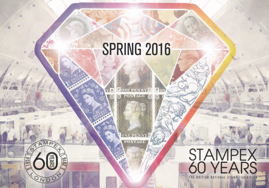
This Spring’s card – No 31 in the ongoing series – breaks ranks from the norm entirely, but for a good reason. The card celebrates the fact that STAMPEX is celebrating its 60th anniversary. The card in question is depicted here.
POST & GO
“500 YEARS OF ROYAL MAIL”
The special Post & Go Machin overprint released today at STAMPEX was for the 500th anniversary of the Royal Mail and the overprint reads as :-
500 Years of Royal Mail
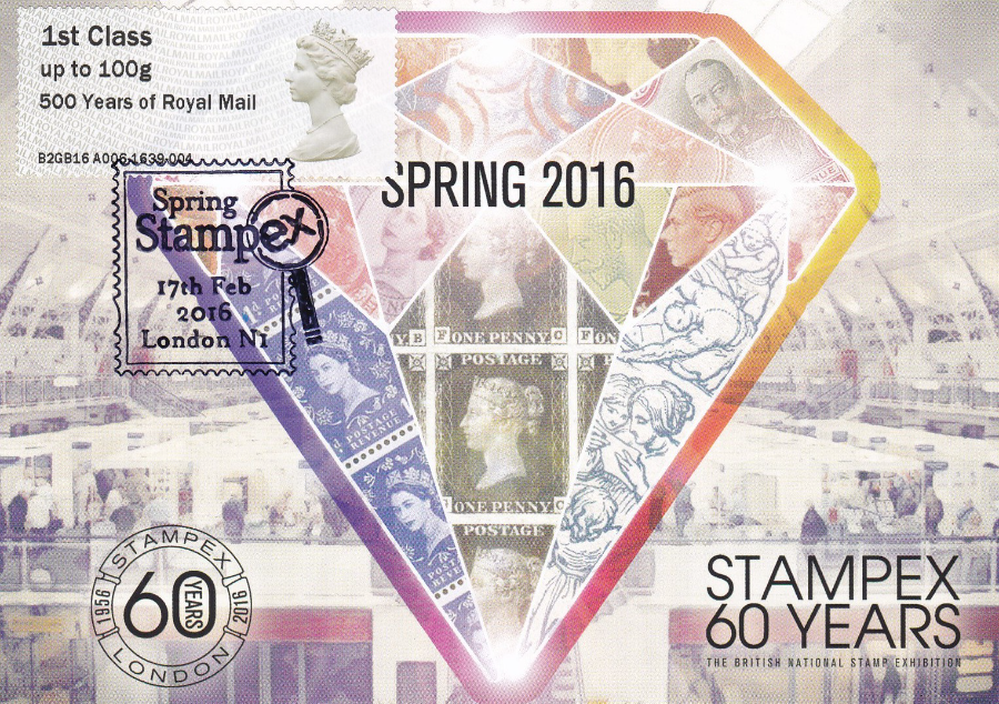
Here I have applied one of these show exclusive overprinted Post & Go stamps to the front of one of the shows exclusive postcards and had it hand stamped with the ‘SPRING STAMPEX 17th Feb 2016, London N1’ special hand stamp. This now has become my personal souvenir of my day’s visit.
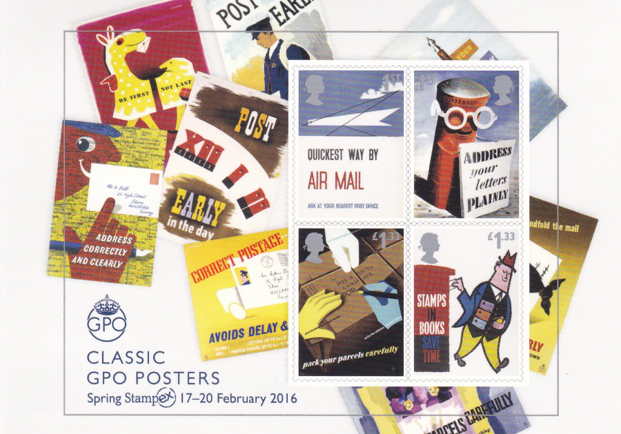
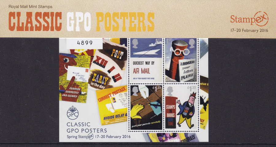
CLASSIC GPO POSTERS POSTCARD
STAMPEX EXCLUSIVE
Postcard depicts the STAMPEX exclusive overprinted ‘Classic GPO Posters’ stamp sheet which has the ‘Spring Stampex 17-20 February 2016’ overprint applied bottom left under the sheets title.
The exclusive sheet itself has been issued in a limited edition of 7,500 copies (available in a presentation pack – see below)
This exclusive postcard depicting the overprinted sheet is apparently issued in a limited edition of 3000.
This idea of a show overprinted sheet and an exclusive postcard depicting this sheet arises from the success of the same venture at the EUROPHILEX 2015 show last year with the Penny Black/Penny Blue stamp sheet (see a previous Blog where these items are displayed). The postcard last year had a blue boarder. The card for this year’s sheet, as displayed here, does not have a boarder as such but has the wonderful view of an extension of the sheets design as it bleeds out further than the actual sheet design itself (in essence you see more of the camel design top left and the title of the postman poster top centre left). I liked this idea and I like this card. Copies cost 90p each and were exclusive to the Royal Mail stand (there was a separate queue just for the exclusive sheet and postcard – a large number of these were being sold today and there is still three more days of the show, which finishes this Saturday – 20th Feb)
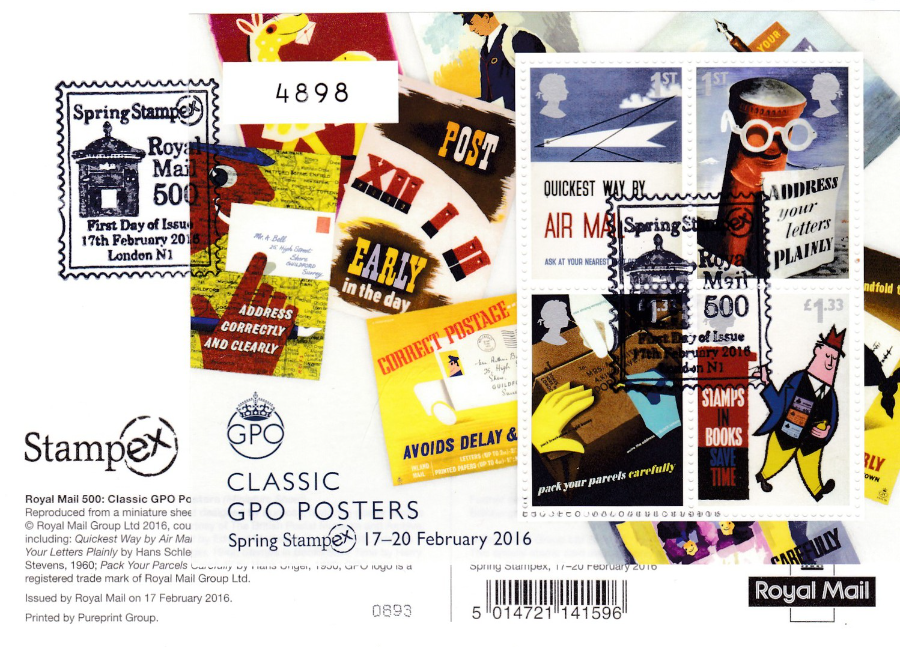
CLASSIC GPO POSTERS POSTCARD
STAMPEX OVERPRINT SPECIAL
Reverse Side
USED FIRST DAY OF ISSUE WITH A COPY OF THE ACTUAL
‘Spring Stampex 17 – 20 February 2016’
OVERPRINTED STAMP SHEET APPLIED AND CANCELLED FIRST DAY OF ISSUE
“17TH February 2016’
This of course had to be done and here you can see my personally produced copy where I have applied one of these show exclusive overprinted sheets to the reverse side of the exclusive postcard which depicts said sheet. I then had this hand stamped first day of issue with a special STAMPEX 17th Feb 2016 hand stamp. As the card and the sheet can only be obtained from the show this combination will not be extremely common. Many visitors, like me, who have done this will keep their copies for their collections and as their personal souvenirs.
I expect these to be become very collectible and to only rise in value as time moves on.
OVERPRINTED SHEET
PRESENTATION PACK
As I have mentioned this sheet, and depicted one applied and cancelled to the back of one of my cards I thought I would also show you one of the sheets mint in its presentation pack as sold.
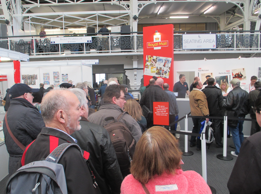
PHOTOGRAPH
17TH February 2016
This is the queue from where I joined it soon after the doors of the show opened. I was not too far back but it still took around 15mins to move along. The queue behind me also built up extremely quickly. The queue here was just for the exclusive overprinted sheet and the exclusive postcard depicting it. They were, as you can see, very popular.
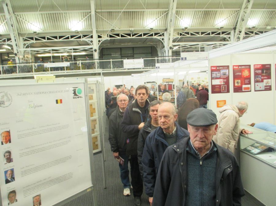
PHOTOGRAPH
17TH February 2016
The queue very quickly built up behind me and remained a very long queue throughout the day and was cause of much discussion. Initially there was a belief that there was no limit to the number of sheets you could buy (there was some later discussion that there was a limit of ten but as I did not ask I did not find out the truth). Last year’s sheet, at ‘Europhilex’ was limited to three per customer. As with ‘Europhilex’ there was apparently no limit on the postcard sales but I got the view, having attend both events now, that far more postcards were being bought here than on the first day at Europhilex so their value in the future, despite costing an extra 40p (this year they are 90p where as last year the special postcard was just 50p) could be very interesting.
THERE WILL BE A FURTHER STAMPEX POST TOMORROW REGARDING OTHER ITEMS SEEN AND BOUGHT - UNTIL THEN I AM OFF TO GET SOME SLEEP
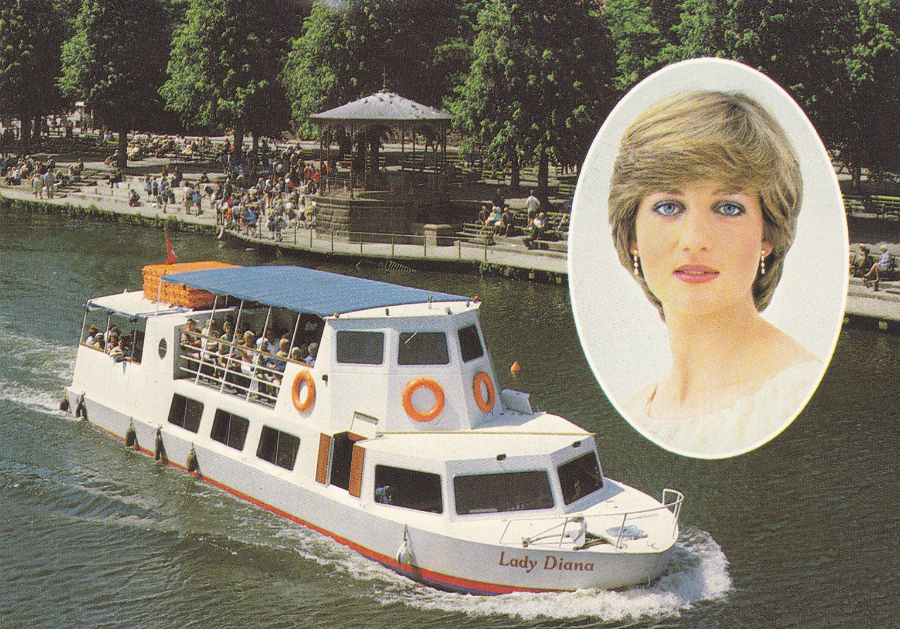
“LADY DIANA” SAILING UP THE RIVER DEE AT CHESTER, CHESHIRE
Published by
(DRG) J. ARTHUR DIXON
Reference PCH/25118
“Sailing for the first time in the Royal Wedding year of 1981, what else could this fine vessel be called? The tree-lined River at Chester provides a splendid sail in this historical city which lies on a bend of this River on a small sandstone ridge”
(Text on the reverse side of postcard)
I have mentioned before, I think, that I have specialized collection of Princess Diana postcards and was in possession of a good collection before she sadly passed away and the value and interested again raised producing even more collectors for items related to her. If you were not previously aware, then you would possibly be surprised to know just how many Diana postcards there actually are. For an example I have over 400 related to her death alone. For the 1981 royal wedding there were again a large number produced. Slowly I will post some here over future blogs.
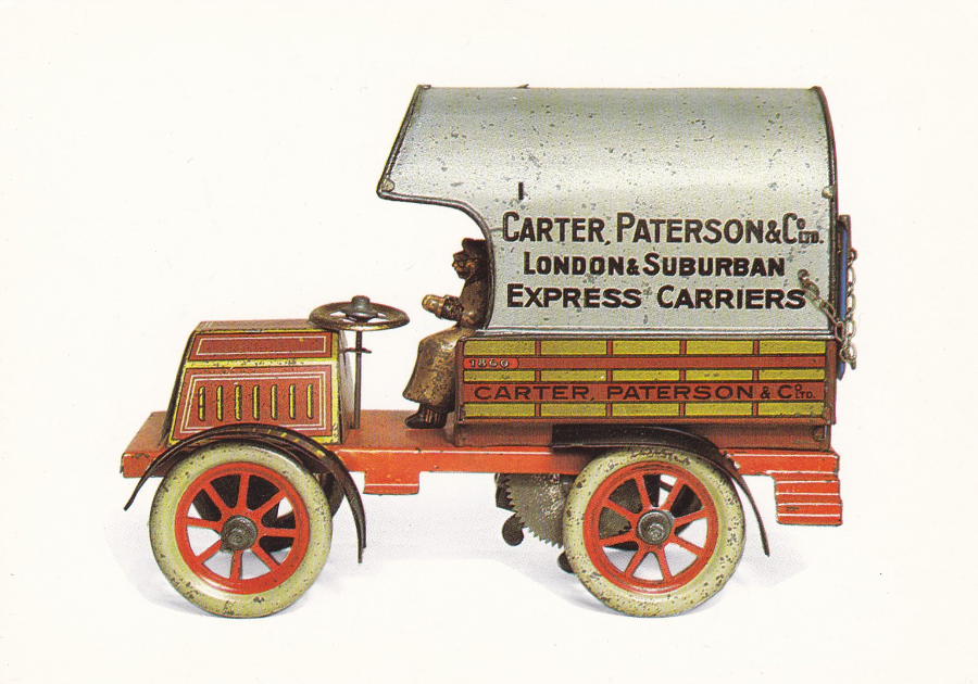
‘CARTER PATERSON’ CLOCKWORK LORRY
German-Carette, 1906
THE LONDON TOY & MODEL MUSEUM
Carter Paterson was a British road haulage firm that was closely associated with the railway industry. Founded in 1860 the company was formed into a private company in 1887 and converted into a public company in February 1934 (long after the time of this little lorry).
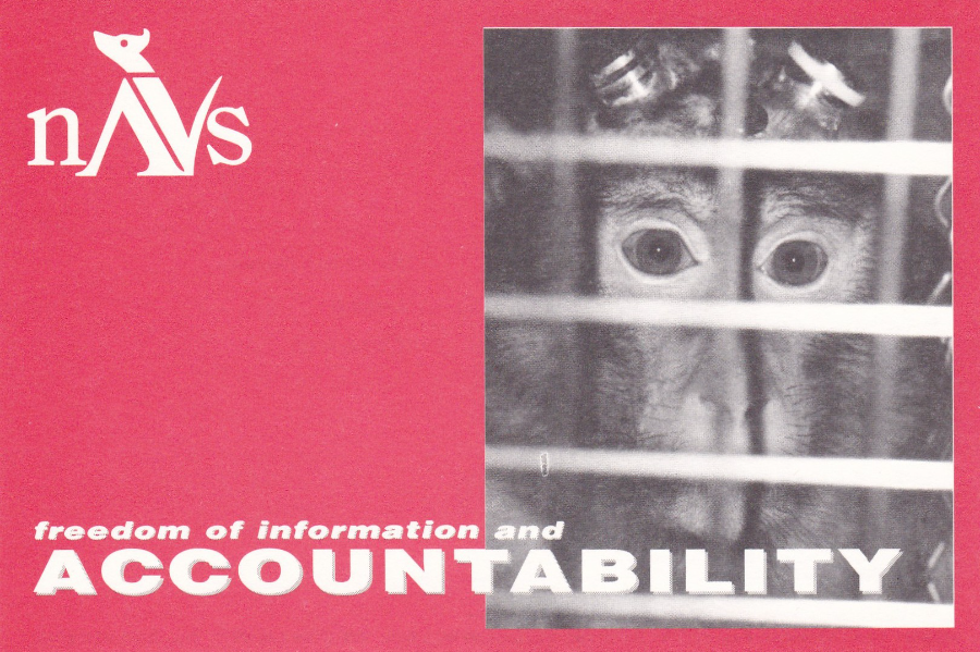
ACCOUNTABILITY
National Anti-Vivisection Society
Throughout the 1980’s and 1990’s postcards were regularly used as campaign cards to bring certain important reports, campaigns or public interest matters to the attention of members of parliament. Sometimes these were (and still area) addressed to specific people, like the Prime Minister, but more often originally they were designed for the sender to address to their particular MP (like this one is – see below).
Whilst I was at senior school the campaigns around animal vivisection become prominent and it was highlighted by acts what was classed as vandalism where masked groups broke into laboratories and released animals that were being experimented on. With my interest in wildlife I read a few books on the subject at the time and remember even today the fact that a sheep can drink a bucket of strychnine with no ill efforts, a point that was trying to be used to show that testing stuff on animals did not make sense. Well that was nearly 40 years ago but if reports are right little has changed today, except the fact that possibly more animals are now used in testing. This card was an attempt to try and change that, unfortunately without success (although I struggle with the understandable need to find a cure for Cancer and other afflictions and that we all want this and the simple fact is that without certain types of testing, including that on animals, this may not be achievable… it is still therefore a very emotive subject)
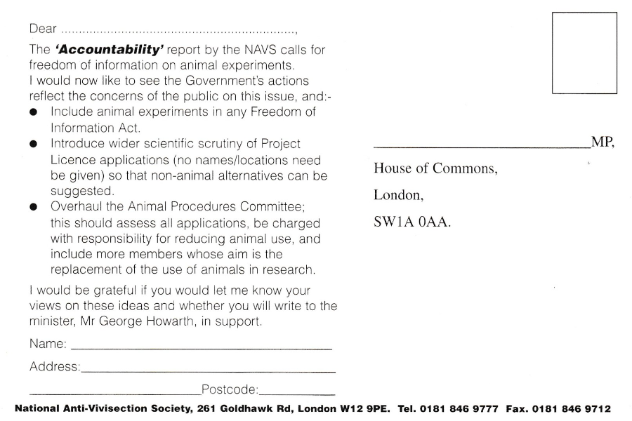
THE REVERSE SIDE OF ABOVE POSTCARD
Here you can clearly see the text filled left side (quite normal on these campaign cards) and the area for the sender to place their name and address and the right side where they could place the details of their local MP.
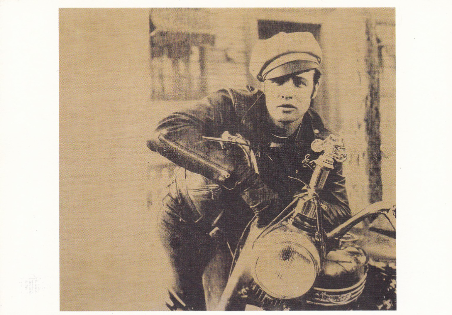
ANDY WARHOL
Marlon Brando, 1966 – Silkscreen ink on Canvas
Published by
NEUES PUBLISHING COMPANY
(For the Visual Arts, Inc)
Printed in Germany
I previously posted an Andy Warhol ‘Superman’ picture but this one came along recently and I thought it would also be worth posting. Like many of Warhol’s pieces this depicts an iconic image of a famous person, actor Marlon Brando. I am sure you don’t need me to tell you that this image is taken from the feature film ‘The Wild One’, from 1953.
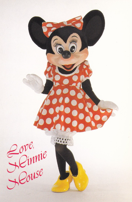
LOVE, MINNIE MOUSE
Disneyland – The Happiest Place on Earth
Minnie Mouse
Reference HSC / 46CH-3005LA
Surely it must be time for another Disney card? This is a fairly basic design showing a studio photograph of Minnie Mouse from the theme park. Literally 1000’s of this type of card were produced but where Disney were initially different is that they had a policy of constantly changing the designs and updating images and releasing new postcards. There was also the bonus that they numbered the cards, admittedly the reference numbers are long and involve letters and numbers but at least you can list them. This example only cost me 20p, but I expect I got it quite cheaply.
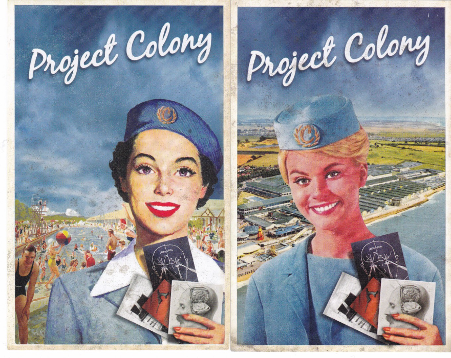
PROJECT COLONY
Advertising Card Flyers designed to appear like Postcards
These are two fantastic advert card flyers which are made to resemble old 1950’s styled American holiday/Airline posters. The images are superb and are I suspect a clever montage of images from the represented era. These are actually adverts for a play based on Franz Kafka’s novel ‘In the Penal Colony’. This was a short run between 2nd and 27th April 2013 at Trinity Buoy Wharf, 64 Orchard Place, London. The front of these cards are lovely but the reverse sides also have a very clever approach to the advertisement of this show…

REVERSE SIDE OF ABOVE ADVERT CARD FLYERS
These are in fact totally printed to resemble old postcards that were posted in the era of King George V (much in odds with the more modern front poster designs used). The one penny George V stamp was used during the Kings reign which was between 1910 and 1936. The stamps are printed here but the designs here are very cleverly done and the layout with the “COMIQUE” Series – Inter Art Co. postcard text down the far left side and the use of a London wavy line cancellation (again obviously printed here) actually makes these look, at first glance, quite real.
What also impressed me is that the test, although reading exactly the same, has been written in two completely different ways making these backs each unique to their own design. This was clearly not necessary but by doing it they created two totally different backs.
Obviously, as mentioned, these are not true postcards but advertising, promotional items, but I think they make a cracking supplementary addition to my collection. And as I have never been too precious about my collection items like this appeal to me.
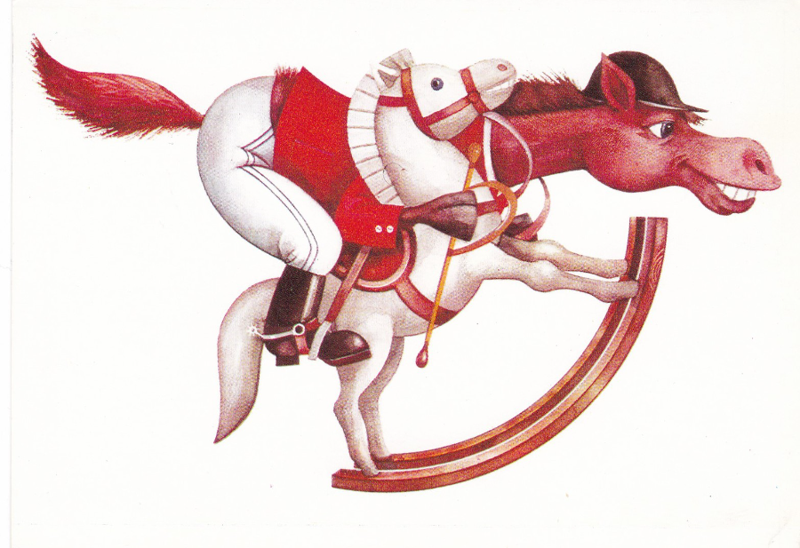
HORSE RIDING CARTOON
Postcard Published in Bulgaria
There is not much I can tell you about this postcard because I can-not read the language and there is little of it anyway and the image on the front has no signature. I bought this for 15p at a recent fair and to be honest I bought it just because I liked it (and is there any better reason?)