
28/10/2016
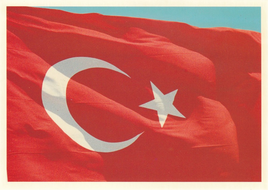
THE TURKISH FLAG
On my recent trip to Turkey I managed to find two postcards which depict the Turkish red flag with its white star and crescent. On any holiday, I try and obtain postcards which are representative of the place, or country I am visiting. The postcards then go together to make a souvenir album.
With both postcard’s I think they have caught the simple and delightfully colourful national flag. One is a very simple flat depiction of the flag whilst the other is a photograph of the flag lightly rippled in the wind.
POSTCARD
Published by
GUNEY
Ref: B – 12
POSTCARD
Published by
KUYDAS
Ref: 109
28/10/2016
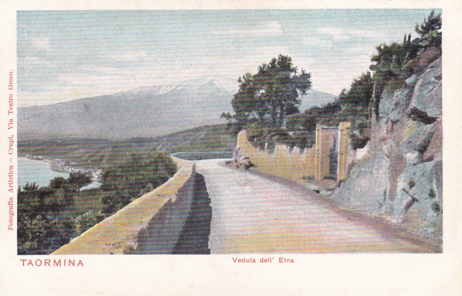
TAORMINA
Veduta dell’ Etna
(View of Mount Etna)
a
CARTOLINA POSTALE ITALIANA
Published by
Fotografia Artistica – Crupi, Via Teatro Greco
This postcard is from the early part of the last century and depicts a road up in the hills from where you could (and possibly still can if this area has not become too built up over the past 100+ years) see Mount Etna.
The card is from Taormina, which is a hilltop town on the East coast of the Island of Sicily. As can be seen from this image it does sit quite near to the active volcano, Mount Etna. Visitors here still visit the ancient Greco-Roman theatre that is famous and known as the Teatro Antico di Taormina. This theatre is still in use to this day.
I have posted this nice old volcano postcard because I realised that it has been awhile since a really old postcard has appeared here.
28/10/2016
CHRISTMAS 1973
“GOOD KING WENCESLAS”
My love of the Royal Mail PHQ Stamp cards should have come across by now as I have posted all of this year’s issues so far received. But, these stamp cards have only been issued since 1973, and in the first couple of years not every stamp in a set, and not every set itself was issued as cards.
The 1973 Christmas stamp was one of those early sets which did not receive representation on stamp cards (there had in fact only been four individual PHQ cards issued prior to the Christmas stamps being released). So, collectors like me try and get these stamps used on other postcards, but, unfortunately, these are not that common. I have been collecting this type of card for many years now (certainly over 35 years now) and until quite recently I had not actually seen a set! Then this month this set depicted here appeared on eBay, so I had to have it.
Whoever put this set together used a range of postcards from two different sources. There is either a Christian, religious, nativity story or Christmas styled theme to each of the postcards.
The stamp issue itself depicts images related to the Christmas Carol ‘Good King Wenceslas’ :-
Good King Wenceslas (last)look'd out,
On the Feast of Stephen;
When the snow lay round about,
Deep, and crisp, and even:
Brightly shone the moon that night,
Though the frost was cruel,
When a poor man came in sight,
Gath'ring winter fuel.
"Hither page and stand by me,
If thou know'st it, telling,
Yonder peasant, who is he?
Where and what his dwelling?"
"Sire, he lives a good league hence.
Underneath the mountain;
Right against the forest fence,
By Saint Agnes' fountain."
"Bring me flesh, and bring me wine,
Bring me pine-logs hither:
Thou and I will see him dine,
When we bear them thither."
Page and monarch forth they went,
Forth they went together;
Through the rude wind's wild lament,
And the bitter weather.
"Sire, the night is darker now,
And the wind blows stronger;
Fails my heart, I know now how,
I can go no longer."
"Mark my footsteps, good my page;
Tread thou in them boldly;
Thou shalt find the winter's rage
Freeze thy blood less coldly."
In his master's steps he trod,
Where the snow lay dinted;
Heat was in the very sod
Which the Saint had printed.
Therefore, Christian men, be sure,
Wealth or rank possessing,
Ye who now will bless the poor,
Shall yourselves find blessing.
The Christmas carol is quite well known and I myself have often sung it (very badly) at one, or more of the Scout or Cub Christmas carol events held yearly.
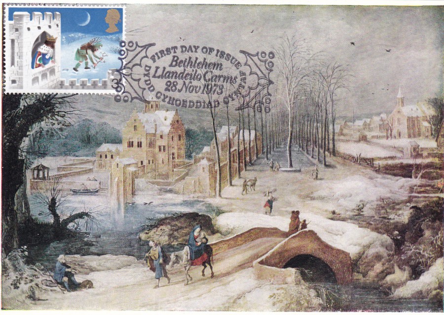
POSTCARD
‘LANDSCAPE WITH THE FLIGHT INTO EGYPT’
Painting by – Joos de Momper (1564 – 1634)
Published by
THE MEDICI SOCIETY LTD, LONDON
(look out for copies where the company’s name is spelt as SOCITY, missing out the letter ‘I’, which is the case with my copy)
Ref: P.C. 959
3p Stamp (SG 943)

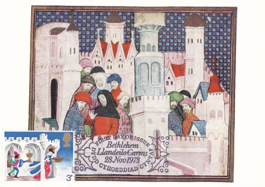
POSTCARD
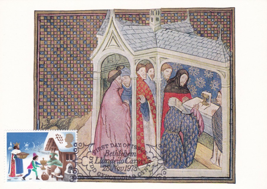
‘HENRY RECEIVES THE DUKES OF EXETER AND SURREY AT CHESTER’
French, early 15th century
Published by
The British Museum
Ref B 420
3p stamp (SG 944)
POSTCARD
‘RICHARD AT CONWAY CASTLE’
French, early 15th century
Published by
The British Museum
Ref: B418
3p stamp (SG 945)
POSTCARD
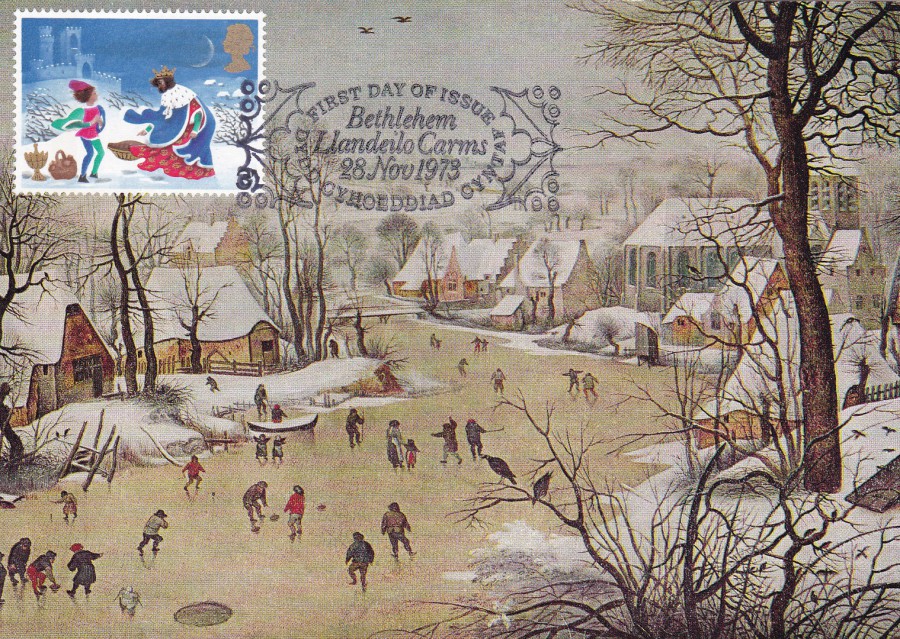
‘A WINTER LANDSCAPE’ (Detail from ‘The Bird Trap’)
Painted by Pieter Brueghel The Younger (1564 – 1638)
Published by
THE MEDICI SOCIETY LTD. LONDON
Ref: P.C. 1519
3p stamp (SG 946)
POSTCARD
‘THE EARL OF NORTHUMBERLAND SWEARS THAT HE MEANS NO TREACHERY TO RICHARD’
French, early 15th century
Published by
The British Museum
Ref B 422
3p stamp (SG 947)

POSTCARD
‘THE FRONTAL OF MOSOLL’
The Three Kings, detail from an altar cloth showing scenes from the life of the Virgin
MAESTRO DE MOSOLL (c. 1200). This frontal is a fine example of the altarcloths that were customarily draped over Romanesque altars. Frontals such as this can be found in country churches built in the districts surrounding Gerona.
Published by
THE MEDICI SOCIETY LTD. LONDON
Ref: P.C. 1409
3 ½ p stamp (SG 948)
This stamp is the gold printed high value stamp in the set (seems strange calling a 3 ½ p stamp as being High Value’, but it was the highest value stamp in this Christmas set).
So, there you have the six stamps, on six different cards, but all cancelled with the same smashing first day of issue hand stamp –
‘FIRST DAY OF ISSUE – BETHLEHEM LLANDEILO CARMS – 28 NOV 1973 – DYDD CYHOEDDIAD CYNTAF’
This set is worth every penny if you can find it anywhere between £10 and £18 (but soon £20+ will seem a reasonable price, as this is not an easy set to acquire)
26/10/2016
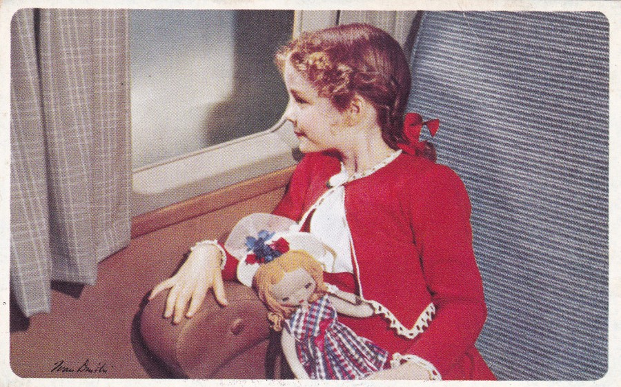
AMERICAN AIRLINES
“In Flight, Route of the Flagships”
“Volando Por la Ruta de los “Flagships””
Ref: T – 151 B (Printed in U.S.A.)
“Sky-high geography in a cradle-smooth classroom – no wonder the children enjoy a Flagship flight”
(Text from reverse side of postcard)
This is a nice transport advertising postcard for the ‘American Airlines’. From the look of it I suspect it is from the late 1950’s (possibly early 1960’s). It depicts a young girl, and her doll, sat looking out of a window. The Airline connection adds another layer of thematic collecting to this card as there are many collectors who specialise in airline publicity material.
The placement of a child on this postcard follows a long running tradition of depicting children, both on photographic images, and artwork, on postcards. There are even collectors who concentrate on postcards depicting children.
Personally, I think this is a lovely little postcard.
American airlines Logo from the reverse side of the postcard
Enlarged section
26/10/2016
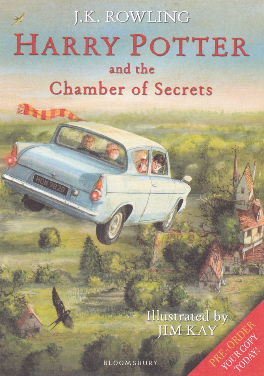
HARRY POTTER AND THE CHAMBER OF SECRETS
ILLUSTRATED EDITION
PRE-ORDER CARD
This lovely card depicts the cover of the relatively new illustrated edition of the Harry Potter book. The illustration here, and those used throughout the book, is by Jim Kay.
This particular card has areas on the reverse side which are designed to be filled in so that the book could be pre-ordered by someone and reserved for them (more than one copy if they wanted).
Although technically a pre-order card rather than a true postcard, this is still a cracking card for any Harry Potter collector (and there are quite a few of them)
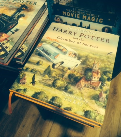
PHOTOGRAPH
22/10/2016
This is a copy of the actual book on display in the Waterstone’s bookshop in the Lakeside Shopping Centre which I saw this past weekend.
26/10/2016
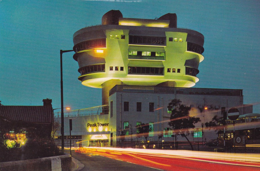
PEAK TOWER RESTAURANT
HONG KONG
Published by
NATIONAL Co.
Ref: N886
Way back in 1981 I had the pleasure of visiting Hong Kong and I rode the Peak Tram to the top of Victoria Peak and visited the building at the top, and looked out across the city. This stricture depicted here is what I remember seeing at the peak. So, this postcard brings back memories of my trip. But, much has changed here and I would not now recognise the structure that replaced the one shown here – take- a- look at the below photograph to see how much this has changed!

PHOTOGRAPH
24/10/2016
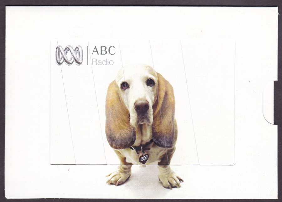
ABC RADIO
NOVELTY PULL TAB POSTCARD
“DIGITAL RADIO”
“ON-AIR. ONLINE. ON DIGITAL RADIO”
Made for Arid Zone in Australia
As you know by now, I love novelty postcards, and this one is a cracker. The card in question has a tab on the right side which is designed to be pulled out. This moves a section of card, in strips, along and behind a second set thus revealing a second and different image.
With the tab still in place you have a long eared dog looking passive. Pull the tab…..
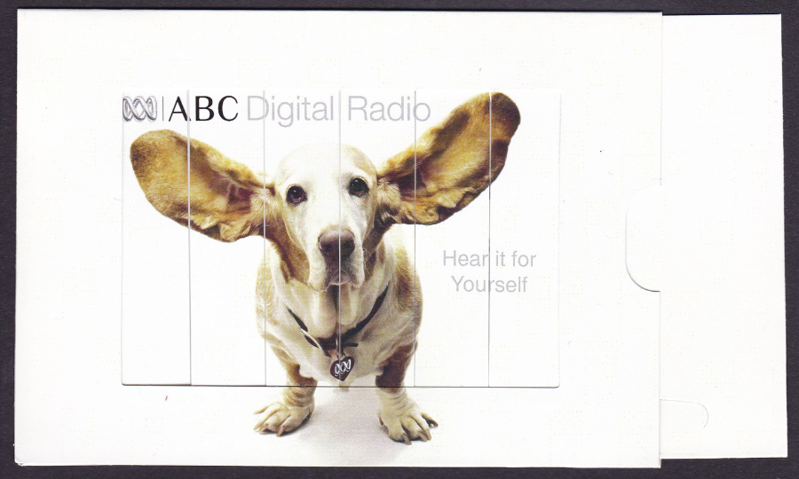
……and the dog is transformed into a dog with its ears raised and protruding to the side, although personally, I don’t think the dog looks any happier!
These are the type of cards which make postcard collecting fun…

24/10/2016
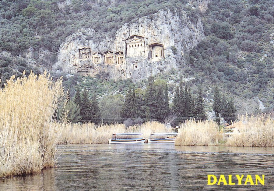
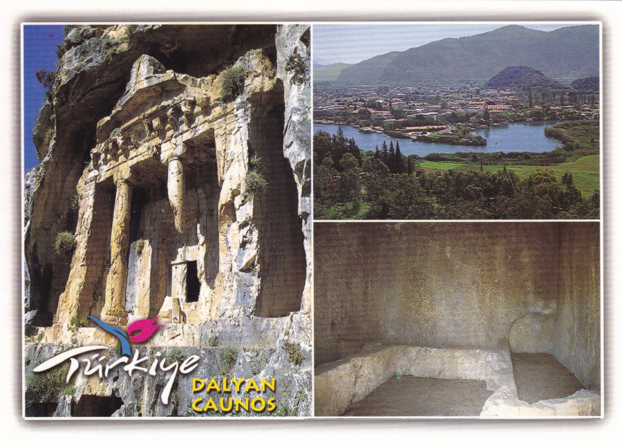
DALYAN, TURKEY
Some of you will be aware that I spent the first two weeks of October in the town of Dalyan in Turkey. This was my first visit to Turkey and we had a cracking time enjoying the sun and the wildlife, and, especially the views around the town.
As with any holiday I spent time looking out for postcards to keep as my souvenir of the trip. I have always said that postcards can be found almost anywhere, and this is true, but, I never travel to a place purely to see what postcards can be found. But, when I travel I always look and I have found that travel is one of the best ways of finding and enhancing my collection with new postcards. Here at Dalyan the range available was perhaps not extensive, and I think I found only four locations (shops) which had spinners of cards for sale, but none the less the quality of the printing and the images depicted were very good. The cost was good as well as most postcards were just 25p each, although I found one shop set back from the main drag where they were just 12 ½p each.
Anyone who has been to Dalyan will be aware of the Rock Tombs, which are perhaps the best landmark and attraction the town has. They are located across the river and face the town itself. As they are so prominent they appear on many postcards and I start my Turkey postings with the range of cards of these that I obtained.
DALYAN – MUGLA – TURKIYE
Published by
KESKIN COLOUR LTD
(BASKAN SHOPPING CENTER)
Ref: 48/1266
A view of the rock tombs. These are in fact from the period 400BC and are Roman and although they are now some miles from the sea they were originally cut into the rock when this area was beside the sea itself.
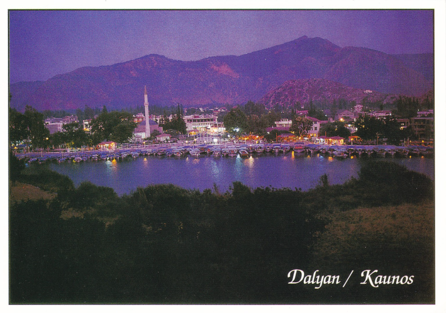
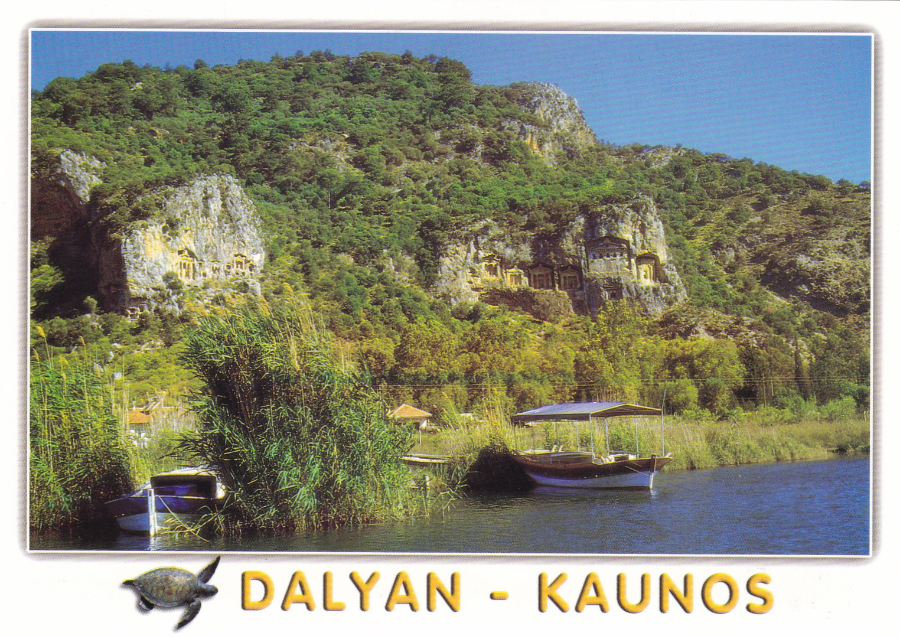
DALYAN / KAUNOS
Published by
GUNEY
Ref: M-14
This photograph of the town is taken from the rock face into which the Rock Tombs are carved. All the little blue ferry boats, which take tourists from this town to the beach, can be seen moored up as the night settles in. We spent many hours walking alongside this area and eating in the river front restaurants.
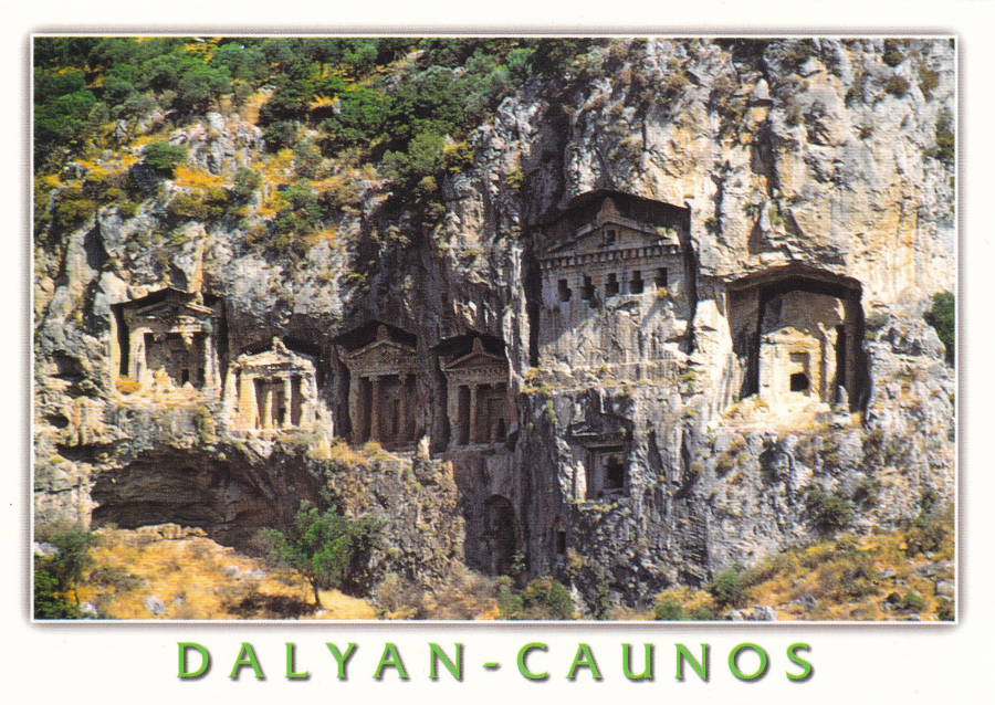
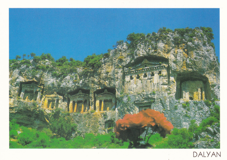
DALYAN – CAUNOS - MUGLA – TURKIYE
Published by
KESKIN COLOUR LTD
(BASKAN SHOPPING CENTER)
Ref: 48/1175
This image is of the larger set of tombs
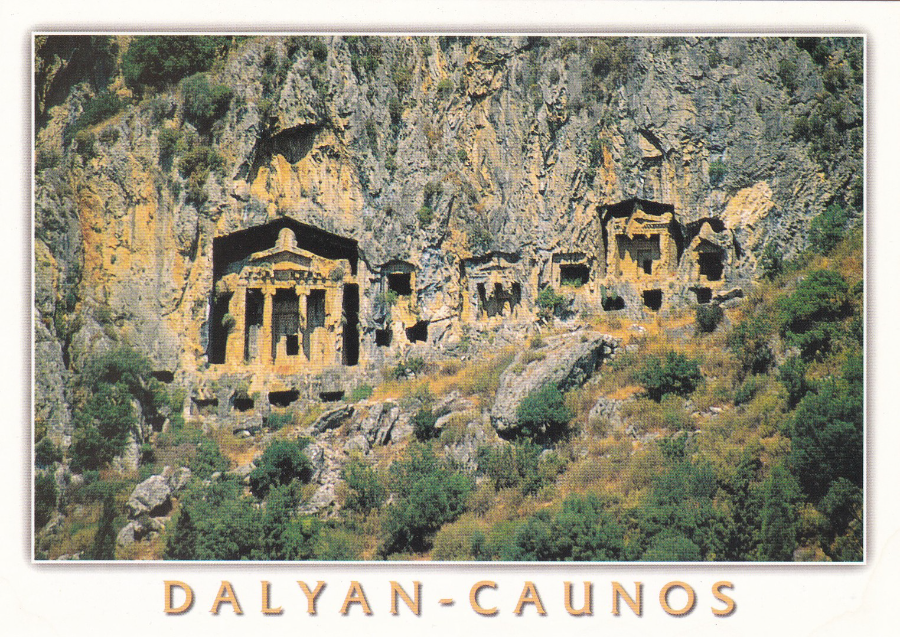
DALYAN – CAUNOS - MUGLA – TURKIYE
Published by
KESKIN COLOUR LTD
(BASKAN SHOPPING CENTER)
Ref: 48/1177
Here you have the set of smaller tombs which are to the left of the larger ones depicted above
DALYAN – MUGLA – TURKIYE
Published by
KESKIN COLOUR LTD
(BASKAN SHOPPING CENTER)
Ref: 48/1472
Here you can see how high up the rock face the tombs actually are. Below them now is the river, but once these tombs overlooked the sea.
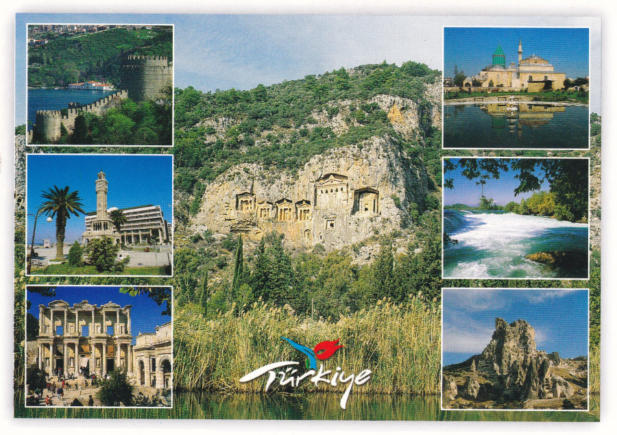
MULTI-VIEW POSTCARD
Published by
GUNEY
Ref: B – 624
Top Left – Rumelihisan lst
Middle Left – Izmir
Bottom Left – Efes
Center – Kaunos – Dalyan
Top Right – Meviana – Konya
Middle Right – Manavgat Waterfall
Bottom Right – Capadocia

CENNET DALYAN KAUNOS – TURKIYE
(The Paradise Dalyan Caunos – Turkey)
Published by
KESKIN COLOUR LTD
Ref: 96/1532
Lovely multi-view featuring the rock tombs and a nearby amphitheatre (that I did not get the chance to visit – maybe next time)
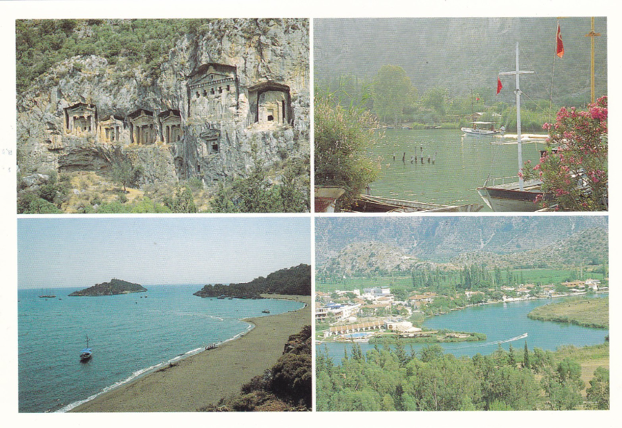
DALYAN
Published by
MEHMET HENGIRMEN
Ref: KOD NO: 104
Another multi-view postcard which also features a view of the beach, bottom left, where turtles come up and dig out their pits to lay their eggs. This beach is reached either by bus (one end) or by small ferry boat (the other end of the beach).
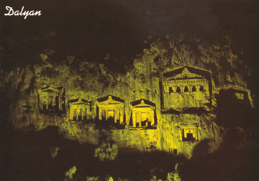
DALYAN – MUGLA – TURKIYE
Kaya Mezarlari
The rock-cut tombs
Published by
KESKIN COLOUR LTD
(BASKAN SHOPPING CENTER)
Ref: 48/1084
This image depicts the tombs lit up at night. Although the image here does not show this the light used has a slight green tinge and brings out the curves, and cuts, really well. I should know, as we spent many nights sitting in river front restaurants overlooking these tombs. We worked out that the lights come on at 19:30hrs each night.

DALYAN – CAUNOS - MUGLA – TURKIYE
Published by
KESKIN COLOUR LTD
(BASKAN SHOPPING CENTER)
Ref: 48/1275
DALYAN – CAUNOS - MUGLA – TURKIYE
Published by
KESKIN COLOUR LTD
(BASKAN SHOPPING CENTER)
Ref: 48/1271
A multi-view postcard which I think goes nicely with the above postcard
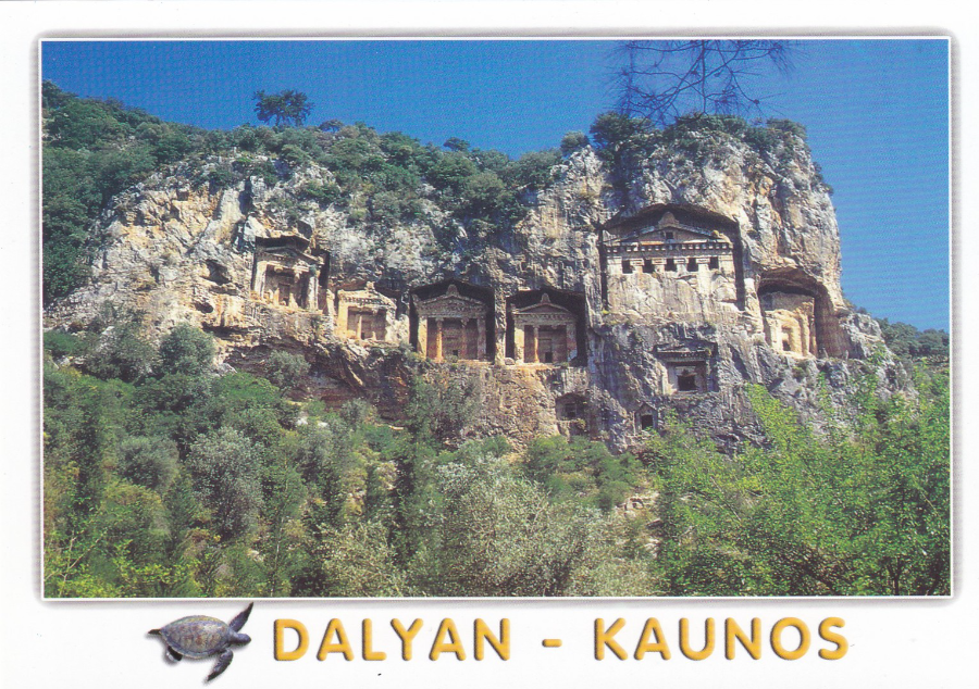
DALYAN – KAUNOS - MUGLA – TURKIYE
Published by
KESKIN COLOUR LTD
(BASKAN SHOPPING CENTER)
Ref: 48/1339
One of my favourites this one as it puts the rock tombs into perspective, within the landscape
DALYAN
Published by
ENGIN KARTLARI
(No Reference Number)
DALYAN – KAUNOS - MUGLA – TURKIYE
Published by
KESKIN COLOUR LTD
(BASKAN SHOPPING CENTER)
Ref: 48/1337
A CRACKING VIEW LOOKING UP AT THE ROCK TOMBS

CENNET DALYAN KAUNOS – TURKIYE
(The Paradise Dalyan Caunos – Turkey)
Published by
KESKIN COLOUR LTD
(BASKAN SHOPPING CENTER)
Ref: 96/1528
This is such a delightful and traditional image, and it was one that I posted out to some friends. The two girls are dressed in what I assume are national (or possibly local) dress. This postcard image harks back to the style of the golden age older postcards which would have depicted much the same sort of scene – some things really do not change (maybe the size, and the addition of colour – but the style and content really is traditional of early 1900 issued postcards).
23/10/2016
AGATHA CHRISTIE
ROYAL MAIL
PHQ STAMP CARDS
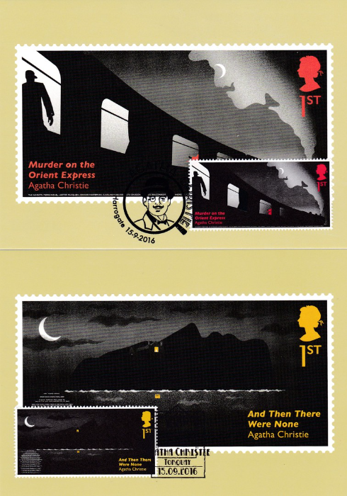
On the 15th September, this year, the Royal Mail issued a lovely, and unusual, stamp issue which contained some special features. As always the stamp images were also reproduced on PHQ Stamp cards.
TOP
AGATHA CHRISTIE
MURDER ON THE ORIENT EXPRESS
PHQ 421 (1) 9.16
1st Class stamp
Now, the stamps have some, as already mentioned, special features, but these can-not always be reproduced on the actual postcards. This is such a one. On the stamp, there is a thermal activated area which is the curtain on the second carriage from the left. If you hold your finger down on this curtain, on the stamp, the curtain disappears and reveals a half-hidden figure holding a knife (the ink here is thermochromic). And, although it is almost impossible to see clearly with the naked eye there is a line of microtext along the bottom of the stamp (you can possible see it slightly better on the postcard image) which lists all the murder suspects. There is also the fact that the smoke from the train engine is shaped into the face of the character Hercule Poirot with the moon acting as his eye. Poirot is of course the little Belgian detective who stars in this story.
The story in question was published in 1934
BOTTOM
AGATHA CHRISTIE
AND THEN THERE WERE NONE
PHQ 421 (2) 9.16
1st Class stamp
This was of course originally titled under a much less PC title, one now considered too racist in wording to still be used (if you don’t know then look it up), so the new title has been used here. You may of course have watched the dramatization of this story on TV earlier in the year.
On this stamp the island has been made to look like the outline of a man’s face and the moon has a reflection which is again in microtext. Here the microtext is the poem ‘Ten Little Soldier Boys’. There is also another piece of miniscule microtext in the reflection on the water of the house light. In this reflection, you can (with a microscope) read the name ‘U N Owen’, which is the name of the person who sends out the requests to all those who attend the island in the story.
The story in question was published in 1940
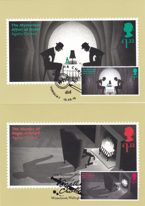
TOP
AGATHA CHRISTIE
THE MYSTERIOUS AFFAIR AT STYLES
PHQ 421 (3) 9.16
£1.33 value stamp
This story from 1920 (written in 1916) is another Poirot story, narrated by Captain Hastings. In-fact I believe it is the very first Poirot story and Agatha Christie’s first novel.
The stamp is designed so that the heads of the two men sitting at the small table make the image look like a skull.
BOTTOM
AGATHA CHRISTIE
THE MURDER OF ROGER ACKROYD
PHQ 421 (4) 9.16
£1.33 value stamp
In this image, you can see the face of Poirot in the fire. Also, the blood-stained letter in the hand of the man sat in the chair has more microtext used on it. This is part of the letter that is actually read out aloud, in the story, by Ackroyd before his death. And, more obviously, there is the fact that the shadow from the chair features as a man with a knife.
The story in question was published in 1925
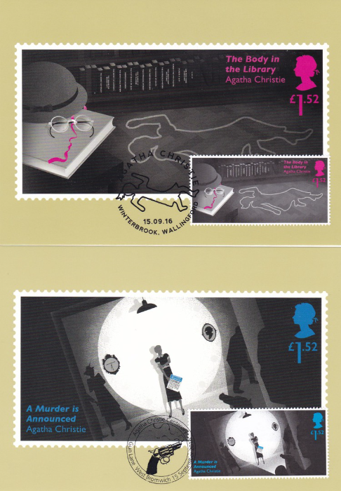
TOP
AGATHA CHRISTIE
THE BODY IN THE LIBRARY
PHQ 421 (5) 9.16
£1.52 value stamp
This is another stamp which has some interesting additions. The outline of the body on the floor is printed in Ultra-violet ink (it glows in the dark – quirky), although only on the stamp, not on the postcard. Also, the hat, glasses and pink ribbon, on the left side, are laid out to look like a face, the face of Miss Marple (this was the second Miss Marple story). And lastly, on the spines of the books on the shelf you have, in microtext again, all the story titles of Agatha Christies books and short story collections published prior to this one (but not those featuring Poirot).
The story in question was published in 1942
BOTTOM
AGATHA CHRISTIE
A MURDER IS ANNOUNCED
PHQ 421 (6) 9.16
£1.52 value stamp
Another Miss Marple story. The stamp design has the spotlight featured as a clock face with the numbers (on the stamp) printed in ultra-violet ink (and again they will only show up in the dark). At the 9 o’clock position is a clock set at 6.30 with the word SWITZERLAND in microtext (they certainly liked using microtext on this set) on its face. Both of these elements are important factors in the story. The story revolves around an advertisement in a local paper that announces a murder that is going to take place. The advertisement itself is depicted in microtext on the paper held by the lady at the centre of the design.
This story was published in 1950.
So, an interesting stamp issue and one where for once the stamps are more interesting than the postcards depicting them. But, if you get a set with the stamps applied to the them then you will get the best of both worlds.
23/10/2016
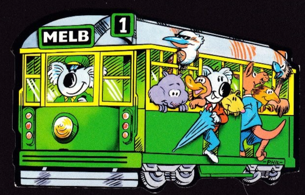
AUSTRALIA
TRAM SHAPED POSTCARDS
MELBOURNE, AUSTRALIA
Published by
NUCOLORVUE
(AUSTRALIA’S NATIONAL SOUVENIR COMPANY)
This first one here has already been previously posted, but I wanted to show it again with the next two cards. This one here is fairly ‘modern’, and as previously stated is from Melbourne, which is why the tram has MELB on the front. Because my copy of this particular- card is used (see previous posting) I do not know its reference number as these are placed within the stamp box, which then obviously get covered with the stamp.

CITY CIRCLE TRAM
MELBOURNE, AUSTRALIA
Published by
VISIT GALLERY
Ref: 00687 (above bar code)
So, here we have a second card which is clearly in the same format as the above postcard. The animals, including the Koala driver, are all the same but, the colour of the tram has been updated. You also have the number 1 removed and replaced with the Australian flag. In fact, if you check this image closely, although it is superficially the same, the image has been completely redrawn from the one used above. The two cards shown, so far, I feel, really, do go together nicely. This postcard came to me just last month, and is certainly the most recently produced amongst the cards depicted here.
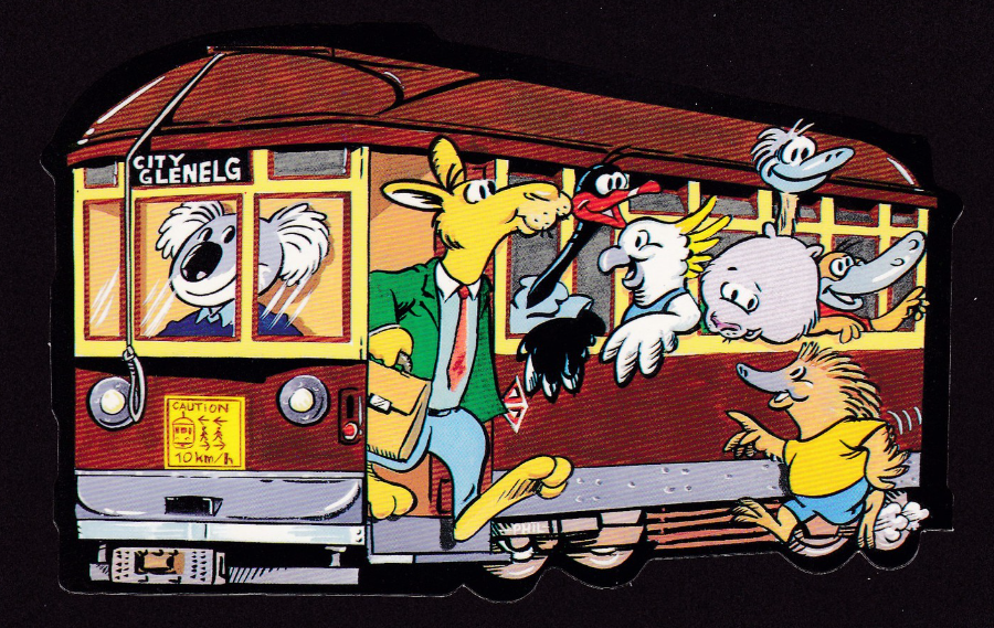
ADELAIDE
SOUTH AUSTRALIA
“South Australia’s only tram which runs to the bayside suburb of Gleneig”
Published by
NU-COLOR-VUE OF AUSTRALIA
Ref: 11 SFO51 – NCV 6383
This is a card I have had since the early 1990’s (I think it actually came out in the very late 1980’s and came with a selection of Australian postcards I bought from a dealer). Therefore, this is the oldest of the three postcards depicted here, and was the one which started me off, and, I find it interesting that the three postcards depicted here came from different sources and have taken over 25years to come together.
22/10/2016
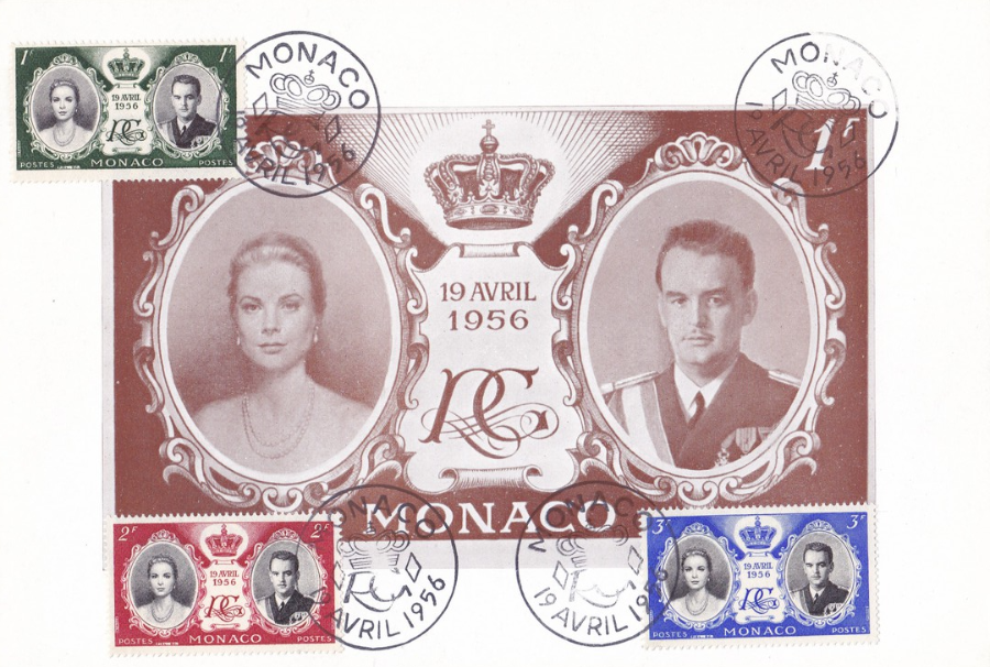
MONACO
ROYAL WEDDING 1956
Printed by
PHILATELIE PECHITCH Palais de la Scala, Monte-Carlo
Under the ‘May Blogs 2016’ tab you will find a posting of a normal sized postcard depicting one of the Monaco 1956 Royal Wedding stamps, with the 1F, 2F and 3F stamps applied, to the front and cancelled first day of issue. As already stated that card is the size of any standard modern postcard.
This postcard depicted here is over twice the size of that one. This one here is slightly larger than A5 size. The printed stamp image is brown (the smaller one already posted is in black).
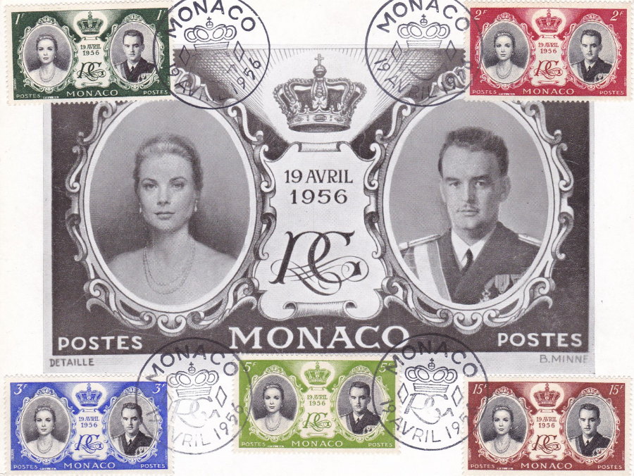
MONACO
ROYAL WEDDING 1956
Printed by
PHILATELIE PECHITCH Palais de la Scala, Monte-Carlo
This postcard was printed by the same company that produced the above large postcard. This one here has the centre printed design printed in black (like the small one previously posted). This one here is, in my opinion, the best of the three because it has five of the actual stamps applied, whilst the other two only have three stamps on the front.
1f stamp – black and green – SG578
2f stamp – black and red – SG579
3f stamp – black and blue – SG580
5f stamp – black and green – SG581 (a lighter green print)
15f stamp – black and brown – SG582
22/10/2016
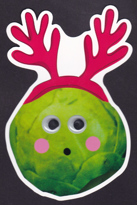
Paperchase Published Postcard
(Untitled)
Ref: FSC C104990
Bar Code number – 5 054026 398578
I found this postcard today in the ‘paperchase’ store located in the Lakeside Shopping Centre. It is a shaped postcard and it also has plastic wobble eyes attached – the black centre pieces move around within see-through plastic bubbles, so this has two novelty elements.
When I saw this today I wondered, obviously, if this is a new postcard item issued for the upcoming Christmas period. The fact that this is a Brussel Sprout wearing reindeer horns seems to indicate that I might be right!
Paperchase Published Postcard
(Untitled)
Ref: FSC C104990
Bar Code number – 5 054026 421177
This is another of today’s paperchase buys, and it is also clearly in the same format as the above Sprout card, as in it is a shaped card with the wobbly eyes attached again. Despite these being shaped, and having these plastic eyes on them, they are the same price as the other basic paperchase postcards – 70p

20/10/2016
KING NORA
Published by
CHARTA
Design by Fred Leicester
Ref: DK 12
This is a nice simple art card of a mouse eating, or at least gloating over, a piece of cheese. The area of the actual image is gloss printed, but the white boarder is matt printed. This means when the card is turned into the light the centre box shines whilst the boarder remains dull.
This may be simple in design but it is still a nice and attractive postcard.

20/10/2016
IRELAND
Connacht – Munster – Leinster – Ulster
“Greetings from Ireland”
Published by
LIFFEY ARTEFACTS 2015
Ref: SPC154P
I bought this postcard back in March when I was in Ireland. It is a nice souvenir of my visit and a typical tourist styled postcard. I suspect copies of this postcard are bought mainly for posting out to people rather than as kept items.
As a secondary little bonus there is a small speech bubble on the reverse side, on the message side, which has “P.S. If you don’t get this postcard, let me know!” in it.
20/10/2016
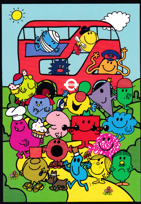
MR MEN
UNDERGROUND
LITTLE MISS
Published by
‘paperchase’
Ref: FSC C014059
Copyright – Transport for London – 2016
This postcard is a new release from this year and is a ‘paperchase’ issue which is a combined issue with ‘London Transport’ (as indicated by the logo on the bus, centre bottom).
A large number of Mr Men are depicted along with some of the ‘Little Miss’ characters. I thought this was an appropriate postcard to post today as the Royal Mail has issued this very day a ten stamp issue set which individually depicts ten of the Mr Men and Little Miss characters. Interestingly only six of the ten characters depicted on the stamps are included here on this image.
(I will of course post the full Royal Mail card set when I receive it – but there is an Agatha Christie set to come before then)
19/10/2016
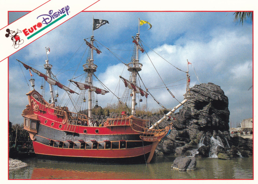
EURO – DISNEY
ADVENTURELAND
This is another of the Euro-Disney postcards from my collection. This shows the pirate ship and the skull shaped rock which appear in the Adventureland section. I believe there is something similar in the original Disneyland theme park in California (which I have not visited), but there is nothing like this in the Florida ‘Walt Disney World park (which I have visited). As it was a new area to me I enjoyed it when I first got to visit here, Disneyland Paris, and got to see this area. You can in fact go inside the skull rock and look out of the eyes.

19/10/2016
SYMPHONY ANGEL
CAPTAIN SCARLET
Published by
Gebr. Spanjersberg N.V., Rotterdam
Ref: 1
ANGEL JAGER bestuurd door
SYMPHONY ANGEL
Het is niet toegestaan deze kaart
als reklame – bijpak – of premieartikel
te gebruiken
ALLe rechten voorbehouden
Copyright Century 21Ltd 1968
(Text from reverse side of Postcard)
This is a superb Dutch 1960’s postcard featuring one of the Angel Interceptors from the Gerry Anderson puppet series called ‘Captain Scarlet and the Mysterons’. Personally I always preferred this series to the Thunderbirds, but they were both good. It is probably worth noting that there are far less Captain Scarlet related postcards than there are ‘Thunderbirds’ ones. This Dutch series contains some of the best related postcards I have seen, unfortunately, they are also some of the hardest ones to pick up as well. These are worth looking out for.
(Although not shown on this scan, this postcard has a slight deckle edge)
19/10/2016
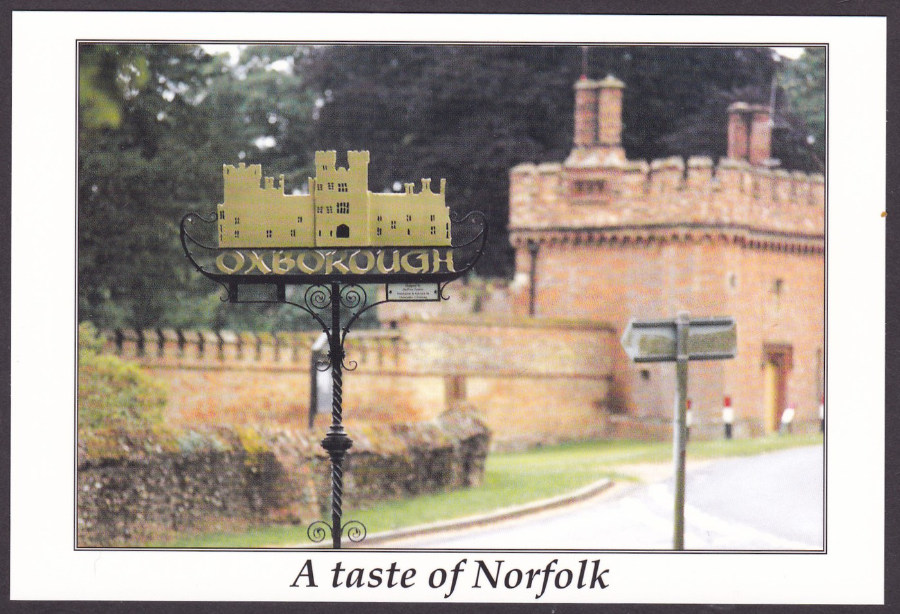
A TASTE OF NORFOLK
OXBOROUGH VILLAGE SIGN
Outside the grounds of Oxburgh Hall (National Trust)
Published by
PH TOPICS
Ref: No 387 (Ton 11)
Photo by Brian Partridge (2001)
One of the many PH Topics postcards which had a local theme and which were collected by many people who specialised in this numbered series. This particular postcard also comes in an overprinted version (see below) which was produced in a much smaller quantity. This one here, clearly, is the unadorned version.

A TASTE OF NORFOLK
OXBOROUGH VILLAGE SIGN
Outside the grounds of Oxburgh Hall (National Trust)
Published by
PH TOPICS
Ref: No 387 (Ton 11)
Photo by Brian Partridge (2001)
Overprinted Version:
2002
NORFOLK POSTCARD CLUB
Twelfth Annual Postcard Fair
Blackfriars Hhall, Norwich
Saturday 28 September
I believe this version was used as a pre-publicity postcard for the postcard fair mentioned. It may also have been available at the fair as well. I had a standing order for all PH TOPICS postcards and received this one direct from Pat Holton herself, who produced the series.

18/10/2016
T-REX SCENE
LIVELIFE POSTCARD
By
David Penfound (2012)
Ref: 9851
Printed by
DELUXEBASE LTD – UK (HU17 8EX)
Made in China
This is a 3D postcard and it has the standard 3D like format of being a quite thick card with the almost plastic feel to the surface. This smashing T-Rex one was picked up at Colchester Zoo on a visit last year. Colchester Zoo is of course in my home county of Essex in the UK.
Now, the scanning process does not quite manage to capture how good these postcards are. The dinosaur does stand out from the background and its head seems to project from the card towards you. I loved this this card
(Please note that all four of the postcards posted here have rounded corners – this does not come out well in the scans – but these often have rounded corners now because it takes away the sharpness of the plastic corners, which could scratch you – oh the world of health and safety!!)
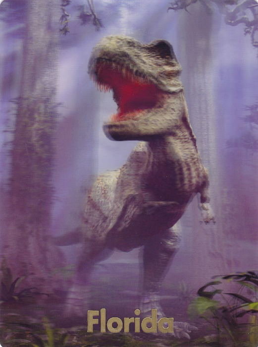
T-REX
ART WORKS
By
David Penfound (2012)
Ref: 46971
Printed by
IMPACT PHOTO GRAPHICS
(100% Employee Owned)
Made in China
So, imagine my surprise when on my holiday, in October of last year, in sunny Florida state in the USA, I came across this very similar looking postcard, look familiar? It is in fact a little lighter in print than the above version, and has a completely different reverse side layout and reference number, but, clearly, this is the same image. The one major, and obvious, difference here is the addition of the gold ink printed ‘Florida’ along the bottom, which is actually cut slightly into the plastic surface of the card so is not actually printed on the surface itself. How cracking is it to find these two postcards, separately, and on opposite sides of the Atlantic Ocean. It is part of the joy of both travel and collecting.
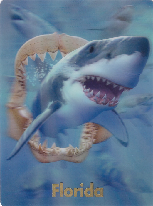
SHARKS & JAWBONE
JERRY LOFARO DESIGNS
By
Jerry Lofaro (2013)
Ref: 47069
Printed by
IMPACT 3D DESIGNS
Made in China
Although the printer here has a slightly different name it is in fact the same company. ‘Impact’ have been a well-known publisher of American postcards for many years and have often been at the forefront of new printing styles and postcard sizes. This one here was found alongside the above T-Rex design in the same shop (in Old Town Kissimmee to be precise). Unfortunately, I have not yet found a copy here in the UK without the added overprint on the front (But I am looking!)

T-REX GREEN MIST
LIVELIFE POSTCARD
By
David Penfound (2012)
Ref: 9844
Printed by
DELUXEBASE LTD – UK (HU17 8EX)
Made in China
Having shown you the above T-Rex design I thought I should also depict this other 3D design which I also picked up at Colchester Zoo. Again, the design is much better than this scan can fully pick up, but you do get some of the impact of this 3D image. These lovely 3D image postcards are available around the country now so look out for them as they are really good (and I will depict some more soon)
17/10/2016
CORONATION STREET
FRISKY THE CORONATION STREET CAT
Published by
KARIZZMA ENTERPRISES LTD
Ref: KK4
JEAN ALEXANDER …. RIP
Jean M. Hodgkinson
11TH October 1926 – 14th October 2016
Probably best known for playing the character Hilda Ogden in the long running television serial ‘Coronation Street’. She played this part between 1964 and 1987. I also remember her as Auntie Wainwright in another long running programme; ‘Last of the Summer Wine’

Hilda Ogden as played by Jean Alexander