
27/01/2017
VIRGO FROM THE ‘BEDFORD HOURS’
(French c. 1423)
The British Library
Published For
W.H.SMITH
By
ALAN HUTCHISON LTD
This is a very common postcard, which often turns up in charity bundles and in many circumstances where copies were used as competition entries (I am not positive but I believe this may have originally been a free postcard). I have several copies in my collection but they are all there because of the reverse side, and how the card in question has been used.
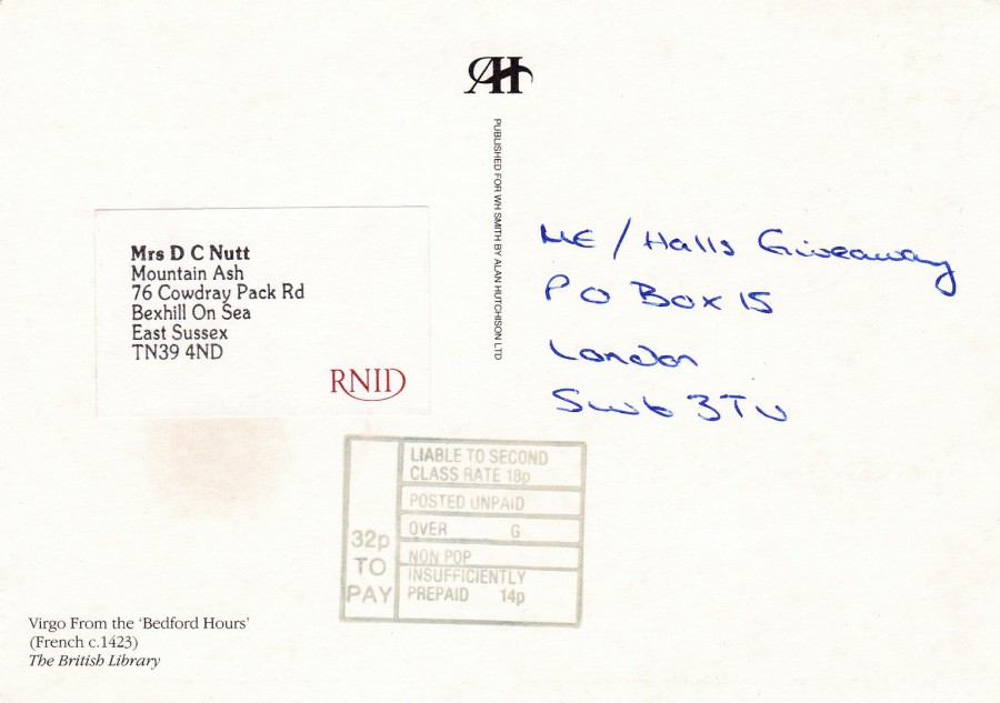
REVERSE SIDE OF ABOVE POSTCARD
This’ particular’ copy was used as a competition entry, one of many, as previously stated above. Unfortunately, the sender forgot to place a postage stamp on the postcard before posting it. Because there was no stamp applied the Royal Mail have applied one of their instruction ‘Postage Unpaid’ mark cachets. The card was then subject to a requirement for at least 18p, the second-class postage rate at the time. Quite correctly the Royal Mail have charged 14p in handling charges, as recorded in the bottom of the box. This charge, along with the missing 18p stamp value, means the receiver was charged 32p (I do wonder if they paid it, after all they were under no obligation to pay the fee as this was a competition entry submission). Although I doubt the submission was successful it has at least meant that I have a nice, and clear example of this applied instruction mark. This postcard is in my postal history collection.
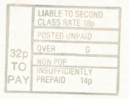
CLOSE UP OF INSTRUCTION ‘POSTAGE UNPAID’ MARK

27/01/2017
WISH YOU WERE HERE
MELBOURNE – AUSTRALIA
GREETINGS FROM THE CHARLES DICKENS
“I wish you would make up your mind, Mr. Dickens. Was it the best of times or was it the worst of times? It could scarcely have been both.”
(Text from reverse side of Postcard)
This is an advertising postcard for ‘The Charles Dickens Tavern’ located in the Australian city of Melbourne. I picked this one up as a cheap 15p postcard in a box here in the UK at a postcard fair. I liked it as a cartoon postcard.

REVERSE SIDE OF ABOVE POSTCARD
This has the Charles Dickens portrait outline on it that is used in the sign for the actual tavern, as can be seen in the below photograph
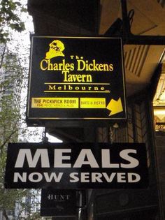
PHOTOGRAPH
This is a photograph of the taverns sign
25/01/2017
There will be no posting tomorrow (26/01/2017) because I will be travelling back to the UK from France, a journey that will take all day as I expect not to be back home before midnight, after an early start. We are bringing my Mother-in-Law back home. She has lived in France for over ten years with her husband, my Father-in-Law who sadly passed away last week (this has been the reason for my recent rather rushed trips back and forth over the past three weeks as he had been rushed into hospital the week before last). I expect to return to normal service on Friday (27th).
25/01/2017
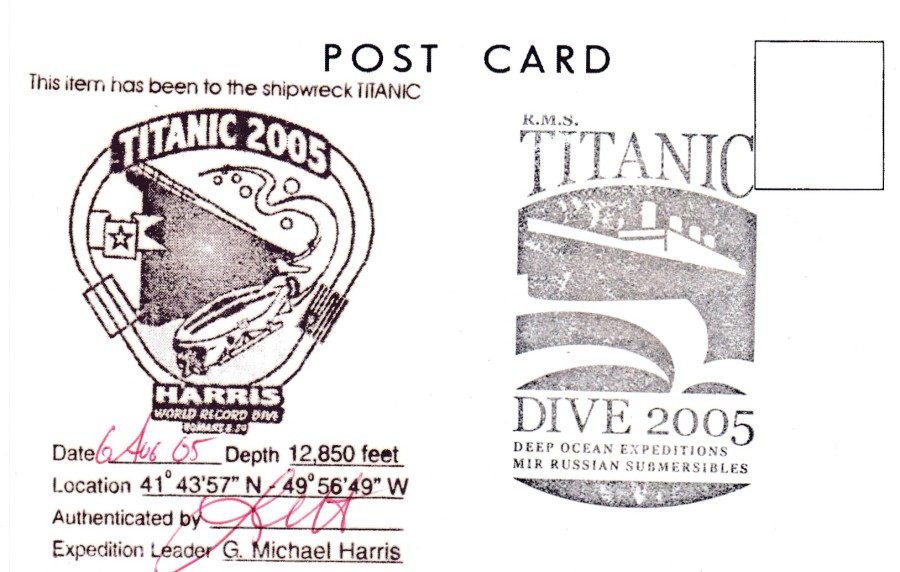
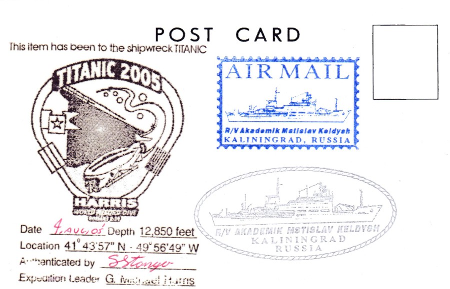
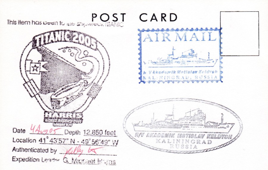
TITANIC DIVE 2005
HARRIS WORLD RECORD DIVE
G. Michael Harris is an entrepreneur and explorer who headed up a Titanic expedition in 2005. He is also the person, as President of GEX, who created and designed the ‘Titanic the Experience’ which I have visited in Florida. Harris has made 11 deep sea dives to the sea-bed and the resting place of the RMS Titanic wreck. He logged 120 hours in the Russian Mir Submersibles as the went down 2.5 miles to the site of the wreck.
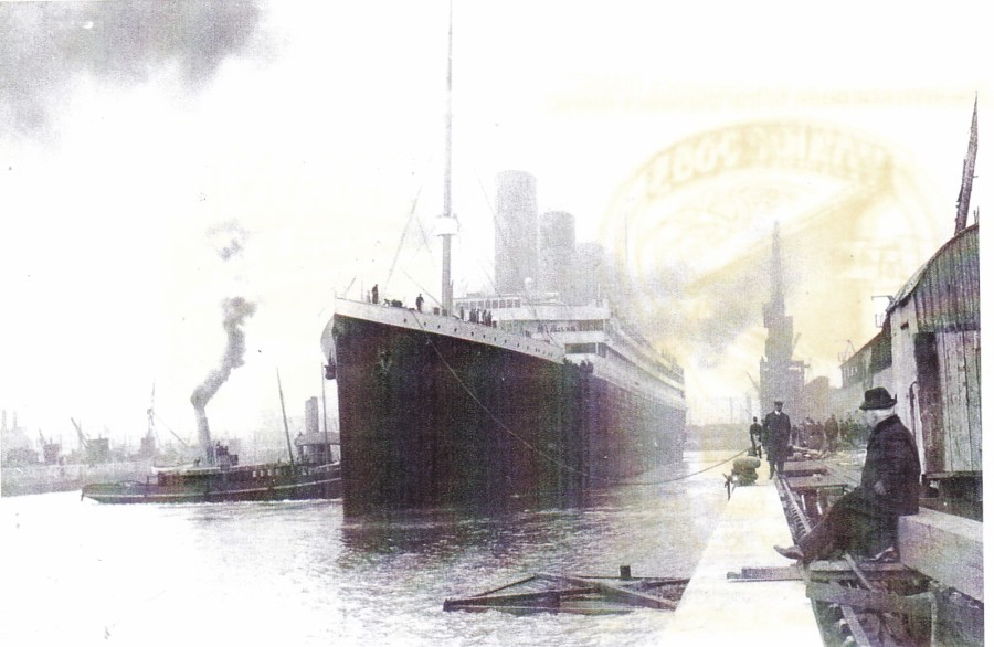
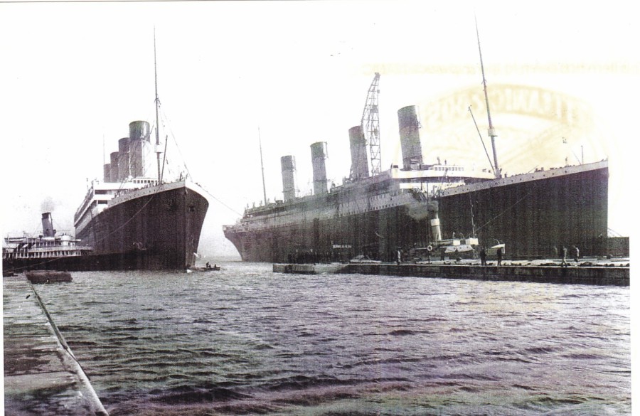
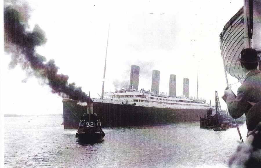
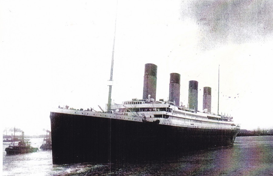
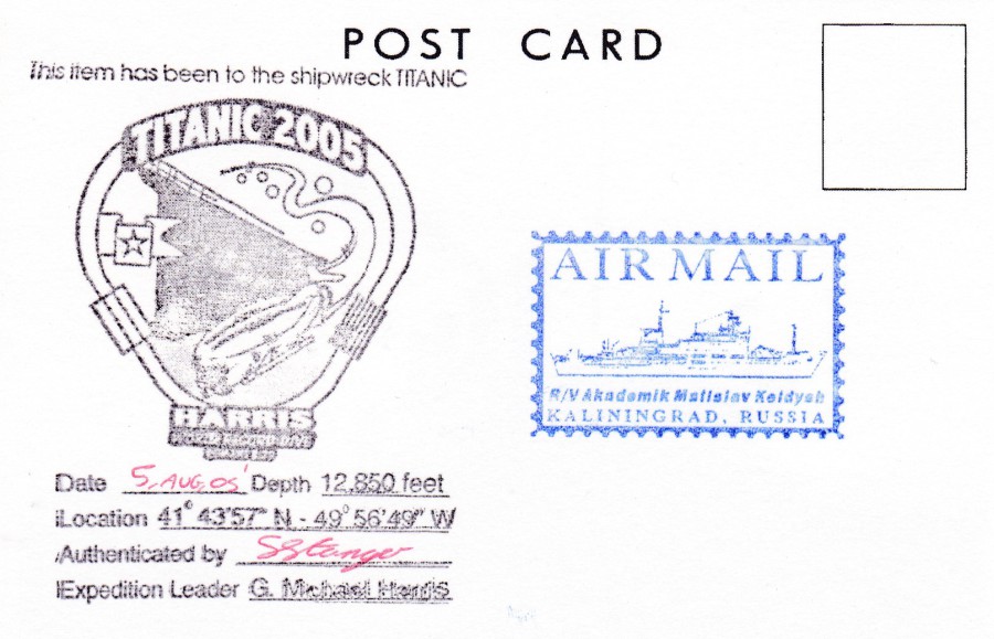
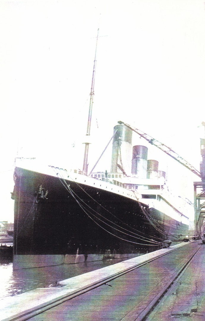
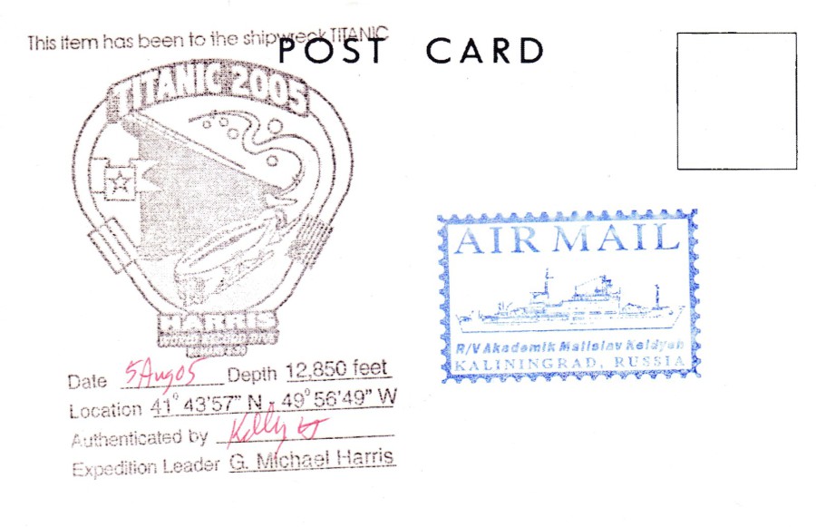
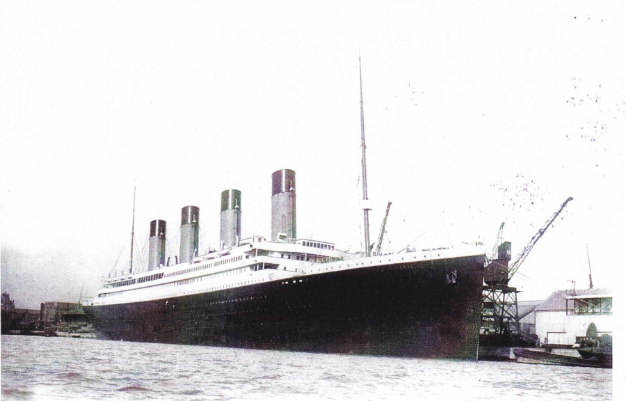
On the 2005 Expedition Harris took with him a number of black and white postcards which depict photographs of the RMS Titanic taken as she left Southampton in 1912. He then took these postcards with him in the submersible down to the Titanic wreck site. There was more than one dive, and I am aware of dives taking place on the 4th, 5th and 6th August 2005. Postcards were carried down on each of these days. These postcards then received a special expedition cachet; ‘TITANIC 2005 – HARRIS WORLD RECORD DIVE’ which had an open section for the date to be applied and for an authenticating signature. This was applied to the left side on the reverse side. Then, depending on the card it either received a single further cachet, either a different expedition cachet or one or more of the ships cachets for the R/V AKADEMIK MSTISLAV KELDYSH – KALININGRAD, RUSSIA’, either an oval one or one that resembles a stamp print.
There postcards were then sold to raise further funds. I came across them at the ‘Titanic the Experience’ in Florida in the October of that same year, 2005. As a big Titanic fan, I knew that I needed to have as many different versions as were on sale. At the time, I believe they were $5 each, which, considering where they had been I thought was good value really. I suspect you would have to pay a lot more now, over ten years later. I know that when I returned to the ‘Titanic The Experience’ two years later in 2007, they were sold out (and of course they could have sold out long before my 2007 visit, certainly the staff had no idea what I was talking about when I asked about them, so I suspect they had been gone for some time by then, Oct 2007).
So here are the postcards that I obtained in 2005 with both the fronts and the backs depicted.
TITANIC DIVE 2005
HARRIS WORLD RECORD DIVE
6th August 2005
TITANIC DIVE 2005
HARRIS WORLD RECORD DIVE
TITANIC DIVE 2005
HARRIS WORLD RECORD DIVE
4th August 2005
TITANIC DIVE 2005
HARRIS WORLD RECORD DIVE

TITANIC DIVE 2005
HARRIS WORLD RECORD DIVE
4th August 2005
TITANIC DIVE 2005
HARRIS WORLD RECORD DIVE

TITANIC DIVE 2005
HARRIS WORLD RECORD DIVE
6TH August 2005

TITANIC DIVE 2005
HARRIS WORLD RECORD DIVE
TITANIC DIVE 2005
HARRIS WORLD RECORD DIVE
5th August 2005
TITANIC DIVE 2005
HARRIS WORLD RECORD DIVE
TITANIC DIVE 2005
HARRIS WORLD RECORD DIVE
5th August 2005
TITANIC DIVE 2005
HARRIS WORLD RECORD DIVE
TITANIC DIVE 2005
HARRIS WORLD RECORD DIVE
4th August 2005
25/01/2017
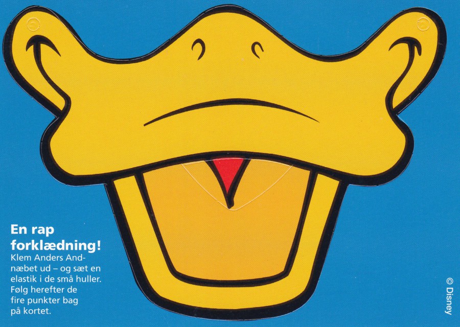
DONALD DUCK BEAK CUT OUT
‘EN RAP FORKLAEDNING! KLEM ANDERS AND-NAEBET UD – OG SAET EN ELASTIK I DE SMA HULLER. FOLG HEREFTER DE FIRE PUNKTER BAG PA KRTET’
(I tried to put this through a Danish – English translator, but what I got back did not make much sense as you can see here –
' A RAP FORKLAEDNING! SQUEEZE THE DONALD DUCK-NAEBET OUT – AND SETS AN ELASTIC BAND IN THE SMA HOLES. FOLG THEN THE FOUR POINTS BEHIND PA KRTET '
But, what I think it is saying here is that this is a Donald Duck mask which you can push out from the card and then via the holes in the top of the beak, on each side, you can add an elastic strip and apply this to your face – give or take a bit of translation licence)
Published by
GO-CARD
(A Denmark based free advertising rack postcard company)
Issued 2006
As you will have picked up from past postings, I do like a novelty postcard. This one fits that category and is what we call a ‘Cut – Out’ postcard design, which means there is a segment of the card which can be pushed out and removed from the card, in this case a Donald Duck face (beak) mask.

REVERSE SIDE OF ABOVE POSTCARD
As you can see this postcard is an advert postcard for a comic book called ANDERS AND (which, If I am correct is the Danish name for Donald Duck). You can also see the cut marks of the edge of the beak mask as well from this side.

25/01/2017
NUMERICAL SYMMETRY
Back in July 2016 (see Blog Entry tab JULY BLOGS 2016 and then click on ‘July Blog 2’ tab) you will find postcards which have the special Numerical Symmetry handstamps for the dates 06-06-06 (6th June 2006) and 07-07-07 (7th July 2007). July seems like a long time ago so I thought it time to show you another one. This one is for the 9th September 2009, otherwise shown as 09 – 09 – 09. Again, you have this on a red meter mark and a special ‘Numerical Symmetry’ hand stamp designed especially for the day.

THE FRONT DESIGN IMAGE WHICH APPEARS ON THE ABOVE POSTCARD
ROYAL MAIL METERED MAIL POSTING BOX 1996.
Box MB4 at Parkway, Bredbury, Stockport
Published by
REGUS PUBLICATIONS
“REGUS COLLECTOR CARD 4”
This is the same postcard as was used for the two postcards depicted in July 2016

24/01/2017
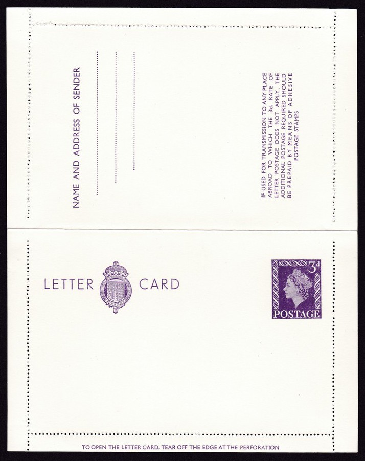
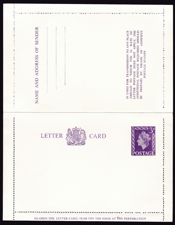
GREAT BRITAIN QUEEN ELIZABETH II
3D LETTER CARD
With ‘GARTER’
Issued 1957, November
8
LETTER CARDS
2s 6d
(Wrapper).
Another postal stationery item with the original sales wrapper which surrounded the eight letter cards being sold (although I only have one single letter card with this wrapper).
This version has the ‘Garter’ symbol between the words LETTER and CARD.
GREAT BRITAIN QUEEN ELIZABETH II
3D LETTER CARD
With ‘GARTER’
Here is the fully opened 3d letter card as held within the wrapper depicted above.

CLOSE UP OF THE ‘GARTER’ SECTION
GREAT BRITAIN QUEEN ELIZABETH II
3D LETTER CARD
With new ‘ROYAL ARMS’ design
Issued 1957, December
Again, this design has been depicted fully open. At a first quick glance this looks the same as the above letter card, but there is one change. This is the royal arms design that appears between the words LETTER and CARD. Look closely and you will see this is a totally new design to that which appears on the above letter card.

CLOSE UP OF NEW ROYAL ARMS DESIGN

24/01/2017
GREAT NORTHERN STIRLING ‘SINGLE’
1870 – 1970
POSTAL STATIONERY CARD
(Pre-Printed 4d Postage Paid Machin Head stamp)
Nice philatelic produced postcard which has a pre-printed postage mark on the reverse side. The image depicts the No1 Stirling Single which, as a class, was introduced in 1870, as inferred by the date printed on the postcard. The postcard celebrates the 100th anniversary of the class.
The postmarks depicted are those used on mail carried on the trains. I have two copies of this postcard, each of which has been used with different postmarks, see below.
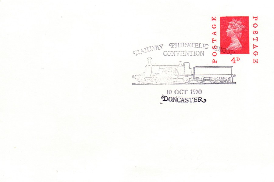
REVERSE SIDE – FIRST POSTCARD
The pre-printed postage mark has been cancelled with a special hand stamp issued for the ‘RAILWAY PHILATELIC GROUP CONVENTION – 10TH OCTOBER 1970 – DONCASTER’.
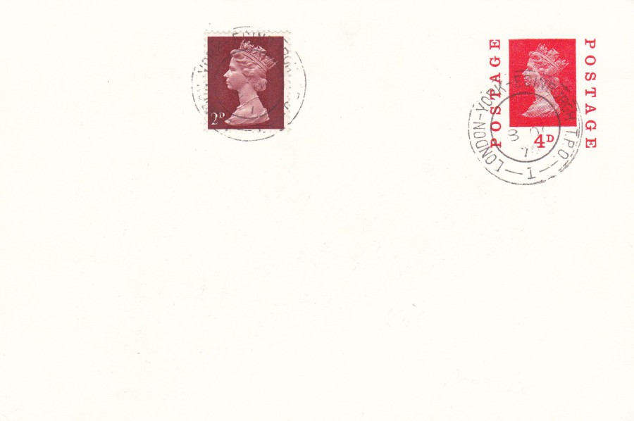
REVERSE SIDE – SECOND POSTCARD
This time the postcard has received an applied second stamp (a 2d Machin Head stamp). Both this stamp and the pre-printed 4d Machin head stamp have been cancelled with a ‘LONDON – YORK – EDINBURGH T. P. O. – No 1’ double ring cancellation dated 3rd October 1970. The T. P. O. letters stand for ‘Travelling Post Office’. This means that the item of mail was handled and carried on a train. T. P. O. hand stamps are collected by a dedicated group of collectors, and since their demise, they are no longer used, interest in them has increased instead of declining. This example here was philatelically produced as a collectible and may either have been produced in a number for re-sale or was singularly produced by a collector for their own collection.

CLOSE UP OF T. P. O. CANCEL
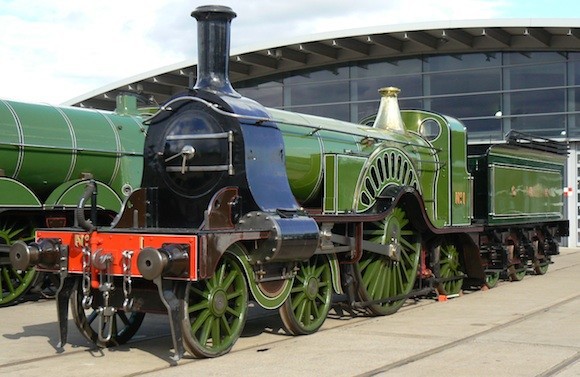
PHOTOGRAPH
This is the train depicted in black and white on the sketch on the front of the postcard
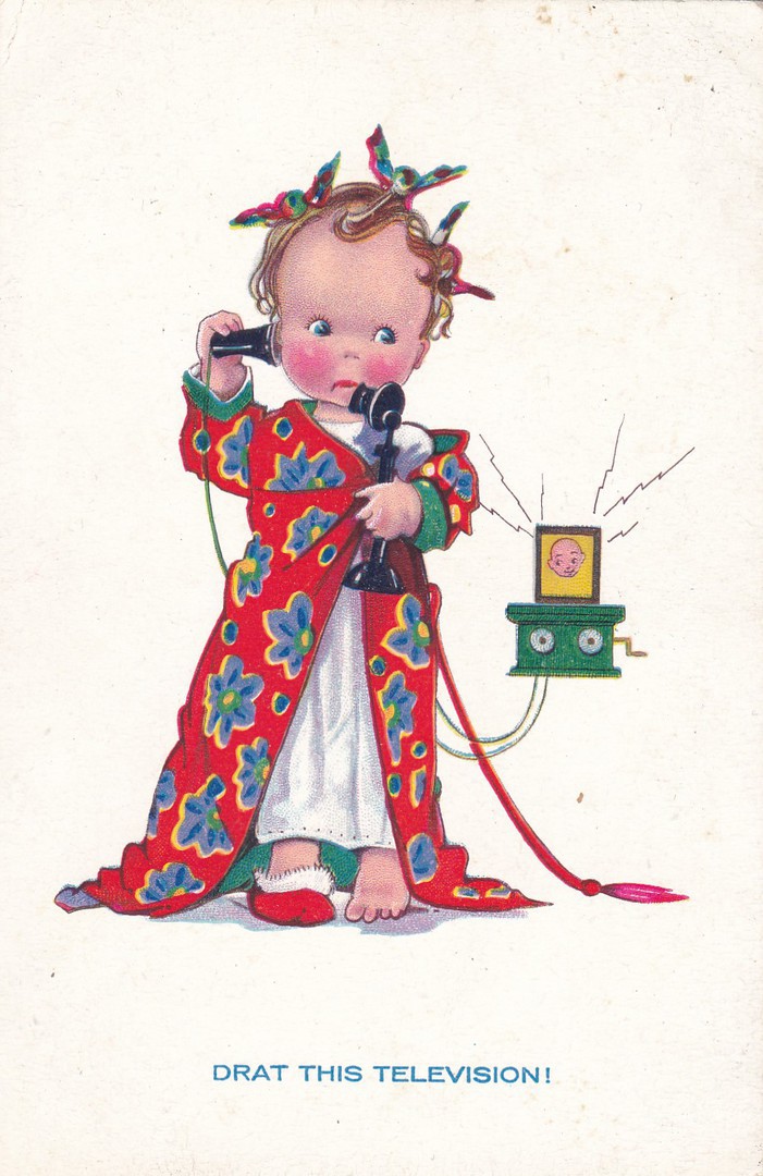
24/01/2017
DRAT THIS TELEVISION!
Unknown Publisher
Ref: 17
This is an early ‘Television’ related postcard, and it depicts a typical cartoon drawn image of a child in an adult situation, the type of image that was so popular at the time (this is very similar in style to the more famous ‘Mabel Lucie Attwell’ postcard designs).
For me though, it is the mention of television on such an early image that appeals.
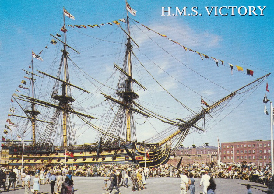
24/01/2017
H.M.S. VICTORY
Published by
SALMON LTD
(Salmon Cameracolour Post Card)
Ref: 2 – 58 – 04 – 30
“Launched in 1765 but not commissioned until 1778, H.M.S. Victory was a First Rate Ship of the line mounting 104 guns. She became Lord Nelson’s flagship in 1803 – leading up to her most famous role in the Battle of Trafalgar in 1805. She now lies in dock at Portsmouth, restored to her former glory.”
(Text from reverse side of Postcard)
I first visited HMS Victory as a child (I was only collecting wildlife postcards at that time) but did not buy any postcards on that visit. But, I do remember my mother posting a postcard of the ship home to receive the ‘Posted on Board’ cachet (which at that time was blue – I still have this card somewhere, I shall have to dig it out and posted it on here).
I have been back to see H.M.S. Victory a couple of times as an adult and on my last visit I bought these two postcards placed on the webpage here today
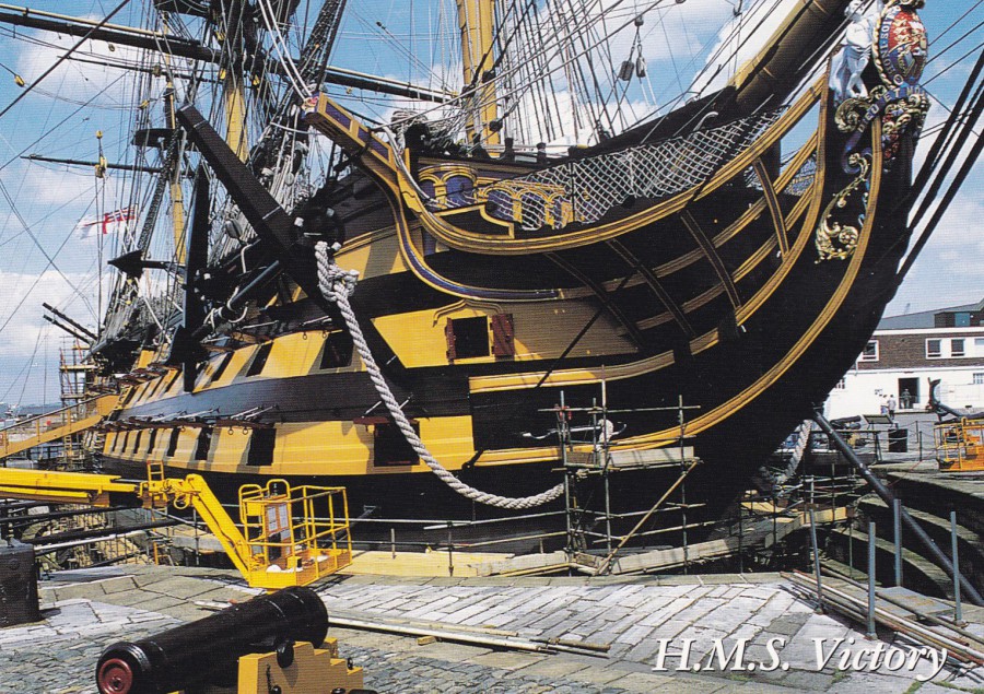
H.M.S. VICTORY, PORTSMOUTH
Published by
SALMON LTD
(Salmon Cameracolour Post Card)
Ref: 2 – 58 – 04 – 04
Both, of these postcards have the front title H.M.S. VICTORY, but the top card has no title on the reverse side whilst this one does, and is titled H.M.S. VICTORY, PORTSMOUTH. The descriptive text is the same as for the card above. I prefer this close-up image to the full ship one depicted above.
23.01.2017
GORDON KAYE ….. RIP
Gordon Fitzgerald Kaye
7TH April 1941 – 23rd January 2017
Comic actor who was best known for playing the character Rene Artois in the long running, and in its time, extremely popular, television series ‘Allo’ Allo!’
POSTCARD
ALLO’ ALLO!
Published by
ATHENA INTERNATIONAL
From a series of Allo’ Allo! postcards
23.01.2017
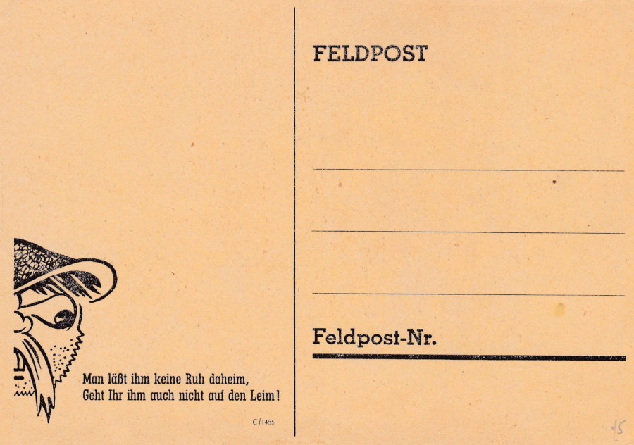
GERMAN FIELDPOST CARD
SECOND WORLD WAR
"FELDPOST"
“MAN LABT IHM KEINE RUH DAHEIM,
GEHT IHR IHM AUCH NICHT AUF DEN LEIM!”
Ref: C/1485
I fed the text on the front of this WW2 German fieldpost card into an online translator and got back the following –
YOU LET HIM NO PEACE AT HOME, DON’T YOU GO DOWN TOO HIM ON GLUE!
We also tried a different translator and got –
DO NOT GIVE HIM PEACE AT HOME, YOU DO NOT GO ON THE GLUE
I am not sure that this is quite correct, interesting, but not sure about that last word. Clearly the first section is about the pressure placed on the allies on the home front, the bombing of London and other UK cities and towns. The second part, the ‘GLUE’ part, is a little less clear. But I wonder if its meaning relates to not becoming unsettled and distressed because of the bombing attacks in Germany. I’m not sure, but regardless I do like the simplicity of this design. This copy is unused and worth far less than any used copy would be, but having this example is a start.
23/01/2017
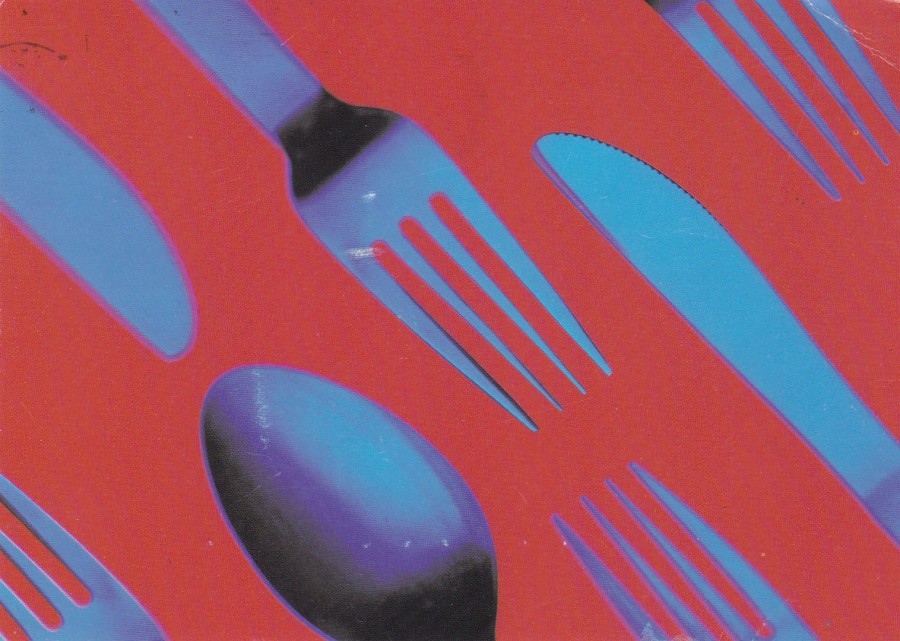
“CUTLERY”
THE TIME OUT EATING AND DRINKING GUIDE
Unknown Printer (Published on behalf of ‘TIME OUT’)
Now, I am not trying to say that anyone out there collects ‘Cutlery’ as a theme, although I would not be surprised if someone out there does. But, the two cards depicted here do each show cutlery items. On this advert postcard, you have a spoon, knife and fork.
My copy of this advert postcard for the TIME OUT magazine was posted in 1994, so the postcard is either from this year or pre-dates this year.
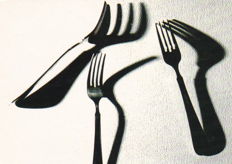
PHOTOGRAPH
By
BJORN LOFTERUD
Stockholm, Sweden
Published by
LONDON CARDGUIDE LTD
London Cardguide were a company who produced free rack cards, and I have mentioned them before and depicted at least one of the past cards issued by them. The company has long since ceased to be but as previously mentioned they produced some of the most interesting and unusual of the free rack cards from the 1990’s era. This one here, which depicts just forks, is an artist black and white photograph. I suspect this was issued under a similar system as the Avantcard Australia artist cards posted on the webpage yesterday (see below), designed to catch the eye and make you approach the postcard rack and take examples, and thus the advertising postcards (possibly less interesting in looks but which the company received payment for distributing). My copy of this postcard was also posted in 1994.
So, does anyone collect cutlery, or eating utensil postcards? If you do, then these two are worth seeking out. And, I doubt they will cost more than a few pence each.
p.s.
I do select the postcards to depict on the webpage in a ‘fairly’ random way, unless something has happened on the day, or someone has passed away etc. But I have just noticed that even with a random selection process the last three postcards prior to this posting were all from Germany. Not sure how that randomly occurred!
23/01/2017
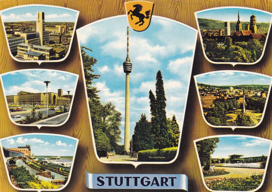
STUTTGART
Published by
ANCO
Printed and Distributed by
ANDRES + CO VERLAG HAMBURG
Ref: S 315/8000M
This is a typical German styled multi-view postcard in that it has that wood grain styled background which I have seen on postcards from this country, and, to be fair, some other main European countries. Here you have three views down each side and a larger central image. Depicted bottom left is the Airport, the addition of which, on any view postcard increases the popularity and collectability of any card (the world of Aviation collectors is very large and the subject matter is very popular).
Above the airport image is one depicting the main Railway Station (another very popular theme) with two yellow trams visible. The top left side image shows the Rathaus, or Town Hall, with the traditional town hall clock. The images on the right side are more tourist based and depict areas of interest like the park shown at the bottom. For me though, it is the main central image which appeals. This is the Stuttgart broadcasting tower which was strongly connected to the areas television output. It therefore fits into my Television themed collection (and it was, I admit, my main reason for buying this one)
23/01/2017
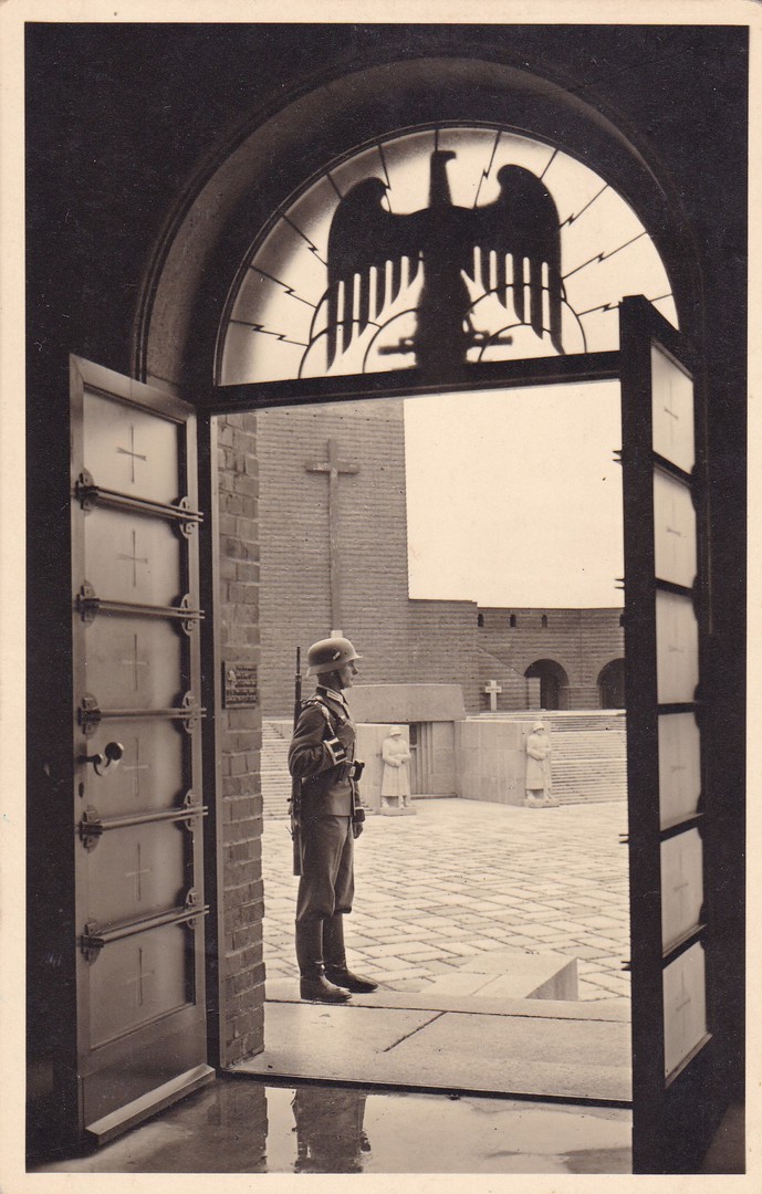
Foto – Reinhard Borchert
Hohenstein O/Pr. Adolf Hitler Str. 49
Nachdruck Verboten (Reproduction Prohibited)
I bought this postcard from a stamp and postal stationery dealer at my local fair in Rayleigh, a number of years ago, now. I wanted it for my military collection as it depicts a German soldier standing guard at the entrance door. Unfortunately, I have been unable to ascertain where this photograph was taken. The large crosses and soldier statues on the structures that can be seen in the background lead me to believe this could be some sort of ceremonial, commemorative church or state like building.
Any help with identification would be appreciated.

REVERSE SIDE OF ABOVE POSTCARD
Despite the written prices to the contrary I only paid £1 for this postcard (a bargain). I have since always been intrigued by what was written on the back here. There are some dates here which are clearly the 19 / 06 (19th June) to 22 / 06 (22nd June), then the year is either 1938 or 1939 (I think it is 1939).
Then the words are a bit more difficult. The first I think is ‘WORCH’ which means ‘WEEK’, then the second - long word which ‘definitely’ starts with the word ‘REICHS’, which translates as ‘EMPIRE’. After this I am a bit stumped. But, I am assuming this was some sort of special event or exhibition which was held between these dates. Maybe the person acquired this postcard at this event and recorded the fact themselves on the reverse side as a future reminder. There is also the possibility that they received the card from someone with advance details of an event that they wanted to attend.
If you can read German, and can make out what has been written here I would very much like to hear from you. Whatever the origin of the writing it does add a little bit of added interest.
23/01/2017
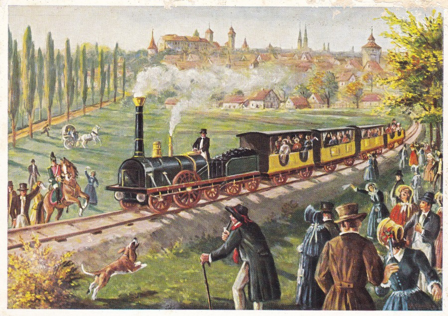
FIRST GERMAN RAILWAY BETWEEN NUREMBERG AND FUERTH
IN 1835
Published by
VERLAG FRITZ LAUTERBACH
FURTH IN BAYERN
Ref: Frila-Karte Nr. 808
A German published postcard depicting an early (in fact the first between Nuremberg and Fuerth) steam train in 1835. This is a postcard for the Steam Train enthusiasts, like my eldest son James. Steam train images, both paintings and photographs are extremely popular and have been collected since the very first days of picture postcards, and, I think it is fair to say that the theme has remained in the top ten collected themes since the beginning. It is not a theme that I will spend much money on but if I come across nice cards which are not too expensive then I will add them to my collection.

22/01/2017
SOUTHERN AFRICA
SPRINGBOK (Antidorcas Marsupialis)
Published by
GERALD HOBERMAN
1996
Ref: GH-111
Photograph by
Gerald Hoberman
I first came across the photographic postcards of Gerald Hoberman when I bought some of his images of London, including a police officer. His London images are, in my opinion, some of the best images of the capital issued on postcard. This one here though, is clearly from Africa, and I was unaware that there were any photographs issued other than the views I was already aware of before I was given this postcard.
22/01/2017
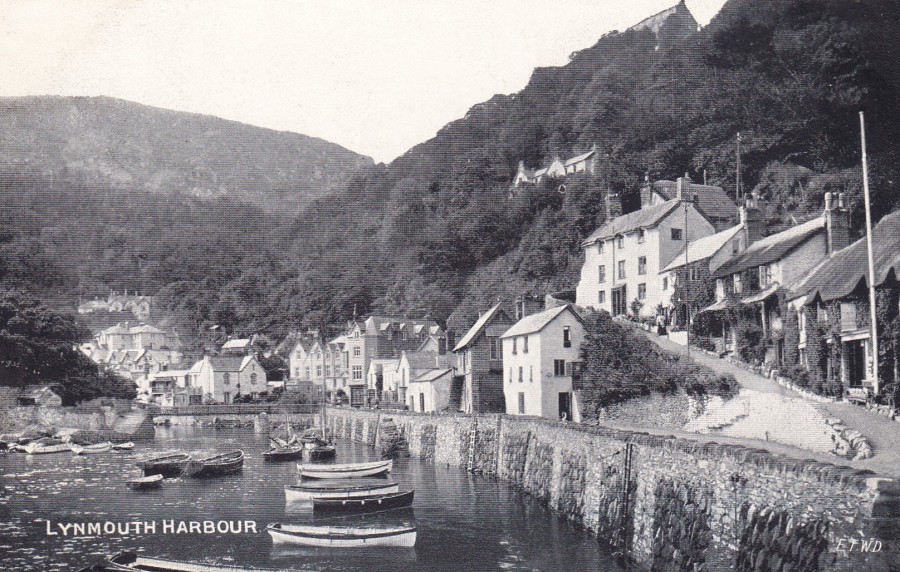
LYNMOUTH HARBOUR
Published by
E.T.W. DENNIS & SONS
“DAINTY SERIES”
This is not my first Lynmouth depicted postcard, I have shown a previous one viewed from the opposite direction, i.e. looking out into the harbour, and one depicting the grievous damage caused by the severe flood of 1952. This view here pre-dates that terrible night and the area was changed overnight.
As previously mentioned on a past posting I spent many childhood holidays in this area and we always visited Lynmouth. These visits have led to me collecting a small number of view cards of the area.
ENLARGEMENT OF PUBLISHER LOGO FROM REVERSE SIDE (TOP CENTRE)
22/01/2017
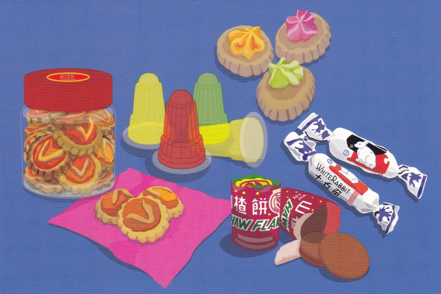
CHEAT DAYS: MALAYSIAN CHILDHOOD MEMORIES (2015)
DIGITAL ILLUSTRATION
Farhan Mahmud
Published by
AVANTCARD AUSTRALIA
Published 2016
Ref: 19815
I have mentioned before that Avantcard Australia print the work of upcoming artists and distribute them as free postcards in their racks. I have depicted a number of these artistic efforts in the past (who could forget the Zombie one with the eyeball on the ice-cream?) They publicise this artist offer with text on the reverse side of the postcards that reads:
“We print emerging artists work on our Postcards, apply to have your art printed”
This one is a digital illustration, something which seems to be more common these days and these now regularly appear on postcard. In my opinion the designs are simplistic in their look, almost childlike but with more precise rendering.
REVERSE SIDE OF ABOVE POSTCARD
This one has an attractive deep orange colour printing
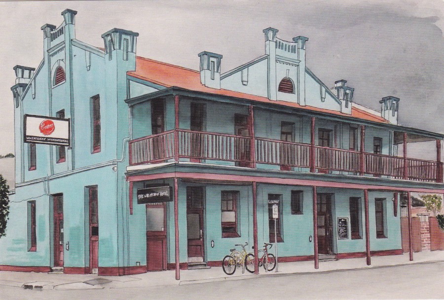
THE WHEATSHEAF HOTEL OF THEBARTON SOUTH AUSTRALIA (2015)
PEN, WATERCOLOUR AND GOUACHE
Chelle Destefano
Published by
AVANTCARD AUSTRALIA
Published 2016
Ref: 19814
This one is more traditional in its approach and is very nicely executed. It is a piece which I suspect depicts a building close to, or well known by the artist, maybe even from their home town.
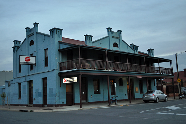
PHOTOGRAPH
This photo shows how well the artist has caught this hotel, what do you think?

REVERSE SIDE OF ABOVE POSTCARD
This time the card is of the more traditional white colouring, although I do like the red heart
22/01/2017
US INVASON OF GRENADA 1983
Published by
Coral-Lee
Ref: CL-RR. SER. #79
“The Reagan administration invasion of Grenada bought one of the most critical challenges of his presidency. Americans rallied behind the presidency during international turmoil as evacuated medical students loudly expressed their gratitude. Reagan revealed the planned Cuban-Soviet buildup on the tiny island and gained public support for the relatively clean strike as America remains “the force for freedom and peace that makes America the brightest star of hope in the world of today.” October 25, 1983
Date of Landing on Grenada – October 25, 1983
Number of Marines in the landing – Approximately 400
Maximum number of Marines on Grenada – Approximately 1000
Redeployment date of Marines from Grenada – November 2, 1984
(Data – courtesy of Department of Navy, Marine Corps Headquarters)”
(Text from reverse side of Postcard)
There are not a great number of postcards related to this short invasion of Grenada by the US Marines. I remember that it caused quite a stir at the time and despite the backing it received by many Americans there was some condemnation from other countries around the world. The result was an outstanding success for the American Marines, who took part in what was code named ‘Operation Urgent Fury’. The US Forces sustained a loss of 19 killed and 116 wounded and regardless of a campaign run by those in the US Congress to impeach Reagan, the resolution to do so was defeated, Reagan came out of the whole affair on top.
22/01/2017
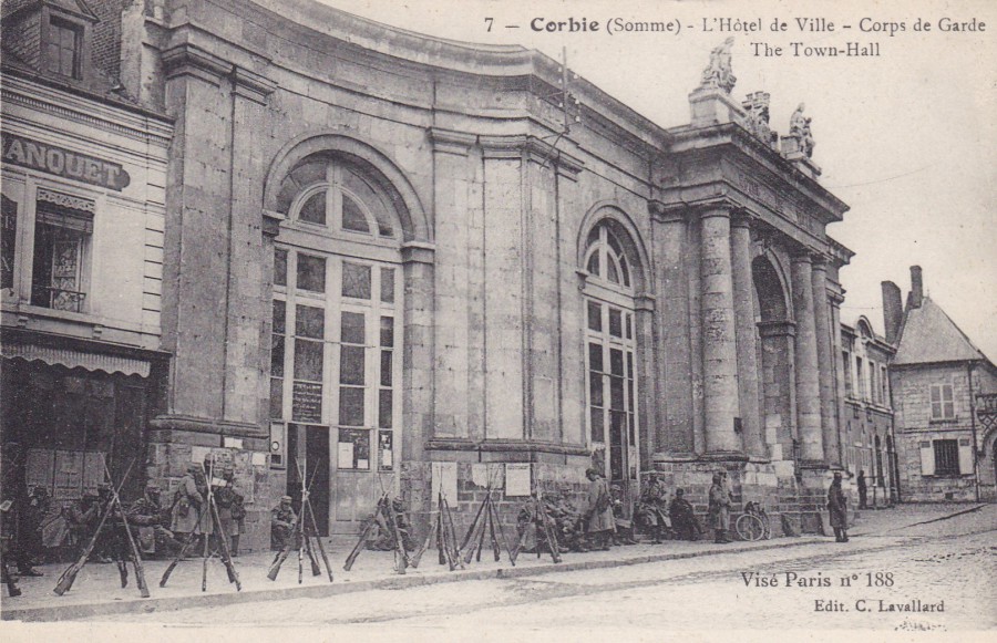
7 - CORBIE (SOMME)
L’HOTEL DE VILLE – CORPS DE GARDE - THE TOWN HALL
(City Hotel – Guard)
VISE PARIS No 188
(Edit. C. LAVALLARD)
Published by
IMPRIMERIE CATALA F. PARIS
I have picked another French postcard to be depicted (I had to return to France Friday night – it was the first time I had driven my own car onto the Channel Tunnel train).
This postcard is from the First World War and depicts resting French soldiers outside the Town Hall. I liked the way their rifles have all been stacked in tripods using the bayonets crossed over at the top. Unfortunately, there is no way to know if these soldiers are resting after already being to the front line or if they are new recruits awaiting transportation to the war for the first time.
The postcard was not posted but does have a hand-written message on it in pencil (which was of course the normal implement used by soldiers during this war to write their letters and postcards with).
The message reads:
“This is where I first got a taste of hospital life. It is not a cinema as I thought”
This message is intriguing as it clearly seems to be referring to the front image so was the building used as a hospital during the war? And, one does wonder immediately if the sender was in the hospital because he had received an injury at the front. But, this is fanciful thinking because it was just as likely that he was hospitalised because of an illness, infection or disease, all of which were more common because of the bad living conditions and the decline in hygiene. But, which-ever it was, the message gives some historic content to the use of the building shown.
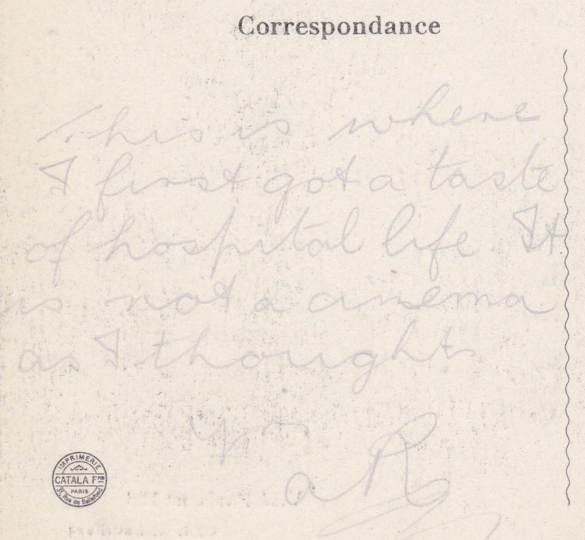
ENLARGEMENT OF THE REVERSE MESSAGE AREA
Corbie, described as a small commune, is in the ‘Somme Department’ area of France, but remained out of the war until 1918, and even then, it was on the margin of the battlefield, where the First Battle of the Somme 1918 came to an end.
This proximity of the commune to the fighting areas, but still being outside the fighting areas until 1918, could explain why a hospital was placed here.

PHOTOGRAPH
Here is the building, shown on the postcard, depicted as it is today