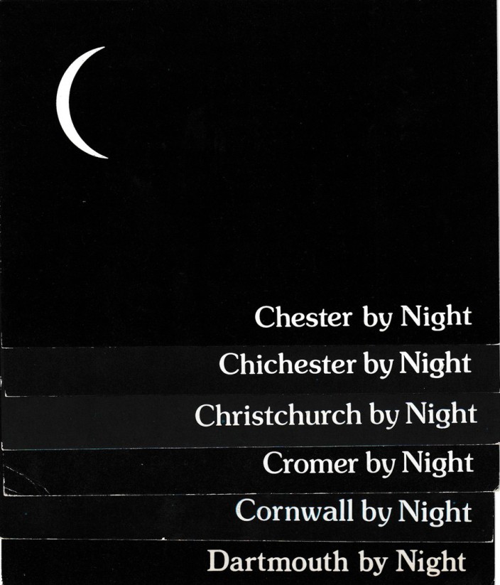
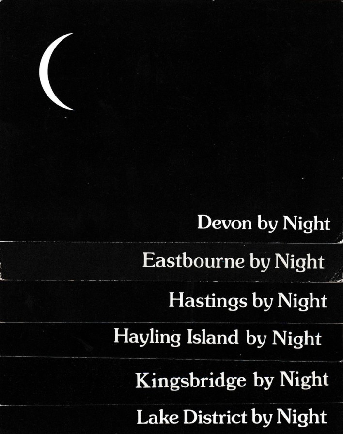
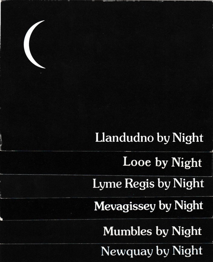
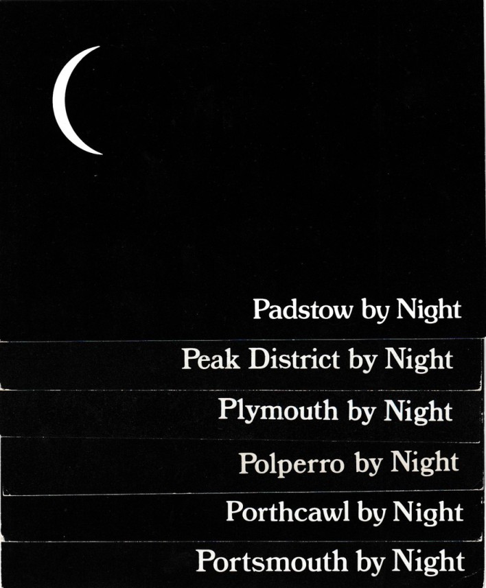
…… BY NIGHT

& ALL BLACK COLOURED POSTCARD DESIGNS


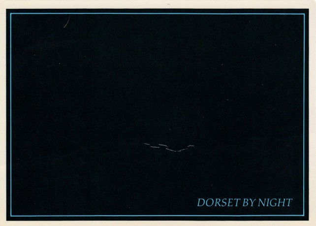
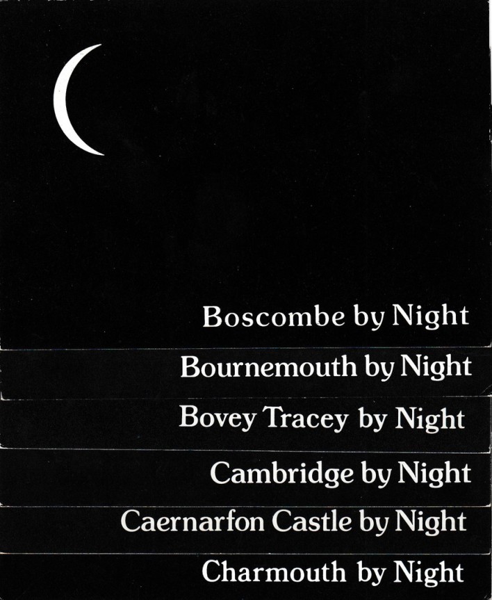
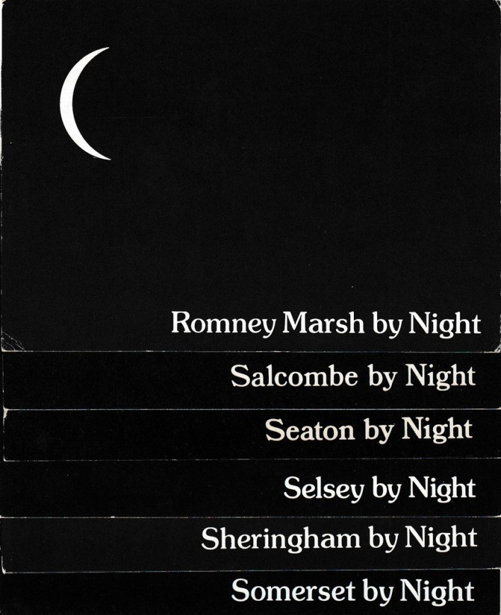
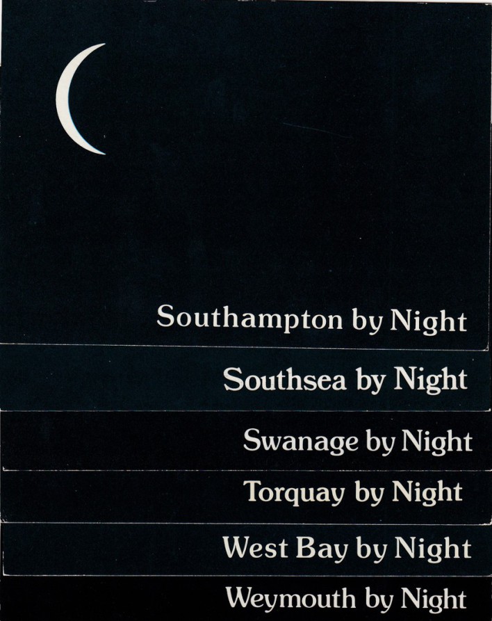
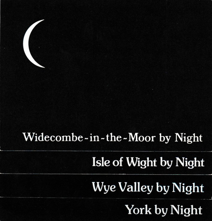
At one point the ‘…BY NIGHT’ postcards were so popular that you could travel almost anywhere in the country, and across other countries as well, and find a version for whatever location you were in. Many different companies had their own version of the ‘…BY NIGHT’ postcard design, many were just plain black with the location in white text, but ‘J. SALMON’ had a design which included a sliver crescent of the moon, which added a little more to the basic idea.

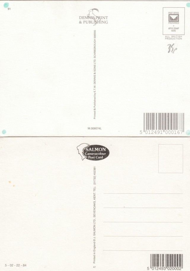
Each postcard for each different location had its own reference number (although sometimes the basic design had a reference number and this same number was used for all or most different location cards issued), but I do not intend to record them all here as it would take some time to do this (but with some I have shown the reverse side which shows you the reference number). Also, rather than show each individual design in full I have decided, where applicable to overlay six cards (or less) at a time for scanning, which means that you can get more locations without having to move down the page to much.

I am also fascinated with the fact that you can find this type of postcard from the era around 1915 (first world war) and the 1930's and here in more modern times, so this idea has been a popular one for different generations.

 Lastly, am I the only idiot who collects these? I am sure people have sent them, in fact I know they have as I have seen lots of posted copies, but has anyone else put together a collection of these cards?

So, here we go…     


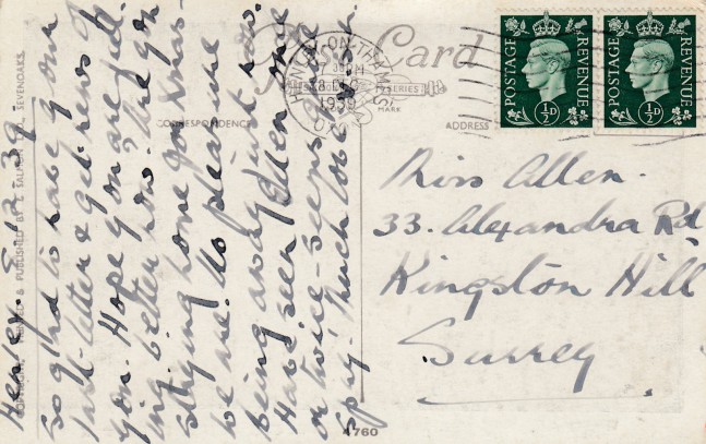
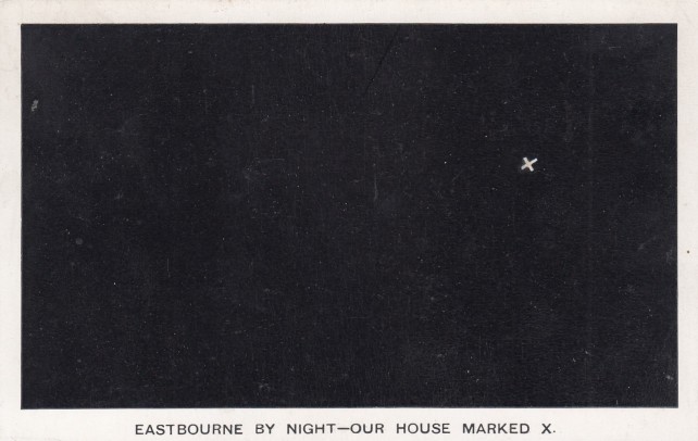
WHEN ARE COMING TO SEE US - OUR HOUSE MARKED X


A different type of '..By Night' card design, and an early one used in the late 1930's, but one which does not use the 'BY NIGHT' wording. 


REVERSE SIDE OF ABOVE POSTCARD.


Postmarked HENLEY-ON-THAMES - 8th December 1939. 


The Second World War had started by now and at this point the UK was technically at war with Germany. 


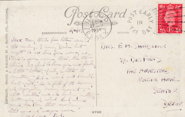
REVERSE SIDE OF SECOND COPY OF ABOVE POSTCARD - 

Used with 'POST EARLY IN THE DAY - ILFORD, ESSEX' slogan cancel dated 27th November 1939. This slogan was in use for much of 1939 from various locations around the country. 


REVERSE SIDE OF THIRD COPY OF ABOVE POSTCARD -  MINT COPY


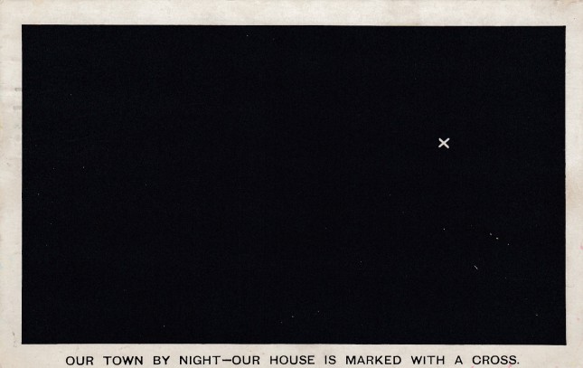
OUR TOWN BY NIGHT - OUR HOUSE MARKED WITH A CROSS


A generic styled design which could be used anywhere. For some examples of specific lnamed locations on this type of card see below. 


Reverse side of above postcard


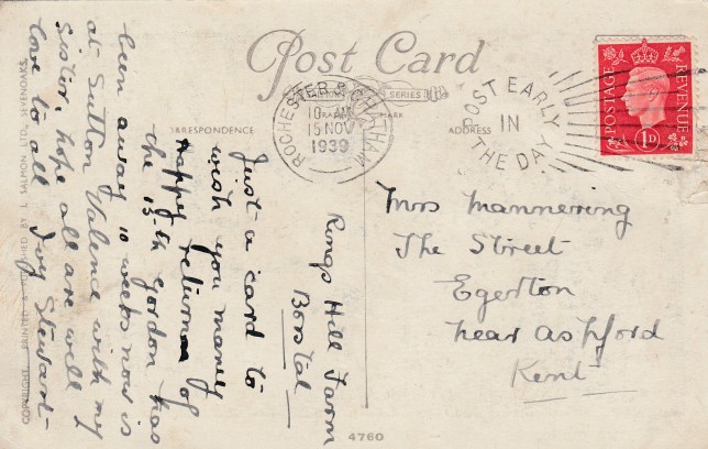
Nice clear 'POST EARLY IN THE DAY - ROCHESTER & CHATHAM' slogan cancel dated 15th November 1939.

This slogan was first used in 1937 and then again in 1938. In 1939 it was generally in use throughout the year when not stopped for the use of a short term specific slogan period.  


- OUR HOUSE MARKED X


Named location cards (this one is London, with three other locations depicted blow) 

.

.

.


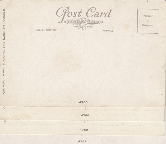
Reverse side of above four postcards


The top three all have the same reference number; 4760, but the bottom card has the reference number 4761. This all makes collecting these cards very confusing, especially around any reference number usage 


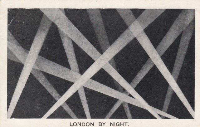
LONDON


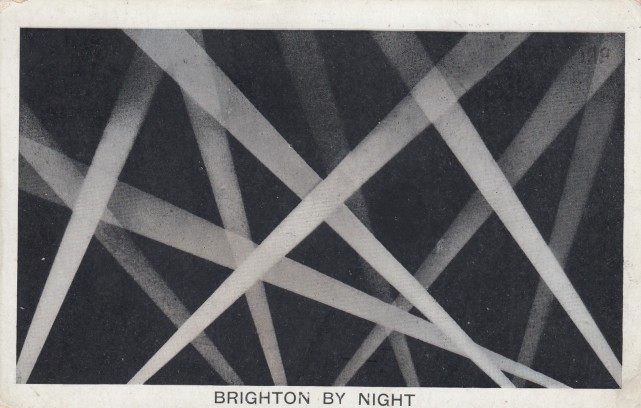
I do like this World War 1 searchlights design. I suppose it is a different take on the standard all black design. I think this one, and the Brighton one depicted below are probably my favourite of this type of card. 


Reverse side of above postcard


BRIGHTON


World War 1 searchlights 


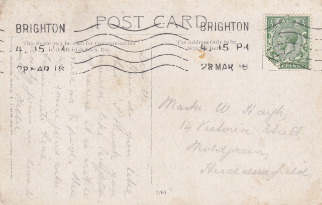
Reverse side of above postcard


This Brighton card has the same reference number as the London one above


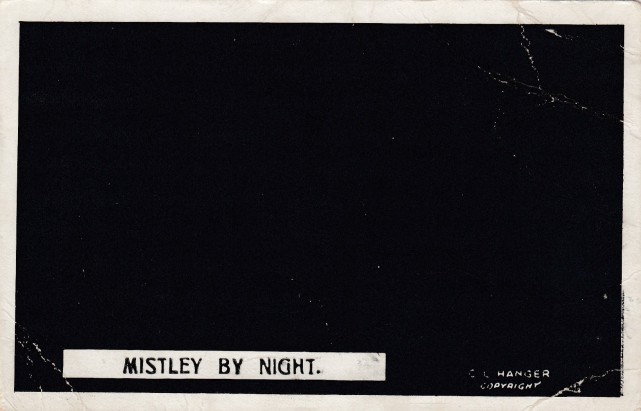
MISTLEY


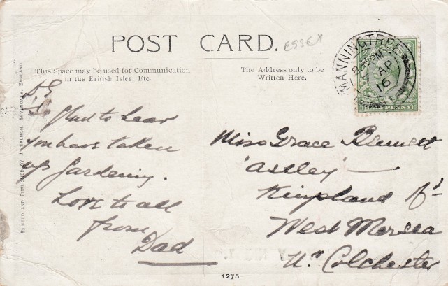
Reverse side of above postcard


SWAFFHAM


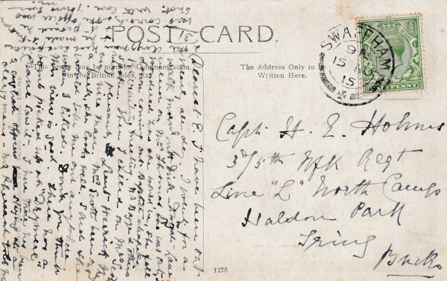
Reverse side of above postcard


TIDWORTH


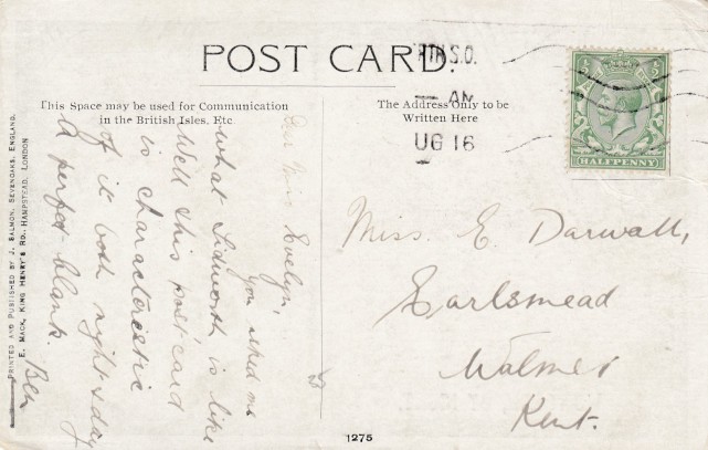
Reverse side of above postcard


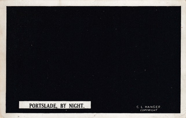
PORTSLADE


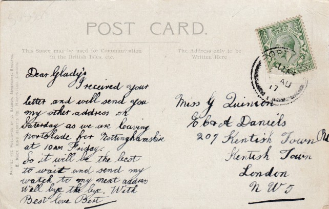
Reverse side of above postcard


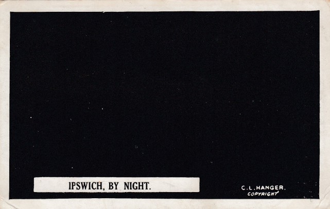
IPSWICH


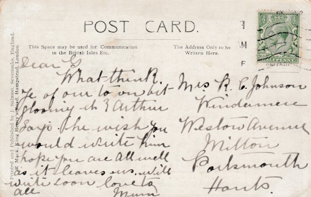
Reverse side of above postcard


DEREHAM


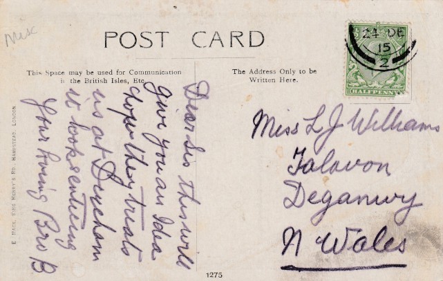
Reverse side of above postcard


CROWBOROUGH 


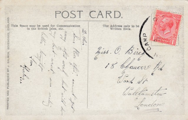
Reverse side of above postcard


It is a shame this cancel is incomplete as it looks like it could have been an interesting one. 


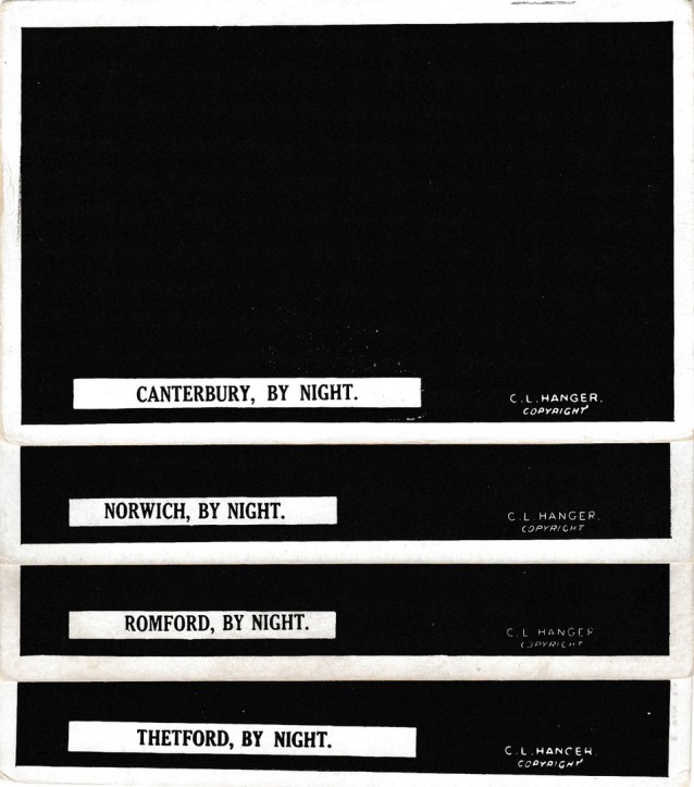
CANTERBURY


NORWICH


ROMFORD


THETFORD


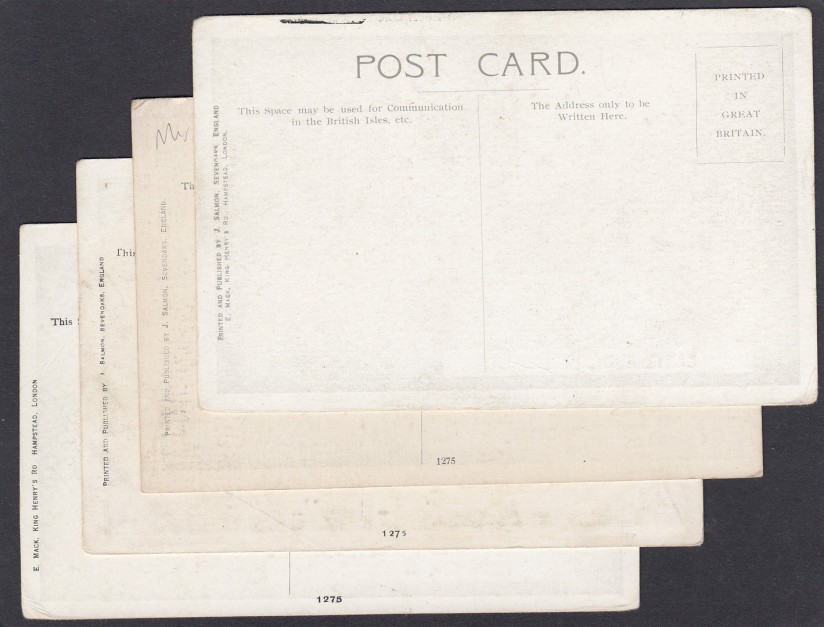
Reverse sides of the above four overlaid postcards.

Note that the top card does not have a reference number. 

The other three, despite having different locations on the front all have the same reference number here on the reverse side - 1275. There are two different publishers shown as well.   


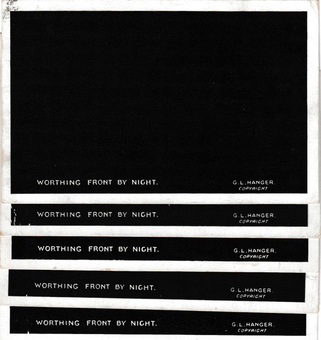
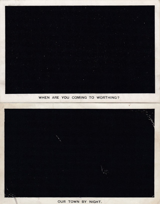
WORTHING FRONT BY NIGHT


Can you have too many of a single design? Apparently not! I clearly have five copies of this one, but I like checking for different hand stamps, and it is nice to have a mint copy beside used ones as well.  


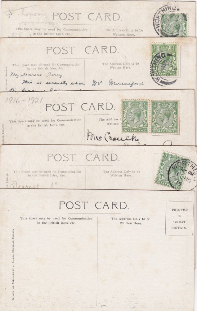
The reverse sides of the above postcards overlaid to show their usage, with a mint copy at the bottom 


TOP - 'WHEN ARE YOU COMING TO WORTHING?'

BOTTOM - a generic design which could be sold almost anywhere, especially where the demand would have been very low, a small village or hamlet perhaps (although it does say TOWN, but I doubt that would have been an issue). 


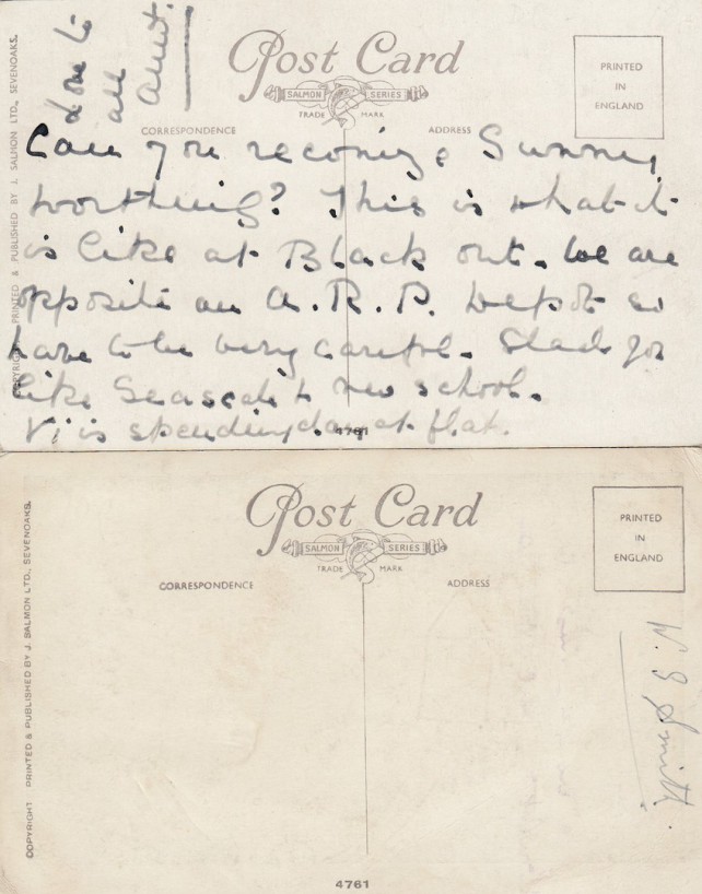
Reverse sides for the two postcards depicted above.

Although these two cards have different wording on the front they have the same reference number here on the reverse sides (bottom centre). This is not uncommon, but does make it hard to compile a checklist. 


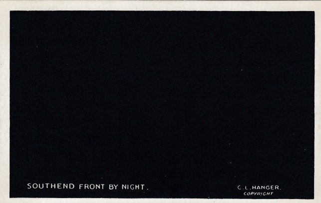
SOUTHEND

I was really pleased to get this one because this is my home town, and it is always nice to have an example from your home location.


Reverse side of above postcard


TUNBRIDGE WELLS


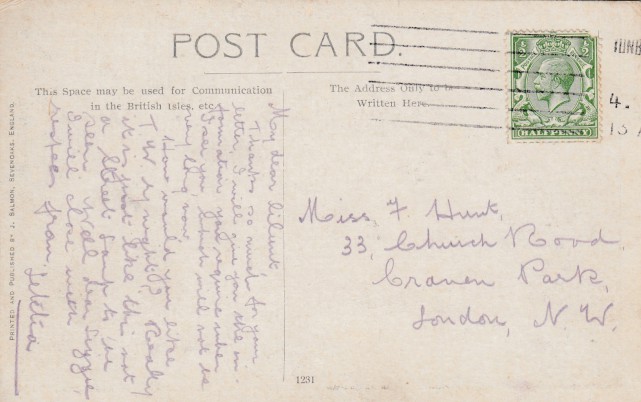
Reverse side of above postcard


TOP - LITTLEHAMPTON

BOTTOM - SEVENOAKS


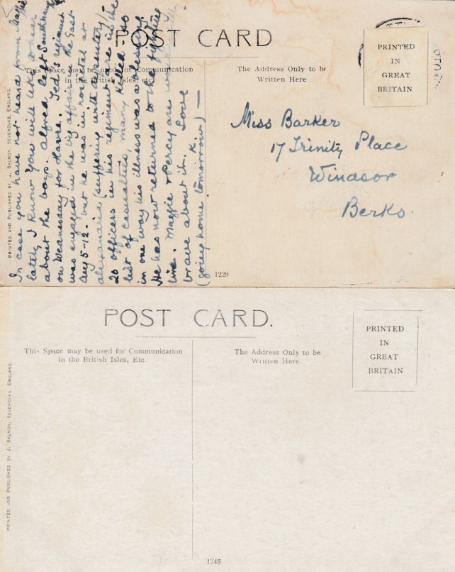
Reverse sides of the two postcards depicted above


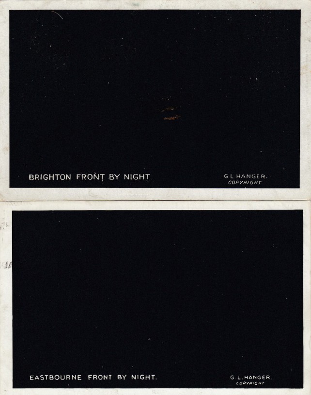
TOP - BRIGHTON

BOTTOM - EASTBOURNE


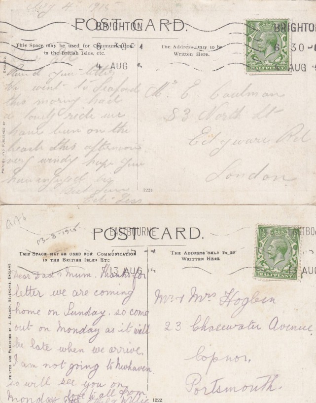
Reverse side of above two postcards 


TOP - Posted 1915 at BRIGHTON (which seems logical given this is the Brighton card)

BOTTOM - Posted 1915 at EASTBOURNE (appropriately used again)


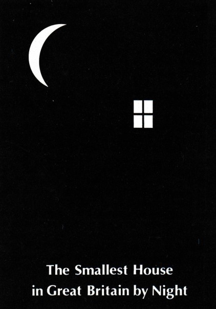
THE SMALLEST HOUSE IN GREAT BRITAIN BY NIGHT

It is not often that you get a vertical 'By Night' design. This one probably fits in with the 'Crescent Moon' selection which appears at the bottom of this page. 


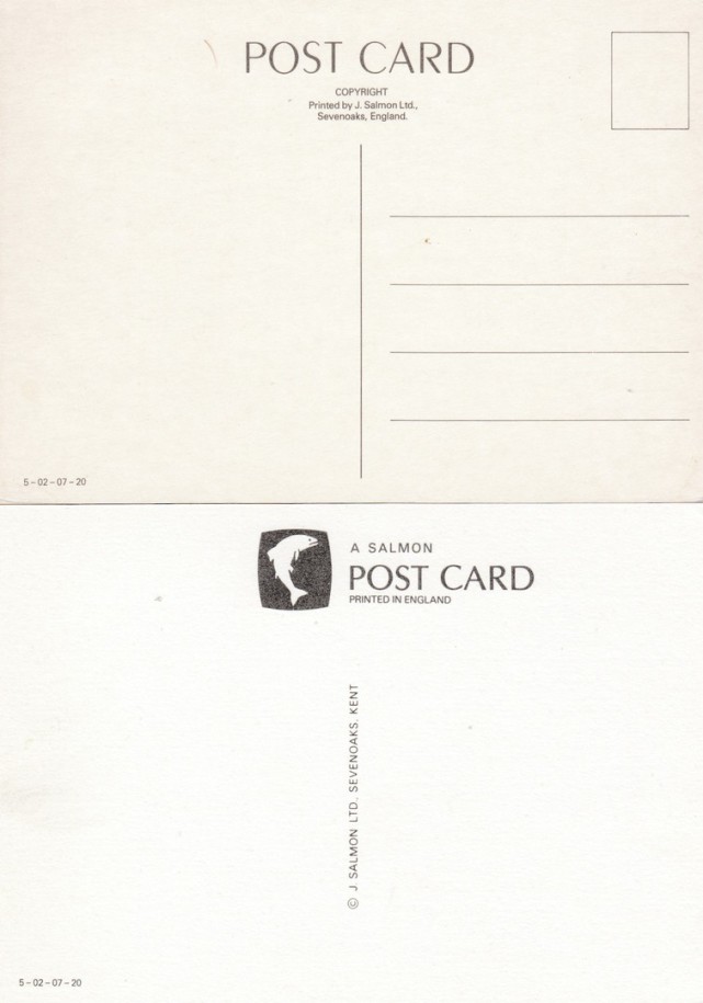
Two different reverse type layouts for the above 'The Smallest House' postcard. Both are J. SALMON LTD, but the company changed their reverse header every ten years, so different formats for their cards are a norm. 


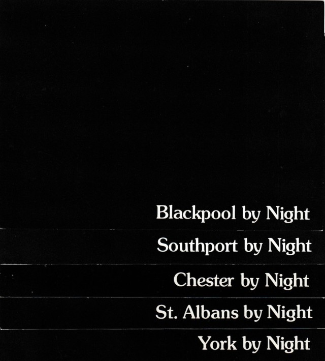
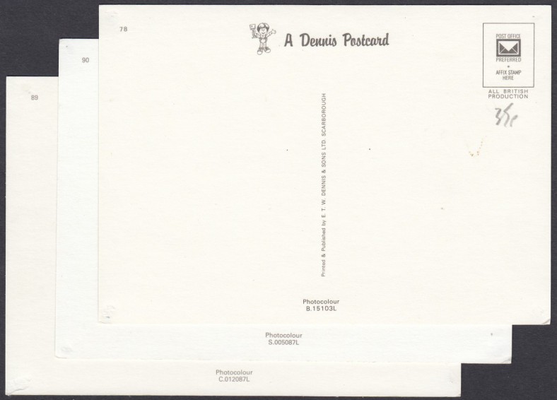
E. T. W. DENNIS & SONS LTD issues


Reverse sides of the top three postcards in the above stack 


Reverse sides of the bottom two postcards in the above stack of five overlaid postcards


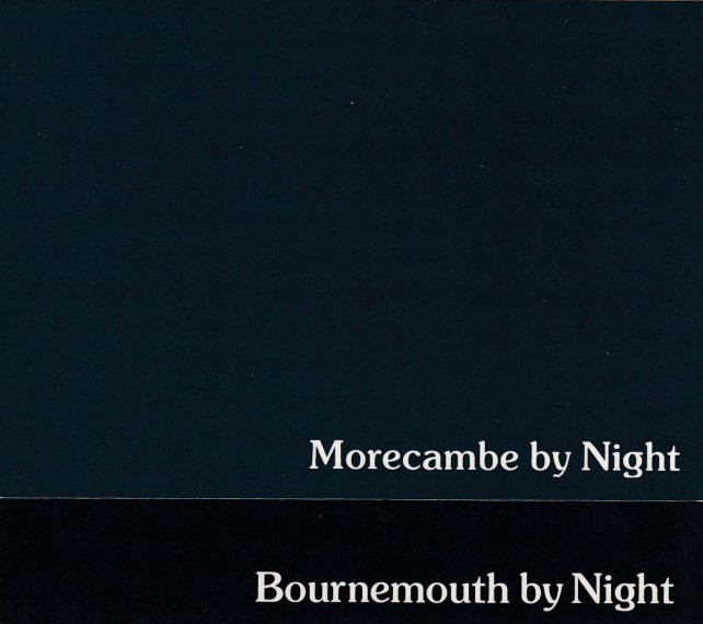
Two different 'BY NIGHT' location postcards over-laid


Reverse sides of the two over-laid postcards deicted above. Notice how although the fronts have the same basic format these are by different companies.  


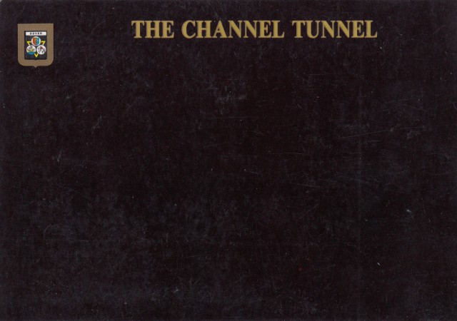
One of what I call the 'CREST' series, although this one kis a little different as it is not a county or town, but the Channel Tunnel. 


Reverse side of above postcard


Almost the ultimate in black BY NIGHT postcard designs


Reverse side of above postcard


A different design 


Reverse side of above postcard


…… BY NIGHT

Postcards Published by

J. SALMON LTD

Crescent Moon Design


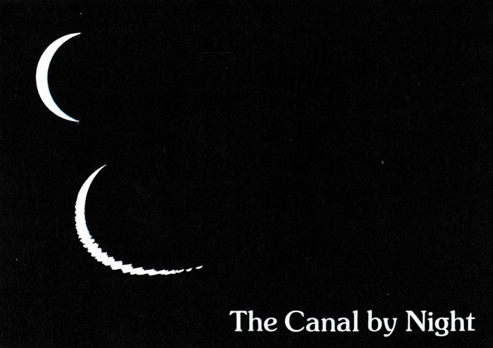
…… BY NIGHT

THE CANAL BY NIGHT

Postcard Published by

J. SALMON LTD

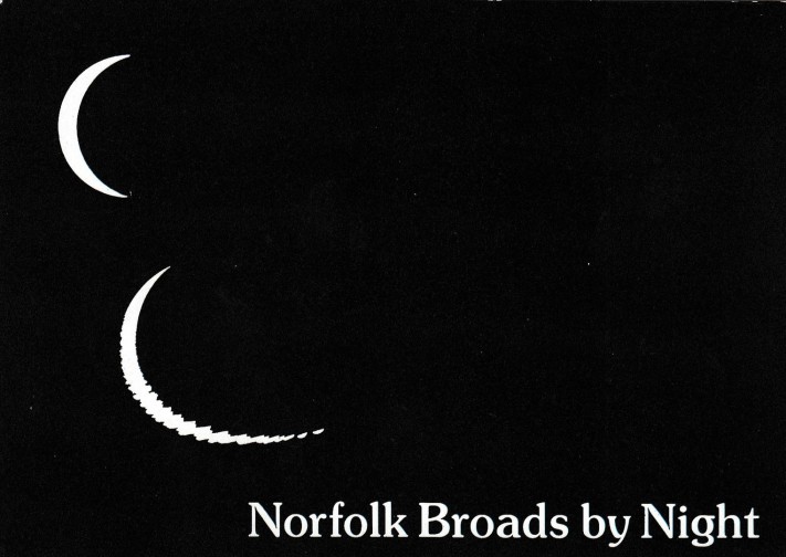
Crescent Moon Design with reflection


This version, and the one below uses the reflection of the crescent moon as an addition to enhance the general idea just a little bit more. It is, therefore, another version of this basic crescent moon issue.


…… BY NIGHT

NORFOLK BROADS BY NIGHT

Postcard Published by

J. SALMON LTD

Crescent Moon Design with reflection


…… BY NIGHT

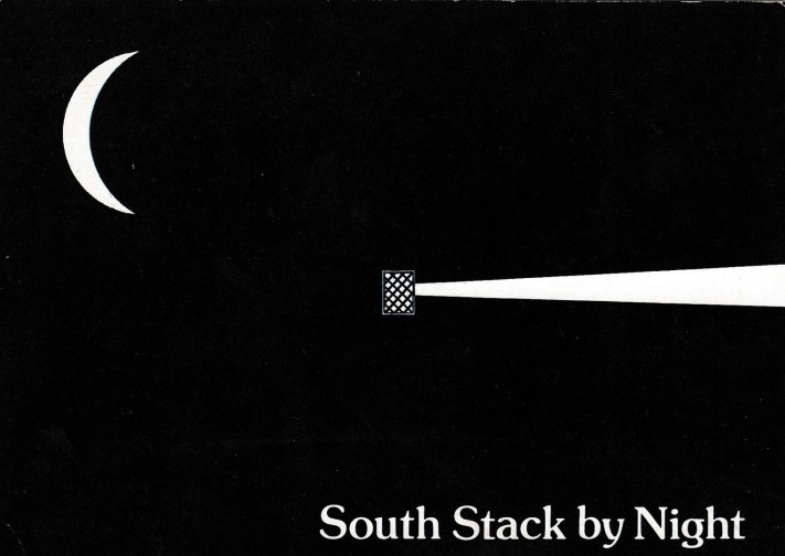
SOUTH STACK BY NIGHT

Postcard Published by

J. SALMON LTD

Crescent Moon Design with additional Lighthouse top and beam


This one takes advantage of the fact that there is a lighthouse at this location, so, obviously you need to show the light and beam which comes from the top of this lighthouse on the design. It is another adaptation of the basic design.


…… BY NIGHT

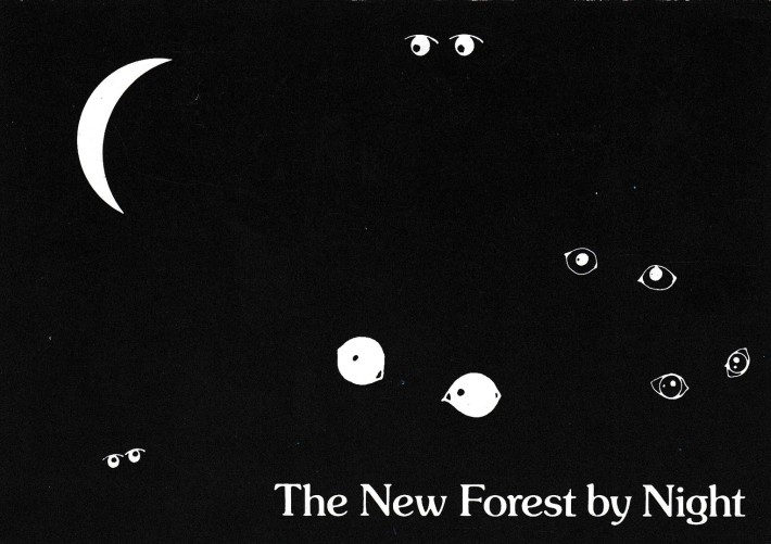
THE NEW FOREST BY NIGHT

Postcard Published by

J. SALMON LTD

Crescent Moon Design with additional animal eyes


This idea of the shine you get from animal eyes at night was used for a few locations which have a wild element and where critters might be seen. It is yet another adaptation of the basic ‘… BY NIGHT’ design, one which I do like.

Print | Sitemap
© Mark Routh