
18/07/2018
TIGERS
(SIBERIAN TIGERS)
RUSSIAN STAMP SET
Used on Postcards
Published by
THE WORLD WIDE FUND FOR NATURE
(WORLD WILDLIFE FUND)
(WWF)
OFFICIAL MAXIMUM CARD
(TOP) 50r – Tiger (SG 6443)
(BOTTOM) 100r – Tiger in undergrowth (SG 6444)
Tigers are my favourite animals (I have mentioned this before, a few times I think!) so when I saw this official maxi-card set I was always going to be buying it.
The four stamps were issued in Russia on 25th November 1993 and here on these postcards they have been
cancelled with the special ‘tiger face’ special first day of issue hand stamp. In the Stanley Gibbons Stamps of the World catalogue the stamps are described as follows
50r – Tiger (SG 6443)
100r – Tiger in undergrowth (SG 6444)
250r – Two tiger cubs (SG 6445)
500r – Tiger in snow (SG 6446)
The World Wide Fund for Nature, perhaps better known now simply as the World Wildlife Fund, thus the WWF panda logo, issued a numerous and extensive series of official WWF maximum card sets, normally (all the ones I have seen anyway) containing four maxi-cards in each set. I believe some countries were even approached with a view to issuing a set which the fund could then produce into a maxi-card set. The stamps were official commemorative ones which were sold to also raise awareness and promote the WWF whose Panda logo appeared on each stamp. The stamps tended to depict a single animal or a series of animals loco to the country of issue, so here you have the Siberian tiger.
Because so many of these official maximum sets were produced they can now be picked up quite cheaply from dealers and on the second-hand market. Most sets of four can be picked up from as little as 50p to a £1 (some of the better ones maybe £1.50 - £2.50).

TIGERS
(SIBERIAN TIGERS)
RUSSIAN STAMP SET
Used on Postcards
Published by
THE WORLD WIDE FUND FOR NATURE
(WORLD WILDLIFE FUND)
(WWF)
OFFICIAL MAXIMUM CARD
(TOP) 250r – Two tiger cubs (SG 6445)
(BOTTOM) 500r – Tiger in snow (SG 6446

17/07/2018
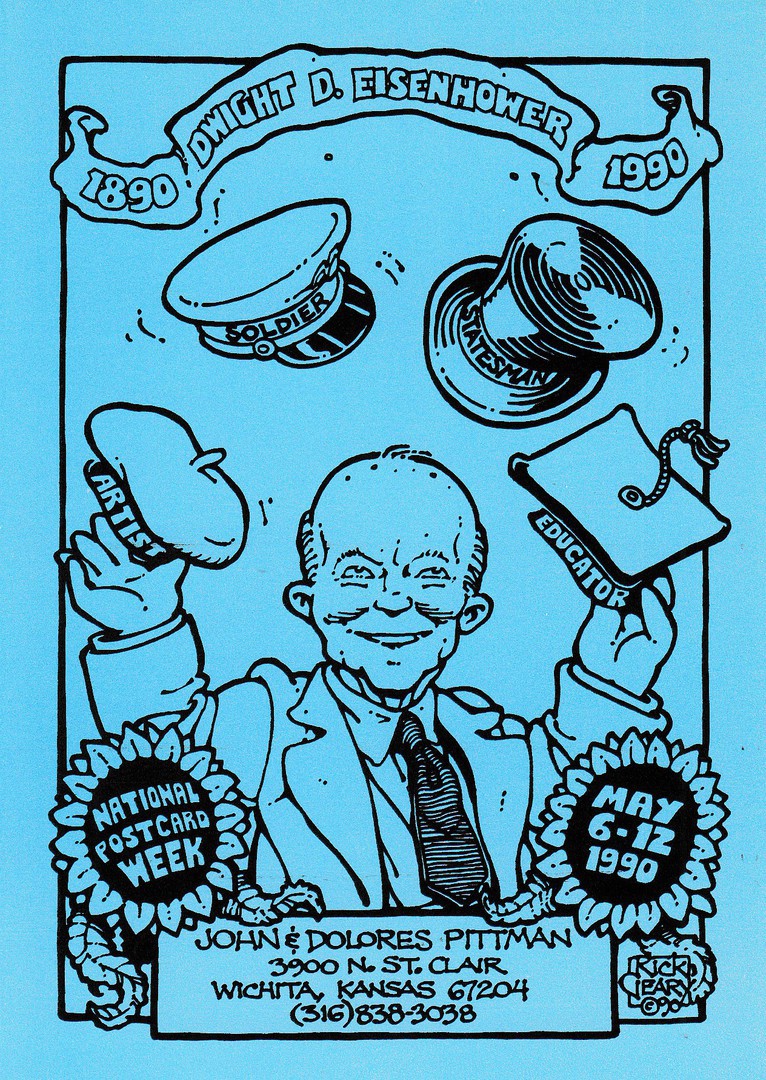
1890 - DWIGHT D. EISENHOWER – 1990
NATIONAL POSTCARD WEEK
MAY 6 – 12, 1990
Design by
RICK GEARY
Published by
JOHN & DOLORES PITTMAN
(KANSAS)
Printed in a Limited edition of 400 individually numbered postcard)
I have just noticed that the Ann Rusnak and the Patrick Hamm postcards below are both signed but the earlier Rick Geary one was not, so, I thought I would show you a Rick Geary signed postcard to even things up a bit. This one is signed on the front top left, down the outer margin area. Signed Geary cards are not as common as Patrick Hamm signed cards (still a bit cheaper though!), but examples do compliment a collection.
This signed edition is number 51 of the 400 postcards issued.
1890 - DWIGHT D. EISENHOWER – 1990
NATIONAL POSTCARD WEEK
MAY 6 – 12, 1990
Design by
RICK GEARY
Published by
JOHN & DOLORES PITTMAN
(KANSAS)
Printed in a Limited edition of 400 individually numbered postcard)
I thought I would also show you the unsigned copy I also have in my collection. This unsigned copy is number 107 of the 400 issued.
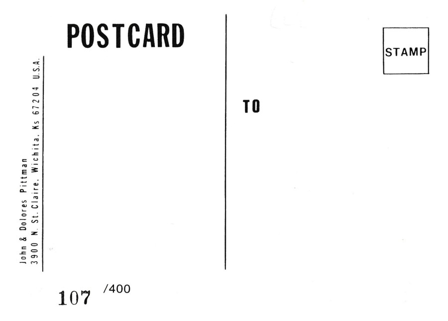
REVERSE SIDE OF ABOVE UNSIGNED POSTCARD

17/07/2018
4e CONGRESS ET SALON
CARTES POSTALES
MENTON
4TH Congress and Postcard Salon
Menton
PALAIS DEL L’EUROPE
28 – 29 MARS 1987
(28 – 29 March 1987)
Design by
PATRICK HAMM
Official Event Postcard Design
Published by
PATRICK HAMM
Limited edition of 500 individually numbered postcards
As we seem to be having a bit of a modern postcard artist day today I thought I would move over to France and depict a postcard design by one their popular modern postcard artists; Patrick Hamm. Now, time to be a bit honest here. I have never fully been able to explain why Patricks work has been so popular and why it is so highly collected, but I am one of those who seems to like his simplistic, and immediately recognisable, style and I do have a small collection of his work. These can also be expensive with a card like this being anywhere between £8 and £15 (although lately I have noticed a bit of a dropping off in the prices for Patricks work on eBay, with many now around the £4 - £7, although these are the more recent issues and not the much older ones which still can reach double figures).
Patrick was one of those artists that attended French postcard fairs (Salon’s) and who designed and published a special limited-edition postcard for each event which he would initially sell at that event. If you saw him at these events you could also get him to sign the postcard for you and this card here has been signed on the reverse side.
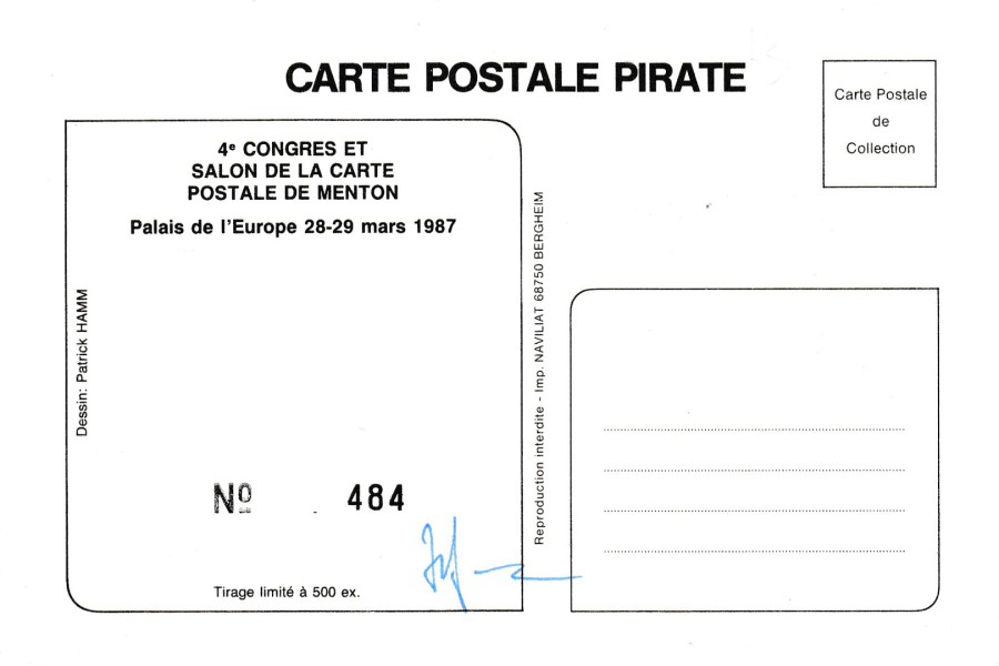
REVERSE SIDE OF ABOVE POSTCARD
Signed by the artist Patrick Hamm
(blue ink)
17/07/2018
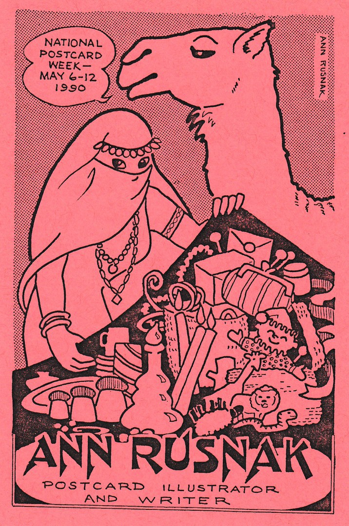
NATIONAL POSTCARD WEEK
MAY 6 – 12 1990
ANN RUSNAK
POSTCARD ILLUSTRATOR AND WRITER
Design by
ANN RUSNAK
Published by
ANN RUSNAK
Well, we’ve had a Rick Geary National Postcard Week design already today so why not an Ann Rusnak one as well! Rick Geary and Ann Rusnak are two of my favourite American modern postcard artists and I am going to be showing a few of their designs over the coming days and weeks. This one was Ann’s official NPW postcard release for the year 1990 and it has an Arabian Nights sort of theme (in case you are wondering if this was produced as a result of the popularity of the Disney ‘Aladdin’ animated film. I can tell you that it was not, as that came out in 1992). This is one of my favourite of Ann’s designs and was one I got her to sign for me when I met her in 1994.
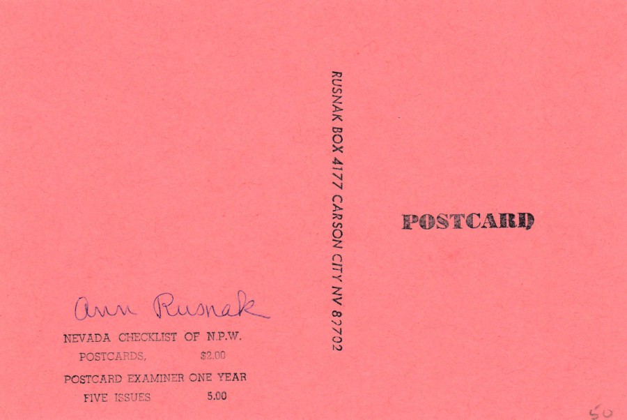
REVERSE SIDE OF ABOVE POSTCARD
Personally signed by Ann Rusnak for me at the 1994 Picture Postcard Centenary Postcard Show
17/07/2018
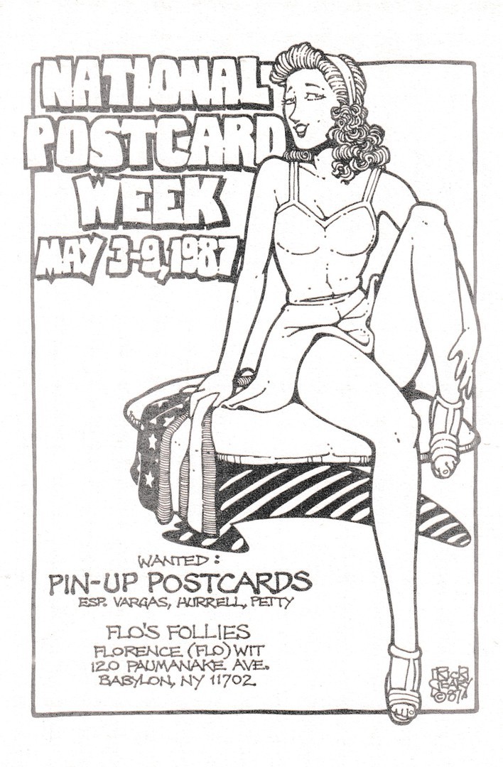
WANTED:
PIN – UP POSTCARDS
NATIONAL POSTCARD WEEK
MAY 3 – 9, 1987
Design by
RICK GEARY
Published by
FLO’S FOLLIES
FLORENCE (FLO) WITT
Limited Edition of 300 hand numbered postcards
With this privately produced personal 1987 American National Postcard Week issue Flo was advertising what postcards she wanted and collected. This is one of my favourite Rick Geary designs and with there only being 300 produced it is also quite a hard one to source now, one which will cost you a few pounds.
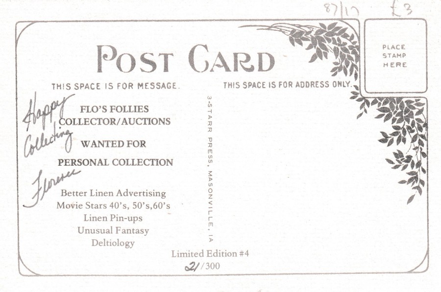
REVERSE SIDE OF ABOVE POSTCARD
I don’t know if Flo signed all these postcards, but she has certainly signed this one. As you can see from the pencil marks this cost me £3, but this many years ago now. I suspect it would cost more now. My copy is number 21 of 300.
17/07/2018
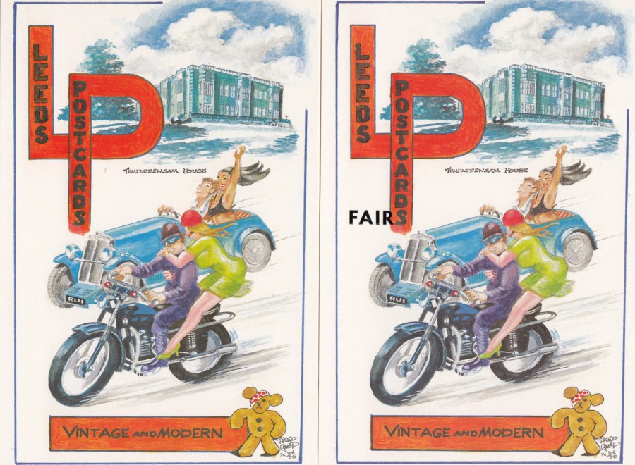
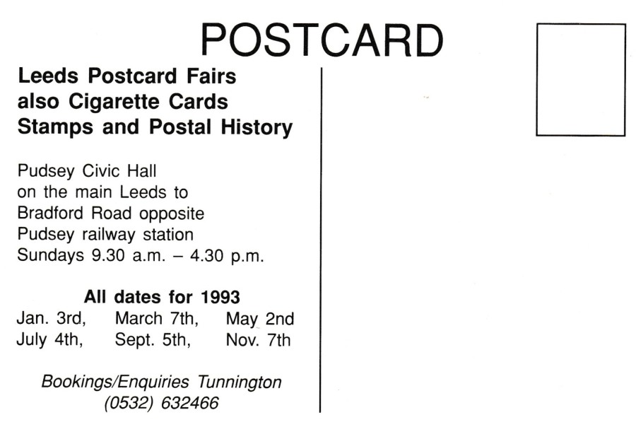
LEEDS POSTCARDS.
LEEDS POSTCARDS FAIRS.
(LEEDS POSTCARD FAIRS)
(TEMPLENEWSAM HOUSE)
Dates for 1993
Design by
FRED CAMP
Official Postcard Fairs Publicity Postcard
Published by the Fairs organising team
I have been collecting postcards for many, many years and I have picked up modern postcards as and when they came out, especially during the 1980’s and 1990’s when I was in contact with many modern postcard dealers and had a range of standing orders on certain themes. Therefore, I picked up the stories behind their issue as well. Some of these are interesting and would not be obvious just from the look of the card(s). These two here are a good example. The cards are the same except for the addition of the black letters ‘FAIR’ added to the design at the bottom of the large red letter ‘P’ in the top left corner. Why was this word added? Well, it was due to a complaint from what was then a major postcard publisher, one I have mentioned before and a range of whose cards I have depicted on the webpage.
LEEDS POSTCARDS still produce postcards, but in the 1980’s and 1990’s they were the UK’s most well known political postcard publisher. They issued cards on politics, green issues, diversity and feminism, along with campaign cards for Greenpeace, CND and other such organisations. Here it was their strong support behind the equal rights, feminism movement and campaigns which was causing them an issue with these postcards being issued to promote the Leeds Postcard Fairs. This was because the designs used, always by Fred Camp at this time, depicted women as pretty additions to the image, an almost sexual additive. There was not a strong aversion to the images themselves, but there was against the inclusion of the words LEEDS POSTCARDS. It was believed, by the company LEEDS POSTCARDS, that the cards could have been confused by people as being issued by them, which they were clearly not. The use of women as decorative adverts went against the general policy of the LEEDS POSTCARDS and their postcard output. They feared it would, or could, cause them issues with the organisations that used their company to publish their campaign postcard designs, thus losing them contracts and money (potentially, I don’t believe the company had ‘actually’ had this happen, I think something was just mentioned along the lines of this being a possible outcome after someone had either asked them about these Fair cards or someone in the company became aware of them). It should also be remembered that the company LEEDS POSTCARDS had copyrighted their company name.
What to do? Well, the answer proved quite simple in the end, and if I am right the matter was dealt with quite amicably between the Postcard issuing company and the organiser of the fairs who was producing these depicted postcards (I have always hoped it was amicably sorted out as the postcard world is a friendly one I have found). The potential problem was resolved by adding the above mentioned black letters reading as ‘FAIR’ at the bottom of the ‘LEEDS POSTCARDS’ section of the design to make it read as LEEDS POSTCARDS FAIRS, not quite grammatically correct, but a solution and a problem solved.
So, there you have it, a quite simple story, but one which I suspect will not be known by many who have copies of either of these two slightly different issues.
REVERSE SIDE OF ABOVE POSTCARDS
The reverse sides remained the same

16/07/2018
SWEDISH STAMP POSTCARD
POSTVERKETS TRYCKERI 1973
I DALOM –
Booklet of stamps issued on 2 March 1973.
The five motifs are from the province of Dalecarlia
Official Postal Authority Postcard
The Swedish postal authority has issued many postcards like this which depict either a set of stamps or a single stamp issue. These postcards were mainly given away free at stamp shows and exhibitions around the world, although in Sweden I assume they were available from either their main post offices or possibly via subscription. I have managed to obtain quite a few over the years.
16/07/2018
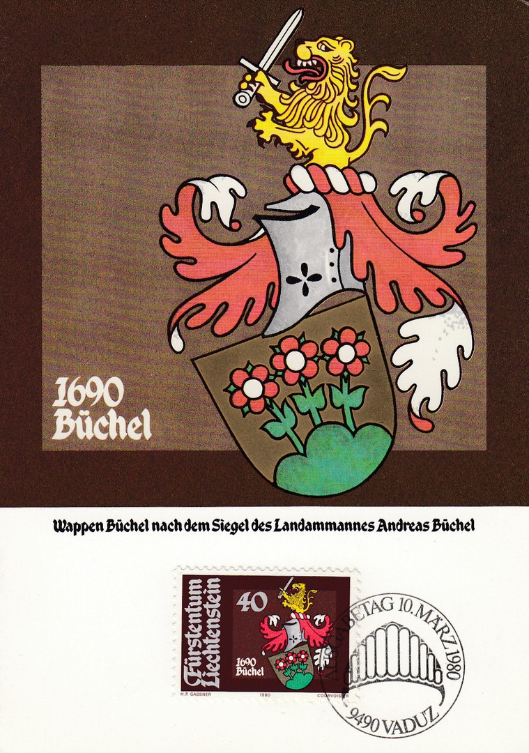
ARMS OF LANDAMMANNER (BALIFFS)
ARMS OF ANDREAS BUCHEL
LIECHTENSTEIN
40 Rappen value stamp
Issued
10th MARCH 1980
Designed by
HANS PETER GASSNER
Stamp printed in Photogravure
By
Courvoisier SA
Maxi Card Published Officially by the Liechtenstein Postal Authority
Ref: MK/Nr. 14
These three maxi-cards were all found in the 20p box last week on my visit to Chelmsford. These are nice attractive stamps with the main pictorial part of the stamp pictured on the card part. There should be four cards in the set, but there were only three in the box, so I am missing the 70 Rappen value stamp card. These are typical of the official maxi-cards issued by the Lichtenstein post.
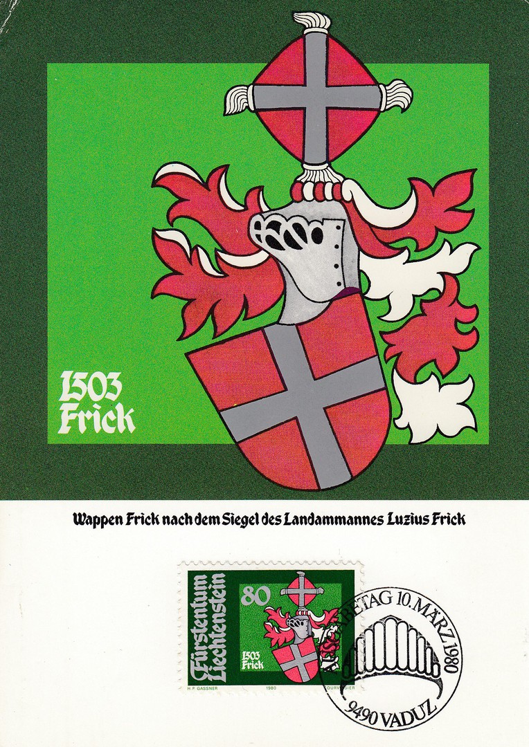
ARMS OF LANDAMMANNER (BALIFFS)
ARMS OF LUZIUS FRICK
LIECHTENSTEIN
80 Rappen value stamp
Issued
10th MARCH 1980
Designed by
HANS PETER GASSNER
Stamp printed in Photogravure
By
Courvoisier SA
Maxi Card Published Officially by the Liechtenstein Postal Authority
Ref: MK/Nr. 14
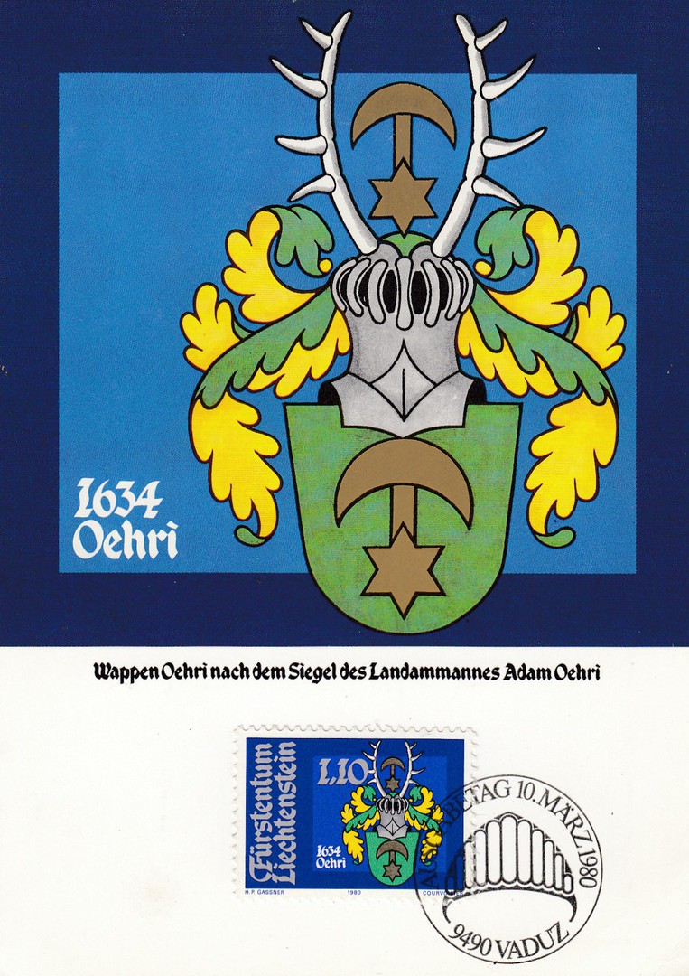
ARMS OF LANDAMMANNER (BALIFFS)
ARMS OF ADAM OEHRI
LIECHTENSTEIN
Franken 1.10 value stamp
Issued
10th MARCH 1980
Designed by
HANS PETER GASSNER
Stamp printed in Photogravure
By
Courvoisier SA
Maxi Card Published Officially by the Liechtenstein Postal Authority
Ref: MK/Nr. 14
16/07/2018
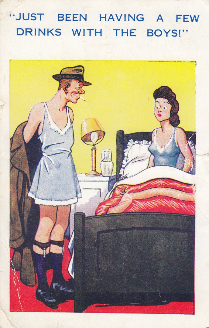
“JUST BEEN HAVING A FEW DRINKS WITH THE BOYS!”
Published by
INTER-ART, LONDON
In their:
COMIQUE SERIES
Ref: 631
This is quite a common joke, and a number of different publishers issued a cartoon card covering the same idea of a man coming home in a women’s cloths underneath his coat. The joke does not travel quite so well to today’s times and can be looked at in different ways now, especially as cross-dressing and other aspects of trans-gender nature are far better known to us all and can put a whole new meaning to this image. Originally of course the intent was to show that the man has been sleeping with another woman and has mistakenly put on her cloths in the dark before leaving to come home, probably whilst also being a little drunk. This copy here was posted out of Gravesend, Kent on the 8th August 1952.
16/07/2018
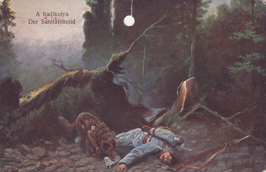
A HADIKUTYA
DER SANITATSHUND
WAR DOG
THE SANITARY HOUND
Unknown Publisher
(but there is a nice mounted medieval or Norman conquest era knight logo on the reverse side)
Ref: 126 – 1915
(does the 1915 perhaps refer to the date of production and/or issue of this postcard?)
In Hungarian ‘Hadikutya’ means ‘War Dog’ and I believe that is the words meaning in the context of the title of this postcard. From the image, quality of card and the design of the reverse side I would say this was from the first world war period, or immediately before that. At some point in its history someone has punched a hole in the top of this card, possibly to hang it somewhere like a room in a house or an office, possibly even a military office, but we shall never know where.
This was another of the 20p postcards I picked up last week, and despite the punched hole it is a lovely card.
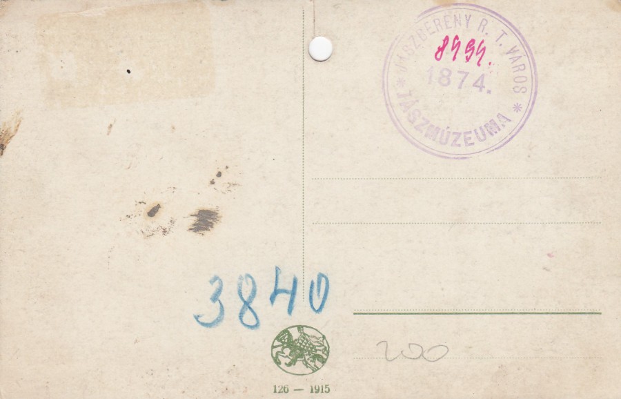
REVERSE SIDE OF ABOVE POSTCARD
Anyone having read through the many entries across the two and half years of this webpages postings would by now be well-aware that I love cachets and postal marks used on postcards. Here we have a nice cachet that reads:
JASZBERENY R. T. VAROS
* JASZMUZEUMA *
1874
If you place this into Google Translate it does not come up with anything in English but it detects the language as Polish. Having looked at this for awhile and checked the words through other sites I believe this to be a name and that this is a collector’s cachet which they applied to the cards in their collection. This was not a common practice, but it did occur, and more often abroad than in the UK. If this is the case, and I am correct, there will be other postcards out there with this same cachet applied.

16/07/2018
SANDOWN & SHANKLIN
Multi-View Postcard
Published by
THE PHOTOGRAPHIC GREETING CARD CO. LTD.
LONDON
Distributed by
WOOTTON WHOLESALERS, SHANKLIN 3538
Ref: 894
Top left: Battery Gardens, Top Right: Cliff Walk & Keats Green, Bottom Left: Cliff Walk & Lift, Bottom Right: Lake Slipway, Centre: Old Village.
The descriptive title for this card are a bit strange in their placement. There is no indication of which image they are describing, like I have down with the ‘Top Left’ etc., so when you turn the card around your brain places the titles in the same position, i.e., from the front the image top left is the one with the pier on it and is the Battery Gardens, but the description ‘Battery Gardens’ is printed top right on the reverse side, directly behind the front image – so, you could logically think that it was the ‘Cliff Walk & Keats Green’, as this is printed top right on the back! I thought this was a bit of a strange, even confusing way of doing this. Anyway, back to the card, which is a basic small modern ‘golden age’ sized multi-view postcard of very little value, but I liked the usage on the reverse side.
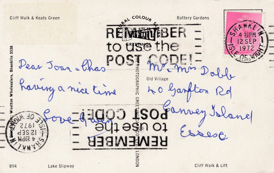
REVERSE SIDE OF ABOVE POSTCARD
You do come across postcards, and envelopes when they have been saved, which appear to have gone through the franking machine twice and been cancelled across the top as normal and then also cancelled across the bottom when the card was put through the cancel machine upside down. What I suspect happened was the card was initially incorrectly cancelled at the base, bottom, of the card by being wrongly placed upside in the machine and then had to be re-cancelled properly to place the cancel on the stamp as is required. Although I have a few examples of this happening this is a very nice example with clear sharp and well-placed slogan machine cancellations for:
REMEMBER
to use the
POST CODE!
SHANKLIN
ISLE OF WIGHT
12 SEP 1972
I also note that this was addressed to Canvey Island in Essex which is where I spent my first years as a police officer back in the late 1980’s early 1990’s.

15/07/2018
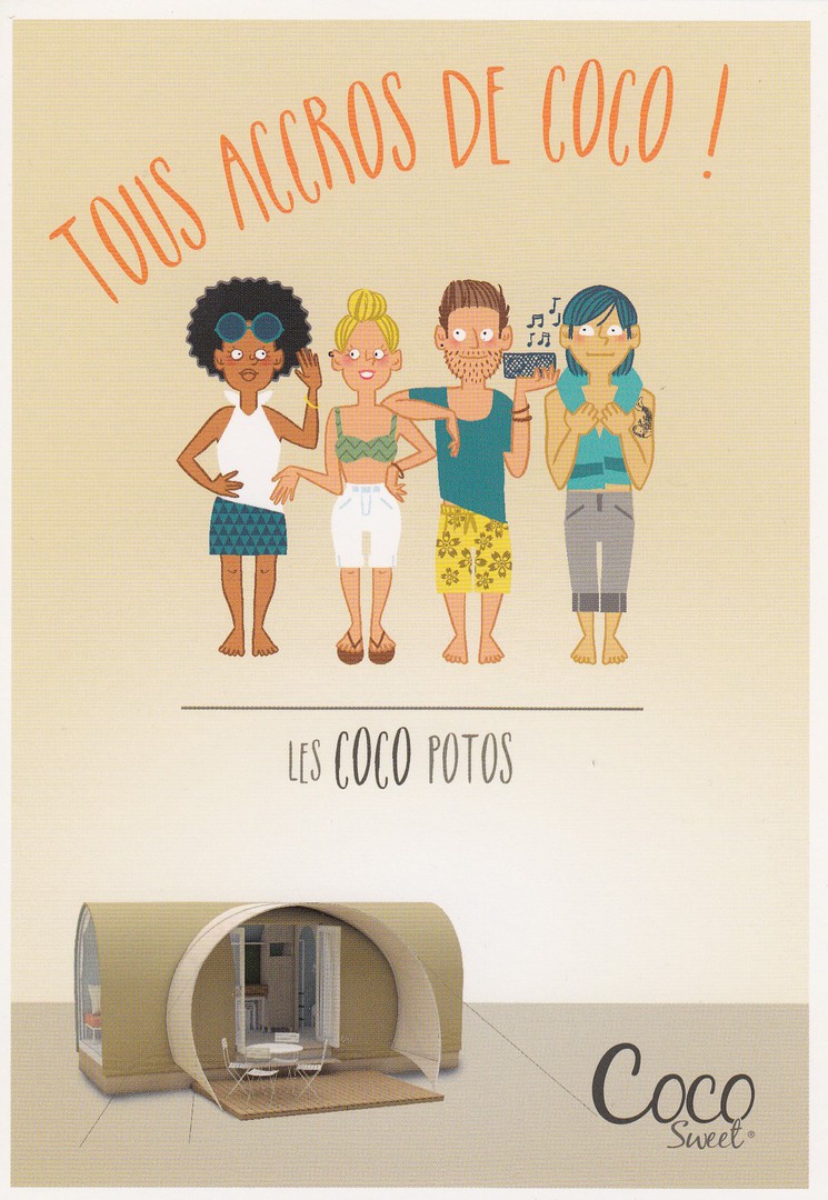
TOURS ACROS DE COCO!
LES COCO BAMBINOS
Official Advert Postcard
Coco Sweet Tent (mobile home)
I came across these three free advert postcards whilst in France one year. They are adverts for a tent, which is described as a mobile home – it’s a tent though. Each card has a different set of people drawn across the top with the idea being that this tent will appeal to all types of travellers and holiday people. My favourite is the middle one with the cycles. Over time the collecting of ‘Cycle’ related postcards has increased, and now it is a popular theme.

TOURS ACROS DE COCO!
LES COCO CYCLOS
Official Advert Postcard
Coco Sweet Tent (mobile home)
TOURS ACROS DE COCO!
LES COCO POTOS
Official Advert Postcard
Coco Sweet Tent (mobile home)
REVERSE SIDE OF ABOVE POSTCARD
All three cards have the same back
15/07/2018
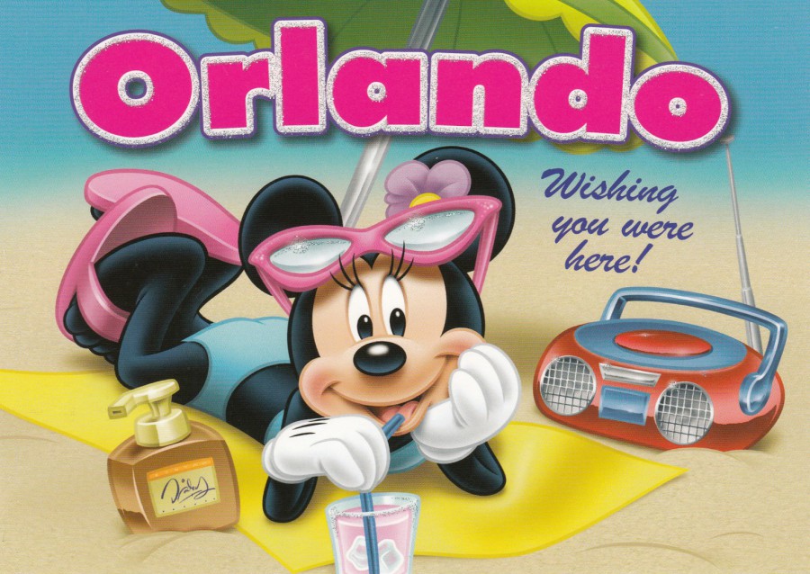
ORLANDO
WISHING YOU WERE HERE!
(MINNIE MOUSE)
Published by
THE POSTCARD FACTORY
Ref: PC57G-MN-OR 857
This design has added ‘Glitter Dust’ applied around the edges of the letters which make up the word ORLANDO.
This time next week I shall be waking up on my first full day in Orlando, having arrived after a 9 hour(ish) journey next Saturday. This will be our longest stay in America, in fact it will be our longest holiday ever! This is my retirement special holiday, one we have been planning for many years, and we are looking forward to it greatly. It is a special holiday and we have decided to take our Grandchildren with us – they are definitely looking forward to it – we pick up their cases today, so we can sort out the packing during the week as we pick our youngest up from his last day at school and drive straight to the airport to book our cases in before an overnight stay at a Gatwick Hotel (just across from the North Terminal – a short walk Saturday morning). Postings will continue during the holiday, but I suspect there will also be a large number of ‘facebook’ postings as well, so if you have not yet looked up my ‘facebook’ page then this could be a good time to do so – lots of stuff appears here which does not appear on the webpage – shops, postcard racks, interesting postal related stuff. I suspect I will even find some racks of these common Disney themed Orlando postcards which will appear here.
REVERSE SIDE OF ABOVE POSTCARD
15/07/2018
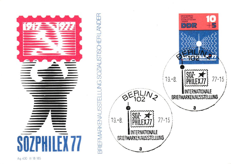
SOZPHILEX 77
Official East German (DDR)
Stamp Exhibition
Postal Stationery Post Card
A number of stamps, and small stamp sheets, were issued for this 1977 German stamp exhibition. I have collected all the philatelic material I can because the exhibition used the East Berlin Television Tower as part of the exhibitions logo. This appears on all the stamps and special hand stamps I have so far come across. The pre-printed exhibition stamp on this postal stationery post card was also issued as an actual postage stamp, again I have copies both mint and used on covers. Here the pre-printed stamp has been cancelled with the SOLPHILEX 77 official cancellation. This is an item from my television collection

SOZPHILEX 77
Official East German (DDR)
Stamp Exhibition
Postal Stationery Post Card
Another card from my collection re this stamp exhibition – this has a great drawing of the East Berlin Television Tower

15/07/2018
AUDREY HEPBURN UNISSUED
GERMAN STAMP
Free Auction House Publicity Postcard
I have previously shown a similar card by this auction house for the auction of a used copy of this stamp, which was depicted on the front of the card. I gave the long and interesting history around why the stamp was withdrawn and how a few copies remained in circulation, and their value – this is all on a blog dated 04/11/2016 (Under the Tab ‘November Blogs 2016’). This card shown here today depicts a mint bottom corner copy of the stamp which was auctioned off in 2017. This card makes a nice companion card to the original one – and they were both free.
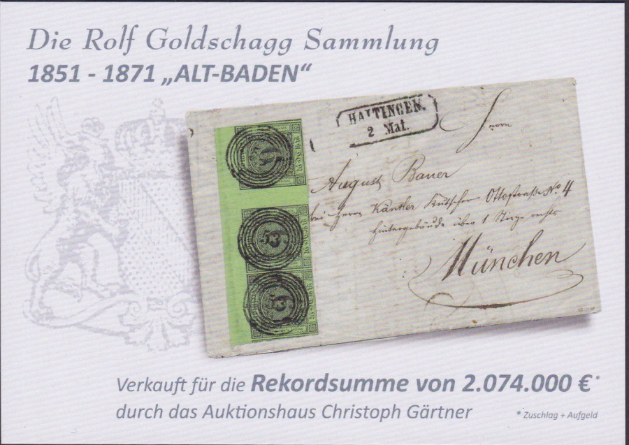
DIE ROLF GOLDSCHAGG SAMMLUNG
1851 – 1871 “ALT-BADEN”
This auction house has also given out free other advertising postcards (more information backed cards than true postcards, but nice none-the-less) which depict special philatelic items appearing in their auctions. This rare letter and stamps raised a record 2,074,000 million euro’s when it was sold.
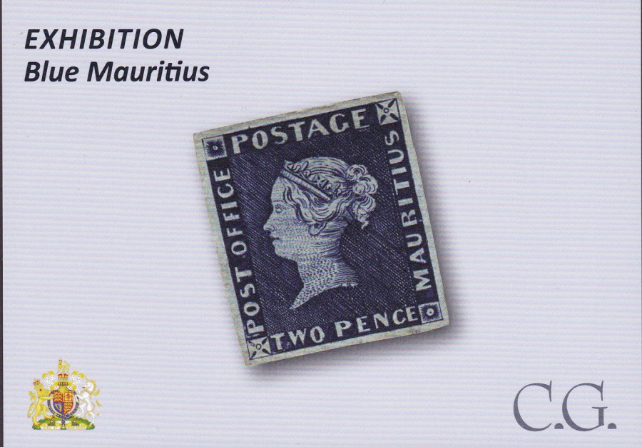
MAURITIUS
2 PENCE BLUE
One of the great rarities of philately and back in 2002 it was estimated to be worth £2 million. It was first issued in 1847, 21ST SEPTEMBER. The ones to look put for are those with the words POST OFFICE down the left side as these were the original issue. This was quickly changed to the more correct POST PAID. This stamp, and its companion the 1d orange red coloured stamp of the same design, were the first British Empire stamps produced outside the UK. In 1904 King George V paid the then record price of £1,450 for an unused copy of the 2d blue ‘POST OFFICE’ issue for the royal collection. There is a reported incident whereby the next day one of the King’s secretaries said to the King “some damned fool” had paid a huge amount of money for one postage stamp. The King is said to have replied “I am that damned fool”.
14/07/2018
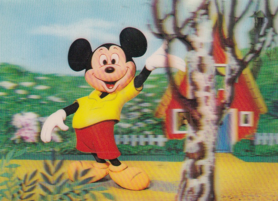
UNTITLED
MICKEY MOUSE
Printed in Japan
Although not shown on the segments of the card I can see I believe this was published by the Japanese company ‘TOPPAN’
This is a nice 3D postcard of Disney’s major character sent to me by my friend Frank in America (he is also known as the ‘Postcardist’). It arrived yesterday morning. It will go into my Disney collection because of the front image and for the reverse side and the stamps Frank has used to post it.
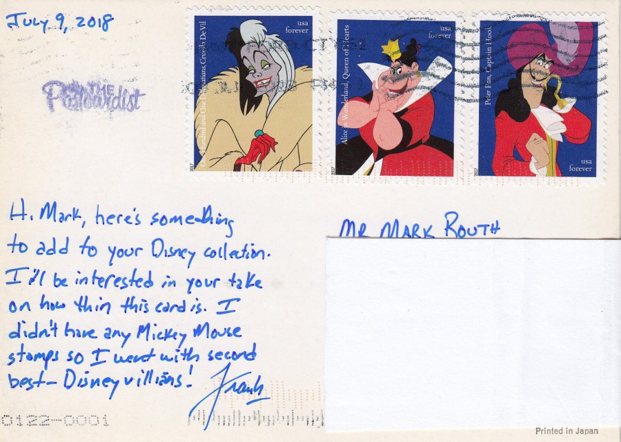
REVERSE SIDE OF ABOVE POSTCARD
Frank has used three of the USA ‘Disney Villains’ stamps which were issued in 2017, last year. I love these stamps and bought a full mint sheet of twenty stamps on my visit last year.

14/07/2018
UNTITLED
DREAMWORLD THEME PARK
Dedicated to fun and thrills. But what’s going on beneath the surface? Lies, crime, murder? Find out what they’ll never tell you…
DREAMWORLD – By Jane Goldman
Out in Paperback
Published by
BOOMERANG CINEMA
Free Rack Postcard
I picked this one up because of the silver coloured card which has been used, I like cards with different surfaced card. There is also the fact that this depicts the face of a cat, a computer styled cat face to be fair, but still obviously a cat. The book this free postcard is promoting was issued in 2000, so this card is 18 years old now.
14/07/2018
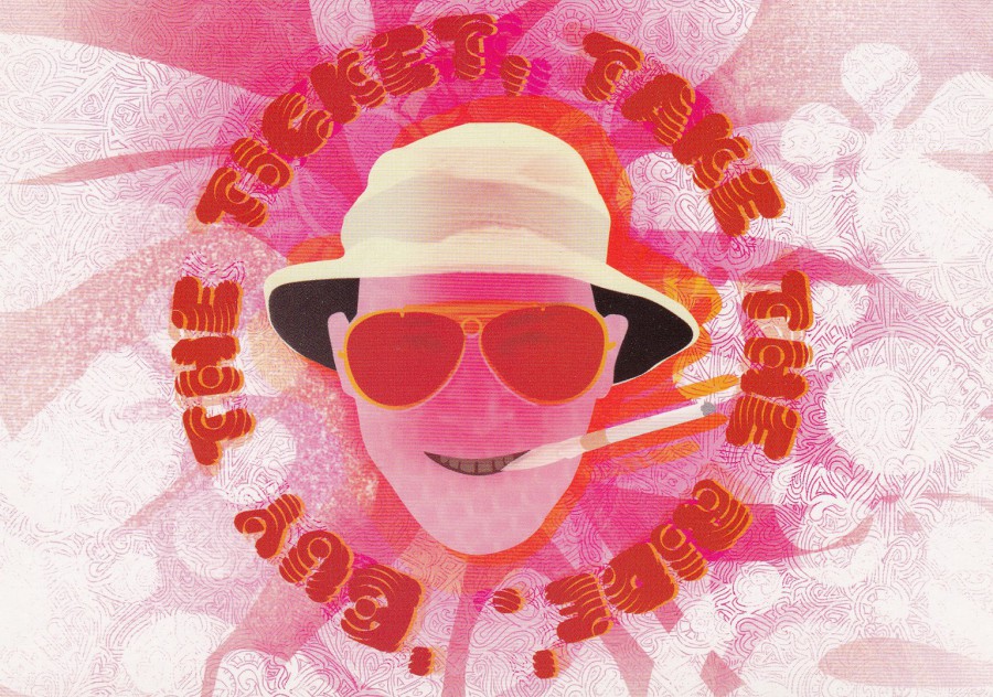
“BUY THE TICKET, TAKE THE RIDE”
Published by
BOOMERANG
In their:
“CINEMA IN CARDS”
Series
Ref: No 82
FEAR & LOATHING IN LAS VEGAS
Time for another postcard from this very large series of cards which depict a phrase or quote from a specific film. Some of these are easy to work out, some from the fact that the quote is famous, some from the design of the card and others from personal fandom for that film.
This is a film I have not seen, one which stars Johnny Depp as a drug fueled Raoul Duke. It is not one that is on my wish list to see if I am going to be honest, but it stars some well-known actors: Benicio del Toro, Toby Maguire, Christina Ricci, Cameron Diaz, Ellen Barkin, Gary Busey, Mark Harmon and the late Verne Troyer. So, perhaps I should give it a go because that seems like a good cast.
14/07/2018
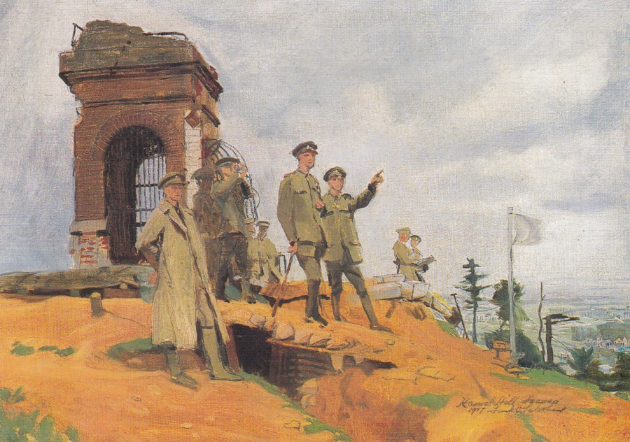
THEIR MAJESTIES VISITING
THE BATTLE DISTRICTS OF FRANCE
(MOUNT KEMMEL)
1917
By
FRANK O SALISBURY (1874 – 1962)
Published by
THE NATIONAL ARMY MUSEUM
1990
This is another of the superb 20p finds which I picked up earlier in the week. Military postcards are one of my favourite themes, especially artist paintings related to military conflict. This image depicts the top of Mount Kemmel, more properly called Kemmelberg (the French called it Mont Kemmel). This is a hill formation located in Flanders, Belgium about a kilometre outside the village of Kemmel. During World War I and the Fourth Battle of Ypres in April 1918 the German forces attacked the French here with gas grenades and forced the allied forces back and off the hill formation killing a large-number (it is recorded that thousands lost their lives) of French soldiers in the process. The hill was not retaken until late in September 1918, during the Battle of the Peaks of Flanders.
At the western foot of the hill there is a large war cemetery, the Kemmel No. 1 French Commonwealth War Graves Commission Cemetery which contains more than 5,000 French soldiers.

14/07/2018
RAGAZ,
TAMINASCHLUCHT
(Tamina Canyon)
Switzerland
Published by
GEBR. METZ KUNSTVERLAGS-ANSTALT, BASEL
Ref: 14910
Ragaz, or to be more correct ‘Bad Ragaz’ is in Switzerland, from where this postcard was posted in 1900. The image is of the narrow gorge known as Tamina Gorge (the translation of the title on this card came back as Tamina Canyon, which is also an apt title). The gorge is so narrow that only a few rays of sunlight penetrate, and this is at mid-day when the sun is directly above the gorge. This local landmark is about 15 minutes outside of Bad Ragaz, which is itself located in the Swiss canton of St Gallen in the district of Sarganserland. The image used here is a hand-coloured negative from a black and white photograph.
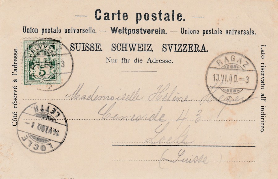
REVERSE SIDE OF ABOVE POSTCARD
This is beautifully used, nice and clean marks and with a pencil address. It is also an undivided back where only the address could be placed, as was standard with all postcards at this time. A Swiss definitive stamp has been applied and this has been cancelled with the local RAGAZ circular bridge hand stamp with another identical cancel applied on the right side – these are dated 13th June 1900 (13.VI.00). The postcard was addresses internally to another Swiss location – LOCLE, where it received an arrival cancellation dated 14th June 1900 (14.VI.00).
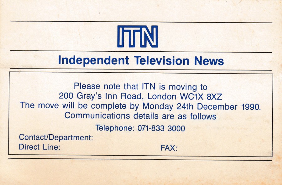
13/07/2018
ITN
INDEPENDENT TELEVISION NEWS
Official Notification of Move Postcard
When ITN moved address in 1990 they used this official postcard to notify people of their change of address. I love this type of postcard as they can be difficult to source. They were not sold to people and were printed for a specific use. The companies and people who did receive a copy would have kept it in their records, possibly filing the actual card or recording the details in their system and then throwing away the card. A copy may have been kept by ITN for their records (although I somewhat doubt they would have bothered – but some companies and organisations do keep archives). All this means that collectors like me have-to hunt around for the few copies that escaped out into our world. Fortunately for me a copy turned up on eBay and I obtained it. It is a simple card, with a very simple, very basic reverse layout – but as a television collector it is a great thematic postcard. It is also a piece of Television history as well of course.
REVERSE SIDE OF ABOVE POSTCARD
13/07/2018
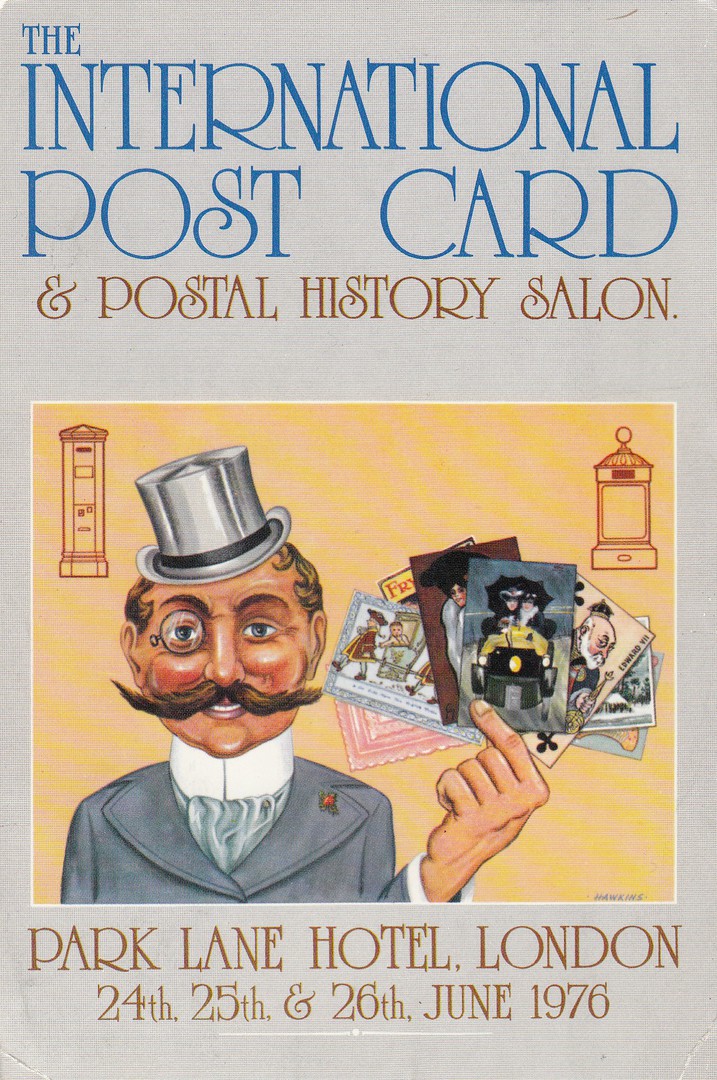
THE INTERNATIONAL POST CARD
& POSTAL HISTORY SALON
PARK LANE HOTEL,
LONDON
24TH, 25TH & 26TH JUNE 1976
Design by
HAWKINS
Official Event Postcard
This was a premier early postcard fair event here in the UK. In all my years of collecting I have only come across two examples whilst going through dealer’s stalls etc (I bought both – who says you don’t or cant have doubles in your collection! Stamp collectors often have more than one example of a stamp, and I collect postcards in a similar way, mint, used and different usages). I have always collected the postcards connected to ‘Postcard Fairs’, ‘Postcard Events’, Postcard Clubs’ and ‘National Postcard Week’ postcards as a single combined theme. It was once an extremely popular theme, but sadly it seems to have badly waned and is little collected by current collectors – is this because the issuing of new related cards has also heavily dropped off? Perhaps.
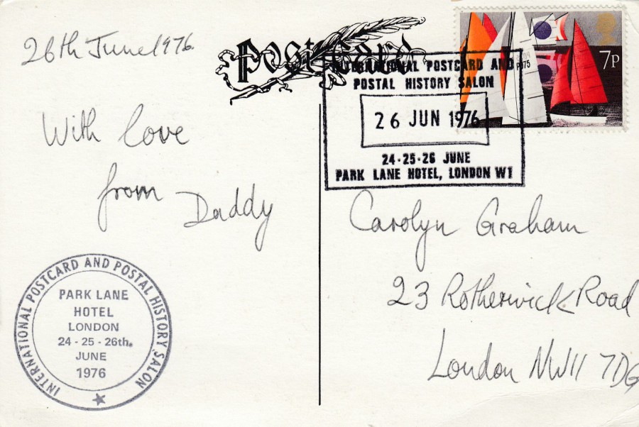
REVERSE SIDE OF ABOVE POSTCARD
This has the large circular ‘INTERNATIONAL POSTCARD AND POSTAL HISTORY SALON – PARK LANE HOTEL – LONDON – 24-25-26th JUNE 1976’ cachet applied bottom left. My other copy of this card also has this cachet applied. This copy here also has a 7p Sailing stamp applied which has been cancelled with the large official special hand stamp for the event:
INTERNATIONAL POSTCARD AND POSTAL HISTORY SALON
26 JUNE 1976
24-25-26 JUNE
PARK LANE HOTEL, LONDON W1
This hand stamp was available for each of the three days although here it is dated for the last day of the event. My other copy of this card, which I have had for many years and bought first, does not have this hand stamp applied. I was unaware of the hand stamp until I recently obtained this second copy. The combination of hand stamp and cachet makes this a much more interesting card.

13/07/2018
ADVENTURE THRU INNER SPACE
Presented by Monsanto
Official ‘Disneyland/Monsanto’ Postcard
“A view of Monsanto Company’s attraction “Adventure Thru Inner Space” in Disneyland. Located in the newly expanded Tomorrowland, the futuristic building houses a ride through the inner space of a snowflake, in a vehicle called an ‘Automobile’. The rider feels the unusual illusion of shrinking to the size of an atom”
(Text from reverse side of Postcard)
I do like the more unusual Disney park related postcards, and these are also the ones that seem to be sought by other collectors on eBay as well, and as a result they often cost more as well. The postcards related to this Monsanto sponsored attraction do seem to be of interest because the attraction has long gone. Anything which is no longer in the parks, and which people may have seen and remembered (possibly, and often, even fondly) has a nostalgic value as well.

REVERSE SIDE OF ABOVE POSTCARD
I like the little blue snowflake

12/07/2018
WANTED TO BUY:
ROADSIDE POSTCARDS
FROM KANSAS, OKLAHOMA, NEW MEXICO
NATIONAL POSTCARD WEEK 1990
HAL N. OTTAWAY
Design by
RICK GEARY
1990
Limited numbered edition of 300 cards
This is not the first Hal Ottaway postcard I have posted on the webpage, it is also not the first Rick Geary drawn design either, but here the two have come together to produce a cracking design. With there only being 300 produced it is also quite a hard postcard to obtain as well, especially as Rick Geary postcards are highly collected in both the US and the UK (although here in the UK interest has dropped off a bit – sadly). Personally, I have always been a big fan of Rick Geary and I have accumulated a quite substantial collection of his early postcard work.

REVERSE SIDE OF ABOVE POSTCARD
12/07/2018
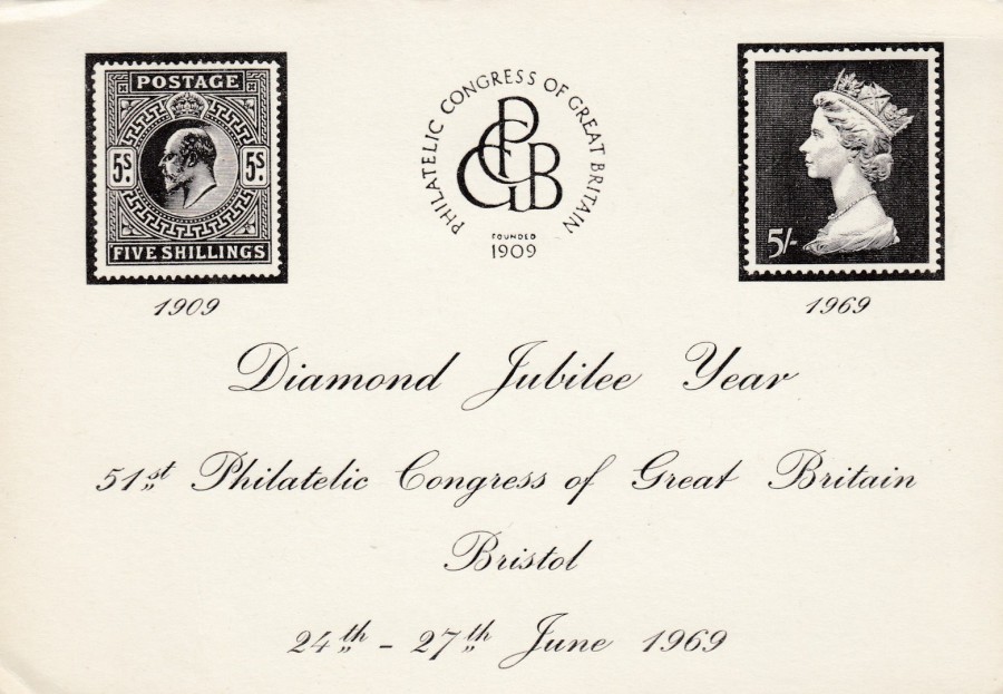
PHILATELIC CONGRESS OF GREAT BRITAIN
1969
DIAMOND JUBILEE YEAR
51ST PHILATELIC CONGRESS OF GREAT BRITAIN
BRISTOL 24TH – 27TH June 1969
This was another of my 20p finds in the box in the Oxfam Shop on Tuesday. I have a collection of postcards and other items relating to the annual Philatelic Congress events. This one is plain backed, and almost looks like an invite card or ticket, whichever it may-be it is a nice card, in fact, for just 20p a very nice card.

12/07/2018
FIELD MARSHAL THE VISCOUNT MONTGOMERY
OF ALAMEIN K.G., G.C.B., D.S.O.
By
SIR OSWALD BIRLEY
Published by the
IMPERIAL WAR MUSEUM
Ref: Cat. No. LD 5915
One of the military celebrities of World War II, although I am aware that there are mixed views around his overall effectiveness and character traits. Despite these views he was and is still considered a hero to the British public. I remember when he died in 1976. He received a massive military funeral progression which I was fortunate to see on television because our English teacher decided that it was a better experience for us to watch this than have a proper English lesson. Our teacher, quite correctly as it happens, said that we would never get another chance to watch a funeral like this.
12/07/2018
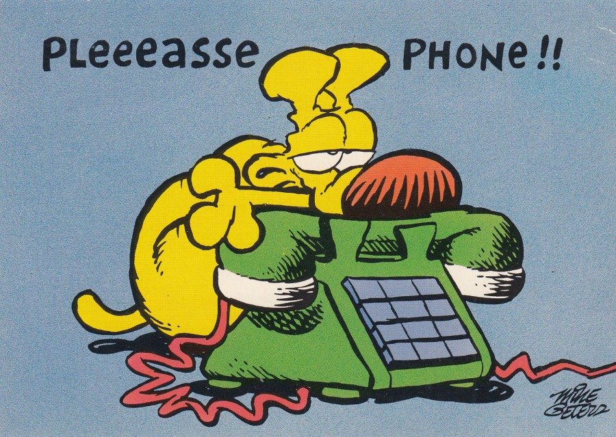
PLEEEASSE PHONE!!
Published by
HALLMARK CARDS INC
Ref: 20HZA 627-8
Copyright 1993
This is the cartoon dog from a syndicated cartoon strip called ‘Mother Goose and Grimm’ by Mike Peters of the ‘Dayton Daily News’. The cartoon was first syndicated in 1984 and was at one time distributed to 500 different newspapers. Grimm is the dog, otherwise also known as ‘Grimmy’. Hallmark issued a range of different cartoon postcards featuring Grimmy, and although not as well known in the UK as Garfield the cat these cards were on sale over here.
REVERSE SIDE OF ABOVE POSTCARD
I have always liked the fact that Hallmark work on the reverse side of their postcards

An example of one of the cartoon strips for you…it’s a good one.
12/07/2018
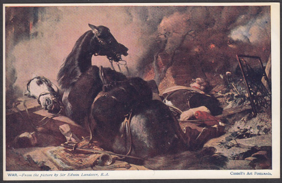
WAR
From the picture by
SIR EDWIN LANDSEER, R. A.
Published by
CASSELL’S ART POSTCARDS
I think Landseer’s most famous painting is the one depicting the Stag, but I think this military themed painting is one of his better ones, and it catches the feel of the loss of life that resulted (and still does result) from military conflict.

TOP OF THE REVERSE SIDE OF ABOVE POSTCARD
There is noting along the bottom of this one, so I have only depicted the top strip which has the superb company logo in it
12/07/2018
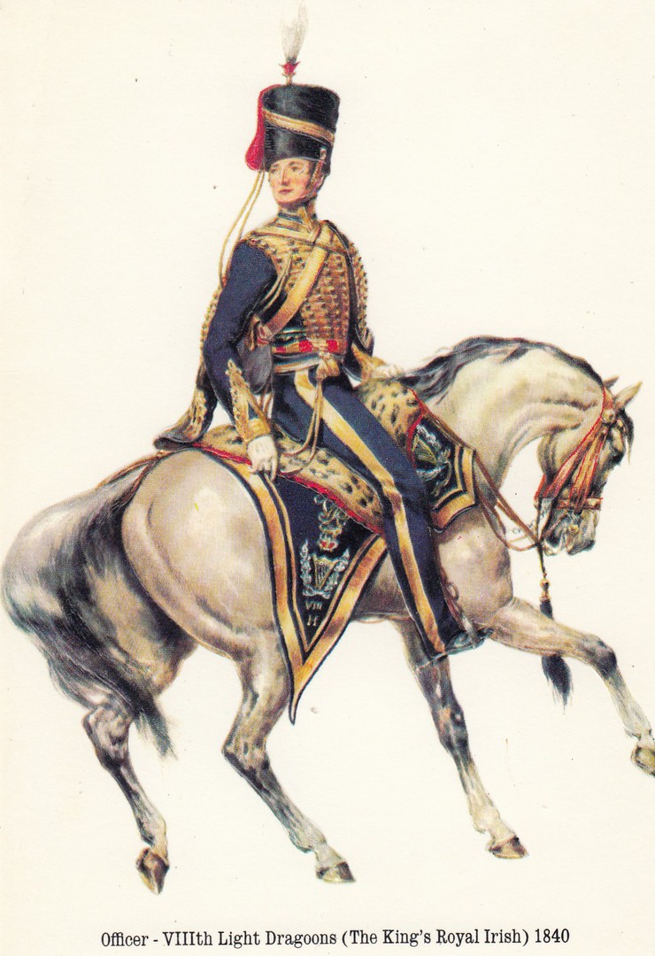
OFFICER
VIIIth LIGHT DRAGOONS
(THE KING’S ROYAL IRISH)
1840
‘EMBOSSED IMAGE’
(Embossed means the figure is raised upwards out of the card – I am sure you all already knew this, but, just in case, explanation never hurts)
Unknown Publisher / Printer
Plain Backed Card.
I found this lovely embossed card in a 20p box in an Oxfam Book Shop (in Chelmsford). Although this is a plain backed card the embossing effect is so good (although this does not show up on this scan) I had to still have at… and it was just 20p!