
06/12/2016
GEORGES RODENBACH
By
DHUMER-LEVY
‘MENU CARD’
Every so often I buy a collection, or someone sends me a bunch of cards and other card like items. The postcards are clearly of interest to me and I enjoy sorting through bundles. A few years ago, now, I bought a collection of around 200 cards which contained items from all over the world. Amongst this collection was this item. It is a painting by an artist called Lucien Levy-Dhurmer (30th September 1865 to 24th September 1953 – and yes, the spelling is like this and not as above and on the actual item). It depicts a portrait of Georges Rodenbach (circa 1895 pastel on paper). Rodenbach was a French poet and novelist. Although this item was amongst postcards it was not until I turned it over that I discovered that it is in fact a ‘Menu’ card. Unfortunately, it is a blank menu card, but I still found it interesting and have kept it in my collection of miscellaneous card items. It is clearly French and was printed in Paris.
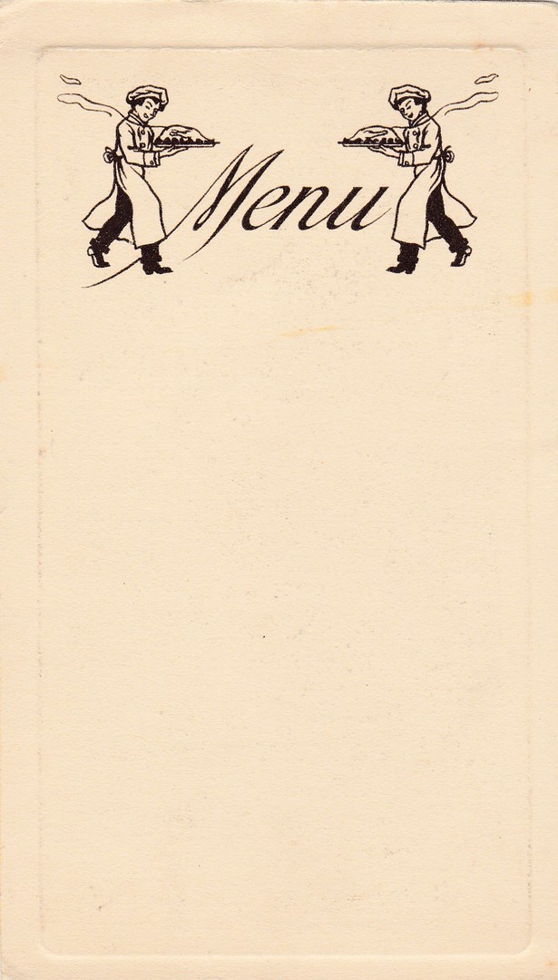
REVERSE SIDE OF MENU CARD
As already stated this is plain backed except for the title which incorporates two waiters/cooks carrying trays of steaming food. It is this reverse side which I like the best, and which lead to me keeping this item. It’s clearly not a postcard, but I am keeping it anyway.
06/12/2016
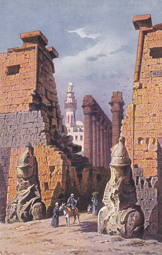
TEMPLE A’ LUXOR
(TEMPLE AT LUXOR)
Ref: R 148
This is a fantastic early postcard depicting artwork of the Temple of Luxor in Egypt. I bought this postcard because in 2008 I visited this temple and walked through this very area. My copy here is mint so has no stamp or postmark with which to date it (and there is no written message upon the reverse side which might contain dating information). Despite the lack of detail’s I believe this to be a pre - WW1 postcard.
06/12/2016
SPOT THE DOG
Unknown Printer/Publisher
But copyrighted to the writer and creator of Spot, Eric Hill - 1997
For a while Spot the Dog was everywhere, television, books, toys and just about every other childlike product you can think of. Of course, postcards were also issued. It is fair to say that Spot has lost his popularity with the children of today but those of us still collecting all television related postcards can still find lovely postcards like this one.
The character first appeared in books by Eric Hill, with the first one being called ‘Where’s Spot’ published in 1980.
REVERSE SIDE OF ABOVE POSTCARD
This is another postcard which has a nice reverse side which is equally collectible
06/12/2016
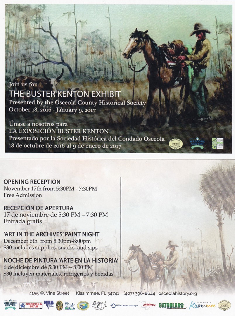
THE BUSTER KENTON EXHIBIT
Presented by the Osceola County Historical Society
October 18th 2016 – January 9th 2017
This is a free postcard that I picked up whilst attending a Pioneer Day open day event at an outdoor museum in Osceola County, Florida.
Ernest L. “Buster” Kenton specialised in delicate ink etchings and oil paintings depicting cowboys and their homesteads and pastures. Being a lifelong resident of Kissimmee his artwork is extremely popular and seen hanging in churches, cafes and houses all over the county. KENTON passed away in 1991.
TOP
Front of Postcard
BOTTOM
Reverse side of postcard
Two years ago, I went for a two-hour horse ride on a cracker cattle farm, in Florida. We rode through the swamps and wooded areas which looked exactly like that which is depicted on this painting. For that reason alone, I really like this postcard.
06/12/2016
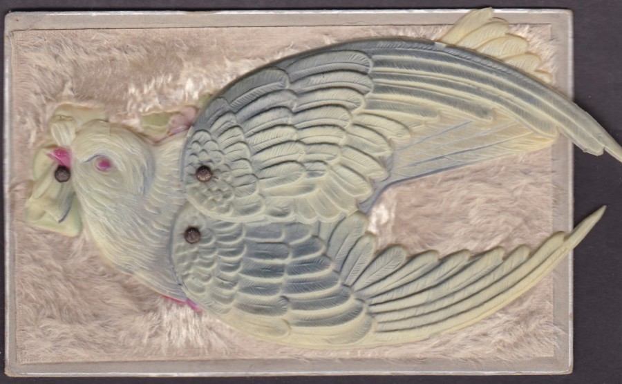
MECHANICAL POSTCARD
“BIRD”
Printed in Germany
AMERICAN POSTCARD
This was my favourite buy in America on my visit to Florida last month. I found it on a stall at the outdoor antiques fair mentioned in previous postings. This type of early novelty postcard was always going to attract my attention. The postcard has a plastic bird applied to the front. To this bird has been added two plastic wings which are on rivets which allow them to be swung out and moved around. This was priced at $30, which although a reasonable price, even in pounds, was still worth a little bartering over. In the end this came my way for a very reasonable $25, I was very pleased with it. Here you can see the postcard with the wings folded in, although they still protrude out a little at the back.

MECHANICAL BIRD POSTCARD
This is the same postcard with the plastic wings expanded outwards. As you can see the wings move out quite a bit and in this position the postcard becomes even more attractive.
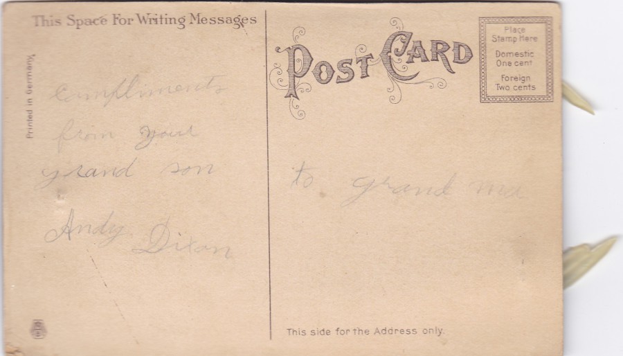
REVERSE SIDE OF ABOVE POSTCARD
No publisher is shown on this postcard although there is a logo bottom left, but I do not know which company used this
06/12/2016
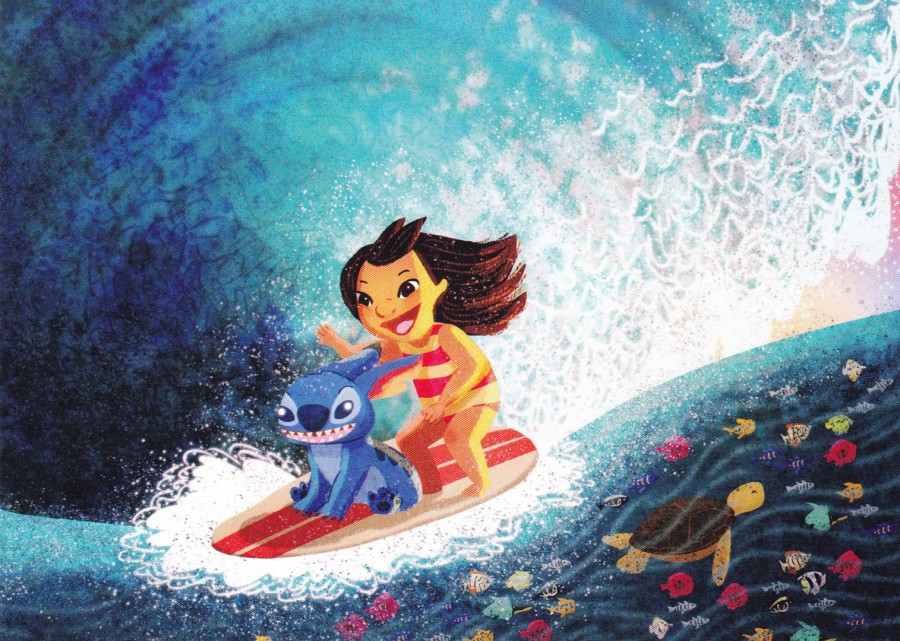
WONDERGROUND GALLERY
WALT DISNEY WORLD
FLORIDA
Original Artwork of
“HAWAIIAN ROLLERCOASTER”
By Artist
Nidhi Chanani
As promised after last night’s introduction posting to the world of the ‘Wonderground’ postcards here is Tonight’s ‘Wonderground’ Disney postcard. This one depicts artwork of the characters Lilo and Stitch surfing. I think this one is attractive and is a good example of the type of images issued on these postcards.
05/12/2016
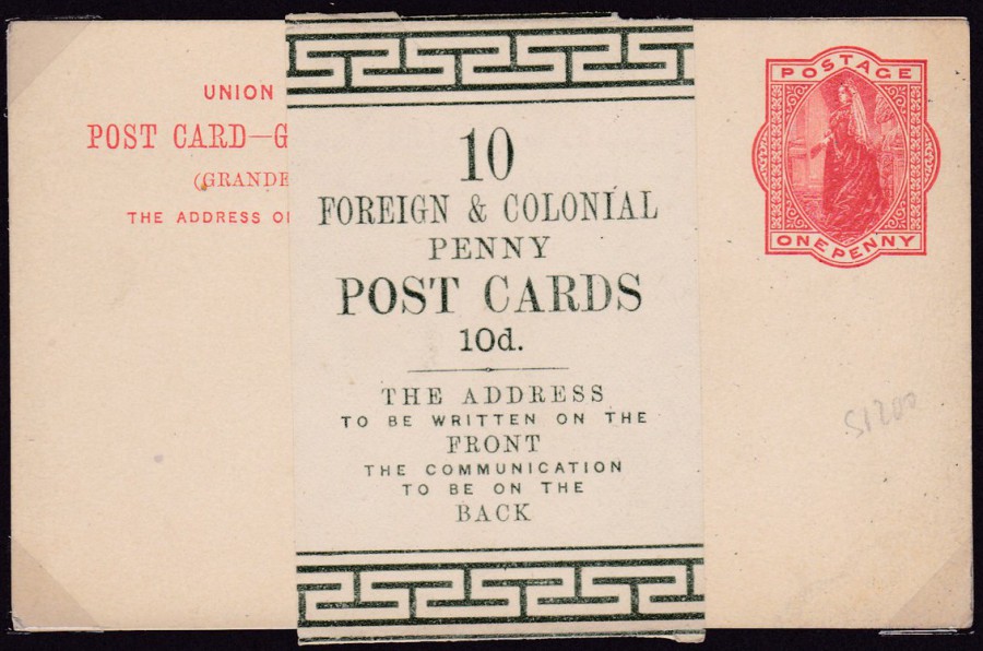
10 x FOREIGN & COLONIAL
PENNY
POST CARDS
10d
POSTAL STATIONERY CARD & WRAPPER
Circa 1892 Universal Postal Union (Union Postale Universelle) 1d Post Card with scarce original green wrapper. This postal stationery card has a lovely Queen Victoria pre-printed One Penny stamp which was an exclusive design for postal stationery cards. The card is described in the ‘Higgins & Gage World Postal Stationery Catalogue – Great Britain’ as ‘1892 One Penny orange red on Buff card (reference 21)’. The postal stationery card itself is quite easy to obtain and reasonable in value, but the wrapper around this card is much more difficult to find. These are the type of things that I like to find and when they turn up I am happy to pay the proper higher price for them (£25).
05/12/2016
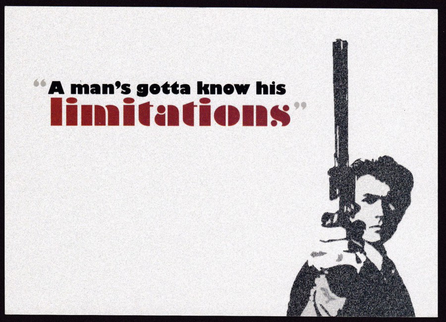
“A MAN’S GOTTA KNOW HIS LIMITATIONS”
From the Film
MAGNUM FORCE
Published by
BOOMERANG MEDIA
In their -
‘CINEMA IN CARDS SERIES’
Ref: No 149
Director: Ted Post (1973)
This was a long running series from Boomerang and although simple in concept and design and, often, what was depicted, it was a good idea, and I thought it was an interesting set. I don’t have a full set but I do have quite a few. This is one of the better ones.
Also, by coincidence, I am watching another ‘Harry Callaghan’ film as I am typing this. I am watching ‘Dead Pool’, which is perhaps not one of Clint Eastwood’s best Harry Callaghan films, but then a less than best ‘Dirty Harry’ film is still better than many other films in this, or any other genre.
05/12/2016
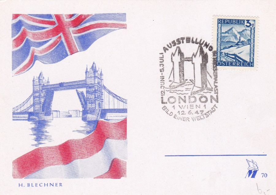
AUSSTELLUNG
LONDON
12TH June 1947
IM MESSEPALAST
BILD EINER WELTSTADT
WIEN
PICTURE A WORLD EXHIBITION, LONDON 12TH June 1947 The Trade Fair Palace – VIENNA
Special Exhibition postcard with an image of the Tower of London with the Union Jack flag above and the flag of Austria below. The stamp used on this card is a 1945 3g blue view of Lermoos (SG 923).
The cancellation on the stamp is for the city of Vienna (Wien) and is dated 12th June 1947, the first day of this exhibition that ran until 5th July 1947.
This is a nice philatelic item but I can-not find out anything about the actual exhibition, and do not even know if it was held in London with an Austrian stand or held in Vienna, as per the hand stamp, and thus hand stamped there. Whatever its actual source it is a nice early post WWII card.
05/12/2016
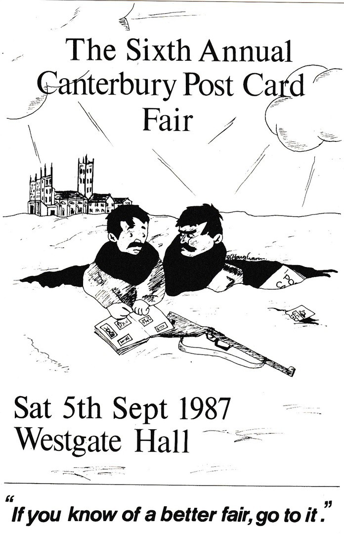
THE SIXTH ANNUAL CANTERBURY POST CARD FAIR
Sat 5th Sep 1987
Westgate Hall
“If you know of a better fair, go to it”
Published by the
CANTERBURY AND EAST KENT POSTCARD CLUB
‘with acknowledgement to Bruce Bairnsfather’
The design used here on the Postcard Fair publicity postcard (which in just under a year will be 30 years old – hard to believe) is based on a world war one cartoon which was drawn originally by Bruce Bairnsfather, a WW1 soldier and artist. The original drawing is titled ‘If you know of a better ole’ go to it’, the soldiers being in a bomb crater and still being shelled. This cartoon was (is) a well-known sketch and was issued on a postcard during the war. So, here you have a modern postcard based on an original postcard. Simple, but effective.
05/12/2016
WONDERGROUND GALLERY
WALT DISNEY WORLD
FLORIDA
I have mentioned, and depicted, a couple of these oversize (slightly less than A5 size) postcards which are Disney Theme park exclusive designs. They are sold in specialist shop areas called ‘Wonderground Galleries’ and in some of the shops located throughout the theme parks. I have been interested in these postcards since I first discovered of their existence. The issue for me is the cost, both at source, where these are $4.95 each, and on the second-hand market via eBay and the like where they are considerably more, mainly due to the postage costs placed on these by the sellers. This means that I only really pick up copies on my visits to the theme parks themselves.
Despite the cost I like these and buy those I can find when in Florida, as I was a couple of weeks back. Over the next few weeks I intend to show you some of those I obtained.
First up we have four which depict ghosts related to the ride and attraction known as ‘The Haunted Mansion’. If I am right I think these are the ghosts at the end of the ride that hitch a ride with you in your buggy.
WONDERGROUND
ORIGINAL ARTWORK
OF
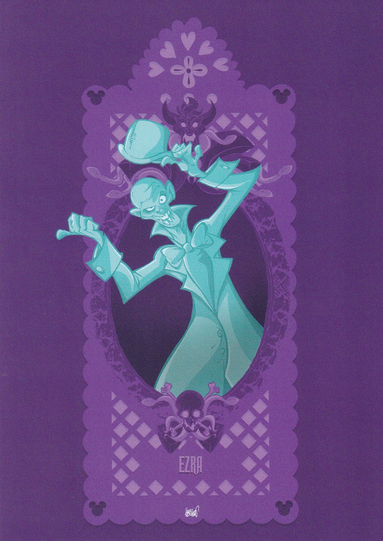
“DIA DE MUERTOS PAPEL PICARDO EZRA”
By Artist
FRANCISCO HERRERA
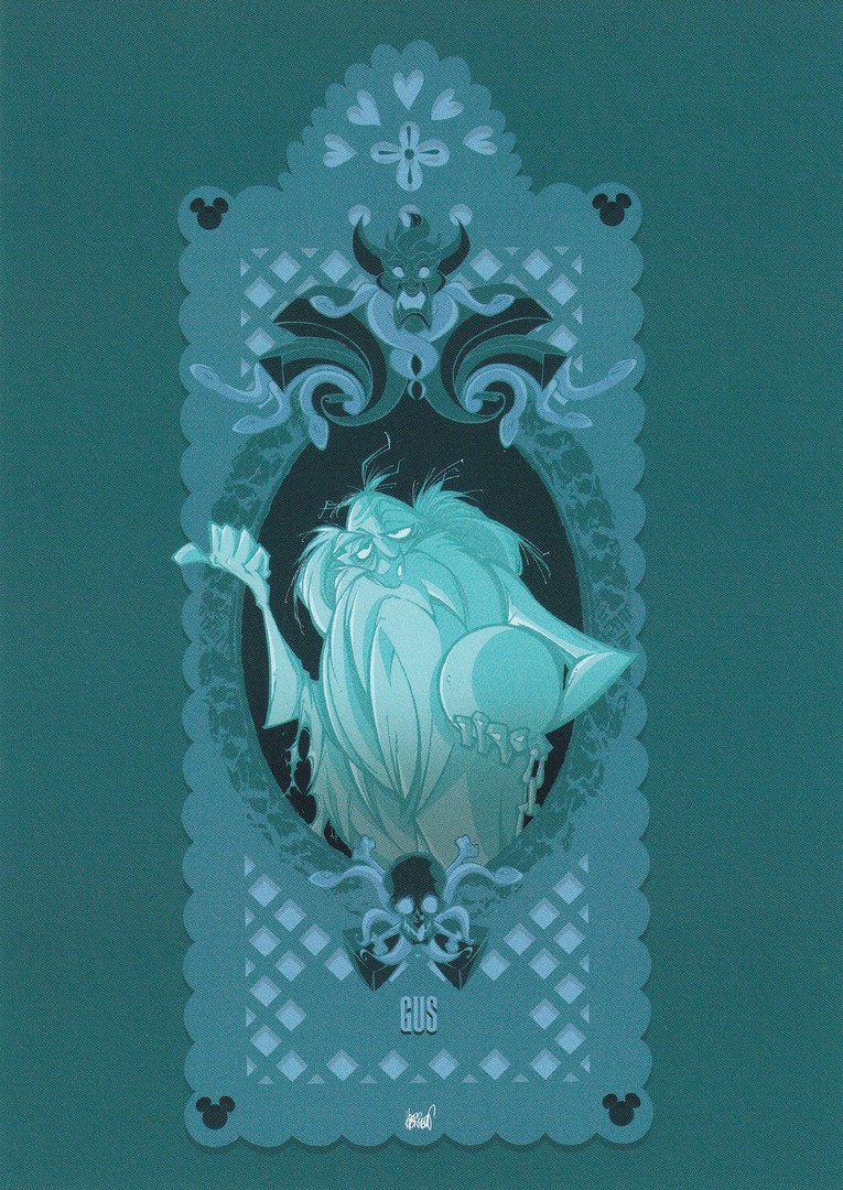
WONDERGROUND
ORIGINAL ARTWORK
OF
“DIA DE MUERTOS PAPEL PICARDO GUS”
By Artist
FRANCISCO HERRERA

WONDERGROUND
ORIGINAL ARTWORK
OF
“DIA DE MUERTOS PAPEL PICARDO PHINEAS POCK”
By Artist
FRANCISCO HERRERA
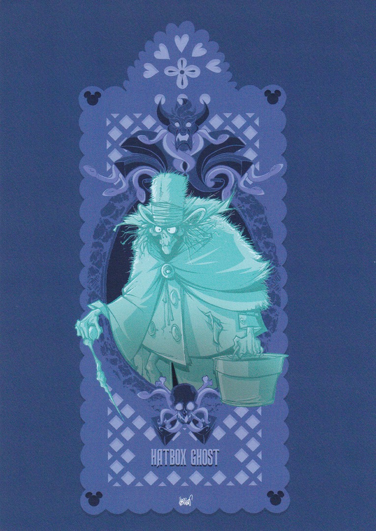
WONDERGROUND
ORIGINAL ARTWORK
OF
“DIA DE MUERTOS PAPEL PICARDO HATBOX GHOST”
By Artist
FRANCISCO HERRERA
Watch out for more Wonderground postcards over the coming days and weeks
04/12/2016
PHOTOGRAPH
03/12/2016
I posted yesterday a load of postcards from the Party Pack I found in America. I have said before that these are not available in the UK. But, the closest I have found are these ‘fold over’ invite card packs which are on sale in my local branch of ‘Wilkinson’s’. The images used on these are partial pieces taken from the items I picked up in the US so I assume are by the same or similar company. I picture them here for interest – maybe we don’t get the postcards because we do not have a tradition of sending ‘thank-you’ letters/cards to those who attended after the party! I take it they do in America.
PHOTOGRAPH
03/12/2016
The Captain America and The Hulk image are both on the postcard from the American pack - see yesterdays posting - So we in the UK are getting part of the package, but, sadly not the postcards...
04/12/2016
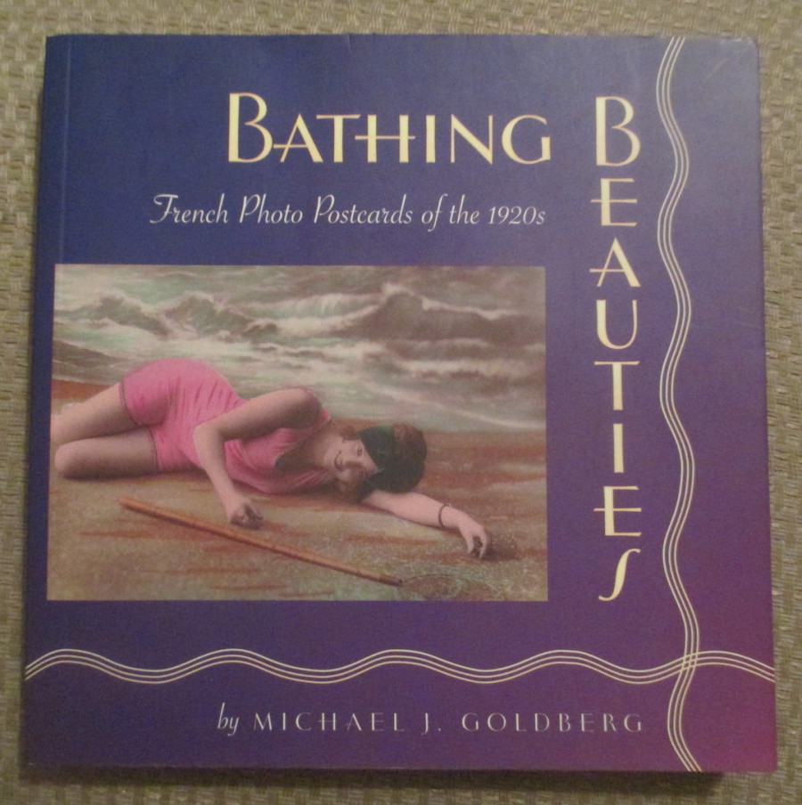
BATHING BEAUTIES
French Photo Postcards of the 1920’s
By
Michael J. Goldberg
Yesterday I picked up this book at my local ‘Oxfam’ charity shop for just a few pounds. I have a thing for charity shops and nearly always look in them to see what books they have. My speciality is early TV related books but I also have a collection of Postcard related books. This one here is an American publication so it was quite a find for me here in the UK.
04/12/2016
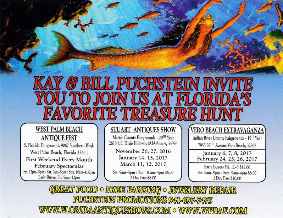
KAY & BILL PUCHSTEIN INVITEYOU TO JOIN US AT FLORIDA’S FAVOURITE TREASURE HUNT
Free Advertising Postcard
MERMAID
Many years ago, I met a couple of collectors at a fair and was chatting to them about collecting in general, and obviously asked them what they were looking for. They were friends and both collected
Maritime related themes. One of them said his specialist collection was ‘Mermaids’ and ‘Mermen’. This sounded like a very interesting topic and I have always been interested in what is called Cryptozoology (the technical word for the study of folklore creatures from myth and legend, including such other well-known creatures like the Yeti and Bigfoot, and searching for long extinct creatures like dinosaurs in the jungles of Congo, or Moas in the dark reaches of wild New Zealand). He did say that he rarely came across any and that they were scarce. Since then I have always picked up any mermaid cards I have come across as he sparked an interest in me and I wanted to see just how hard they were to find.
This one here has a smashing mermaid picture on it and it had the added bonus of being a free postcard which I picked up at the outdoor antique collector’s fair I attended in Florida last month. I depict here to show what can be found by just always looking on every counter.
(p.s. Mermaid cards have become a little bit more easier to find with modern postcards but the theme is still one where there is not a great deal of postcards around - it is a really good theme for someone who likes a good hunt to find anything new)
REVERSE SIDE OF ABOVE POSTCARD
As I am depicting their free postcard it seems only proper to show you the reverse side as you never know, you may find yourself in the area for one of these.
04/12/2016
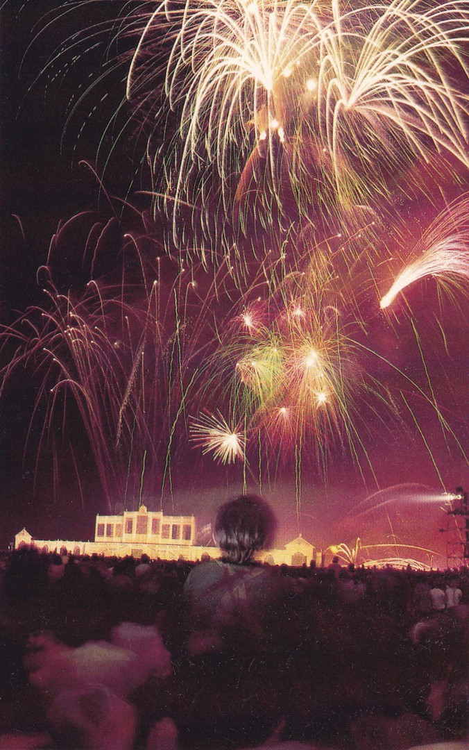
THE ROYAL FIREWORKS
28TH July 1981
Published by
Coral-Lee
Ref: CL-RW Ser. #1
“An unprecedented display of fireworks etched the sky over Hyde Park, London, on the night before the royal wedding. As royalty and heads of state gathered, the British monarchy paraded in full panoply for a grand occasion of love. Three quarters of a million TV viewers were mesmerized by the resplendent rituals and regalia, beginning with fireworks, surpassing George II’s 1749 historic display that signalled the ending of the Austrian War in 1749.
July 28, 1981”
(Text from reverse side of Postcard)
The fireworks in question were held the night before the royal wedding of Prince Charles and Diana Spencer. These days of course firework displays occur far more often, and the New Year’s Eve display in London is truly outstanding. But, back in 1981 public firework displays were unknown, which is why this one was considered so special at the time. On the night in question Hyde Park was packed with 1000s of people. Prince Charles and the royal family, The Queen, Prince Philip, Prince Andrew, Prince Edward and Princess Anne, and the heads of state and the monarchy of many countries, including Prince Rainer and Princess Grace of Monaco, and the members of Parliament, including the Prime Minister Margaret Thatcher, were all in attendance. Nancy Reagan attended on behalf of her husband, President Ronald Reagan who had been shot in an attempted assassination on 30th March that year, and was therefore unable to attend himself.
All the dignitaries arrived either by bus or by limousine (it was mainly the British Royal family members who arrived by car). These vehicles had to drive along the roadway through Hyde Park to their seating area. This route was lined by hundreds of scouts, all bearing torches to light the way. I know this because I was one of those scouts. I was placed right at the seating area end and I saw the arrival of everyone mentioned above. I also of course had a grand stand view of the firework display as well.
This is why, when I saw this postcard on a stall at an antiques fair in America, last month, I knew I had to have it. I did not know that there was a postcard produced but this American one clearly was – it had to come my way.
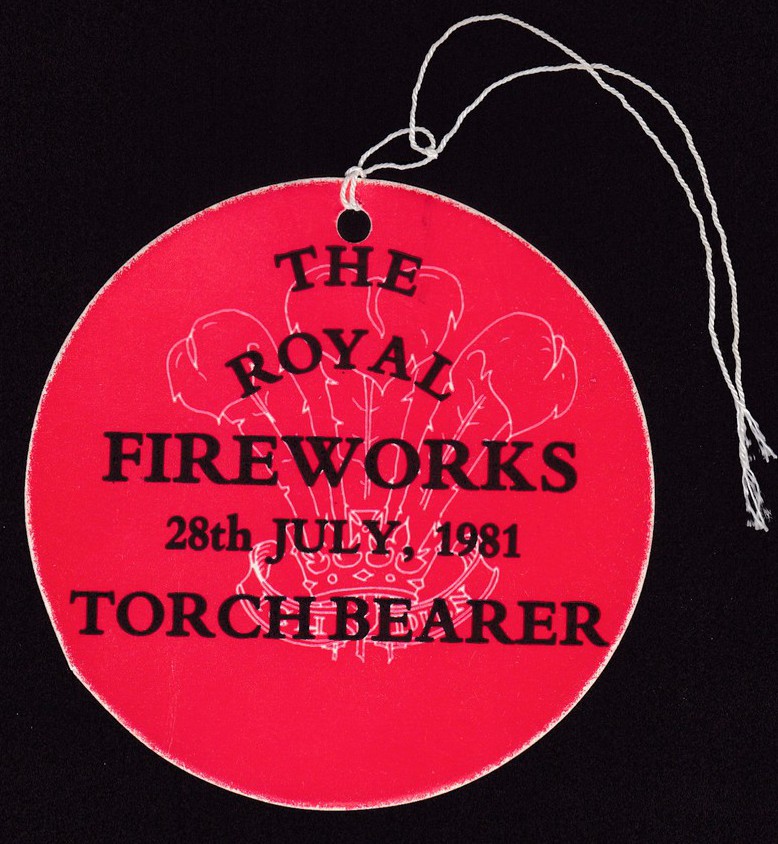
THE ROYAL FIREWORKS
28TH JULY 1981
TORCHBEARER
Official Pass
When I got home from America I had a search through my boxes of bits and pieces from my past and found my very own official Torchbearer card pass. I know it is not a postcard but you have to admit this naturally goes with the above postcard. I was 18 years old when I attended this event and I have kept this pass ever since as my personal memento of what was an amazing night for an average 18yr old Venture Scout.

03/12/2016
PARTY INVITATION & THANK-YOU POSTCARD PACKS
“PARTY PACKS”
Part One
These appear to be an American thing as I have still not found them here in the UK, or for that matter anywhere else. I normally get my packs from a ‘Walmart’ store in Florida whilst I holiday there. It is a shame that they are not more easily available as I think these are really nice items.
Each pack contains eight ‘fold over’ (normally) invitation cards (greetings card styled) and eight ‘Thank-You’ postcards along with eight envelopes. The eight invitation cards all have the same design whilst the eight postcards also all have the same design but this is a different one to that used on the Invitations. The packs are normally around $3.49 to $3.99, which I think is a reasonable price (although you do of course end up with 8 of the same postcards).
So, here is the first selection of the packs that I have bought over the past couple of years, and their contents. The photographs depict the full, unopened packs. It is the front of the Invitation card that can be seen at the front of the packages:
FAR LEFT
Mickey Mouse
MICKEY MOUSE CLUBHOUSE
Published by ‘DesignWare’
NEAR LEFT
Minnie Mouse
MINNIE
Published by ‘DesignWare’

TOP
Mickey Mouse ‘THANK-YOU’ postcard
This is a really nice postcard which features both Mickey Mouse and Pluto
BOTTOM
Minnie Mouse ‘THANK YOU’ postcard
PHOTOGRAPH
FAR LEFT
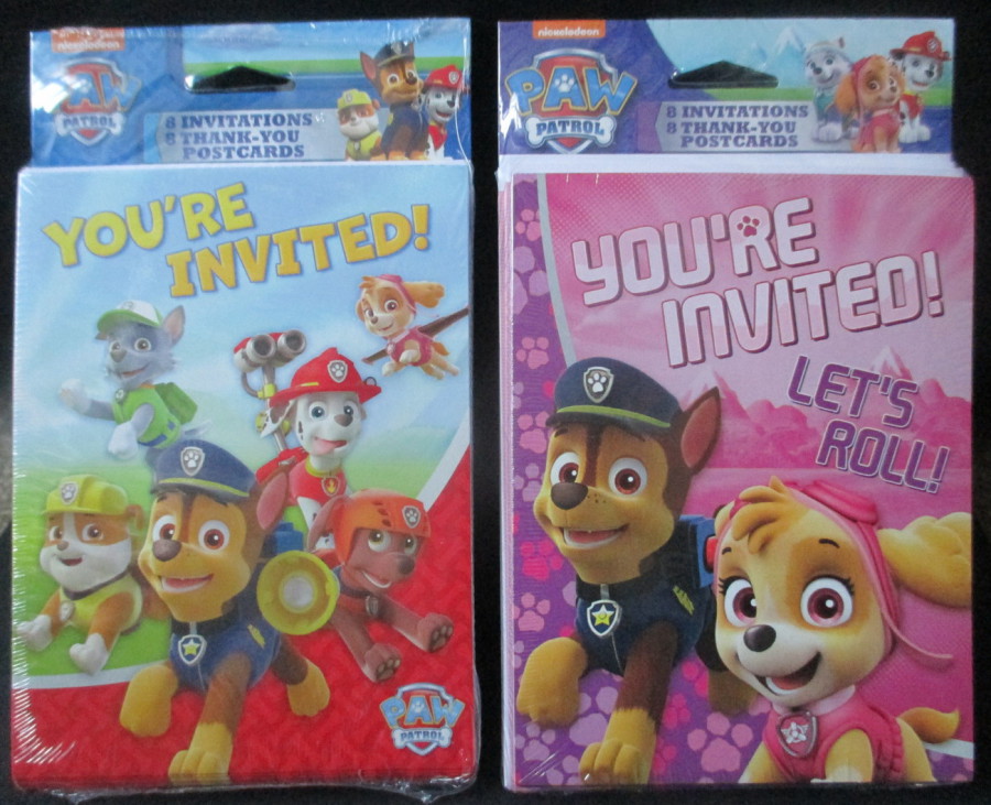
Paw Patrol – blue topped Pack – “YOU’RE INVITED”
Published by ‘DesignWare’
I bought this pack last year but it was still available this year as well
NEAR LEFT
Paw Patrol – pink topped Pack – “LET’S ROLL”
Published by ‘DesignWare’
This year was the first time I had come across this particular pack and I think it might be a newer pack
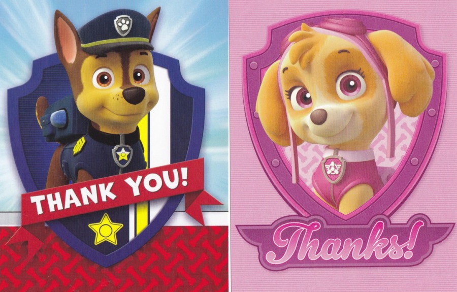
FAR RIGHT
This is the postcard from the “YOU’RE INVITED” pack. I believe it features a character called ‘Chase’ (but that is a guess as I have never seen this programme and I am working on information from the internet). It is a nice postcard though and these two here are the only postcard I have in my television collection which relate to this series.
NEAR RIGHT
Obviously, this postcard is therefore from the “LET’S ROLL” pack. This would appear to be a female character from the series. I am guessing again but I believe she may be called ‘Skye’ – I suspect any child under 10 would be able to confirm these details for us…!
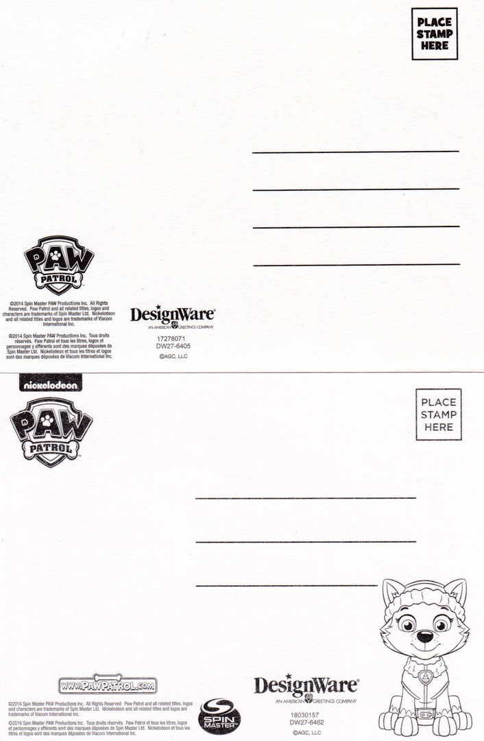
REVERSE SIDE OF ABOVE TWO POSTCARDS
It is not my intention to show the reverse sides of all of the postcards, but some do have some attractive additions, like the bottom one here which has a little drawing of one of the puppies. The top reverse side is more typical of the issued postcards and comes with the shows logo.
PHOTOGRAPH
FAR LEFT
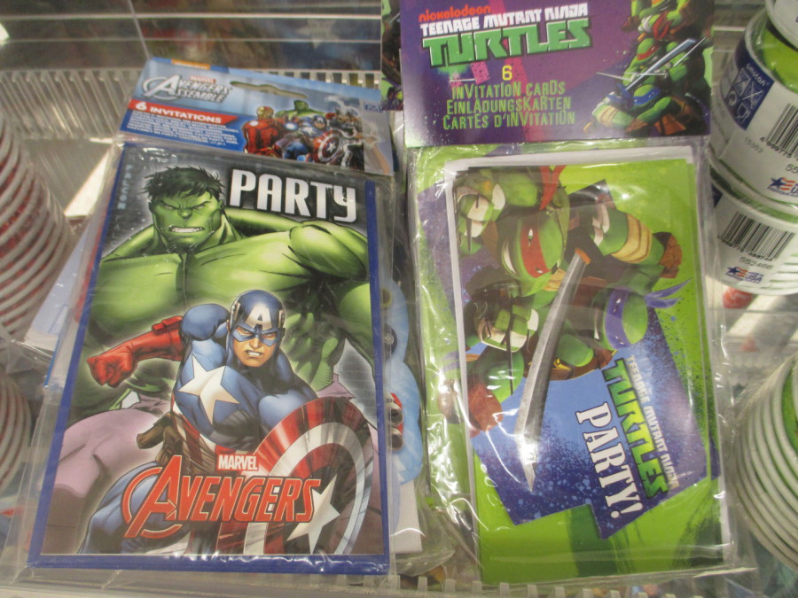
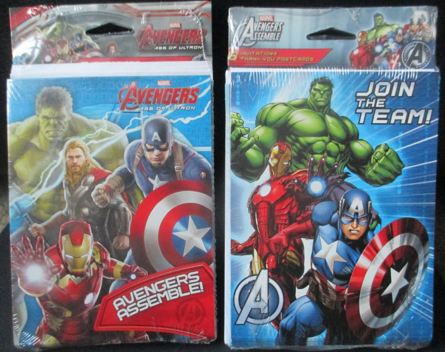
Marvel AVENGERS – AGE OF ULTRON
Published by ‘DesignWare’
NEAR LEFT
Marvel AVENGERS ASSEMBLE
Published by ‘DesignWare’
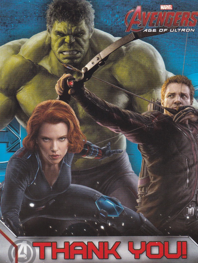
This is the postcard from the ‘AVENGERS – AGE OF ULTRON’ pack. The design features The Hulk, Black Widow and Hawkeye from the feature film. The image here is directly linked to the feature film.

Unlike the above postcard this one uses cartoon versions of the characters: Captain America, Thor, Iron Man and The Hulk. This one is horizontal in design.
PHOTOGRAPH
FAR LEFT
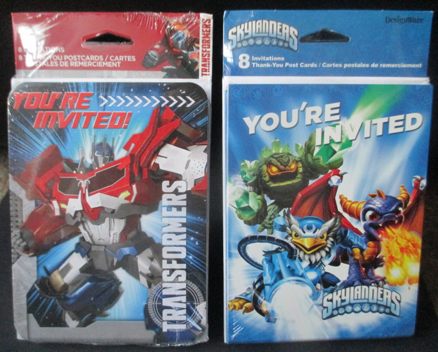
TRANSFORMERS
Published by ‘DesignWare’
NEAR LEFT
SKYLANDERS
Published by ‘DesignWare’
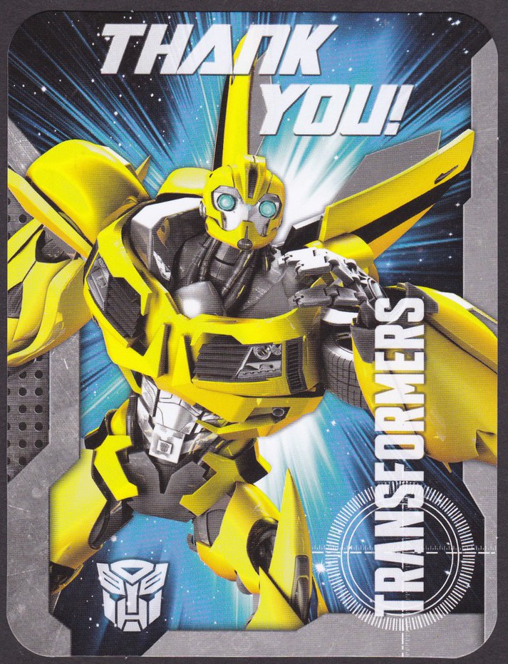
This is the Transformers postcard and it features the character ‘Bumblebee’, although this is the cartoon version rather than the character as depicted in the current film franchise. This is the first of a number of these postcards which come with rounded edges, most have the normal sharp corners, but a few do come like this.

Skylanders – well, I have to be honest, and say that I had to look this one up. These are apparently characters from a video game. I had never heard of these but for there to be a party pack available then I assume the video game is popular with the kids. The postcard is quite fun and the design is great.
PHOTOGRAPH
FAR LEFT
&
NEAR LEFT
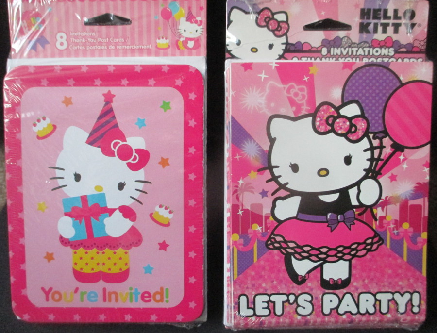
HELLO KITTY PACKS
Published by ‘DesignWare’

HELLO KITTY drops in and out of fashion on a regular basis (although it remains pretty much a constant in Japan, where it is a much-loved franchise). This horizontal design is a pretty ‘standard’ styled image for the Hello Kitty brand although this one is in what I call the ‘Soft Edged’ style.

This second Hello Kitty design is in what I call the ‘Hard Edge Line’ style. At the moment ‘Hello Kitty’ is back in fashion and I saw quite a bit of ‘Hello Kitty’ merchandise on sale in the Japanese shop in the Epcot ‘World Showcase’ area, which is probably why both of these packs were on sale this year.
PHOTOGRAPH
FAR LEFT
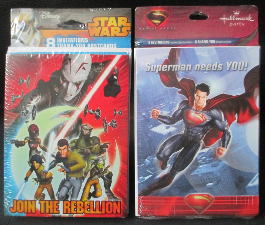
STAR WARS REBELS
‘JOIN THE REBELLION’
Published by ‘DesignWare’
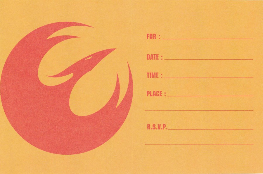
NEAR LEFT
MAN OF STEEL
‘Superman’
Published by ‘Hallmark’

This is the first postcard I have based on the new television animated series ‘Star Wars Rebels’. It features the main rebel characters and is a cracking little old postcard.
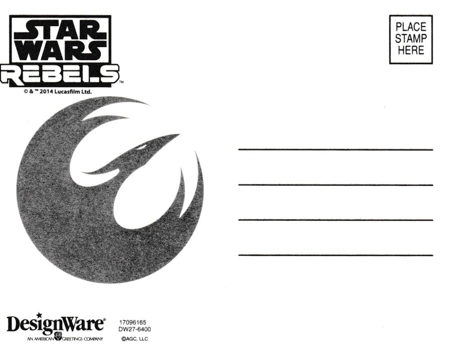
REVERSE SIDE OF ABOVE POSTCARD
The reverse side of the above postcard. I liked this one because it has a nice large logo printed on it which adds a bit of interest to the overall design.
GREETINGS STYLED ‘INVITATION CARD’
This is the inside of the fold open Invitation card that comes in this pack. This also has the same logo as used on the reverse side of the postcard. I depict this here to show that the invite cards are also worth keeping as part of the package (although you only need to keep one of course)
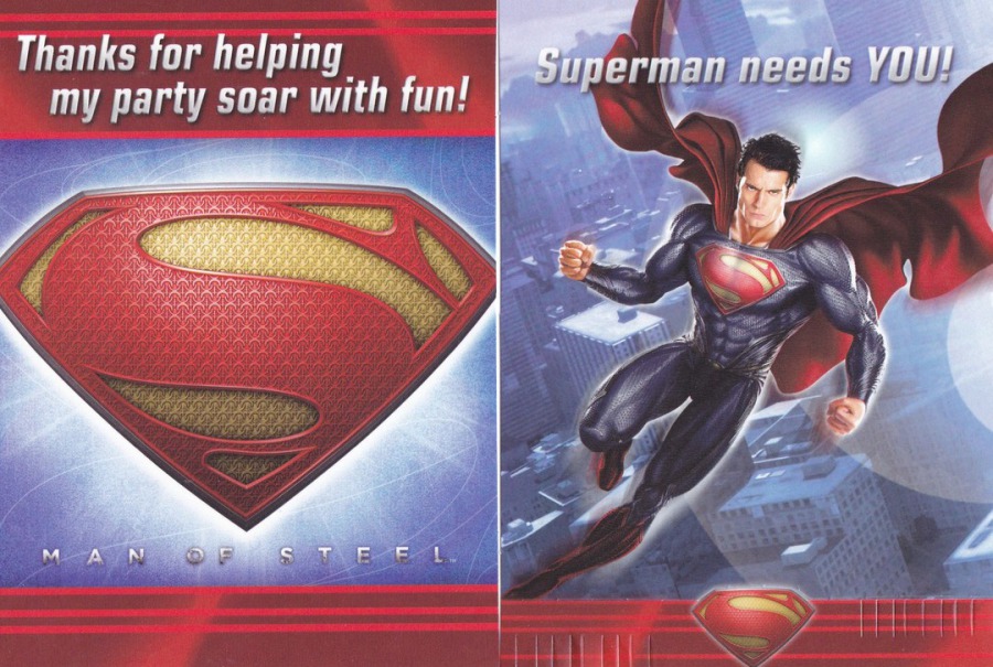
SUPERMAN
Far Left - Here you have the ‘Thanks for helping my party soar with fun!’ postcard (far left). This depicts the ‘S’ logo from the front of Superman’s chest.
Near left you have the Invite card, which here is an actual single card, and not a folded card. I think the design on this is better than the actual postcard, but as it is the same size, and a single piece of card, I will gladly keep this in my collection as another ‘Card’.
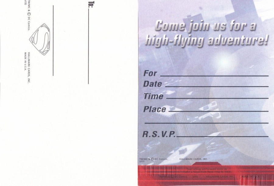
REVERSE SIDE OF THE TWO ABOVE CARDS
Here you can see the reverse side of the postcard and the reverse side of the invite card. I still think you should keep a copy of both.
PHOTOGRAPH
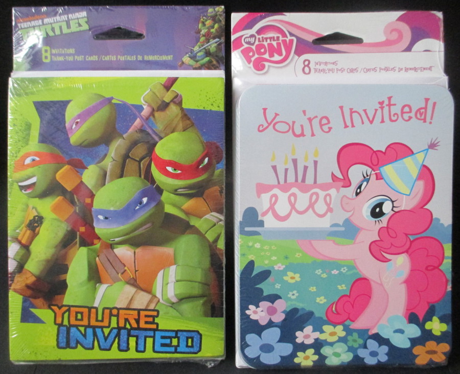
FAR LEFT
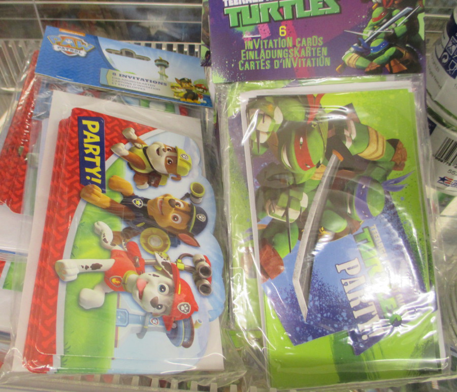
TEENAGE MUTANT NINJA TURTLES
Published by ‘DesignWare’
NEAR LEFT
MY LITTLE PONY
Published by ‘DesignWare’

TOP
The Teenage Mutant Ninja Turtle postcard (and pack) is based on the ‘nickelodeon’ animated children’s television series version. So, this is a nice addition to my television series
BOTTOM
My Little Pony has been around for many years and has a very dedicated band of collectors and fans. This is why you can still find related merchandise around like this party pack. And, as an added ‘bonus’ for me this image here is from the latest animated version of the characters so fits again into my television collection.
So, that finishes my first selection of these very interesting postcards. The next selection will include some more Marvel and DC superheroes and a number of Disney character and film related themes. Keep your eyes open for the post – or keep connected via the ‘facebook’ page where I will give details when posted
02/12/2016
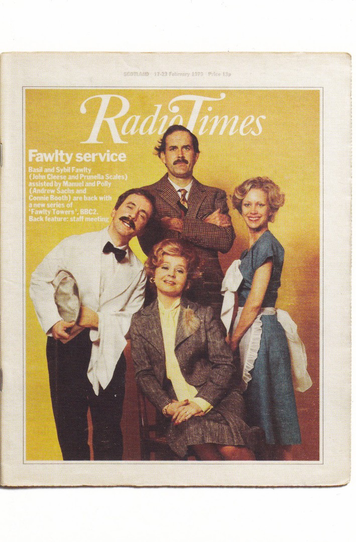
ANDREW SACHS ….. RIP
Andreas Siegfried “Andrew” Sachs
7th April 1930 – 23rd November 2016
Theatre and Television Actor
POSTCARD
RADIO TIMES COVER
Ref: No. 62 Fawlty Towers
(John Cleese, Connie Booth, Prunella Scales, Andrew Sachs)
Single postcard from the boxed set of 101 Radio Times covers “101 CLASSIC COVERS – POSTCARDS FROM RADIO TIMES”. This superb boxed set covers issues of the Radio Times from the very first right, up to one just over a year ago. At £14.99 it was a superb collection and for any TV collector like me well worth having. This postcard is placed here in remembrance of many entertaining nights watching ‘Fawlty Towers’.
I can remember after one of my friends 21st Birthday parties (so it was a really long time ago, especially as he has emigrated to Australia and been there for over 10 years, he was actually the friend I mentioned some blogs back that I was going out for a drink with and would probably not post anything that night – I didn’t!) we all went back to his place and then had a marathon Video (remember video?) fest where we went through the entire two series of Fawlty Towers. Although 20+ people started out watching only me and my friend were awake at the end, around 0700hrs in the morning – what an excellent comedy series, what fond memories – RIP Manuel, you bought me much joy.

01/12/2016
AUTO RICKSHAW
(Indian Three Wheel Taxi)
LARGE SHAPED POSTCARD
Published by
AD-VISION
Ref: 550 INDIA
It has been awhile since I posted a shaped postcard, so here is one. This one was posted from India to the UK. As you know I am fond of shaped postcards and when I saw this one I knew I had to have it. I think it only cost me about 10p (a major bargain).

REVERSE SIDE OF ABOVE POSTCARD
It is not that common to find these shaped postcards nicely used as by their nature they have unusual edges, ones which stick out and therefore get damaged in the post. This one has survived very well, although there is a bit of a bend on the rear wheel, but otherwise it is still nicely edged.
There is also the bonus that this has two nice India stamps applied, although, sadly, the cancel is unreadable. Unfortunately my Stanley Gibbons Simplified Stamp Catalogue is only up to 2004 (I am a bit out of date but then I mainly collect postcards, the majority of which still come in as mint unused, but those used one tend to be older and my catalogues cover this – but I may update soon to a mire recent set) so I do not know the details behind these two stamps, but this lack of knowledge by no way reduces my enjoyment of having these stamps in my collection.
01/12/2016
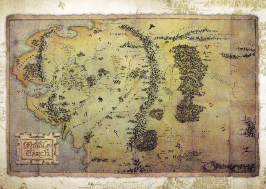
THE HOBBIT: AN UNEXPECTED JOURNEY
JOURNEY MAP
Published by
PYRAMID INTERNATIONAL
Ref: PC52069
This was a postcard that came out just after the release of the first of the Hobbit feature films. Now, I was a massive (and still am) fan of the ‘Lord of the Rings’ trilogy, but, I struggled a bit with the Hobbit films. Firstly, I struggled with there being enough material for three films (have you seen the size of the book?). Secondly, they introduced too many extra characters, that simply do not appear in the original story, not to mention the extra sections of added story which in my mind made the film story more expansive (some would possibly say this was a good thing, and I can see that, but having read the book, more than once, I kind of wanted just the book story). The Lord of the Rings book (technically three books) was of course much bigger, and with the films they actually had to cut bits of the story out, and somehow those films still seemed to be more true to the original source.
It’s not that I don’t enjoy the Hobbit films, I just think that they are not my view of this book. If you watch the Hobbit films without having read and loved the book, then I think the enjoyment level must be much higher. Either way, the postcards are well worth collecting.
REVERSE SIDE OF ABOVE POSTCARD
I do like postcard companies that make an extra effort to make the reverse side of their postcards a little more interesting than the norm. One of the techniques which works well is the faded background image which blends into the postcard but which still allows the writing of an address and a message over the top. This is a good example of this and, to be honest, better than others which just reproduce the image from the front. Here you have an entirely new image.

30/11/20176
Happy ‘St Andrew’s Day’
GLASGOW
JUBILEE EXHIBITION CALEDONIAN P.S (Philatelic Society)
1956
Posted 6th March 1956
This special exhibition was held in 1956 at the Kelvingrove Art Galleries, Glasgow between the 27th February and the 11th March. There was a special log produced for the exhibition which incorporated a shield and spear and the words ‘Caledonian P.S. Jubilee Exhibition 1906 – 1956’. This simple logo was printed on plain postcards which could be posted on any day of the exhibition and receive the special ‘Glasgow’ hand stamp. Here the hand stamp has been applied twice to three QEII stamps. The hand stamps are dated the 6th March 1956, so this postcard is from the end period of the exhibition.
GLASGOW
JUBILEE EXHIBITION CALEDONIAN P.S (Philatelic Society)
1956
Posted 27th February 1956
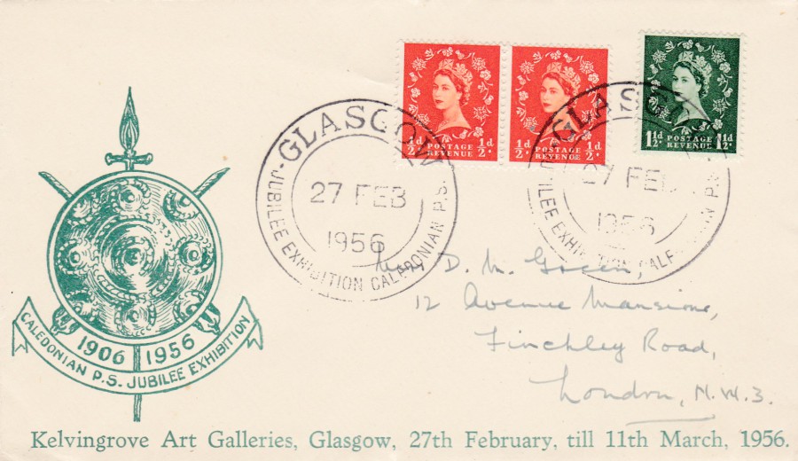
This is actually an envelope, and not a postcard, but it goes so well with the above postcard I bought it as well, at the same time, from a dealer who had a collection of Exhibition material on sale.
As a bonus this is postmarked on the first day of the exhibition – 27th February 1956, so it is also the first day of use for the special exhibition hand stamp that was applied. Also, although the event logo is the same as used on the above postcard, here it has been printed in green. I know it’s not a postcard, but it sits well in my collection as a companion item to the above postcard.
30/11/2016
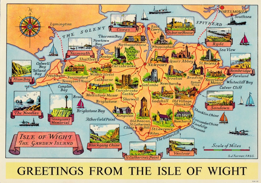
GREETINGS FROM THE ISLE OF WIGHT
Published by
‘Nigh’, Ventnor, Isle of Wight
Printed by
JARROLD & SONS, NORWICH
This is a large postcard, over A5 size, but I think it is a really smashing design. Depicted is an artist drawn map of the Isle of Wight with small drawings of some of the main landmarks on the island, whilst other, mainly, coastal based attractions and towns and villages are displayed in boxes around the edge (Osborne House and Blackgang Chine are the two locations which are more inland from the coast, although Blackgang Chine is practically on the coast, you can certainly see the sea from areas of it). The larger size of this postcard actually makes it more attractive to me, you can see the images much more clearly, the colours are more vibrant as they are not squashed down in size, and you can see so much more. I have only ever seen this one copy, but I doubt it is a very scarce card, it certainly would not be considered one of any great value (maybe £1.50 - £3), but I treasure it none the less
29/11/2016
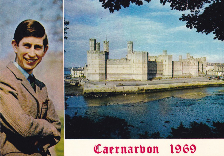
THE INVESTITURE OF THE PRINCE OF WALES
CAERNARVON 1969
Published by
J. ARTHUR DIXON
Ref: Wales 7729
“To Commemorate the Investiture of H.R.H. the Prince of Wales at Caernarvon Castle on July 1st , 1969”
(Text from Reverse side of Postcard)
The Investiture of Prince Charles was quite an event and was televised live. As a result of the popularity of the Royal family at this point (except perhaps with a small portion of the Welsh population who were anti-monarchy) a large number of collectible items related to the event were produced. There was even a set of stamps issued by Royal Mail to celebrate the day. So, postcards were inevitable and royal collectors have quite a range of related postcards to seek out. I have always really liked this one.

REVERSE SIDE OF ABOVE POSTCARD
Normally I would not have depicted the reverse side of this postcard, as there is nothing much special about the text content itself, it is just that I have always wondered why they decided to have it printed entirely in pink!
29/11/2016
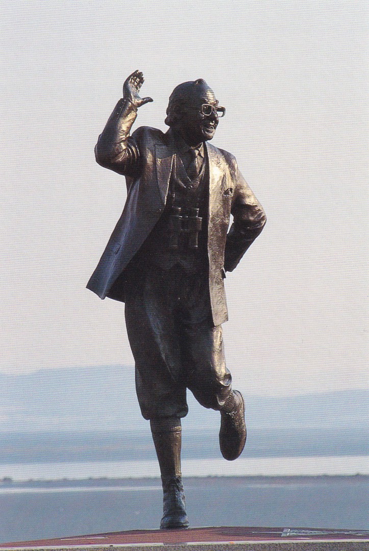
THE ERIC MORECAMBE STATUE
MORECAMBE PROMENADE
Photography by
JON SPARKS
Printed by
Abacus (Colour Printers) Ltd, Cumbria
This lovely statue of the late comedian Eric Morecambe can be found on the promenade at Morecambe. It is a smashing statue to a much-loved comedian and entertainer. The Morecambe & Wise television show was, and still is, a much-loved show, and the Christmas specials are still watchable to this day, and possibly were the best ‘Xmas’ shows ever produced. There are at least three different postcards which depict this statue but tonight I am concentrating on just this vertical one (the other two are multi-view cards which show the statue along with photographs of other Morecambe landmarks)
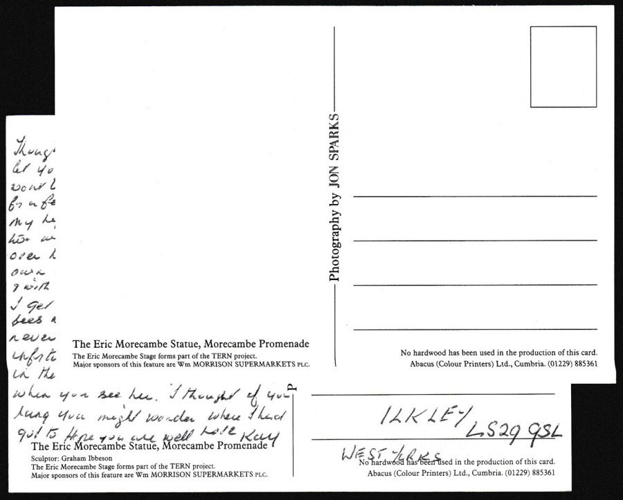
REVERSE SIDE OF TWO POSTCARDS
This image depicts the reverse side of two postcards which both show the above front image. This is a really good example of how it is worth looking at the reverse sides, and serious collectors like to find differences in text layouts.
Here the top mint copy has three lines of descriptive text bottom left, whilst the postal used copy underneath it has four lines of descriptive text. The difference really is just the inclusion on the bottom reverse side of the line:
‘Sculptor: Graham Ibbeson’
A small piece of information which was for some reason omitted from the printing. As a specialist in Television related postcards I love little quirks and differences like these as they make me feel like I know what I am doing (as if?!). If you find yourself in possession of two postcards which have the same front design, turn them over and double check the reverse side, you never know, they may be very different.