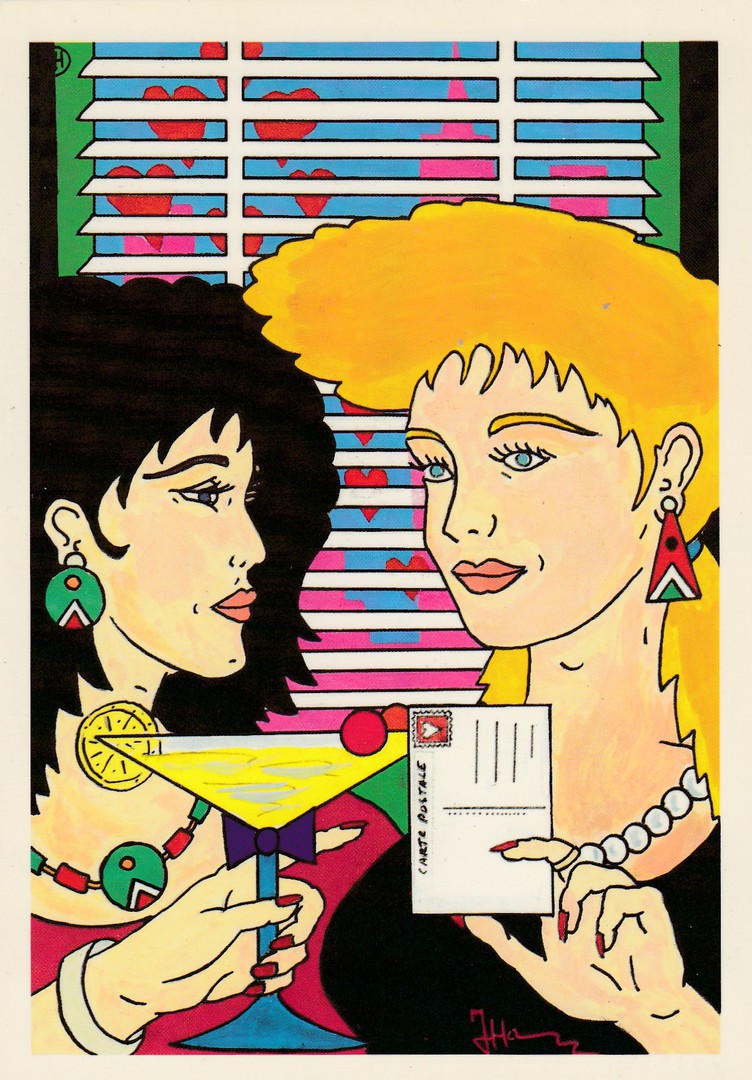
22/11/2017
PATRICK HAMM
Untitled
Published by
CLUB NEUDIN
Ref: Club Neudin No 19 – 1986
(Published 1986)
Limited Edition of 2000 copies
I have previously posted a Patrick Hamm postcard, but this is another one and one which works as a private publicity postcard as well as it has his details on the back with a short potted-history of his works. As previously stated Hamm’s work is very expensive and was, at least for a while, highly collected in his native country, France. This one here cost me £4, but fifteen years ago would have cost me nearer £15. Despite his drop in real value the cards will still cost you anywhere between £4 and £15 depending on the card, although some very scarce and low print run items still go for £30+.
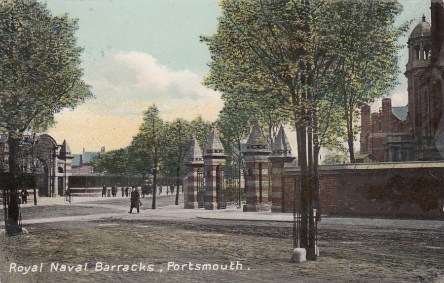
22/11/2017
ROYAL NAVAL BARRACKS, PORTSMOUTH
Published in:
THE “EXPRESS” SERIES
Posted 1909
This postcard is an example of how one image can appeal to more than one type of collector. Local history collectors interested or studying the Portsmouth area would have some interest in not only the image on this card but also the message side as the card was posted in Portsmouth. Then you have those interested in the Royal Navy and its buildings and structures. This image of the Naval Barracks would surely be of some interest to them. Then you have general postcard collectors who like something just for its postcard history element, like me.
The Naval Base at Portsmouth is the oldest in the Royal Navy and was at one point the largest industrial site in the world. The Naval Barracks were on Queen Street and it once had the designation ‘HMS NELSON’ but in 2000 this designation was changed to take in the entire base. The Naval Barracks is now the Naval Personnel Centre. The Naval Barracks opened in 1903 but much of the barrack blocks were demolished and rebuilt in the latter half of the 20th century.

REVERSE SIDE OF ABOVE POSTCARD
Posted from Portsmouth – 5th August 1909
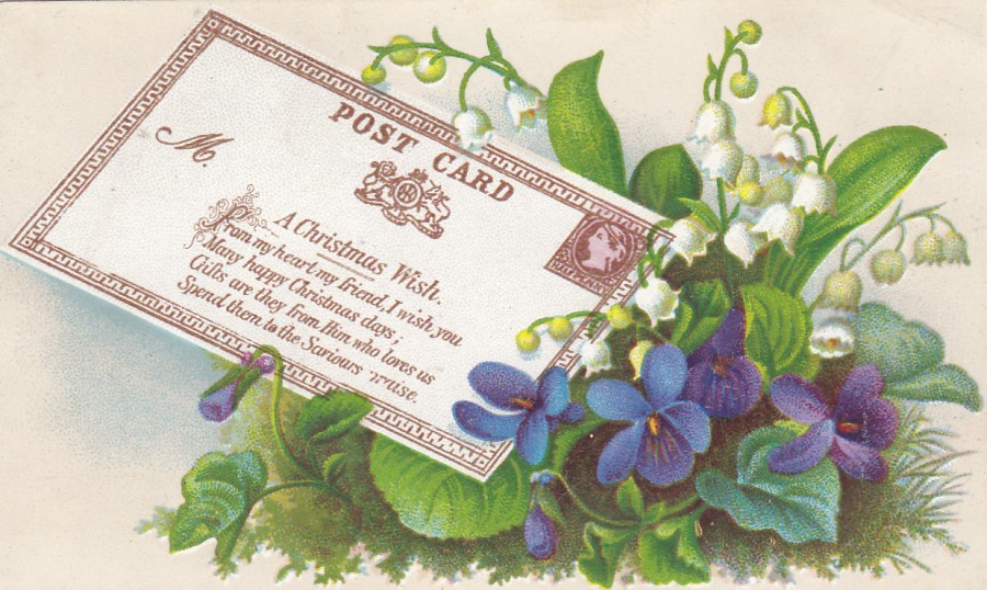
22/11/2017
NON-POSTCARD ITEM
VICTORIAN SCRAP
VICTORIAN SCRAPBOOK PIECE
I bought this item over thirty years ago from an antiques shop in my local area. At the time I was unaware of Victorian scraps, but I was fascinated by the depiction of this early postal stationery post card, based on the very first Britain postal stationery post card, which dates this scrap to around the 1870’s period. The Victorian’s loved collecting and they fell into the fad of scrapbooks where they collected printed items and stuck them down in their books. Companies caught onto this craze and started producing ‘scraps’ which were small coloured images and pieces which were either already cut out to shape or could be cut out to stick into people’s books. Some of these can be quite expensive if unused, as clearly, they were designed to be stuck down and as such most were used in this way. This piece here cost me £1.50 at the time, which was quite a bit back then, but I really like it. It is also Christmas related so could have been sent out to someone around that time (it could also potentially be dated from the Christmas of that first year of release – 1870)
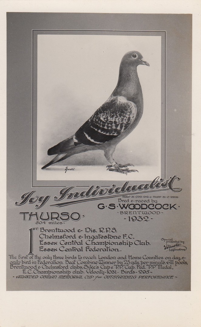
21/11/2017
IVY INDIVIDUALIST
RACING HOMING PIGEON
BRENTWOOD 1932
Privately Produced Postcard
“The first of the only three birds to reach London and Home Counties on day, and only bird in Federation. Beat Combine Winner [name of another racing pigeon?] by 23 yards per minute.
Awarded Osman Memorial Cup for Outstanding Performance”
The owner of this pigeon - G.S. WOODCOCK – must have been very proud of his bird. Homing pigeons were very popular in the last century and I had close contact with them myself because my Grandad was a well-known and very successful breeder and racer. He kept his birds in a building at the bottom of his garden. He had photographs just like of his winning birds. I suspect I bought this postcard because of the connections with my Grandad as a child over the racing pigeons.
REVERSE SIDE OF ABOVE POSTCARD
21/11/2017
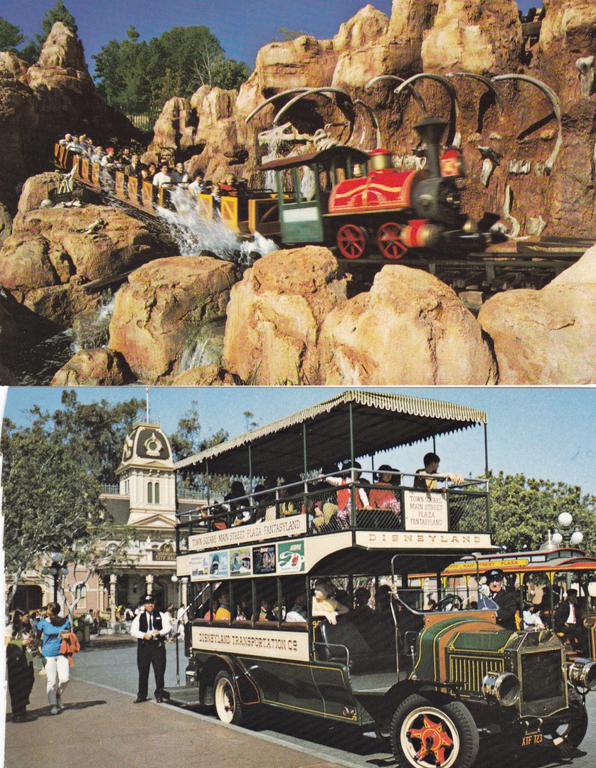
DISNEYLAND TRANSPORT
POSTCARDS
TOP
BIG THUNDER MOUNTAIN RAILROAD
“SPALSHIN’, RIP-ROARIN’ FUN!”
“Dinosaur bones aren’t the only surprise in store for passengers who climb aboard the ‘runaway’ trains of ‘Big Thunder Mountain Railroad”
(Text from reverse side of postcard)
Official Disneyland Postcard
Ref: 0100-11401
BOTTOM
DISNEYLAND OMNIBUS
“Disneyland’s 5/8 scale doubledecker Omnibus carries hundeds of passengers daily on a fun-filled tour. Camera fans especially like the unique angles the Omnibus second deck provides”
(Text from reverse side of postcard)
Official Disneyland Postcard
Ref: 0100-10403
Both, of these postcards have the black printed reverse layout
Big Thunder Mountain Railroad appears at many Disney theme parks, this image is from Disneyland, but the same image could be taken at Disney World and at Disneyland Paris (the latter two I have ridden). Action shots of rides are always popular and on this one you can almost feel the speed as the train is slightly blurred.
The lower postcard image is interesting to me as I have never been to Disneyland, just Disney World and Disneyland Resort Paris, so I have not seen the omnibus depicted here. The omnibus at Walt Disney World is a single decked vehicle, although there is also a horse drawn trolley (which I think is also at Disneyland) and a Fire Engine (not sure if Disneyland have had one of these). I do remember that at Epcot they had a red double-decker bus that used to bring out Disney characters for the opening of the World Showcase area. It was called the ‘Characters on Holiday’ (I believe in past times there were buses that could take you around the World Showcase as well but that was a while back now).

21/11/2017
STAR WARS: THE FORCE AWAKENS
POSTCARD SET IN PACKET
DISNEYLAND PARIS
This was a nice exclusive Disneyland Resort Paris postcard pack which contains six postcards depicting montage artwork designs featuring characters of what was at the time the new Star Wars film release. The postcards are not individually titled or numbered, and all have a basic postcard reverse. I thought these were really nice and they were amongst the first postcards I found related to this film (after the Royal Mail stamps cards and the American Designware party invite postcard/pack – all of which have previously been depicted on this webpage).
FRONT COVER OF POSTCARD PACK
SET DE 6 CARTES DE COLLECTION

REVERSE SIDE OF POSTCARD PACK
This depicts the cards that were contained within the pack
This also has the:
Disneyland Paris
Mark on it

FAR LEFT
Rey
NEAR LEFT
Kylo Ren and Storm Troopers
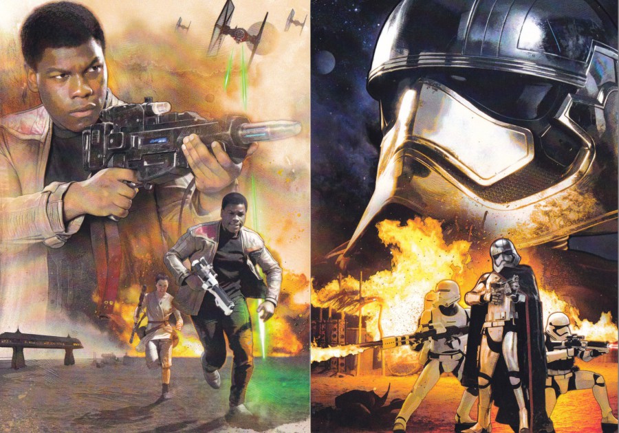
FAR LEFT
Finn (and Rey)
NEAR LEFT
Captain Phasma and Storm Troopers
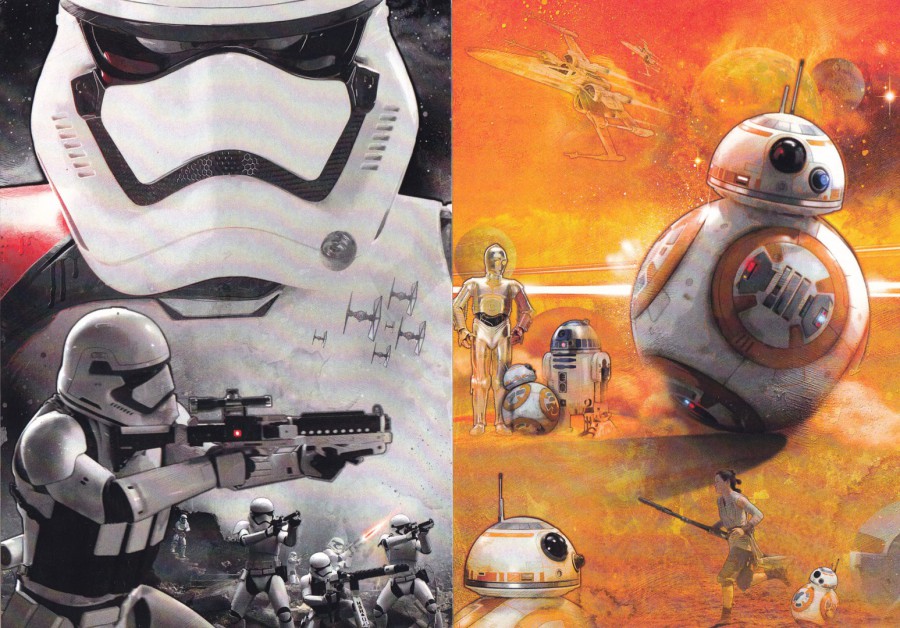
FAR LEFT
Storm Troopers
NEAR LEFT
BB8 (and C3PO and R2D2, and Rey)
I think this was a smashing set and I would not be at all surprised to find that these were also available as poster images elsewhere.
21/11/2017
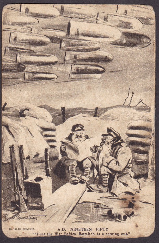
A.D. NINTEEN FIFTY
“I see the War Babies’ Battalion is coming out”
“BYSTANDERS” FRAGMENTS FROM FRANCE – SERIES 4
Cartoon by
BRUCE BAIRNSFATHER
WORLD WAR I
This postcard really does look like it’s been in the war, and it may well be that it was. The postcard cartoons of Bruce Bairnsfather, in his ‘Fragments from France’ series’ were extremely popular and well known during the conflict. As a soldier at the front himself he managed to capture what was called ‘Trench Humour’ and created his most famous character ‘Old Bill’ who appeared on many of his postcards. This copy here is especially showing its age which is possibly appropriate for the content of the cartoon itself which surmised what it would be like if the war was still going in 1950 (it must have felt like it was never going to end to some of the soldiers and this cartoon captures that feeling). This card here was one which someone was going to throw away because it looked so tatty around the edges. At the time it was nearly 100 years old and having survived that long I said I would take it for my collection and keep it safe. It is worth little, especially in its current state but somehow it evokes the period of the first world war far more to me than a perfectly kept mint copy of the same card would, or could.
REVERSE SIDE OF ABOVE POSTCARD
The postcard was unused, so I assume must have been kept by someone as a memento, perhaps it was kept by a soldier who found it amusing, or a soldier’s family member as a keepsake. I will never know now the source of this tatty card, but at least it was not just thrown away.
21/11/2017
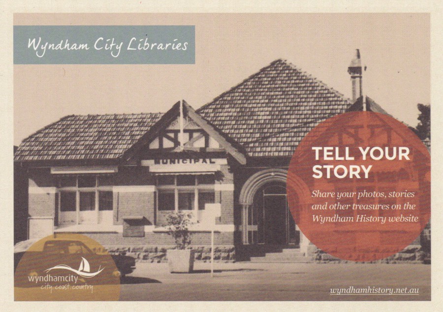
TELL YOUR STORY
WYNDHAM CITY LIBRARIES
“Share your photos, stories and other treasures on the Wyndham History Website”
“Do you have a friend or family member with an interesting story/photo to share about Wyndham? Please send a postcard on to them”
As a person who loves history, and collects most aspects of it through postcard images, I did like the idea of this project. There are many people in towns, villages and other locations who have a wealth of local knowledge and topical stories which will lost when they pass on. So, why not get these details recorded and stored in the local library? And, if you are running this type of project what better way to publicise it than a free postcard?
21/11/2017
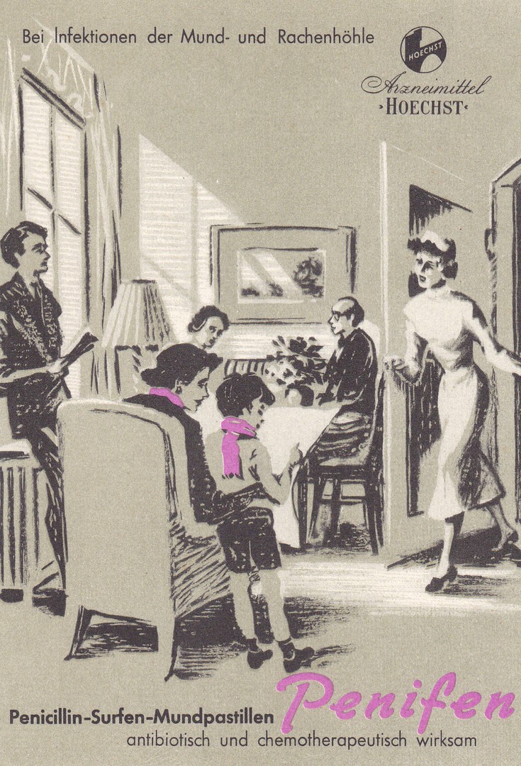
PENICILLIN – SURFEN – MUNDPASTILLEN
‘PENIFEN’
ANTIBIOTISCH UND CHEMOTHERAPEUTISCH WIRKSAM
(Penicillin – Surf – Mouth Pastilles
‘PENIFEN’
Antibiotic and Chemotherapeutic effective)
German Advert Postcard
Used 1956
This is a smashing early medical advertising themed postcard sent out by a company called ‘FARBWERKE HOECHST AG’ in 1956 to advertise their mouth pastilles which they seem to link to being chemotherapeutic. The artwork used here is simple but attractive and the use of the single colour of lilac seems to ne impactive. This would certainly make for an unusual medical themed postcard.
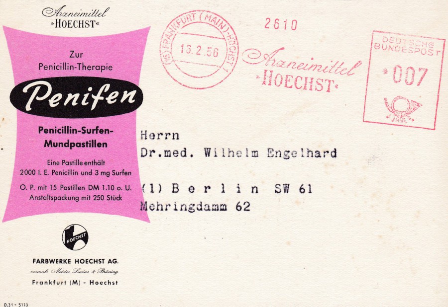
REVERSE SIDE OF ABOVE POSTCARD
This postcard was posted from Frankfurt, Germany on 16th February 1956 using a pre-paid personal company advertising meter frank, printed in red as these so often had to be. This usage adds some value to the card as it is all related. This cost me £1 earlier this year from a £1 box of material, I think it was a good buy at that price.

21/11/2017
H.M. QUEEN ELIZABETH II
LONDON
Published by
PAPER MILL CARDS
(Paper Mill Press)
Photo By
Jayne Fincher
Ref: 4491
Congratulations to Queen Elizabeth and Prince Phillip on their 70th Wedding Anniversary which they celebrated yesterday. There were some very nice official photographs released to celebrate the anniversary and I look forward to one or more of these being released as an official postcard. In the meantime, I give you this easily obtained Queen Elizabeth postcard which is on sale in many of the gift shops in London for a very reasonable price (I have seen it for as little as 15p up to 50p – so shop around, although what’s 50p these days?).
20/11/2017
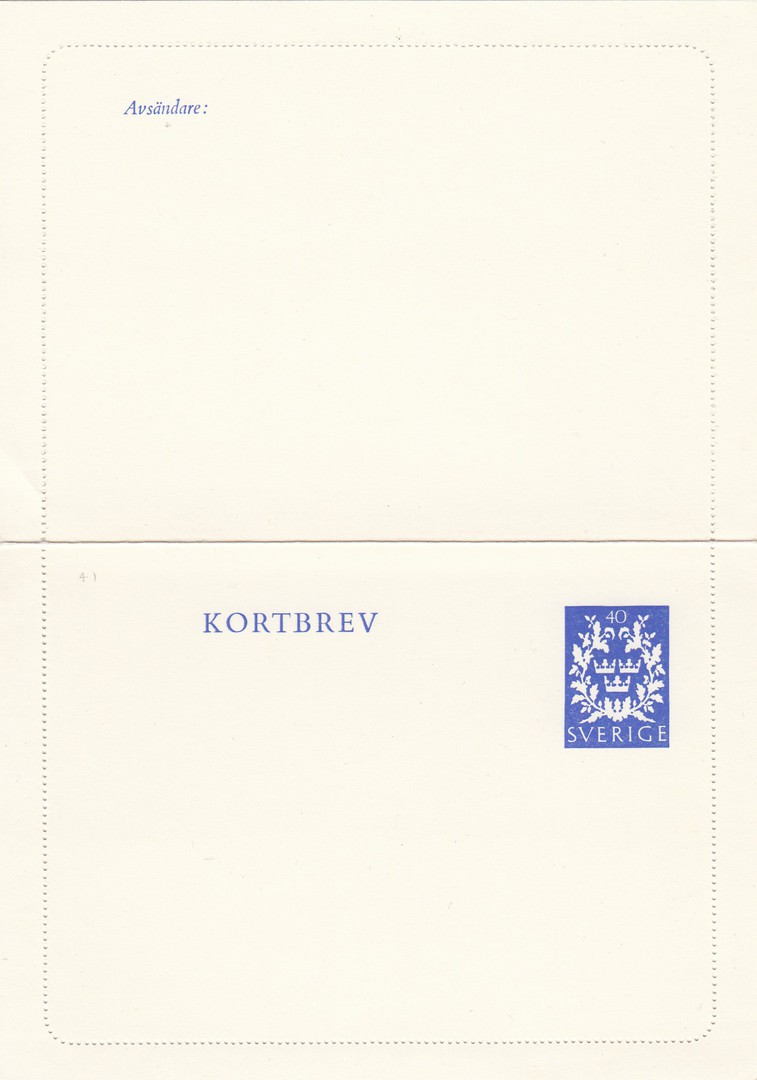
KORTBREV
(LETTERCARD)
SVERIGE
(SWEDEN)
This is an expanded view, i.e. an opened view, of a Swedish mint unused Lettercard. This is a modern release and unfortunately, I have no further details around this issue (after all, you can’t know everything). These items are quite plain to look at but can of interest to stamp and postal history collectors, although they rarely rate any great value. This item here I picked up for just 50p.
20/11/2017
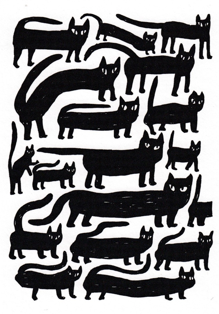
UNTITLED
Black cat cartoon card
Published by
USTUDIO DESIGN
“Paper Planes”
Ref: PAP 094
Design by
Eva Stalinkski
What is it, with cats at the moment? They seem to be everywhere on postcard. There definitely seems to be a resurgence in the interest in depicting these animals on card. I have posted a few recently which all have been bought within the past few months, mostly at branches of ‘paperchase’. This one here is another very recent ‘paperchase’ buy. It was the weirdness of the design shown here that appealed to me, or at least caught my eye and would not let it go. There are some very long cats here, and a three-legged one bottom left, unless it is scratching itself with the other leg, so you can-not see it, and as for what the cat centre left is about to do to the front in front of it…well!
20/11/2017
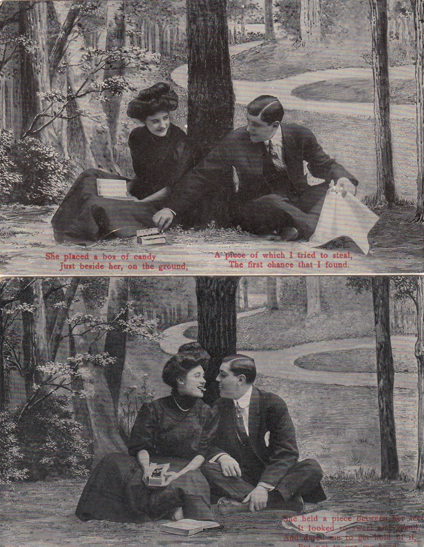
POSTCARD SONG/POEM SET
Unknown Publisher
Made in Germany
All four cards bare the number – 735 on the reverse side.
It was not unusual for publishers to produce cards in a series as it meant that people would often buy all of the cards in the set instead of just one postcard to use. Postcard collecting was very popular at the turn of the century in 1900 and many families had a postcard album. Initially they would just place in it the cards they received through the post, but eventually most started buying souvenir cards on visits, and then unusual cards to show people. This sort of set is very much like the song card sets published by Bamforth (although this is not by them). It is also a bit cheeky and sexual for the time so would have got some tongues wagging.
Top
SHE PLACED A BOX OF CANDY
JUST BESIDE HER, ON THE GROUND,
A PIECE OF WHICH I TRIED TO STEAL,
THE FIRST CHANCE THAT I FOUND.
Bottom
SHE HELD A PIECE BETWEEN HER TEETH
IT LOOKED SO SWEET AND GRAND,
AND DARED ME TO GET HOLD OF IT,
BUT NOT TO USE MY HAND
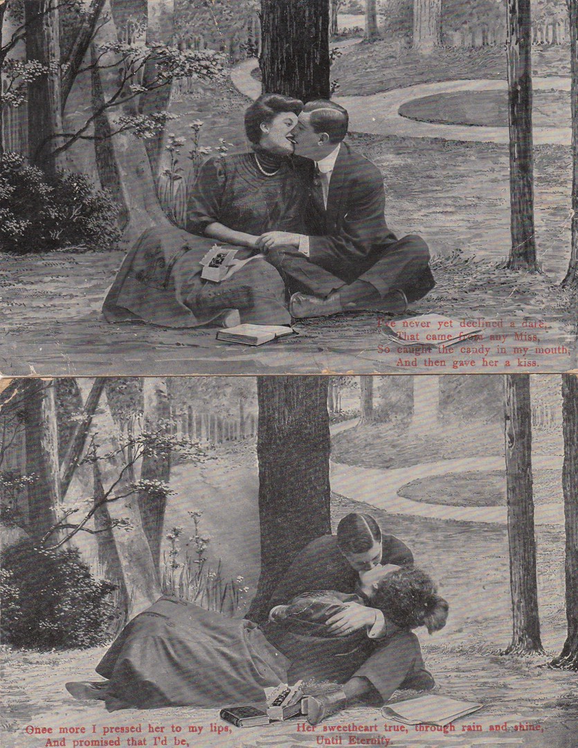
Top
I’VE NEVER YET DECLINED A DARE,
THAT CAME FROM ANY MISS,
SO CAUGHT THE CANDY IN MY MOUTH,
AND THEN GAVE HER A KISS
Bottom
ONCE MORE I PRESSED HER TO MY LIPS
AND PROMISED THAT I’D BE,
HER SWEETHEART TRUE, THROUGH RAIN AND SHINE,
UNTIL ETERNITY.
Studio shot sets like this were very popular and I suppose if you were dating, or perhaps even fancied dating a young lady then perhaps cards like this could have broken the ice. As I have already stated I suspect they were even considered ‘risqué’ by some at the time. Despite being popular back in the day these are rather cheap to pick up now, but I liked this set.

20/11/2017
EDINBURGH FRINGE FESTIVAL
11 -13 AUGUST 1996
Official Poster of the 1996 Fringe
Designed by
Dawn Exley
Drummond Community High School,
Edinburgh
Annual Poster Design Competition
Sponsored by
MACDONALD LINDSAY PINDAR
Postcard Published/Printed by
MACDONALD LINDSAY PINDAR
Ref: FF96
There was a time when the Edinburgh Fringe Festival poster was issued as a postcard every year, I am not sure this is still the case as I have not seen a new card for some years now. The poster designs were often by children and as a result you did get some interesting images. This one is not one of the best, but it is still a nice little poster, and not untypical of the style of these. This was a recent buy from a cheap box (it is also a slightly larger card than normal - which is no bad thing in my mind) .
20/11/2017
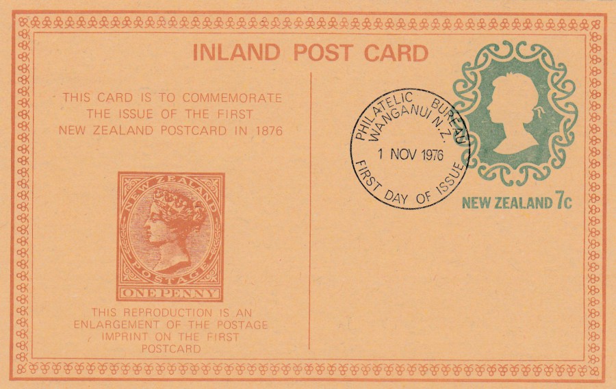
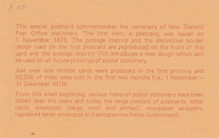
NEW ZEALAND
INLAND POSTCARD
7 cent
THIS CARD IS TO COMMEMORATE THE ISSUE OF THE FIRST NEW ZEALAND POSTCARD IN 1976
Used First Day of Issue
This is a smashing postal stationery postcard which celebrates the 100th anniversary of the release of New Zealand’s first postal stationery back in 1876. This ‘particular’ card was released on 1st November 1976 and has been cancelled first day of issue with a ‘PHILATELIC BUREAU – WANGANUI, NEW ZEALAND – FIRST DAY OF ISSUE – 1 NOV 1976’ circular standard use FDI cancel. The reverse side of this card has a potted history of the first postal stationery post card issue (see below) which adds interest to what is a nice modern release. But, although nice this still only cost me £1.
REVERSE SIDE OF ABOVE POSTCARD

19/11/2017
NOVELTY BAROMETER
Published by
55 JAHRE BOTTGER’ SCHER KUNSTVERLAG, BAD GODESBERG
Ref: Nr 34
There have been a number of versions of this comedic idea of adding a piece of string to a card, often as a donkey’s tail (or another animal – although the donkey seemed to be most popular). The joke revolves around how wet the piece of string is in relation to the weather – i.e. wet = rain (very humourous I am sure). This version is from Germany.
19/11/2017
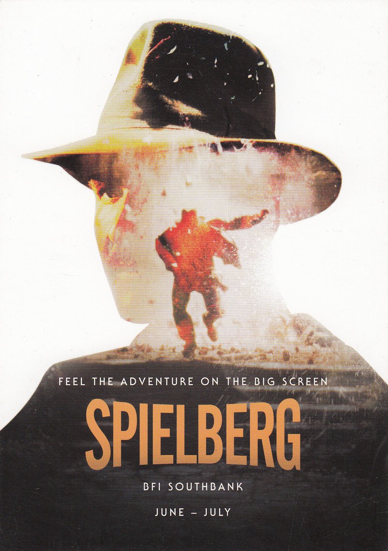
SPIELBERG
JUNE – JULY
BFI (British Film Institute) Southbank
Film Season
RAIDERS OF THE LOST ARK
INDIANA JONES
FEEL THE ADVENTURE ON THE BIG SCREEN
These postcards here were used to advertise a season of Spielberg films which were shown at the BFI Southbank (London). Unfortunately, the year this occurred is not mentioned on the cards themselves, so it could be this year, or any of the more recent years (does anyone know?).
The designs are clever and attractive and are a must have for any film themed collection. I bought mine at 50p each from a book stall in London.
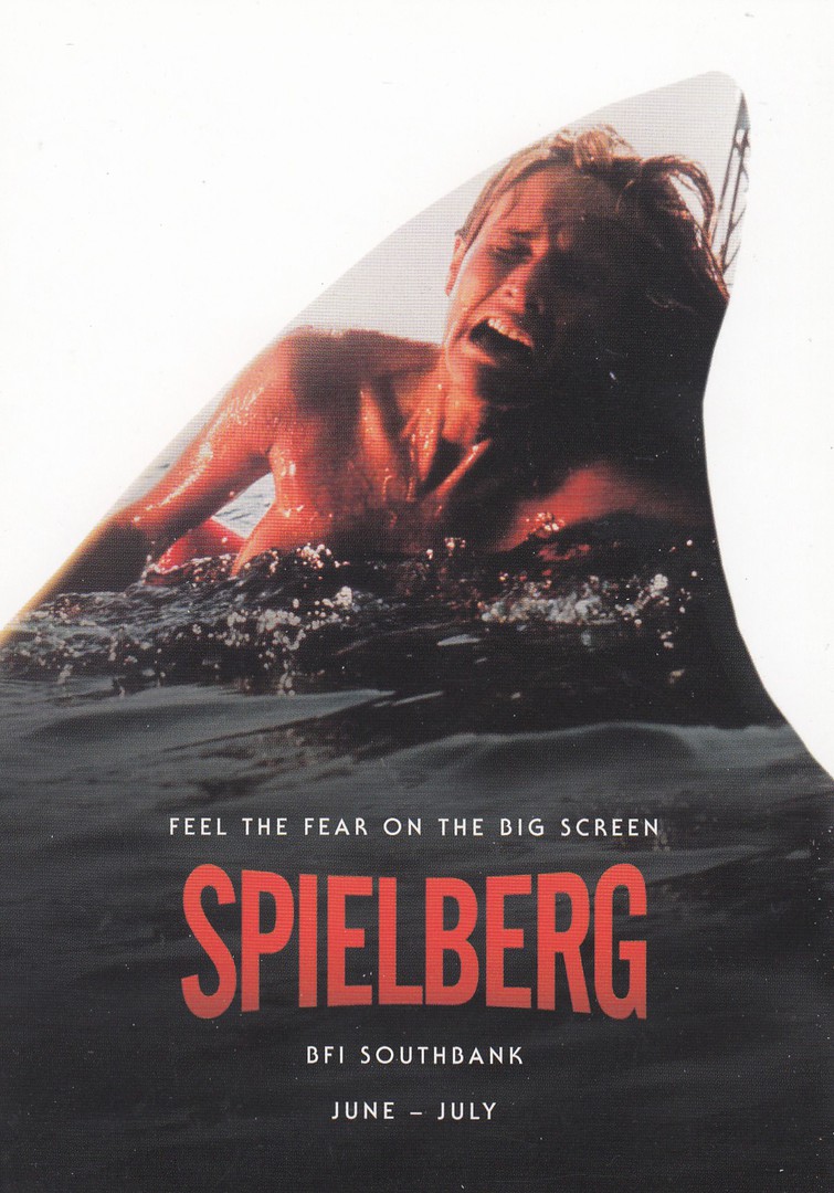
JAWS
FEEL THE FEAR ON THE BIG SCREEN
The scene is taken from the opening segment of the film when the solo female swimmer is attacked. This is contained in the outline of a shark’s fin. I remember this film well as I had to queue for a very long time, the longest I ever queued for a film, to see it in my home time. It is still a classic in my mind.
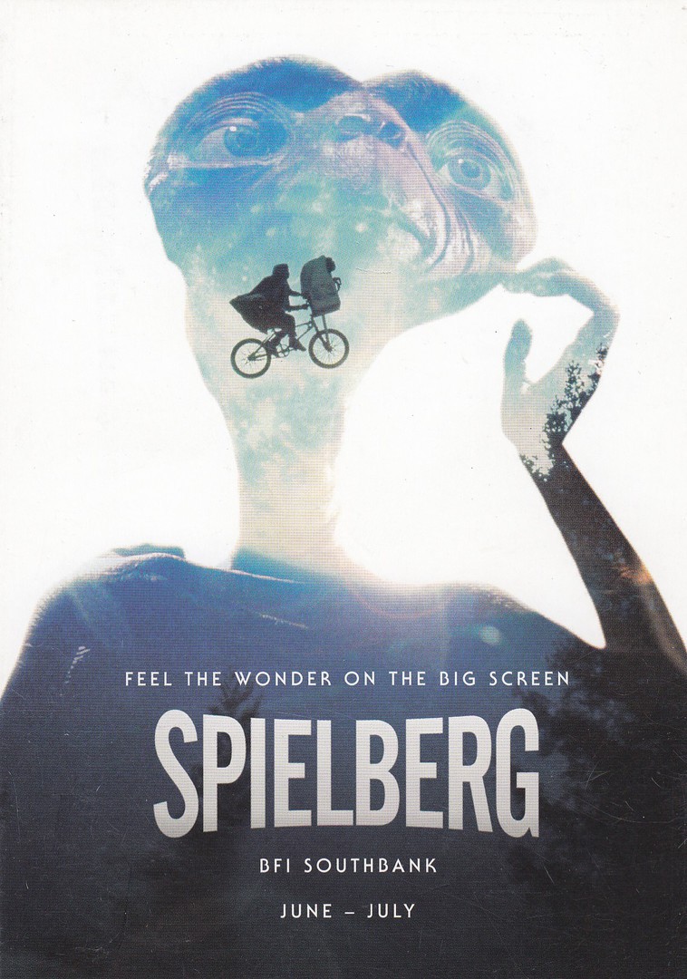
ET
FEEL THE WONDER ON THE BIG SCREEN
I enjoyed this film when it first came out and I saw it in the cinema upon its release here in the UK. But, I am not so sure it stands up to too many secondary viewings (and I am sure many will disagree with this statement, especially my daughter who states this as being one of her favourite films).
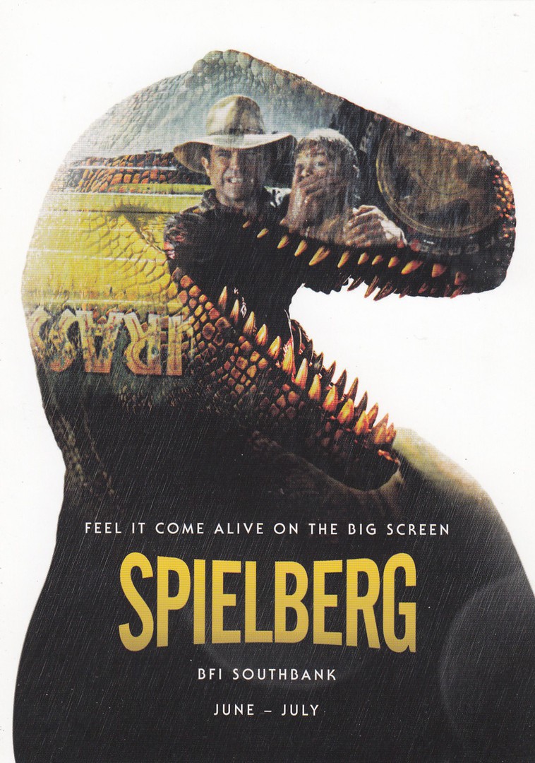
JURASSIC PARK
FEEL IT COME ALIVE ON THE BIG SCREEN
If it is possible I think my daughter rates Jurassic Park even higher that ET amongst her favourite films. This card is my least favourite of the four cards here, but I still think it is a great design. Does anyone know if there were any more in the set? These are well worth looking out for and I was unaware of them before finding them all on the one book stall.
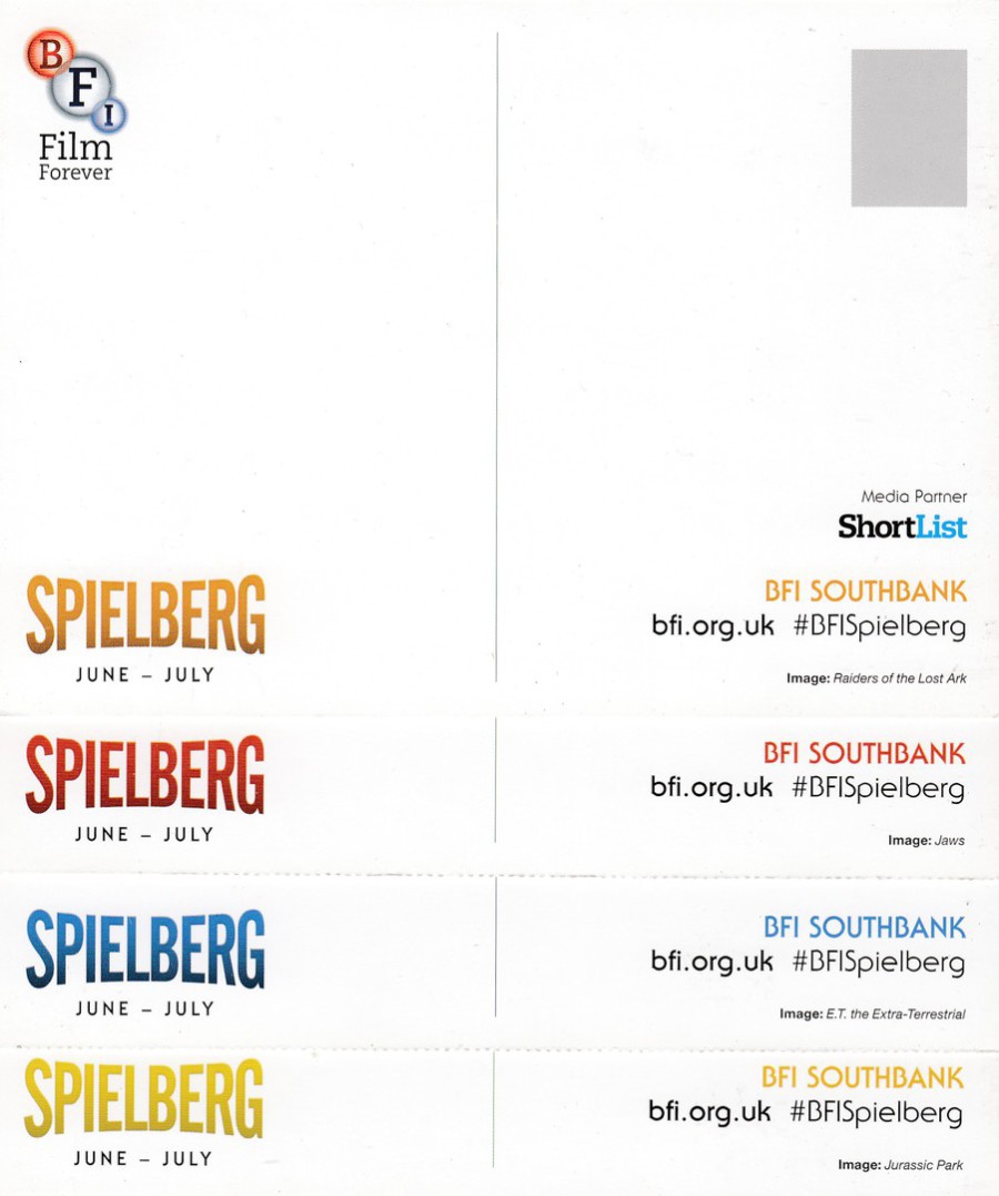
REVERSE SIDES OF THE ABOVE POSTCARDS
Overlaid on top of each other to show the different colours used for the printing.
18/11/2017
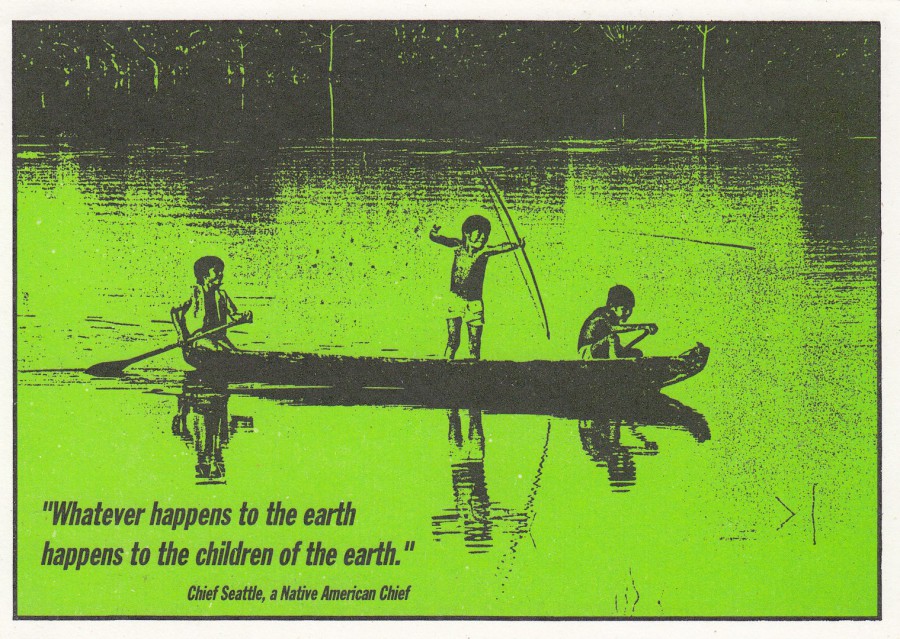
“WHATEVER HAPPENS TO THE EARTH
HAPPENS TO THE CHILDREN OF THE EARTH”
Chief Seattle, a Native American Chief
Published for
OXFAM
Ref: PC 2
“The Yanomami Indians in Brazil have lived in harmony with the forest for generations. Now their future - and ours – is under threat. They are fighting to hold onto their land by organising and educating themselves”
(Test from reverse side of postcard)
I like this one, which I suspect was a free postcard when it was released, although I had to obtain mine from a postcard dealer (I think it only cost me 25p though – and worth every penny). I have a collection which I title as my ‘Green’ theme. I have cards related to conservation, environmental issues and campaign postcards related to indigenous people and their rights. This is a card from that collection (it could also fit into a ‘Children’ themed collection as well and I know this is something others collect as well).
18/11/2017
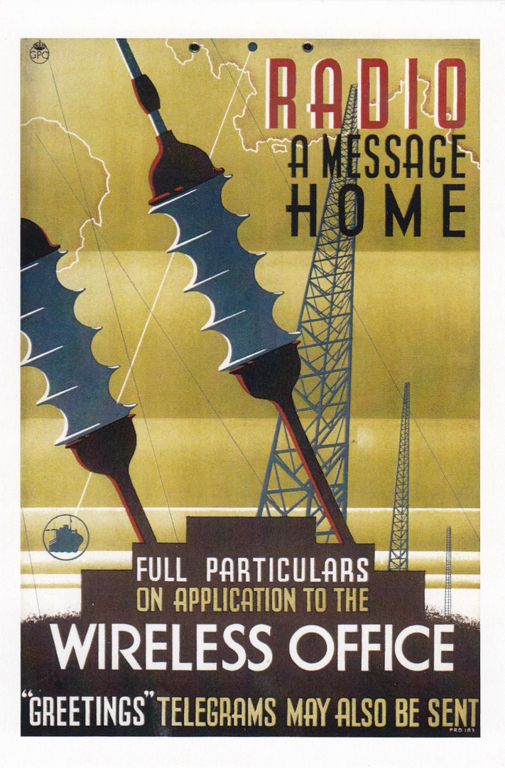
RADIO A MESSAGE HOME
FULL PARTICULARS
ON APPLICATION TO THE
WIRELESS OFFICE
“GREETINGS” TELEGRAMS MAY ALSO BE SENT”
Published by
THE NATIONAL RAILWAY MUSEUM
Printed and distributed by
STAR EDITIONS LTD
Although television is my main interest I do like postcards which also relate to the world of radio. This GPO (General Post Office – their small logo appears top left) poster also comes into my ‘post office’ history interest as well, something which some postcard collectors also study because it is so closely tied into the way postcards are used and the official rules behind postcard use (and there were rules around the size, thickness, amount of text and its placement etc., – this is also why some earlier cards have PRINTED MATTER across the top instead of POST CARD). But, despite the themes and history behind this card my interest in it was also the fact that it depicts a cracking poster.
18/11/2017
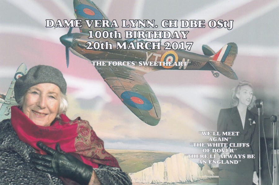
DAME VERA LYNN. CH DBE OStj
100TH BIRTHDAY
20TH MARCH 2017
Published by
CoIR CARDS
Ref: 2017.CR.223
Surely one of our great icons, but I was unaware that she had reached such a great age until I saw this postcard as, somehow, I had missed all the announcements in the news. This is a great further example of how CoIR Cards are issuing relevant current event designs on themes and events which no other publisher is covering. If it was not for them this fantastic achievement and celebration would have been postcard free, and that would have been a shame.
This is also another postcard for my 'Spitfire' collection.

18/11/2017
PADDINGTON
(PADDINGTON BEAR)
THE THIRD IN A SERIES OF LIMITED EDITION
WADE FIGURINES FROM
CAMTRAKS
“CHILDHOOD FAVOURITES”
COLLECTION
Printed by
ALPHAGRAPHICS, NOTTINGHAM
There have been a ‘number’ of promotional postcards issued to publicise the release of these Wade figurines and I have a few of them in my collection. This one here depicts Paddington Bear, which is type of topical at this moment, as ‘Paddington 2’ is now on release and in the cinemas (and it has received really good reviews – the Metro Newspaper gave it five stars out of 5 – and they are normally quite critical, so I suspect it is worth a look). Here Paddington is seen wearing a red hat and wellies and a blue duffle coat. These cards are nice if you can find them.
REVERSE SIDE OF ABOVE POSTCARD
With full advert details
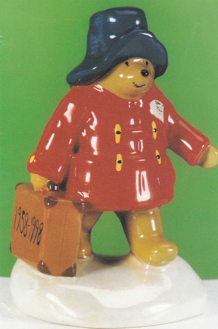
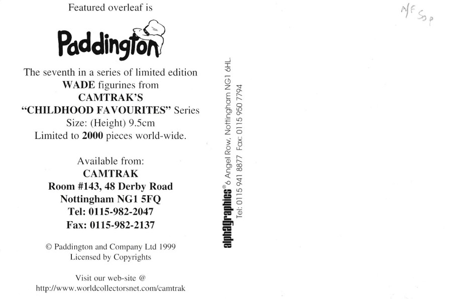
PADDINGTON
(PADDINGTON BEAR)
THE SEVENTH IN A SERIES OF LIMITED EDITION
WADE FIGURINES FROM
CAMTRAKS
“CHILDHOOD FAVOURITES”
SERIES
Printed by
ALPHAGRAPHICS, NOTTINGHAM
Clearly Paddington must have been popular as here they have had another issue released, as their seventh in the series for this collection. Here they have tried to mix things up by having him wear a blue hat and a red duffle coat (I wonder how many people bought both versions?)
REVERSE SIDE OF ABOVE POSTCARD
With full advert details
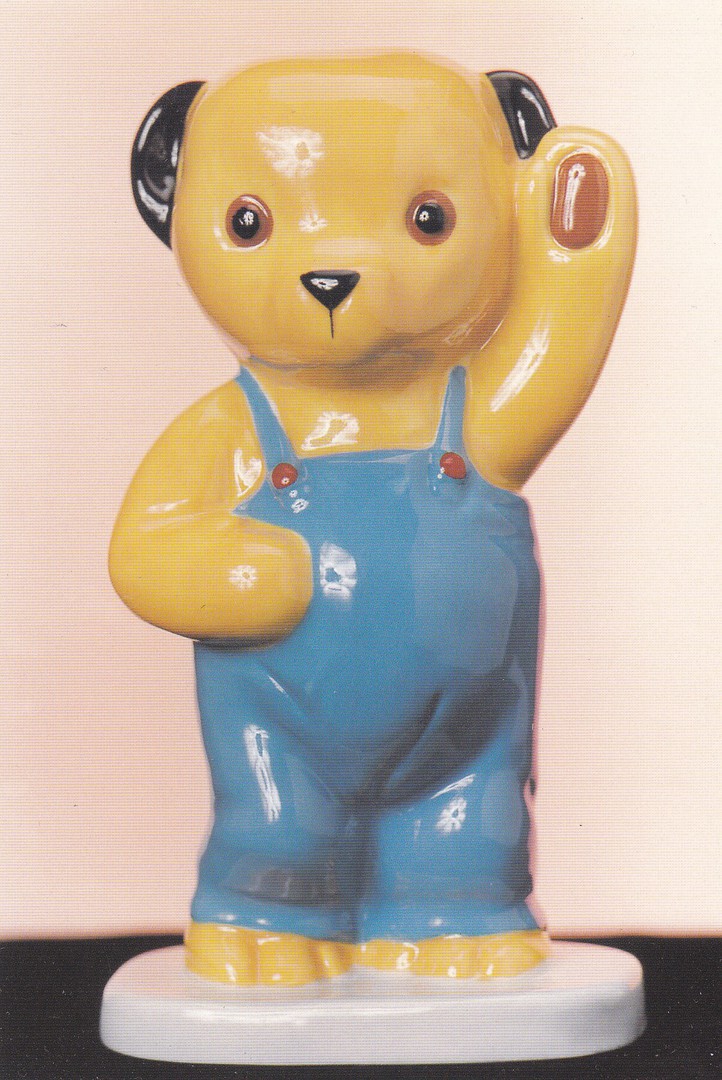
SOOTY
THE FIFTH IN A SERIES OF LIMITED EDITION
WADE FIGURINES FROM
CAMTRAKS
“CHILDHOOD FAVOURITES”
SERIES
Printed by
ALPHAGRAPHICS, NOTTINGHAM
Just to show that there are other characters in this series I include here the Sooty figurine. As with the two Paddington ones above there are details on the reverse side for this figure. I also have some Rupert the Bear ones as well and when I dig these out, I may show these on the webpage at a later date.
REVERSE SIDE OF ABOVE POSTCARD

17/11/2017
2002 ‘MODERN’S’ FAIR
LONDON
31ST AUGUST 2002
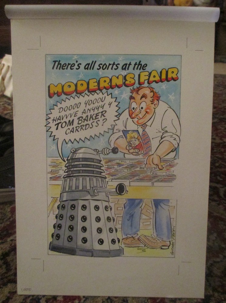
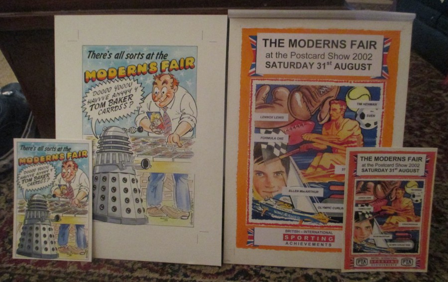
THERE’S ALL SORTS AT THE
MODERN’S FAIR
“DOOOO YOOOU HAVVVE ANYYYY Y TOM BAKER CARRDSS?”
MARKS’ PIRATE POSTCARD
(With Compulsory ‘Dr Who’ reference)
THE MODERN’S FAIR – LONDON 31ST AUGUST 2002
ARTIST
MICHAEL O’BRIEN
Printed by:
LONDON POSTCARD COMPANY
For
Mark Routh (yep, me)
In 2002 the PTA (Postcard Traders Association) wanted to add a Moderns fair single day fair to that years Picture Postcard Show in London. They asked someone who they thought had some knowledge around the modern postcard world if they would organize this if the PTA supplied the room. The person they asked was me, and stupidly, because I had no idea what would be involved, I agreed and managed to pull things together for what I believe was a ‘really’ successful fully modern one-day event.
To help get into the feel of things I decided to publish my own postcard for this fair and asked a then well-known modern postcard artist, Michael O’Brien to design it for me. Knowing my love of Dr Who Michael came up with this design.
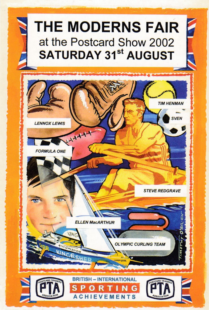
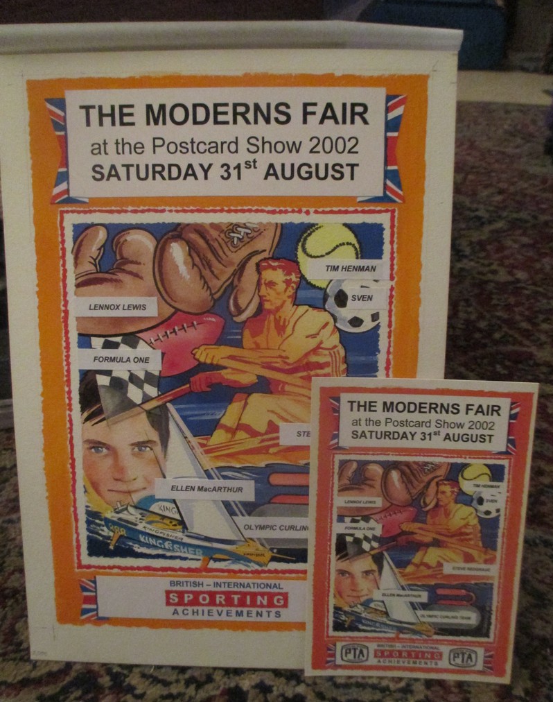
THE MODERNS FAIR
At the Postcard Show 2002
SATURDAY 31ST AUGUST
BRITISH INTERNATIONAL SPORTING ACHIEVEMENTS
OFFICIAL POSTCARD FOR THE P.T.A SPONSORED
‘MODERNS’ FAIR 31ST AUGUST 2002
ARTIST
TIMOTHY O’BRIEN
Printed by:
LONDON POSTCARD COMPANY
I also believed, like the main Postcard Fair it was attached to, the Modern’s Fair deserved its own postcard that everyone visiting the event could receive as a fair souvenir. So, I contacted Tim, who is the son of Michael who designed my card for me (I thought I may as well make it a family affair) and asked him if he would mind coming up with a design for me. Tim opted for a nice sports related design. As with my own card I commissioned the London Postcard Company (with whom I had some very special links) to print the card. Anyone who then attended the Modern’s Fair, and there were quite a few people who did so, the turnout was considered a success, received one of these cards.
In the end both Tim and Michael attended the fair as well and sold their own cards and signed cards for people.
PHOTOGRAPH
If you commission a piece of artwork for use as a postcard then you will of course, potentially, and if that is what you have agreed, receive the actual piece of artwork as well. This is the Dalek themed original painting which Michael O’Brien did for me

PHOTOGRAPH
Here is a copy of the postcard depicted beside the actual piece of corresponding artwork

PHOTOGRAPH
This is a photograph of the original piece of artwork from Tim O’Brien with the sheet of protective tracing paper laid over the top. This overlay was used to show me where Tim suggested the PTA logos should be applied.
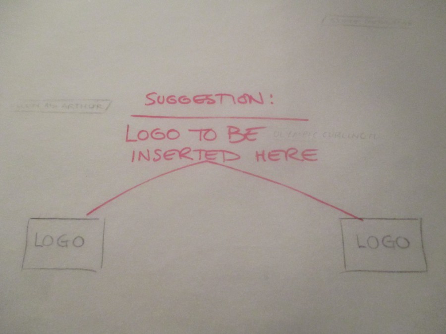
PHOTOGRAPH
This is an image of the overlay mentioned above where Tim has written about the suggested location for the logos to be applied.
PHOTOGRAPH
The original artwork for Tim’s design with the still clear white areas at the bottom where the PTA logos were placed on the printed postcard
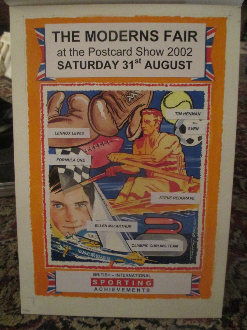
PHOTOGRAPH
Here is a copy of the postcard depicted beside the actual piece of corresponding artwork

PHOTOGRAPH
Close-up picture of the bottom of the artwork and the postcard showing the PTA logo on the latter
PHOTOGRAPH
Both pieces of artwork with matching postcards

17/11/2017
BBC
CHILDREN IN NEED
Official Pudsey Bear Postcard
No printer or official publisher noted
I suppose it had to be something like this that got posted on the webpage today. I am not sure of the source of this card, it does not have any text on the reverse side, but it looks like an official issue. As a TV collector it fits nicely into my collection. As this is such a popular charity and raises money for good causes let’s hope they do well tonight, which I am sure they will.

16/11/2017
NEW DOCTOR WHO
JODIE WHITTAKER
Published by
DWAS (*apparently*)
Is this the first new doctor postcard image? It has appeared on eBay recently (early November 2017) and it is stated there that this is a publication from DWAS (The Doctor Who Appreciation Society – although the eBay advert does not give the details of what DWAS means). Sadly, this is a plain backed card, although text on the front does state that the image is by Kevin Mullen. This image is prior to the recent release of her costume and comes from her initial introduction in the original TV adverts when she was shown to be the replacement actor for the role. Whatever its true source, and it may be the DWAS, this is a smashing first postcard look at the new doctor (and this may be one of the rare ones showing her prior to her costume being worked out).
Comments
-
Clarification to above - It was originally created just for my own pleasure and DWAS (Doctor Who Appreciation Society) asked if they could use it.
-
Hi, I'm Kevin Mullen and I created the Jodie Whitaker postcode for DWAS. It was originally created the day after she was announced as the 13th Doctor. A few days later, DWAS asked if they could give it away as a free gift with their magazine. Jodie has apparently said she thought the image was stunning.
16/11/2017
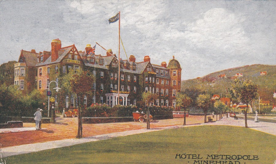
HOTEL METROPOLE
MINEHEAD
Published by
THE PHOTOCHROM CO., LTD (LONDON & TUNBRIDGE WELLS)
In their:
CELESQUE SERIES
This artists impression postcard was posted a hundred years ago in 1917 from Minehead. No artists name is given but the style is typical of many postcards issued around the period prior to WW1, although stocks must have continued to be stored at the hotel, or perhaps the sender had some laid by, as the quality of cards issued in 1917 had been greatly affected by the ongoing war by this year. Whatever the story is around its use in 1917, and I believe it was obtained from the hotel by someone staying here (which seems to me to be the most likely option – the hand-written message does not indicate anything more), this is a lovely card for anyone interested in this area (I had several holidays as a child in the Butlins camp at Minehead and visited the town itself many times).
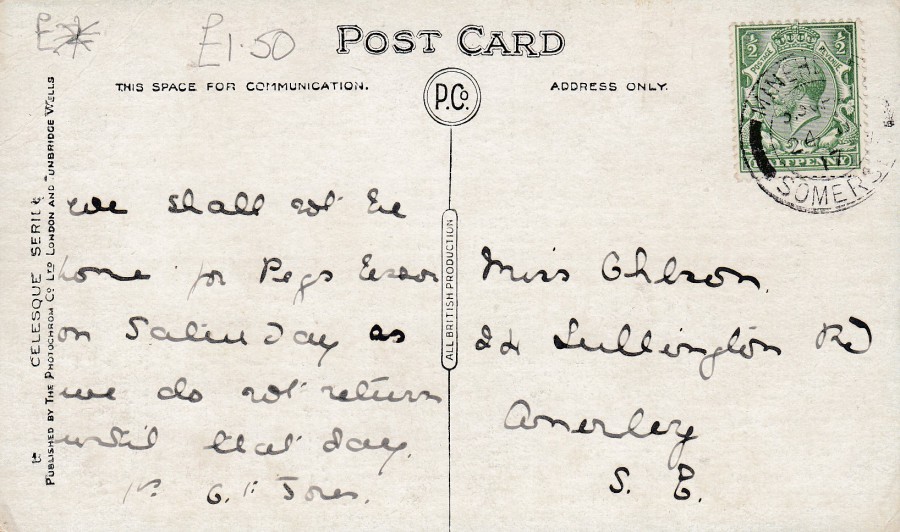
REVERSE SIDE OF ABOVE POSTCARD