10/02/2018
BELGIUM
‘V’ FOR VICTORY
LIBERATION MARK
Overprinted Postage Stamp on Postcard
1945
Published by
EDITIONS “CENTRE MAXIMAPHILE” BRUXELLES
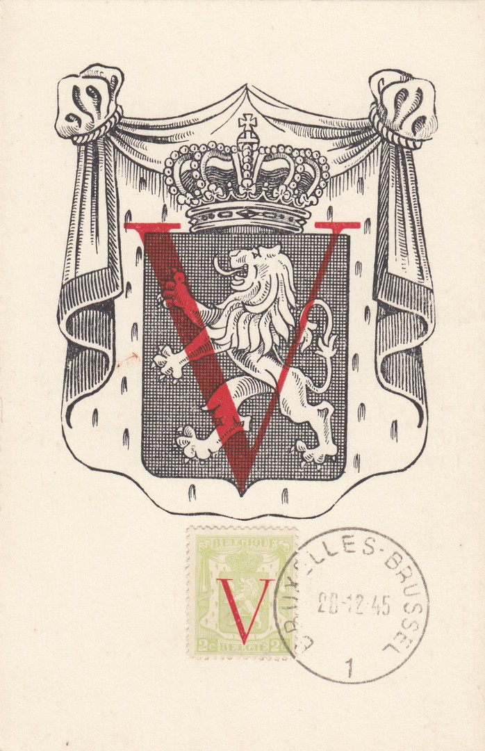
This is an interesting one for military theme collectors, and one I suspect they might not come across. The stamp here is a 1936 issued 2c Green definitive (originally SG 727) which has been overprinted with a large red ‘V’ to commemorate the liberation and victory in Belgium in 1944. This new overprinted stamp is reference SG 1078 (Michel Catalogue reference 681) and it was released on 10th November 1944. The copy attached to this postcard has been cancelled with a ‘BRUXELLES – BRUSSEL’ (Brussels) 1 single ring cancellation dated 28th (possibly 20th – the second digit is indistinct) December 1945. It is clear from the postcards illustration that it related directly to the stamp issue, but I could not see why it was cancelled so long after the issue of the stamp itself, over a year and month after. There was apparently a session meeting of the Belgian Chamber of Representatives held on the 20th December 1945, but I am not sure if this is related. Someone ‘definitely’ went to some trouble to produce this item so what does the date represent? If anyone does know I would love to hear from you. Whatever the reason for its cancellation date this is still a smashing postal item, and one which I was happy to pick up for a £1 at last years Autumn Stampex.
10/02/2018
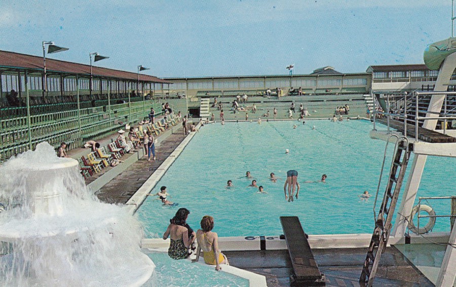
BATHING POOL
CLACTON-ON-SEA
Published by
ERNEST JOYCE & Co., Ltd., NORWICH
Printed In
PLASTICHROME – by
COLOURPICTURE PUBLISHERS LTD., NORWICH
(This also has ‘Made in the USA’ in red, but not sure how this can be
Considering the Norwich connection to printer)
Ref: P43385
“The popular Essex resort of Clacton is well known for its sandy beaches and safe bathing. The Wonder Bathing Pool on Clacton Pier is the only pool suspended in air in England. Clacton is located by roads A 133, B 1027 and 1032”
(Text from reverse side of postcard)
I was not aware that Clacton had had a swimming pool that was then unique in the UK. This postcard image is from the 1960’s and I know that the pool was closed by 1971 because between 1971 and 1985 this pool was changed over to a feature which had dolphins and, supposedly (although I was unaware of this), killer whales on display, although there was a fire on the pier in 1973 and the pier was damaged again in a severe storm in 1978 and I think that during, or around these times the animals may have been moved away, so I don’t think the animals were there throughout these years.
The pier itself was opened in 1871 but it was not until its purchase by Ernest Kingsman in 1922 that many of its attractions were commenced, and by the start of WWII the pool was one of its attractions. So, there is a lot of history contained in this image, in fact, far more than even I imagined (and this is the fun part of collecting, researching the images and finding out about them, even for what initially looks like a simple uninteresting photograph).

REVERSE SIDE OF ABOVE POSTCARD
Standard styled ‘Plastichrome’ layout
(this layout style can be seen on both UK and US published ‘Plastichrome’ postcards)
10/02/2018
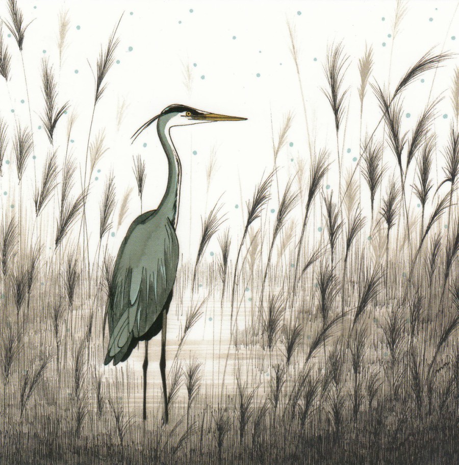
UNTITLED
(HERON)
By
MYRIAM NION
Published by
EDITIONS TITI PINSON
Ref: M C025
This French published art postcard was another buy from my visit to Saintes over a week ago (you will have to excuse my regular postings of the cards I bought in France on my recent trip, but as every collector knows it is the most recent acquisitions which are nearly always the cards which one wants to show others – so, although I do have many older buys it is still quite often the cards I have just bought which appear here!). This cards artwork appealed to the wildlife collector and birdwatcher in me. I is a lovely painting of a Heron, and I love the fact that some companies are still publishing modern art designs like this which could be considered to have a smaller appeal and sale ability than more popular bigger sales liked themes. This is also a square shaped card, a size and shape I found to be quite common on current French art design postcards as the shop I bought this card in had two spinners of postcards inside which were all of this shape (I posted a photograph of the shop front on the webpages connected ‘facebook’ page – 1st Feb). These modern issues are not always cheap, and often at the highest end of the current costs – I am not positive but this was around the 2 euro to 2.50 euro mark – but I think they are worth the money as they are superbly printed.
09/02/2018
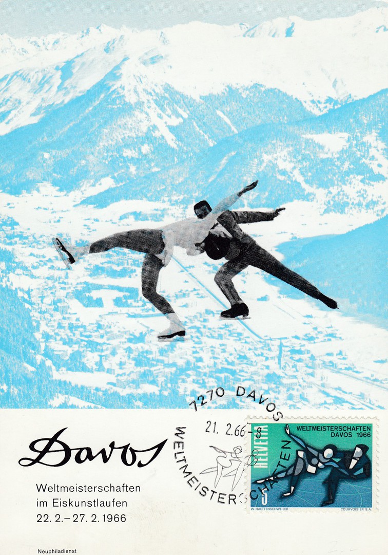
SWITZERLAND
WORLD FIGURE SKATING CHAMPIONSHIPS
In
DAVOS
22ND February – 27th February 1966
Anonymous Publisher
As the Winter Olympic Games have commenced I thought I would dig out something appropriate to post and have gone for a winter sports related card for the World Figure Skating Championships held in Davos in Switzerland IN 1966. This has the applied stamp cancelled by a special event postmark dated 21/02/1966, which I believe was the opening event day, prior to the actual championships commencing. The stamp was issued earlier, on 14th September 1965 as a pre-publicity stamp (Ref: SG 730), but it has been used here on a card published for the actual event the stamp promoted. A nice combination, not a first day of issue usage but an event usage.

09/02/2018
ST JAMES PARK
BY TUBE AND BUS
Artist:
Jennie Tuffs
1999 Poster
Published by the
LONDON TRANSPORT MUSEUM
(Covent Garden, London)
Ref: LTM 657
The London Transport Museum postcard series is huge and highly collected. The other good thing about it is that it is ongoing with new postcards still being issued. I picked this design up on my last visit to the museums shop, always well worth a trip (although I will admit for some strange reason I have still not actually been inside the museum – perhaps I will make it one of my things to do this year).
This postcard would be equally collectible to a Poster collector, Transport related collector and a wildlife or bird collector.
09/02/2018
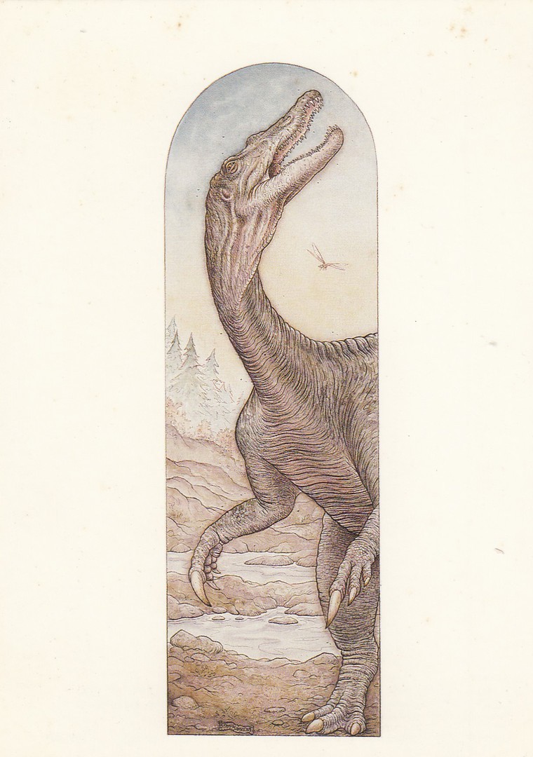
“CLAWS”
Published for
BRITISH MUSEUM (NATURAL HISTORY)
(THE NATURAL HISTORY MUSEUM (LONDON))
(1987)
Printed by
JUDGES POSTCARDS LTD (HASTINGS)
Ref: Card DPG 77
(C9495X)
“Baryonyx walker, the only reasonably complete large flesh-eating dinosaur from Early Cretaceous rocks anywhere in the world. It probably stood between three and four metres tall in bipedal pose”
(Text from reverse side of postcard)
This postcard, amongst others, was published by the museum to coincide with a special exhibition titled ‘Claws’ which was related to this specific dinosaur discovery. I remember paying a visit and buying this postcard.

09/02/2018
KYRIAD HOTEL
DISNEYLAND PARIS
Official Hotel Postcard
No Printer/Publisher named
From previous posts over this past week you will know that I visited Disneyland Resort Paris last Friday and Saturday (we went into the theme park itself on the Saturday). We arrived mid-afternoon last Friday, and we stayed overnight here at the Kyriad Hotel. This is an official Disney hotel, but it is the furthest away from the actual park, but they run a free bus service which takes you too and from the hotel to the main bus terminal right by the entrance to the theme park. If you are after a reasonable hotel, remembering that they will all be more expensive here than a standard hotel almost anywhere -else, then this one is the best priced. Our last-minute booking was 125 euros for the night, for three of us sharing, and there was another bunk, so another person could have stayed as well. I have stayed here before and the price includes breakfast (which includes both continental and full fried selections). I like this hotel and use it for short single stay visits.
On the booking in counter they have a small display of these exclusive hotel postcards, which cost 50c each. I bought one to show you and to place in my collection.
09/02/2018
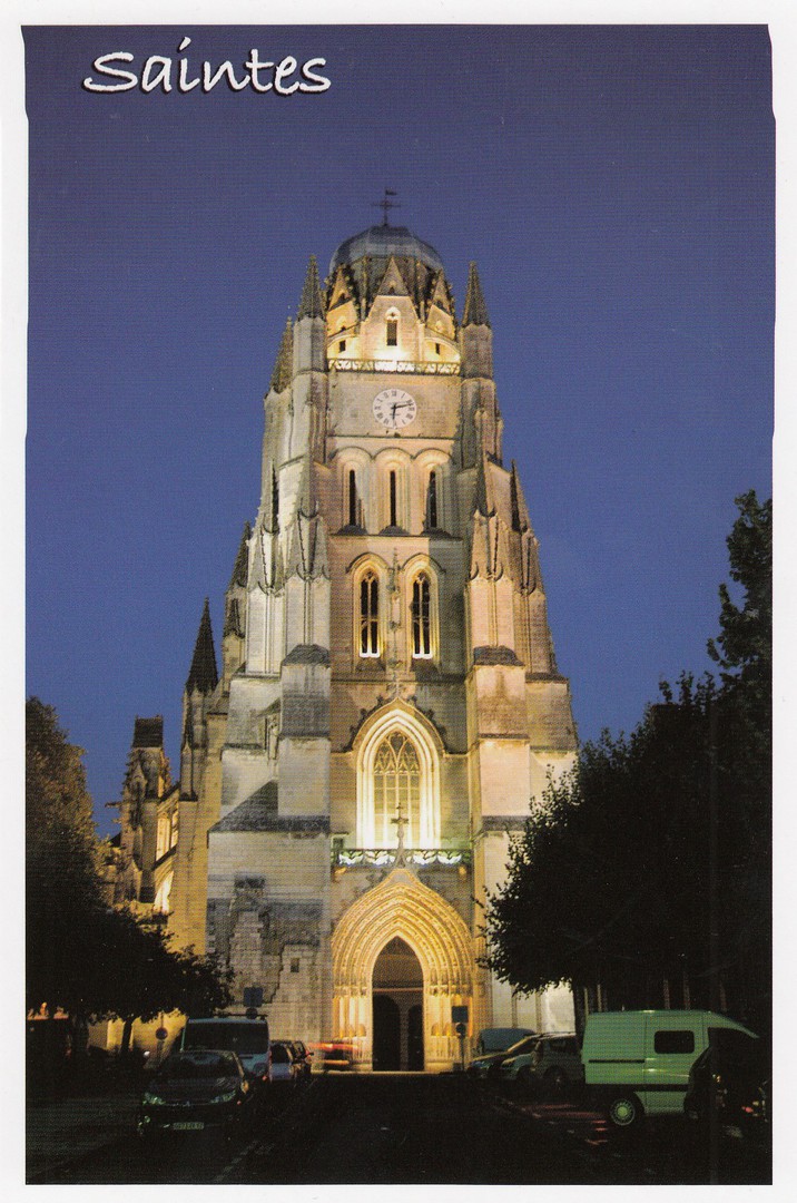
SAINTES
(CATHEDRAL SAINT-PIERRE)
Published by
EDITIONS MARCOU
(Royan)
Ref: 179661
“Eclairage nocturne sur la façade, le portail et le clocher de la cathedrale Saint-Pierre style gothique”
(“Night lighting on the façade, the portal and the bell tower of the Cathedral Saint-Pierre gothic style”)
My in-laws house, which we are currently caring for after the sad death of my father-in-law last year, is located just outside the historic town of Saintes, so I know this area very well now. It was here that we spent most of last week (before heading to Disney). Although there was a lot of work to do we still made time to visit the town and have a look around. It was here, in the post office, that I bought the Star Wars BB8 stamp sheet posted on the webpage on 05/02/2018 (see below, bottom of page). We also paid another visit to this cathedral, which is in the centre of town. This is an amazing building and I always enjoy a walk around inside it. On this last visit I found this postcard on a table within, there was no person with the table, they ask that you place the money in a slot on a wall mounted deposit box. This I did as I think the card is delightful. This is an example of me buying a postcard souvenir of my visit rather than buying a postcard for any of my specific collections. This was me being a typical tourist rather than a postcard collector.
09/02/2018
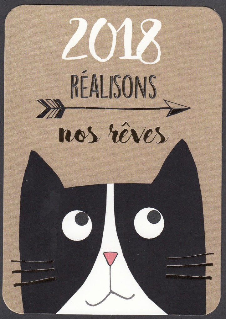
2018
REALISONS
NOS REVES
(2018 REALISE YOUR DREAMS)
Titled
“HAPPY 2018”
By
Corinne Demuynck
Published by
EDITIONS CARTES D’ART PARIS
Ref: DC 602
It would appear the fascination with cat themed postcards is not just happening here in the UK! I picked up this postcard in France only last week. I have always liked dated cards because you know they will have a shorter shelf life and often a shorter print run as well, as I expect will be the case with this design, and it is a lovely design. The gold coloured letters and sections of the arrow, and the whiskers on the cat, are printed in shiny gold, which adds something to the overall image.
It will be interesting to see if 2018 continues to be a ‘Cat’ postcard year after the popularity of the theme in 2017.
09/02/2018
UNTITLED DESIGN
By
BEN PEPPER
Published by
BOOMERANG MEDIA
I don’t know why this design appeals to me, but it does. It was a free card I found in the postcard rack at my Odeon cinema many years ago now. Sometimes things don’t need to be explained to be liked, and this card has no title and no descriptive text. Boomerang used to produce postcards of artists work for free as a form of promotion, this is an example of this kind of release. There is a contact email for the artist on the reverse side if you are interested: pepper_ben@hotmail.com
08/02/2018
WOMEN’S SUFFRAGE CENTENARY
THE CENTENARY OF THE 1918 SUFFRAGE ACT
There was a lot of news coverage for this centenary a couple of days ago on the actual centenary, 6th February. In honour of this very important UK anniversary, and to give support around the much-raised issues of equal pay and rights, something which has been campaigned for, and was the subject of postcard artwork back in the 1980’s via this postcard company, I post here four postcards which support or celebrate those involved in the women's rights movement, or which bring to attention the equal rights issue.
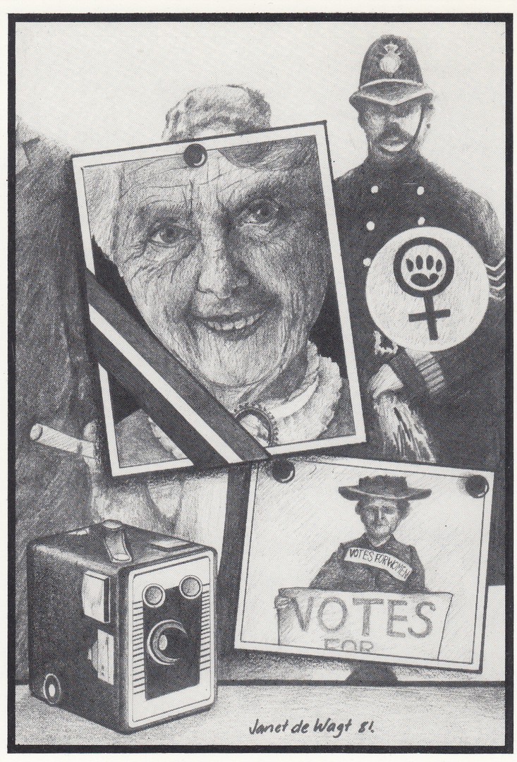
SUFFRAGETTE
By
JANET DE WAGT
(1981)
Published by
LEEDS POSTCARDS
(Ref: 37 – although this does not appear on the postcard itself – the number is allocated to this postcard design by the postcard company)
Janet de Wagt had a range of her black and white artwork pieces published on postcard by Leeds Postcards. These all had a female content and the art style is very distinctive. I have always like this one as I think it gives a real historical view on the votes for women and equal rights movements.
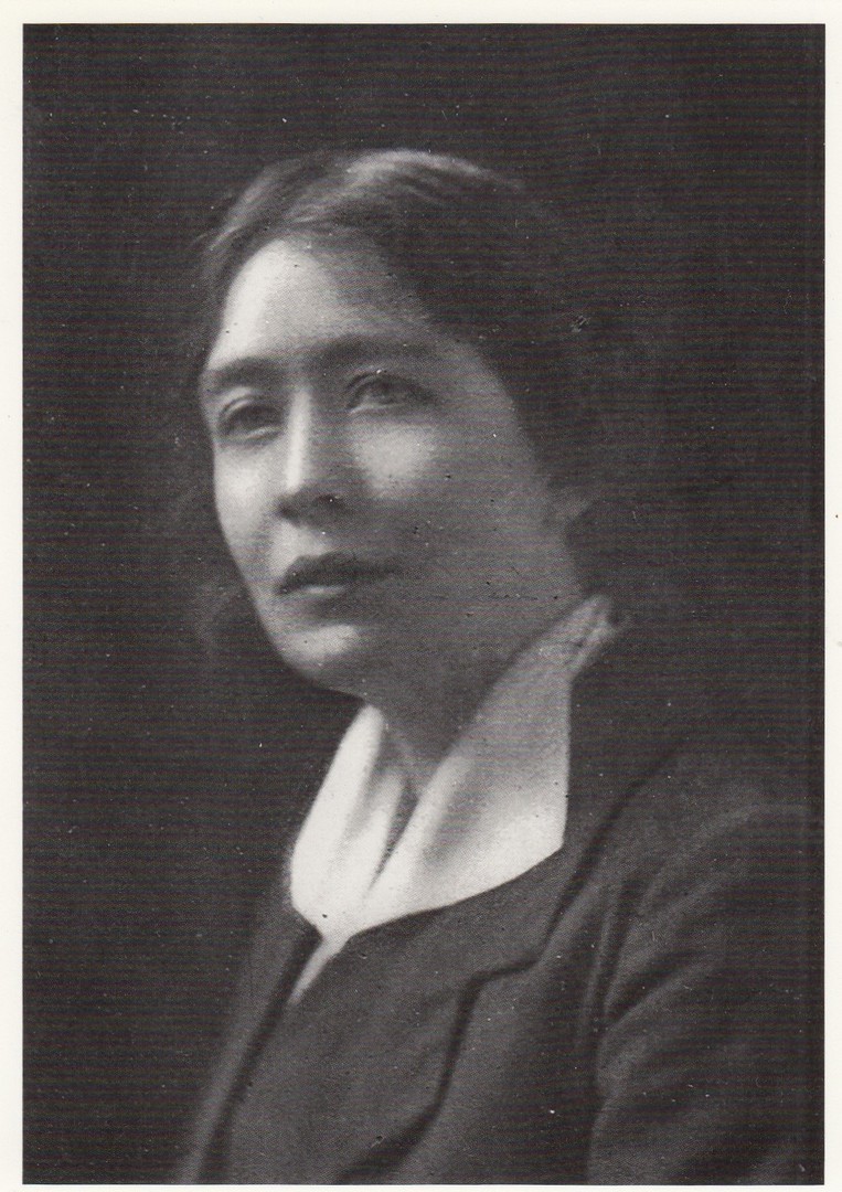
SYLVIA PANKHURST
(1881 – 1960)
Published by
LEEDS POSTCARDS
Ref: L373
“Suffragette and socialist, Sylvia Pankhurst centred her campaign for women’s rights on working women. Her base was London’s East End where from 1914 she edited THE WORKERS DREADNOUGHT’ (1914 – 1924), a weekly paper… ‘through which working women, however unlettered, might express themselves and find their interests defended’”
LEEDS POSTACRDS issued a selection of postcards which depicted women from the past and the then current times who had or were working in the movements of both equal and civil rights.
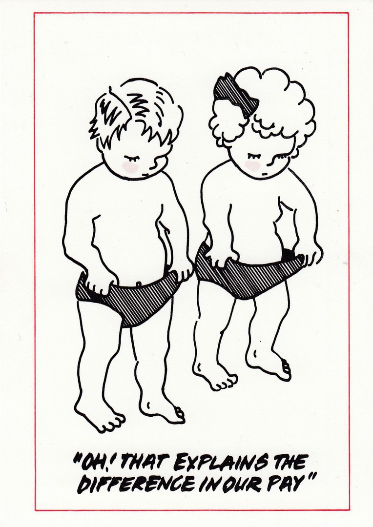
“OH! THAT EXPLAINS THE DIFFERENCE IN OUR PAY”
Published by
LEEDS POSTCARDS
PROOF COPY
Of postcard
This one was issued as a postcard, but this copy here is a rare plain backed – but with the companies red cachet stamp – copy. I will have to dig out my copy of the issued postcard and record its reference number, which is missing from this copy because it does not have the postcard back.
REVERSE SIDE OF ABOVE PROOF COPY
If you can find these, they are a nice addition to any LEEDS POSTCARDS collection
ANNIE BESANT
(1847 – 1933)
Published by
LEEDS POSTCARDS
Ref: L059
“Trade Unionist (leader of the Match-Girls’ strike), Fabian orator, popular journalist and advocate of birth control”
Another good example of a LEEDS POSTCARDS issue with a photograph of a person probably otherwise not seen on modern postcard. Anyone interested in the equal rights movements, civil rights movements, the green movement and other worldwide campaigns around people’s rights, then the issues by this company throughout the 1980’s and 1990’s into the 2000’s are well worth collecting.
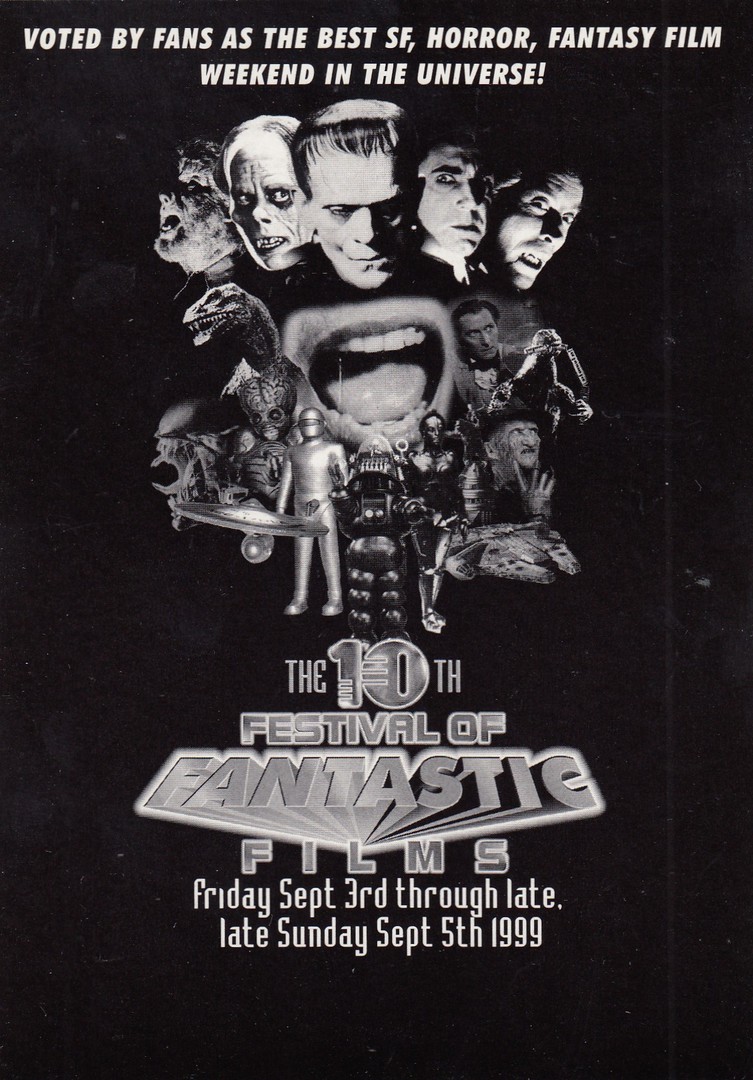
08/02/2018
THE 10TH FESTIVAL
OF
FANTASTIC
FILMS
1999
(Friday Sept 3rd through late Sunday Sept 5th)
The 1999 Convention of the Society of Fantastic Films
The Britannia Hotel, Piccadilly. Manchester. England
Published by
BOOMERANG CINEMA CARDS
This design has a superb montage of images from horror and science fiction films, including the classics of Dracula (played by both Bela Lugosi and Christopher Lee, both depicted here), Frankenstein, The Phantom of the Opera and the Wolfman. There are also some images which make this fit into a number of very collectible specific themes: the USS Enterprise from Star Trek (which means this also fits into my television collection), Godzilla (very collected in Japan as a single theme), King Kong (only a small image, but an iconic one, depicting Kong on top f the Empire State Building) and, perhaps most collectible of all, the Millennium Falcon from the Star Wars films (perhaps the most collectible category for this card). If you include the range of robots across the bottom (from the films ‘The Day the Earth Stood Still’, ‘Forbidden Planet’ and ‘Metropolis’ – I know my robot films), and the Alien, from the Alien film franchise, Freddie from ‘A Nightmare on Elm Street’ (originally from way back in 1984 believe it or not!) you get a really mixed bag of content here. Peter Cushing also makes an appearance, which seems only appropriate as his long-term friend and fellow horror film actor Christopher Lee appears at the top. I have always been a fan of Peter Cushing and love his films, especially the Hammer Horror ones, although he was also in the first Star Wars film as well of course.
On the left side is a Ray Harryhausen created dinosaur, which he named as the Rhedosaurus, from the 1953 black and white film ‘The Beast From 20,000 Fathoms. I like this film and it is one of Harryhausen’s best stop-motion animations.
And, before anyone picks me up on it, there is one other inclusion in this montage and this is the big-headed alien from the 1955 film ‘This Island Earth’. This is a mutant from the planet Metaluna that appears briefly towards the end of the film, but which is perhaps the best thing in the film. So, there you have it, a wonderful free postcard, well, free at the time, I expect it will cost you at least 50p from a postcard fair and more, maybe £1 - £1.50 from eBay if you ant a copy today – it is 18 odd years old now!
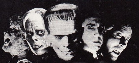
CLOSE UP SECTION OF ABOVE POSTCARD
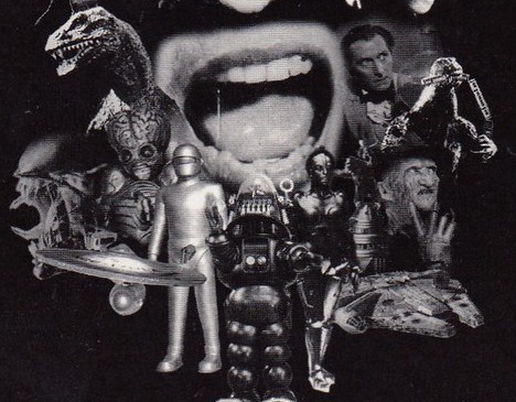
CLOSE UP SECTION OF ABOVE POSTCARD
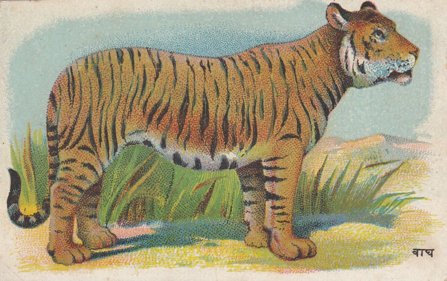
08/02/2018
TIGER
Printed at the Chitra Shala Press,
Poona City, India
This was a new buy this week. I have always loved tigers, which I have mentioned before, and they are the animal which I still dedicatedly collect on postcard. This one is a nice old card which was printed and distributed in India. I think the simplicity of the colour printing used here makes this a delightful card.
REVERSE SIDE OF ABOVE POSTCARD
08/02/2018
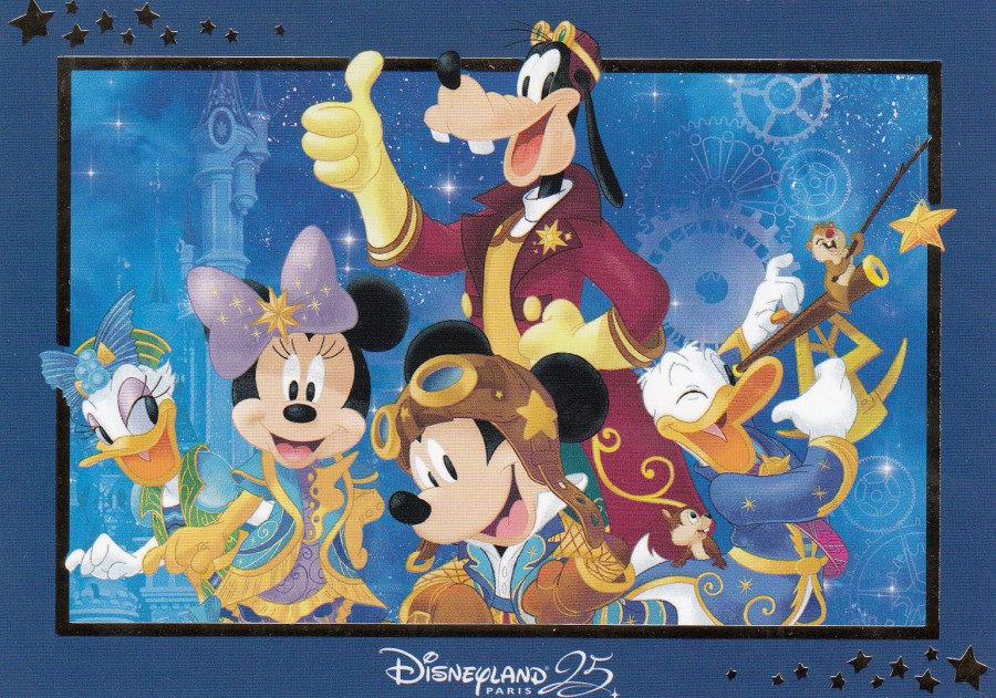
DISNEYLAND PARIS 25
OFFICIAL THEME PARK POSTCARD
Ref: FAC-022768-16325
(Original retail price – 2.50 euro – 2017/2018)
Disneyland Resort Paris (although I noticed that here on this postcard it comes over as just Disneyland Paris, without the additional ‘Resort’ bit – have they changed it again?) has been celebrating its 25th Anniversary and when we visited this past Saturday they still had lots of related 25th merchandise on sale, although they are coming up on the end of this celebration period. This is the official 25th anniversary/birthday postcard, and I think it is a really-good one. The inner gold boarder and the stars within the outer boarder are printed in shiny gold, which adds some sparkle to the design, but its not over the top here. These special event type Disney postcards are the ones collectors most want to try and obtain, which is why this one does appear on eBay sales already, although I would not pay £7 for this one, at this time! (not whilst it is still on sale at the park anyway). On my visit I could only find copies of these cards in the main shop on the left side as you enter the Walt Disney Studios Park (the second park area) and the shop in the Sequoia Hotel (although I did not check the shops in the other hotels so they too may have copies - worth a check)
REVERSE SIDE OF ABOVE POSTCARD
Disney quite often add little images, framed, outlined or in faded or shadowed design on the reverse side of their postcards, sometimes they also add colour, although not in this case (I have found the use of colour to be more common with the American theme parks and not with Paris). Here you have a shadow Mickey Mouse depicted in his costume that he is wearing on the front of this postcard as well.
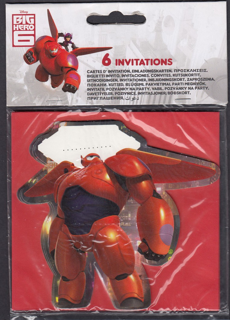
08/02/2018
DISNEY
BIG HERO 6
PARTY INVITATION CARDS
(Shaped Cards with red envelopes)
Published by
Decorata Party
I have in the past depicted many of the American Party Invitation packs which contain postcards (THANK-YOU postcards normally), which I have picked up on my trips in Florida. So far, here in the UK I have been unable to find any of these styled packs, but as I have previously explained we do not have the same tradition of sending out ‘Thank-you’s’ to people who have attended birthday parties here (it took a long for the ‘goodie bag’ for each attendee to catch on, so maybe we will eventually get these invitation packs with postcards, but I am not so sure – I am back in the US for a number of weeks across the summer so I will look out for any new ones).
This pack here contains invite shaped cards, not true postcards, but shaped cards with areas on the reverse side for the party invite details. It is the closest I have come to what the Americans have. I also had the added-bonus that I found this pack in a sale this month priced at just 50p. For that price I would have been stupid not to add the item to my collection, and as you will be aware, I do like Disney related cards. The card depicts the robot character called ‘Baymax’ from the 2014 animated Disney film ‘Big Hero 6’. Judging from the languages used on the fold over description title card at the top this item was destined to be sold in numerous places across the world, and I doubt the UK was anything other than just another of these countries as there is very little English contained here.
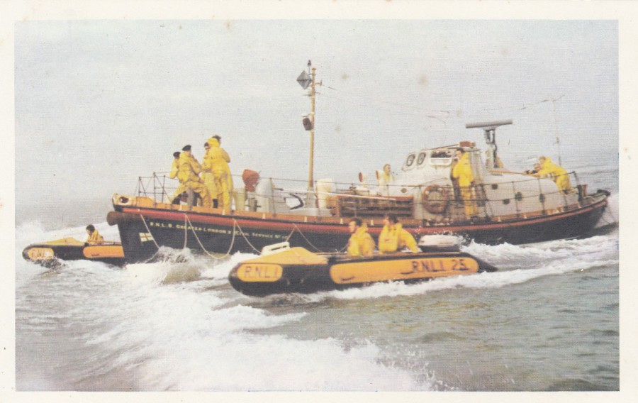
07/02/2018
SOUTHEND-ON-SEA
LIFE-BOAT
‘THE GREATER LONDON’
CIVIL SERVICE No. 30 WATSON DECK CABIN LIFE-BOAT
46FT, 9IN LONG
TWIN DIESEL
V.H.F. U.H.F. R.T. & RADAR
TWO INSHORE RESCUE BOATS POWERED WITH OUTBOARD ENGINE AND FITTED WITH RADIO
(Text all on reverse of postcard)
Published for the local R.N.L.I.
This postcard is quite a few years old now, but I like it because this depicts the lifeboats for my home town. I have previously depicted a local lifeboat card I picked up from the R.N.L.I. Shop on the Pier here in Southend. But, this card here I have had in my collection for some time. If I remember correctly I came across this one at a local event on an R.N.L.I. stall. I think I bought ten copies, one for my collection and nine to put away, after all they were raising money for a good cause.

07/02/2018
MAGDEBURG
Black zur Wilhelm – Pieck – Allee
(View of Wilhelm-Pieck-Allee)
Published by
Gebr. Garloff KG. Magdeburg
Ref:
Z 196 IV-14-45 T 115/59
(All of these appear on the reverse side of this postcard)
From what I can see the word ALLEE means a straight path or road with a line of trees or large shrubs running along each side. So, this would therefore be the Wilhelm Pieck Road/Street. Wilhelm Pieck was a German politician and communist who became the first President of the German Democratic Republic (the office of ‘President’ was abolished upon his death). He was in office from 1949 to 1960, he died on 7th September of that year. Magdeburg is in what was called East Germany, during the time that Pieck was President. The buildings depicted here look post WWII, and this is more than plausible as much of Magdeburg was destroyed by allied bombing in 1945.
When you look at the history of a place it makes the depicted postcard more interesting, and I certainly found this to be the case with this postcard. So, it may come as a surprise to hear that I got this postcard free as someone used it as a ‘stiffener’ board inside an envelope in which they were sending me another postcard which I had bought on eBay. They clearly did not see anything interesting in this image – I did.
07/02/2018
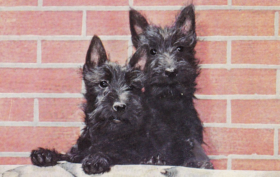
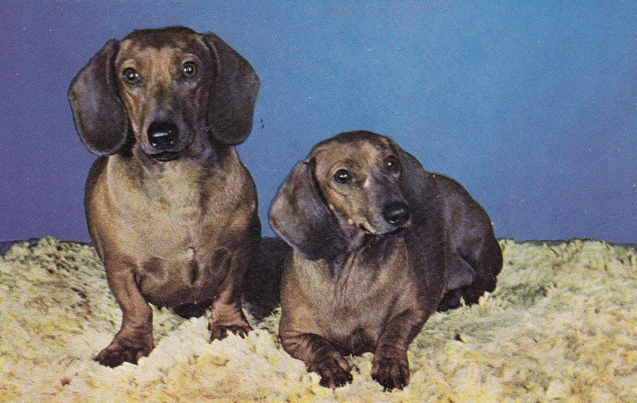
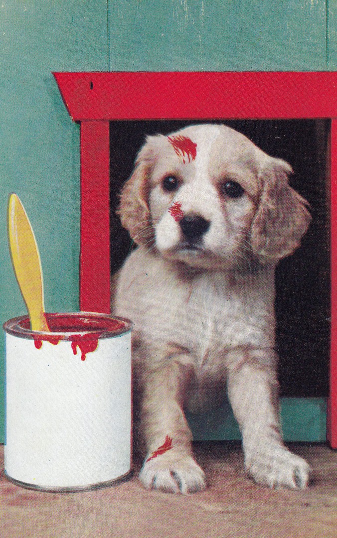
DOG POSTCARDS
Published by
SALMON LTD,
SEVENOAKS
“SALMON SERIES”
I bought these six postcards together as they at first appear to be similar in style and content, but the reference numbers seem to indicate that there are cards missing from my collection. The cards have no text and no descriptions, on either side, but they are individually numbered. The breeds of the dogs depicted are sometimes obvious, but not always, not to some one who does not know much about dog species. So, I will just depict the six cards I have. The reference numbers for cards are as follows:
5202
5203
5205
5234
5235
5236


07/02/2018
PERU
2 CENTAVOS in blue overprint on 5 CENTAVOS grey blue printed card
Higgins & Gage, World Postal Stationery Catalog
Section 14
Peru - Page 1
Reference No: 14
Issued 1884
My Higgins & Gage catalogue states that there are many minor varieties on this issue, but that this is a specialised area of study and was beyond this catalogue. I suspect these minor differences relate to the use and application of the blue overprints, the sideways ‘2’ top left, the PERU sun central logo and the blue octagon with central pricing value which appears top right. There certainly appear to have been a number of different overprints on what was originally a card issued without these back in the previous year, 1883.
07/02/2018
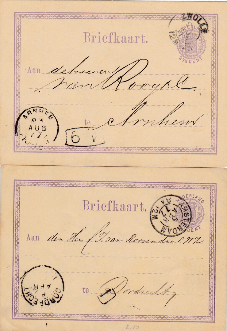
NEDERLANDS
2 ½ Cent Violet on Cream Card
Higgins & Gage, World Postal Stationery Catalog
Section 13
Nederland - Page 1
Reference No: 2a (address lines of dots close together)
Issued 1872/73
TOP POSTAL STATIONERY POSTCARD
This copy was posted from the city of Zwolle, in the Netherlands, to Arnhem, also in the Netherlands. The pre-printed postage mark has been cancelled with a double ring ZWOLLE cancellation dated 2(?) AUG 1877. In the bottom left corner is the ARNHEM receiving mark dated 23rd August 1877.
BOTTOM POSTAL STATIONERY POSTCARD
This second copy of the 2 ½ cent postal stationery post card was posted from AMSTERDAM with the pre-printed postage mark cancelled with a nice clear double ringed AMSTERDAM cancellation dated 5th April 1877. This time the destination was DORDRECHT, another city in the Netherlands. The DORDRECHT receiving mark can be seen in the bottom left corner. This is dated the 6th April (the year section – although clearly 1877 – has not been inked well enough to be seen here).
These are not scarce cards, which can be seen by the fact that I have three to show you here, but as with all these early postal stationery items it is nice to have used copies with all their different marks and cancels. This is after all what these cards were produced for, internal postage across the Nederland, so it is nice to see from where, and to where, these were addressed and cancelled.
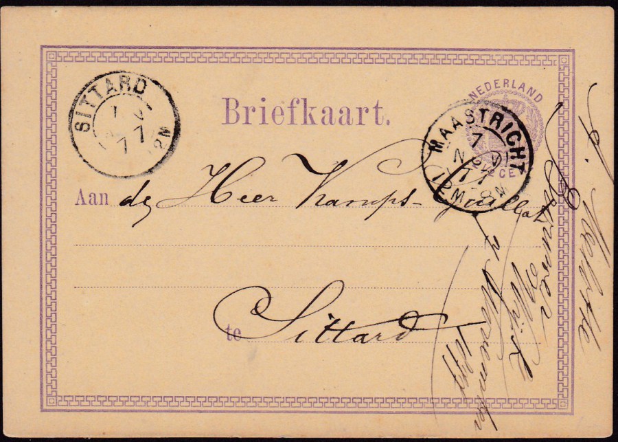
NEDERLANDS
2 ½ Cent Violet on Cream Card
This is a third copy of this early postal stationery post card (in fact there was only one earlier Nederland issue, in 1871, and this was the same design as seen here but with four lines of information text, instructions, along the bottom. These instructions were removed from this 1872 issue).
This copy was posted from MAASTRICHT to SITTARD. The pre-printed postage mark has been cancelled with a MAASTRICHT double ring cancellation dated 7th November 1877. The card arrived at SITTARD on the same day and received a receiving cancellation mark top left; SITTARD – dated 7th Nov 77.
07/02/2018
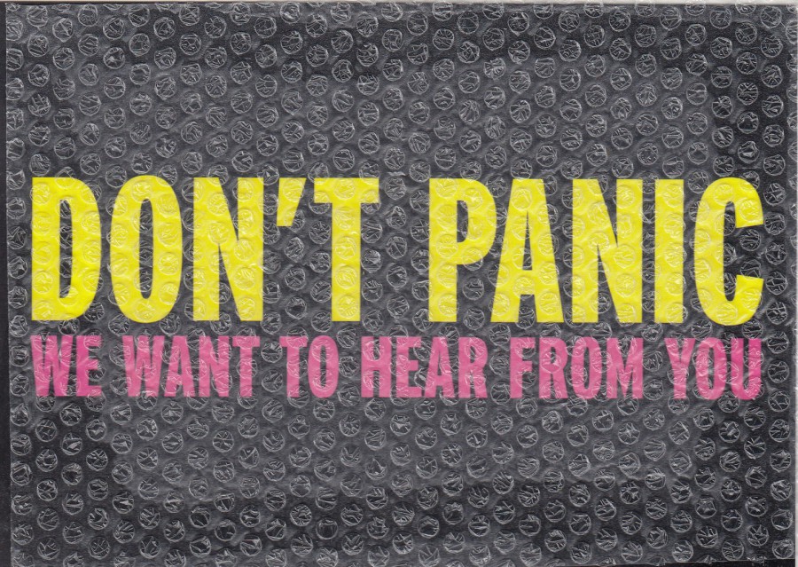
DON’T PANIC
WE WANT TO HEAR FROM YOU
UNIVERSITY OF SUNDERLAND
Novelty Postcard
Postcard with sheet of ‘Bubble Wrap’ attached to the front
Published by
PLANET BOOMERANG
(The same company as BOOMERANG MEDIA but under a sub-name)
There are two things I really like about this unusual postcard. The first is the obvious addition of the sheet of bubble wrap across the front of this postcard. I have always liked novelty postcard items, and this is definitely one of those. The second thing is something which is not mentioned anywhere on the card itself, and, may even be considered something that was not aimed for, although I strongly suspect not. This is the design itself, the big words ‘DON’T PANIC’, printed on the front in big letters – does this remind you of anything? For me it was a direct link to one of my all-time favourite books (which was originally a radio series and went on to be a television series, a feature film and a series of books), THE HITCHHIKER’S GUIDE TO THE GALAXY. Surely this card is reproducing the cover of that iconic publication. I certainly believe so.
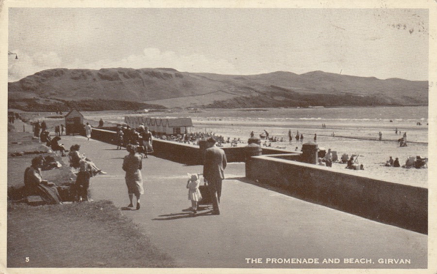
07/02/2018
THE PROMENADE AND BEACH, GIRVAN
Anonymous Publisher
Ref: 5
Girvan is in South Ayrshire, Scotland, on the east coast of the Firth of Clyde, and is a burgh in Carrick. I have never been to Girvan, but this 1950’s beach scene postcard came my way in a bundle I bought some years ago. It can be described as an example of the most standard of postcard ‘types’, the seaside view.
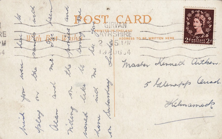
REVERSE SIDE OF ABOVE POSTCARD
The sender of this postcard used 2d brown Queen Elizabeth II Wilding definitive stamp (first issued on 31st August 1953). This has been cancelled with a rather nicely applied machine roller cancellation: GIRVAN – AYRSHIRE – 2 15 PM – 12 AUG 54.
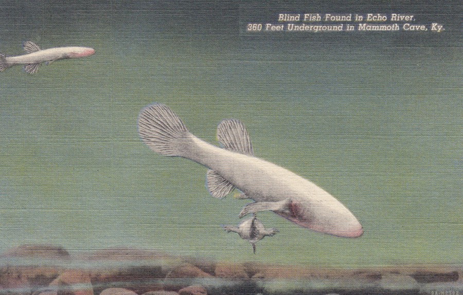
07/02/2018
CAVE FISH
“Blind Fish Found in Echo River, 300 Feet Underground in Mammoth Cave, Ky”
National Park Concessions, Incorporated, Mammoth Cave, Kentucky
Published by
GENUINE CURTEICH-CHICAGO “C.T. ART-COLORTONE” POST CARD (REG. U.S. PAT. OFF.)
This American postcard, from sometime around the 1940’s – 1950’s, I think, just goes to show that you really can find just about everything depicted on a postcard. This is the first, and only time that I have seen Blind Cave Fish on a postcard. When I first started collecting postcards, as a kid, it was just wildlife ones that I was after. As a result, I can-not resist any postcard that depicts an unusual creature, and these are definitely strange. These cave-adapted species are generally known as ‘eyeless fish’ and have adapted to their lightless, low-energy environment by ceasing to grow eye structures and unnecessary skin pigments.
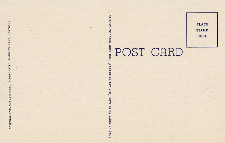
REVERSE SIDE OF ABOVE POSTCARD
This is a good example of the basic reverse layout for GENUINE CURTEICH-CHICAGO printed postcards, a standard style if you like, and one which is often seen on this type of printed card.
06/02/2018
EXCLUSIVE FREE POSTCARDS
Issued with the
MARCH 2018
Edition
If you are reading this in the UK in March (2018) then this issue of the magazine is still available in the shops. If you are interested in philatelic related postcards, especially the early Penny Black period, as these postcards relate to this era, and mostly to this issue. I depict all five of the postcards below:
In association with
MARK BLOXHAM STAMPS LTD
Collectible Postcard 1 of 10
“SG 145 6d Pale Buff Plate 13 on Cover”

STAMP & COIN MART MAGAZINE
In association with
MARK BLOXHAM STAMPS LTD
Collectible Postcard 2 of 10
“A Penny Black”
An iconic postage stamp, and one which I believe has appeared on more postcards than any other philatelic postage stamp. I once did a display at one of my stamp clubs on Penny Black Postcards. People were surprised just how many there have been.

STAMP & COIN MART MAGAZINE
In association with
MARK BLOXHAM STAMPS LTD
Collectible Postcard 3 of 10
“In the Beginning……..the Genesis Plate (Spec DP9)”
I wonder if this is not the first time this item has appeared on a postcard. It is definitely an unusual item and one which even many stamp collectors are unaware of.
STAMP & COIN MART MAGAZINE
In association with
MARK BLOXHAM STAMPS LTD
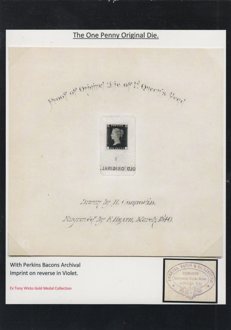
Collectible Postcard 4 of 10
“The Old Original from the Perkin Bacon Archive”
A famous Penny Black item
STAMP & COIN MART MAGAZINE
In association with
MARK BLOXHAM STAMPS LTD
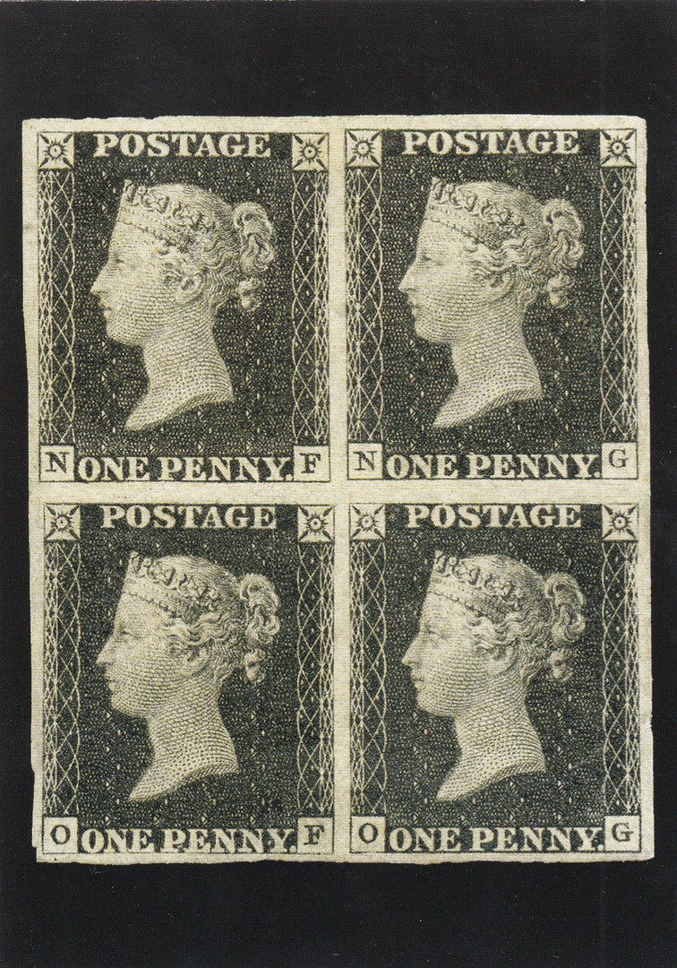
Collectible Postcard 5 of 10
“Penny Black Plate 1b”
Here you have a block of four Penny Blacks
These are great cards, which if you subscribe or buy this magazine anyway, are free. They clearly have a very strong, very early philatelic content but they are also superbly produced. As a collector of philatelic themed postcards, I am happy to add these into my own collection.

06/02/2018
CORNWALL
CORNWALL MAP AND SCENES
From Original Watercolours by
Harry McConville
Published by
JBA
(JBA Souvenirs)
(Redruth, Cornwall)
Map cards were once very popular and there was even once a GB Map Postcard Collectors Club, but unfortunately there was a drop off in the interest in this theme. This was never more evident than in the fact that few dealers these days have a ‘Map’ themed section. Despite this though, you can still find some very attractive map postcards out there around the country. This is a good example of a modern, slightly larger than normal sized postcard. The trick these days is to make the map design more attractive by making the map element less over-powering. Here this has been done via the addition of little paintings of locations around the area of the map.
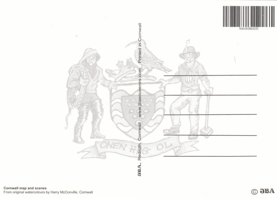
REVERSE SIDE OF ABOVE POSTCARD
I like the addition of the crest across the back of this card

06/02/2018
KING KONG
Published by
EDITION DELTA-PRODUCTIONS
Printed in France
Ref: CP11
My top ten list of favourite films often changes a little, but one film has remained a constant throughout; King Kong, and by this, I mean the original 1933 black and white film, which has, in my mind, never been bettered.
This modern postcard depicts a well- known publicity image used to promote the original movie and which was used on some film posters and on other promotional material. I have a range of books about this film and this image appears in all of them. I always thought that the actress Fay Wray looked a little large in this image, but apparently this was a deliberate move on the part of publicity people as the female element was such a big part of the films story. Postcards depicting King Kong are not that common, even modern issues, but if I see any I always pick them up.

06/02/2018
SUGAR PUFFS
FREE TOYS TO BE FOUND INSIDE PACKETS OF SUGAR PUFFS
Promotional Postcard Set
Published by
BOOMERANG MEDIA
When these toys were available, I can’t remember the year, but it was a quite a few years ago, there were five little toy plastic figures to collect, with one figure inside each packet of Sugar Puffs. Although I don’t know when these toys were available I do know that it was prior to 2014 as in that year the brand name of this cereal was changed from ‘Sugar Puffs’ to ‘Honey Monster Puffs’, after the Honey Monster mascot who appeared on the packets and in the advertising material including television adverts. Although the cereal was launched in 1957, the well-known Honey Monster did not come along until 1976. I believe the name change came about because of the negative connotation that the word ‘Sugar’ has obtained in recent years what with the constant references to diabetes and obesity and the incredibly high level of sugar in some products. With the name containing the word SUGAR in large top loaded letters on the product there was some, possibly plausible, belief that sales would be affected because of this. I don’t personally think it matters much but then I always loved Sugar Puffs.
The character depicted here is named BAZRA WIZZ
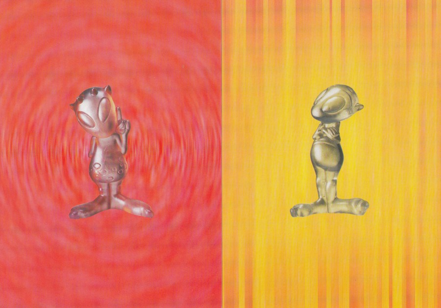
FAR LEFT
Character called
VESTRA TARPAZ
NEAR LEFT
Character called
ZARBADORE GOONDANDI
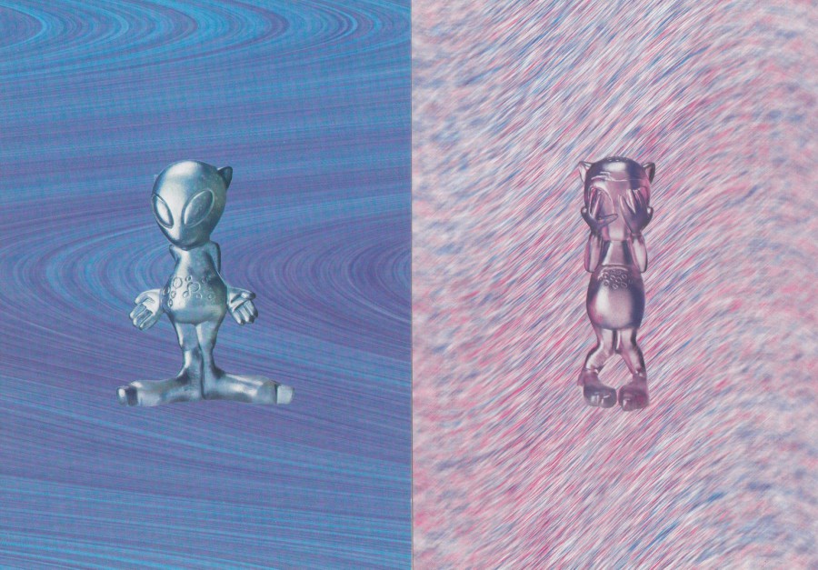
FAR LEFT
Character called
ZOOL COORBAR
NEAR LEFT
Character called
OOBAR INDAROO
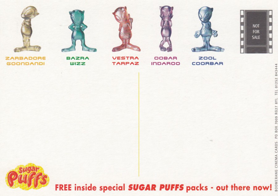
REVERSE SIDE OF ABOVE POSTCARDS
These five postcards all have the same reverse side, which features five coloured images of the characters on which the toy plastic figures are based. You also have here the original SUGAR PUFFS cereal logo, also in colour. I have failed to discover what these little characters relate too, or possibly they were just unusual little alien like characters created to be given away here with these cereal boxes? Whatever their original source I would love to know who came up with these weird and wonderful names!
This is a nice set of postcards, and I have noticed that there is a set on eBay at the moment for just £1.50 (plus £1 postage), which seems to be a fair price, although originally of course these were free as they came from the Boomerang racks. If I remember correctly I found my copies in the rack at my Odeon cinema.

05/02/2018
ED SHEERAN
By
Colin Davidson – 2016
Oil on linen
1270 x 1170mm
Published for
NATIONAL PORTRAIT GALLERY
On my last visit to the National Portrait Gallery (and regular readers of my blog will know that I visit their shop several times a year) I found this Ed Sheeran postcard. As Ed seems to be appearing just about everywhere I was not surprised that he has ended up on a postcard issued by this fantastic gallery. So, I see no reason why Ed should not make an appearance here on my webpage, and I quite like some of his songs as well.
05/02/2018
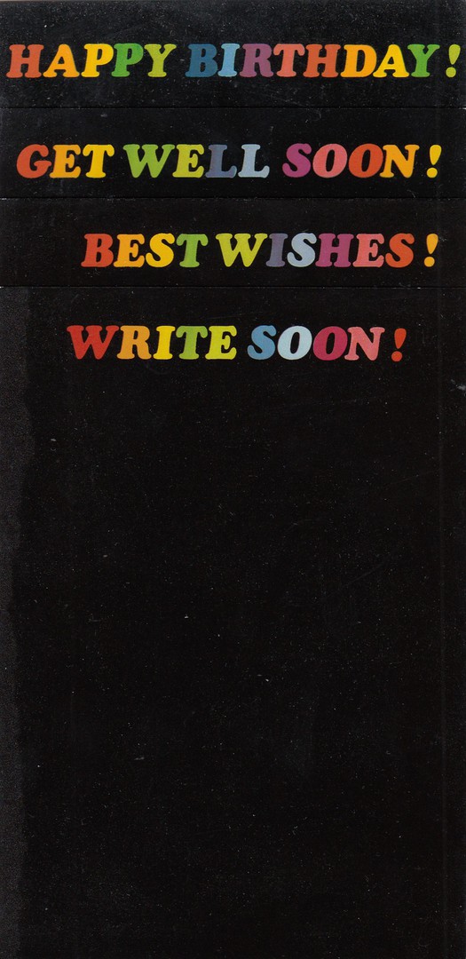
HAPPY BIRTHDAY!
Ref: 553519
GET WELL SOON!
Ref: 553515
BEST WISHES!
Ref: 553517
WRITE SOON!
Ref: 553514
Four word only postcards
Published by
BEECHWWOD PUBLICATIONS LTD
This is four postcards overlaid across each other so that you can only see the brightly coloured words, each in a single line of text across the top of each postcard, but as the rest of each of the cards is just a large plain black area. These are simple postcards, each designed for a specific event or sentiment. These are also, I believe the first BEECHWOOD PUBLICATIONS LTD postcards I have posted on the webpage. The company was issuing postcards in the early 1980’s and I was a big fan and put together quite a reasonable collection of their postcards. Clearly, I liked their pictorial art designs, but I also thought that these simple designs were worth adding to my collection because these were designed to be used, and at the time people were still likely to send one of these cards to someone on their Birthday, or if they were ill or recovering from an operation. I have scanned some other cards by this company which I will post in the near future, but these are a good introduction to the company and a superb example of just how much postcards were used during the early days of the 1980’s.
05/02/2018
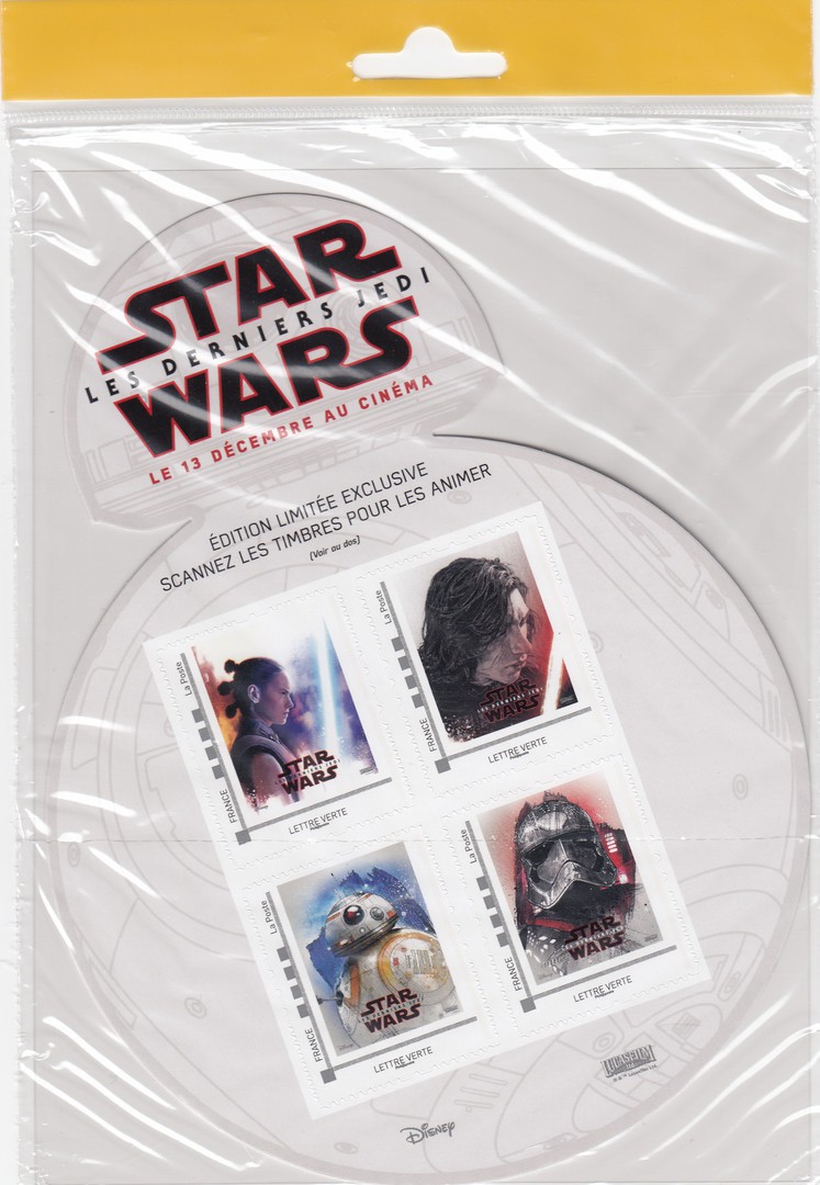
FRENCH STAR WARS POSTAGE STAMPS
STAR WARS: LES DERNIERS JEDI
(STAR WARS: THE LAST JEDI)
FRANCE – LA POSTE
When I was in France last week I visited the local post office (‘La Poste’) in the location where we were staying, or at least the nearest major town to our location. Although postcards are my main interest I do have an interest in stamps, although I try to only collect mint ones which have either a television theme or which relate to certain films, like Star Wars. So, when I saw this BB8 robot shaped stamp sheet, with four self-adhesive stamps featuring characters from the Star Wars film, I had to buy myself one. It is an unusual item, and one I was not aware of before seeing it on sale here. For any Star Wars collector this is a lovely item and I was pleased to get one. The stamp sheet comes sealed in a cellophane bag with a display case strip across the top which allows these to hang from display sales stands.
I know this is technically a postcard webpage, but it is always nice to pick up something different every so often, and after all, it is my webpage and I have never been very good at following any type of rulebook.
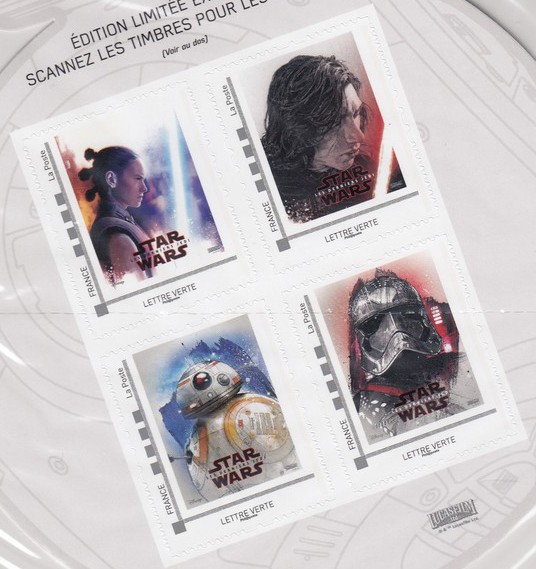
ENLARGEMENT OF THE FOUR STAMPS