
12/04/2017
5TH REGIMENT ARMORY
PATERSON, N. J.
Unknown Publisher
Ref: 63308
The Armory was built for the New Jersey National Guard’s Second Regiment in 1894. The regiment expanded with many eager men wanting to fight in 1898 after war was declared with Spain, but at the end of this war the Second Regiment was disbanded.
In 1902, the National Guard reorganised under a new regiment, the 5th, and the Amory was again occupied by them. On the 9th February, just days after the 5th Regiment had moved in there was a massive fire which swept through downtown Paterson which caused the regiment to be placed into action protecting the ruins from looters. After the fire the Armory was used as a church for a while. The building became a refuge again in 1903 after the city was flooded forcing the citizens to take shelter there.
The Armory ran on for many years, providing soldiers for both the First and Second World Wars but by the late 1970’s the National Guard were looking for another armory site. Around 1978 attempts were made to sell the building but there was little interest. In 1984, an auction received no interest at all with zero bids. When a buyer was eventually found he then failed to pay his taxes and the city took over the building.
The building was in a real state and in 2007 was described as full of layers of bird feathers and waste. On the 10th November 2015, a fire ripped through the Armory causing serious damage to the structure and especially its walls. The damage was so severe that on the 16th November they started to demolish the building.
So, this postcard here, which cost me just a few pennies, and which at first looks to be nothing special, lead me to the very interesting history behind the building.

PHOTOGRAPH
As you can see here the building was eventually demolished, although here it is still in the early stages of being taken apart. The steel and bricks were re-used.
12/04/2017
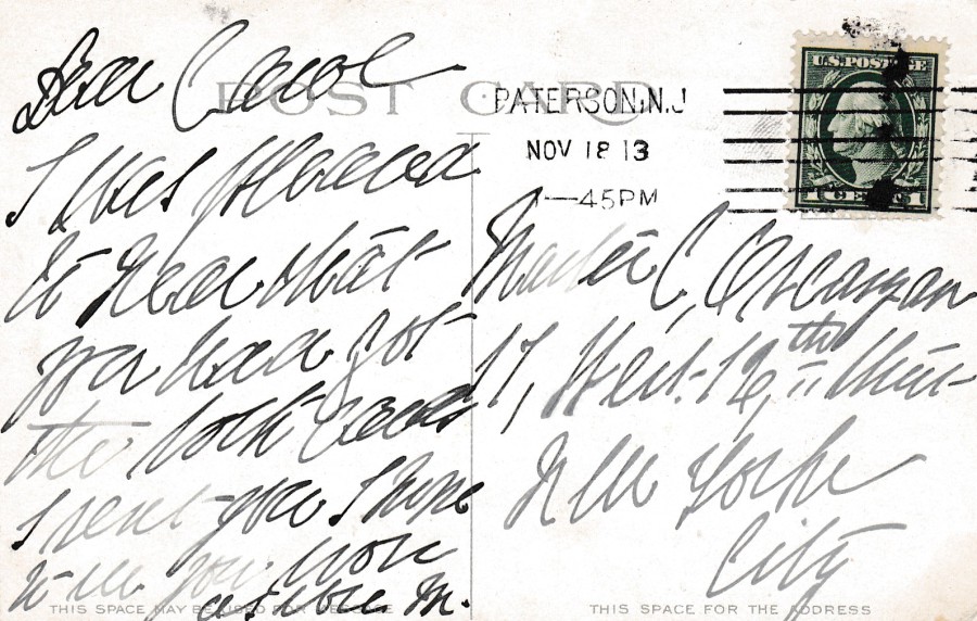
REVERSE SIDE OF ABOVE POSTCARD
This postcard was posted from Paterson on the 18th November 1913 and the sender used a 1908 issued 1cent green featuring the head of Washington (SG 505).

12/04/2017
DOCTOR WHO
DAVID TENNANT
Official BBC Promotional issue(s)
I am a huge collector of Doctor Who related postcards. When I see one I normally pick it up, often even if I think I have the postcard already because there is always a chance that there will be a small or subtle difference between the one I have and the one I have just bought.
Hopefully you can see that the image used here on these two postcards is the same. But, can you also see that one is printed much darker than the other. These were scanned at the same time side by side. If you just looked quickly you might have assumed they were the same card, but the reverse sides prove otherwise.
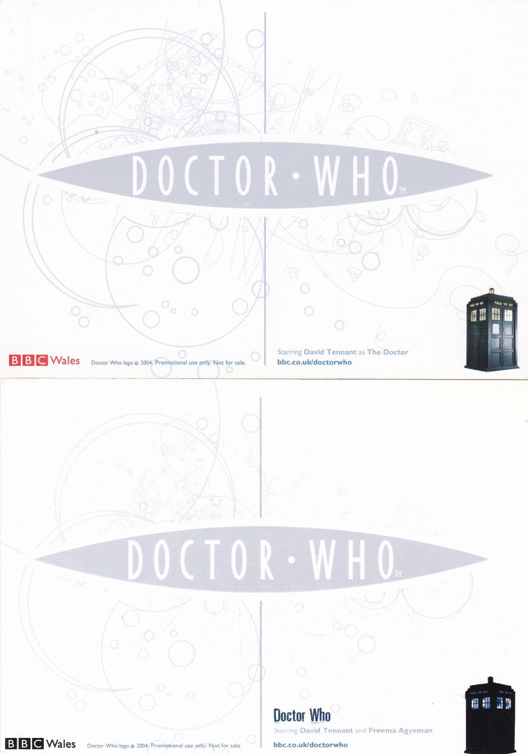
REVERSE SIDE OF THE TWO POSTCARDS DEPICTED ABOVE
TOP – POSTCARD FAR RIGHT ABOVE
BOTTOM – POSTCARD NEAR RIGHT ABOVE
The first difference is obvious, the top card has a red BBC logo bottom left whilst the bottom card has this print in black. The bottom postcard also has additional text saying; ‘Doctor Who’, bottom right. But, if you look closely the text on the top card bottom right reads:
Starring David Tennant as The Doctor
Whilst if you check the text in the same position on the lower postcard reverse side then you will see here it says:
Starring David Tennant and Freema Agyeman
Also, the two images of the Tardis are different as on the top card you can see the side panels whilst on the lower version it looks solid and no panels can be made out. Also check out the swirl patterns on the two cards as they are more distinct on the top one and I also see that part of this pattern is missing top right.
I suspect for many, these little differences would not be of interest, but to a real collector these are the things which make collecting fascinating.
12/04/2017
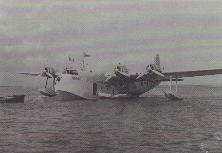
FOYNES FLYING BOAT MUSEUM
COUNTY LIMERICK
IRELAND
IMPERIAL AIRWAYS SHORT S.30 EMPIRE BOAT, G-AFCV, CARIBOU
UNDER THE COMMAND OF KELLY RODGERS, MOORED AT FOYNES WITH BOATS ALONGSIDE.
THE CARIBOU WAS COMMANDEERED BY THE RAF IN OCTOBER 1939 AS V3138.
IT WAS DESTROYED IN BODO IN MAY 1940
I have a fascination with Flying Boats and two of my top five aeroplanes are flying boat designs. This is not one of those two (which are the Short Sunderland and the Dornier DOX) but it is an interesting craft none the less, with and interesting story which is given in the above text, which appears on the reverse side of the card.
This card was sent to us by my Father & Mother-in Law in April of last year (my Father-in-Law sadly passed away this past January). For me it was a real bonus that they used one of the Irish Post Easter Rising 100th anniversary post & go styled machine stamps. Some regular readers may remember me posting images of some postcards I posted to myself from Ireland using some of these same stamps last year. So, I was delighted to have one on a proper used postcard.
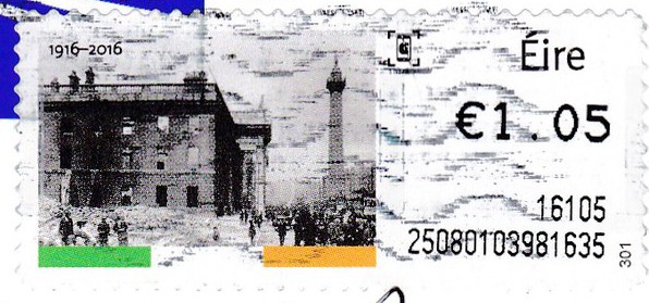
STAMP ENLARGEMENT
This is the stamp that appears on the reverse side of this postcard
11/04/2017
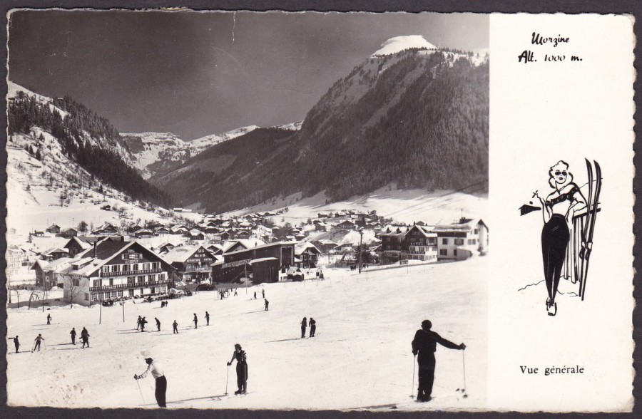
MORZINE
Alt [altitude] 1000m
VUE GENERALE
(General View)
Published by
EDITIONS PHOTOGRAPHIQUES JANSOL
Ref: No 164
‘Morzine’, as depicted on this postcard, is to be found in the South-Eastern area of France. It is a commune in the Haute-Savoie and Auvergne-Rhone-Alpes region. The area is known for its skiing, as again depicted here in both the photograph itself and in the little sketch of a female with skis on the right side.

REVERSE SIDE OF ABOVE POSTCARD
The cancel is a bit feint but I believe this was posted in 1962. This would seem to make sense as the stamp used is the 1960, 15c ‘Tourist Publicity’ issue featuring the Laon Cathedral (SG 1461). This has been cancelled with a Morzine wavy line machine cancellation.
Bottom centre is a red cachet which reads:
N’habite pas
a l’adresse indiquee
FACTEUR 11
(DO NOT LIVE
AT THE ADDRESS INDICATED
FACTOR 11)
It would seem, that the wrong house number was used and thus this little cachet was applied. It seems that someone has written that it could be No 85, in blue pen, top right to the side of the stamp. I do wonder if they did indeed reside at No 85 and if they ever received this postcard.
The added pen marks and cachet add some postal history interest to what is otherwise a standard holiday postcard.
11/04/2017
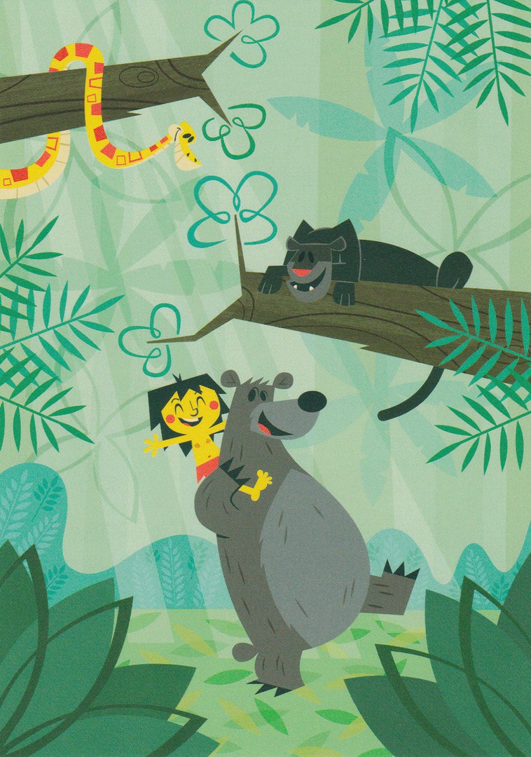
WONDERGROUND GALLERY
WALT DISNEY WORLD
FLORIDA
Original Artwork of
“JUNGLE HARMONY”
By Artist
Ben Burch
Excuse me posting some more ‘Disney Wonderground Gallery’ postcards but I have been checking out their availability on eBay today and they are in my mind. This one here is a Jungle Book themed design

WONDERGROUND GALLERY
WALT DISNEY WORLD
FLORIDA
Original Artwork of
“A BOY AND HIS CONSCIENCE”
By Artist
Ben Burch
Another Ben Burch design, this time themed on the Pinocchio animated film. Ben has a very distinctive style and, both postcards were on sale when I attended the ‘Wonderground Gallery’ shop in Disney Springs last November. They were also available, like much of the ‘Wonderground’ output, as prints and large pictures. In fact, these two designs here were being used as part of the window display for the shop when I visited, see below.
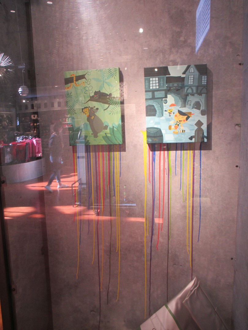
PHOTOGRAPH
‘Disney ‘Wonderground Gallery’ window display
November 2016
11/04/2017
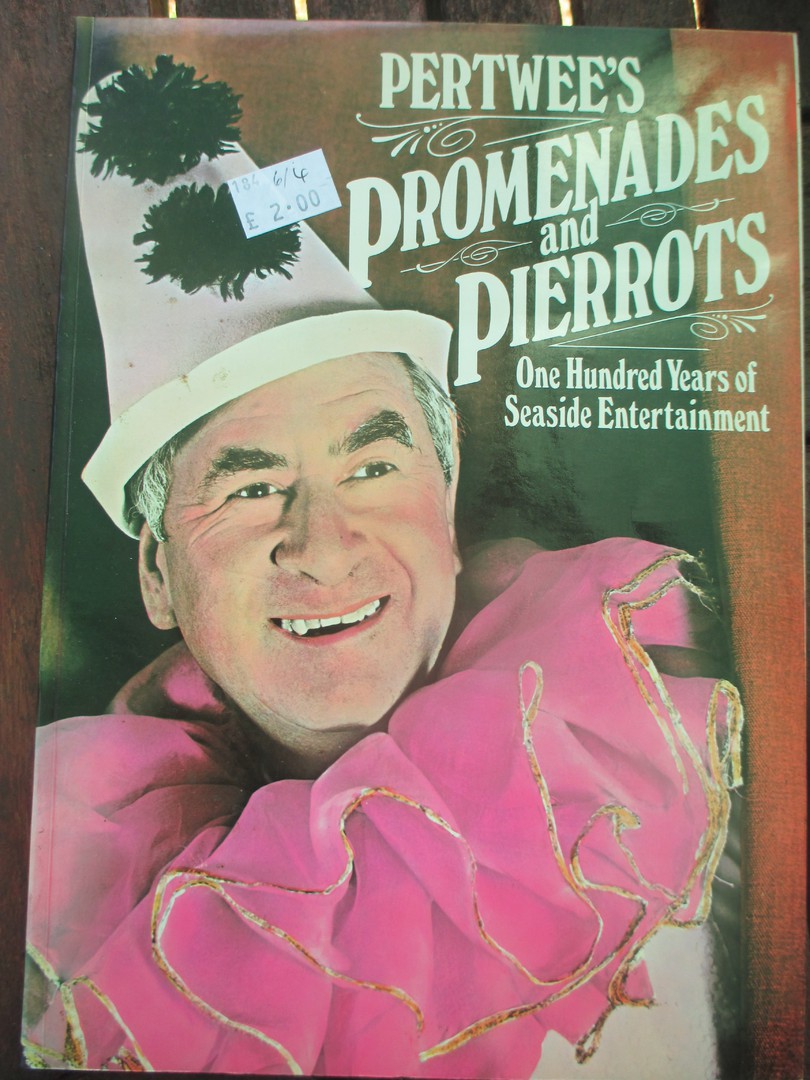
BOOK
PHOTOGRAPH
PERTWEE’S
PROMENADES AND PIERROTS
One Hundred Years of Seaside Entertainment
Published by
WESTBRIDGE BOOKS
In 1979
As a postcard collector, I am always on the look-out for books which enhance my collection and my knowledge around the hobby. There are the obvious postcard catalogues but sometimes it is the more unlikely looking books which have a wealth of either images or information inside.
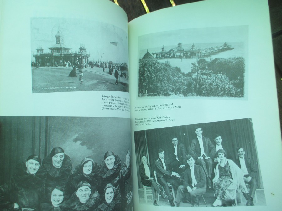
I like looking in charity shops anyway but I do try and look through the books to see what unusual ones I can find. On Saturday I came across this one, which at first look would not seem to be a postcard source, but, when you look inside this book there are in fact at least 42 postcards illustrated (and a small number of other images which I also suspect may be from postcards).
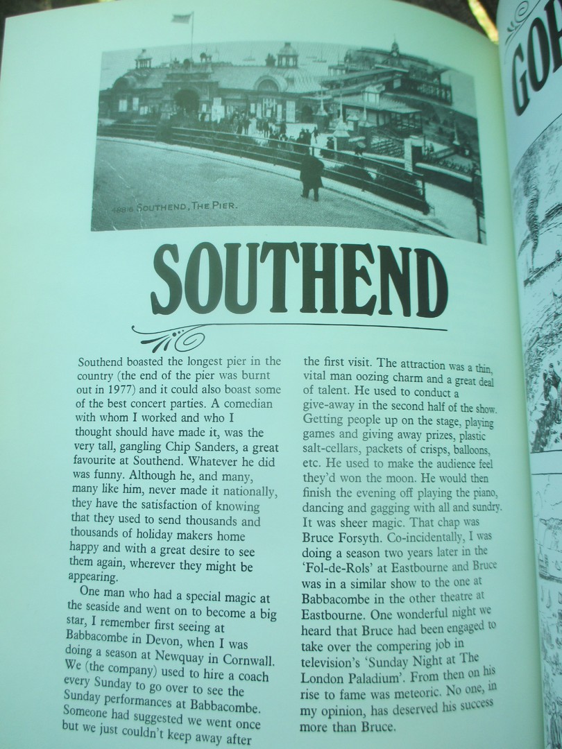
There is also a whole page dedicated to my home town, Southend. This page includes a postcard image of the Pier at the top. All in all, a bargain for just £2. So, check out your second-hand charity shops for books like this because whatever you collect books enhance your collection.

PHOTOGRAPH
Two pages from the book which depict postcards
PHOTOGRAPH
The ‘Southend’ page – check out the pier postcard at the top
PHOTOGRAPH
Two pages which have different pier postcards at the top
10/04/2017
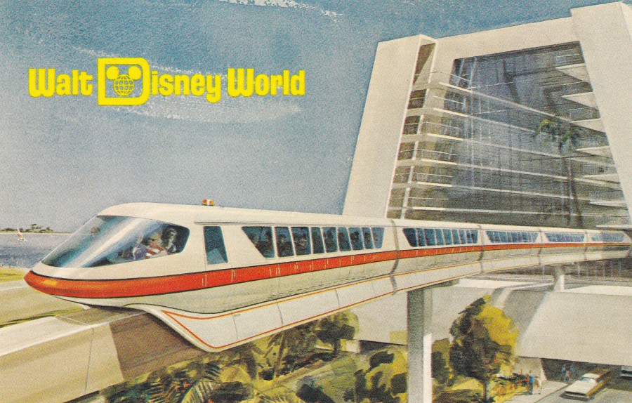
WALT DISNEY WORLD
“THE VACATION KINGDOM OF THE WORLD”
OPENING OCTOBER, 1971
Published by
WALT DISNEY PRODUCTIONS
Ref: Fl -025
RIDING THRU THE CONTEMPORARY RESORT
“Departing the Contemporary Resort, guests journey by monorail over the “Highway in the Sky” for a spectacular tour of the Vacation Kingdom. The Walt Disney World-Alweg monorail system will connect all the theme resort hotels and the Magic Kingdom Theme Park”
(Text from reverse side of Postcard)
This is a very early Walt Disney World postcard which came out before the Theme Park even opened. There is text down the centre on the reverse side which states ‘OPENING OCTOBER, 1971’, which nicely places this as a very early issue. Although sold as a pre-publicity postcard I have good reasons for believing that it continued to be sold way past the opening, and that this postcard was also available to the first visitors to the Walt Disney World.
I have a special fondness for this postcard for a couple of reasons, firstly I have travelled on the monorail many, many times and I am always, even now, impressed as it passes through the Contemporary Hotel. Secondly, a couple of years ago I got to stay in the Contemporary Hotel for a week and I think it is my favourite ‘Disney’ hotel.

REVERSE SIDE OF ABOVE POSTCARD
10/04/2017
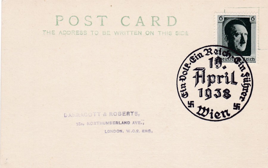
EIN VOLK, EIN REICH, EIN FUHRER
10TH April 1938
This is a standard British post card, plain backed and of the type sold in packs even to this day. This was used by a British collector to receive a special handstamp on this date back in 1938. On the 10th April 1938 Germany held an election and referendum which included the recently annexed Austria. This was in fact to end up being the final elections held during the Nazi rule (except for a small one related to the annexation of the Sudetenland in December). The elections were really held to largely rally support from, and for Austria. The handstamp is for the city of ‘Wien’, better known to us as Vienna, the capital of Austria. The sender has used a 6 Reichsmark Hitler’s head German definitive stamp (it’s use again showing the fact that Austria was German!)

09/04/2017
PULA
JUGOSLAVIJA
(YUGOSLAVIA)
Zalozil Kompas, Ljubljana – Tisk CP Delo, obrat Triglavska tiskarna, Ljubljana
Since the fall of Yugoslavia in 1991 the city of Pula (also called Pola) has been in the Republic of Croatia. So, this used postcard has some history to it already as it states that this is from Jugoslavija.
Depicted here is the Paula Arena which is just one of the many surviving Roman structures that the city is best known for. This 1st century amphitheatre is one of the six largest surviving Roman arenas in the world, but locally it is just known as the ‘Arena’. The arena is still used to this day as they hold film festivals here. But, we are lucky that it is still located in its original place as during WWII the fascist administration of Italy wanted to dismantle the Arena and move it to mainland Italy – thankfully the project was too expensive and never happened.
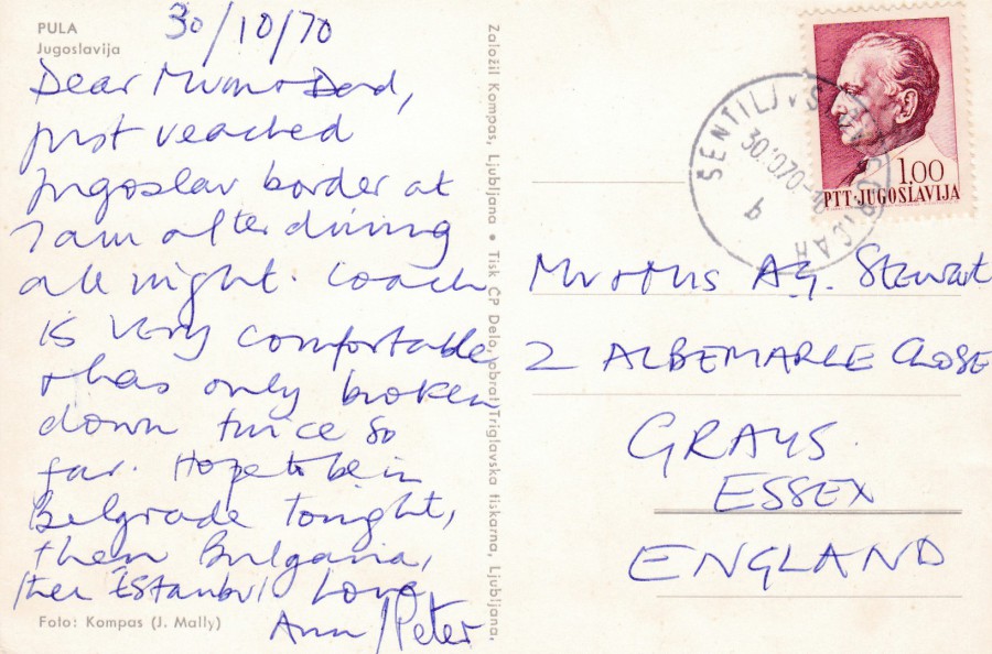
REVERSE SIDE OF ABOVE POSTCARD
The stamp – a 1967 1d Red ‘President Tito’s 75th Birthday issue (SG 1273) - has been cancelled with a date stamp for 30th October 1970. It is postcards used like this from around the world which have been used with such like stamps that helps me have a small stamp collection as well as a postcard one. It is true that the postage rate is normally the basic postcard/letter rate so that the stamps themselves are mostly quite common, but then value is not everything.
09/04/2017
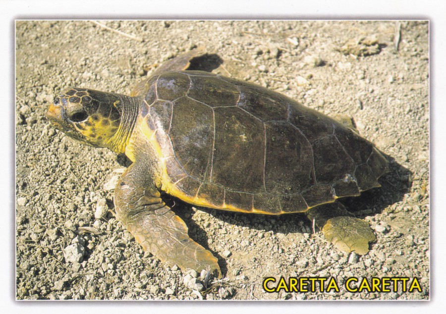
SEA TURTLES
TURKEY
Last September I spent two weeks in Turkey by the sea in Dalyan. Whilst there I had the pleasure of seeing a few wild sea turtles which as a big wildlife fan was a major holiday plus. I also managed to pick up a few turtle related postcards:
CARETTA CARETTA
DALYAN – MUGLA – TURKIYE
Published for the –
BASKAN SHOPPING CENTER
By
KESKIN COLOR
Ref: 70/401
Caretta Caretta is the scientific name for the Loggerhead Sea Turtle which I believe is the main turtle species for the area I was in.
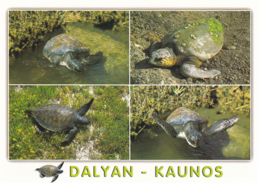
DALYAN – KAUNOS
DALYAN – KAUNOS - MUGLA – TURKIYE
Published for the –
BASKAN SHOPPING CENTER
By
KESKIN COLOR
Ref: 48/1344
A nice multi-view picturing locally taken images

I LOVE YOU
TURKIYE
CARETTA – CARETTA (DALYAN – KAUNOS)
Published by
GUNEY
Ref: B – 050
I suspect this would be classed as your more typical tourist postcard because of the added over-picture text, but to be fair, all of these turtle postcards depicted here are designed to be sold to tourists and I suspect far more of these are bought and sold than are bought and saved in a collection.

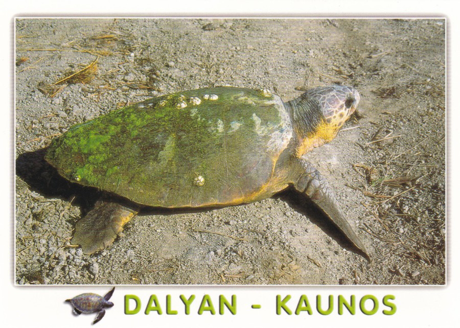
DALYAN
DALYAN – KAUNOS - MUGLA – TURKIYE
Published for the –
BASKAN SHOPPING CENTER
By
KESKIN COLOR
Ref: 48/1497
This is my favourite image from the selection I managed to obtain. This is because It is a reasonable photograph of a wild turtle, and it has the location top left of where the postcard was bought (useful and interesting to any collector, and to any tourist for that matter – for two reasons, one it shows where they have been to anyone who they send the postcard too, and second, if they keep a mint card as a souvenir then they will know where exactly they bought it from)
DALYAN – KAUNOS
DALYAN – KAUNOS - MUGLA – TURKIYE
Published for the –
BASKAN SHOPPING CENTER
By
KESKIN COLOR
Ref: 48/1338
So, there you have my selection. Not too many but then how many turtle postcards can one small tourist location sell?
09/04/2017
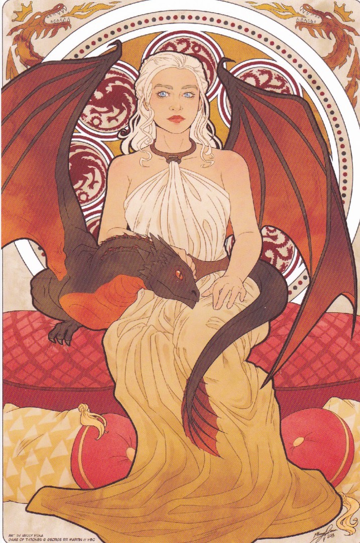
GAME OF THRONES
Designs by
MISSY PENA
Published by
REDBUBBLE
REDBUBBLE is an internet based company which has thousands of different images which can be ordered as postcards. Some are more-simple than others, whilst some are really attractive (I have previously depicted a nice Concorde postcard image of theirs on the webpage). These three here, based on characters from the really popular, and soon to return, television series ‘Game of Thrones’. I really liked these.
FIRE NOUVEAU
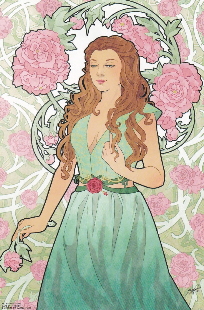
ROSE NOUVEAU

WILD NOUVEAU
If you fancy any of these, and they are cracking collectibles for any 'Game of Thrones' fan then visit the REDBUBBLE web site

09/04/2017
ELIZABETH TAYLOR
Published by
KRUGER
Ref: 902/20
Kruger have published many postcards depicting actors who were famous around the time of the 1960’s and 1970’s. This means that if you are after a nice earlier publicity picture then this is the company to look out for. This one is a very charming promotional image of the actress Elizabeth Taylor.

09/04/2017
PEGASUS
AND THE NEW OLYMPIANS
A Novel by KATE O’HEARN
Published by (That’s this postcard – not the book!)
BOOMERANG MEDIA
A MYTHICAL STALLION
A BRAVE RIDER
THE LEGEND IS BORN
For a few years now Boomerang have been issuing some ‘really’ attractive postcards advertising book releases. This is one of these from a few years back. It has the ‘added’ bonus of featuring a mythical creature and there are lots of people who collect these on postcard. It is also a ‘really’ nice image of Pegasus so even though it has the text around it, because it is the image of the front of the actual book, because you need to know what to look for after all, Pegasus is the main feature. And, of course, the card was originally free.
09/04/2017
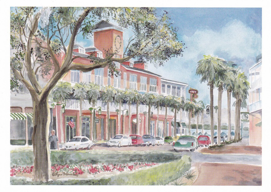
CELEBRATION – FLORIDA
Thousands of people visit Orlando, Florida and those attending for their first time have to try and pack in visits to all four Disney theme parks, two Universal theme parks, Sea-World, Discovery Cove, at least four different water parks (few manage this), Kennedy Space Center, Disney Springs, Universal City Walk and also eat and, somehow, also relax. So, very few get time or even consider visiting the small but lovely town of Celebration.
Celebration is a Disney run town which is very much your ‘White Picket Fence’ America. All the gardens and buildings are excellently maintained and there is a nice lake and a small handful of shops, really not many. It is a quiet place to spend a relaxing hour or so. We ended up visiting here on what I think was our fourth time in Florida. We loved it here and visit now on every trip. We mainly come to have breakfast in the excellent Diner (try the pancakes – they are huge…but I recommend only ordering one!)
I also visit the Post Office here and it is from where I post most of my postcards and pick up any stamps which have a TV theme (last year it was a sheet that celebrated the Star Trek TV anniversary). Anyway, back to postcards – There are just the two postcard designs available from the shops in this town, and I depict them both here.
CELEBRATION FLORIDA
Published by
LYNN SANDS, CELEBRATION
This is an artwork design which is available in the shop which is ‘actually’ depicted in this painting, it is the one with the American flag hanging outside. Actually, this is the shop where both of these depicted postcards are sold.
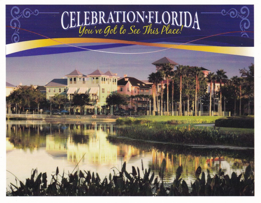
CELEBRATION – FLORIDA
“You’ve Got to see This Place”
This one is available in both a normal smaller postcard size and as a larger A5(ish) size. As a collector, I obviously bought both sizes abut I suspect the smaller one sells more. The big green building is the diner which I mentioned above, well worth a visit, whilst the pink coloured building behind it is located opposite the buildings depicted on the artist painted postcard shown above.
So, what I am saying here is that if you are on your first couple of visits, and especially if you have young kids, I would not bother visiting here. But, if you have been on all the rides and been to all the parks and fancy some quiet time and lovely surroundings then spend an hour or two here.

09/04/2017
SOUTHEND ON SEA & DISTRICT GENERAL HOSPITAL
Locally produced postcard
For me, this is a smashing postcard. It is a very early image and much has changed, although the basic building is much as shown here. The grass area behind the metal fence in the foreground is now a car park and is never empty.
This was not a cheap postcard, it is after all a nice piece of local history and was released during a period when postcards were not as common as they were pre-WWI. But it was worth every penny.
I have had four operations here, three as a child and one as an adult. I have also had an angiogram which resulted in another stay. So, the hospital is somewhere I know well.
REVERSE SIDE OF ABOVE POSTCARD
A nice simple, but attractive Post Card header
09/04/2017
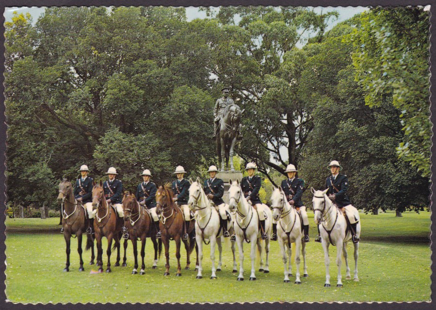
VICTORIA MOUNTED POLICE
MELBOURNE, VICTORIA, AUSTRALIA
Published by
GARRICK COLOUR POSTCARDS
Ref: GP 2025
My friend Willy Allen found this postcard in a second-hand shop in Melbourne and posted it to me. It fits very nicely into my ‘Police’ themed collection. Willy reckons it might be from the 1980’s and I think he has made a good estimation there.
We used to have mounted police section here at Southend but unfortunately it was disbanded some years ago now so now Essex Police no longer has any horses, but I believe the Victoria Mounted Police are still going.

09/04/2017
PIE-EYED PANDA
CHARTA LIMITED
Published by
LONSDALE PRESS LTD
Ref: FP 1
The central boxed Panda image is gloss printed, but the surrounding large white boarder is on matt board. There is not much to say about this postcard. Sometimes a collector just buys something because it is nice.
09/04/2017
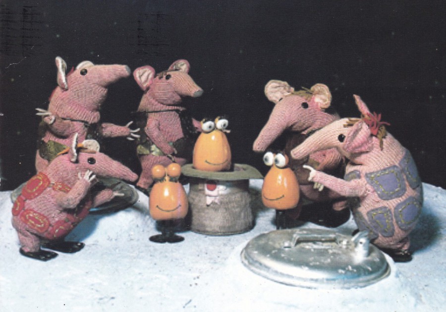
THE CLANGERS
THE TRUSTEES OF THE CARTOON MUSEUM
ARE DELIGHTED TO INVITE YOU TO THE
PRIVATE VIEW OF
“TOY TALES”
AN EXHIBITION OF HIGHLIGHTS FROM CLASSIC BRITISH CHILDREN’S ANIMATION
TUESDAY, 6TH JULY 2010
This is a large A5 postcard which was sent out as an official invite to the private viewing and opening of an exhibition titled ‘TOY TALES’ which opened at the Cartoon Museum located at 35 Little Russell Street, London. What I like about this large postcard is that it was not a card you could just go out and buy, you had to ever receive one, know someone who received one or be lucky enough to come across a dealer who had obtained one for sale (this last option was how I got mine). The image on the front is superb but you also get all the information around the exhibition as well.
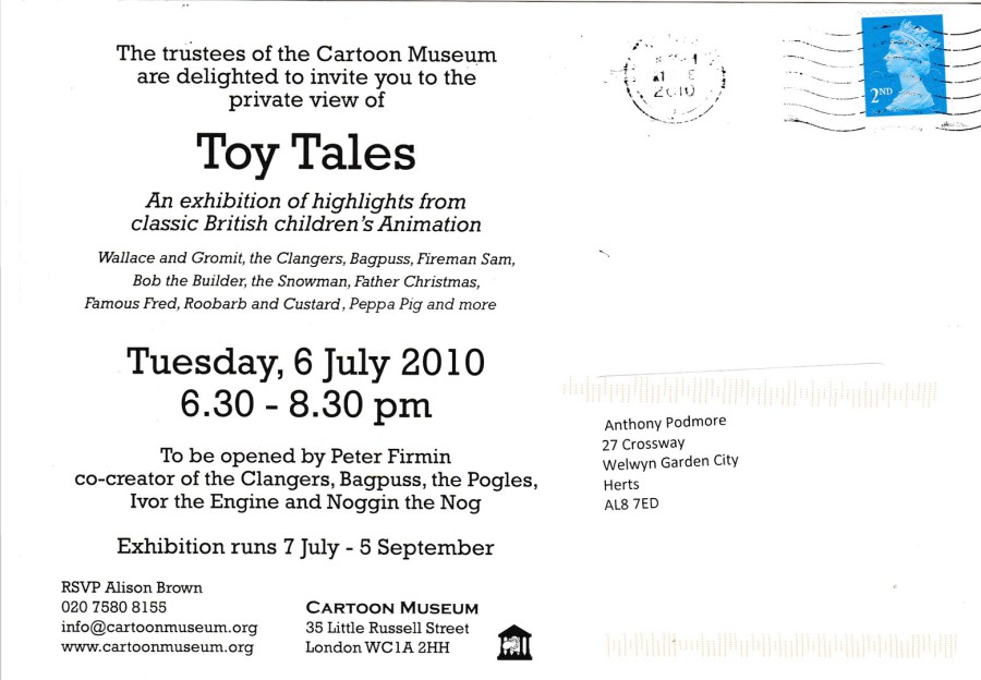
REVERSE SIDE OF ABOVE POSTCARD
09/04/2017
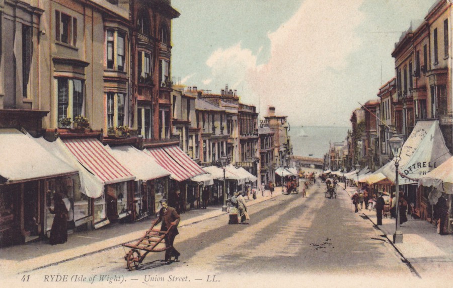
RYDE (Isle of Wight)
UNION STREET
Published by
LL
Ref: 41
This is a nice early photograph of Union Street on the Isle of Wight with some people nicely placed to give some animation to the street scene. There is a lot of information here as well with shop front advertising on what is quite a crisp and clear image.
The LL series of postcards is one of the most respected of early photographic scene postcard issues and they were produced by ‘Leon & Levy’ who were a French printer and photograph editing company.
Leon & Levy was founded in 1864 by Isaac, who was known as Georges Levy, and his son-in-law Moyse Leon. They produced photographic images of areas from across Europe, Asia, Africa and the Americas. Their trademark was the LL and the cards were individually numbered and were generally issued as black and white photographs although some, like this one here, can be found colourised. It is fair to say that LL are, considered to be, one of the most important of the early postcard producers and their cards are highly collected with scarce issues often reaching high values, although it should be stressed that with such an extensive output many of the cards are quite cheap to pick up.
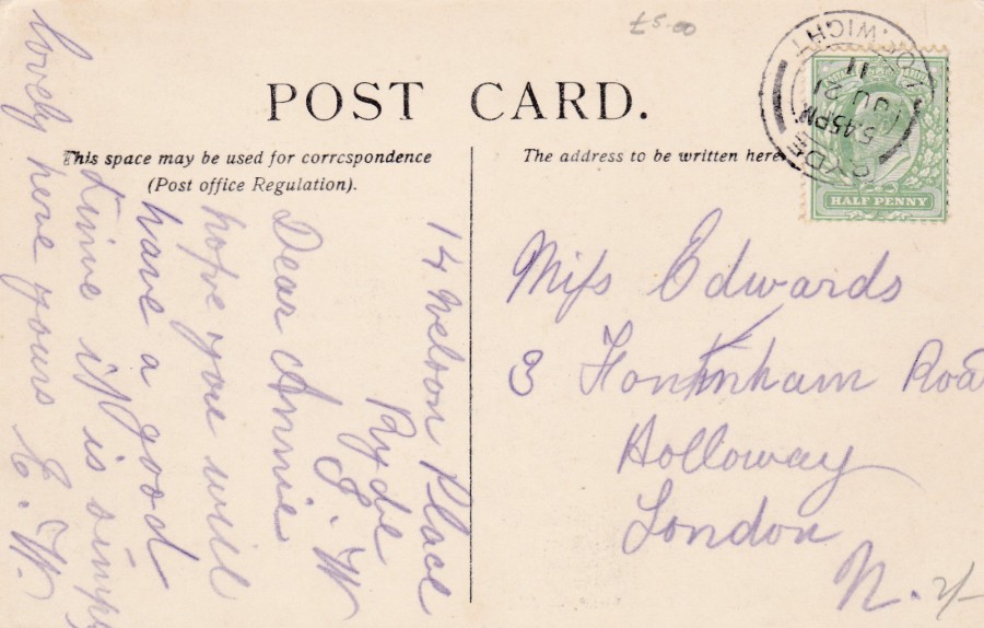
REVERSE SIDE OF ABOVE POSTCARD
This card here was posted from the Isle of Wight, from Ryde itself, which is probably no great surprise, on 21st July 1911 and the King Edward VII ½ P (HALF PENNY) green stamp has been nicely cancelled with a crisp and clear ‘RYDE – ISLE OF WIGHT’ thin single bar double ringed date stamp.
As you can see this cost me £5, but I admit is the top end area of value for this postcard but, in my defence, I bought the card on the Isle of Wight and postcards are always more expensive when obtained in the area that they depict. It was a souvenir I bought on my holiday to the island, as was the postcard depicted below.
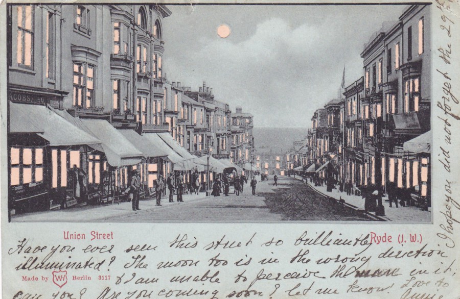
RYDE (I. W)
UNION STREET
“HOLD - TO – LIGHT”
Novelty Postcard
Made by
WH – Berlin
Ref: 3117
This is not the first ‘Hold-to-Light’ novelty postcard I have pictured but it is my favourite so far. As I explained last time the hold-to-light cards are constructed by having the main piece of card, on the front, which has cut out windows, and here every single window is individually cut out, also here the moon has been cut out as well. Then this thicker piece of card is attached to a thinner piece of backing card. This means that when the card is held up to a strong light the cut-out areas are lit up making them look like a light has been turned on. A clever format, but a simple one. Most of these cards that I have seen have the image printed on a light blue card which is used to try an indicate ‘night-time’.
It was the similarities between this image of Union Street, and the one on the postcard depicted above, that made me buy them both. I think they go well together in a collection.
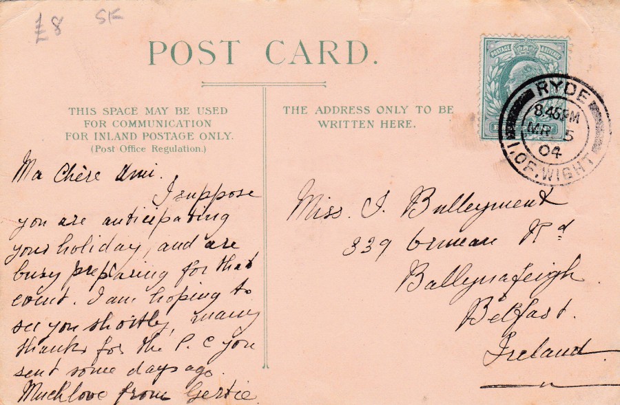
REVERSE SIDE OF ABOVE POSTCARD
This postcard was again posted using a King Edward VII ½ P (HALF PENNY) green stamp which has again been cancelled with a nice clear strike. The handstamp used here is also from RYDE – I. OF. WIGHT, although with an earlier date of 5th March 1904. This time this is a thick single bar double ringed date stamp (check out the difference with the strike on the top postcard – you can see the difference in the thickness of the inner bars either side of RYDE) – or check out the enlarged images below.
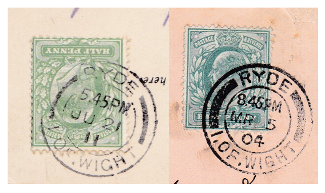
Close up images of the two cancellations for comparison