14/03/2017
ARMENIA
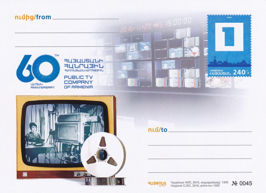
60TH ANNIVERSARY OF PUBLIC TV COMPANY OF ARMENIA
POSTAL STATIONERY POSTCARD
The stamp is pre-printed and the reverse side of this postcard is blank, as with most postal stationery card items. This one I saw on eBay and as it is television related I had to get a copy. I can see from the small text bottom right that this was issued in 2016 and was produced in a limited-edition print run of 1500 with each card individually hand numbered – my copy here is number 45.

14/03/2017
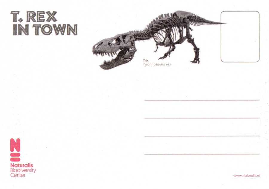
T-REX IN TOWN
NATURALIS BIODIVERSITY CENTER
I have always had a thing for Dinosaurs, and thus a thing for postcards that depict them as well. I started including Dinosaur postcards from the very start of my collecting as a child so when I recently saw this one I had to have it.
The Naturalis Biodiversity Center is described as having various functions, including a national museum, academic research institute and a cultural heritage institution. The museum (or center) is located in the city of Leiden, in the Netherlands. The T-Rex in Town exhibition, which this postcard promoted, was a display which included the whole skeleton of a Tyrannosaurus Rex. The skeleton was apparently the only T. Rex in the world mounted with a real skull. The exhibition commenced on the 10th September 2016 but has long finished although I expect the T-Rex might still be here (does anyone know if it became a permanent exhibit?
REVERSE SIDE OF ABOVE POSTCARD
Here you can actually see the T-Rex skeleton upon which the exhibition was built around. The skeleton was named Trix and it looks impressive. This is another good example of a postcard being interesting on both sides.
13/03/2017
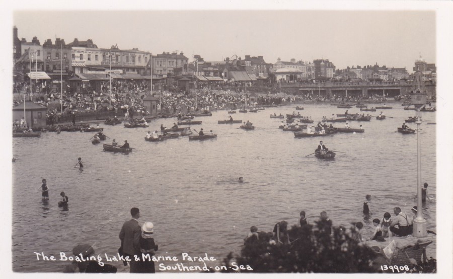
THE BOATING LAKE & MARINE PARADE
SOUTHEND ON SEA
Published by
B. P. Co. Ltd
Ref: 139908
This boating lake is now long gone and is now the location of an amusement park called Adventure Island. For a collector of local view ‘images’ it is always nice to obtain postcards which depict something that has gone. I can actually remember this lake, but only just. So, it is a part of my past as well.
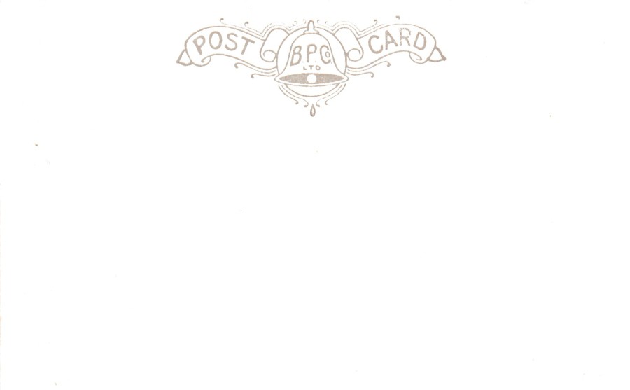
REVERSE SIDE OF ABOVE POSTCARD
A very simple reverse layout but the company header is very attractive
13/03/2017
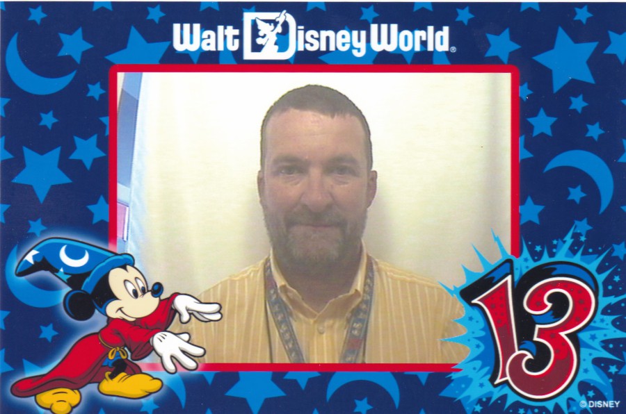
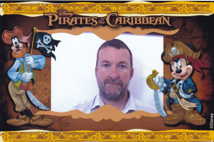
WALT DISNEY WORLD
PHOTO-POSTCARDS
With Apologies as I am not that photogenic, Sorry.
If you travel to the Walt Disney World in Florida, then when you are in the Epcot theme park make sure you pay a visit to the Figment ride called ‘Journey into Imagination’ (although you may have to do this soon as the current gossip is that it may be ‘closing down’ soon). When you get off the ride (which, to be totally honest, is mediocre) make sure that you do spend some time in the area where most people just walk through. This is the area where you can use your imagination on lots of technical games and electronic wizardry. Here they have a photo-booth where you can produce your own postcards. They cost $5 each (but may have gone up so do not hold me to this price). They can make for some very unusual souvenirs, although I admit that they do come plain backed, so some may state that these are actually just souvenir photographs, but there is nothing to stop someone placing a stamp on the reverse side and addressing this and posting it (although I have not been tempted to try this yet).
So, with another apology for having to look at me, here are my personal souvenirs.
2013 VISIT SOUVENIR PHOTO-POSTCARD
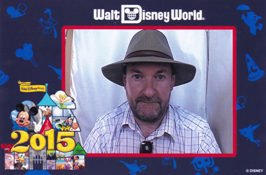
2015 VISIT SOUVENIR PHOTO-POSTCARD
(I forgot to take my hat off for this one, so I look even worse in this one)

2016 VISIT SOUVENIR PHOTO-POSTCARD
This one is not a year specific design
2015 VISIT SOUVENIR PHOTO-POSTCARD
DISNEY – PIRATES OF THE CARIBBEAN
13/03/2017
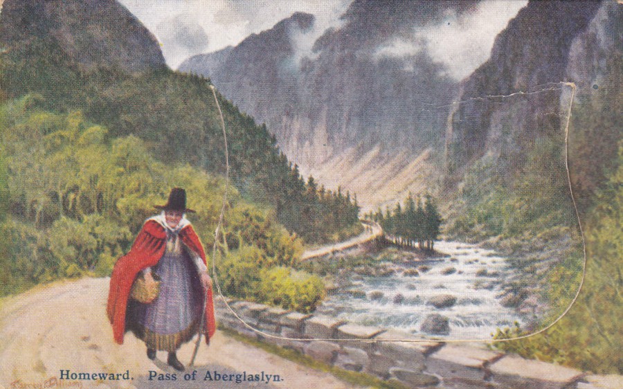
POCKET NOVELTY CARD’s
WELSH NATIONAL COSTUME
“PULL OUT’S”
THE “DAINTY” SERIES
Published by
E. T. W. DENNIS & SONS, LTD
HOMEWARD. PASS OF ABERGLASLYN
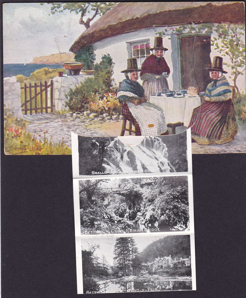
I had the opportunity recently to buy three of these Welsh ‘Pull Out’ postcards. A Pull Out is a postcard that has a flap on the front that when lifted reveals a strip of, normally, black and white view photographs which can be pulled out and looked at. They were very popular and can be found issued over a number of different decades.
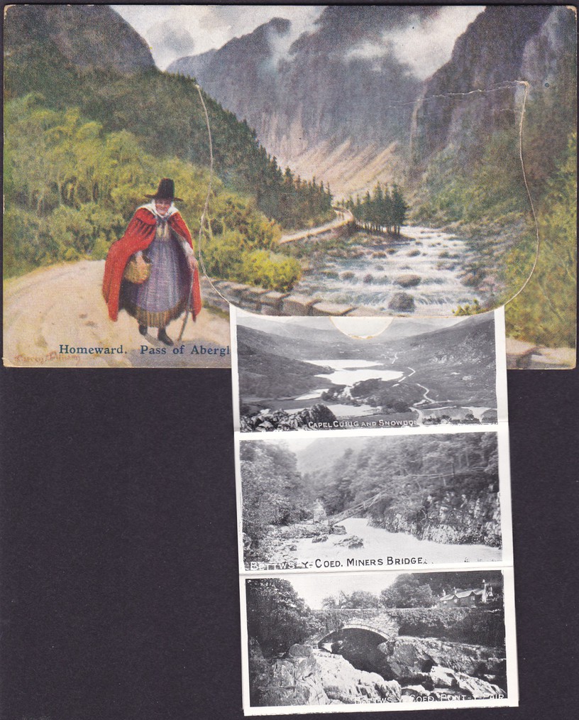
HOMEWARD. PASS OF ABERGLASLYN
With Photograph strip partially pulled out
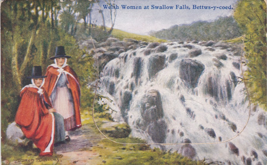
WELSH WOMEN AT SWALLOW FALLS, BETTWS-Y-COED
Another postcard in this series
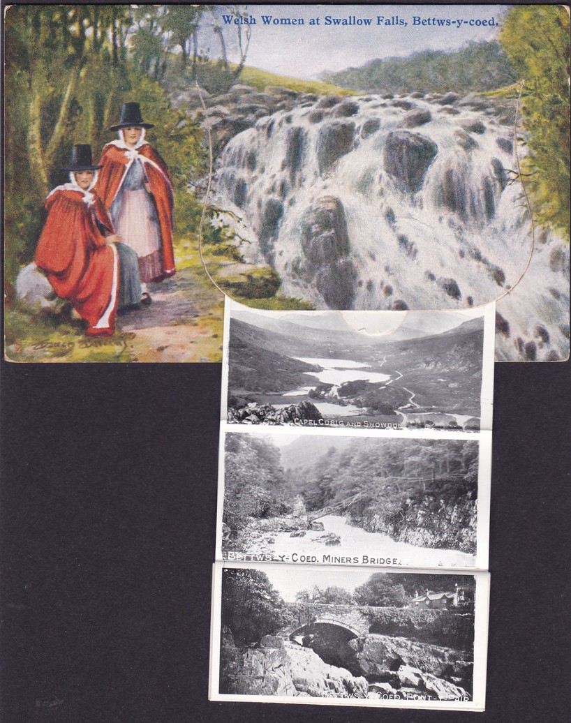
WELSH WOMEN AT SWALLOW FALLS, BETTWS-Y-COED
With Photograph strip partially pulled out
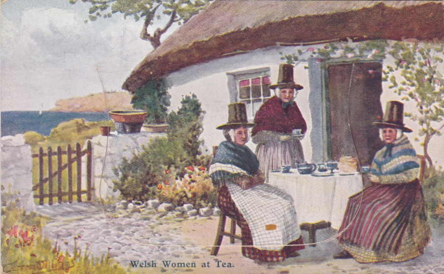
WELSH WOMEN AT TEA
Another postcard in the series, and my favourite of these three. ‘Pull Out’s’ are another novelty item and thus these three fit into my novelty themed collection. They would of course also appeal to the many people who specialise in collecting ‘Welsh Costume’ postcards, and these three here are not the first Welsh National Costume postcards that I have posted on the webpage.
WELSH WOMEN AT TEA
With Photograph strip partially pulled out
By now you may have noticed that they all have the same photograph strip inside them – but then they are all from the same series
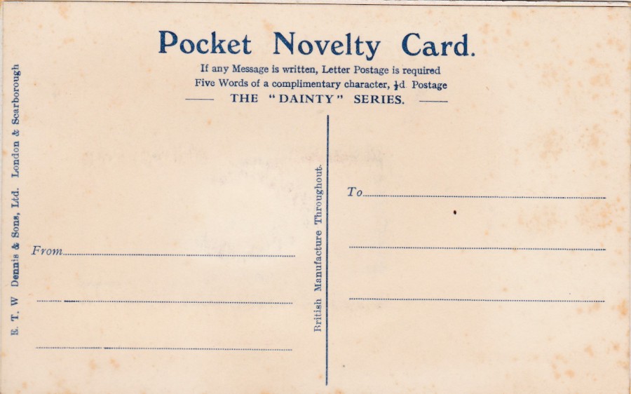
REVERSE SIDE OF ABOVE POSTCARD
All three postcards have the same reverse design
PHOTOGRAPH
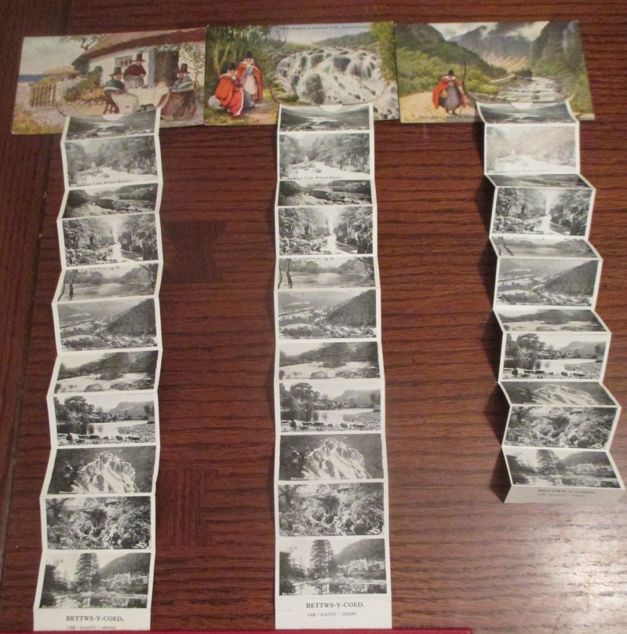
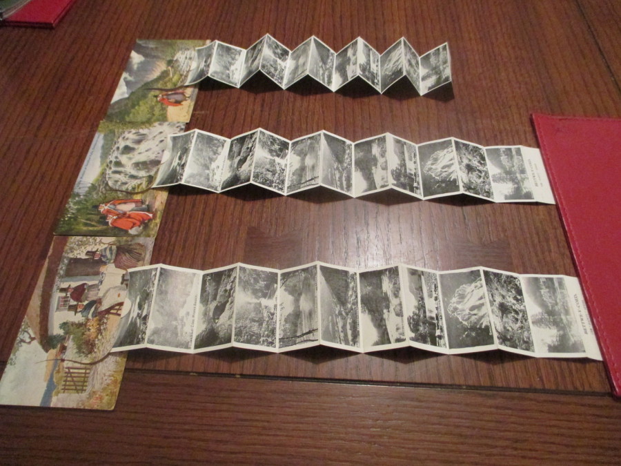
Here I have pulled out all three photograph strips so that you can see all of the small pictures and see just how many there are.
PHOTOGRAPH
Here I have pulled out all three photograph strips so that you can see all of the small pictures and see just how many there are.
12/03/2017
BOOMERANG
“CINEMA IN CARDS SERIES”
This was a long running series, some of which I have already posted on the webpage in the past, where a single quote from a film is depicted. Some of the designs are very ‘text only’ but some others have slight images or some pictorial content. The ones I am depicting here are very much text only.
CINEMA IN CARDS SERIES
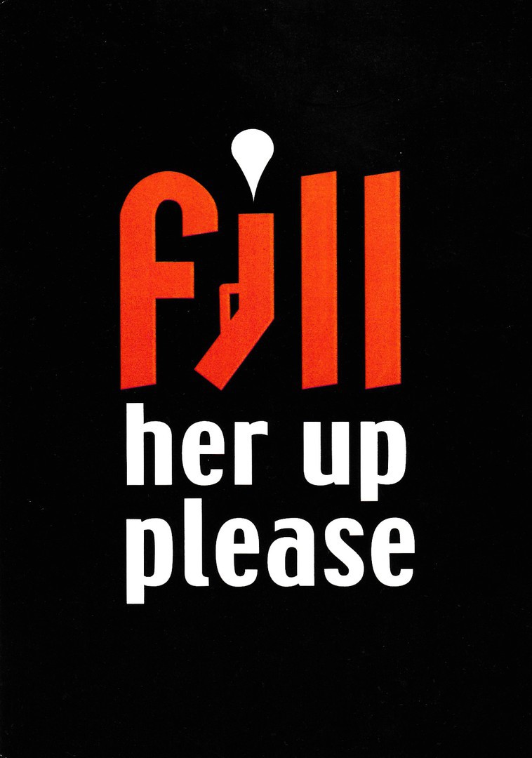
No 89
FILL HER UP PLEASE
From
OCTOPUSSY
The James Bond connection makes this one a little more collectible. The quote is from when he lands the small single seat mini-plane and drives it up to an old American petrol shack (I think this is in the opening segment before the titles, in fact I believe the titles come up immediately after this quote)
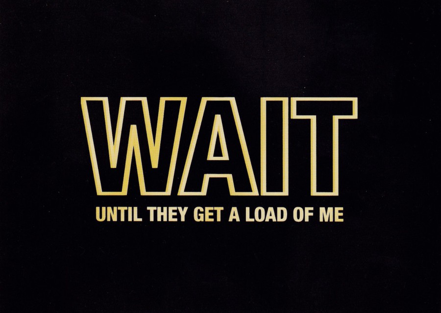
CINEMA IN CARDS SERIES
No 95
WAIT UNTIL THEY GET A LOAD OF ME
From
BATMAN
Quote made by The Joker (Jack Nicholson)
Batman related postcards are always popular whatever they depict
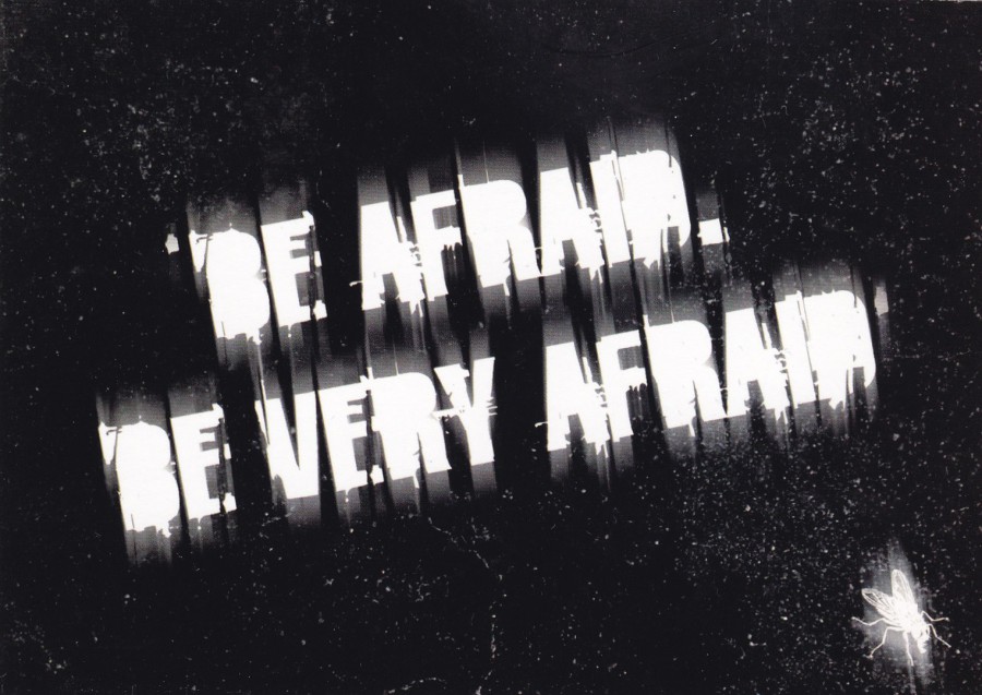
CINEMA IN CARDS SERIES
No 92
BE AFRAID. BE VERY AFRAID
From
THE FLY

CINEMA IN CARDS SERIES
No 104
PRETTY STANDARD REALLY
From
AUSTIN POWERS
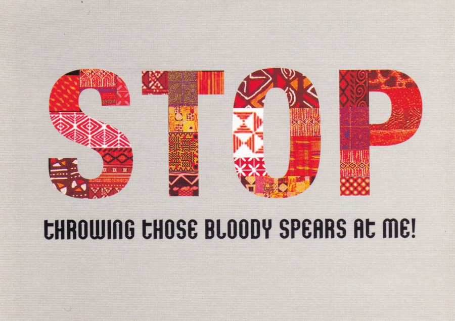
CINEMA IN CARDS SERIES
No 99
STOP THROWING THOSE BLOODY SPEARS AT ME!
From
ZULU
One of my favourite films
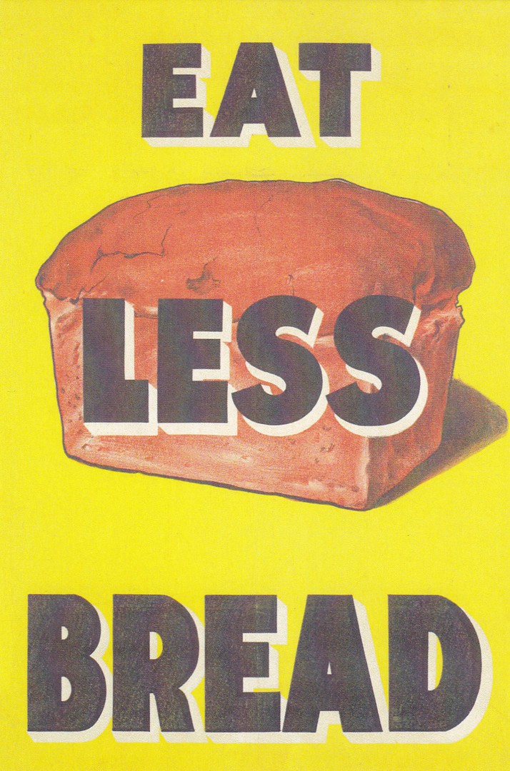
12/03/2017
EAT LESS BREAD
1917 – ARTIST UNKNOWN
Published by
ENGLISH HERITAGE
Ref: 63272 PC WWI ‘Eat Less Bread’
Another in a line of English Heritage issues which I have depicted. This one is a world war I poster which if issued in 1917 was towards the later end of that conflict. A simple design but it would have been impactive on the larger poster boards. This would technically fit into a military collection, because of its home front connection, a poster collection and in any collection which is food related.
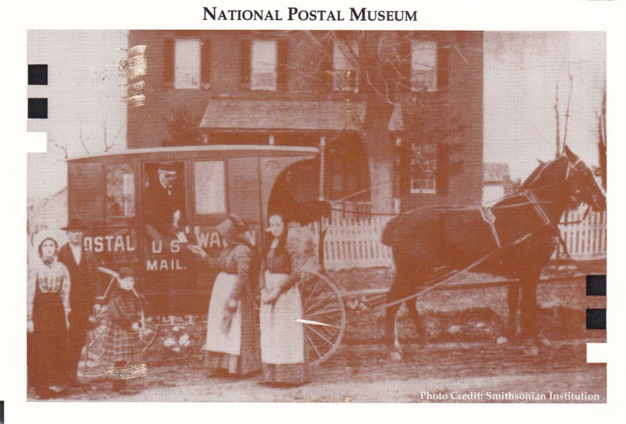
12/03/2017
NATIONAL POSTAL MUSEUM
US MAIL POSTAL WAGON
Official Museum Postcard
This postcard depicts an old photograph of a US Mail postal wagon. Unfortunately, there is no descriptive text on the postcard do explain where and when this picture was taken. The lack of information does not detract from the interest in this postcard because there is also a nice postmark on the reverse side
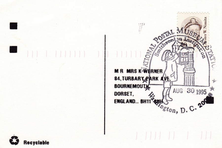
REVERSE SIDE OF ABOVE POSTCARD
As you can see here the Chester W. Nimitz 30cent stamp has been cancelled with a special pictorial hand stamp which reads:
NATIONAL POSTAL MUSEUM STATION
SMITHSONIAN INSTITUTION
WASHINGTON D. C.
30TH August 1995
The image used shows a child posting a letter (or possibly a post card) into an old styled mail box.
Whilst we are talking about American special cancels it might be an idea to explain to those collectors outside of the USA the US Post Office special cancel operation system. If you check this, and other special cancels from America, you will notice the use of the word ‘STATION’. This is because each pictorial hand stamp is linked to one location and that becomes the station point for items to receive the cancel. Here in the UK we do have special hand stamps sponsored to a location but these are applied at one of a small number of special hand stamp centres. Also, here in the UK the release of any new issue of stamp can come with any number of different first day of issue special handstamps sponsored by philatelic companies, other organisations or individual people. In the USA there is only the one pictorial official special handstamp for any stamp issue and the Station for this is normally somewhere which has relevance to the stamp issue, the town where a depicted person was born or the location where a depicted event took place etc. This is one major difference between the UK and USE special cancel set up.
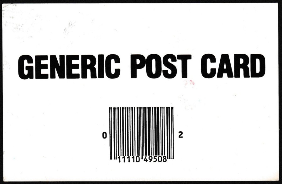
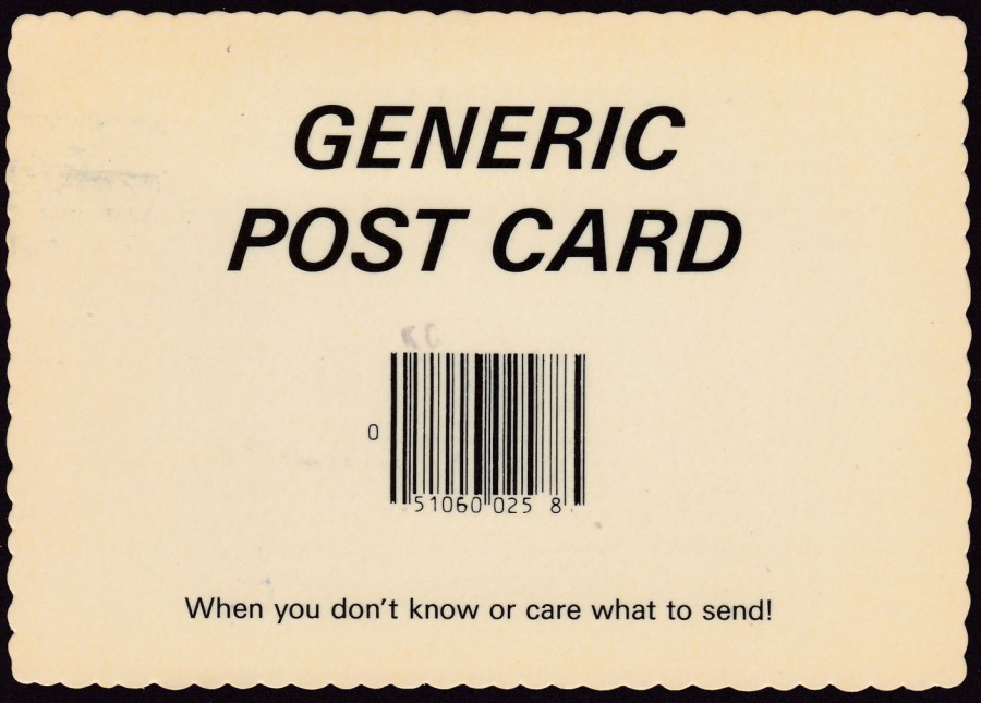
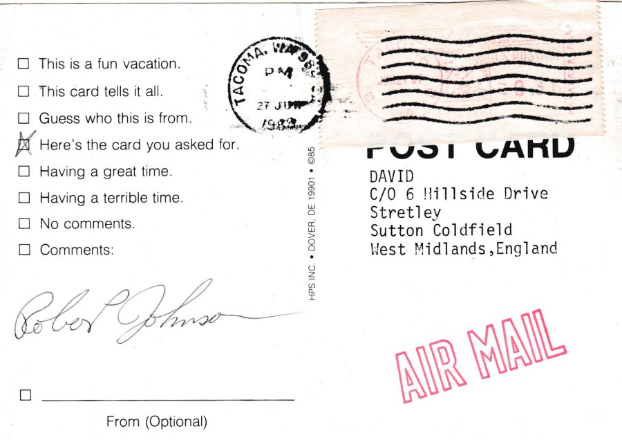
11/03/2017
The
GENERIC POST CARD
Craze/Fad of the 1980’s
America
Like all things, postcard issues have their crazes and fads, and one which I noticed in the late 1980’s was the ‘GENERIC POST CARD’ idea. I do not know where it started, but before too long, after the initial releases, these cropped up everywhere across North America.
The design is very simple incorporating the words GENERIC POST CARD along with a bar-code, and in some cases a line of text pretty much saying the sender is a lazy person. The craze for these cards really took off and as a result many versions can be found.
I obtained a number of these when I bought some of the ‘David’ collection. David was a young boy who wanted to be in the Guinness Book of Records for holding the largest postcard collection. Because he was ill the request for postcards went world-wide, and as a result of much of this collection later being sold onto other collectors many of us have items from it in our collection.
Depicted here are some of the Generic Post Card postcards from my ‘David’ collection.
NATURAL COLOR CARD
Published by
Modern-Ad
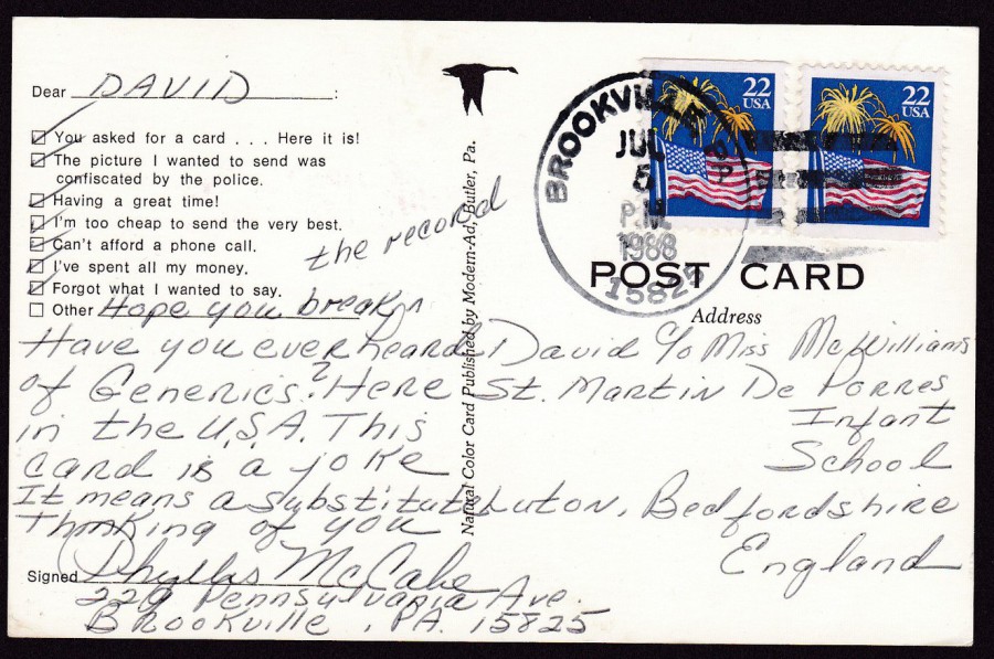
REVERSE SIDE OF ABOVE POSTCARD
The joy of these being mostly postal used is that I also obtained a range of USA issued postage stamps. This copy here was posted in July 1988 with two copies of the 22cent ‘Flag with Fireworks’ booklet stamps (Issued 09/05/1987 – the stamp on the left has a straight edge at top and the one on the right along the bottom).
The sender has also nicely filled out the tick box section and really used this particular copy to the maximum effect.
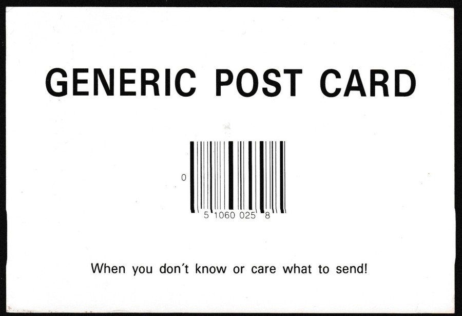
MARKETPLACE MERCHANDISING
Printed in Canada
Ref: L-95453-D
“When you don’t know or care what to send!”
This postcard is slightly larger than the above postcard, this one is what would be considered normal modern size whilst the one above is more golden age sized.
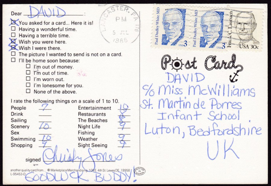
REVERSE SIDE OF ABOVE POSTCARD
This one has more areas to complete in the format. The stamps used are a single 30cent Frank C. Laubach (issued 02/09/84) and two of the 3cent Paul Dudley White MD issue from 15/09/86

DEXTER PRESS Published version
Similar to the above design, but with the ‘GENERIC’ on one line and ‘POST CARD’ on a second
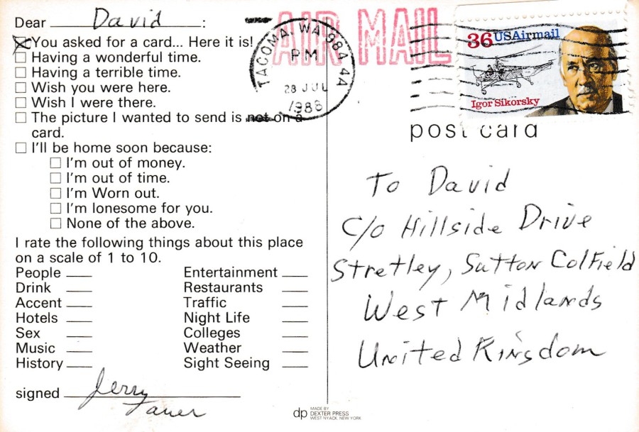
REVERSE SIDE OF ABOVE POSTCARD
Question format layout the same as the above postcard.
The stamp is a 36cent ‘Igor Sikorsky’ airmail issue (issued 23/06/88)
AERIAL PHOTOGRAPHY SERVICES
Ref: 81679-D
Printed by
DEXTER PRESS
Pretty much the same front design as the above postcard but printed by a different company and issued with a deckle edge.
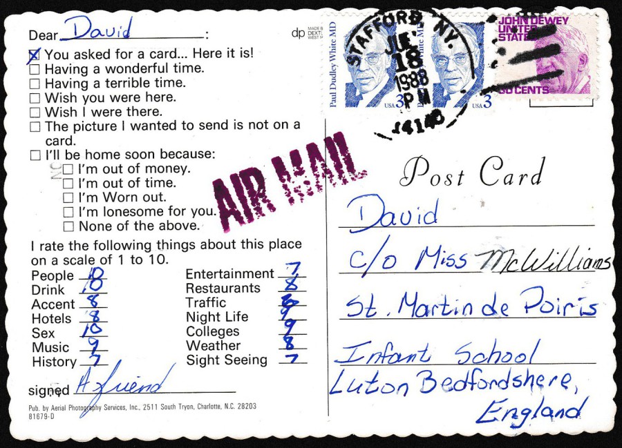
REVERSE SIDE OF ABOVE POSTCARD
Same reverse question set.
Used with two 3cent Paul Dudley White MD issue and a 30cent John Dewey (issued 21/10/68)

GENERIC CARDS
(OREGON printed)
Copyright 1981
“If you’re so cheap that you’d give not much of anything”
This one really fills out the front of the card with large letters and bar-code. This one is also printed on Matt card (Every other postcard in this selection is printed on Gloss card)
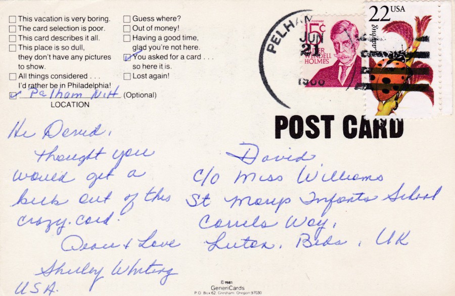
REVERSE SIDE OF ABOVE POSTCARD
Here you have 15cent Oliver Wendell Holmes (issued 08/03/68) and a ladybird 22cent stamp from the 1987 ‘American Wildlife Issue (issued 13/06/87)

LAS VEGAS GENERIC POST CARD
Published by
PLASTICHROME
BOSTON
Distributed by Las Vegas News Agency, Las Vegas
Eventually it was obvious that these Generic Post Cards would come with a named location included. This one here is for the party capital of America – Las Vegas.

REVERSE SIDE OF ABOVE POSTCARD
The questionnaire box section on this postcard is different and the last section is specific to Las Vegas.
The two stamps are 25cents pheasant stamp – booklet pane stamps, the left-hand stamp has a straight edge at top and the right side has a straight edge along the bottom (issued 29/04/88)
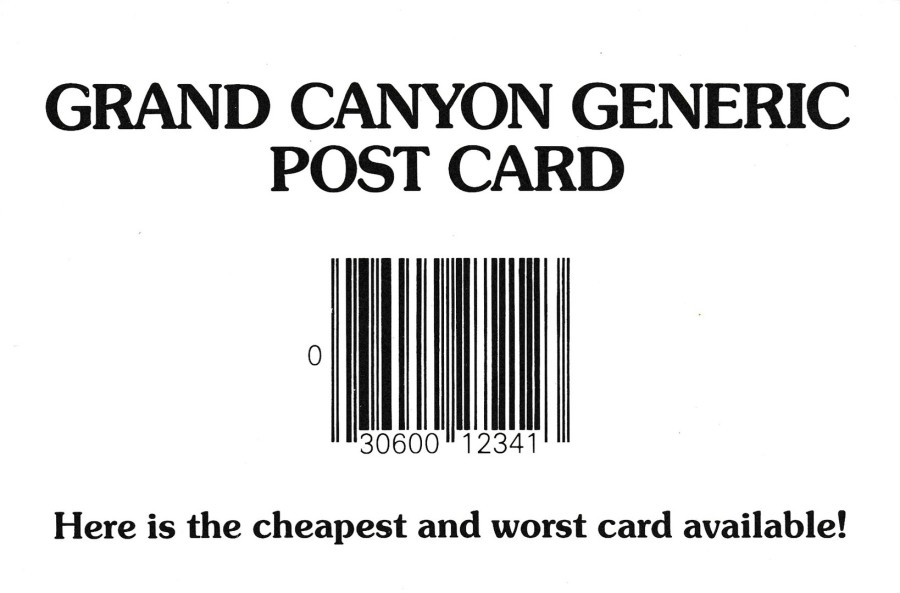
GRAND CANYON GENERIC POST CARD
Published by
PETLEY
Distributed by Petley Studios, Arizona
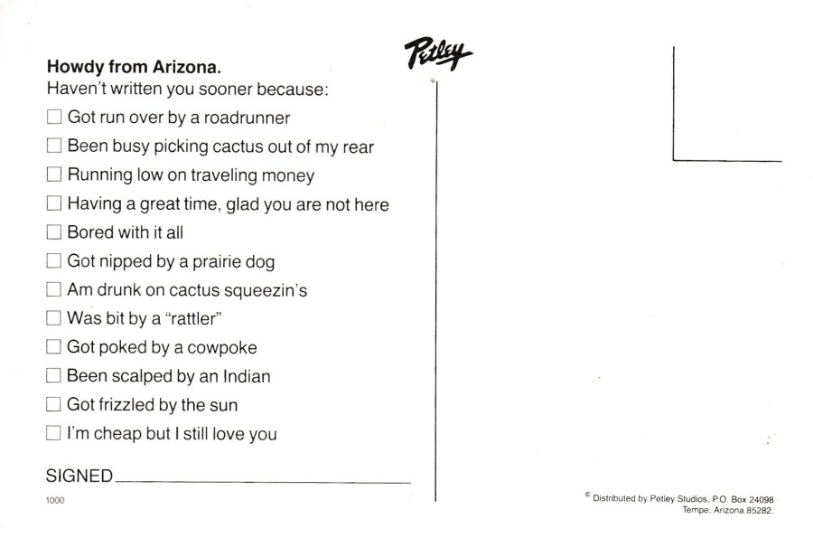
REVERSE SIDE OF ABOVE POSTCARD
One of the few I have mint unused, although I prefer these used as then you get at least part of a story.
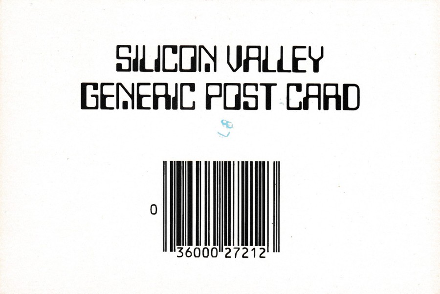
SILICON VALLEY
GENERIC POST CARD
Published by
Smith Novelty Co, San Francisco
Ref: C-229
They have cleverly changed the script font for this issue

REVERSE SIDE OF ABOVE POSTCARD

SAN FRANCISCO
GENERIC POST CARD
Published by
Smith Novelty Co, San Francisco
This one has been printed with a deckle edge
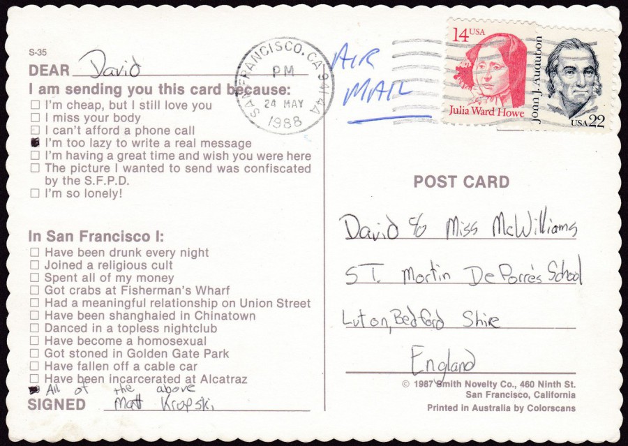
REVERSE SIDE OF ABOVE POSTCARD
I like that the sender, despite the number of options given, has decided to add their own option at the bottom (just lazy really, which is ironic as the idea behind the original joke is that this is a type of postcard issued for lazy people, as they could be bothered to tick all the boxes!)
The two stamps used are the 14cent Julia Ward Howe (issued 12/02/87) and a 22cent John J. Audubon (issued 23/04/85)
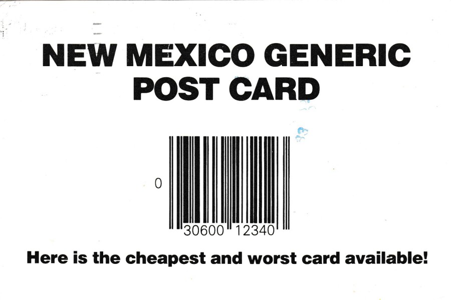
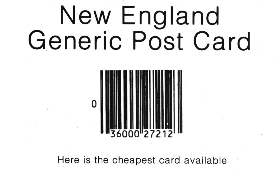
NEW MEXICO GENERIC
POST CARD
Published by
PETLEY SOUTHWEST Inc
“Here is the cheapest and worst card available!”
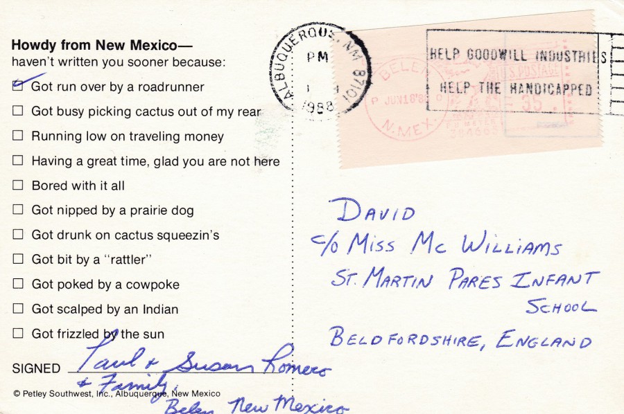
REVERSE SIDE OF ABOVE POSTCARD
This one has a nice slogan cancellation which reads:
HELP GOODWILL INDUSTRIES
HELP THE HANDICAPPED
The use of the word handicapped is now no longer acceptable but it often crops up in old postmarks and on material issued before the word was, quite rightly, no longer acceptable.
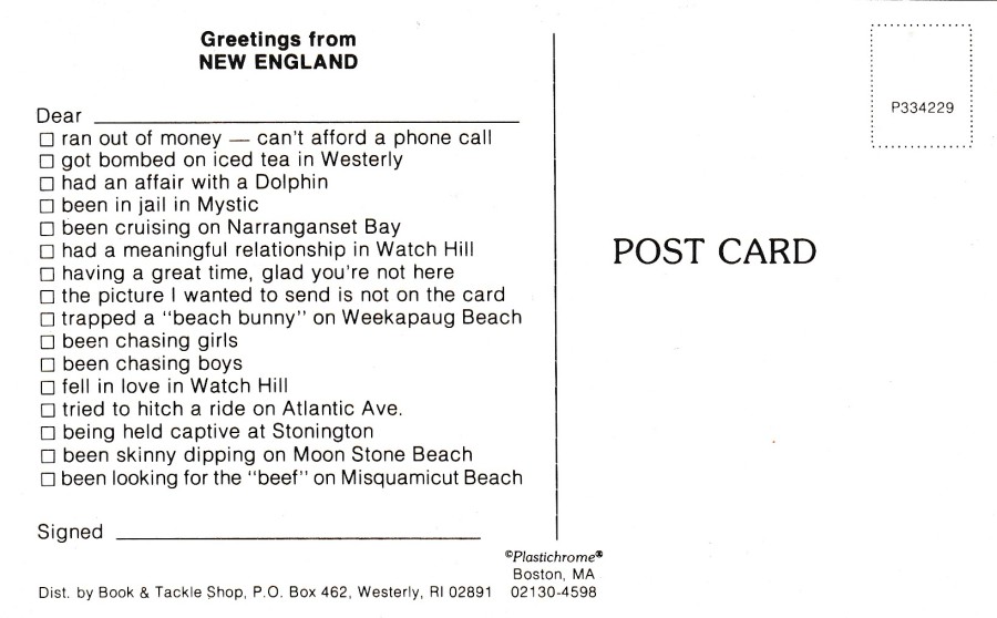
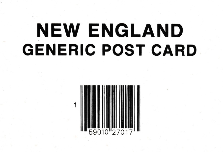
NEW ENGLAND
GENERIC POST CARD
Published by
PLASTICHROME
BOSTON
Distributed by
BOOK & TACKLE SHOP, WESTERLY
“Here is the cheapest card available”
Ref: P334229
This is another smaller size postcard (certainly much smaller than the one immediately below)
REVERSE SIDE OF ABOVE POSTCARD
Another mint unused copy
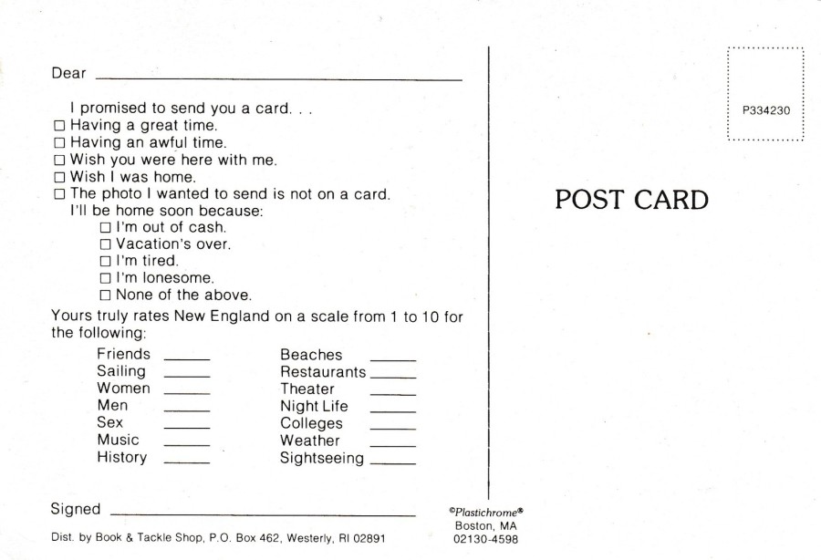
NEW ENGLAND
GENERIC POST CARD
Published by
PLASTICHROME
BOSTON
Distributed by
BOOK & TACKLE SHOP, WESTERLY
Ref: P334230
This card is larger in size than the above one and interestingly the reference number is one number higher here than for the above postcard. The question set layout is also very different.
REVERSE SIDE OF ABOVE POSTCARD
Another mint copy
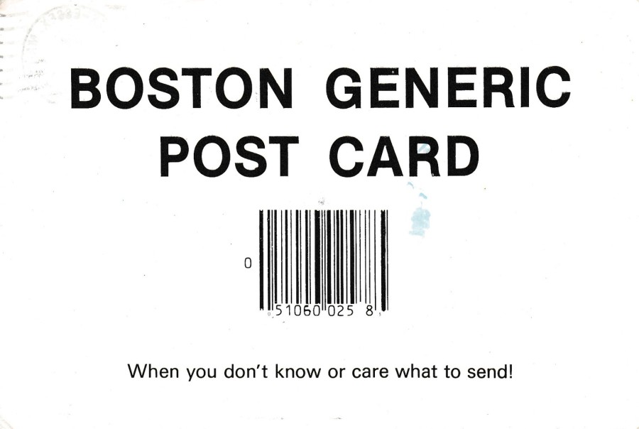
BOSTON GENERIC
POST CARD
Published by
KLIEN POST CARD SERVICE
“When you don’t know or care what to send!”

REVERSE SIDE OF ABOVE POSTCARD
This one has been posted using 1cent Margaret Mitchell (issued 30/06/86) and a 5cent Pearl Buck (25/06/83) and a 30cent Frank C. Laubach (issued 02/09/84)
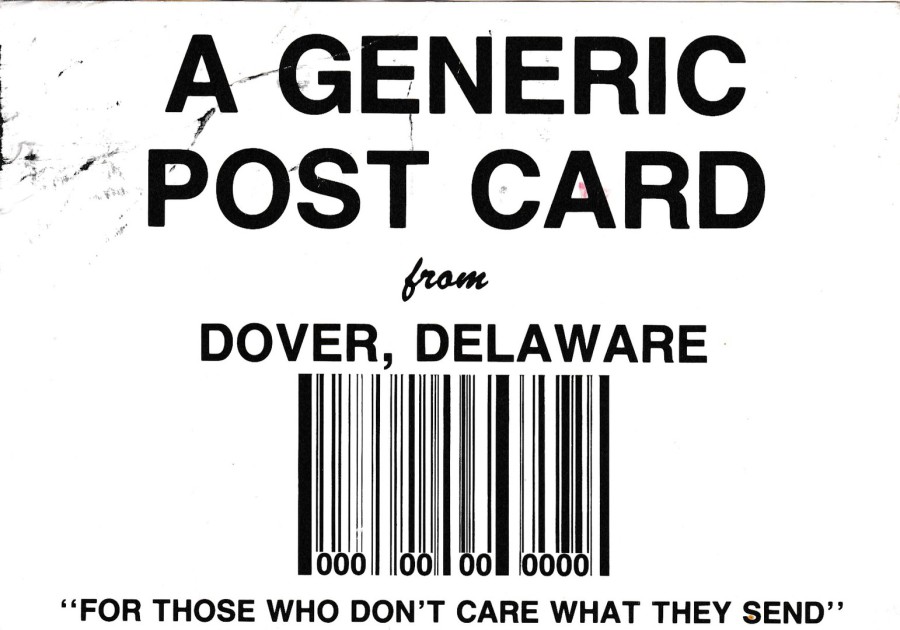
A GENERIC
POST CARD
From
DOVER, DELAWARE
“FOR THOSE WHO DON’T CARE WHAT THEY SEND”
Published by
HPS INC, DOVER
REVERSE SIDE OF ABOVE POSTCARD
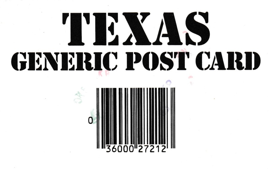
TEXAS
GENERIC POST CARD
Published by
MIKE ROBERTS COLOR PRODUCTIONS
Ref: C35560

REVERSE SIDE OF ABOVE POSTCARD
Apparently, the senders preferred postcard was confiscated by the Texas Highway Patrol!!
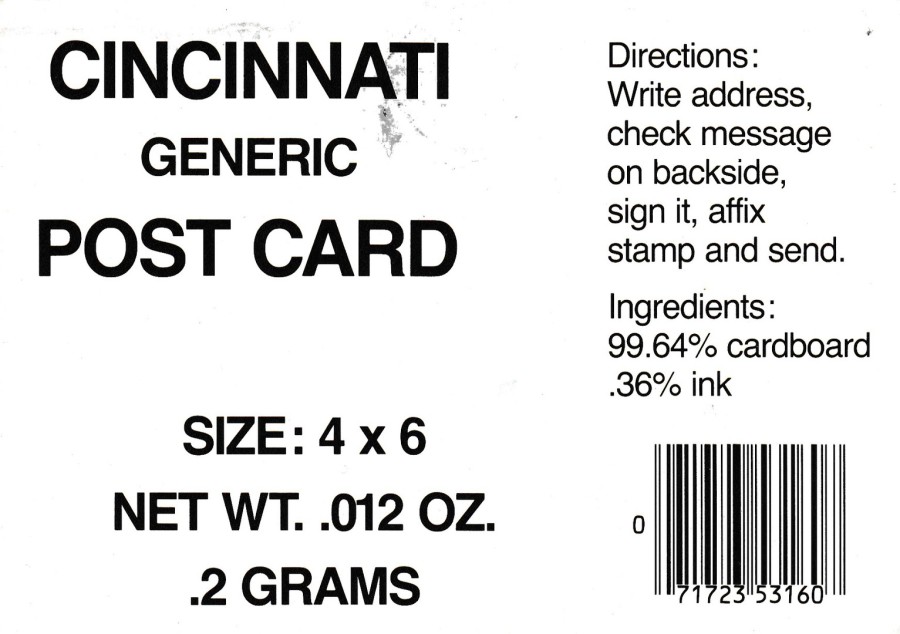
CINCINNATI GENERIC POST CARD
Published by
WHITE HOUSE PUBLISHING Co
Created by R. E. White
Ref: 16102682
This postcard design has much more text than the more basic designs. It would be fair to say that people were now looking for something a little different and this design has far more information on the front than any of the others posted above.
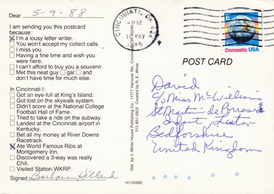
REVERSE SIDE OF ABOVE POSTCARD
This one was posted using an “E” (25cents) Earth booklet pane – straight edged along top and bottom (issued 22/03/88) – technically this is underpaid for transit to the UK but it has not been marked up as postage underpaid. Maybe because the postal authorities were aware that it was going to a good cause.
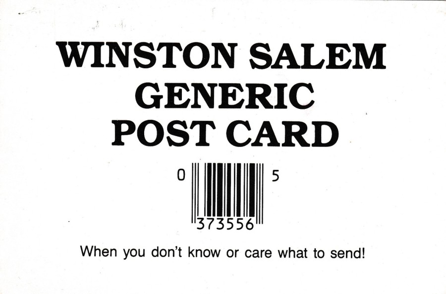
WINSTON SALEM
GENERIC
POST CARD
Published by
AERIAL PHOTOGRAPHY SERVICES INC (APS)
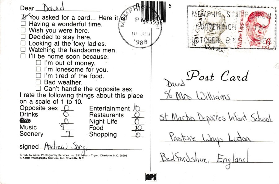
REVERSE SIDE OF ABOVE POSTCARD
Posted using a 30cent Frank C. Laubach (issued 02/09/84) and a 6cent Walter Lippman (19/09/85)
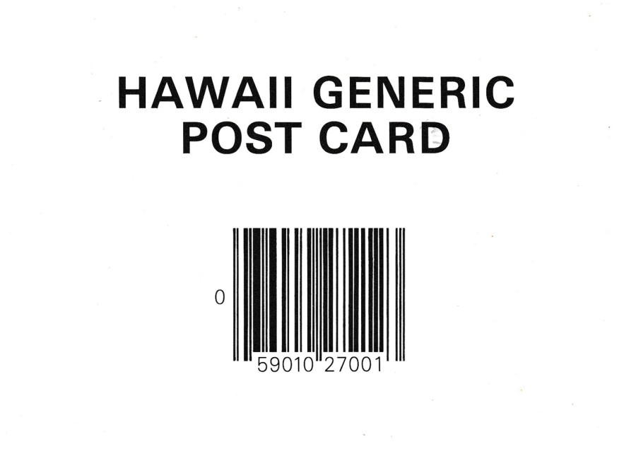
HAWAII GENERIC
POST CARD
“MEMORIES OF HAWAII”
Printed by
PLASTICHROME
For the
HAWAIIAN SERVICE INC, HONOLULU
At least they have again used the most basic version of this type of postcard.

REVERSE SIDE OF ABOVE POSTCARD
The stamp is a 36cent ‘Igor Sikorsky’ airmail issue (issued 23/06/88)

CALIFORNIA
GENERIC POST CARD
Unknown Printer – Publisher
Ref: # 5544
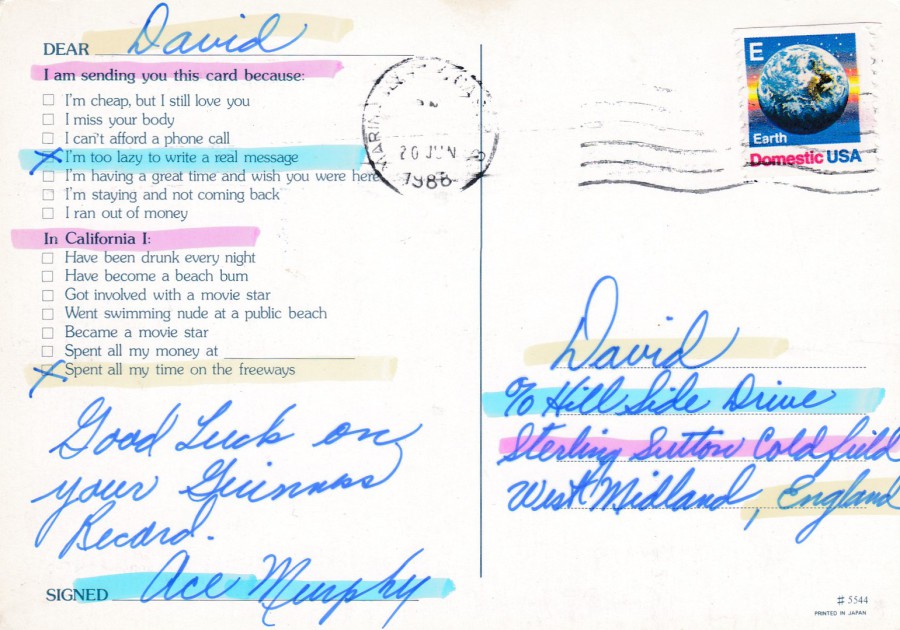
REVERSE SIDE OF ABOVE POSTCARD
This one was posted using an “E” (25cents) Earth booklet pane – straight edged along top and bottom (issued 22/03/88) – technically this is underpaid for transit to the UK but it has not been marked up as postage underpaid. Maybe because the postal authorities were aware that it was going to a good cause.
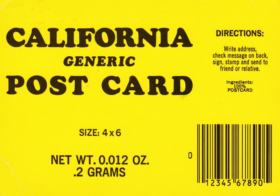
CALIFORNIA
GENERIC
POST CARD
Published by
MITOCK PUBLISHERS INC
Printed in Ireland for
JOHN HINDE CURTEICH INC
Ref: MJH-002
2US CA 229
I suppose there was no reason why the colour of the card could not change, except that it went against the basic idea of laziness which was so well represented by the ‘use’ of the white card. But, as the fad moved forward there needed to be changes to keep the idea going so here they have used the addition of colour card.
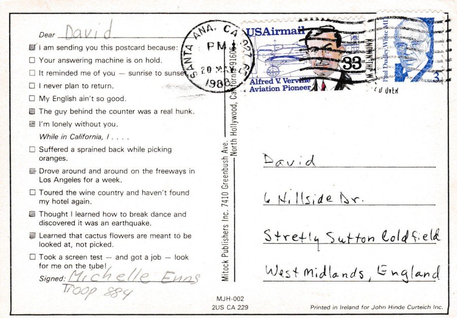
REVERSE SIDE OF ABOVE POSTCARD
The stamps used here are a 3cent Paul Dudley White MD issue from 15/09/86 and a 33cent airmail Alfred Verville and airplane diagram stamp released 13/02/85.

UNIVERSITY OF
CALIFORNIA
GENERIC POST CARD
Printed by
PLASTICHROME
Published by
Smith Novelty Co
Ref: 02130-4598
Here we have a yellow/orange toned postcard colour, and another attempt to move on from the plain white card stock that had launched the initial craze for these cards.
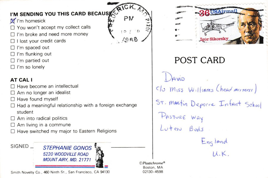
REVERSE SIDE OF ABOVE POSTCARD
The stamp is a 36cent ‘Igor Sikorsky’ airmail issue (issued 23/06/88)
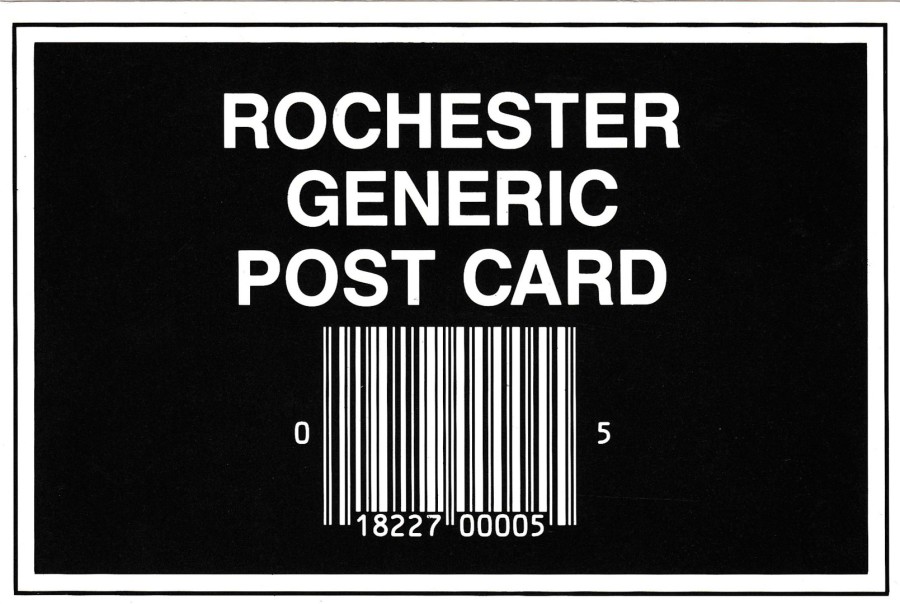
ROCHESTER
GENERIC
POST CARD
“ROCHESTER SCENIC PRINTS”
Published by
EDWARDS PRESS, ROCHESTER
Ref: R-202
And, I suppose the use of black was also an inevitable change, and here you can see it being used on a generic styled postcard from Rochester
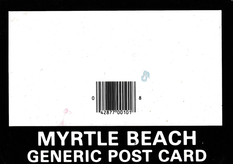
MYRTLE BEACH
GENERIC POST CARD
Printed by
PLASTICHROME
BOSTON
Published by
BRANDON ADV
This one has a different set up again but maintains the theme and intent of these issues
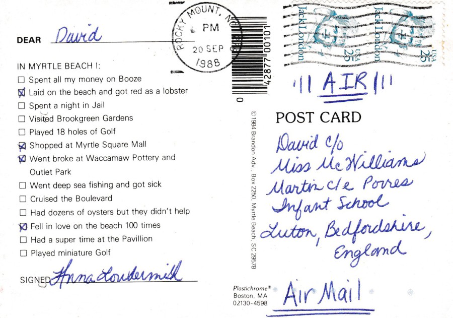
REVERSE SIDE OF ABOVE POSTCARD
Here two copies of the 25cent Jack London stamp (issued 11/01/86, although I suspect these are from the booklet pane which was released 03/05/88)

11/03/2017
FORMULA 1.
ANDREA DE CEASARIS
TYRELL IIMOR 020/B
Published jointly by
HOUSEMARTINS &
DENNIS PRINT & PUBLISHING
In the series:
HOUSEMARTINS SPORTING PUBLICATIONS
Ref: G032056L
I only have a few Formula 1. Related postcards, this is mainly because the subject is not one I actively seek out. But, non- the-less I do have a handful of which this is one.

LAUDA
MCLAREN – PORSCHE
Published by
GRAFICHE BIONDETTI – VERONA
Ref: 231/2
And, this is another one
JOHN SURTEES CBE ….. RIP
11th February 1934 – 10th March 2017
Motorcycle Racing Champion and Formula 1 World Championship racer
1956 500CC Motorcycle World Champion
1964 Formula 1 World Champion
Was the first man to win the Senior TT t the Isle of Man TT three years in succession.