04/02/2017
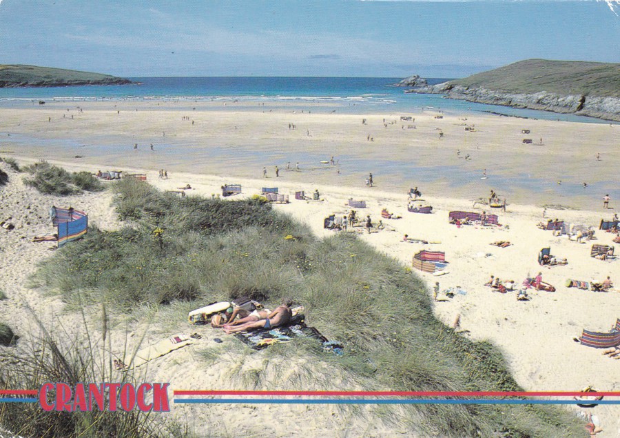
CRANTOCK
Published by
JOHN HINDE
John Hinde Original
Ref: 2DC 1748
“Crantock lies to the south of Newquay across the Gannel estuary, and is renowned for its picturesque scenery of smart thatched cottages. The nearby beautiful sandy beaches and dunes offer ideal family bathing facilities. In the little church, centre of interest is focused on the 15th century font. This is an area rich in fine examples of 15th century domestic architecture. Crantock, within easy reach of Newquay, has much to offer the tourist in holiday amenities.”
(Text from reverse side of Postcard)
Surely there can-not be a more-simple postcard than this one here, or one that is so indicative of what people believe a postcard should be. But, to be honest, it is a bit dull, except, it was the back of this postcard that interested me.
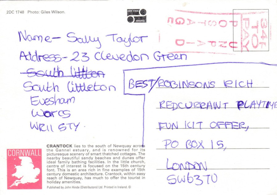
REVERSE SIDE OF ABOVE POSTCARD
I am interested in cachets and marks which are applied to mail, or especially in my case, postcards. Here someone entered a competition but forget to place a stamp on their entry. I have posted on the webpage something similar before but that was a black boxed instruction mark. Here you have a red ‘POSTAGE UNPAID’ mark, but it is one that I have not seen before. This red mark I thought was quite interesting and I bought the postcard for this alone.
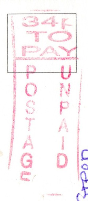
CLOSE UP OF ‘POSTAGE UNPAID’ MARK
04/02/2017
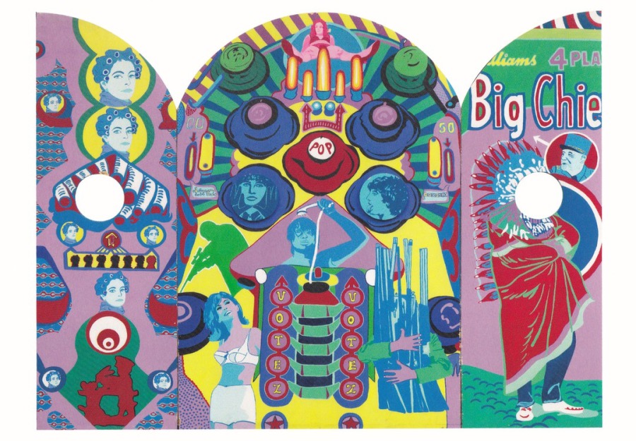
GOD OF WAR (1967 – 1968)
Triptych Acrylic paint on wood
Artwork by
Ulrike Ottinger
Published by
TATE MODERN, LONDON
This is an A5 sized postcard, so much larger than the normal design, depicting a piece of artwork which is ‘definitely’ unusual. To be honest I would probably not have bought this if it had been full price (i.e. over £1) but, fortunately, it was in the sale they held just before Christmas, so it only cost me 10p. For that price, I was happy to add it to my art collection.
04/02/2017
UNTITLED
Artwork by
Art Director Marshoud Dababneh
Published by
GO-CARD
Ref: Free Advertising Postcard # 11366
This cracking piece of artwork has a while range of themes attached to it including television, cartoons, music, food, advertising, art and Americana.
The main background image is the face of the Statue of Liberty, seen here crying, but you also have Mickey Mouse, a Smurf, Campbells Soup, Coca Cola, Burger King, MacDonald’s (Ronald MacDonald), Bart Simpson, Orko (from ‘He-Man and the Masters of the Universe), Superman, Pinocchio (Walt Disney version), Rolling Stones (Lips logo), Hip Hop and Woody the Woodpecker.
With all of this going on in one single design this postcard would appeal to several collectors.
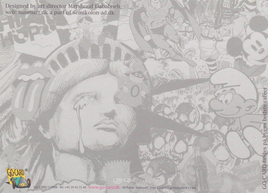
REVERSE SIDE OF ABOVE POSTCARD
They have used the entire front design as a faded background image across the reverse side of this postcard. Some would say this negates this being a true postcard, but, I think it just makes this card more interesting.
04/02/2017
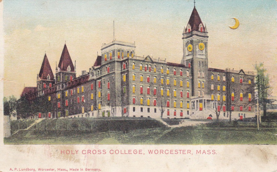
HOLY CROSS COLLEGE, WORCESTER, MASS
(MASSACHUSETTS)
‘HOLD TO LIGHT’ Novelty Postcard
Published (or Printed) by
A.P.LUNDBORG, WORCESTER, MASS
Made in Germany
I have shown a ‘Hold to Light’ postcard before, actually, I think I have depicted two. These are a type of postcard where holes have been cut into the top piece of card, normally window areas on a building, here they have also cut out the clock rounds on the tower and the crescent of the moon. A second thinner piece of card is applied to the back of the top card. This then means that if you hold the card up to a light the areas on the top card which have been cut out show through as illuminated from behind by the light. It is a very simple idea but these were very popular at the time.
REVERSE SIDE OF ABOVE POSTCARD
A very simple post card reverse layout, printed in green which is not uncommon in American postcards from the early years of the last century. I do like the early American way of printing the elaborate ‘POST CARD’ headings.
04/02/2017
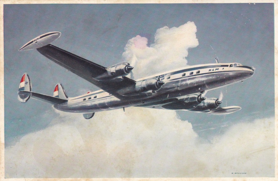
KLM
LOCKHEED SUPER CONSTELLATION L 1049 G
Printed in the Netherlands by
Meijer Wormenveer (sic – not sure about all the letters at the end here as there is hand writing across it on my copy)
This is one of my top ten aeroplanes. It was apparently nicknamed the ‘Connie’ and was built by the Lockheed Corporation between 1943 and 1958 in California. 856 of these were built, in different models, but they all had the distinctive triple-tail design and that dolphin-shaped fuselage. The Constellation was mainly used as a civil airliner but also was used by the military and civilian air transport and some saw service in the Berlin airlift and the lesser known Biafran airlift. Three Constellations were also used by President Dwight D. Eisenhower.
03/02/2017
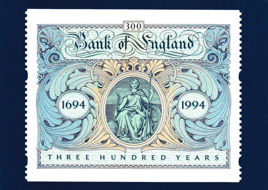
BANK OF ENGLAND TERCENTENARY
Published by
THE ROYAL MAIL
Ref: ROYAL MAIL STAMP CARD SERIES D9 4/96
Reproduced from a commemorative label designed by Sedley Place Limited and issued by Royal Mail on 27 July 1994
Postcard Printed by
THE WHITE DOVE PRESS, SOUTHEND ON SEA
© the post office 1996
Although the commemorative label depicted here, which in its original form came in a booklet alongside four queen head Machin stamps, was issued in 1994 this postcard reproducing its image was not issued until April 1996 (thus denoted by the 4/96 at the end of the descriptive reference line above).
One of my favourite things about Royal Mail postcards is that for a while they were all, alongside the PHQ Stamp Cards, printed in my home town of Southend on Sea. In fact, whilst I was stationed at Rochford the premises of The White Dove Press were located on my ground and I visited it on several of occasions. I even got to see the PHQ Stamp cards being printed.

03/02/2017
JUST A LINE FROM BOGNOR REGIS
Published by
VALENTINE & SONS
Ref: K.703
The use of the phrase ‘JUST A LINE FROM…’ was very popular with various postcard publishers and was often married up with an image, either a photograph or sometimes a drawn image, of a line of puppies, dogs, cats, kittens or a line of other creatures, I have even seen a line of hung up caught fish used for this representation. Here, this well-known British publisher, has used a photograph of a line of puppies, which is a very traditional approach. This is also of course a multi-view postcard, and here there are five local view photographs; Top Right – EAST SANDS, Middle Right – WEST SANDS, Bottom Right – MARINE GARDENS, Centre Bottom – WEST PROMENADE, and lastly, Bottom Left – THE PIER.
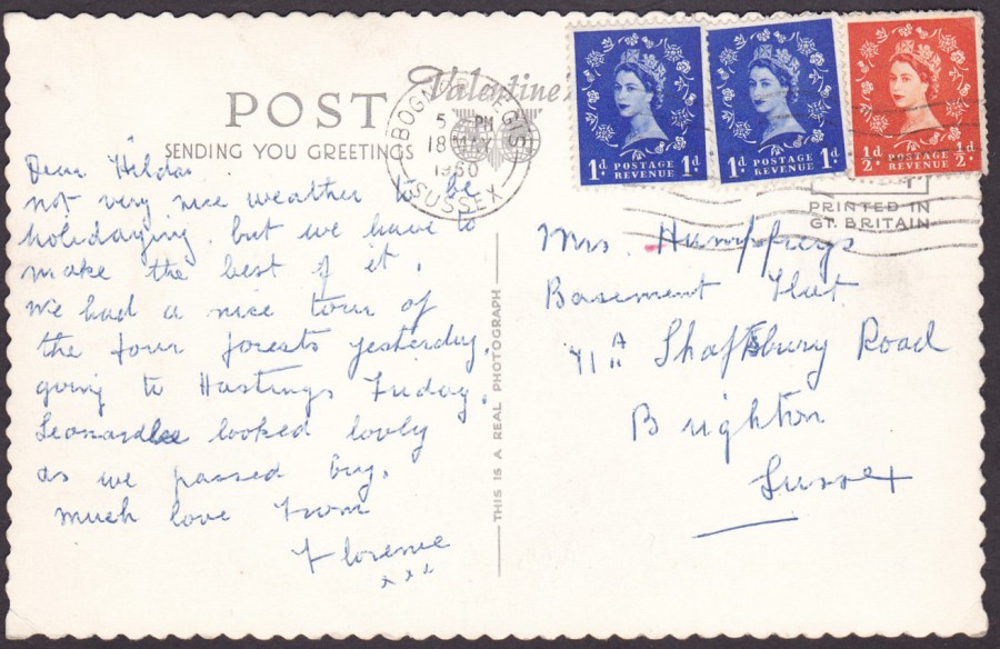
REVERSE SIDE OF ABOVE POSTCARD
This postcard was posted from Bognor Regis (no surprise there) using three Queen Elizabeth II ‘Wilding’ definitive stamps, 2 x 1d stamps and 1 x ½ d stamp. The stamps have been cancelled with a Bognor Regis, Sussex wavy line machine cancel dated 18th May 1960.

03/02/2017
BATH
ROMAN BATHS
Published by
FRITH
(Frith’s Series)
A nice early image (published around 1902 – 1903) of the Roman Baths attraction in the city of Bath. I have visited here twice myself and I do like these bath buildings, although I think the condition of the attraction has improved since the era of this photograph. The area where the two people are standing on the left side, and the area opposite them beyond the pillar posts is now all under cover. There are new pillars in place and the area around the people can now be walked around in any weather without getting wet. But, I think this is a lovely photograph which just reeks of history. The postcard itself was posted in 1903.
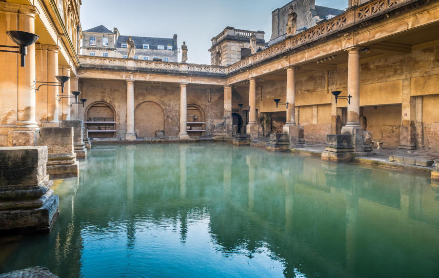
PHOTOGRAPH
This modern photograph allows you to see how much this changed
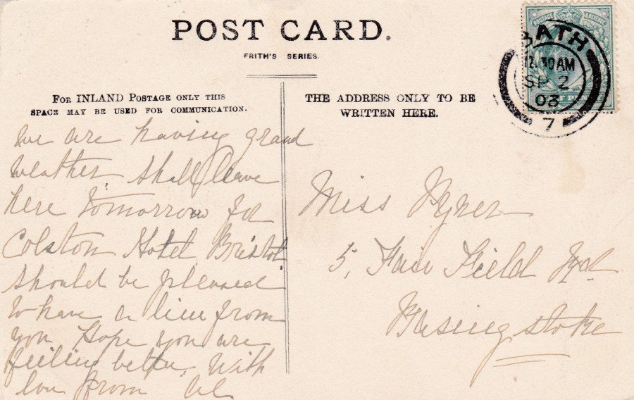
REVERSE SIDE OF ABOVE POSTCARD
The stamp used here has been cancelled with a nice BATH medium arc circular cancel with handstamp number at base, the number 7. The handstamp is dated 2nd September 1903.
03/02/2017
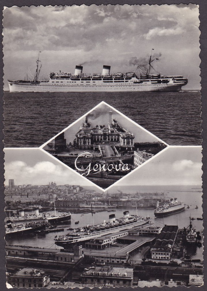
GENOVA
“GENOA”
Multi-view Postcard
Published by
BROMOFOTO, MILANO (Milan)
Ref: 148
This is a nice multi-view topographical postcard which has a smashing ‘Shipping’ theme to it. Genoa (Genova in Italian, and it is also known as Genua in archaic English) is an Italian city, the sixth largest city in the country and one of the largest metropolitan areas along the Riviera, along the Mediterranean Sea. It is also the largest seaport in Italy, which explains the images on this 1950 era postcard.
This postcard would fit nicely into any shipping collection but it would also be sort after by anyone who collects images and postcards of the area of Genova, where this postcard would be valued higher than it was here in the UK where I bought it.
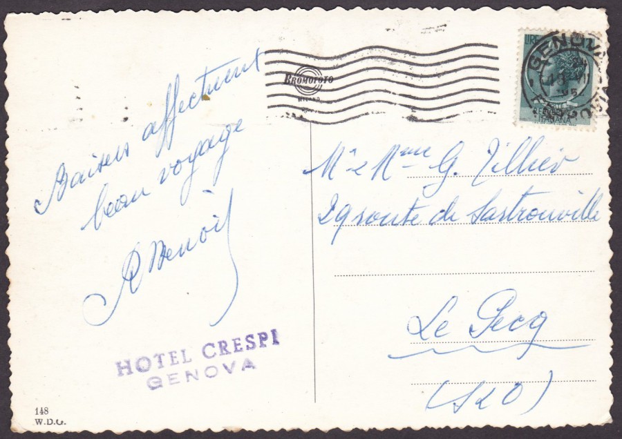
REVERSE SIDE OF ABOVE POSTCARD
This Postcard was posted using an Italian definitive stamp which has been cancelled with a Genova wavy line machine cancellation dated 18 VII (7TH month – July) 195? (I can’t make out the last digit for the year).
The postcard also has a purple hotel cachet for the ‘HOTEL CRESPI, GENOVA’, which is not an unusual addition to find on a postcard. Many hotels had postcards for sale to customers, or sometimes even free postcards which had been ‘pre-cachet applied’ for the hotel as a publicity item. They are not collected much but can add an extra touch of interest to any used postcards.

02/02/2017
AARDMAN
ANIMATE IT
CUT OUT & ANIMATE YOUR OWN MORPH!
Published for
AARDMAN ANIMATIONS LTD 2012
This is a superb television related postcard and one which is quite hard to source. The character Morph, of course started out on the Tony Hart children’s art series’ like ‘Take Hart’ and ‘Hartbeat’. Morph first appeared way back in 1977 but went on to appear in a series or two of his own; ‘The Amazing Adventures of Morph’ (1980 – 1981), ‘The Morph Files’ (1995), ‘Morph TV’ (1997, this was again with Tony Hart), ‘Morph’ (2006), ‘Brand New Morph’ (2014 – 2015) and another series simply called ‘Morph’ (2016).
This is a type of novelty postcard as the idea is to cut out Morph and pin his legs and arms on so that you can move his limbs. I wonder if anyone did cut him out as instructed, it would have course have destroyed the postcard, which would have been a shame as I love this card.
01/02/2017
DOCTOR WHO
The newspapers today were full of details and articles around the news that Peter Capaldi is to quit his role as Doctor Who after this year’s series. Some have said this is due to the lower viewer figures (but it still reaches figures of around 4 ½ million viewers). There is no doubt he plays a very complicated Doctor, but I have enjoyed his portrayal, if perhaps not all of the stories (although 2016’s Christmas story was light and comical and I quite enjoyed it). Well, the news he is leaving cannot go without some sort of postcard representation, so…
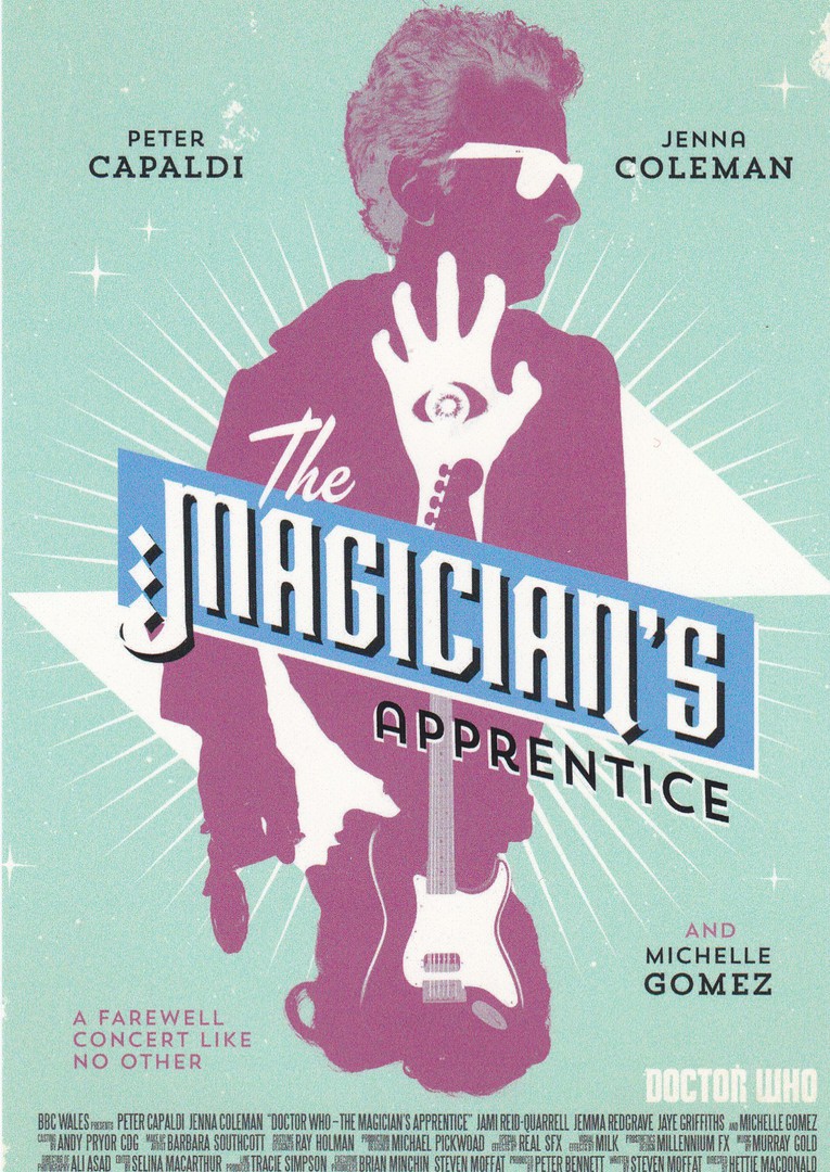
DOCTOR WHO
THE MAGICIAN’S APPRENTICE
THE RETRO POSTER COLLECTION – SERIES 9
Art work by
STUART MANNING
Published by
DYNAMIX ART CARDS COLLECTION
“A FAREWELL CONCERT LIKE NO OTHER”
This company issue some very professionally designed poster styled artwork postcards where the subject matter in each case relates to a single episode from a series. This design here is from an episode story from series 9, one of the Peter Calpaldi series.
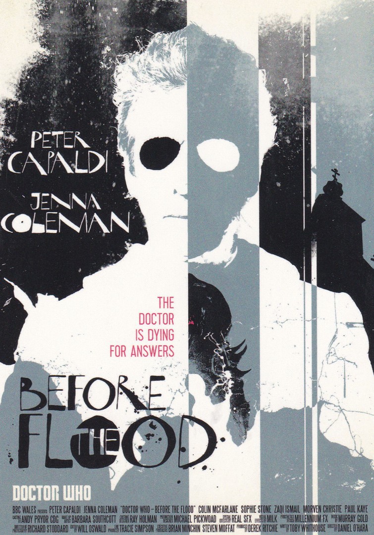
DOCTOR WHO
BEFORE THE FLOOD
THE RETRO POSTER COLLECTION – SERIES 9
Art work by
STUART MANNING
Published by
DYNAMIX ART CARDS COLLECTION
“THE DOCTOR IS DYING FOR ANSWERS”
Another postcard from this same series. This one is a little darker than the one above but again still captures the essence of this ‘particular’ episode. If you can find these postcards they are a delightful addition to any Doctor Who collection.
31/01/2017
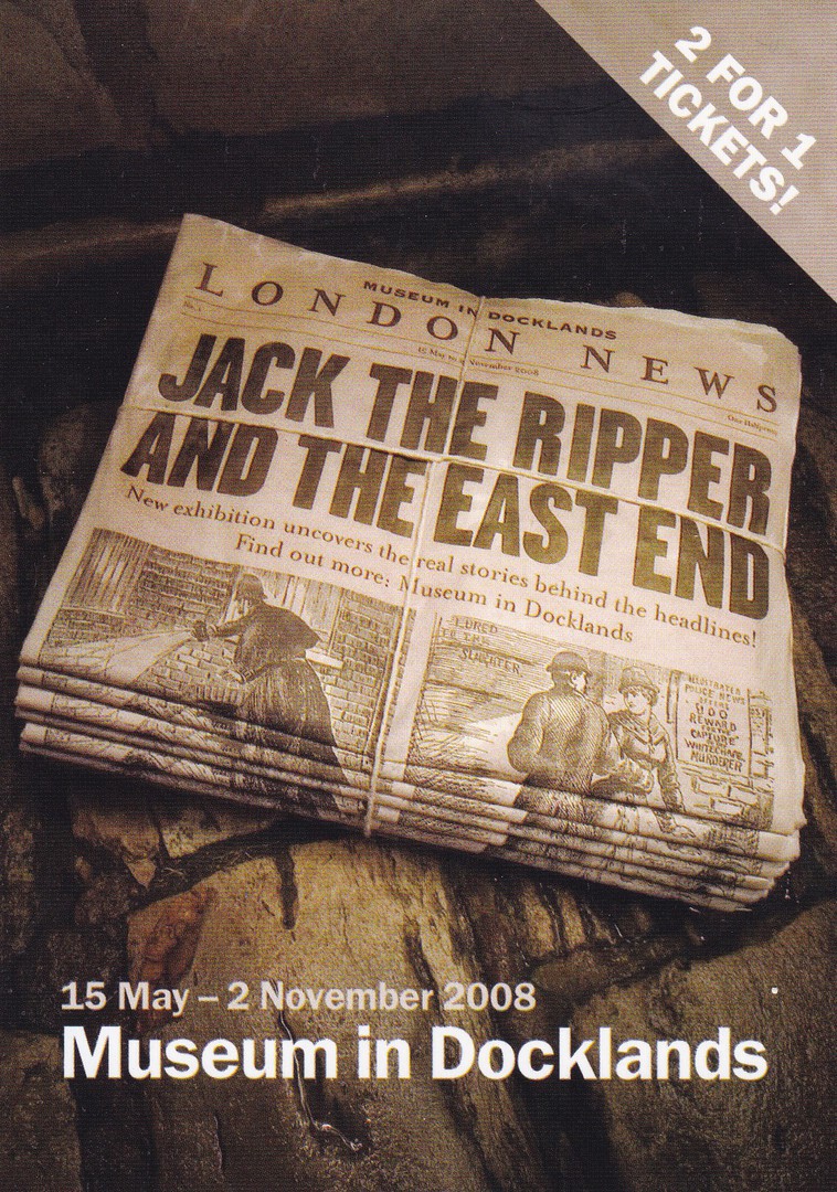
JACK THE RIPPER AND THE EAST END
MUSEUM IN DOCKLANDS
15TH MAY – 2ND NOVEMBER 2008
Published by
BOOMERANG
(Free Rack Card)
This advertising postcard promoted an exhibit held at the Museum of Docklands in 2008. The story of ‘Jack the Ripper’ has fascinated people since the very days of the attacks themselves. Like many people, I have been fascinated by the story and all the conspiracy theories and the theories on who ‘Jack’ was. Thus, postcards related to the theme of Jack the Ripper tend to appeal to a number of different collectors, those who collect Crime & Disorder, London History (and history in general), newspapers (because a lot of images depict the newspaper images of the time) and, of course, those who are just fascinated in the story. This one would appeal to all of those, and, originally it was a free postcard (but expect to pay at least 50p from any dealer now)

31/01/2017
L’AFRIQUE EN COULEURS
AFRICA IN PICTURES
‘Jeunes femmes sous un flamboyant’
‘Young women under a blooming tree’
Published by
EDITIONS HOA – QUI
Printed in France via ‘MEXICHROME’
Ref: 3232
If you put to one side the rather amusing English title for this card (‘Young women under a blooming tree’, or is it just me that finds that sentence a little funny?) this is a nice African postcard from the early 1960’s (so this is over 50 years old now).

REVERSE SIDE OF ABOVE POSTCARD
I have mentioned many times that although I am not a big stamp collector I still have quite a large stamp collection because of all my used postcards. The stamp used to post this postcard is a Cameroun (Cameroon) 1960 issued 20f value stamp which was issued to celebrate the Proclamation of Independence (SG 276) and which is inscribed ‘1 ER JANVIER 1960’ (1st January 1960). The date cancel used to cancel the stamp is for Cameroun (Cameroon), and is dated 23rd June 1962, but unfortunately, I can-not make out the town/village or city name which is across the top of the circle, this is because the letters are blurred. The name of where the sender was also written by them in the top left corner. Looking at this and working through some details I believe this may have been sent from Yaounde, which is the capital of Cameroon.
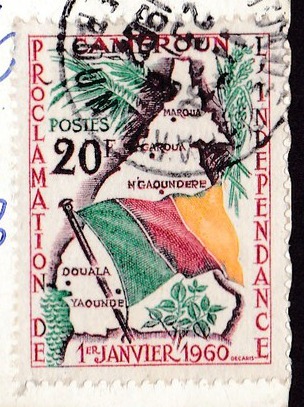
CLOSE UP OF POSTAGE STAMP
Turned to be in the correct position
Yaounde is located on he map on the stamp, bottom left corner
30/01/2017
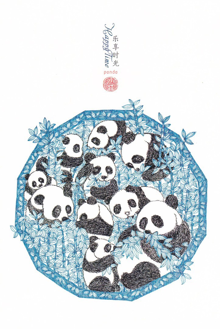
CHINA
PANDA POSTCARD
This is a postcard that I bought in the massive shop that can found in the China area of the ‘World Showcase’ in the Disney World ‘Epcot’ theme park in Florida. They sometimes sell some postcards in this shop and they are all imported from China and are actual Chinese products. I wanted to lighten things up after my last posting and this lovely Panda art design achieves this for me in every way (and I love panda’s)
30/01/2017
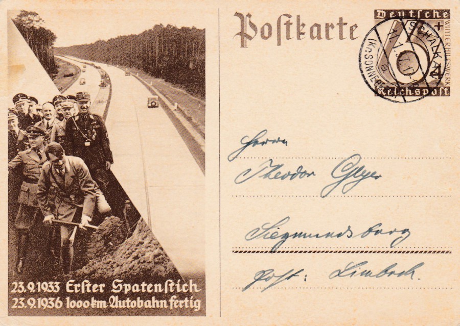
POSTKARTE
23.9.1933 ERSTER SPATENSTICH
23.9.1936 1000km AUTOBAHN FERTIG
(23.9.1933 FIRST SPATIAL STITCH [I think this means the first shovel, or first dug section, or similar]
23.9.1936 1000km of Motorway [Autobahn] Finished)
Posted copy of this well-known Nazi Germany postal stationery card (it was used in January 1937). This publicity ‘propaganda’ postcard promoted the work done to build the, now famous, German autobahns. The photograph depicts Hitler digging what was an initial, or at least early, part of the soil moved to allow the building of these roads.
BRUNHILDE POMSEL
11TH January 1911 – 27TH January 2017
I have posted this today because I read this morning of the death of someone closely connected to the Nazi Party. Brunhilde Pomsel was the former secretary to Joseph Goebbels, the Nazi propaganda minister. Pomsel was one of the last people who still had connections to the Nazi hierarchy. She joined the Nazi Party in 1933, apparently, to take up a government job with the German national radio. She moved across to become Goebbels secretary in 1942. Pomsel did not speak about these years until quite recently, when she said that she was just a secretary and knew little of the Nazi’s brutal actions during the Holocaust. Pomsel was captured by Soviet troops at the end of WWII and went on to spend five years in detention camps. Upon her return to Germany she again entered the world of German broadcasting in 1950, and continued here for a further twenty years. She, as already stated above, would not speak openly about her time within the senior Nazi circle, until a newspaper interview in 2011. An extensive documentary was later filmed in 2016. She said “The people who today say they would have done more for those poor, persecuted Jews…I really believe that they sincerely mean it…But they wouldn’t have done it either”. She also said “I wouldn’t see myself as being guilty, unless you end up blaming the entire German population for ultimately enabling that government to take control. That was all of us. Including me”. Pomsel died in Munich aged 106.
Her story is interesting whatever your views may be around her knowledge of what was happening. Did she know? Could she not have known in her position as secretary to Goebbels? I do wonder how much of it was for her, and many others, a type of deliberate blindness rather than a true lack of knowledge.
29/01/2017
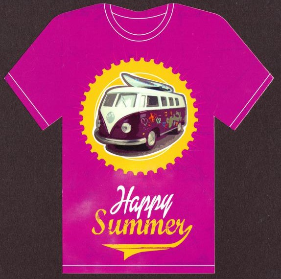
TEE – SHIRT SHAPED POSTCARDS
All Published by
CART’ IMAGE EDITIONS
HAPPY SUMMER
Ref: CSTEE 04
I found these last week in France, in a newsagent styled shop inside a massive supermarket called ‘Hyper – U’, in the town of Sainte. They caught my eye and looked like something that needed to be in my novelty postcard collection. They are French produced (obviously) and I ended up buying a handful, three of which I depict here (the others I will show another time).
This one came my way because I love VW Campervans (a friend of mine has one which she drives everywhere in)
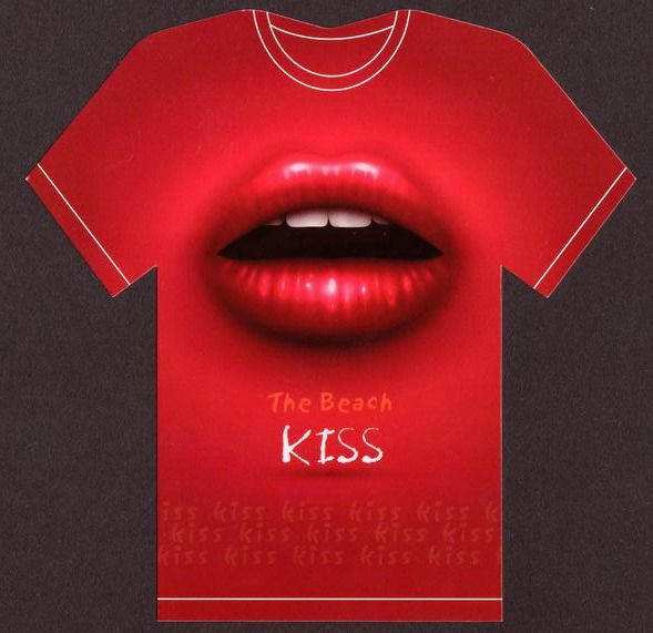
THE BEACH KISS
Ref: CSTEE 09
Who could resist this one. The colouring is great and it stood out on the spinner, because it was the only one in this colour and the design is very bright.
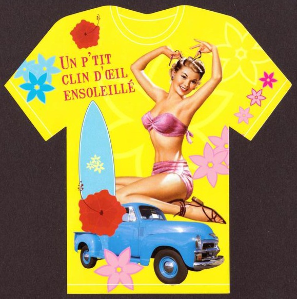
UN P’TIT CLIN OEIL ENSOLEILLE
(Again, I have tried to put this through a translator – but ended up with this:
A P’ SUNNY LITTLE BLINK EYE
I suspect it relates to the sun and missing something if you blink)
What-ever it does exactly mean it is my favourite of these cards
29/01/2017
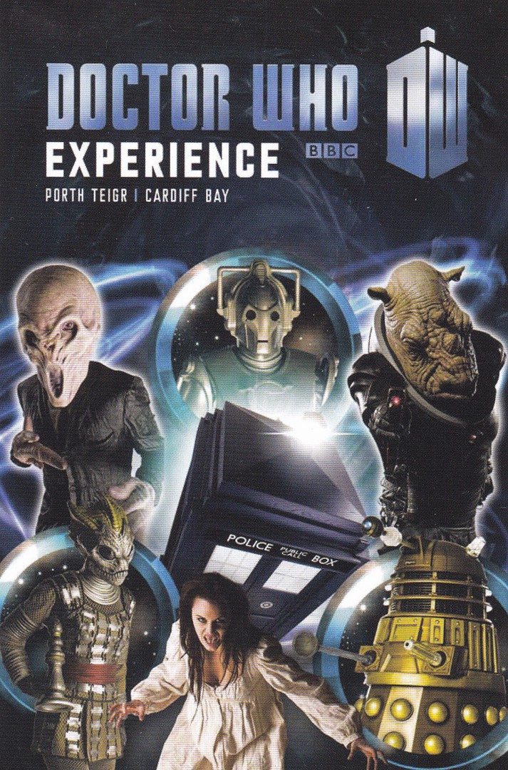
DOCTOR WHO EXPERIENCE
CARDIFF
DOCTOR WHO POSTCARD SET
This is a cracking set of postcards issued by the Doctor Who Experience in Cardiff. There are six individual postcards which each depict an enemy of the Doctor, with the Doctors Tardis in the background. The six postcards fit together to make one single composite picture. The seventh postcard, depicted here, shows the whole design which the six other cards fit together to make. The characters/creatures are not named on the postcards and these are not numbered or titled.
DOCTOR WHO EXPERIENCE
postcard
COMPLETE PICTURE

DOCTOR WHO EXPERIENCE
“THE SILENCE”
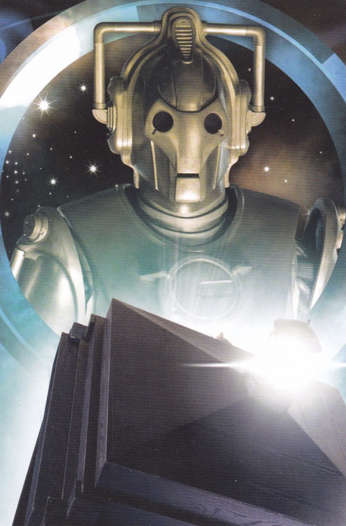
DOCTOR WHO EXPERIENCE
“CYBERMAN”

DOCTOR WHO EXPERIENCE
“JUDOON”
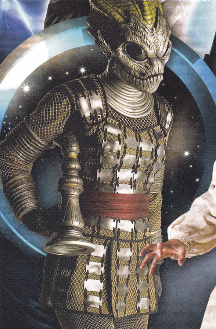
DOCTOR WHO EXPERIENCE
“SILURIAN”

DOCTOR WHO EXPERIENCE
“VAMPIRE”
From the story ‘The Vampires of Venice’
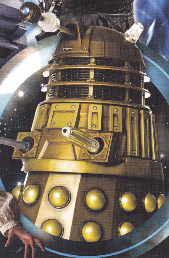
DOCTOR WHO EXPERIENCE
“GOLD DALEK”
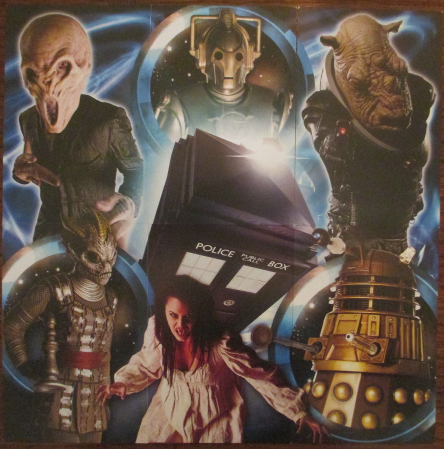
PHOTOGRAPH
Here you can see the six individual postcards placed together to make the single complete compo-site image.
STANDARD REVERSE LAYOUT FOR THE POSTCARDS IN THIS SET

29/01/2017
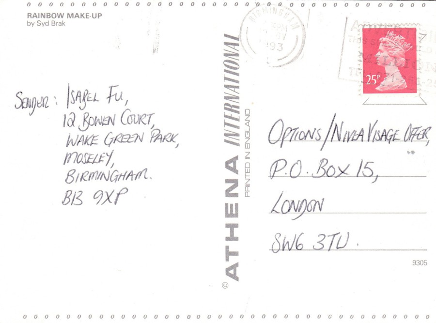
RAINBOW MAKE UP
Published by
ATHENA INTERNATIONAL
By
Syd Brak
Ref: 9305
This is so typical of the Athena Internal art related postcards issued throughout the 1980’s and into the 1990’s. I was a big collector of Athena International postcards and bought postcards like this as and when they came out. But, some of the designs were very popular and were therefore re-printed over many years. This means that the same design, with the same reference number, can be found with this companies different reverse layouts.
Many of the designs are well known by people of a certain age, as Athena International also issued these as large framed pictures and prints and many people had these same images on their walls. They really were extremely popular and many people had an Athena Internal picture hanging on their wall, and I had these same paintings and prints on postcards in my collection.

REVERSE SIDE OF ABOVE POSTCARD
“VERSION ONE”
RAINBOW MAKE UP
Published by
ATHENA INTERNATIONAL
By
Syd Brak
Ref: 9305
This is the earlier of the two reverse types depicted here (see below)
This also has a nice 'BBC NORTHAMPTON' radio slogan postmark from 1993
REVERSE SIDE OF ABOVE POSTCARD
“VERSION TWO”
RAINBOW MAKE UP
Published by
ATHENA INTERNATIONAL
By
Syd Brak
Ref: 9305
This is a later reverse layout for the same postcard design
29/01/2017
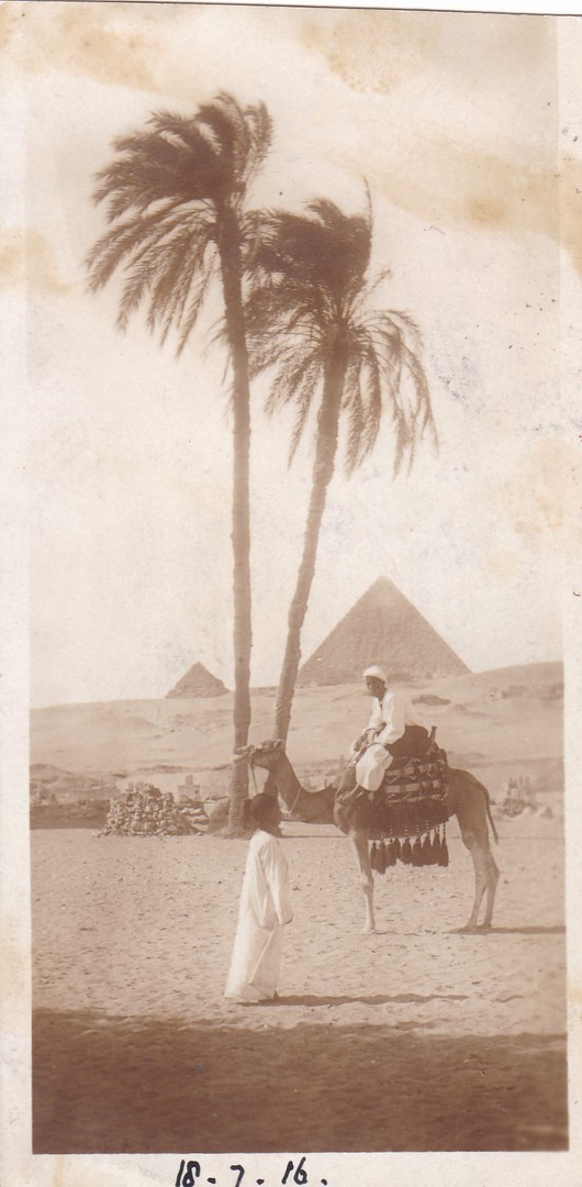
THE PYRAMIDS
Published by
THE CAIRO POSTCARD TRUST
MADE IN ITALY
Ref: 29 (possibly 20, as it is unclear, but I think it is 29)
This is what is called a ‘Bookmark’ postcard, this is clearly because of their appearance to the bookmarks people use to mark their place in books. So, these are long and thin. They have been issued for many years and I have old ones, like this, and modern ones from the 1990’s.
This one depicts a camel and palm trees in-front of the distant Pyramids of Cairo. There is a clear hand written date along the bottom – 18 -7 -16 (so, the 18th July 1916). This date alone would indicate to any World War I collector that this might be worth a further look. And, in truth, it was the reverse side that caught my idea and led to this card being bought.
Sadly, and explicably, someone has trimmed this card down and chopped the top section of the postcard off (possibly so that it would fit better with the general length of the more common postcards it would be packaged with – so this may have been done at the time).

REVERSE SIDE OF ABOVE ‘BOOKMARK’ POSTCARD
BASE ARMY POST OFFICE ‘T’
Black circular ‘Skeleton’ cancel dated ‘6 JY 16’ (6TH July 1916 – which pre-dates the date written on the front of the postcard)
PASSED BY CENSOR – No 3968
Red triangular censor cachet mark
A previous owner of this postcard has written on it that the BAPO T cancel is from Port Said, which is in Egypt. I have checked this up in the 8th edition of the ‘Stanley Gibbons Collect British Postmarks’ and this is confirmed on page 259 (where it is valued at £6, so I paid the right price for my copy). This is dated 6th July 1916 but I can-not explain why this pre-dates the hand-written date on the front of the postcard, which is the 18th July 1916. But, someone may well have simply made a mistake when recording the front date, perhaps got the month wrong, maybe it was June and should have been a ‘6’.
The red Passed by Censor cachet is in the triangular format. On the western front, in Europe, this triangle styled cachet was only in use between April and December 1915, and was the third shape used during WWI. Clearly this item here was posted in the following year but in Egypt they used the cachet shapes at different times and for longer periods.
Both the Base Army Post Office skeleton cancel and the Passed by Censor red cachet have been nicely applied and are clear and easily readable which makes this an interesting item for those who collect the philatelic material of World War One.
28/01/2017
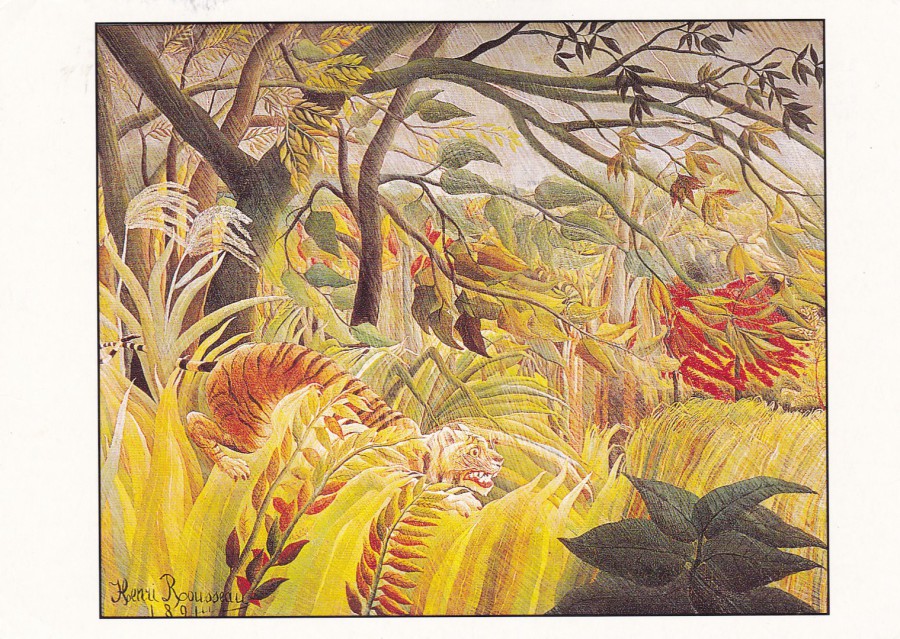
THE GREAT ARTISTS
TROPICAL STORM WITH A TIGER (SURPRISE)
Henri J. F. Rousseau
(The National Gallery)
Way back, I think it was either the early 1990’s or possibly the very late 1980’s a magazine came out called ‘The Great Artists’. Each issue concentrated, if I remember correctly, on a specific artist. Each issue also came with free postcards (it may have been just one postcard per issue, but I can-not remember). Being interested in art anyway, and, to be fair, I was also interested in the postcards, I bought the magazine, I bought a ‘large number’ of the magazines, and thus collected together a very nice collection of the postcards, each of which depicts a single, often extremely well known, painting.
This one here hangs in The National Gallery and I have stood before it many times as it is one of my favourites.
TEXT SEGMENT FROM TOP LEFT CORNER OF REVERSE SIDE
The postcards that came with ‘THE GREAT ARTISTS’ magazines can easily be identified by the basic text layout in the top left corner. The cards also only have this little block of texts, no stamp box, no address lines and no centre dividing line. So, if you have a painting postcard with this text type on the back you now know it was sourced via these magazines.

28/01/2017
BATTLE OF BRITAIN
July – September 1940
50th ANNIVERSARY
Published by
R. D. BILLINGS
I have always found this postcard interesting as it crosses a couple of my themes. By now many of you will know that I collect ‘Military’ themed postcards, but I also collect ‘Maps’ on postcard and this design ‘kind of’ crosses both of these. I am also interested in the Essex village of Rochford, where I worked for around eleven years. I was aware that there was a small WWII airfield in Rochford, there was, and of course is, Southend Airport itself, but there was also a flat grass runaway in Rochford – I know where it was located because I was shown by a local historian when I was working the area. Its location is not commonly known as there is now no indications that the runway was here, all structures have been removed and all markings. It is only the flatness of the field and its straight length that gives the game away a little. So, I was pleased to see Rochford listed on this postcard, along with other RAF airfields in the south of England.

REVERSE SIDE OF ABOVE POSTCARD
I have depicted this because it has a wealth of information and statistics and shows what can be done with a postcard without losing its basic ‘postcardness’ (I think I may have just made this word up, but it sounds right).
28/01/2017
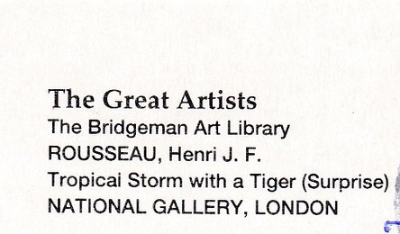
JOHN HURT ….. RIP
SIR John Hurt
22nd January 1940 – 25th January 2017
Actor
POSTCARD
1984
Film Poster
Published by
EDITIONS F. NUGERON
Ref: E 188
John Hurt had been acting since 1961 and featured in many feature films and television programmes. When I was looking for a postcard to feature here in remembrance of his many appearances I was torn between a number of different film poster designs, not least of which the poster for the sci-fi film ‘Alien’, who can forget the creature bursting out of his chest. But, in the end I opted for the film ‘1984’, based on the book ‘1984’ written by George Orwell. Hurt played the main character in the film, Winston Smith and thus his name prominently appears at the top of the listing, opposite Richard Burton’s.
POSTCARD
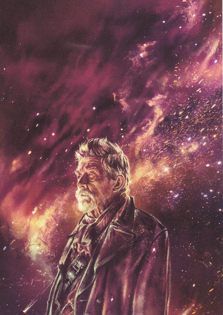
DOCTOR WHO
THE LONELY GOD
Art by
ALICE X. ZHANG
Published by
DYNAMIX ART CARDS COLLECTION
I may be biased, but one of my favourite John Hurt appearances is as the War Doctor in the Doctor Who 50th anniversary special titled ‘The Day of the Doctor’. This superb postcard depicts a painting of John Hurt in that very role. This is a cracking postcard, and one from a set that depicts the other recent Doctors, all of which are superb.