EMAIL ADDRESS - markspostcardchat@gmail.com
SET CONTINUED ON NEXT PAGE
(AT BOTTOM OF PAGE)
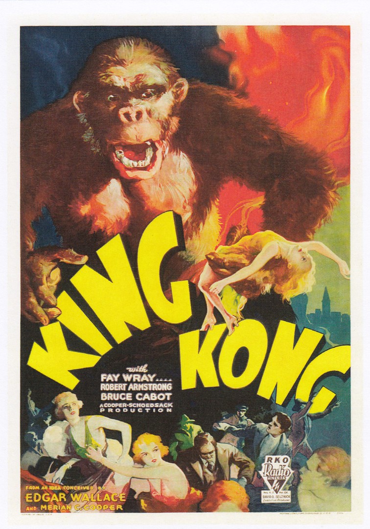
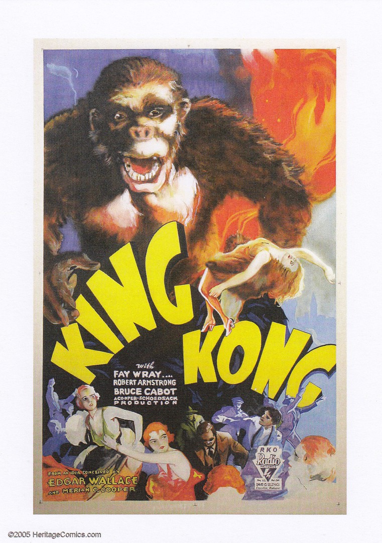
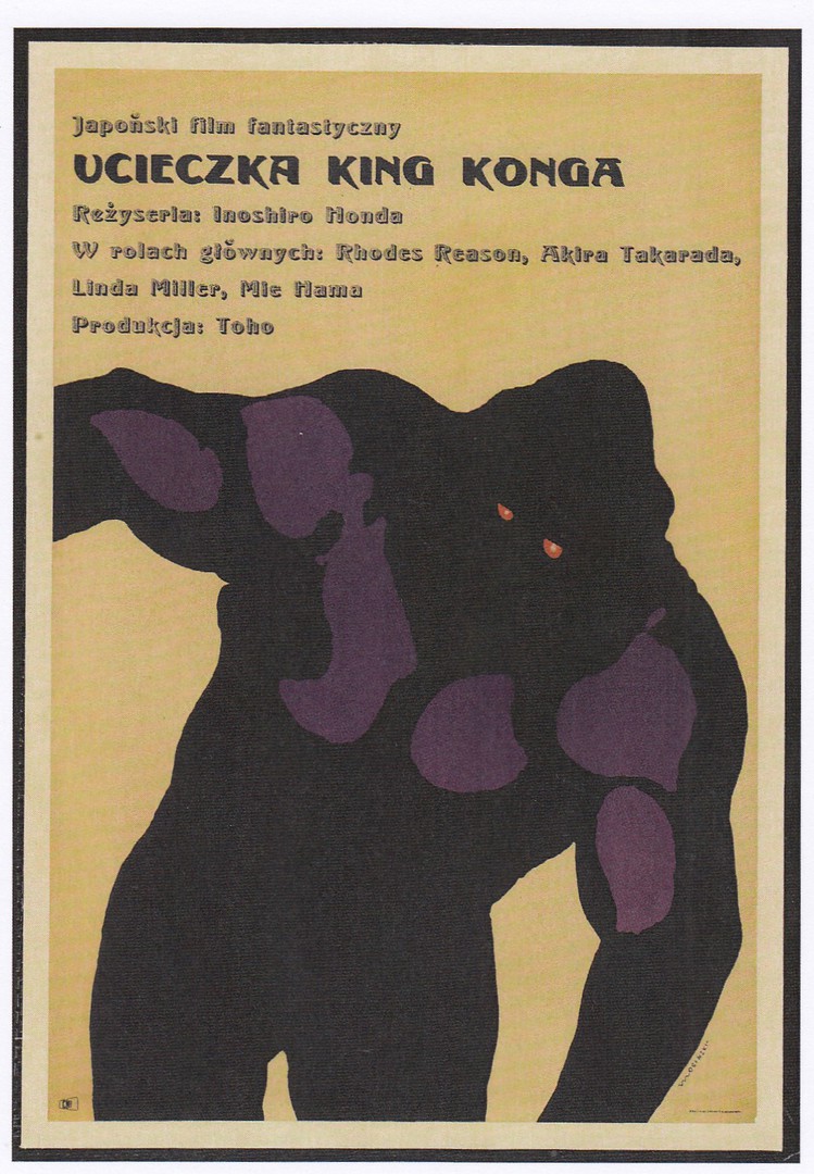
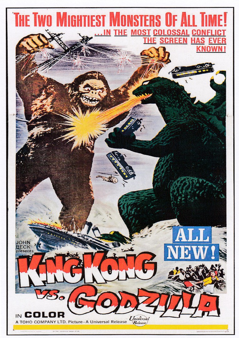
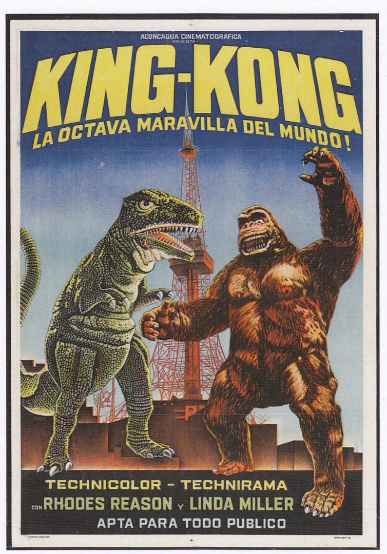
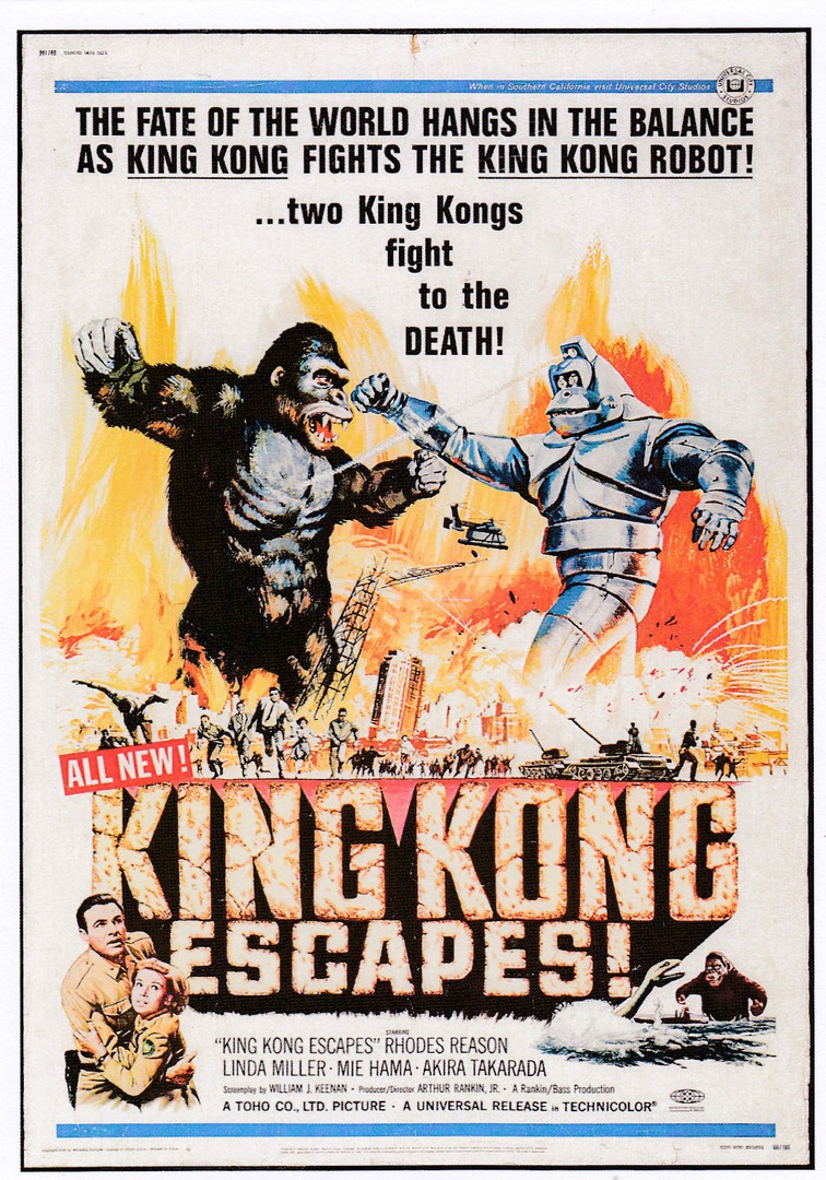
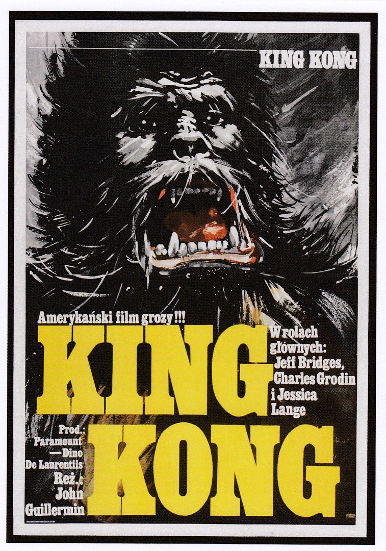
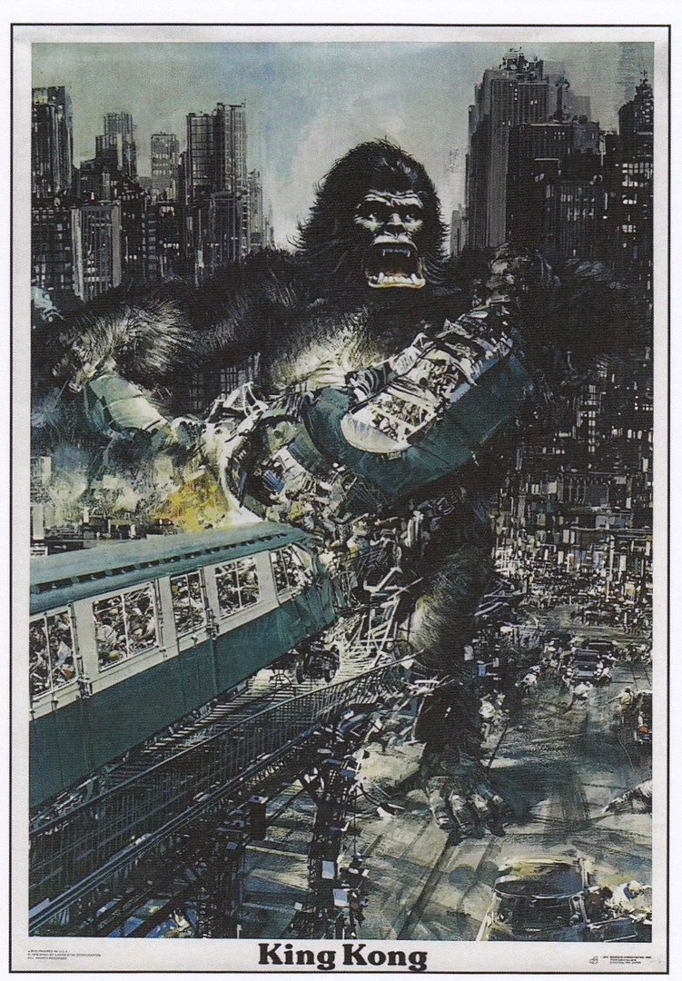
Details about this King Kong poster postcard set appear on the next page
.
.

.
.
.
.

.
.
.

.
27/03/2020
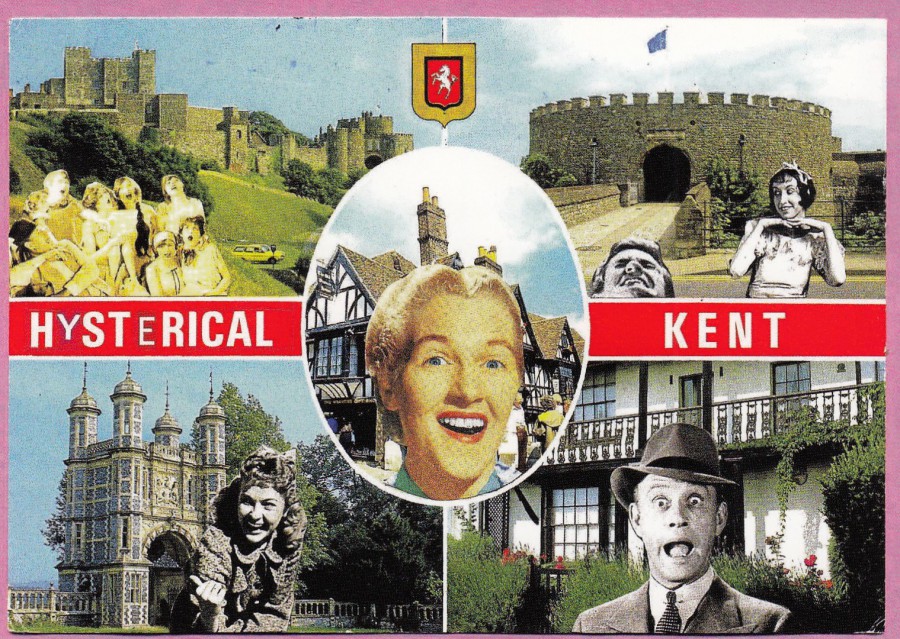
HYSTERICAL KENT
Collage 2015
By
MICHAEL LEIGH
Published by the artist
MICHAEL LEIGH – LAUGHING SHED
This is such a clever idea, and I love it. The artist Michael Leigh takes common standard styled multi-view postcards and adapts them by sticking other little pictures on them and, sometimes, adapting the cards text to match the new additions, as has been done here with the change from ‘HISTORICAL’ to ‘HYSTERICAL’ which matches the grinning, smiling people added to the card. So far, I have only found three of these cards, but I think they are great.
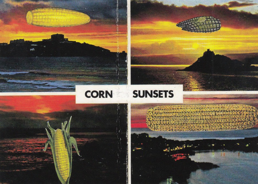
CORN SUNSETS
2014
By
MICHAEL LEIGH
Published by the artist
MICHAEL LEIGH – LAUGHING SHED
Here the artist has taken a badly folded, so therefore damaged, postcard and has covered over the WALL part of CORNWALL thus changing the entire meaning of the card. This is technically a piece of art I suppose, but to me it is comic postcard
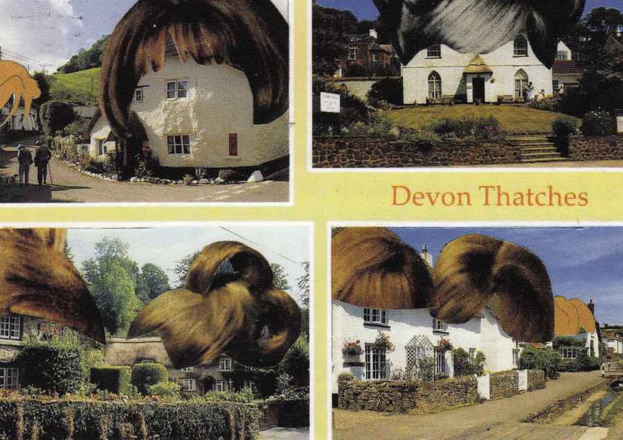
DEVON THATCHES
Collage 2016
By
MICHAEL LEIGH
Published by the artist
MICHAEL LEIGH
This might possibly be my favourite of the three designs. Here there was no need to change the cards title text in any way as the artist was clearly inspired by it. The simple addition of some wig like hair pieces to each cottage changes the entire meaning of this postcard (imagine an emoji laughing face inserted here).
26/03/2020
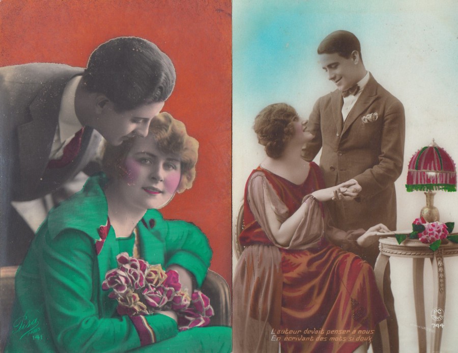
(Left side postcard)
UNTITLED
Published by
PISA PARIS
Ref: 141
(Right side postcard)
“L’AUTEUR DEVAIT PENSER A NOUS
EN ECRIVANT DES MOTS SI DOUX”
‘The author had to think about us
Writing words so sweet’
Published by
P. C. PARIS
Ref: 744
There was a trend towards colourising postcards in these garishly bright colours, a trait which reached its peak during the 1920’s in France, where I believe they issued more of this type of card than anywhere else. This printing style also seems to have been exclusively used on what I class as ‘Romantic’ themed images, which is certainly what these two cards depict.
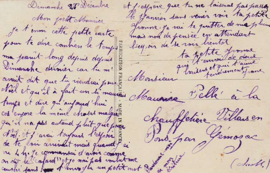
REVERSE SIDE OF THE LEFT-HAND SIDE CARD ABOVE
This has quite a long hand-written message on it, but it has no stamp or signs which indicates this was probably posted inside an envelope, something which was far more common then you might expect. Unfortunately, I don’t read French, so I do not know what this message is about, and it is just too long for me to attempt a Google – Translate. But, by-all-means give it a go if your intrigued (if you read French, or are French then it will of course be much easier)
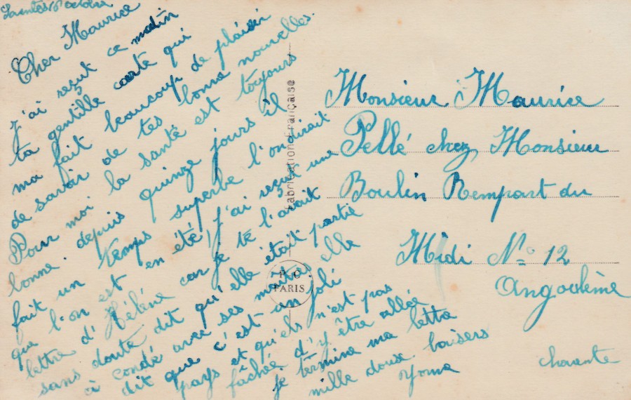
REVERSE SIDE OF THE RIGHT-HAND SIDE ABOVE
It seems possible, after looking at these two reverse sides, that they were written by the same person as aspects of the lettering are similar, especially with the capital letter ‘P’ on ‘Pelle’. I did buy these two from the same little antique postcard shop in France, so they may have come from a single collection.
26/03/2020
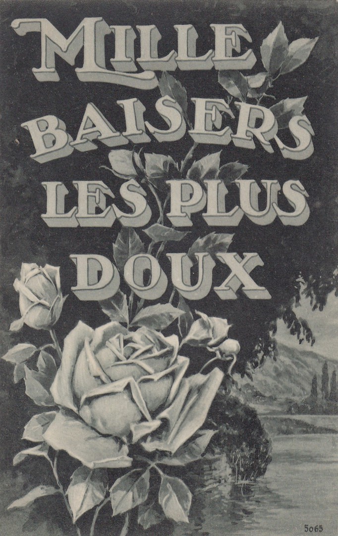
MILLE BAISERS LES PLUS DOUX
A Thousand Sweeter Kisses
(A Thousand Sweet Kisses)
Unknown French Publisher
Ref: 5065
A nice message on an early French issued postcard. As often mentioned here on the webpage, the French were very adept at producing romantic themed postcard designs.
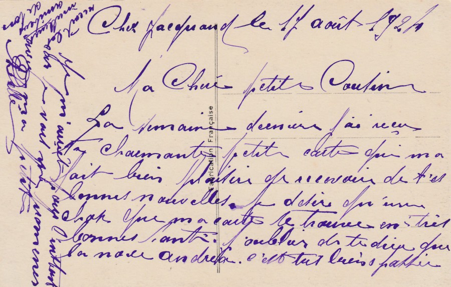
REVERSE SIDE OF ABOVE POSTCARD
26/03/2020
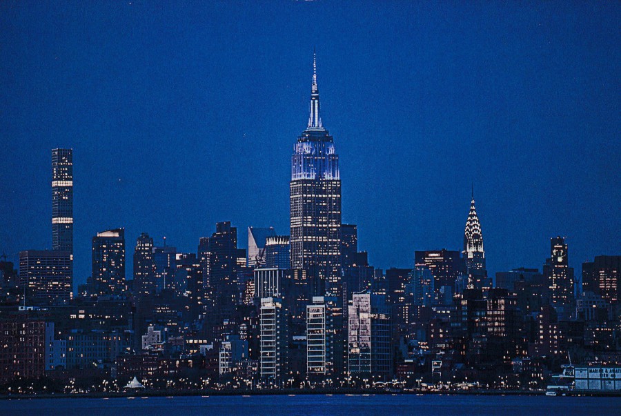
MIDTOWN
Photo by
KONSTANTINO HATZISARROS
2019
Published by
PSARIS PRODUCTIONS
Ref: #200N
“POSTCARD FROM NEW YORK CITY”
Timing wise we were ‘really’ lucky with our trip to New York last month. The area is now in a coronavirus lockdown and has been since the 22nd March. There has also sadly been a number of deaths across New York State, 385 as I write this. How things can change across such a short period of time. I enjoyed New York a lot and hope to travel back to the city at some future point, so I hope, like the rest of the world, the city and state recovers soon.

25/03/2020
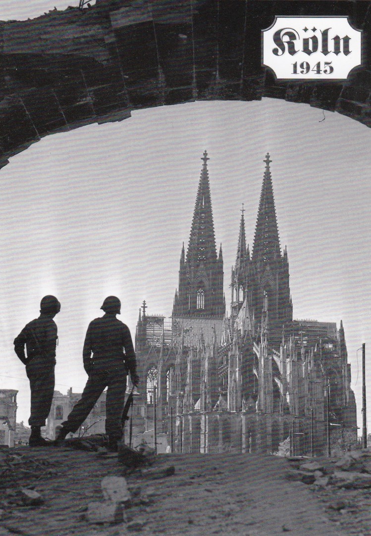
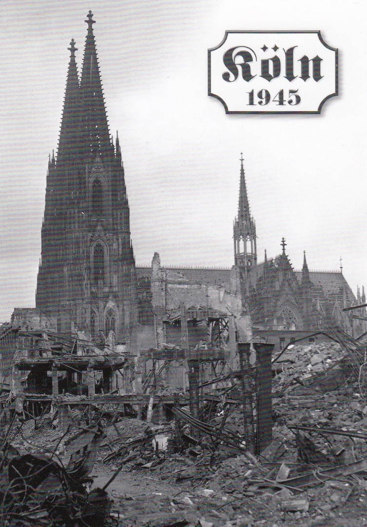
KOLN 1945
Cologne 1945
Published by
CITY SIGHTS
Ref: WPKK033
When we were doing a train tour of parts of Europe last year, we had to change trains at Cologne Railway station, which is the large covered area you can see bottom left in this photograph. We had only a brief period between trains, but it meant that we could at least get a look at the outside of the famous Cologne Cathedral which dominates the skyline from the railway station, and which also dominates this postcards image.
Cologne was bombed on 262 separate occasions during WW2, all by the RAF and 20,000 civilians died in these air raids. Cologne was the target for the RAF’s first 1,000 bomber raid overnight between 30th and 31st May 1942.
So, the fact that by the end of the war much of the city was badly damaged should come as no surprise. Many of the photographs taken of the damaged city have been issued as postcards, and these can still be found on sale around the city, and in at least one souvenir shop within the city’s railway station. I know this because this is where I found this selection depicted here.
REVERSE SIDE OF ABOVE POSTCARD
With one exception (the card immediately below) this is the standard reverse layout for these cards, with just the reference number changing. Note that this one has a double barcode top right. Most of these cards only have a single barcode.

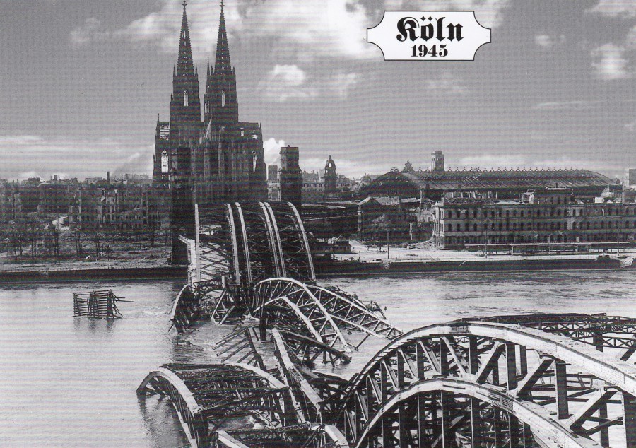
KOLN 1945
Cologne 1945
Published by
CITY SIGHTS
Ref: K 28
This photograph is taken from the other side of the river and shows one of the collapsed bridges (not the railway bridge - see further down).

REVERSE SIDE OF ABOVE POSTCARD
This particular postcard does not have the greyed-out photograph on the reverse side (which all the others have), and has a different styled reference number, which is located under the barcode top right.
KOLN 1945
Cologne 1945
Published by
CITY SIGHTS
Ref: K61-WPK
REVERSE SIDE OF ABOVE POSTCARD
Here the greyed-out image is much clearer. Also note the single barcode
KOLN 1945
Cologne 1945
Published by
CITY SIGHTS
Ref: K60-WPK
Single Barcode reverse
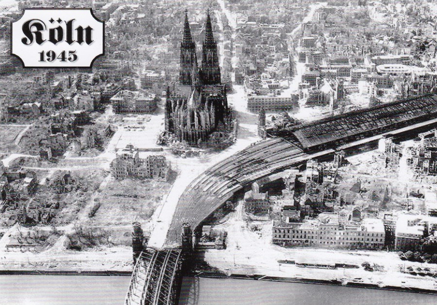
KOLN 1945
Cologne 1945
Published by
CITY SIGHTS
Ref: K30-WPK
This photograph depicts the collapsed railway bridge which has now been rebuilt, which is a good thing really as we crossed this as we left the city on our train.
This has a single barcode reverse.
KOLN 1945
Cologne 1945
Published by
CITY SIGHTS
Ref: K55-WPK
You can see the railways station building much better on this picture, it is located on the right side in the centre. You can see the railway lines coming out and then bending towards one end of the bridge, with this section still up and not down in the river like much of the bridge was (see previous postcard)
This has a single barcode reverse.
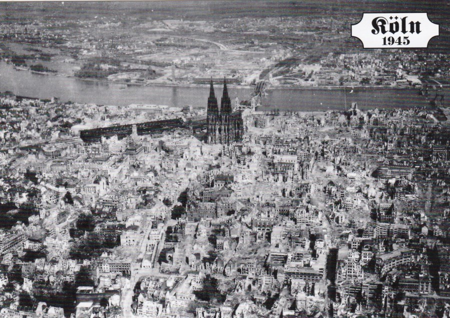
KOLN 1945
Cologne 1945
Published by
CITY SIGHTS
Ref: WPKK032
You get a far greater idea of the damage caused from this wider view of this part of the city. Again, the railway station and the Cathedral can be seen.
This card has the double barcode reverse side format.
25/03/2020
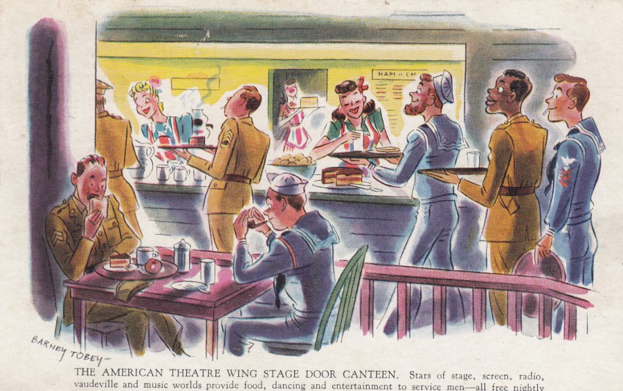
THE AMERICAN THEATRE WING STAGE DOOR CANTEEN.
STARS OF STAGE, SCREEN, RADIO, VAUDEVILLE AND MUSIC WORLDS
PROVIDE FOOD, DANCING AND ENTERTAINMENT TO SERVICE MEN
- ALL FREE NIGHTLY
By
BERNEY TOBEY
‘TUNE IN! STAGE DOOR CANTEEN’
COLUMBIA NETWORK EVERY THURSDAY EVENING.
9:30 TO 10:00 EASTERN WAR TIME
Sponsored by DEXTROSE, food-energy sugar
Official Columbia Network Postcard
Second World War American postcard which has a nice front cartoon like image. This one fits nicely into my ‘Entertainment’ collection with its obvious radio connection. This is one of those rare cards where I cannot remember where I obtained it from, it was definitely somewhere here in the UK, possibly in a bundle of cards I bought somewhere.
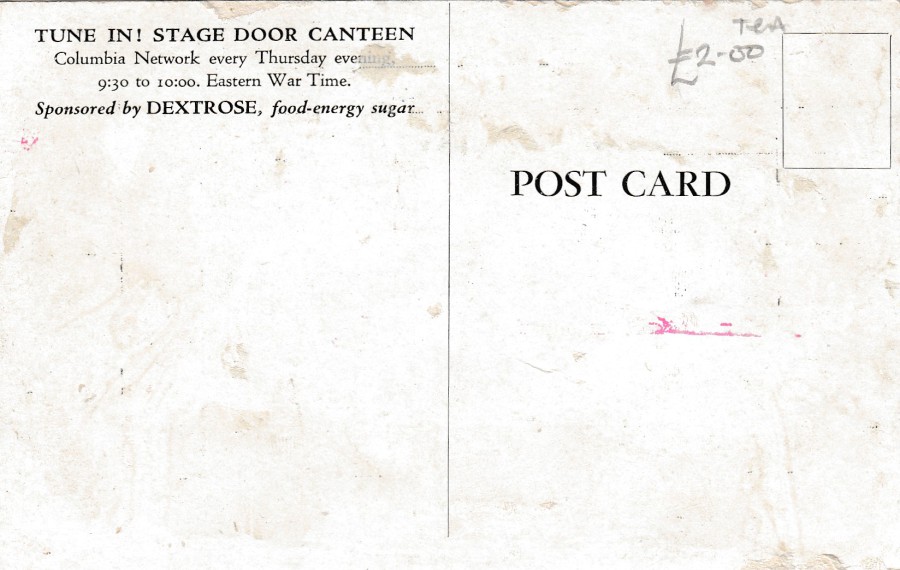
REVERSE SIDE OF ABOVE POSTCARD
24/03/2020
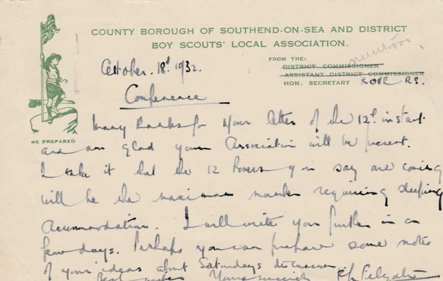
COUNTY BOROUGH OF
SOUTHEND-ON-SEA
AND DISTRICT BOY SCOUTS’
LOCAL ASSOCIATION
Official local scout association overprinted postcard
This simple postcard is of interest to me because it relates directly to my hometown and to an organisation that I have been a member of for many years. As you can see from the written message this is from 1932, that’s seven years before the start of world war II. A great piece of local scouting ephemera.

REVERSE SIDE OF ABOVE POSTCARD
This was posted from London (for some reason) to Stanford-Le-Hope in Essex. The stamp has been cancelled with a LONDON E.1 machine slogan cancellation dated 18th October 1932; ‘THE BEST INVESTMENT – A TELEPHONE’.
Maybe this card was taken to London by a local scout officer and posted whilst either serving under some scouting position in London or whilst he was to or from a London based place of work.
24/03/2020
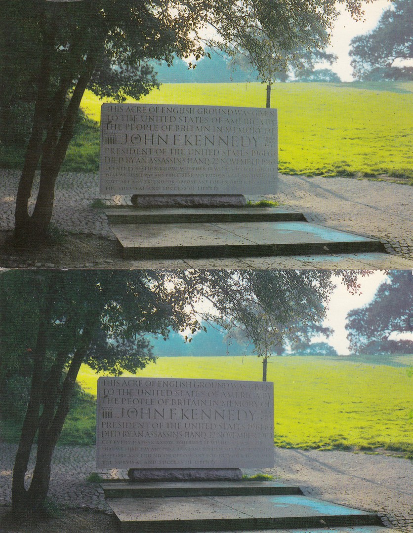
THE JOHN F. KENNEDY MEMORIAL,
RUNNYMEDE
Published by
COLOURMASTER INTERNATIONAL
Ref: PT5274
This British memorial for the assassinated US President John F. Kennedy was dedicated on the 14th May 1965 by both Queen Elizabeth II and Jacqueline Kennedy. The quote engraved on the stone is taken from the president’s inaugural address. The monument is reached by climbing 50 steps which are made of irregular granite pieces with 60,000 hand cut sets making up the 50 steps.
The ground upon which the monument is stood was given as a gift to the United States by the people of the United Kingdom. The garden area around the monument was designed by landscape architect Geoffrey Jellicoe whilst the monument itself was designed and carved by Alan Collins.
These two postcards look almost identical, and they do depict the same photograph although slightly cut in different positions.
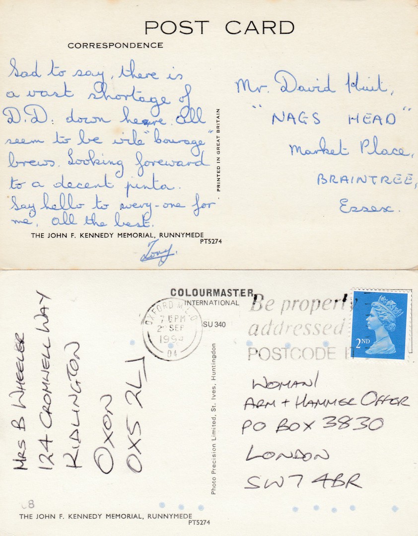
REVERSE SIDES OF THE ABOVE TWO POSTCARDS
This is one of the aspects of postcard study which fascinates me, the way one design is re-issued over time but with a different reverse layout. Many companies changed their reverse layout designs over time, some more regularly than others. When you know the order in which these layouts were used you can partially date a card. For example, the top reverse layout depicted here came before the one depicted below it. I believe the top card is from the 1960’s (probably late) and the bottom card is from the 1970’s.
24/03/2020
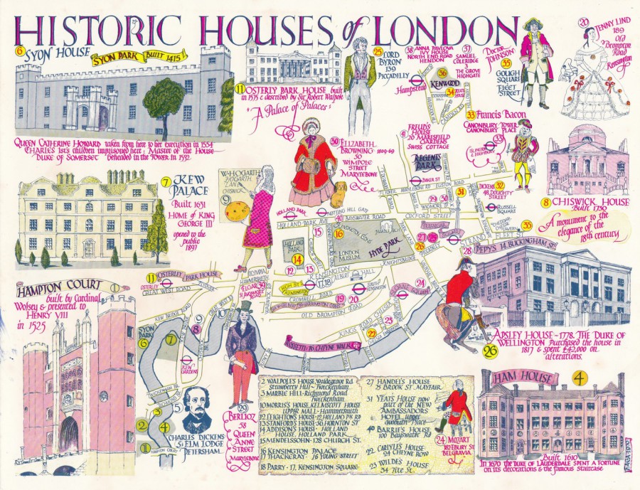
HISTORIC HOUSES OF LONDON
By
FAGA
Printed by
S. E. DEVENISH LTD
Published by
FAGA
Ref: ‘GREETINGS FROM LONDON’
THE ‘FAGA’ SERIES
No. 47
One of the many FAGA large sized map themed postcards which were published by FAGA (Frederick Foley) during the 1960’s and 1970’s) Although these were often re-printed many times they are often quite hard to source and can also, where people know what they are, be quite expensive as well. I have always liked the FAGA postcards and have put together one of the top largest collections of his postcard issues.
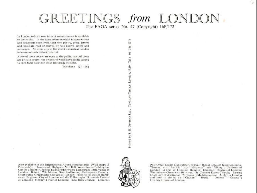
REVERSE SIDE OF ABOVE POSTCARD
Top right you will see the details ‘16P/172’ and something similar will be found on the reverse side of most, if not all FAGA’s early map postcards. These can be very useful to postcard historian as the line is full of details and can be decoded as follows
16P/ - sixteenth printing (obviously earlier printings will have a lower number)
1 – the month of the printing, i.e, January in this case
72 – the year of re-print, so 1972 in this case
When you know how these lines of numbers work then it opens-up all sorts of information.

24/03/2020
EVOLUTION
EINDHOVEN HOLLAND –
PHILIPS
PERMANENT INDUSTRIAL EXHIBITION CENTRE
SPECIAL JUBILEE FLIGHT
PHILIPS FRIENDSHIP PH-LIP
SEPT 24TH 1966
Official Philips 75th Anniversary release
The front picture appears to be a model, possible for the above-mentioned industrial exhibition centre. The front image is nice, but as is often the case with the philatelic postcards in my collection it is the reverse side which is more intriguing.
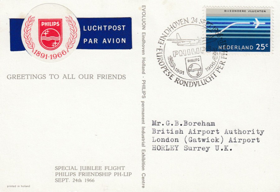
REVERSE SIDE OF ABOVE POSTCARD
Top left we have a specially printed and applied ‘PHILIPS 1891 – 1966, LUCHTPOST PAR AVION’ air mail etiquette (which is the official name for these, but most people just call them ‘Air Mail Labels’), produced for the 75th anniversary of the company.
The 25 cent ‘special flights’ Nederland postage stamp has been cancelled with a special handstamp:
EINDHOVEN
24 SEPT 1966
EUROPESE RONDVLUCHT PER PH-LP
[European scenic flight by PH-LP]
1891 - 1966
The combination of special air-mail etiquette, stamp and special handstamp makes for a nice combination.
24/03/2020
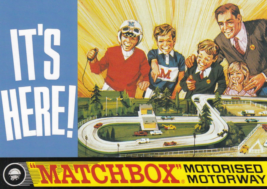
IT’S HERE!
“MATCHBOX” MOTORISED MOTORWAY
1960’S BOXED GAME
Published by
ROBERT OPIE COLLECTION
Ref: DIE-CAST MODELS SERIES
Ref: 01DM06
I suspect with everything being as it is and everyone being stuck in their homes for so much of the day (in some countries for all of the day, near enough) something like this would currently be very popular. I am sure there is something like this still available, maybe Scalextric, which is what we had as kids.

24/03/2020
ALBERT UDERZO ….. RIP
Alberti Aleandro Uderzo – 25th April 1927 –
24th March 2020
French comic book artist and writer who is perhaps best known as the co-founder and illustrator of the comic book character Asterix, and his many Gaul friends.
SIN DIE JECK, DIE KOLSCHE!
DAM ASTERIX SINGE JUNG
Published by
EDGAR GRATIS POSTKARTEN SERVICE
Ref: # 1.317
This image depicts the character Obelix who is Asterix’s best friend and companion on all his adventures and travels. The cartoon book being advertised here is ASTERIX AND SON, which was the 27th volume of the Asterix comic book series collection. This book was released in 1983, although I think this postcard is from a much later decade. I have also struggled to translate the title of this card (Google Translate did not like this at all for some reason!), so I am not sure what exactly being promoted here.

PHOTOGRAPH
ALBERT UDERZO
REVERSE SIDE OF ABOVE POSTCARD
23/03/2020
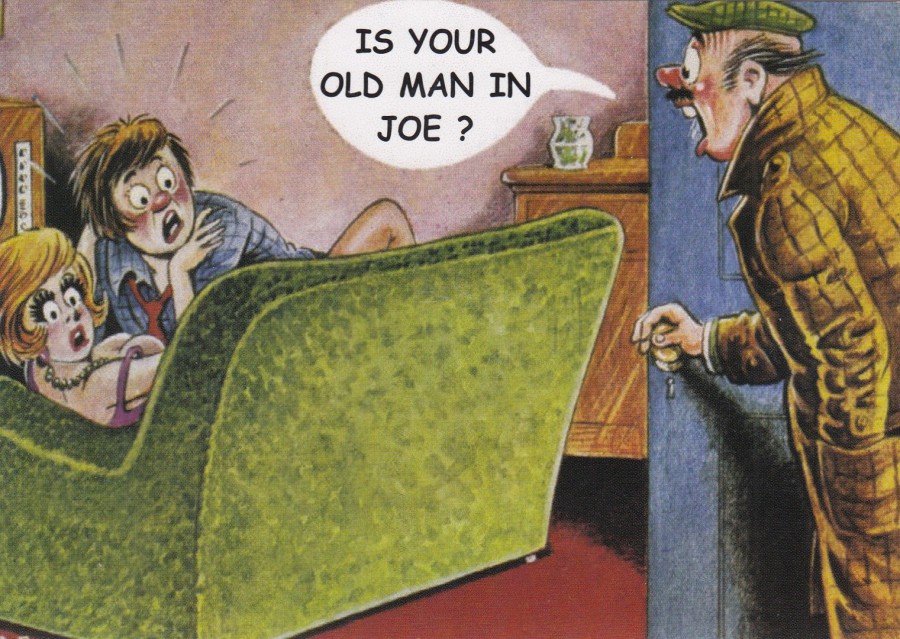
IS YOUR OLD MAN IN JOE?
Published by
BAMFORTH COMPANY LTD 2013
Ref: C-42203
This one is from when a large selection of the Bamforth comic designs were re-released in and around 2013, but on larger modern sized postcard stock. They were also printed with a nice colourful reverse layout. This is another of the cards I bought because a television appears in the design.
REVERSE SIDE OF ABOVE POSTCARD
23/03/2020
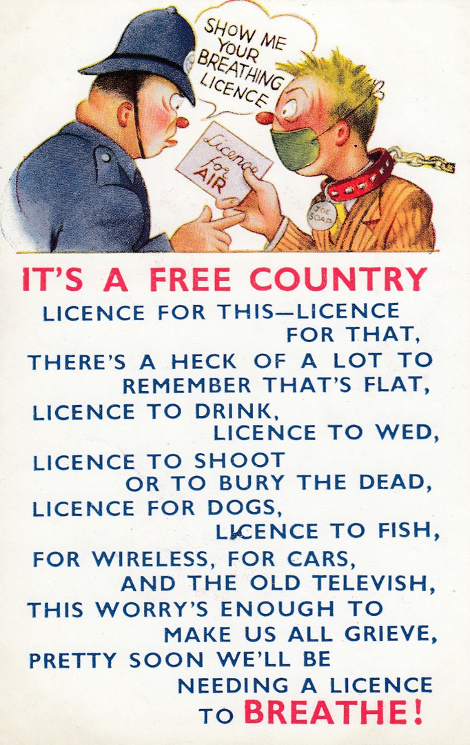
IT’S A FREE COUNTRY
LICENCE FOR THIS – LICENCE FOR THAT
THERE’S A HECK OF A LOT TO REMEMBER THAT’S FLAT,
LICENCE TO DRINK, LICENCE TO WED,
LICENCE TO SHOOT OR TO BURY THE DEAD,
LICENCE FOR DOGS, LICENCE TO FISH,
FOR WIRELESS, FOR CARS, AND THE OLD TELEVISH,
THIS WORRY’S ENOUGH TO MAKE US ALL GRIEVE,
PRETTY SOON WE’LL BE NEEDING A LICENCE TO BREATH!
Published by
BAMFORTH & CO., LTD., Holmfirth, Yorkshire
Ref: “COMIC” Series No. 1212
I thought the face mask was quite topical! Another of the Bamforth comic postcard releases. I bought this one because of the mention of television, which is referred to here as ‘Tevevish’.
REVERSE SIDE OF ABOVE POSTCARD
23/03/2020
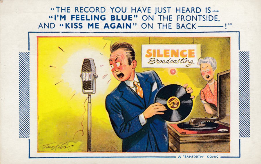
“THE RECORD YOU HAVE JUST HEARD IS –
‘I’M FEELING BLUE’ ON THE FRONTSIDE,
AND ‘KISS ME AGAIN’ ON THE BACK….!
By
ARNOLD TAYLOR
Published by
BAMFORTH & CO., LTD., Holmfirth, Yorkshire
Ref: “COMIC” Series No. 802
I am sure we can all do with a little more humour in our lives in these currently horrible times, so, I shall do my bit and picture some comic cards for you.
REVERSE SIDE OF ABOVE POSTCARD
23/03/2020
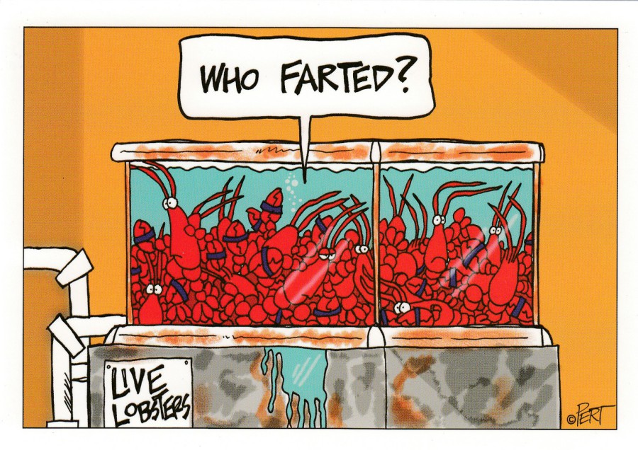
WHO FARTED?
By
PERT
(JEFF PERT)
Printed by
ENTERTAINYAMANIA
Tonight it has been announced that we should only go out for the essentials of food and once a day for exercise, keeping the required distance apart of course, so, I thought this postcard could be amusing and is posted for those people shut up at home with their families… remember it could always be worse…
REVERSE SIDE OF ABOVE POSTCARD
23/03/2020
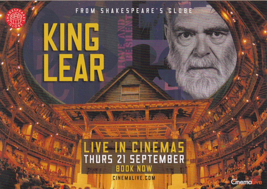
KING LEAR
From Shakespeare’s Globe
LIVE IN CINEMAS
THURS 21 SEPTEMBER
(KEVIN McNALLY)
Advert Postcard Published for
CINEMALIVE.COM
This was a free postcard which was in Odeon cinemas (and possibly other cinema branches) some years ago. It is one of those cards which fits into several themes, theatre, Shakespeare, Cinema and television (the depicted actor, Kevin McNally appeared in I’ Claudius, The Duchess of Duke Street, Poldark, Doctor Who, Z-Cars, Casualty, Midsomer Murders, Spooks, Life on Mars, Law & Order: UK, Downton Abbey and CSI: Crime Scene Investigation, amongst many others). It is always nice when a free postcard fits into one of your main themes.
REVERSE SIDE OF ABOVE POSTCARD

23/03/2020
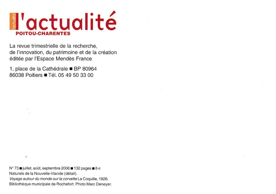
L’ACTUALITE
POITOU – CHARENTES
EXPLORATEURS ET GRANDS VOYAGEURS
‘News
Poitou-Charentes
Explorers and Great Travellers’
Published as a free advertising postcard for this exhibition
I loved the image on this postcard, which was a free postcard advertising a 2006 exhibition. I like history, especially our own human history and how native people dressed and acted, before others invaded their countries. The costumes depicted here are unusual and make this an attractive postcard. I picked this one up whilst in France in 2006 visiting my in-laws. Poitou-Charentes is a region of France which I have visited often, as it is where my in-laws house is located. I suspect this exhibition would have been interesting.
REVERSE SIDE OF ABOVE POSTCARD
23/03/2020
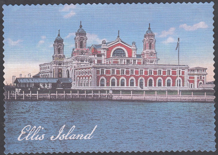
ELLIS ISLAND
Published by
IMPACT PHOTOGRAPHICS
Printed in China
Ref: 57872
This is another of my souvenir postcards from my personal visit to the famous New York Ellis Island. What I like about this card is that its printed in the linen style format that is so well known in older modern US postcards. I thought it was nice that you can still find these.
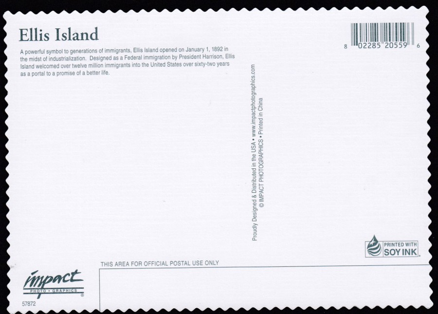
REVERSE SIDE OF ABOVE POSTCARD
I am genuinely intrigued as to what ‘Soy Ink’ is. Also, its nice to see that beside s the old linen style of card stock being used, they have also used that old, and once popular, deckle-edging.
23/03/2020
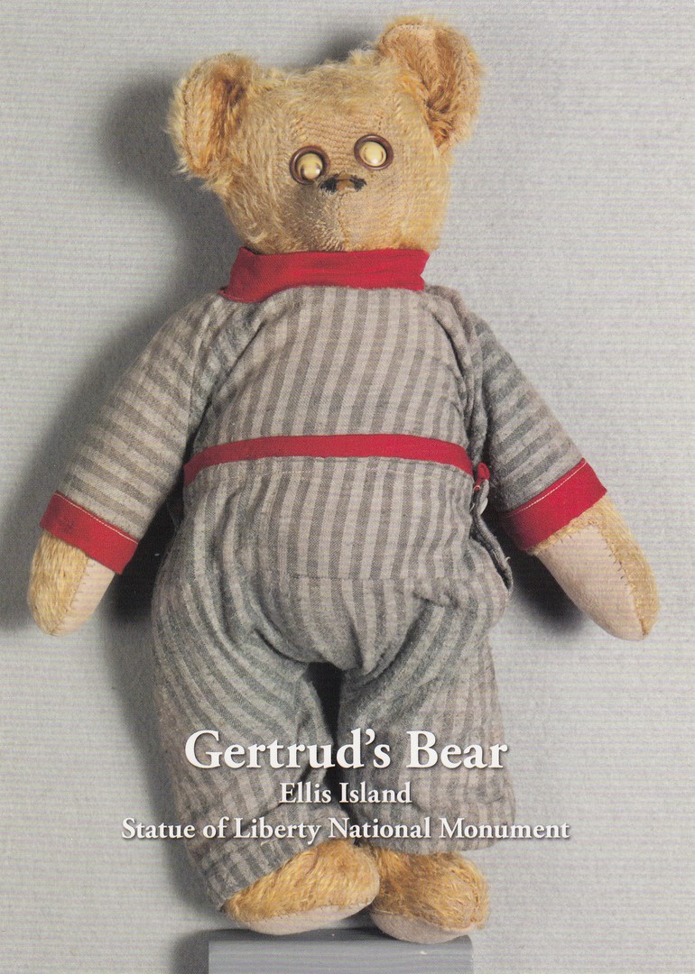
GERTRUD’S BEAR
ELLIS ISLAND
STATUE OF LIBERTY NATIONAL MONUMENT
Printed by
PIGMENT & HUE, INC
Copyright 2016
For the
ELLIS ISLAND GIFT SHOP
This is one of the display items at the Ellis Island museum. Text on the reverse side gives a little potted history of the ‘Teddy Bear’ and explains that this ‘particular’ teddy bear is in the Ellis Island museum collection because it was brought through Ellis Island by Gertrud when she was a child. When I saw this postcard, I had to have a copy.

REVERSE SIDE OF ABOVE POSTCARD
I like it when publishers put stuff on the reverse side, photographs, informative text or just a greyed-out image. I think it makes a postcard far more interesting and appealing.