27/05/2016
INTERNATIONAL CONFERENCE ON
ASBESTOS AWARENESS AND MANAGEMENT 2015
Towards an asbestos-free Australia
Brisbane Convention & Exhibition Centre
AVANTCARD AUSTRALIA
Ref: #18952
Published on behalf of the Australian Government – Asbestos Safety and Eradication Agency
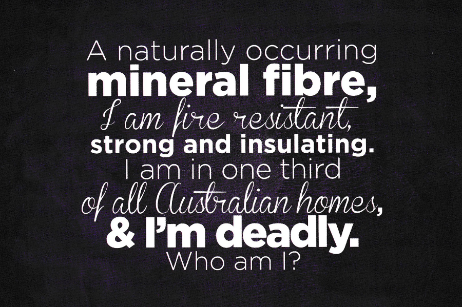
“A naturally occurring mineral fibre, I am fire resistant, strong and insulating, I am in one third of all Australian homes, & I’m deadly.
Who am I?”
An unusual subject for a postcard but a very important one. Work is being done worldwide to try and remove this substance – Asbestos – from schools and homes. I have some knowledge in this area as I have been involved in funding training in Asbestos removal, a dangerous but prosperous occupation with apparently years of work still required here in the UK.
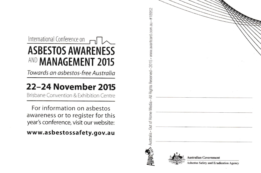
REVERSE SIDE OF ABOVE POSTCARD

27/05/2016
MEMORABILIA ‘94
ROADSHOW & FAIRS
GLASGOW – MANCHESTER – BIRMINGHAM
GLASGOW
CITY HALLS, CANDLERIGGS
10TH & 11TH SEPTEMBER 94
Europe’s largest ever events for Collectables relating to Pop Memorabilia, Films, Comics, Television & Science Fiction
Card Ref: Memorabilia ’94 Promotions No. 1
I regularly attend the Memorabilia fairs at the NEC Birmingham but I was unaware of these ‘Roadshow & Fairs’ events held elsewhere, like here at Glasgow. This is actually quite a rare card and I do not come across copies very often. I like these cards because they always contain some sort of television subject matter but I suspect copies were either disposed of as unwanted items once the information had been taken from them or were kept because they featured something which fitted into their collection.
This one here has the following illustrated things:
THUNDERBIRDS (TB1)
STAR TREK (Spock)
THE SAINT (Roger Moore)
BATMAN & ROBIN (from the TV series from the 1960’s)
THOR (but only just – bottom centre right)
ELVIS PRESLEY
DIRE STRAITS (guitar pick)
BOB DYLAN
ADAM ANT
2000AD COMIC (I used to read this and bought the very first issue when it came out)
26/05/2015
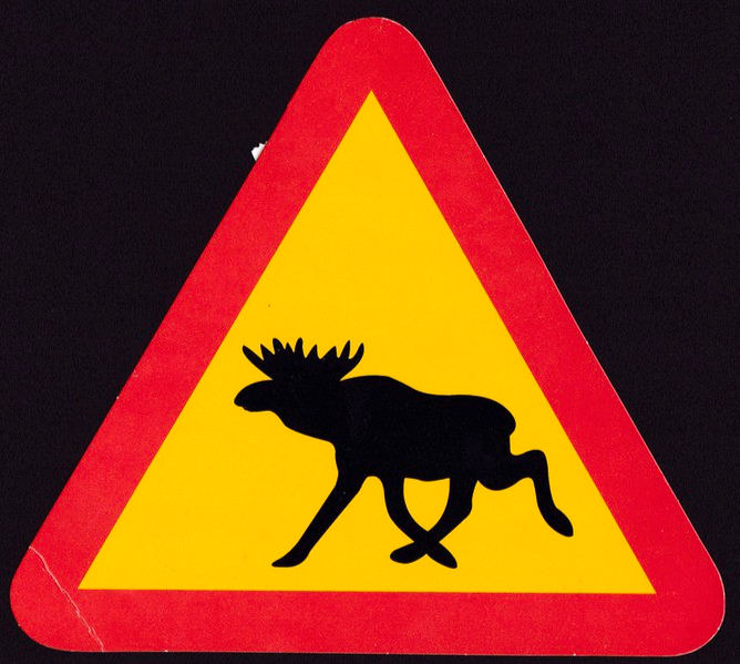
SWEDEN
Large Shaped Postcard Published by:
Gallerix
Large shaped postcard which resembles a Swedish road sign which warns of Elk crossing the road (the Elk of course is also known elsewhere in the world as the Moose). This is a fun postcard aimed at tourists and those who like something different. So, again this is not a card which collectors would really go for. But, I love shaped postcards so it is in mine. This copy here is used but the date stamp is unclear so I do not know what year it was posted. The stamp used is a nice 12kr car and caravan stamp.
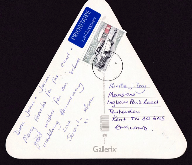
REVERSE SIDE OF ABOVE POSTCARD
26/05/2016
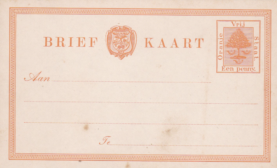
ORANGE FREE STATE
1884, 1 Penny orange on thick white card
This was the very first postal stationery card issued by the Orange Free State (Orange River Colony)
The Orange Free State was an Independent Boer sovereign republic in South Africa which was around during the second half of the 19th century. Its borders were determined by the United Kingdom in 1848 when the region was proclaimed as the Orange River Sovereignty. Following the granting of sovereignty to the nearby Transvaal Republic the British recognized the independence of the Orange River Sovereignty on 17th February 1854. The country officially became independent as the Orange Free State on 23rd February 1854 with the signing of the Orange River Convention. Despite becoming a successful republic there was the later conflict with the British during the Boer War and as a result the area was annexed as the Orange River Colony in 1900. It ceased to officially exist as an independent Boer republic on 31st May 1902 after the signing of the Treaty of Vereeniging at the conclusion of the second Anglo-Boer War.
25/05/2016
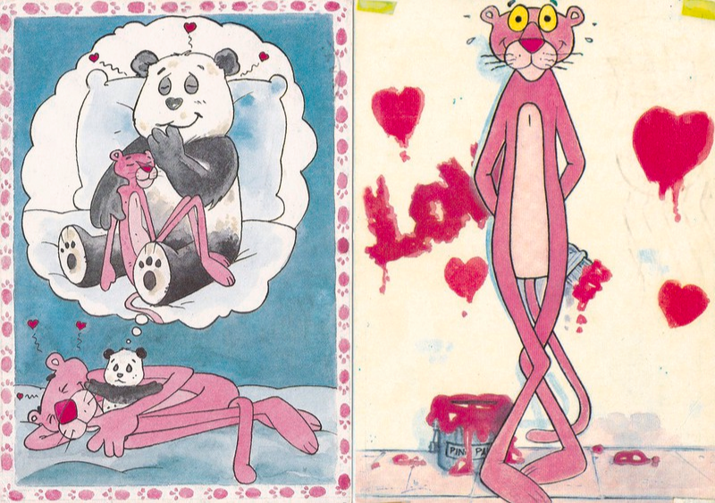
PINK PANTHER
Italian art cartoon cards
Far left – Pink Panther with Panda cuddly toy. Used with a Postmark dated 1988. Reference Number: OR07 – SOGNI ROSA (Distributed by G. Stevani)
Near Left – Pink Panther with paintbrush. Italian postcard used with a postmark dated 1988. Unknown publisher and printer but has MADE IN HONG KONG down centre line on reverse side (reverse printing in blue – there is no reference number or title given on reverse side either)
I have Posted these two cards in commemoration of Burt Kwouk who sadly died yesterday. He played the character Cato in the Pink Panther films. Cato was the manservant to Inspector Clouseau and was introduced in the second film but went on to appear in the next six films. On television he appeared in Danger Man, The Avengers, The Saint, The Champions, Warship, The Water Margin, The Tomorrow People, Minder, Shoestring, Tenko, Howard’s Way, Lovejoy, The House of Elliott, Last of the Summer Wine, Silent Witness and many others. But for me his appearance in the Doctor Who story ‘Four to Doomsday’ was important because when the video of this story was released I bought a copy which had the cover signed by Burt Kwouk. This signed cover remains in my Dr Who collection.
BURT KWOUK ….. RIP
Herbert Tsangtse Kwouk
18th July 1930 – 24th May 2016
24/05/2016
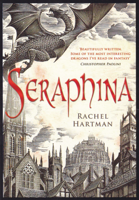
SERAPHINA
Book Advert Postcard
Published by
Boomerang
(Free Rack Card)
Who can resist a Dragon? And it would seem that books about Dragons are also very popular. This postcard depicts the cover of the book ‘Seraphina’ written by Rachel Hartman. This was released in 2012 (Published on 10th July) and is aimed at the very popular young adult market. This was the debut novel by Rachel Hartman but it managed to be ranked No8 in The New York Times Best Sellers list in its first week of publication. The book has gone on to receive a number of awards but for me it is the dragon on the cover and on the subsequent postcard that really catches the eye.
24/05/2016
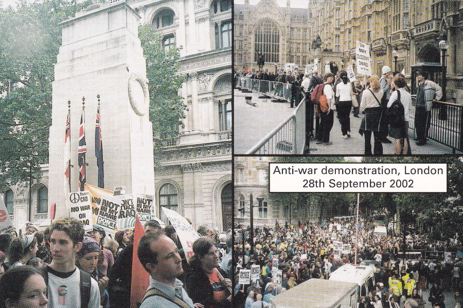
ANTI-WAR DEMONSTRATION IN LONDON
28TH September 2002
Published by
Reflections of a Bygone Age
Photo’s: Mary Lund
“Around 250,000 people marched from the Embankment to Hyde Park to oppose any war on Iraq”
(Text from reverse side of postcard)
This postcard is from 2002 but it could be from almost any recent period really as anti-war marches became quite common an event as did large gatherings of people in London protesting against any one thing or another.
24/05/2016
WE WILL ROCK YOU
THE MUSICAL
‘QUEEN – BEN ELTON’
DOMNINION THEATRE
Series of advert postcards published by
BOOMERANG
(Free rack-cards)
I have always been a big ‘Queen’ fan and got to see them at Wembley Stadium during their ‘Magic Tour’. As a result, my wife and I were given tickets for this musical as a Christmas Present from her brother. As a fan I clearly loved the music and even though I am not a great musical fan this was a smashing show. The musical actually opened at the Dominion Theatre in 2002 and has, despite some early poor reviews, become an audience favourite and has travelled around the world with success.
This series of simple advert postcards was issued to promote the very early days of the show. Each card has a well-known section of lyrics from Queen’s most famous song; Bohemian Rhapsody. These would be a must for any Queen fan.

23/05/2016
TERRY WAITE
Last evening (22/05/16) I attended an event called ‘An Evening with Terry Waite’ during which he entertained a packed house with tales of his life. Amongst many comic asides he obviously spoke about his time as a hostage.
This was a fantastic evening and Mr. Waite has a host of stories to tell and speaks extremely well and everyone present had a fantastic time, despite some of the more horrific things he has seen or suffered which he did not shy away from speaking about.
The evening reminded me that I have a signed Terry Waite postcard in my collection. It is actually in my mounted ‘Autographed Faga Postcard display’, a display that I have presented to a number of postcard and stamp clubs up and down the country.
FAGA POSTCARD No 360
BRITISH ARMY
Autographed by Terry Waite on the reverse side
Displayed here is the complete mounted sheet with the signed postcard, photograph of Terry Waite and a brief biography
22/05/2016
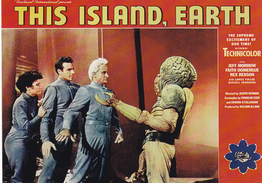
THIS ISLAND, EARTH
Film Poster Postcard
Published by
PYRAMID
Ref: PC 8389
I love films and have a fondness for the older ones which are either Science Fiction based or horror (I am not a lover of modern horror films – I much prefer the originals and the older Hammer House of Horror films).
This film poster is for the 1955 American film ‘This Island, Earth’ (released on 1st June 1955). Although this film has since been the subject of some lampooning when it first came out, in glorious Technicolor, it was praised by critics for its apparently well written script and special effects and the ‘eye-popping’ colour (spelt as color in these reports of course).
I have seen this film a couple of times and my favourite bit is the Mutant Alien reveal, depicted here on the poster with the mutant on the right side). If you do not know the full story of the films plot it ends up with a war between the Metalunans and the Zagons (classic space names) – what else do you need to know? It is actually quite a good watch if you like period sci-fi films and is one worth a look.
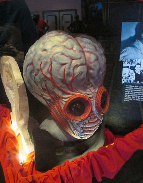
PHOTOGRAPH
Sep 2015
Last year whilst in Universal Studios I was waiting for the Horror Special Effects Show when I had the chance to look through a display of original props outside the theatre. On display was a full head mask of the Mutant from the original film. Here is my photograph of that very prop item.

22/05/2016
THE MERRYWELL FOOD TRUCK
SHAPED POSTCARD
Published by
AVANTCARD AUSTRALIA
Ref: #17941
Published in 2014
‘PARK THE MERRYWELL AT YOUR PARTY’
‘EATS ON THE STREET’
(I like the fact that the trucks side window is actually cut out of this card as well)
Free advertising rack postcard
22/05/2016
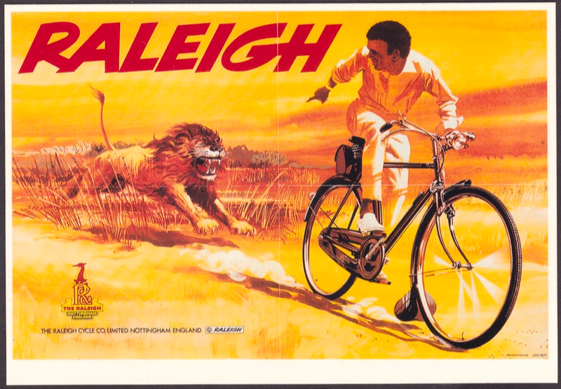
THE RALEIGH LION POSTER
Published by
MAYFAIR CARDS OF LONDON
Distributed by
The Postcard Warehouse
Ref: RC 599
“This poster is a 60’s version of Raleigh’s longest running advertising campaign in Africa – which started just after the second world war. The series of posters chart developing prosperity in Africa as original posters showed the rider in just shorts, but over the years he gained long trousers, a smart long sleeved shirt and finally a gold wrist watch!”
(Text from reverse side of postcard)
Mayfair have, and still do, sell a whole range of fantastic poster designs, amongst other images, and their postcards can still be found all over London. This one is one of my favourites as prior to seeing this I was unaware that this poster existed and it is a cracker. If you do a Google search the other Lion Posters mentioned in the descriptive text are viewable – and interestingly there is a similar one for India but showing a tiger (I wonder if this has ever appeared on a postcard?)
22/05/2016
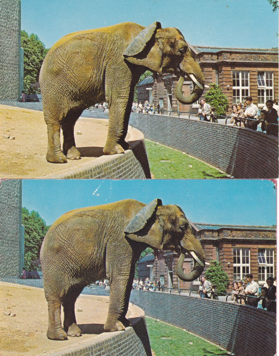
AFRICAN ELEPHANT AT THE LONDON ZOO
Photograph by M. Lyster, Zoological Society of London
Ref: PT7808
I have a few times illustrated Disney postcards and shown how the reverse side layouts have differed. I thought I would show how this is by no means unique to Disney. Here you have two identical postcard images showing an African Elephant in the outside area of the Elephant House at London Zoo. The card is interesting because as I have previously mentioned they no longer have elephants at the zoo and the famous ‘Elephant and Rhino House’, designed by Sir Hugh Casson (he was of course the architectural master of the Festival of Britain – and had been connected to the zoo since 1956) in 1962-5, now houses a couple of camels and I think some wild pigs whilst the organisers attempt to come up with a plan as to what to do with a listed structure they cannot knock down and which is specifically designed to house the large type of mammals that the zoo no longer has.
The loss of the elephants makes postcards depicting the old days when the creatures were still a major draw all the more interesting. I remember them well myself from my own youthful visits.
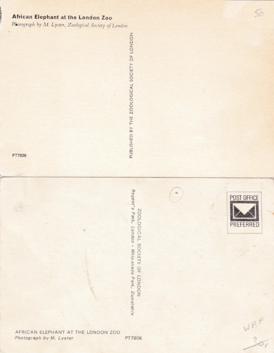
REVERSE SIDES
Here you can clearly see how the reverse side layouts are totally different with the descriptive title appearing top left on one and bottom let on the other. The centre line text comes in a single line format and a double line format which includes the location and the addition of Whipsnade Park. The code reference number also moves from the far left corner to the centre. The most immediately obvious change is the addition of the boxed POST OFFICE PREFERRED stamp box design.
I know I have said this before but never assume you have the card just because the front is the same (if you are of course only interested in the front images then look no further – but if you want to study the full varieties of what were available then look closer and check the backs).
The top postcard was issued first and the lower one is a later publication.

22/05/2016
JAYWICK SANDS
Locally produced postcard by unknown publisher/printer
Postmarked CLACTON-ON-SEA - 9TH July 1958
(Does not have POST CARD across top on reverse side – but has GREETINGS instead)
All these people depicted look like they are having fun on the beach and along the front. Oh how times have changed! Jaywick Sands is now known as the most deprived area in the United Kingdom and has changed from a holiday retreat, as shown here, into a rundown refuge area for its troubled residents. As a holiday retreat area it had fairground rides, a miniature railway, cafes and clubs but very little is left now and what remains is being eroded by the lack of regeneration in the area.
It was never really designed as a permanent location and many of the structures built there have no official electricity or other amenities. It has appeared on a number of television documentaries where the issues of the occupants have been discussed and depicted. The postcard shown here really does show another long gone era.
22/05/2016
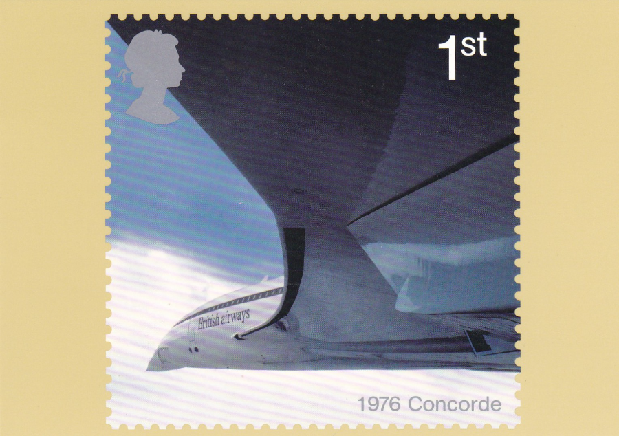
AIRLINERS – 1976 CONCORDE
ROYAL MAIL PHQ/STAMP CARD
Reproduced from a stamp designed by Roundel. Featuring a photograph courtesy of Adrian Meredith
Stamp issued 2nd May 2002
I was going through a box of postcards yesterday and came across some PHQ stamp cards which I had actually sent off for hand-stamping myself. Amongst these were a number of sets of the 2002 Airliners cards. This set was popular because it included a 1st class stamp depicting the Concorde (which is a specialty of mine – I have posted numerous previous Concorde postcards and have mentioned that I am a member of a Concorde Collectors Society).
This is the front of the Concorde PHQ stamp card.
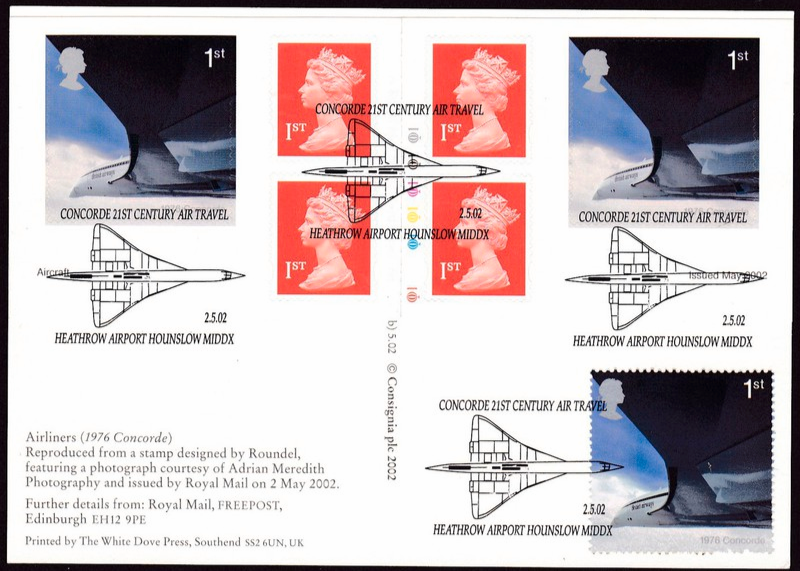
REVERSE SIDE OF ABOVE POSTCARD
The Concorde 1st stamp was issued in sheets of gummed stamps and as a single stamp within a multi-stamp miniature stamp sheet (but the stamp was the same and still of the gummed variety). On the same day as the release of the gummed stamps a retail stamp booklet was issued which contained two self-adhesive Concorde stamps which were otherwise identical to the gummed stamps. The booklet also contained four Queen’s machin head 1st class stamps as well – so this was a standard booklet of six stamps.
Being a collector I took one of the Concorde PHQ stamp cards and applied a complete stamp booklet pane across the top of the card, thus including the 4 Queen machin head stamps as well. I also applied a single sheet, gummed, stamp as well in the bottom right corner. I then sent this off to have the ‘CONCORDE 21ST CENTURY AIR TRAVEL – HEATHROW AIRPORT, HOUNSLOW, MIDX – 02/05/2002’ special hand stamp, featuring the Concorde, applied. I also managed to obtain and use a Cylinder Number booklet as well (for non-stamp specialists this means that this is one of the booklets which has a line of colour idents down the centre – these are the colours used in the printing of the items – these cylinder number booklets are issued in a much lower number than the non-cylinder number versions – these ones with these are much sought after by stamp book collectors).
All in all I ended up with what I think is an attractive item – and I like the fact that the CONCORDE 21ST CENTURY AIR TRAVEL section of the hand stamp appears under the image of the plane on the two stamps, it almost looks like part of the stamp design.
22/05/2016
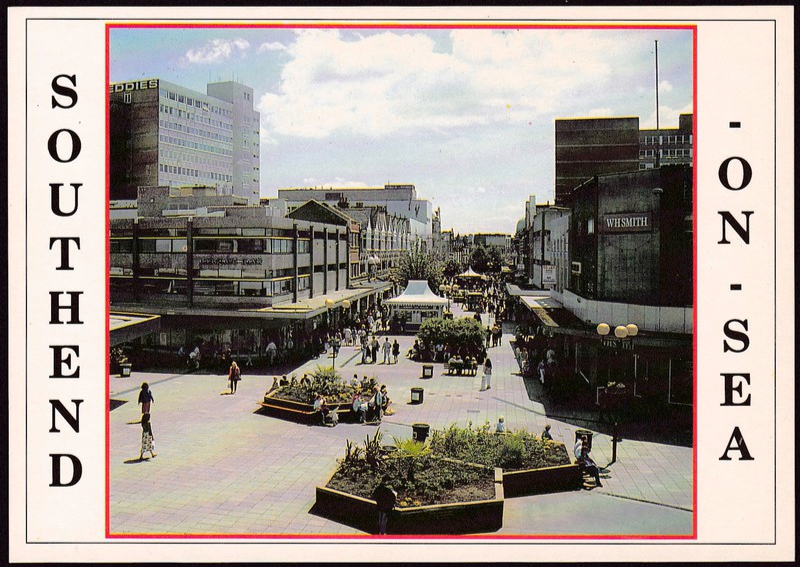
SOUTHEND – ON – SEA
HIGH STREET
Published by
DENNIS PRINT & PUBLISHING
Ref: S004079L
This is what would probably be described as a ‘bog standard’ postcard image, one of little real interest to your postcard collector and more the type of card that a tourist would buy to send home (assuming anyone would want to send back a postcard of this part of Southend!)
This is actually what locals call the top end of the High Street and the photograph was taken from what was a walkway across from a local shopping centre. This walkway has long gone and has been replaced by a cloths shop, so you could not take a photograph from this position any more. The postcard itself is of a common style and you can find cards like this in just about every location in Britain, and of course across the world in countries own styles.
But despite this ‘cheapness’ these images can be of real interest to those interested in local history. This one for example depicts a number of things which are no longer present. The hexagonal raised garden beds which can be seen in the foreground are no longer here. The overgrown one slightly further back has also gone. I remember them being built and I remember them coming down (the area is now just flat and is often used for displays from local organisation’s and sometimes car companies and military displays – my Grandson got to use a mine-detector here a couple of years ago during an army promotion – yesterday there was a man running in a giant hamster wheel for charity – so you get all-sorts). Although I remember them being removed I cannot find out when this was. There was a major High Street project between 2003 and 2006 and they possibly came down around this time, but I’m not sure.
Also you can see in the centre, just beyond all the raised beds, a small chalet like building with a white roof. This used to be the Rossi’s Ice Cream shop. Take a good look because this has also long gone and the area now remains flat and is used at Christmas by the visiting Christmas market. There is also a tree visible growing up behind this structure – this too has gone. And further back you can just see another small structure in the centre of the walkway, this was a fruit & veg stall – this has also gone.
The building centre front on the left side is shown here as Barclays Bank (for a few years I banked here before moving to Lloyds further along the High Street). Barclays left this building some years ago and it is now a mobile telephone accessories shop. The tall building on the far left in the background has white letters across the top but you cannot see the first letter as this should read KEDDIES. This was a major department store in Southend for many years and was a multi-floored store. It sadly closed on 26th February 1996 and these large white letters have been removed.
In fact, looking at this image now it is only really the WH SMITH shop on the right side which still has the same shop in it. So this photograph, which I think might be from the early 1990’s (possibly late 1980’s) shows much that has changed – therefore it really is a piece of local history (not bad for something probably worth no more than 30p!).
21/05/2016
PAT HOLTON
PHOTOPICS
‘PHT POST CARD’
‘REAL PHOTO LIMITED EDITIONS’
‘Delivering to The Corner Shop – High Street, Stoke Ferry, Norfolk – Photo Pat Holton 2001’
The wonderful Pat Holton used to produce the ‘P.H.TOPICS’ post card series (one of which I have already posted) for which I had a standing order for many years. I do not have a complete collection but it is a quite comprehensive one.
Then in 2001 Pat started another little postcard sideline which was a series of ‘Real Photo Limited Editions’. This was a series of specially produced postcards using photographs taken by Pat herself (there may have been an occasional guest photographer – but I am not sure). The first such card went out to just 50 people and each was individually hand numbered by Pat. I unfortunately missed out on their announcements and did not get the first card. I immediately signed up for number 2 and then received every card until the series came to an end.
Then I wrote about this series in Picture Postcard Monthly and mentioned my missing of the first card in the series. Then out of the blue someone kindly sent me their copy of the first release, which apparently they had not wanted. So here is the first of the ‘Real Photo Limited Editions series’ – my copy is number 27 of 50.
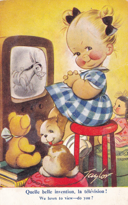
21/05/2016
WE LOVES TO VIEW – DO YOU?
Published by
BAMFORTH (Foreign Issue)
“IMPRIME EN ANGLETERRE”
Ref: No. K137
Like most collectors I have those items which I really want. Some I have seen in other people’s collections, some in catalogues and books and occasionally on the internet. About twenty odd years ago I read a book about postcards of the 1950’s and in it was a ‘Taylor’ cartoon card of a young girl watching television with her pet dog and cuddly teddy bear and doll. On the screen was a mule who just had to be Muffin the Mule from the children’s television programme. I fell in love with that image and I have looked for it ever since. You have no idea how many dealers boxes and albums I have gone through and how long I have hunted this card down on eBay etc.
Well, as you can see here, there is good news at last. Last week, whilst away, this cracking card popped its head up on eBay and set off all my alarms. It was on a ‘Buy-it-Now’ eBay listing and that was exactly what I did with it – immediately. I am therefore delighted to post this card here today (don’t worry I still have a few ‘wants’ on my list … there is a Woodentopps one I have looked for almost as long!)
21/05/2016
LITERARY POSTCARD MENTIONS
And POSTCARD BOOKS
I love it when postcards get mentioned in books that I am reading even if it is just on the one page or used as a small, or large, important device within the story. I shall list here the ones I come across. This will include when factual books also mention or depict postcards
Number 11
THE BONES OF PARIS
By
Laurie R. King
Paperback version published by Allison & Busby Limited
The story is set in 1929 and has an American detective, Harris Stuyvesant, being employed to seek out a missing young woman who has disappeared in the Montparnasse area of Paris. The story soon descends into the murky world of perverted artists and murderers.
(Some readers might know the Sherlock Holmes and Mary Russell stories written by Laurie R. King which are very good)
PAGE 56
Harris is searching the missing girls room and looking at her books:
‘Casual bookmarks in some of the thicker French tomes, all in the first quarter of their book, suggested that Pip [the missing woman’s name] had found them hard going. The bookmarks were mostly postcards (Mrs Crosby from Niagara; Mrs Crosby from Chicago; a friend – Sally? Susan? The signature smudged – from the Metropolitan Museum in New York)..
PAGE 64
Harris is talking to the police – missing person’s section in Paris
“But it concerns me that she hasn’t written to her mother – which she did regularly, and more than just dutiful picture postcards.”
PAGE 228
Harris is talking to his past love, who he has not seen for some years (Bennett Grey is her brother). She has just told him that she has not been told what he has been doing in the years since they parted and said she though Harris had not seen her brother:
‘Stuyvesant made a mental note to slap Bennett Grey around a little, next time he was in arm’s reach. “I haven’t, but I send him a lot of picture postcards”
“If they’re colour pictures, the neighbour lad probably steals them”
PAGE 291
Harris is in an art showroom asking about an artist called Didi – the stores salesman is speaking:
“Would monsieur care to see some of Didi’s…older work?”
The man might have been offering dirty postcards.
PAGE 332
Nefarious people from a secret organization in Britain are discussing Bennett Grey (this is an ongoing subplot that crosses the current two Harris Stuyvesant books):
“And you think Captain Grey [Bennett Grey] is going to see him?”
“Possibly. They’re friends. Sort of. The American [Harris] writes him chatty postcards every few months”
PAGE 399
Bennett Grey is thinking to himself here – his sister Sarah (Harris’ ex love) has gone missing:
“He’d thought he was immune to a fear of death. Sarah worried about him – Harris Stuyvesant, too. That was why she’d chosen a house that might soothe him into visiting, why Stuyvesant continued to send him picture postcards: chain-links binding him to life”.
21/05/2016
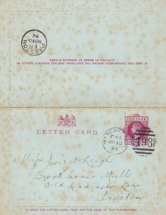
QUEEN VICTORIA LETTER CARD
ISSUED 1892
The first British Letter Card Issue
Postmarked 10th March 1892 – MANCHESTER – Addressed to Preston.
Back-stamped upon arrival at PRESTON on the same day – 10th March 1892
I have mentioned Letter Cards before and posted images of a few. This one here is interesting for a number of reasons; firstly, the sender clearly did not seal the edges of the card down as the perforated outer edge is still present and the entire card is intact. But it was clearly posted as it has all the correct postage marks and cancels. The Queen Victoria red One Penny pre-printed stamp has been cancelled with a Manchester Duplex cancel – Numbered 498 – dated March 10th, 1892. The back of the item, the other outer half, has been correctly cancelled at the local delivery location upon the cards arrival – Preston (delivered the same day – 10th March).
Secondly, this one has a fascinating printed advertisement inside for the ‘Oldest Local Insurance Office – The Manchester Fire Assurance Company’. It is this which appealed to me when I saw this for sale. It was really cheap because the item has quite a bit of ‘Foxing’ (this is the name for the brown spotting that appears across the whole item – this can be found on cards, envelopes, documents, books and any paper item which has been infected thus. It is named due to the red fox colour like appearance of the stains or the rust chemical Ferric Oxide which may be involved. Fortunately, although it does affect the look and the value of the infected item, it does not affect the actual integrity of the paper. There appears to be some lack of clarity on what causes ‘Foxing’ but one theory is that it is caused by a fungal growth. Another states it is the effect of oxidation of iron and copper on certain paper – or possibly something within the substances used to make the pulp from which paper is made – it is accepted though that High humidity may also bring it on so may be a catalyst). Despite this damage I still thought the item interesting and bought it. I have since kept this carefully away from heat, damp and protected within a plastic sleeve. The ‘Foxing’ has not subsequently increased.
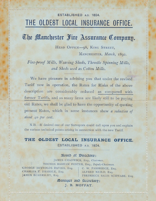
INSIDE OF LETTER CARD
Printed Advertisement for:
THE OLDEST LOCAL INSURANCE OFFICE,
THE MANCHESTER FIRE ASSURANCE COMPANY
Head Office – 98, KING STREET,
MANCHESTER, March 1892
This is a smashing advert and increases the interest with this particular item. There is more ‘Foxing’ around the upper edges of the card because it has come through the adhesive that is still present around the upper exterior area of the perforated strips. On unused letter cards this adhesive area still often turns a shade of light brown as the glue discolours.
Despite these marks and affected ‘Foxing’ that occurred I still like this item.
21/05/2016
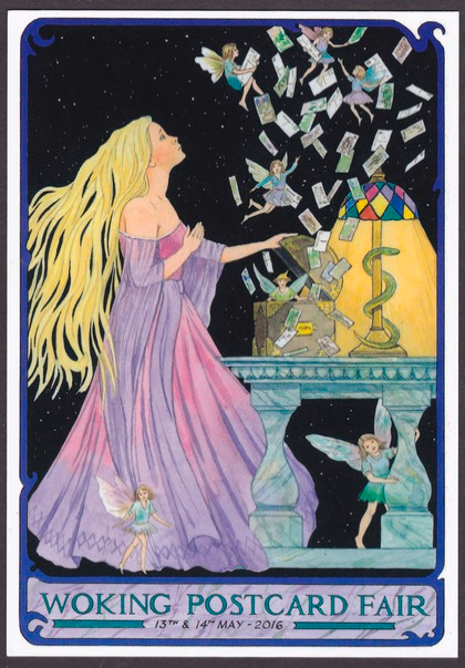
WOKING POSTCARD FAIR
13TH – 14TH MAY 2016
Published by the Postcard Traders Association 2016
Design by John Pulham
Ref: PTAW1
(There next fair at Woking Leisure Centre will be held on 23rd – 24th September 2016)
I usually try and attend this fair on the Saturday as they have a special Moderns Section at the back which is always a fantastic side event/addition. Unfortunately, this time I had to attend a Conference and was tied up with work so was unable to go. This seems to have been a shame as they issued a special postcard for this particular event, which I do not believe they have done before. Fortunately, someone, with an excellent first name, picked up a copy for me and sent it through (many thanks Mark).
I am glad I have managed to obtain a copy as the design is excellent and a real delight and is especially of interest as fair postcards have been a bit in decline recently and Postcard Club/Fair/Dealer cards are a specialist theme of mine.
So, put the next date in your diary – 24th September (this is if you want to visit the modern’s area – and why wouldn’t you? – the show is also open the day before – but there will be fewer modern specialist dealers – but you could of course visit both days!)
21/05/2016
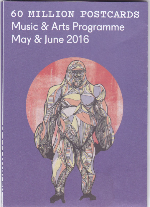
60 MILLION POSTCARDS
19 – 21 EXETER ROAD
BOURNEMOUTH
BH2 5AF
This is not a postcard depicted here but the cover of the May & June 2016 ‘Music & Arts Programme’ pamphlet given out at this rather unusual local bar (and burger counter – although it is a large bar really – much like an unusual pub).
The bar area is covered from floor to ceiling, and partially across the ceiling as well, with hundreds of real postcards. I visited here one evening whilst at Conference. I have been before in a previous year and eaten a nice burger one lunch time, but this time I got to go late one night for a drink with friends. They knew I would love it and it was fascinating to see the way the postcards were just displayed everywhere (along with record cases and other paper bits and pieces – but mainly postcards – thus the name).
I could not resist mentioning the place – and could not resist depicting the fold out pamphlet.
p.s. I counted up to 57 postcards which were on display which I have in my collection - I stopped then for my drink.
20/05/2016
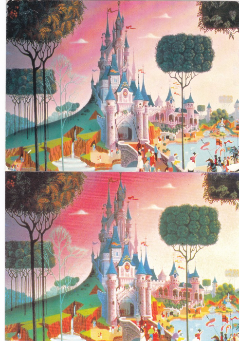
EURO DISNEY
DISNEYLAND PARIS
When Euro Disney was announced and about to open a series of advance paintings showing how areas in the park would look were released. Copies were even sold in the Disney shops in England. These images were designed to give people an idea of what to expect before the park had even opened.
Once the park has opened the cards were sold in the park. They were popular and appear to have been sold for a great many years.
Depicted here are two of these cards which have the exact same image shown on the front. This is the Fantasyland Castle – “Le Chateau de la Belle au Bois Dormant”. These are a good example of not just looking at the front – see below images for the reverse sides of these two postcards and an explanation of the differences.
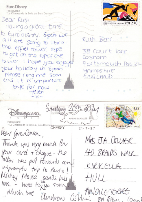
REVERSE SIDE OF ABOVE TWO POSTCARDS
Here is where you can see the difference between the two postcards. If you look top left on the top card’s reverse side, you will see that it says:
EURO DISNEY
This copy was used quite early on in the parks history and the stamp is cancelled 1992 (the park opened in April 1992) so this has a nice early reference. As previously stated I have a collection of Euro Disney postcards.
Now, I believed that these art view cards were exclusively used during the EURO DISNEY name period and had ceased being sold before the park changed its name just two years later.
Here on the bottom copy you can clearly see that the name of the park has now changed and here in the top left corner you can see that it now says:
DISNEYLAND PARIS
This second copy, now giving the new name, was posted in 1997 and has the MARNE VALLEE slogan cancel.
The slight change of reverse layout to incorporate the parks new name could lead collectors to not realise that this is a different issue (assuming that you are interested in this sort of thing – the different issues of postcards with the same image can make a nice additional area of study for collectors).
20/05/2016
I am back from my Conference week so the webpage images can continue.
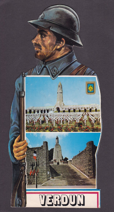
VERDUN
LE POILU DE VERDUN
Large Soldier Shaped Postcard
Published by
Editions MAGE
Ref: JP011
About ten years ago I did a Battlefield Tour of the Verdun area. I came back with a heap of postcards from the area and enjoyed an information packed trip with an extremely experienced guide. This particular postcard I did not see whilst I was there. This one came in a charity bundle of shaped postcards I received earlier this year.
The top photograph depicts the Douaumont Ossuary which is a memorial which contains the remains of both French and German soldiers who died on the Verdun battlefield. You can look through small windows which are located on the outside of this monument and see the bones of at least 130,000 unidentified soldiers which fill the alcoves of the building.
The photograph on the bottom depicts Charlemagne at the summit of Verdun’s Victory Monument. This monument was created by the French architect Leon Chesnay but was sculptured by Jean Boucher who was a veteran of the Verdun battlefield. The foundation stone was laid down in 1920 by the War Minister Andre Lefevre and in 1929 (23rd June) the inauguration took place in the presence of the French President.
The monument is at the summit of a stairway that links lower Verdun with upper Verdun.
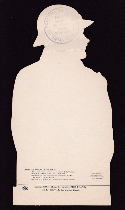
REVERSE SIDE OF ABOVE POSTCARD
With cachet applied at top. The text on the circular black cachet reads:
“MEMORIAL DE VERDUN – 1914 -1918 – Fleury devant DOUAUMONT”
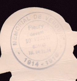
ENLARGEMENT OF CACHET
15/05/2016 - UNFORTUNATELY, I AM ATTENDING A CONFERENCE FOR THE NEXT FIVE DAYS – SO MY NEXT POSTING WILL NOT BE UNTIL FRIDAY NIGHT – 20TH May 2016 – UNTIL THEN ENJOY THE CARDS I HAVE POSTED THIS WEEKEND - Mark
15/05/2016
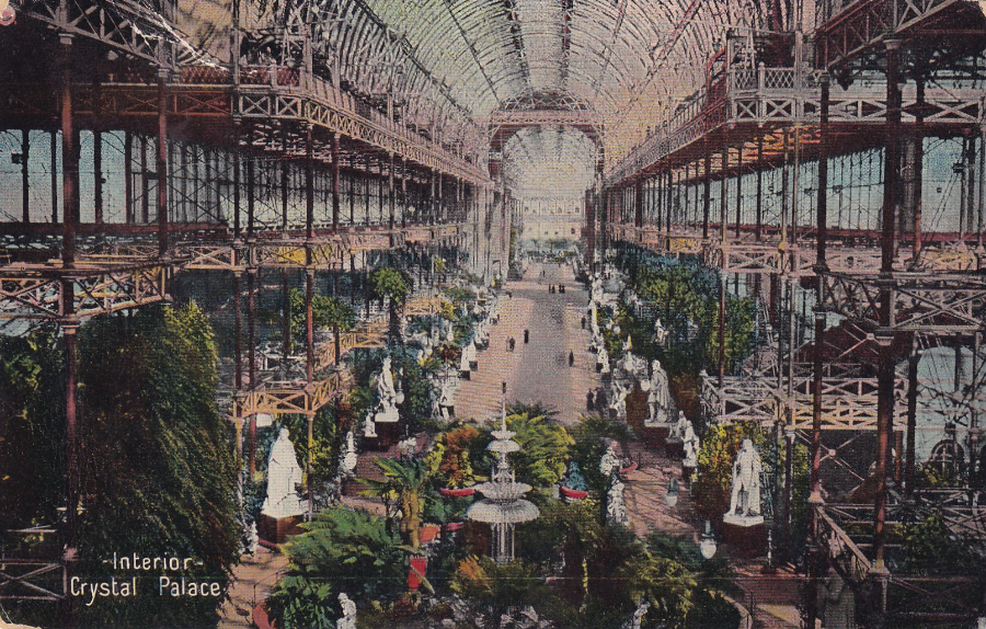
CRYSTAL PALACE – INTERIOR
Published by
FIELD’S SUPPER SERIES – No 351
This particular copy was posted 11th October 1912
My interest in Crystal Palace postcards arises from its rather unusual television connection. The inventor of television, John Logie Baird had his offices located in the palace and it was where all his spare equipment was stored. In 1936 Baird was competing with Marconi for the contract with BBC to provide television. Despite the Marconi system being better there was some support from the general public for Baird because he was the first person to ever get television to actually work and to transmit an image. But when the Crystal Palace burnt to the ground on 30th November 1936, thus destroying all his equipment, Baird was rendered incapable of continuing the fight for the BBC contract. This event is why I collect Crystal Palace postcards.
This one here is a nice interior photograph and I think it shows why the location was so popular and why people attended events here almost daily. Looks good doesn’t it.
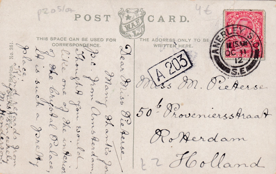
REVERSE SIDE OF ABOVE POSTCARD
The stamp has been cancelled with an ‘ANNERLEY S.D – S.E’ double ring cancel
Dated 11th October 1912
This postcard was sent to Rotterdam in Holland
15/05/2016
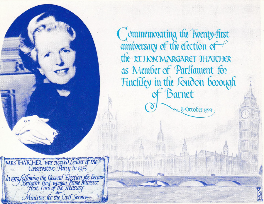
FAGA
Commemorating the Twenty-first anniversary of the election of the RT. HON. MARGARET THATCHER as member of Parliament for Finchley in the London borough of Barnet – 8th October 1959
In the ‘Complete Works of FAGA’ catalogue this is listed as reference 154, although the actual postcard is unnumbered itself. The card was issued in 1980 and was printed in navy and Cambridge blue in a limited edition of just 820.
This is a much sought after Thatcher postcard which rarely turns up these days. Copies can be found which were posted from the House of Commons on the actual anniversary that the postcard was designed for – 8th October 1980. These cards received a circular HOUSE OF COMMONS date stamp. I have a number of these from a collection I bought back in the 1990’s. This means I had some spare copies which was useful when Margaret Thatcher’s death was announced on the news on 8th April 2013.
I took a mint card, and a used card (as above), and had both cancelled with a nice ROYAL MAIL LONDON SW1 special hand stamp, which features an image of the Big Ben clock tower, dated 8th April 2013. These made for what possibly might be some unique items now.

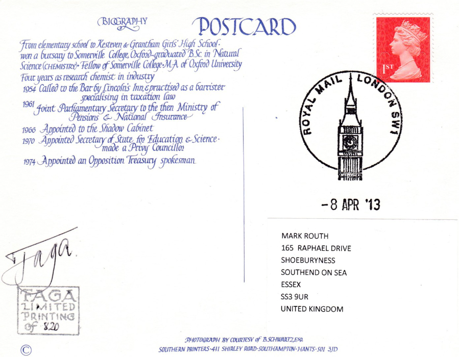
REVERSE SIDE OF ONE OF THE USED POSTCARDS
Used with HOUSE OF COMMONS circular date stamp dated 8th October 1980 – the anniversary date as mentioned on the front of the postcard design.
ALSO
Posted to receive the ROYAL MAIL LONDON SW1 cancel dated 8th April 2013
The date of Margaret Thatcher’s death
REVERSE SIDE OF ONE OF THE USED POSTCARDS
Signed by FAGA
Posted to receive the ROYAL MAIL LONDON SW1 cancel dated 8th April 2013
The date of Margaret Thatcher’s death

15/05/2016
WALT DISNEY CLASSICS COLLECTION
Cinderella’s 50th Anniversary
One of the many free advert postcards issued out to promote Disney’s figurines. Some of the figures are very collectible and are much sought after. The postcards depicting them are also popular but they can be difficult to obtain as many of the people who receive them also keep them. They are certainly popular on eBay when they turn up.
15/05/2016
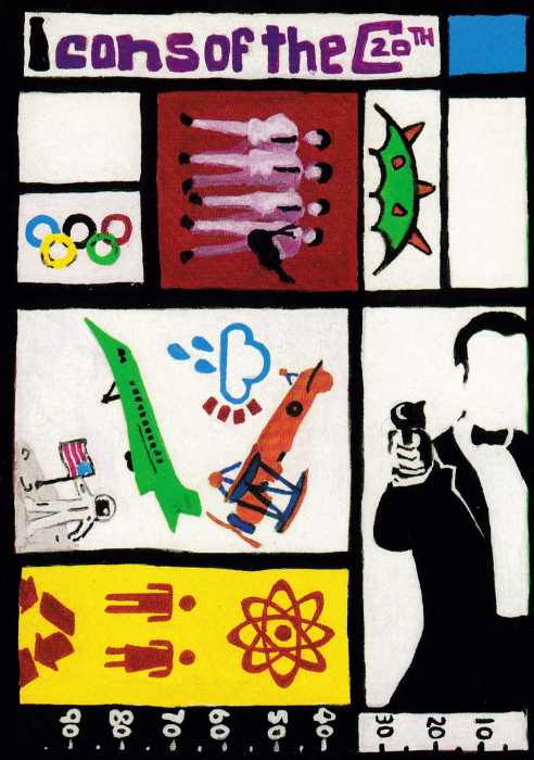
ICONS OF THE 20TH CENTURY
BOOMERANG RACK POSTCARD
‘THE ARTS COUNCIL OF ENGLAND
‘Prize donated by FUJIFILM’
Clare Barry, Competition Winner of ‘Icons of the 20th Century
I liked this design, I suspect it was drawn by a school child as it appears to have been released on a schools Boomerang styled rack card. The design covers a number of topics, many of which I am interested in as well, such as: Film (James Bond), Concorde, Apollo Moon landing, the Millennium Dome, The Beatles and the Olympics. Not bad for one simple little design – so, congratulations to the winner.
15/05/2016
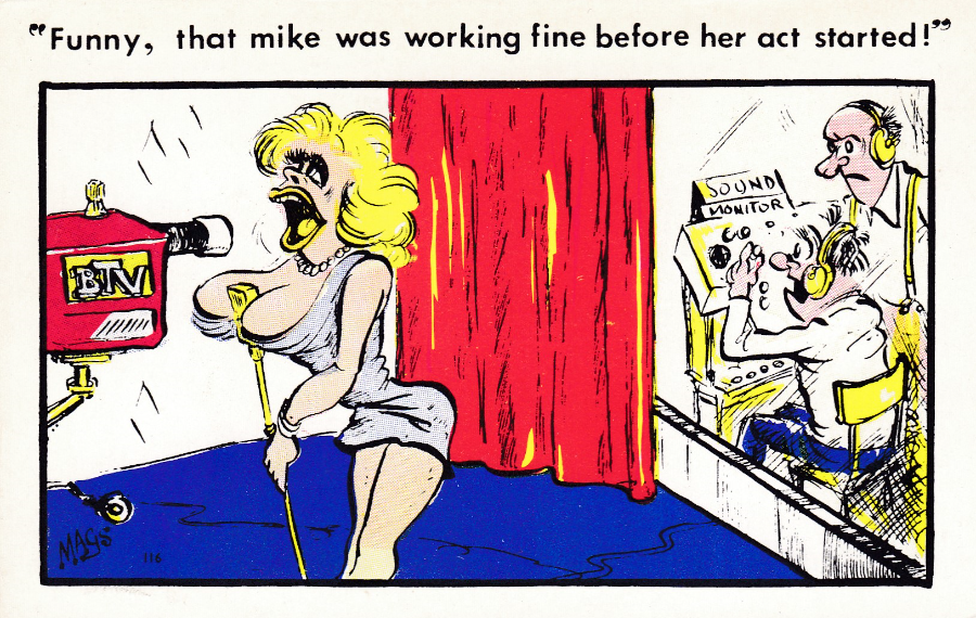
“FUNNY, THAT MIKE WAS WORKING FINE BEFORE HER ACT STARTED!”
MAGS CARTOON CARD……CC…….Printed in England
This is typical of many of the cheap styled cartoon postcards which proliferated in the late 1970’s and 1980’s. Simple cartoon drawings with often a very sexual reference or a joke directly related to something of a sexual nature. With these cartoons the people depicted can sometimes look quite grotesque, this seems to have been considered as funny and occurs more often than one might suspect. This particular card was added to my collection for the television connection – it certainly was not added for the quality of the cartoon!