20/05/2017
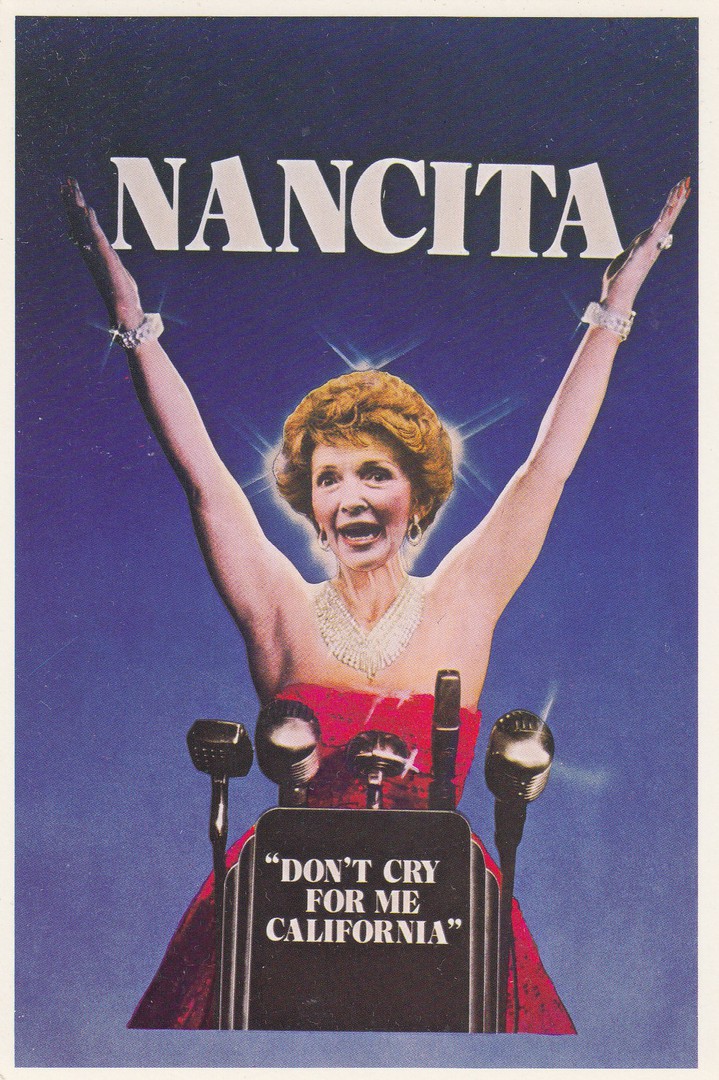
NANCITA
“DON’T CRY FOR ME CALIFORNIA”
Published by
THE AMERICAN POSTCARD CO., INC
Ref: B1
This is one from a range of postcards published by The American Postcard Company which lampooned Nancy Reagan, with many being about her husband President Ronald Reagan, who was President during most of the 1980’s (January 1981 – January 1989). Reagan’s presidency coincided with the peak years of the modern political satire postcard production. This is a good example of an American political 1980’s postcard. I am sure you do not need me to tell you that the joke here is wrapped around a word play on the musical ‘Evita’, and the song ‘Don’t cry for me Argentina’.
20/05/2017
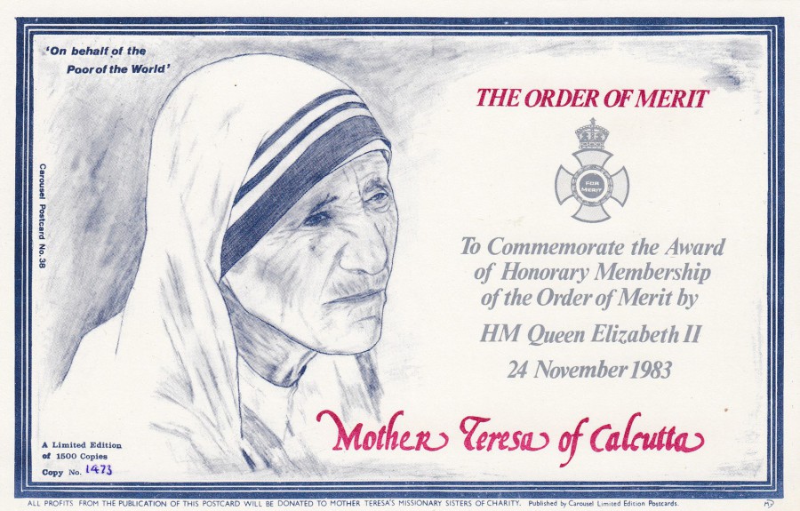
MOTHER TERESA OF CALCUTTA
THE ORDER OF MERIT
Published by
CAROUSEL LIMITED EDITION POSTCARDS
Ref: CAROUSEL POSTCARD No. 38
Limited Edition of 1500 copies
(This one is numbered 1473)
“To commemorate the Award of Honorary Membership of the Order of Merit by HM Queen Elizabeth II – 24 November 1983”
Carousel produced a number of different limited edition postcards during the 1980’s, and they were pretty much all mostly artist designs like this one. For such an amazing and selfless woman Mother Teresa makes few postcard appearances, in comparison with other well-known people alive around this period. I think I only have a couple from the 1980’s, with this one being my favourite. But I do have some which connected her death with that of Princess Diana, as they died within days of each other with the sad result of Diana’s death overshadowing that of Mother Teresa.
20/05/2017
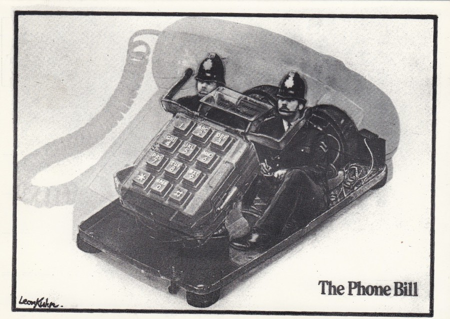
THE PHONE BILL
Printed by
LITTLEPRINTS, LONDON
Cartoon by
Leon Kuhn
This is another 1980’s postcard, I think. It takes the simple concept of the Phone Bill and makes a pictorial cartoon photo-composition representation of it. This postcard fits nicely into my ‘Police’ themed collection and is a postcard design which I think is a real cracker. It made me giggle when I saw it.
20/05/2017
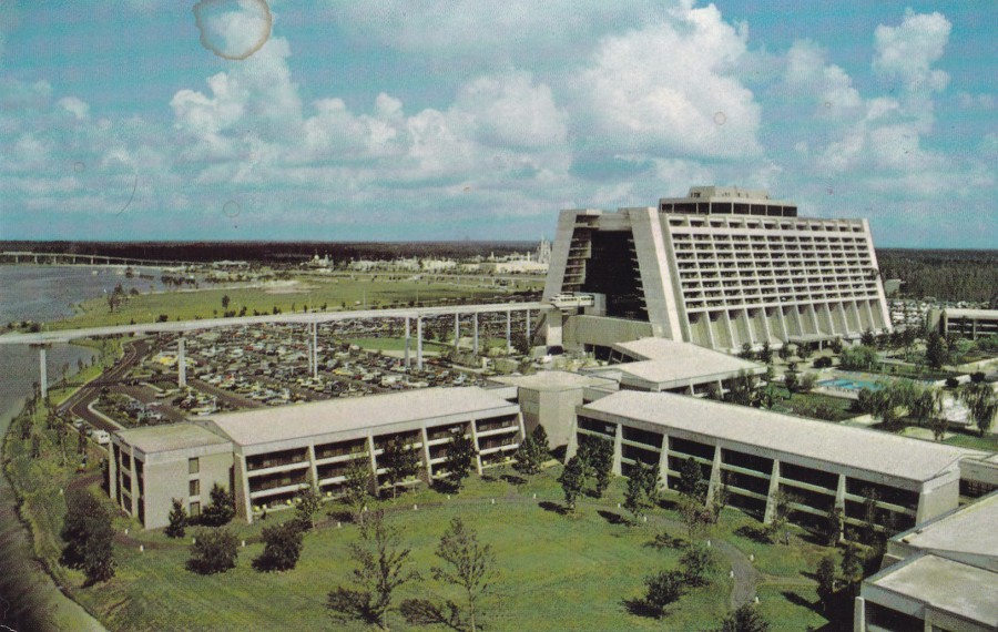
CONTEMPORARY RESORT – A VACATION ADVENTURE
WALT DISNEY WORLD
Official Postcard
Ref: 7530-0277
“The exciting Contemporary Resort is located along the shores of beautiful Bay Lake… right in the middle of ‘The Vacation Kingdom of the World’. More than 1000 luxurious rooms and a wide range of family vacation activities and convention accommodations are available. Sleek monorail trains connect the Contemporary Resort with the rest of Walt Disney World”
(Text from reverse side of Postcard)
Not the first Contemporary Resort postcard I have posted on my webpage, and probably not the last, but this one does give you a nice wide view of the complex, and you can just see part of the monorail sticking out of its entrance and exit from the main resort building. As previously mentioned I have had the pleasure (and expense!) of staying here and it is one of my favourite places to stay in Walt Disney World.
20/05/2017
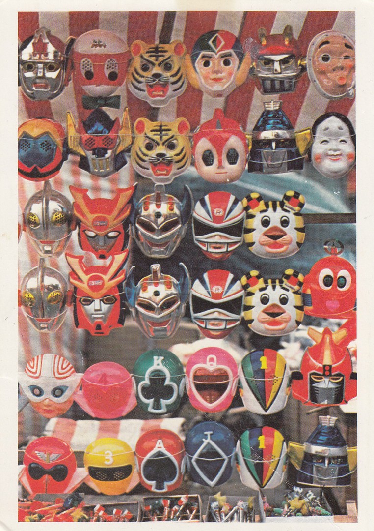
TOY MASKS
Of popular T.V. Cartoon Heroes on display at a Festival.
Japanese, Modern
VICTORIA AND ALBERT MUSEUM
Ref: J.S.6
This is an unusual addition to my television collection and one which I actually found on a stall at a postcard fair being used as a ‘marker’ card, inside a plastic sleeve. I had to ask the dealer if I could buy it and he looked a little surprised that I wanted it.
The design, a photograph, shows a number of masks, and there are some strong TV connections here as I can see Ultraman (3rd and 4th down from top on the far, left side) and some that look very ‘Power Ranger’s’ like as well. I am no expert on Japanese cartoons, but I know a couple. I knew enough to know I wanted this postcard despite being unable to see the text on the reverse side first.
This copy was posted sometime in the 1960’s.
20/05/2017
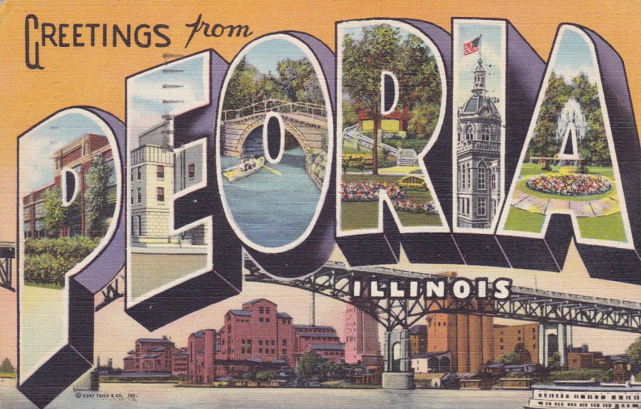
GREETINGS FROM PEORIA
Published by
PEORIA CANDY CO., PEORIA, ILLINOIS
Printed by
GENUINE CURTEICH-CHICAGO “C.T. ART COLORTONE” POST CARD
One of the iconic, and well known in America, American letter place name postcards. The idea for these designs is simple enough, take each letter of the location and within it place an image from that location. This example here is typical of the design. The images within the individual letters are:
P – Caterpillar Factory
E – Post Office
O – Lake and Bridge, Glen Oak Park
R – Bradley Park
I – Court House
A – Electric Fountain, Glen Oak Park

REVERSE SIDE OF ABOVE POSTCARD
Posted in 1951 from Peoria with the 3 cents stamp being cancelled with a Peoria slogan cancel ‘HIRE THE HANDICAPPED – ITS GOOD BUISNESS’ this has been used as a competition entry postcard.
20/05/2017
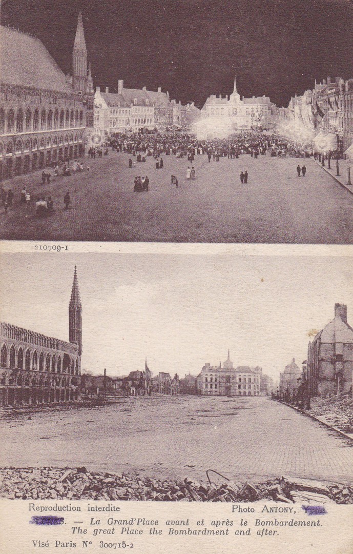
YPRES
LA GRAND’ PLACE AVANT ET APRESLE BOMBARDEMENT.
THE GREAT PLACE THE BOMBARDMENT AND AFTER
Published by
IMP.PHOT. NEURDEIN ET CIE. – PARIS
Ref: Vise Paris No 300715-2
This is another of the many World War I bomb/shell damage postcards which were on sale to soldiers visiting here. These postcards were cheaply made using lower quality card than that that was available before the war commenced. They were also produced in their thousands with many being posted to family and friends but with many also being kept as personal souvenirs. Some were also left over after the war ended and these found their way into postcard collections.
Censorship was in place, of course, during the conflict and as such it was a requirement to obliterate the name of the location for the images on postcards to prevent the enemy knowing where the image was from. This seems a little redundant to me with this ‘particular’ card as I would like to think the Germans were intelligent enough to know that the ‘Grand Place’ was in Ypres, after all they were fighting over it and shelling it. But, bureaucracy always wins over common sense, and so, the printed location of YPRES has been pencilled over on the front of this card. I am not going to lie, but, I don’t think the person assigned to obliterate the location name had their full heart and soul in the job as I think you can still see ‘YPRES’ underneath the pencil marks, but then I suspect they had a huge bundle to go through as I believe the location was pencilled over prior to the sale of the card in preparation of censorship.
The Grand Place is a beautiful location and all the destroyed buildings have now been entirely rebuilt. I have visited here a few times now and it is well worth a visit.
20/05/2017
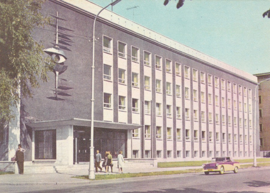
TALLINN
ESTONIAN TELEVISION BUILDING
Published by
KIRJASTUS “EESTI RAAMAT” TALLINN
Ref: B51
I am always on the lookout for more unusual television related postcards and especially those from abroad. From the front, you would be hard pressed to know, without some prior knowledge, that this has a television connection. This postcard here is why I always try and read the backs of cards when I can. This card here is a good example of what I am looking for. The photograph used here looks to be an old image, although probably contemporary to the issue period for this card.
19/05/2017
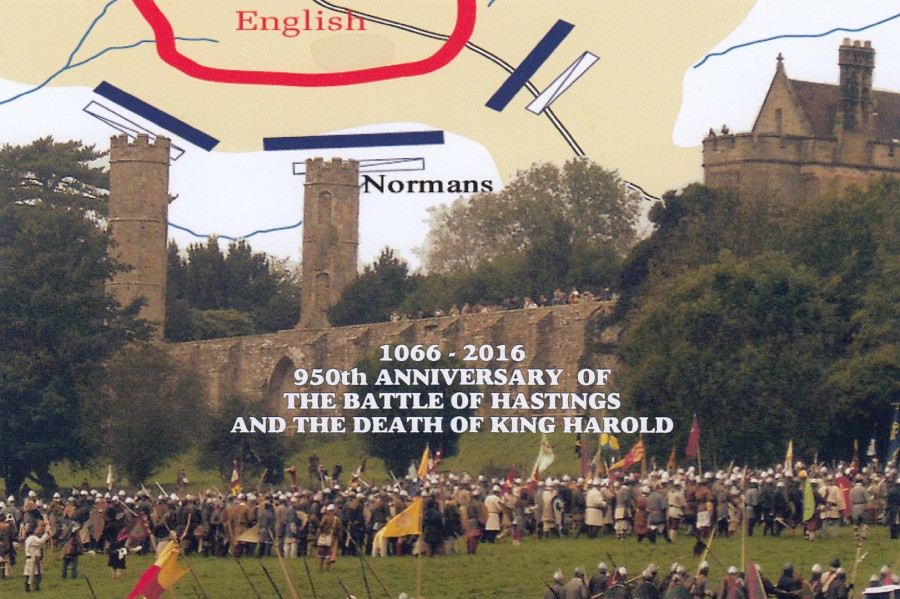
1066 – 2016
950th ANNIVERSARY OF THE BATTLE OF HASTINGS
AND THE DEATH OF KING HAROLD
Published by
CoIR. CARDS
Ref: 2016 CR.214
The Battle of Hastings is a very important point in my family history as my ancestor came over with William and took part in this battle fighting alongside William. When I studied my family history I was surprised to discover that my ancestor was an important knight in William’s army and for his participation he was awarded, by the now King William, a large piece of land which I was amazed to find was much of the land to the east of York in Yorkshire. To this day, the seat of his power, a village called Routh, is still there and still bears his, and my name. As the location has my name I have naturally enough visited here, on a sort of family crusade. My brother has also made the same trip. So, any postcards which relate to the Battle of Hastings (the site of which I have also visited) will always make their way into my collection.
19/05/2017
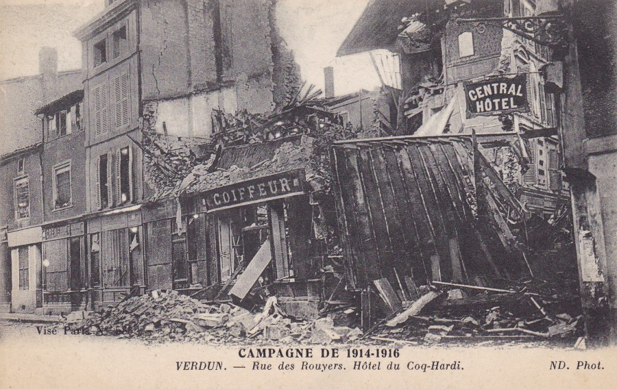
CAMPAGNE DE 1914 – 1916
Campaign of 1914 – 1916
VERDUN – Rue des Rouyers. Hotel du Coq-Hardi
Published by
IMP. PHOTO. NEURDEIN ET CIE. – PARIS
Many postcards were issued during World War I which depict the extensive and shattering damage that certain villages, towns and other French locations received from both German and allied shelling. Verdun was the French armies major campaign and the location where the German forces tried to push the French Army to destruction. It was a long campaign with a high number of casualties and is remembered by the French as the location they refused to surrender to the German advance and held the line. It is also an area I have visited on a battlefield tour and one area which is packed with WWI history.

19/05/2017
BILLIE PIPER
Published by
IDOLZ
(No reference number)
My interest here is the fact that Billie Piper has gone on to be an actress in several popular television programmes. This postcard here is from her earlier career as a pop singer and if it was not for one ‘particular’ television programme this card would have very little value. But Billie, of course, played the character of Rose Tyler when Doctor Who triumphantly returned in 2005. With that success came a different fame, the fame attached to the cult success of the world of Doctor Who and thus postcards like this one suddenly became collectible to a whole new band of collectors.
19/05/20
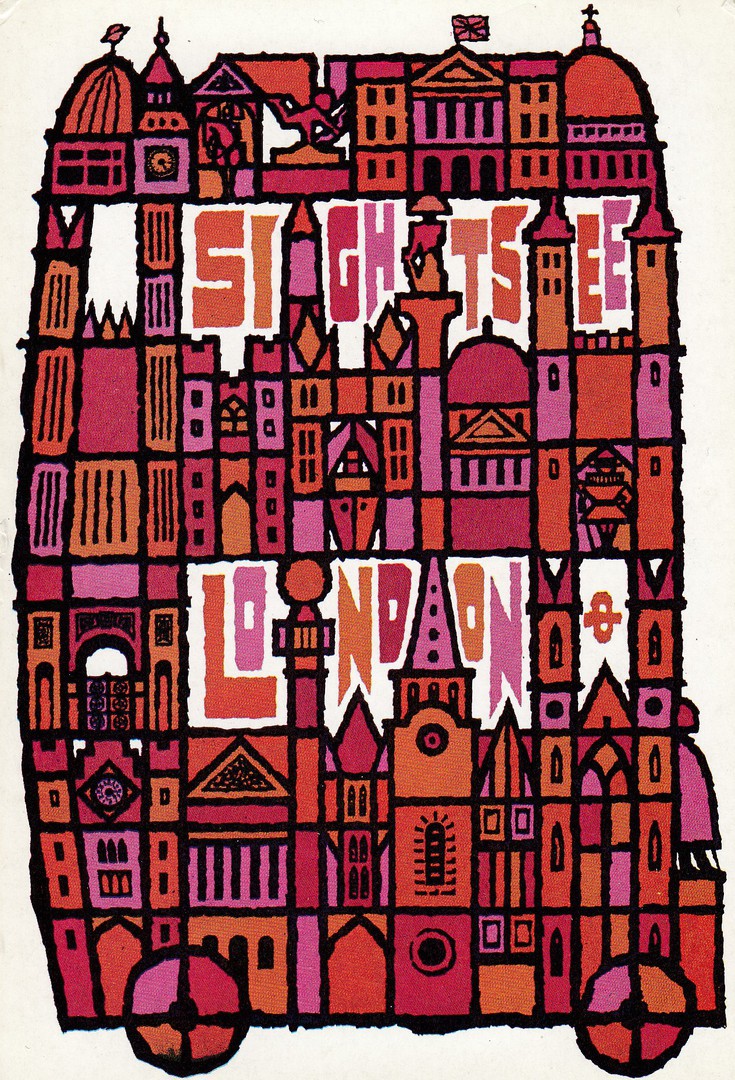
SIGHTSEE LONDON
LONDON TRANSPORT POSTER SERIES
Poster design by Abram Games
Poster design from 1968
Ref: 871/187RP/5M
The London Transport poster series was published from around the 1960’s into the 1970’s and is an extremely popular series with some of the designs being worth £5+, although the majority are normally around £3 (which is what I recently paid for this one). This one here is a nice London red bus themed design. This example is typical of the quality of the designs in this series, but not typical of the style as one of the attractions of this series is that it depicts posters by a range of different artists in an amazing variety of styles. This is one reason why these postcards are so popular.
19/05/2017
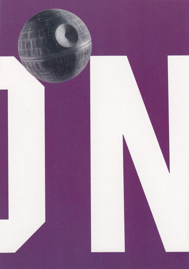
ODEON CINEMA
STAR WARS
“UCI IS NOW PART OF ODEON, THE BIGGEST NAME IN CINEMA”
Published by
BOOMERANG (rack cards)
This is another recent buy (originally this would have been free but it never turned up in my local Odeon cinema so I was unaware of it until I found it on a stall at the recent Woking Postcard Fair – so it cost me 75p, which is a fair price for an unusual ‘Star Wars’ themed postcard). All Star Wars fans would recognise the ‘Death Star’ from the first and third film, and it is its inclusion here which makes this simple postcard so collectible. Having looked at this one I do wonder if it is not part of a composite image made up from a number of postcards which once placed side by side make the word ODEON. I shall have to look out and see if there are any more. If you know the answer to this question please do message below and let us know.
19/05/2017
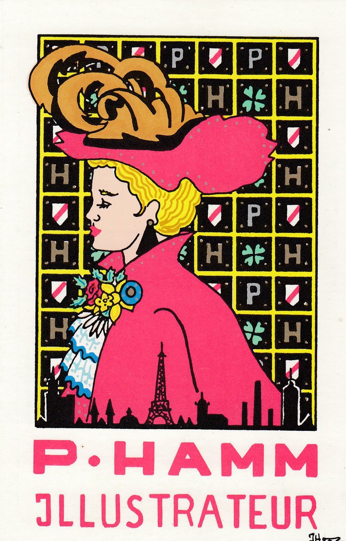
P. HAMM
ILLUSTRATEUR
(PATRICK HAMM)
Personal Advertising Postcard
Individually numbered Limited Edition of 600
(My copy here is number 426)
Patrick Hamm is a French modern postcard artist and throughout the 1980’s, 1990’s, and beyond, his ‘limited edition’ postcard releases have been extremely popular with many being valued at £10+, some much more. His postcards are easily spotted because of his very distinctive style, which, if I am going to be truly honest is one which does not appeal to everyone. It is also a style often described as quite simplistic, even sometimes quite childlike, and I can see this. His designs do not always appeal even to me, but I have still put together a small collection of his work, often also despite the cost of the cards many of which have cost me £8+. This postcard here has always been one of the more popular and expensive ones, in the past anyway, when Hamm’s cards were at their peak in value. A copy once sold for £30. Unfortunately, these days I would expect it to sell for anywhere between £8 and £18 depending on condition and assuming it is artist signed on the reverse side. This is also one of the earlier designs as well which adds value.
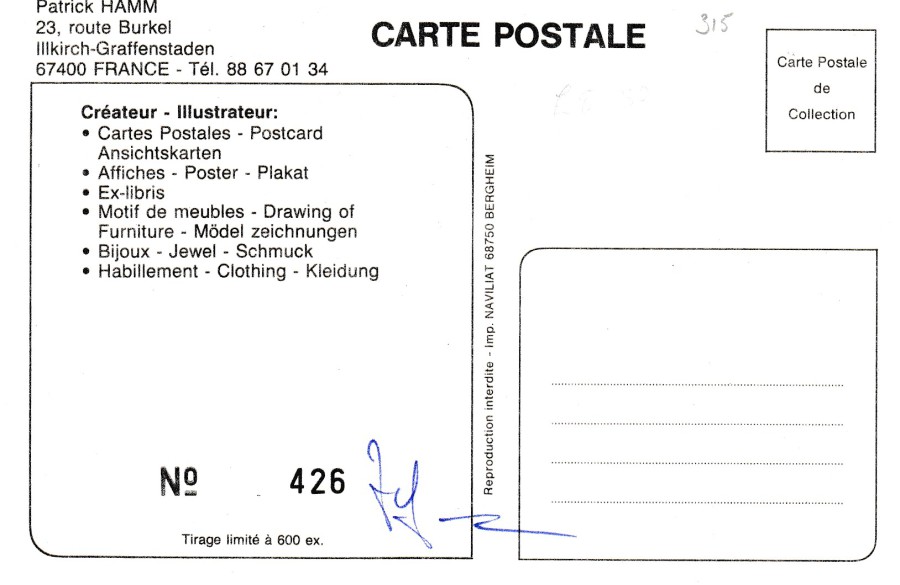
REVERSE SIDE OF ABOVE POSTCARD
The signature of Patrick Hamm can be seen beside the cards individual number – 426 – written with a blue ink pen. Not every card is signed but normally some of each design are and these ones are the ones more eagerly sought out by collectors of these postcards.
18/05/2017
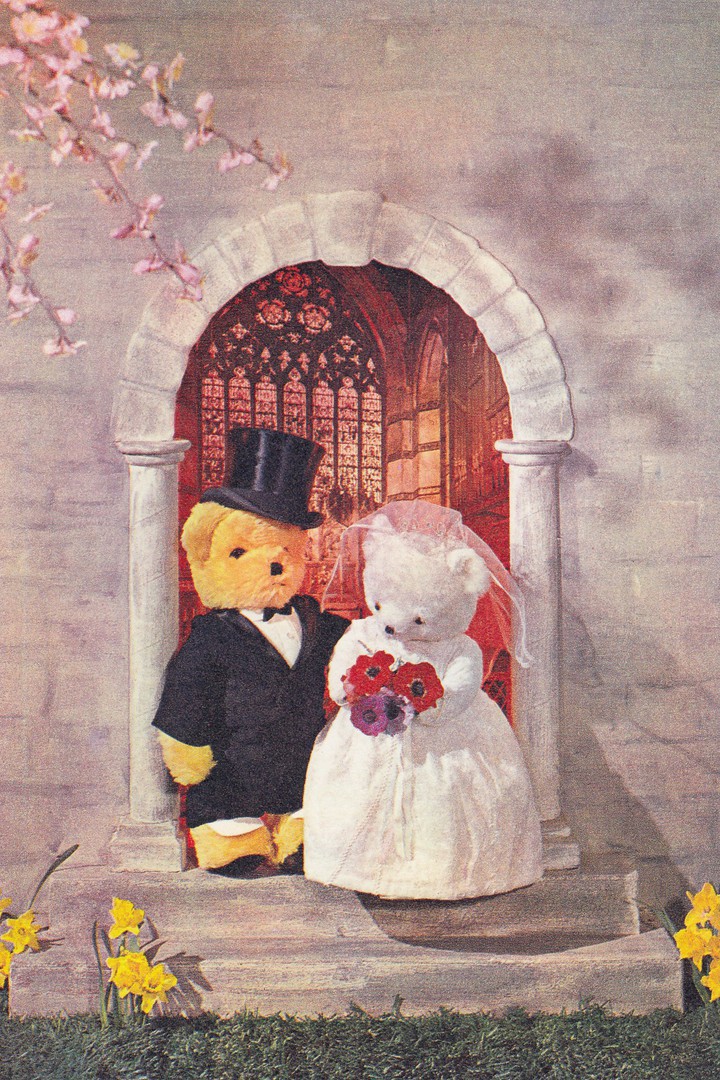
TEDDY BEAR’S WEDDING
J. ARTHUR DIXON LTD
Ref: C.P. 2245
It is a sad fact that Teddy Bear postcards are not as popular as they were ten, fifteen years ago. I don’t know why this is but it is not unique to Teddy Bear postcards as ‘Map’ postcards have gone the same way. Regardless of this sad fact I think Teddy Bear postcards still have charm, especially the earlier modern ones from the 1960’s and 1970’s (I think this one is from the early 1970’s). This one has a wedding themed image so could perhaps also have other uses as well…who knows.
17/05/2017
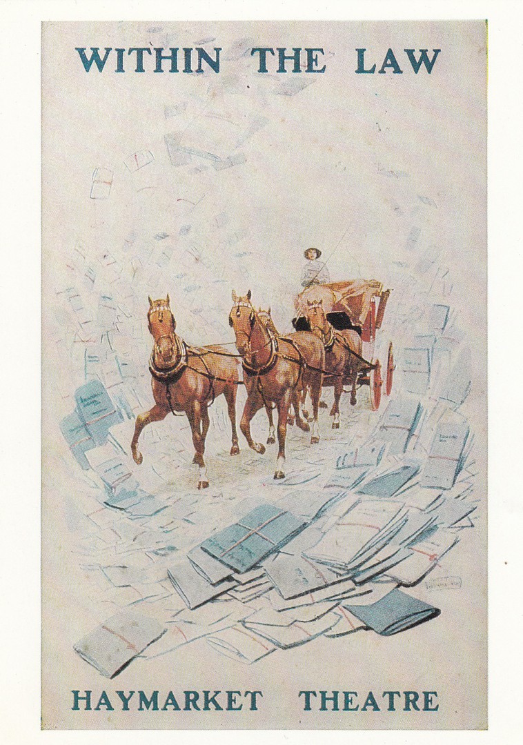
WITHIN THE LAW
HAYMARKET THEATRE
Theatre Poster
Published by
VICTORIA AND ALBERT MUSEUM
THEATRE MUSEUM
Ref: TM264
“Advertising postcard for the play ‘Within the Law’ first performed in London at the Theatre Royal Haymarket, 24 May 1913. From a design by Albert Morrow.”
(Text from reverse side of postcard)
This was a buy at the weekends Woking Postcard Fair. I wanted it for several reasons. It mentions the ‘Law’ so fits into my law and enforcement/police collection. It is also a poster design, and poster postcards have always been popular and collectible. Lastly, the design is really attractive.
17/05/2017
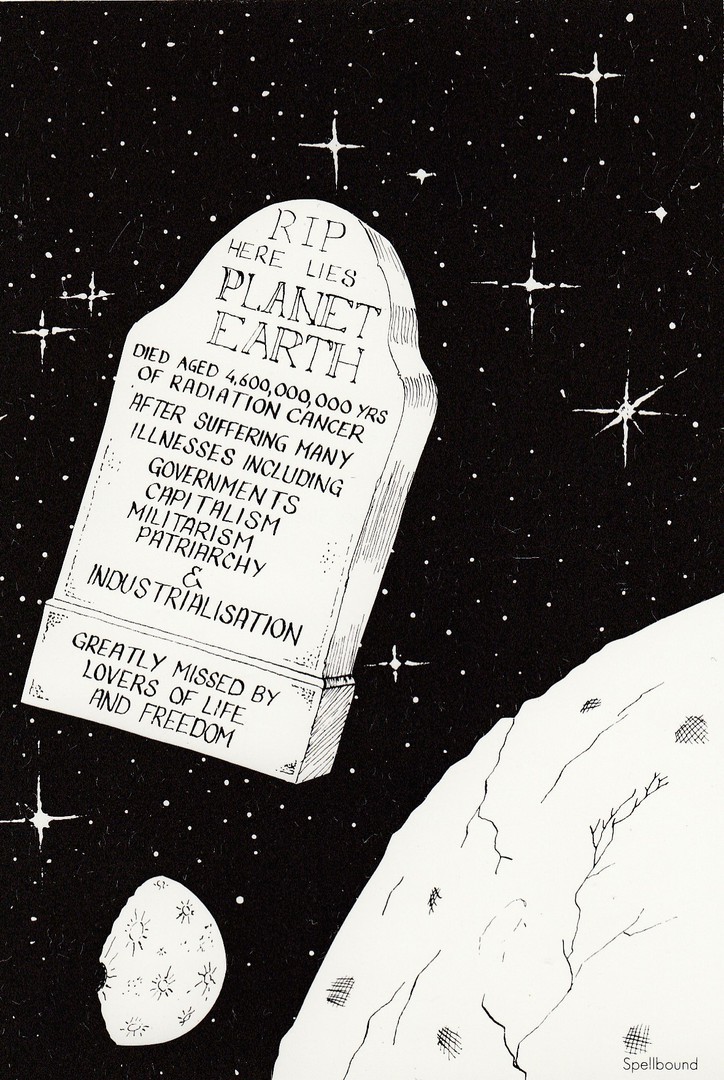
R.I.P.
HERE LIES PLANET EARTH
Published by
SPELLBOUND POSTCARDS
(Dublin)
Graphic: Marc
A cartoon postcard but one with a serious warning message. There has been a tradition of issuing postcards, especially comic ones, which have political or environmental messages incorporated within their design. This is a quite nice one which was printed by a company based in Dublin. This one was priced up as 75p, a fair price, but was found in a 20p box.
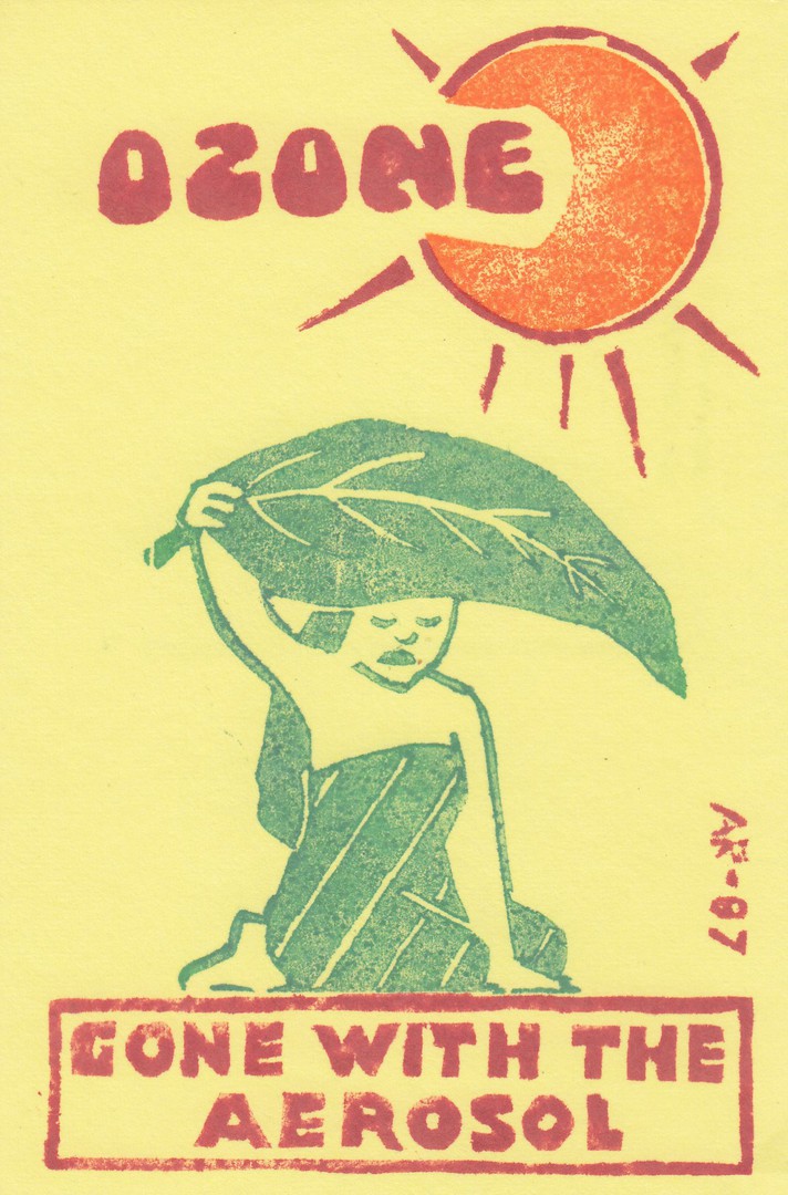
17/05/2017
OZONE
GONE WITH THE AEROSOL
1987 (as indicated by the AR 87 down the right side)
LINO-CUT STYLE individually produced postcard
Design by
ANN RUSNAK
In her
NEWSVIEWS series
Ref:
NEWSVIEWS # 4
“FLUOROCARBON PROPELLANTS ARE STILL LEGAL IN MANY NATIONS”
Although, perhaps not her best postcard release this 1987 release is of interest because of how these postcards were produced. They were individually produced by Ann herself using the old-style printing method of lino cut design pressing. I remember doing this when I was doing my O’ Level art back in the late 1970’s. Because these cards had to be hand-made they were not produced in high numbers and they are interesting when copies are closely examined as the images appear in slightly different positions on the cards. I have always liked these and I am a big fan of Ann’s work.

17/05/2017
PAINTED TIGER
Published by
ATHENA
CARTEL INTERNATIONAL LIMITED
Illustration by
KIM RAYMOND FRSA
Ref: CARTEL E2204589
Copyrighted to ‘Disney’ this is clearly an image of Tigger from the Disney ‘Winnie the Pooh’ animated films. I found this postcard at the Woking Postcard Fair and was surprised to see it as I had no idea this postcard had been issued. I must have missed it when it came out. This cost me 50p but I would happily have paid £2 for it as I really liked it when I saw it. A smashing addition to my ‘Disney’ themed collection.

17/05/2017
RMS TITANIC 100TH ANNIVERSARY
Published by
WHITE STAR MOMENTOS 2010
‘GIFTS FROM THE BIRTHPLACE OF TITANIC’
The construction of the Titanic commenced in 1909 and she was launched in 1911, and of course there was her famous, and tragic maiden voyage where she sunk after hitting the iceberg in 1912. This postcard here does not indicate which 100th anniversary it directly commemorates but it would logically be the fatal maiden voyage, so the assumption is that this was issued in 2012 (but this would need confirming as the 2010 that appears in the companies name causes me some interest as this may indicate otherwise).
As the text says this is from the birthplace of the Titanic I also assume this is from Northern Ireland. This cost me a £1, but Titanic related postcards are always slightly higher priced than other cards, especially the original ones, and limited edition modern ones..
16/05/2017
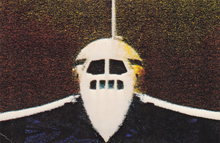
CONCORDE
(Although this postcard is not actually titled)
Published by
BUNCH OF ARTISTS (LONDON/NEW YORK)
(‘Flip it’ series)
(No reference number – and the details of artist are also missing)
By now people should have realised that I like Concorde postcards, I have certainly posted a few on this website. But, it is the more unusual ones which I find myself drawn towards. This one is typical of the unusual approach which appeals to me. Unfortunately, the company have supplied little information on the card itself. Never mind, I still like it.
16/05/2017
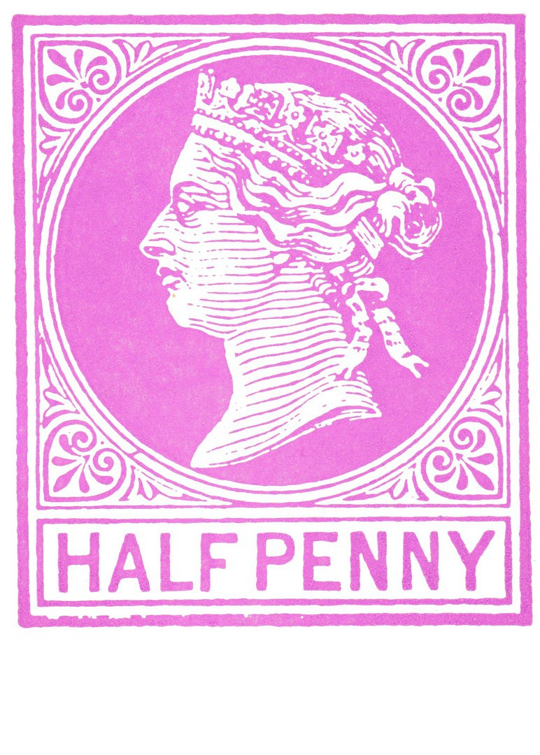
HALF PENNY QUEEN VICTORIA
Pre-Printed version as used on Postal Stationery Post Card
Published by
ALLEGRA STAMPS
“To commemorate the centenary of the first British post card which was issued by the General Post Office on 1st October 1870 and sold for the price of its stamp – one halfpenny”
(Text from reverse side of postcard)
As this commemorates the centenary of the first British post card it must have been issued in 1970. It is a nice commemorative and the image on the front reproduces the printed stamp that appeared on the first British post cards. The stamp design incorporates the head of Queen Victoria. Printing on the reverse side is in the same colour as used on the front.
16/05/2017
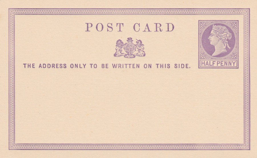
HALF PENNY BRITISH POST CARD
QUEEN VICTORIA
Britain’s very first Post Card
Issued on 1st October 1870
This is Britain’s very first post card, a postal stationery post card. It features a half penny stamp with Queen Victoria’s face on it. The cards were sold at the cost of the stamp so technically the card aspect was free, people just paid the cost of the printed half penny stamp. Although this was our first UK post card it is not a scarce post card as many thousands were printed and sold. A single mint card like this can be picked up for just a few pounds. It’s value though does not negate its historic position in the British postcard story.
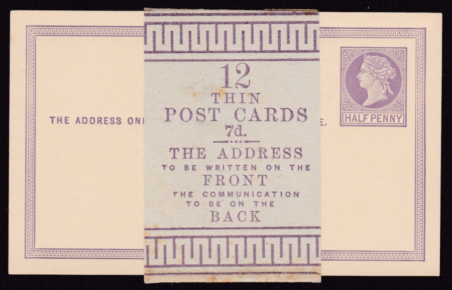
HALF PENNY BRITISH POST CARD
QUEEN VICTORIA
ORIGINAL SALES WRAPPER
Wrapped around a complete pack of 12 Post Cards
12
THIN
POST CARDS
7d
THE ADDRESS
TO BE WRITTEN ON THE
FRONT
THE COMMUNICATION
TO BE ON THE
BACK
Although the individual post cards are ‘fairly’ easy to obtain the original sales wrapper, as depicted here around a complete set of 12 of these post cards, is much harder to obtain. I have been very fortunate in obtaining this one here, which is also in very nice condition. I would expect to pay somewhere between £60 and £100 for this complete item.
15/05/2017
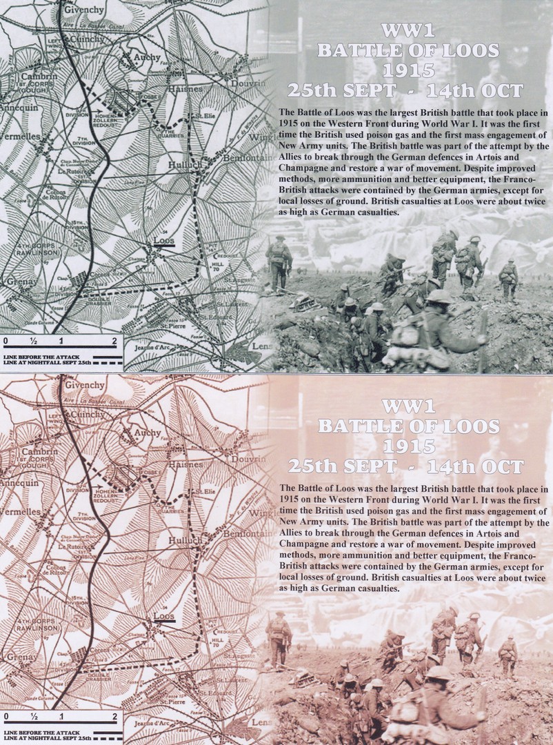
WW1
BATTLE OF LOOS
1915
25TH September – 14TH October
Published by
CoIR. CARDS
Ref: 2015.CR.189
As the text on the front of this postcard explains this was the largest British battle that took place in 2015, and, the first time the British army used gas. The engagement was not a success and the British army lost twice as many casualties as the Germans. Something the text does not inform us about is the large number of shells fired by British artillery which were duds, as I they did not explode. The number was so high it caused the subject to be mentioned in the Houses of Parliament. They were also so prominent that there is a Commonwealth War Graves commission cemetery in Loos called the ‘Dud Corner Cemetery’.
The two postcards depicted here are the same in design and reverse layout and reference number, but, hopefully you can see that they have been printed in different tones, decidedly clear different tones in my opinion, which is why I bought both. This I suspect was not done deliberately and resulted simply from the printing of a couple of batches being printed and they ended up this way.
I have visited the battlefields of Loos and the Dud Corner Cemetery and the area is littered with cemeteries and if you climb the small corner towers of Dud Corner Cemetery you can look across the fields over which the army advanced on the first day. Now as you look across these fields you can see lines of smaller cemeteries stretching out in front of you. It is a very sobering sight.
We visited a couple of these smaller cemeteries including one which was in the middle of a field and we had to walk through the corn to it. The area can still be dangerous as evidenced by me finding an unexploded British hand grenade in the same field. Lots of people visit the battlefields of The Somme and Passchendaele but Loos is also worth a visit. It is also the area where Rudyard Kipling's son John was killed, on the very first day of the Battle of Loos. His body was not originally found and his name appears on the wall at Dud Corner Cemetery along with all the other 20.000 soldiers whose bodies were not found after the battle and are recorded here. Many, many years later a body was found which has been identified (although there has been some dispute) as John Kipling. This body was given a proper burial and now John Kiplaing has an individual stone, so has both a stone marker and his name carved into the wall.
15/05/2017
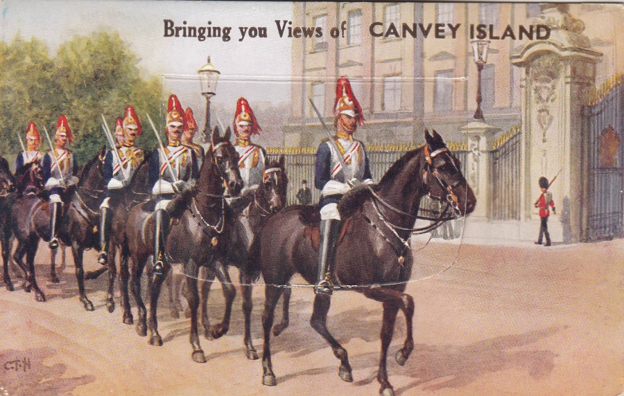
BRINGING YOU VIEWS OF CANVEY ISLAND
NOVELTY VIEW CARD
Published by
A.H.J. SERIES
Ref: 117
PULL OUT ‘NOVELTY’ POSTCARD
Now, I am not going to lie to you, but, I worked on Canvey Island for over seven years and I can say, with a high degree of certainty that this scene has never been seen on the Island! Quite clearly this is a scene of the Horse Guards out on parade in…. London, ‘definitely’ London, not, and I cannot say this loud enough, not, Canvey Island. But, having said this, I had a good laugh when I saw this postcard image being linked to Canvey Island, especially as I assume it must have been sold on the Island as well!! Was it worth the £8 it cost? To be fair that’s probably the top end of its value, but for someone who knows the Island well, and who lives not that far from it this was a must have item.
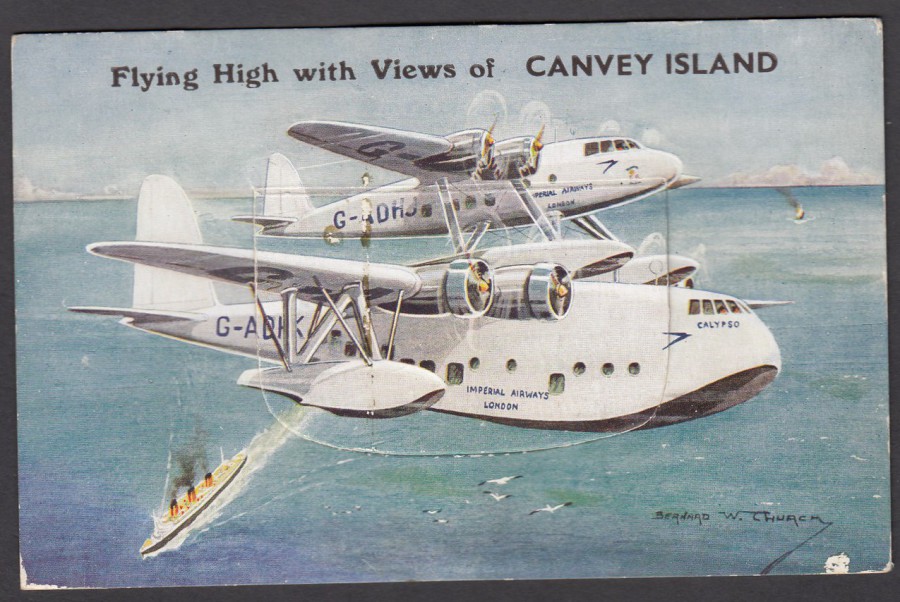
I have previously depicted this pull out postcard but thought I would show it again as it fits nicely with the above CANVEY ISLAND overprinted postcard
15/05/2017
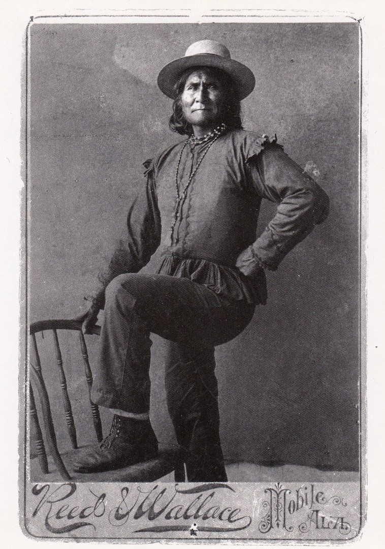
GOYATHLAY
“GERONIMO”
(1829 – 1909)
Photograph by Reed and Wallace Studio
Albumen silver print, 14.1 x 10.2 cm – 1890
Postcard Published by
NATIONAL PORTRAIT GALLERY NPG.80.246
(Printed in Korea)
I have just finished reading an old book, first published in 1970, called ‘Bury My Heart at Wounded Knee’ written by Dee Brown. It is described as an Indian History of the American West and it tells the story of the era between 1860 and 1890 when the Native Americans were removed from their homelands and pushed onto reservations and systematically hounded, and then, in every way had their tribal ways erased. It is a fascinating history, but not always an easy, or, in anyway, happy read. But, it is a book I fully recommend. It was after reading this book that I came across these two postcards, depicted here, at the weekends Woking postcard fair. Having read the book, I had to buy these two cards. I was especially intrigued because I have not seen this postcard in the National Portrait Gallery shop, and, as readers will know, I visit quite regularly and have posted many of their cards on this webpage. I think this one could be quite a few years old.
This postcard depicts a younger Geronimo than shown on the next postcard below.
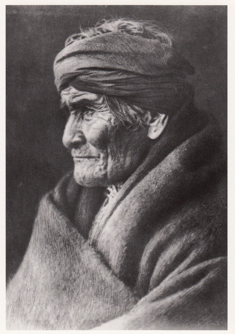
GERONIMO, 1905
Photograph by Edward S. Curtis (1868 – 1952)
Published by
POMEGRANATE PUBLICATIONS
Ref: 5438
Geronimo makes a number of appearances in the book ‘Bury My Heart at Wounded Knee’, and his story is typical of many of the fighting Indians who tried to obtain peace but who were then pushed into corners and abused by the traders and government officials, and especially certain army officers, and in in many cases forced to fight to try and regain or keep their hunting grounds. This image here is of a very old Geronimo.
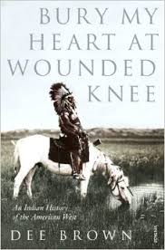
PHOTOGRAPH
Book Cover
If you have not read this book, and you have an interest in history, military or otherwise, then this is an extremely good read. It will give you an insight into the way the Indians, as they were then called, were treated.
14/05/2017
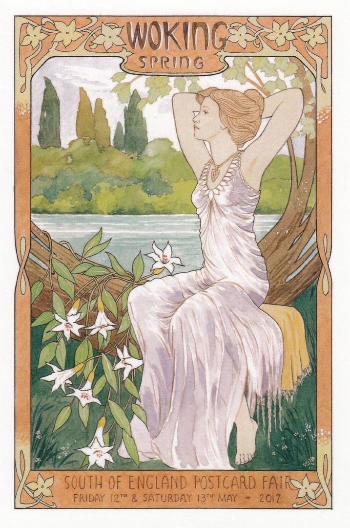
WOKING POSTCARD FAIR – SPRING 2017
SOUTH OF ENGLAND POSTCARD FAIR
Friday 12th & Saturday 13th May
Published by
THE POSTCARD TRADERS ASSOCIATION
Ref: PTAW4
Design by
John Pulham
Yesterday I attended the Spring ‘Woking’ Postcard Fair. Every attendee receives a special show postcard with the entrance fee (£2) and brochure. I have found these to be very attractive and this spring’s show postcard is no exception. I depict here my copy.
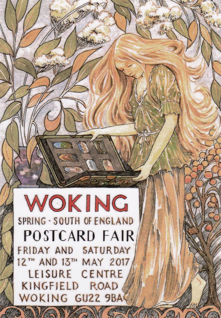
WOKING SPRING – SOUTH OF ENGLAND
POSTCARD FAIR
Friday 12th & Saturday 13th May
Published by
THE POSTCARD TRADERS ASSOCIATION
Ref: PTAW3
Design by
John Pulham
This year they also produced a pre-publicity postcard which was used to promote the fair in advance. This therefore also becomes a ‘Woking Fair’ official postcard although people were not automatically given a copy on the actual fair days. Fortunately, as I know the organisers, I did get a copy for my collection.
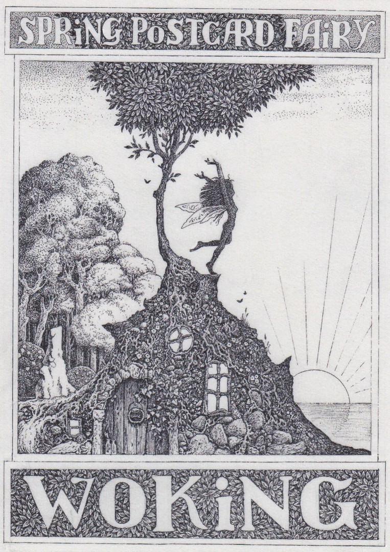
WOKING
SPRING POSTCARD ‘FAIRY’
Published by
BRIAN PARTRIDGE
In his
‘MICKLEGATE POST’ name
The artist Brian Partridge was also in attendance at the show and had display boards of some of the many postcards he has designed and painted. He also had a folder of some of the original artwork for these which were a delight to look through. He was also selling an exclusive postcard design which he had produced for sale at this event. This is the copy which Brian very kindly gave to me (I have known Brian for many years and we had arranged to meet up at the fair and have a chat).
I was told that when they announced Brian’s presence he had a number of people attend his stall and buy copies of this postcard, and, that many also had him sign them as well. When I spoke to a couple of the modern dealers present they also informed me that they had taken the opportunity to get Brian to sign some of his card designs that they had with them. Brian has always, on his not too common appearances, been happy to sign postcards for collectors.
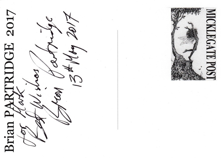
REVERSE SIDE OF ABOVE POSTCARD
Part of the front design has been used here to almost resemble a stamp like design in the top right corner. Brian also very kindly signed the postcard for me as well.
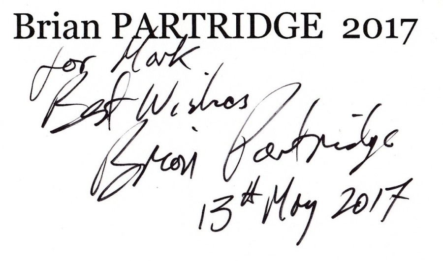
SIGNATURE AND DEDICATION BY
BRIAN PARTRIDGE
(From above reverse of postcard)
14/05/2017
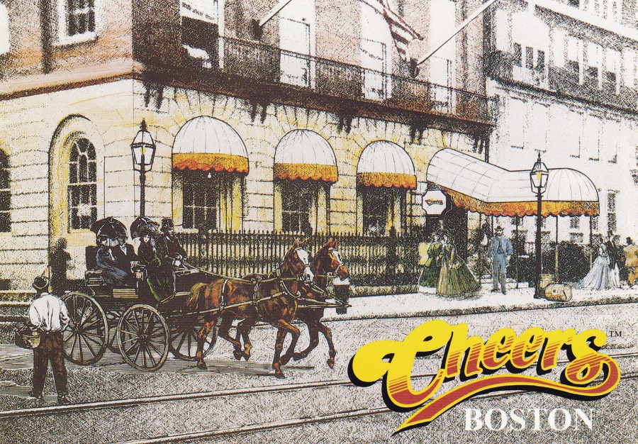
CHEERS
BOSTON
Published by
THE POSTCARD FACTORY BOSTON
Distributed exclusively by
THE CARD WORKS INC
Ref: PC57-BOS097
‘Cheers’ was an extremely popular American comedy series but so far the only postcards I have seen related to it are these official ones which I believe are sold in, or close to the building which was used as the outside view of the bar that appeared in the series, the inside was obviously a studio set up. This postcard depicts the outside of the bar in an image taken from the opening credits of the programme.
The series ran from the 30th September 1982 through to the 20th May 1993 and in all there were 270 episodes which were split across 11 seasons. The show was set in a bar in Boston, Massachusetts and involved a mixed bag of people who met there to drink and socialise and the staff who served them and ran the bar. The main character was Sam Malone (Ted Danson) the owner and a bartender at ‘Cheers’. His initial love interest was Diana Chambers (Shelley Long) but in later seasons, after Shelley Long left the series, she was replaced with Rebecca Howe (Kirstie Alley).
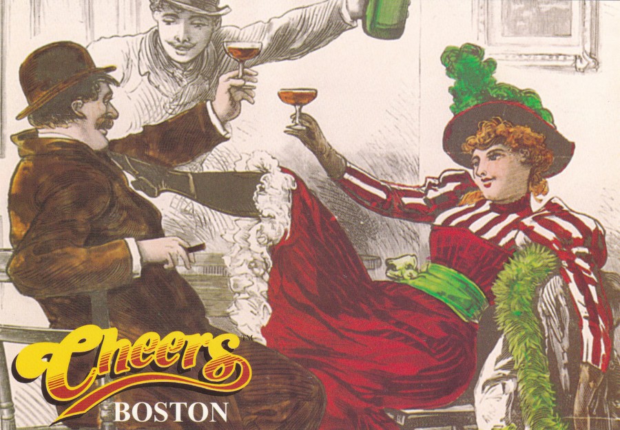
CHEERS
BOSTON
Published by
THE POSTCARD FACTORY BOSTON
Distributed exclusively by
THE CARD WORKS INC
Ref: PC57-BOS095
This is another image taken from the opening credits, this time depicting artwork of old time drinkers enjoying themselves. The opening credit sequence was a layover of drawn images which implied that the bar had been a bar for many years. These postcards, and others that I have seen which are photographs of the outside of the building are all ones which have been sold in Boston as souvenirs of a visit to the filming location. As such, these are only available to those who have visited here or when they appear on eBay, where unfortunately they are often £5 with an extra, often quite high, postage charge as well. So, these are rarely found in the UK in postcard collections.
12/05/2017
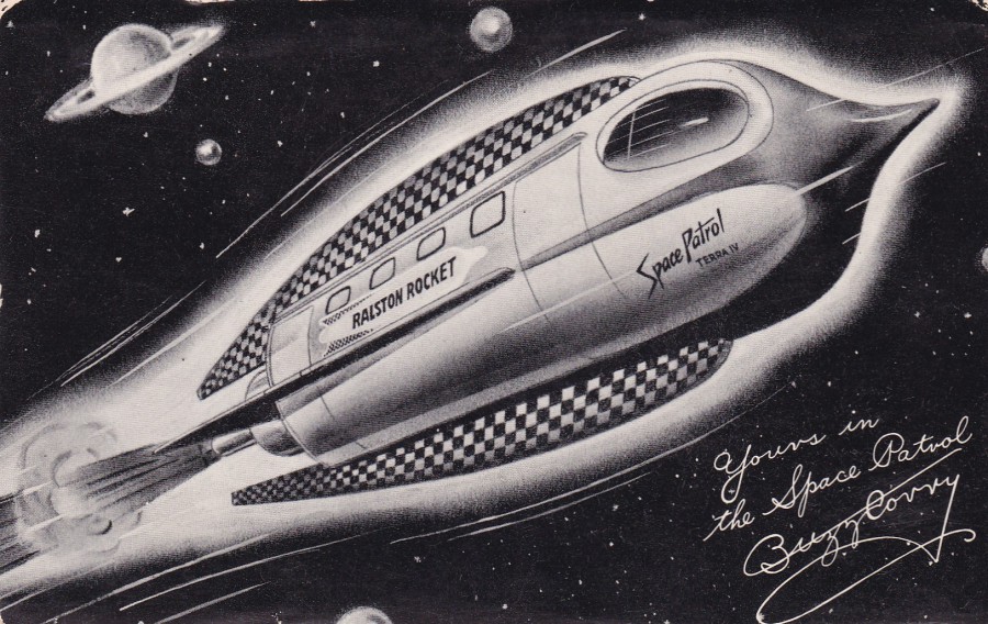
SPACE PATROL
TOP SECRET
Interior plan of the Ralston Space Patrol Rocket Ship
“Don’t miss Buzz Corry “Space Patrol” on TV and Radio”
COLLECTOR CARD Ref: C 2235B
Printed in the U.S.A.
Although this is the same size as a postcard it is not a true postcard but is in fact a collector card, which has information text on the reverse side. These large cards were very popular in America, especially where they depicted something with a television connection (the theme of television was very collectible in the 1950’s and 1960’s in America and cards like this were eagerly picked up, especially ones like this with a science fiction theme, which was becoming very popular around this time).
Space Patrol (The American programme which this item relates to – there was also a UK TV series of the same name which was from the 1960’s, but this a different entity) was a science fiction series supposedly set in the 30th century.
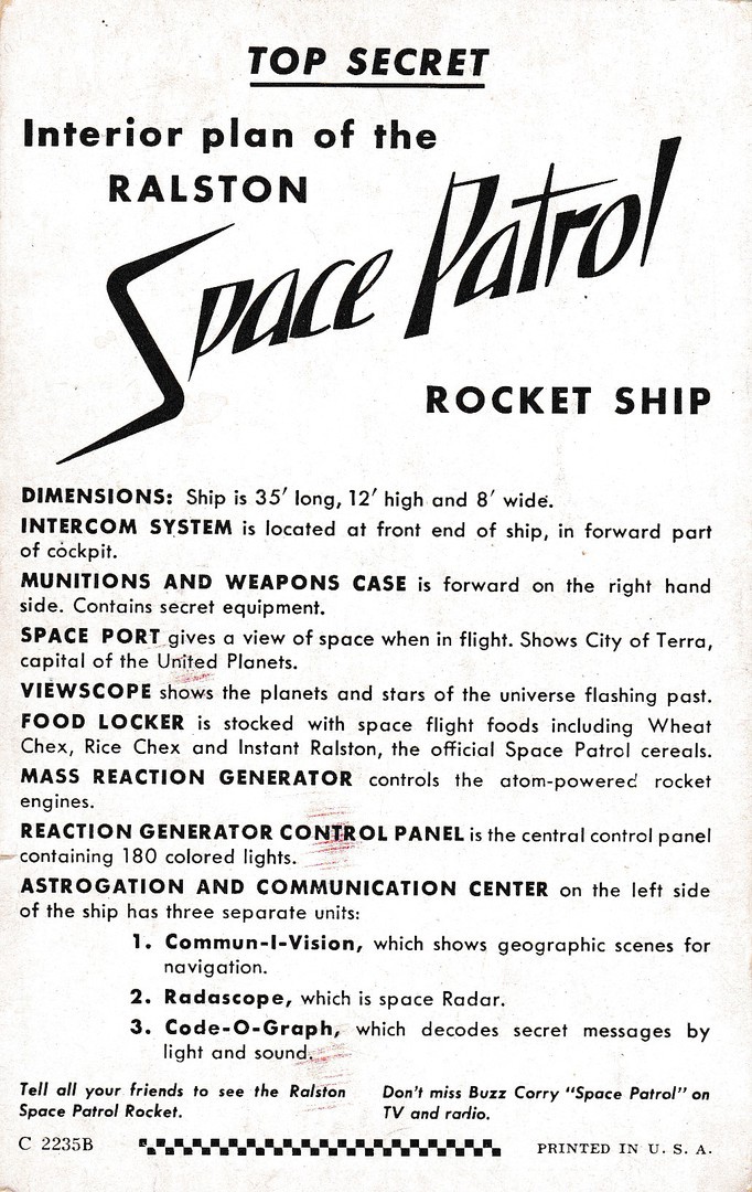
REVERSE SIDE OF ABOVE CARD
Here you can see the difference between this and a true postcard
The programme was both a radio show and a television show, and a comic book series. Although aimed at children the programme built up quite an adult audience.
The television show first went out on the 9th March 1950 on what was a 15 minute, Monday through Friday series broadcasted on a local Los Angeles station, KECA. On the 30th December 1950 the ABC (American Broadcasting Company) channel added a half-hour version of the program on Saturday’s. From this it became an overnight sensation. Both the 15 - minute weekday shows and the half-hour Saturday shows continued. In 1953 a 30-minute episode became the first U.S. TV program to be in 3D, it was broadcast on the 29th April. It also broke records by being the first regular live morning West Coast network programme beamed to the East Coast, via a complicated network of cables and relay stations.
The radio series was also popular and ran from 18th September 1950 until the 19th March 1955 and 129 thirty-minute episodes were produced.
The television series aired continuously until the 2nd July 1954 and then returned, after a short break, on the 4th September 1954 and again ran through until 26th February 1955. In all they showed 210 half-hour episodes and close to 900 of the 15-minute shows.
Space Patrol featured a Commander-in-Chief called Buzz Corry (Ed Kemmer) of the ‘United Planets Space Patrol. He had a sidekick who was younger than him and called Cadet Happy (Lyn Osborn). It is interesting to note that many of the villain’s they fought against had Russian or German accents, which I suppose is no surprise considering when it was made. I also like the fact that the show was originally pitched as a cop show in outer space and that it did evolve into an intergalactic space police and military force themed show.
Being such a popular show there was naturally a number of tie-in items of merchandise, including this card, but also toys that could be sent off for including mail-order premium items.
I picked up this particular card at a fair in Florida last year from a specialist dealer in these items. It cost me $8 and the dealer was full of information about it and it seems it is a very collectible card as the show is still collected by many who remember it as a child (they would now be in their 60’s or 70’s, the original viewers). As a TV collector, I was really pleased to pick this up and I think it is a cracking piece of American TV history.
12/05/2017
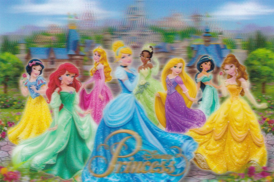
DISNEY PRINCESS
3D POSTCARD
Official Walt Disney World Theme Park Postcard
Other than Mickey and Minnie Mouse I think the princess’ appear on more postcards published for sale in the theme parks than any other characters. For a number of years now the parks have been selling 3D postcards, which, despite the often ‘high’ cost are still extremely popular. Unfortunately, they do not often scan very well so the picture here does not show the postcard image at its best.
This image here is right up to date as it includes Rapunzel, from the 2010 animated film ‘Tangled’ and ‘Tiana’ from the 2009 animated film ‘The Princess and the Frog’. Both the new princess have been very popular and when you walk around the theme parks you do see lots of young girls dressed up as Tiana.
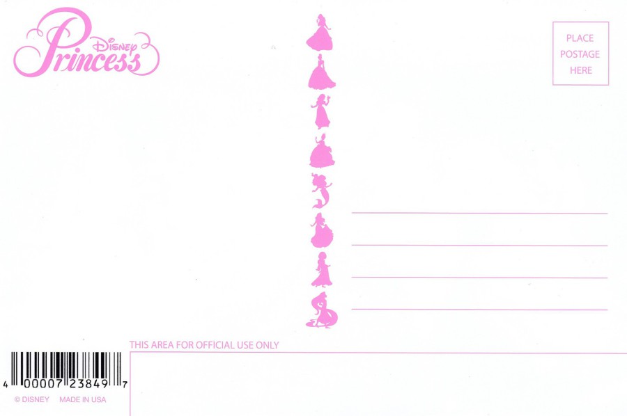
REVERSE SIDE OF ABOVE POSTCARD
I do like the way they make the reverse side of these cards attractive to the eye as well – this one is surely designed to catch the eye of young girls visiting the park shops
12/05/2017
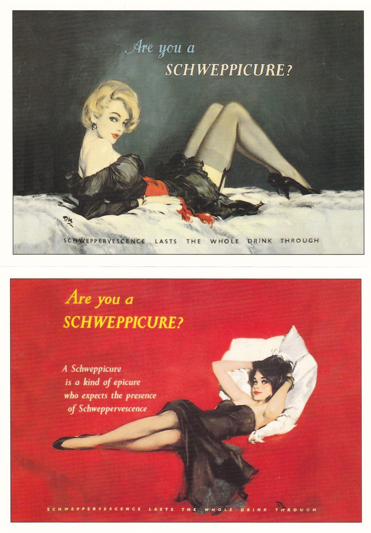
Published by
THE ROBERT OPIE COLLECTION
In their:
“SCHWEPPES PIN-UP SERIES (A)”
TOP
“SCHWEPPERVESCENCE LAST THE WHOLE DRINK THROUGH”
BOTTOM
Ref: 01PU01
“A SCWEPPICTURE IS A KIND OF EPICURE WHO EXPECTS THE PRESENCE OF SCWEPPERVESENCE”
Glamour has always been a popular theme, in all its different guises, but good quality advertising material like this is not only collectible but also captures the advertising style of a different era. Glamour has always been used to sell products and for a while there was a style called ‘The Pin-Up’ which was in common use. These images here are of that style, although from the later end of the popularity of this approach.
These are postcards from the extensive collection of advertising material held by Robert Opie. No matter whether you are a postcard collector or not I guarantee you will have come across his postcards somewhere in the country, a museum, specialist shop, stately home, castle or other historic location. I have mentioned here, and in my regular ‘Picture Postcard Monthly’ articles that I believe that Robert is on his way to conquering the ‘Postcard’ world and I suspect there are more of his postcards on sale than that of almost any other company. The designs, all advertising material, appeal to our sense of nostalgia and interest in history, something which has become a popular theme with lots of people regardless of what they collect. The clever thing with Robert’s issues is that although he does issue postcards depicting Victorian items he also has postcards showing items from the 1960’s, 1970’s and even the 1980’s, all of which are periods which we look back on fondly and which even younger people can remember in one way or another. Thus, these images are always popular, things like ‘Space Dust’, Chopper bikes, Dan Dare toys and similar items have all been depicted.
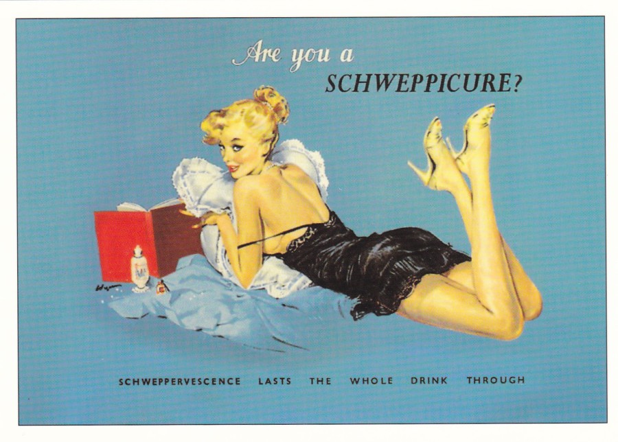
ARE YOU A SCHWEPPICTURE?
Published by
THE ROBERT OPIE COLLECTION
In their:
“SCHWEPPES PIN-UP SERIES (A)”
Ref: 01PU04
“SCHWEPPERVESCENCE LAST THE WHOLE DRINK THROUGH”
Another one in this series (I must hunt down card 01PU03 – as I have no doubt that cards image fits into this collection). I remember Schweppes, and I believe the drinks are still being made, you know, tonic’s, ginger ale and lemonade and the like. I think their tonic water is quite famous and I particularly remember those little small rectangular bar towels which had the company’s name across them which were on the bars in most clubs, pubs and drinking establishments.
12/05/2017
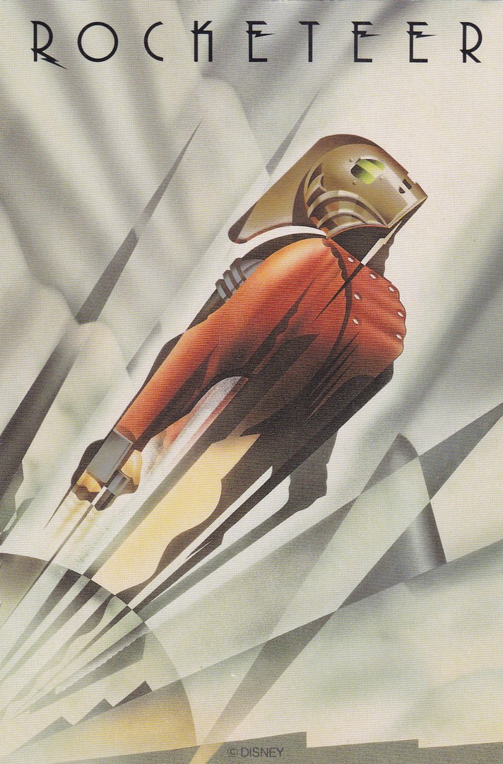
ROCKETEER
‘DISNEY’
‘DISNEY STORE LTD’
The Rocketeer was a Disney film released on 21st June 1991 (it was filmed between 19/09/1990 and 22/01/1991) and starred Billy Campbell as the main character with the story being set in 1938 Los Angeles, California. The films story has a stunt pilot who comes into possession of a rocket powered jet pack and through its use comes to the notice of many parties including Howard Hughes, the FBI and the Nazi’s (who were responsible for the Jet Packs original theft).
This card is a nice poster styled artwork image and I received it in a bundle of odd ‘Disney’ postcards. At first I assumed it was a proper postcard but when I turned it over I found it was actually some sort of Disney Store receipt card for a store item. I am not sure if this is a receipt for an item taken away by the buyer or a card handed out confirming that the item has been paid for but which could be collected later upon production of this card. Either way, I suspect this is a scarce item as I have never come across one before.
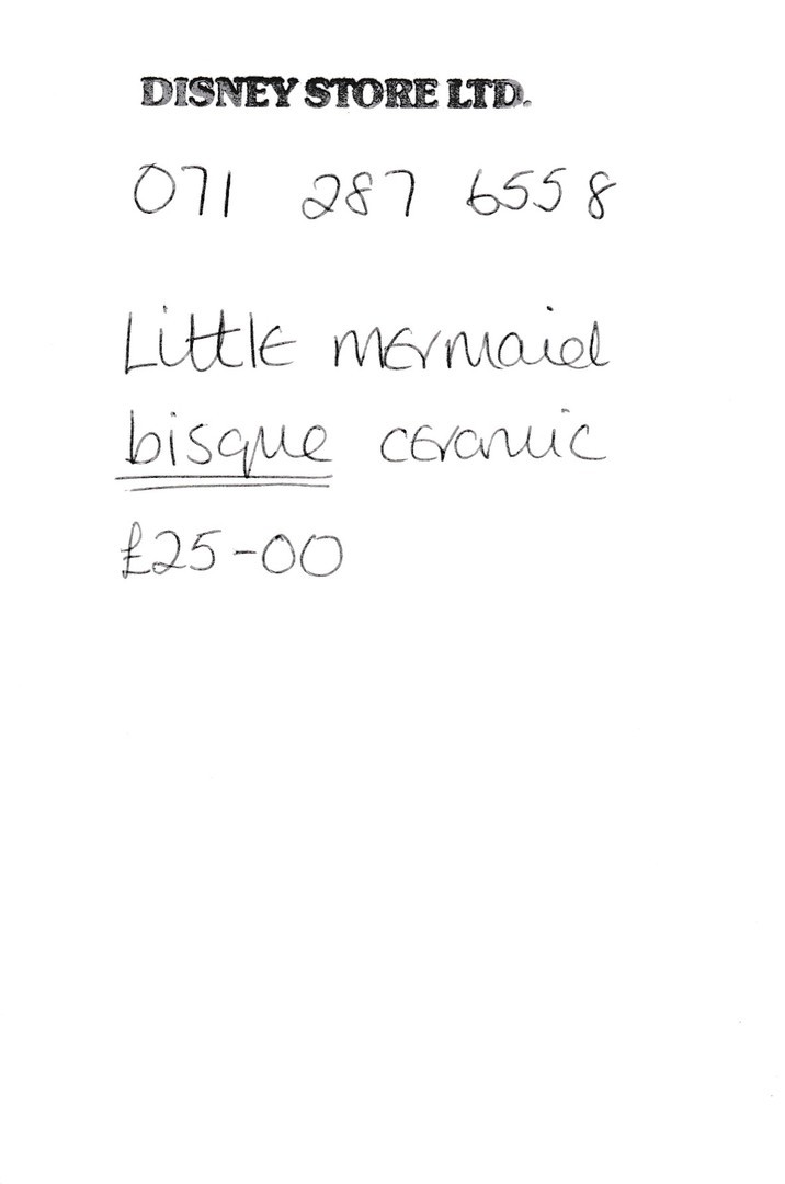
REVERSE SIDE OF ABOVE CARD
Here you can see this was used as a receipt styled card where someone had bought a ceramic ‘Little Mermaid’ item.
(Reduced)
12/05/2017
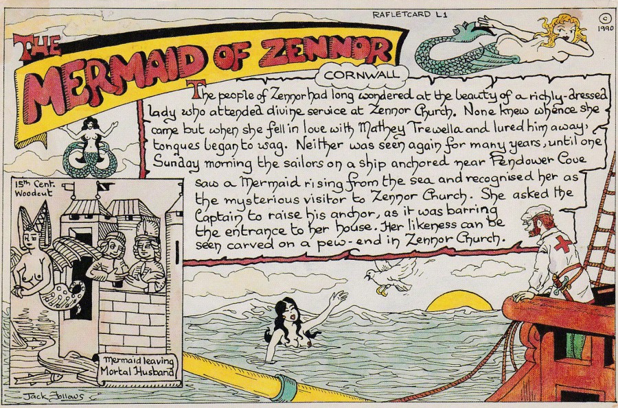
THE MERMAID OF ZENNOR
CORNWALL
Published by
RAFLET STAMP CLUB
“Legends, Folklore and Apparition Series”
Ref: Raflet L1
Limited issue of 1000
Published 1991
Artwork by
Jack Follows
I believe that this is the first Jack Follows design I have posted. He was responsible for a wide range of postcards through the 1980’s and 1990’s, many of which were for postcard clubs and fairs. His artwork was always recognisable and t the height of his work he was very collectible. This one is a quite unusual card but tells an interesting old tail and it is another from my side line collection of ‘Mermaid’ themed postcards.
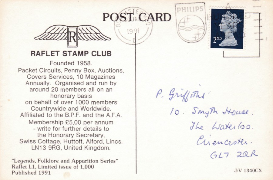
REVERSE SIDE OF ABOVE POSTCARD
Details are given here about the ‘Raflet Stamp Club’. They produced a number of postcards around the early 1990’s. This also has a nice ‘PHILIPS – A HUNDRED YEARS AHEAD’ slogan postmark for Doncaster 1991.
12/05/2017
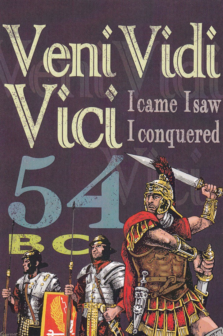
VENI VIDI VICI
I CAME, I SAW, I CONQUERED
54 BC
Designed and Printed in the UK for –
ENGLISH HERITAGE
Ref: 64464 PC VVV Postcard
This is another of the superb ‘English Heritage’ issued postcards with a Roman era connection. Designed like a poster this is great card and reasonably priced at 60p.