27/04/2018
Today I have added some cards to the CENSORED section, and a single card to the BULL FIGHTING page (under CENSORED) and several books to the BOOKS page (under BOOKS 2)

27/04/2018
SILVER WEDDING
OF
THE QUEEN
AND THE
DUKE OF EDINBURGH
1947 – 1972
First Day of Issue used
Maxi-Cards
Published by
PHILART PRODUCTIONS LTD
These postcards were printed ‘especially’ to receive the 3p and 20p Silver Wedding GB (UK) stamps issued on 20 November 1972. Here one stamp has been applied to each card and then cancelled with the Windsor, Berks first day of issue special hand stamp.

27/04/2018
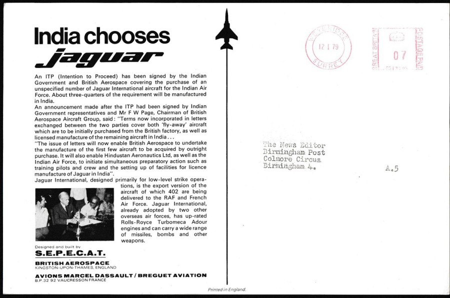
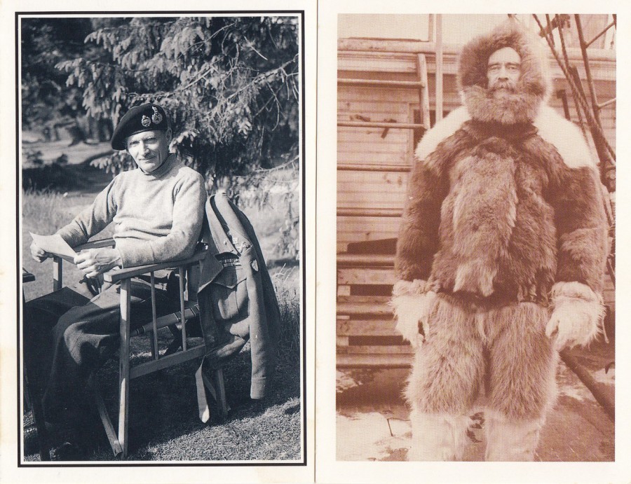
… AND NOW INDIA SELECTS JAGUAR
Official publicity postcard
1979
This ‘Massive’ large postcard was used by the company to advise newspapers and other publicity papers about a deal the company had made with India. The size of the card appealed to me and the fact that I suspect that not too many of these have survived and that it was used. All the details are on the reverse side of the postcard depicted below.

27/04/2018
FRENCH
CARTE POSTALE
‘Postcard’
When I was last in France a few weeks ago I, as previously mentioned, and depicted on the facebook page, visited a little antique collectors shop which specialised in postcards, money and stamps. Whilst here I found a box of these early – 1870’s – little postcards, and when I say box I mean a box of what must have been three to four ‘HUNDRED’ of these cards.
I picked out six of these for my collection as I liked their design and smaller size. I picked out three with 10 cent stamps and three with 15 cent stamps, and I tried to choose the ones with nicer writing and general look.
Text in French across the top reads:
PRIX pour la FRANCE et l’Algerie : 10 centimes pour la meme ville
ou la circonscription du meme bureau : 15 centimes du bureau a bureau
PRIX pour les PAYS ETRANGERS avec lesquels l’echange des Cartes
postales est authorise : 15 ou 20 centimes suivant la destination
(Translation: )
PRICE for FRANCE and Algeria : 10 cents for the same city
or the constituency of the same office : 15 centimes from the office
PRICES FOR FOREIGN COUNTRIES with whom the exchange of cards
is allowed : 15 or 20 cents depending on the destination
Down the left side there is the following text:
L’addresse seule doit etre mise de ce cote de la carte
L’autre cote est reserve a la correspondence
(Translation: )
The address alone must be put on this side of the card
The other side is reserved for the correspondence
And lastly, there is a box f text down the right side of these postcards. This text reads as follows:
Lorsque la carte est a destination
d’une ville, indiquer tres-exactement la
rue et le numero de la maison.
Quand elle est destinee pour une
commune rurale, indiquer le nom du
bureau de poste qui la dessert
(Translation: )
When the card is at your destination
of a city, indicate very exactly the
street and the house number.
When she is destined for a
rural municipality, indicate the name of the
post office that serves it.
The top card was destined for Lille, and as 10 cents was used for postage I must assume it was locally posted as well, if the above instructions were stuck to. This was posted in 1878
The bottom card was for Rouen under the same rules as the above card although here I can not make out the year of postage, but I liked the boxed HOTEL ALEXANDRE cachet applied in the top left corner.

TOP
Another posted within and to a Rouen address. The stamp has a tab attached to the left side which I quite liked. I am not positive, but I think this was posted in 1877.
BOTTOM
The bottom one here is addressed to Loiret but it was posted from another area as a 15 cents stamp was used. Unfortunately, the other handstamps can not be made out so the location it came from is unknown. This one was ‘definitely’ posted in 1877.
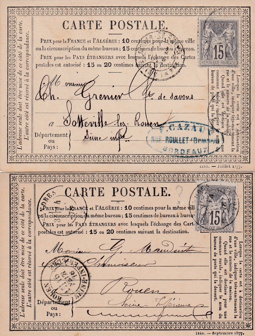
TOP
Posted from Bordeaux to Sotteville-les-Rouen (in the Normandy region of Northern France) with cancellations for both locations, although the Bordeaux ones are feint. This also has a nice oval cachet bottom right which I suspect is from either a shop, company or retailer of some sort, located in Bordeaux. Posted 1877.
BOTTOM
Posted to Rouen Seine-Inferieure from a location which I can not quite make out on the other hand stamps, and my knowledge of French locations is not that great (and someone else has tried to make it out as well and pencil marked a ‘?’ beside the hand stamp top right. As a 15 cents stamp has been used we can at least say it was from another area of France.
So, these were the six that I bought, and I was quite pleased with my selection. I could easily have picked out more but these ones seemed to be the most interesting ones that I found, and they were a bargain at just 50cents each – a bargain I thought (perhaps I should have bought more….. )
26/04/2018
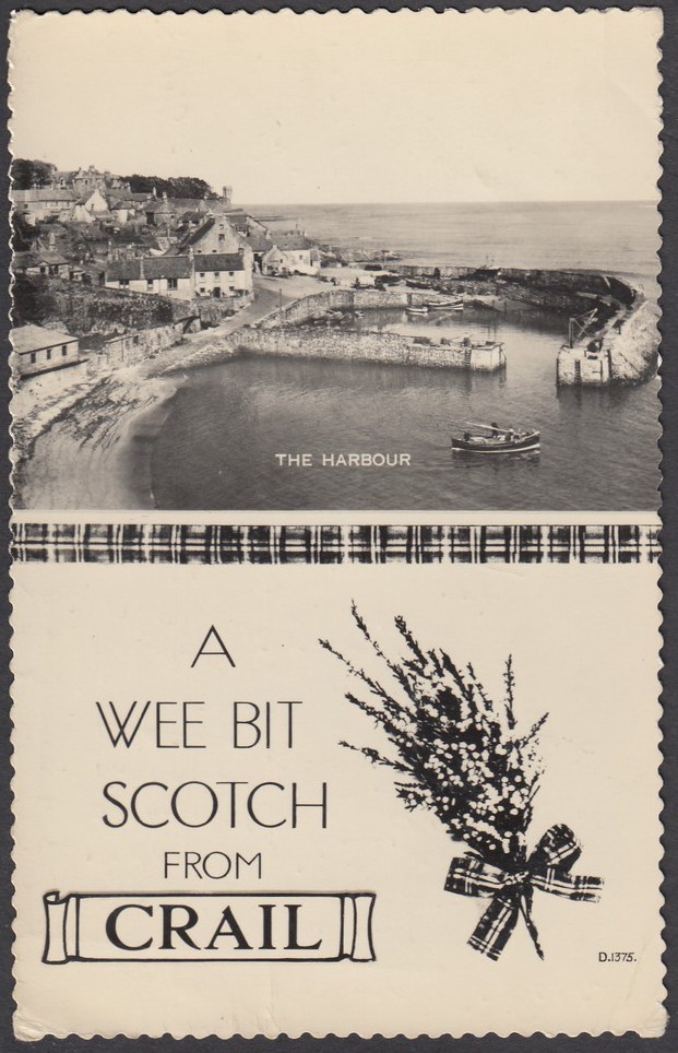
A WEE BIT
SCOTCH
FROM
CRAIL
‘THE HARBOUR’
Published by
VALENTINE & SONS LTD, DUNDEE
‘VALENTINE’S REAL PHOTO’
Ref: D. 1375.
A Scottish deckle-edged postcard which was posted to America in the 1960’s, I suspect the early 1960’s but the date is unclear beyond the first ‘6’ of the year tab. As it is deckle edged this leads me to suspect it is from the earlier years of that decade. It is a simple design, but an attractive early post WW11 one which incorporates a topographical photograph with an extra postcard sentiment half as well, combining elements to make for a more interesting design.
I have always preferred, with no real reason as to why, postcards that have been posted from the location to which they are connected. It seems right to me that a postcard like this, depicting a scene from Crail, Scotland, should have been posted from Crail and have a 'Crail' postmark cancelling the stamp - this one does. I know that there are some people, quite a few really, who collect postmarks, and they seek out postcards as often these are the best source of postmarks from smaller locations around the country (and the world for that matter). Many postcards have entered the collection of a postmark collector, and why not, as the reverse side of postcards can often be no less interesting than the front.
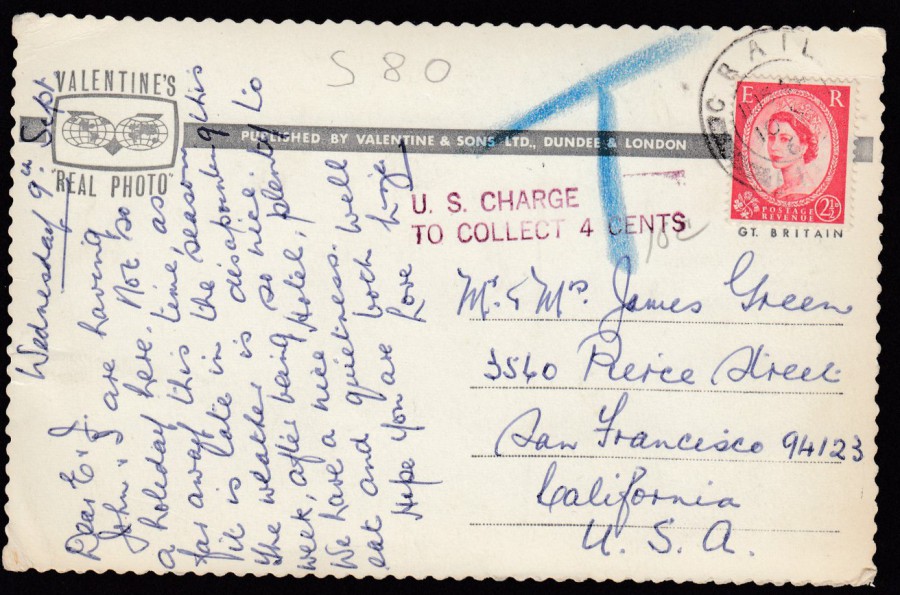
REVERSE SIDE OF ABOVE POSTCARD
This was posted to North America but a 2 ½ d Wilding QEII definitive was used as postage, but this was the postcard rate for UK addresses only so the postage was underpaid. Therefore, it received a purple US Charge to pay cachet/mark:
U. S. CHARGE………….
TO COLLECT 4 CENTS
This charge was to be collected by the receiver of the postcard, Mr & Mrs Green in San Francisco. The big blue 'T' coloured pencil mark is an indication that 'to-pay' tax is required here because the card has underpaid postage. It was a way of noting that money was due.
26/04/2018
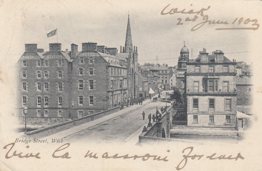
BRIDGE STREET,
WICK
Anonymous Publisher
Posted to Italy in 1902
Wick, for those who do not know, is a town and royal burgh in Caithness, in the far north of Scotland. This very early undivided back postcard has a cracking black and white photograph which I suspect is packed with local history information. I have never been here but sometimes I look at a postcard on a stall and something about the image fascinates or interests me, and that was the case with this one. It did not hurt the case that it was a cheap card either, another of those 50p buys which I can never resist.
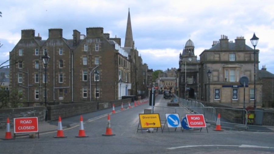
PHOTOGRAPH
I am not sure when this was taken, but fairly recently, but it shows that it has not changed that much by the looks of it.
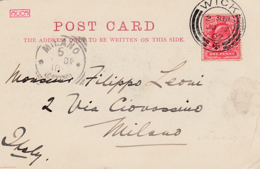
REVERSE SIDE OF ABOVE POSTCARD
Posted from WICK, with a superb double arc circular date stamp (type 9/25 in the Stanley Gibbons Postmark catalogue) cancelling the 1 penny stamp – dated 2 JU (July ?) 1902. Addressed to Milano (Milan), Italy it has received a Milano (Milan)receiving mark of indistinct date.

26/04/2018
DUNBLANE HYDROPATHIC,
PERTHSHIRE
Anonymous Publisher
Posted 1911
This is now known as the Doubletree by Hilton Dunblane Hydro, a hotel, but it was once the Dunblane Hydropathic Establishment, opened in 1878. This was a Victorian health spa resort where you could drink the local spring water and enjoy (if that is the right word) a range of hydropathic treatments. As times changed the guests came for the countryside and outdoor activities. During World War I the building was first used to house evacuated girls from a boarding school and later as a centre for convalescing soldiers on leave from the front trenches.
When the structure was to be ‘Opened up’ again as a new hotel in 1946 the opening (or ‘grand re-opening’ as it was called) was badly affected by a fire which caused extensive damage to the buildings north wing, still extensively damaged and shut off when the hotel was re-opened a week later.
In 2009 the hotel was bought by the Ability Group who spent £12 million on a refurbishment and it is now a well-known and well-respected hotel, one where the 2012 Olympic Torch visited.
Not a bad little old story behind an old postcard which I picked up for just 50p.
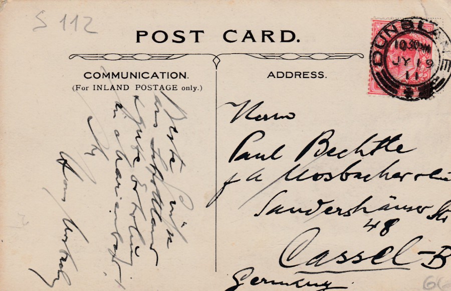
REVERSE SIDE OF ABOVE POSTCARD
Posted to Germany in 1911
26/04/2018
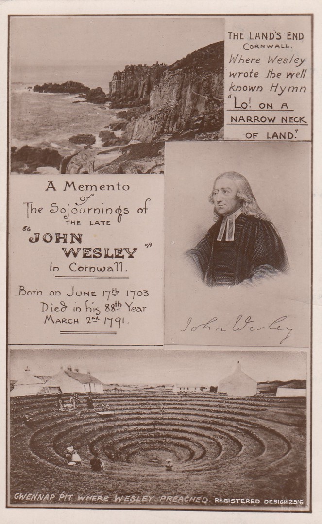
JOHN WESLEY
A MEMENTO OF THE SOJOURNINGS OF THE LATE
JOHN WESLEY IN CORNWALL
BORN ON JUNE 17TH, 1703
DIED IN HIS 88TH YEAR
MARCH 2ND, 1791
Published by
PHILIP’S PHOTO SERIES,
TRURO
This is an interesting religious themed design from Cornwall. I know that John Wesley has a very dedicated band of thematic collectors. I know one of these myself as he is a member of one of my stamp clubs, he will buy anything that is John Wesley related. He does not have this card and is a bit jealous that I picked it up for just 50p at a recent Stampex show. I think this a nicely constructed design, with the portrait and photographs of locations connected with the life of John Wesley. Although I do not specifically have an interest in religious based postcards I can still recognise an interesting one when I see it.

25/04/2018
GARRY PARSONS
ILLUSTRATOR
Published by
BOOMERANG (Cinema)
This is another example, two, actually, of an artist using the Boomerang postcard new artist facility where they would publish your artwork and distribute it around their free racks. I believe these two cards appeared at the same time, or at least very close together. These are simple, but they appeal to me – and they were free of course (at least originally, not now though as you will need to hunt them down from a dealer or on eBay)


25/04/2018
CHINA
POSTAL STATIONERY POST CARD
NAVAL MILITARY THEME
I have little knowledge of the Chinese Postal Stationery post card issues, but this does not mean I will not pick them up if I find really cheap ones like this one, which cost me just 50p at a recent Stampex show. As a collector of Military themed postcards, old and modern, I liked the image used and it’s a lovely card.
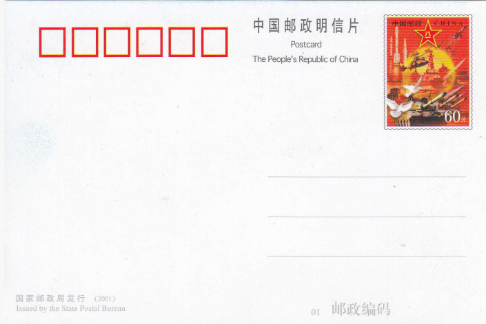
REVERSE SIDE OF ABOVE POSTAL STATIONERY POST CARD
With pre-printed stamp
25/04/2018
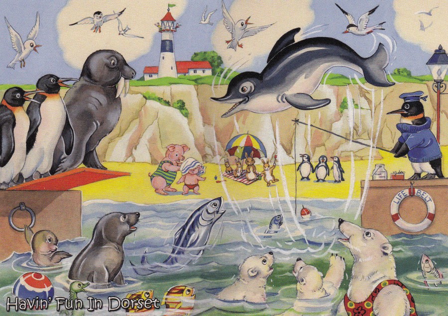
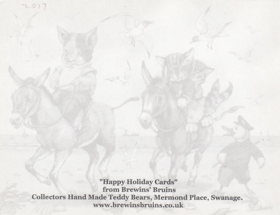
HAVIN’ FUN IN DORSET
Published by
HAPPY HOLIDAY CARDS
For
BREWIN’S BRUINS
THE SWANAGE TEDDY BEAR SHOP
(5 MERMOND PLACE)
This is a good example of why it is always worth looking around when you visit somewhere new. This was found in a Teddy Bear shop and is an exclusive to them. Lots of cartoon animals here in a design which is a bit ‘Enid Blyton’ like with a 1950’s, 1960’s feel to it.
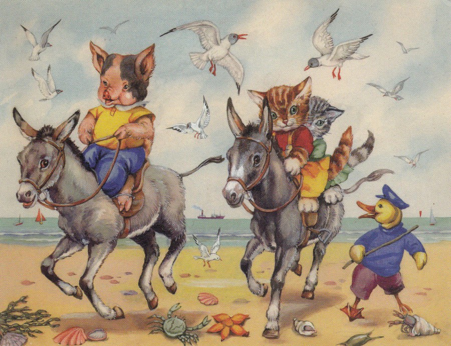
UNTITLED
Published by
HAPPY HOLIDAY CARDS
For
BREWIN’S BRUINS
THE SWANAGE TEDDY BEAR SHOP
(5 MERMOND PLACE)
REVERSE SIDE OF ABOVE POSTCARD
Nice faded background image - makes the back almost as interesting as the front
24/04/2018
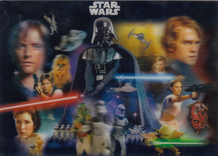
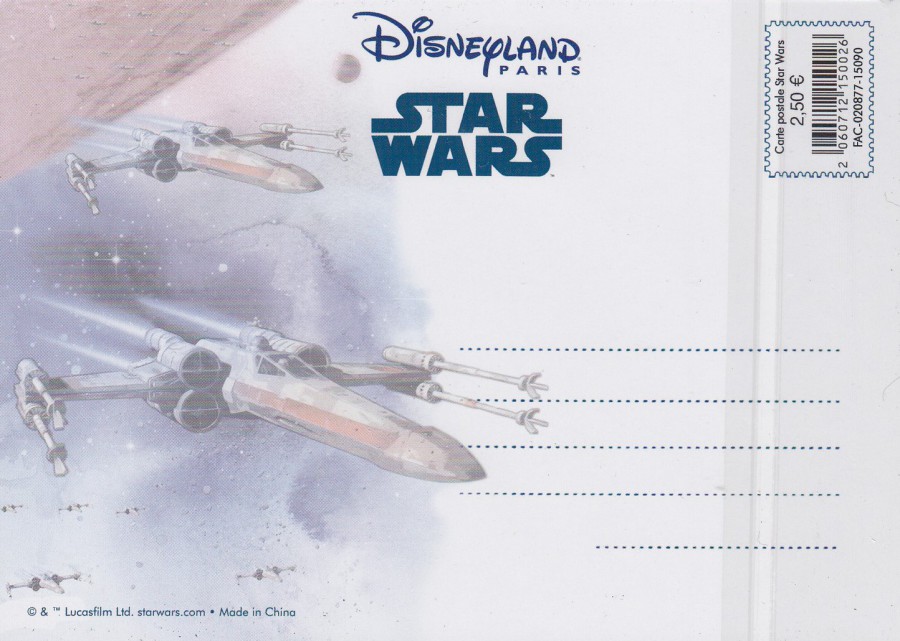
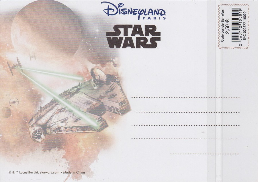
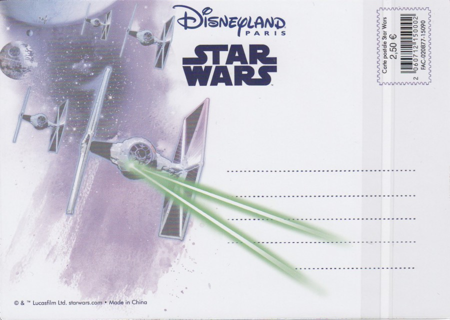
DISNEYLAND PARIS RESORT
STAR WARS
3D, LENTICULAR (Moving Image) POSTCARDS
Theme Park Exclusive postcards
These excellent postcards were picked up on my most recent (three weeks ago now) trip to the Disneyland Paris theme park. I think they are great additions to any Star Wars collection and although they may appear a bit blurred here (there is always an issue with scanning these cards because of the 3D effect) the actual images are sharp and superb, and the 3D effect is really good.
The cards are not individually titled or numbered, but they do have different reverse side images, all depicted below. I have depicted the three postcards which I found, which I suspect is the complete range as I saw no others despite searching every store/shop inside and outside the official parks.
(On some of these images you will see some vertical lines – especially on the right side on the reverse side images. These are from the cellophane bags that these cards are sold in. I have not removed the cards from these bags because the cards are being protected by these - the plastic surface used with these cards can be easily scratched, so I have not removed these)


24/04/2018
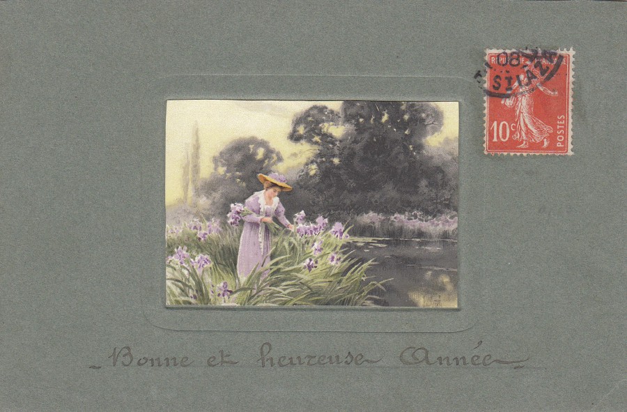
BONNE ET HEUREUSE ANNEE
(HAPPY NEW YEAR)
EMBOSSED FRENCH ISSUED POSTCARD
Anonymous Publisher
A simple design, but here produced in a then common form of postcard issue where a smaller central image, normally at his time a painting or drawn image, within an embossed boarder placed at the centre of a postcard. The reverse side is not divided so this card was issued before 1910, and the stamp is cancelled 1908 (the ‘Divided Back’, where half is for address and half for a message was invented in the UK in 1902, but it still took awhile to transfer over to other countries and regions). On this particular-card the hand stamp has attached to the stamp but has barely printed upon the card itself. Although I think this is a simple design, I still think this is an attractive early card, one with little real catalogue value, but an early example of its type (and I think 1908 was a late usage for this card)
REVERSE SIDE OF ABOVE POSTCARD
24/04/2018
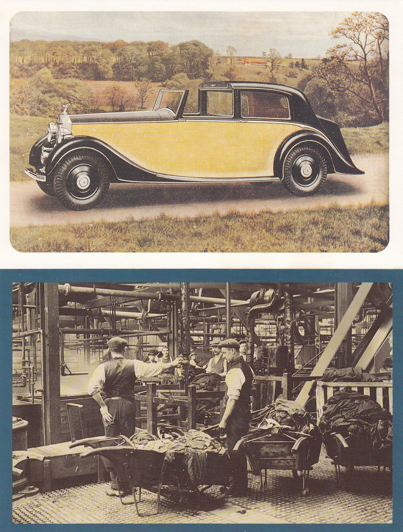
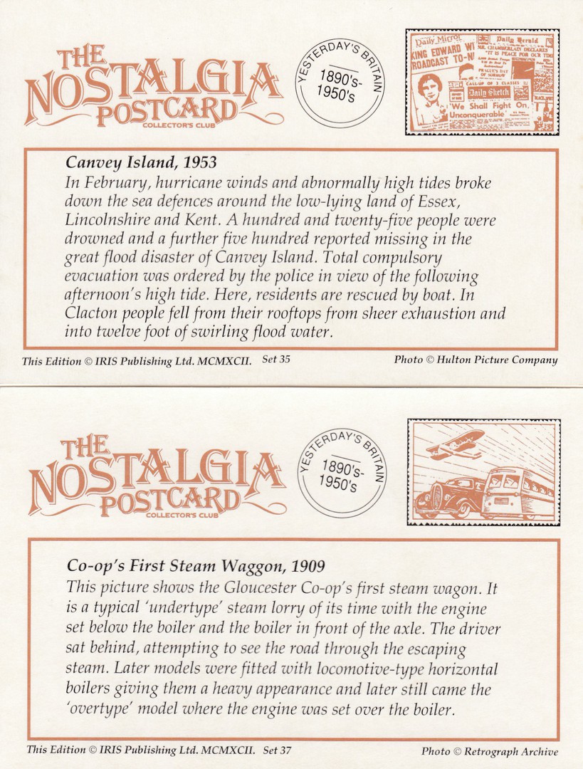
THE NOSTALGIA POSTCARD
COLLECTOR’S CLUB
Published by
IRIS Publishing Ltd
(Printed in England)
SECOND POSTING
This is a further selection of these unusual information (postcard sized) cards.
As with the previous large posting I have displayed both sides of the cards as the reverse sides are packed with information about the images.
I have tried to pick out some of the more unusual cards, and some of my favourites, for whatever reason – often because they are unusual!
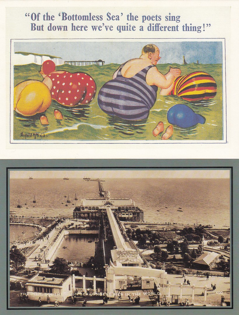
I will start off with two which I like for completely different reasons, but both really good ones! The top is a postcard on one of these cards, it is a Donald McGill comic seaside one of typical style for his earlier issues. Donald McGill is a famous UK seaside postcard artist and I really should put some of my collection of his cards here on the webpage…. I shall add it to my ‘To Do List’.
The second is here because this is the Pier in my home town of Southend-on-Sea. I was delighted to find one of these cards depicting a local view.


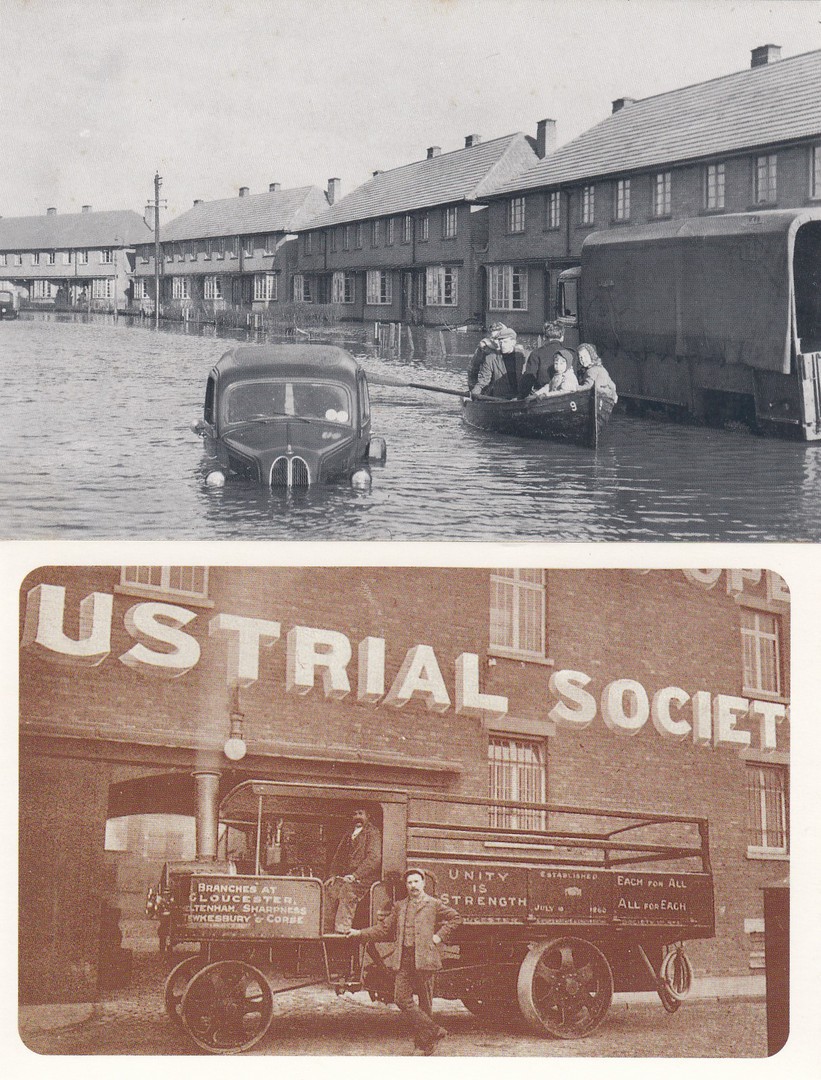
(TOP)
CANVEY ISLAND 1953
The top card here depicts a flooded street in what was a major disaster for this small island close to where I live. I worked on Canvey Island for around seven years and know it really well, and although the street is not named here I am fairly certain it is Thameside Crescent, a curved road which runs off of Long Road, which cuts the Island in half across its centre. I also knew someone who lost his brother in this terrible flood, so I have some historical knowledge of it. This card is a good example of how this series covers many events with some really interesting images.


23/04/2018
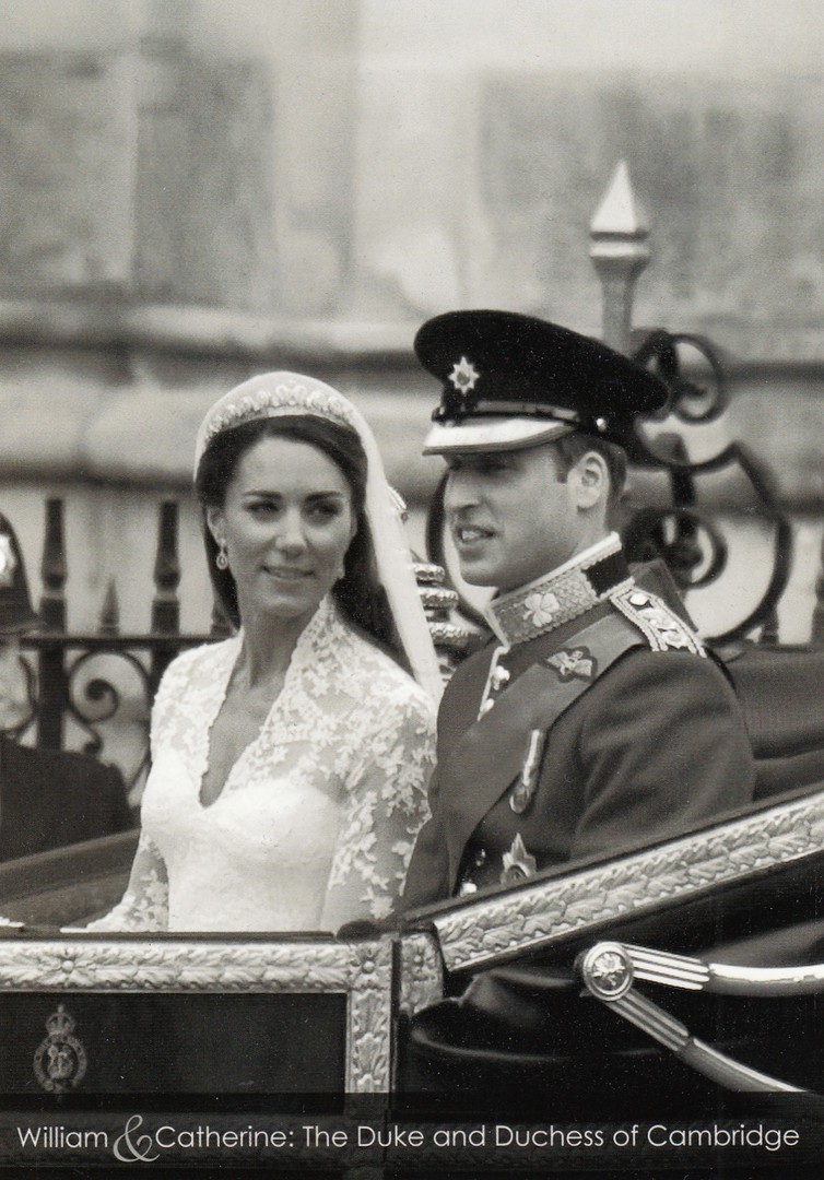
Congratulations to William and Catherine on the birth of their third child
WILLIAM & CATHERINE
THE DUKE AND DUCHESS OF CAMBRIDGE
Published by
KARDORAMA
Ref: SV – 417a
Photo Oliver Hollis
23/04/2018
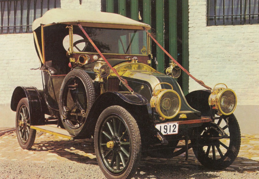
RENAULT 1912
Published by
VITA NOVA
Printed in Holland
Ref: VN 425/4
A nice car postcard printed in Holland. The reverse side has no descriptive text beyond the title above, so it is as simple a car postcard as you can get, but it is still a really nice photograph.
23/04/2018
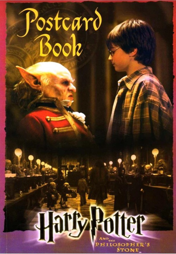
VERNE TROYER..... RIP
1ST January 1969 – 21st April 2018
Actor, comedian and stunt performer
Best known for playing the character Mini-Me in the Austin Powers movies but he also played the goblin Griphook in the first Harry Potter film, Harry Potter and the Philosophers Stone.
Front cover of Harry Potter Postcard Book
23/04/2018
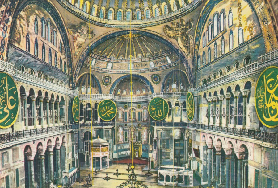
INTERIOR OF ST. SOPHIA MUSEUM
ISTANBUL
Published by
HER HAKKI MAHFUZDUR
KESKIN COLOR
ANKARA CADDESI
Ref: No. 98
I have never visited Istanbul, I’ve been to Turkey but went further south on my visit. This card though, when I saw it in an antiques shop, appealed to the eye immediately, as I suspect most postcard images are designed to do. Looking at this image immediately makes me want to book a holiday and visit this building as it looks amazing here.
22/04/2018
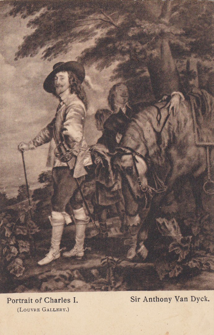
PORTRAIT OF CHARLES 1
SIR ANTHONY VAN DYCK
(LOUVRE GALLERY)
Published by
EYRE & SOTTISWOODS Ltd,
Ref: Woodbury Series – No. 6158
Yes, I know, Deja-Vu…..
I did post an image of this very painting on the 17th (just 5 days ago! April 2018 Blog 3), but I was going through an old box of mine in storage and up popped this little old card. The last one was in colour whilst this one is in brown (sepia I believe is the proper title of this colour – looks brown to me). This is the oldest one as it was posted in 1913. So, with the new one I bought this year that makes three postcards I have depicting this painting, and they stretch across 105 years - thats one of the things I love about postcard collecting, the spread and age and the difference over the years between printing processes and techniques.
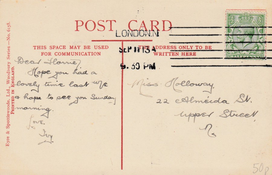
REVERSE SIDE OF ABOVE POSTCARD
22/04/2018
As I stated from the beginning it has not been my intention to post cards in the CENSORED category tab every day, or even every week, but I will advise you when some have been posted there and today two cards have gone on.
22/04/2018
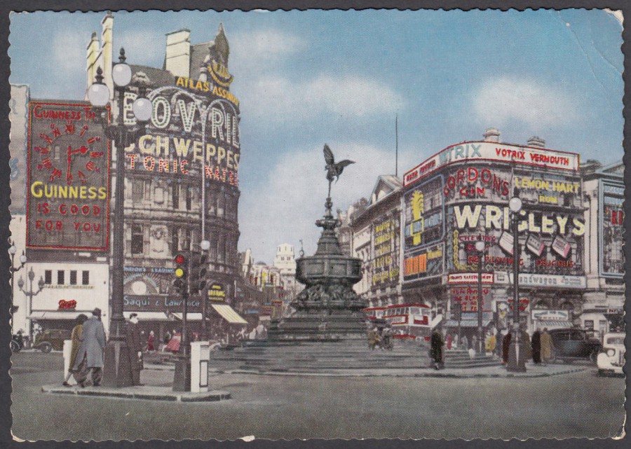
PICCADILLY CIRCUS,
LONDON
Published by
A. V. FRY & Co., Ltd, London
Ref: G. 124
“The centre of London’s ‘West End’. The Eros statue can be seen in the foreground.”
(Text from reverse side of postcard)
Just to highlight what I was saying about the popularity of ‘Deckle-Edging’ in the previous posting here is a card from London posted in 1958 which again has that popular deckle edge of the period. This is a nice early view of Piccadilly Circus which has that other 1950’s trend of a colourised black and white photograph. This one has some other interesting features as well including the Guinness clock, seen here on the left side edge. Guinness is a collectible theme in its own-right and this would make a great addition to such a collection. I also like all the other adverts; Gordon’s Gin. Bovril, Schweppes Tonic Water and Wrigleys gum. I think this is a nice card.
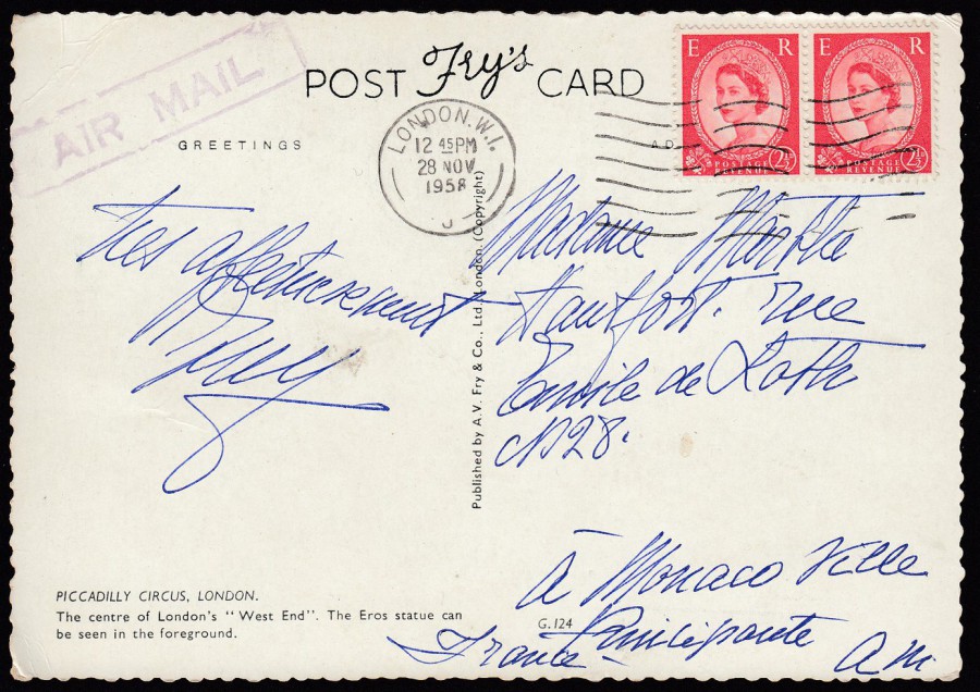
REVERSE SIDE OF ABOVE POSTCARD
This copy was posted to Monaco Ville, France and has a boxed added purple AIR MAIL cachet, and two 2 ½ d wilding QEII definitive stamps (5d postage in all). The stamps have been cancelled with a machine London W.1. wavy line cancel dated 28th November 1958.

22/04/2018
L’AVEYRON
SES SITES… SES MONUMENTS
Published by
COMBIER IMP MACON
Ref: 11
This is a lovely example of a 1950’s issued French map postcard with lightly hand coloured black and white photographs placed around a central map of a specific area. When I saw this one recently in an antiques shop in France it caught my eye, as I suspect it did even more to the original buyer back then. My copy was posted from Aveyron in 1960, but the card is clearly from the decade before this, when deckle edging on postcards was all the craze. This was another bargain at just 20cents.

REVERSE SIDE OF ABOVE POSTCARD
Someone, almost certainly a stamp collector, has removed the stamp from the back of this postcard. This was not an unusual thing to do back in the stamp collecting days of the 1960’s through to the 1980’s, although it was the 1980’s when stamp collectors started to realise that removing the stamp from a card reduced some of the information around the source, time, date and usage of the stamp. Gladly, this no longer happens and few modern era (mid 1980’s through) posted postcards have their stamps removed now.
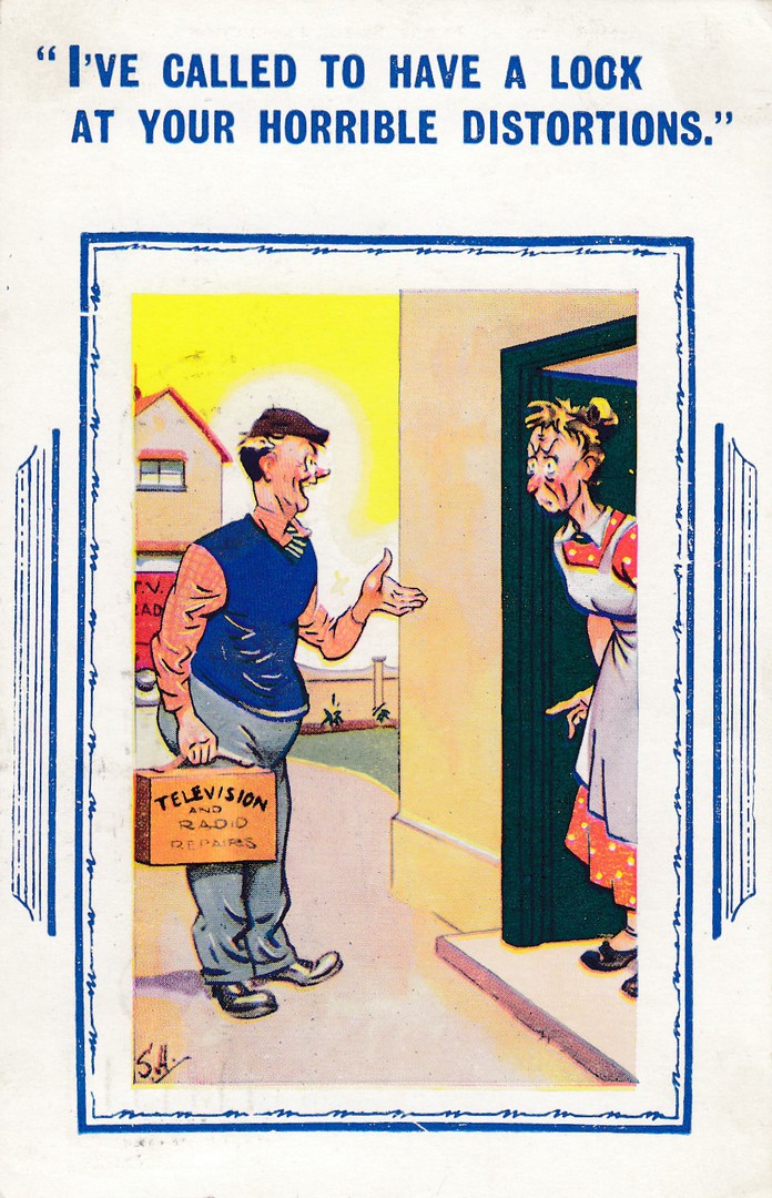
22/04/2018
“I’VE CALLED TO HAVE A LOOK
AT YOUR HORRIBLE DISTORTIONS”
Published by
H. B. LIMITED
Ref: 7502
This cartoon comic postcard is another one from my ‘Television’ collection and can be added because of the nice wording on the workman’s case. My copy was posted in 1962.
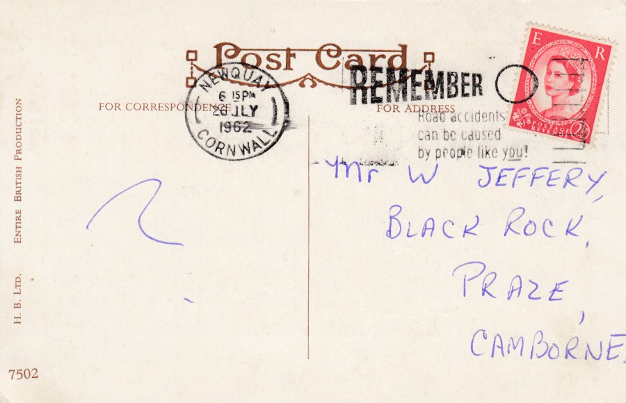
REVERSE SIDE OF ABOVE POSTCARD
This one has the added-bonus of a nice slogan cancellation:
REMEMBER
ROAD ACCIDENTS
CAN BE CAUSED
BY PEOPLE LIKE YOU!
I suspect these days people would take offence at reading this, but back in the 1960’s there were a lot less cars on the road and a lot less vehicular trips, so imagine, if they needed this sort of thing back then what must it be like now!!
I have now dug out from storage my ‘COLLECTING SLOGAN POSTMARKS’ catalogue, a fantastic source of information on these slogan cancels which I have had buried away until now, so I can give you some information around this one now.
This is slogan ref. number203 and it was in use in 1962 between the 14th and 31st July (with a late usage recorded at Kennington SE11 on 3rd September (it was not unusual for a cancel to be used out of its time slot at some locations).

20/04/2018
ZOO DE LA PALMYE
(France)
TIGER
Official Zoo Postcard
This is one of my favourite zoo’s and one I visit often when in France on my trips over there. The zoo has a wide range of postcards which they often change as well, which is nice for the collector. I will be placing more cards from this zoo in future posts.
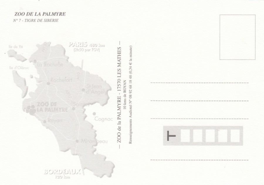
Reverse side of above postcard
there is a fient map print on the left side which gives the Zoo's location. Most of the zoo's cards appear to have this map (the most recent ones definately)

17/04/2018
STEIFF
ZOO FAVORITES [sic]
Published for Steiff
By
BLOCK IMPORTING Co., Inc
(Made by NYACK ART, N.Y)
Ref: No. 12 of Steiff Zoo Series (37378-B)
Copyright 1960
Steiff toys are quite famous, and expensive, but very high quality. There have been Steiff postcards around for many years but this one is from the 1960’s and although American it was posted in the UK in 1966. This image depicts a family of stuffed elephant toys.
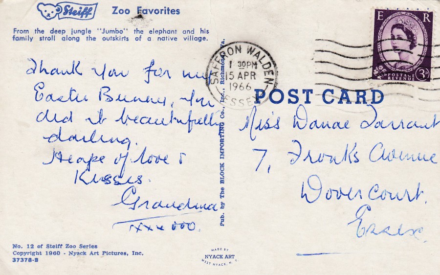
REVERSE SIDE OF ABOVE POSTCARD