27/10/2017
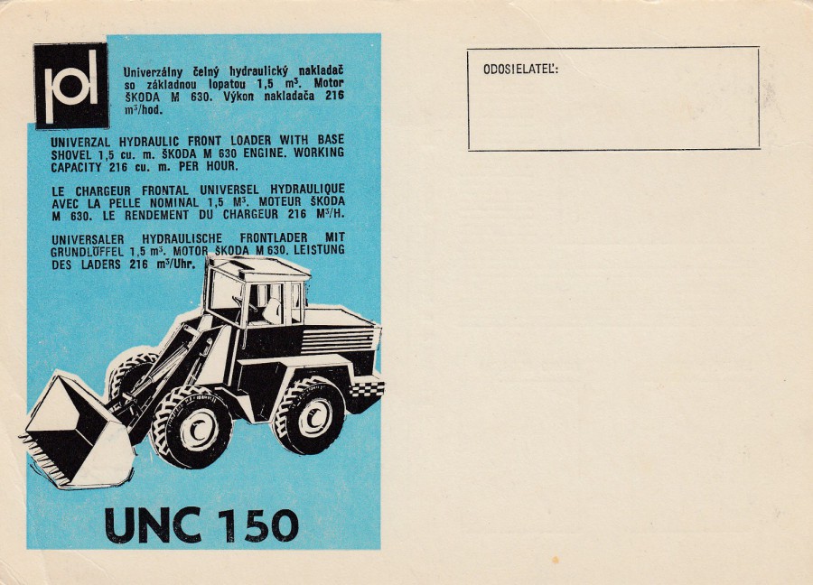
UNIVERSAL HYDRAULIC FRONT LOADER WITH BASE SHOVEL
SKODA M 630 ENGINE
UNC 150
Advertising Postcard
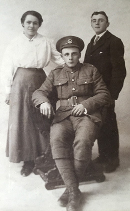
This multi-language advert card is a real corker. It is simple and to the point, but it has an European eastern bloc feel and charm to it. This is no surprise when my enquiries into text on the reverse side show this is from Slovakia. A postcard like this would appeal to many different collectors. It is certainly a form of transport (sort of), it has industrial connections via building work etc., and it is an advertising postcard as well. For me, I just thought it was unusual.
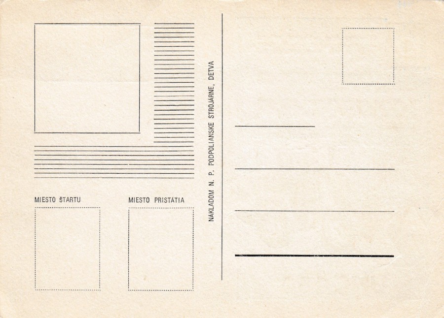
REVERSE SIDE OF ABOVE POSTCARD
The text down the centre dividing line ends with the word DETVA. This is a town in central Slovakia and it was this information that identified the source of this postcard for me.
27/10/2017
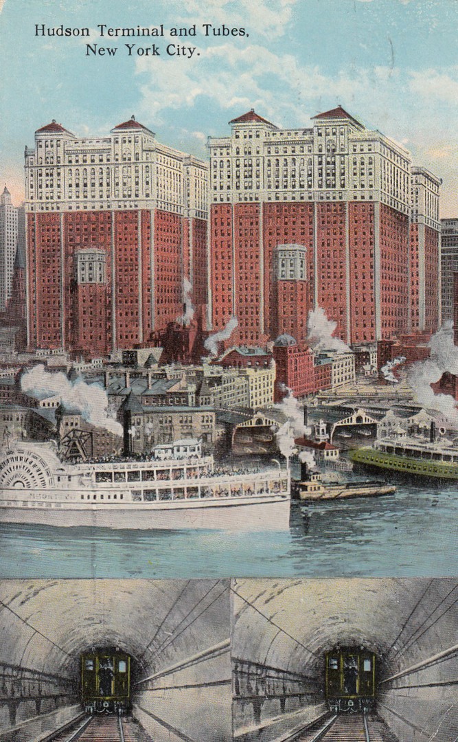
HUDSON TERMINAL AND TUBES
NEW YORK CITY
Published by
THE AMERICAN ART PUBLISHING CO., NEW YORK CITY
Ref: A – 43629
“The Hudson Terminal buildings on Church Street, between Cortland and Fulton Streets are twin structures, and together form the largest office building in the world. The weight is estimated at 200,000 tons, resting on a cofferdam 400 x 178 feet, 75 to 98 feet deep. It is 2 stories, 375 feet high and has office room for 20,000 people. Twin tubes enter the basement from Jersey City”
(Text from reverse side of postcard)
This postcard was posted from New York in 1920 and it depicts what I expect is an earlier view, although not by much as the facility depicted was built in 1909, and ran until 1971 before being mostly demolished by 1972. This then became the site of what was the original World Trade Center.
I like the images at the bottom which are supposed to represent the two single-track tubes that the trains ran along, although, clearly, these two photographs depict the same photograph of one of the tubes (why bother taking two separate photographs when just the one will suffice!). The tubes were in place at the time the above buildings opened in 1909. By 1914 the Hudson Terminal had a yearly passenger volume of 30,535,500 (surely that deserved two separate photographs!)
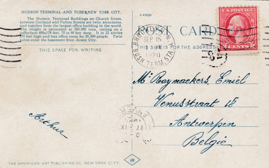
REVERSE SIDE OF ABOVE POSTCARD
This postcard was posted to Antwerp in Belgium and the 2 cents George Washington (postage to Europe) USA postage stamp has been cancelled with a wavy-line ‘BROOKLYN N. Y [New York] – BUSH TERM [Terminal] STA [Station] – 15 SEP 1920’ cancellation. There is also a small circular mark with the number 82 inside it, which has also partially stamped the postage stamp (I think this might be an area or post office location identifier). The postcard has been ‘back-stamped’ upon arrival with an ‘ANVERS [Antwerp] double ring cancellation which appears to be dated 27th September (?) 1920.
I found the ‘BUSH TERM STA’ cancel interesting as there is still a Bush Terminal Station Post Office to this day, located in Kings N. Y. It has a passport section where you can submit your passport applications. It is shown as being at 900 3rd Avenue. It is closed on Sundays but seems to otherwise offer all the services one could require. I wonder if it is the in the same location, or is even the same, post office as where this postcard was cancelled, and maybe even posted.
27/10/2017
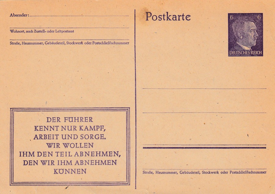
GERMAN THIRD REICH POSTAL STATIONERY POSTCARD
6 DR Pre-Printed Hitler postage stamp
As is unfortunately the case with these German postal stationery postcards I do not know any official details about this individual card. I do not have a reference book relating to them (they do exist but are too expensive for what is a sideline interest for me). This one does have a boxed area of text bottom left which reads:
DER FUHRER
KENNT NUR KAMPF,
ARBEIT UND SORGE.
WIR WOLLEN
IHM DEN TEIL ABNEHMEN,
DEN WIR IHM ABNEHMEN
KONNEN
THE LEADER
KNOWS ONLY FIGHT,
WORK AND CARE.
WE WANT
TO TAKE THE PART,
WHICH WE CAN TAKE FROM HIM
A propaganda and political message printed on the front of this card which was designed, as many cards from this period were, as a promotion of the Fuhrer to his people. This was another STAMPEX £1 box find, it may be worth more, it may not, but as an example of how the postal system and related items were dragged into the political conflict of this time this is an excellent example.
27/10/2017
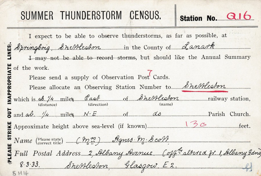
SUMMER THUNDERSTORM CENSUS
STATION NUMBER Q16
1933
Postcard Requesting to be allocated an Observation Station Number and to receive a supply of Observation Postcards.
Here you have Agnes Scott from Springboig (a district close to Glasgow, and in the area of ‘Shettleston’) requesting allocation of an observation station number (she was allocated Q16) and a supply of observation postcards (she seems to have been sent 7, as this what the receiver has written in above her request). Clearly Agnes wanted to be part of the Thunderstorm census in 1933 and I hope she got to see some and use the cards that had been sent to her.
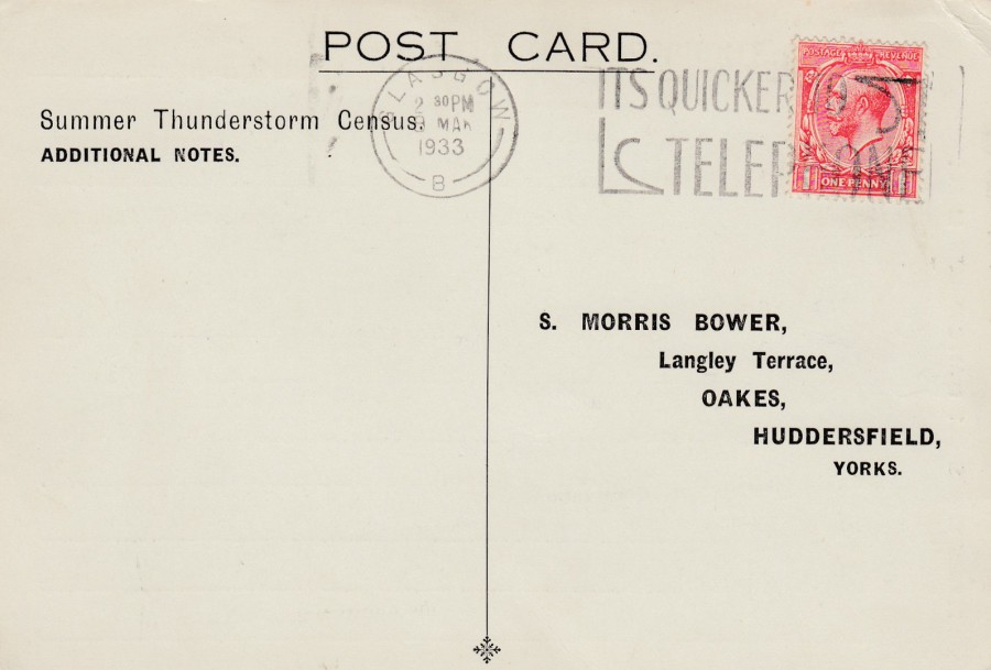
REVERSE SIDE OF ABOVE POSTCARD
The stamp has been cancelled with a nice ‘GLASGOW – 9TH MARCH 1933 – IT’S QUICKER TO TELEPHONE’ slogan cancellation.

REPORT OF THUNDERSTORM
8TH June 1933
Census Postcard
Unfortunately, Agnes did not send this one (see above postcard), but it is an example of a used Thunderstorm report postcard from the year 1933. This one is from Batcombe in the Mendip District of Somerset (so a long way away from Agnes up near Glasgow!). It was nice to find one of these used for its proper reason - although the sender seems to have had some difficulties in estimating the distance te thunderstorm was from him. Would this class as a novelty postcard because of its reason for existence?
REVERSE SIDE OF ABOVE POSTCARD
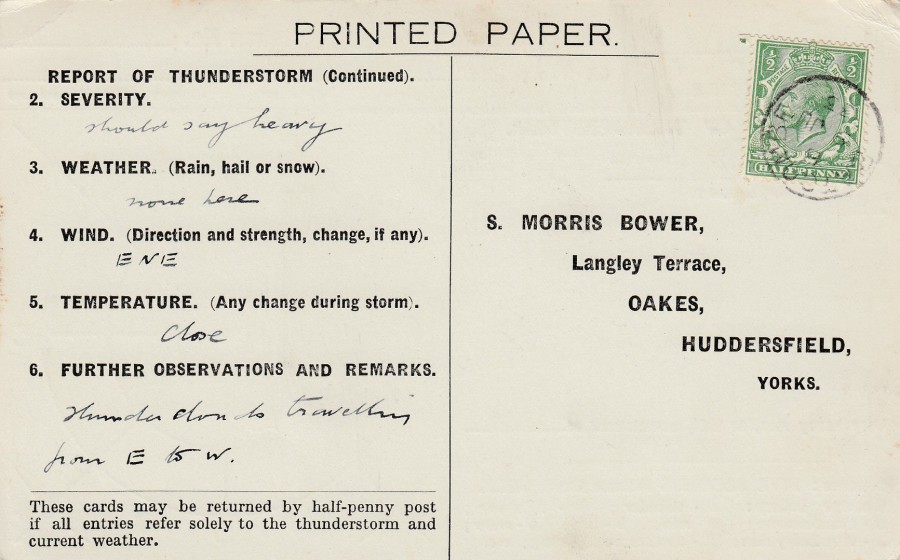
PRINTED PAPER
These cards would normally require the full Printed Matter postage rate because of their size and the content printed here. But if the message purely related to the reported thunderstorm it could be sent at postcard rate – thus a half-penny (as in-fact has occurred here).
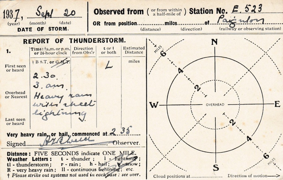
REPORT OF A THUNDERSTORM
20TH September 1937
Census Postcard
These obviously ran for some time as this postcard here is from four years later than the above one. They also seem to have been sent in from people all around the country. This one is from Paignton in the county of Devon, which forms part of the borough of Torbay with Torquay. This one is a report of heavy rain with sheet lightning.
The top card was my first find. It was on a stall at STAMPEX this year. I had not seen one before and thought it unusual enough to add to my collection. It cost me £2. The middle card above I found the same day and could not believe I had found another related card which appeared to be the type of card requested by the sender of my original purchase. Under these circumstances I had to have it. It was also in a £1 box which added to this being a bonus buy. This third card depicted here I found on another STAMPEX the day after buying the top two. So, I went from never having seen one before to buying all these within less than 48 hours!
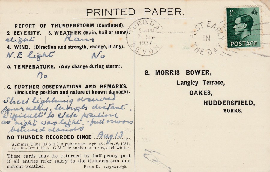
REVERSE SIDE OF ABOVE POSTCARD
This has the stamp cancelled with a nice TORQUAY (which agrees with the original location of the identified thunderstorm) DEVON – POST EARLY IN THE DAY – 21 September 1937’ slogan cancellation.
An unusual selection of cards, with the ‘added’ bonus that two of them have been nicely used as well. I suspect there must be lots of these, but these are the first I have come across. This one here cost me the most at £2.50 but I think it was worth it.

26/10/2017
YOU’RE ONE OF A KIND
Published by
paperchase
Printed on recycled card
NOVELTY POSTCARD
Raised ‘Felt’ applied letters
A simple message postcard but it has a nice deckle edge around it and the letters have been cut out of felt material and applied to the front. They are unusual to touch and make this a very unusual novelty postcard. This is a current issue and can be found in branches of the stationery shop ‘paperchase’. Who says there are no new attractive and unusual modern postcards?

REVERSE SIDE OF ABOVE POSTCARD
26/10/2017
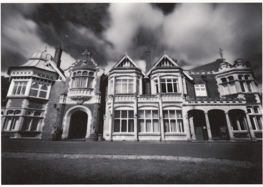
BLETCHLEY PARK TRUST
THE MANSION
Official Postcard
This is not my first Bletchley Park postcard depicted here, but It might be the most unusual for reasons which will become apparent later.
Bletchley Park is of course where, during the second world war, work was done on breaking the German Enigma coded messages. It is now a museum and a fascinating place to visit. There was a post office here right up until quite recently, but it is no longer running (which is a shame as when I visited this was where I spent some time posting cards to myself and buying souvenirs).
At the recent STAMPEX show in London some of the remaining post office stock, stamp sheets, stamp cover’s and a few other items were out on a stall for sale. This was because one of the main people to work on the Bletchley Park stamp items was asked to help with manning the ‘Isle of Man’ stall and he only agreed if he could place out on the stand some of the remaining Bletchley Park stock.
One of the items that was on sale, and there was only one remaining, was this postcard. It was not cheap, £2, but I am interested in the Bletchley Park story and I decided I wanted it anyway. But, then I was offered something to make it a little special…see below
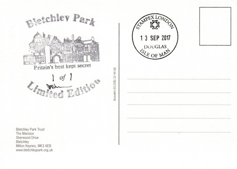
REVERSE SIDE OF ABOVE POSTCARD
Cachet:
BLETCHLEY PARK – BRITAIN’S BEST KEPT SECRET - LIMITED EDITION
1 of 1
Cachet:
STAMPEX LONDON – DOUGLAS, ISLE OF MAN – 13 SEP 2017
The seller asked me if I would like the postcard to receive the special cachet for Bletchley Park limited edition items. He had the cachet with him and applied this and signed it (which he apparently did to the items that received this cachet). He then numbered this for me as “1 of 1”. I then had the Isle of Man STAMPEX cachet applied (dated the first day of this particular ‘Stampex’ show). In the end I have ended up with what I think is a ‘really’ unusual, and clearly unique, item which made the price of £2 seem quite cheap in the end.
25/10/2017
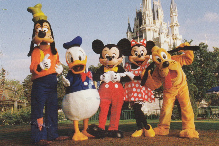
WALT DISNEY WORLD, FLORIDA
CINDERELLA CASTLE
Official Disney Magic Kingdom Theme Park Postcard
This has been a popular postcard for a few years now, probably because it depicts what is known as the Disney Big Five; Mickey Mouse, Minnie Mouse, Goofy, Donald Duck and Pluto, with Cinderella’s Castle in the background.
As it is also a reasonably priced (for Disney Prices) postcard it is also the card that I chose this year to send to myself to obtain the special cachet that is available.

REVERSE SIDE OF ABOVE POSTCARD
I wanted to post a card to myself because I did not have a used example of the USA Post ‘Forever - Global’ cactus plant circular shaped postage stamp, which I believe was released only this year. So, as you can see I obtained one of these stamps and used it here on this card.
I then obtained the ‘MAIN STREET U.S.A – MAGIC KINGDOM’ circular cachet, which can be applied to any postcard, whether bought here or not I believe, at the small open fronted gift shop which is on the entrance side of the arches you walk through to enter the park itself. So, if you are standing facing these arches (just the other side of the bag check and entrance barriers, then the shop is on your left.
This year, or at least this time I obtained it, the cachet is coloured green. I have obtained in this in the past and it was black. When I return next year, I will post at least one card to see what colour this is then and will report back here.
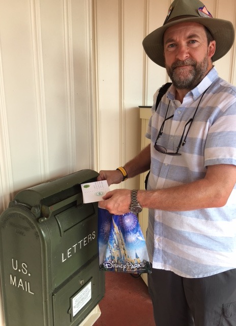
PHOTOGRAPH
October 2017
This is a photograph of me posting the above postcard in the wall mounted box which is beside the gift shop where the cachet can be obtained.
This is where postcard collecting becomes more than just buying a card from a shop or a dealer (or eBay) - this is using postcards for what they meant for, travelling through the postal system. It is making postcard souvenirs for your collection. It also takes you out of your home and on the road and still enables you to be active with your collection.
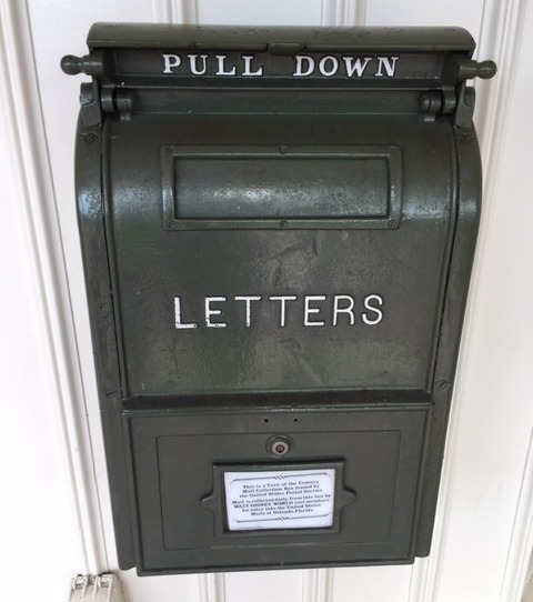
PHOTOGRAPH
October 2017
Photograph of the mail box in which you can see me posting the card in the above photograph

24/10/2017
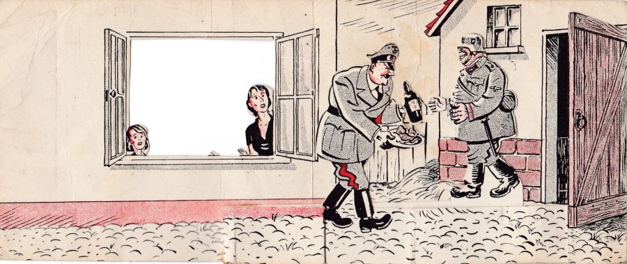
DIT IS, DE NIEUWE ORDE!
“THIS IS THE NEW ORDER”
WWII PROPAGANDA FOLDED LEAFLET
Even though I collect postcards I still occasionally pick up, or are given something interesting which although not a postcard is a piece of memorabilia which appeals to me because of its history, theme or what it is.
This item here is a folded ‘Anti – Nazi’ propaganda leaflet designed to be released in the Nederland. The front of the leaflet, depicted here, shows Hitler reaching in through the window and taking the food and drink from the table of the woman and child residing there (no males shown as in the house – I think this is deliberate and makes the apparent theft of the food even more nasty). When you open the leaflet Hitler, who is attached to a strip of card along the bottom between the front and back of the card, turns around and hands the food and drink to a fat German soldier. Hitler has now gained a grin as well on this side of his cut-out figure.
The complete opened leaflet is depicted below.
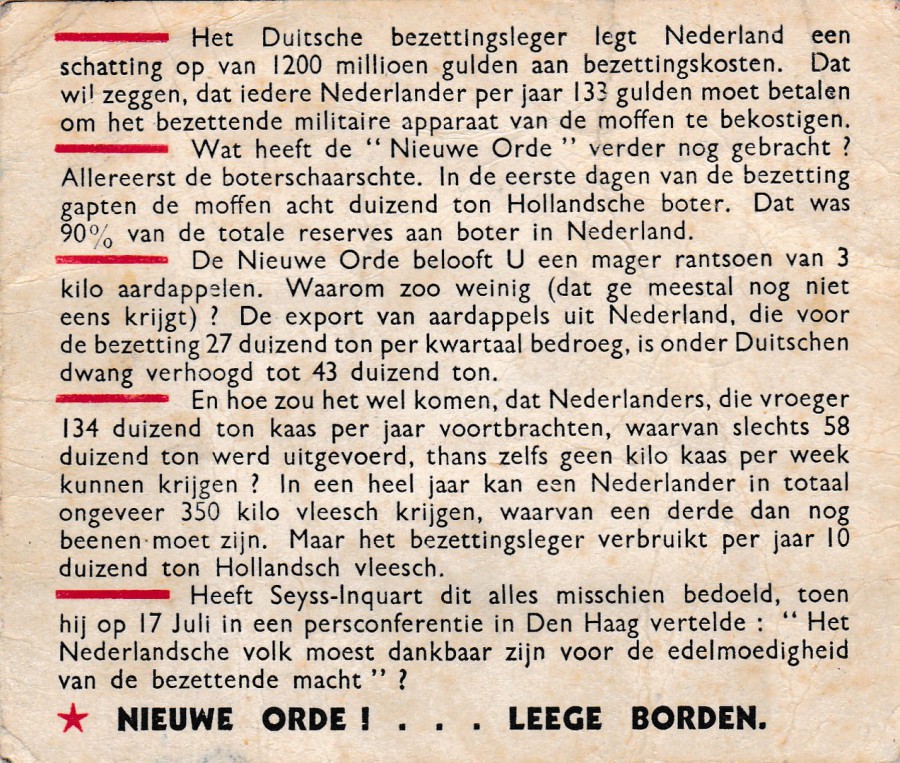
REVERSE SIDE OF FOLDED PROPAGANDA LEAFLET
This has text in Dutch for the residents of the distribution area to read. It gives details of the cost the German Nazi regime was extracting from the citizens of the Nederland.
I gave a postcard display once to a group in a church hall somewhere many years ago. Afterwards a woman gave me this item saying it had been in her house for many years and nobody really wanted it so would I like it. The answer to that question is obvious as here I am displaying it here. It has been in a sleeve inside my Military Album ever since. As a person who is fascinated by military history, including the propaganda side of any conflict, this is an interesting item. As I have stated, this is not a postcard, but it does fit perfectly into my collection of miscellaneous paper/card items.
24/10/2017
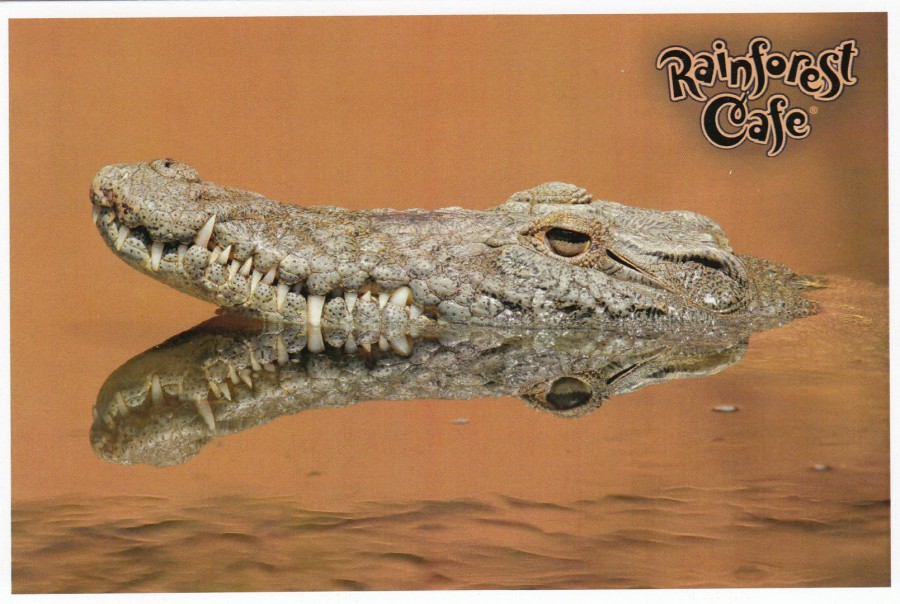
RAINFOREST CAFÉ
DISNEY SPRINGS
WALT DISNEY WORLD
FLORIDA
When I was here about two weeks ago I found a rack of postcards which were on sale at 5 for $1 (incredibly cheap for Disney World, in fact for anywhere I have found in Florida). The cards each depict an animal, in one case three, with the RAINFOREST CAFÉ logo in one corner. These I thought were delightful. I do not think this is the complete range that may have previously been available, but it is the six which were here at the time of my visit.
RAINFOREST CAFÉ
CROCODILE
IMAGE #48790
(This is my favourite of the six cards)
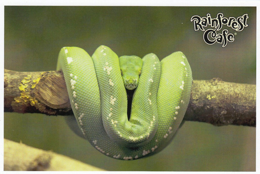
RAINFOREST CAFÉ
GREEN BOA
IMAGE #48791
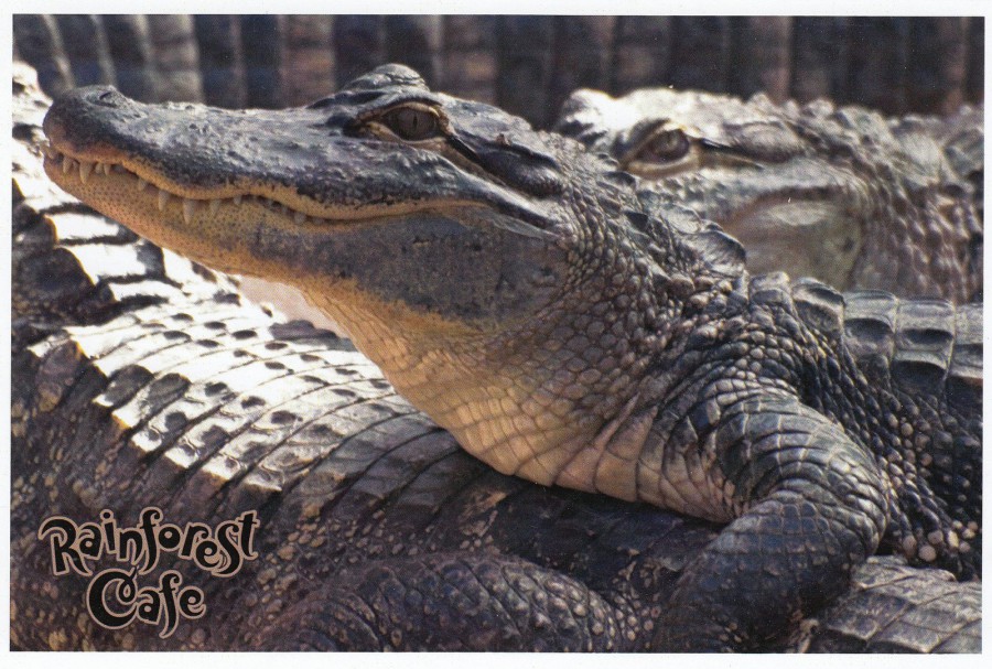
RAINFOREST CAFÉ
ALLIGATOR
IMAGE #48792
(This is the card depicting more than one animal)

RAINFOREST CAFÉ
TOUCAN
IMAGE #48797

RAINFOREST CAFÉ
SQUIRREL MONKEY
IMAGE #48799

RAINFOREST CAFÉ
ORANGUTAN
IMAGE #48800
Nice cards, nice price, a bargain really
24/10/2017
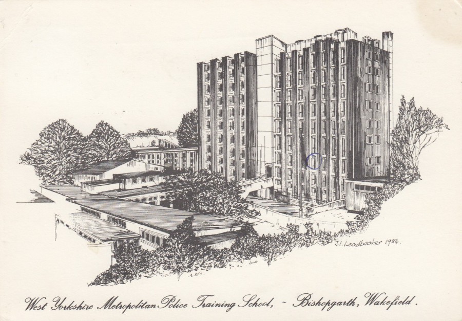
WEST YORKSHIRE METROPOLITAN POLICE TRAINING SCHOOL
BISHOPGARTH, WAKEFIELD
Artwork by
JEANETTE I. LEADBEATER (1984)
This postcard, and the one below, was recently sent to me by another collector. I like the police connection and the fact that this one has been used and the sender – who simply refers to himself as ‘Dad’ – has circled the window of the room he was staying in. The card was sent in 1986 (that was just a year before I started my training). There is lots of nice police history contained here in this card.
Some Television collectors like myself may recognise the name of the artist, Jeanette Leadbeater as she produced a range of postcards depicting the characters from the series ‘Last of the Summer Wine’. These are very well-known postcards which are highly collected (I depicted the one of Clegg here on the webpage when Peter Sallis passed away).
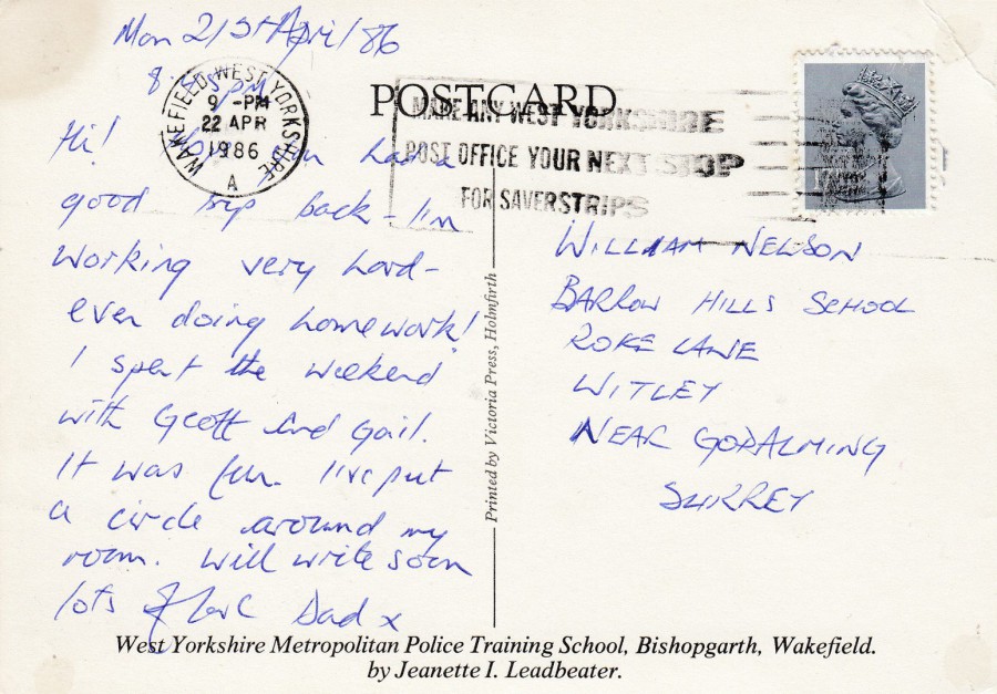
REVERSE SIDE OF ABOVE POSTCARD
Posted from Wakefield on 22nd April 1986 – has a nice “MAKE ANY WEST YORKSHIRE POST OFFICE YOUR NEXT STOP FOR SAVERSTRIPS” slogan postmark
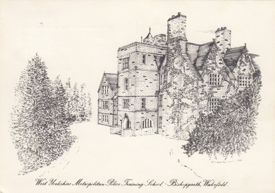
WEST YORKSHIRE METROPOLITAN POLICE TRAINING SCHOOL
BISHOPGARTH, WAKEFIELD
Artwork by
JEANETTE I. LEADBEATER (198?)
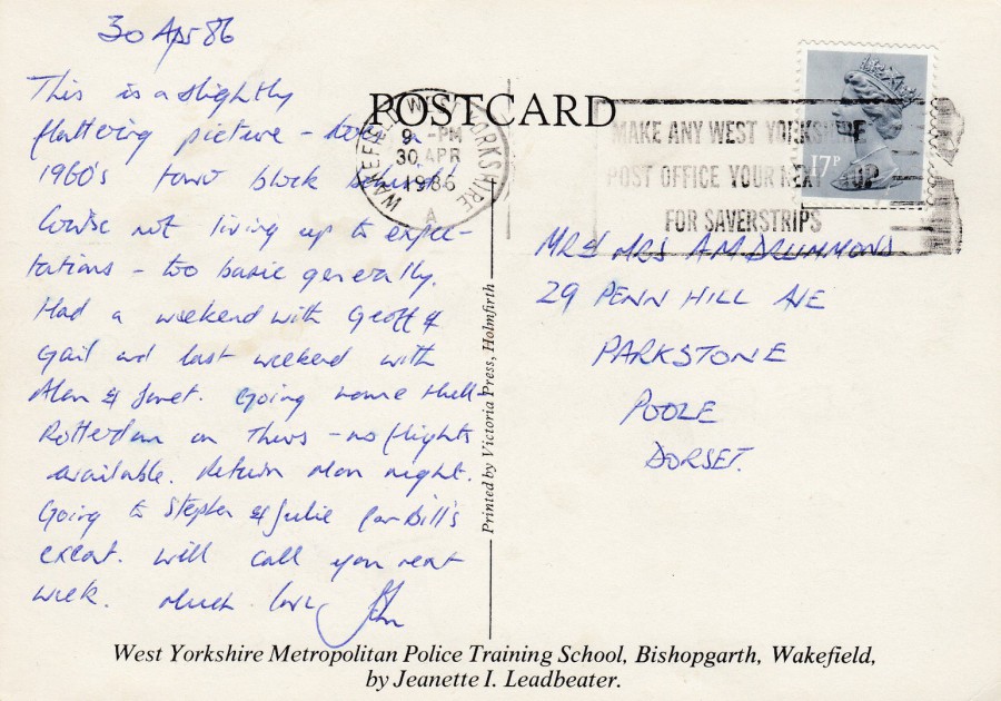
This postcard was sent by the same sender – although here we learn that his name is John and that he was not enjoying his course – his comments about this building are also amusing and enlightening. This image looks like it could be in a different location entirely from the tower block that appears on the above postcard, but John says in his message “This is a slightly flattering picture – has a 1960’s tower block behind!”. So, this rather attractive looking stately home building has the tower block from the first postcard towering above and behind it. This situation is not unlike my own HQ where there is a beautiful line of old orange-brown bricked buildings which really catch the eye. But, beside them is a massive hexagonal concrete block which is, quite honestly, an eye-sore.
REVERSE SIDE OF ABOVE POSTCARD
Posted the 30th April 1986 from Wakefield with the same slogan postmark, slightly better struck, as the above top postcard

23/10/2017
“YOUR DAY WILL GO THE WAY THE CORNERS OF YOUR MOUTH TURN”
Published by
SUGARBOO
I have depicted some SugarBoo postcards before after my last visit to Florida in November 2016. SugarBoo is a company who have a shop in Disney Springs. They specialise in quirky prints and stationery and other little things of fancy. They do their own range of postcards which are $3 each. The designs are simple and often incorporate some sort of old styled print drawing. This one here is typical and was the first one I bought this year (I visited the shop three times to sort through the big box of postcards – which I depicted on the webpages facebook page – and bought a small number of cards on each visit). Mammals are not so common on these cards but this camel is a nice one.
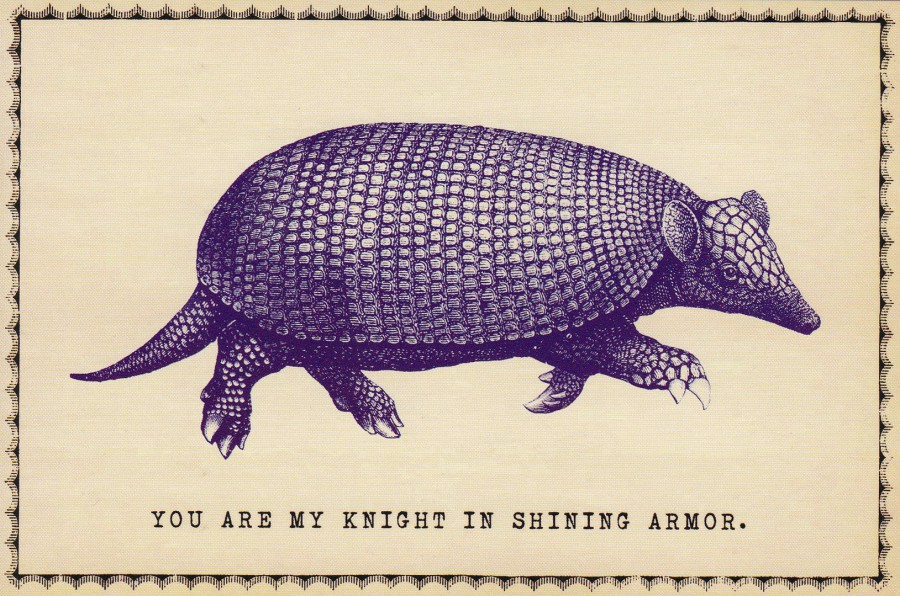
“YOU ARE MY KNIGHT IN SHINNING ARMOUR”
Published by
SUGARBOO
Having previously said that mammals are not common amongst the SugarBoo cards here is another one – the previous one above is a camel – I am not sure I have many armadillos on postcard so it is an unusual animal to add to my collection. I also really liked this one.
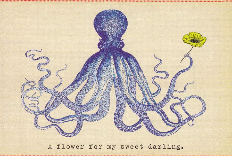
“A FLOWER FOR MY SWEET DARLING”
Published by
SUGARBOO
When I bought the previously posted Camel SugarBoo postcard I also saw this octopus one. At the time I only had enough cash to buy the Camel so I put this ne at the bottom of the pile of cards and decided I would pick it up next time. Well, next time was a couple of days later. There was the stack of postcards. Could I find the octopus one? Apparently not. I searched through bundles of the cards and was still searching when my daughter turned up and asked what I was doing. She then helped me look through the cards. Then a member of the shops staff assisted and went out back to see if they had any octopus ones out there…. they didn’t. Then, just as I was about to lose hope, and had decided someone else had liked the card and bought it I finally found it. It was the only copy they had as well. I worked hard for this postcard but it is now mine. The only real problem was as I looked through so many other postcards trying to find this one I inevitably found a couple of others I also liked, which I also bought
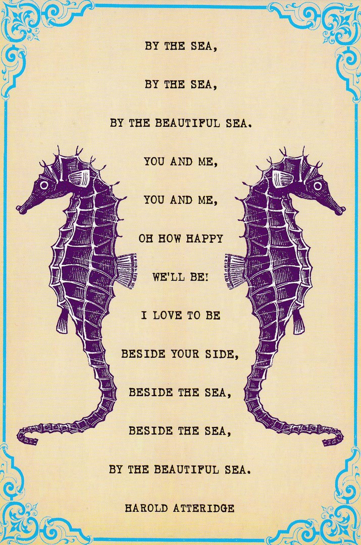
“BY THE SEA,
BY THE SEA,
BY THE BEAUTIFUL SEA.
YOU AND ME,
YOU AND ME,
OH HOW HAPPY
WE WE’LL BE!
I LOVE TO BE
BESIDE YOUR SIDE,
BESIDE THE SEA,
BESIDE THE SEA,
BY THE BEAUTIFUL SEA”
Harold Atteridge
Published by
SUGARBOO
Just so you know, I bought this one for the sea horses, not for the words. What I have learnt is that the words are taken from a popular song published in 1914. The song was originally recorded by the Heidelberg Quintet and it topped the American music charts for six weeks in the summer of 1914. The composer of the music for the song was Harry Carroll but as the postcard states the words were by Harold R. Atteridge. Amazing what you can learn by digging a bit further into a postcard.
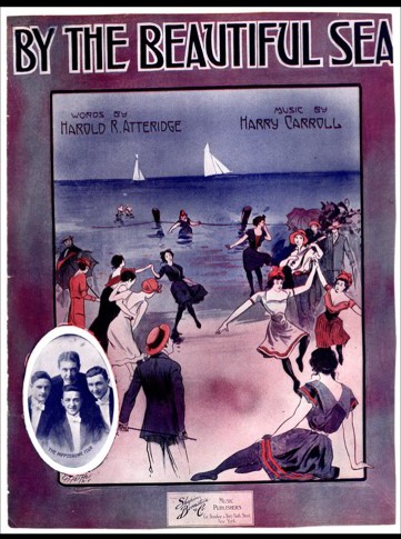
PHOTOGRAPH
NON-POSTCARD ITEM
This is a picture of the sheet music for ‘By the Beautiful Sea’
23/10/2017
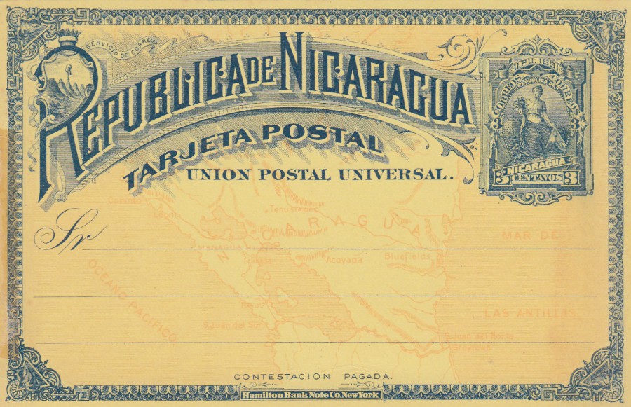
REPUBLICA DE NICARAGUA
3 cents
Postal Stationery Post Card
1891
‘Higgins & Gage’ Ref: 13
3 cent dark blue stamp with dark blue printed text on yellow card with an orange printed map of Nicaragua in the background. The pre-printed 3 cent stamp depicts what was at the time a new design of a seated allegorical figure. This design was printed in 1891 1894 (the first postal stationery post card for Nicaragua was issued in 1878). These are really cheap postcards as they were produced in quite high numbers, but, for all that I think they are really beautiful examples of early postal stationery cards.
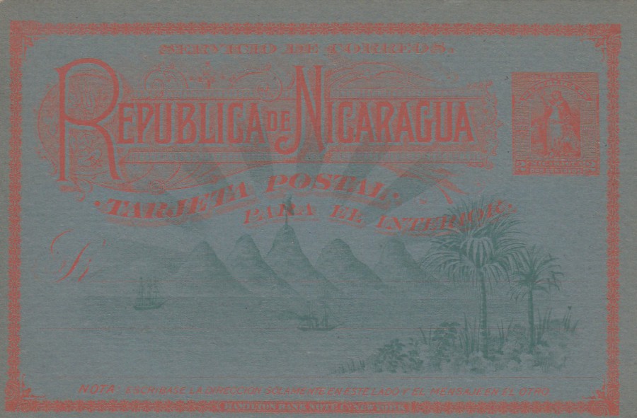
REPUBLICA DE NICARAGUA
2 cents
Postal Stationery Post Card
1894
‘Higgins & Gage’ Ref: 24
This postcard is designated as a 2 cents vermilion on blue board and it was issued in 1894. The background design is of palm trees, water, ships and mountains all printed in green. The depicted pre-printed stamp features a standing allegorical figure. According to my copy of the ‘Higgins & Gage World Postal Stationery Catalog – Section 13, Nicaragua Page 2, used copies of this card are worth 20 times that of the mint copies, but then it also states that a mint card is worth only 25p! (but the catalogue is from 1966 so I think you can expect to pay a £1 for this today and it would be worth every penny of that).
22/10/2017
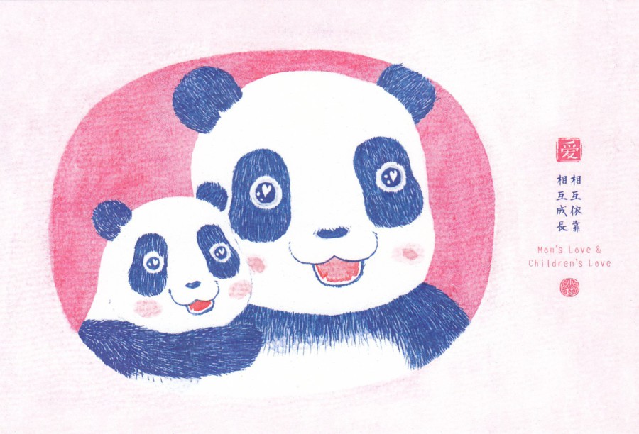
MOM’S LOVE & CHILDREN’S LOVE
Published by
ORIGINAL ILLUSTRATION BRAND
CHINESE ORIGIN
This is another postcard that I bought in the China shop in the China segment of the World Showcase in the Epcot theme park in Walt Disney World, Florida in October of this year. The card is a Chinese postcard exclusively shipped in for sale at this location. This one is a ‘really’ cute image which again shows the fascination the Chinese people have with the panda.
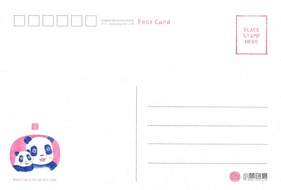
REVERSE SIDE OF ABOVE POSTCARD
Again, this is improved by the addition of a small cameo copy of the front image – and in full colour
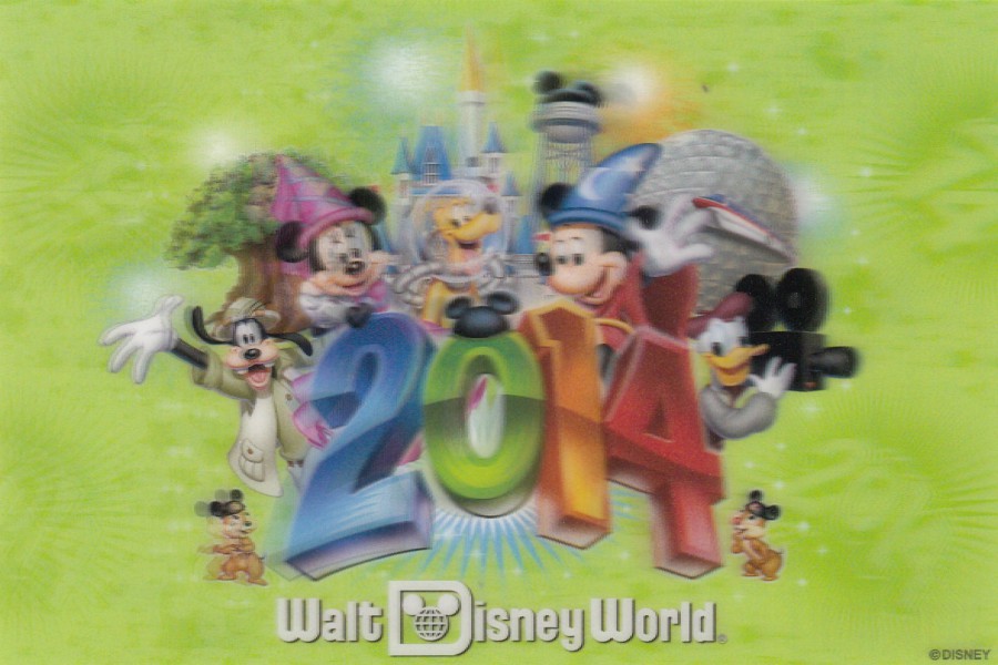
22/10/2017
2014
WALT DISNEY WORLD
Official Year Date Postcard
Official year date postcard only sold in Walt Disney World shops. There is new one of these every-year and I normally try and get a hold of one whenever I visit. I did not go in 2014 but was lucky enough to buy a bundle of Disney postcards from a charity which contained this copy. I love these cards but they are expensive at source so I was very fortunate here. It is slightly blurred because it is 3D and this type of card does not scan really well.
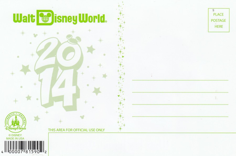
REVERSE SIDE OF ABOVE POSTCARD
Nice use of green print just to make the card a little different and stand out
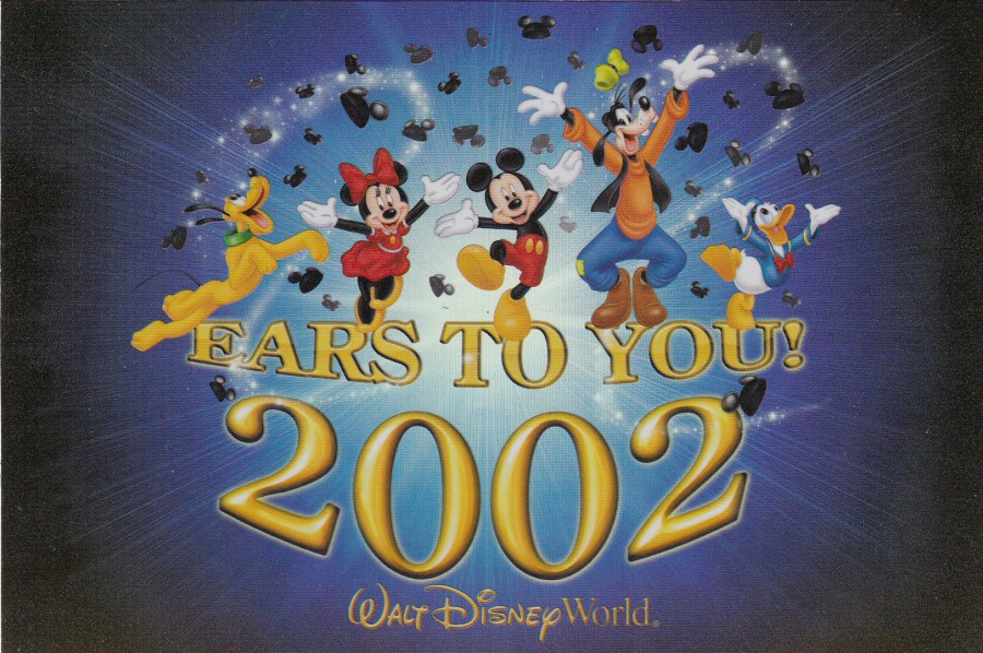
EARS TO YOU 2002
WALT DISNEY WORLD
Official Year Date Postcard
This was a year before my second visit and it is another charity bundle bought postcard (as I clearly could not bu a copy in 2003 when I went). These cards were not 3D, but, they were printed on a shiny glitter card so as you titled them the colour sometimes glistens and changes slightly. This was also from the period where each new year card incorporated a line of text around the date – so here you have ‘EARS TO YOU’, which goes nicely with 2002. Another nice find of what, despite large sales, are often very hard postcards to track down outside of the year itself.
22/10/2017
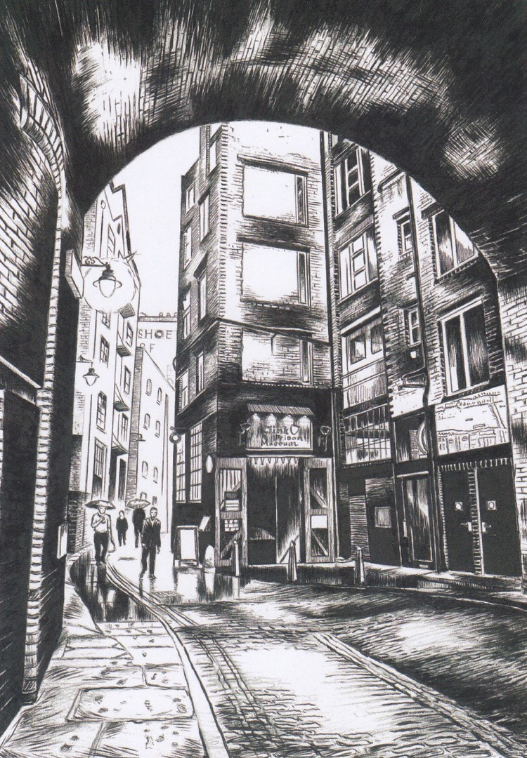
THE CLINK PRISON MUSEUM, BANKSIDE
LONDON
ORIGINAL ARTWORK BY
PETA BRIDLE
Official Museum release
I visited here earlier in the summer. It is located on the Southbank of the Thames in London. It is an interesting, although small, museum but one which I really enjoyed. I bought this card, one of only two available from the museums nice little gift shop which is at the end of your visit (it is also a gift shop which can-not be accessed without going through the actual museum. I liked this one and it is clear, from the people holding up open umbrella’s and the glimmer to the footpaths that this image depicts it as raining. Quite appropriate as that is exactly what it was doing when we came out!
You may also be aware, or not, that this is the location, the original source, of the English phrase ‘Being in the Clink’, which refers to be being imprisoned.

THE CLINK PRISON
1144 – 1780
WILLIAM DE RAT
The museum has some rather gruesome and brutal descriptions of the tortures and treatments which were handed out in the prison along with some quite gory waxwork figures, like a few chopped off heads on spikes. So, naturally enough these days, it is ideal for children! To help them around they have their own ‘child friendly’ information boards which are signposted with the use of the pictorial little character called ‘William de Rat’. So, it was nice that he received his own postcard fame via this exclusive, although sadly, plain backed card.

22/10/2017
MR. HAPPY
Artwork by John Bond
Published by
OH DEER
In their ‘MR MEN – LITTLE MISS’ series
I was surprised, but also delighted to come across this alternative illustration of Mr. Happy from the Mr. Men book series. I collect Mr Men postcards, you might be surprised how many there are, so this one was a nice addition to my collection. I placed it in my ‘Picture Postcard Monthly’ article some months back but thought it time it appeared here on the webpage.
22/10/2017
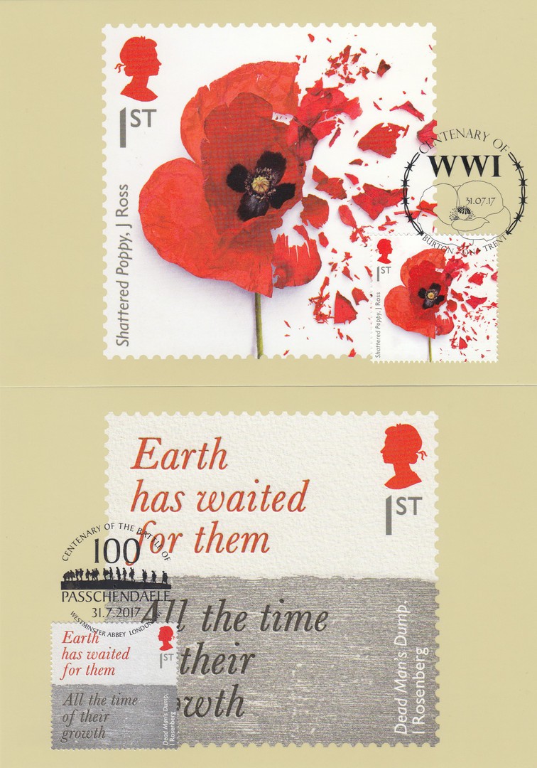
THE GREAT WAR, 1917
PHQ / STAMP CARD SET
Stamps issued 31st July 2017
SHATTERED POPPY
1ST CLASS STAMP
Published by
ROYAL MAIL
Ref: PHQ 432 (1) 7.17
This year’s addition to the ongoing annual series of WWI commemorative sets continues the common thread of having the first design incorporating the image of the red poppy. Here you have a photograph of what I believe was a freeze-dried poppy which was then shattered on one side. The art piece was by John Ross. The poppy designs, two of which have previously been depicted on the website – with the 2015 and 2016 sets – have been very attractive and well presented.
DEAD’ MAN’S DUMP
QUOTATION BY ISAAC ROSENBERG
“EARTH HAS WAITED FOR THEM – ALL THE TIME OF THEIR GROWTH”
1ST CLASS STAMP
Published by
ROYAL MAIL
Ref: PHQ 432 (2) 7.17
Isaac Rosenberg was an English poet. His poems titled under the heading ‘Poems from the Trenches’ are recognised as some of the best of the poetry that came out of the first world war. Rosenberg was initially attached to the 12th Bantam Battalion of the Suffolk Regiment (a bantam battalion being made up of men under the height of 5’3” – which was then the minimum height to be a soldier). When later transferred via the South Lancashire Regiment to the Kings Own Royal Lancaster Regiment Rosenberg found himself on the Western Front in June 1916. In January 1917 Rosenberg reported sick and through his family speaking with his superiors he was transferred to the Fortieth Division Works Battalion where he was responsible for the delivery of barbed wire to the trenches. It was in this period that he wrote ‘Dead Man’s Dump’, from which the stamps quote is taken. Eventually Rosenberg was returned to the front lines with the Kings Own Royal Regiment. On the 1st April 1918 Rosenberg was killed upon returning from a night patrol. The exact circumstances of his death are a little confused as it is stated he either died by a sniper’s bullet or he died in hand to hand close combat.

NURSES ELSIE KNOCKER AND MAIRI CHISHOLM
1ST CLASS STAMP
Published by
ROYAL MAIL
Ref: PHQ 432 (3) 7.17
I loved this stamp when I first saw it, but this was for a very particular reason. It is nice that Royal Mail have depicted a photograph which celebrates the amazing contribution given by the women who worked as nurses and ambulance drivers during the first world war, and this stamp does do that, but Elsie and Mari are also special for another reason. Their story was published as a book titled ‘ELSIE AND MAIRI GO TO WAR’ by Diane Atkinson. By coincidence I read this book earlier in the year and had thoroughly enjoyed it. So, when I saw that they were to appear on this stamp I felt quite that I already knew their story and believed that they do deserve to appear here. If you get a chance, and like a good military and personal history story then I can recommend this book.

PHOTOGRAPH
Book – ‘Elsie and Mari go to War’
By
Diane Atkinson
(this is the book I mention above and which I read earlier in the year – well worth a look)
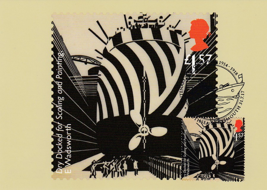
DRY DOCKED FOR SCALING AND PAINTING
By
EDWARD WADSWORTH
£1.57 STAMP
Published by
ROYAL MAIL
Ref: PHQ 432 (4) 7.17
This painting depicts a ship which has been painted with unusual stripes of black and white which were used to confuse submarines when they were being looked at on the horizon. The lines broke up the shape of the ship and made it difficult to assess distance and shape making the use of torpedoes very hard. Ships that were painted with these patterns of lines were called ‘Dazzle Ships’. I believe this painting is in the Imperial War Museum’s collection.
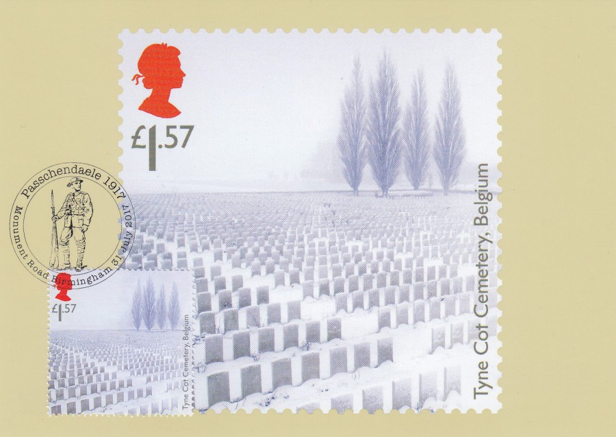
TYNE COT CEMETARY
£1.57 STAMP
Published by
ROYAL MAIL
Ref: PHQ 432 (5) 7.17
I have had the privilege of visiting Tyne Cot Cemetery several times now. It is a hauntingly large Cemetery, in fact it is the largest Commonwealth War Graves Commission cemetery in the world being the resting place for 11,900 servicemen. This cemetery is located in the area where the Battle of Passchendaele took place, and many of those that died in that 1917 battle are buried here. This is the reason why the cemetery makes an appearance in this year’s commemorative stamp set.
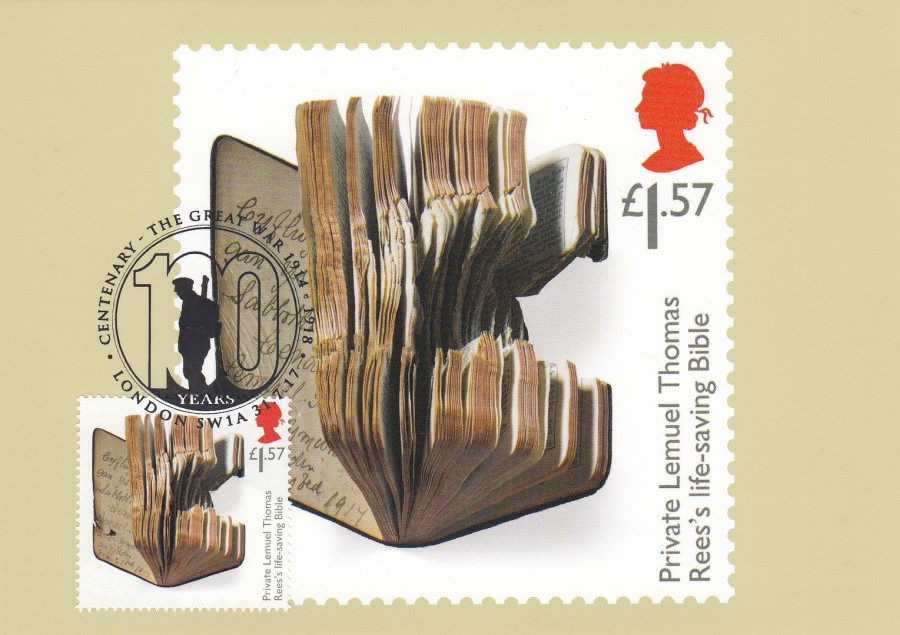
PRIVATE LEMUEL THOMAS REE’S LIFE SAVING BIBLE
£1.57 STAMP
Published by
ROYAL MAIL
Ref: PHQ 432 (6) 7.17
Ree’s was conscripted into the army in 1917 joining the South Wales Borders, 6th Battalion and served in the Battle of Passchendaele. During this period, he took the brunt of the force of an exploding German shell which landed in his trench beside him. His life was saved by his Sunday School Bible which he kept in his pocket. Although his life was saved he was still seriously injured and spent four months in a field hospital before being sent home on leave. Whilst on leave his brother witnessed his nightmares and saw him trying to bayonet imaginary Germans in his sleep whilst shouting out.
When Ree’s returned to the trenches he was involved in action in July 1918 which resulted in him and his colleagues sleeping out and becoming very wet. By the end of October many of the soldiers had influenza and were evacuated out. Ree’s, better known as Thomas to his family and friends, was one of those evacuated. He later died of a combination of events which resulted in him having bronchial pneumonia. Some of this was brought on by the conditions he had been staying in but, also the fact that his hospital underwent a gas attack on the 13th November 1918. He died two days after the peace treaty was signed.
Congratulations to Royal Mail for putting together another excellent selection of images in this series – I assume next year’s set will be the last and it will therefore be interesting to see what they produce for this one.
PHOTOGRAPH
PRIVATE LEMUEL THOMAS REE’S